Business Intelligence Patterns and Pitfalls
Begin
13 pages · ~26 min
Business Intelligence Patterns and Pitfalls
Explore real-world BI examples to identify effective patterns, key strengths, and common pitfalls—ideal for analysts and BI professionals seeking practical insights.
What you’ll learn
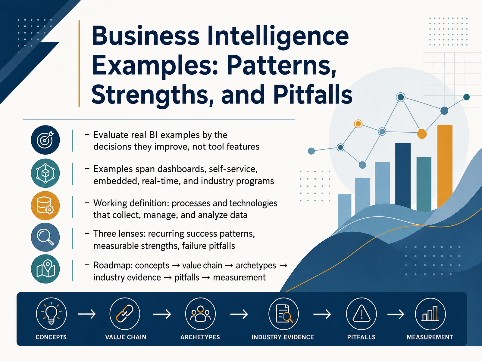
- 01Business Intelligence Examples: Patterns, Strengths, and PitfallsWelcome. I'm glad you're here, because this course is about judgment, not tool shopping. Over the next few slides, we will evaluate real business intelligence examples by the decisions they improve, not by the features on a vendor checklist. We will cover dashboards, self-service, embedded, real-time, and industry programs. For a working definition, business intelligence is the processes and technologies that collect, manage, and analyze data to inform decisions. We will use three lenses: recurring success patterns, measurable strengths, and failure pitfalls. Your roadmap runs from core concepts to the value chain, then archetypes, industry evidence, pitfalls, and finally measurement. As we go, ask one question of every example: what decision would be better, faster, or cheaper because this exists? That is the so what that separates a credible use case from a demo. Next, we will draw clear boundaries between business intelligence, analytics, data science, and embedded analytics.tableau.comibm.comsap.com+22 min
- 02Definitions and Boundaries: BI, Analytics, Data Science, and Embedded AnalyticsLet's draw some clear boundaries before we go further. Business intelligence answers two questions: what happened, and what is happening right now. Business analytics extends that into why it happened, what comes next, and what you should do about it. Those four analysis types, descriptive, diagnostic, predictive, and prescriptive, each demand different data and different skills. Self-service BI splits responsibility: I T governs security, accuracy, and access, while your users explore their own views. Embedded analytics is different again, because it inherits the host product's identity and permissions, so the right people see the right data inside the tool they already use. Data science begins where statistical modeling and automated decisioning become the core work. Here is the hard lesson. Broad access alone does not create value. Governance and decision rights do. Give people data without clear ownership, and you get conflicting numbers and slow decisions. So before you widen access, define who owns each metric and who can act on it. Next, we trace how raw data becomes a decision in From Raw Data to Decisions: The BI Value Chain.
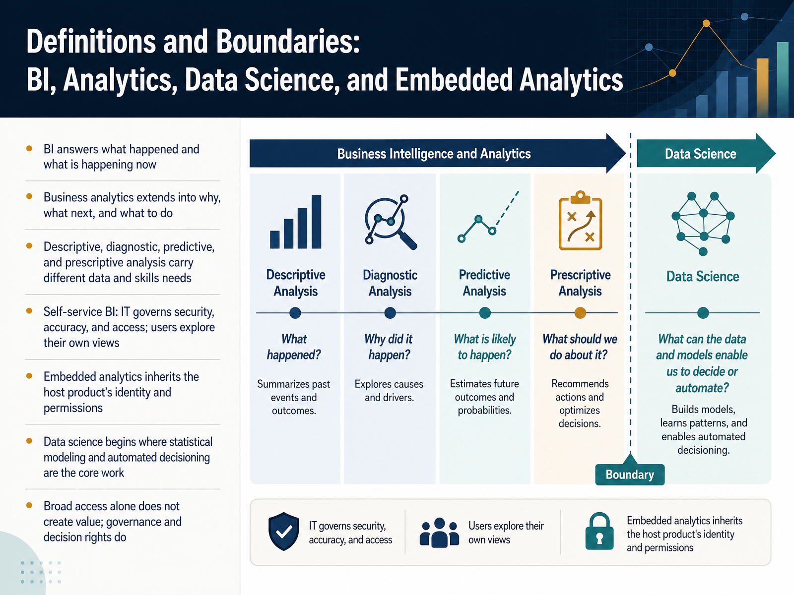 tableau.comibm.comsap.com+21 min
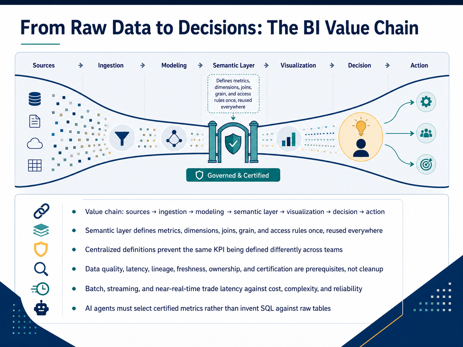
 - 03From Raw Data to Decisions: The BI Value ChainLet's walk the value chain from raw data to decisions. It runs sources, ingestion, modeling, semantic layer, visualization, decision, action. The semantic layer is the pivot point. It defines metrics, dimensions, joins, grain, and access rules once, then reuses them everywhere. Your team stops arguing about whose revenue number is right, because one approved calculation serves every report and every agent. Treat data quality, latency, lineage, freshness, ownership, and certification as prerequisites, not cleanup. Batch, streaming, and near-real-time each trade latency against cost, complexity, and reliability. And note this: AI agents must select certified metrics rather than invent SQL against raw tables, so they inherit your governance instead of guessing. So what? If the semantic layer is weak, everything downstream is built on sand. Next, Pattern 1: Executive and Operational Dashboards.
 cube.devovaledge.comovaledge.com+22 min
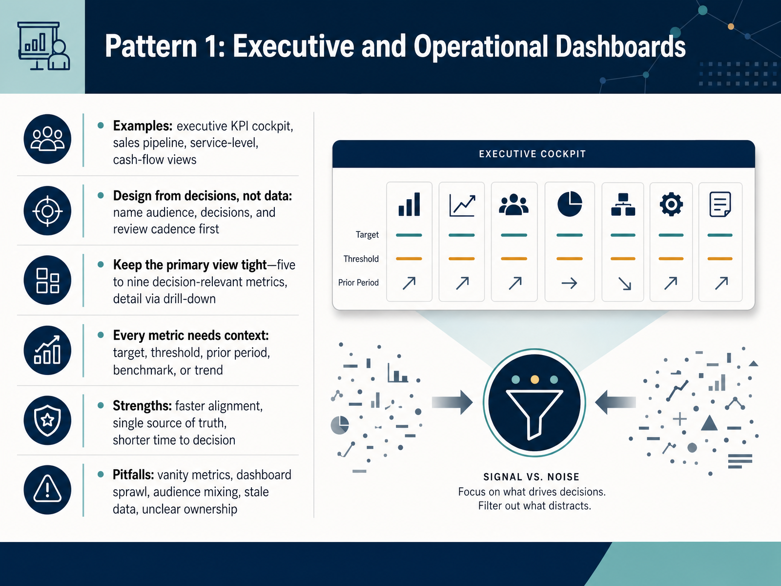
 - 04Pattern 1: Executive and Operational DashboardsLet's start with the most common pattern: executive and operational dashboards. Think of an executive KPI cockpit, a sales pipeline view, a service-level screen, or a cash-flow dashboard. Here's the design rule that matters most. Start from decisions, not data. Name the audience, the decisions they make, and how often they review. Then keep the primary view tight. Five to nine decision-relevant metrics, with detail available through drill-down. And every metric needs context. A target, a threshold, a prior period, a benchmark, or a trend. Without context, a number is just noise.
The strengths are real. You get faster alignment around one version of the truth, and shorter time to decision. But watch the pitfalls. Vanity metrics that look good and change nothing. Dashboard sprawl as every request gets added. Audience mixing, where executives and operators fight over one screen. Stale data from manual updates. And unclear ownership, where a red number triggers no action.
So the takeaway is simple. A dashboard earns its keep only when a specific person sees it at a set cadence and knows what to do when a number moves. That brings us to our next pattern: self-service analytics and data democratization.
 clearpointstrategy.comappdeck.comcadeon.com+22 min
 - 05Pattern 2: Self-Service Analytics and Data DemocratizationNow let's look at Pattern 2: self-service analytics and data democratization.
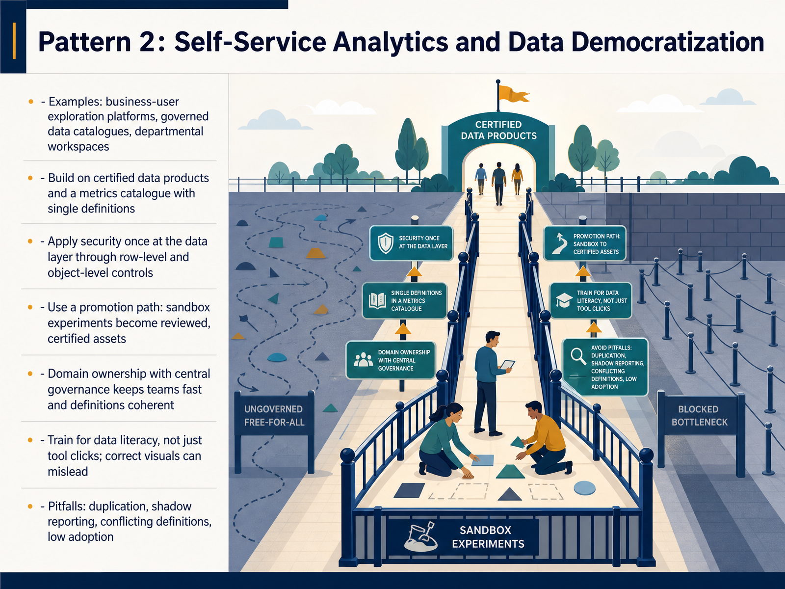
Picture a marketing manager who wants campaign performance without waiting two weeks for the central team. That's the promise here. You give business users exploration platforms, a governed data catalogue, and departmental workspaces. But the pattern only works when you build it on certified data products and a metrics catalogue with single definitions. Apply security once at the data layer, using row-level and object-level controls, so access travels with the data no matter which tool someone uses.
Then add a promotion path. Sandbox experiments get reviewed and certified before they become official assets. Domain ownership with central governance keeps teams fast and definitions coherent. And train for data literacy, not just tool clicks, because a technically correct chart can still mislead.
Here's the contrast. Done well, you get speed and trust. Done poorly, you get duplication, shadow reporting, conflicting definitions, and low adoption. Ungoverned self-service doesn't remove the bottleneck. It relocates it and adds risk.
So what's the takeaway? Self-service is a privilege you engineer, not a feature you switch on. Build the guardrails before you open the doors.
Next, we move to Pattern 3: Embedded, Customer-Facing, and Product Analytics.
 ve3.globaldatasemantics.copowerbiconsulting.com+22 min
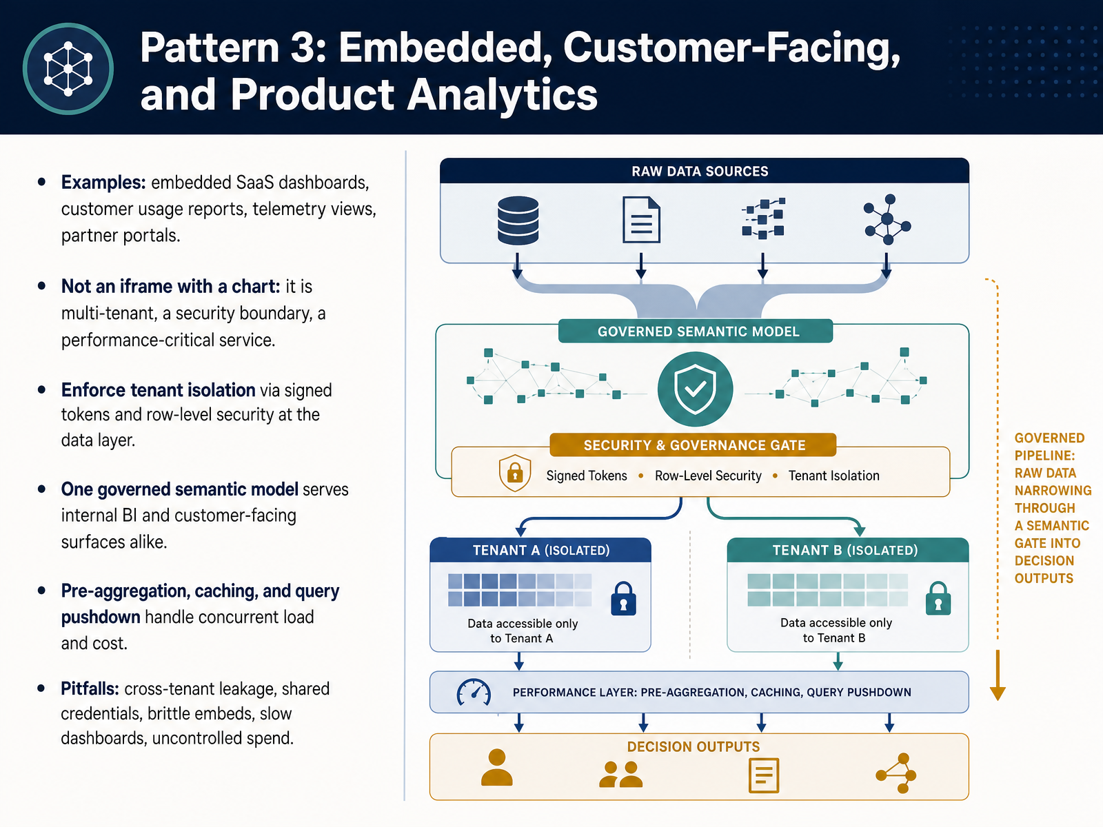
 - 06Pattern 3: Embedded, Customer-Facing, and Product AnalyticsLet's move to pattern three, embedded, customer-facing, and product analytics. Think of an embedded software-as-a-service dashboard, a customer usage report, or a partner portal. Here is the critical distinction. This is not an iframe with a chart. Once analytics reaches your customers, it becomes a multi-tenant system, a security boundary, and a performance-critical service. So enforce tenant isolation with signed tokens and row-level security at the data layer, never in the interface. One governed semantic model should serve both your internal BI and your customer-facing surfaces, so the numbers match everywhere. Then handle concurrency and cost with pre-aggregation, caching, and query pushdown. The pitfalls are unforgiving. Cross-tenant leakage, shared credentials, brittle embeds, slow dashboards, and uncontrolled spend. So what? Treat embedded analytics as product infrastructure, not a report. Next, pattern four, real-time, location, and advanced analytics.
 2 min
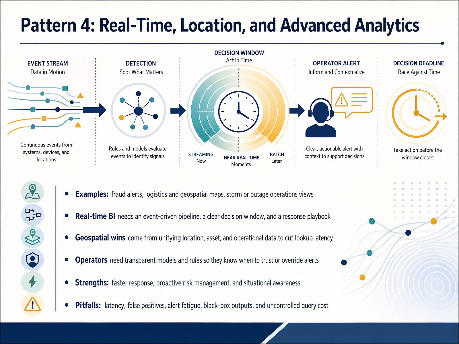
2 min - 07Pattern 4: Real-Time, Location, and Advanced AnalyticsLet's move on to Pattern 4, real-time, location, and advanced analytics. Think about a utility operations center during a storm. Live outage, customer, and terrain data come together in one view, so dispatchers deploy crews faster. Real-time business intelligence needs three things: an event-driven pipeline, a clear decision window, and a response playbook. Geospatial wins come from unifying location, asset, and operational data. At one fleet operator, replacing manual tick sheets cut storm response from over an hour to immediate, and spatial lookups dropped from roughly thirteen hundred fifty milliseconds to about one hundred twenty-seven. Operators also need transparent models and rules, so they know when to trust an alert or override it. The strengths are clear: faster response, proactive risk management, and situational awareness. The pitfalls are just as real: latency, false positives, alert fatigue, black-box outputs, and uncontrolled query cost. So what? Adopt real-time and geospatial analytics when the decision window is short and the data is unified, not before. Next, we look at Pattern 5, Industry Examples in Healthcare, Retail, Finance, and Manufacturing.
 1 min
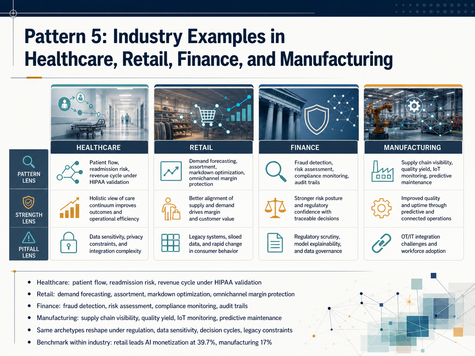
1 min - 08Pattern 5: Industry Examples in Healthcare, Retail, Finance, and ManufacturingNow let's see how these patterns land across four industries. In healthcare, BI drives patient flow, readmission risk, and revenue cycle performance, all under HIPAA validation. In retail, it powers demand forecasting, assortment, markdown optimization, and omnichannel margin protection. In finance, you get fraud detection, risk assessment, compliance monitoring, and audit trails. And in manufacturing, it shows up in supply chain visibility, quality yield, IoT monitoring, and predictive maintenance. Here is the pattern to notice. The same archetypes reshape themselves under regulation, data sensitivity, decision cycles, and legacy constraints. A readmission model and a fraud model may share the same math, but they face very different validation and governance. So benchmark within your industry, not across it. Retail leads AI monetization at thirty-nine point seven percent, while manufacturing sits at seventeen percent. The gap is not talent. It is incentive and constraint. So what? Compare your BI portfolio to peer benchmarks in your own sector, because the regulatory and operational context determines what is realistic and what is risky next. Next, we move into the pitfalls clinic, and the question of why BI examples fail.
 1 min
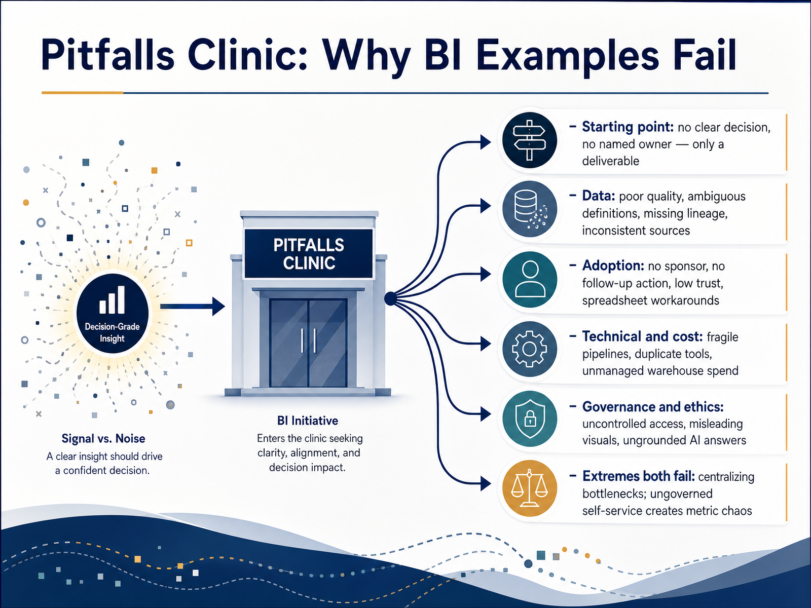
1 min - 09Pitfalls Clinic: Why BI Examples FailLet's turn to why business intelligence examples fail. Think of this as a clinic, and these are the recurring diagnoses. First, the starting point. Too many projects begin with a deliverable instead of a decision. Nobody names who owns the outcome, so you build dashboards that no one is accountable for acting on. Second, data. Poor quality, ambiguous definitions, missing lineage, inconsistent sources. If finance and sales report different revenue numbers, trust collapses fast. Third, adoption. No executive sponsor, no follow-up action, low confidence, and suddenly your team is back in spreadsheets as a workaround. Fourth, technical and cost. Fragile pipelines, duplicate tools, and unmanaged warehouse spend quietly drain the budget. Fifth, governance and ethics. Uncontrolled access, misleading visuals, ungrounded AI answers. So here is the key contrast. Extremes both fail. Total centralization creates bottlenecks, while ungoverned self-service creates metric chaos. Your takeaway: name the decision, own the data, and govern the middle path. Next, let's look at the early warning checklist, signals to pause, redesign, or retire.
 cube.devovaledge.comovaledge.com+22 min
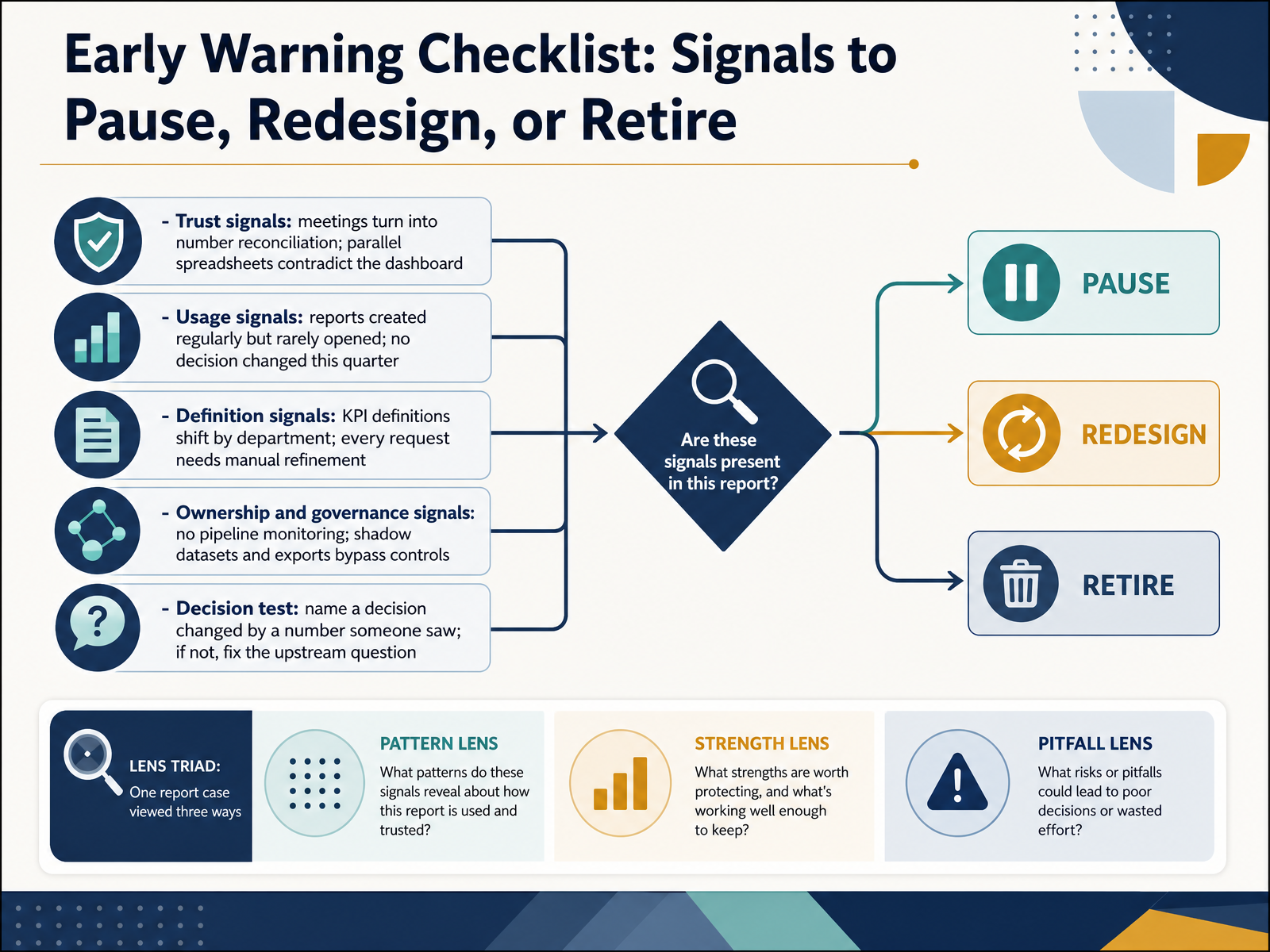
 - 10Early Warning Checklist: Signals to Pause, Redesign, or RetireLet's turn the pitfalls we discussed into a practical early warning checklist. Pause and listen for trust signals. If your meetings turn into number reconciliation, or parallel spreadsheets contradict the dashboard, trust has already eroded. Usage signals matter too. Reports created regularly but rarely opened, and no decision changed this quarter, mean analytics has detached from the business. Then watch definitions. When KPI definitions shift by department, or every request needs manual refinement, your data model isn't scaling. And check ownership. No pipeline monitoring, plus shadow datasets and exports that bypass controls, is a governance gap waiting to break. Here is the decision test. Name one decision that changed because of a number someone saw. If you cannot, fix the upstream question before building more dashboards. So audit your current reports against these signals and act on the strongest one. Next, Strengths and Value Measurement: Proving BI Impact.
 ve3.globaldatasemantics.copowerbiconsulting.com+22 min
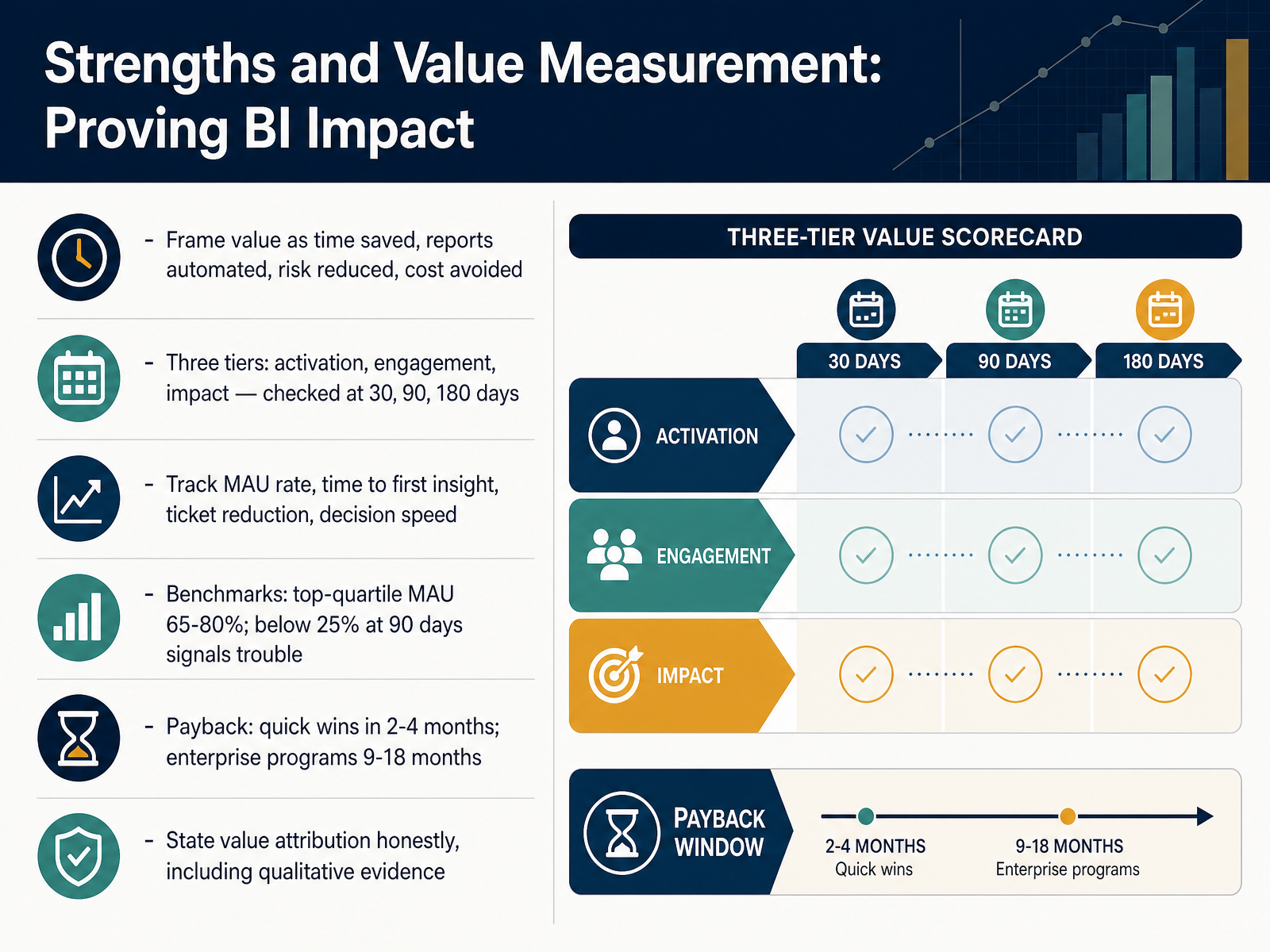
 - 11Strengths and Value Measurement: Proving BI ImpactNow let's talk about proving BI impact, because value you can't measure is value leadership won't fund. Frame value concretely: hours saved, reports automated, risk reduced, cost avoided. Then check three tiers over time. Activation at thirty days, did people start? Engagement at ninety, do they keep coming back? Impact at a hundred and eighty, did outcomes change? Track a handful of numbers: monthly active user rate, time to first insight, data team ticket reduction, and decision speed. Benchmarks matter here. Top-quartile monthly active use runs sixty-five to eighty percent. If you're below twenty-five percent at ninety days, that signals a tool-fit or rollout problem, and teams rarely recover without deliberate intervention. On payback, quick wins land in two to four months, while enterprise programs typically take nine to eighteen months. So before you promise returns, set a baseline and be honest about attribution, including qualitative evidence like decision quality. The so what: measure adoption first, impact second, and report both. Next, we move into the Evaluation Playbook: Choosing and Scaling a BI Example.
 2 min
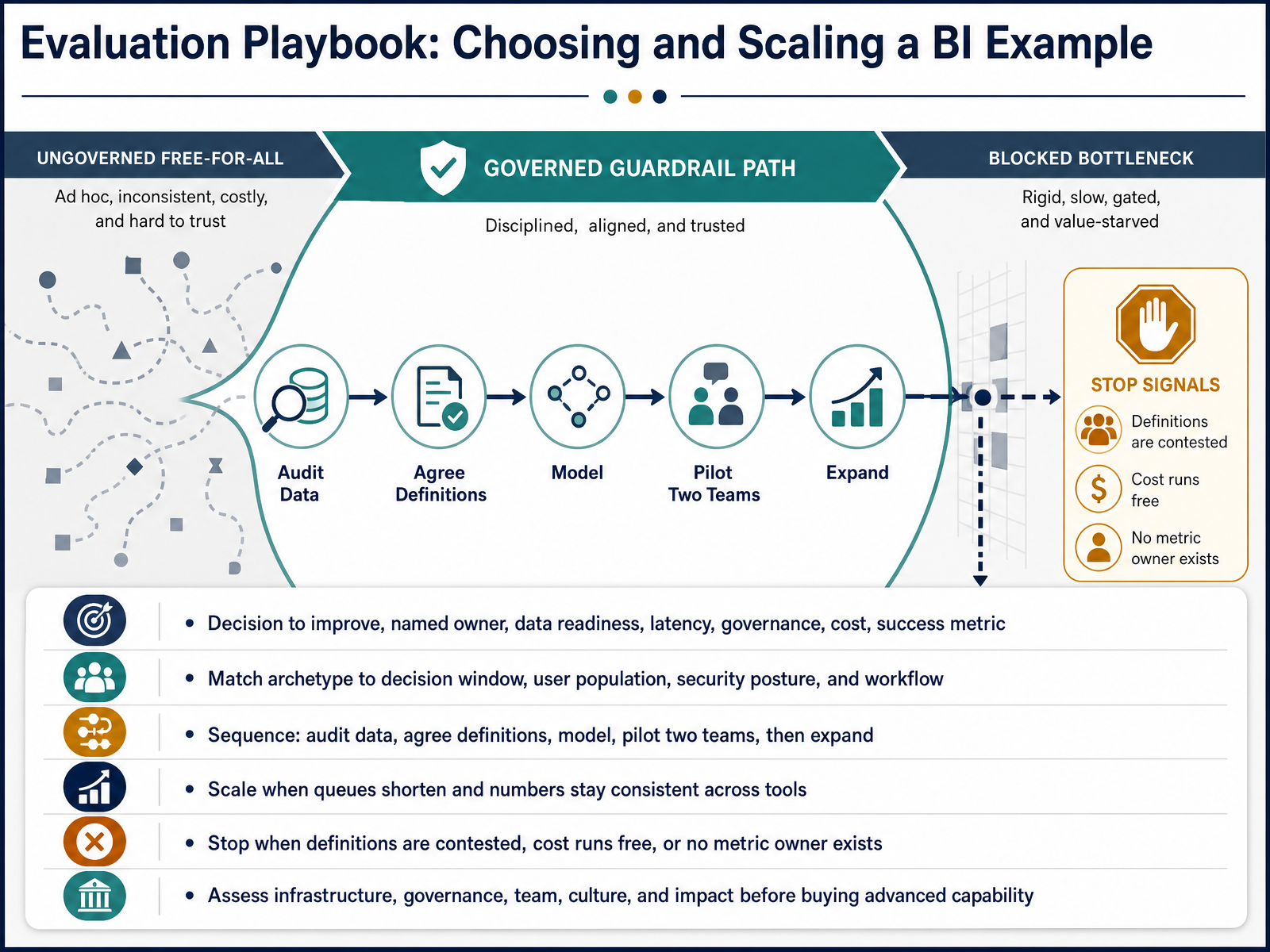
2 min - 12Evaluation Playbook: Choosing and Scaling a BI ExampleNow let's pull this together into an evaluation playbook, so you can choose the right BI example and scale it deliberately. Every viable use case starts with a real decision to improve, a named owner, an honest read on data readiness, and an agreed success metric. If any of those are missing, stop. Then, match the archetype to your decision window, your user population, your security posture, and the existing workflow. A fraud alert and a monthly board pack demand very different latency and governance. Sequence the work the same way every time. Audit your data. Agree on definitions. Build the model. Pilot with two teams. Only then expand. Scale when queues shorten and numbers stay consistent across tools. Stop when definitions are contested, cost runs free, or no one owns the metric. And before you buy advanced capability, assess five things: infrastructure, governance, team, culture, and business impact. If those aren't ready, the tool won't save you. Let's put this playbook to work in the workshop ahead.
 2 min
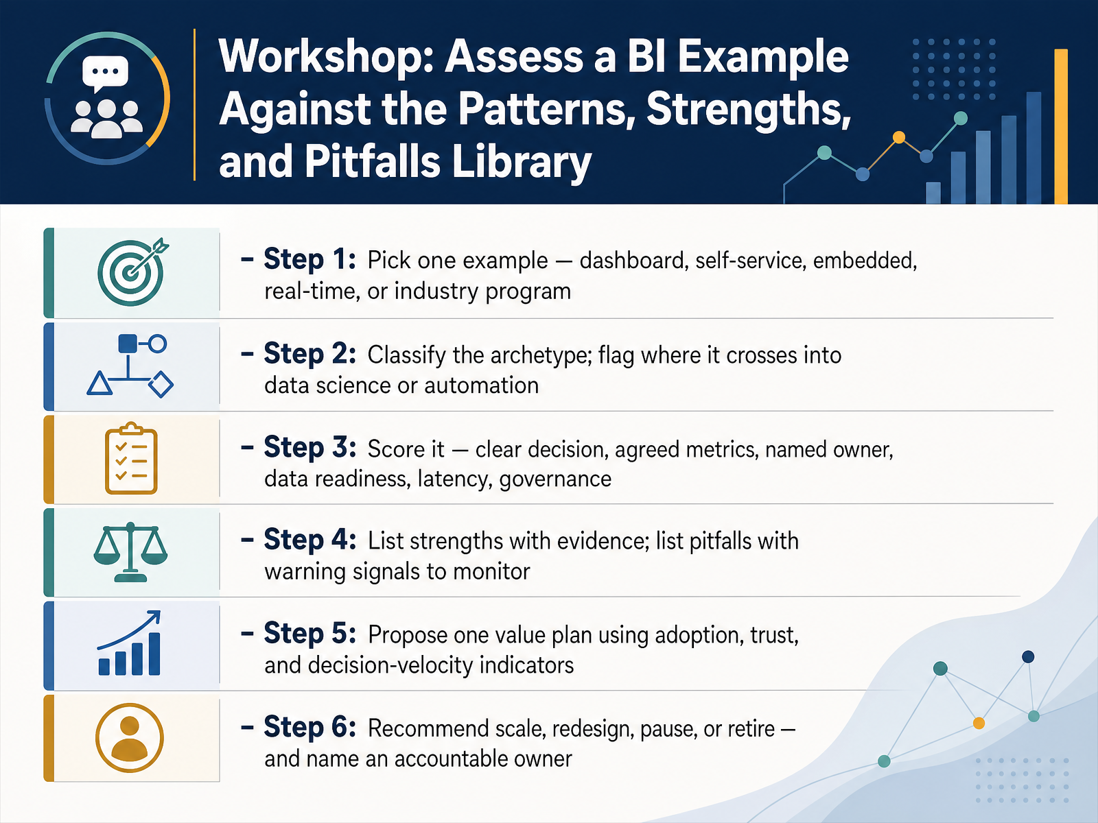
2 min - 13Workshop: Assess a BI Example Against the Patterns, Strengths, and Pitfalls LibraryLet's put everything you've learned into practice. Pick one example: a dashboard, self-service, embedded, real-time, or an industry program. First, classify the archetype, and flag where it crosses into data science or automation. Next, score it against six criteria: a clear decision, agreed metrics, a named owner, data readiness, latency, and governance. Then list strengths with evidence, and pitfalls with warning signals to monitor. Finally, propose one value plan using adoption, trust, and decision-velocity indicators, and recommend scale, redesign, pause, or retire, with an accountable owner named. Here's the takeaway: the honest assessment is the hard part, and it's what separates programs that compound value from those that quietly decay. Earlier, we saw how most organizations overestimate their maturity. This workshop is your reality check. Thank you for working through this course with me. Go assess one real use case this week, and let the evidence guide your next move.
 ve3.globaldatasemantics.copowerbiconsulting.com+22 min
Take the deck with you
Download this course as a file — free, no sign-up needed.
- PDF handoutEvery slide page, ready to print or share.14 pages · 3.8 MBDownload
- Narrated PowerPointThe deck that presents itself — every slide carries the digital human's narration video.14 pages · 26.3 MBDownload
- PowerPoint slidesThe full deck as a .pptx — open it in PowerPoint, Keynote, or Google Slides.14 pages · 3.6 MBDownload
Free to use in your own training — please keep the PersonWise credit page at the end.
Have your own deck? Turn it into a course
Sources consulted
Web sources consulted while building this course.
- What is Business Intelligence? A Complete Overview | Tableau — tableau.com
- What Is Business Intelligence (BI)? | IBM — ibm.com
- What Is Business Intelligence (BI)? How It Works and Examples| SAP — sap.com
- What is Business Intelligence (BI)? A Detailed Guide | TechTarget — techtarget.com
- Business Intelligence (BI): Tools, Types, Benefits, and ... — investopedia.com
- Semantic Layer Architecture in the AI Era | Cube — cube.dev
- Semantic Layer Architecture Explained for Enterprise AI — ovaledge.com
- Governed Semantic Layer for AI: Enterprise Guide for 2026 — ovaledge.com
- Semantic Layer for AI and BI (2026): Why It Matters, How to Choose, and How to Implement It - Omni Analytics — omni.co
- Production-Ready Semantic Layer Design: A Practical Guide | Ridiculous Engineering — ridiculousengineering.com
- KPI Dashboard Best Practices: 12 Rules for 2026 | ClearPoint Strategy Blog — clearpointstrategy.com
- 20 KPI Dashboard Examples for Every Business Function [2026] — appdeck.com
- Top KPI Dashboard Examples for Better Business Insights 2026 - Cadeon Inc. — cadeon.com
- What Is a KPI Dashboard? The Ultimate 2026 Guide | Cyndra Blog — cyndra.ai
- Dashboards: Design, Types & Best Practices (2026) — infinisynapse.com
- Self-Service BI Without the Chaos: Governance Guardrails That Work | VE3 Blog — ve3.global
- Self-Service Business Intelligence: A Complete 2026 Guide | Data Semantics — datasemantics.co
- Self-Service BI Governance in Power BI | Power BI Consulting — powerbiconsulting.com
- Self-Service Analytics Governance for Data Quality — xylitytech.com
- How to Roll Out Self-Service BI Without Losing Governance: A Practical Playbook — bixtech.ai