Loading and Progress State Design
Begin
13 pages · ~26 min
Loading and Progress State Design
Teaches UI designers how to create effective loading indicators and progress states to improve user experience and reduce perceived wait times.
What you’ll learn
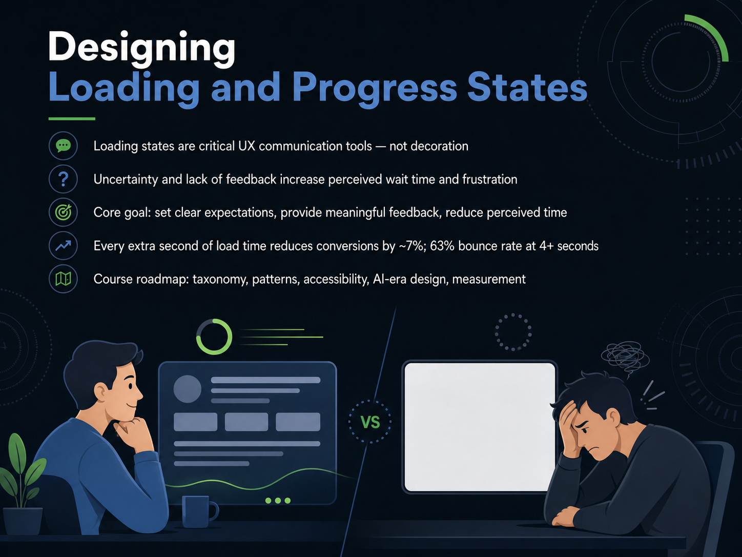
- 01Designing Loading and Progress StatesWelcome to Designing Loading and Progress States. In this session, we will explore how the feedback you give during a wait can either build trust or drive users away. Loading states are not decorative extras. They are critical communication tools that answer three questions for the user: What is the system doing right now? How much longer will it take? And has something gone wrong? When users lack that feedback, uncertainty inflates their sense of time. Seconds feel like minutes, and patience runs out fast. In fact, research shows that every extra second of load time reduces conversions by roughly seven percent. If a page takes more than four seconds, the bounce rate can jump to sixty three percent. Our core goal is to set clear expectations, provide meaningful progress, and reduce perceived time. Throughout this course, we will build a shared understanding of loading taxonomy, key design patterns, accessibility requirements, emerging AI-era considerations, and how to measure success. Next, we will look at the cost of waiting, where we connect user behavior directly to business impact.css-zone.comuxpatterns.devuxpatterns.dev+22 min
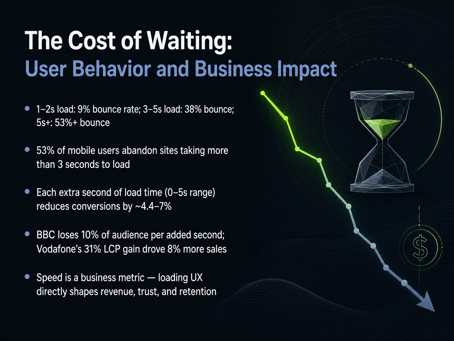
- 02The Cost of Waiting: User Behavior and Business ImpactNow let's look at the hard numbers behind waiting. When a page loads in just one or two seconds, bounce rates hover around nine percent. That number jumps to thirty-eight percent between three and five seconds, and climbs past fifty-three percent beyond five seconds. Over half of all mobile users will leave a site that takes more than three seconds to load. Every extra second of delay, in that zero-to-five-second window, reduces conversions by roughly four to seven percent on average. Real-world examples confirm the pattern. The BBC found it loses about ten percent of its audience for each added second of load time. Meanwhile, Vodafone improved its Largest Contentful Paint by thirty-one percent and saw sales increase by eight percent. Speed isn't just a technical metric. It directly shapes your revenue, your user trust, and your ability to retain customers. Next, we'll explore a taxonomy of loading states so you can design feedback that fits the exact wait you're working with.
 yottaa.comsearchlab.nledmondscommerce.co.uk+22 min
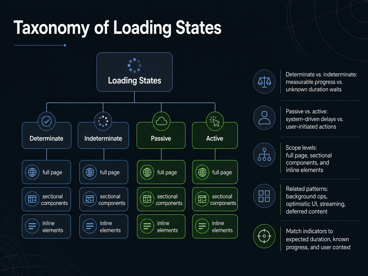
 - 03Taxonomy of Loading StatesNow let's build a shared vocabulary by looking at the taxonomy of loading states. This mental model helps you pick the right pattern instead of defaulting to a single spinner. First, determinate versus indeterminate. Determinate indicators show measurable progress, like a percentage bar while exporting a file. Indeterminate indicators are for waits where the duration is unknown, such as a looping animation during a server connection. Next, passive versus active. Passive delays are system driven, like a report generating in the background. Active delays are directly triggered by a user action, like submitting a form, where immediate feedback is essential. We also consider scope. A full-page skeleton screen, a sectional loader inside a card, or an inline spinner replacing a single button label each set very different expectations. Related patterns include background operations, optimistic UI updates, streaming content chunks, and deferred content placeholders. The core takeaway is to match the indicator type to the expected duration, how much progress is known, and the user's immediate context. Let's apply that matching logic next, when we examine determinate and indeterminate progress patterns in detail.
 2 min
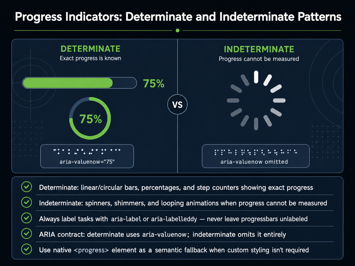
2 min - 04Progress Indicators: Determinate and Indeterminate PatternsNow let's look at the visual patterns that tell users how long they'll be waiting. Progress indicators fall into two main categories: determinate and indeterminate. Determinate indicators are used when the system can measure the remaining time or steps. Think of a linear bar filling up, a circular ring with a percentage, or a step counter showing 'Step two of five.' These patterns reduce uncertainty because the user can see an endpoint. Indeterminate indicators are for processes where progress cannot be measured. Common examples are spinning circles, shimmer loading effects, and looping animations. They communicate that work is happening, but without a measurable finish line. A critical rule is to never leave these indicators unlabeled. Every progress element should have a text description using aria-label or aria-labelledby, so assistive technology can announce what is loading. For the ARIA contract, determinate progress bars must include aria-valuenow to expose the current value numerically. Indeterminate bars omit aria-valuenow entirely, signaling that no specific progress percentage exists. When custom styling is not a priority, using the native HTML progress element is a solid semantic choice. It provides built-in accessibility without extra effort. Next, we'll explore how skeleton screens and placeholder UI can make perceived performance feel even faster.
 2 min
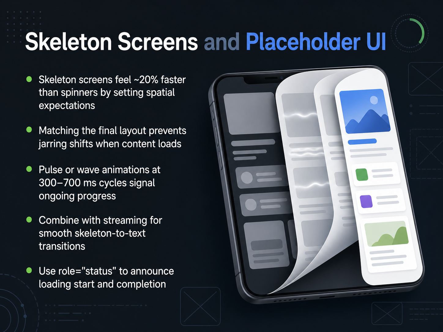
2 min - 05Skeleton Screens and Placeholder UINow let's look at skeleton screens and placeholder UI — one of the most effective ways to make loading feel faster. Research shows skeleton screens feel about 20 percent quicker than spinners for the same wait time. Why? Because they set spatial expectations. When the placeholder matches the final layout, the transition from loading to real content feels smooth, not jarring. Use pulse or wave animations that cycle every 300 to 700 milliseconds to signal ongoing progress without distracting the eye. For chat interfaces, think of two or three grey rounded lines inside the assistant bubble. For document generation, use a full-page layout placeholder. Pair the skeleton with streaming for seamless, word-by-word reveals. And don’t forget accessibility — wrap the loading state in a live region with role equals status so screen readers announce when loading begins and ends. Up next, we’ll explore empty, error, and interruption states.
 telerik.comcloudscape.designai-tldr.dev+21 min
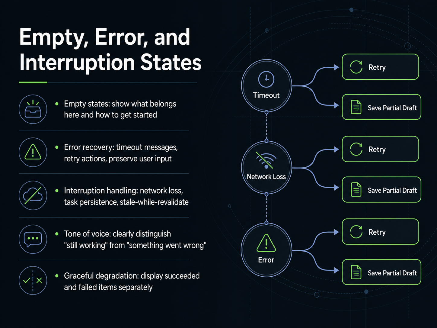
 - 06Empty, Error, and Interruption StatesMoving beyond loading, let's talk about states where nothing is happening yet, or where something has gone wrong. These are your empty, error, and interruption states. For an empty state, don't just leave a blank screen. Show the user what will eventually live here and offer a clear, single action to get started, like 'Create your first project'. When errors occur, a good recovery flow is essential. Provide a specific message, not just 'Error'. Say 'Request timed out'. Always include a direct retry button, and crucially, preserve any input the user already typed so they don't have to start over. For interruptions like network loss, think about task persistence. Queue the action locally and retry it in the background. A stale-while-revalidate pattern can show cached data instantly while fetching fresh data, avoiding a loading spinner altogether. Your tone of voice is key here. Clearly distinguish 'still working' from 'something went wrong'. If it's a background sync, use a calm tone. If it's a blocking failure, be direct and helpful. Finally, embrace graceful degradation. If a list of items partially fails to load, display the succeeded items separately from the failed ones, with a clear retry option for only what broke. Next, we'll explore perceived performance and how to make necessary waits feel much shorter.
 2 min
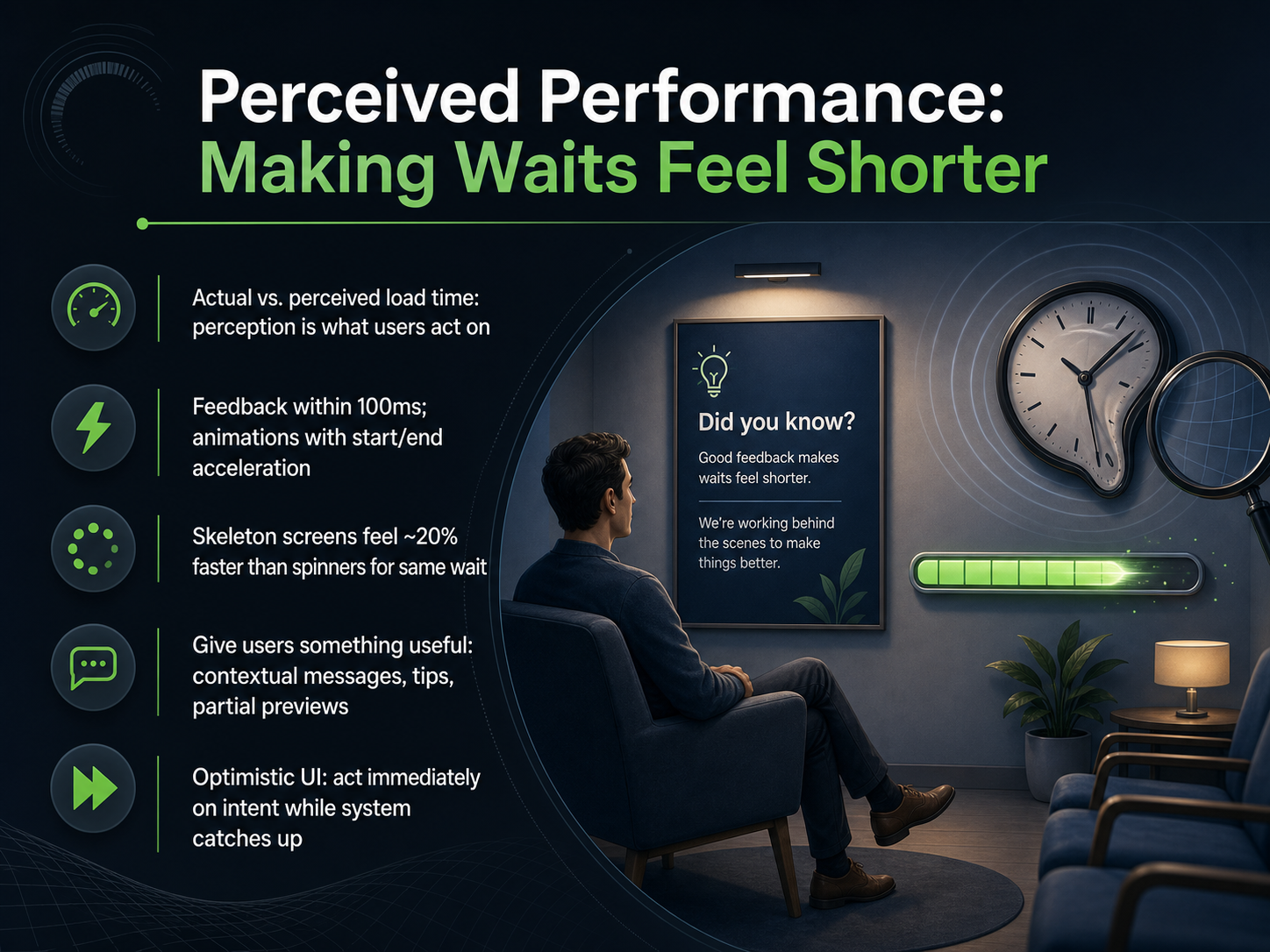
2 min - 07Perceived Performance: Making Waits Feel ShorterNow let's shift focus to perceived performance, where the goal is making waits feel shorter than they actually are. Users don't measure loading in milliseconds; they judge it by how responsive the interface feels. So here's the first rule: provide feedback within about one hundred milliseconds of an action. That's the window where a button state change or a subtle animation confirms the system heard them. For longer waits, the tools we choose really matter. Skeleton screens, for example, can make the same wait feel about twenty percent faster than a traditional spinner, because they create spatial expectations and reduce jarring layout shifts when content arrives. Another powerful technique is giving users something useful while they wait. Contextual messages like "Analyzing your data" or "Generating recommendations" turn an anxious pause into a narrated moment. Even better, if you can show partial previews or stream partial results, the user begins consuming value before the full response is ready. There's also the concept of optimistic UI, where the interface acts on the user's intent immediately and reconciles with the backend afterwards. The system trusts the action will succeed, keeping the experience fluid. Ultimately, perceived speed isn't about tricking the user; it's about designing every moment of the wait to be informative and grounded. Next, we'll look at how to make all these visual cues truly accessible in our discussion of accessible loading design, ARIA, focus, and motion.
 telerik.comcloudscape.designai-tldr.dev+22 min
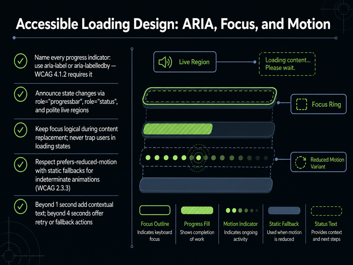
 - 08Accessible Loading Design: ARIA, Focus, and MotionNow let's make loading indicators that work for every user. Accessibility in loading design comes down to naming, announcing, and managing focus and motion. First, give every progress indicator a clear name using aria-label or aria-labelledby. Without a name, a screen reader just says 'progress bar, forty-three percent' and the user has no idea what is loading. The name tells them the task, like 'Upload progress' or 'Report loading status.' Next, announce state changes properly. Use the role 'progressbar' for measurable tasks, and the role 'status' or polite live regions when the system is simply busy. These announcements help users understand when the wait starts and when it ends. Focus management matters too. When content replaces a loading state, move focus logically to the new content. Never trap a keyboard user inside a loading indicator. For motion, respect the prefers-reduced-motion setting. When someone has that turned on, replace continuous spinner animations with a static visual, like a striped bar or a single pulse. This prevents discomfort for users with vestibular sensitivity. Finally, use timing to guide your wording. If a wait exceeds one second, add context like 'Loading your results.' If it goes beyond four seconds, give users a retry button or a fallback action so they aren't stuck wondering. When you design with these rules, loading becomes a conversation rather than a dead end. Up next, we explore a new set of challenges in 'Designing for AI Latency: The New Frontier.'
 css-zone.comuxpatterns.devuxpatterns.dev+22 min
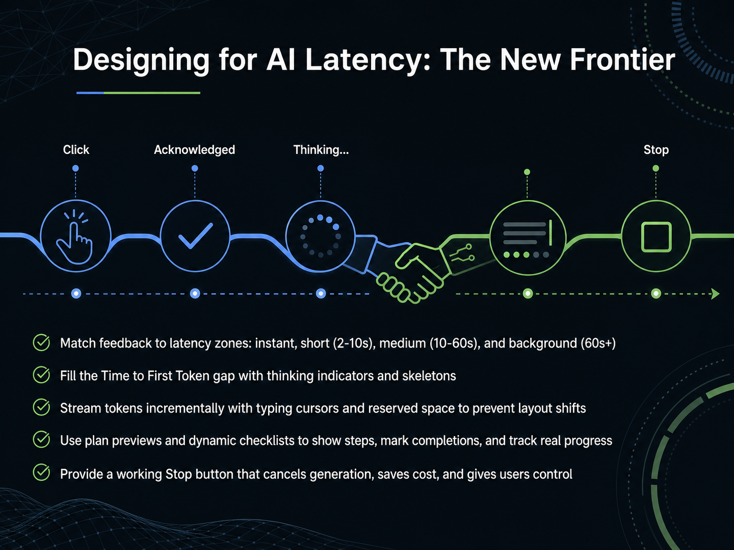
 - 09Designing for AI Latency: The New FrontierLet's shift our focus to a new frontier in our work: designing specifically for AI latency. This isn't just about making spinners prettier. It's about understanding that different wait times demand fundamentally different feedback. We can break this down into four latency zones. For waits under two seconds, a near-instant confirmation is all that's needed. For short waits of two to ten seconds, a lightweight indicator paired with a simple status line, like 'Searching documents,' works well. The most critical zone is medium waits, from ten to sixty seconds. This is where user trust is won or lost. Here, we must fill the 'Time to First Token' gap. Use animated skeleton screens and a thinking indicator to show that the model is working, even before the first word appears. Once generation starts, stream tokens back incrementally. Use a typing cursor and reserve stable space to prevent jarring layout shifts. For agentic workflows, dynamic checklists and plan previews that mark steps as complete are far more reassuring than an endless spinner. Finally, a working Stop button is non-negotiable. It gives users control, cuts costs by canceling the actual API request, and should always preserve the partial text that was already generated. These techniques transform the anxiety of the unknown into a managed, transparent experience. Next, we'll build on this by exploring AI transparency patterns, focusing on how visibility creates trust.
 telerik.comcloudscape.designai-tldr.dev+22 min
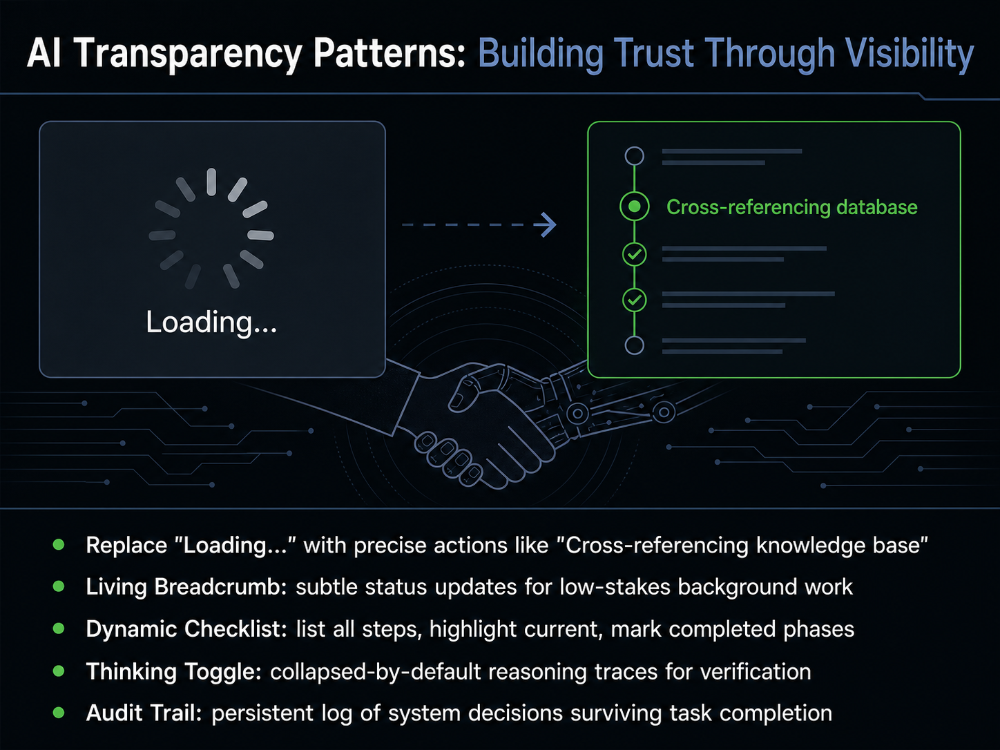
 - 10AI Transparency Patterns: Building Trust Through VisibilityNow let's look at five specific patterns that build trust by showing exactly what the system is doing. First, replace Loading with precise actions. Instead of a generic message, say Cross-referencing knowledge base or Analyzing document structure. Concrete labels turn an anxious wait into a narrated process. Second, use a Living Breadcrumb for low-stakes background work. This shows subtle status updates that don't demand full attention but quietly reassure. Third, for high-stakes multi-step tasks, use a Dynamic Checklist. List all planned steps, highlight the current one, and mark completed phases. This gives users a plan to anchor on, so delays feel expected rather than alarming. Fourth, the Thinking Toggle gives experts optional access to reasoning traces, collapsed by default. It says I have nothing to hide, without forcing everyone to read the logs. Finally, the Audit Trail persists after a task completes as a permanent, reviewable record of system decisions. This is the ultimate safety net. Even if a user never opens it, just knowing it exists signals that the system stands behind its work. Coming up next, we'll see how these patterns play out in real-world domains.
 telerik.comcloudscape.designai-tldr.dev+21 min
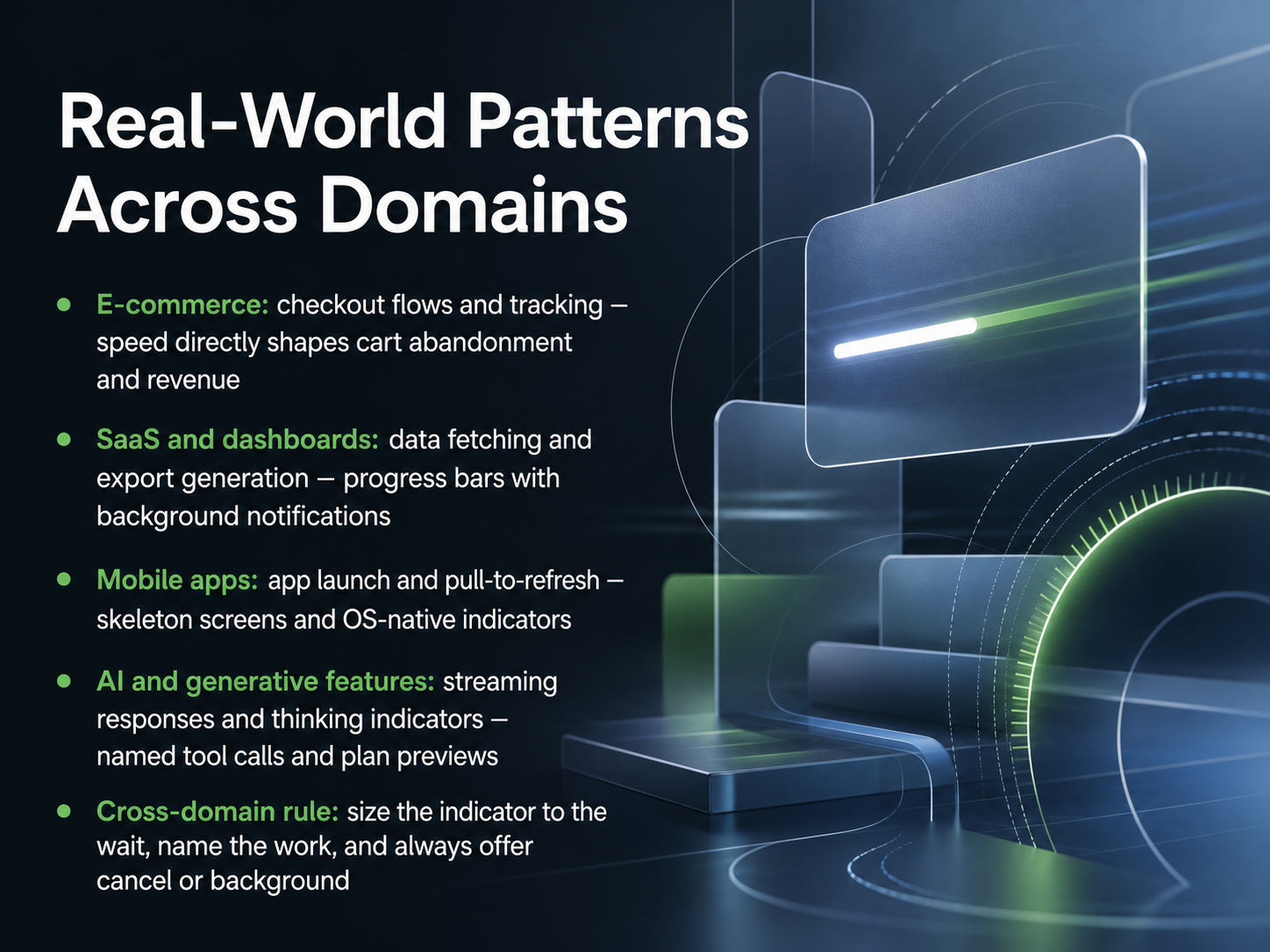
 - 11Real-World Patterns Across DomainsLet's see how these ideas play out across real-world domains. In e-commerce, checkout flows and package tracking are critical. The speed and clarity of your loading state directly impact cart abandonment, which hits your revenue. For SaaS dashboards, data fetches and export jobs can run long. Combine progress bars with background notifications so users can move on and get alerted when work finishes. Mobile apps rely on fast startup and pull-to-refresh. Skeleton screens and OS-native indicators keep these moments smooth and familiar. For AI and generative features, you need streaming responses and thinking indicators. Name the tool calls and show a plan preview so users see the reasoning, not a blank wait. Across all domains, one rule binds them: size your indicator to the actual wait, name the work being done, and always offer a cancel or background option. This keeps control with the user. Next, we'll look at measuring and testing these loading experiences.
 telerik.comcloudscape.designai-tldr.dev+21 min
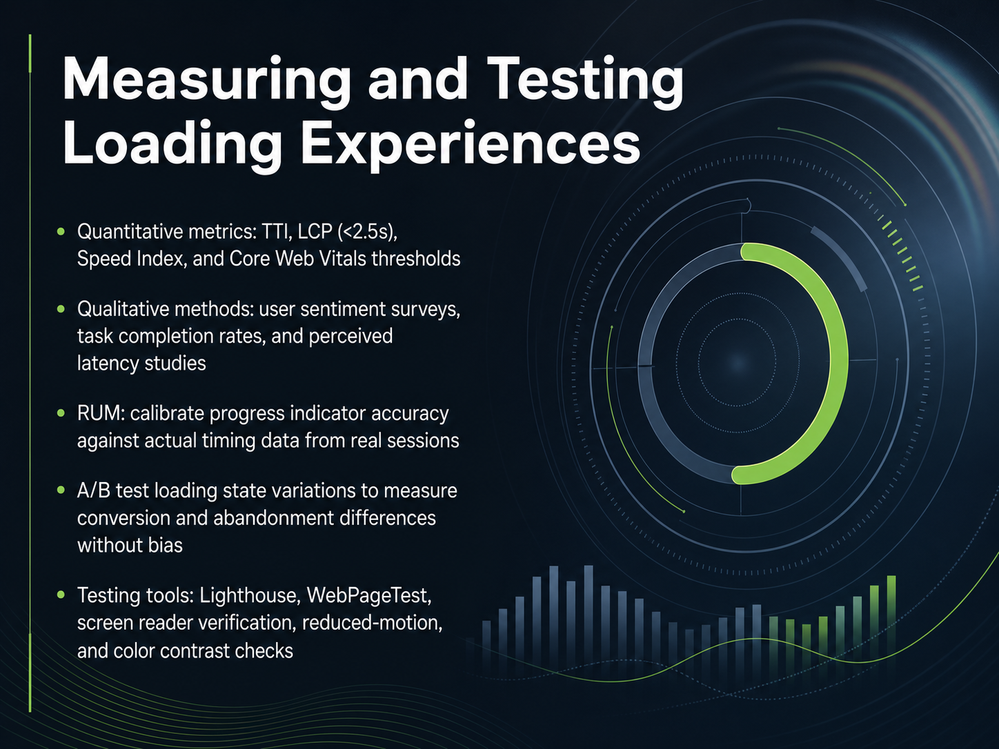
 - 12Measuring and Testing Loading ExperiencesYou can't improve what you don't measure. When we test loading experiences, we look at both the cold, hard numbers and the human perception. On the quantitative side, track Core Web Vitals like Largest Contentful Paint, aiming for under two point five seconds, and the Time to Interactive. But numbers alone don't tell the full story. Run qualitative sentiment surveys and watch for perceived latency. Users often feel a page is slower than the stopwatch says. A powerful technique is Real User Monitoring, which lets you calibrate your progress bar animations against actual timing data from real sessions so the feedback never lies. You should also A slash B test your skeleton screens and spinners. Measure exactly how much a loading variant moves the needle on conversion and abandonment without introducing bias. Finally, test with the right tools. Run Lighthouse and WebPageTest. And crucially, verify your states with a screen reader, check the reduced-motion experience, and ensure color contrast is sufficient. Quantitative data tells you when a page is slow; qualitative testing tells you when a page feels broken. Coming up next, we will explore how to integrate all of these design decisions into a governed system with our final topic: Design System Integration and Governance.
 yottaa.comsearchlab.nledmondscommerce.co.uk+22 min
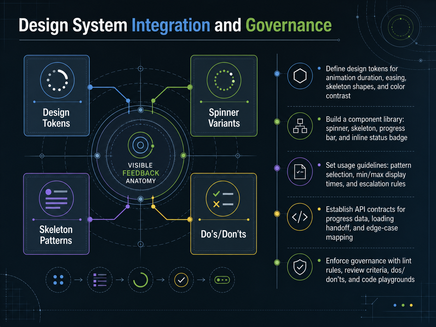
 - 13Design System Integration and GovernanceLet's bring everything together through design system integration and governance. First, define design tokens for animation duration, easing, skeleton shapes, and color contrast. These tokens make loading experiences feel consistent while staying accessible. Next, build a component library with four essentials: a spinner, a skeleton, a progress bar, and an inline status badge. This library gives teams ready-made, accessible building blocks so they don't reinvent the wheel. Then set clear usage guidelines. Document which pattern to choose, minimum and maximum display times, and when to escalate to a stronger feedback state. For example, after one second provide text context, and after four seconds offer a retry action. Establish API contracts for progress data, loading handoffs, and edge-case mapping. This ensures developers know exactly what data to expect and how to handle timeouts or errors gracefully. Finally, enforce governance with lint rules, review criteria, documented dos and don'ts, and live code playgrounds. This catches issues early and educates teams in real time. You've now completed our journey through designing loading and progress states. You understand how to set expectations, reduce anxiety, and build experiences that respect every user's time and attention. Thank you for learning with me today. Go build waiting experiences people can trust.
 css-zone.comuxpatterns.devuxpatterns.dev+22 min
Take the deck with you
Download this course as a file — free, no sign-up needed.
- PDF handoutEvery slide page, ready to print or share.14 pages · 3.0 MBDownload
- Narrated PowerPointThe deck that presents itself — every slide carries the digital human's narration video.14 pages · 12.8 MBDownload
- PowerPoint slidesThe full deck as a .pptx — open it in PowerPoint, Keynote, or Google Slides.14 pages · 2.9 MBDownload
Free to use in your own training — please keep the PersonWise credit page at the end.
Have your own deck? Turn it into a course
Sources consulted
Web sources consulted while building this course.
- Accessible Loading Animations for Real Products - CSS-Zone — css-zone.com
- Progress Indicator Pattern | UX Patterns for Developers — uxpatterns.dev
- Loading Indicator Pattern | UX Patterns for Developers — uxpatterns.dev
- Progress — uianatomy.dev
- Understanding Success Criterion 2.2.2: Pause, Stop, Hide — w3.org
- Q1 2025 Yottaa Web Performance Index | Yottaa — yottaa.com
- Website Speed & Performance Statistics 2026 | 50+ Data Points | Searchlab — searchlab.nl
- Page Load Time Impact on Conversions (2025) | Edmonds Commerce — edmondscommerce.co.uk
- How Page Speed Impacts Conversion Rate (And What to ... — luckyorange.com
- How Page Load Time Impacts SEO and Conversions — neilpatel.com
- Loading UI/UX Patterns for AI Applications — telerik.com
- Generative AI loading states - Cloudscape Design System — cloudscape.design
- Designing for LLM Latency: Streaming UX Patterns | AI/TLDR — ai-tldr.dev
- Designing Buttery Smooth AI Loading States in 2026 | Rune Hub — rune.codes
- The Agent Loading State Problem: Designing for the 45-Second UX Abyss — tianpan.co