Begin
14 pages · ~28 min
Graphic Design Patterns and Pitfalls
This training reviews graphic design examples to help learners identify effective patterns, strengths, and common pitfalls in visual work.
A digital instructor presents all 14 pages. Hold “Ask” at any point and ask out loud — the answer comes from this course. No sign-up needed.
What you’ll learn
- 01Graphic Design Examples: Patterns, Strengths, and PitfallsWelcome to Graphic Design Examples: Patterns, Strengths, and Pitfalls. I'm glad you're here. This course is designed to help you look at real design work with a more confident, more curious eye. We'll focus on four practical goals. First, we'll learn to recognize recurring patterns in real design examples, things like how designers use alignment, contrast, and grouping to guide our attention. Second, we'll explore why strong designs work. Instead of just saying a poster looks good, we'll name the specific choices behind that feeling. Third, we'll spot common mistakes that weaken designs, like inconsistent spacing, too many fonts, or unclear visual hierarchy. And finally, we'll use these examples to strengthen your own design thinking, whether you're creating a presentation, a flyer, or a social media post. You don't need to be a trained designer to benefit from this. Think of it as learning a new way of seeing. Each slide will show you what to try, what to avoid, and how to translate those lessons into your own work. Next, we'll begin with a simple question: Why study real design examples?baselinehq.cominteract-studio.combaselinehq.com+22 min
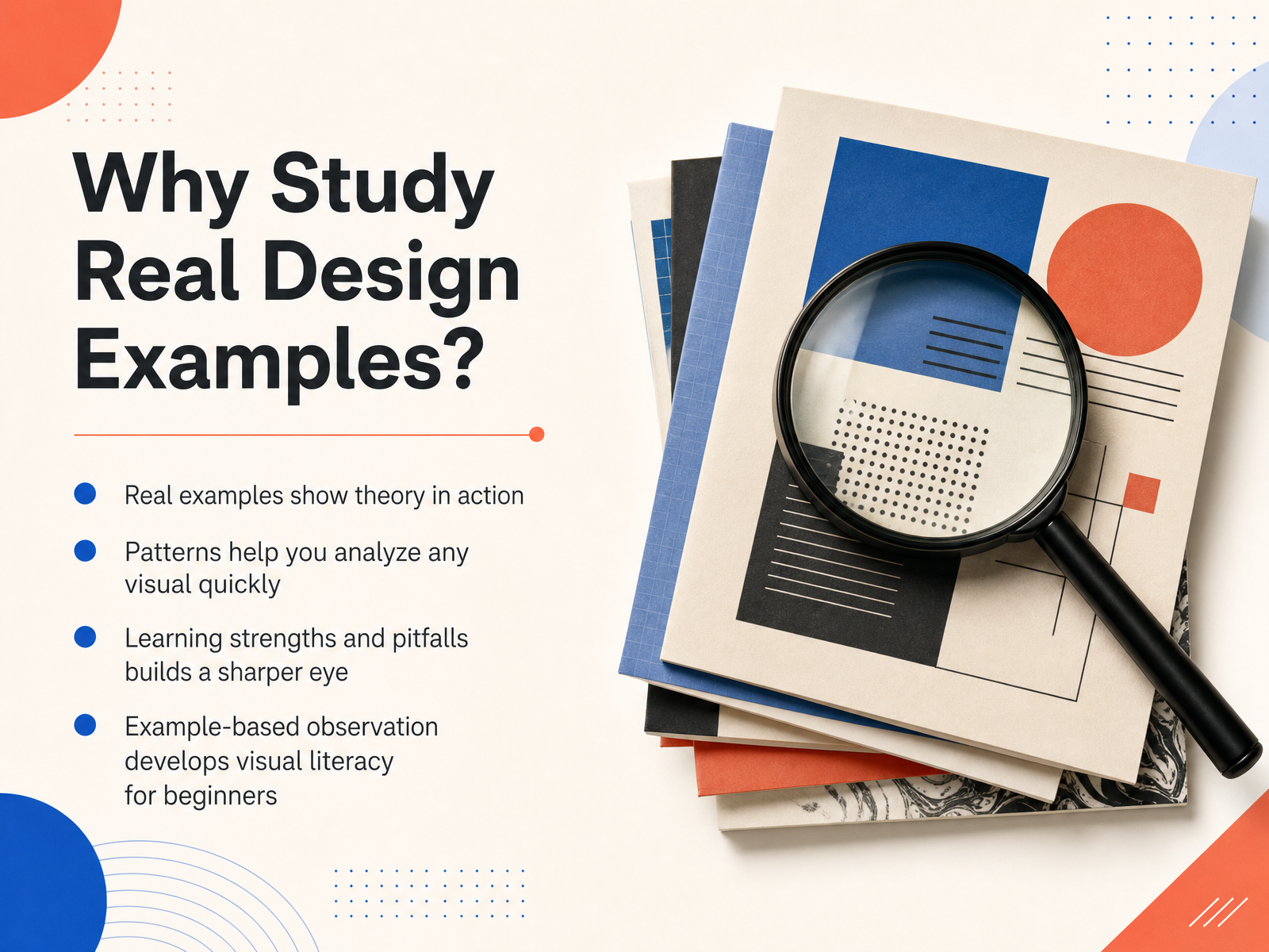
- 02Why Study Real Design Examples?Studying real design examples is one of the fastest ways to train your eye, because it turns abstract ideas into something you can actually see and evaluate. When you look at a finished poster, app screen, or social graphic, you are seeing design theory in action, not just reading about it. Patterns help here. Once you recognize a few common visual patterns, like repetition, alignment, or contrast, you can analyze almost any layout quickly and explain why it feels organized or scattered. You also start noticing strengths and pitfalls side by side. For example, a well spaced flyer feels calm and easy to scan, while a cluttered one with too many competing fonts feels overwhelming. Comparing those builds a sharper eye over time. For beginners, this example-based observation is really the foundation of visual literacy. It is the skill of seeing choices, not just images. So in the next part, we will begin with core visual patterns, specifically layout and structure.
 1 min
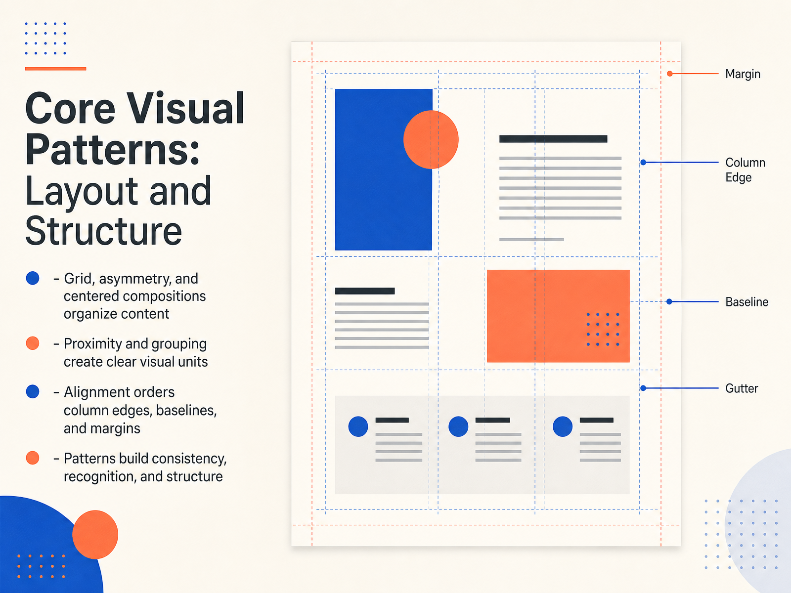
1 min - 03Core Visual Patterns: Layout and StructureNow let's look at how layout and structure help your design feel organized and easy to follow. Start with the three most common composition patterns. A grid breaks the page into invisible columns and rows, giving every element a clear place to sit. Asymmetry creates dynamic balance, where one side carries more visual weight but the whole still feels stable. Centered compositions are calm and formal, and they work well for invitations, posters, or simple title screens. Next, think about proximity and grouping. When related items sit close together, the viewer instantly sees them as one unit. If you place a caption directly under its image, for example, the connection is obvious. Alignment is another quiet but powerful tool. Lining up column edges, text baselines, and margins creates order without adding extra decoration. Even when elements are far apart, shared alignment ties them together. These patterns do more than make a layout look neat. They build consistency and recognition across a project. Once viewers learn where to expect certain information, they can move through your design with less effort. So to summarize, try simple grids, intentional grouping, and consistent alignment. Avoid placing elements randomly, because even small misalignments can make a layout feel unsettled. Next we'll move into Core Visual Patterns: Color, Contrast, and Typography.
 2 min
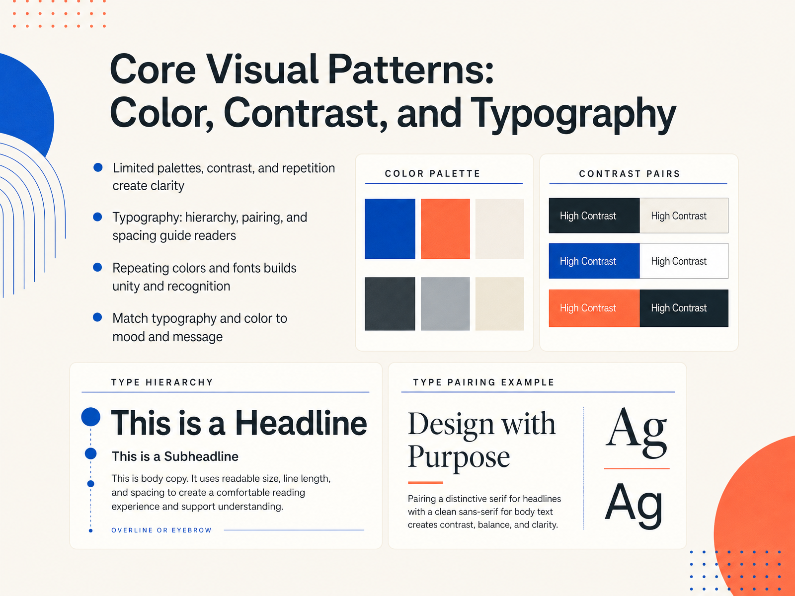
2 min - 04Core Visual Patterns: Color, Contrast, and TypographyNow let's focus on the three visual patterns you'll use most often: color, contrast, and typography. Start with a limited palette. That simply means choosing a small set of colors and sticking with them. Too many colors compete for attention, but a limited palette creates calm and clarity. Next, use contrast to guide the eye. A dark heading on a light background, or a bright accent against a muted tone, tells the viewer where to look first. Repeat those choices across a project. Repeating colors and fonts builds unity, and over time, that repetition creates recognition. Typography works the same way. Establish hierarchy by making headings clearly larger or bolder than body text. Pair typefaces that complement each other, such as a strong serif for titles and a simple sans serif for paragraphs. Give text enough spacing, because cramped letters feel harder to read. And always match the mood. A playful rounded font suits a children's event, while a clean modern typeface feels more professional. The key is consistency. When color, contrast, and typography work together, the design feels intentional rather than accidental. Next, we'll look at the strengths of effective design.
 2 min
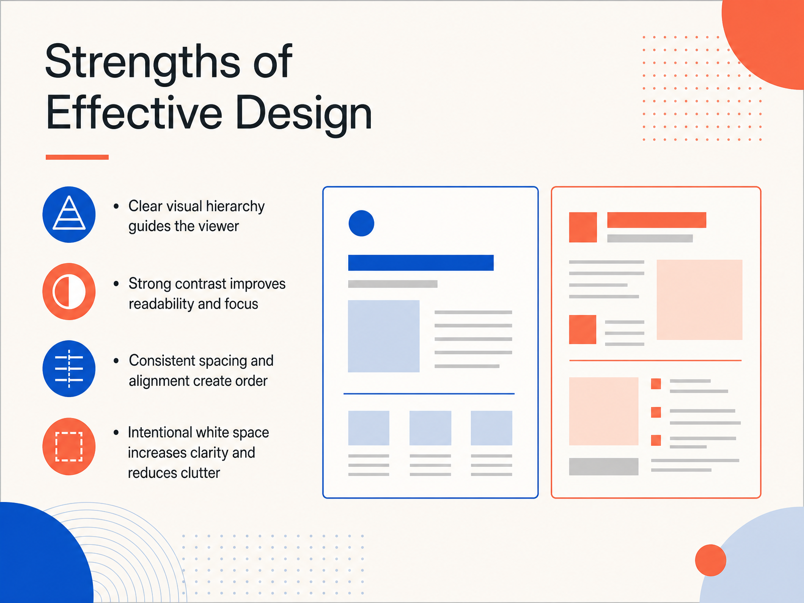
2 min - 05Strengths of Effective DesignNow let's look at what makes a design truly effective. First, effective designs have a clear visual hierarchy. This simply means the design shows you where to look first, second, and third by using size, color, and position. For example, a poster might have a large headline, a medium-sized subheading, and smaller body text. Second, strong contrast improves readability and focus. Think of pairing dark text with a light background, or using a bold accent color against neutral tones. This helps important elements stand out. Third, consistent spacing and alignment create a sense of order. When elements line up along invisible lines and have equal space between them, the whole design feels intentional and calm. And fourth, intentional white space increases clarity and reduces clutter. White space is the empty area around your content. It gives your design room to breathe. Instead of filling every corner, try leaving generous margins and space between sections. This makes your message much easier to understand. Up next, we'll explore some common design pitfalls to avoid.
 2 min
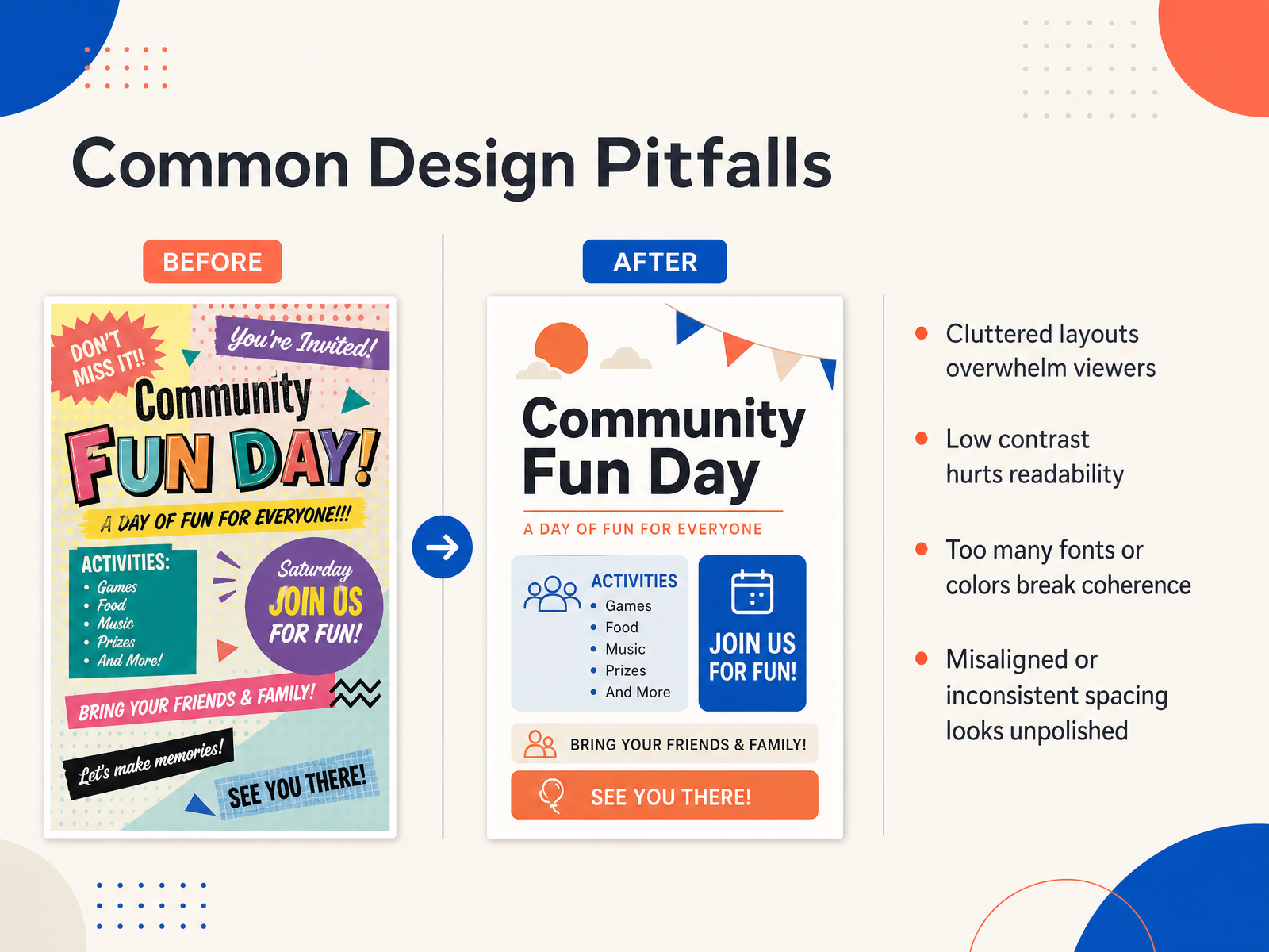
2 min - 06Common Design PitfallsNow let’s look at some common pitfalls that can quietly weaken a design. The first is clutter. When too many elements compete for attention, the viewer doesn’t know where to look, so the message gets lost. The second pitfall is low contrast. Light gray text on a white background may look elegant at first, but it often fails the readability test, especially at smaller sizes. Third, using too many fonts or colors breaks coherence. A design may use three different typefaces and five bright accent colors, and suddenly nothing feels connected. A simpler palette usually communicates more clearly. Finally, watch alignment and spacing. When margins and gaps are inconsistent, even a good layout can look unfinished. Small spacing issues can make a professional design feel accidental. If you remember nothing else, try this. After finishing a layout, step back and ask whether every element earns its place, and whether your spacing feels intentional. With these pitfalls in mind, let’s move to a simple framework for analyzing designs.
 2 min
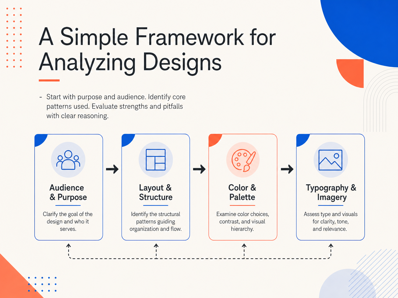
2 min - 07A Simple Framework for Analyzing DesignsNow that we have looked at several examples, let’s bring it together with a simple framework you can use whenever you analyze a design. Start by asking who the design is for, and what it is trying to achieve. Purpose and audience come first, because a poster for a children’s library and a poster for a tech conference make very different choices, even when the layouts look similar. Next, identify the core patterns. Look for the grid, the color system, the use of contrast, and how the eye is guided through the page. For example, a strong event poster might use a centered title to anchor attention, then a bright accent color to lead you toward the date and location. Finally, evaluate strengths and pitfalls with clear reasoning. Instead of saying a design feels busy, you could say the three competing focal points make it hard to know where to look first. Asking these three questions keeps the process practical and turns a quick impression into a useful review. Let’s apply that same framework in the next example, a case study on what makes a strong poster work.
 1 min
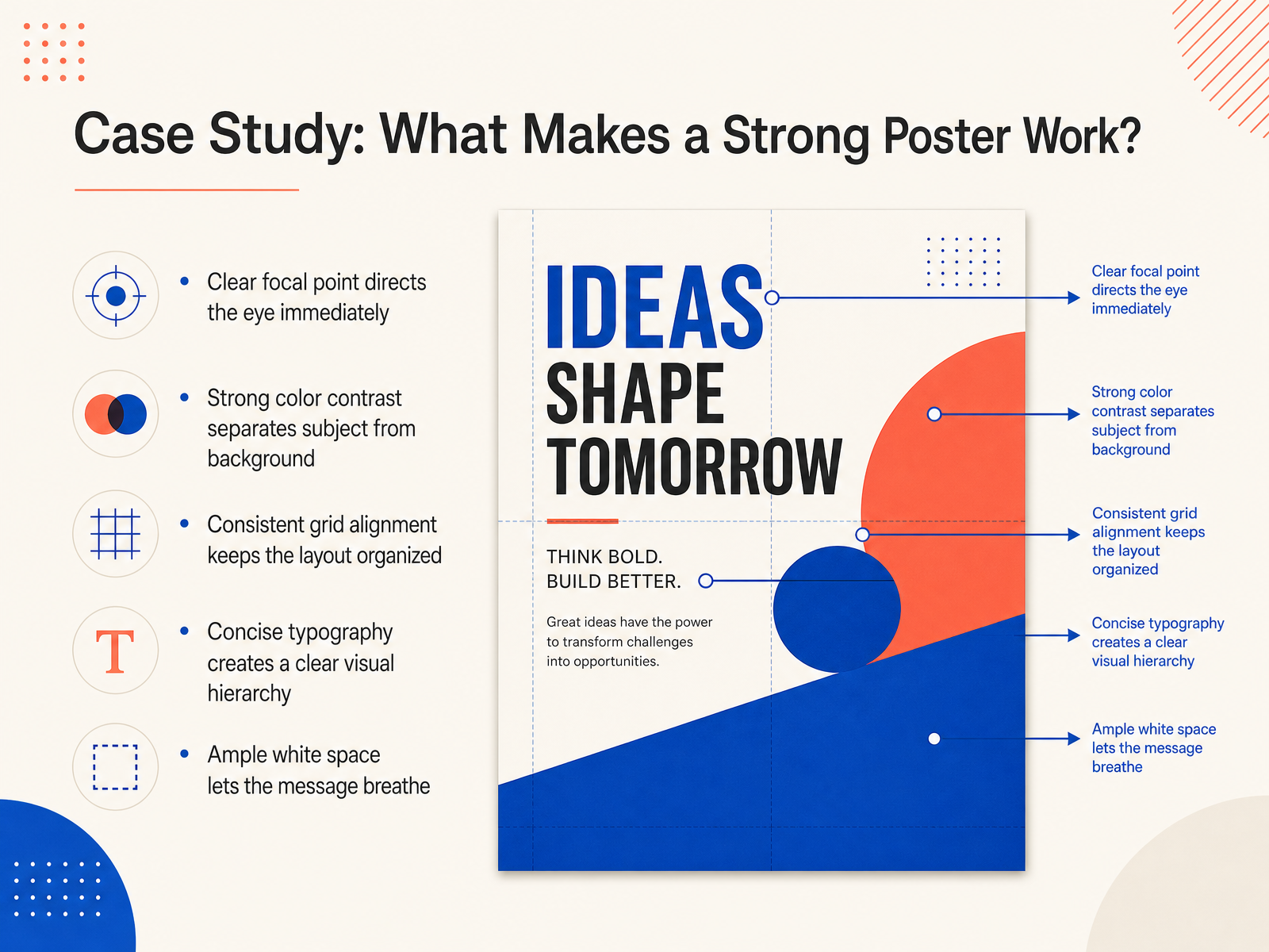
1 min - 08Case Study: What Makes a Strong Poster Work?Let's look at a poster that really works, and break down exactly why it works. First, notice where your eye lands right away. A clear focal point, like one bold image or a single dominant headline, gives the viewer an instant starting point. Strong color contrast helps too, by separating the subject from the background so nothing gets lost. The layout also feels organized because the designer used a consistent grid. That means the elements are aligned to invisible lines, which keeps everything tidy and easy to scan. The typography is concise, maybe two or three type sizes at most, and that creates a clear visual hierarchy. In other words, your eye knows what to read first, second, and third. And notice the white space around the message. That breathing room keeps the poster from feeling crowded, and it lets the main idea stand out. So the takeaway here is that every choice, from the focal point to the empty space, supports one central message. Next, let's examine a different case study: what weakens a design.
 2 min
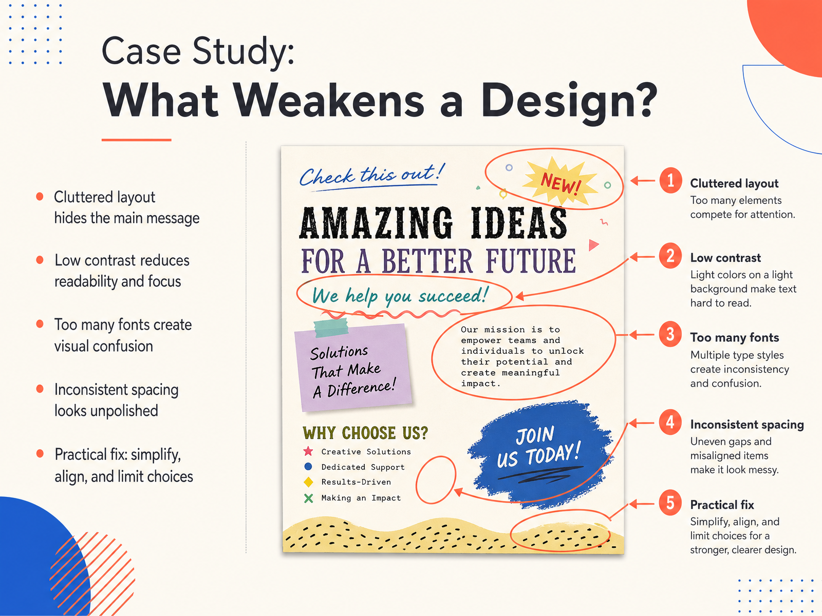
2 min - 09Case Study: What Weakens a Design?Now let's look at what can actually weaken a design, because these mistakes are very common and very fixable. A cluttered layout often hides the main message. When too many elements compete for attention, the viewer doesn't know where to look first. Low contrast creates a similar problem. If the text color is too close to the background color, readability drops and focus disappears. Another issue is using too many fonts. Different fonts with competing personalities can create visual confusion, almost like several voices talking at once. Inconsistent spacing also makes a layout look unpolished. Uneven gaps between elements can feel accidental rather than intentional. The practical fix is to simplify, align, and limit your choices. Remove what doesn't support the message, line elements up on a clear grid, and stick to a small set of fonts and colors. These small changes bring clarity and calm to any design. Next, we will focus on putting these ideas into practice.
 2 min
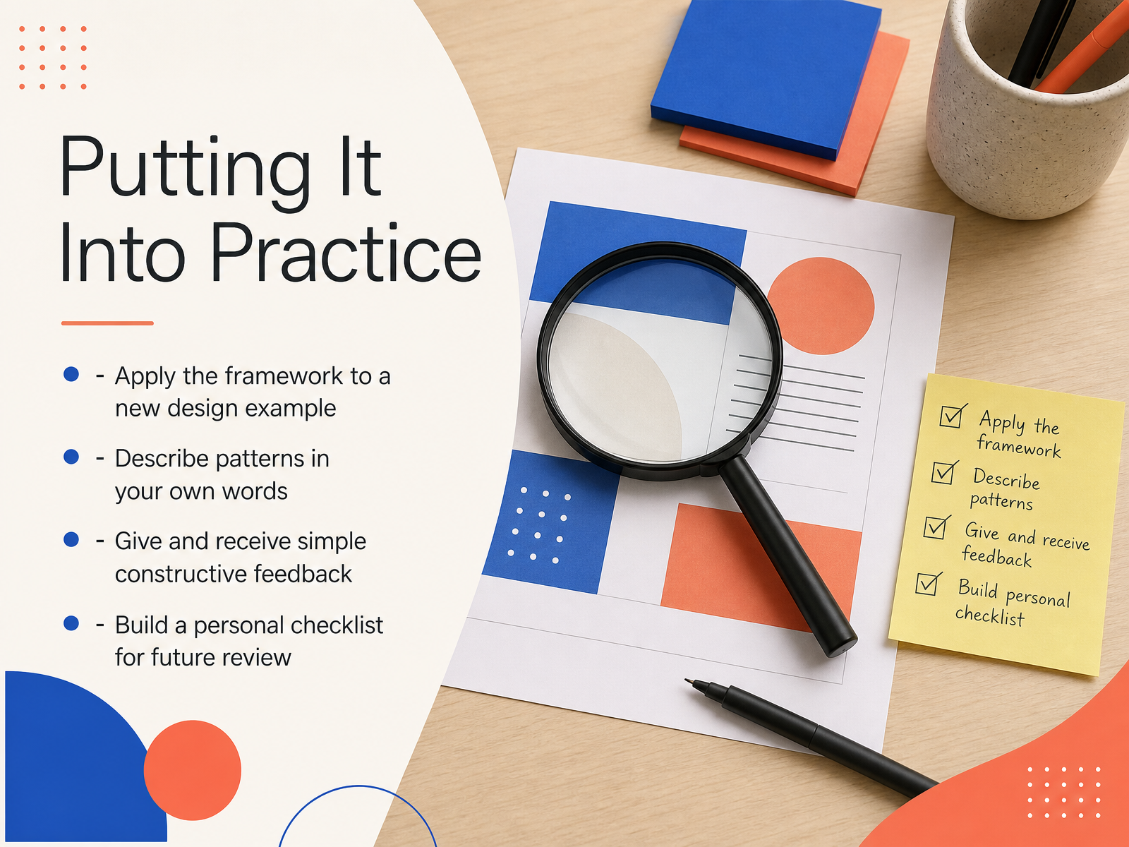
2 min - 10Putting It Into PracticeNow, let's turn this framework into a habit. Putting it into practice is really about doing three simple things. First, when you see a poster, a website, or even a product package, pause and try to describe its patterns in your own words. Ask yourself, why did the designer repeat that shape, or align the text that way? Second, practice giving and receiving simple, constructive feedback. Instead of saying, I don't like it, try saying, the pattern here is interrupted, and that makes it feel busy. That kind of language helps everyone see more clearly. And third, build a personal checklist. It can be as simple as asking, is the pattern consistent, does the contrast guide my eye, and are the spaces balanced? This gives you a quick, friendly way to review your own work before you share it. So this week, choose one new design you admire, and walk through these steps at your own pace. Learning to see patterns is a skill that grows with each review. Next, we'll wrap up with a quick review and key takeaways.
 2 min
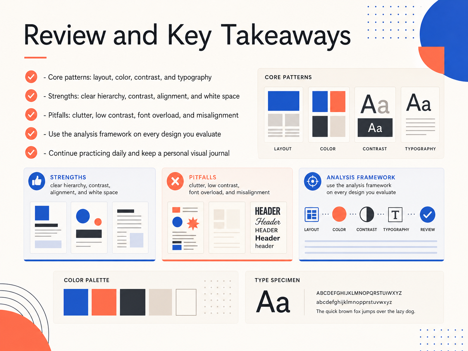
2 min - 11Review and Key TakeawaysLet's pause and bring everything together. The core patterns we explored are layout, color, contrast, and typography. Together, they shape how a design feels and how easily people understand it. Strong designs usually share the same strengths. Clear hierarchy guides the eye to what matters first. Good contrast makes text readable and important elements stand out. Intentional alignment creates order, and open white space gives the design room to breathe. On the other side, common pitfalls can quietly weaken your work. Clutter comes from holding on to too many elements. Low contrast makes messages hard to read. Font overload happens when too many typefaces compete for attention. Misalignment creates a scattered, unfinished feeling, even when every individual piece looks good. The key is to use the analysis framework on every design you evaluate. Ask what pattern is driving the visual. Then check the strengths and scan for the pitfalls. This simple habit builds your eye faster than any single technique. To make it stick, continue practicing daily and keep a personal visual journal. Save examples you admire, write a quick note about why they work, and revisit your own designs after time away. Next, we'll move to frequently asked questions, where we'll address some of the most common doubts beginners have.
 2 min
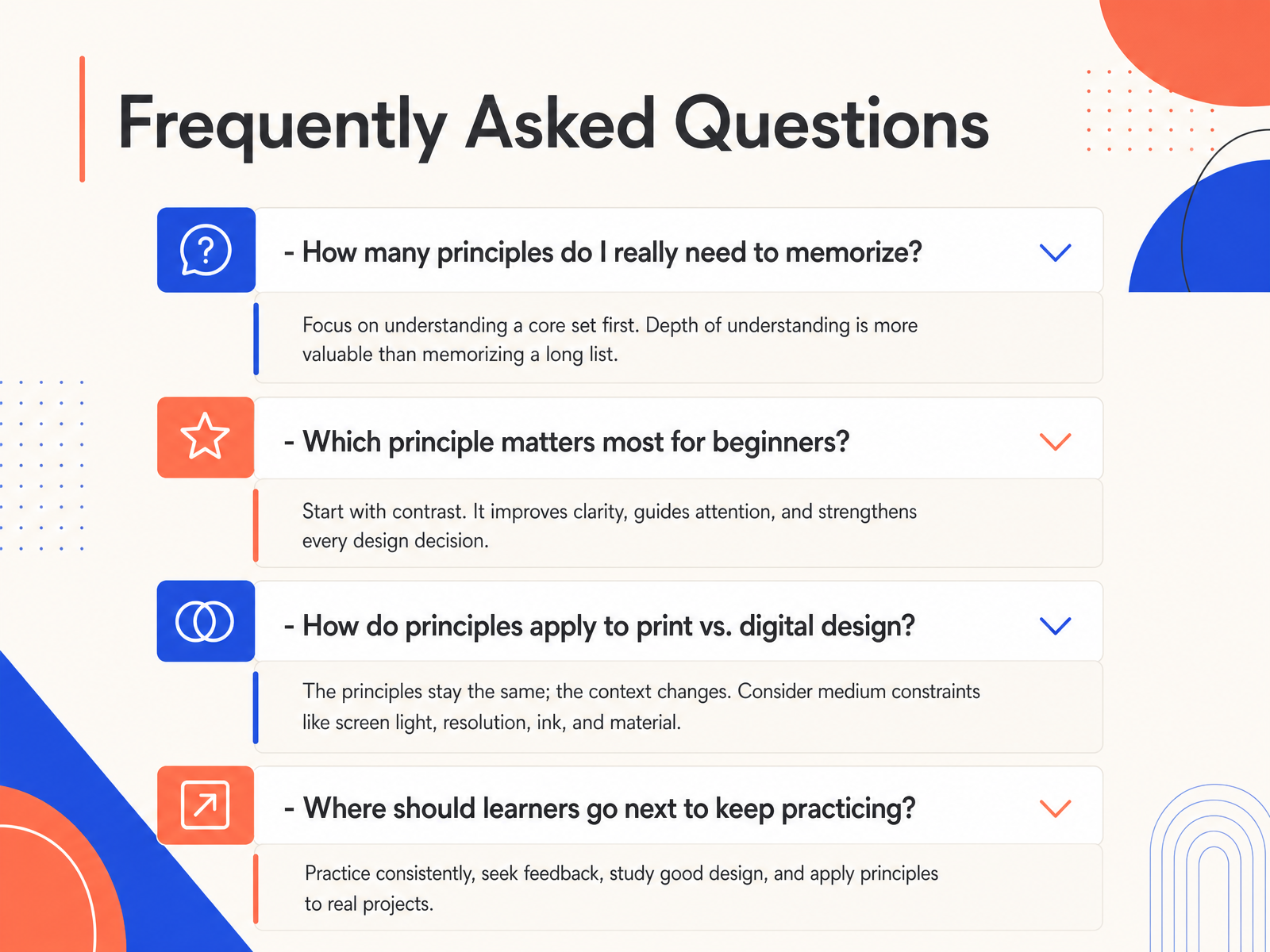
2 min - 12Frequently Asked QuestionsLet’s address a few questions that come up often. First, how many principles do you really need to memorize? You don’t need a long checklist. A solid starting set is contrast, alignment, repetition, proximity, and white space. Think of them as five reliable tools. Next, which principle matters most for beginners? Most instructors will point to alignment, because clean alignment quickly makes a design look intentional, even before you refine colors or type. Another common question is how these ideas apply to print versus digital design. The principles stay the same, but the constraints shift. In print you design for a fixed page size, where in digital you plan for scrolling, screen sizes, and interactive elements like buttons. Finally, where should you go next to keep practicing? Start by reviewing one poster, one app screen, or one flyer each week and identifying the five principles in action. Now, let’s put that into practice with a hands-on exercise where you analyze a poster yourself.
 2 min
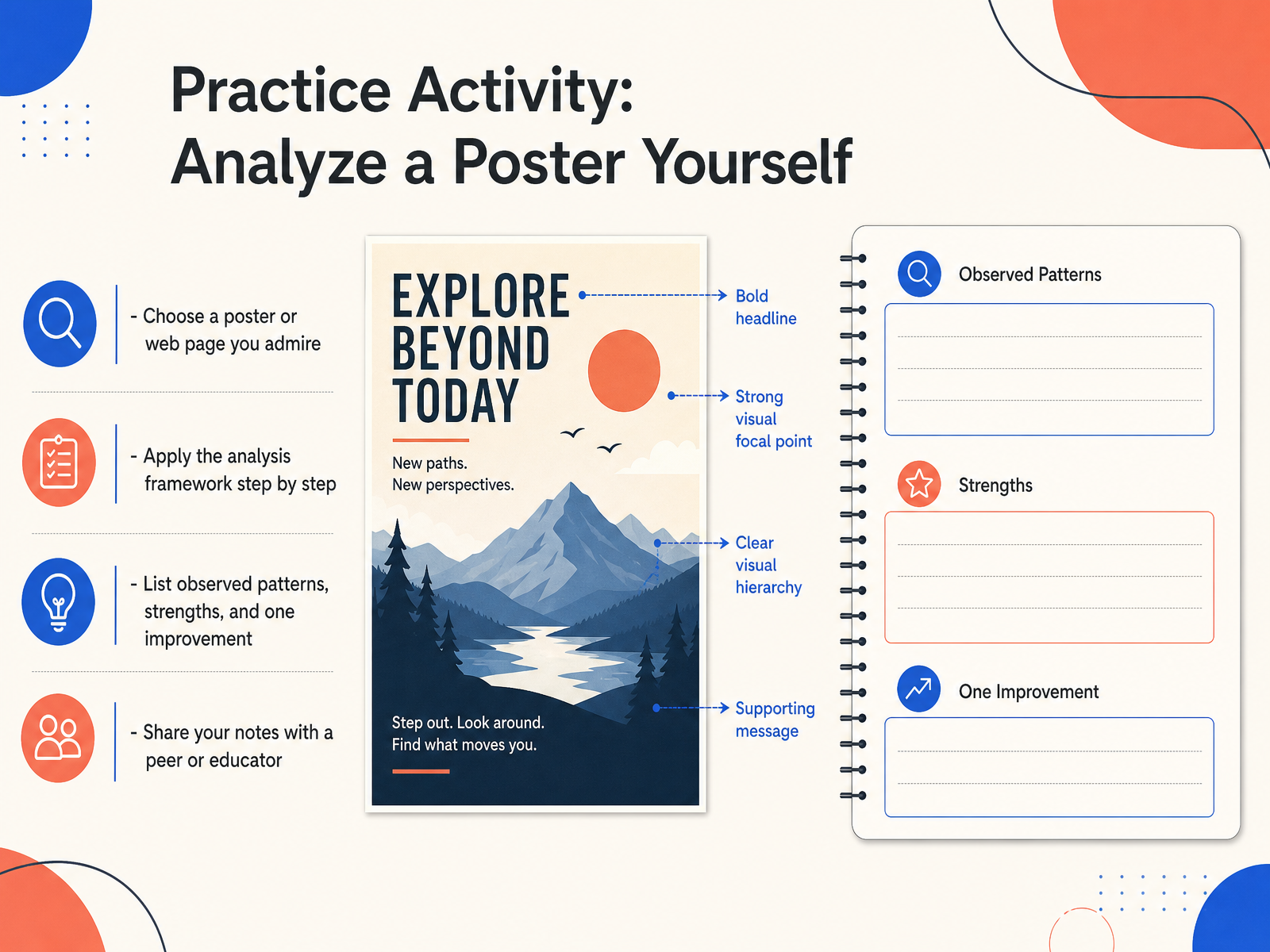
2 min - 13Practice Activity: Analyze a Poster YourselfNow it is your turn to practice. Choose a poster or a web page that you genuinely admire. It could be a favorite movie poster, a restaurant menu, or even a website landing page. Once you have it in front of you, apply the analysis framework step by step. Start by listing the patterns you notice, like repeating colors, shapes, or consistent spacing. Then write down the strengths. What makes the design feel balanced or easy to understand? Finally, identify just one improvement. Maybe the text is a little too small, or perhaps one image pulls your attention away from the main message. When you are done, share your notes with a peer or an educator. Explaining your observations out loud often reveals new insights. This kind of focused practice is how your eye for design grows stronger. In our final slide, we will look at how to continue building these skills on your own.
 1 min
1 min - 14Next Steps for Continued LearningWe have covered a lot together, so let me leave you with a few practical next steps that really help these ideas stick. First, try to analyze one real design every day. It could be a poster, an app screen, or even a cereal box. Ask yourself what patterns you notice, and whether those patterns support the message or get in the way. Second, keep a visual journal. When you spot a pattern or a pitfall, save a quick screenshot or sketch and write one sentence about why it works or feels off. Third, apply your checklist to your own projects before you call them finished. That small pause can catch common mistakes early and make your work clearer. Finally, continue exploring typography, color, and layout resources. Each of those areas will deepen your ability to see and use patterns with confidence. Thank you for learning with me today. Keep observing, keep questioning, and keep creating. Your visual instincts will grow stronger with every design you study.
 2 min
2 min
Take the deck with you
Download this course as a file — free, no sign-up needed.
- PDF handoutEvery slide page, ready to print or share.15 pages · 3.2 MBDownload
- Narrated PowerPointThe deck that presents itself — every slide carries the digital human's narration video.15 pages · 14.8 MBDownload
- PowerPoint slidesThe full deck as a .pptx — open it in PowerPoint, Keynote, or Google Slides.15 pages · 3.1 MBDownload
Free to use in your own training — please keep the PersonWise credit page at the end.
Have your own deck? Turn it into a course
Sources consulted
Web sources consulted while building this course.
- Baseline • The Free Design Bootcamp • Identify Visual Principles — baselinehq.com
- Visual Hierarchy in Graphic Design: 7 Principles With Real Examples - Interact Studio — interact-studio.com
- Baseline • The Free Design Bootcamp • Analyse an Editorial Design — baselinehq.com
- 12 Design Principles Explained Clearly (With Examples + Checklist) — thecrit.co
- Baseline • The Free Design Bootcamp • Visual Principles — baselinehq.com