Help and Support Experience Design
Begin
14 pages · ~28 min
Help and Support Experience Design
Learn to design effective help and support experiences for users, focusing on creating intuitive, accessible, and user-friendly assistance systems.
What you’ll learn
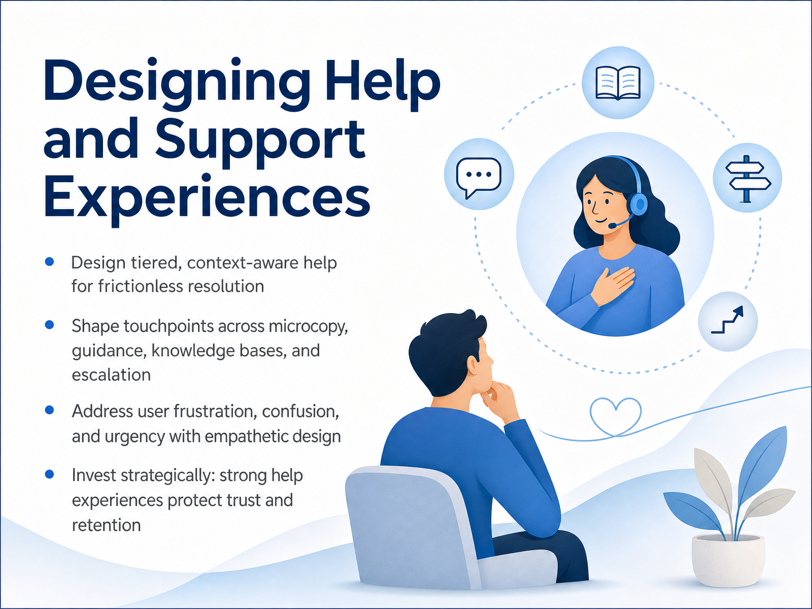
- 01Designing Help and Support ExperiencesWelcome. Today we're going to work through the practical challenge of designing help and support experiences. Our goal is simple: give users the right information at the right moment, so they can solve problems on their own or get to a human helper without friction. We'll explore how to build tiered, context-aware help that meets users where they are, whether they need a quick tip, a step-by-step guide, or direct escalation. Along the way, we'll look at shaping microcopy, in-product guidance, knowledge bases, and escalation paths as one connected system. Most importantly, we'll frame every decision around the user's emotional state—because when someone is frustrated, confused, or in a hurry, good design protects their trust and keeps them moving forward. Let's begin by looking at how to understand user context, urgency, and emotional state.uxmag.commedium.comjournals.eiid.eu+22 min
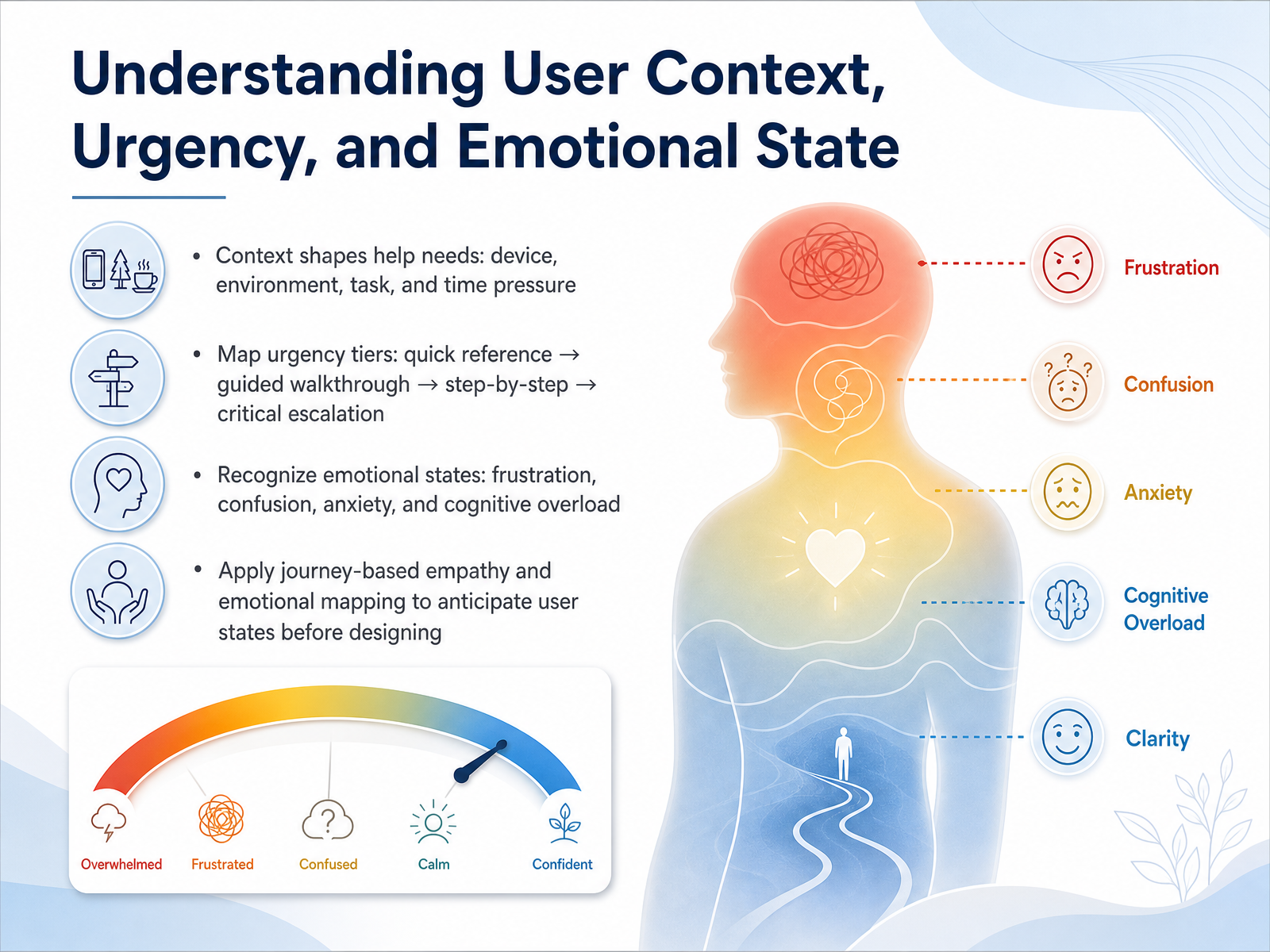
- 02Understanding User Context, Urgency, and Emotional StateNow let's dig into the core of designing effective support: understanding your user's situation before they even ask for help. We need to consider four critical factors. First, context. A user's help needs change dramatically based on their device, their physical environment, the task at hand, and how much time they have. Someone troubleshooting a server outage on a phone in a data center has a very different need than someone casually exploring app settings from their couch. Second, we map urgency. Think of this as tiers: a quick reference pop-up for a minor doubt, a guided walkthrough for a new feature, detailed step-by-step instructions for a complex task, and finally a clear path to critical escalation when something is genuinely broken. Third, we must recognize emotional states. People seeking help are often frustrated, confused, anxious, or suffering from cognitive overload. A wall of text is the worst thing to show someone who is already overwhelmed. And fourth, we apply journey-based empathy. By mapping a user's likely emotional highs and lows over their entire journey, we can anticipate these fragile moments and design the right support before frustration ever takes hold. That anticipation leads us directly to the structure of our help content. Next, we'll explore a layered information architecture for tiered assistance.
 uxmag.commedium.comjournals.eiid.eu+22 min
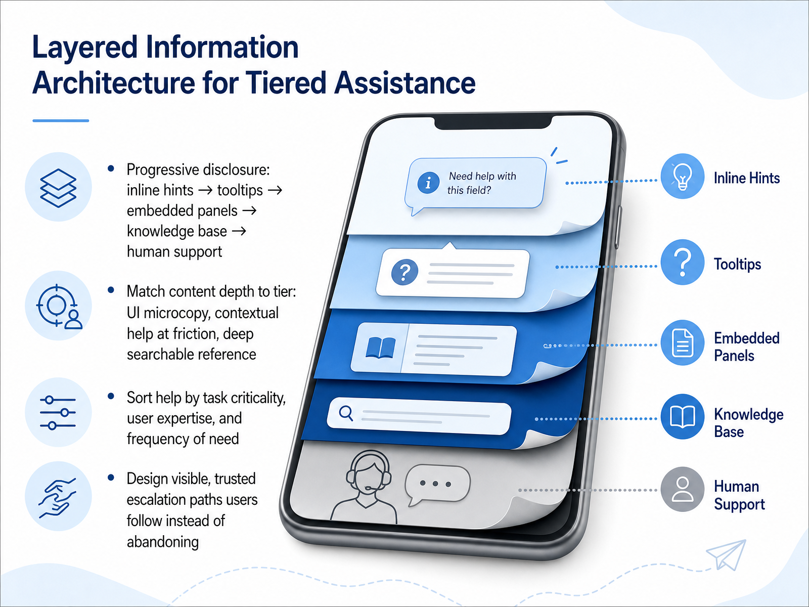
 - 03Layered Information Architecture for Tiered AssistanceLet's turn that concept of help tiers into a practical information structure. Think of this as a layered approach, where we progressively disclose more detail only when the user needs it. It starts with the lightest touch: an inline hint right next to a field, then a tooltip on hover, expanding into a side panel for more context. If that isn't enough, we connect them to a searchable knowledge base, and finally, a clear path to human support. The key is matching the depth of the content to the tier. For a simple data entry field, microcopy is perfect. At a known friction point, like a complex configuration step, embed contextual guidance right there. Save the deep, searchable reference articles for when users are researching a workflow on their own. To organize this, don't just think about features. Sort your help by task criticality, the user's expertise level, and how frequently the need arises. A beginner on a critical task needs help surfaced much more prominently than a power user on a routine one. Most importantly, design a visible and trusted escalation path. The moment a user starts thinking 'this help isn't working,' they need to see an obvious next step, like 'Contact support,' right there. Otherwise, they will just leave. Next, we'll look at how to actually craft that effective embedded and contextual help.
 2 min
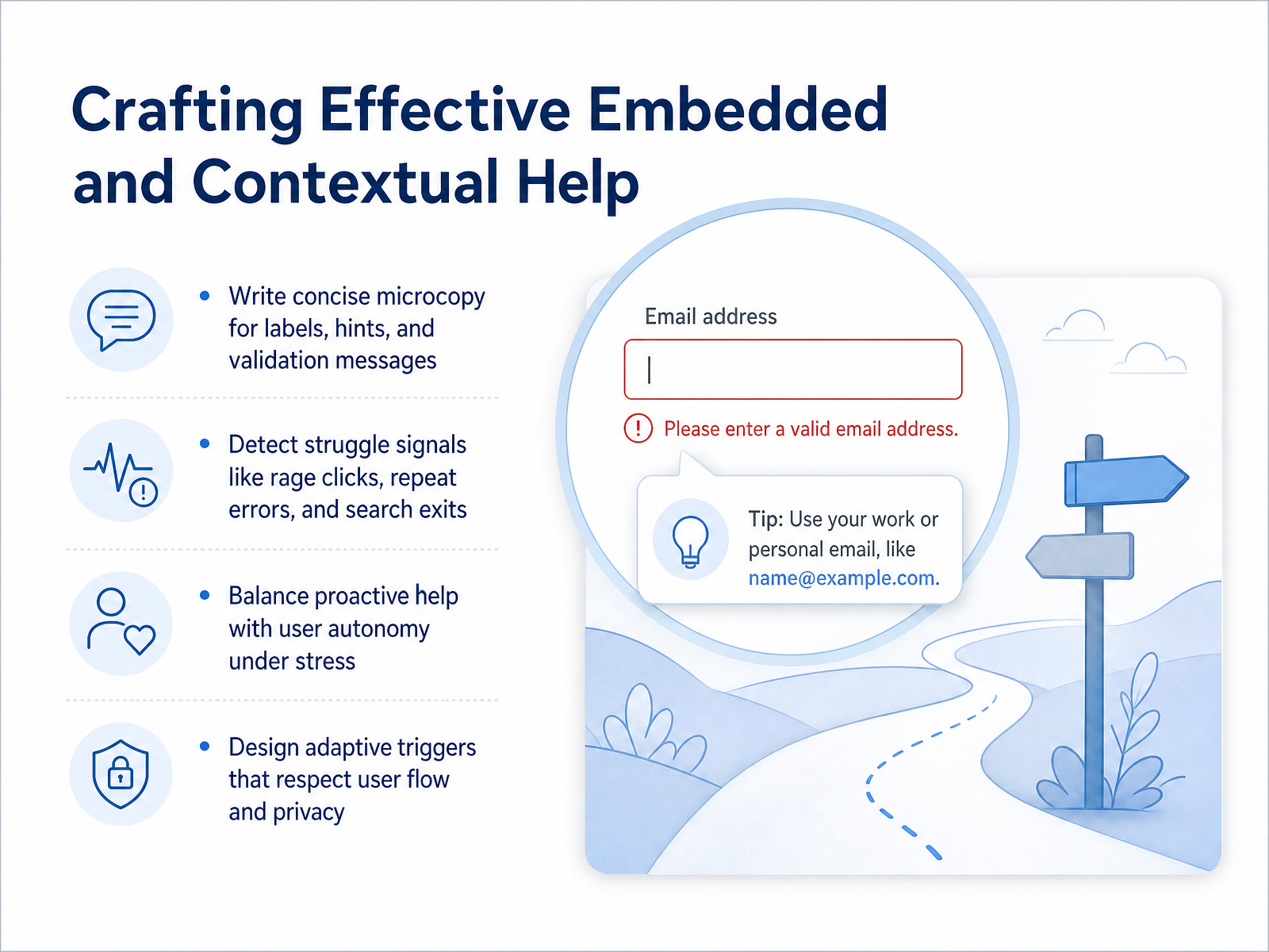
2 min - 04Crafting Effective Embedded and Contextual HelpOne of the most powerful ways to design effective help is to embed it directly in the interface where users are already working. Let’s start with microcopy. Every label, hint, and validation message is a tiny teaching moment. Instead of a red error that says 'Invalid input,' try saying, 'Please enter your number the way it appears on your card.' This reduces friction and guides the user forward without pulling them out of their task. Next, we need to listen for unspoken cues. Think about rage clicks, where someone rapidly taps the same button, or when they repeat an error several times. Even a search query that leads to an immediate exit is a signal. These behaviors tell us the user is struggling before they ever file a ticket. Our job is to detect these signals and respond with support that feels timely, not intrusive. That brings us to the balance between proactive help and user autonomy. When someone is visibly stressed, an unsolicited pop-up can feel like an interruption, not assistance. A better approach is to surface a subtle, persistent prompt, like a small banner that asks, 'Need more time? Let me walk you through this.' This offers a path without taking away their control. Finally, we design the triggers themselves. A smart trigger should respect both the user's flow and their privacy. Instead of jumping in the moment a mistake happens, wait for a pattern that confirms the trouble is real. And always make it easy to dismiss. The goal is to feel like a safety net, not a surveillance tool. Up next, we will put these concepts into practice by designing clear examples, templates, and guided paths.
 uxmag.commedium.comjournals.eiid.eu+22 min
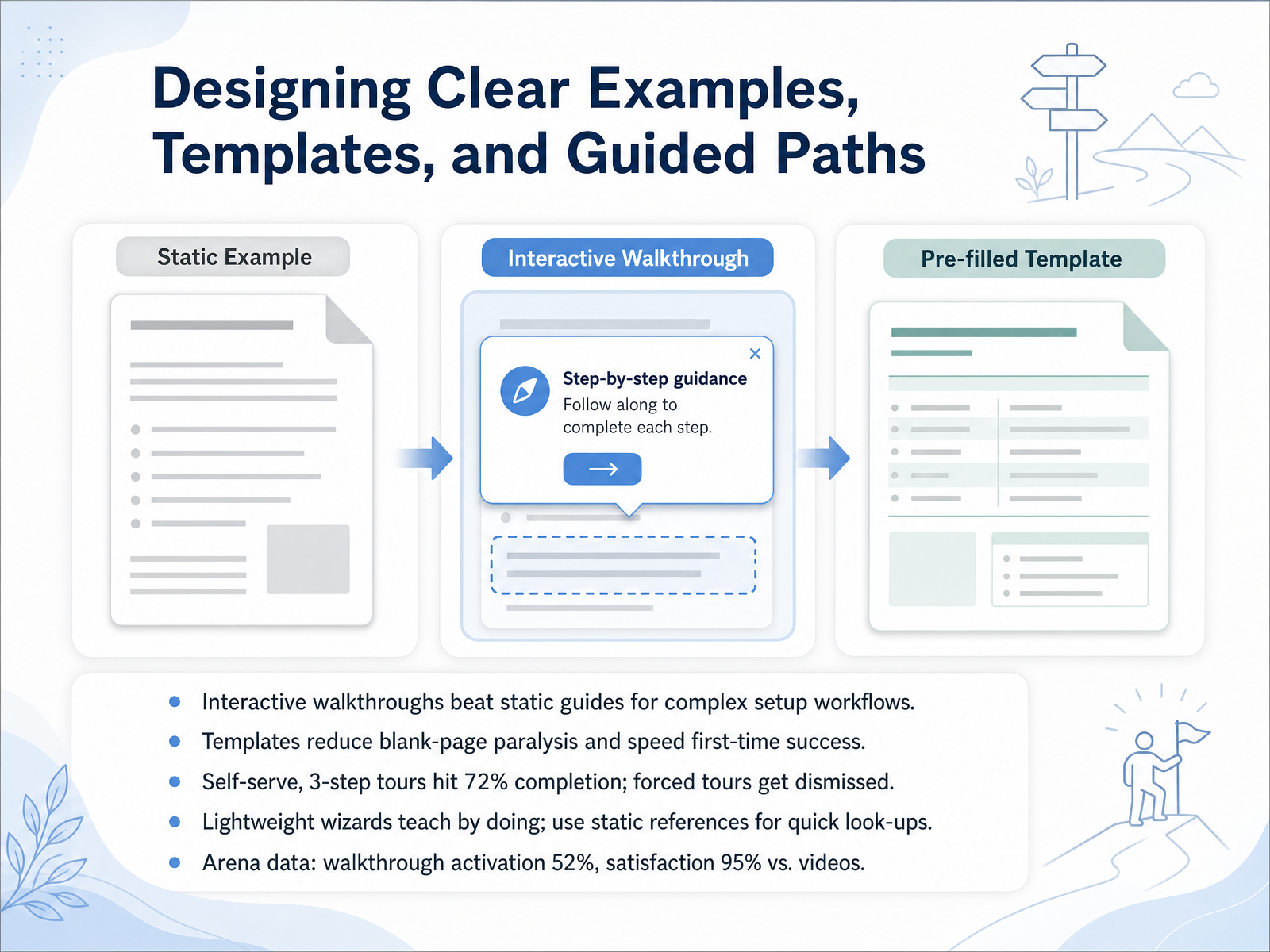
 - 05Designing Clear Examples, Templates, and Guided PathsNow let's get practical and look at how to design clear examples, templates, and guided paths. When you're helping users through complex setup workflows, interactive walkthroughs consistently outperform static guides. Research from a twenty twenty-five study shows walkthroughs achieved a fifty-two percent completion rate and ninety-five percent satisfaction, far higher than passive videos. The key is letting users learn by doing, not just reading or watching. Templates are another powerful tool. They reduce blank-page paralysis and help users achieve their first success much faster. When you build guided tours, remember that self-serve, three-step tours can hit seventy-two percent completion, while forced, lengthy tours just get dismissed. Lightweight wizards are great for teaching by doing, but keep static references available for quick look-ups. The takeaway is simple: match the format to the task. Use interactive paths for critical setup moments and searchable documentation for fast reference. Next, we'll explore where these help strategies should live with 'Help Entry Points and Accessible Discovery Patterns.'
 urn.kb.sechameleon.iodemogo.com+22 min
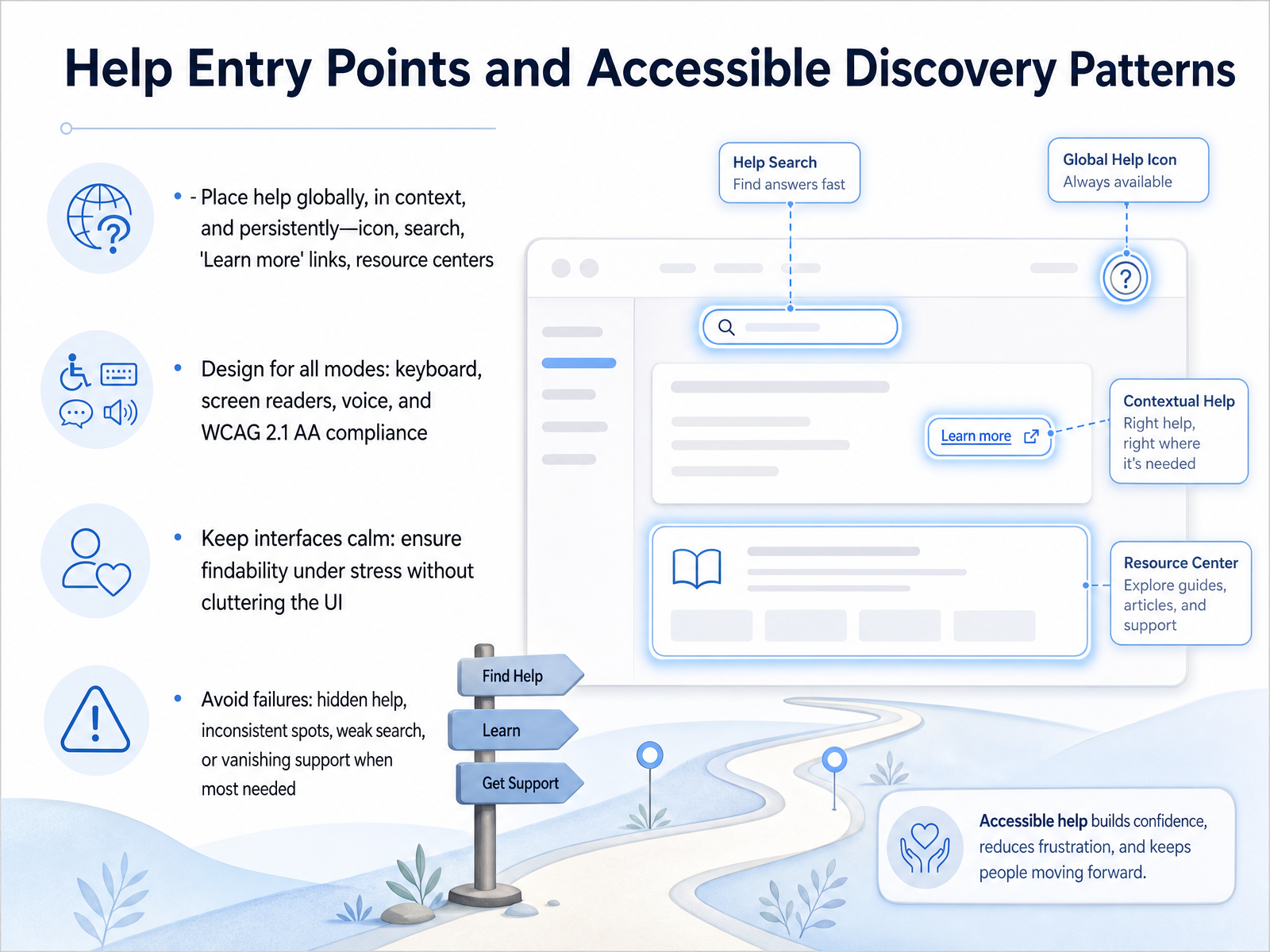
 - 06Help Entry Points and Accessible Discovery PatternsLet's now focus on where and how users actually find help. This slide is about entry points and accessible discovery patterns. The first rule is to place help globally, in context, and persistently. Think of an ever-present question mark icon, a universal search bar, or inline 'Learn more' links. The goal is for help to meet users in their moment of need, without forcing them to hunt for it. Next, we have to design for all modes of access. This means full keyboard navigation, screen reader compatibility, and support for voice interaction. We must meet WCAG 2.1 AA standards as a baseline, so no user is locked out of support. We also need calm interfaces. Under stress, users scan, they don't read. So keep the interface clean to ensure findability, without cluttering the screen. Finally, watch out for common failures. Avoid hidden help icons, inconsistent placement across pages, and weak search that returns nothing. And crucially, never let support vanish when users hit an error state. That is precisely when trust is on the line. Now, getting users to the right person or community is just as critical, so let's look at seamless handoff to human and community support.
 mdpi.comrenascence.ioblogs.cisco.com+22 min
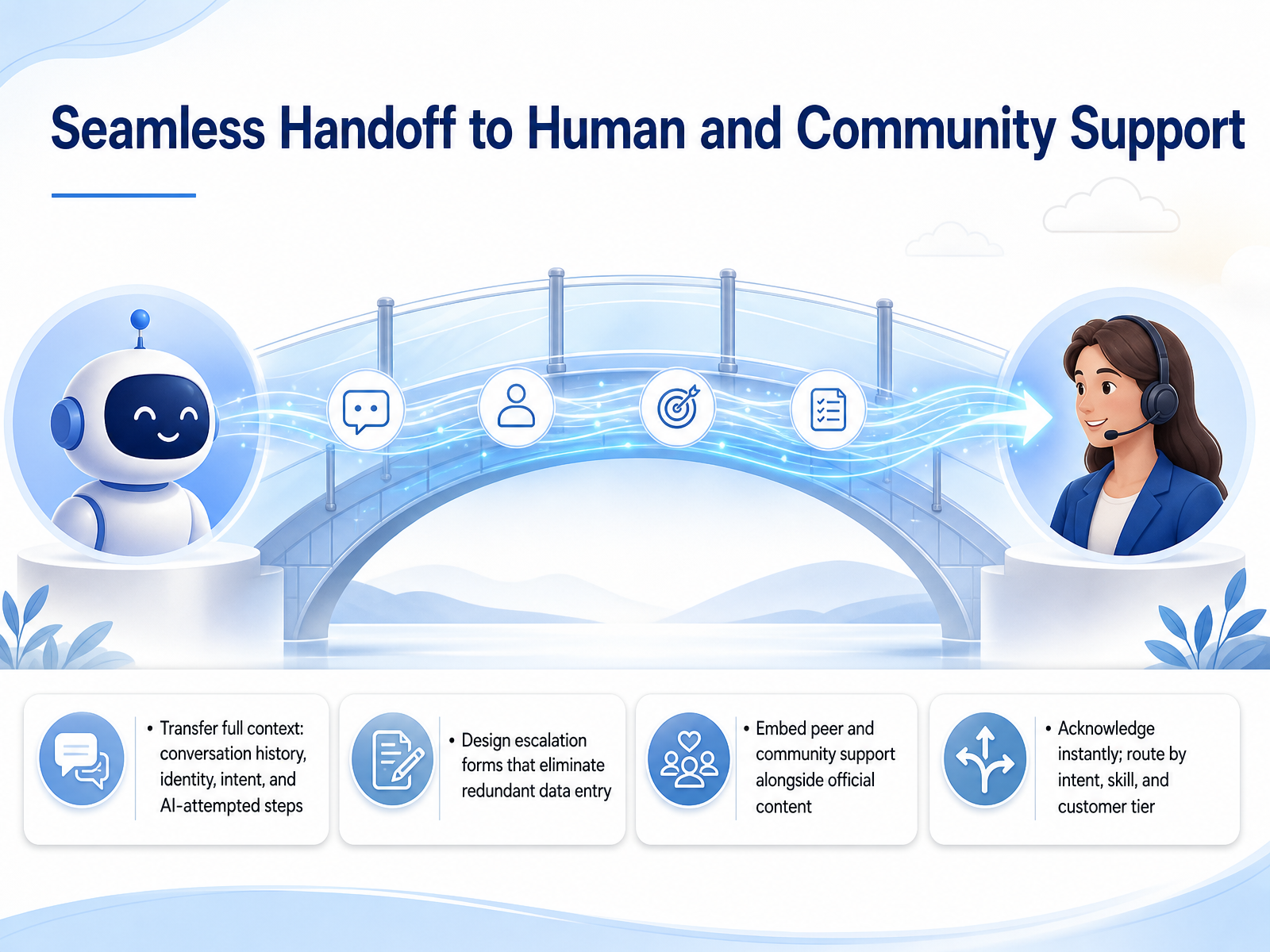
 - 07Seamless Handoff to Human and Community SupportNow let's talk about what might be the most critical moment in any support journey: the handoff from AI to a human. When a bot can't solve the problem, the transition has to be seamless. The number one complaint in AI support isn't accuracy, it's the handoff. Customers hate repeating themselves. So, our first rule is to transfer full context. That means the conversation history, customer identity, detected intent, and everything the AI already tried. The agent should see a concise summary and be able to greet the customer by name, referencing the exact issue immediately. Next, design your escalation forms to eliminate redundant data entry. Don't ask for an order number the bot already collected. That's a fast track to frustration. We also need to embed peer and community support alongside official content. Sometimes the best answer comes from another user, and making that accessible within the help experience prevents unnecessary escalations. Finally, route with intelligence. Acknowledge the handoff instantly, and then route the ticket by intent, agent skill, and customer tier. A billing question from an enterprise client should go straight to a dedicated specialist, not a general queue. Getting these handoffs right protects trust and directly improves customer satisfaction scores. Next, we'll move on to measuring quality and the metrics that drive continuous improvement in your help content.
 thread-transfer.comeesel.aisupports.live+22 min
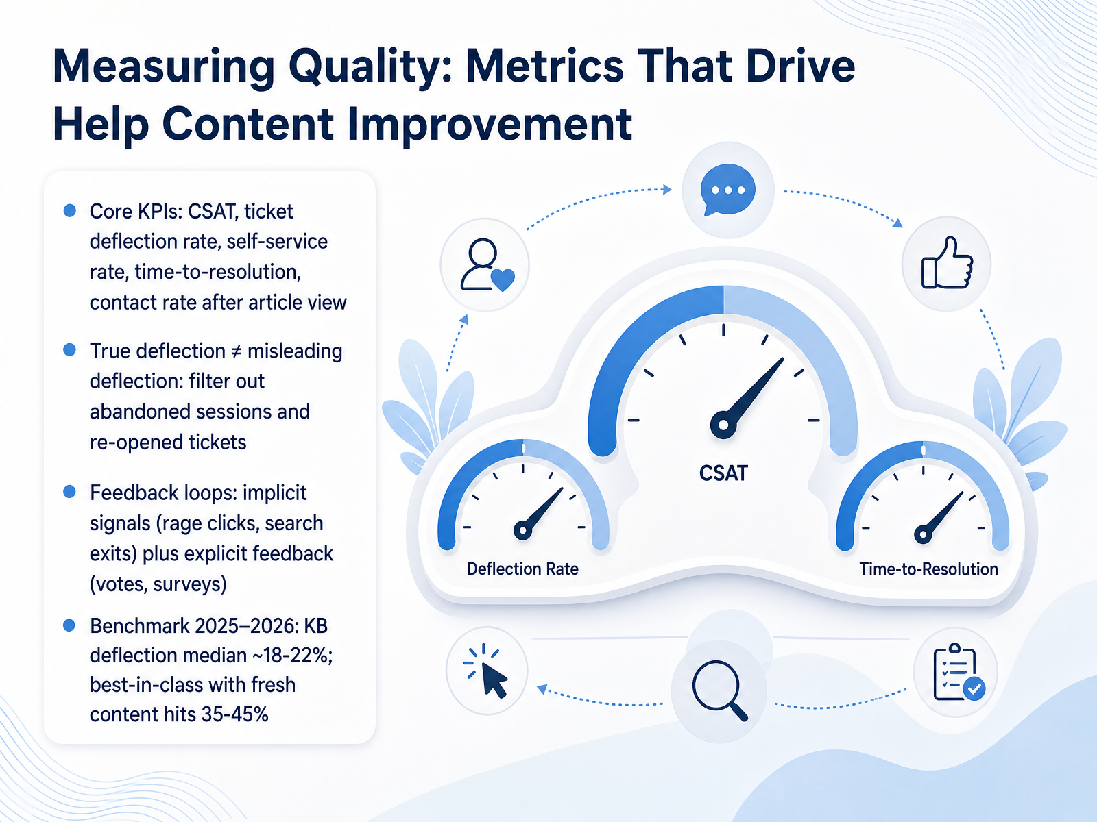
 - 08Measuring Quality: Metrics That Drive Help Content ImprovementNow that you've designed your content tiers, let's talk about how you'll measure their impact. This is where you move from publishing articles to truly improving help experiences. Your core metrics start with C-SAT, or customer satisfaction score, and ticket deflection rate. You'll also track your self-service rate, time-to-resolution, and contact rate after a user views an article. But here's a critical nuance: not all deflection is true deflection. You need to filter out abandoned sessions and re-opened tickets. Otherwise, you might celebrate a user simply giving up in frustration as a win. To validate whether your content genuinely helps, build strong feedback loops. Look at implicit signals like rage clicks and search exits. Combine these with explicit feedback from votes and surveys. For a realistic benchmark, think about where the industry is heading. The median knowledge base deflection rate sits around eighteen to twenty-two percent. But teams who keep their content fresh—updating it at least every thirty days—can push that number into the thirty-five to forty-five percent range. The difference highlights an essential truth: measurement isn't just for reporting; it's your primary engine for ongoing content improvement. Next, we'll explore how to use analytics and feedback to evolve your help content, turning these insights into actionable updates.
 2 min
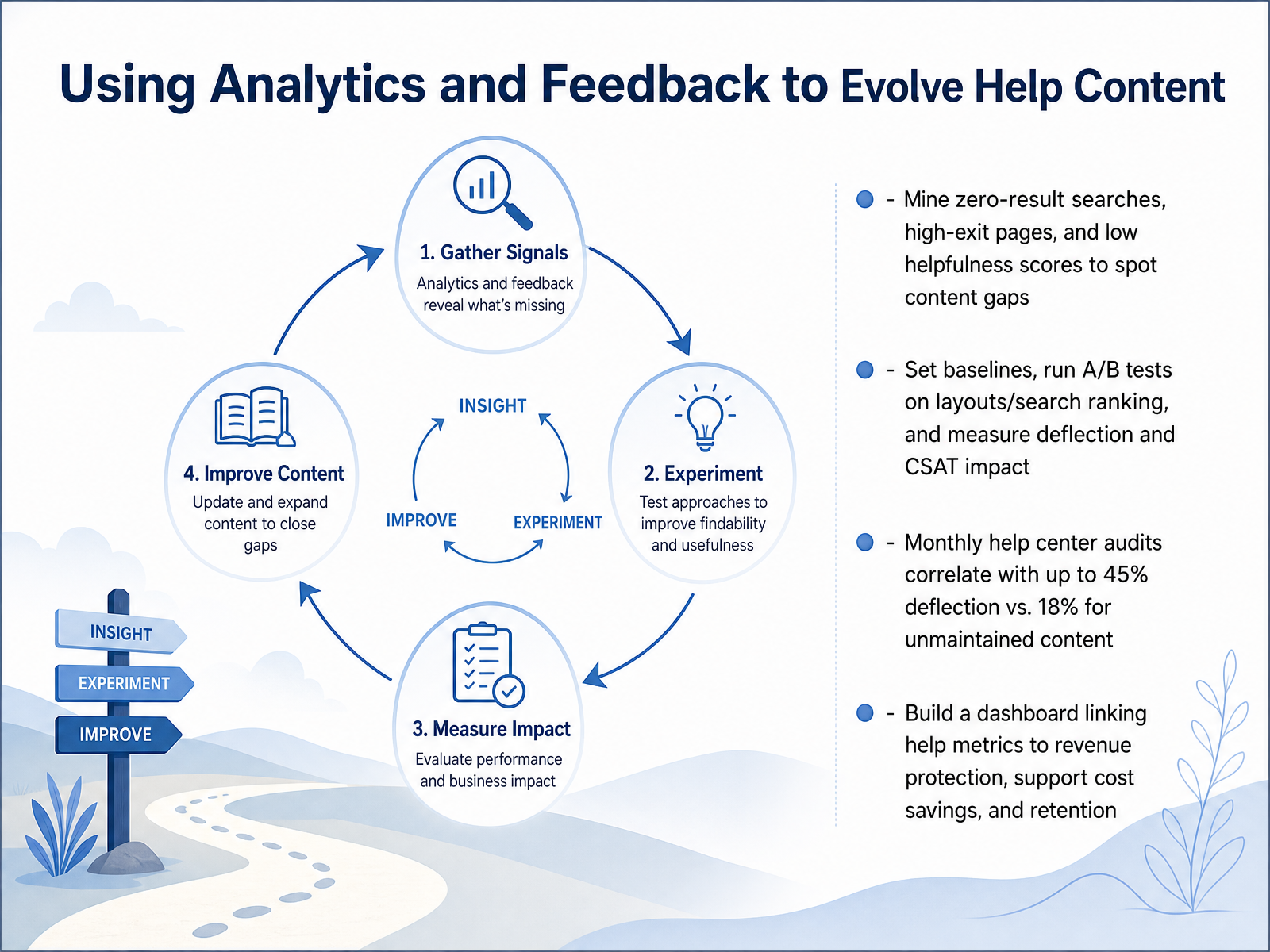
2 min - 09Using Analytics and Feedback to Evolve Help ContentNow let's talk about using analytics and feedback to make your help content better over time. Your goal here is to let the data show you exactly where users are struggling. Start by mining your search logs for zero-result searches. Those are direct signals of missing content. Next, look at pages with high exit rates and articles with low helpfulness scores. These three data points will reveal your most critical content gaps. Once you know the gaps, set a baseline and start experimenting. Run A/B tests on things like page layouts or search ranking algorithms. Then measure the impact on your deflection rate and customer satisfaction. The numbers are compelling. Research shows that teams who audit their help centers monthly achieve up to 45% ticket deflection. Teams that leave content unmaintained for six months or more see that number drop to around 18%. To sustain this, build a dashboard that connects your help content metrics directly to business outcomes like revenue protection, support cost savings, and customer retention. This turns your help center from a cost center into a clear value driver. Up next, let's explore how AI and automation are reshaping these help experiences.
 2 min
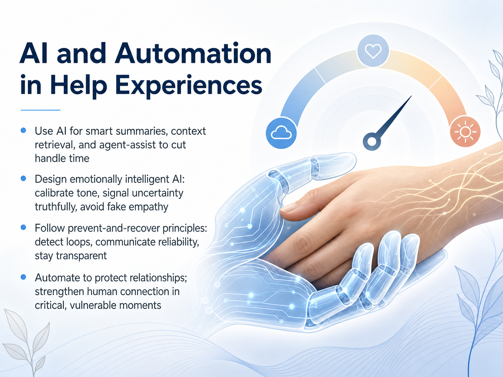
2 min - 10AI and Automation in Help ExperiencesNow let's apply these smart capabilities to our help experiences, with a specific focus on AI and automation. We'll tackle this in three layers. First, use AI for smart summaries, context retrieval, and agent-assist. The goal is to cut handle time—not by rushing people, but by giving agents a quick, accurate summary so the customer never repeats their story. Second, design emotionally intelligent AI. This means calibrating tone, signaling uncertainty truthfully, and avoiding fake empathy. If the system isn't sure, it should say so plainly. And third, follow prevent-and-recover principles: detect loops early so users don't get stuck, communicate reliability clearly, and always stay transparent about what the AI can and cannot do. Ultimately, our job is to automate in order to protect relationships. Let machines handle the predictable so that when something critical or vulnerable happens, we can strengthen the human connection exactly where it matters most. That balance between efficiency and empathy is what makes modern help experiences truly work. Next, we'll ground these ideas in the frameworks that shape them, starting with service design foundations for help experiences.
 uxmag.commedium.comjournals.eiid.eu+22 min
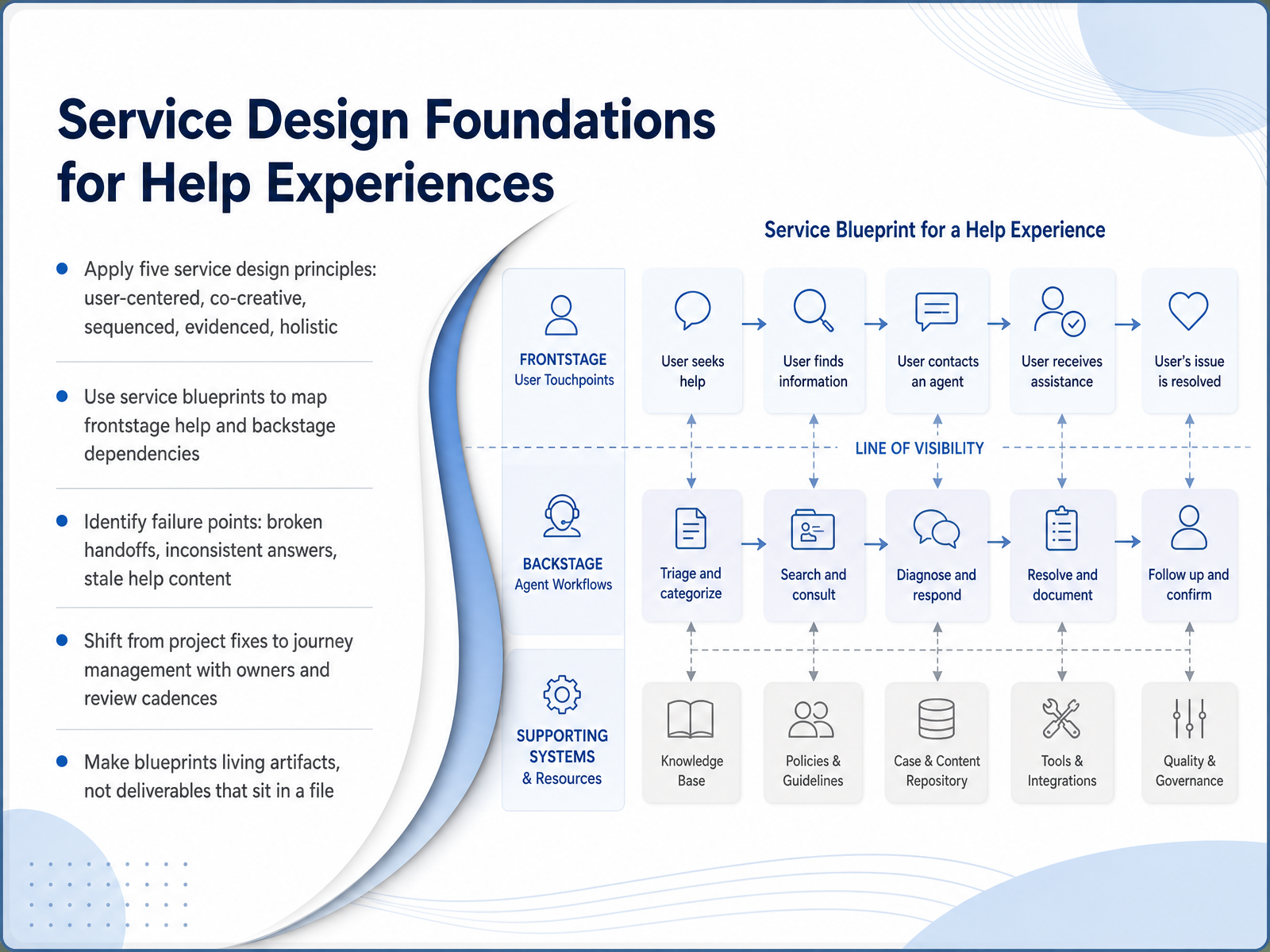
 - 11Service Design Foundations for Help ExperiencesNow let's ground all of this in a structural approach. To design help that actually works, we apply five core service design principles. First, user-centered: we build from real customer research, not internal assumptions. Second, co-creative: we involve support agents, operations, and IT in the design, because they know where things break. Third, sequenced: we treat help as a journey across time, not isolated touchpoints. Fourth, evidenced: we make invisible support processes visible through blueprints and maps. Finally, holistic: we look at the entire ecosystem, including channels, partners, and backstage systems. The primary tool here is the service blueprint. It maps frontstage help interactions against the backstage dependencies that enable them. This is how you spot real failure points, like broken handoffs between teams, inconsistent answers across channels, and knowledge base content that has gone stale. The goal isn't a one-time fix. We shift from project firefighting to ongoing journey management. That means assigning a named owner for each help journey, setting a regular review cadence, and treating the blueprint as a living artifact that evolves with each release, never a static file collecting dust. Next, we'll explore designing for trust, dignity, and inclusive support.
 mdpi.comrenascence.ioblogs.cisco.com+22 min
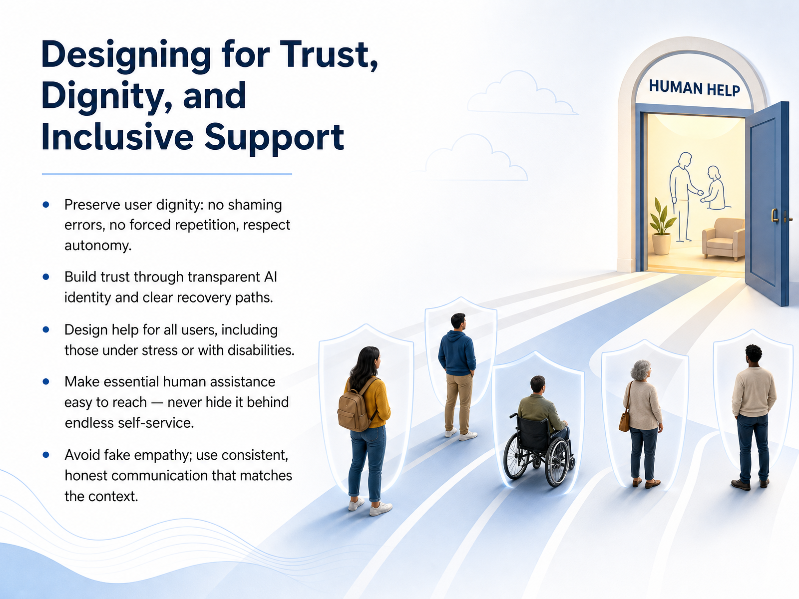
 - 12Designing for Trust, Dignity, and Inclusive SupportNow we turn to the emotional core of any support experience: designing for trust, dignity, and inclusive support. First, always preserve user dignity. Never shame someone for an error, avoid forcing them to repeat information, and respect their autonomy. Build trust by being transparent about AI identity and offering clear recovery paths. Next, design help for everyone, including users under stress or with disabilities. This means making essential human assistance easy to reach. Never hide it behind endless self-service loops. Finally, avoid fake empathy. Use consistent, honest communication that matches the user's context. For example, a simple, direct response often provides more comfort than an overly cheerful script when someone is stuck. These principles ensure your help experience supports all users respectfully. Let's now apply these ideas directly in a practical design workshop by auditing a real help flow.
 uxmag.commedium.comjournals.eiid.eu+22 min
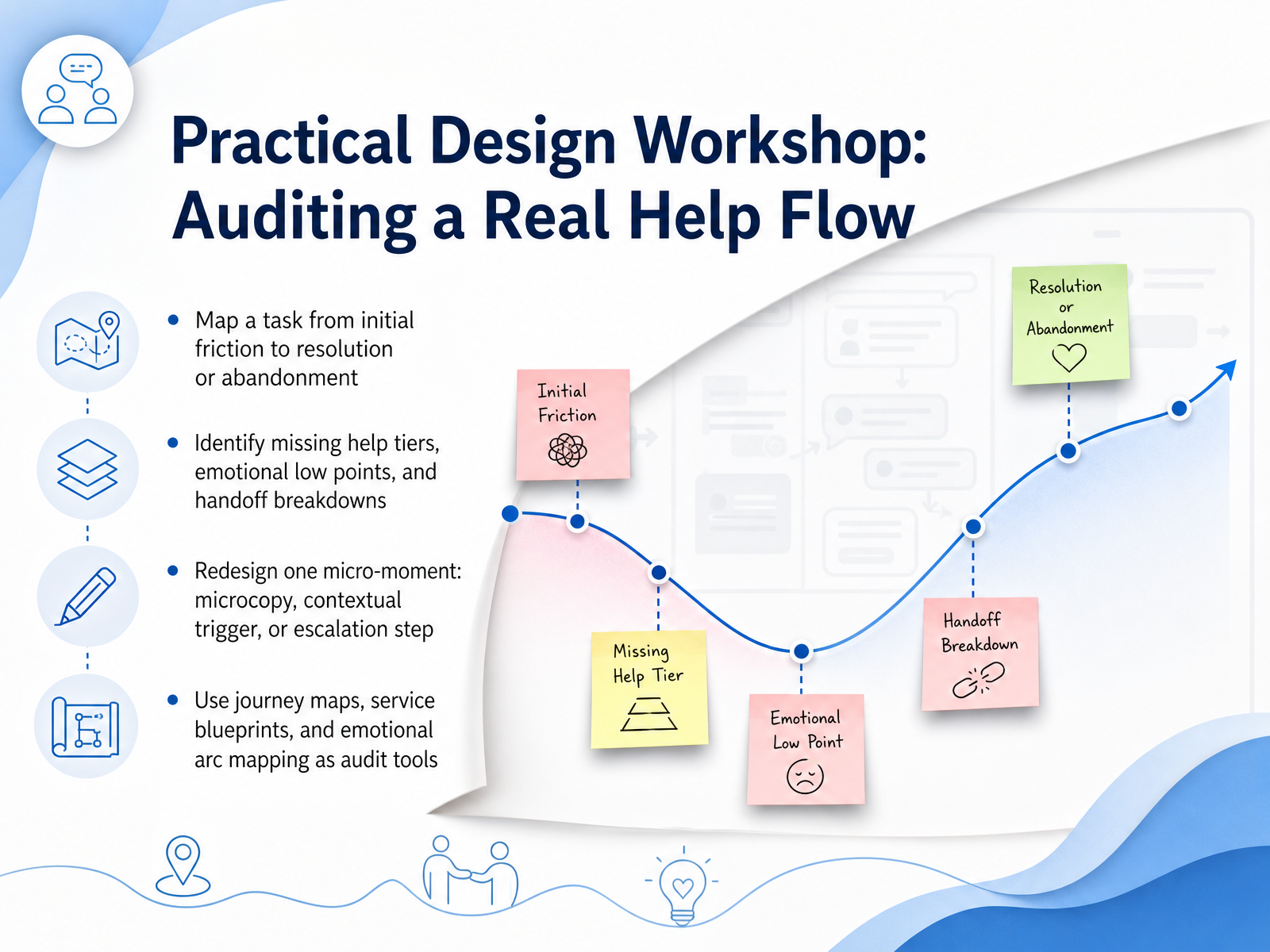
 - 13Practical Design Workshop: Auditing a Real Help FlowSo let's put this into practice. In this workshop, you’ll audit a real help flow. Start by mapping a complete task from the moment a user hits friction to either resolution or abandonment. As you map, pinpoint missing help tiers, emotional low points, and any breakdowns where a handoff fails between self-service and human support. Then choose one micro-moment to redesign. Maybe it’s a line of microcopy that feels cold, a contextual trigger that appears too late, or an escalation step that asks the user to repeat themselves. Use tools like journey maps and service blueprints to see the frontstage and backstage together, and emotional arc mapping to spot exactly where frustration peaks. Your goal is to turn that one moment of friction into a moment of clarity. When we come back, we’ll wrap up with key takeaways and an action plan for your own product.
 uxmag.commedium.comjournals.eiid.eu+22 min
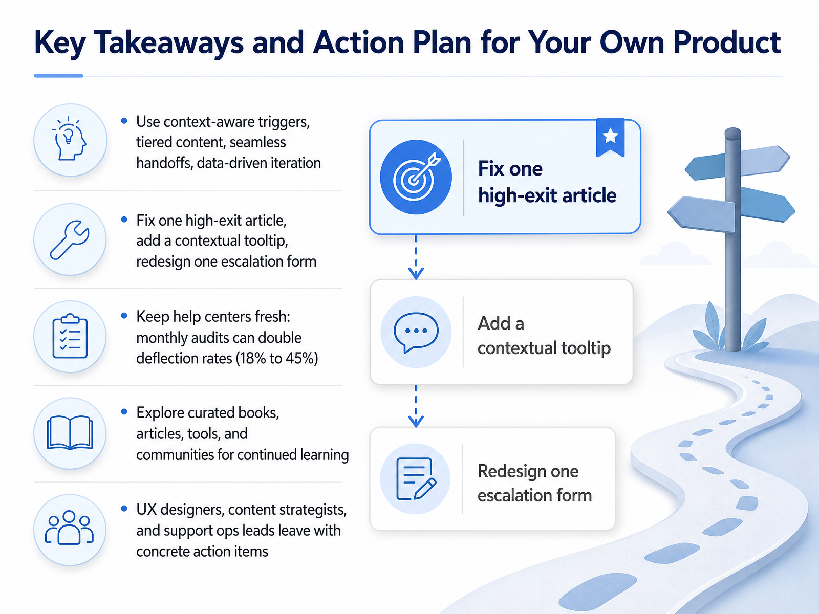
 - 14Key Takeaways and Action Plan for Your Own ProductWe have reached the final slide and the real starting line. Let us turn these concepts into your action plan. First, remember the four pillars: use context-aware triggers so help arrives at the right moment. Build tiered content so the answer matches the depth of the problem. Design seamless handoffs so no one has to repeat themselves. And commit to data-driven iteration, because what you measure is what you improve. Now pick three concrete tasks to begin. Find one high-exit help article and rewrite it for clarity. Add one contextual tooltip to unblock a stuck workflow. Redesign one escalation form so it carries full context to your agent. Here is a compelling reason to stay disciplined: fresh help centers can double deflection rates. Data shows teams that audit content monthly hit forty-five percent deflection, while those who skip audits languish at eighteen percent. Treat help content like code, update it, test it, and measure it constantly. If you want to go deeper, explore the curated books, articles, tools, and communities linked in the course materials. Emotions and empathy in support are evolving fast, and continuous learning keeps your skills sharp. Whether you are a UX designer shaping the interface, a content strategist crafting the right words, or a support ops lead building the backend, you now own concrete actions that reduce user frustration and build genuine trust. Thank you for investing this time in designing better help experiences. Now go make your next support moment feel like a safety net, not a dead end. Your users will notice the difference.
 uxmag.commedium.comjournals.eiid.eu+22 min
Take the deck with you
Download this course as a file — free, no sign-up needed.
- PDF handoutEvery slide page, ready to print or share.15 pages · 3.4 MBDownload
- Narrated PowerPointThe deck that presents itself — every slide carries the digital human's narration video.15 pages · 14.9 MBDownload
- PowerPoint slidesThe full deck as a .pptx — open it in PowerPoint, Keynote, or Google Slides.15 pages · 3.3 MBDownload
Free to use in your own training — please keep the PersonWise credit page at the end.
Have your own deck? Turn it into a course
Sources consulted
Web sources consulted while building this course.
- The Role of Emotion in UX: Embracing Emotionally Intelligent Design - UX Magazine — uxmag.com
- Building Emotionally Intelligent Interfaces | by Blessing Okpala, PhD | Medium — medium.com
- Emotionally Adaptive UX Interfaces: A Scenario-Based Framework for Real-Time Personalization | European Scientific e-Journal — journals.eiid.eu
- Design for AI: Emotional UX in AI Products - by Ileana — ileanamarcut.substack.com
- Emotionally Adaptive Interfaces: How UX Changes With User Mood — blessingokpala.substack.com
- Evaluating Strategies for User Onboarding in Web Applications — urn.kb.se
- Benchmark Report 2025 | Chameleon — chameleon.io
- Why Interactive SaaS Walkthroughs Are Outperforming Traditional Video Tutorials in User Onboarding — demogo.com
- Interactive Guides vs. Documentation for Adoption — trainn.co
- The ROI Math: Static Video Tours vs Interactive, Self‑Hosted Demos - Demogo — demogo.com
- Designing for Trust, Progress, and Dignity: A Conceptual Framework for Reliability, Responsiveness, and Relational Quality in AI-Enabled Service Systems — mdpi.com
- Core CX Design Principles Explained — Renascence — renascence.io
- How Cisco architected AI-driven support and validated against industry benchmarks - Cisco Blogs — blogs.cisco.com
- Why service design should be at the core of your CX strategy — zendesk.com
- Design principles for customer-engaging digital service systems: An action research study — ink.library.smu.edu.sg
- Human-AI handoff done right: The complete 2025 playbook | Thread Transfer — thread-transfer.com
- 7 best practices for human handoff in chat support (2025 guide) | eesel AI — eesel.ai
- Designing an Omnichannel Helpdesk: Best Practices — supports.live
- Omnichannel support and escalation tools | NiCE — nice.com
- Stopping Context Loss with Customer Service Handoff Process — omind.ai