Data Visualization Portfolio
Begin
14 pages · ~28 min
Data Visualization Portfolio
Create a data visualization portfolio that showcases your skills to employers and clients. Ideal for aspiring analysts and designers building a professional presence.
What you’ll learn
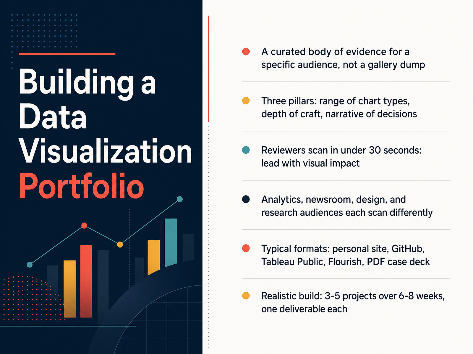
- 01Building a Data Visualization PortfolioWelcome. Over the next few slides, we are going to build a data visualization portfolio together. The goal is simple. By the end, you will know what to include, what to leave out, and how to present your work so a busy reviewer understands it fast. Let us start with the core idea. A portfolio is not a gallery dump of every chart you have ever made. It is a curated body of evidence for a specific audience. Think of it as a case you are building, not an album you are filling. There are three pillars to keep in mind. First, range, meaning different chart types and different problems. Second, depth of craft, meaning clean design and careful choices. Third, narrative, meaning you can explain why you made each decision. Reviewers scan a portfolio in under thirty seconds, so lead with visual impact and put your strongest work first. Just as important, different audiences scan differently. An analytics team, a newsroom, a design studio, and a research group each look for different signals. So tailor what you show. Your format can be a personal site, GitHub, Tableau Public, Flourish, or a simple PDF case deck. And be realistic. Three to five projects over six to eight weeks, with one clear deliverable each, is enough. As a next step, before you build anything, write down who you are making this for. Next, we will look at what reviewers actually look for.kindatechnical.comjohal.inpencraftednews.com+22 min
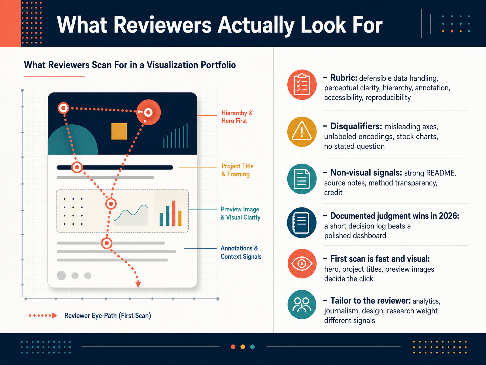
- 02What Reviewers Actually Look ForLet's talk about what actually happens when a reviewer opens your portfolio. Not the theory, the real moment. Most first scans take about thirty seconds. That first look is fast and visual. The hero, your project titles, and the preview images decide whether anyone clicks deeper. So before you write a single caption, ask yourself what a stranger sees in that first half minute. Reviewers are also checking against a quiet rubric. They want defensible data handling, perceptual clarity, hierarchy, annotation, accessibility, and reproducibility. Some things will get you dismissed outright. Misleading axes, unlabeled encodings, stock charts, and work with no stated question. Then there are the non-visual signals that carry real weight. A strong README, source notes, transparent methods, and proper credit. Here is what wins in twenty twenty-six. A short decision log beats a polished dashboard. Show reviewers how you chose a chart, why you excluded rows, what you would do differently. And tailor to your reviewer, because analytics, journalism, design, and research each weight these signals differently. Before you move on, pick your three strongest projects and draft one decision log entry for each. Next, we look at choosing and scoping portfolio projects.
 kindatechnical.comjohal.inpencraftednews.com+22 min
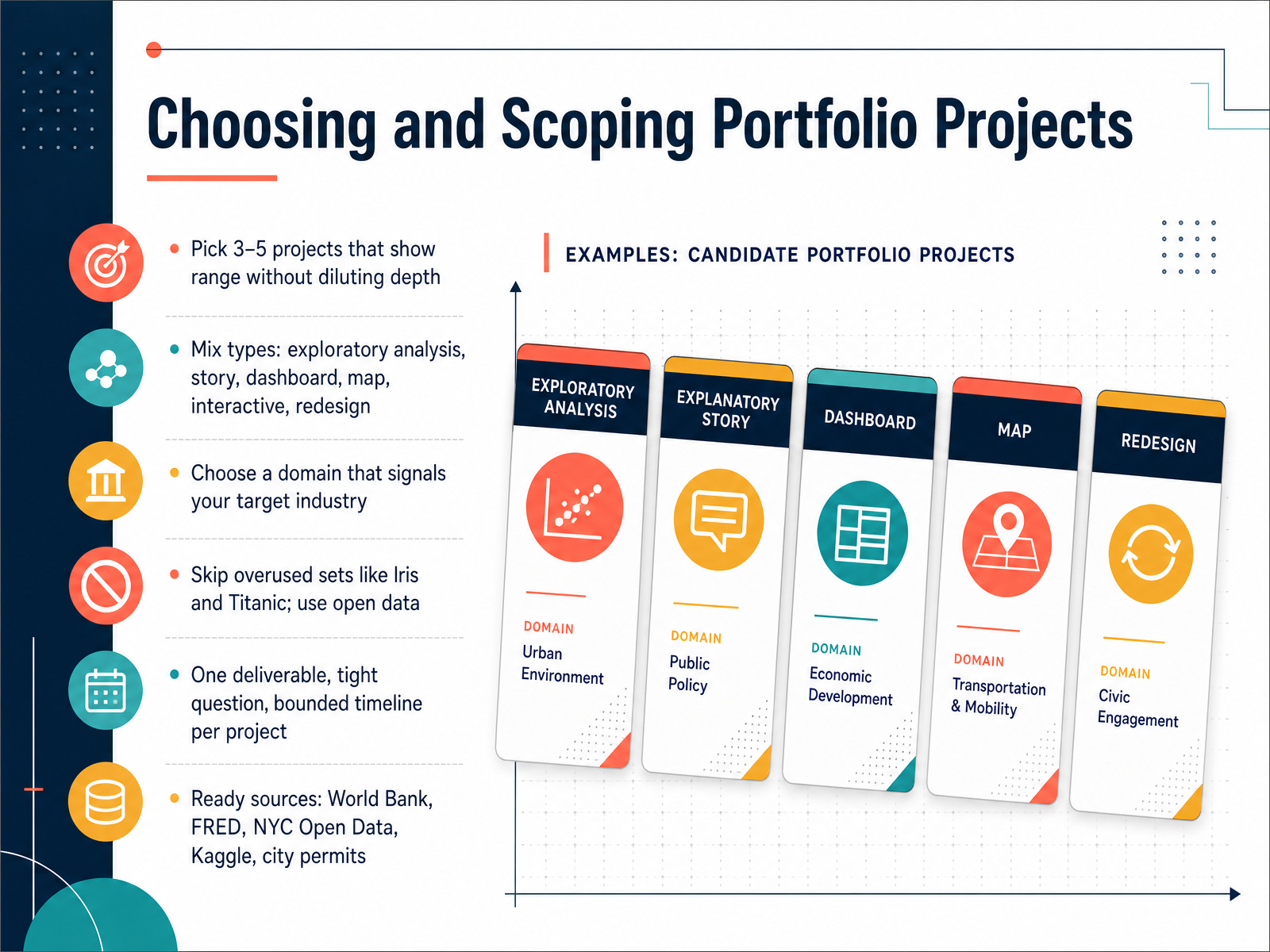
 - 03Choosing and Scoping Portfolio ProjectsSo how do you choose which projects make the cut? Aim for three to five pieces that show range without diluting depth. Mix the types: an exploratory analysis, a data story, a dashboard, a map, an interactive piece, or a redesign of something weak. Pick a domain that signals your target industry, because reviewers scan for fit. Skip overused sets like Iris and Titanic. They are clean and familiar, which is exactly the problem. Use open data from the World Bank, FRED, NYC Open Data, Kaggle, or city permit records. For each project, define one deliverable, one tight question, and a bounded timeline. That constraint is what keeps quality high. Next, a reproducible workflow from raw file to chart.
 huggingface.cogithub.comgithub.com+21 min
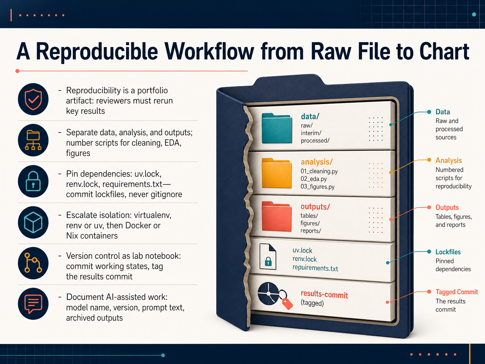
 - 04A Reproducible Workflow from Raw File to ChartNow let's talk about the workflow itself, from raw file to finished chart. Think of reproducibility as part of the portfolio artifact, not an afterthought. A reviewer should be able to rerun your key results with reasonable effort. So separate your project into three concerns: data, analysis, and outputs. Number your scripts in the order they run, cleaning first, then exploratory analysis, then figures. Pin your dependencies. Whether you use uv dot lock, renv dot lock, or requirements dot txt, commit the lockfile and never add it to gitignore. Then escalate isolation as needed. Start with a virtual environment, renv, or uv, and move to Docker or Nix when you need full control. Treat version control like a lab notebook. Commit working states and tag the commit that produced your results. And if AI helped, document the model name, version, prompt text, and archive the outputs. Your next step is simple: pick one project this week and restructure it into these numbered stages, then commit a lockfile. That single habit makes everything downstream easier to trust. Next, we will look at charting choices that show judgment.
 tobias.isenberg.ccdoi.orgopensource.posit.co+22 min
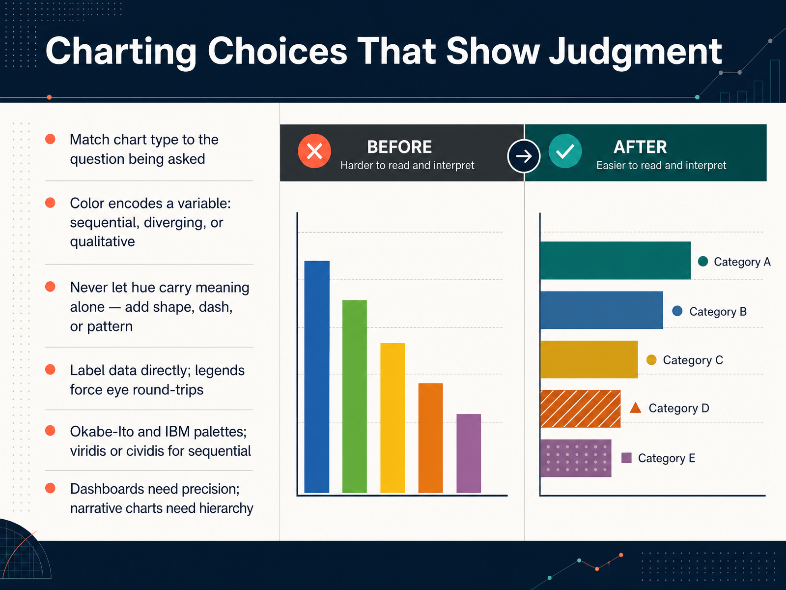
 - 05Charting Choices That Show JudgmentLet's talk about chart choices that show judgment. Ask yourself: does this chart answer the question someone actually has? A bar chart for comparison, a line for trend, a scatter for correlation. That match matters more than any styling. Color should encode a variable: sequential for magnitude, diverging for deviation from a midpoint, qualitative for unordered categories. And never let hue carry meaning alone. Add shape, dash, or pattern so the chart still reads in grayscale. Label data directly instead of relying on a legend, because legends force constant eye round-trips. For accessible palettes, Okabe-Ito and IBM work well for categories, while viridis or cividis suit sequential scales. One last distinction: dashboards need precision, narrative charts need hierarchy. Your next step: open one chart you've made and check whether the chart type actually matches the question being asked. Direct labeling and redundant encoding are what separate a competent chart from a clear one. Next, we look at interactive and web-native visualizations.
 interactive-data-visualization.comaccessibility.buildlucky.graphics+22 min
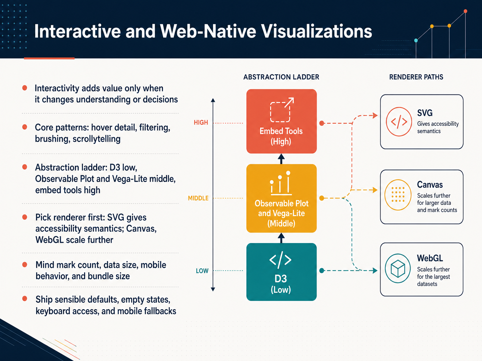
 - 06Interactive and Web-Native VisualizationsLet's turn to interactive and web-native visualizations. Ask yourself a simple question: does the interaction actually change what someone understands or decides? If not, it's decoration. The core patterns are hover detail, filtering, brushing, and scrollytelling. Think of an abstraction ladder. D3 sits low, giving you full control. Observable Plot and Vega-Lite sit in the middle, letting you declare what you want. Embed tools sit high, where the chart is almost done for you. Pick your renderer before your library. SVG gives you accessibility semantics for free, while Canvas and WebGL scale much further. Watch your mark count, data size, mobile behavior, and bundle size. A million-point scatter needs a different path than a five-bar chart. Finally, ship sensible defaults, clear empty states, keyboard access, and mobile fallbacks. Takeaway: before adding any interaction, name the decision it helps someone make. Next, we look at accessibility as a baseline, not a bolt-on.
 interactive-data-visualization.comaccessibility.buildlucky.graphics+22 min
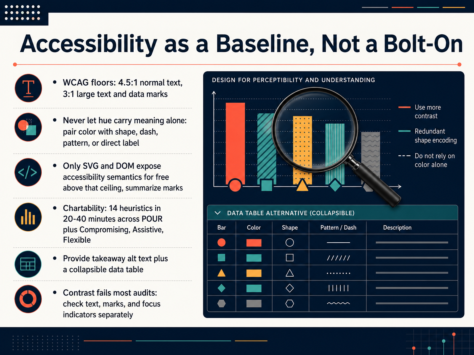
 - 07Accessibility as a Baseline, Not a Bolt-OnLet's talk about where accessibility actually belongs in your process. Here's a question worth sitting with. If a reader cannot perceive the contrast in your chart, does the rest of the design even matter? Start with the floors. Normal text needs a contrast ratio of four and a half to one. Large text and data marks need three to one. Then, never let hue carry meaning alone. Pair color with shape, dash pattern, or a direct label, so the chart still reads in grayscale. One practical note on rendering. Only S V G and the D O M expose accessibility semantics for free. Canvas draws pixels, so you build every semantic by hand or summarize above a ceiling. For a lightweight audit, Chartability gives you fourteen heuristics you can run in twenty to forty minutes across P O U R plus Compromising, Assistive, and Flexible. Pair takeaway alt text with a collapsible data table. So your next step, before you publish your next chart, check contrast on text, marks, and focus indicators separately. That is where most portfolio audits fail. Pack each project as a case study.
 interactive-data-visualization.comaccessibility.buildlucky.graphics+22 min
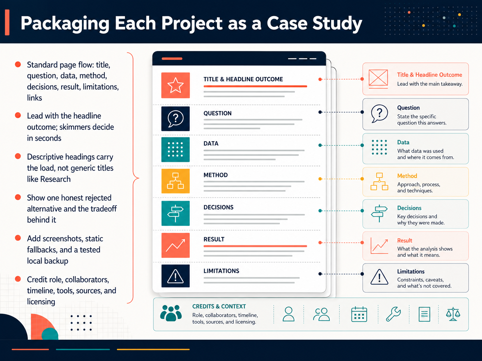
 - 08Packaging Each Project as a Case StudyLet's talk about packaging each project as a case study. A simple, standard page flow works well: title, question, data, method, decisions, result, limitations, and links. Lead with the headline outcome, because skimmers decide in seconds whether to keep reading. "Cut reporting time by forty-five percent" beats "Dashboard Project" every time. Then let descriptive headings carry the load. Instead of writing Research, write Users hated updating spreadsheets by hand. Show one honest rejected alternative and the tradeoff behind it. That single paragraph proves judgment, not just polish. Add screenshots, static fallbacks, and a tested local backup, so your work survives a broken link. Finally, credit role, collaborators, timeline, tools, sources, and licensing. Your next step: write the headline outcome for your most recent project, then build the page around it. Next, we look at building the portfolio site and personal brand.
 kindatechnical.comjohal.inpencraftednews.com+21 min
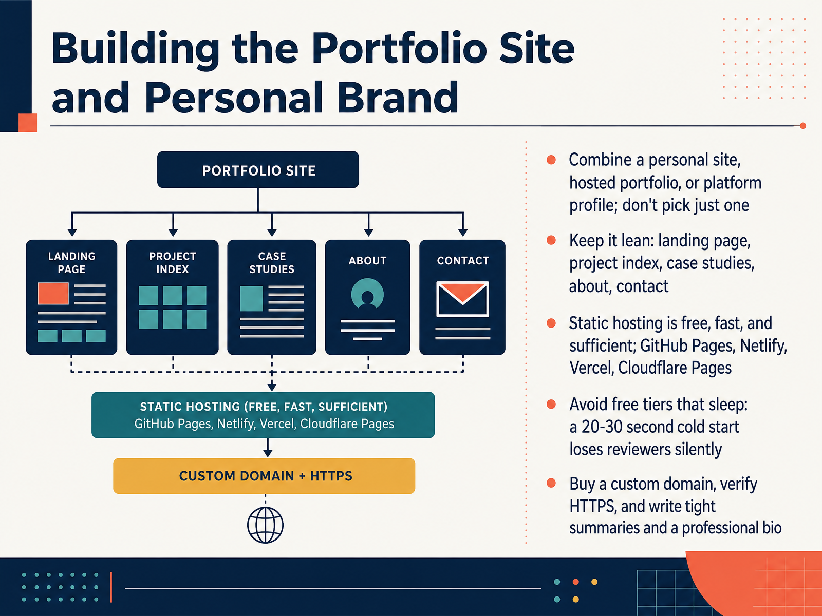
 - 09Building the Portfolio Site and Personal BrandNow let's talk about where your portfolio actually lives, and how it shapes how people see you.
Should you build one home for your work, or spread it across several? The honest answer is both. Keep a personal site you control, and also keep a profile on the platforms your field uses. A personal site gives you room to tell the story; a platform profile helps people discover you. They serve different jobs, so don't pick just one.
Structurally, keep it lean. You need a landing page, a project index, individual case studies, an about page, and clear contact details. That's enough. Reviewers scan quickly, so make the path obvious.
For hosting, static sites are free, fast, and genuinely sufficient. GitHub Pages, Netlify, Vercel, and Cloudflare Pages all work well. But avoid free tiers that sleep. A cold start of twenty to thirty seconds loses reviewers silently, and you never find out it happened.
Finally, buy a custom domain, confirm that HTTPS is working, and write tight project summaries and a professional bio.
Your next step: register a domain in your own name this week, point it at static hosting, and test it cold from a phone before you share the link.
Next, we'll look at how to use review and feedback to keep improving your portfolio over time.
 2 min
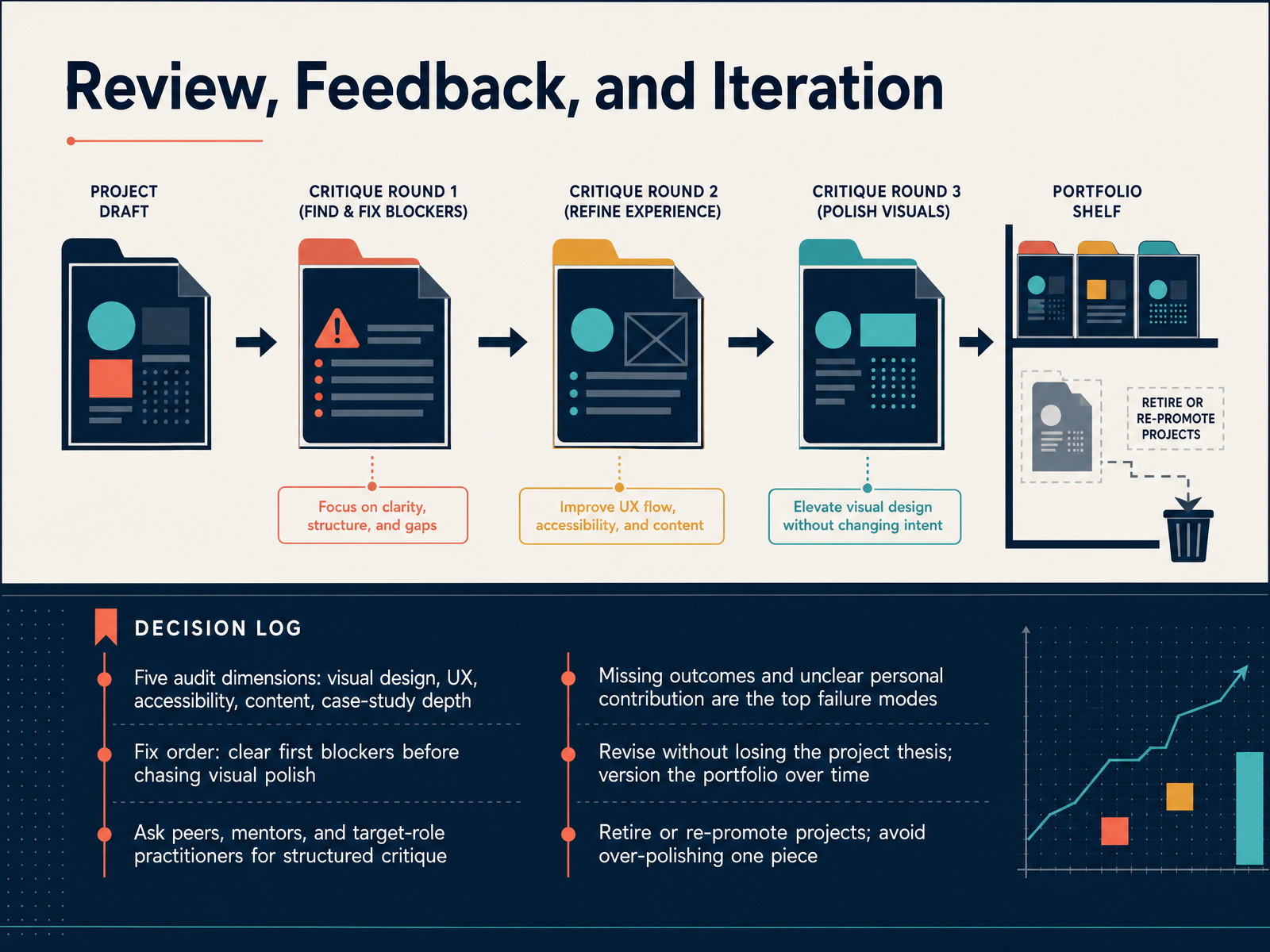
2 min - 10Review, Feedback, and IterationNow let's talk about review and iteration, because a portfolio is never finished, only versioned. When you audit your work, run it through five dimensions: visual design, user experience, accessibility, content, and case-study depth. Then fix in order. Clear first blockers before chasing visual polish. A missing outcome matters more than a slightly imperfect color palette. What do reviewers actually flag? Two things: missing outcomes, and unclear personal contribution. If a project lacks a result, or nobody can tell what you specifically did, the work reads as unfinished. So ask peers, mentors, and people already in your target role for structured critique, and give them those five dimensions as a frame. Then revise without losing the project thesis, and retire or re-promote projects as your goals shift. Avoid over-polishing one piece. Next, we'll look at presenting your work in interviews and reviews.
 interactive-data-visualization.comkindatechnical.com1 min
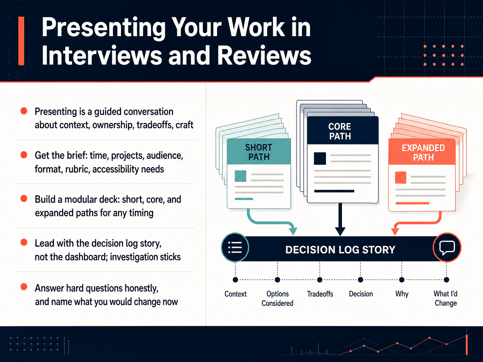
 - 11Presenting Your Work in Interviews and ReviewsLet's talk about how to present your work in interviews and reviews. First, reframe what is happening. A portfolio presentation is not a read-aloud of your case study. It is a guided conversation about context, ownership, tradeoffs, and craft. Next, get the brief before you build anything. Ask how much time you have, which projects they want, who is attending, what format and rubric apply, and whether there are accessibility needs. Then build a modular deck with three paths. A short path for when time shrinks, a core path that fits the brief, and an expanded path for deeper questions. Lead with the decision log story, not the dashboard itself. The investigation, the tradeoffs, and the call you made are what stick. When a hard question comes, answer honestly, name what you would change now, and say what you would do next. Your next step is simple. Rehearse your short path out loud with a colleague and time it. That sets up our next topic, tailoring the same portfolio to different audiences.
 kindatechnical.com2 min
 - 12Tailoring the Same Portfolio to Different AudiencesNow, here is something most people get wrong. You do not build one portfolio per job. You build one portfolio with several entry points into it, then you change the order and framing depending on who is reading. So ask yourself, who actually opens this link? If it is an analytics or BI reviewer, lead with the business question, show your SQL evidence, report adoption, and end with a clear recommendation. If it is a newsroom editor, they care about the reported story, annotation craft, sourcing, and how fast you iterate. A design or product team wants hierarchy, interaction craft, accessibility, and an honest explanation of the options you rejected. And a research reviewer wants reproducibility, provenance, method transparency, and statistics you can defend. The trick is to keep one portfolio with three entry points, a summary, the method, and the code, then adjust project order and call to action per audience. So before you send your next application, open your portfolio and ask which entry point this specific reviewer will actually click.
 kindatechnical.comjohal.inpencraftednews.com+22 min
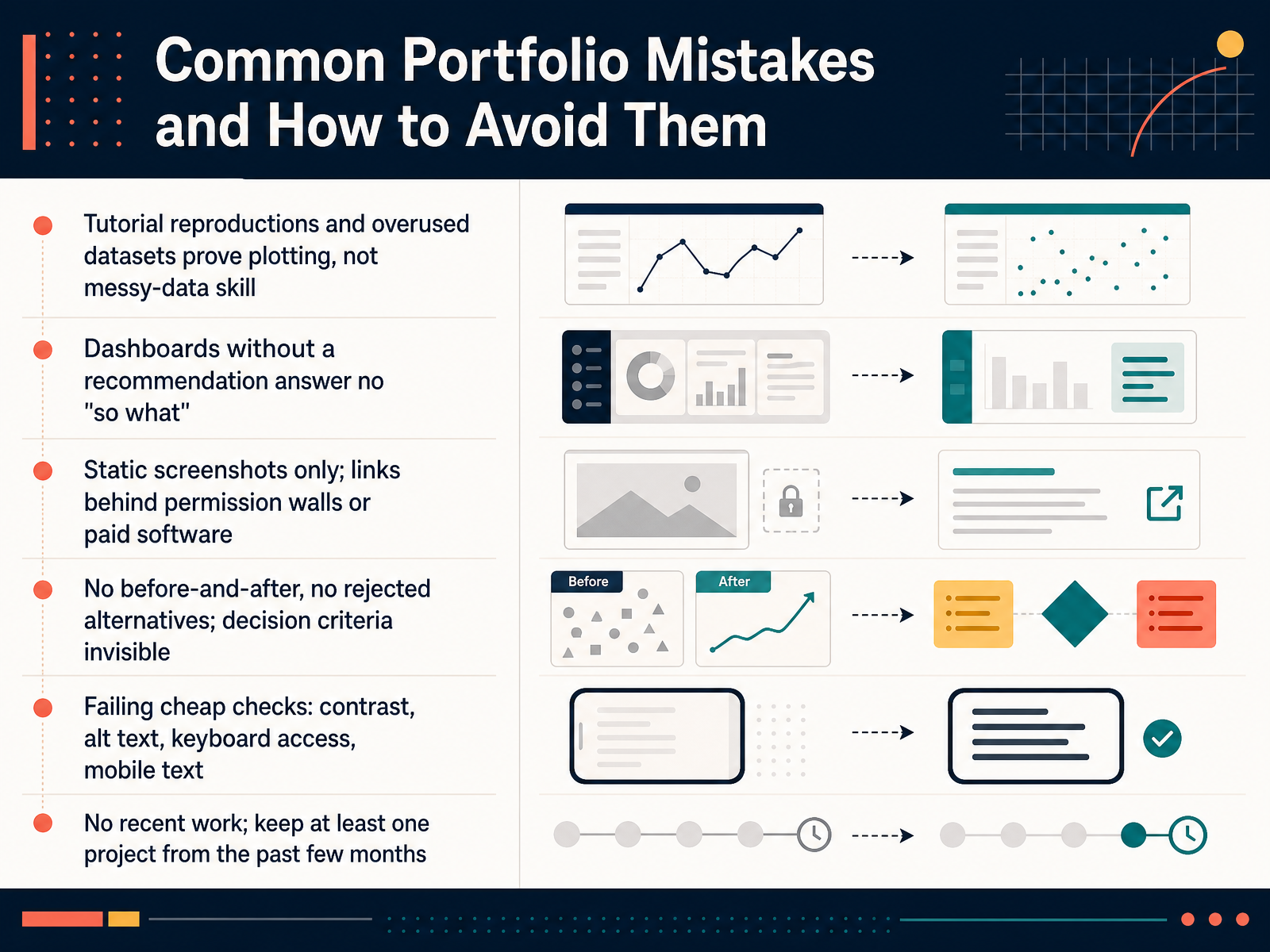
 - 13Common Portfolio Mistakes and How to Avoid ThemLet's talk about the mistakes that quietly cost people interviews. First, tutorial reproductions and overused datasets. The Iris and Titanic sets prove you can plot, not that you can wrestle with messy, real-world data. Second, dashboards with no recommendation. If the viewer still asks so what, it isn't analysis yet. Third, static screenshots only, or links locked behind permission walls or paid software. A reviewer should click once and see the work. Fourth, no before-and-after. Show the rejected alternatives, because that is where your decision criteria become visible. Fifth, failing cheap checks, like contrast, alt text, keyboard access, and mobile text. These take minutes and signal a lot. Finally, keep at least one project from the past few months. So pick one project right now and run it through these six checks before you send anything out. Next, we'll close with your thirty-day action plan and next steps.
 kindatechnical.comjohal.inpencraftednews.com+22 min
 - 14Your 30-Day Action Plan and Next StepsLet's close with a plan you can actually start this week. Weeks one and two: pick three to five projects, and for each write one sentence covering the question and the audience. Weeks two to four: build your two strongest projects end to end, keep a decision log, and run a Chartability audit for accessibility. Weeks four to six: package them as case studies, then launch on static hosting with your own custom domain. Weeks six to eight: seek structured critique, revise in fix order, and rehearse your short, core, and expanded paths. Keep momentum with a ninety day cadence, community, talks, and open-source contributions. Before you publish, run one final self-check: could a non-data reviewer grasp your problem from the summary alone? If not, fix the summary first. So your next step is simple. Open a document today, list your three to five candidate projects, and write one sentence for each. That single page is your plan. Thanks for staying with me through all fourteen slides. You already have the skills. Now build the portfolio that shows them. Go make something worth reviewing.
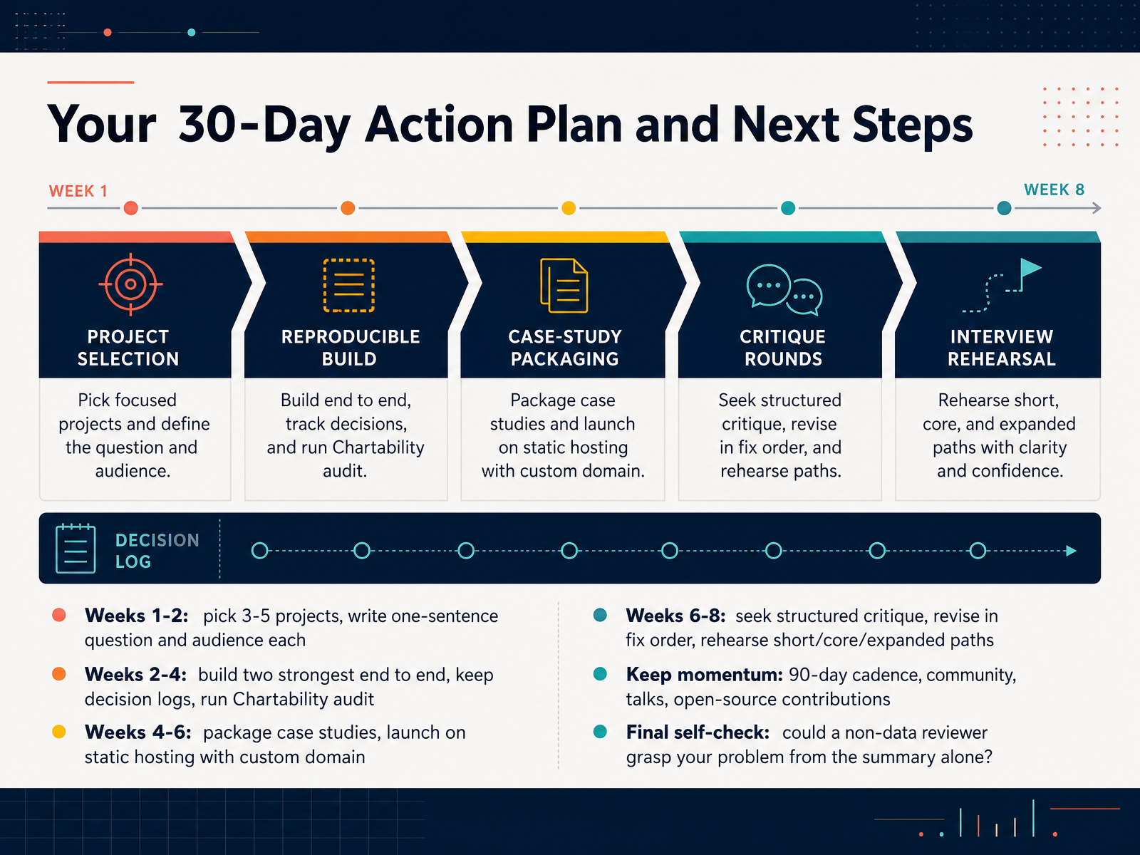 kindatechnical.comjohal.inpencraftednews.com+22 min
Take the deck with you
Download this course as a file — free, no sign-up needed.
- PDF handoutEvery slide page, ready to print or share.15 pages · 3.7 MBDownload
- Narrated PowerPointThe deck that presents itself — every slide carries the digital human's narration video.15 pages · 14.6 MBDownload
- PowerPoint slidesThe full deck as a .pptx — open it in PowerPoint, Keynote, or Google Slides.15 pages · 3.5 MBDownload
Free to use in your own training — please keep the PersonWise credit page at the end.
Have your own deck? Turn it into a course
Sources consulted
Web sources consulted while building this course.
- kindatechnical() - How to Build a Data Visualization Portfolio — kindatechnical.com
- Data Visualization From Zero to Job: What No One Tells You — johal.in — johal.in
- How to Build a Data Analytics Portfolio That Lands Interviews - PenCraftedNews — pencraftednews.com
- Data Visualization Engineer Staffing - KORE1 — kore1.com
- What Kind of Portfolio Data Analyst Should Carry to Get a Job — admecindia.co.in
- ibm-granite/ChartNet · Datasets at Hugging Face — huggingface.co
- bamwor-dev/bamwor-open-data — github.com
- ChartGalaxy/ChartGalaxy — github.com
- oyi77/OpenMedallion · Datasets at Hugging Face — huggingface.co
- Unsplash Dataset | The world’s largest open library dataset — unsplash.com
- README.md: A Tutorial on Reproducible Visualization Research — tobias.isenberg.cc
- yProv4DV: Filling the visualization gap in reproducible research workflows — doi.org
- Structuring Reproducible Research Projects in R: A Workflow with renv, Quarto, and GitHub :: Posit Open Source — opensource.posit.co
- From data exploration to production-ready data apps with Observable Notebooks and Framework | Observable — observablehq.com
- <vfilipov/> — velitchko.github.io
- Color and Contrast Encoding for Charts | IDV Guide — interactive-data-visualization.com
- Accessible Charts & Data Visualization Guide (SVG, WCAG 2.2) | Accessibility.build — accessibility.build
- Chart Color Accessibility Checklist: Palettes That Work Without Relying on Hue Alone | Lucky Graphics | Lucky Graphics — lucky.graphics
- Colour & accessibility for clarity — Data Visualization — datarekha — datarekha.com
- Accessible Interactive Data Visualization | IDV Guide — interactive-data-visualization.com