Misleading Statistics
Begin
14 pages · ~28 min
Misleading Statistics
Learn to identify common statistical fallacies and misleading data presentations, equipping professionals to critically evaluate statistics in reports, media, and research.
What you’ll learn
- 01How Statistics Can Be MisleadingWelcome to How Statistics Can Be Misleading. This course is about learning to look at numbers with a little healthy skepticism, whether you're reading a report, checking a dashboard, or making an everyday business decision. Misread data costs analysts, students, and business teams real time and money. The good news is that most of these mistakes follow a few recognizable patterns. In the next few minutes, we'll explore four key sources of distortion: averages that hide more than they reveal, selective reporting, charts that exaggerate, and correlation confused with causation. You'll build practical habits to question numbers before you act on them. Let's begin by looking at why honest statistics need context.microsoft.comklipfolio.comhbr.org+21 min
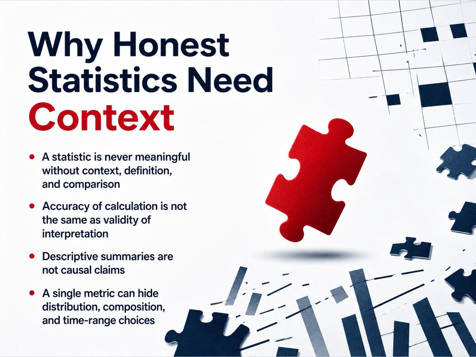
- 02Why Honest Statistics Need ContextNow, before we look at specific ways data can fool us, let's set a ground rule. A statistic is never meaningful without context, definition, and comparison. Getting the arithmetic right is not the same as interpreting the number correctly. A precise calculation can still support a completely wrong conclusion. So when you see a number, ask yourself, what exactly is being measured, and compared to what? Also remember that a summary is not a cause. If two numbers move together, that does not prove one caused the other. And a single metric, like an average or a total, can hide a lot. It can hide how the data is distributed, what it is made of, and what time range was chosen. When any of that context is missing, the statistic can quietly mislead you. In the next slide, we will look at one of the most common examples of this problem, the average itself.
 microsoft.comklipfolio.comhbr.org+21 min
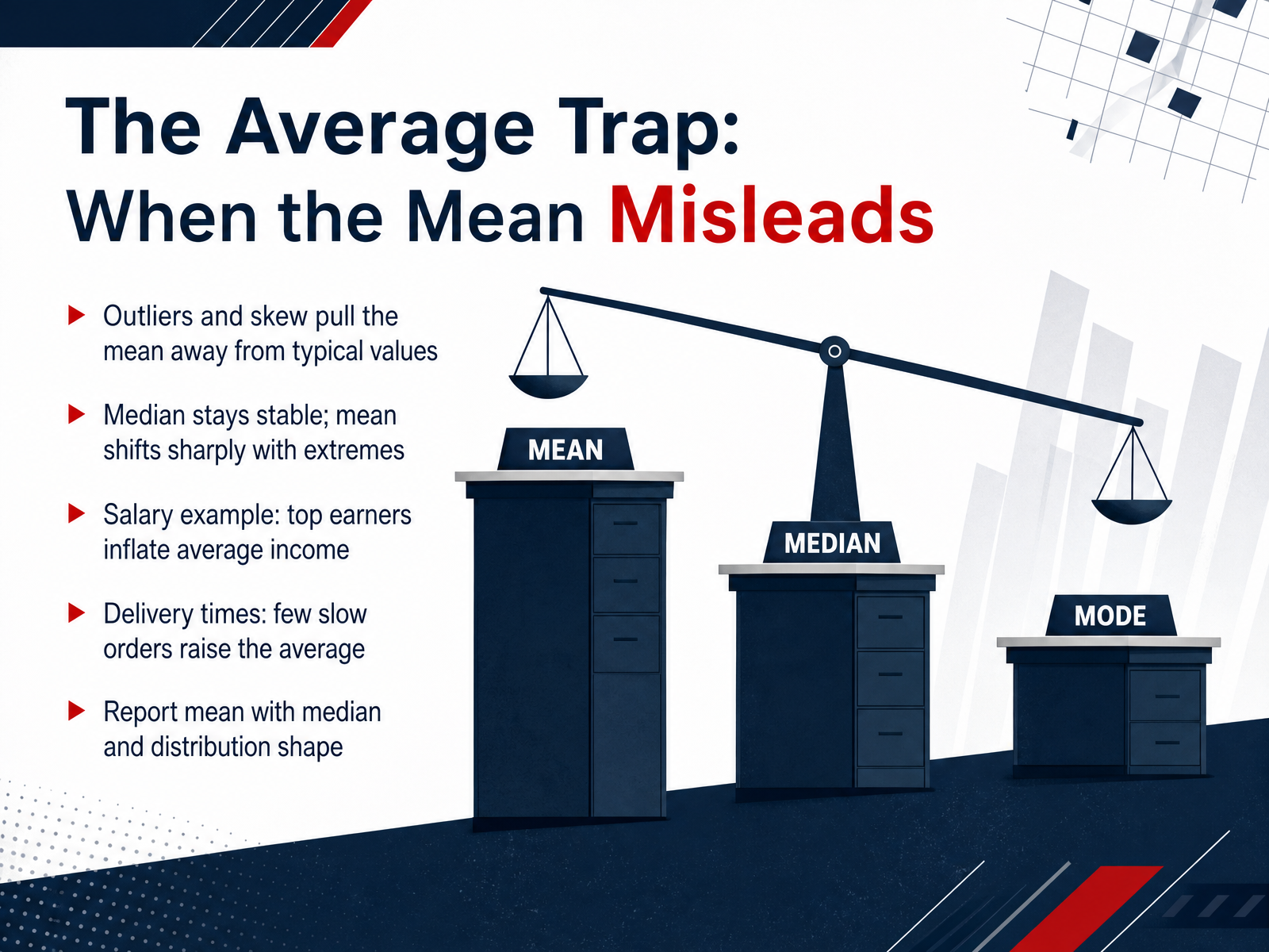
 - 03The Average Trap: When the Mean MisleadsNow let us look at one of the most common traps in everyday statistics, the average trap. The mean, or what most people call the average, seems simple. But it can be pulled away from typical values by a few extreme numbers. Outliers and skew do exactly that. A small number of very high or very low values can shift the mean sharply, while the median stays stable because it only reflects the middle value. Think about salaries. If one person in a small company earns an extremely high amount, the mean salary rises and gives a misleading picture of what most employees earn. The same happens with delivery times. A few very slow orders can make the average look worse than the service most customers actually receive. So when you see a reported mean, do not treat it as the whole story. Ask for the median and check the shape of the distribution. Reporting the mean alongside the median and a view of the spread gives a far more honest picture. Next, we will look at selective reporting and cherry picking, where the choice of what to show can mislead even more than the numbers themselves.
 web.stanford.edustats.mom.gov.sgstats.libretexts.org+21 min
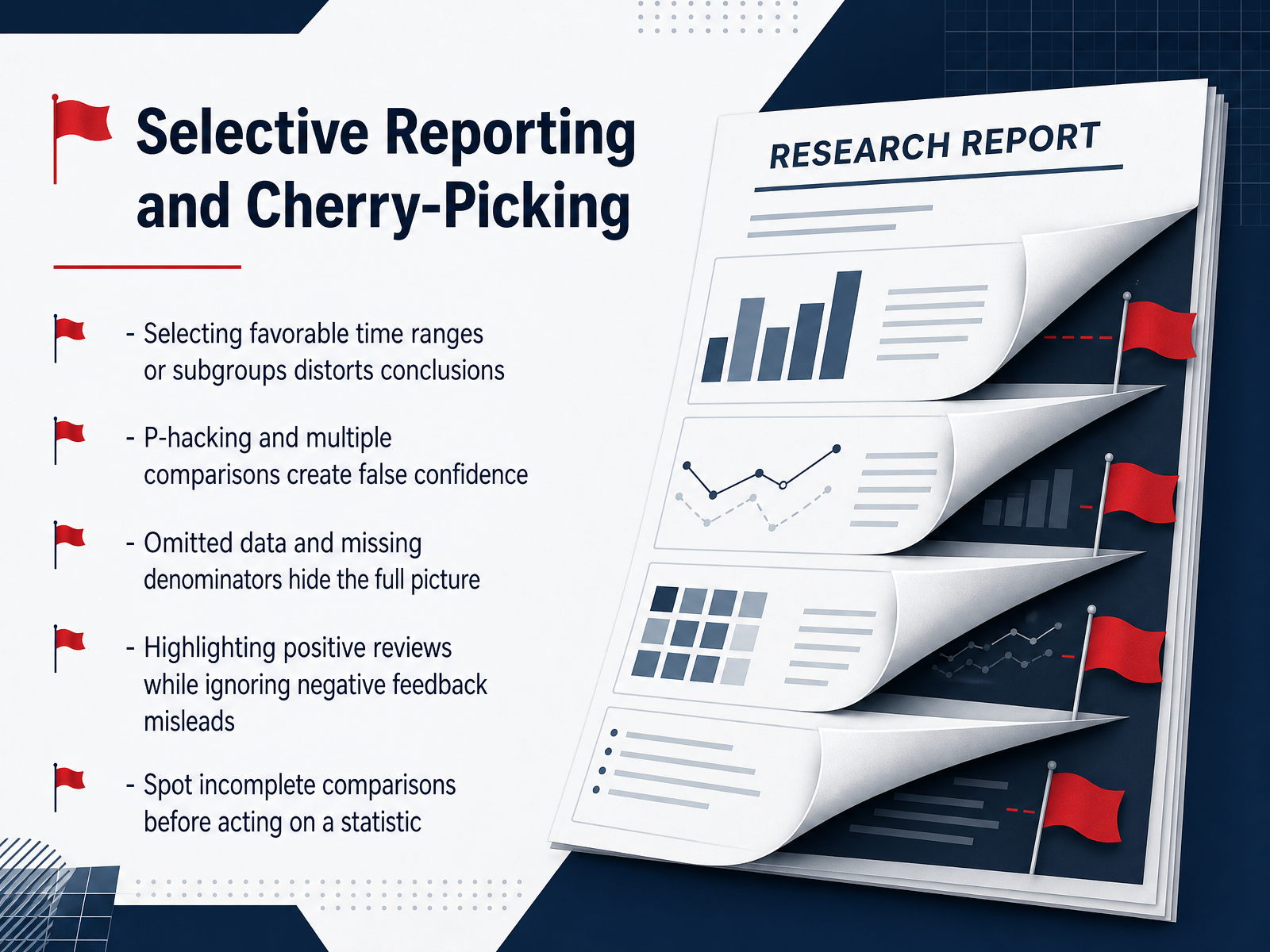
 - 04Selective Reporting and Cherry-PickingNext, let’s look at one of the most common traps: selective reporting, or cherry-picking. This happens when someone chooses specific time ranges or subgroups to make a story look better than the full picture would support. For example, an investor presentation might show revenue only from February to March, when it went up fifteen percent, while quietly leaving out January and February, when it dropped nearly fifteen percent. Both statements use real numbers, but each tells a very different story. A related problem is p-hacking, where analysts run many tests on the same data and report only the few results that appear significant. That creates false confidence, because those findings may not hold up when the whole analysis is considered. In business, you often see this with customer reviews. A marketer might highlight dozens of glowing testimonials while hiding a larger pool of negative feedback, which paints a misleading picture of product quality. Another common issue is a missing denominator. A statement like “eighty percent of rural literacy rates improved” sounds strong, but if only five percent of the county is rural, the real impact affects just four percent of the total population. So before you act on a statistic, ask what was left out. Check the full time range, ask about the subgroup size, and look for the data that isn’t being shown. That habit will protect you from being misled, and it’s exactly the skill we’ll use as we move into charts that distort.
 institutedata.comproformative.commichaelnocito.github.io+22 min
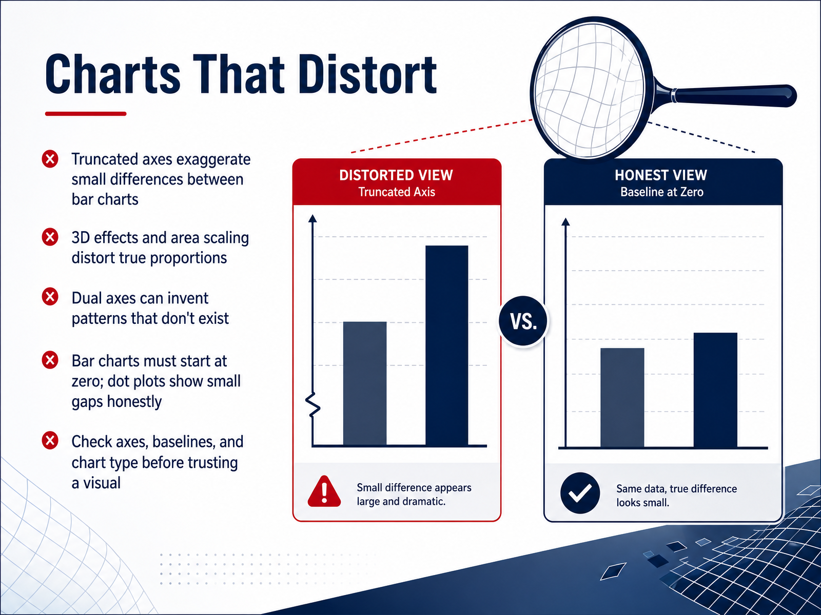
 - 05Charts That DistortNow let's talk about charts that distort. A chart is a visual argument, but its design choices can quietly change the argument. The most common trick is a truncated axis. Imagine two bars showing sales of $1,700 and $1,800. If the axis starts at $1,650, the second bar looks twice as tall, even though the real difference is tiny. Bar charts must start at zero because our eyes compare length. If you need to show small gaps honestly, use a dot plot instead. Three-dimensional effects cause a different problem. A 3D pie slice or a scaled object is judged by area or volume, not just height, so a value three times larger can look nine times larger. Dual axes can also invent patterns. When two lines are forced onto different scales, they can appear to move together even when the underlying data has no relationship. Before you trust a visual, check the axes, the baseline, and the chart type. The same data can tell opposing stories depending on those choices. Next, we will examine a logical trap that goes beyond any single chart: correlation versus causation.
 handsondataviz.orgblog.spreadsheetlife.comtableau.com+21 min
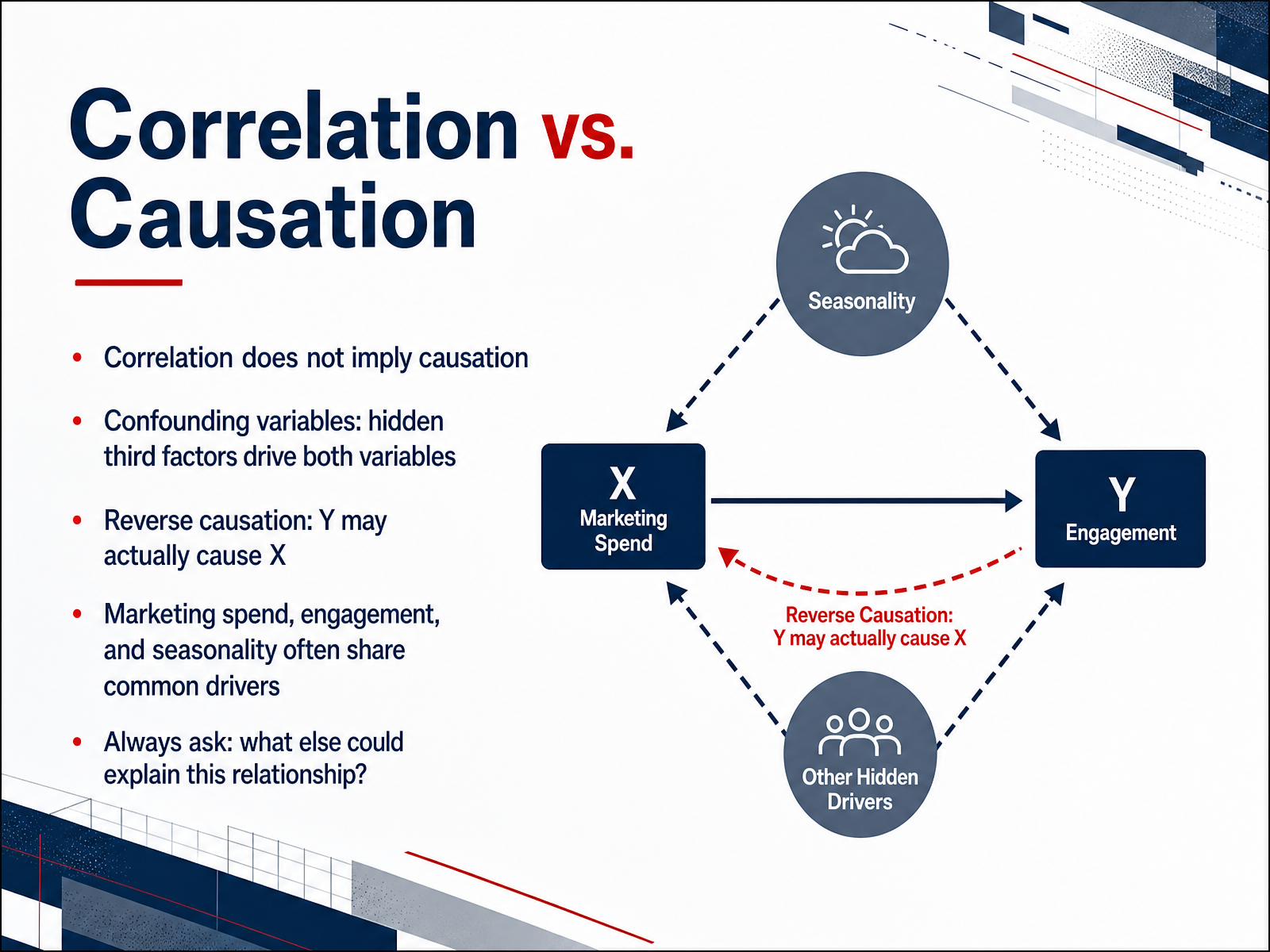
 - 06Correlation vs. CausationNow let's talk about one of the most important rules in data analysis. Correlation does not imply causation. Just because two things move together does not mean one causes the other. Think about ice cream sales and drowning incidents. They both rise in summer. But ice cream does not cause drowning. A third factor, hot weather, drives both. That hidden third factor is called a confounding variable. We also need to consider reverse causation. You may see a relationship and assume X causes Y, but sometimes Y actually causes X. For example, a company increases marketing spend and engagement rises. But maybe engagement was already rising due to seasonality, and that trend prompted more marketing. In your own analysis, always ask, what else could explain this relationship? Is there a hidden driver, a reverse effect, or just coincidence? That one question can save you from building decisions on a false story. Next, we'll look at spurious correlations in business data, where these traps show up in everyday reporting.
 2 min
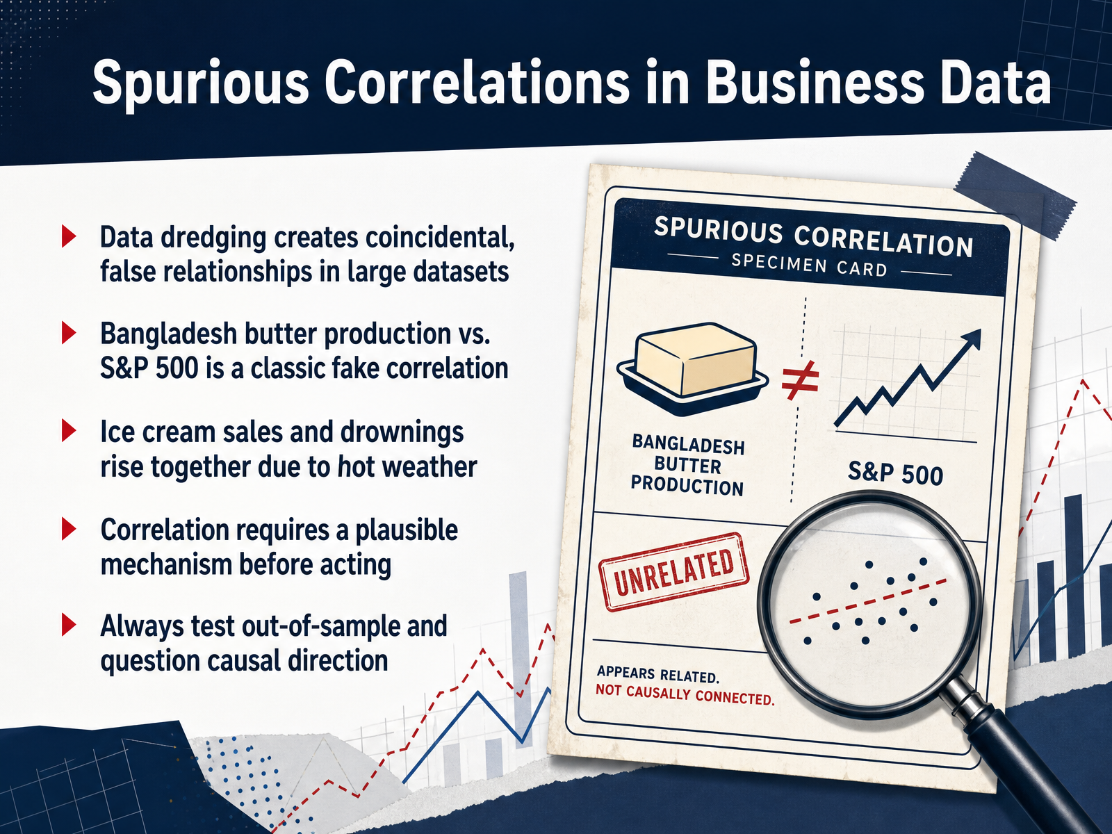
2 min - 07Spurious Correlations in Business DataNow, let's talk about spurious correlations, those relationships that look real but aren't. This happens a lot in business data because when you search across a huge dataset, you will find coincidental matches, just by chance. Analysts call this data dredging. The classic joke example is Bangladesh butter production versus the S&P 500. The correlation looks impressive on a chart, but it's pure coincidence, with no real economic link. A more familiar example is ice cream sales and drowning incidents. Both go up in summer, but ice cream doesn't cause drowning. The hidden factor is hot weather, which drives both. So before you act on a correlation, ask whether there is a plausible mechanism connecting the two variables. If you can't explain how one could cause the other, the pattern is probably just noise. Always test a relationship on new data outside the period where you found it, and consider whether the causal direction might be reversed. Next, we'll look at Simpson's Paradox, where the totals can reverse the truth you see in subgroups.
 2 min
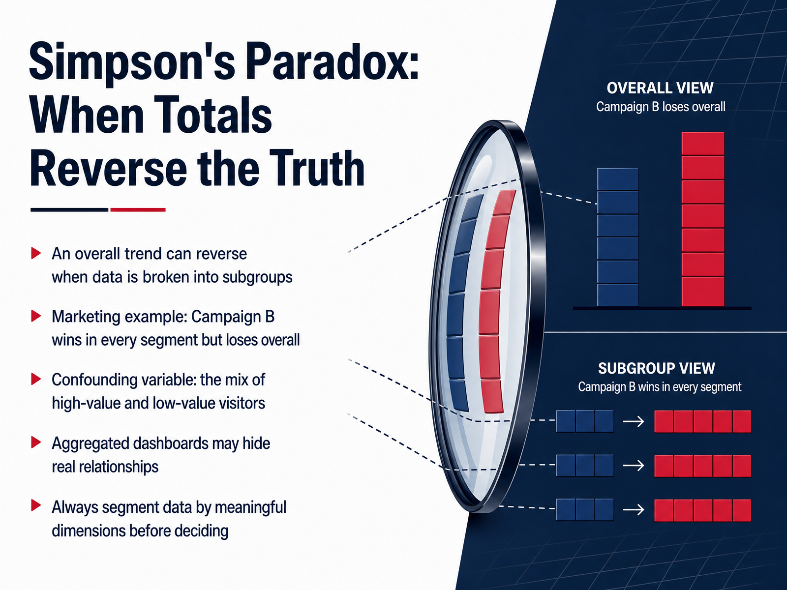
2 min - 08Simpson's Paradox: When Totals Reverse the TruthNow we come to one of the most surprising traps in data analysis, Simpson's paradox, when the totals reverse the truth. Picture this. You run two marketing campaigns, A and B. Campaign B performs better with high-value visitors. It also performs better with low-value visitors. So B wins in every segment. But when you look at the overall conversion rate, Campaign A comes out ahead. How is that possible? The answer lies in a confounding variable, the mix of visitors. Campaign A received mostly high-value visitors, who convert easily. Campaign B received a much larger share of low-value visitors, who are harder to convert. That uneven mix drags down B's overall average, even though B was better in every individual segment. This is why aggregated dashboards can hide real relationships. A single total looks clean and simple, but it may be answering a different question than you think. Before you decide, always segment your data by meaningful dimensions, like visitor type, channel, or region. If the overall trend flips when you segment, you need to investigate before acting. This sets us up for another common pitfall, how sample size and variability can quietly distort what you see.
 2 min
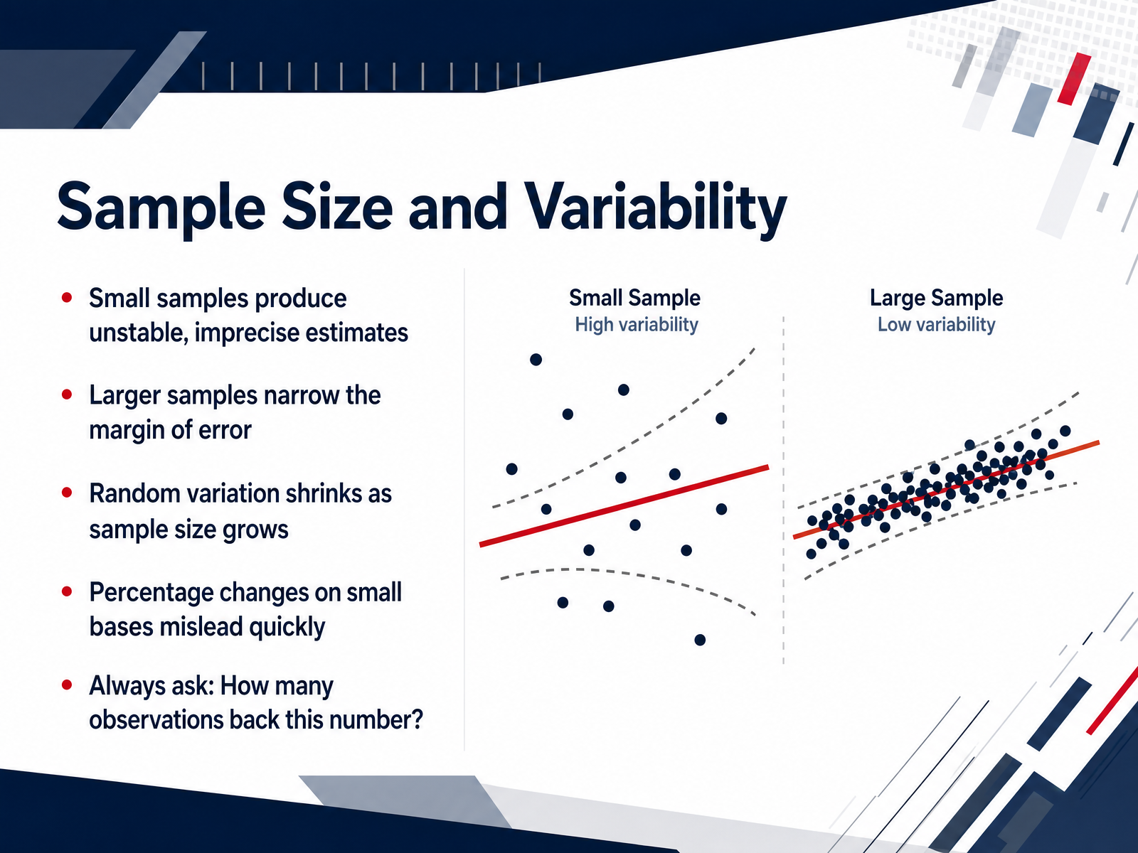
2 min - 09Sample Size and VariabilityNow, let's talk about sample size and why it matters so much. A small sample is like tasting one spoonful of soup to judge the entire pot. It might be too salty, or not salty enough, and you just can't be sure. Small samples give us unstable estimates because random variation can easily throw things off. When we gather more observations, that random noise starts to smooth out, and our estimate becomes more precise. The margin of error shrinks. But watch out for percentage changes on small numbers. If a store says complaints dropped by fifty percent, that sounds impressive. Yet, if they went from two complaints to one, the real change is just one person. So, before you trust any result, ask a simple question: how many observations are actually behind that number? Next, we’ll move to a closely related trap: base rates and missing context.
 1 min
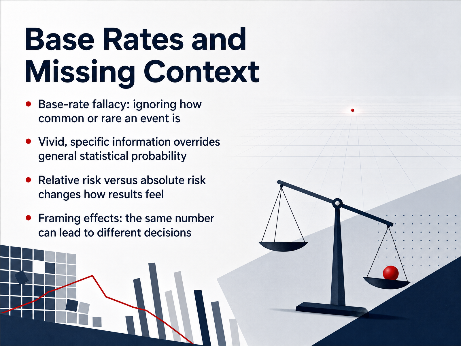
1 min - 10Base Rates and Missing ContextLet’s turn now to a subtler trap: base rates and missing context. The base-rate fallacy happens when we ignore how common something is in the first place. A vivid story or a dramatic test result feels more real than the overall odds. For example, if a rare disease affects only one person in ten thousand, and a screening test is ninety nine percent accurate, most positive results are still false alarms. The specific test result overrides the fact that the disease itself is extremely rare. In business, this often looks like reacting to three complaints without asking whether they came from fifty customers or five thousand. It also appears in the way the same number can be framed. A medication that cuts risk from two percent to one percent can be described as a fifty percent reduction, which sounds huge, even though the absolute change is just one percentage point. Before you act on any number, ask: What is the normal rate? What is the total context? Next, we’ll explore what happens when good metrics go bad.
 2 min
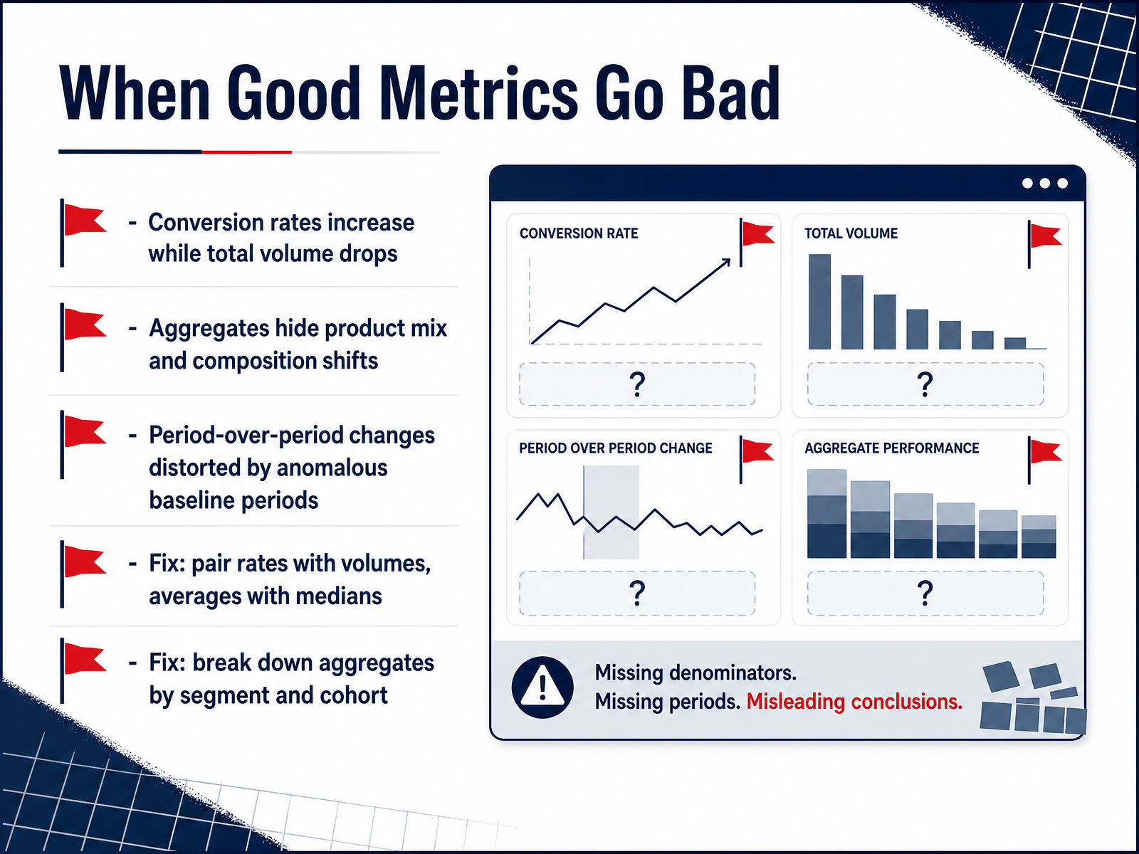
2 min - 11When Good Metrics Go BadNow, let's look at what happens when good metrics go bad. Take conversion rate. It can rise while your total sales volume drops. A smaller, self-selected group converting at a higher rate sounds great, but the actual business is shrinking. The rate is only half the story. Aggregates hide product mix shifts. Your total revenue can look flat while high-margin products quietly decline and low-margin ones fill the gap. That top-line number feels like ground truth, but it is not. Period-over-period changes can also mislead if you compare against an anomalous baseline, like a month with a one-time promotion or a data outage. The fix is to pair rates with volumes, and averages with medians. Always break down aggregates by segment and cohort. If the breakdown looks different from the total, that difference is your real story. Next, we will build on this with how to spot data distortion quickly.
 microsoft.comklipfolio.comhbr.org+21 min
 - 12How to Spot Data Distortion QuicklyLet's walk through a quick checklist you can use to spot data distortion fast. First, ask about the source. Who produced the data, and what are their motives? Second, look at the chart type. Is it the right format for the data being shown? Third, check the axes. Do they start at zero, and are the scales consistent? Fourth, examine the message. Does the interpretation actually match what the data shows? Finally, watch for red flags like unsourced numbers, missing denominators, or cherry-picked time windows. If any of these stand out, pause before you trust the claim. Let's move on to practical checks for analysts and business teams.
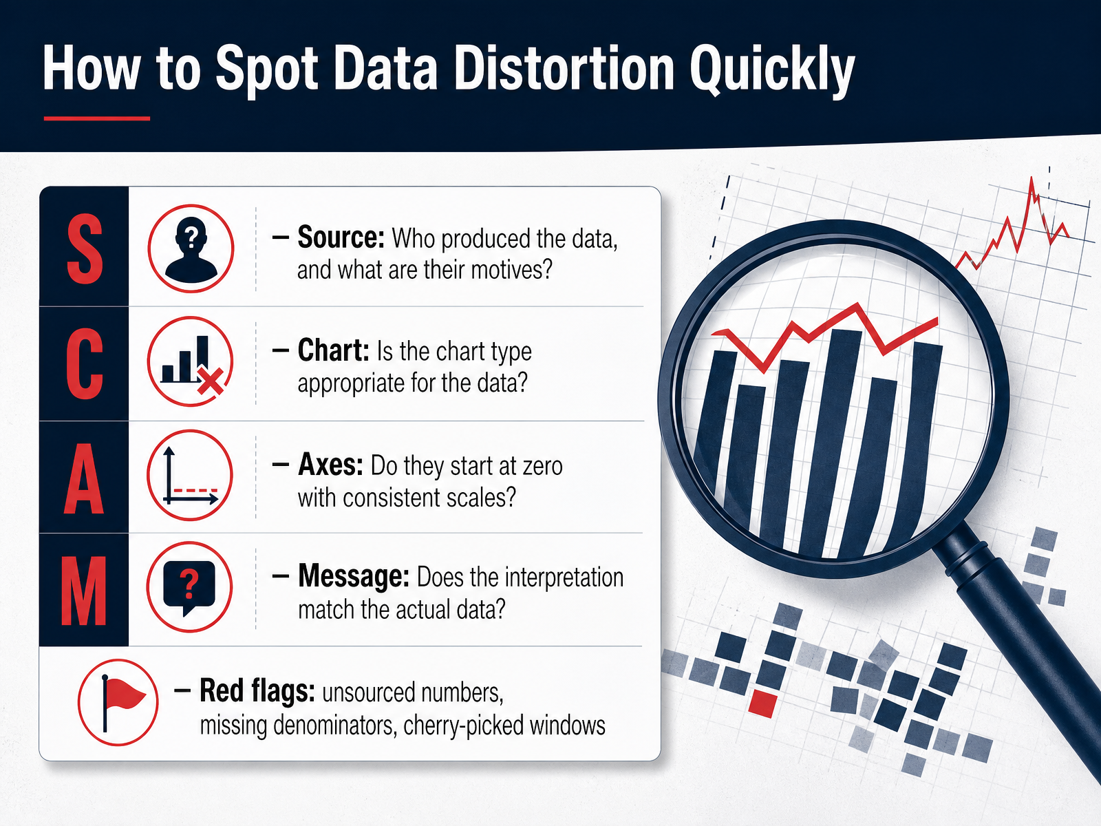 tableau.com1 min
 - 13Practical Checks for Analysts and Business TeamsNow let's turn these ideas into practical habits for your own work. Whenever you see a new statistic, start with three questions. Compared to what? Since when? And says who? These three questions alone will catch a large share of misleading claims. Next, verify the basics. Check the sample size, how people were selected, and where the data came from. If the source is missing, the number should not drive your decision. Then look at any chart closely. Check the axes, where they start, and what comparison was chosen. A quick SCAM check can help here. SCAM stands for Source, Chart, Axes, and Message. Try to run through those four checks in about thirty seconds. Finally, build these checks into your routine. Plot distributions instead of trusting a single average. Ask for denominators when someone gives you a percentage. And always check the baseline before accepting a trend. These habits do not require advanced math. They require a little discipline. And they make a big difference. In the final slide, we will pull together the key takeaways and next steps.
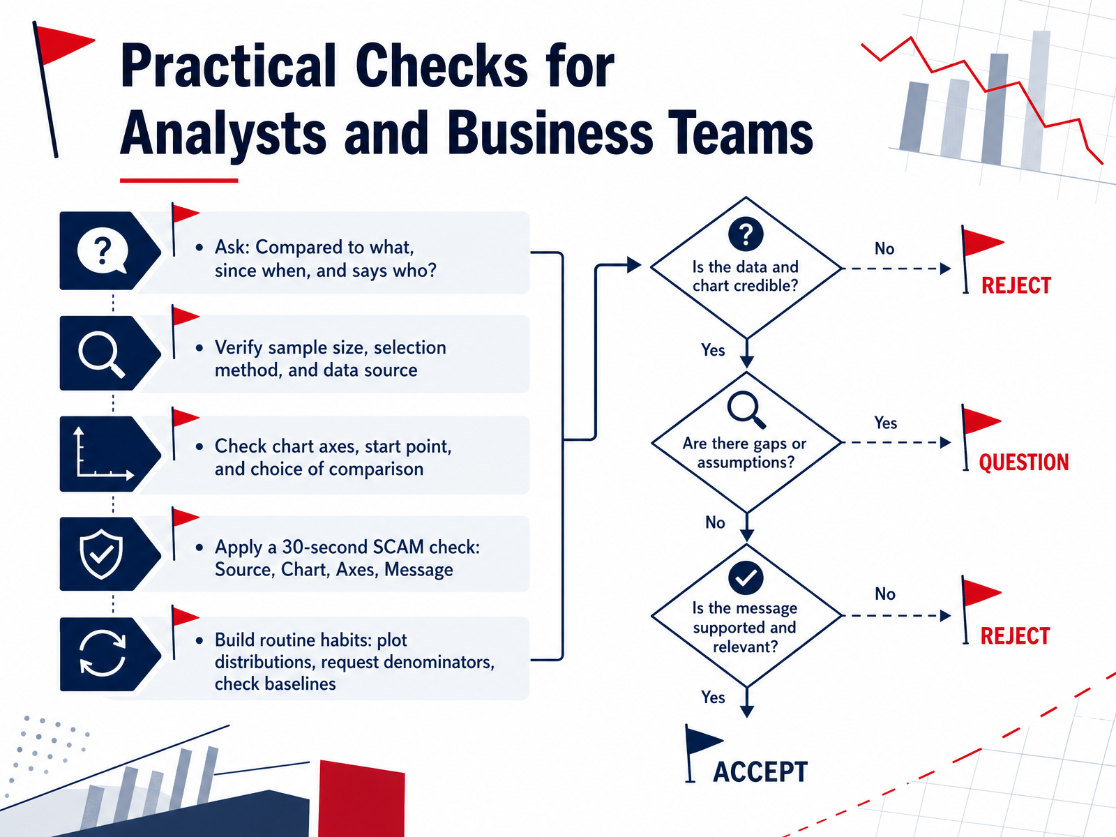 tableau.com1 min
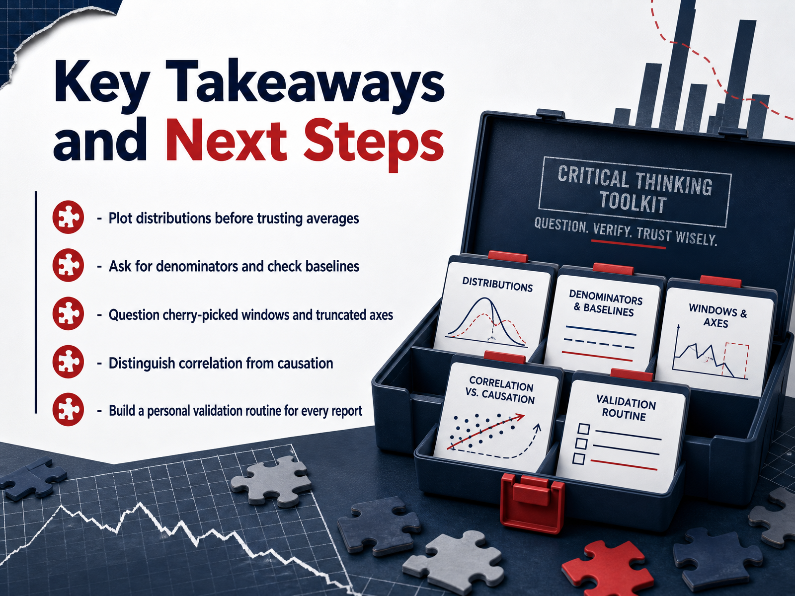
 - 14Key Takeaways and Next StepsLet us bring it together. First, plot your distributions before you trust an average. A mean can hide outliers and skew, so ask what the spread actually looks like. Second, always ask for denominators and check your baselines. A rising rate can hide a shrinking total, so never accept a percentage without the underlying numbers. Third, question cherry picked windows and truncated axes. If a chart starts at an unusual date or a bar axis does not start at zero, ask what was left out and why. Fourth, remember that correlation is not causation. A shared pattern does not prove one thing caused the other. And fifth, build a small validation routine for every report you see. Check the sample size, the time range, the chart scale, and the raw counts behind the ratios. Think of this as a habit, not a formula. You are not expected to redo every analysis. You are expected to pause, ask one sharp question, and decide whether the data earns your trust. Thank you for working through these ideas. The next time a headline or dashboard number feels too tidy, slow down, ask for the denominator, and see what changes.
 microsoft.comklipfolio.comhbr.org+22 min
Take the deck with you
Download this course as a file — free, no sign-up needed.
- PDF handoutEvery slide page, ready to print or share.15 pages · 3.6 MBDownload
- Narrated PowerPointThe deck that presents itself — every slide carries the digital human's narration video.15 pages · 13.3 MBDownload
- PowerPoint slidesThe full deck as a .pptx — open it in PowerPoint, Keynote, or Google Slides.15 pages · 3.6 MBDownload
Free to use in your own training — please keep the PersonWise credit page at the end.
Have your own deck? Turn it into a course
Sources consulted
Web sources consulted while building this course.
- A Dirty Dozen: Twelve Common Metric Interpretation Pitfalls in Online Controlled Experiments - Microsoft Research — microsoft.com
- Misleading Statistics: How To Spot & Get Rid Of Them — klipfolio.com
- 3 Ways Data Dashboards Can Mislead You — hbr.org
- 11 Common Data Analysis Mistakes and How to Troubleshoot | NetSuite — netsuite.com
- Why Your Dashboard Metrics Are Lying to You (And How to Catch It) — plotstack.dev
- Lecture 8: When means mislead — STATS60, Intro to statistics — web.stanford.edu
- Mean Pitfalls — stats.mom.gov.sg
- 2.24: Mean and Median (2 of 2) - Statistics LibreTexts — stats.libretexts.org
- 3.4 – Choosing a Measure of Center – Introduction to Statistics and Statistical Thinking — open.maricopa.edu
- How Do Outliers Affect the Mean? — statology.org
- Cherry-Picking in Data Analytics: Exploring the Meaning of Cherry-Picking in the Context of Data Analytics | Institute of Data — institutedata.com
- Cherry-Picking: The Subtlest Form of Dishonesty | Proformative — proformative.com
- How Charts Mislead: Eight Distortions, Worked on One Real Table — Analyst Prep Kit — michaelnocito.github.io
- Painting with Numbers by Randall Bolten — painting-with-numbers.com
- Data Distortion: What is it? And how is it misleading? – Analyst Answers — analystanswers.com
- How to Lie with Charts | Hands-On Data Visualization — handsondataviz.org
- Five Charts and How to Fix Them – Spreadsheet Life – Blog — blog.spreadsheetlife.com
- How to Spot Misleading Charts, a Checklist — tableau.com
- Chapter 14 Detect Lies and Reduce Bias | Hands-On Data Visualization — handsondataviz.org
- Misleading Graphs: Real Life Examples - Statistics How To — statisticshowto.com