Mastering Python Data Visualization
Begin
14 pages · ~28 min
Mastering Python Data Visualization
Learn to create compelling data visualizations using Python libraries, empowering analysts and developers to transform raw data into insightful charts and graphs.
What you’ll learn
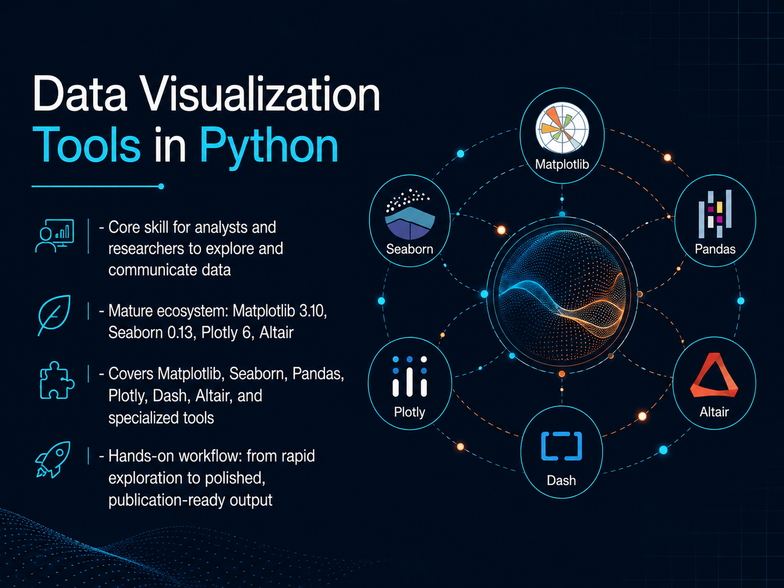
- 01Data Visualization Tools in PythonWelcome. If you can wrangle data with pandas, you're ready to turn it into insight. That's what this course is about: data visualization in Python. It's a core skill for any analyst or researcher because a clear chart answers questions faster than a raw table ever will. We're going to build a practical toolkit using the modern ecosystem. Matplotlib 3.10 remains the foundational layer, and it now ships with colorblind-accessible defaults. Seaborn 0.13 builds on that for high-level statistical plots. And Plotly 6 delivers fully interactive charts with native support for libraries like Polars. We will also touch on Altair for declarative charts and Dash for full analytical dashboards. The real goal here is workflow. You'll learn to use Seaborn for rapid exploration in a notebook, switch to Plotly when your stakeholder needs to hover and zoom, and finish with Matplotlib when you need a publication-ready figure for a paper. These aren't competing tools. They are complementary stages of a single analysis pipeline. By the end, you'll know exactly which library to reach for and why. Now, let's lay the foundation by looking at how to choose the right chart for your data and your question.pythondatabench.comgithub.comtechpulsesite.com+21 min
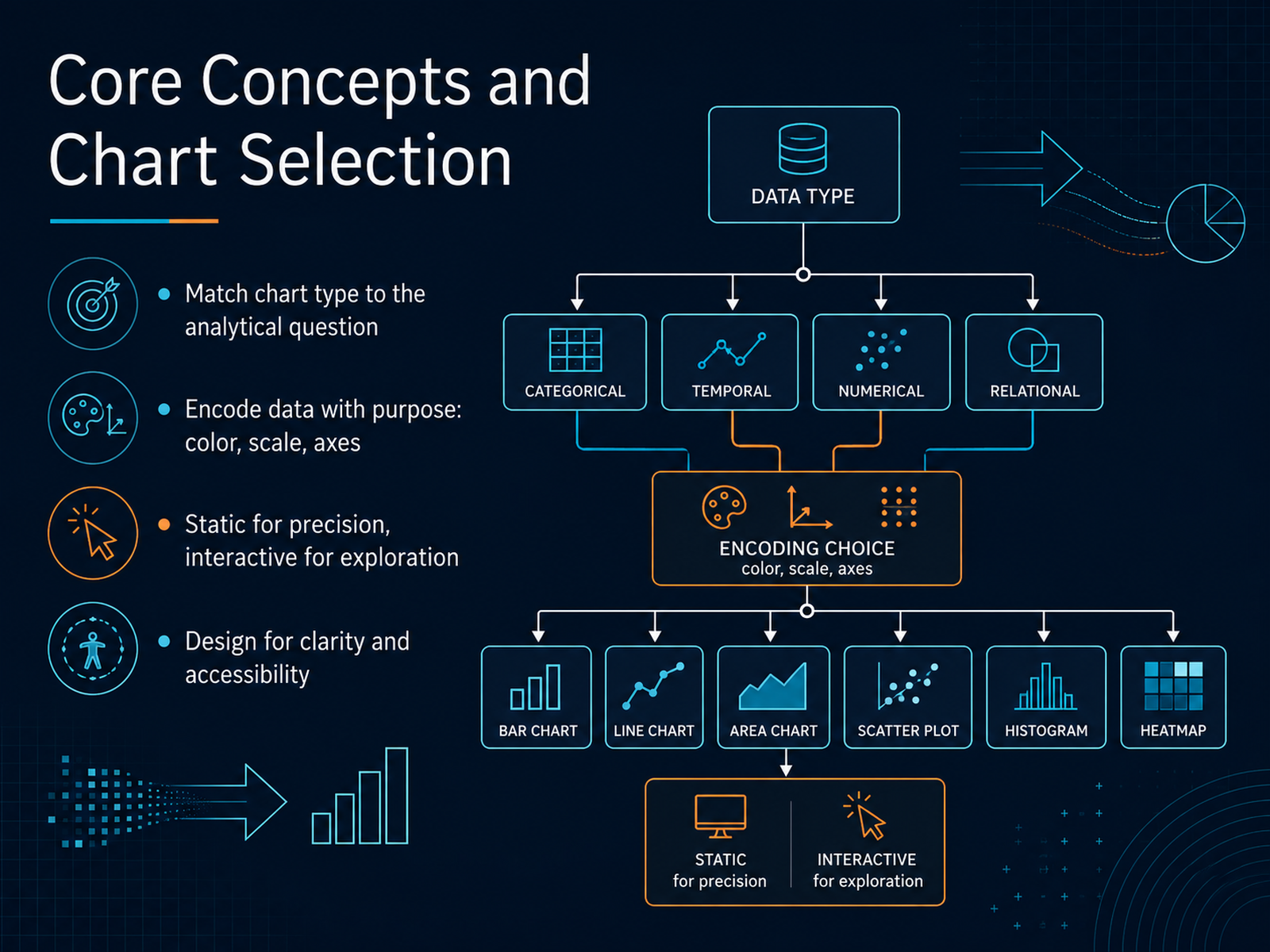
- 02Core Concepts and Chart SelectionLet’s talk about what makes a visualization genuinely useful. Before you write a single line of code, match the chart type to the analytical question you’re answering. Are you comparing categories? A bar chart. Showing a trend over time? A line chart. Revealing a distribution or relationship? A histogram or scatter plot. Encoding data with purpose is equally important. Use color to represent a category, scale to represent magnitude, and don’t overload the visual with unnecessary dimensions. A scatter plot with x, y, and one color encoding is usually enough. Now, consider your output. Static charts, like those from Matplotlib or Seaborn, are precise, fast, and ideal for reports and publications. Interactive charts, like those from Plotly, allow stakeholders to hover, zoom, and explore. Choose static for precision and interactive for exploration. Finally, design for clarity and accessibility. Use clear titles, label your axes with units, and always go for colorblind-safe palettes. A clean chart respects your audience. Keep these principles in check, and now we can jump into the foundation of it all: the Matplotlib library.
 fastero.comkellton.comtechnoscripts.com+21 min
 - 03The Matplotlib FoundationNow let’s get to the foundation of nearly every Python chart you’ll ever make: Matplotlib. Think of a Figure as the entire canvas, and an Axes as one plotting area within that canvas. This object model is the key to Matplotlib’s power. It gives you full control over ticks, labels, legends, and styles, down to the exact pixel. You can create line charts, bar charts, scatter plots, and histograms with just a few lines of code. But here’s why it matters beyond its own charts: Seaborn, and even pandas' built-in plotting, are built on top of Matplotlib. So when you master the Figure and Axes model, you’re really learning the underlying language of all those tools. For publication-quality static figures, Matplotlib is essential. Use the object-oriented approach, like fig, ax equals plt.subplots, to get that precise control. Next, we’ll talk about how to make those figures truly publication-ready.
 pythondatabench.comgithub.comtechpulsesite.com+21 min
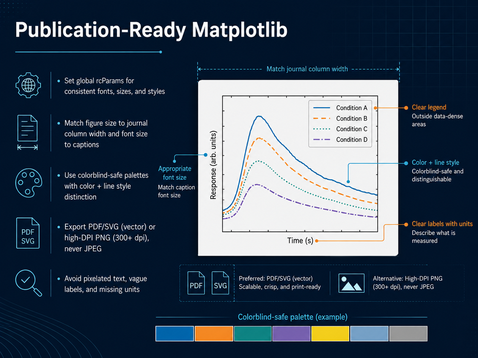
 - 04Publication-Ready MatplotlibNow let's talk about making your Matplotlib figures truly publication-ready. This is where you stop producing plots that look fine on screen and start producing figures that survive peer review. The first step is setting global parameters with rcParams. This gives you consistent fonts, sizes, and styles across every figure in your project. Define these once, and every plot inherits them. Next, match your figure size to the journal's column width. A single column is typically around three and a half inches. Set your font size to match the caption size, usually eight to ten points. This ensures text stays legible at final print size. Color choice matters more than you think. Use colorblind-safe palettes like Okabe-Ito or viridis. But don't rely on color alone. Combine it with different line styles, solid, dashed, or dash-dot. That way, your figure works in grayscale and for readers with color vision deficiency. When exporting, always use vector formats like PDF or SVG. They scale without quality loss. If you must use PNG, export at three hundred DPI or higher. Never, ever use JPEG. The compression artifacts destroy text clarity, and reviewers will notice immediately. Finally, avoid the classic pitfalls. Pixelated text, vague labels with no units, and missing context. A label like "Temperature" is useless. "Temperature in degrees Celsius" is informative. These finishing details are what separate a chart from a decision-ready figure. Next, we'll look at Seaborn for statistical graphics.
 youvenz.github.ioyuhi-sa.github.ioaugmentedscholars.com+21 min
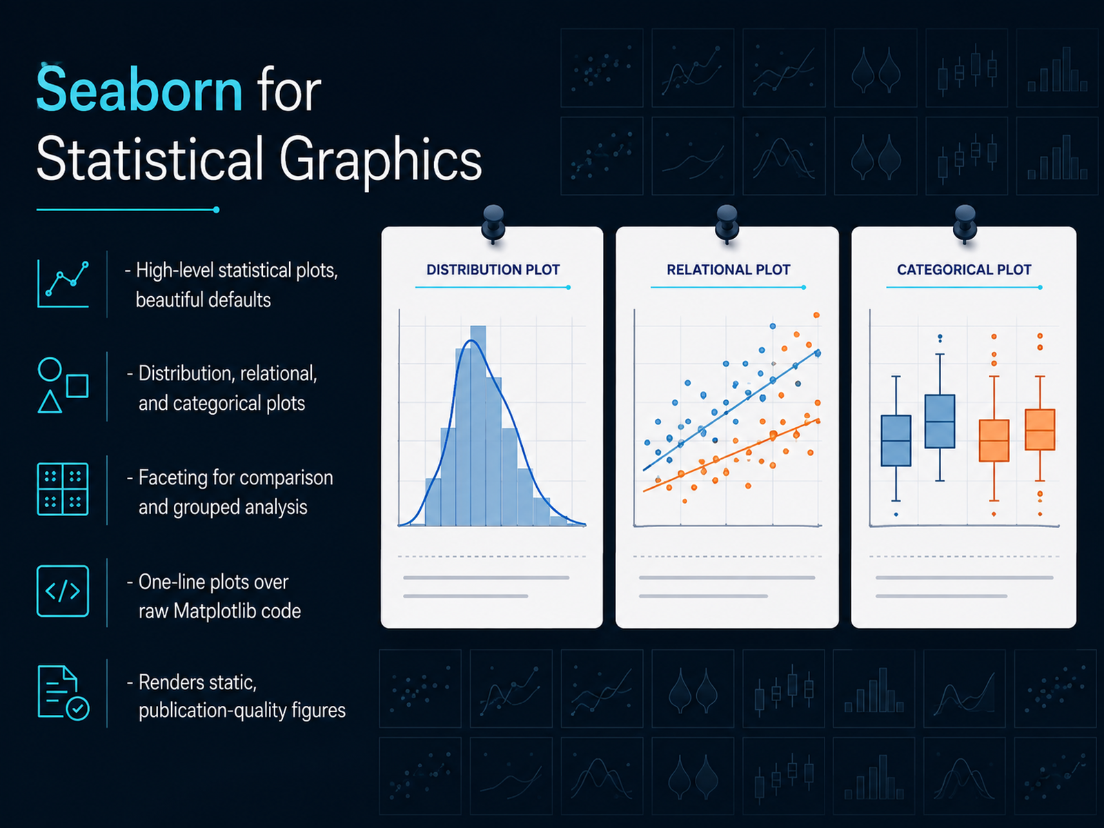
 - 05Seaborn for Statistical GraphicsNow let's talk about Seaborn. If Matplotlib is about control, Seaborn is about insight. It sits on top of Matplotlib and gives you high-level statistical plots with beautiful defaults. The key win is this: what takes fifteen lines of raw Matplotlib code often takes one line in Seaborn. You pass a DataFrame directly. You don't loop over groups or build legends by hand. For distribution plots, relational plots, and categorical plots, Seaborn has it covered. Need a histogram with a kernel density estimate? sns.histplot handles it. Want to see how two variables relate across categories? sns.relplot does the heavy lifting. And when you need to compare groups, faceting makes it trivial. One function call, and you get a grid of small multiples. Seaborn renders static, publication-quality figures. It's your go-to for exploratory data analysis and statistical reporting. The output is ready for a paper or a deck without extra polish. Now, before we wrap up this comparison, there's another tool you already know from pandas that often gets overlooked. Let's look at pandas built-in plotting.
 pythondatabench.comgithub.comtechpulsesite.com+21 min
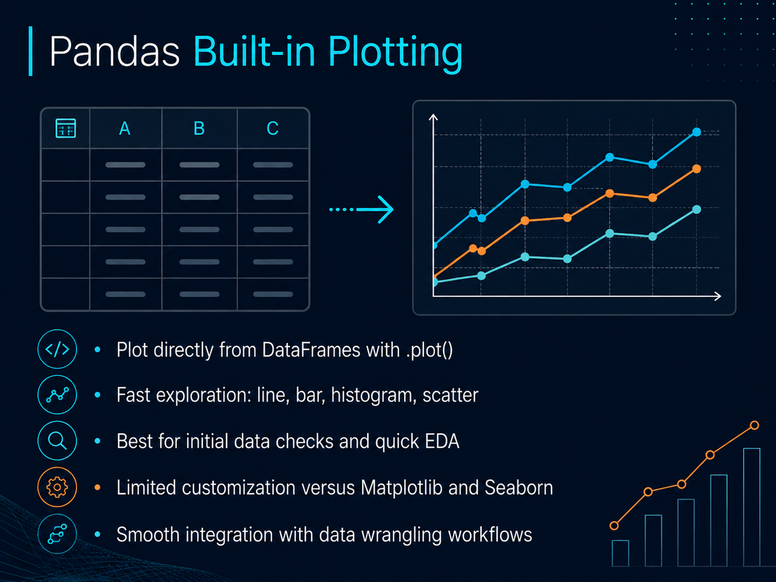
 - 06Pandas Built-in PlottingLet’s look at the quickest way to get a chart on screen: pandas built-in plotting. If you already have a DataFrame, you can call its plot method directly. No extra imports, no figure setup. Just df dot plot. That single call gives you line charts, bar charts, histograms, and scatter plots, all rendered behind the scenes by Matplotlib. This is your first pass at the data. You want to check distributions, spot missing patterns, see if a column trends upward. Speed matters here. You can literally go from a raw CSV to a histogram in two lines of code. And because this lives inside pandas, it fits naturally into your existing data wrangling flow. You filter, group, and plot without breaking your chain of operations. But there is a trade-off. Customization is limited. If you need to tweak axis labels, adjust legend positions, or fine-tune colors, you will quickly hit the wall. That is fine. Use this for initial exploration, then escalate to Seaborn or Matplotlib when you need publication-ready control. Now, when your analysis needs interactivity, that is where Plotly comes in.
 pythondatabench.comgithub.comtechpulsesite.com+21 min
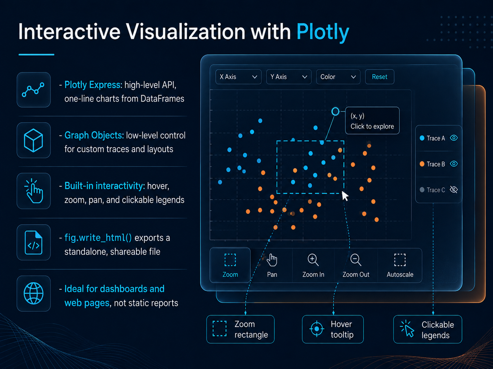
 - 07Interactive Visualization with PlotlyNow let's shift from static charts to something your audience can actually explore: interactive visualization with Plotly. This is the tool you reach for when stakeholders want to hover, zoom, and click through the data themselves. Plotly gives you two ways in. Plotly Express is the high-level API: one function call, like px.line or px.scatter, builds a complete interactive chart straight from a DataFrame. It handles legends, tooltips, and axis labels for you. Then there's Graph Objects, the low-level API. You create a go.Figure, add each trace manually, and control every detail of styling and layout. Start with Express; drop into Graph Objects only when you hit a wall. The real payoff is built-in interactivity: hover to read exact values, drag to zoom, pan around, and click legend entries to hide or show series. That's a game changer in meetings. And when you're ready to share, fig.write_html() exports a single standalone file anyone can open in a browser. No server, no Python on their end. One caveat: for web pages, pass include_plotlyjs="cdn" to keep the file size small. Plotly shines in dashboards and interactive web apps. For static reports or printed PDFs, stick with Matplotlib. Next up, we'll see how Dash takes these interactive figures into full dashboards with live controls.
 technoscripts.comituonline.compyrastra.com+21 min
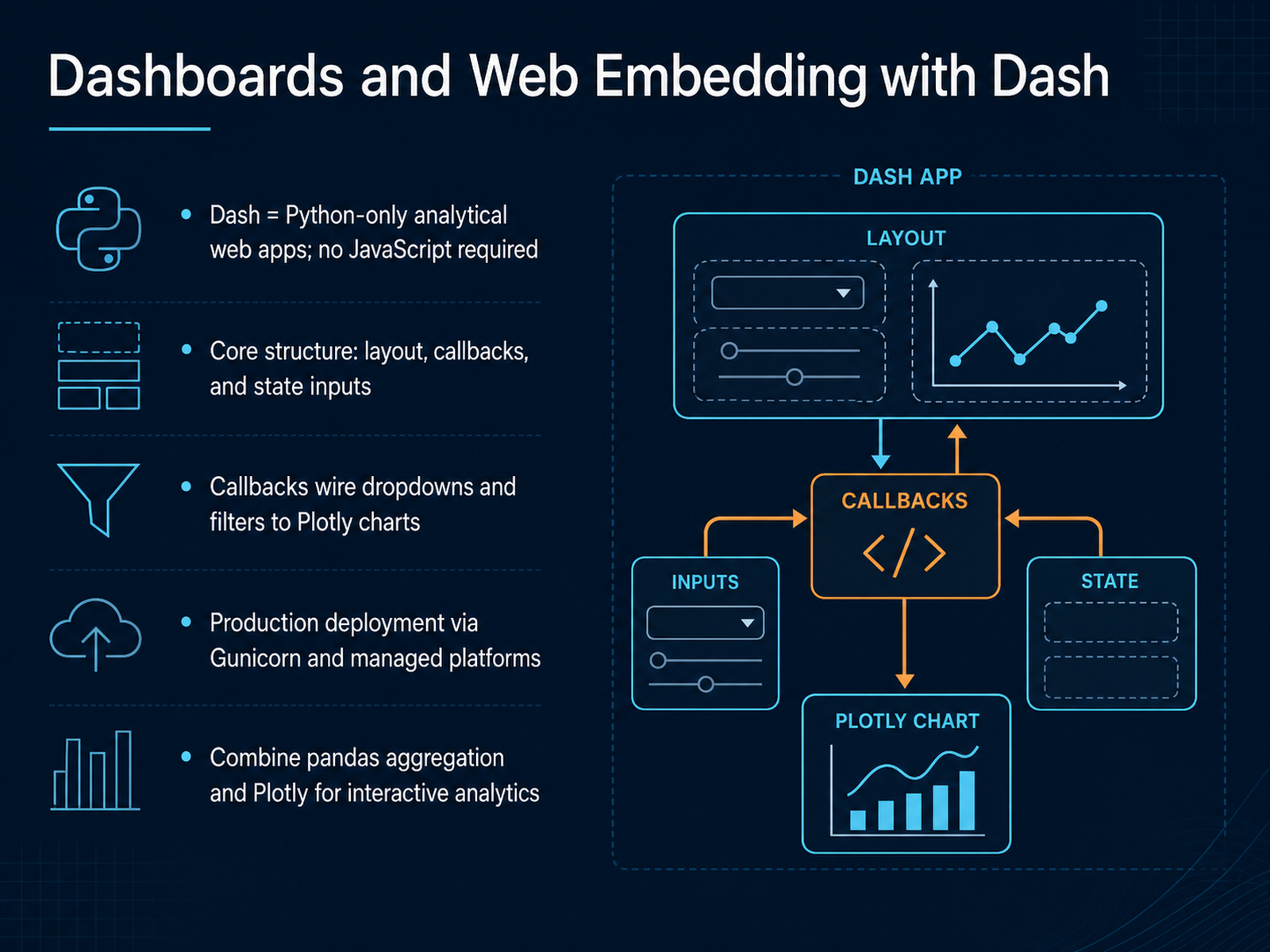
 - 08Dashboards and Web Embedding with DashNow, let’s take interactivity one step further with Dash, Plotly’s framework for analytical web apps. You can build a full dashboard with zero JavaScript. The core structure has three parts: layout, callbacks, and state. The layout defines what users see, callbacks wire dropdowns and filters to your Plotly charts, and state reads values without triggering unnecessary updates. Here’s the pattern you’ll use most: a user picks a region in a dropdown, the callback runs a pandas groupby, and returns a brand-new figure. That’s it. You get drill-downs and live updates without leaving Python. It’s the same data pipeline you already know, just wrapped in an app. When you’re ready to share it, deploy with Gunicorn or a managed platform, and your dashboard goes live for your whole team. The key takeaway: Dash turns your pandas and Plotly workflow into a decision-ready tool. Now, let’s look at Altair and declarative visualization.
 technoscripts.comituonline.compyrastra.com+22 min
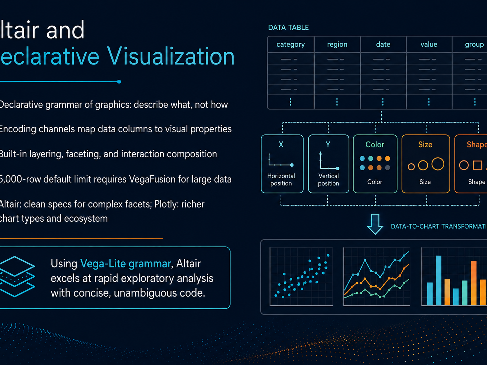
 - 09Altair and Declarative VisualizationNow let's shift to Altair, which takes a fundamentally different approach. Altair is built on the Vega-Lite grammar, so instead of telling Python how to draw each element, you describe what your chart should show, and Altair figures out the rendering. The core idea is encoding channels. You map data columns directly to visual properties like x, y, color, or size. This makes your code concise and extremely unambiguous. Need a faceted chart? Altair's composition operators handle layering and faceting natively, which makes small multiples trivially easy to build. One honest caveat: by default, Altair caps charts at five thousand rows. For anything larger, you'll need to enable the VegaFusion data transformer to push that limit comfortably past one hundred thousand. So how does it compare to what you've seen so far? Altair gives you cleaner specs for complex facets and rapid iteration in a notebook. Plotly, on the other hand, offers a richer variety of chart types and a much larger ecosystem. If you think in terms of grammar of graphics, Altair will feel incredibly natural and efficient. Use it for exploratory analysis where iterating quickly on chart type is more valuable than access to exotic chart types. Next, we'll look at specialized tools built for niche needs.
 geeksforgeeks.orgfastero.comkellton.com+21 min
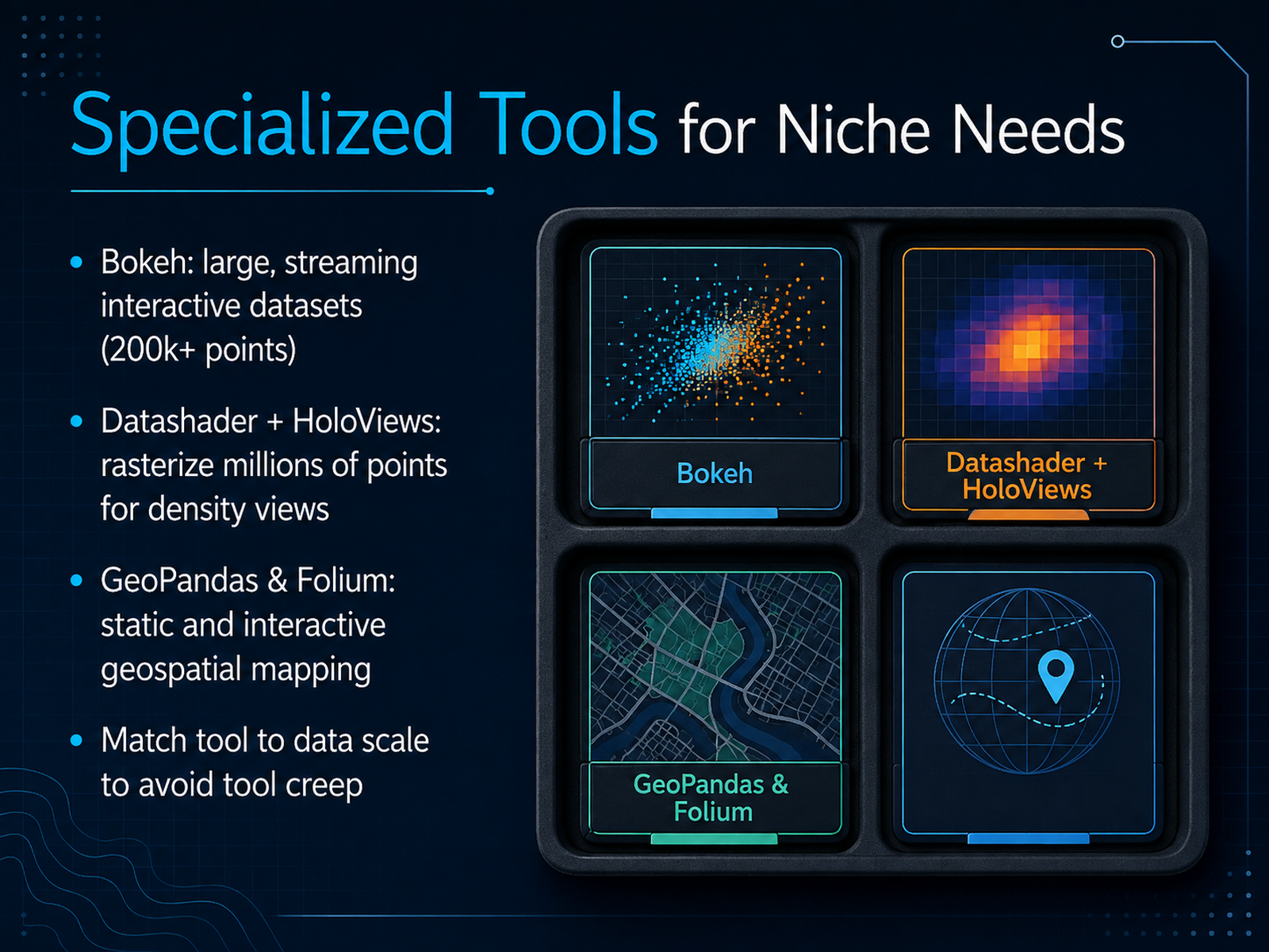
 - 10Specialized Tools for Niche NeedsNow let's step beyond the everyday tools and look at some specialized options for niche needs. When your dataset grows to two hundred thousand points or more, and you need interactivity, Bokeh is your best bet. It renders to HTML canvas and handles streaming data gracefully, making it ideal for real-time dashboards. But if you're dealing with millions of points, even Bokeh will struggle. That's where Datashader comes in. It rasterizes your data into a fixed-size image, aggregating points per pixel to reveal true density patterns. Pair it with HoloViews for a clean, high-level interface. For geospatial data, GeoPandas extends your DataFrame to handle points, lines, and polygons, giving you static maps with Matplotlib. Folium brings Leaflet.js into Python for interactive, web-ready maps you can embed in notebooks. The key here is matching the tool to your data scale and interactivity needs. Don't reach for a heavy interactive library when a static rasterized view will answer the question faster. And don't force a tool meant for a hundred points onto a million-row dataset. Know your scale, know your audience, and pick accordingly. Up next, we'll turn these choices into a practical workflow and style guidelines. Let's continue.
 fastero.comkellton.comtechnoscripts.com+22 min
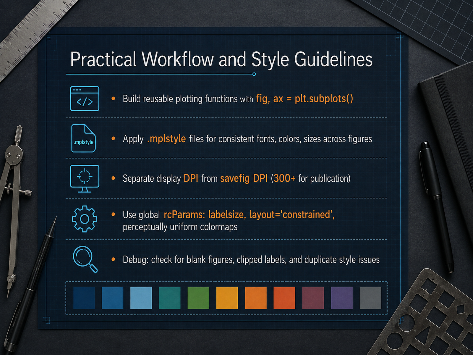
 - 11Practical Workflow and Style GuidelinesLet's shift from library choice to something just as critical: your actual workflow. The goal here is simple. You want every figure you produce to be decision-ready with minimal rework. So, first rule: build reusable plotting functions. Don't copy-paste code. Wrap your logic in a function that returns the figure and axes objects using the standard pattern, fig, ax equals plt dot subplots. This gives you precise control and makes multi-panel figures trivial later. Second, enforce consistency automatically with a style file. An mplstyle file sets your fonts, colors, and line widths in one place. Apply it at the top of your script with plt dot style dot use, and every chart in your project will look like it belongs to the same family. Next, separate your display resolution from your export resolution. What looks sharp on screen is often blurry in print. Set your figure dpi for the notebook, but always define a higher dpi, like three hundred or more, in your savefig call for reports. Configure global parameters in rcParams. Set sensible label sizes, enable constrained layout to prevent clipping, and switch to perceptually uniform colormaps. Viridis is your default. Finally, when something looks wrong, debug systematically. A blank figure usually means you called savefig after show. Clipped labels? Check your layout and bbox inches setting. Duplicate styles? You likely applied multiple style sheets that are overriding each other. Master this routine and your output will be publication-ready every time. Up next, we will cover the final step in that routine: exporting and sharing your visual outputs.
 youvenz.github.ioyuhi-sa.github.ioaugmentedscholars.com+21 min
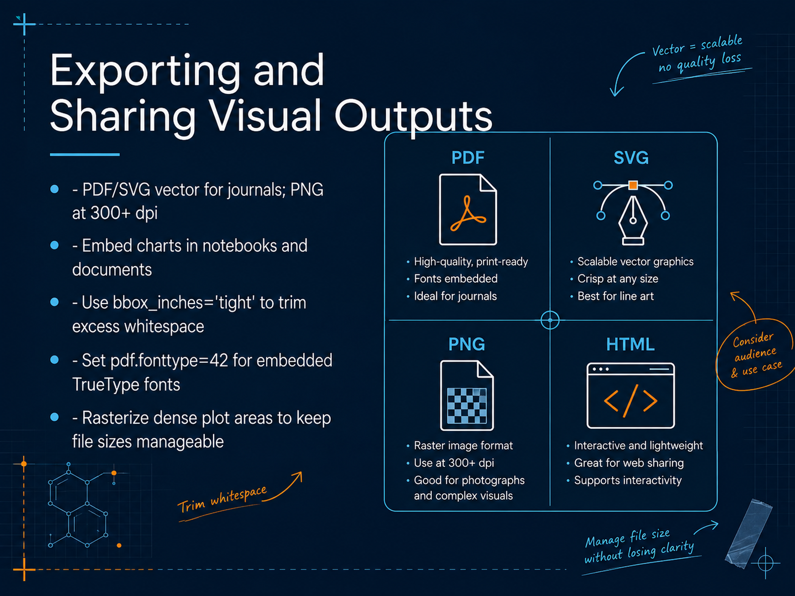
 - 12Exporting and Sharing Visual OutputsLet's talk about getting your visual output out of the notebook and into the world. The format you choose depends entirely on where that figure is going. For journals or any print medium, export as a vector file like PDF or SVG; these scale without losing quality. Use PNG only when you must, and push the resolution to at least 300 dots per inch. One simple habit will save you from ugly margins: always set bbox_inches to tight when you call savefig. That trims the excess whitespace automatically. If you're sending a PDF to a publisher, set pdf dot fonttype to 42 in your rcParams. This embeds TrueType fonts, preventing those silent glyph substitutions that ruin a figure's typography. Now, here's a real-world tip for dense scatter plots with tens of thousands of markers. If you save that as a pure vector file, the file size balloons and editors will hate you. The fix is selective rasterization. Mark the dense collection with rasterized equals True. That area becomes a high-resolution bitmap while your text and axes stay crisp and vector. This gives you the best of both worlds. Your chart is clear, your file is manageable, and your output meets the standard. Up next, we'll look at automating these reporting workflows with Python.
 youvenz.github.ioyuhi-sa.github.ioaugmentedscholars.com+22 min
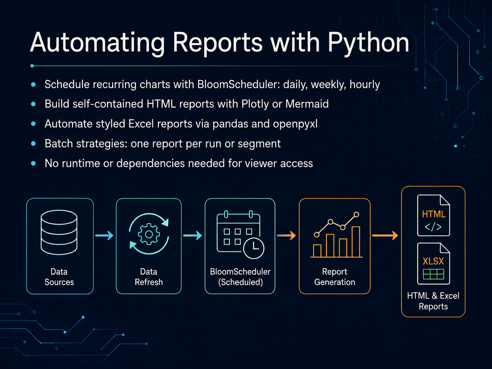
 - 13Automating Reports with PythonNow let's talk about moving from one-off charts to a fully automated reporting pipeline. The first step is scheduling. Tools like databloom include a scheduler that can fire reports daily, weekly, or even hourly. You define a configuration once, point it at your data source, and let the loop run in the background. That frees you from manually refreshing dashboards every morning. Next, think about the delivery format. If your stakeholders need to view results without installing anything, generate self-contained HTML reports. Libraries like report-creator or tessera-report let you embed Plotly charts and Mermaid diagrams into a single file. That file needs no runtime and no dependencies on the viewer's machine, which is a huge win for cross-team sharing. If your audience lives in Excel, automate styled workbooks instead. You can pair pandas with openpyxl to build multi-sheet reports with native charts, formula tables, and professional theming. Databloom offers eighteen themes and nine chart types out of the box, so you don't have to hand-tune every cell. For batch work, decide on your strategy: either generate one comprehensive report per run, or segment your data and emit one report per segment, such as per region or per experiment. That loop is trivial with a deck-based tool. The key takeaway is this: once your charts are correct, the next step is making them repeatable. Schedule them, package them, and let your code deliver the insights. Now, let's look at how to choose the right tool for your next chart.
 2 min
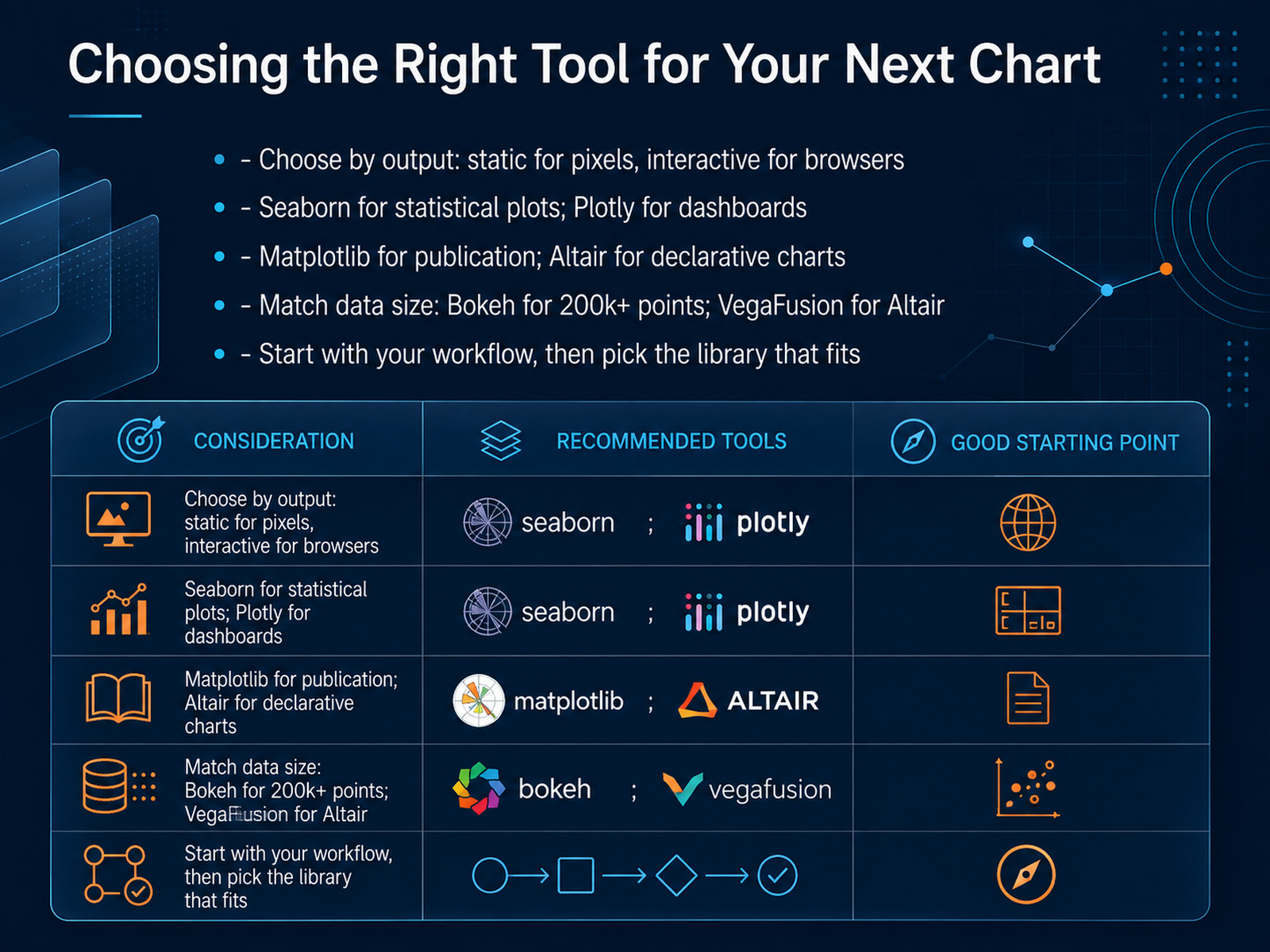
2 min - 14Choosing the Right Tool for Your Next ChartSo, let’s pull everything together. You’ve now seen the core libraries, their strengths, and their quirks. Choosing the right tool isn’t about picking a winner. It’s about matching the tool to the job. Start with your output. Need a static image for a paper or report? Matplotlib gives you precision. For statistical exploration, Seaborn does the heavy lifting with beautiful defaults. Now, if your audience needs to hover, zoom, or filter, you’re in interactive territory. Plotly is your dashboard workhorse. And if you think in terms of data encodings, Altair’s declarative style is incredibly clean. But watch your data size. For over two hundred thousand points with interactivity, Bokeh handles it gracefully. In the end, your workflow decides. Many analysts use Seaborn for quick exploration, then switch to Plotly for the final dashboard. That’s normal. Different stages of analysis call for different engines. So, don’t feel pressured to master all of them today. Pick the one that solves your next chart. Build from there. You now have the map. Go make some great visuals. Thanks for joining, and happy plotting.
 fastero.comkellton.comtechnoscripts.com+22 min
Take the deck with you
Download this course as a file — free, no sign-up needed.
- PDF handoutEvery slide page, ready to print or share.15 pages · 3.3 MBDownload
- Narrated PowerPointThe deck that presents itself — every slide carries the digital human's narration video.15 pages · 16.0 MBDownload
- PowerPoint slidesThe full deck as a .pptx — open it in PowerPoint, Keynote, or Google Slides.15 pages · 3.3 MBDownload
Free to use in your own training — please keep the PersonWise credit page at the end.
Have your own deck? Turn it into a course
Sources consulted
Web sources consulted while building this course.
- Python Viz 2026: Matplotlib 3.10, Seabo… | Python Data Bench — pythondatabench.com
- venkatviswa/python-ecosystem-map-2026 — github.com
- Python Data Visualization 2026: Matplotlib, Seaborn, Plotly and Streamlit – TechPulse — techpulsesite.com
- Data Visualization in Python: The Complete Guide (2026) - Review Publically — reviewpublically.com
- The Complete Guide to Python Data Visualization Libraries | by Wajdi Ben Saad | Medium — medium.com
- Best Python Visualization Libraries in 2026: Which One for Your Chart? — fastero.com
- 6 Best Python Data Visualization Libraries in 2026 — kellton.com
- Python Visualization: 3 Essential Libraries Compared — technoscripts.com
- Top 10 Python Data Visualization Libraries in 2026 — reflex.dev
- Make Matplotlib Figures Publication Quality | Rachid Youven Zeghlache — youvenz.github.io
- Matplotlib Practical Tips: Publication-Quality Figures in Python (plt.rcParams, savefig, colormap, subplots, tight_layout) | tomato blog — yuhi-sa.github.io
- Matplotlib — Publication-Quality Figures in Python | The Augmented Scholar — augmentedscholars.com
- Six Matplotlib Changes That Improve Your Figures for Reporting and Publication | by Andy McDonald | Data Science Collective | May, 2026 | Medium — medium.com
- Chapter 27: Statistical and Scientific Visualization — Publ... | Data Viz with Python — datafield.dev
- Python Plotly: Interactive Charts, Practical 2026 Guide — technoscripts.com
- Building Interactive Data Dashboards With Python Dash Framework – ITU Online IT Training — ituonline.com
- Build Interactive Dashboards with Plotly Dash: A Complete Guide — pyrastra.com
- Creating Interactive Data Visualizations with Python and Plotly Dash — johal.in — johal.in
- Python Dashboard: The Complete 2026 Guide (Streamlit, Dash, Gradio) — usedatabrain.com
- Plotly Express vs. Altair/Vega-Lite for Interactive Plots — geeksforgeeks.org