Begin
14 pages · ~28 min
Graphic Design Core Skills and Practice
This training builds core graphic design skills for aspiring and practicing designers, covering essential principles and hands-on practice to create effective visual work.
A digital instructor presents all 14 pages. Hold “Ask” at any point and ask out loud — the answer comes from this course. No sign-up needed.
What you’ll learn
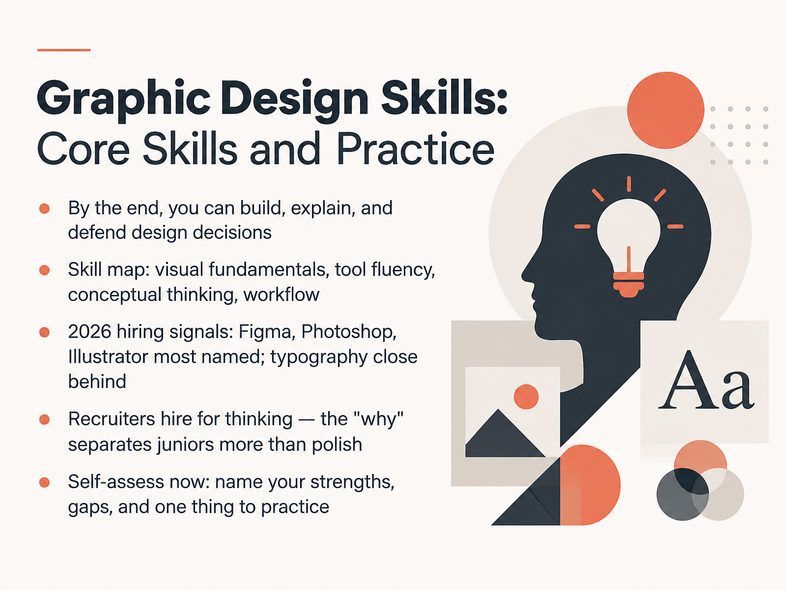
- 01Graphic Design Skills: Core Skills and PracticeWelcome. I'm glad you're here. This course is about the core skills that get early-career graphic designers hired, and the practice that makes those skills visible in your portfolio. By the end, you'll be able to build work, explain your decisions, and defend them in an interview. We'll map four areas: visual fundamentals, tool fluency, conceptual thinking, and workflow. Here's what hiring data shows for 2026. Figma, Photoshop, and Illustrator are the most named tools in job postings, with typography close behind. But recruiters hire for thinking. The why behind your choices separates juniors more than polish does. So before we move on, do one honest self-assessment. Name two strengths, two gaps, and one thing you'll practice this week. Write them down. We'll return to them later. Next, let's look at what junior designers actually do.roberthalf.comresources.rework.comcreativeboom.com+21 min
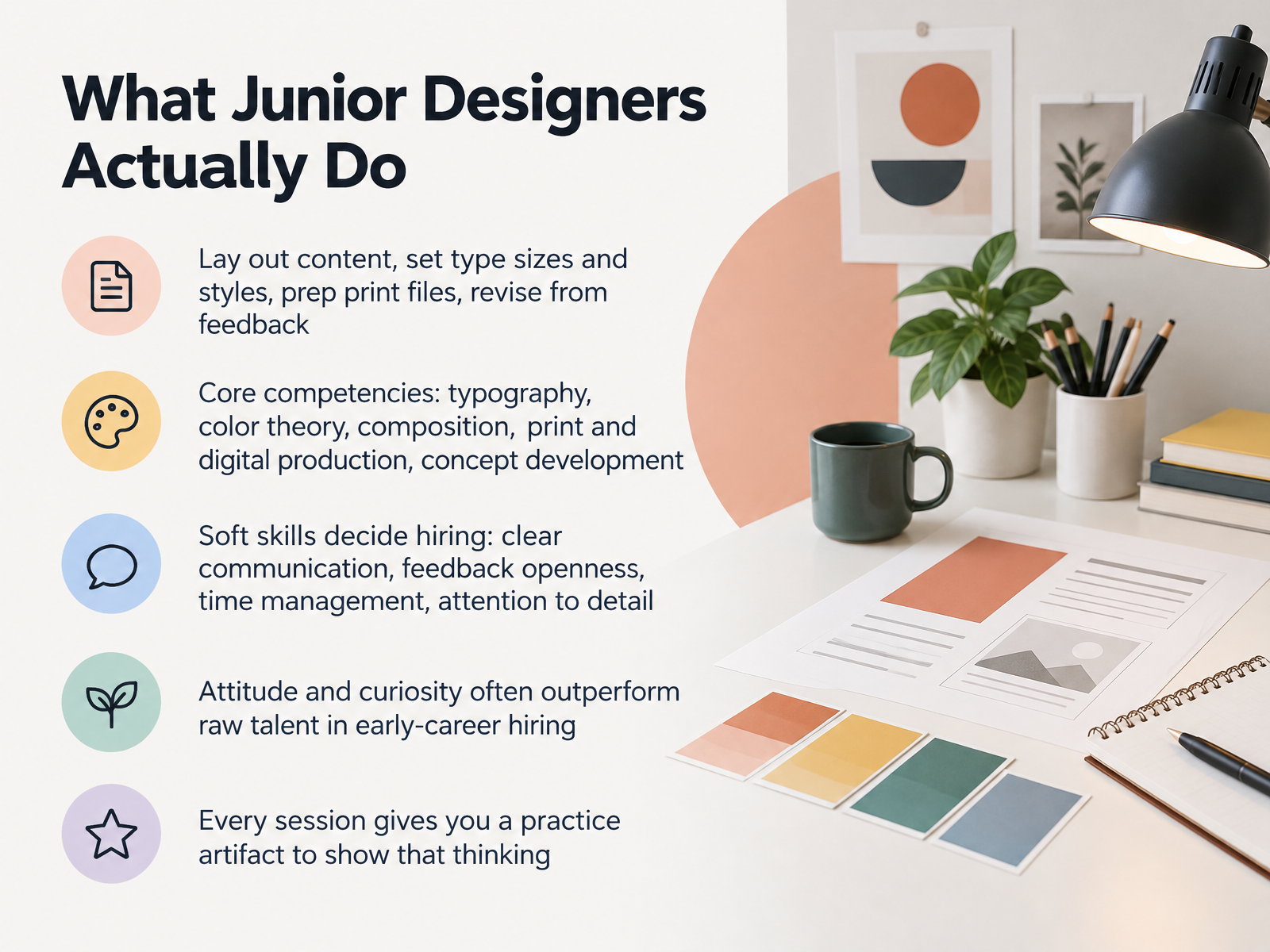
- 02What Junior Designers Actually DoSo here is what the job actually looks like day to day. A lot of it is craft: laying out content, setting type sizes and styles, prepping print files correctly, and revising from feedback. Your core competencies are typography, color theory, composition, print and digital production, and concept development. Build them in Photoshop, Illustrator, InDesign, and Figma. But soft skills decide hiring. Clear communication. Openness to feedback. Time management. Attention to detail. Recruiters say attitude and curiosity often outperform raw talent early on. Common worry: my portfolio is thin. Fine. Every session here gives you a practice artifact, a small case study that shows your thinking. Save each one. Next, we look at the visual fundamentals behind all of it: elements and principles.
 roberthalf.comresources.rework.comcreativeboom.com+21 min
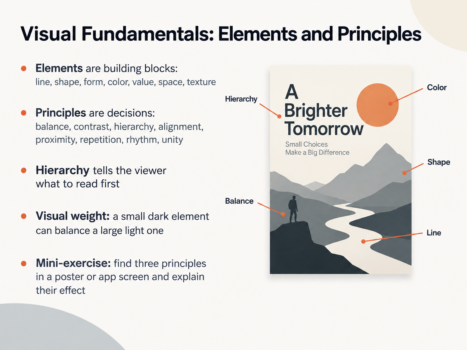
- 03Visual Fundamentals: Elements and PrinciplesNow let's break down the visual fundamentals. Elements are your building blocks: line, shape, form, color, value, space, and texture. Principles are your decisions: balance, contrast, hierarchy, alignment, proximity, repetition, rhythm, and unity. Think of elements as the vocabulary, and principles as the grammar. Hierarchy is the one to master first, because it tells the viewer what to read first. Then consider visual weight. A small, dark element can balance a large, light one. Try this mini-exercise. Find a poster or an app screen, spot three principles at work, and explain their effect out loud. That habit builds your eye and gives you portfolio-ready language. Next, we'll move into Color Systems and Accessibility Contrast.
 guides.lib.berkeley.edudoi.orgdepts.washington.edu+21 min
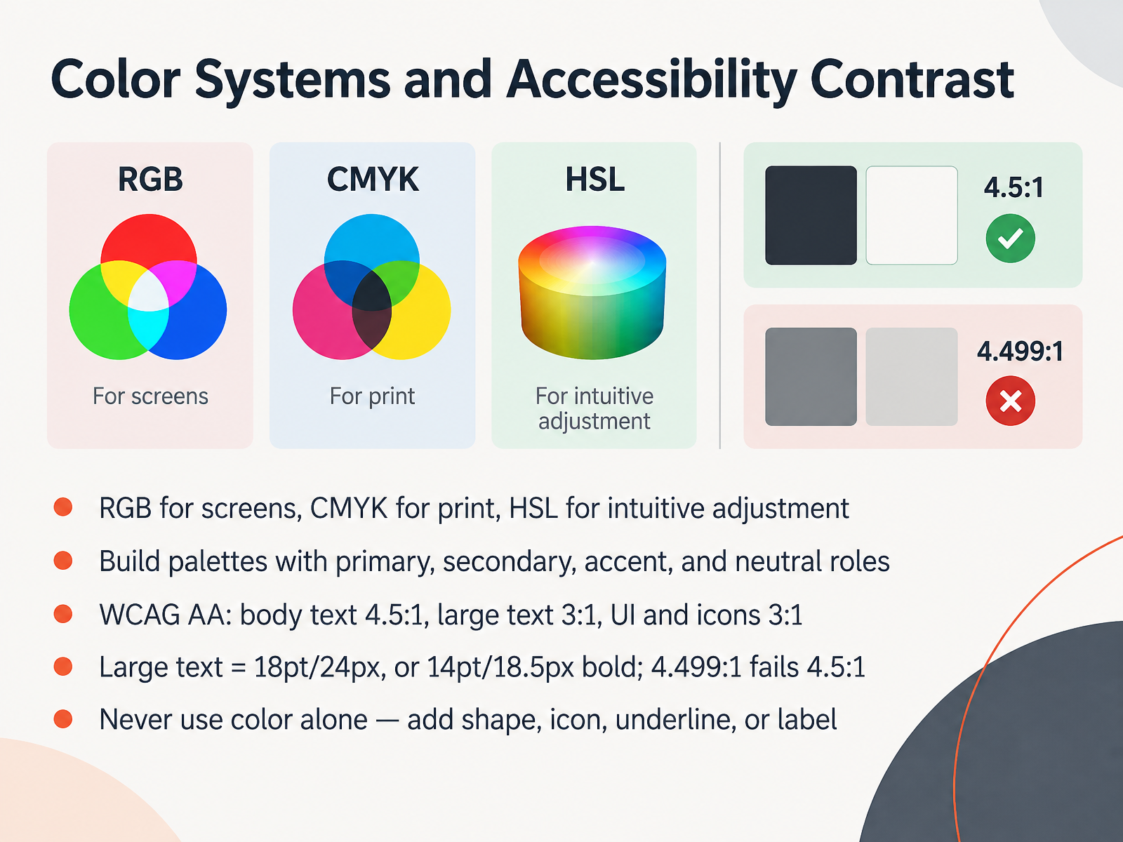
- 04Color Systems and Accessibility ContrastNext, let's get your color system right. Match the color space to the output. Use R G B for screens, C M Y K for print, and H S L when you want to adjust hue, saturation, and lightness intuitively. Build every palette with roles: a primary, a secondary, an accent, and neutrals. Roles keep your choices consistent across a portfolio piece. Now the numbers you'll be checked against. WCAG Double A requires body text at four point five to one, large text at three to one, and UI elements and icons at three to one. Large text means eighteen point, or twenty-four pixels, or fourteen point bold. Thresholds are exact. Four point four nine nine to one fails. So aim a little higher and test with a contrast checker. And never rely on color alone. Add a shape, an icon, an underline, or a label. That habit alone will make your work both stronger and more accessible. Next, we move into typography that works.
 w3.orgw3.orgdeveloper.mozilla.org+22 min
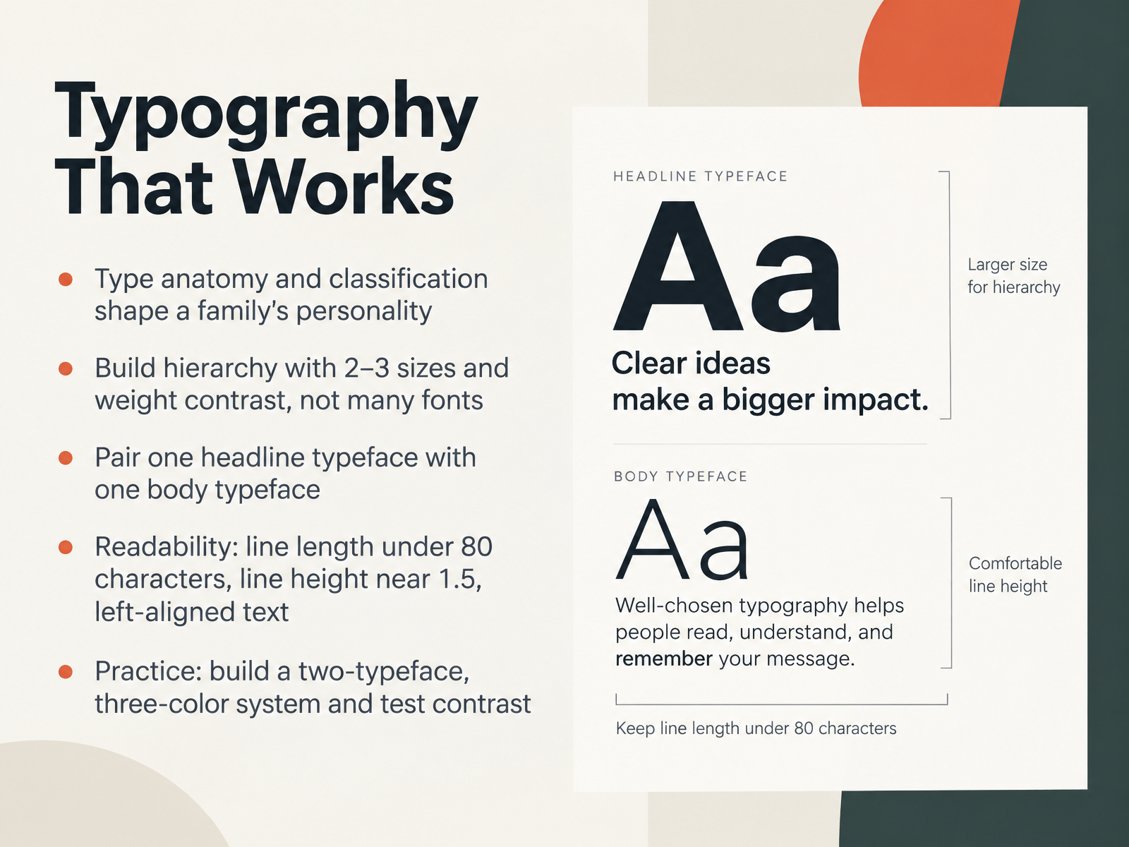
- 05Typography That WorksLet's talk about typography that works. Type anatomy and classification shape a family's personality. The x-height, the terminals, the contrast between thick and thin strokes, all of it changes how a typeface feels before a reader even reads a word. So keep it simple. Build hierarchy with two or three sizes and weight contrast, not many fonts. A bold heading against regular body text does more than five typefaces ever will. Then pair one headline typeface with one body typeface. That's the system. For readability, keep line length under eighty characters, set line height near one point five, and left-align your text. Post a two-typeface, three-color system, then test contrast with a checker tool. Body text needs a ratio of at least four point five to one against its background. Next, we move into layout, grids, and composition.
 w3.orgw3.orgdeveloper.mozilla.org+21 min
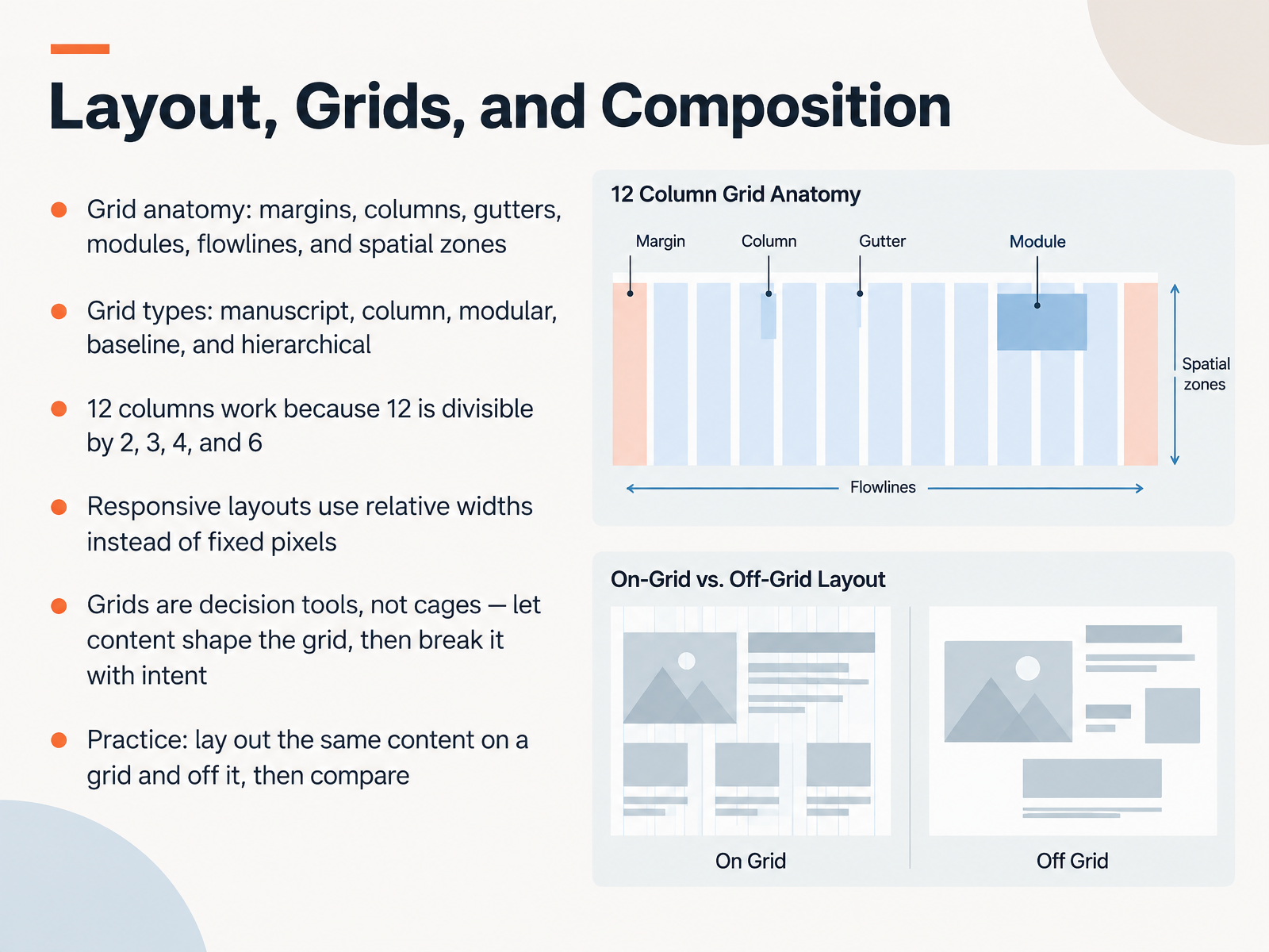
- 06Layout, Grids, and CompositionNow, let's talk about layout. Arranging elements on a page is the heart of graphic design, and the grid is your main tool. First, learn the anatomy. Margins frame the content. Columns hold text. Gutters are the gaps between them. Modules are the individual cells, and flowlines split the page into bands. Grouped modules create spatial zones. Next, the grid types: manuscript, column, modular, baseline, and hierarchical. The twelve column grid is popular because twelve divides by two, three, four, and six, giving you flexibility. For responsive layouts, set relative widths instead of fixed pixels, so the design adapts to screen size. And here's the mindset shift. Grids are decision tools, not cages. Let content shape the grid, then break it with intent. Your practice task: lay out the same content on a grid and off it, then compare. You'll see how much faster and cleaner the grid makes your decisions. Next, we move into concept and problem solving, designing with intent.
 data.europa.euassets.interaction-design.orgnorthampton.ac.uk+22 min
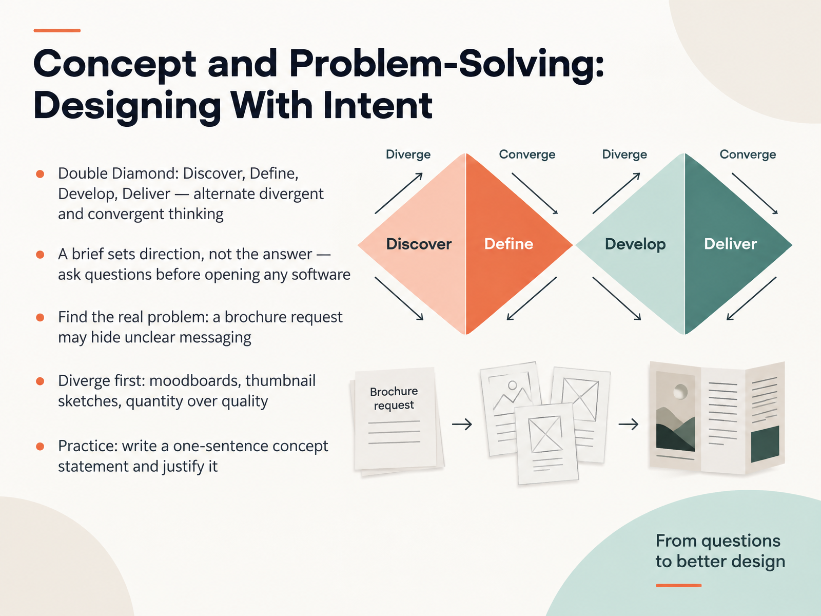
- 07Concept and Problem-Solving: Designing With IntentNow let's talk about designing with intent. The Double Diamond breaks the work into four phases: Discover, Define, Develop, Deliver. It alternates divergent thinking, where you open up possibilities, with convergent thinking, where you narrow down. Here's a rule I want you to keep. A brief sets direction, not the answer. So ask questions before you open any software. For example, a brochure request may actually hide unclear messaging. Your job is to find the real problem. Diverge first. Build moodboards, sketch quick thumbnails, and favor quantity over quality. Try forty thumbnails before choosing one. Then practice writing a one-sentence concept statement and justify it. That's how you turn intention into portfolio-ready work. Next, we move into tools and workflow: from sketch to file.
 1 min
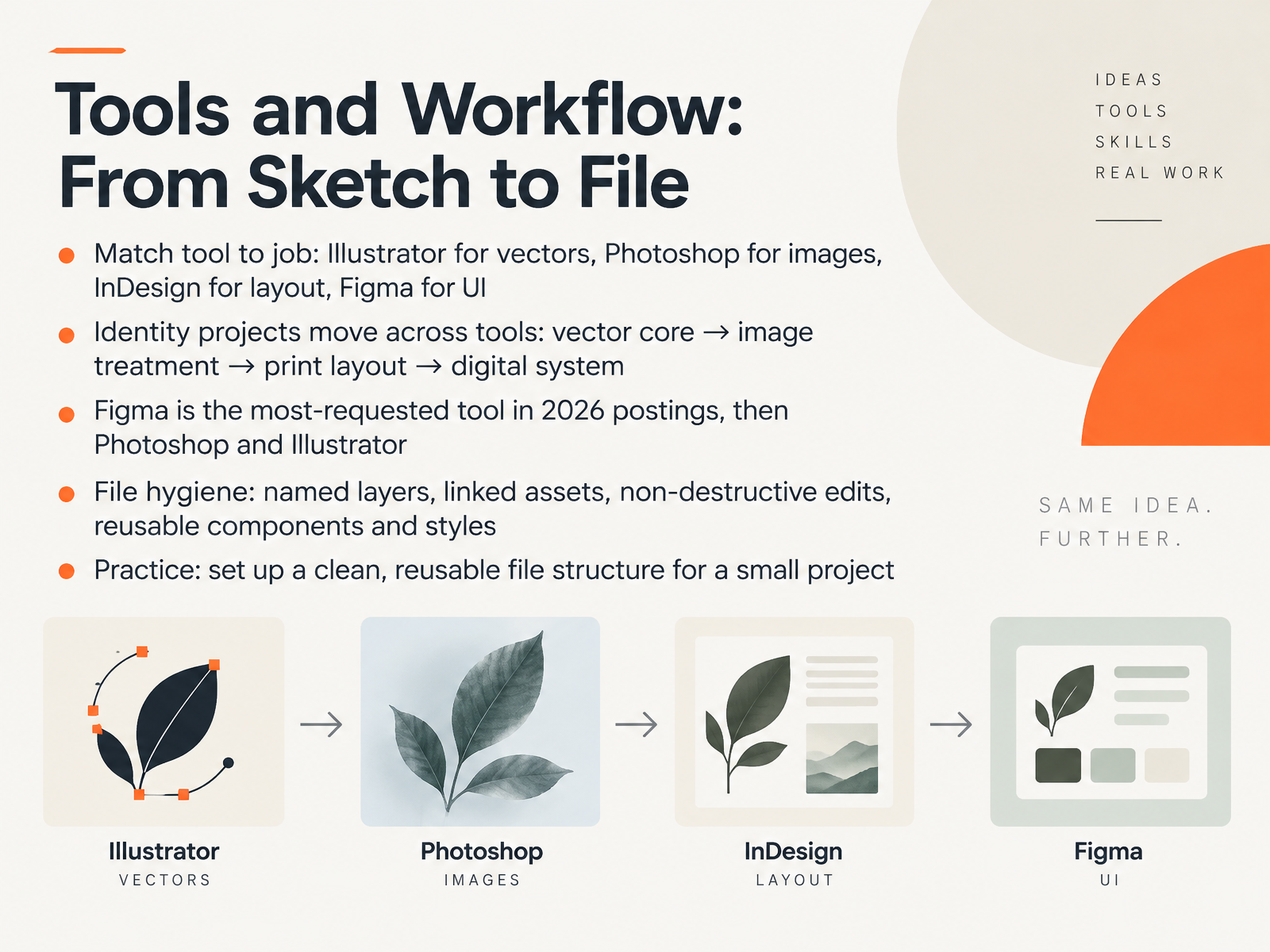
- 08Tools and Workflow: From Sketch to FileLet's talk tools and workflow, from your first sketch to the final file. Match the tool to the job. Illustrator for vectors like logos. Photoshop for images. InDesign for multi-page layout. Figma for UI and design systems. A real identity project moves across all of them. The vector core starts in Illustrator, image treatment happens in Photoshop, print layout lands in InDesign, then the digital system lives in Figma. On hiring, Figma is the most-requested tool in 2026 postings, followed by Photoshop and Illustrator. So learn Figma early, then build vector and print depth. Now file hygiene. Name your layers. Link your assets instead of pasting them in. Edit non-destructively with masks and smart objects. And build reusable components and styles so changes update everywhere. Here's your practice: take a small project and set up one clean, reusable file structure you can open again and again. Next, we go deeper into branding and identity systems.
 roberthalf.comresources.rework.comcreativeboom.com+21 min
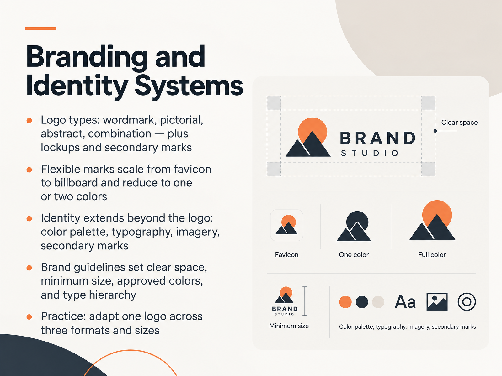
- 09Branding and Identity SystemsNext, let's talk about branding and identity systems. A logo alone is not a brand. Start by choosing a logo type: a wordmark, which is stylized type like FedEx; a pictorial mark like Apple; an abstract mark like Nike; or a combination of icon and wordmark. Then design your lockups, which are fixed arrangements of the mark with type or a tagline. Your marks must scale from a tiny favicon to a billboard, and reduce cleanly to one or two colors. Beyond the logo, the identity includes your color palette, typefaces, imagery, and secondary marks. Brand guidelines document clear space, minimum size, approved colors, and type hierarchy, so anyone can apply the brand consistently. Here is your practice: take one logo and adapt it across three formats and sizes. That exercise gives you real portfolio material. Now, let's look at designing for screens versus print.
 2 min
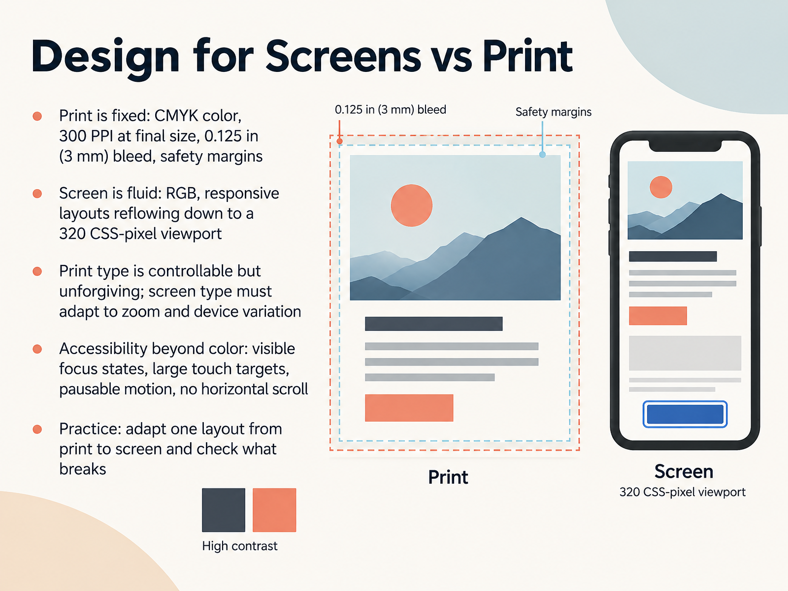
- 10Design for Screens vs PrintNow let's compare designing for screens versus print. Print is fixed. Build your file in CMYK, keep images at 300 pixels per inch at final size, add a 0.125 inch, or three millimeter, bleed, and keep text inside the safety margin. Screen is fluid. Work in RGB, and make sure your layout reflows cleanly down to a 320 CSS pixel viewport. Print type is controllable but unforgiving. If a line breaks badly, it stays broken. Screen type has to adapt to zoom and device variation, so test it. Accessibility goes beyond color. Add visible focus states, large touch targets, pausable motion, and no horizontal scroll. Your practice task: take one print layout and adapt it for screen. Then check what breaks. Next, we'll look at giving and getting critique.
 1 min
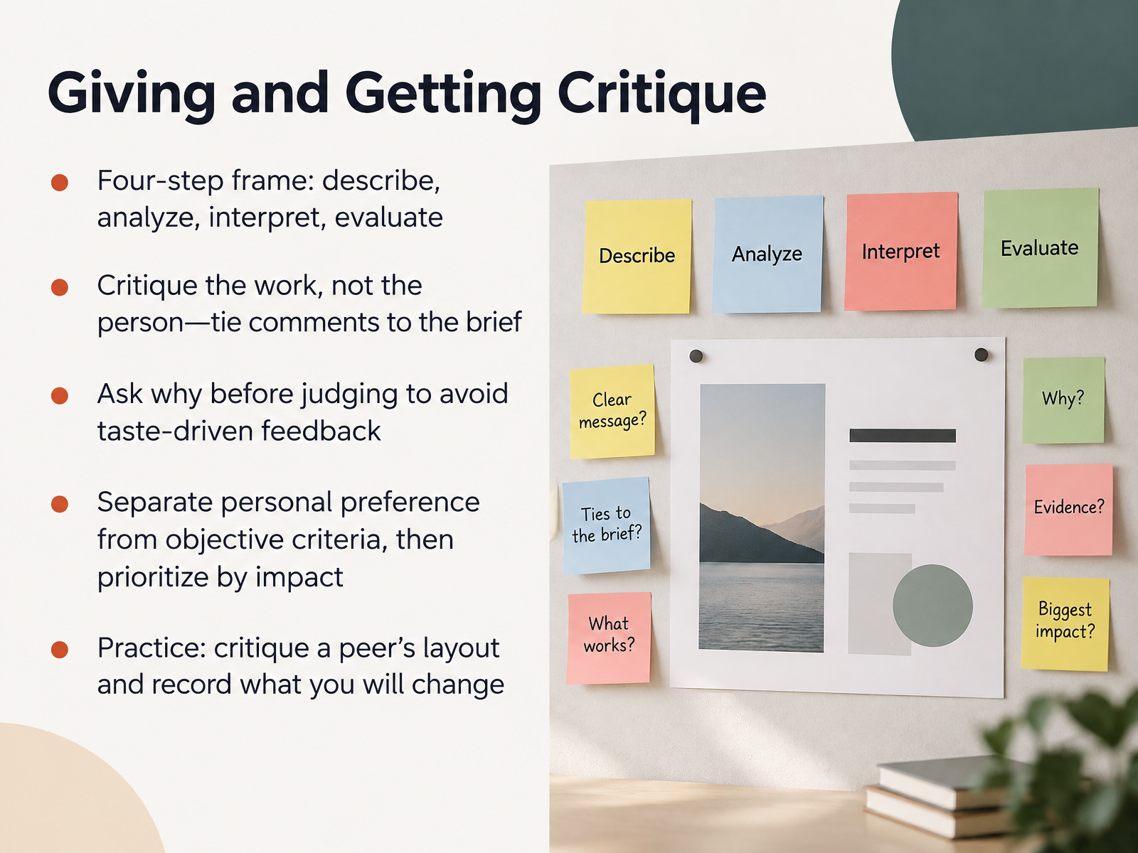
- 11Giving and Getting CritiqueNext, let's talk about giving and getting critique. This is a skill, and you can practice it. Use a four-step frame. First, describe what you actually see. Second, analyze how the elements work together. Third, interpret what it means. Fourth, evaluate it against the brief. Critique the work, not the person. Tie every comment back to the brief and the objective. Before you judge a choice, ask why the designer made it. That one question prevents taste-driven feedback. Separate personal preference from objective criteria, then prioritize by impact. For practice, critique a peer's layout, and write down one specific change you will make in your own work. You are not judging talent. You are testing decisions. And that gets easier with every round. Now, let's take these critique habits into building a portfolio: case studies that land work.
 2 min
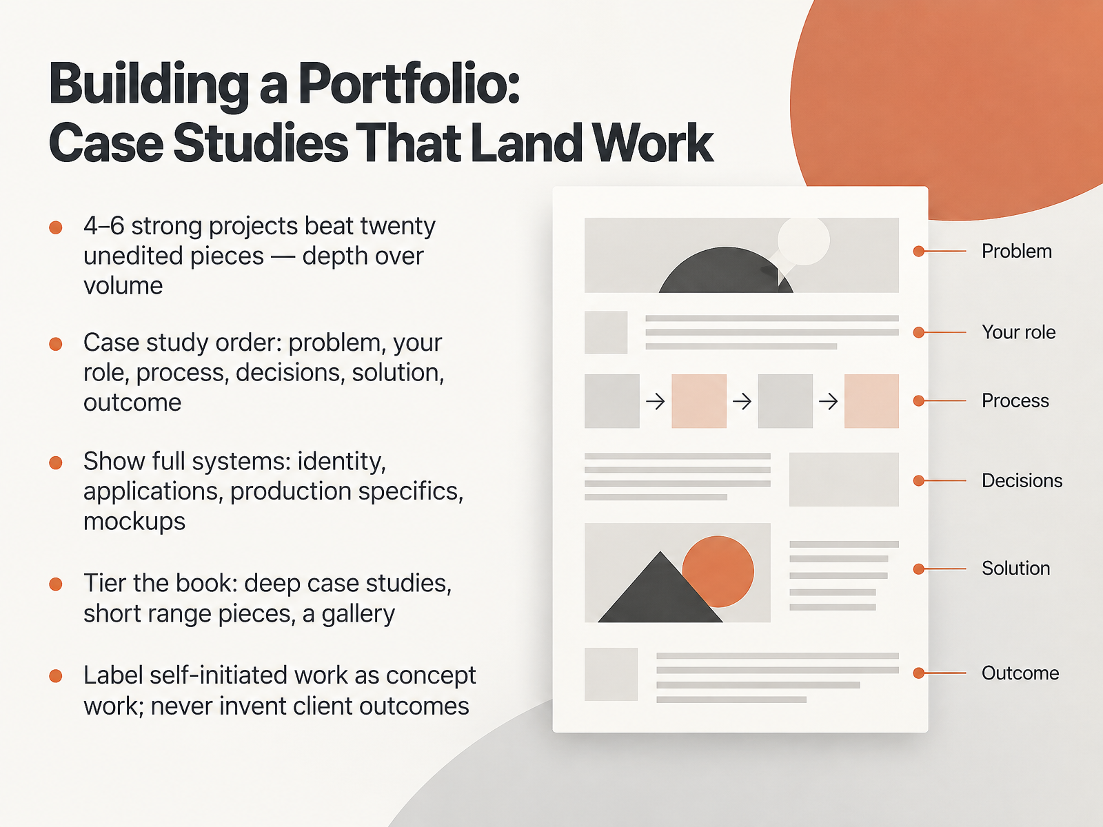
- 12Building a Portfolio: Case Studies That Land WorkNow let's turn your projects into a portfolio that actually lands work. Four to six strong projects beat twenty unedited pieces, so choose depth over volume. Structure each case study in this order: the problem, your role, your process, your decisions, the solution, and the outcome. Show full systems, not just a logo on a white background. Include identity, real applications, production specifics like paper stock and Pantone, and quality mockups. Tier your book. Lead with deep case studies, add a few short range pieces, then a gallery for personality. And label self-initiated projects as concept work. Never invent client outcomes. Honest reflection is stronger. That's your takeaway: curate tightly, document your thinking, and present the whole system. Next, we'll look at Career Paths and a 30-Day Action Plan.
 roberthalf.comresources.rework.comcreativeboom.com+21 min
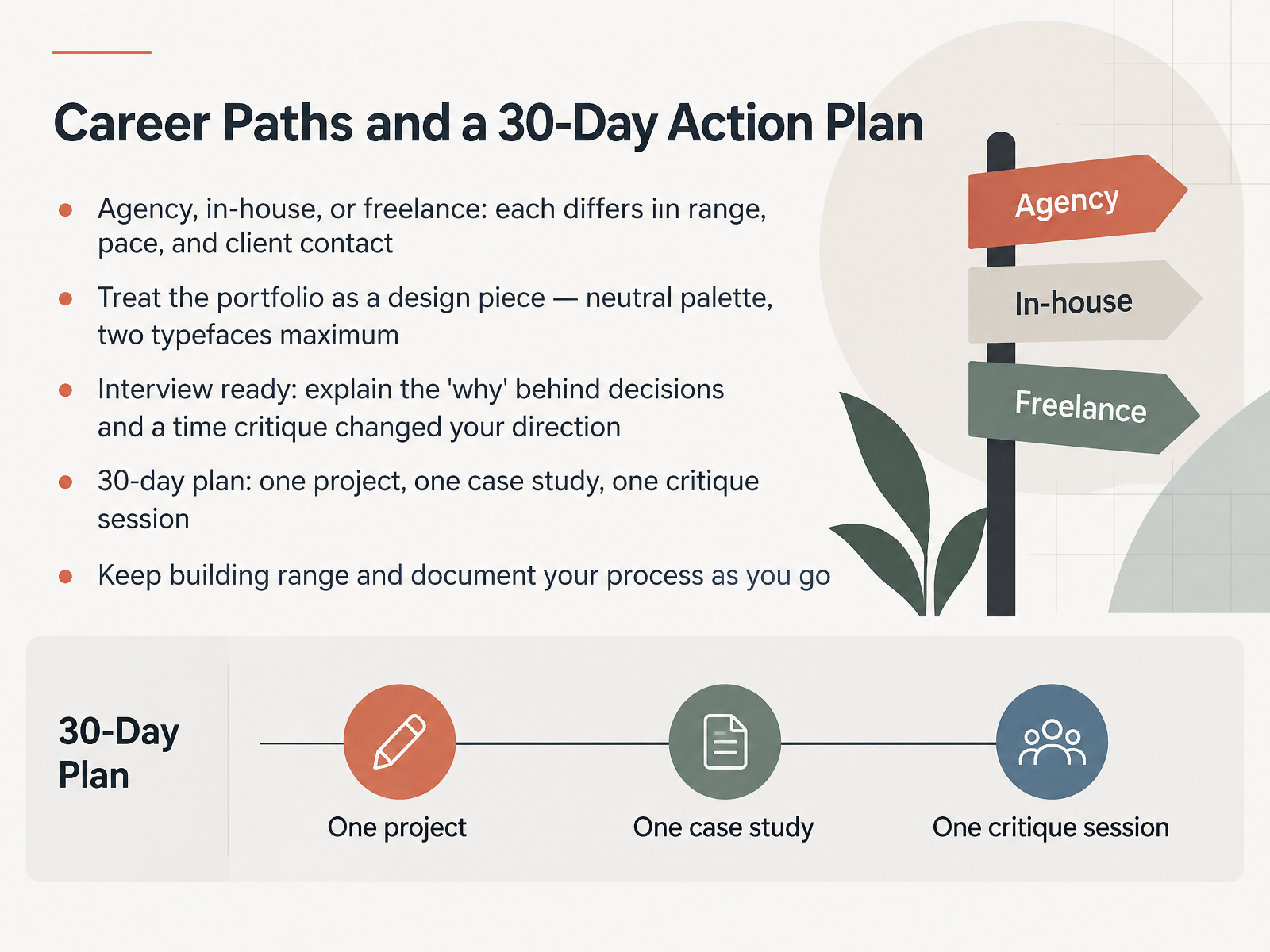
- 13Career Paths and a 30-Day Action PlanNow let's turn skills into a career path. Agency, in-house, and freelance work differ in range, pace, and client contact. Agencies give you variety and fast feedback. In-house teams give you depth on one brand. Freelance means you handle everything, and client contact comes sooner. Treat your portfolio as a design piece. Use a neutral palette and two typefaces maximum, so the work stands out, not the container. In interviews, explain the why behind each decision, and describe a time a critique changed your direction. That answer shows judgment. Here's your 30-day plan. One project, one case study, one critique session, completed start to finish. Then keep building range and document your process as you go. Start this week, because momentum builds confidence. Next, the Capstone Workshop: Putting the Core Skills Together.
 roberthalf.comresources.rework.comcreativeboom.com+22 min
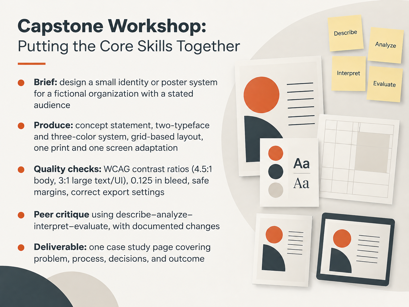
- 14Capstone Workshop: Putting the Core Skills TogetherNow let's put the core skills together in the capstone workshop. Here is your brief. Design a small identity or poster system for a fictional organization, with a clearly stated audience. Produce a concept statement, a two-typeface and three-color system, a grid-based layout, and one print and one screen adaptation. Then run your quality checks. WCAG contrast ratios are four point five to one for body text, and three to one for large text and UI elements. For print, a zero point one two five inch bleed, safe margins, and correct export settings. Critique each other using describe, analyze, interpret, evaluate, and document the changes you make. Your deliverable is one case study page covering problem, process, decisions, and outcome. And that closes the course. You now have a repeatable process, from brief to portfolio-ready case study. Thank you for your focus and effort. Keep making work, keep testing it, and trust that your early-career confidence will grow one project at a time.
 w3.orgw3.orgdeveloper.mozilla.org+22 min
Take the deck with you
Download this course as a file — free, no sign-up needed.
- PDF handoutEvery slide page, ready to print or share.15 pages · 3.0 MBDownload
- Narrated PowerPointThe deck that presents itself — every slide carries the digital human's narration video.15 pages · 12.7 MBDownload
- PowerPoint slidesThe full deck as a .pptx — open it in PowerPoint, Keynote, or Google Slides.15 pages · 2.9 MBDownload
Free to use in your own training — please keep the PersonWise credit page at the end.
Have your own deck? Turn it into a course
Sources consulted
Web sources consulted while building this course.
- Graphic design careers in 2026: Skills, salaries and industry trends — roberthalf.com
- Junior Graphic Designer Job Description Template - 2026 Guide — resources.rework.com
- In 2026, here's what creative recruiters are looking for in juniors | Creative Boom — creativeboom.com
- Graphic Design Hiring Trends 2026 | Get U Hired — getuhired.co
- How to become a junior designer (with skills and FAQs) | Indeed.com UK — uk.indeed.com
- Elements & Principles - Design Fundamentals - Library Guides at UC Berkeley — guides.lib.berkeley.edu
- The Elements and Principles of Design — doi.org
- The Little Book of Visual Design Principles for Scientists — depts.washington.edu
- 13 Graphic Design Principles + How To Apply Them | Figma — figma.com
- https://assets.interaction-design.org/literature/article/the-top-4-things-you-can-learn-from-ixdf-s-new-visual-design-course — assets.interaction-design.org
- Web Content Accessibility Guidelines (WCAG) 2.2 — w3.org
- Understanding Success Criterion 1.4.3: Contrast (Minimum) | WAI | W3C — w3.org
- Color contrast - Accessibility | MDN — developer.mozilla.org
- Text Contrast | ta11y — ta11y.org
- Color - Web Guide - Publications Office of the EU — op.europa.eu
- Grammar of Graphics in practice: Observable Plot — data.europa.eu
- https://assets.interaction-design.org/literature/topics/grid-systems — assets.interaction-design.org
- Grids and structure — northampton.ac.uk
- https://ixdf.org/literature/article/how-to-use-grid-systems — ixdf.org
- Chapter 9: Creating Grid Systems and Page Layouts - Graphic Design For Dummies [Book] — oreilly.com