Data Storytelling for Reports
Begin
14 pages · ~28 min
Data Storytelling for Reports
Learn a practical workflow to transform data reports into compelling stories that drive action and improve stakeholder engagement.
What you’ll learn
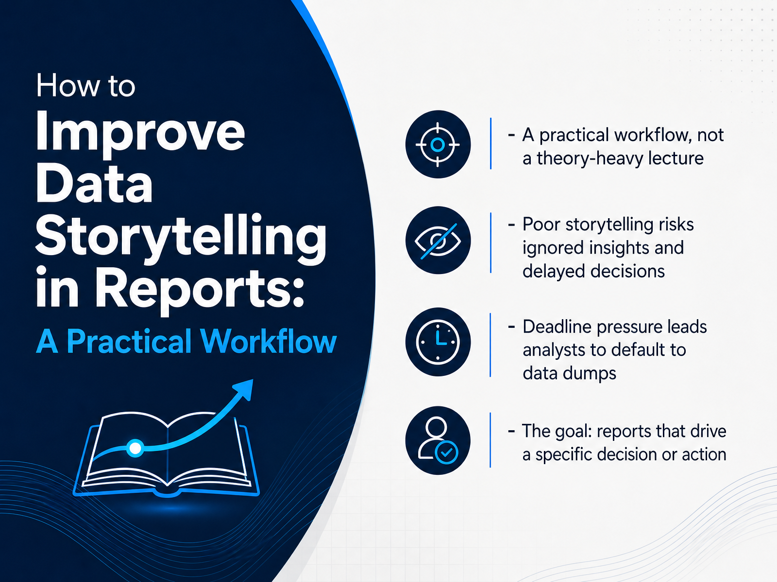
- 01How to Improve Data Storytelling in Reports: A Practical WorkflowWelcome. This course is a practical workflow for improving data storytelling in your reports. You already know your data. The gap is usually in how it gets framed for a decision. We will not spend time on theory. Instead, we will focus on concrete steps you can apply immediately. The problem is familiar. A strong analysis gets buried in a data dump and the insight is ignored, which delays the decision. Deadline pressure makes this worse, because it pushes us to default to exporting charts instead of building a narrative. The goal of this workflow is different. It pushes the report toward a single desired outcome, a specific decision or action. By the end, you will have a repeatable process to get there. Let us start with the root cause of the failure.swydo.comkdnuggets.comwinningpresentations.com+21 min
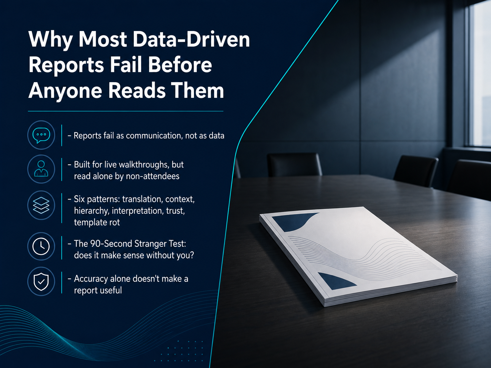
- 02Why Most Data-Driven Reports Fail Before Anyone Reads ThemNow let's look at why most data-driven reports fail before anyone really examines them. The core issue is that reports fail as communication, not as data. The numbers can be accurate and the charts can be clean, yet the document still lands as a wall of numbers that gets skimmed and forgotten. The problem happens in the gap between how a report is built and how it is actually consumed. Most reports are designed for a live walkthrough, but they are read alone by someone who missed the meeting. They have to stand on their own without you in the room. This gap shows up in six repeating patterns: translation, context, hierarchy, interpretation, trust, and template rot. Each one traces back to a specific step in the reporting workflow. To catch these failures early, apply the ninety second stranger test. Hand the report to someone unfamiliar with the project. Ask them what it means and what they should do. If they cannot answer clearly, the report has not done its job. Accuracy alone does not make a report useful. The value comes from making it comprehensible. With that baseline in mind, let's examine the core narrative structure behind effective reports.
 swydo.comkdnuggets.comwinningpresentations.com+22 min
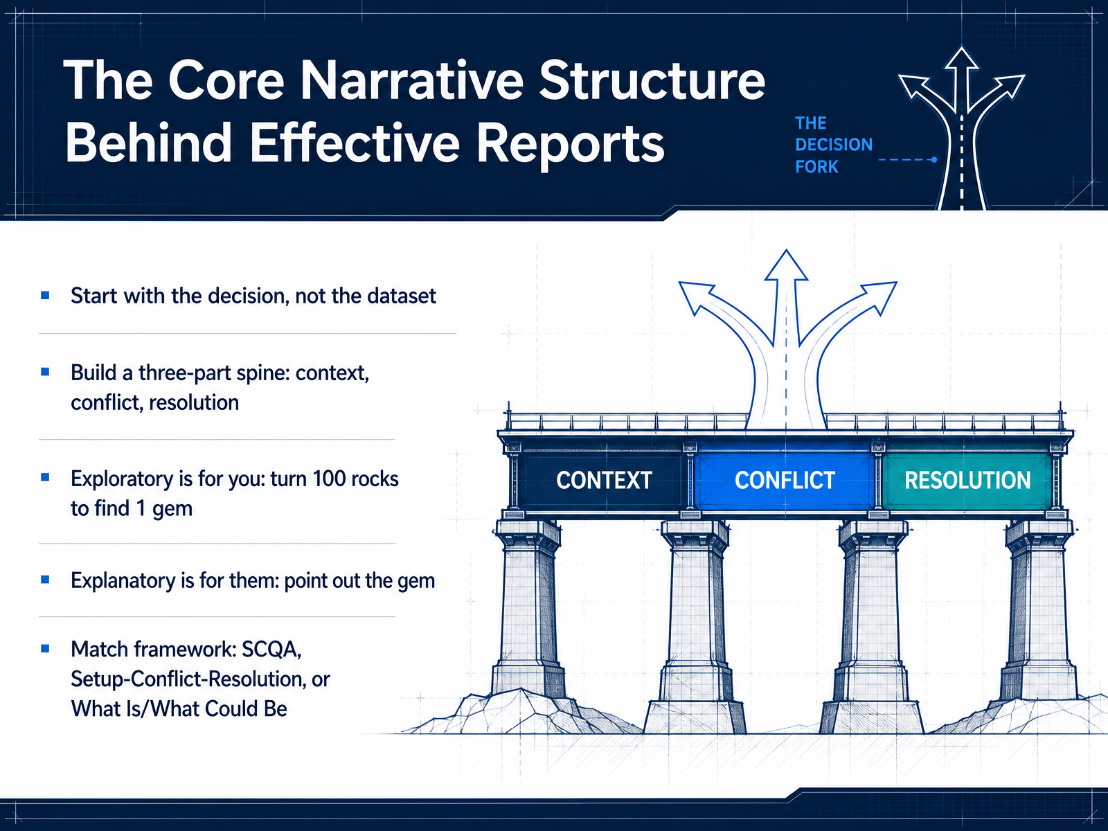
 - 03The Core Narrative Structure Behind Effective ReportsNow let's bring this into focus with a simple structure. Effective reports start with the decision, not the dataset. So resist the urge to walk your audience through every step of your research. Instead, build your message on a three-part spine: context, conflict, and resolution. Show the current situation, reveal the obstacle or insight, then present the path forward. This works because exploration and explanation are different jobs. Exploratory analysis is for you. It is the process of turning over a hundred rocks to find one gem. Keep that messy search in your workshop. Explanatory analysis is for them. That is where you simply point out the gem and explain why it matters. You can match this to a familiar framework. Use SCQA, Setup-Conflict-Resolution, or What Is versus What Could Be. Pick one, and stick to it. Next, let's move from exploratory analysis to the explanatory story.
 juiceanalytics.comsona.comstatstest.com+21 min
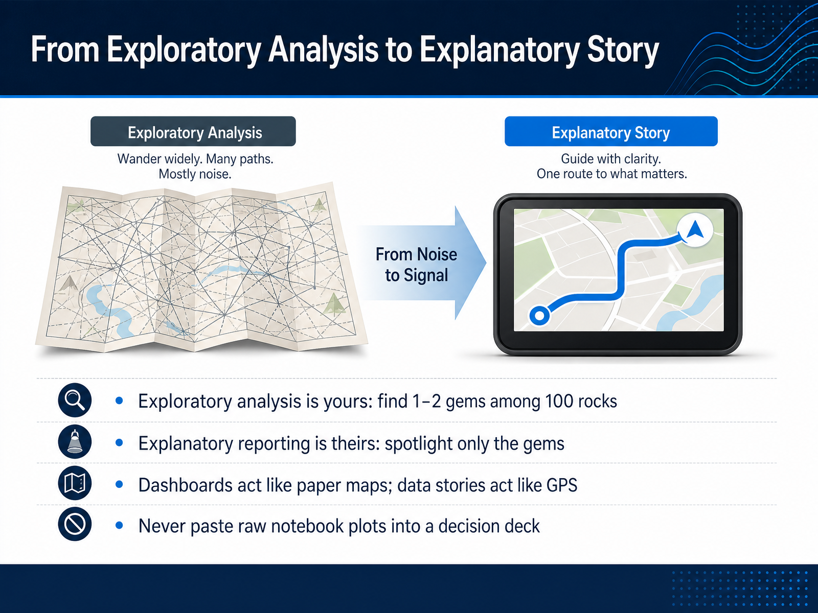
 - 04From Exploratory Analysis to Explanatory StoryNow let's make the shift from exploring your data to explaining it. Think of exploratory analysis as your private workspace. You're turning over a hundred rocks to find one or two gems. Those messy charts and raw outputs are perfectly fine at that stage. But explanatory reporting is a completely different job. It belongs to your audience. Your only task is to spotlight those gems you found, and leave the rest of the rocks behind. A dashboard is like a paper map. It shows everything, but it's up to the reader to figure out the route. A data story is a GPS. It gives one clear direction. So, never paste raw notebook plots directly into a decision deck. They still carry the clutter of exploration. Take the extra step. Clean the visual. Focus the message. Translate the finding into a specific action. That editing is what turns analysis into influence. Next, let's talk about who exactly that influence is for.
 juiceanalytics.comsona.comstatstest.com+21 min
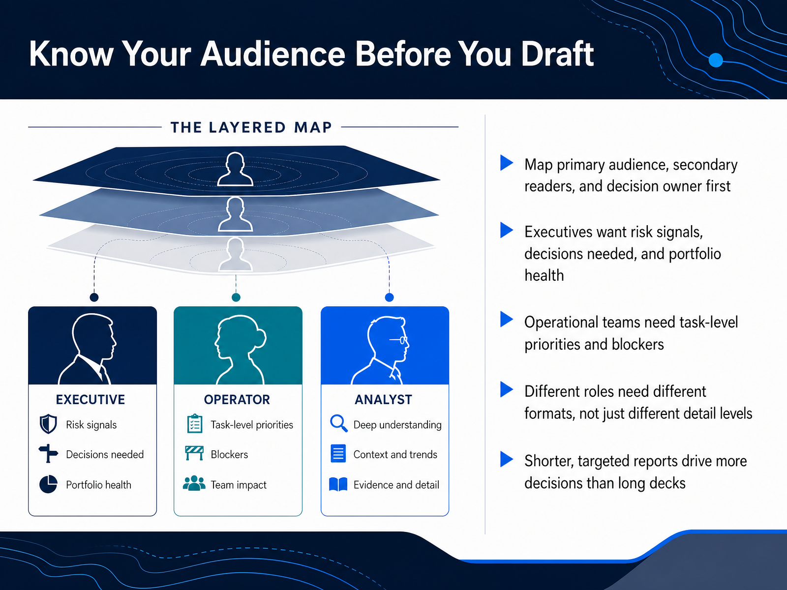
 - 05Know Your Audience Before You DraftBefore you draft anything, map your audience. Identify your primary reader, your secondary readers, and the one person who actually owns the decision. These are not the same audience. Executives need risk signals, the decisions you need from them, and overall portfolio health. They want signal, not noise. Operational teams need task level priorities and specific blockers that are slowing them down. Different roles need different formats, not just different levels of detail. An executive needs a one page summary with clear callouts. A team lead needs a structured list of priorities. And a shorter, targeted report will drive more decisions than a long deck that nobody reads past slide three. Knowing who you are writing for shapes the entire structure of your story. Next, let’s look at how to turn this into a reusable report drafting workflow.
 teamwork.comradiusinsights.comiiba.org+21 min
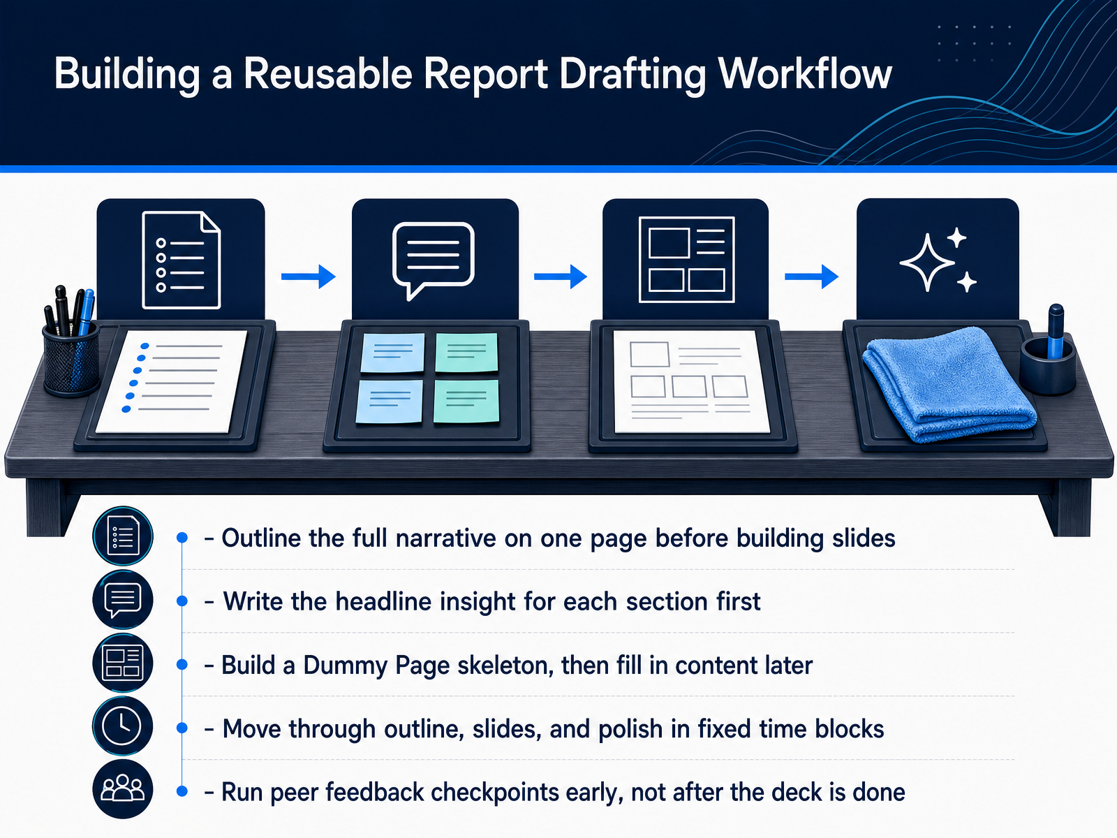
 - 06Building a Reusable Report Drafting WorkflowNow let's make this a repeatable system. A strong workflow removes the guesswork, so you can focus on the thinking, not the formatting. First, outline your full narrative on a single page before you touch any slides. This keeps the whole report pointed in one direction. Then, for each section, write the headline insight first. That one sentence becomes the anchor for the entire section. Next, build a skeleton of dummy pages, with only the structure and placeholders. Don't get distracted by visuals yet. Once the frame is set, move through outlining, drafting slides, and polishing in fixed time blocks. This prevents last-minute over-editing. Finally, and this is important, bring in peer feedback early. Get a colleague to review the skeleton while changes are still cheap, not after the deck feels finished. When you treat report building as a disciplined workflow, every deliverable becomes clearer and faster. In the next part, we'll look at choosing the right visual to carry each of your key messages.
 curalo.iodatabox.comteamwork.com+21 min
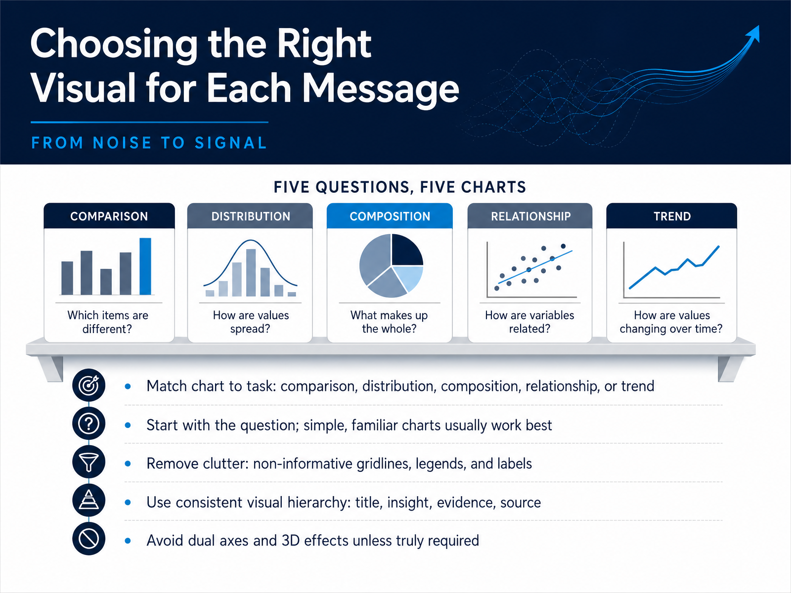
 - 07Choosing the Right Visual for Each MessageNow let's turn to the visual itself. Choosing the right chart starts with one simple question. What comparison do you need your reader to make? If they need to compare categories, a bar chart is almost always your best friend. If they need to follow a trend over time, use a line chart. Resist the urge to use unfamiliar or complex visuals. Simple and familiar charts build trust and are understood much faster. Once you have the right chart, edit it ruthlessly. Remove gridlines, redundant legends, and any labels that don't directly help the reader. Think about your visual hierarchy. The title should state your insight. The data should provide the evidence. The source should be quiet and unobtrusive. And please, avoid dual axes and three dimensional effects. They distort perception and make your data harder to trust. If your chart needs that much decoration, it probably needs to be split into two simpler views. Let's carry that same principle of ruthless clarity into our next step, writing headlines and annotations that drive decisions.
 juiceanalytics.comsona.comstatstest.com+22 min
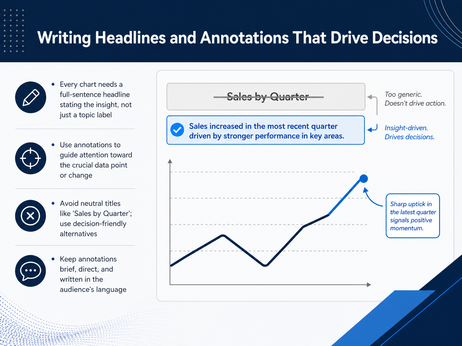
 - 08Writing Headlines and Annotations That Drive DecisionsNow let's turn to the words that surround your chart. Every chart deserves a full sentence headline that states the insight, not just a label. Instead of 'Sales by Quarter,' try 'Revenue fell twenty percent after the pricing change.' That one shift tells your audience exactly what to look for before they even study the data. Next, use annotations to guide attention. A short note on a specific data point can explain both what happened and why it matters. That does the interpretive work for your reader. Keep those annotations brief and direct, and use the language your audience already speaks. Avoid jargon or internal shorthand. A neutral title invites interpretation. A decision friendly headline directs it. So review every chart and ask: does this headline give my audience a reason to care, or just a description of the file? Make that small change first. It is often the fastest way to sharpen your whole report. Up next, we will talk about handling uncertainty and complexity without losing the story.
 1 min
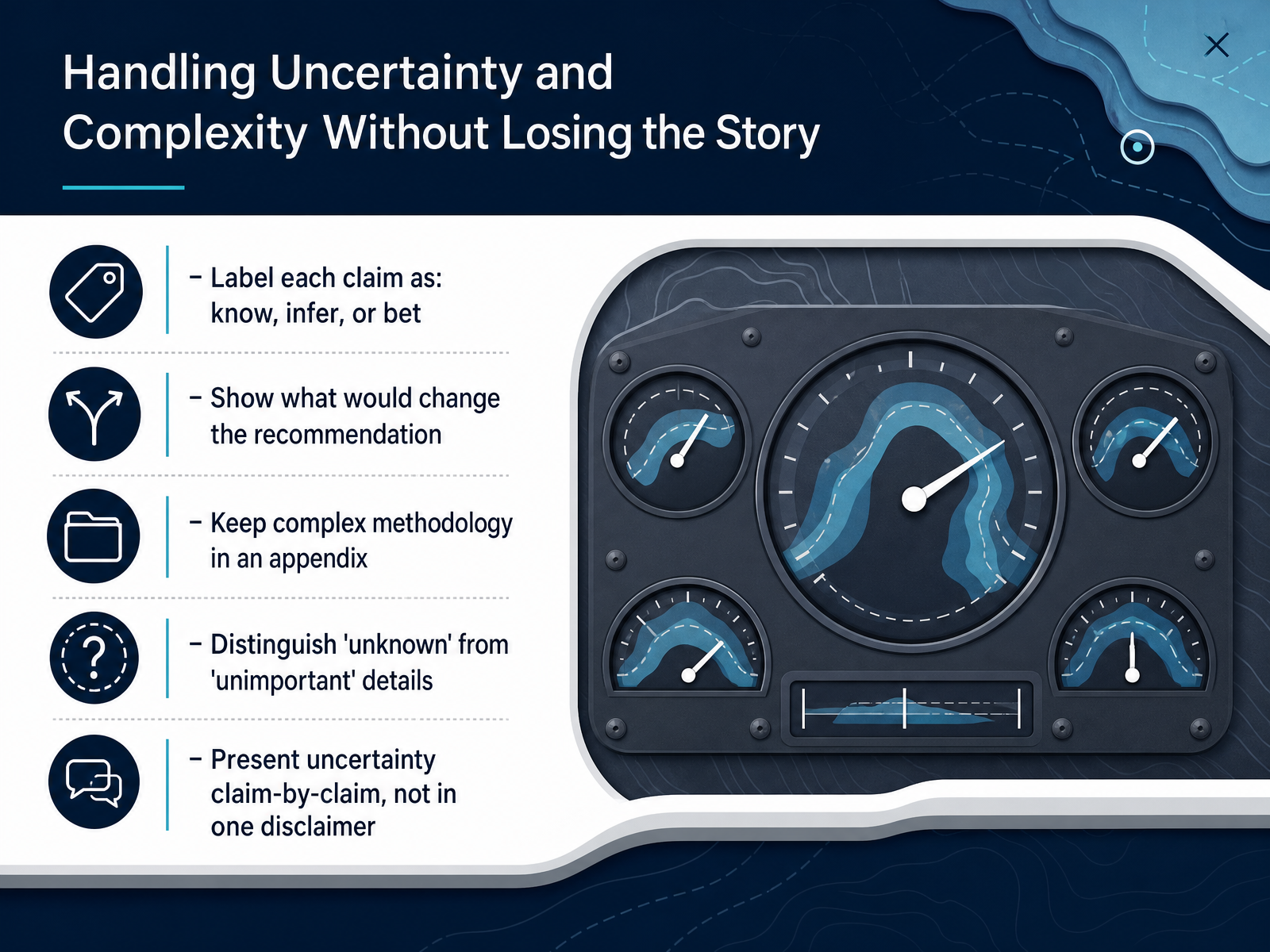
1 min - 09Handling Uncertainty and Complexity Without Losing the StoryWhen your data gets messy, your story doesn't have to. Start by labeling each claim as one of three things. Know, infer, or bet. A know is something you can verify and stand behind. An infer is a reasoned judgment from incomplete evidence. A bet is your recommendation under genuine uncertainty. Naming the label out loud builds trust because it shows exactly where your evidence ends and your judgment begins. Then show what would change your recommendation. Name the trigger. If a key assumption shifts, what decision changes with it. Keep complex methodology out of the main flow. Put the model details, the sensitivity runs, and the technical notes in an appendix so the decision stays front and center. Also separate what is unknown from what simply doesn't matter. Both can be ignored in the wrong way. When a detail is unknown, say so and explain the risk. When it is unimportant, say that and move on. Finally, don't stack all your uncertainty into one quiet disclaimer. Present it claim by claim, right where each number appears. That keeps the caveat attached to the specific decision it affects. Up next, we'll move from findings to recommendations.
 2 min
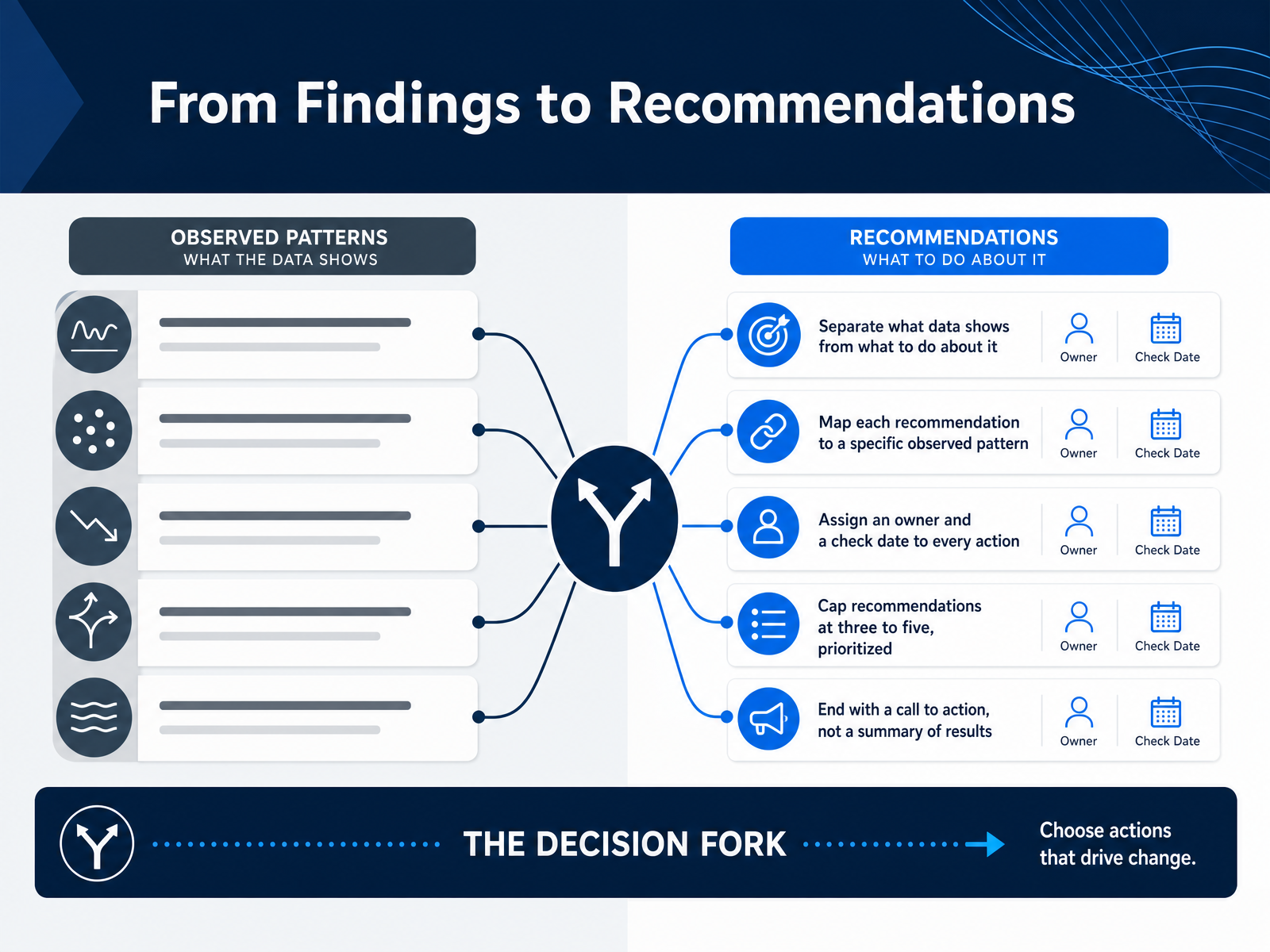
2 min - 10From Findings to RecommendationsNow we move to the critical step where analysis becomes influence. This is about going from findings to recommendations, and the first rule is to keep them separate. State clearly what the data shows. Then, state what should happen because of it. Mixing those two confuses your audience and buries the decision. Next, map every recommendation back to a specific pattern you observed. If you cannot trace a recommendation to a data point, it is probably just an opinion. Cut it. For every action you propose, assign a real owner and a check date. A recommendation without a name is just a wish, so be specific about who is responsible and when you will review progress. Keep your list short. Cap it at three to five prioritized items. Even if you found ten problems, forcing yourself to prioritize tells stakeholders where to start, and it makes action more likely. Finally, end your report with a call to action, not a summary. Your last sentence should tell people the single first step to take. Next, we will look at common report structures and when to use them.
 1 min
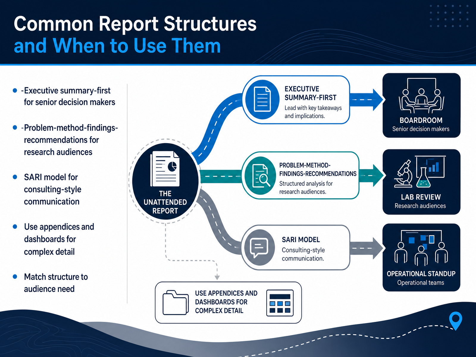
1 min - 11Common Report Structures and When to Use ThemNow let's turn to how you actually structure your report. The right structure depends on who is reading it and what they need to do with it. For senior decision makers, lead with the executive summary. Give them the conclusion and the recommendation on the first page. They may never read the rest. For research audiences, use a more traditional flow: problem, method, findings, and recommendations. They need to see your reasoning and evidence to trust the result. If you are in a consulting or advisory role, try the SARI model. SARI stands for Situation, Action, Result, and Interpretation. It frames your work as a response to a business problem, which keeps the focus on decisions. For complex detail, do not bury your reader. Move supporting tables, methodology notes, and extra cuts into appendices or a linked dashboard. That keeps the main narrative clean. The common thread is simple: match the structure to the audience's need. A senior leader wants speed. A researcher wants rigor. A client wants implications. Give each one the path that gets them to action fastest.
 1 min
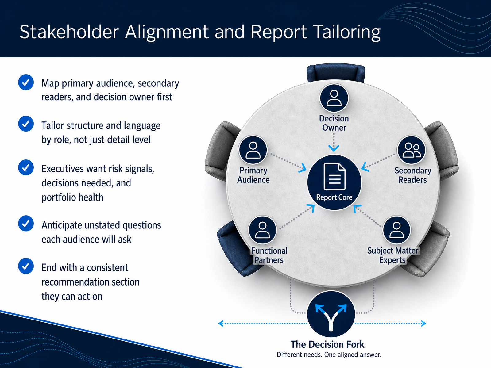
1 min - 12Stakeholder Alignment and Report TailoringNow let's talk about aligning your story with the people in the room. Before you write a single sentence, map your audience. Identify the primary reader, the secondary readers, and most importantly, the decision owner. They all need different things from the same data. Executives generally want risk signals, the decisions that need their input, and a clear view of portfolio health. They are not looking for task-level detail. A project manager, on the other hand, needs clarity on blockers and priorities. So tailor the structure and the language by role, not just by the level of detail. Think ahead about the unstated questions each person will ask. A finance lead may wonder about budget burn, while an operations lead is thinking about capacity. Answer those questions before they interrupt your narrative. And regardless of the audience, always end with a consistent recommendation section. Give them something clear and actionable to respond to. If the report does not drive a decision, it is just noise. Next, let's look at a bad-to-good report transformation, step by step.
 teamwork.comradiusinsights.comiiba.org+21 min
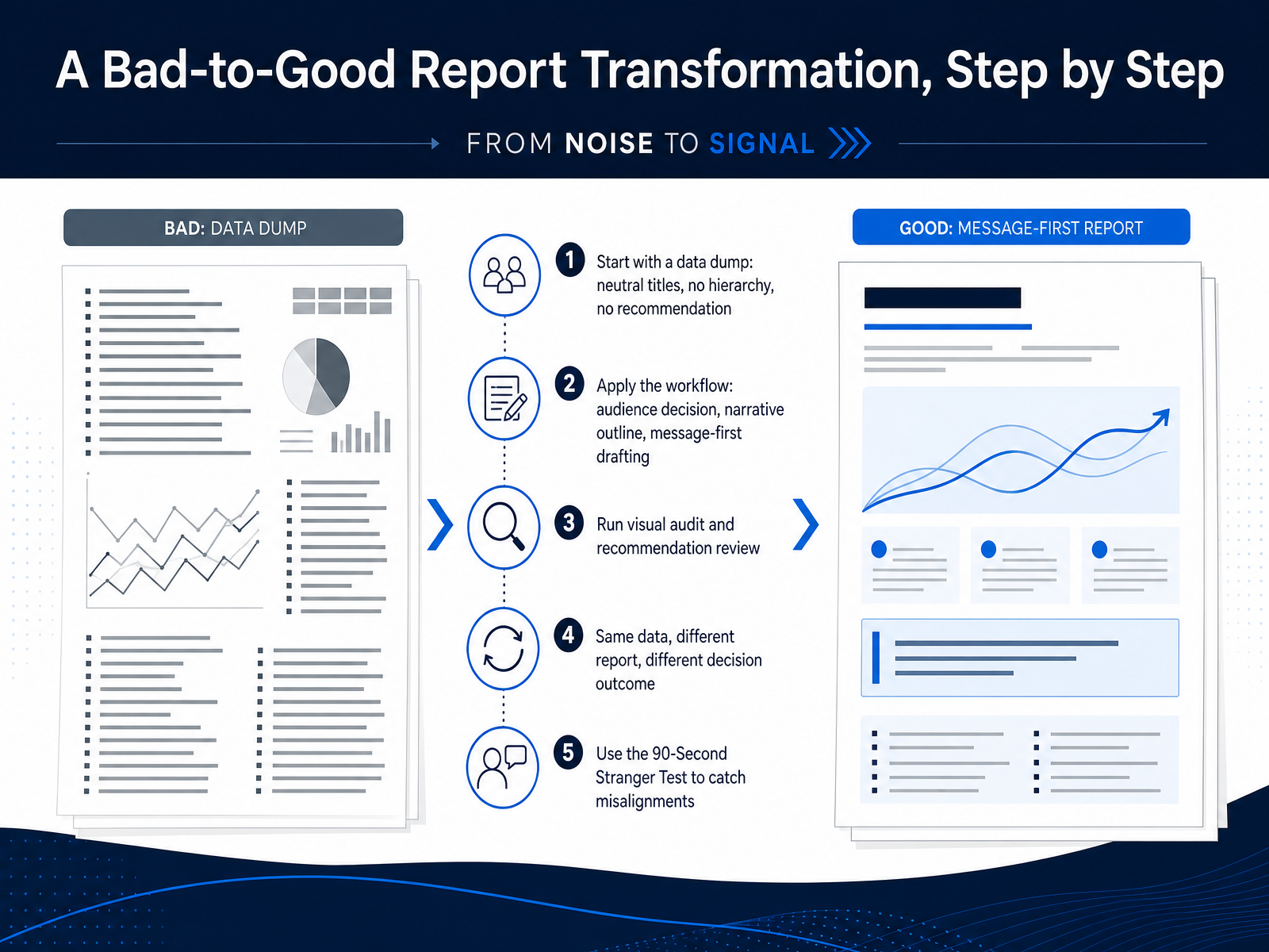
 - 13A Bad-to-Good Report Transformation, Step by StepLet’s walk through one transformation, step by step. We start with what looks like a data dump. Titles are neutral. There’s no visual hierarchy. And there’s no recommendation anywhere. The report simply presents numbers. Now we apply the workflow. First, we identify the audience decision. Then we build a narrative outline. And we draft with the message first. After that, we run a visual audit and a recommendation review. Same data, different report. The first version makes readers search for meaning. The second version puts the decision and the recommendation up front. The outcome changes because the framing changed. Before you deliver, run the ninety-second stranger test. Hand the report to someone unfamiliar with the project. If they can’t state the decision and the recommended action within ninety seconds, you still have misalignments to fix. The transformation isn’t about more analysis. It’s about clearer structure. Next, we’ll move to a practical workflow checklist and next steps.
 2 min
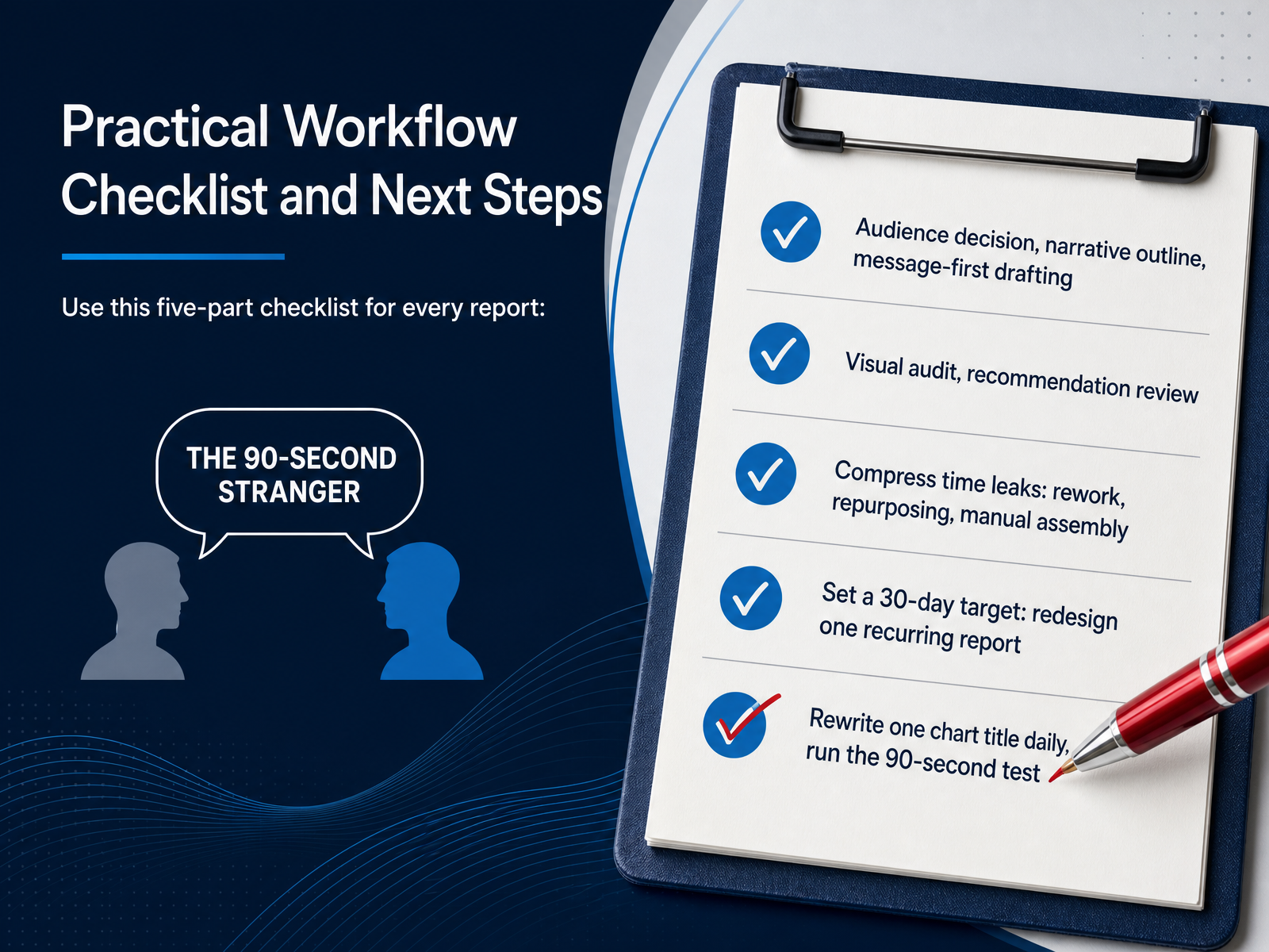
2 min - 14Practical Workflow Checklist and Next StepsLet's turn this into a repeatable practice. Keep a simple checklist for every report you build. Start with the audience decision, map your narrative outline, and draft with your message first. Then run a visual audit and review every recommendation against the decision it supports. Watch for time leaks. Rework, repurposing, and manual assembly quietly eat the most hours. Compress those first. Give yourself a thirty day target. Pick one recurring report and redesign it end to end. And build a daily habit. Rewrite one chart title each morning, then run the ninety second test. If your update cannot be read in ninety seconds, it is too long. That single habit compounds faster than any tool change. Thank you for working through this workflow. You already know your data. What you are building now is the discipline to make it move decisions. Start with one report this week.
 curalo.iodatabox.comteamwork.com+21 min
Take the deck with you
Download this course as a file — free, no sign-up needed.
- PDF handoutEvery slide page, ready to print or share.15 pages · 3.6 MBDownload
- Narrated PowerPointThe deck that presents itself — every slide carries the digital human's narration video.15 pages · 13.8 MBDownload
- PowerPoint slidesThe full deck as a .pptx — open it in PowerPoint, Keynote, or Google Slides.15 pages · 3.5 MBDownload
Free to use in your own training — please keep the PersonWise credit page at the end.
Have your own deck? Turn it into a course
Sources consulted
Web sources consulted while building this course.
- Why Your Client Reports Fail Before Anyone Reads Them - Swydo — swydo.com
- The Psychology of Bad Data Storytelling: Why People Misread Your Data - KDnuggets — kdnuggets.com
- Why the Chart Your Analyst Chose Destroys the Case Your Words Are Making | Winning Presentations — winningpresentations.com
- What is Data Storytelling? 5 Common Mistakes Businesses Make When Presenting Data | Research Institute of Digital organisation and Economy — ridein.org
- War Story: How a Tableau 2026 Dashboard Error Misled Our Executive Team on Q1 Revenue by 15% – Here's How We Fixed It — johal.in — johal.in
- Exploratory vs. Explanatory: The Difference Between Data Analysis and Data Presentation — Juice Analytics — juiceanalytics.com
- How to Write a Report Data Analysis: Tips, Examples, and Best Practices | Sona — sona.com
- Analytics Reporting That Doesn't Get You Killed in Review | StatsTest Blog — statstest.com
- Explanatory versus exploratory data visualisation — data.europa.eu
- Differences Between Data Exploration and Presentation | FlowingData — flowingdata.com
- Stakeholder Reports: What to Include and Who Needs What — teamwork.com
- Why Stakeholder Audiences Drive Your Report Storytelling — radiusinsights.com
- 2.4.1 Validate Understanding of Stakeholders — iiba.org
- 2.4.3 Determine Communication Needs of Stakeholders — iiba.org
- Audience Identification — enterprisecampus.net
- Building a Client Reporting Workflow — Consultant Playbook — curalo.io
- How to Write a Great Business Consulting Report: Best Practices and Report Examples | Databox — databox.com
- Reporting Best Practices for Client Work | Teamwork.com — teamwork.com
- 03_Consulting_Report/REPORT_PRODUCTION_WORKFLOW_EN.md — github.com
- Client-facing dashboard automation: reducing consulting report delivery cycles • INSYNCR — insyncr.com