Begin
14 pages · ~28 min
Digital Accessibility: A Visual Introduction
This visual introduction explains how digital accessibility works, helping designers, developers, and content creators understand and apply inclusive practices.
A digital instructor presents all 14 pages. Hold “Ask” at any point and ask out loud — the answer comes from this course. No sign-up needed.
What you’ll learn
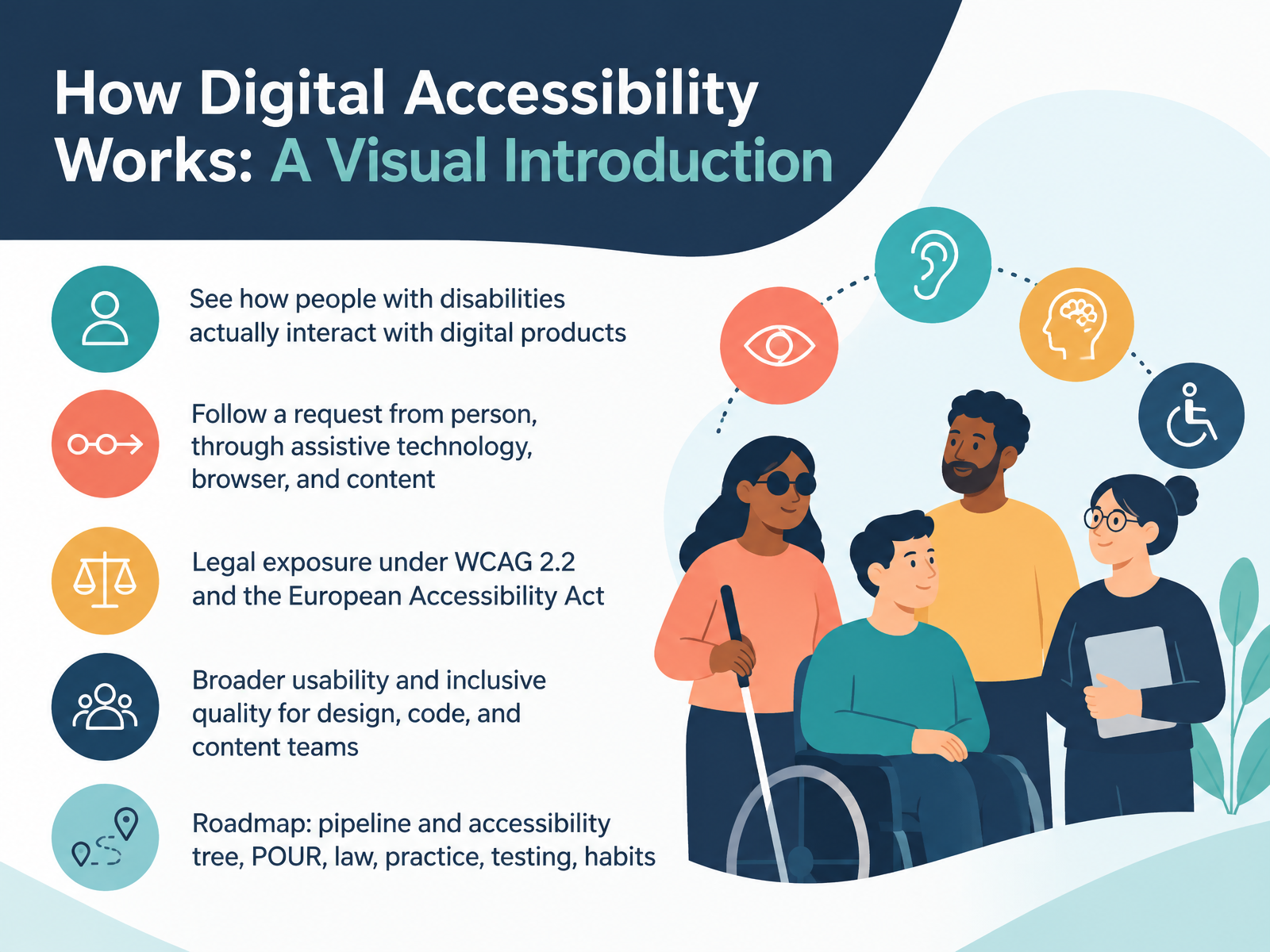
- 01How Digital Accessibility Works: A Visual IntroductionWelcome. I'm glad you're here. Over the next few minutes, we'll build a clear picture of how digital accessibility actually works, not just what the rules say. You'll see how people with disabilities really interact with digital products, and we'll follow a single request from the person, through their assistive technology, into the browser, and down to your content. We'll also look at legal exposure under WCAG two point two, and the European Accessibility Act. Two quick definitions. WCAG two point two is the international set of testable web accessibility guidelines from the World Wide Web Consortium. The European Accessibility Act is a European Union law that sets accessibility requirements for many products and services sold in Europe. Beyond compliance, accessibility improves usability for everyone, which matters to design, code, and content teams alike. Our roadmap moves from the technical pipeline and the accessibility tree, to the POUR principles, then law, practice, testing, and everyday habits. Here's your takeaway for this first slide. Accessibility starts with real people using real tools, so keep the person, not the checklist, at the center of every decision. Next, we'll look at who accessibility serves, covering disabilities, situations, and assistive technology.accessible-eu-centre.ec.europa.eucommission.europa.eunda.ie+22 min
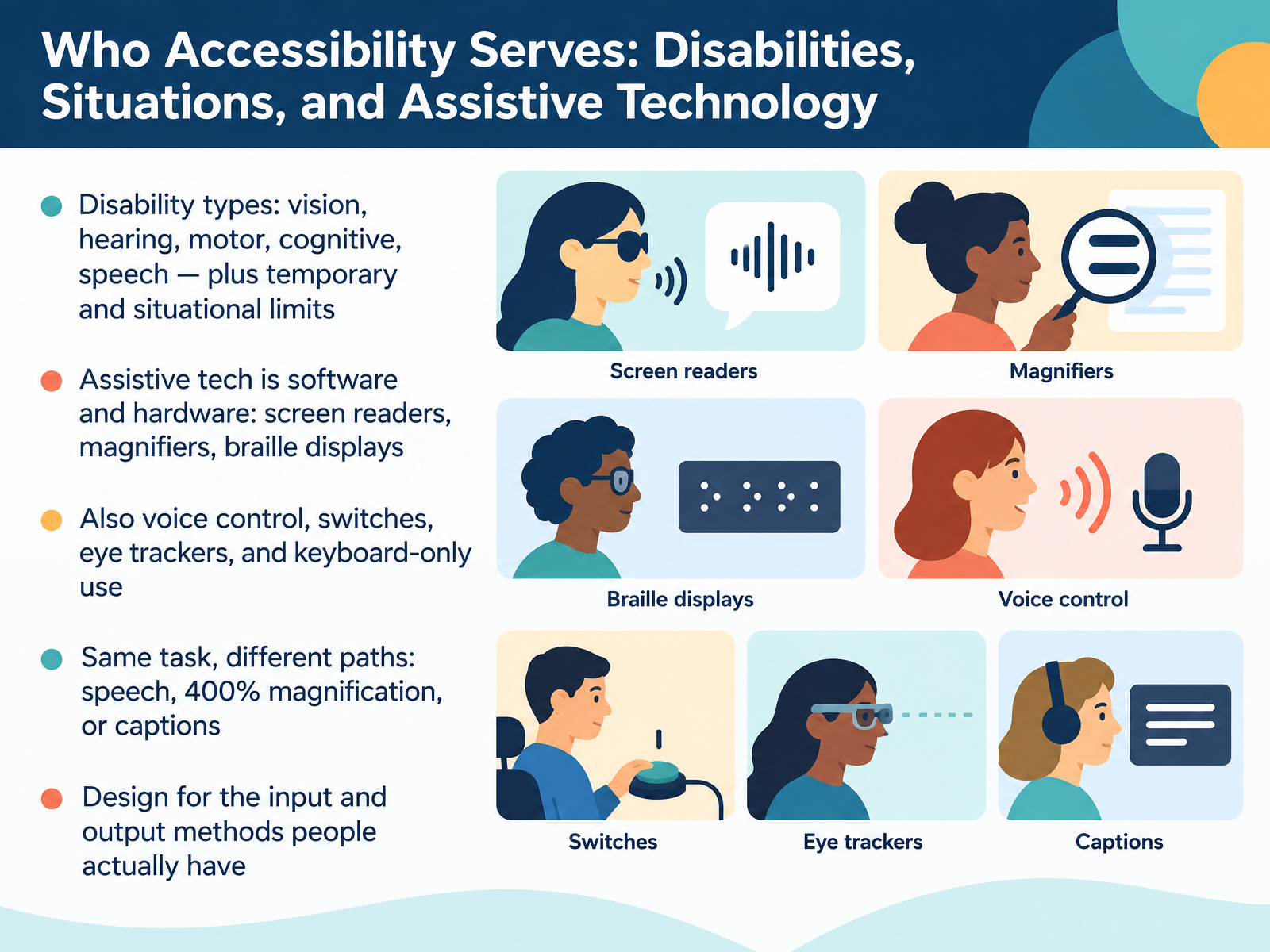
- 02Who Accessibility Serves: Disabilities, Situations, and Assistive TechnologyLet's look at who accessibility actually serves. Disability comes in many forms: vision, hearing, motor, cognitive, and speech. And limits can be temporary, like a broken wrist, or situational, like bright sunlight on a phone screen. Many people use assistive technology, which is software and hardware that improves interaction. That includes screen readers that speak a page aloud or send it to a braille display, and magnifiers that enlarge part of the screen. Others rely on voice control, switch devices, eye trackers, or simply a keyboard alone. The same task can be completed by different paths: speaking a command, zooming in closely, or reading captions. So design for the input and output methods people actually have. Your takeaway: when you review a design or build, ask how this task works without a mouse, without sight, and without sound. Next, The Accessibility Pipeline: From Markup to Speech.
 w3.orgaccessibility.arizona.eduaccessibility.arizona.edu+22 min
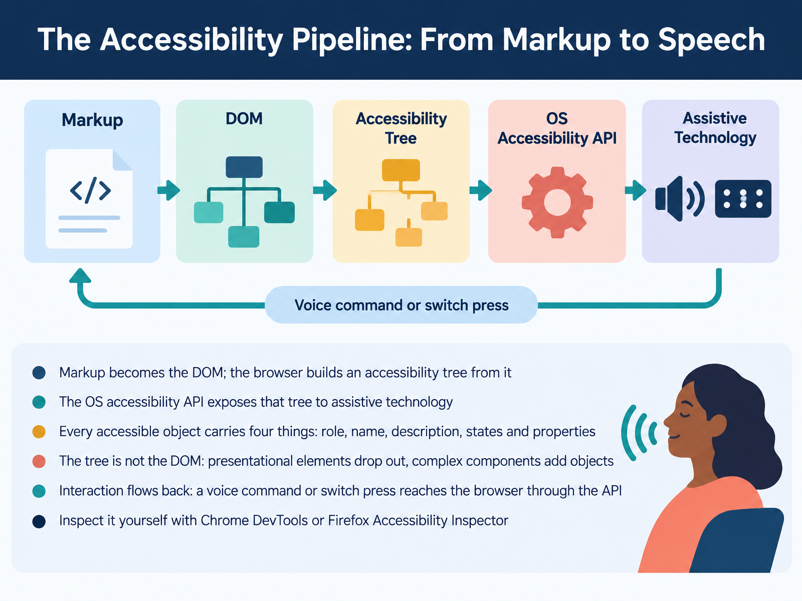
- 03The Accessibility Pipeline: From Markup to SpeechNow let's trace how your markup actually reaches a screen reader. Your HTML becomes the DOM, the browser's internal model of the page. From that DOM, the browser builds a second structure, the accessibility tree. Think of it as a simplified map of the page, written for assistive technology. The browser hands that tree to your operating system's accessibility API, which is simply the shared channel apps use to talk to screen readers and other tools. Every accessible object in that tree carries four things: a role, like button; a name, like Submit; a description, which is optional extra context; and states and properties, like checked or expanded. And here's the key idea: the tree is not the DOM. Purely visual elements drop out, while complex widgets add extra objects. Interaction flows back too. A voice command or switch press travels through the API to the browser, which treats it like a click. You can inspect all of this yourself in Chrome DevTools or the Firefox Accessibility Inspector. So before you ship, open one of those tools and check the role and name of your main controls. Next, we'll look at where the pipeline breaks: common barriers mapped to roles.
 browser.engineeringweb.devhacks.mozilla.org+22 min
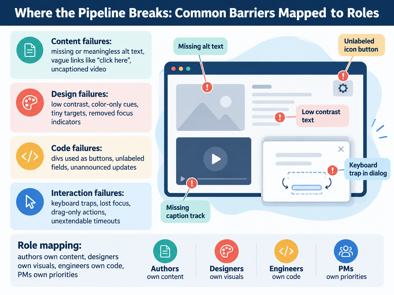
- 04Where the Pipeline Breaks: Common Barriers Mapped to RolesSo let's map where the accessibility pipeline actually breaks, and who owns each fix. Here's the key point. Most barriers trace back to a missing role, name, or state in the accessibility tree. That's the browser's simplified model of your page that assistive tech reads. Start with content. Alt text that's missing or just says image, vague links like click here, and uncaptioned video. Authors own these. Next, design. Low contrast, color-only cues, tiny targets, and removed focus indicators. Designers own these. Then code. Divs used as buttons, unlabeled fields, and updates that aren't announced. Engineers own these, using native elements or ARIA roles and states. Finally, interaction. Keyboard traps, lost focus, drag-only actions, and timeouts you can't extend. Engineers and designers fix these together. One trade-off worth naming. No single role can fix everything alone. A button needs a designer's visible focus state and an engineer's real button element. So here's your takeaway. In your next review, name the owner and ask whether the role, name, and state reach the accessibility tree. Next, let's frame these barriers with the four principles, POUR in practice.
 browser.engineeringweb.devhacks.mozilla.org+22 min
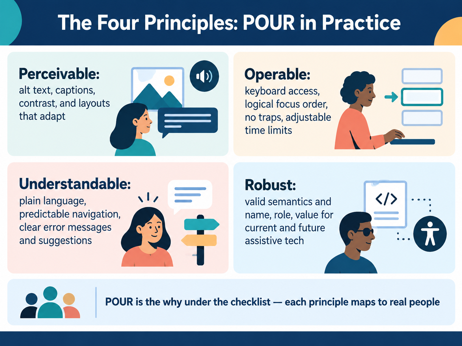
- 05The Four Principles: POUR in PracticeLet's put the guidelines into a simple frame. The Web Content Accessibility Guidelines rest on four principles, often shortened to P O U R. Perceivable means content can be taken in through different senses. Think alt text for images, captions for video, strong contrast, and layouts that adapt to zoom. Operable means people can interact with it. Keyboard access, a logical focus order, no keyboard traps, and time limits users can adjust. Understandable covers plain language, navigation that stays predictable, and error messages that say what went wrong and how to fix it. Robust means valid semantics and clear name, role, and value, so current and future assistive technology can interpret your components. Here's the point. P O U R is the why under the checklist. Each principle maps to real people. A quick tip. During your next review, name which principle each issue touches, and you'll explain the fix far more convincingly. Next, we'll look at what changed in WCAG 2.2 and the new success criteria.
 w3.orgw3.orgw3.org+22 min
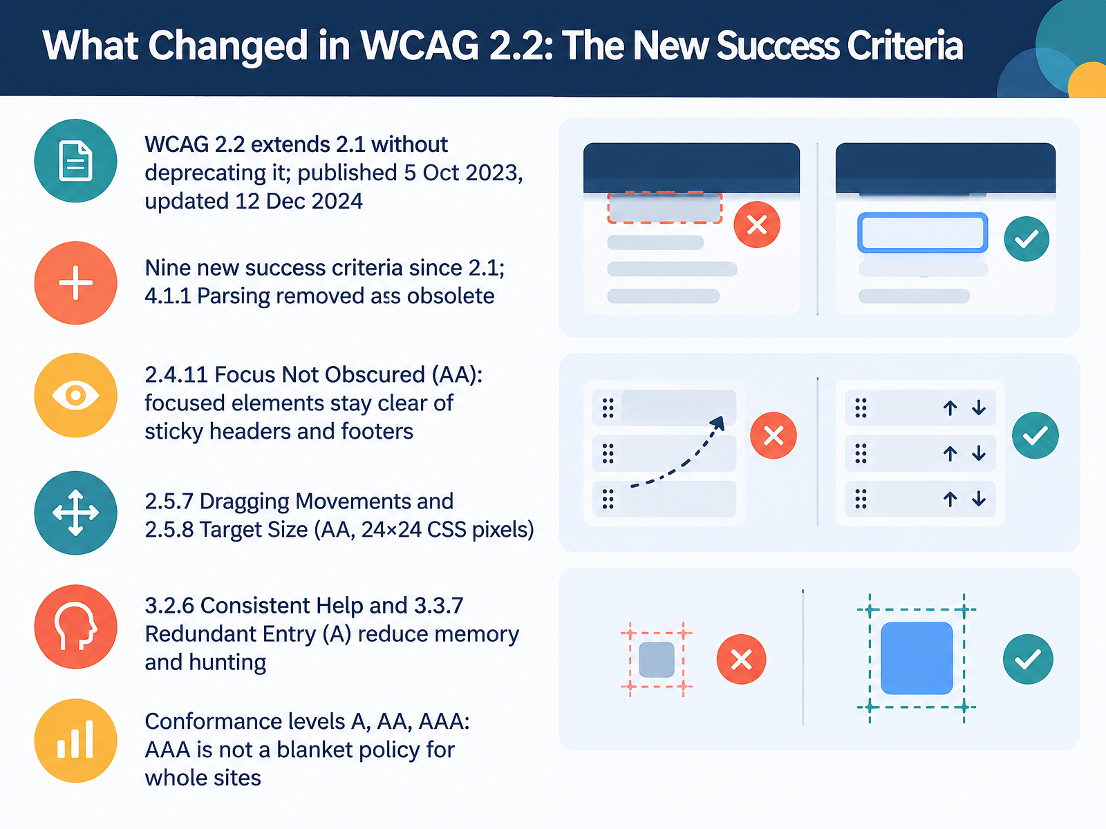
- 06What Changed in WCAG 2.2: The New Success CriteriaNow let's look at what changed in WCAG 2.2. WCAG 2.2 extends version 2.1 without deprecating it. It adds nine new success criteria, and it removes one, 4.1.1 Parsing, which is now obsolete. Here are the ones you are most likely to meet. Criterion 2.4.11, Focus Not Obscured, means a focused element stays at least partly visible. Watch for sticky headers and footers that cover it when someone tabs through a page. Criterion 2.5.7, Dragging Movements, asks for a simple pointer alternative to any drag, such as up and down buttons. And 2.5.8, Target Size, says pointer targets should be at least 24 by 24 CSS pixels, or spaced far enough apart. CSS pixels are the unit your CSS uses for sizing. Two criteria reduce memory and hunting. Consistent Help, 3.2.6, keeps help like a chat button in the same place across pages. Redundant Entry, 3.3.7, means don't ask people to re-enter information they already gave you. Finally, conformance has three levels: A, AA, and AAA. Aim for AA as your baseline, and remember that AAA is not a blanket policy for whole sites. Your takeaway: pick one of these criteria, check it in your next design or build review, and fix it. That leads us to standards and law: WCAG, EN 301 549, and the European Accessibility Act.
 w3.orgw3.orgw3.org+22 min
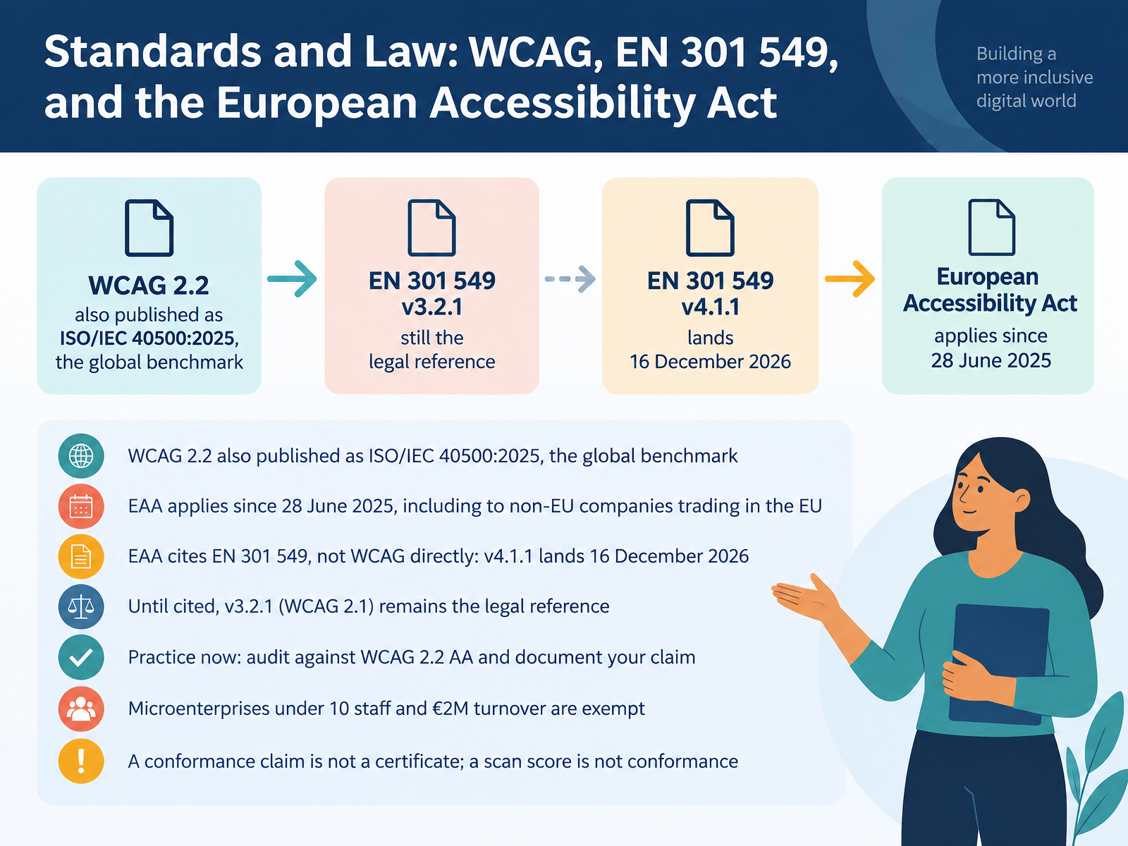
- 07Standards and Law: WCAG, EN 301 549, and the European Accessibility ActNext, let's connect the guidelines you've seen to the standards and laws behind them. WCAG 2.2 is the global benchmark, and it's also published as ISO/IEC 40500, twenty twenty-five. In Europe, the European Accessibility Act has applied since the twenty-eighth of June, twenty twenty-five. It covers companies trading in the EU, even if they're based elsewhere. Here's the nuance. The Act points to the standard EN 301 549, not to WCAG directly. Version four point one point one, which adopts WCAG 2.2, is expected to be cited on the sixteenth of December, twenty twenty-six. Until then, version three point two point one, built on WCAG 2.1, remains the legal reference. Microenterprises with fewer than ten staff and under two million euros turnover are exempt. So what do you do now? Audit against WCAG 2.2 level AA, and write down exactly what you tested and how. And remember, a conformance claim is not a certificate, and a scan score is not conformance. That distinction matters in a legal review. Other legal frameworks to know.
 accessible-eu-centre.ec.europa.eucommission.europa.eunda.ie+22 min
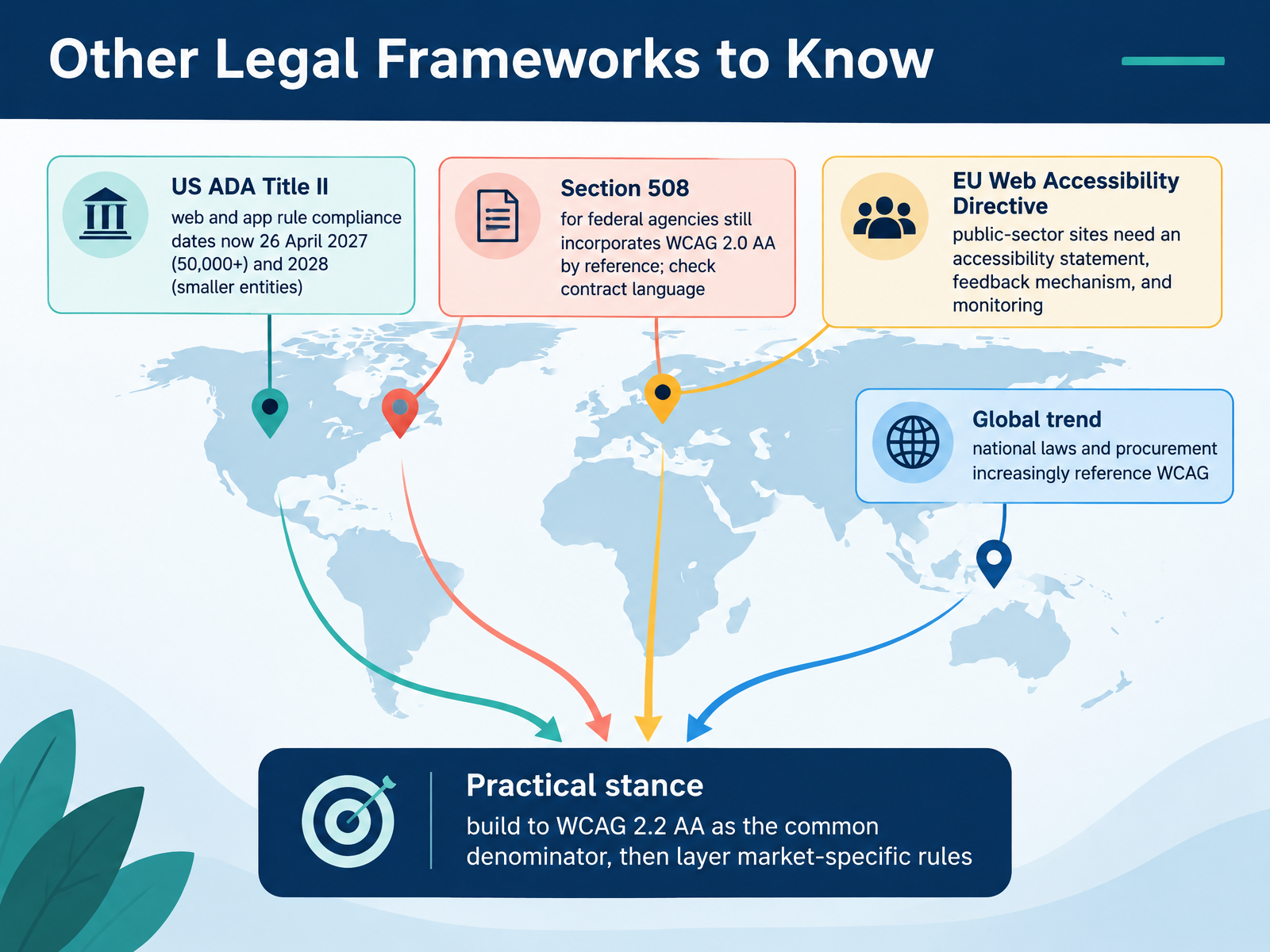
- 08Other Legal Frameworks to KnowNext, let's look at the other legal frameworks worth knowing. The Americans with Disabilities Act, Title Two, now gives state and local governments until April twenty-sixth, twenty twenty-seven to make their web content and mobile apps accessible, if they serve fifty thousand people or more. Smaller entities have until twenty twenty-eight. Section five-oh-eight still applies to federal agencies, and it points to WCAG two point zero, Level Double A. If you work with government contracts, read that contract language carefully. In the European Union, the Web Accessibility Directive requires public-sector sites to publish an accessibility statement, offer a feedback mechanism, and take part in monitoring. Around the world, laws and procurement rules increasingly point to WCAG. So here's a practical stance. Build to WCAG two point two, Level Double A, as your common baseline, then layer on market-specific rules where you operate. Now, let's move into the patterns themselves, with Designing for Accessibility: Visual and Interaction Patterns.
 w3.orgaccessible-eu-centre.ec.europa.eucommission.europa.eu+22 min
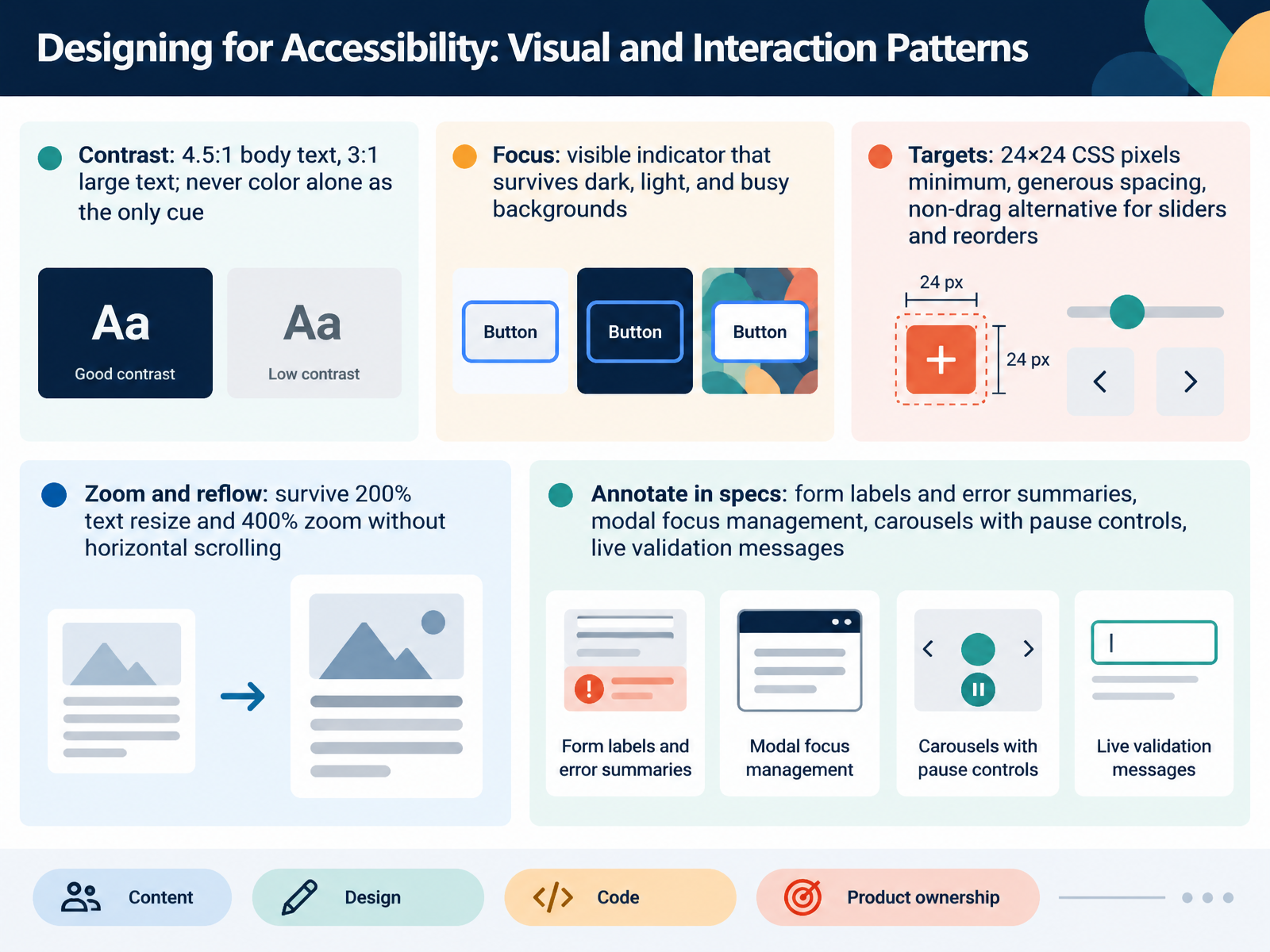
- 09Designing for Accessibility: Visual and Interaction PatternsNow let's turn these principles into visual and interaction patterns you can design and review today.
Start with contrast. Body text needs a contrast ratio of at least four point five to one. Large text needs at least three to one. And never rely on color alone as your only cue, because some people can't perceive that difference. Pair color with an icon, a label, or an underline.
Next, focus. Keyboard users need a visible indicator that shows where they are. That indicator should stay visible on dark backgrounds, light backgrounds, and busy images.
Then, target size. Aim for at least twenty four by twenty four CSS pixels, with generous spacing between controls. And for sliders or reordering, always offer a non-drag alternative, like arrow buttons.
Finally, test zoom and reflow. At two hundred percent text resize and four hundred percent zoom, content should survive without horizontal scrolling.
One actionable takeaway: annotate these patterns in your design specs. Call out form labels and error summaries, modal focus management, carousels with pause controls, and live validation messages. That way, accessibility moves from an afterthought to a build-ready requirement. Up next, building it in code: semantics, names, and dynamic content.
 w3.orgw3.orgw3.org+22 min
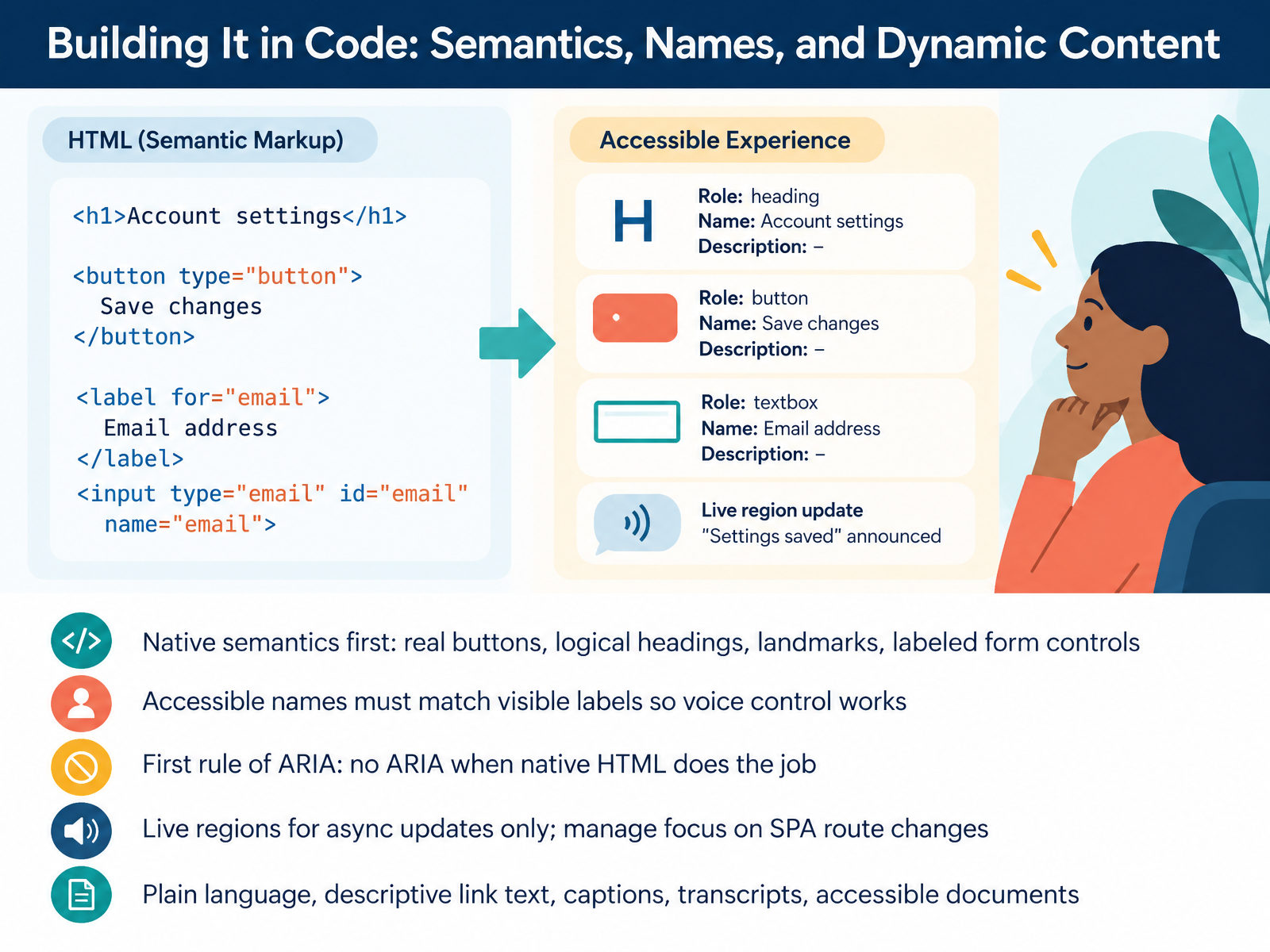
- 10Building It in Code: Semantics, Names, and Dynamic ContentNow let's move from design into code. The core idea is simple. Start with native semantics: real buttons, a logical heading order, landmarks, and form controls that have proper labels. Next, make sure each control's accessible name matches its visible label. That name is what assistive technology announces, so when the two match, voice control users can say the label they see and actually trigger the control. Here's the first rule of ARIA, a set of attributes that add semantics: don't use ARIA when native HTML already does the job. Native elements come with behavior built in, so there's less to break. For dynamic content, use live regions only for updates that happen without user action, like a status message. A live region is a marked area whose changes screen readers announce. In a single page application, manage focus on route changes so users land in the new content. And regardless of framework, use plain language, descriptive link text, captions, transcripts, and accessible documents. Your takeaway: before writing custom code, check whether a native element already gives you the role, name, and behavior you need. Next, we'll look at testing accessibility: what tools catch and what humans must.
 w3.orgw3.orgbrowser.engineering+22 min
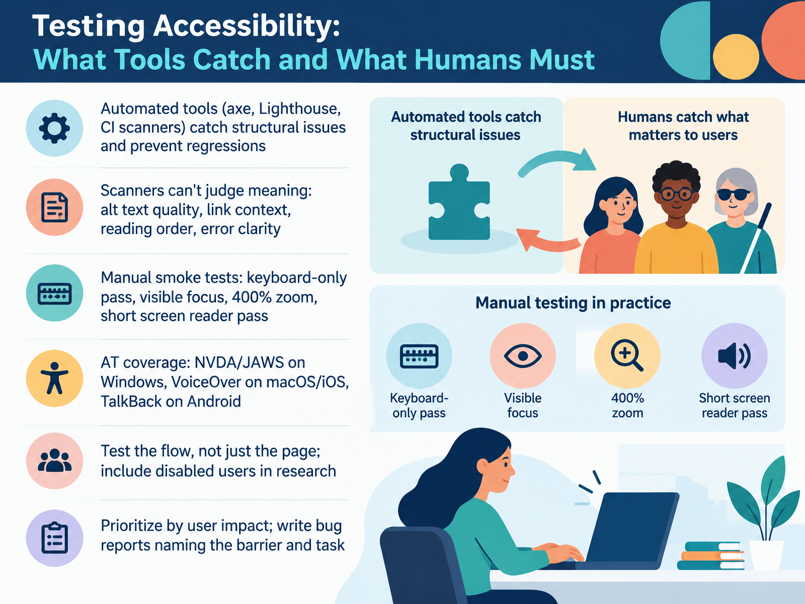
- 11Testing Accessibility: What Tools Catch and What Humans MustNow let's look at testing, and what each kind of check can and cannot tell you. Automated tools like axe, Lighthouse, and CI scanners are your safety net. They catch structural issues, missing labels, low contrast, and they prevent regressions. But a scanner can't judge meaning. It can tell an alt attribute exists. It can't tell whether the description actually explains the chart. The same goes for link context, reading order, and whether an error message is clear enough to act on. So pair the tools with quick manual smoke tests. Tab through with the keyboard only. Confirm the focus indicator is visible. Zoom to four hundred percent and check nothing breaks. Then do a short screen reader pass, using NVDA or JAWS on Windows, VoiceOver on macOS and iOS, and TalkBack on Android. Test the whole flow, not just a single page. And bring disabled users into your research. When you file a bug, name the barrier and the task it blocks, and prioritize by user impact. Your takeaway is this. Treat automated scans as a floor, not a finish line. Next, we'll look at making this stick, with roles, process, and a definition of done.
 2 min
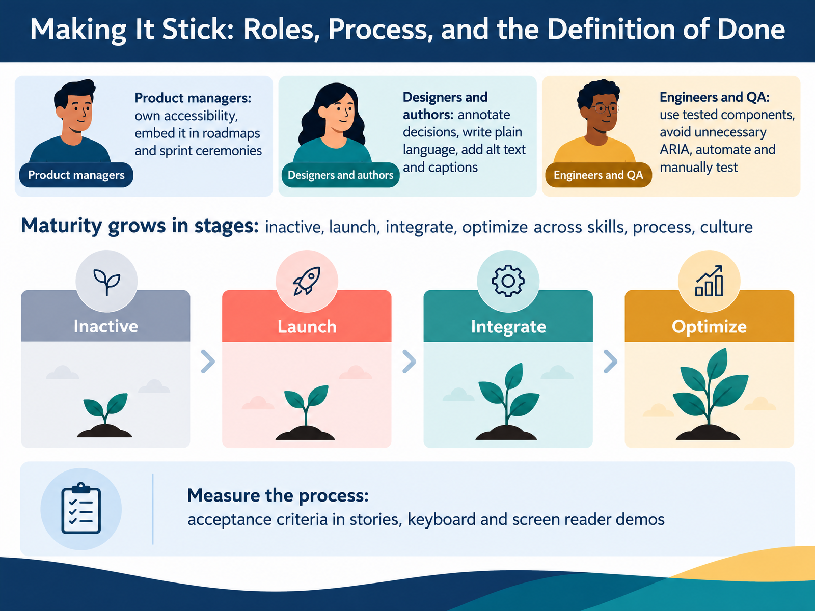
- 12Making It Stick: Roles, Process, and the Definition of DoneLet's turn all of this into something that lasts. Accessibility sticks when it's built into roles and process, not treated as a one-time fix. Product managers own it. Put accessibility on the roadmap and inside sprint planning, review, and your definition of done. Designers and content authors make decisions visible, write in plain language, and add alt text and captions. Engineers and QA start with tested components, avoid unnecessary ARIA, and combine automated checks with manual testing. Maturity grows in stages, from inactive to launch, integrate, and optimize across skills, process, and culture. So measure the process. Add acceptance criteria to stories, and demo keyboard and screen reader use at the end of each sprint. Your takeaway: agree as a team what done means, then check accessibility before a story closes. Next, let's look at your first thirty days.
 2 min
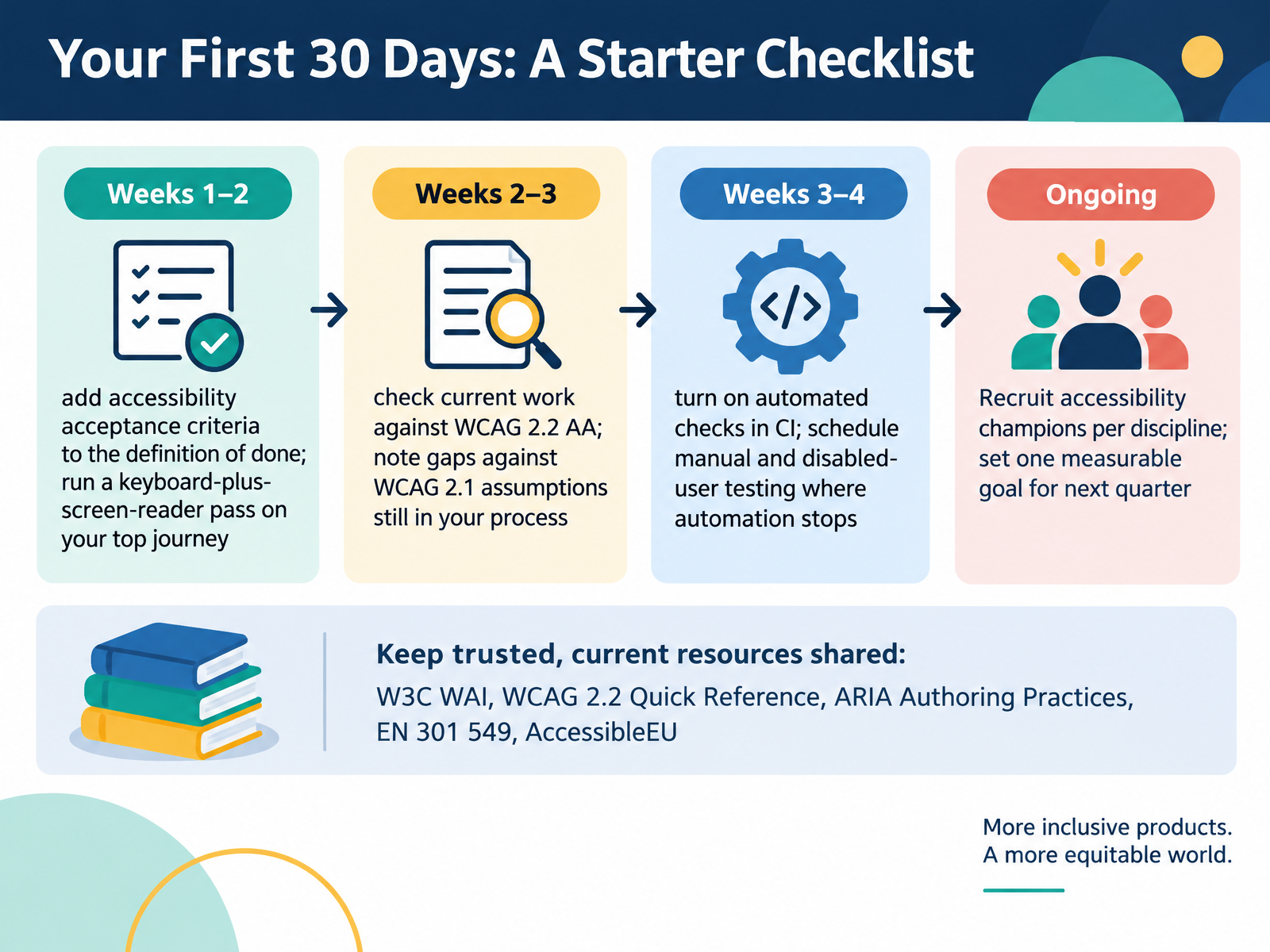
- 13Your First 30 Days: A Starter ChecklistLet's make this concrete with a thirty day starter checklist. In weeks one and two, add accessibility acceptance criteria to your definition of done. In plain terms, that's the shared list of conditions work must meet before anyone calls it finished. Then run a keyboard plus screen reader pass on your top user journey. Next, check current work against WCAG 2.2, level double A, and note where your process still assumes WCAG 2.1. In weeks three and four, turn on automated checks in continuous integration, then schedule manual and disabled user testing where automation stops. Keep trusted resources shared, like the W3C Web Accessibility Initiative, the WCAG 2.2 quick reference, the ARIA Authoring Practices, EN 301 549, and AccessibleEU. Finally, recruit an accessibility champion in each discipline and set one measurable goal for next quarter. Your takeaway: agree on your acceptance criteria this week, so every future review has a clear bar. Next, Key Takeaways and Discussion.
 w3.orgw3.orgw3.org+22 min
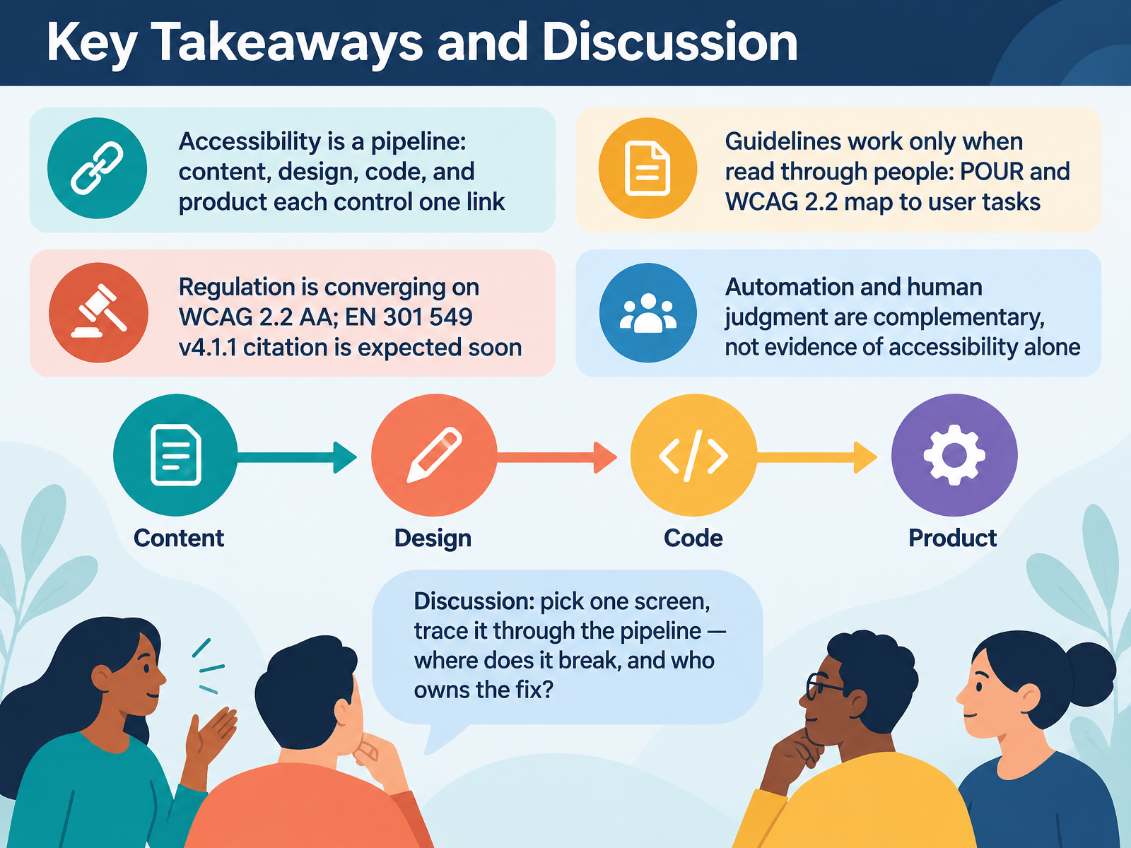
- 14Key Takeaways and DiscussionLet's bring this together with five takeaways. First, accessibility is a pipeline. Content, design, code, and product each control one link, so a single weak link can block a user. Second, guidelines work only when you read them through people. POUR and WCAG 2.2 map to real user tasks, like reading a heading or activating a button. Third, regulation is converging on WCAG 2.2 level AA. The EN 301 549 version four point one point one citation is expected soon, so plan for it now. Fourth, automation and human judgment are complementary. A scanner can flag a missing alt attribute, but only a person can judge whether the description is useful. Neither is proof of accessibility alone. Finally, for discussion, pick one screen and trace it through the pipeline. Ask where it breaks and who owns each fix. My takeaway for you is this: confirm accessibility in your definition of done, then walk one real screen with a keyboard and a screen reader. Thank you for joining me, and carry that one screen review into your next sprint. You have everything you need to start.
 browser.engineeringweb.devhacks.mozilla.org+22 min
Take the deck with you
Download this course as a file — free, no sign-up needed.
- PDF handoutEvery slide page, ready to print or share.15 pages · 3.5 MBDownload
- Narrated PowerPointThe deck that presents itself — every slide carries the digital human's narration video.15 pages · 14.9 MBDownload
- PowerPoint slidesThe full deck as a .pptx — open it in PowerPoint, Keynote, or Google Slides.15 pages · 3.4 MBDownload
Free to use in your own training — please keep the PersonWise credit page at the end.
Have your own deck? Turn it into a course
Sources consulted
Web sources consulted while building this course.
- The European accessibility standard EN 301 549 has been updated - AccessibleEU — accessible-eu-centre.ec.europa.eu
- European Accessibility Act (EAA) — commission.europa.eu
- Updated EN 301 549 Standard Strengthens Accessibility Requirements for ICT Products and Services - National Disability Authority — nda.ie
- Accessibility to products and services for people with a disability and older people - Consilium — consilium.europa.eu
- AccessibleEU Final Report Getting to know the European legislation on accessibility. — accessible-eu-centre.ec.europa.eu
- Tools and Techniques | Web Accessibility Initiative (WAI) | W3C — w3.org
- Assistive Technology Overview | Accessibility — accessibility.arizona.edu
- Assistive Technology Deep Dive | Accessibility — accessibility.arizona.edu
- Assistive technologies | Red Hat design system — ux.redhat.com
- Using assistive and accessible technology (ATech) - GOV.UK — gov.uk
- Making Content Accessible | Web Browser Engineering — browser.engineering
- The Accessibility Tree | Articles | web.dev — web.dev
- How accessibility trees inform assistive tech - Mozilla Hacks - the Web developer blog — hacks.mozilla.org
- Chromium Docs - How Chrome Accessibility Works, Part 2 — chromium.googlesource.com
- Browsers, code and assistive technologies — Web Accessibility Guide — NZ Government — govtnz.github.io
- How to Meet WCAG (Quickref Reference) — w3.org
- Web Content Accessibility Guidelines (WCAG) 2.2 — w3.org
- What's New in WCAG 2.2 | Web Accessibility Initiative (WAI) | W3C — w3.org
- Web Content Accessibility Guidelines (WCAG) - Service Manual — servicemanual.gov.scot
- Accessibility at Penn State | WCAG 2.2 Guidelines — accessibility.psu.edu