Regression Analysis Fundamentals
Begin
13 pages · ~26 min
Regression Analysis Fundamentals
This training introduces foundational regression concepts, including lines of best fit, residuals, and pattern analysis, for learners new to statistical modeling.
What you’ll learn
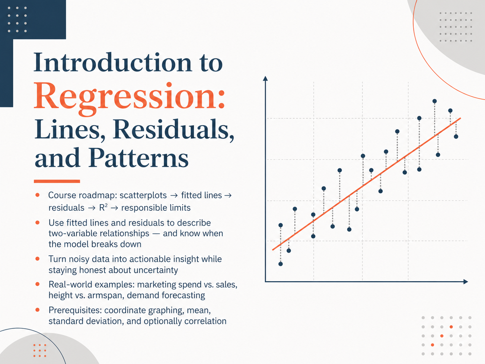
- 01Introduction to Regression: Lines, Residuals, and PatternsWelcome. In this course, we are going to learn how to describe patterns between two variables using fitted lines and residuals, and just as importantly, how to recognize when those patterns break down. We will start with scatterplots, then build fitted lines, look at residuals, and eventually talk about R-squared and the responsible limits of any model. The goal is not just to fit a line, but to turn noisy data into honest, actionable insight. To get the most out of this, you should be comfortable with coordinate graphs, the mean, and standard deviation. A little familiarity with correlation helps, but is not required. Let's begin our roadmap by first visualizing what a two-variable relationship actually looks like.juanitorduz.github.iodatafield.devjournals.sagepub.com+21 min
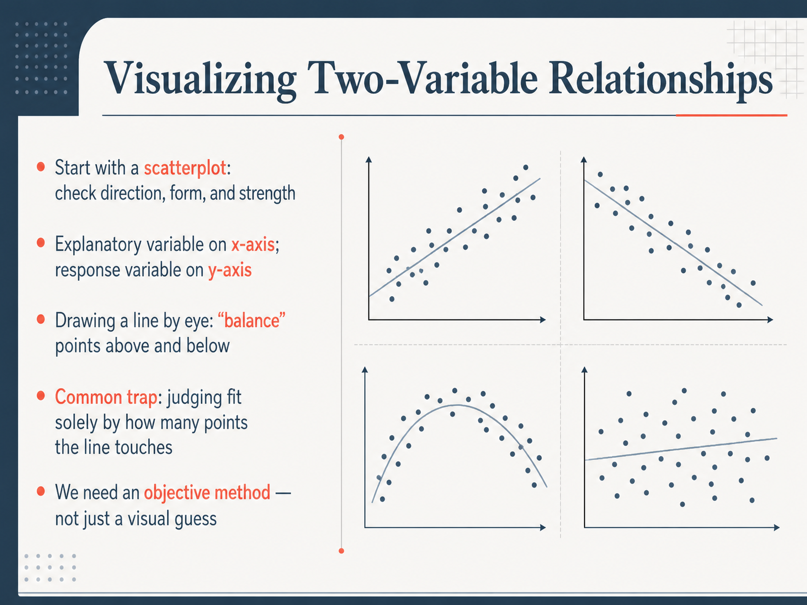
- 02Visualizing Two-Variable RelationshipsNow let's start at the very beginning, with a scatterplot. Imagine you have measurements for two things—like height and arm span. Each person in your dataset becomes a single dot on the graph. The explanatory variable, or what you're using to predict, goes on the x-axis. The response variable, the thing you are trying to understand or predict, goes on the y-axis. The first step is simply to look at the cloud of dots. Does it seem to go up, down, or show no clear pattern? We call this checking the direction, the form, and the strength. Now, we can start trying to capture that pattern with a line. You might find yourself trying to sketch a line that seems to cut through the points. A good visual trick is to balance the points: you want roughly the same number of points above your line as below it. But here is a common trap I want you to watch out for. Don't fall into the habit of judging a line just by how many points it actually touches. A line can be perfectly placed without touching a single point, or it might touch several points but still be a terrible fit. We need an objective method. We need a way to find and judge our line that is more reliable than just a visual guess. In the next slide, we'll start building that method ourselves by actually drawing a candidate line through some real data.
 mathequalslove.netlearnlattice.orgww2.amstat.org+22 min
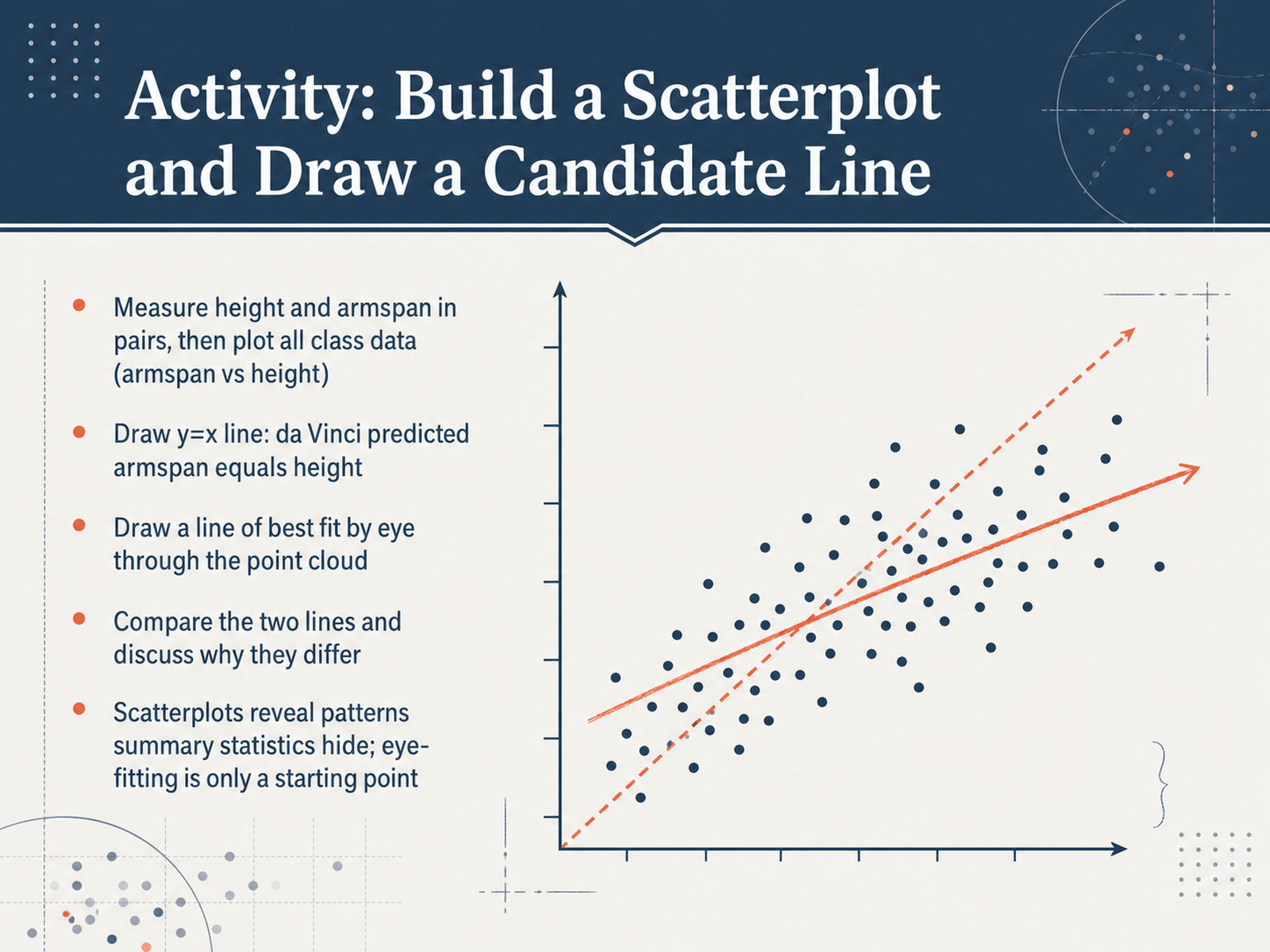
 - 03Activity: Build a Scatterplot and Draw a Candidate LineNow we put those ideas to work with our own data. In pairs, you'll measure height and armspan in centimeters. Then we pool all the class data and plot armspan versus height on a scatterplot. Once the points are on the graph, draw the line where armspan equals height — that's da Vinci's prediction, the y equals x line. Then, by eye, draw a candidate line of best fit right through the point cloud. Now compare the two lines. How close is da Vinci's ideal line to your fitted line? Where do they drift apart, and why do you think that happens? You'll probably notice that a scatterplot reveals patterns and spread that a single summary number can hide. Remember, eye-fitting is only a starting point — real differences between lines are not failures; they show us the limits of a simple prediction. Next, we move from drawing by eye to a systematic way of choosing the line. Let's look at the least-squares idea.
 mathequalslove.netlearnlattice.orgww2.amstat.org+22 min
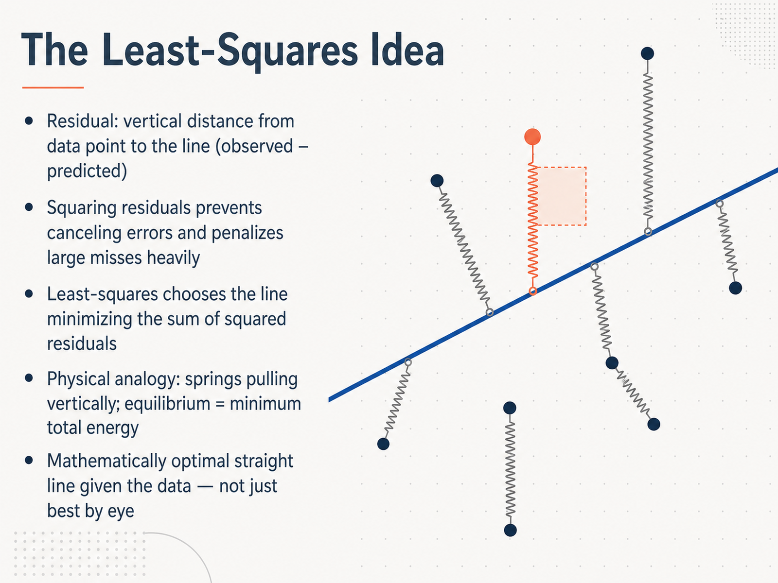
 - 04The Least-Squares IdeaNow, let's explore the core idea behind the least-squares line. First, recall the residual. That's the vertical gap from a data point to our fitted line. We calculate it as the observed value minus the predicted value. Some points will sit above the line and have positive residuals, while others will fall below and have negative residuals. If we simply added all these residuals together, the positives and negatives could cancel out and trick us into thinking a poor fit was actually perfect. To fix this, we square each residual. Squaring makes every gap positive, and importantly, it heavily penalizes large misses. A point that's way off gets a much bigger squared penalty than several points that are just a little off. The least-squares method therefore chooses the single line that minimizes the sum of these squared residuals across all data points. Here's a helpful mental model. Picture each data point anchored in place with a vertical spring pulling on the line. The further a point is from the line, the more tension is in that spring. Physical equilibrium, the minimum total energy, occurs exactly where we minimize the sum of squared residuals. That's the least-squares solution. It isn't just a visual guess. It's the mathematically optimal straight line for the data we have. Moving on, let's see how to interpret the two parts of this optimal equation: the slope and the intercept.
 nickch-k.github.ioonline.stat.psu.edumathsisfun.com+21 min
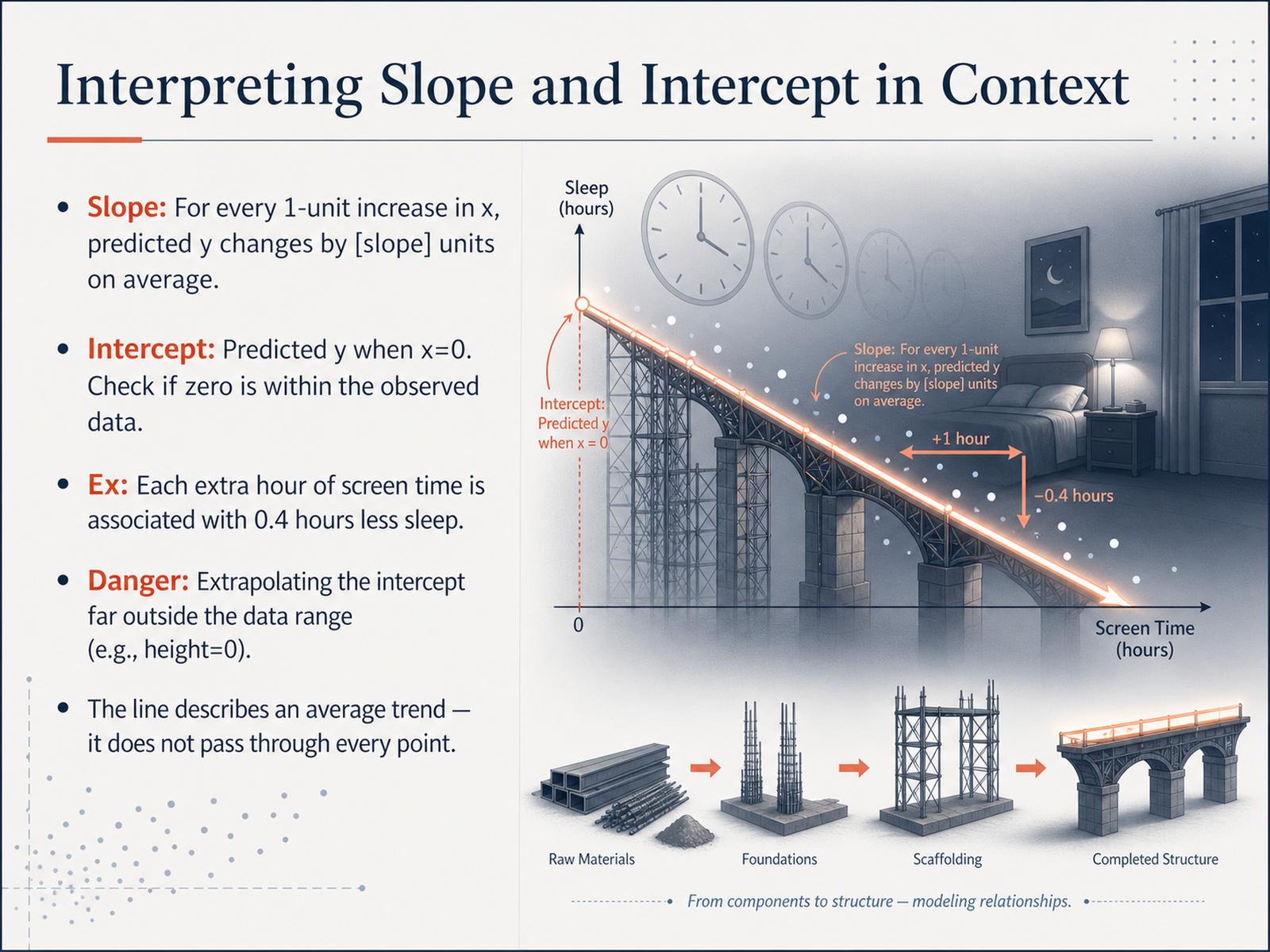
 - 05Interpreting Slope and Intercept in ContextNow, let's make sense of the line itself. Two numbers describe a fitted line: the slope and the intercept. The slope tells us that for every one-unit increase in x, the predicted y changes by the slope's value, on average. So if the slope is negative zero-point-four for screen time and sleep, it means each extra hour of screen time is associated with about zero-point-four hours less sleep. The intercept is the predicted y when x equals zero. But we have to pause and ask: does x equals zero make sense in our data? If we're modeling adult height, a height of zero is far outside anything we measured. Extrapolating the intercept that far can give us a meaningless number—like predicting sleep for zero screen time in a world that doesn't exist. Finally, and this matters most, the line is an average trend. It does not pass through every point. Some people will sleep more than the line predicts, some less. Those gaps are what we call residuals, and they're just as informative as the line itself. In fact, let's turn next to working with residuals: what the line missed.
 online.stat.psu.edustatsnotebook.ioonline.stat.psu.edu+22 min
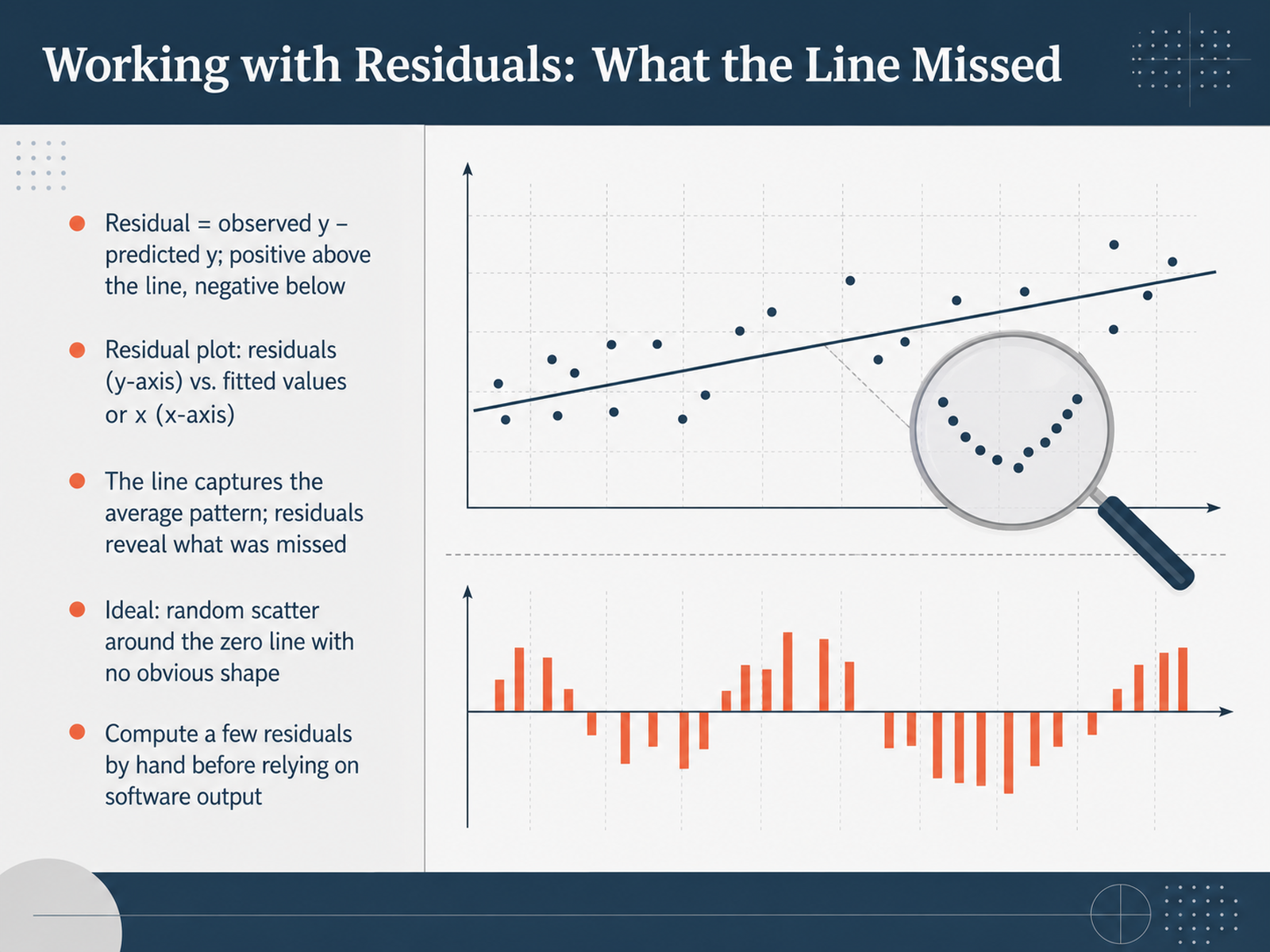
 - 06Working with Residuals: What the Line MissedNow, let's dig deeper into what the line missed. We call the leftover distance between an observed data point and our fitted line the residual. It is simply the observed value minus the predicted value. If a residual is positive, the point sits above the line; if it's negative, the point sits below it. A great way to see these leftovers is with a residual plot. We put the residuals on the vertical axis and the fitted values, or the x-values, on the horizontal axis. The fitted line captures the average pattern, but the residual plot reveals what was missed. In an ideal world, these points scatter randomly around the zero line with no obvious shape. That tells us our linear model is a reasonable fit. But if you see a curve, a fan shape, or just one point standing far away, the data is telling you something your line has not captured. Before jumping to software output, I recommend computing a few residuals by hand. It really builds your intuition for what these numbers mean. Next, let’s move on to recognizing those specific residual patterns.
 online.stat.psu.edustatsnotebook.ioonline.stat.psu.edu+22 min
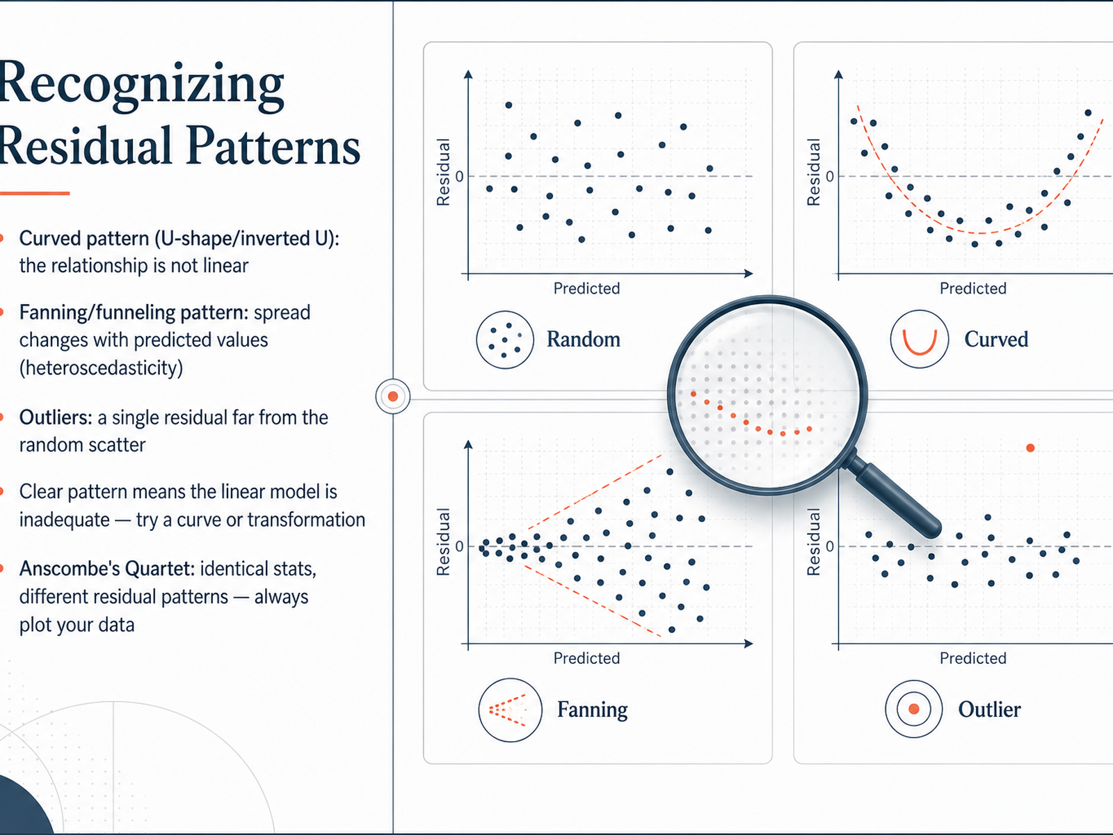
 - 07Recognizing Residual PatternsNow let's talk about what happens when a linear model isn't the right choice. The key is to look for patterns in our residuals. If the residual plot shows a curved shape, like a U or an inverted U, that tells us the relationship is not linear. Another common pattern is fanning or funneling. This means the spread of the residuals changes as the predicted values change. It's a sign of what we call heteroscedasticity. We might also spot an outlier, a single residual that sits far away from the random scatter of the rest. When you see any clear pattern, it doesn't mean the analysis has failed. It simply means the linear model is inadequate for this data. This is our signal to try a curve or a transformation. A famous example that drives this home is Anscombe's Quartet. It shows four different datasets that have identical summary statistics, like the same correlation coefficient and regression line. But when you plot the data and the residuals, the patterns are completely different. The takeaway is fundamental: always plot your data. Never rely on summary numbers alone. Next, we'll take a closer look at how to handle outliers and influential points.
 online.stat.psu.edustatsnotebook.ioonline.stat.psu.edu+22 min
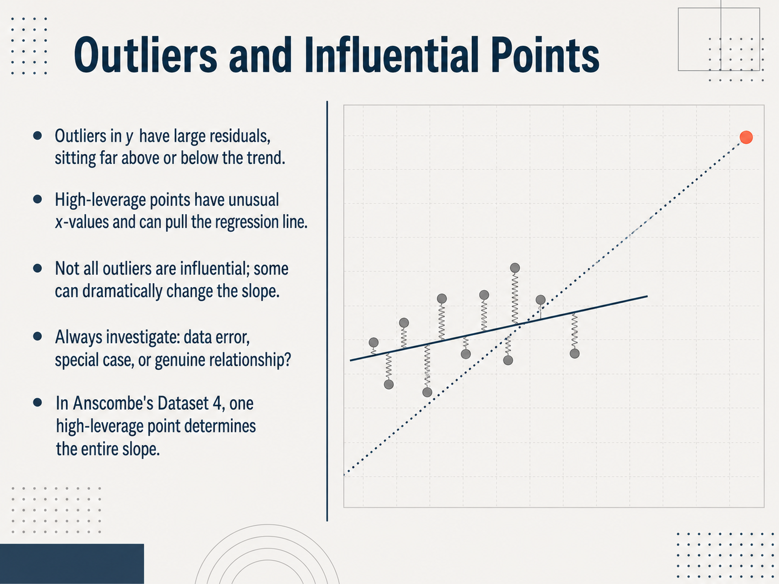
 - 08Outliers and Influential PointsNow we turn to the troublemakers in our data: outliers and influential points. An outlier in the y-direction sits far above or below the general trend, and you can spot it by a very large residual. A different kind of point has high leverage, meaning its x-value is unusual. These high-leverage points don’t always have big residuals, but they can pull the regression line toward themselves. Not every outlier is influential. Some barely change the slope, while others can flip the story almost completely. Think of Anscombe’s fourth dataset. Nearly all the x-values are identical, except for one point far to the right. That single high-leverage observation determines the entire slope. Remove it, and we cannot even estimate a line. So whenever you see a point like this, pause and investigate. Is it a data entry error? A special case that doesn’t belong with the rest? Or perhaps a genuine relationship that deserves its own explanation? Asking these questions turns a diagnostic plot from a simple check into a deeper conversation with your data. Coming up next, we will ask how much variation the line actually captures when we explore R-squared: how much variation does the line capture.
 online.stat.psu.edustatsnotebook.ioonline.stat.psu.edu+22 min
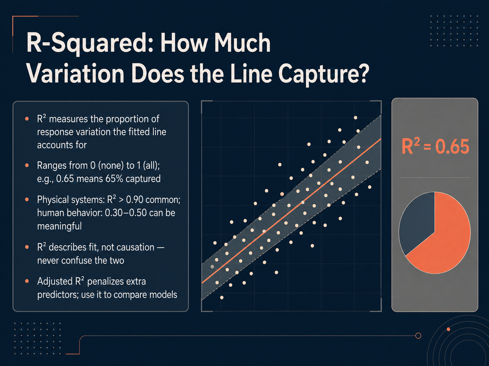
 - 09R-Squared: How Much Variation Does the Line Capture?Now let's talk about r-squared. It's a number that tells us what proportion of the response variation our fitted line captures. Think of it as a report card for the line's fit. It ranges from zero, meaning the line explains none of the variation, to one, meaning it explains all of it. For example, an r-squared of zero point six five means sixty-five percent of the variation in the response is accounted for by the line. But context is everything. In a physical system, like a controlled lab experiment, we often see r-squared values above zero point nine. In studies of human behavior, values between zero point three and zero point five can be genuinely meaningful. People are just harder to predict. A crucial point: r-squared describes fit, not causation. A high r-squared never proves that changes in one variable cause changes in another. Also, when we add more predictors to a model, r-squared always looks a little better, even if the new predictor is just noise. That's why we have adjusted r-squared. It penalizes added complexity and gives us a more honest number for comparing different models. Next, we'll explore some specific limitations and traps to avoid when using r-squared.
 juanitorduz.github.iodatafield.devjournals.sagepub.com+22 min
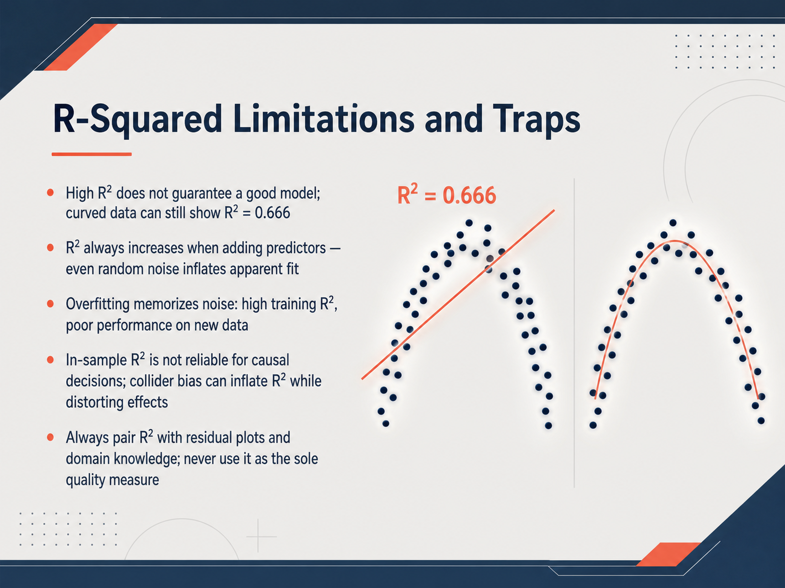
 - 10R-Squared Limitations and TrapsLet's look at how R-squared can fool us, and what to do about it. First, a high R-squared does not mean the model is good. Imagine fitting a straight line to data that curves, like satellite dish shape. The R-squared can still be 0.67, or about two-thirds, while the line completely misses the real pattern. Second, R-squared always climbs when you add more predictors, even if you add complete random noise. That inflates the appearance of fit without real improvement. Third, overfitting happens when the model memorizes noise instead of learning the signal. You get great training R-squared, but it fails on new data. Fourth, do not rely on R-squared alone for causal decisions. Including a collider variable can push R-squared up while badly distorting the effect you care about. The takeaway is clear: never use R-squared as your only quality check. Always pair it with residual plots and your own domain knowledge. That is how you catch hidden traps and build models that truly explain what is going on. Up next, let's talk about describing relationships responsibly.
 juanitorduz.github.iodatafield.devjournals.sagepub.com+22 min
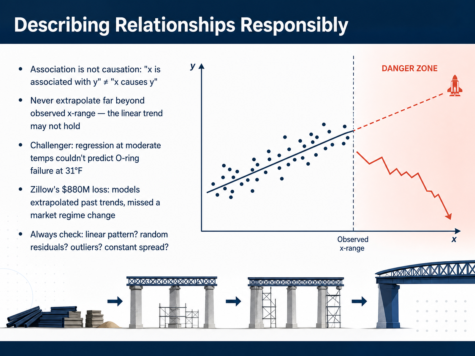
 - 11Describing Relationships ResponsiblySo far, we have learned how to build and interpret a fitted line. Now, let's talk about how to describe the relationship responsibly. The most important rule is this: association is not causation. Just because x and y move together does not mean x causes y. There could be a hidden third factor, or it might be just chance. Another critical rule is to never extrapolate far beyond the observed x-range. The linear trend you see in your data may not hold outside that window. History gives us painful examples. Before the Challenger disaster, engineers used data from moderate temperatures to predict O-ring failure. They were extrapolating. On the morning of the launch, the temperature was just thirty-one degrees Fahrenheit, far below any test data, and the model failed to predict the risk. A more recent case is Zillow's home-buying program. Their models extrapolated past market trends and missed a major market shift, resulting in a loss of almost nine hundred million dollars. The lesson? Even a great fit inside your data range does not guarantee accurate predictions outside it. So always check your diagnostics. Is the pattern really linear? Are the residuals scattered randomly? Are there any outliers? And is the spread constant? These checks protect you from overconfidence. Next, we will discuss communicating these findings clearly to your colleagues.
 juanitorduz.github.iodatafield.devjournals.sagepub.com+22 min
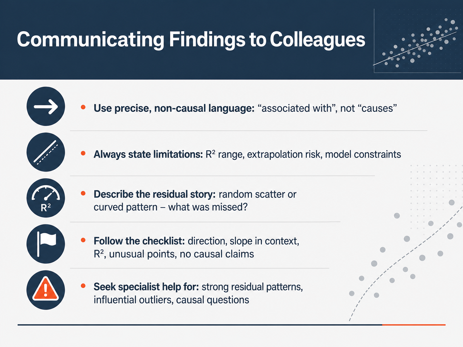
 - 12Communicating Findings to ColleaguesNow that we have a fitted model, how do we actually talk about it with colleagues? This is where statistical storytelling really matters. Use precise, non-causal language. Say that a change in the predictor is associated with a change in the outcome—never say it causes the outcome. Always state your model’s limits. Mention the R-squared range, the risk of extrapolation beyond the observed data, and any constraints in how the model was built. Describe the residual story. Are the residuals scattered randomly, or do you see a curved pattern that suggests something important was missed? Follow a simple checklist: report the direction of the relationship, state the slope in context, give the R-squared value, flag any unusual points, and avoid causal claims. And know when to call in a specialist. If you see strong patterns in the residuals, influential outliers, or if the business question is really about cause and effect, reach out for deeper statistical help. Communicating findings honestly builds trust and leads to better decisions. Let’s move into a guided practice to put these ideas together.
 juanitorduz.github.iodatafield.devjournals.sagepub.com+22 min
 - 13Guided Practice and Wrap-UpLet’s bring everything together with some guided practice and a quick wrap-up. First, I want you to try the full workflow yourselves: start with a small dataset—maybe Anscombe’s quartet from our readings—fit a line, compute the residuals by hand or with software, and then build a residual plot. As you look at the plot, ask, “Do the residuals show a curve?” That suggests nonlinearity. “Do they fan out?” That hints at unequal variance. “Is one point pulling the line?” That’s an outlier worth investigating. Next, I’d like you to think about your own work. Where could fitting a line help you spot a trend or summarize a pattern? And just as importantly, where does that line break down—maybe because the relationship is curved, or because you’re tempted to extrapolate far beyond the data? Remember the six essentials we’ve built this whole course on: plot the data first, minimize squared errors to get the fitted line, always inspect the residuals, check R-squared but don’t stop there, know that association is not causation, and never blindly extrapolate. Keep a quick-reference card handy with the line-fitting steps, the diagnostic patterns you’ve learned to spot, and a few plain-language rules for communicating about a fitted model. Thank you for working through these ideas. Trust your plots, question your fits, and keep practicing.
 online.stat.psu.edustatsnotebook.ioonline.stat.psu.edu+22 min
Take the deck with you
Download this course as a file — free, no sign-up needed.
- PDF handoutEvery slide page, ready to print or share.14 pages · 2.9 MBDownload
- Narrated PowerPointThe deck that presents itself — every slide carries the digital human's narration video.14 pages · 12.9 MBDownload
- PowerPoint slidesThe full deck as a .pptx — open it in PowerPoint, Keynote, or Google Slides.14 pages · 2.8 MBDownload
Free to use in your own training — please keep the PersonWise credit page at the end.
Have your own deck? Turn it into a course
Sources consulted
Web sources consulted while building this course.
- In-Sample \(R^2\) is Not a Good Metric for Decision Making - Dr. Juan Camilo Orduz — juanitorduz.github.io
- Chapter 8: Supervised Learning — Regression | AI & ML for Business — datafield.dev
- R-Squared (R 2 ) – How much variation is explained? — journals.sagepub.com
- R Squared (Coefficient of Determination): Practical, Modern Guidance for Regression Work – TheLinuxCode — thelinuxcode.com
- R Squared Guide For Business Growth — kurums.com
- 11 Hands-On Scatter Plot Activities (Free PDF Downloads) — mathequalslove.net
- Height vs Armspan | Scatter Graphs Investigation | MYP Math Grade 8 — learnlattice.org
- Scatter It! (Using Census Results to — ww2.amstat.org
- Scatter It! (Predict Billy’s Height) — ww2.amstat.org
- Sensors and Scatterplots | OER Commons — oercommons.org
- Some Thoughts: Ordinary Least Squares, Translated into English — nickch-k.github.io
- 7.2 - Least Squares: The Idea | STAT 415 — online.stat.psu.edu
- Least Squares Regression — mathsisfun.com
- Least Squares Regression, Explained: A Visual Guide with Code Examples for Beginners | Towards Data Science — towardsdatascience.com
- joshua loftus - Least squares as springs — joshualoftus.com
- 4.4 - Identifying Specific Problems Using Residual Plots | STAT 462 — online.stat.psu.edu
- Residual Plots and Assumption Checking — statsnotebook.io
- 4.2 - Residuals vs. Fits Plot | STAT 462 — online.stat.psu.edu
- Understanding Diagnostic Plots for Linear Regression Analysis — library.virginia.edu
- Residual Plots | College Board AP® Statistics Revision Notes 2026 — savemyexams.com