Begin
14 pages · ~28 min
UI Design Styles Overview
This training covers the fundamental types of UI design styles, helping learners identify and apply distinct visual approaches to create effective user interfaces.
A digital instructor presents all 14 pages. Hold “Ask” at any point and ask out loud — the answer comes from this course. No sign-up needed.
What you’ll learn
- 01Types of UI Design StylesWelcome. If you've ever opened a design file and felt the pressure to pick the "right" look, you're in the right place. This course is about UI design styles — the visual languages that shape how products feel and function. You'll learn to recognize the major styles, compare them, and select one with confidence for your next project. Style choices aren't just about aesthetics; they affect brand perception, usability, and even development cost. We'll evaluate each style across depth, density, and accessibility — the practical axes that matter when you're balancing user needs with stakeholder expectations. By the end, you'll be able to look at an interface and name its style, but more importantly, you'll know why that choice was made and whether it was the right call. So let's start by understanding why style is a product decision, not just a visual one.dev.tomockflow.comuxplanet.org+21 min
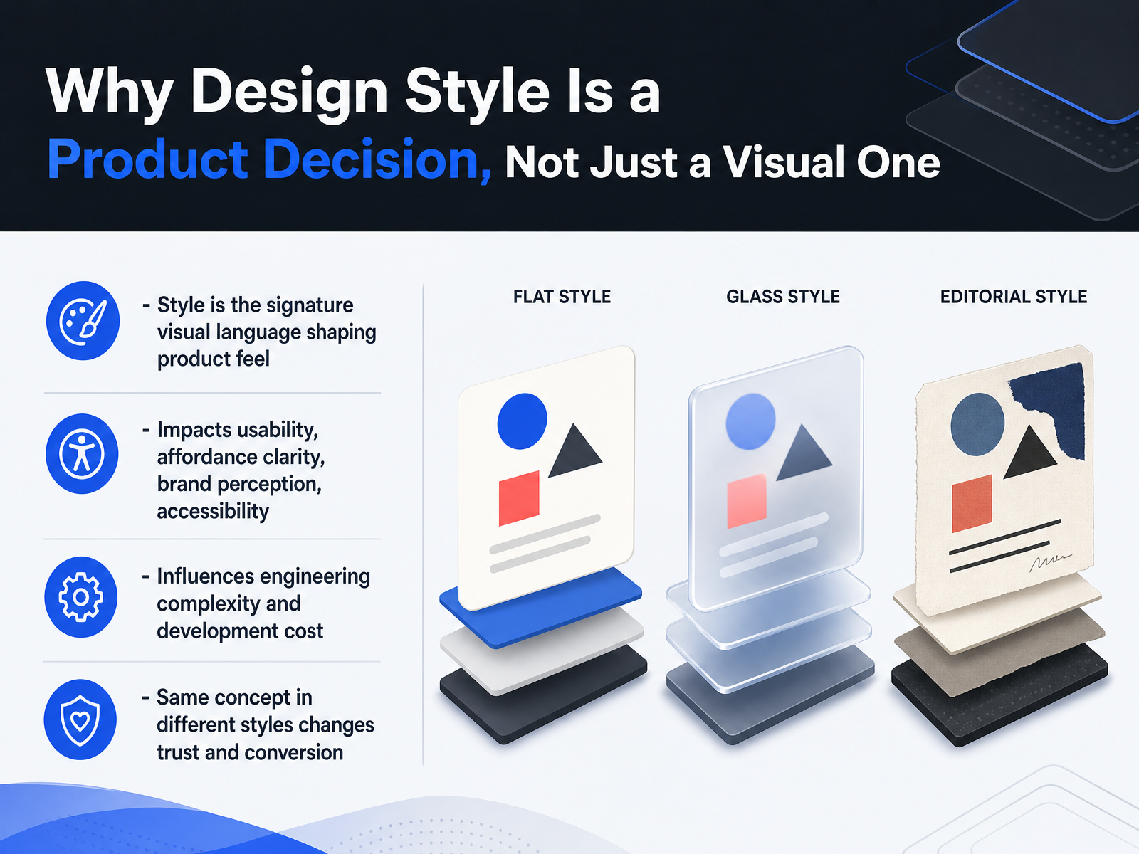
- 02Why Design Style Is a Product Decision, Not Just a Visual OneLet's talk about why the style you pick actually matters. It's tempting to treat UI style as purely cosmetic, but it's really a product decision. The style you choose becomes the signature visual language that shapes how your product feels. It directly affects usability and how clear your affordances are. It shapes brand perception and can make or break accessibility. On the engineering side, some styles are much heavier to build and maintain than others. Remember that the same concept, presented in a different style, can change user trust and conversion rates. A finance app in a playful, rounded style would likely feel wrong, while a fitness app in a cold, dense, enterprise style might feel intimidating. So, as you look at different styles, think about what they communicate and what they cost. Now, let's move on to a way to categorize these styles: a classification framework for reading any interface by its core axes.
 material-minimal.comprincejain.meuxpin.com+22 min
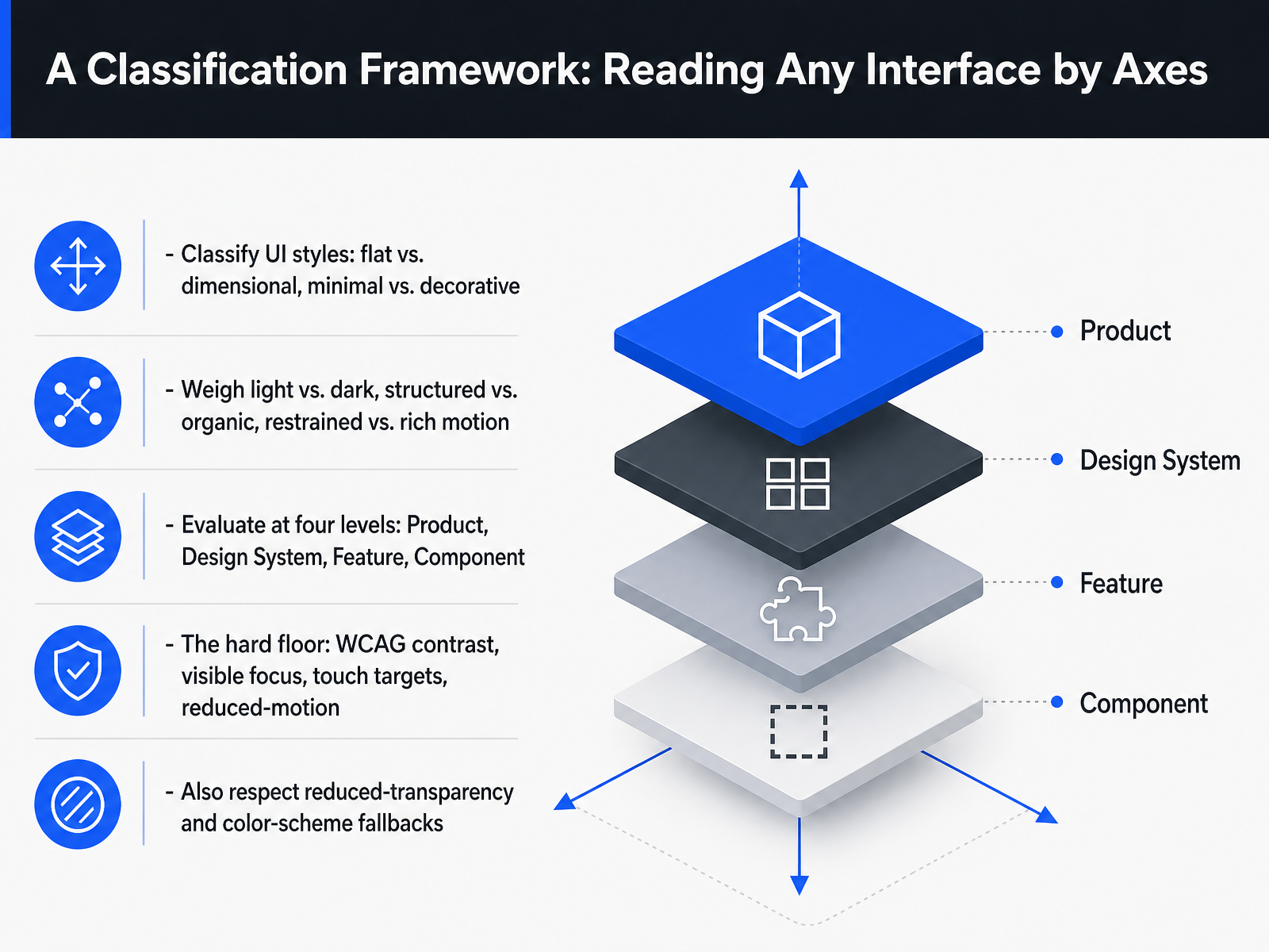
 - 03A Classification Framework: Reading Any Interface by AxesLet’s step back and find a way to read any interface, not just memorize styles. Think of styles as positions on a few simple axes: flat versus dimensional, minimal versus decorative. Then weigh light against dark, structured against organic, and restrained motion against rich motion. Here’s the practical part. Evaluate those axes at four levels: the product as a whole, the design system that holds it together, the specific feature or screen, and the individual component. A button and a dashboard can sit on different points of the same axis, and that’s fine as long as it’s deliberate. Now, these axes give you a lot of freedom, but there is a hard floor you don’t negotiate. WCAG contrast, a visible focus indicator, touch targets around 44 pixels, and real fallbacks for reduced motion. And don’t stop there. Respect reduced transparency and provide a color scheme fallback so your style holds up in dark mode and in light mode. Keep that floor in mind as we look at the first family of styles: flat, minimal, and Swiss-style interfaces.
 doi.orgdl.acm.orggithub.com+21 min
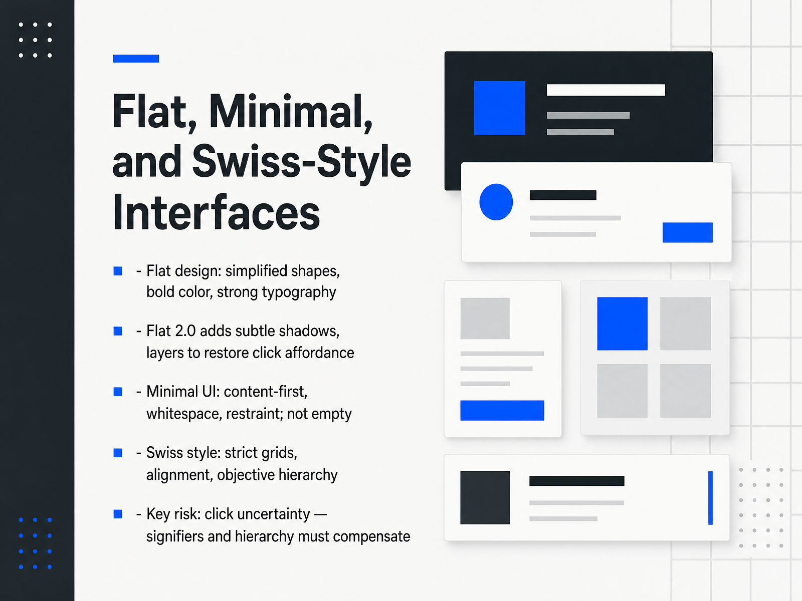
 - 04Flat, Minimal, and Swiss-Style InterfacesNow let's talk about three styles that often get lumped together, but they are not the same thing: flat design, minimalism, and Swiss style. Flat design is about the look. You're using simplified shapes, bold colors, and strong typography, with no gradients or textures. The problem is that removing all that depth creates click uncertainty. Users can't tell what's a button and what's just a colored square. That's why Flat 2.0 exists. It keeps the clean look but adds back subtle shadows and layers to restore affordance. Then you have minimal UI, which is a philosophy, not a visual style. It's content-first, relying on whitespace and restraint. It's not empty, it's focused. And Swiss style, its design grandparent, brings the strict grids, tight alignment, and that objective, impersonal hierarchy. The key risk across all three is the same. Without clear signifiers, your users will hesitate. Your hierarchy and visual cues have to compensate for the lack of physical affordance. Next, we'll look at Neumorphism and Claymorphism, where soft depth creates its own set of accessibility challenges.
 nngroup.comaimyaya.comrgbweb.studio+21 min
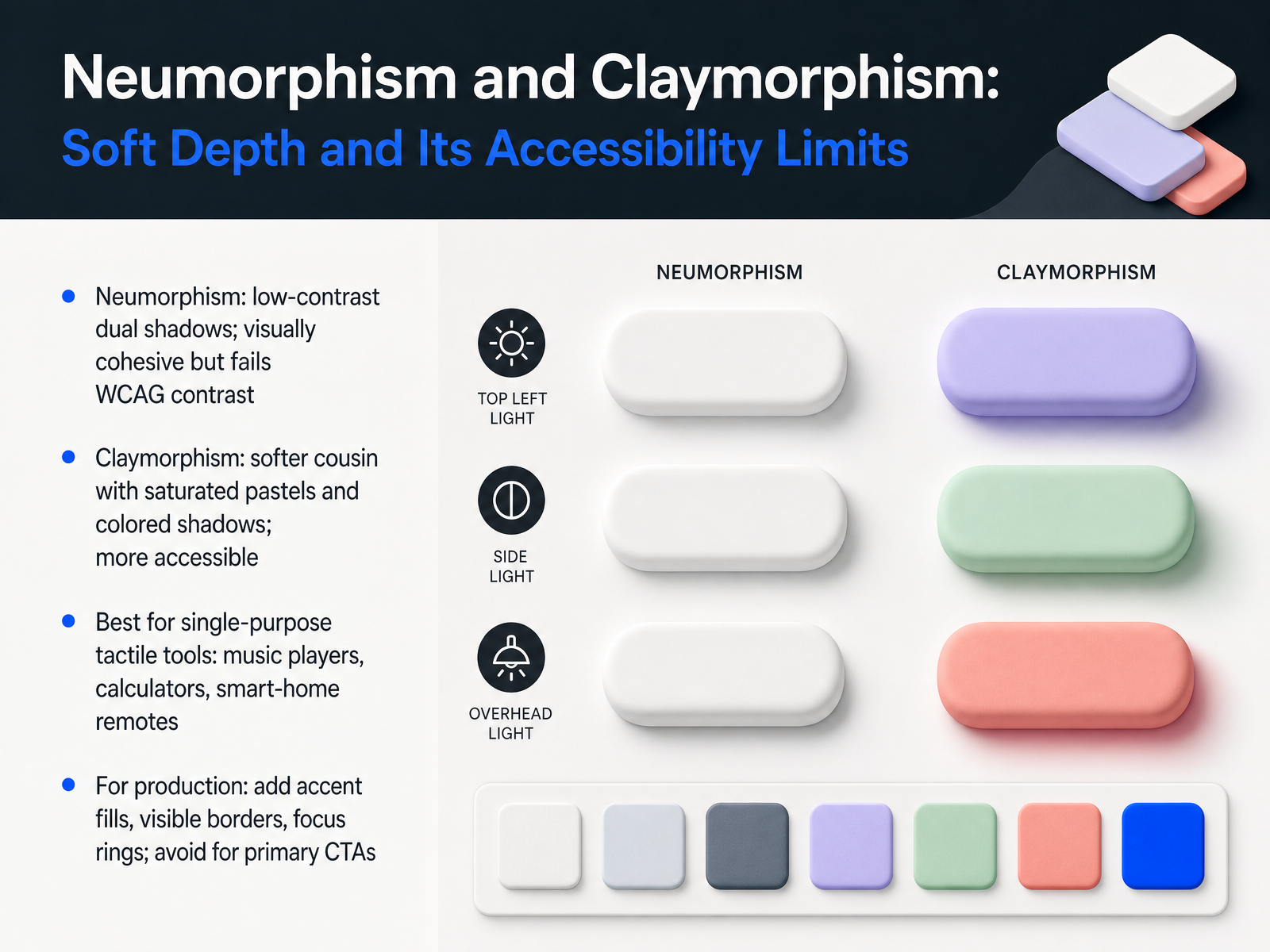
 - 05Neumorphism and Claymorphism: Soft Depth and Its Accessibility LimitsNow let's talk about two styles that feel tactile but come with real trade-offs: neumorphism and claymorphism. Neumorphism uses dual shadows on the same color as the background to create that soft, extruded look. It's visually cohesive, even calm, but here's the problem: it routinely fails WCAG contrast requirements. Buttons blend into surfaces, and users can't tell what's clickable. Claymorphism is its softer cousin — it uses saturated pastels and colored shadows, which keeps things readable while still feeling playful. So where do these shine? Single-purpose tactile tools like music players, calculators, or smart-home remotes. For production, you need to adapt them: add accent fills, visible borders, and focus rings. And absolutely avoid them for primary CTAs like Buy Now or Sign Up. Your users will thank you. Next, let's look at glassmorphism and its layered approach to transparency.
 socialanimal.devdoi.orgdl.acm.org+22 min
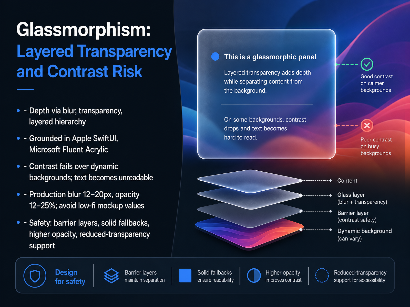
 - 06Glassmorphism: Layered Transparency and Contrast RiskNow let's talk about glassmorphism, the frosted glass look that's become the default for modern dashboards. It gives you depth through blur, transparency, and layered hierarchy, and it's grounded in real OS materials like Apple's SwiftUI and Microsoft's Fluent Acrylic. But here's the catch: contrast is the thing that will bite you. The background behind your glass panel is dynamic, so the text contrast is dynamic too. A component that passes at five point two to one over a dark wallpaper can fail at one point eight over a light one. That's why production values matter. Use a blur radius of twelve to twenty pixels and a background fill opacity of twelve to twenty-five percent. Dribbble-style mockups with five percent opacity are unreadable the moment real data loads behind them. For safety, use barrier layers, solid fallbacks for text areas, higher opacity on critical content, and support reduced-transparency settings. The practical rule: glass belongs on elevated, transient layers like navigation and modals, not on primary text containers. Next, let's look at skeuomorphism and why realism still has a niche.
 socialanimal.devdoi.orgdl.acm.org+22 min
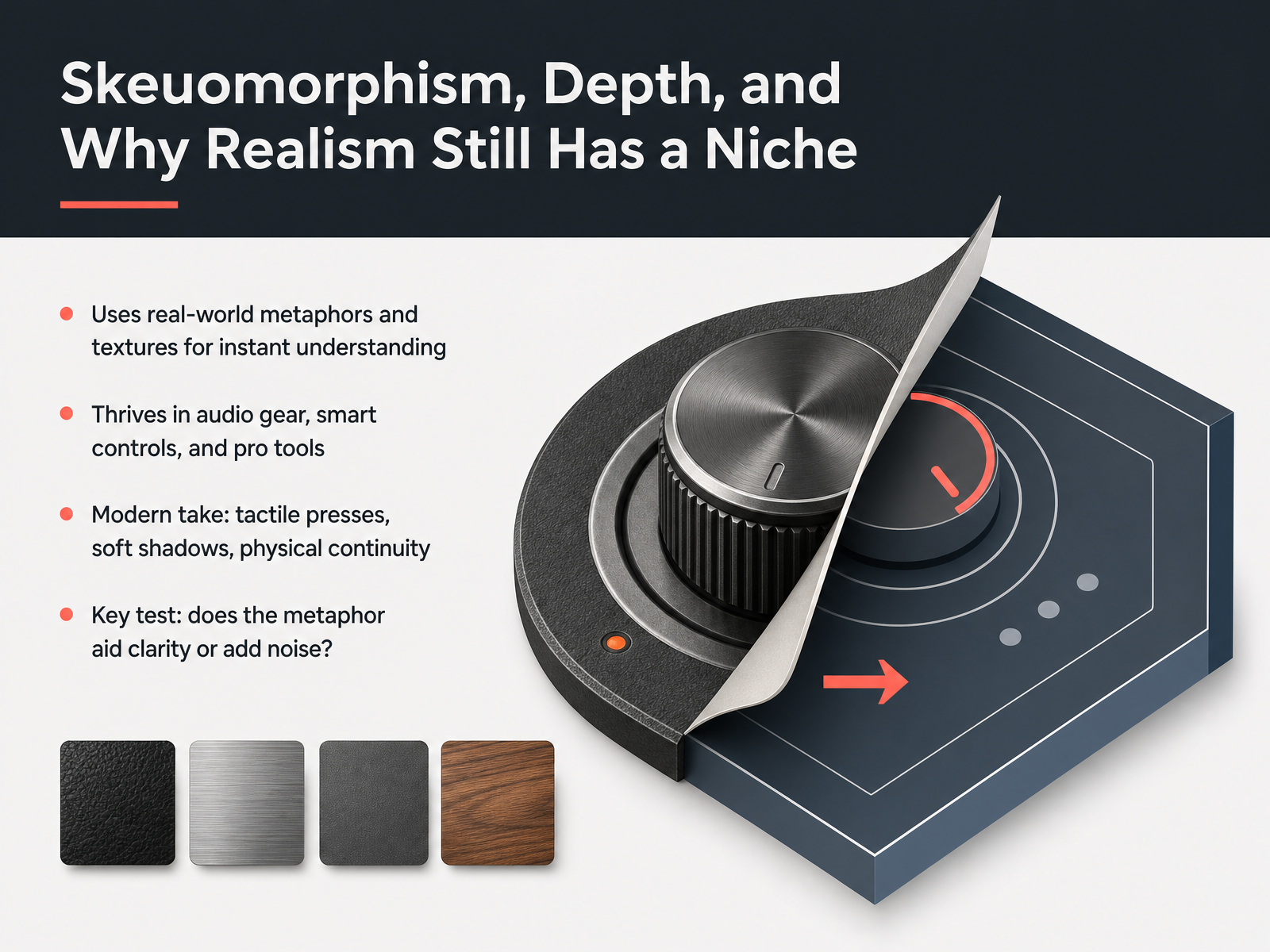
 - 07Skeuomorphism, Depth, and Why Realism Still Has a NicheLet's talk about skeuomorphism, depth, and why realism still has a place in UI design. This style borrows real-world metaphors and textures to make interfaces instantly understandable. Think of a calculator app with buttons that look pressable, or a voice recorder with a shiny red record button. It thrives in audio gear, smart controls, and professional tools, where users expect a tactile, physical feel. The modern take isn't about full leather and stitching. It's about subtle tactile presses, soft shadows, and a sense of physical continuity. The key test is simple. Does the metaphor help users understand what to do, or does it just add visual noise? If it aids clarity, keep it. If it's decoration, cut it. A polished knob might feel great, but if it hides the function, it's a problem. For your own work, ask whether the realism is earning its keep. In the right niche, it builds trust and reduces cognitive load. Used carelessly, it becomes clutter. So use it deliberately, and you'll find that a touch of depth can make an interface feel both familiar and premium. Now, let's consider another side of contrast and visibility with dark mode and high-contrast interfaces.
 socialanimal.devdev.tomockflow.com+21 min
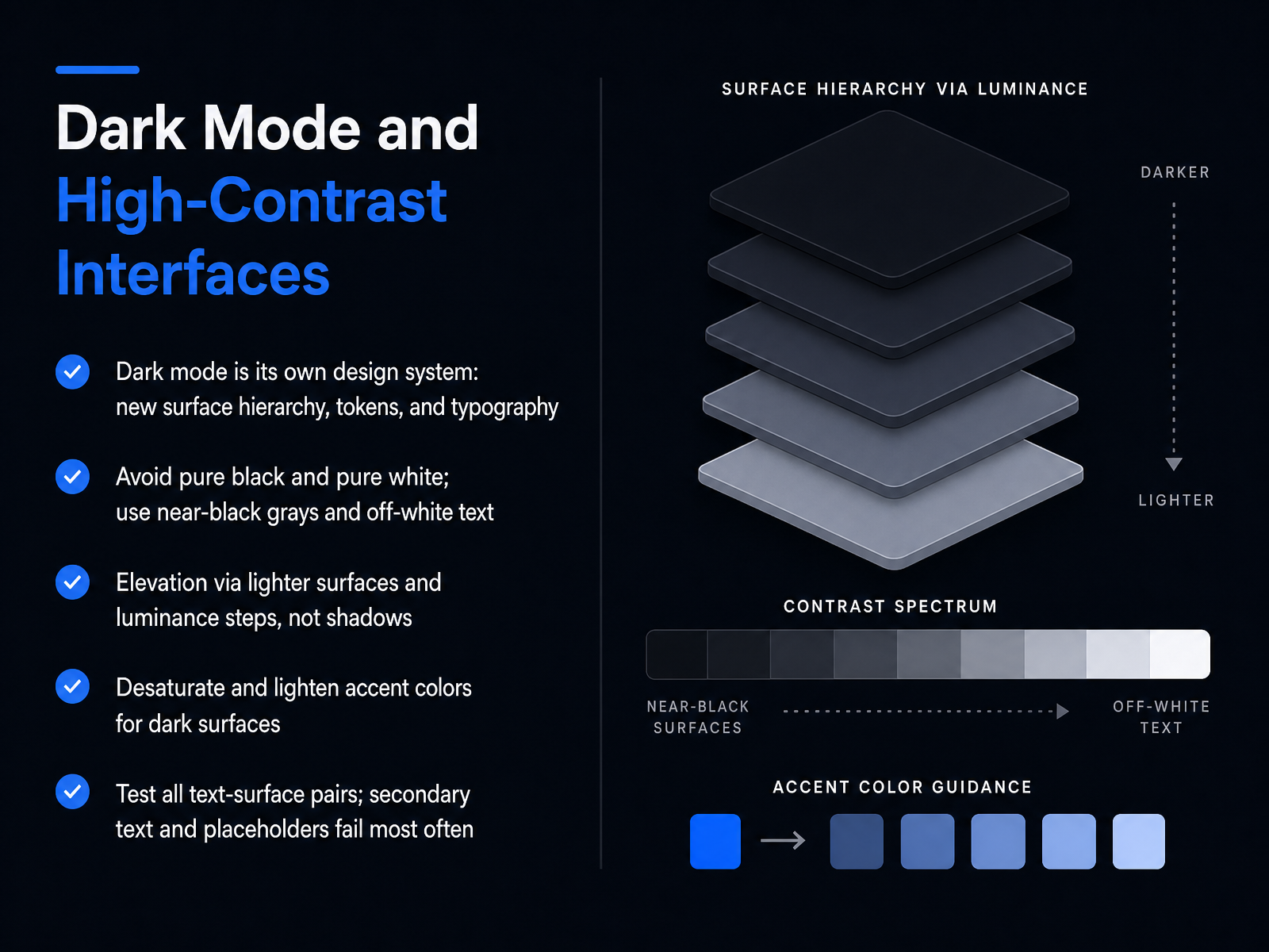
 - 08Dark Mode and High-Contrast InterfacesNext, let's talk about dark mode and high-contrast interfaces. If you're treating dark mode as an inverted color palette, you're already in trouble. It's a separate design system with its own surface hierarchy, tokens, and typography rules. Start by avoiding pure black and pure white. Use near-black grays for surfaces, like the classic Material value of twelve twelve, and off-white text instead of full white to prevent eye strain. Elevation in dark mode works through lightness, not shadows. A card should be a slightly lighter gray than the page, a modal lighter still. Your accent colors need attention too. Desaturate and lighten them, because a saturated blue that looks fine on white will glow harshly against a dark surface. And finally, test every text and surface pair. Secondary text and placeholder text are the most common failures, often dropping below the four point five to one contrast ratio when tested against a raised surface. Plan for these adjustments from the start, and dark mode becomes a polished second theme instead of a retrofit. Next, we'll cover editorial, expressive, and branded interfaces.
 doi.orgdl.acm.orggithub.com+22 min
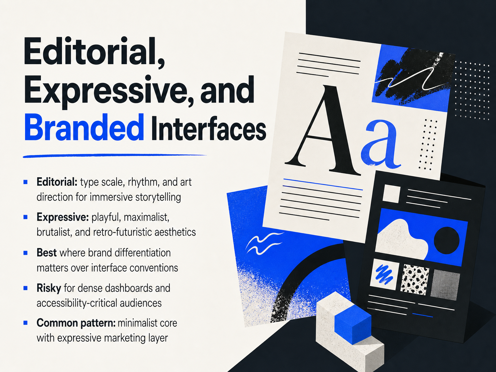
 - 09Editorial, Expressive, and Branded InterfacesLet’s shift gears and look at styles built for storytelling and brand presence. Editorial design borrows from print magazines: oversized headlines, generous whitespace, and a clear visual rhythm. Think of it as art direction for the screen, guiding your users through content like a long-form feature article. Expressive styles go further, pulling in playful, maximalist, or even brutalist aesthetics. You’ll see bold type, saturated color, texture, and asymmetric layouts that deliberately break convention. These approaches shine when brand differentiation matters more than interface norms. They give your product a voice in a sea of generic templates. But that personality comes with risk. High-density dashboards and accessibility-critical audiences need clarity first. Pushing too much expression there can break contrast and readability. The realistic pattern most teams land on is a minimalist core with an expressive marketing layer. That way, you keep the product functional while the brand shows its personality on landing pages and campaigns. Coming up, we’ll explore gradients, 3D, and spatial visual styles.
 dev.tomockflow.comuxplanet.org+22 min
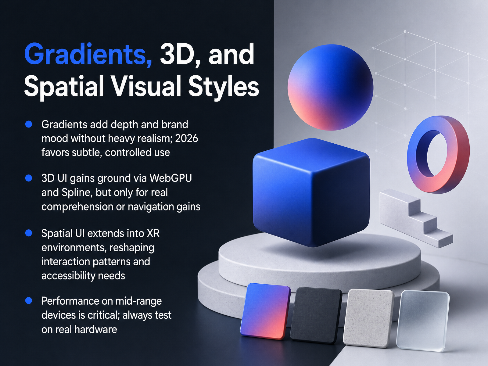
 - 10Gradients, 3D, and Spatial Visual StylesNow let's talk about gradients, 3D, and spatial styles. Gradients are back, but the key in 2026 is subtlety. You're using them to add depth and mood, not to recreate a 2010 Web 2.0 splash page. Keep them controlled and use them to support your brand. 3D is also gaining real ground, thanks to WebGPU and tools like Spline. But before you add a heavy 3D scene, ask yourself if it solves a comprehension or navigation problem. If it's just for the wow factor, it's probably not worth the cost. Spatial UI extends this thinking into XR environments, which completely reshapes your interaction patterns and accessibility needs. The rules you know from flat screens don't all apply. And finally, a critical constraint: performance on mid-range devices. Always, always test on real hardware, not just your high-end simulator. A beautiful style that lags is a bad user experience. So the takeaway is this: depth and dimension can make your product feel rich, but they demand a clear purpose and a relentless focus on performance. Up next, we'll look at how motion itself becomes a style statement with microinteractions and perceived quality.
 dev.tomockflow.comuxplanet.org+21 min
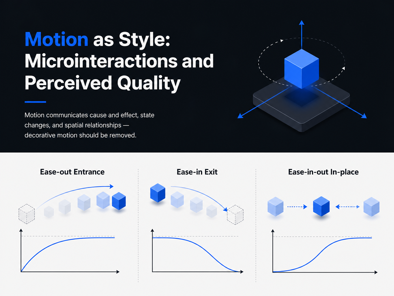
 - 11Motion as Style: Microinteractions and Perceived QualityNow let's talk about motion as a style, and why it's less about decoration and more about communication. In 2026, motion is everywhere, but most of it is wrong. Buttons spring, pages morph, components bounce. The problem is that a lot of this motion is arbitrary and slow. The core principle is simple: motion should communicate cause and effect, state changes, and spatial relationships. If you can't name the information an animation conveys, cut it. Decorative motion should be removed entirely. Think of a modal. It should slide up from the button that triggered it. That's a spatial relationship. A toggle flipping is a state change. A button press compressing slightly is feedback. These all have a job. What doesn't have a job? A logo that bounces on every page load, or a card that spins in for no reason. Keep your durations short. Micro-interactions run between one hundred and two hundred milliseconds. Larger transitions go up to five hundred. Anything above that feels laggy on the tenth use, even if it looks cinematic on the first. Always respect the prefers-reduced-motion setting. That's not optional. Provide a fallback, usually a simple opacity fade. The takeaway here is to treat motion like a functional layer, not frosting. If an animation doesn't answer a question or explain a change, it's just adding a frame-rate tax. Next, let's look at how platform and device constraints shape these style decisions.
 dev.tomockflow.comuxplanet.org+21 min
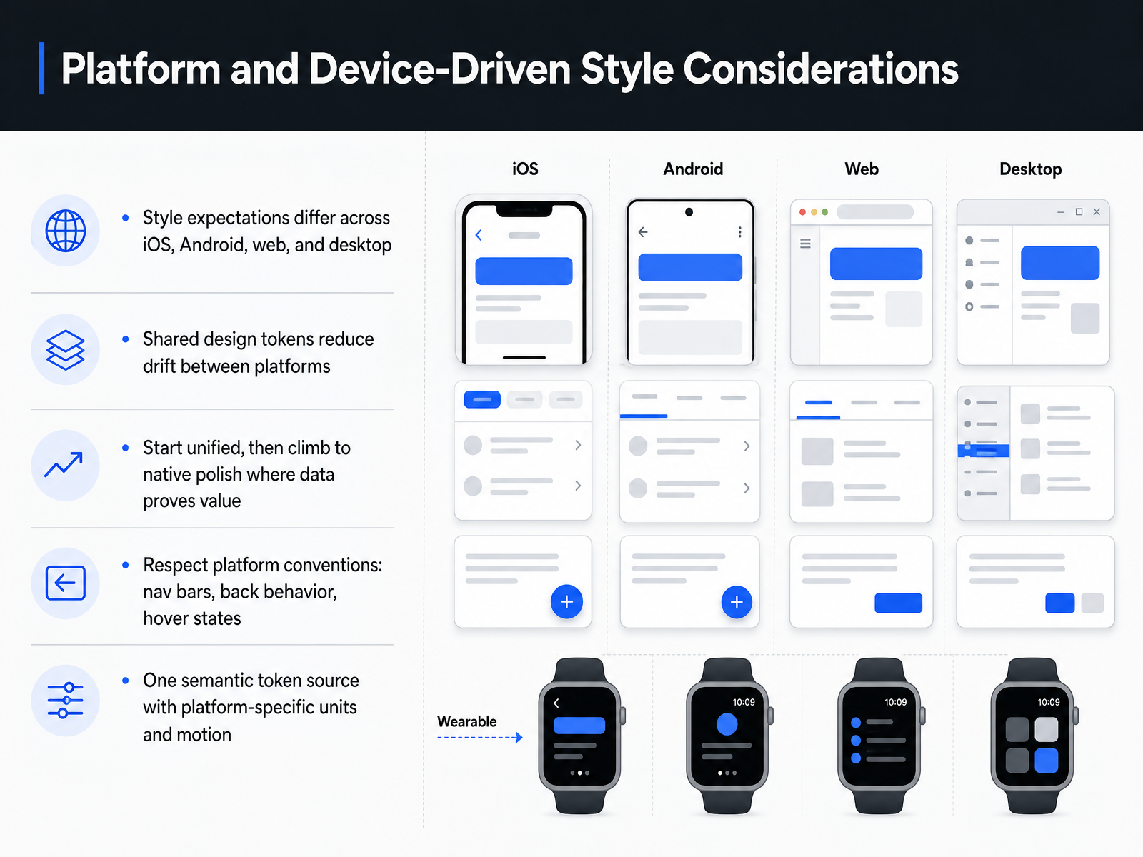
 - 12Platform and Device-Driven Style ConsiderationsLet’s talk about how the platform itself shapes your style decisions. Users carry expectations into every product. iOS users expect a bottom tab bar and an edge swipe to go back. Android users expect a Material navigation bar, system back gestures, and ripple feedback. Web users expect hover states, keyboard navigation, and a back button that actually works with browser history. So your style shouldn’t ignore those conventions. It should respect them. The trick is to start unified. One design language, one set of semantic tokens for color, spacing, and type, shared across every platform. That’s your source of truth. It prevents drift and keeps the product feeling like one thing. Then climb the design ladder. Add native polish only where real usage data proves it earns the cost. Maybe iOS needs haptics, Android needs a floating action button, web needs better focus states. Adapt one platform at a time, measure the impact, and keep your shared baseline intact. Remember, your tokens carry intent. The units adapt per platform, points on iOS, density pixels on Android, rem on web. Motion curves adapt too. Respect the platform, but never fork the source.
 material-minimal.comprincejain.meuxpin.com+21 min
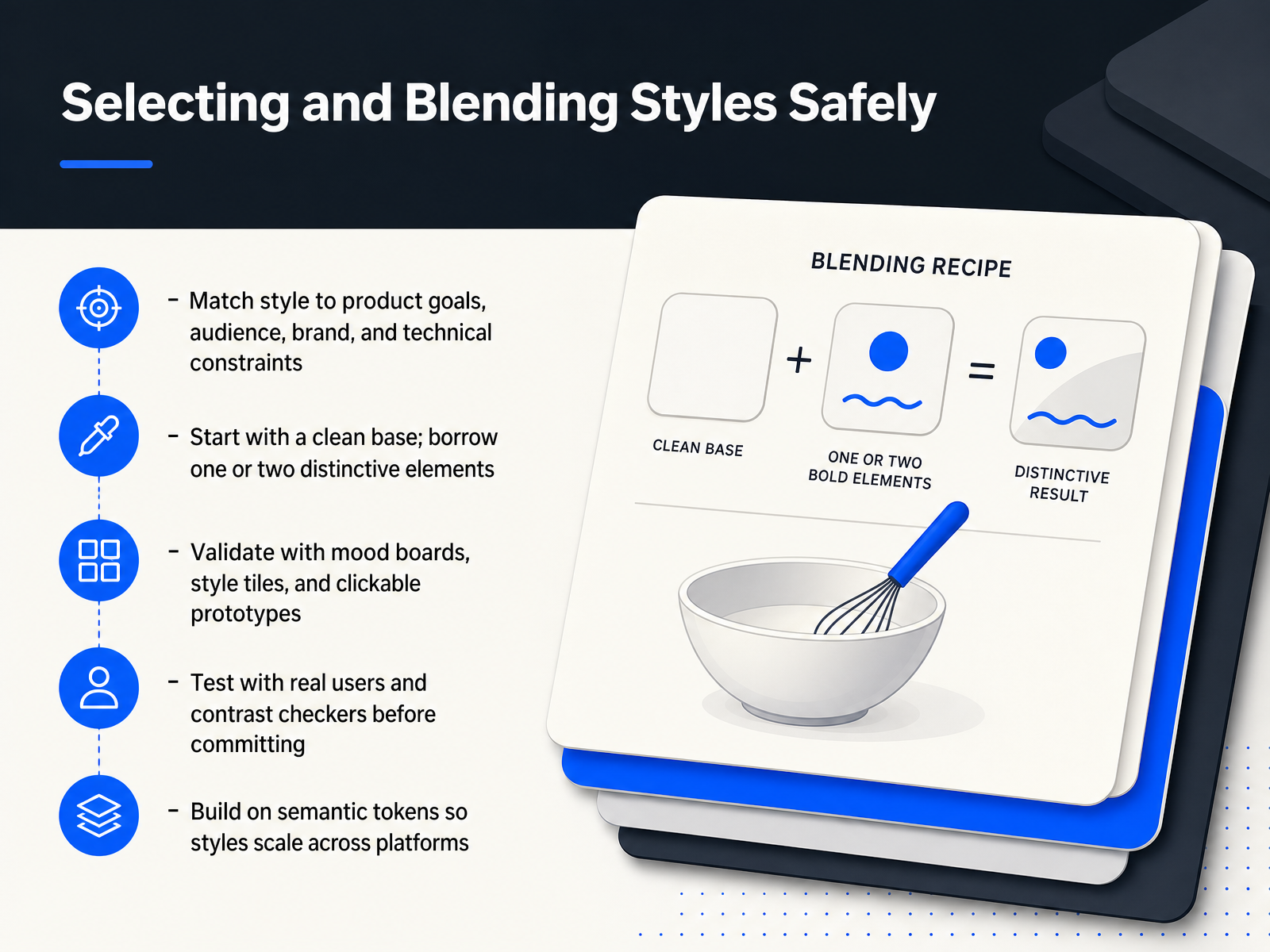
 - 13Selecting and Blending Styles SafelySo how do you actually pick a style without turning a project into a gamble? Start by matching the style to your product goals, your audience, your brand, and your technical constraints. A playful claymorphism interface might win over a consumer app, but it will likely feel wrong for a B2B analytics dashboard. Your users' expectations matter as much as your visual taste. Once you have that direction, resist the urge to go all-in. Start with a clean, familiar base, then borrow one or two distinctive elements. A glassmorphism card on a mostly minimal interface can feel premium and intentional. A fully frosted interface quickly becomes a readability nightmare. Validate your choices early with mood boards and style tiles. Then go further and build a clickable prototype, not just static artboards. Test it with real users and run contrast checkers before you commit anything to code. Accessibility is not a polish phase task. Finally, build your choices on semantic tokens, not hard-coded values. That way, your style decisions scale across platforms and adapt to dark mode or future rebrands without a full redesign. Choose deliberately, blend sparingly, and let the evidence guide you. Next up, we'll pull these ideas together into practical takeaways and a style selection exercise you can apply immediately.
 material-minimal.comprincejain.meuxpin.com+22 min
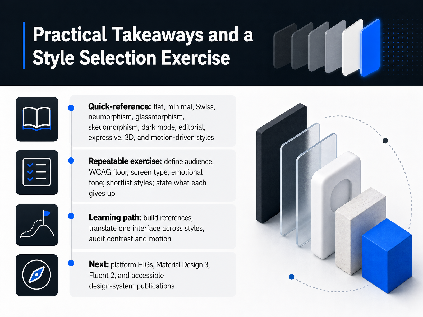
 - 14Practical Takeaways and a Style Selection ExerciseLet's wrap this up with something you can actually use tomorrow. You've now seen the full landscape: flat, minimal, Swiss, neumorphism, glassmorphism, skeuomorphism, dark mode, editorial, expressive, 3D, and motion-driven styles. That's a lot to hold in your head, so here's a repeatable exercise to make the choice concrete. Start by defining four things: your audience, your WCAG floor, the screen type you're building, and the emotional tone you need. Then shortlist three styles that could work. And here's the key move: state, out loud, what each candidate gives up. Neumorphism gives up control contrast. Glassmorphism gives up text legibility on busy backgrounds. Brutalism gives up approachability. If you can't name the trade-off, you haven't made a decision yet. For your learning path, build a reference library of real products, then translate one interface you know across three different styles. Audit the contrast and motion on each pass. Next, dig into platform guidance: Apple's HIG, Material Design 3, Fluent 2, and accessible design-system publications. Those will ground everything you've learned here in production reality. That's it. You now have the vocabulary and the method to pick styles deliberately, not by default. Go build something that fits your users, and keep iterating. Thanks for your time.
 material-minimal.comprincejain.meuxpin.com+22 min
Take the deck with you
Download this course as a file — free, no sign-up needed.
- PDF handoutEvery slide page, ready to print or share.15 pages · 3.0 MBDownload
- Narrated PowerPointThe deck that presents itself — every slide carries the digital human's narration video.15 pages · 15.2 MBDownload
- PowerPoint slidesThe full deck as a .pptx — open it in PowerPoint, Keynote, or Google Slides.15 pages · 2.9 MBDownload
Free to use in your own training — please keep the PersonWise credit page at the end.
Have your own deck? Turn it into a course
Sources consulted
Web sources consulted while building this course.
- The UI Design Styles Every Designer Should Know in 2026 - DEV Community — dev.to
- UI Design Trends 2026: 10 Trends to Watch — mockflow.com
- Medium — uxplanet.org
- Web Design Styles: 9 Types With Examples (2026 Guide) — vikilinks.com
- 50+ UI Design Trends 2026 (Complete Aesthetics Guide) — techyheaven.com
- Choosing a Project Personality in UI Design: A Comprehensive Guide — material-minimal.com
- How I Pick the UI Before Writing a Single Prompt | Prince Jain — princejain.me
- Design Decisions: 10 Examples & How to Make Better Ones (2026) | UXPin — uxpin.com
- A Complete Guide to the UI Design Process in 2026 - UX Design Institute — uxdesigninstitute.com
- 7 Key UI Design Principles + How To Use Them - Figma — figma.com
- Effect of Design Styles of User Interface on User Experience — doi.org
- Bridging Gulfs in UI Generation through Semantic Guidance | Proceedings of the 2026 CHI Conference on Human Factors in Computing Systems — dl.acm.org
- MKAbuMattar/uidesign — github.com
- Your AI doesn't understand design. So I gave it a library it can read. - DEV Community — dev.to
- Flat-Design Best Practices - NN/G — nngroup.com
- What is the difference between flat design and minimalist design? — aimyaya.com
- Flat design or minimalism – what to choose? - RGB Web-studio — rgbweb.studio
- Flat Design: Its Origins, Its Problems, and Why Flat 2.0 Is Better for Users - NN/G — nngroup.com
- Ultimate Guide to Flat Design: Best Practices and Examples — mockplus.com
- Neumorphism Design: CSS, WCAG, and Honest Guide — socialanimal.dev