Data Storytelling Patterns and Pitfalls
Begin
14 pages · ~28 min
Data Storytelling Patterns and Pitfalls
Learn to craft compelling data narratives by examining storytelling examples, including their patterns, strengths, and common pitfalls, to improve your data communication skills.
What you’ll learn
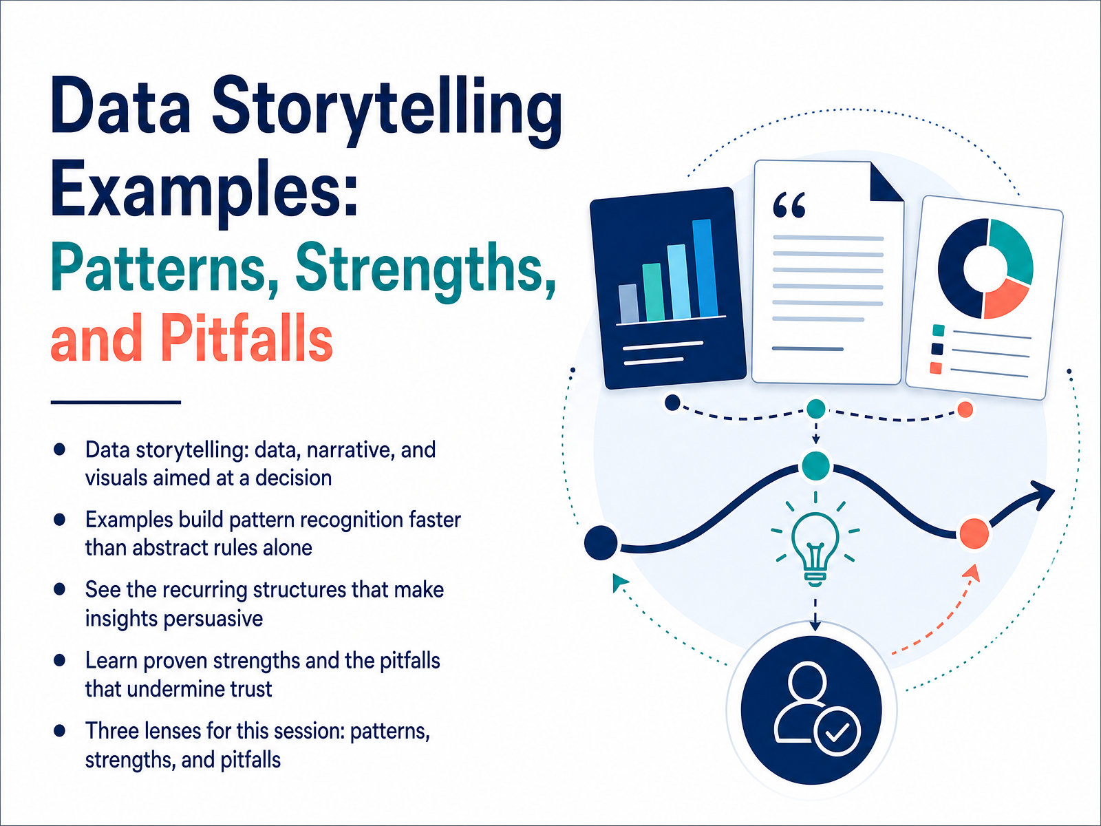
- 01Data Storytelling Examples: Patterns, Strengths, and PitfallsWelcome. In this session, we are going to look at data storytelling through real examples. Our goal is to help you recognize the patterns that make an insight persuasive, understand the strengths that build trust, and spot the pitfalls that quietly undermine it. We are not going to talk about abstract rules in isolation. Instead, we will examine how analysts and consultants actually structure a narrative around data. Think of data storytelling as a deliberate combination of three things: the data itself, the narrative that gives it meaning, and the visuals that make the pattern visible. When those three elements work together, they move an audience toward a decision. Throughout this course, we will use three lenses: patterns, strengths, and pitfalls. Each lens is designed to build your pattern recognition faster than theory alone. By the end, you should be able to look at any report or presentation and quickly identify what is working, what is missing, and what is eroding trust. Next, we will look at why examples accelerate skill development.storyflow.socoursera.orgusdsi.org+21 min
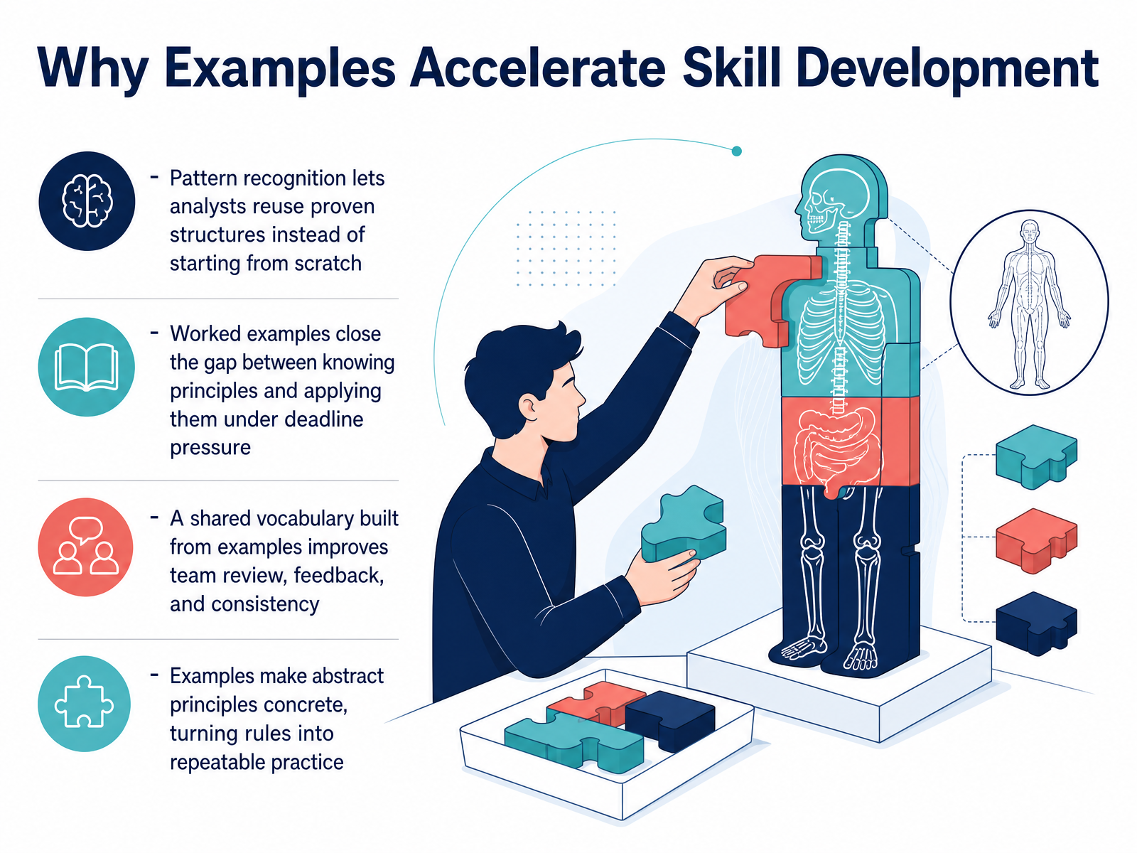
- 02Why Examples Accelerate Skill DevelopmentLet's look at why examples are such an effective way to build this skill. First, pattern recognition. When analysts see worked examples, they start to reuse proven structures instead of staring at a blank slide. They learn the shape of a good data story, so they can apply it to a new dataset without reinventing the process. Second, examples close a real gap. Knowing a principle is one thing. Applying it under deadline pressure is another. Seeing a principle in action shortens that distance. Third, examples create a shared vocabulary. When a team reviews the same examples, feedback gets faster and more consistent. Instead of saying a chart feels off, a reviewer can point to a specific pattern and say, that version worked because it led with the insight. Finally, examples make abstract rules concrete. A rule like add context becomes a visible choice, like pairing a headline with a chart and seeing the difference it makes. In practice, this is what turns a presentation guideline into repeatable behavior. Up next, we'll break down the building blocks with the anatomy of a strong data story.
 ndelgado.co.uklazarinastoy.comrockborne.com+21 min
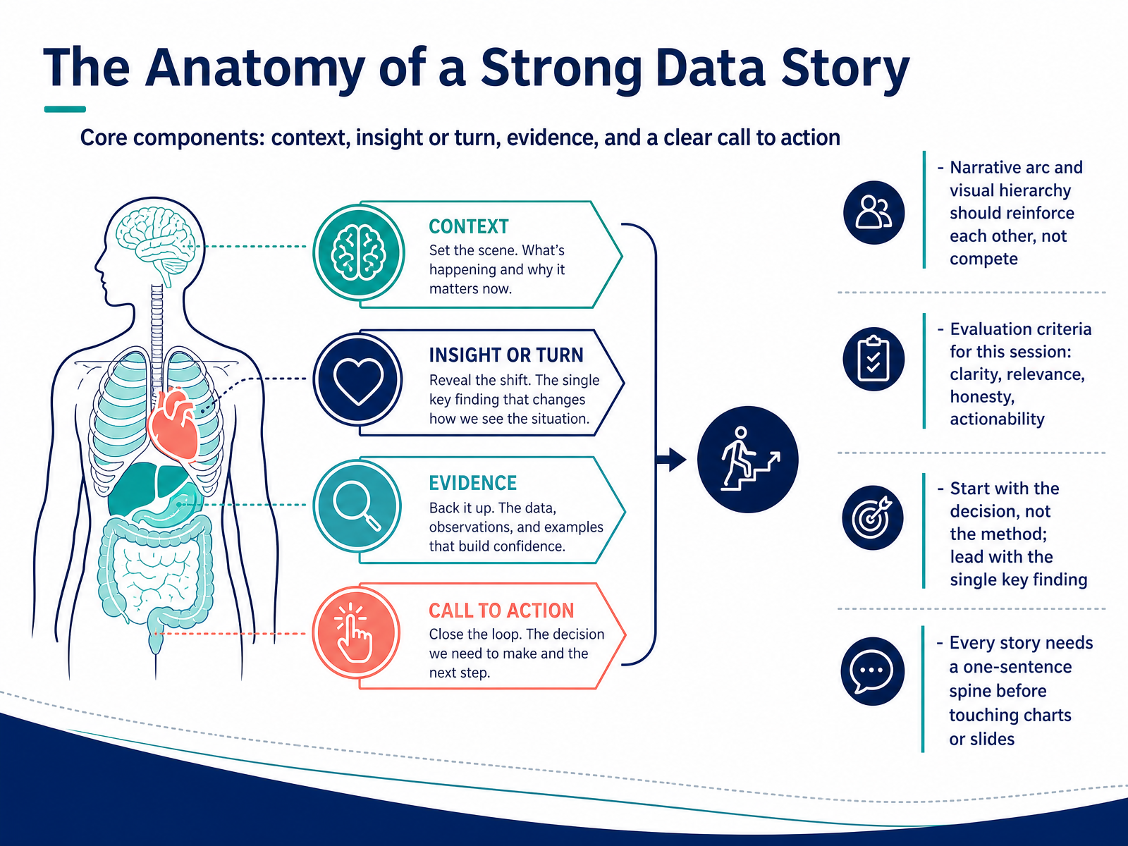
 - 03The Anatomy of a Strong Data StoryNow let’s look at what holds a strong data story together. We’re going to work from a simple four-part spine. First, you set the context. This is the baseline your audience already accepts, the steady state before anything changes. Second, you introduce the turn. That’s the single insight that breaks the baseline, the finding that makes people sit up. Third, you bring evidence. This is where data comes in, not as decoration, but as proof that the turn is real. And fourth, you close with a clear call to action, the decision this insight should drive. The narrative and the visuals should work like a single track, not two competing voices. So if a chart doesn’t carry the message, cut it. If a sentence doesn’t move the argument, rework it. Throughout the rest of this session, we’ll evaluate every example against four things. Is it clear? Is it relevant to the decision? Is it honest with the data? And is it actionable? One habit to build right now, before you touch a single slide, write a one-sentence spine. Something like, the baseline is this, but the data shows this, so we should do this. If you can’t fill that in, you haven’t found your story yet. Next, we’ll look at a recurring pattern that puts this spine into practice. It’s called insight-first storytelling.
 unstats.un.orgdoi.orgmicrosoft.com+22 min
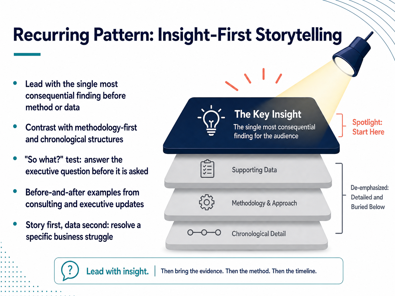
 - 04Recurring Pattern: Insight-First StorytellingNow let's look at a pattern that appears again and again in high-impact data communication: insight-first storytelling. This simply means leading with the single most consequential finding before you explain your method or walk through the data. Compare that with the more common approach of opening with methodology or a chronological review of what you did. The problem with those structures is that they make your audience wait until the end to learn why they should care. The insight-first approach applies what consultants often call the so-what test. You answer the executive question before it is even asked. In an executive update, for example, you might begin by saying that a specific customer segment is driving eighty percent of the recent churn risk, rather than first explaining how you cleaned the dataset. The story comes first, and the data supports it. Your goal is to resolve a specific business struggle, not to document your process. That means the first sentence should give your audience a reason to keep listening. When you apply this pattern consistently, you train stakeholders to see your analysis as a decision tool, not a research memo. Next, we will look at how to build that insight into a bridge from before to after.
 ndelgado.co.uklazarinastoy.comrockborne.com+22 min
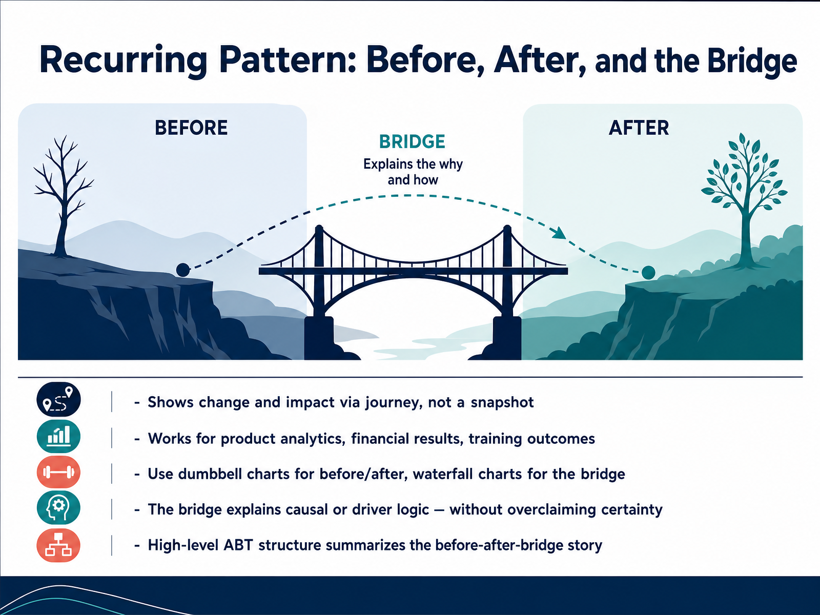
 - 05Recurring Pattern: Before, After, and the BridgeNow, let's look at a pattern you'll return to often: before, after, and the bridge. This structure shows change as a journey, not a snapshot. Instead of saying, for example, that revenue is up, you show where the metric started, where it ended, and what drove the movement between those two points. That middle part, the bridge, is where the real insight lives. It works well for product analytics, financial results, and training outcomes. Visually, a dumbbell chart is a strong choice for the before and after comparison because the gap between the two points represents the size of the change. A waterfall chart then explains the bridge. It breaks the movement into the drivers that pushed the number up or pulled it down. One caution here: the bridge should explain causal logic without overclaiming certainty. You can say which factors moved and by how much, but avoid claiming one factor caused the entire result unless the analysis supports it. At a high level, the whole story can be summarized with the ABT structure: and, but, therefore. You start with the before state, introduce a meaningful shift, and end with the implication. Next, we'll look at another recurring pattern: context, turn, and ask.
 github.comsupport.sas.comdatavis2020.github.io+22 min
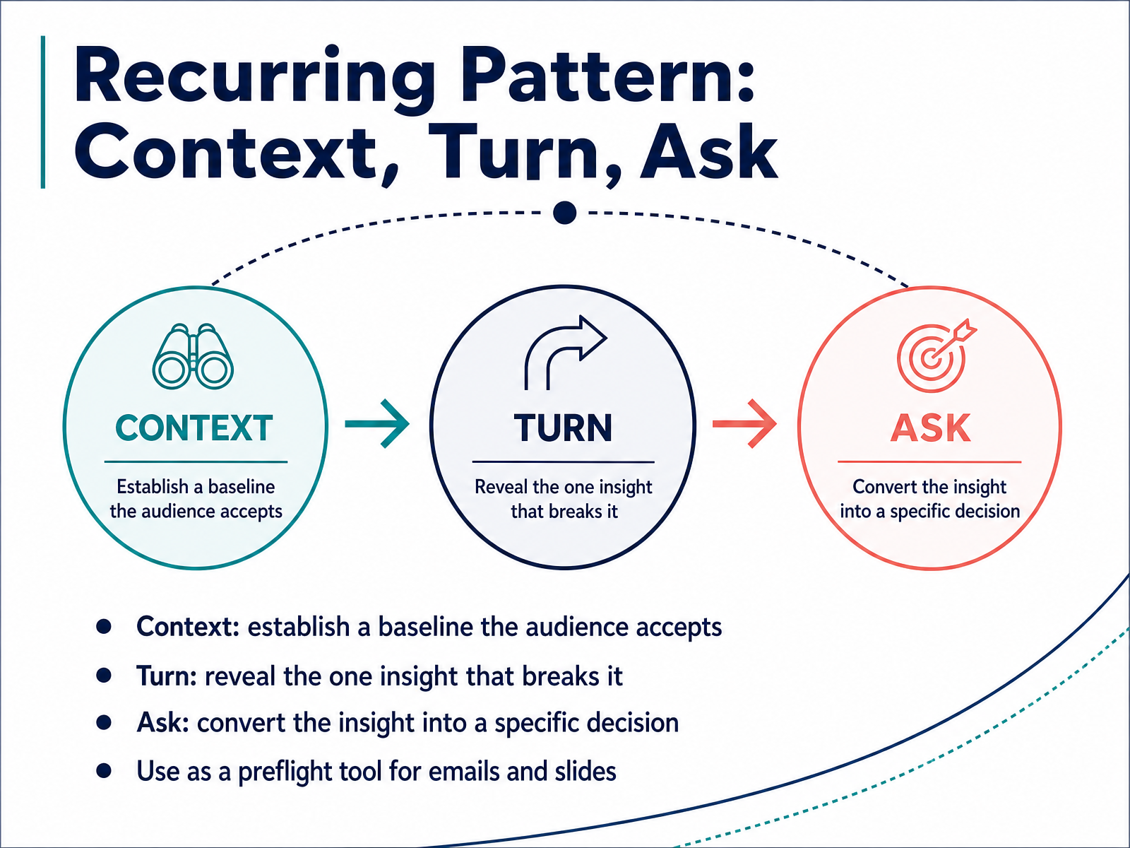
 - 06Recurring Pattern: Context, Turn, AskNow let's look at a recurring pattern that works across reports, briefings, and even short emails. It has three steps: Context, Turn, and Ask. First, Context establishes a baseline your audience already accepts. For example, you might say churn has held steady around four percent a month for two years. Nobody argues with that, which is the point. Second, the Turn reveals the one insight that breaks that baseline. You might say, but churn among customers who never used the mobile app is triple that. The steady four percent is hiding two very different groups. Third, the Ask converts that insight into a specific decision. So we should fund mobile app onboarding this quarter. Use this as a preflight tool before you send an important email or finalize a slide. Can you state the context, the turn, and the ask in three plain sentences? If not, keep refining. In the next slide, we'll explore the strengths that make data stories persuasive.
 storyflow.socoursera.orgusdsi.org+22 min
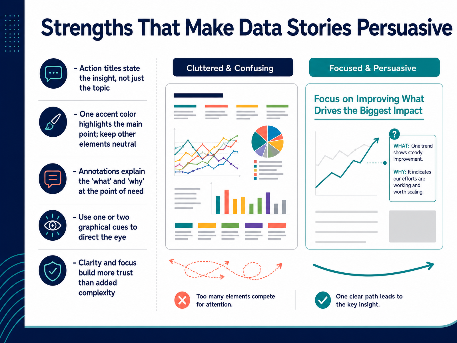
 - 07Strengths That Make Data Stories PersuasiveNow let us look at what makes this level of persuasion work. The first strength is the action title. Instead of a label like quarterly sales, the title states the insight directly, so the audience knows exactly what to look for before they examine the chart. Next, color. One accent color should highlight the point that supports your title, while the rest of the chart stays neutral. That creates a visual hierarchy without adding noise. Annotations then do two jobs. They show the audience what is happening at a specific point and why it matters, so no one has to guess how to interpret a spike or a flat segment. Graphical cues such as an arrow or a bracket direct the eye to the right place. Use one or two at most, and reserve them for the moments that drive the decision. The common thread here is clarity. Complexity feels sophisticated, but it does not persuade as effectively as a focused, well-directed chart. Trust comes from helping the audience understand quickly, not from asking them to work harder. With that baseline in place, next we will turn to the opposite side: the pitfall pattern of complexity overload.
 effectivedatastorytelling.comdatafield.dev1 min
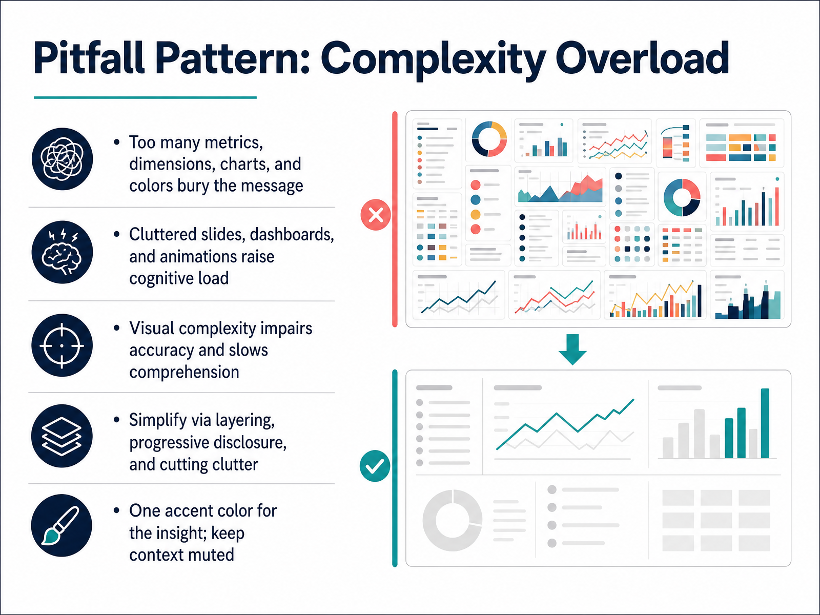
 - 08Pitfall Pattern: Complexity OverloadNow let's look at a pitfall we see all the time: complexity overload. This happens when a slide or dashboard tries to show too much at once. Too many metrics, dimensions, charts, and colors all compete for attention, and the actual message gets buried. Think of a dashboard with twelve KPIs, three filters, four trend lines, and a heat map. Your audience does not know where to look first. Research backs this up. Visual complexity raises cognitive load, which slows comprehension and reduces accuracy. People can hold only a limited amount of information in working memory at one time. When a chart makes them hold too many elements in their head, they either miss the insight or simply stop trying. Clutter is the usual culprit. Extra borders, gridlines, saturated colors, and decorative elements all take attention away from the data itself. The fix is not to animate everything more slowly. The fix is to simplify by layering and progressive disclosure. Start with the single most important message on the slide, then reveal supporting detail only when the audience needs it. One accent color can carry the insight, while everything else stays muted. Context should sit quietly in the background. One clear highlight, one takeaway, and a deliberate path through the information. That is how you keep cognitive load manageable and keep your audience with you. Next, we will look at a different kind of pitfall: the unsupported claim.
 github.comsupport.sas.comdatavis2020.github.io+21 min
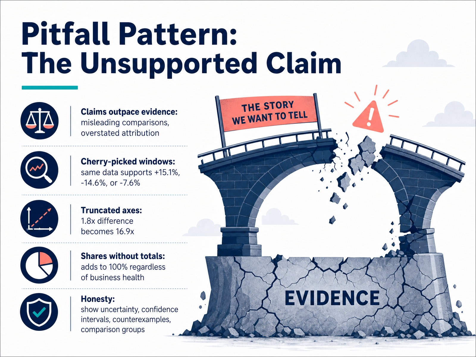
 - 09Pitfall Pattern: The Unsupported ClaimNow let’s look at a pitfall that can quietly undermine the work: the unsupported claim. This is when the claim outruns the evidence. It can show up as a misleading comparison, or as attribution that overstates what the data actually shows. A common version is the cherry-picked window. The same data can look very different depending on the dates you choose. In one table we examined, February to March showed a gain of 15.1 percent. January to February showed a drop of 14.6 percent. January to May showed a drop of 7.6 percent. Every one of those statements is true. Each one tells a very different story. Visual choices create a similar trap. When a bar chart starts above zero, a real difference of 1.8 times can be drawn to look like 16.9 times. And shares without totals can mislead by omission. A regional revenue mix always adds up to 100 percent, even when the overall business is shrinking. The honest alternative is to show uncertainty, confidence intervals, counterexamples, and comparison groups. A strong data story can survive someone re-running the numbers. Next, we will walk through a real-world example analysis of what works and what breaks.
 storyflow.socoursera.orgusdsi.org+22 min
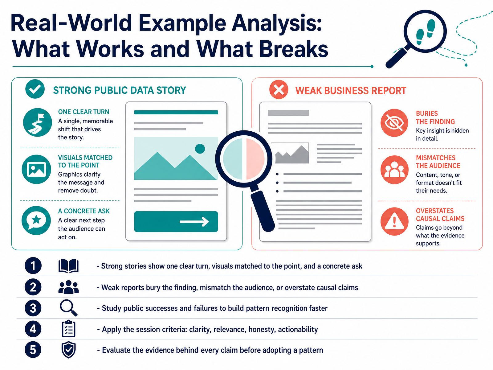
 - 10Real-World Example Analysis: What Works and What BreaksLet's look at real examples to sharpen our pattern recognition. A strong data story has one clear turn, a visual that matches the point, and a concrete ask. Think of a well known case like Hans Rosling showing two hundred years of global health. One baseline, one reversal, one implication. That is the shape to aim for. A weak report does the opposite. It buries the finding on slide fourteen. It is written for the analyst rather than the decision maker. Or it makes a causal claim from a correlation or a cherry picked window. For example, claiming a program caused one hundred thousand extra operations while a third of sites actually saw fewer. That is overstatement, and it breaks trust quickly. Study public successes and failures. Notice how strong stories keep the headline, chart, and ask aligned. Then apply four checks every time. Is it clear, is it relevant, is it honest, and is it actionable. Before you adopt any pattern, check the evidence behind it. Does the claim survive a skeptic with the same data. If not, do not copy it. Let's build on this by choosing the right structure for the moment.
 storyflow.soeffectivedatastorytelling.comdatafield.dev2 min
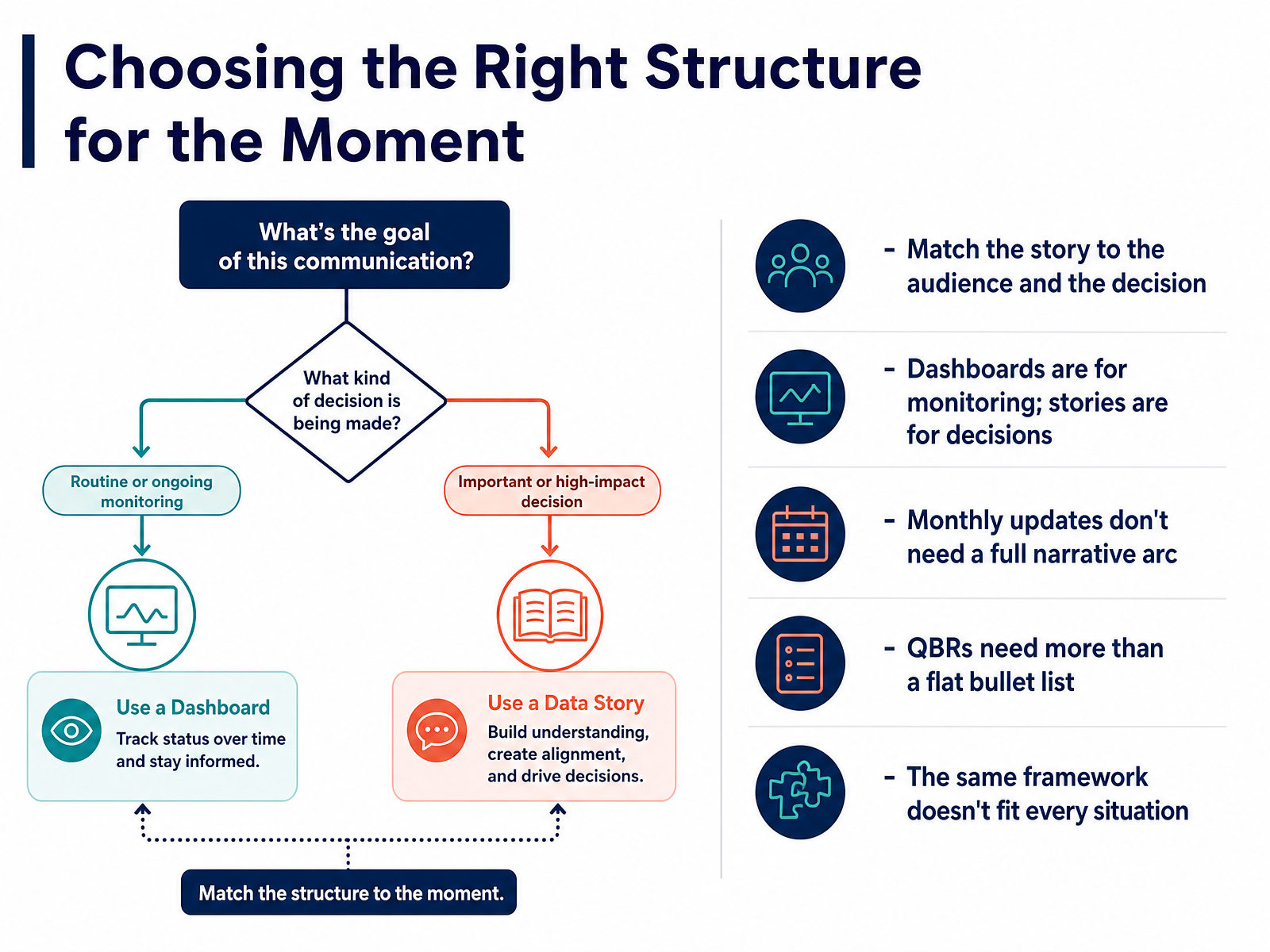
 - 11Choosing the Right Structure for the MomentNow let's talk about choosing the right structure for the moment. The key is to match the story to your audience and the decision you need them to make. A dashboard is for monitoring, but a story is for moving someone to a decision. Here's what that means in practice. A monthly performance update doesn't need a full narrative arc with a dramatic turn. It needs a clear headline, the key comparison, and one or two action items. That's it. But a quarterly business review deserves more than a flat bullet list. That's a moment where you should build context, lead with the main insight, and end with a clear recommendation. The mistake we see often is using one framework for everything. That approach serves no one. So before you open your slide deck, ask what this moment actually requires. Are you helping people monitor the business, or are you asking them to make a specific choice? Next, we'll look at practical strategies for building better data stories.
 storyflow.socoursera.orgusdsi.org+21 min
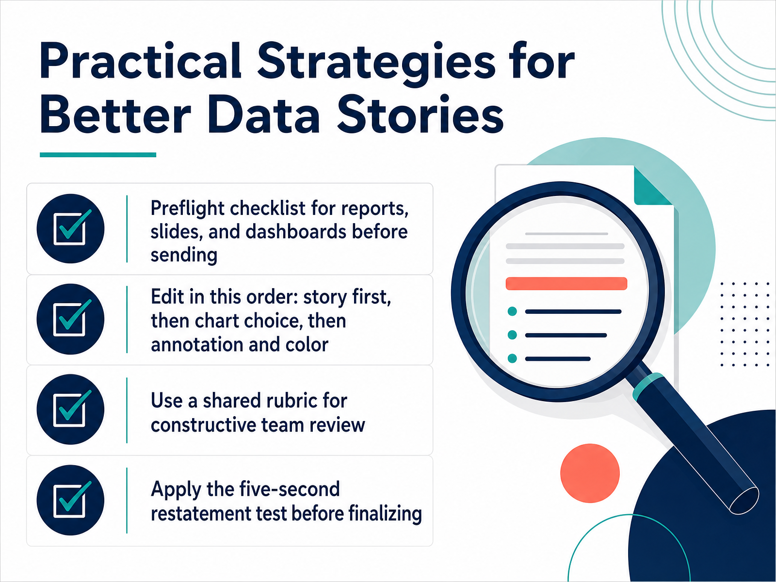
 - 12Practical Strategies for Better Data StoriesLet’s turn these patterns into a repeatable, practical process. Before any report, slide, or dashboard goes out, run a quick preflight check. Confirm the headline states a takeaway, not just a topic. Confirm the chart type matches the point, and confirm the data source and scale are clear enough for the audience to trust what they see. Next, edit in the right order. Story first, then chart choice, then annotation and color. That sequence prevents the most common failure mode: polishing a chart that makes the wrong point. For team review, use a shared rubric rather than free-form opinion. Ask the same five questions every time. Is the takeaway clear, is the chart appropriate, is the design quiet enough, does the sequence build, and can a first-time viewer restate the point. That shared language keeps feedback constructive, not personal. Finally, apply the five-second restatement test. After looking at the piece for five seconds, can someone state the main message in one sentence. If they cannot, go back to the headline and the visual emphasis before adding more detail. These small checks turn storytelling from a vague instinct into a professional standard. And when you are ready, we will look at how to turn these examples into a skill you can practice deliberately.
 unstats.un.orggithub.comsupport.sas.com+22 min
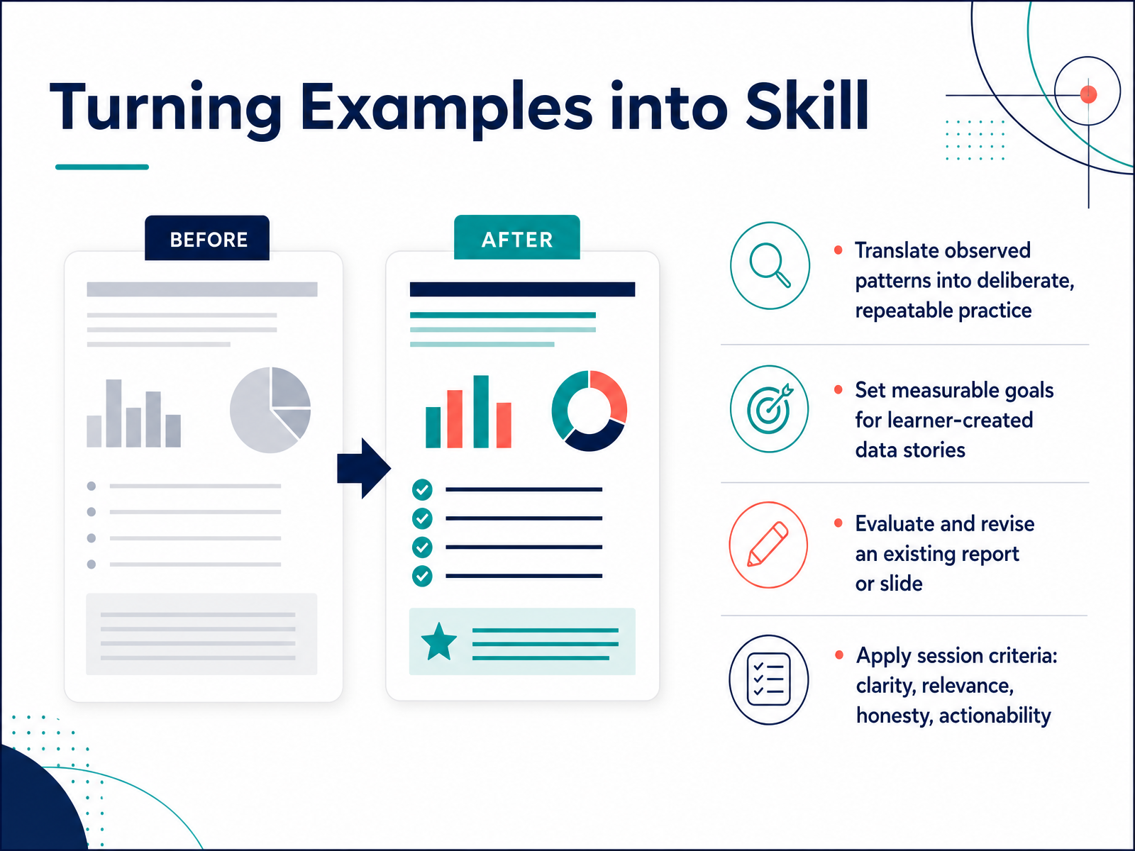
 - 13Turning Examples into SkillNow let's turn these examples into a repeatable skill. The patterns we observed in these stories are only useful if you can apply them deliberately. So start by translating what you saw into your own practice. If a strong example used a single clear insight to drive the message, try writing your next data story around one core finding before you build any chart. Then set measurable goals for the stories your learners create. Instead of asking for a good presentation, define what good means here. For example, each story should pass three of the four session criteria we covered: clarity, relevance, honesty, and actionability. Measurable goals make feedback easier and progress visible. Next, take an existing report or slide and evaluate it against those same criteria. Which section is clear? Which chart fails the honesty test? Revise one piece, not everything. That focused edit builds skill faster than a full redesign. Finally, use the session criteria as a working checklist. Clarity means one message per visual. Relevance means the data speaks to the audience's decision. Honesty means no cherry-picked numbers or hidden axes. Actionability means the audience knows what to do next. When you practice with a checklist instead of a vague idea of good storytelling, you improve with each review. In the final slide, we'll bring these threads together with key takeaways and the next steps you can take in your own work.
 unstats.un.orgstoryflow.so1 min
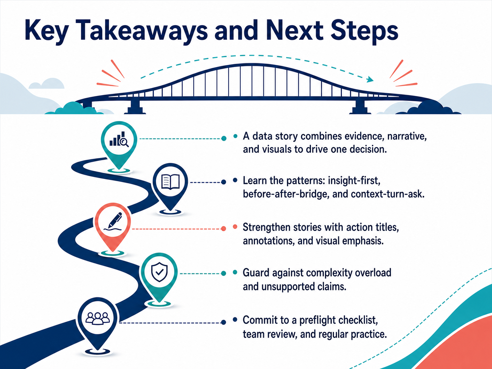
 - 14Key Takeaways and Next StepsLet's bring this together. A data story is not a chart. It is evidence, narrative, and visuals working together to drive one decision. Start by learning the patterns we covered. Use insight-first when your audience needs the answer immediately. Use before-after-bridge when you need to create contrast. And use context-turn-ask when you need a full argument. Strengthen your delivery with action titles that state the takeaway, annotations that explain what matters, and visual emphasis that directs attention to one place. Then guard your credibility. Watch for complexity overload and never make a claim your data cannot support. Your evidence is only as strong as your rigor. So commit to a preflight checklist before you present. Get a team review on the logic. And practice regularly, because this is a skill that compounds with repetition. You now have the patterns, the strengths, and the pitfalls. The next step is to apply them to your next report. Thank you for joining, and keep telling data stories that move people to act.
 storyflow.socoursera.orgusdsi.org+22 min
Take the deck with you
Download this course as a file — free, no sign-up needed.
- PDF handoutEvery slide page, ready to print or share.15 pages · 3.7 MBDownload
- Narrated PowerPointThe deck that presents itself — every slide carries the digital human's narration video.15 pages · 17.4 MBDownload
- PowerPoint slidesThe full deck as a .pptx — open it in PowerPoint, Keynote, or Google Slides.15 pages · 3.5 MBDownload
Free to use in your own training — please keep the PersonWise credit page at the end.
Have your own deck? Turn it into a course
Sources consulted
Web sources consulted while building this course.
- What Is Data Storytelling? The Complete Guide (2026) | Storyflow — storyflow.so
- What Is Data Storytelling? Definition, Examples, and Tips — coursera.org
- What Powers Data Storytelling in 2026 — usdsi.org
- What Is Data Storytelling? Definition, Importance, Examples | SAP — sap.com
- What is data storytelling? Benefits, framework & takeaways | CACI - Do amazing things with data — caci.co.uk
- From Firefighters to Firestarters: Strategic Data Storytelling at Shell — ndelgado.co.uk — ndelgado.co.uk
- Six Practical Ways to Implement Data Storytelling in your Consulting - LAZARINA STOY. — lazarinastoy.com
- Data Storytelling for Data Consultants - Rockborne — rockborne.com
- Data Storytelling 101: Turning Numbers Into Narratives — FGPM — fgpm.org
- Creating Sticky Insights - WatersonGarner — watersongarner.com
- in Voluntary National Reviews and SDG Reporting — unstats.un.org
- Decoupling narrative visualizations into components: Helping designers to tell data-driven stories — doi.org
- Narrative Design Patterns for Data-Driven Storytelling - Microsoft Research — microsoft.com
- Telling stories with data - A systematic review — arxiv.org
- Chapter 9: Storytelling with Data: Narrative Structure for... | Data Viz with Python — datafield.dev
- plugins/powerbi-authoring/skills/powerbi-report-design/references/archetypes/narrative-story.md — github.com
- Tell Me A Different Data Story — support.sas.com
- Narrative Design Patterns for Data-Driven Storytelling — datavis2020.github.io
- 6 data storytelling frameworks I go back to time and again based on my 8+ years experience: | Tom Mitchell — linkedin.com
- Five Excellent Data Storytelling Examples (And What Makes Them ... — effectivedatastorytelling.com