Begin
15 pages · ~30 min
DevOps Metrics: Measurement and Interpretation
Comprehensive training on DevOps metrics, covering measurement techniques, interpretation, and application for professionals aiming to optimize performance and drive data-informed decisions.
A digital instructor presents all 15 pages. Hold “Ask” at any point and ask out loud — the answer comes from this course. No sign-up needed.
What you’ll learn
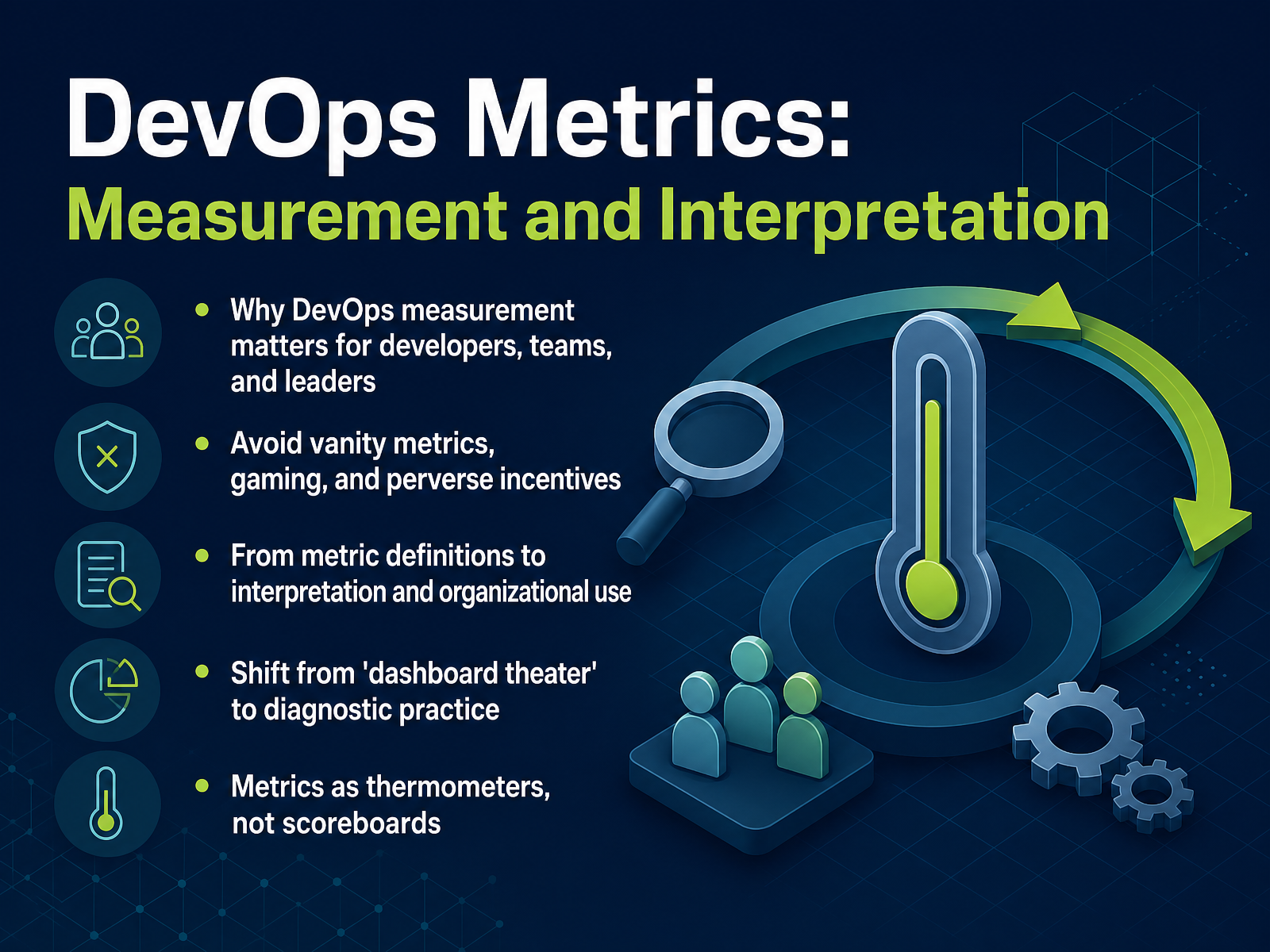
- 01DevOps Metrics: Measurement and InterpretationWelcome. If you're a developer, a DevOps engineer, or a technical leader, you've probably felt the pain of a dashboard that looks great but tells you nothing useful. That's what this course is about. We're going to move from what I call dashboard theater to a real diagnostic practice. We'll define metrics that matter, we'll learn to spot vanity numbers, and we'll avoid the traps of gaming and perverse incentives that turn good measures into bad targets. Here's the core idea to hold onto: metrics are thermometers, not scoreboards. A thermometer tells you the patient has a fever. It doesn't tell you why, and it doesn't cure anything. Same with your delivery pipeline. A good metric tells you something is wrong or right. Your job is to find out what changed and why. Throughout this course, we'll focus on practical levers, not theory. Next, we'll dig into why we measure, what context really matters, and the common pitfalls that turn good data into noise.leaddev.comshipthenfix.comlatini.dev+21 min
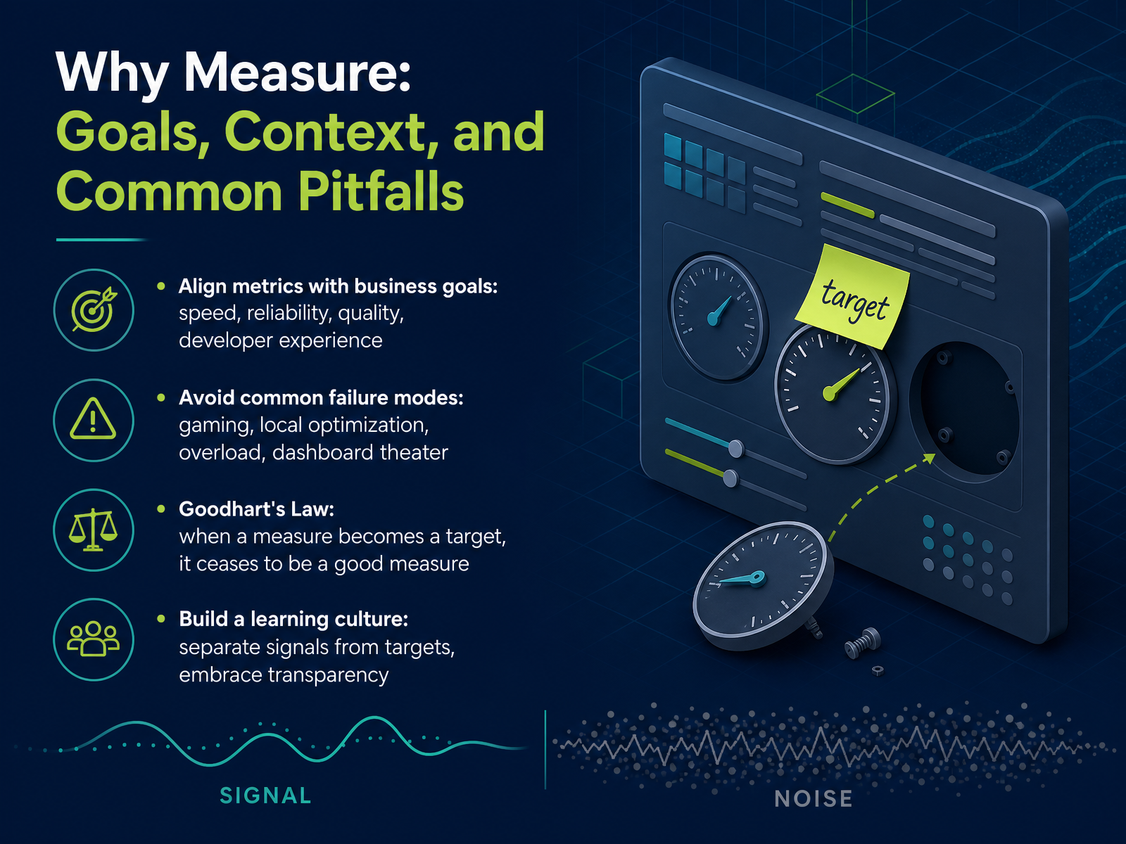
- 02Why Measure: Goals, Context, and Common PitfallsLet’s be honest about why we measure at all. The goal isn’t to make dashboards look green—it’s to align metrics with what the business actually needs: speed, reliability, quality, and a decent developer experience. That’s the frame. Hold onto it, because the pitfalls are where good intentions go to die. We all know the failure modes. Gaming the number when it becomes a target. Optimizing one local metric while the system gets worse overall. Overloading teams with too many indicators until nobody knows what matters. And dashboard theater—charts that look great in the quarterly review while nothing actually ships better. That’s Goodhart’s Law in action: when a measure becomes a target, it stops being a good measure. So what do we do? We build a learning culture. Separate signals from targets. Use metrics to ask questions, not to assign blame. Be transparent about what we know and what we don’t. The metric that surprises you is worth more than the one that flatters you. Now, let’s ground this in a framework you’ve likely heard of—DORA. We’ll look at what it measures, and more importantly, what it doesn’t.
 leaddev.comshipthenfix.comlatini.dev+22 min
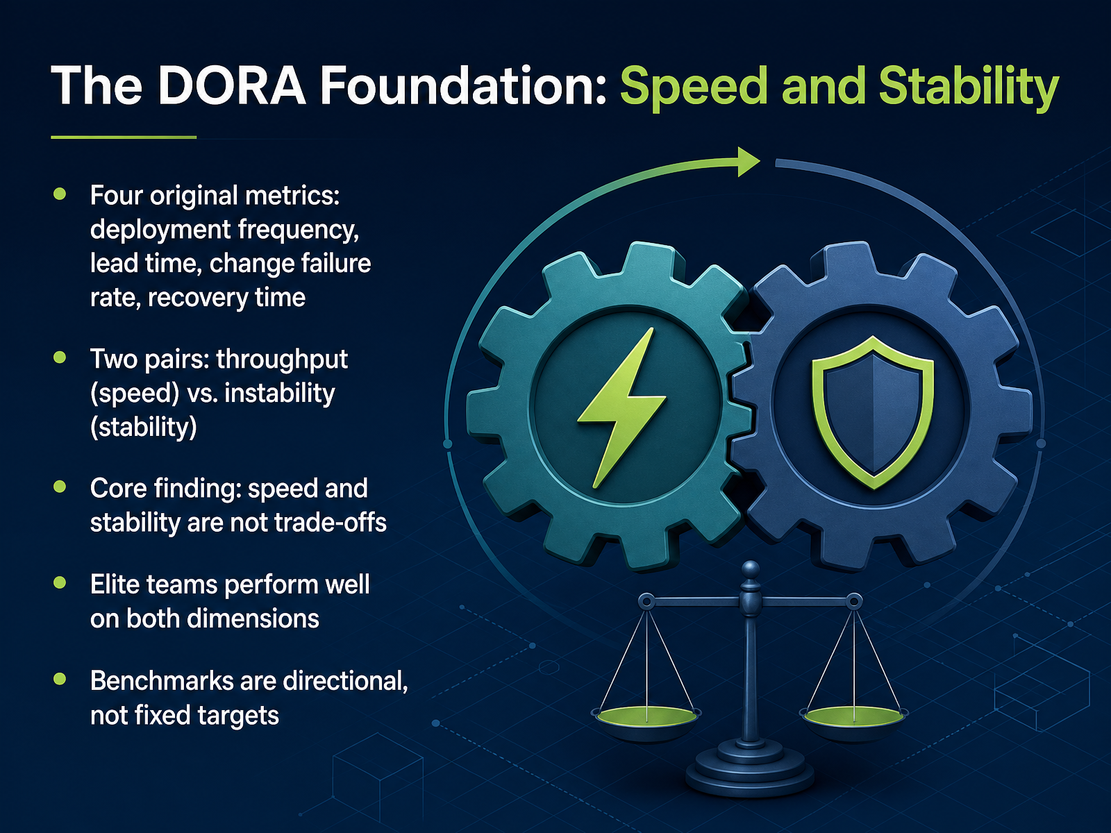
 - 03The DORA Foundation: Speed and StabilityNow let's ground everything in the DORA foundation. These are the original four metrics, and the key is to read them as two pairs. Deployment frequency and lead time measure throughput, your speed. Change failure rate and recovery time measure stability. The research has a counterintuitive finding that should reshape how you think about delivery. Speed and stability are not a trade-off. Elite teams perform well on both dimensions simultaneously, because the same system properties drive both. Small batches, solid testing, shared ownership. High failure rates are rarely fixed by slowing down. They're fixed by improving testing and deployment practices. One practical caution. Treat the elite and high benchmarks as directional, not as quotas. They shift every year, and your team's context, like regulatory constraints, legitimately changes what good looks like. Read the numbers as questions about your pipeline, not verdicts on your team. Next, we'll trace how this foundation evolved from four metrics to five, and why that change matters for how you measure today.
 dora.devcicd.watchgitrecap.com+21 min
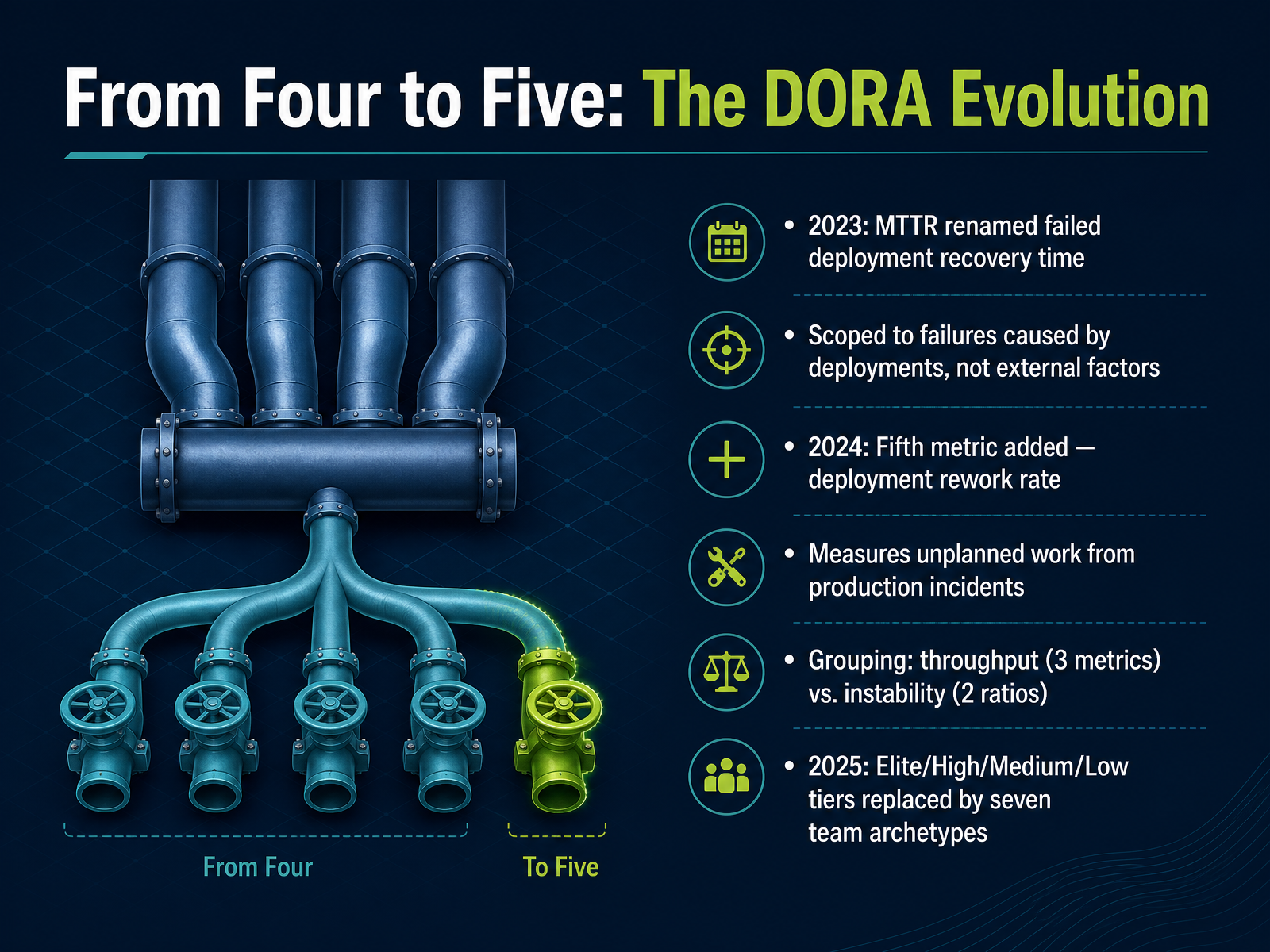
 - 04From Four to Five: The DORA EvolutionNow, let us talk about how the framework itself evolved. The four keys we used for years went through a major refinement. In 2023, DORA renamed MTTR to failed deployment recovery time. That change was precise, not cosmetic. It scoped the metric to failures caused by deployments, excluding outages from external factors. Then, in 2024, a genuinely new metric arrived: deployment rework rate. It captures unplanned deployments caused by production incidents. Think of it as the hidden cost of instability. This gave us a cleaner grouping: three throughput metrics and two instability ratios. And in 2025, DORA retired the old Elite, High, Medium, and Low tiers, replacing them with seven team archetypes that factor in human conditions like burnout. The point? The framework keeps getting sharper, and our dashboards need to keep up.
 dora.devcicd.watchgitrecap.com+21 min
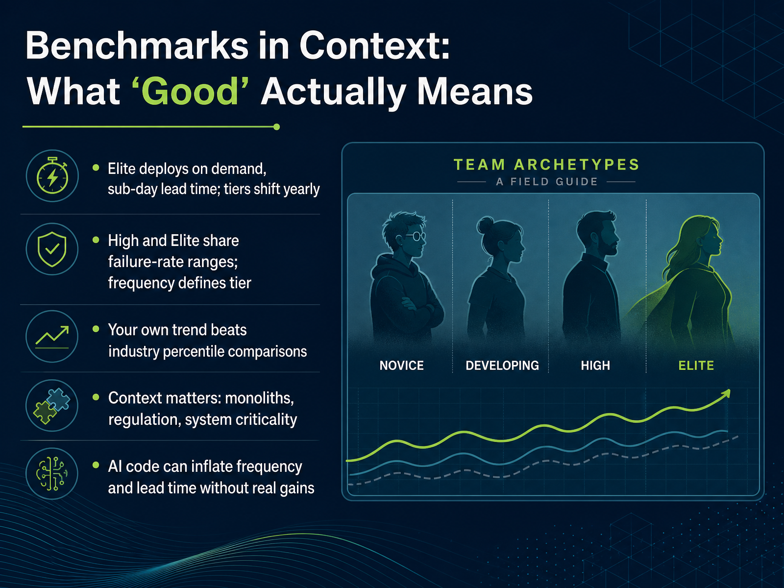
 - 05Benchmarks in Context: What 'Good' Actually MeansLet's talk about what good actually means. We all want the elite badge. But here's the catch: the tiers shift every year. What was elite last cycle might be high now. And here's something that surprises people. High and elite teams often share the same change failure rate range. What separates them is frequency. Elite teams fail at that same rate while deploying multiple times a day. That is a different level of capability. Now, resist the urge to benchmark yourself against industry percentiles. Your own trend over three months tells you more than a chart of anonymous companies. Context matters too. A regulated monolith cannot deploy like a greenfield microservice, and it shouldn't try. And with AI in the mix, be careful. AI can inflate deployment frequency and shrink lead time without delivering real gains. If the volume is mostly boilerplate, you have not tripled your capability, you have just gotten faster at shipping simple work. So read the numbers in context, trend against yourself, and treat the tiers as directional. Next, we will move beyond DORA to look at throughput, quality, and reliability together.
 dora.devcicd.watchgitrecap.com+22 min
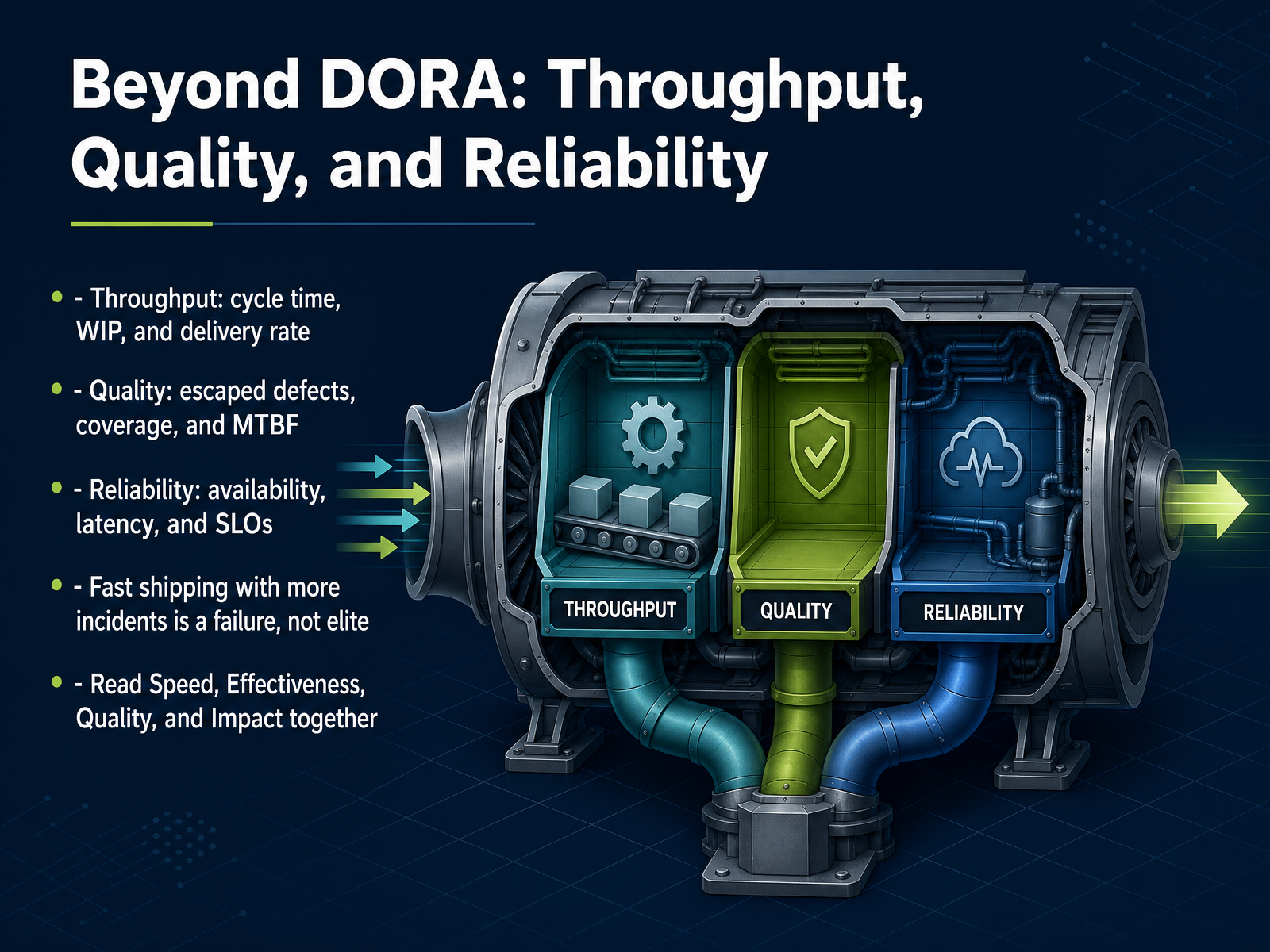
 - 06Beyond DORA: Throughput, Quality, and ReliabilityDORA gives us the baseline, but it doesn't tell the whole story. We need to look beyond it at three more dimensions. Throughput: cycle time, work in progress, and delivery rate. This tells you how fast work moves. Quality: escaped defects and test coverage. This tells you if what you ship actually holds up. And reliability: availability, latency, and service level objectives. This tells you how the system behaves for users. Now, here is the critical point. Shipping fast but generating more incidents is not elite performance. It is a failure mode. If throughput is up but stability is down, you've just automated the chaos. The real skill is reading these together. Speed, effectiveness, quality, and impact are a system of tensions. When you change one, watch what happens to the others. That combined view is where the truth lives. And next, we'll get practical about which signals warn you early versus which ones just tell you what already happened.
 circleci.comlinearb.iocircleci.com+21 min
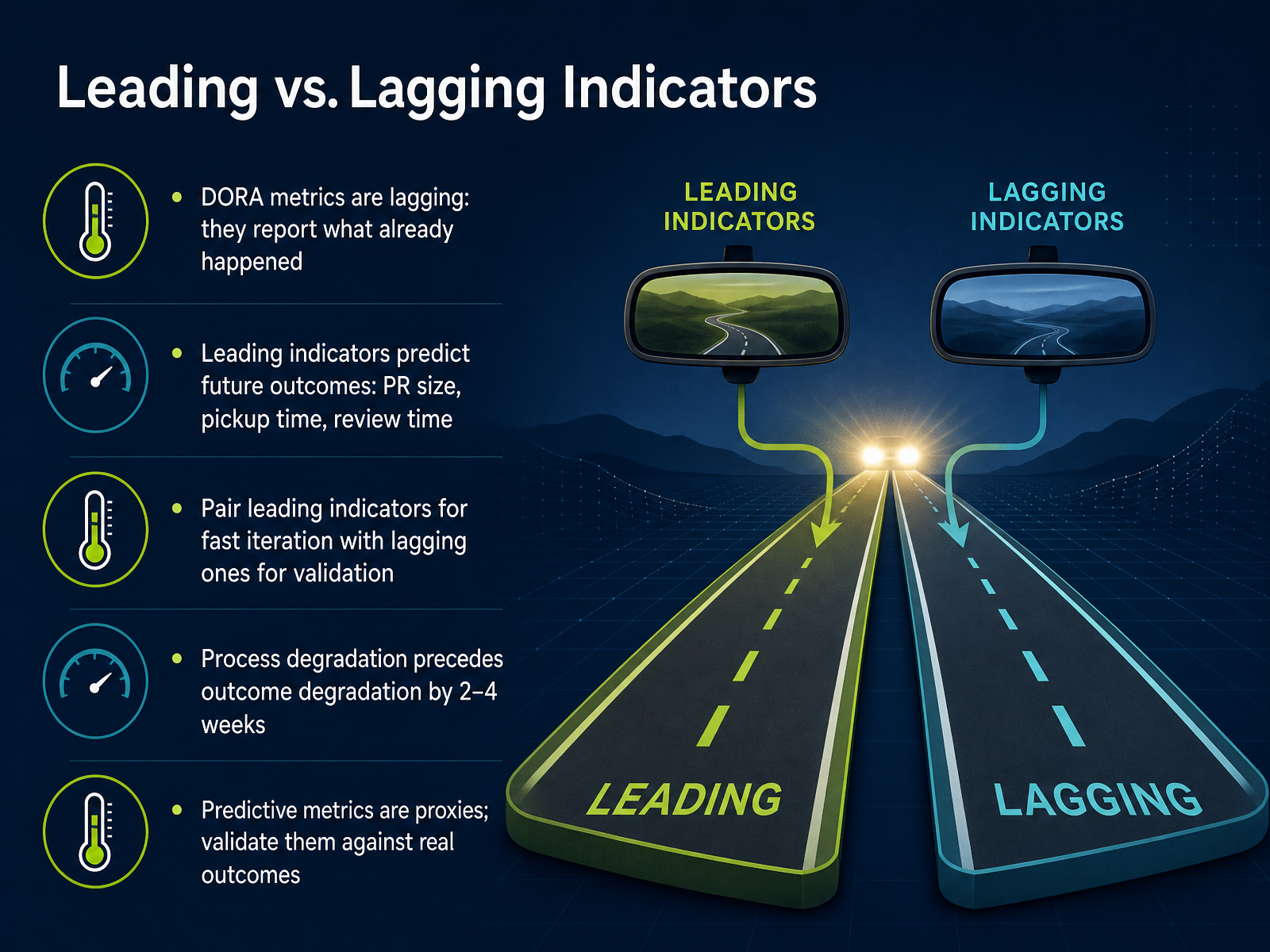
 - 07Leading vs. Lagging IndicatorsLet's talk about leading versus lagging indicators, because this distinction decides whether your dashboard helps you steer or just records the crash. Lagging indicators, like the classic DORA metrics, tell you what already happened. They are the rearview mirror. Useful, but you cannot change the past. Leading indicators, however, predict what is coming. Things like pull request size, pickup time, and review time. These are the metrics you can act on this week. The pattern is simple. Pair a leading indicator for fast iteration with a lagging one for validation. Here is the key insight. Process degradation almost always precedes outcome degradation by two to four weeks. If PR sizes start creeping up and pickup times stretch out, your cycle time will suffer a few weeks from now. Watch the leading signals, and you can intervene before the lagging numbers get ugly. One caution. These predictive metrics are proxies, not guarantees. Validate them against real outcomes. Keep that discipline, and you will move from explaining the past to shaping the future. Next, we will look at how to interpret metrics through trends, context, and causation.
 impactful.engineeringlinearb.iopearpages.com+22 min
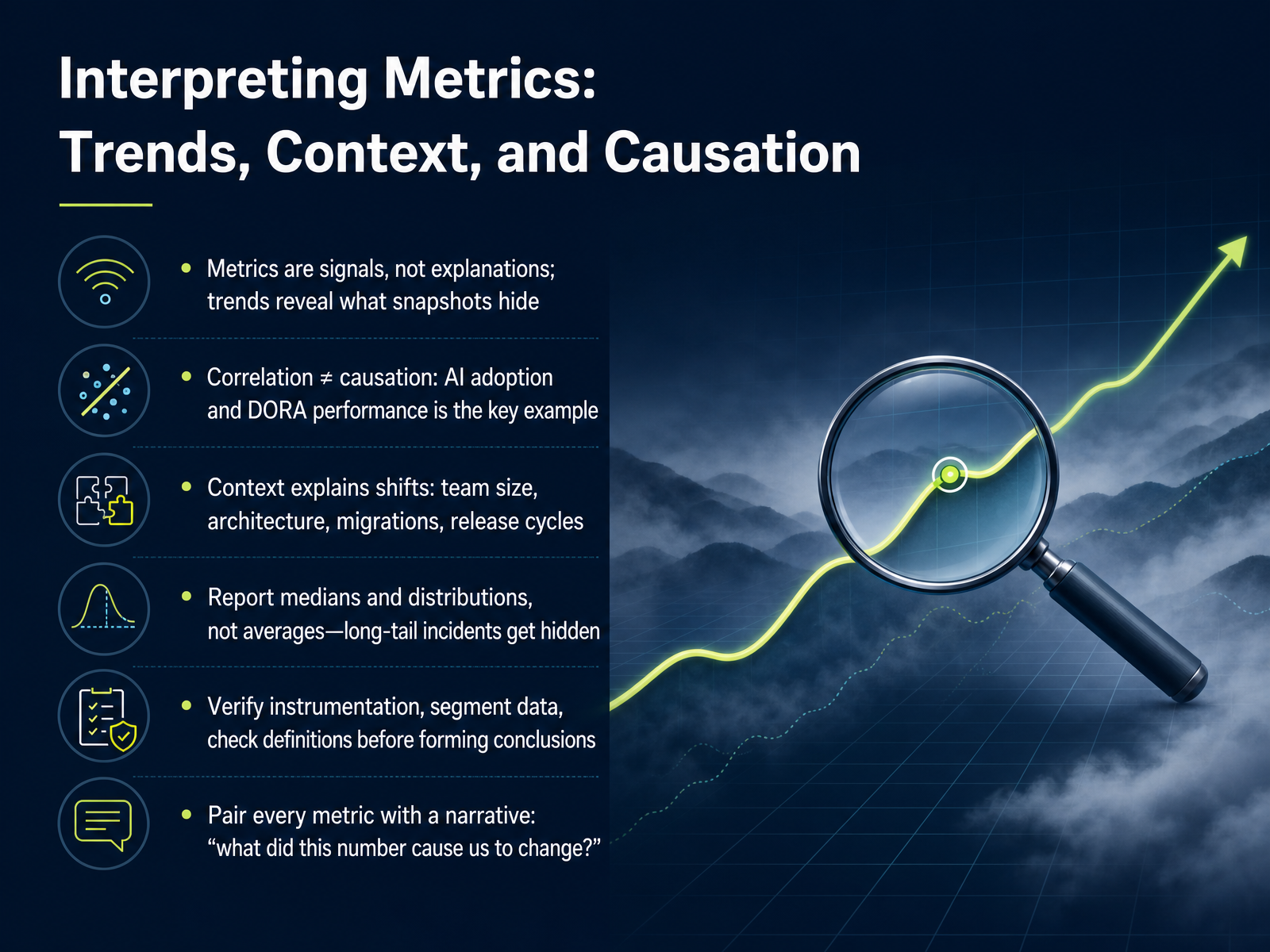
 - 08Interpreting Metrics: Trends, Context, and CausationSo far we've treated these metrics as if they speak for themselves. They don't. A metric is a signal, not an explanation. It tells you something moved. It does not tell you why, or whether the movement matters. Trends reveal what snapshots hide. A single week of deployment frequency is noise. A quarter-over-quarter shift is a conversation. But before you start that conversation, remember this: correlation is not causation. The classic example is AI adoption and DORA performance. One year the data shows a negative correlation. Next year, positive. The numbers flip, not because your teams changed, but because context changed. So when you see a trend, ask what else changed at the same time. Team size, architecture, migrations, release cycles. These explain shifts that the raw numbers cannot. And please, report medians and distributions, not averages. A single long-tail incident will drag a mean in a direction that describes nothing that actually happened. Verify your instrumentation. Segment your data. Check your definitions before you build a story on top of them. Then, pair every metric with a narrative. Not a number on a slide, but an answer to one question: what did this number cause us to change? If the answer is nothing, it's decoration. Next, let's talk about the uncomfortable part: how these metrics get gamed, and how we defend against it.
 leaddev.comshipthenfix.comlatini.dev+22 min
 - 09Metric Gaming and How to Defend Against ItNow let's talk about metric gaming. It is real, it is common, and it usually happens without any bad intent. Goodhart's Law says that when a measure becomes a target, it ceases to be a good measure. Once a number is tied to a bonus or a performance review, people will naturally optimize the path of least resistance. We see this with pull requests split into tiny pieces to inflate deployment frequency. We see it when the definition of failure changes to protect a change failure rate. And we see it when incident clocks start late or stop early. Here is the hard truth. AI agents make this worse, because they optimize stated objectives literally, without understanding intent. An agent measured on tickets closed will close tickets. It will not fix the underlying system. So, how do we defend against this? First, pair every target with a counter-metric. If you measure deployment frequency, also measure change size. If you measure time to restore, track how many incidents are reopened. Gaming one number is easy. Gaming a tension is expensive. Second, separate measurement from consequences. Metrics are for learning. Judgment is for rewarding. The moment a number feeds compensation, assume its reliability is decaying. And the warning sign is simple. If metrics improve while user pain and error budgets get worse, you are not improving. You are gaming. Next, we will talk about data collection and instrumentation.
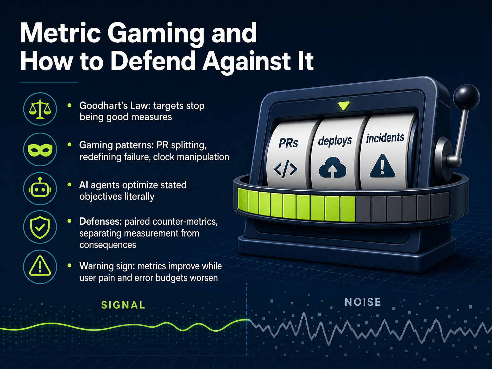 leaddev.comshipthenfix.comlatini.dev+22 min
 - 10Data Collection and InstrumentationOkay, now we get to the part where good intentions meet reality: data collection and instrumentation. The golden rule here is automation. If a human has to type in a number or update a spreadsheet, you are doing it wrong. Manual reporting is not just tedious, it is a breeding ground for errors and political games. We need the system to tell us the truth, objectively. In practice, this means pulling from a few core sources: your CI/CD system gives you deployment events and durations; version control provides commit timestamps; incident management tracks timelines for failures; and observability platforms show the user impact. The key is to automate the collection with consistent definitions across all these tools. This is where the OpenTelemetry pattern shines: instrument once, export anywhere. Use standard semantic conventions so that 'deployment duration' means the same thing in every service. Of course, there is a balance to strike. Higher precision costs more storage and compute. You must control cardinality. Do not put high-entropy data like user IDs into metric labels; that belongs in logs and traces. And, follow the single-writer principle: only one logical source should write to any given metric stream. Two writers create overlapping points, and the data becomes meaningless. Get this foundation right, and your numbers will be trustworthy. Nail the collection, and every decision we make next will be based on solid ground. Now, let’s look at how we use these metrics for continuous improvement.
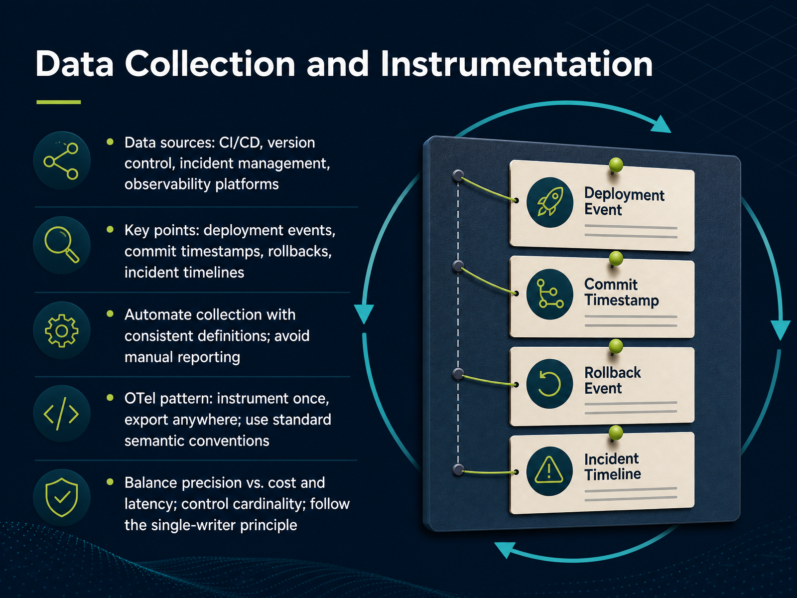 circleci.comlinearb.iocircleci.com+22 min
 - 11Using Metrics for Continuous ImprovementAll right, let's talk about how metrics actually drive improvement. The loop is simple: form a hypothesis, make a targeted change, and measure the impact. We collect, we visualize, we identify the bottleneck, we act, and we repeat. But the key is this: we improve the system, not a single number. When a metric plateaus, that's not a failure; that's a signal to dig deeper. For example, if change lead time is stuck, break it down. If the pickup time is slow, improve the review queue. If it's CI, parallelize the pipeline. If rollback is painful, automate it. Tackle the root cause, not the symptom. Now, who reviews these trends? The team reviews them weekly. That's where you spot regressions early. Leadership reviews them monthly to see if we're hitting targets. And the strategy gets reviewed quarterly to ensure we're aligned with the business. Match the cadence to the decision.</parameter>
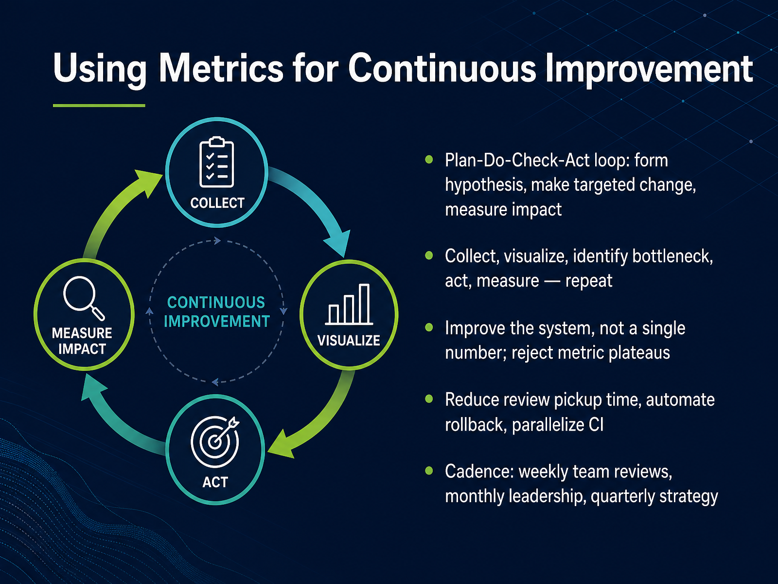 enlightlab.comdev.toimpactful.engineering+21 min
 - 12Metrics for Different AudiencesNow let's talk about who actually reads these numbers. One pipeline, but three very different views. Your team needs the daily and weekly detail—cycle time, review bottlenecks, flaky tests. That's their operational cockpit. Your managers need trends. Weekly signals that show where work is getting stuck and what changed this sprint. Then come the executives. They need a monthly snapshot in business language. Nothing more. Here's the translation layer: lead time becomes time-to-market. Change failure rate becomes cost of rework. Mean time to recovery becomes cost of downtime. That's how you move from engineering terms to decisions. And keep individual metrics out of the executive view. Always. The moment per-engineer data reaches that level, it becomes surveillance. Psychological safety erodes, and data quality degrades at the source. Finally, every review is diagnostic, not a performance judgment. The question is always what the number changed. Did it prompt an action? If the answer is nothing, that metric is just decoration. Cut it. And that leads us to how we actually implement a metrics program, which is next.
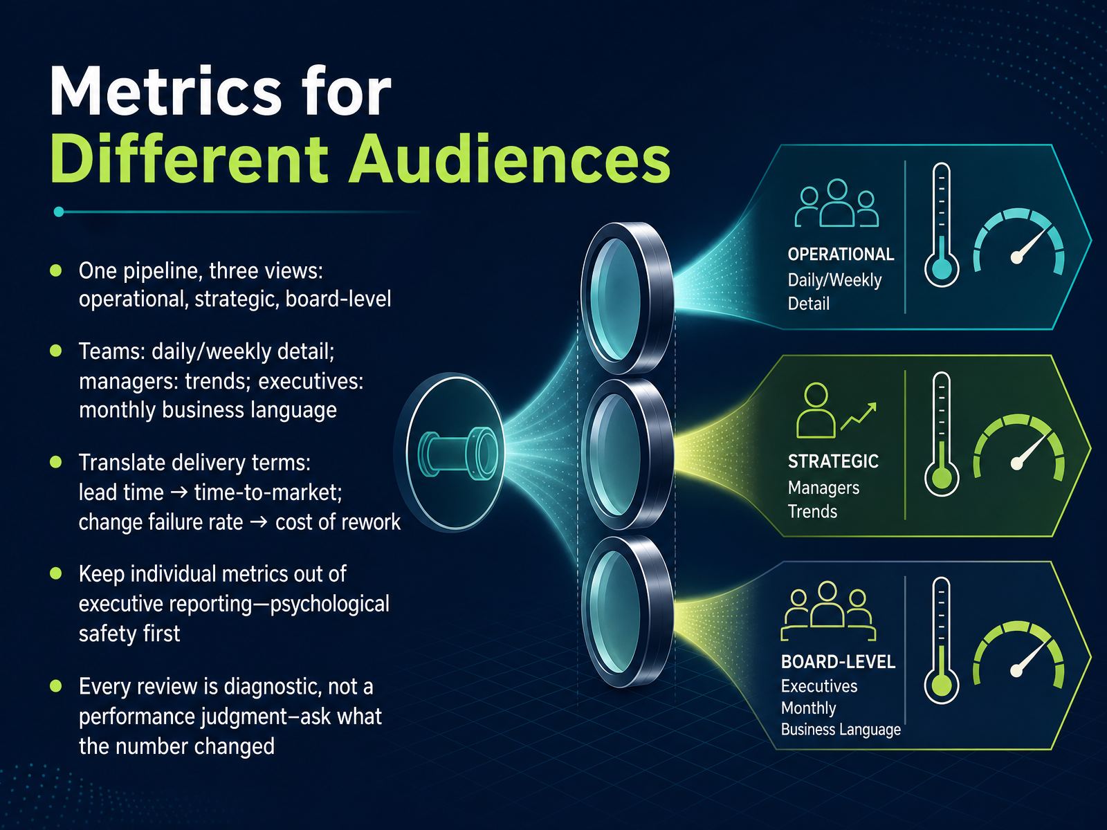 leaddev.comshipthenfix.comlatini.dev+22 min
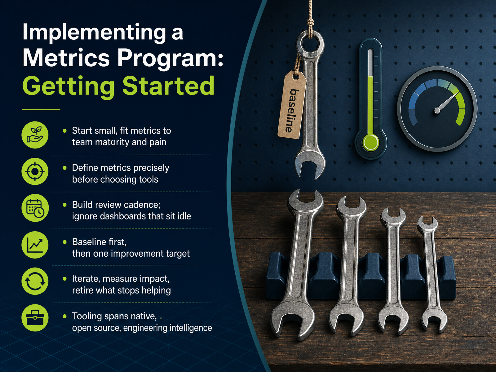
 - 13Implementing a Metrics Program: Getting StartedSo, how do we actually start? Don’t boil the ocean. Begin small, and fit the metrics to your team’s maturity and the pain you’re feeling right now. Define each metric precisely before you choose a single tool. Ambiguity is where trust dies. Then, build a review cadence. A dashboard nobody looks at is worse than none at all. It’s just theater. First, establish a baseline. Don’t set targets until you know where you stand. Then pick one improvement target. Just one. Iterate, measure the impact, and retire whatever stops helping. On tooling, you have options: native features from GitLab or GitHub, open source like Prometheus and Grafana, or engineering intelligence platforms that pull it all together. Start where you are. The goal isn’t perfect instrumentation. It’s a feedback loop. Which brings us to the next challenge: AI is changing what these numbers mean. That’s next.
 enlightlab.comdev.toleaddev.com+21 min
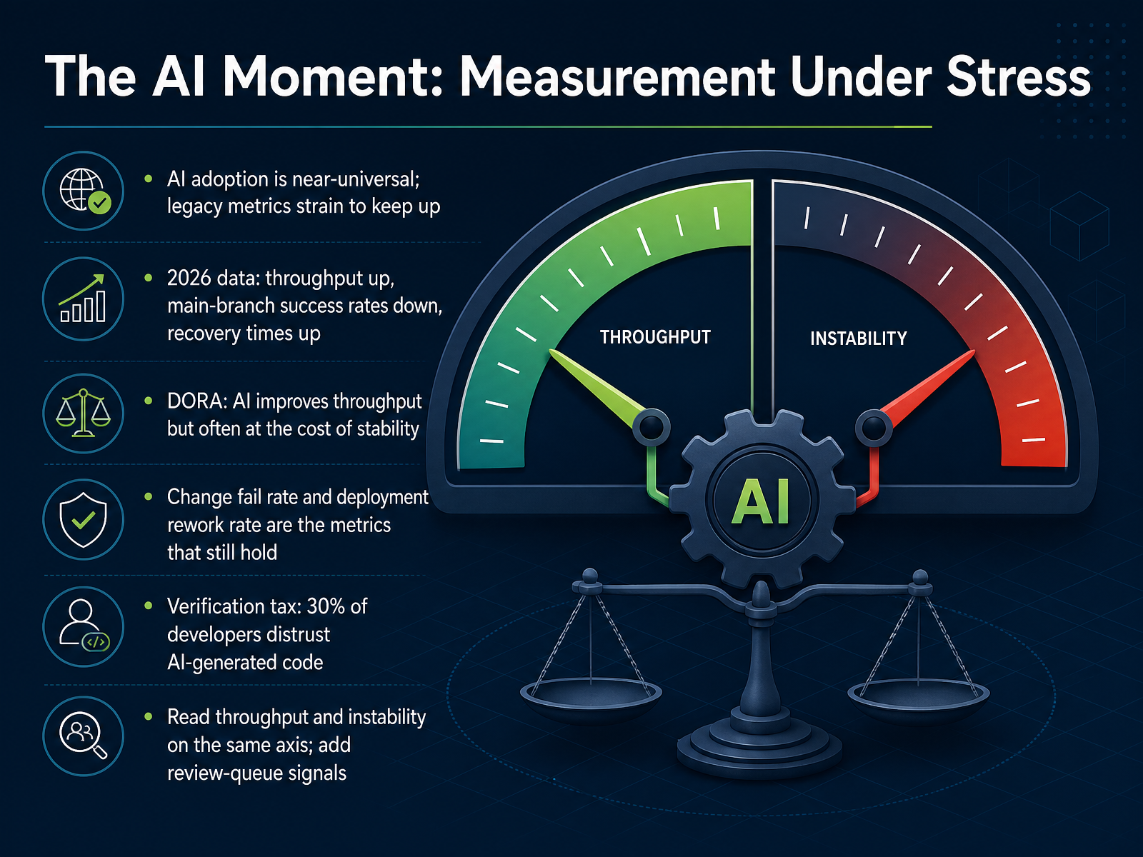
 - 14The AI Moment: Measurement Under StressLet’s talk about what happens when measurement meets the AI moment. And make no mistake—this is a stress test. Nearly every team now uses AI to write code. The 2026 data shows throughput climbing, but main-branch success rates are falling, and recovery times are going up. The CircleCI report is blunt: average throughput rose fifty-nine percent, but main-branch success dropped to seventy percent—the lowest in five years. DORA’s own research says AI improves throughput, but often at the cost of stability. That’s the tension we have to manage. Throughput and instability now rise together under AI adoption. So the metrics that still hold? The two instability ratios—change fail rate and deployment rework rate. When AI generates code faster than humans can review it, those two are the first to tell you something’s wrong. And then there’s the verification tax. Thirty percent of developers say they don’t trust AI-generated code. That distrust doesn’t show up on a throughput chart, but it shows up as extra review time, extra validation, extra rework. So here’s the practical move. Stop reading throughput and stability as separate stories. Put them on the same axis. And add a signal from the review queue—pickup time, acceptance rate, rework on merged PRs. If throughput rises while review gets slower, you’re not accelerating. You’re just building a bigger bottleneck. Let’s turn that into action—next, the key takeaways and action plan.
 circleci.comlinearb.iocircleci.com+22 min
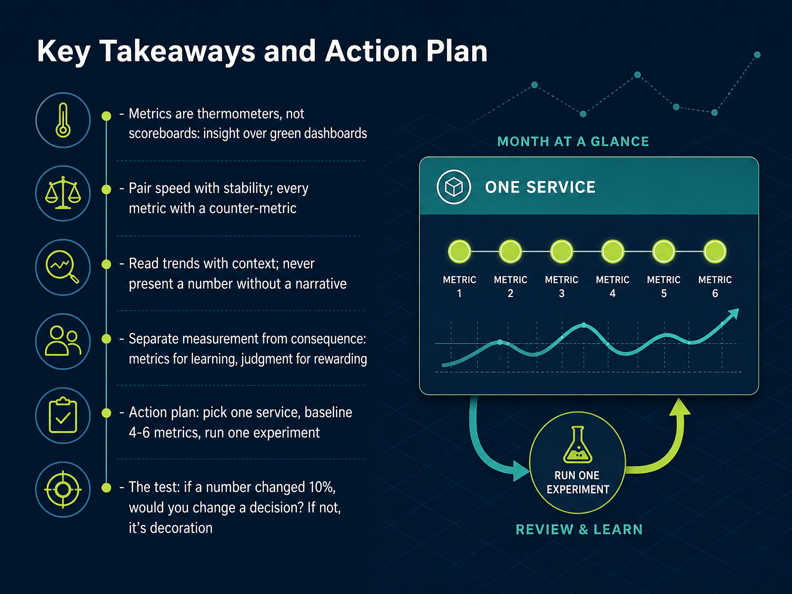
 - 15Key Takeaways and Action PlanLet's pull this together. Metrics are thermometers, not scoreboards. They diagnose the system; they don't grade the people. So pair every speed metric with a stability metric. Deployment frequency means nothing without change failure rate beside it. Read trends in context. Never present a number without a narrative explaining why it moved. And keep measurement separate from consequence. Metrics are for learning; your judgment is for rewarding. Here's your action plan. Pick one service. Baseline four to six metrics for it. Run one experiment tied to a hypothesis. Then ask the final test. If a number changed by ten percent, would you change a decision? If not, it's decoration. Cut it from the dashboard. Start small, stay curious, and let the numbers ask the questions, not provide the answers. Thank you for your time.
 leaddev.comshipthenfix.comlatini.dev+22 min
Take the deck with you
Download this course as a file — free, no sign-up needed.
- PDF handoutEvery slide page, ready to print or share.16 pages · 4.0 MBDownload
- Narrated PowerPointThe deck that presents itself — every slide carries the digital human's narration video.16 pages · 15.6 MBDownload
- PowerPoint slidesThe full deck as a .pptx — open it in PowerPoint, Keynote, or Google Slides.16 pages · 4.0 MBDownload
Free to use in your own training — please keep the PersonWise credit page at the end.
Have your own deck? Turn it into a course
Sources consulted
Web sources consulted while building this course.
- DORA metrics are lying to you and AI is making it worse - LeadDev — leaddev.com
- DORA Metrics Are Not KPIs — Stop Gaming DevOps · Ship Then Fix — shipthenfix.com
- DORA Metrics Without the Dashboard Theatre · F. Latini - IT Engineer — latini.dev
- Google's DORA Metrics Are Failing Engineering Teams - NeuralWired — neuralwired.com
- Your Delivery Dashboard Might Be Measuring | Fieldway — fieldway.org
- DORA's software delivery performance metrics — dora.dev
- DORA Metrics Benchmarks 2026: Elite, High, Medium, Low | CI/CD Watch — cicd.watch
- DORA Metrics Benchmarks 2026: Where Does Your Team Stand? | Gitrecap Blog — gitrecap.com
- DORA Metrics in Practice 2026 · Stride Research — stride.page
- DORA Metrics Benchmarks 2026: What Good Looks Like — techintelix.com
- https://circleci.com/landing-pages/assets/2026-state-of-software-delivery-report.pdf — circleci.com
- 2026 Software Engineering Benchmarks Report — linearb.io
- 2026 State of Software Delivery: Q2 Pulse Report - CircleCI — circleci.com
- DORA Metrics Explained: The 5 Key DevOps Metrics For Measuring Software Delivery Performance In 2026 - Enlight Lab — enlightlab.com
- DORA Metrics in 2026: Why Four Became Five (and What Most Dashboards Still Get Wrong) - DEV Community — dev.to
- Pairing Leading and Lagging Indicators in Software Engineering Metrics<a href="https://hashnode.com/@manuelmorales" id=""><br/></a> - Impactful Engineering — impactful.engineering
- Software development metrics guide: Benchmarks & best practices | LinearB Blog — linearb.io
- Software Engineering Metrics That Matter: DORA, Delivery, and Reliability | pearpages by Pere Pages — pearpages.com
- Software Engineering Metrics: The Complete Guide for 2026 — oobeya.io
- How to See Your Leading, Lagging, and Reliable Estimation Metrics - Johanna Rothman — jrothman.com