File Upload UX Design
Begin
13 pages · ~26 min
File Upload UX Design
Learn to design effective and user-friendly file upload experiences, focusing on key UX principles and practical implementation for web and mobile interfaces.
What you’ll learn
- 01Designing File Upload Experiences: From Selection to RemovalWelcome. In this course, we'll explore designing file upload experiences, covering everything from selection to removal. File upload user experience isn't an afterthought. It's critical for conversion, retention, and building user trust. The core idea is simple: make selection, progress, errors, and removal understandable at every step. We've all felt the frustration of silent failures, ambiguous progress bars, hidden file constraints, or having no way to recover from a mistake. This course gives you practical, immediately applicable patterns for the entire upload lifecycle. Let's start by building a clear mental model. Up next: The Upload Mental Model, mapping user expectations.1 min
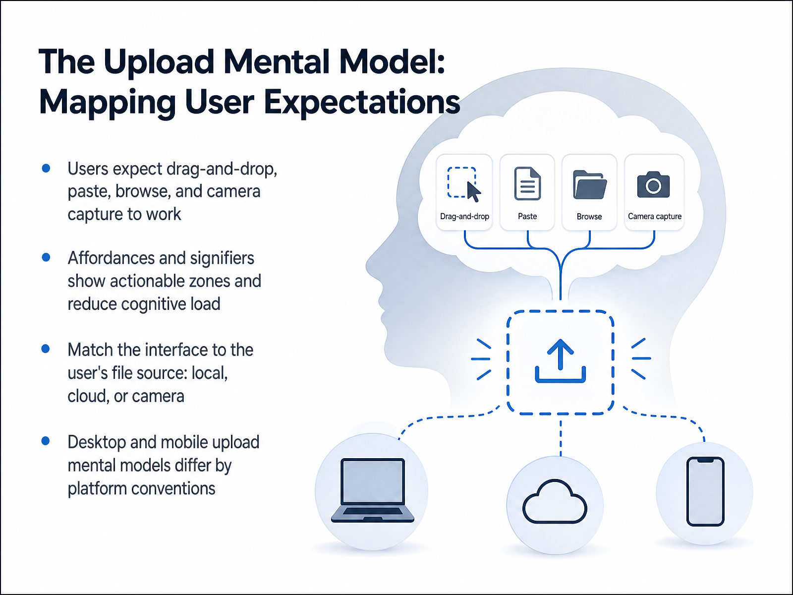
- 02The Upload Mental Model: Mapping User ExpectationsNow let's look at the mental model people bring to an upload experience. Users enter your interface with strong expectations. They assume drag and drop will just work. They expect to paste a copied file, click to browse, or even capture directly from their camera. Your job is to make these actions immediately obvious through clear affordances. A dotted border signals a drop zone. A prominent button invites a click. These signposts reduce the mental effort a user needs to get started. Next, match the interface to the file source. Someone pulling a file from Google Drive thinks differently than someone choosing a local folder or snapping a photo. Finally, remember that desktop and mobile mental models differ sharply. A hover state has no meaning on a phone. Platform conventions guide how users expect to initiate an upload, so your design must adapt seamlessly. Next, we will explore Selecting Files: Clarity, Constraints, and Immediate Feedback.
 1 min
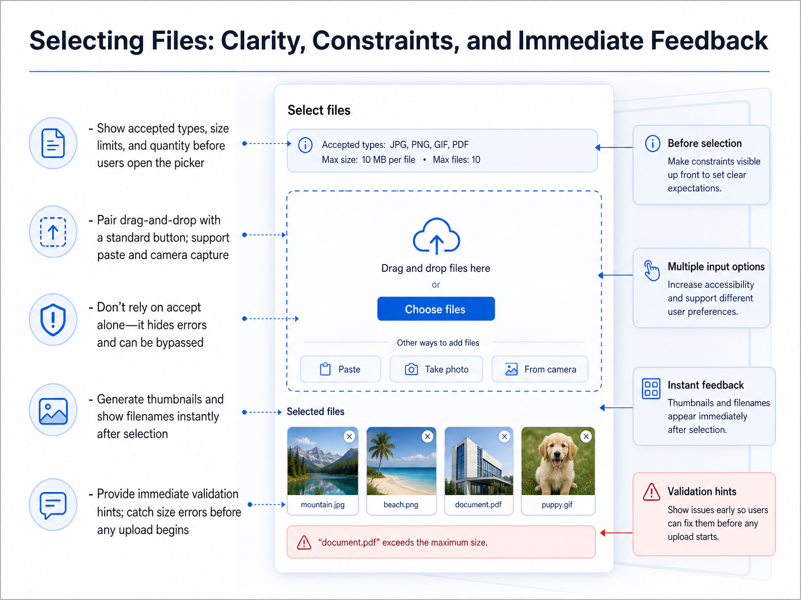
1 min - 03Selecting Files: Clarity, Constraints, and Immediate FeedbackLet's focus now on the first real moment of interaction: selecting files. Here, clarity, clear constraints, and immediate feedback are everything. Before a user even opens the file picker, we should tell them what's accepted. Plain language is best: state the file types, size limits, and how many files they can choose. For the interaction itself, always pair a standard click-to-browse button with drag-and-drop support. You might also support paste and even camera capture for a smoother flow. One critical point: never rely on the accept attribute alone to filter files. It's just a visual hint; it can hide errors and users can bypass it entirely. Once a file is actually selected, action is crucial. Generate thumbnails for images and display filenames instantly. This gives the user immediate visual evidence that they chose the right file. At the same moment, run your first validation. Give instant hints if something is wrong, and catch size errors right here, before any upload or network request even begins. This prevents a slow, failing process later and keeps the user in control. Up next, we'll move from selection to communication and look at how to clearly show upload progress and status.
 programminginsider.comupfiles.cloudsujeet.pro+22 min
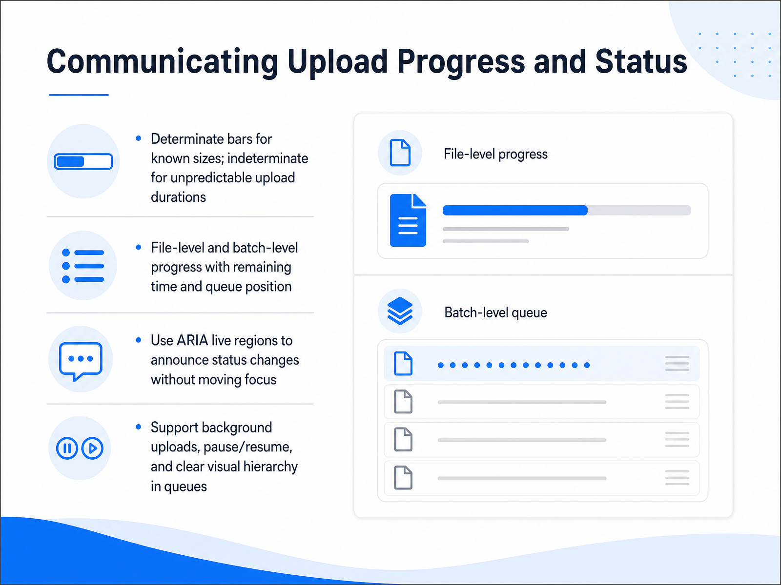
 - 04Communicating Upload Progress and StatusNow let's talk about showing upload progress clearly. When the file size is known, use a determinate progress bar that fills from zero to one hundred percent. When the size is unknown, switch to an indeterminate style, like a pulsing bar, so people know something is still happening. For batch uploads, show both per-file progress and overall batch status, including an estimated time remaining and the queue position. This helps users plan their time without feeling stuck. To keep the experience accessible, use ARIA live regions politely. This announces progress changes to screen readers without stealing keyboard focus, so people can keep working. Also support background uploads with pause and resume controls, and maintain a clear visual hierarchy so it is obvious which files are active, queued, or finished. Next, we will explore making errors understandable and actionable.
 w3.orgw3.orguipotion.com+22 min
 - 05Making Errors Understandable and ActionableNow, let's talk about errors, because they will happen. The key is to make them understandable and actionable, not frustrating. To do that correctly, you first need to classify the type of error. Is it a client-side validation issue, like a file that's too large or the wrong type? Is it a network failure where the connection was lost? Or is it a server rejection, maybe due to a duplicate file name, or even file corruption? Getting this right lets you write a truly helpful message. A good error message clearly states what happened, briefly explains why it happened, and immediately gives the user a specific next step. For instance, instead of saying 'Upload failed,' say 'We couldn't upload your image because the file size exceeds ten megabytes. Please resize it to under ten megabytes and try again.' Next, always provide a clear path to recovery. Depending on the error, offer the right action, like a simple 'Retry' button, a 'Remove' button for a failed file, or an 'Edit' link to rename it. For multiple errors, you can offer bulk retry or remove actions. The golden rules of UX writing apply here: be specific, keep a calm and helpful tone, and always guide the user forward. Now, once a file is uploaded, users need the ability to change their mind. Let's move on to managing and removing files with confidence.
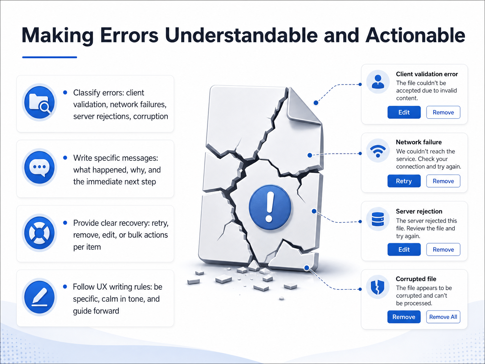 2 min
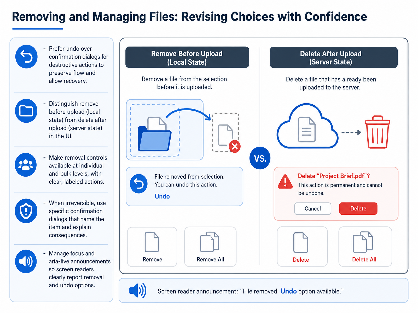
2 min - 06Removing and Managing Files: Revising Choices with ConfidenceNow, let's talk about removing files. When a user changes their mind, the goal is to make them feel in control, not punished. To do that, prefer letting them undo an action rather than throwing up a confirmation dialog. Confirmation dialogs interrupt the flow. An undo option respects the user's intent, lets the action happen, and provides a clear path to recovery if it was a mistake. Think of it like Gmail's undo send feature—instant, non-blocking, and forgiving.
Next, we need to be clear about what kind of removal is happening. A file removed before it's been uploaded is one thing—you're just clearing a local selection. Deleting a file that has already been saved to the server is a completely different action and should be visually distinct. Using clear labels, like “Remove” for pre-upload and “Delete” for post-upload, helps set the right expectations.
You should also let users clean up at different levels. Offer the ability to remove a single file from a list, or to clear everything with a bulk action. Just make sure each control is clearly labeled with the action it takes, like “Clear all” or “Delete file.”
Now, what about actions that truly cannot be undone? If the removal is permanent, then a specific confirmation dialog is genuinely necessary. The key word here is specific. Don't just ask, “Are you sure?” Instead, name the item and explain the consequence. For example, “Delete ‘project_budget_final.xlsx’? This file will be permanently removed from the server.” That gives the user enough context to make a confident decision.
Finally, consider users who rely on screen readers. When an item is removed, manage the focus so the reader doesn't get lost on the page. Use aria-live regions to announce, for instance, “File removed” and to clearly state that an “Undo” option is available. This makes the experience inclusive and robust for everyone.
Next, we’ll apply this mindset to a different challenge: designing for edge cases and network uncertainty.
 nngroup.comuxmatters.comusenix.org+22 min
 - 07Designing for Edge Cases and Network UncertaintyNow let’s talk about edge cases and network uncertainty, because real uploads rarely happen on perfect connections. You need to handle disconnections, timeouts, and large files gracefully. The key is using chunked and resumable strategies. Break files into small pieces so a dropped connection only affects the current chunk, not the entire upload. When the network is unavailable, queue the work offline and show clear sync indicators. Use automatic retry with exponential backoff, which means waiting a little longer between each attempt, to avoid hammering the server. Also design for partial success. If a batch of files fails halfway through, communicate the mixed outcome clearly per file: which ones succeeded and which ones need attention. For files over about ten megabytes, invest in the tus protocol. It saves upload progress on the server. That way, if the user closes the browser or loses power, they can pick up exactly where they left off in a later session. Next, we’ll explore accessibility and inclusive file upload experiences.
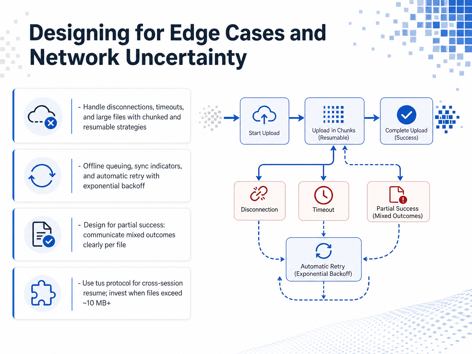 github.comgithub.comtus.io+21 min
 - 08Accessibility and Inclusive File Upload ExperiencesNow let's focus on making file uploads work for everyone, including people who use keyboards, screen readers, or other assistive tools. First, full keyboard control is non-negotiable. A user must be able to press Tab to reach the upload area, then press Enter or Space to open the file picker. And just as important, make sure focus never gets trapped inside the upload component. Next, if your design includes drag and drop, you must pair it with a visible, clickable file picker button. This is actually required by WCAG criterion 2.5.7, because not everyone can perform a dragging motion with a pointer. A simple "Choose files" button right next to the drop zone solves this. Then we need clear communication. Use a live region to announce what's happening: when files are added, when upload is in progress, when it succeeds, and especially when an error occurs. A screen reader user shouldn't have to guess whether a file made it through. Finally, think beyond a single disability. Design for motor impairments with large touch targets, for low vision with strong contrast and visible labels, and for cognitive accessibility with plain language and clear error recovery. Every step should be understandable and forgivable. Up next, we'll apply these principles to mobile and platform-specific upload considerations.
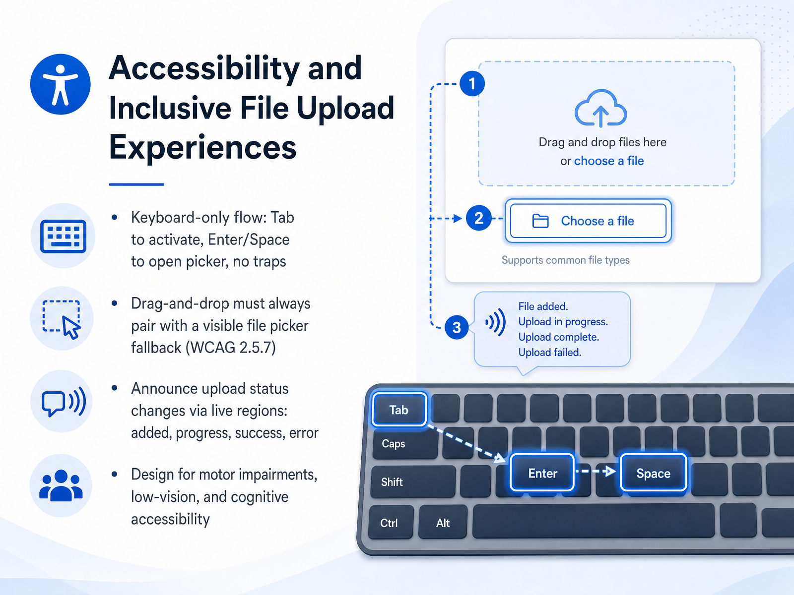 upfiles.clouduipotion.com2 min
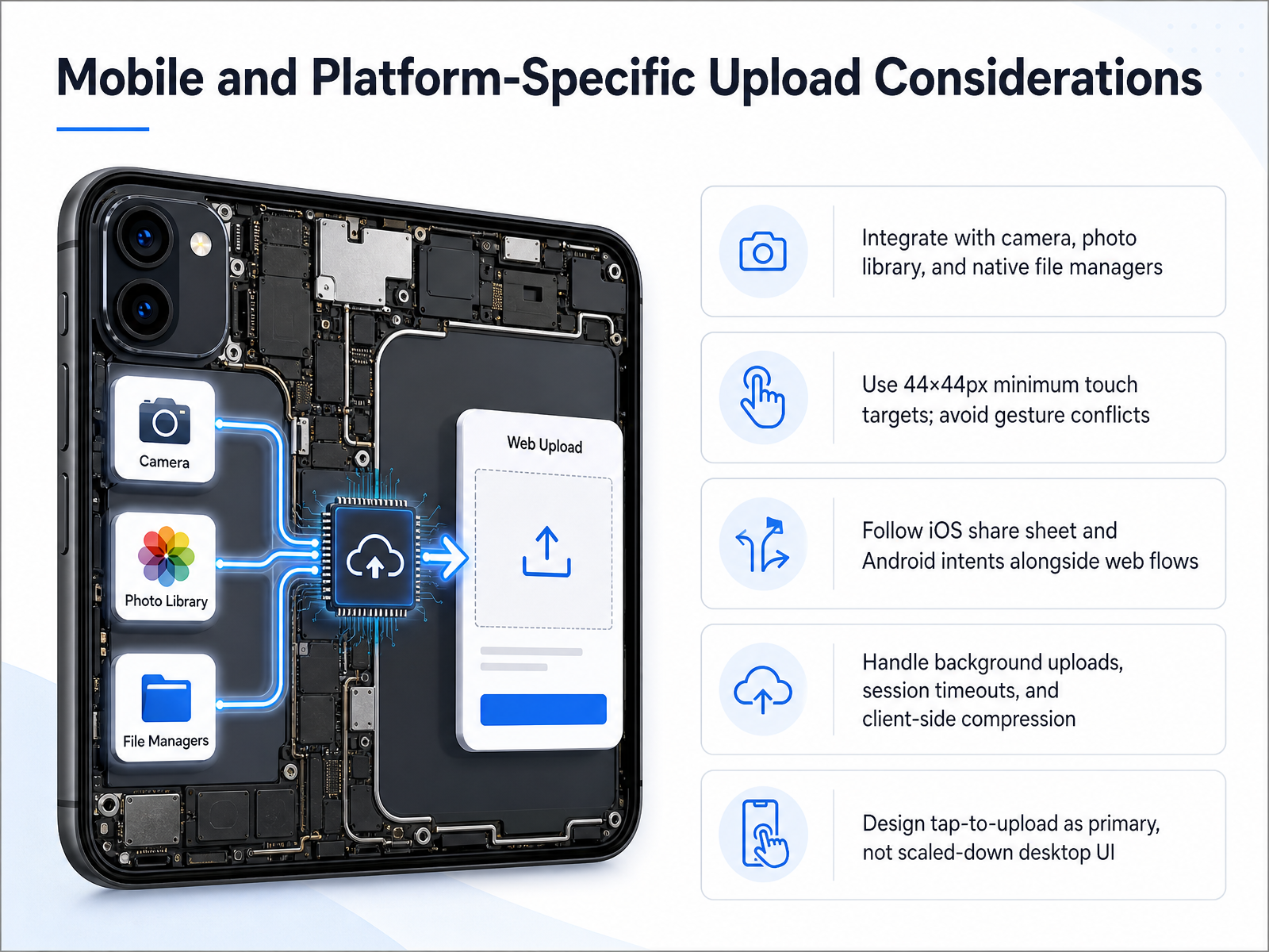
 - 09Mobile and Platform-Specific Upload ConsiderationsNow let's shift our focus to mobile and platform-specific considerations. Designing for a phone or tablet is not about shrinking the desktop interface. It is about building a flow that feels native to the device. Start by integrating directly with the hardware people already use. Instead of just a file picker, offer access to the camera and the photo library. On both iOS and Android, support the system share sheets and intents, so users can pull files directly from other apps or cloud drives without leaving your flow. Touch targets are critical. Make sure every tappable area, like an upload button or a file preview, is at least forty-four by forty-four pixels to prevent mis-taps and frustration. Also, watch out for gesture conflicts; your upload zone should not fight with the browser’s swipe-to-go-back or pinch-to-zoom actions. Next, plan for the reality of mobile connectivity. Users switch apps, lose signal, or lock their phones. You need to handle background uploads gracefully so progress continues even when your app isn't front and center. Be ready for session timeouts by preserving the upload state, and use client-side compression to shrink large photos or videos before transmission, which saves time and data. Most importantly, the primary interaction should be a simple tap-to-upload. Avoid forcing mobile users into a miniature drag-and-drop interface that feels awkward on a touchscreen. A large, responsive button that opens the native file picker is almost always the better choice. Let's build on this reliability next, as we dive into chunked and resumable upload strategies.
 2 min
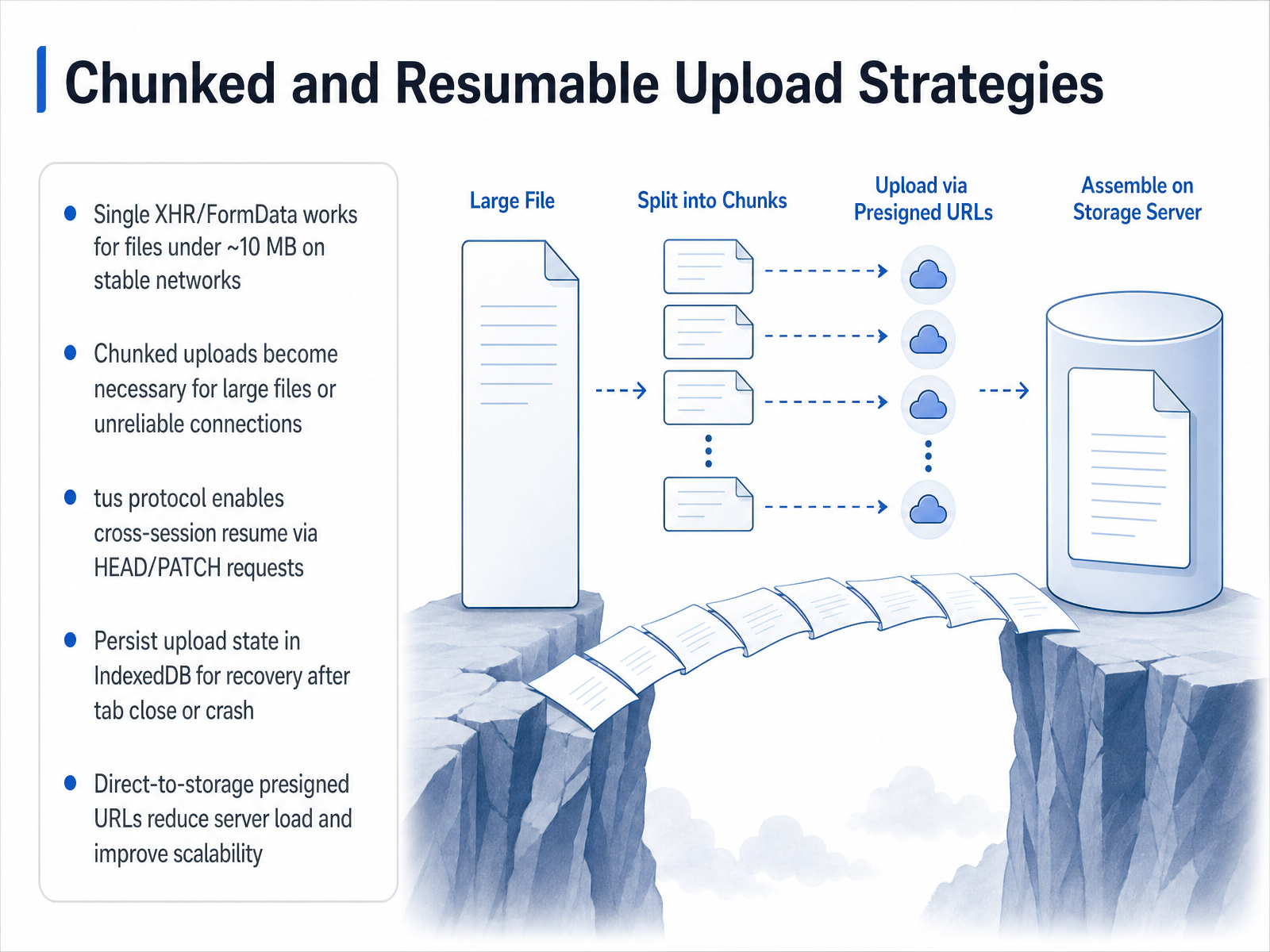
2 min - 10Chunked and Resumable Upload StrategiesNow let's move beyond single-request uploads and talk about strategies for really large files or unreliable connections. A simple post with form data works nicely for files under about ten megabytes on a stable network. But the moment you're dealing with hundred-megabyte videos or flaky mobile connectivity, you need a chunked and resumable approach. The tus protocol is an open standard that makes this straightforward. Instead of one big upload, the client creates an upload session on the server using a post request, then sends the file piece by piece with patch requests. If the connection drops, the client simply sends a head request to ask the server, 'How many bytes did you safely store?' and picks up exactly where it left off. To survive a browser crash or an accidental tab close, you should persist the upload URL and the file metadata in IndexedDB, so the session can be recovered later. For scalability, consider generating presigned URLs that let the client upload chunks directly to cloud storage. This removes your application server from the data path and handles massive traffic far more gracefully. In short, start simple for small files, but adopt a chunked, resumable protocol like tus for large files, persist session state for recovery, and use direct-to-storage presigned URLs to scale. Next, let's talk about keeping the entire pipeline safe with client-side and server-side validation, a layered defense.
 github.comgithub.comtus.io+22 min
 - 11Client-Side and Server-Side Validation: A Layered DefenseLet's talk about validation, and why you need a layered approach. Think of it as two checkpoints that work together. The first layer runs right in the user's browser. This client-side check gives your users instant feedback on things like file size, accepted formats, and basic dimensions, all without waiting for the server. But here is the critical part: server-side validation is your true security boundary. You should never trust the client alone, because all client-side code can be bypassed. For example, the accept attribute on your file input is purely a user experience hint. It guides the file picker, but it is not a security control. Two common pitfalls to avoid are trusting the Content-Type header, which can be easily faked, and blindly saving files with their original filenames, which could introduce path traversal or duplication risks. Next, we will look at how to think about drag-and-drop as an enhancement, not the foundation.
 1 min
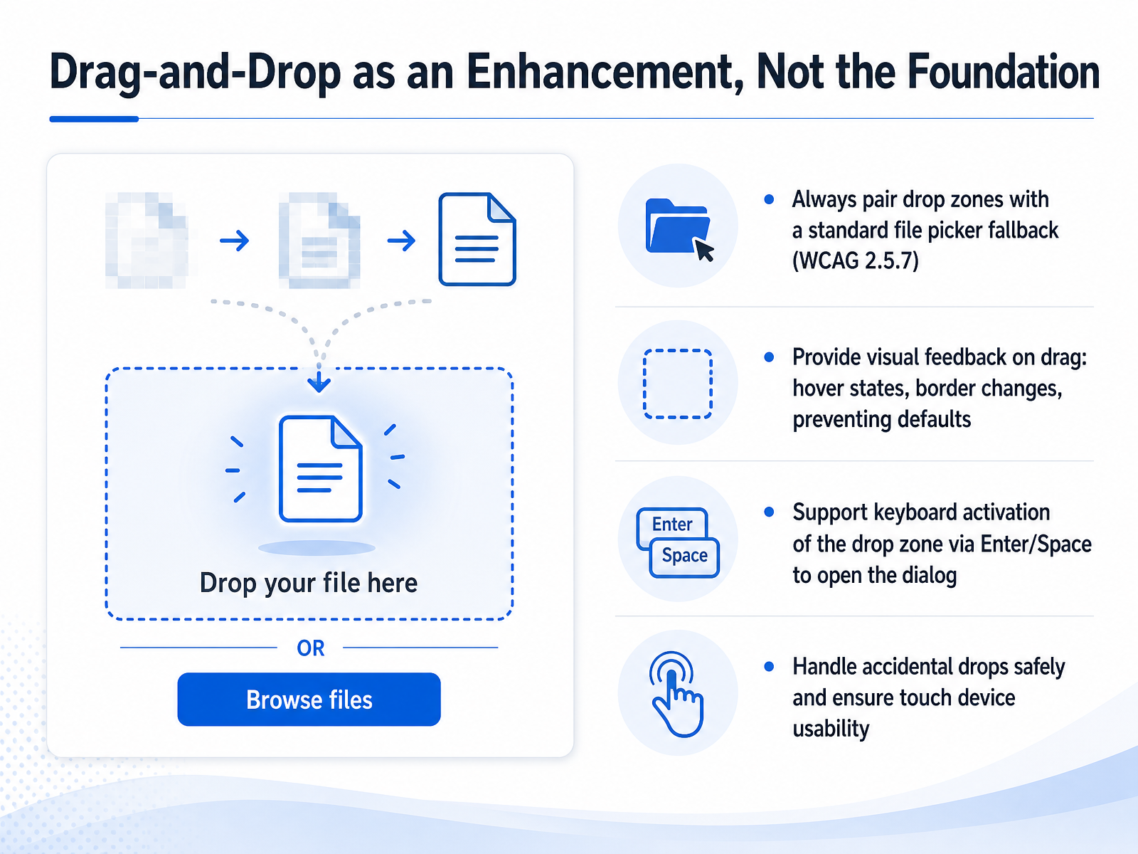
1 min - 12Drag-and-Drop as an Enhancement, Not the FoundationNow let's talk about a common visual pattern: drag-and-drop. It can feel modern and fast, but it must be treated as an enhancement, not your foundation. According to WCAG criterion 2.5.7, any dragging movement needs a single-pointer alternative. That means your drop zone should always be paired with a standard file picker button, so a user can simply click or tap to choose files. When someone drags a file over the zone, give clear visual feedback like a border highlight or a background change. Make sure you prevent the browser's default behavior so the file opens in your app instead of downloading. The zone itself must be keyboard-accessible; pressing Enter or Space on it should open the file dialog just like a click. And remember to handle accidental drops safely. If a user drops a file outside the intended area, don't navigate away or cause a confusing error. Also, confirm the experience works well on touch devices where drag-and-drop is hard to perform. In short, think of the drop zone as a secondary shortcut. The primary path is always a clearly labeled, keyboard-focused file picker. Up next, let's move into practical patterns and implementation principles you can use right away.
 upfiles.clouduipotion.com2 min
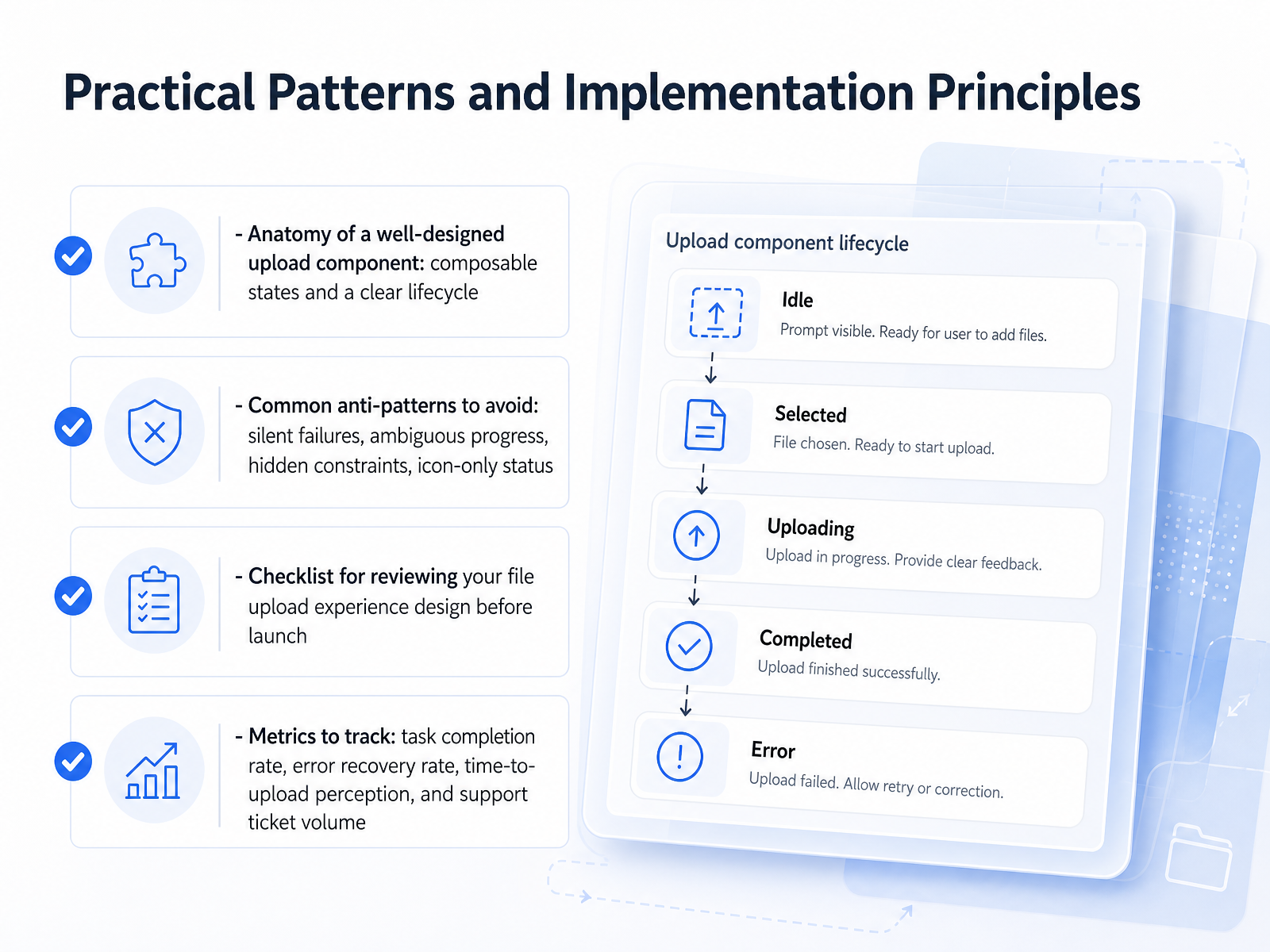
 - 13Practical Patterns and Implementation PrinciplesAlright, let's bring everything together with a few practical patterns you can use right away. When you're designing a file upload component, think of it as having composable states: default ready, drag over, uploading, success, and error. Each state needs a clear visual cue, and the whole component should follow a predictable lifecycle so users always know where they are in the process. Watch out for common anti-patterns like silent failures where nothing happens, ambiguous progress bars that sit stuck at ninety-nine percent, hidden constraints like file size limits that only appear after rejection, or icon-only statuses without text labels which can be confusing. Before you launch, run through a quick checklist: Are constraints communicated upfront? Is progress visible and preferably numeric? Are error messages specific and actionable? And can users easily remove or replace files? Finally, track these metrics: task completion rate, error recovery rate, the perceived time-to-upload, and the volume of related support tickets. These numbers will tell you if your design actually works in the real world. Thank you for joining this deep dive into file upload experiences. Take these techniques, refine your interfaces, and make every file interaction a little smoother for your users.
 2 min
2 min
Take the deck with you
Download this course as a file — free, no sign-up needed.
- PDF handoutEvery slide page, ready to print or share.14 pages · 3.2 MBDownload
- Narrated PowerPointThe deck that presents itself — every slide carries the digital human's narration video.14 pages · 15.8 MBDownload
- PowerPoint slidesThe full deck as a .pptx — open it in PowerPoint, Keynote, or Google Slides.14 pages · 3.1 MBDownload
Free to use in your own training — please keep the PersonWise credit page at the end.
Have your own deck? Turn it into a course
Sources consulted
Web sources consulted while building this course.
- HTML File Upload Done Right: Validation, Accessibility, and UX - Programming Insider — programminginsider.com
- Accessible File Upload Forms: WCAG Checklist — upfiles.cloud
- Design a File Uploader — Sujeet Jaiswal - Principal Software Engineer — sujeet.pro
- File upload UI tips for designers [20+ examples inside] — eleken.co
- File Upload UX: Mastering Drag and Drop Without the Drama | SISL — sisl.pl
- ARIA25: Using an ARIA live region to convey the status of a progress bar | WAI | W3C — w3.org
- ARIA27: Using ariaNotify to convey the status of a progress bar | WAI | W3C — w3.org
- File Upload Component — uipotion.com
- Accessible Progress Bars - The Enable Project — useragentman.com
- How to Build an Upload Progress Bar with JavaScript — blog.openreplay.com
- Confirmation Dialogs Can Prevent User Errors (If Not Overused) — nngroup.com
- Are You Sure? Versus Undo: Design and Technology — uxmatters.com
- “If I press delete, it’s gone” - User Understanding of Online Data Deletion and Expiration — usenix.org
- Giving undo attention — alandix.com
- desktop-src/uxguide/mess-confirm.md — github.com
- docs/usage.md at master · tus/tus-js-client — github.com
- content/articles/design-file-uploader/README.md — github.com
- tus - resumable file uploads — tus.io
- How to Build Resumable File Uploads for Large Files | 137Foundry — 137foundry.com
- How to Implement Progress Indicators and Resumable Uploads with Pinata — pinata.cloud