Designing Readable Long-Form Content
Begin
14 pages · ~28 min
Designing Readable Long-Form Content
Learn to design clear, accessible long-form content by applying readability principles for better audience engagement and comprehension.
What you’ll learn
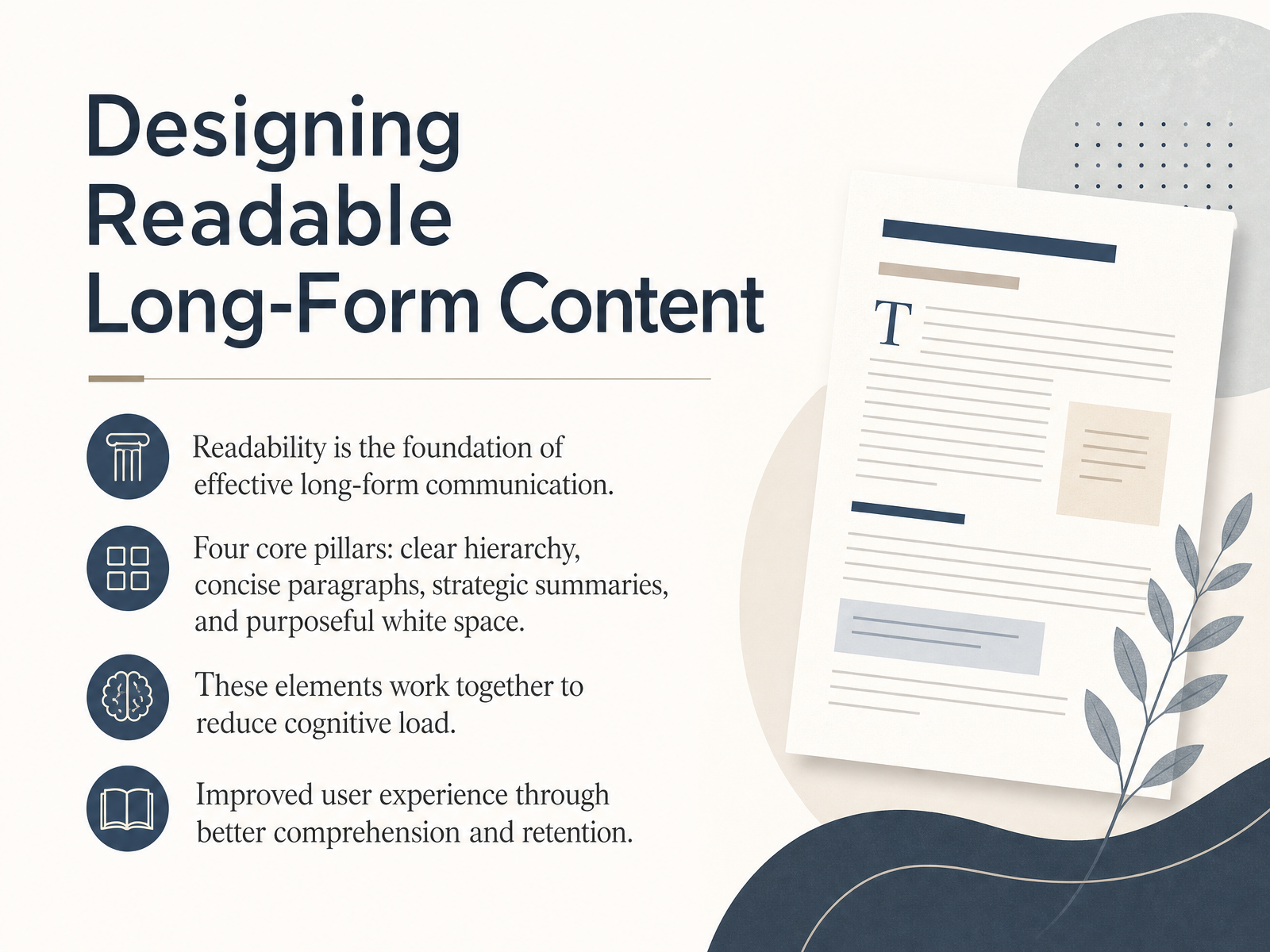
- 01Designing Readable Long-Form ContentWelcome to Designing Readable Long-Form Content. I'm glad you're here to focus on a skill that defines successful professional communication. Readability is not about simplifying your ideas. It is about removing the friction that prevents your audience from engaging with them. In this course, we will treat readability as a structural discipline built on four core pillars. First, a clear visual hierarchy guides the scanning reader. Second, concise paragraphs respect the limits of working memory. Third, strategic summaries help users extract key points without parsing dense text. And finally, purposeful white space gives the eye room to breathe and reduces cognitive load. Together, these elements lower the mental effort required to understand your message, which directly improves comprehension, retention, and the overall user experience. As we move through these concepts, think of them as helpful strategies you can adapt to your own work. Up next, we will explore exactly why readability matters for your content.twisted-marketing.comdokly.cokunnas.com+22 min
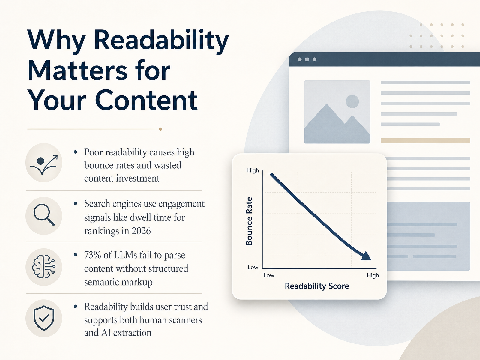
- 02Why Readability Matters for Your ContentLet's get straight to why this matters. When readability fails, your content investment fails with it. Poor structure creates high bounce rates, because readers leave the moment they hit a wall of text. Search engines in twenty twenty-six use engagement signals like dwell time to decide rankings, so if your page drives people away, visibility drops. And here is the newer reality: seventy-three percent of large language models struggle to parse content without structured semantic markup. That means your documentation must serve two audiences at once. It must help a tired human scan fast and act confidently. And it must help an AI system parse the page without guessing. Readability builds user trust, reduces cognitive load, and supports both human scanners and AI extraction. Your formatting choices are not decoration. They are infrastructure. Next, we explore the science of scanning and how readers actually consume digital text.
 twisted-marketing.comdokly.cokunnas.com+22 min
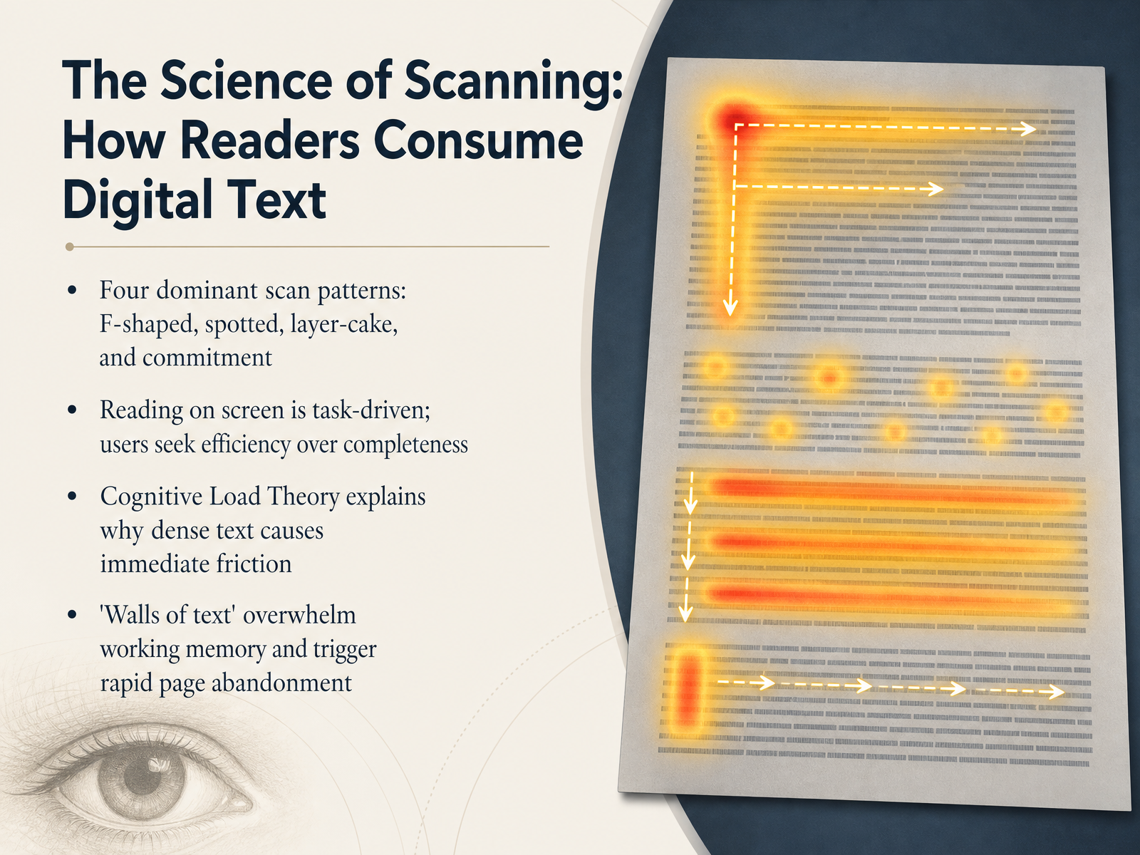
 - 03The Science of Scanning: How Readers Consume Digital TextLet's look at the science behind how people actually read your content. Eye-tracking research identifies four dominant scan patterns: the F-shaped pattern, where readers fixate on the top and left side of a page; the spotted pattern, where they jump to keywords, bolded text, or links; the layer-cake pattern, where they scan headings and subheadings until they find something relevant; and the commitment pattern, where they finally settle in to read every word. The takeaway here is that reading on screen is almost always task-driven. Your audience isn't browsing for pleasure; they're hunting for answers as efficiently as possible. This is where Cognitive Load Theory becomes critical. When you present a massive wall of text with no visual breaks, you immediately overwhelm working memory. The friction is instant, and so is the decision to leave the page. Your job is to reduce that friction before it happens. Next, we'll explore how to build a scannable framework using headings and hierarchy to guide the eye.
 link.springer.comnngroup.comarxiv.org+21 min
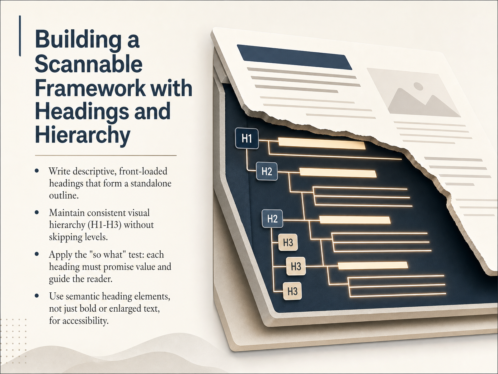
 - 04Building a Scannable Framework with Headings and HierarchyLet's talk about building a scannable framework with headings and hierarchy. This is how you give your long-form content a clear skeleton. First, write descriptive, front-loaded headings. A reader should be able to read just your headings and understand the entire outline of the piece. Think of them as a standalone table of contents. Next, maintain a consistent visual hierarchy without skipping levels. Go from H1 to H2 to H3 in order. Skipping straight from an H2 to an H4 is confusing for both the visual reader and assistive technologies. Also, apply the 'so what' test to every heading. Does it promise value? A label like 'Important Notes' fails, but 'Three Ways to Reduce Bounce Rate' tells the reader exactly what they will gain. Finally, use semantic heading elements in your code, not just enlarged or bold text. This isn't just about aesthetics; it makes your content navigable for screen readers and truly accessible. Next, we will take these structural principles and apply them at the paragraph level by crafting paragraphs for the digital reader.
 w3.orgw3.orgw3.org+22 min
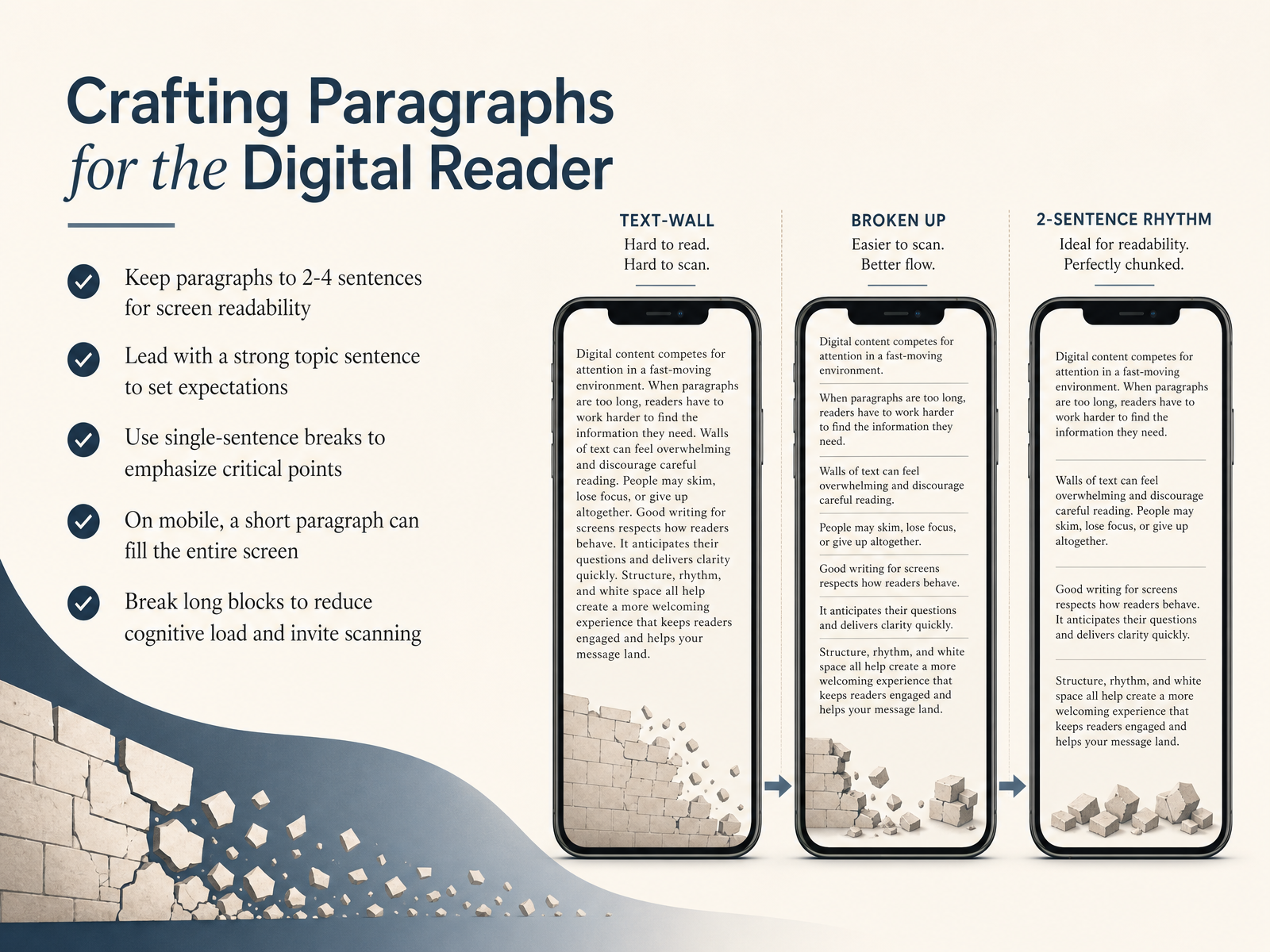
 - 05Crafting Paragraphs for the Digital ReaderLet's turn now to paragraph structure, because how you build a paragraph directly affects whether someone reads it. On a screen, the instinct is to scan, not to read every word. So keep most paragraphs between two and four sentences. This creates visual rhythm and prevents the wall of text that causes readers to bounce. Start each paragraph with a strong topic sentence. That first line sets expectations. If readers only get that far, they should still receive the core idea. You can also use a single-sentence break to isolate a critical point. One sentence, standing alone on the screen, carries more weight than the same sentence buried in a longer block. On mobile, this becomes even more important. A short paragraph can easily fill the entire screen. Long, dense blocks increase cognitive load and feel overwhelming. Breaking them up invites scanning and keeps the reader moving forward. When in doubt, hit enter. That extra white space is often the difference between a paragraph that gets read and one that gets skipped. Up next, we'll look at perfecting typography for long-form reading comfort.
 nngroup.comdl.acm.orgjournals.uc.edu+22 min
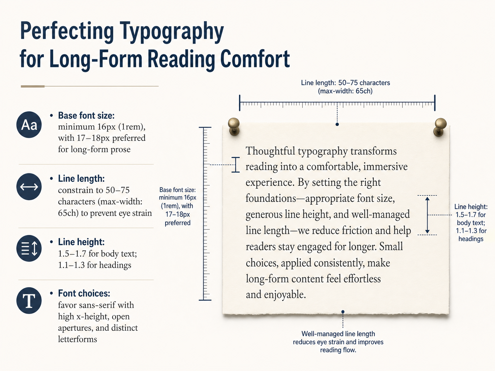
 - 06Perfecting Typography for Long-Form Reading ComfortMoving to the building blocks of comfortable reading, let's talk about perfecting typography for long-form content. First, base font size. The absolute minimum for body text is sixteen pixels, or one rem. But for sustained reading, seventeen to eighteen pixels is preferred. It reduces fatigue. Next, line length, or measure. Constrain your text blocks to a maximum of around sixty-five characters, using the 'ch' unit in CSS. This keeps eye movements comfortable and prevents losing your place. Line height is equally critical. For body text, use a unitless value between one point five and one point seven. This creates enough vertical breathing room. For headings, you can tighten that down to between one point one and one point three. Finally, font choice. Favor sans-serif typefaces with a high x-height and open apertures. Look for distinct letterforms, like a clear difference between uppercase 'I' and lowercase 'l'. These details reduce visual confusion and keep readers immersed in the message. Now, with our typographic foundation set, let's zoom out to look at the bigger picture in Harnessing the Power of White Space.
 2 min
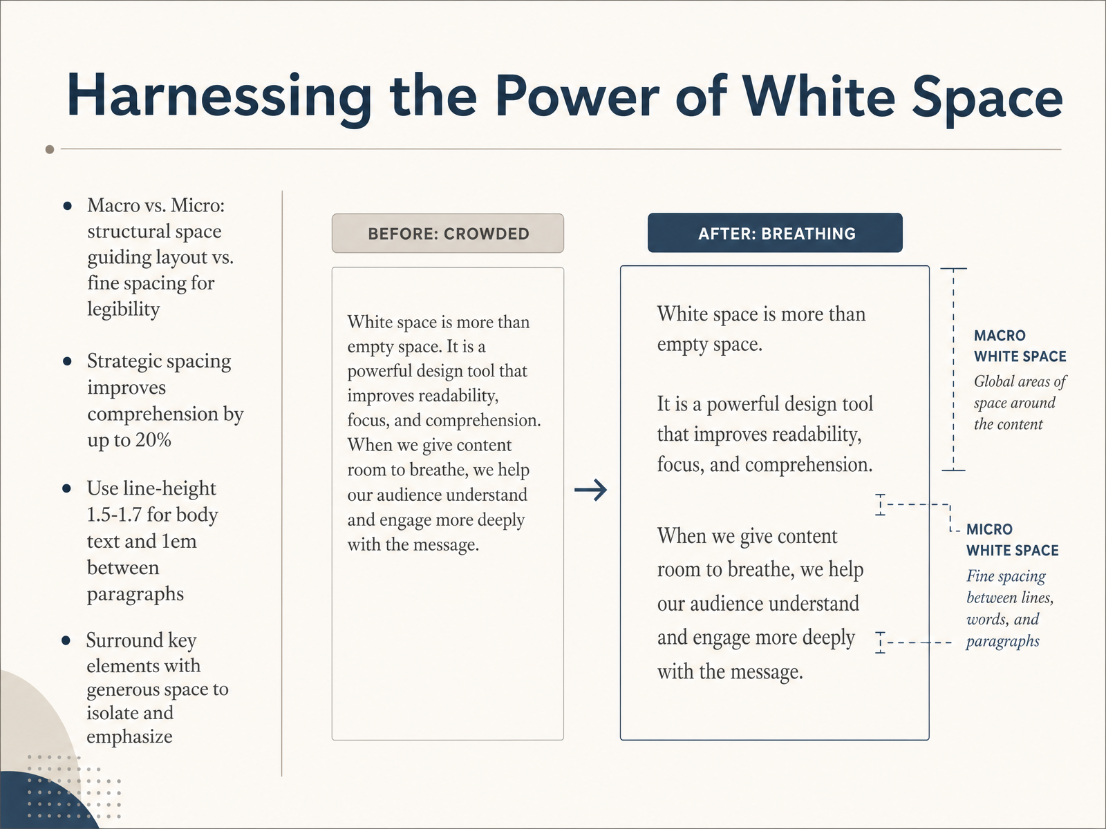
2 min - 07Harnessing the Power of White SpaceLet's turn now to the power of white space, or negative space. It's the empty area around your content, and it's one of the most strategic tools you have. Think of white space in two categories. Macro white space is the large structural space that defines your page layout and guides the eye. Micro white space is the fine detail, like the space between lines or the padding inside a button, that makes text legible. The impact is measurable. Proper spacing can improve reading comprehension by up to twenty percent. For long-form content, start with a line height between 1.5 and 1.7 for your body text. Between paragraphs, use about one em of vertical space to create a clear visual break. Finally, surround your most critical elements with generous space. This isolation directs focus and signals importance without needing a loud color or a border. Up next, we'll build on this foundation with 'Guiding the Eye: Layout, Columns, and Visual Anchors'.
 1 min
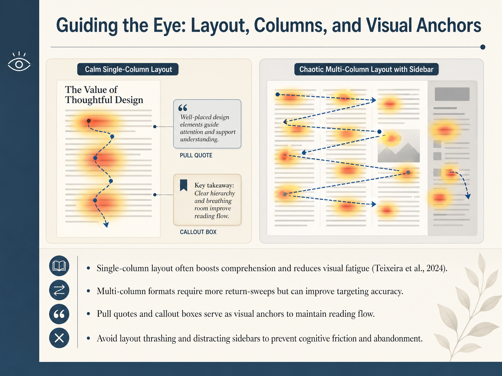
1 min - 08Guiding the Eye: Layout, Columns, and Visual AnchorsAlright, let's talk about guiding the reader's eye through layout, columns, and visual anchors. The structure of your page is a powerful tool for either supporting attention or creating friction. In a study by Teixeira and colleagues in 2024, eye-tracking data confirmed that a single-column layout generally optimizes comprehension and reduces visual fatigue. That said, multi-column formats aren't inherently bad. They require more return-sweep eye movements, but those shorter sweeps can actually improve targeting accuracy. You just need to be more deliberate. Use pull quotes and callout boxes as visual anchors. These elements act like stepping stones, maintaining reading flow and preventing the eye from getting lost in a sea of text. However, be careful to avoid layout thrashing. If you place distracting sidebars or abruptly shift grid structures within a single piece of content, you trigger cognitive friction that can quickly lead to abandonment. In short, choose your layout strategy based on content depth, and use visual anchors consistently to keep readers oriented. Next, we'll build on this by creating strategic summaries for progressive disclosure.
 nngroup.comdl.acm.orgjournals.uc.edu+21 min
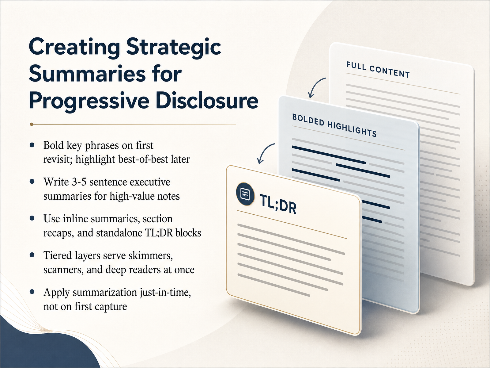
 - 09Creating Strategic Summaries for Progressive DisclosureNow let's talk about strategic summaries, because they are what make progressive disclosure actually work. Think of a summary as a signal that tells skimmers, scanners, and deep readers exactly how much energy to invest. For high-value notes, write a three to five sentence executive summary at the top. This is the very first layer a reader sees. Use bold on your first revisit to flag key phrases, and then save highlighting for later visits when you can identify the absolute best-of-the-best. You can also layer inline summaries, brief section recaps, and standalone TL;DR blocks throughout a page. The critical rule is timing: apply this summarization just in time, not on first capture. Only notes that prove their value through repeated use deserve that extra processing effort. The result is a tiered design that serves every reader at once. Up next, we will zoom in even further on sentence-level clarity in "Writing for Clarity: Sentence-Level Tactics."
 twisted-marketing.comdokly.cokunnas.com+22 min
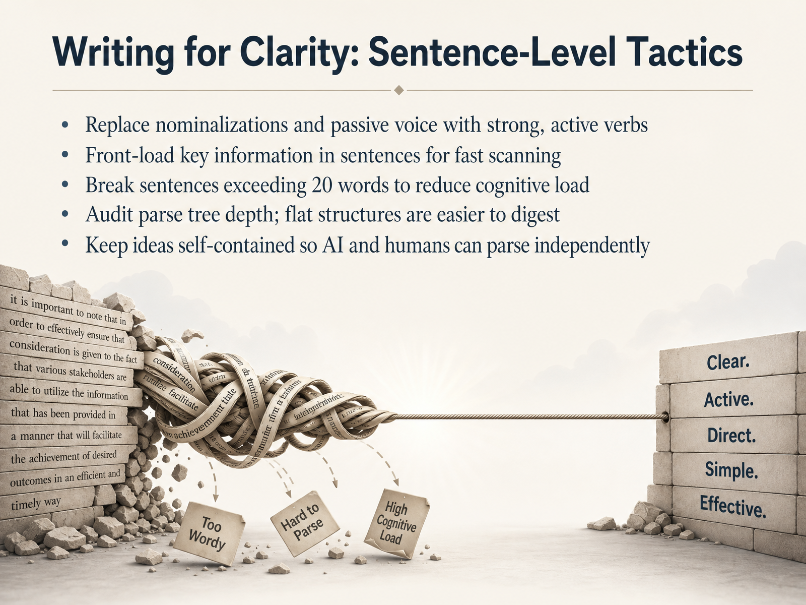
 - 10Writing for Clarity: Sentence-Level TacticsLet's zoom in to the sentence level, where clarity often lives or dies. The first tactic is simple: replace passive voice and nominalizations with strong, active verbs. For example, instead of saying 'an analysis of the data was conducted,' just say 'we analyzed the data.' That single switch reduces cognitive load and makes your actor clear to both human readers and AI systems. Second, front-load your key information. Put the main point at the start of the sentence so scanners catch the most critical part first. Third, count your words. If a sentence runs past twenty words, break it apart. Research shows AI systems extract sentences at a median length of just ten words, and anything over seventeen risks being cut. So shorter is safer. Next, audit your parse tree depth. A thirty-word sentence with a flat structure is actually easier to parse than a short sentence with deeply nested clauses. Aim for straightforward syntax over complexity. Finally, keep each idea self-contained. Avoid starting a sentence with 'This' or 'However' if it refers back to the previous paragraph. AI extractors pull standalone sentences, so every sentence that could be a citation target needs to make sense on its own. That discipline helps human scanners too. Up next, we'll look at how these principles extend into designing for accessibility and machine readability.
 twisted-marketing.comdokly.cokunnas.com+22 min
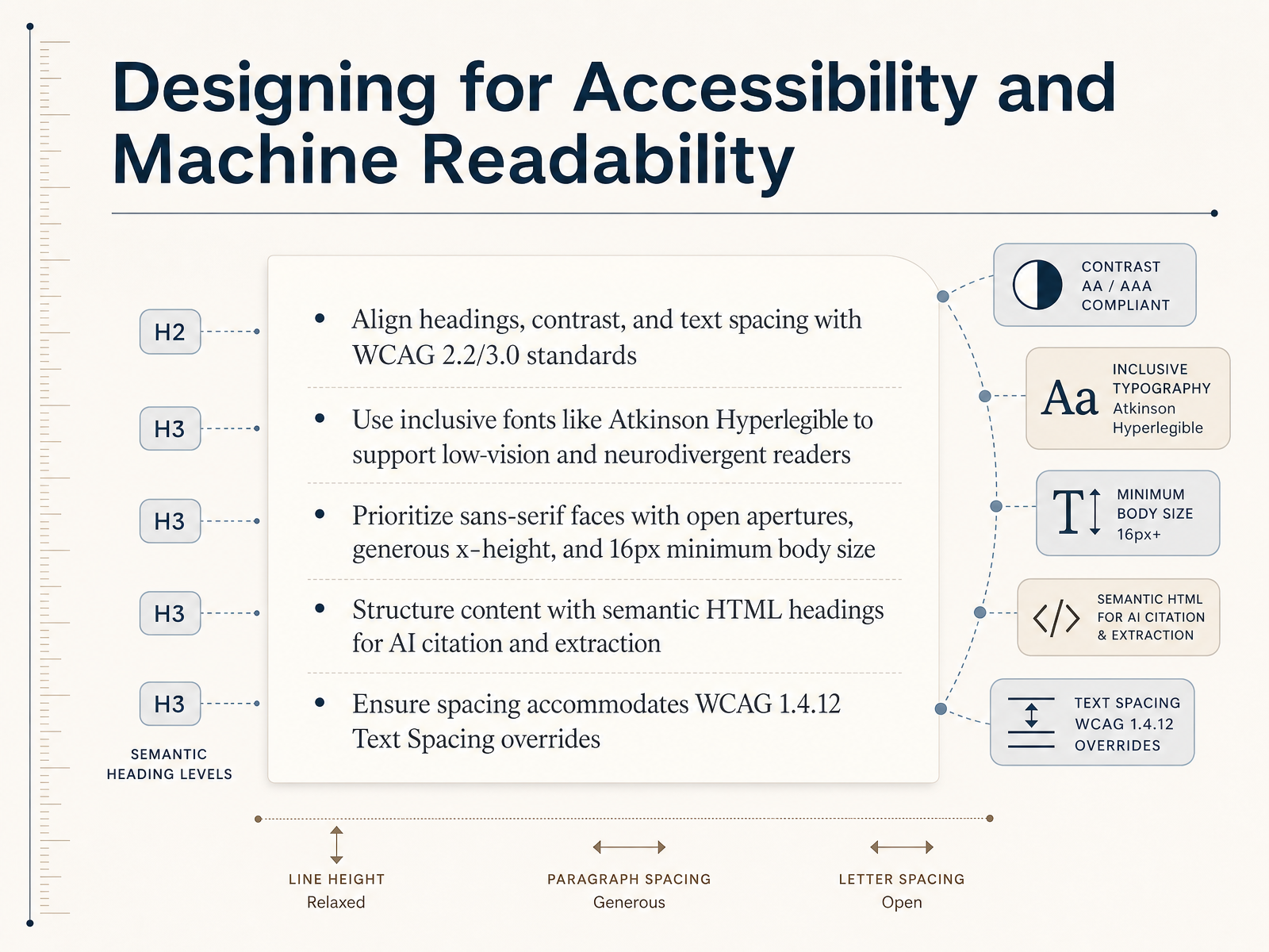
 - 11Designing for Accessibility and Machine ReadabilityNow let's bring accessibility and machine readability into the structural decisions we've been making. The goal is to design content that works for everyone—including low-vision and neurodivergent readers—and for the AI systems that increasingly need to parse your pages. First, align your headings, contrast, and text spacing with the WCAG 2.2 and the upcoming 3.0 standards. For typography, prioritize sans-serif faces with open apertures and a generous x-height. Atkinson Hyperlegible is a strong, evidence-backed choice here. Set body text at a minimum of 16 pixels. Structuring content with semantic HTML headings isn't just for screen readers—it also helps AI tools with accurate citation and extraction. Finally, make sure your layout can handle WCAG 1.4.12 text spacing overrides without breaking. Next, we'll put all of this together. Let's move into auditing your content with a step-by-step readability checklist.
 w3.orgw3.orgw3.org+21 min
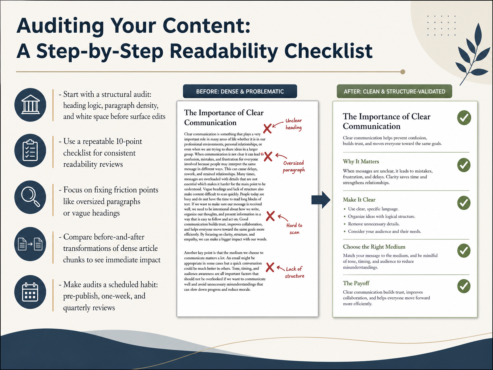
 - 12Auditing Your Content: A Step-by-Step Readability ChecklistLet's make this practical with a step-by-step audit you can use before, during, and after publishing. Start with a structural audit first: check your heading logic, paragraph density, and white space before you fix any surface-level wording. Next, build yourself a repeatable ten-point checklist that covers things like opening clarity, subhead quality, and sentence load. When you're reviewing, focus on fixing friction points: oversized paragraphs, vague headings, or sections that drift. A quick before-and-after pass on a dense section shows you the immediate impact. Finally, make audits a scheduled habit. Try a pre-publish scan, a one-week engagement check, and a quarterly archive refresh. This turns readability from a one-time fix into a maintenance system. Next, we'll look at measuring success beyond just readability scores.
 twisted-marketing.comdokly.cokunnas.com+21 min
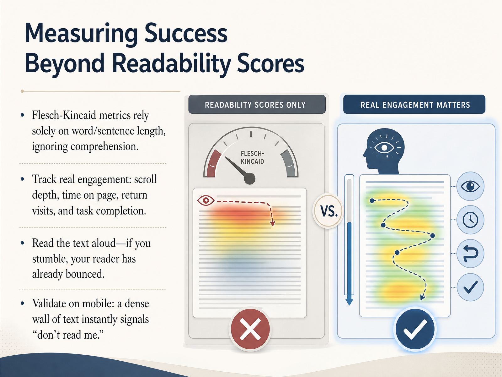
 - 13Measuring Success Beyond Readability ScoresLet's move beyond automated scores and talk about measuring what actually matters. Metrics like Flesch-Kincaid rely solely on word and sentence length; they completely ignore whether someone understands the content. Research now shows these formulas correlate poorly with human judgment. Instead, track real engagement signals. Look at scroll depth, time on page, return visits, and most importantly, task completion. Ask yourself: can the user do what they came to do? Another practical test is reading your text aloud. If you stumble over a sentence, your reader almost certainly bounced at that exact point. Don't ignore that friction. Finally, validate your layout on mobile. A dense, unbroken wall of text instantly sends a signal: don't read me. If it looks impenetrable on a small screen, it is impenetrable. Next, we'll wrap everything up with proven workflows for long-form excellence.
 2 min
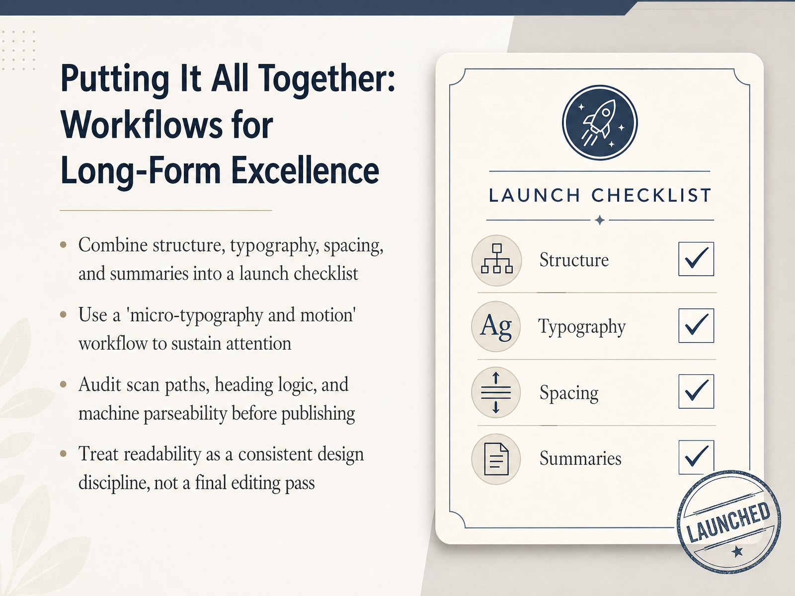
2 min - 14Putting It All Together: Workflows for Long-Form ExcellenceAnd here we are at the final piece: putting everything together into a repeatable workflow. Think of this as your pre-launch checklist. Before you publish, verify that your structure, typography, spacing, and summaries all work together. Don't treat readability as a last-minute editing pass; make it a consistent design discipline from the start. Here's what that looks like. Combine your headings, type scale, white space, and progressive disclosure into a single quality gate. Then adopt what I call a micro-typography and motion workflow. That means checking line heights, measure, and subtle visual cues to sustain attention without adding cognitive load. Next, run a three-part audit. First, check the scan path: can a reader understand the page just by reading the headings and bullets? Second, check heading logic: does every heading preview the content beneath it? Third, check machine parseability: strip the styling away, and make sure the structure still makes sense to search engines and AI tools. That is the modern definition of truly readable content. Thank you for joining me. You now have a complete system to design long-form content that respects human cognition, serves machine readers, and keeps your audience engaged. Now go make your content remarkably readable.
 twisted-marketing.comdokly.cokunnas.com+22 min
Take the deck with you
Download this course as a file — free, no sign-up needed.
- PDF handoutEvery slide page, ready to print or share.15 pages · 3.6 MBDownload
- Narrated PowerPointThe deck that presents itself — every slide carries the digital human's narration video.15 pages · 14.9 MBDownload
- PowerPoint slidesThe full deck as a .pptx — open it in PowerPoint, Keynote, or Google Slides.15 pages · 3.5 MBDownload
Free to use in your own training — please keep the PersonWise credit page at the end.
Have your own deck? Turn it into a course
Sources consulted
Web sources consulted while building this course.
- Structure Long-Form content: complete readability guide — twisted-marketing.com
- How to Improve Readability: A 2026 Guide for AI & Humans — dokly.co
- Optimal Prose — kunnas.com
- Designing Content for Readability: Formatting Tips That Keep Users on Page - NEURONwriter: Content Optimization & AI Visibility Platform — neuronwriter.com
- In-Page Information Architecture: Structuring Content for Three Audiences | Fahlout — fahlout.com
- Eye-tracking study of L2 learners’ reading paths: new insights into reading strategies | Asian-Pacific Journal of Second and Foreign Language Education | Springer Nature Link — link.springer.com
- Text Scanning Patterns: Eyetracking Evidence — nngroup.com
- Following the Eye-Tracking Evidence: Established Web-Search Assumptions Fail in Carousel Interfaces — arxiv.org
- An Eye Tracking Study: Are AI Overviews Changing Search Behavior? - Microsoft Research — microsoft.com
- Eye-Tracking Support for Adaptive Document Exploration: Design Space Model and Application Examples — scitepress.org
- Understanding Success Criterion 2.4.10: Section Headings | WAI | W3C — w3.org
- H69: Providing heading elements at the beginning of each section of content | WAI | W3C — w3.org
- Structured content | How-To | WCAG 3 | Web Accessibility Initiative (WAI) | W3C — w3.org
- Content structure | web.dev — web.dev
- WebAIM: Semantic Structure: Regions, Headings, and Lists — webaim.org
- Reading Content on Mobile Devices - NN/G — nngroup.com
- Preferred Reading Formats for Mobile Devices: Results from Readability Studies | Proceedings of the 25th International Conference on Mobile Human-Computer Interaction — dl.acm.org
- Optimal Line Length in Reading — A Literature Review — journals.uc.edu
- UX Tip #12: The optimal text line length for readability — blog.designary.com
- Device-Dependent Readability for Improved Text Understanding — emnlp2014.org