Begin
14 pages · ~28 min
Product Management KPIs: Measurement and Interpretation
This training teaches product managers how to define, measure, and interpret key performance indicators to drive product decisions and business outcomes.
A digital instructor presents all 14 pages. Hold “Ask” at any point and ask out loud — the answer comes from this course. No sign-up needed.
What you’ll learn
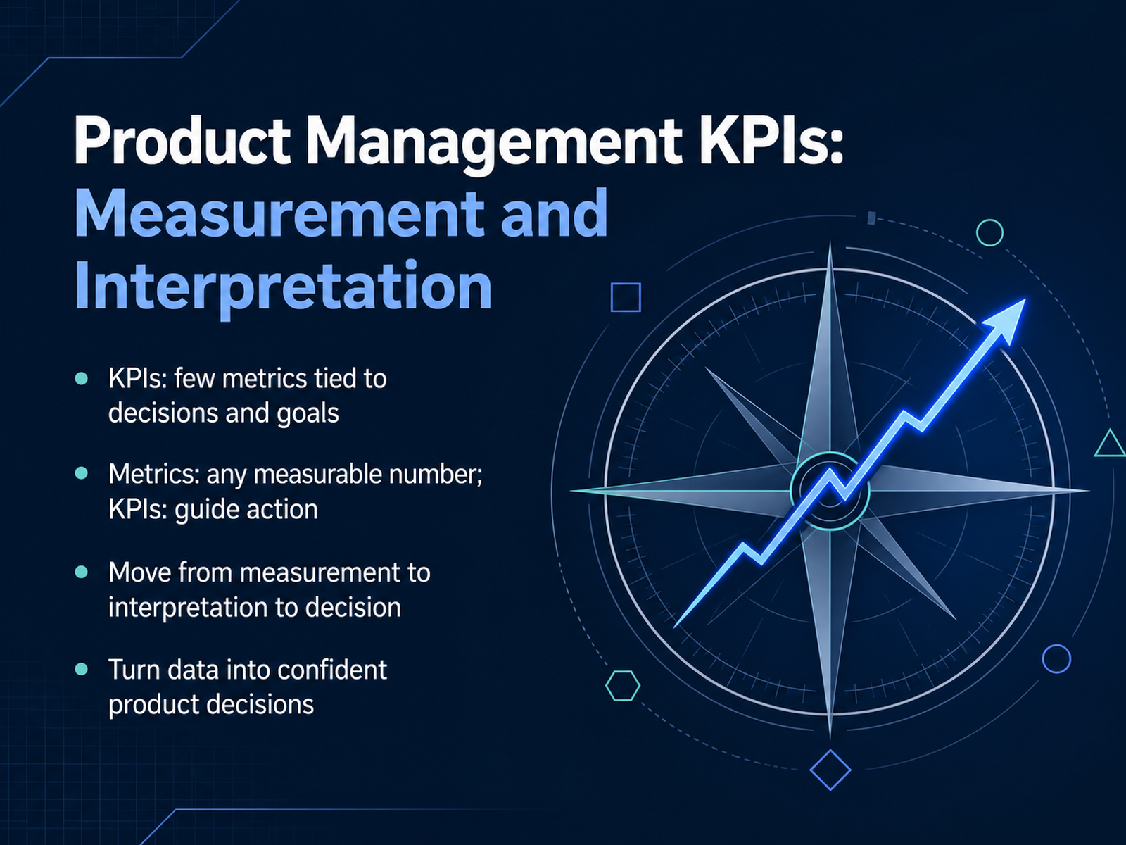
- 01Product Management KPIs: Measurement and InterpretationWelcome. If you're here, you already know the difference between shipping features and moving the business. This session is about the second one. We're going to look at product management KPIs, not as a reporting exercise, but as the core of decision-making. The key distinction up front: a metric is any number you can measure. A KPI is a number you've decided matters enough to act on. That decision is what separates a useful dashboard from a wall of charts nobody opens. So the goal here is simple: move from measurement to interpretation to decision. You'll learn to pick the few metrics that actually drive your product and your business, and to read them with the confidence that comes from knowing why they move. By the end, you'll turn data into product decisions you can defend to your team and your leadership. Let's start with the foundation: separating true KPIs from vanity metrics.ideaplan.ioproductplan.comshopify.com+21 min
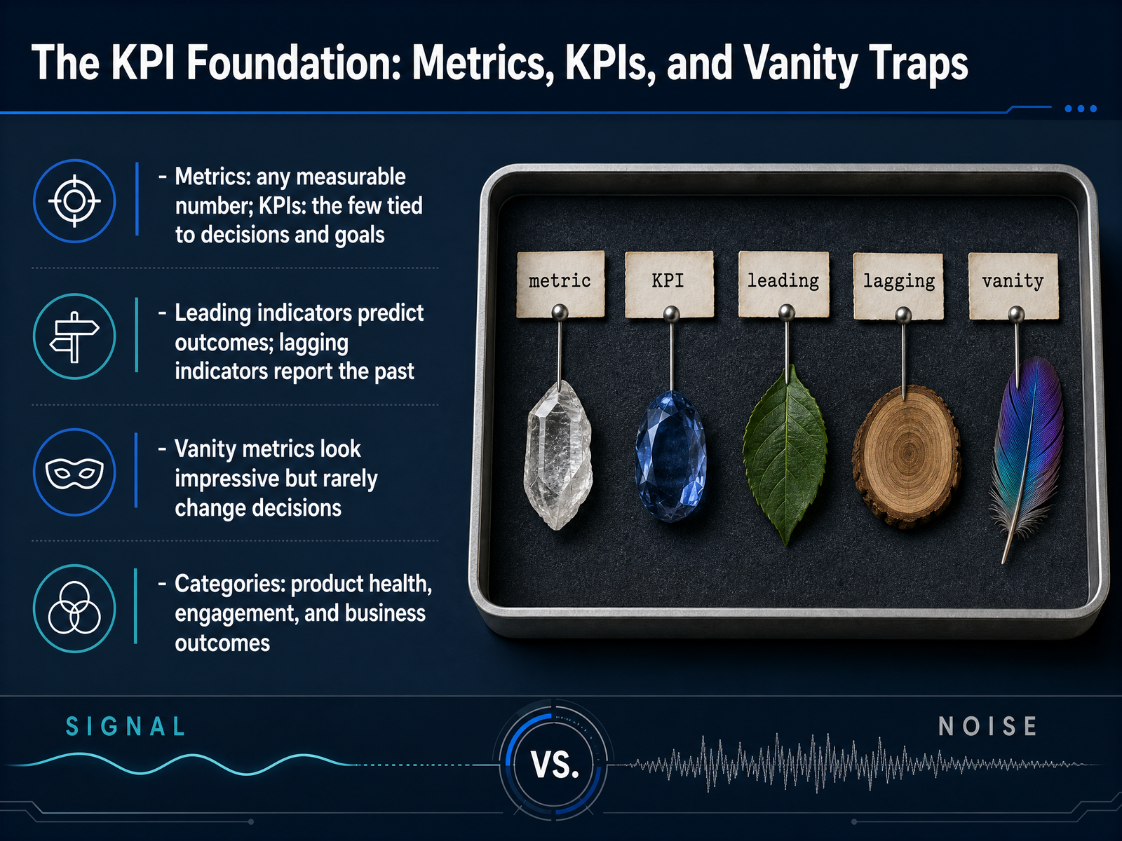
- 02The KPI Foundation: Metrics, KPIs, and Vanity TrapsNow let's ground ourselves in the foundational distinction: not every number on your dashboard is a KPI. Metrics are any measurable quantity; KPIs are the select few tied directly to decisions and goals. The moment a number stops informing a choice, it's just decoration. Leading indicators, like activation rate or time to value, predict what's coming. Lagging indicators, like churn or revenue, confirm what's already happened. Both matter, but they serve different masters. And then there are vanity metrics—raw signups, total page views, DAU spikes. They look impressive in a board deck, but they rarely change a decision. The test is simple: if that number moved tomorrow, would your team know what to do differently? If not, it's noise. Organize your KPIs into three categories: product health, which tells you if the system is stable and usable; engagement, which reveals whether users are returning and adopting core features; and business outcomes, which connect product behavior to revenue and retention. Keep that structure in mind as we move into choosing KPIs that actually match your product stage and strategy.
 getspike.aiideaplan.ioplane.so+22 min
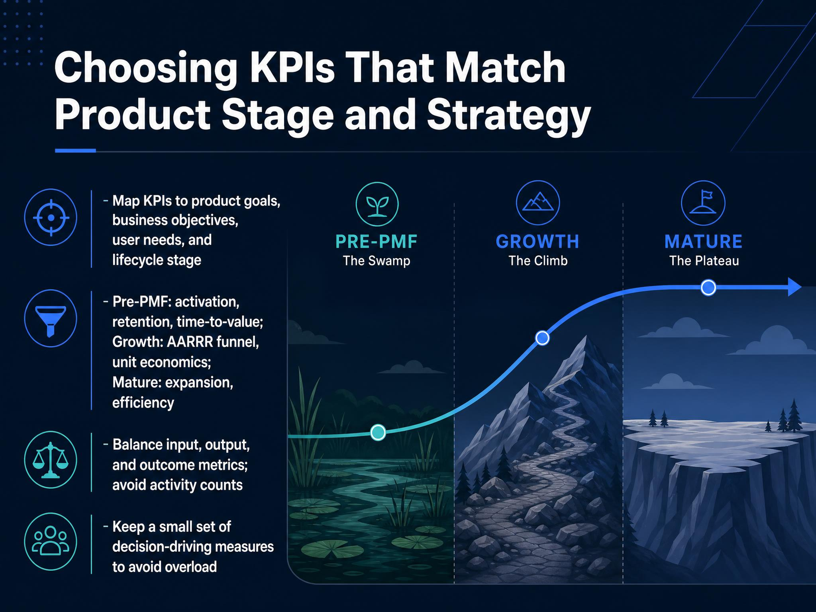
 - 03Choosing KPIs That Match Product Stage and StrategyNow let's talk about choosing the right KPIs, because the biggest mistake is not measuring too little, it's measuring the wrong things. Your metrics must map directly to your product's goals and its lifecycle stage. Before product-market fit, fixate on activation, retention, and time-to-value. Those are your only signals that matter. In growth, shift to the full AARRR funnel and unit economics—CAC, LTV, payback period. At maturity, it's about expansion and efficiency, like net revenue retention and gross margin. And here's the sharp test for every metric you consider: will a leader make a different decision if this number moves? No? Then it's decoration, not a KPI. Also, balance input, output, and outcome metrics. Outputs tell you what you shipped; outcomes tell you whether it mattered. Avoid activity counts like number of features released—that tells you your team was busy, not that the product improved. Keep your dashboard small. Three to five decision-driving measures max. If you have fifteen KPIs, you have none, because nothing will trigger real action. Now, once you've chosen the right KPIs, you need a reliable foundation to measure them—that's our next topic.
 productplan.comprodmapping.comideaplan.io+21 min
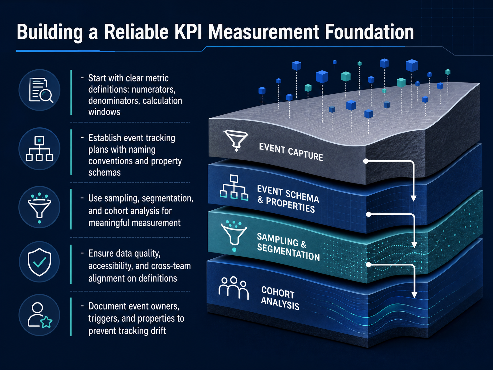
 - 04Building a Reliable KPI Measurement FoundationNow let's talk about building a reliable foundation for measurement, because every metric you track is only as trustworthy as the pipeline feeding it. Start with precise definitions: what is the numerator, what is the denominator, and over what time window? Ambiguity here guarantees confusion downstream at the stakeholder level. Next, formalize your event tracking. Adopt a rigid naming convention like object-action in snake case, and document every property's schema, type, and allowed values. Without this, two teams will name the same event differently, and suddenly your funnels break with no obvious cause. For analysis itself, lean on sampling and segmentation to keep queries fast, but use cohort analysis to answer questions about behavior over time. And never underestimate governance. Assign an owner for each event, clarify the trigger, and audit for drift quarterly. Data quality erodes silently; a 30 percent null rate on a critical property can go unnoticed until someone tries to segment by it. The takeaway is simple: clean, well-documented instrumentation is the difference between dashboards that inform decisions and dashboards that just look busy. We'll build on this next as we talk about reading trends and separating signal from noise.
 amplitude.composthog.comproductanalyticstools.com+22 min
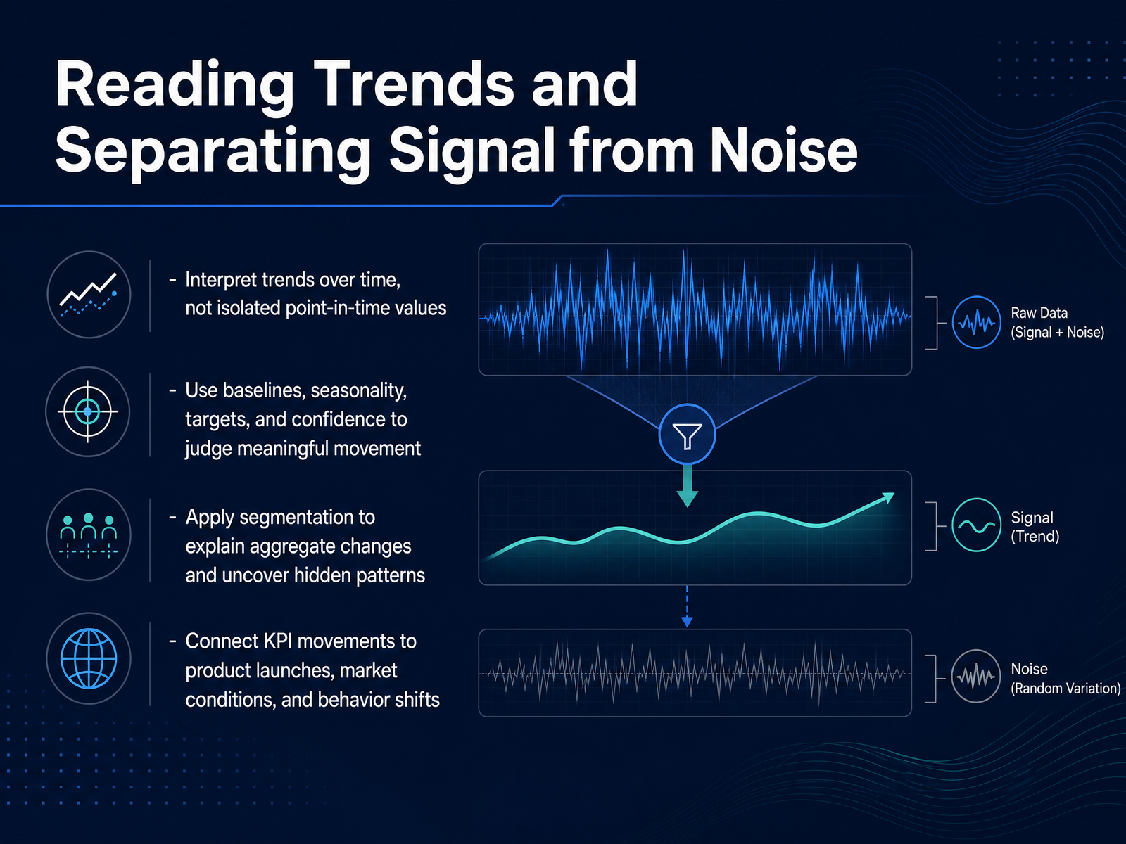
 - 05Reading Trends and Separating Signal from NoiseOnce we accept that a single number is meaningless, we need a method to read the trend. Start by comparing against baselines. That means seasonality, historical averages, and targets. A metric can look like it collapsed, but if it drops the same way every year around this time, that is not a signal. It is the weather. You need confidence intervals too, so you can tell a real movement from random quarterly noise. Then, remember that aggregate numbers hide truth. If conversion drops, ask if the segment that drove it is new users, a specific region, or a mobile platform. Every product team knows that a launch that helps South America can be masked by a tracking bug in Europe. So connect the movement to context. Overlay the release timeline. Check if this was a pricing test, a campaign, or an algorithm change. If the number moves right when a feature flag flips, you have found causality. If it moves but nothing changed internally, check the broader market. Trending up is easy to claim; trending for the right reason is what protects your roadmap. Next, we will discuss diagnosing KPI changes without chasing ghosts.
 graphjson.comkpitree.comedium.com2 min
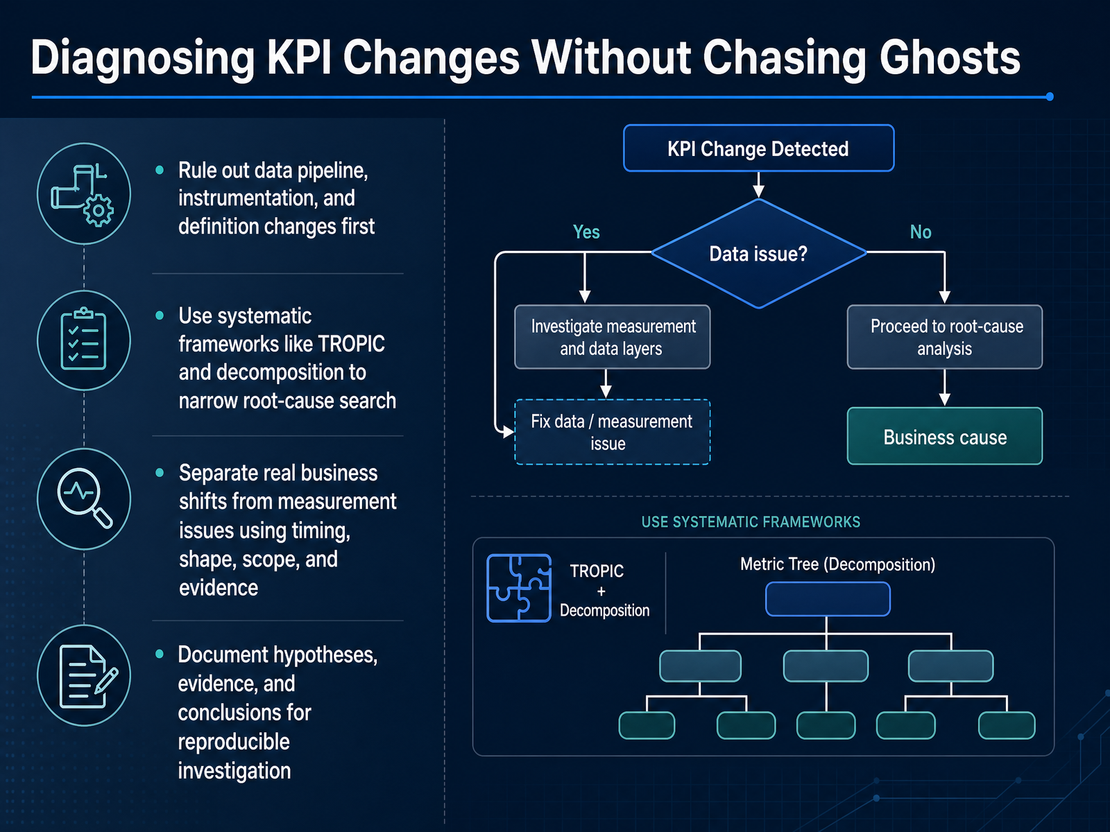
 - 06Diagnosing KPI Changes Without Chasing GhostsLet’s talk about diagnosing KPI changes without chasing ghosts. Before you dive into business explanations, rule out the boring stuff first. Check your data pipeline, your instrumentation, and your metric definitions. A surprising number of movements are just broken tracking or a changed filter. You don’t want to present a churn story that’s actually a schema migration. Once the data is clean, use a systematic framework. TROPIC is a good one: time, region, other features, platform, industry, and cannibalization. Walk through each to narrow your search. For ratios, run a decomposition to separate mix shifts from within-segment movement. The key question is whether the change is real or just measurement noise. Look at timing, shape, scope, and evidence. A sudden cliff tied to a release is different from a gradual trend. And remember, a segment explains where the movement happened, not why. Corroborate it with release logs, support tickets, or external events. Document your hypotheses, evidence, and conclusions. Reproducible investigation beats tribal knowledge every time. Next, we’ll connect product KPIs to broader business outcomes.
 graphjson.comkpitree.comedium.com1 min
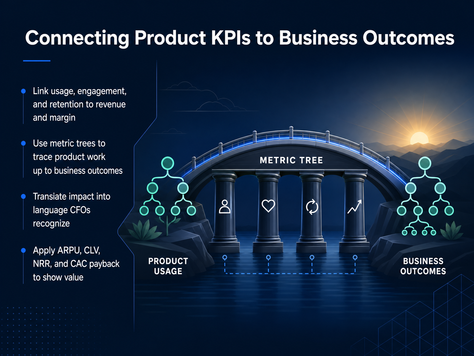
 - 07Connecting Product KPIs to Business OutcomesNow let's bridge the gap between product metrics and the financial outcomes your CFO actually tracks. Activity counts like daily users or feature adoption are inputs, not outcomes. To make the case for your roadmap, you need to trace a clear line from product behavior to revenue and margin. Build a metric tree: put the business outcome at the top and decompose it downward into the product levers your team controls. The discipline here is validating each link with cohort data. Higher activation must actually correlate with retention, and retention with expansion, before you claim the connection. Translate your improvements into the language finance recognizes: average revenue per user, customer lifetime value, net revenue retention, and CAC payback. That's the shift that turns a product update into a capital-allocation decision. When you can say onboarding improvements added two hundred activated accounts per month and that projects to forty-five thousand dollars in annual recurring revenue, you're not just reporting a metric, you're making a business case. Pair every move in a product KPI with its projected impact on one of these financial measures. That's how product work earns its seat in the budget conversation. Next, let's look at how dashboards and visual communication make this measurement practical for your team.
 productplan.com1 min
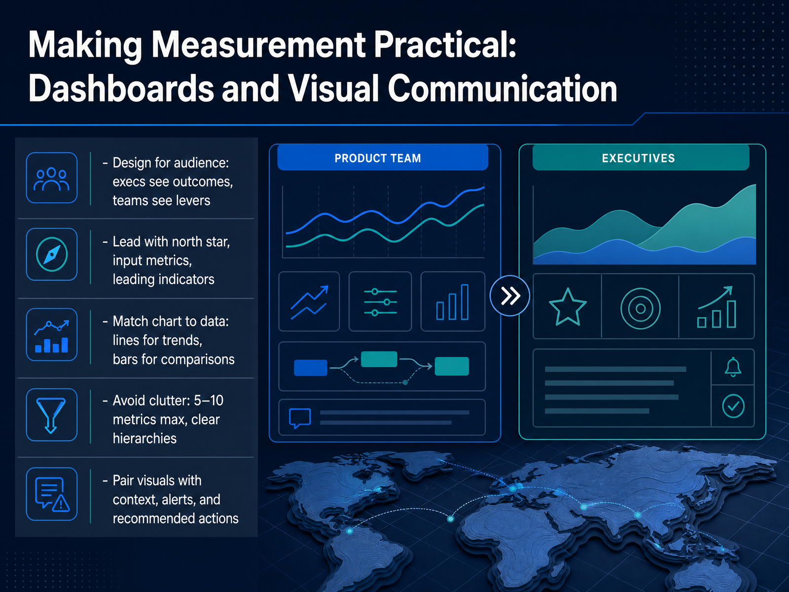
 - 08Making Measurement Practical: Dashboards and Visual CommunicationLet's talk about making measurement practical. A dashboard isn't a data dump—it's a decision tool. Start with your audience. Executives need outcomes, teams need levers. If you can't write one sentence about who this dashboard serves and what question it answers, you're not ready to build it. Lead with your north star, then input metrics, then leading indicators. That hierarchy keeps everyone aligned. Choose your charts deliberately: lines for trends, bars for comparisons, and never more than five to ten metrics on the primary view. Beyond that, attention fragments and the dashboard dies. Pair every number with context—compare it to last week, last month, or a target—so anyone can tell if it's good, bad, or normal. Surface anomalies prominently and tie each one to a recommended action. The goal is to shorten the distance between seeing a problem and fixing it. Remember, a great dashboard has a clear hierarchy, sharp focus, and a path to action. Skip that, and you've just built another pretty screen that nobody opens. Next, we'll look at building a KPI review operating model that sticks.
 1 min
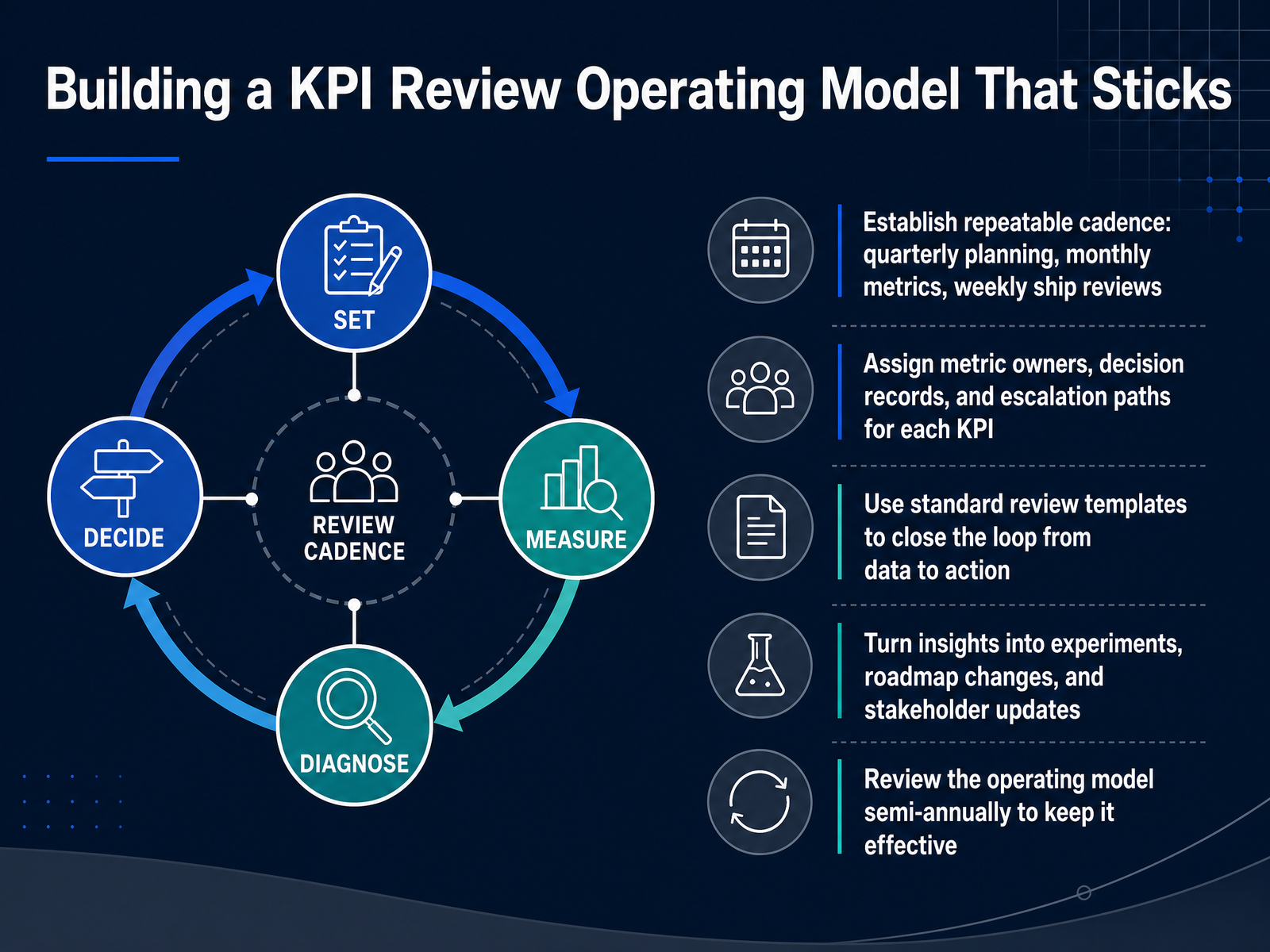
1 min - 09Building a KPI Review Operating Model That SticksA KPI review cadence only works when it becomes a habit. That means locking in a rhythm: quarterly planning, monthly metric deep dives, and weekly ship reviews. Set each one with a clear owner and a standard template so the conversation moves from data to decision quickly.
Assign an owner to every metric, and keep a decision record. When a number moves, you should know who is accountable, what was decided, and what happens next. Escalation paths matter too, so problems surface fast instead of lingering.
For your weekly reviews, cover the leading indicators. In the monthly session, you're looking at the full picture, trends, anomalies, and whether guardrail metrics are holding. Quarterly, you're asking whether you're still measuring the right things at all. Every review should close with action: an experiment, a roadmap change, or a stakeholder update. If a review doesn't change something, it's just theater.
Finally, review the operating model itself twice a year to keep it from going stale. Now let's look at how this workflow plays out when a metric actually moves.
 1 min
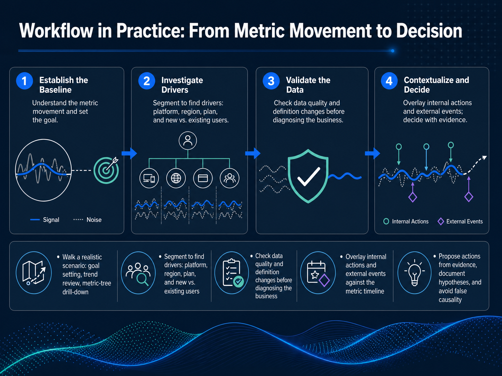
1 min - 10Workflow in Practice: From Metric Movement to DecisionSo how does this actually work in practice? Let's walk through a realistic scenario. Say your activation rate drops by twelve percent week over week. First, you confirm the trend is real and not just noise. Then you drill down your metric tree—is the drop in new users, or existing users? Which platform, which region, which plan? This is where segmentation earns its keep: a drop concentrated on one platform points to a different cause than a drop spread evenly everywhere. But before you diagnose the business, rule out the data. Check for definition changes, tracking bugs, or pipeline delays. A surprising number of metric movements are actually data quality issues in disguise. Next, overlay your internal actions and external events on the timeline. Did you ship a release, change pricing, or did a competitor launch a campaign around the same time? That alignment of scope and timing is your strongest evidence. Then, propose actions based on that evidence, document your hypotheses, and be painfully honest about causality. Descriptive evidence is not causal proof. Unless you have an experiment, say 'the decline is concentrated among Android users on version fourteen,' not 'version fourteen caused the decline.' That discipline is what separates credible product leaders from the ones who chase false alarms. Now, let's talk about the most common mistakes teams make with KPIs.
 graphjson.comkpitree.comedium.com+21 min
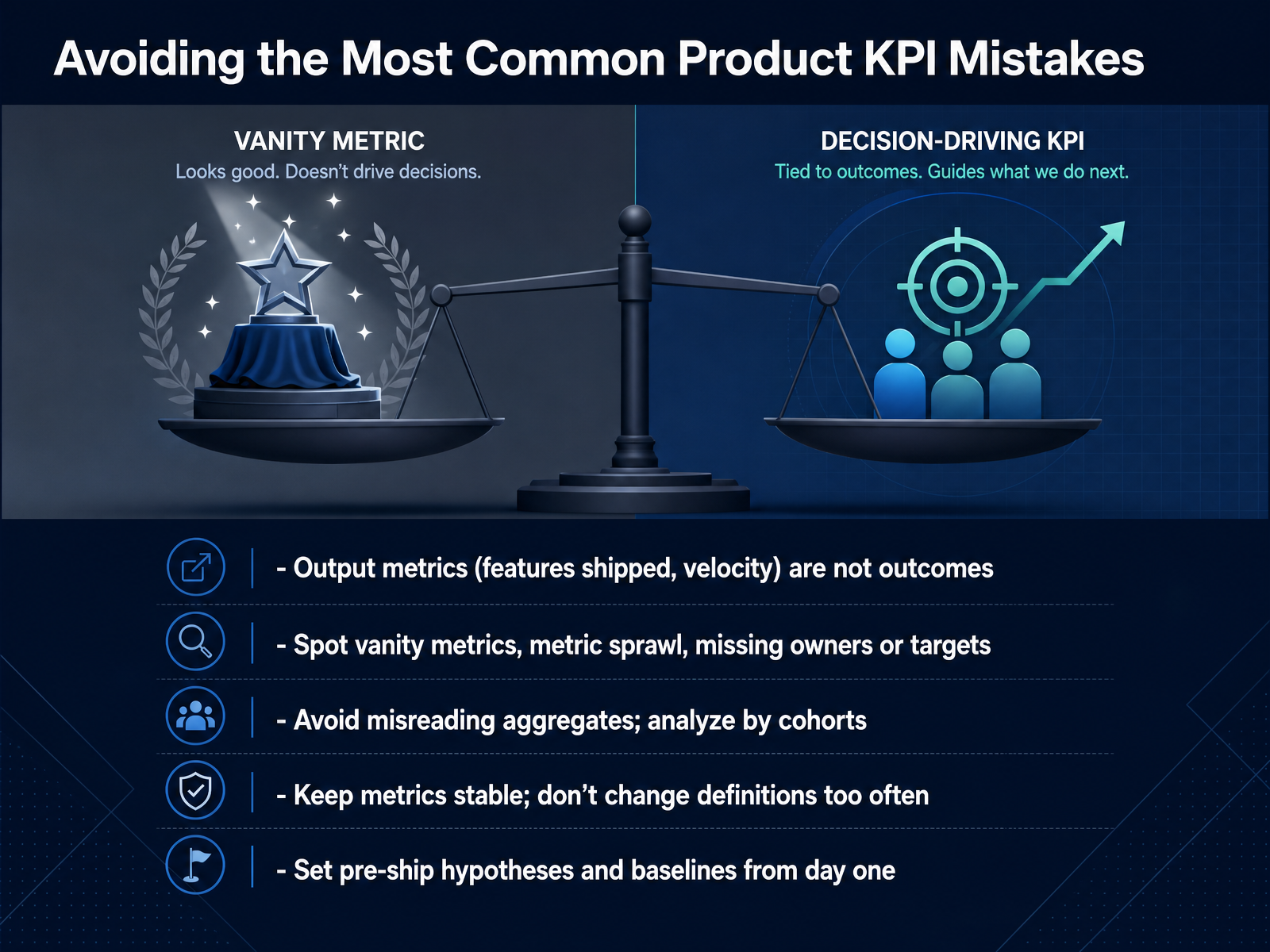
 - 11Avoiding the Most Common Product KPI MistakesLet's talk about the mistakes that quietly sink metric programs. The first and most damaging one? Treating output as outcome. Shipping thirty features is not success. It is activity. Measure adoption, retention, and whether those shipped features actually moved revenue. Second, audit for vanity metrics and dashboard sprawl. Total signups and page views feel satisfying but tell you nothing about value. Keep the set small and ruthlessly decision-driven. Third, stop reading aggregates. Retention averaged across all users hides the truth. You need cohort curves. Newer cohorts should retain better than older ones. If they don't, your product isn't improving. Fourth, keep definitions stable. Changing the formula every quarter makes trend lines meaningless. Set a baseline, document the owner, and hold the line. Finally, commit to pre-ship hypotheses. State what you expect to move on day one, set the forecast, and instrument the events before you build. If adoption misses the target, you learn fast. This discipline turns metrics from noise into judgment. Next, we'll cover how to build a starter KPI checklist and a team adoption plan that locks this in.
 ideaplan.ioshopify.comproductplan.com+12 min
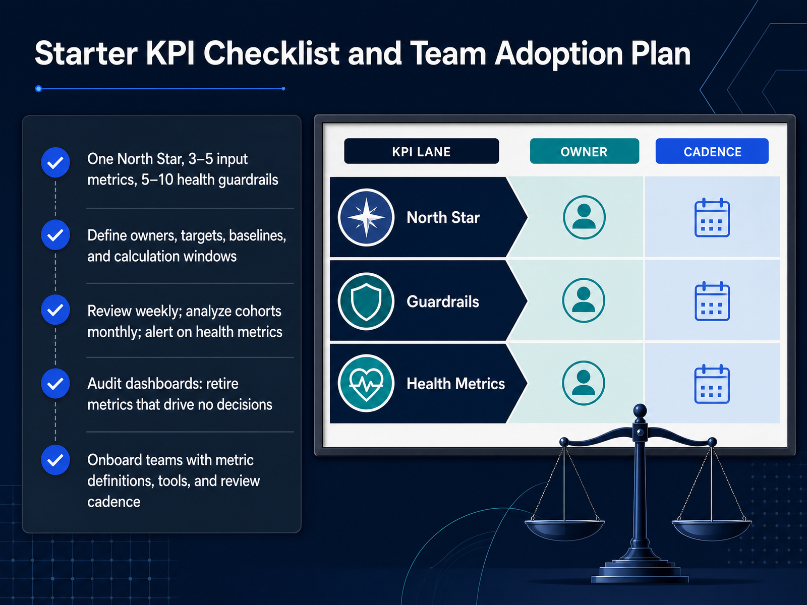
 - 12Starter KPI Checklist and Team Adoption PlanHere is a practical starter checklist. One North Star metric, three to five input metrics, and five to ten health guardrails. That is the entire stack. More than twenty metrics produces dashboard fatigue and zero focus. Now, assign an owner to every input metric and every health guardrail. Define the target, the baseline, and the calculation window. A metric without an owner is a metric that will not improve. Then set the cadence. Review the North Star and your inputs weekly. Analyze cohorts monthly to spot genuine trends. And on health metrics, use alerts rather than waiting for a review. Next, audit your dashboards. If a metric does not drive a decision, retire it. A metric that just decorates a chart is noise. Finally, onboard the team. Document definitions, set up the tools, and agree on the review rhythm. A shared language prevents reporting discrepancies. Keep the stack small, stable, and tied to the value you deliver. That is how measurement becomes a decision engine, not a reporting ritual.
 ideaplan.ioshopify.comproductplan.com+12 min
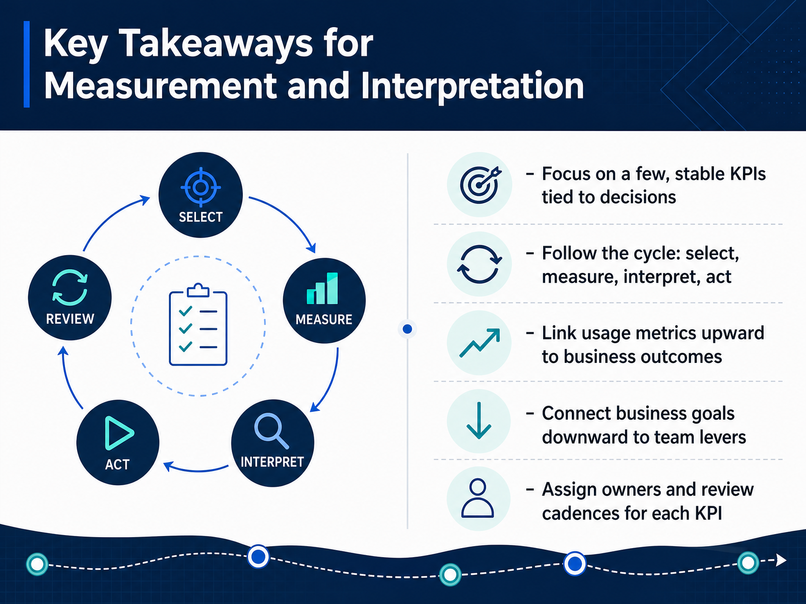
 - 13Key Takeaways for Measurement and InterpretationSo let's pull everything together. The core of measurement is discipline, not complexity. Focus on a few stable KPIs, the handful of numbers tied directly to decisions you actually make. A metric that doesn't change an action is just decoration, so keep your set small and keep it stable. Follow the cycle: select, measure, interpret, act. Interpretation without action is just reporting, and the whole point is better decisions. Link usage metrics upward to business outcomes. Show leadership how activation feeds retention, and retention feeds revenue. Then connect business goals downward to team levers, so your teams know exactly which metric their work moves. And finally, assign an owner and a review cadence to every KPI. If nobody owns it, it won't improve. That's the full picture. Now let's talk about putting this into practice with a concrete action plan and the resources you'll need.
 ideaplan.ioproductplan.comshopify.com+21 min
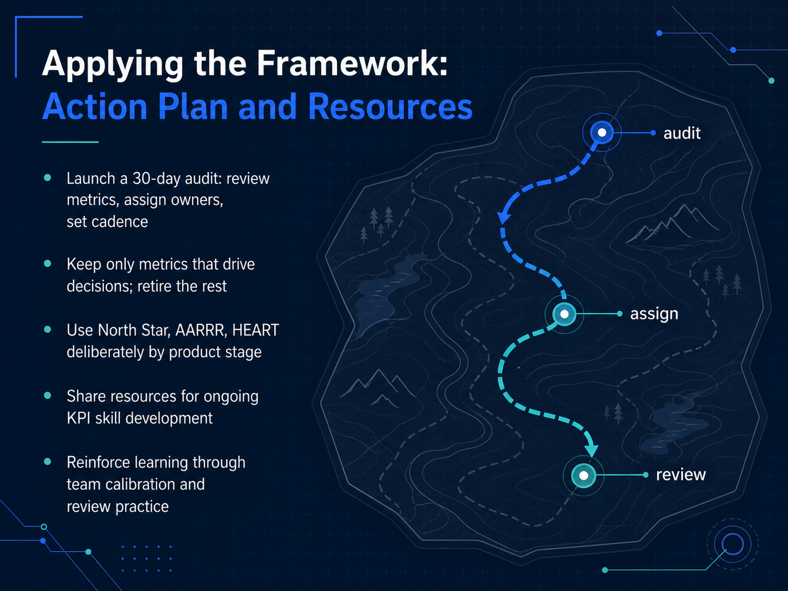
 - 14Applying the Framework: Action Plan and ResourcesLet's lock this in. None of this framework matters if it stays on the slide. Your job is to make it operational. Start with a thirty-day audit. Pull every metric you track, ask whether it drives a real decision, and if it doesn't, retire it. Assign a clear owner to every metric that survives. Then set the cadence. When does the team review the numbers, and what action follows when a metric moves unexpectedly. Use the frameworks deliberately. North Star for alignment. AARRR for funnel diagnosis. HEART for feature-level experience. Not all at once. Only what fits your product stage. Keep building your own skills. Share resources, run team calibration sessions, and make metric review a drill rather than an event. The point is repeated practice, so the team reads the data as a system, not as isolated numbers. You now have the whole toolset. The differentiator is the discipline to apply it consistently. Thank you for your time and attention. Go run that audit, and make your metrics work for your decisions.
 productplan.comprodmapping.comideaplan.io+22 min
Take the deck with you
Download this course as a file — free, no sign-up needed.
- PDF handoutEvery slide page, ready to print or share.15 pages · 3.6 MBDownload
- Narrated PowerPointThe deck that presents itself — every slide carries the digital human's narration video.15 pages · 15.4 MBDownload
- PowerPoint slidesThe full deck as a .pptx — open it in PowerPoint, Keynote, or Google Slides.15 pages · 3.5 MBDownload
Free to use in your own training — please keep the PersonWise credit page at the end.
Have your own deck? Turn it into a course
Sources consulted
Web sources consulted while building this course.
- Product Metrics & KPIs Guide: Frameworks (2026) — ideaplan.io
- How to Build an Effective Product Analytics Framework | ProductPlan — productplan.com
- 18 Product Management KPIs and How To Track Them (2026) - Shopify — shopify.com
- Product management KPIs: What the most effective product leaders are measuring beyond output | airfocus by Lucid — airfocus.com
- What are KPIs in Product Management? A Quick Guide — resources.scrumalliance.org
- The B2B SaaS Product Metrics That Matter — And the Ones Wasting Your Dashboard Space (2026) | Spike AI — getspike.ai
- Product metrics that matter in 2026 | Plane Blog — plane.so
- Stop Tracking Vanity Metrics: How to Choose Analytics That Actually Matter - Segment8 Blog — blog.segment8.com
- Data-Driven Product Management: A Metrics Framework for SaaS | TrackRaptor | TrackRaptor Blog — trackraptor.com
- Choosing the right product metrics for every stage of the product lifecycle — prodmapping.com
- The Right KPIs for Product Managers (and Why Most Teams Track the Wrong Ones) — pmread.org
- Product Metrics: A Complete Guide to What to Measure — ideaplan.io
- Best Practices to Follow When Creating or Evolving Your ... — amplitude.com
- Product analytics best practices - Docs - PostHog — posthog.com
- Event Tracking Best Practices: How to Design Reliable Analytics Data | Product Analytics Tools | Product Analytics Tools — productanalyticstools.com
- What your product data is actually saying | Datadog — datadoghq.com
- What Is Product Analytics? A Data-Backed Guide — amplitude.com
- Explain why a metric changed | GraphJSON Docs — graphjson.com
- Why Did My Metric Change? A Diagnostic Framework - KPI Tree — kpitree.co
- The Quest to Understand Metric Movements | by Pinterest Engineering | Pinterest Engineering Blog | Medium — medium.com