Error Prevention and Recovery Design
Begin
16 pages · ~32 min
Error Prevention and Recovery Design
Learn to design user interfaces that minimize errors and provide clear recovery paths, empowering UX designers to create more resilient and user-friendly experiences.
What you’ll learn
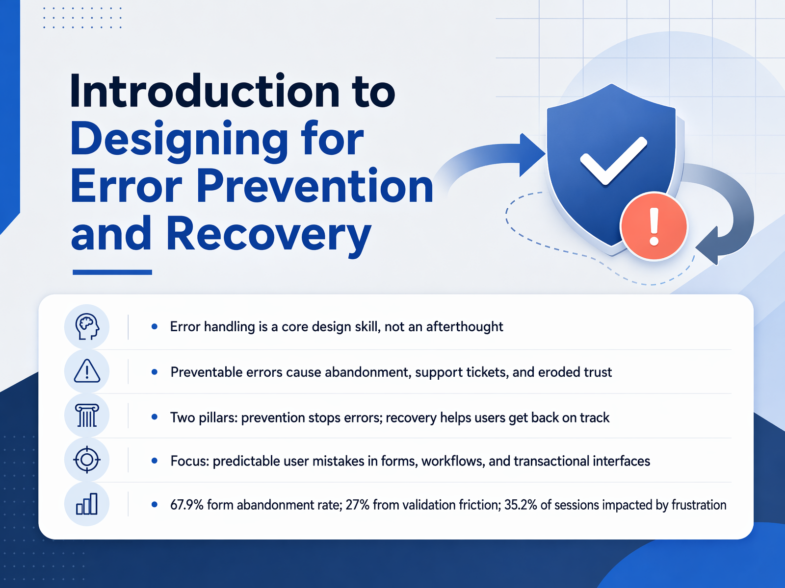
- 01Introduction to Designing for Error Prevention and RecoveryWelcome to Designing for Error Prevention and Recovery. In this course, we treat errors as design opportunities, never as user failures. Our goal is to help you build digital products that guide people past predictable mistakes and get them back on track quickly when something does go wrong. Error handling is a core design skill, not an afterthought. Preventable errors cause abandonment, drive up support tickets, and steadily erode trust. We focus on two pillars: prevention stops errors before they happen, and recovery helps users fix things and move forward. We will concentrate on predictable user mistakes in forms, workflows, and transactional interfaces. The numbers tell a clear story. The average form abandonment rate is about sixty-eight percent. Roughly twenty-seven percent of that abandonment comes from validation friction alone. More than a third of all sessions, about thirty-five percent, are impacted by frustration. These are not just metrics. They represent real people who wanted to complete a task but walked away. When you design for errors, you design for retention, revenue, and respect for your users. Next, let's look at the business case for why error handling directly drives revenue and retention.contentsquare.comretentioncheck.comgetperspective.ai+22 min
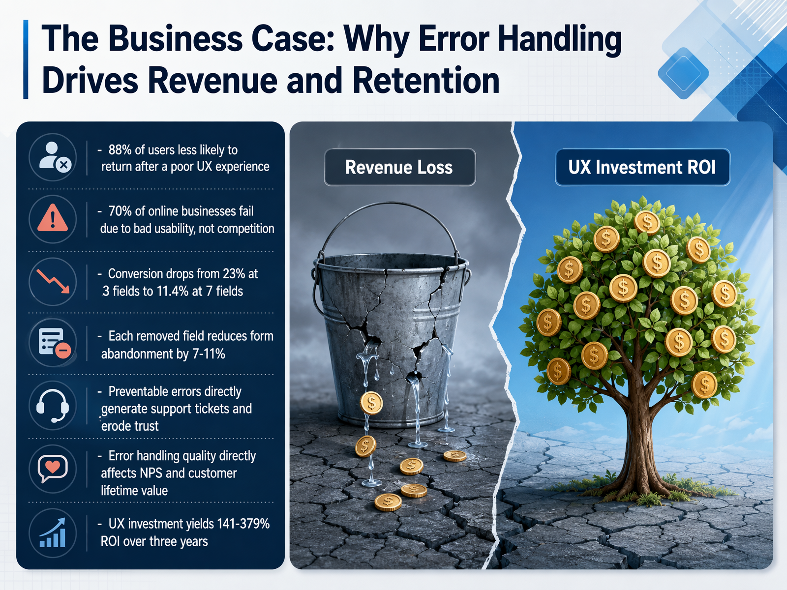
- 02The Business Case: Why Error Handling Drives Revenue and RetentionLet's look at the numbers, because they make a strong case. Eighty-eight percent of users say they are less likely to return after a poor experience. That means one bad error can lose a customer for good. Nearly seventy percent of online businesses fail due to bad usability, not competition. The product might work, but if people can't use it easily, they leave. Consider form fields. Conversion drops from twenty-three percent at three fields to just over eleven percent at seven. Each field you remove reduces abandonment by seven to eleven percent. Preventable errors also generate support tickets and erode trust. When users struggle, they call for help or leave entirely. The quality of your error handling directly affects your Net Promoter Score and customer lifetime value. This is not a cost center. Investing in UX yields between one hundred forty-one and three hundred seventy-nine percent return on investment over three years. So error prevention is not just good design. It is a smart business strategy. Next, we will examine the psychology behind why errors happen and what triggers them.
 contentsquare.comretentioncheck.comgetperspective.ai+21 min
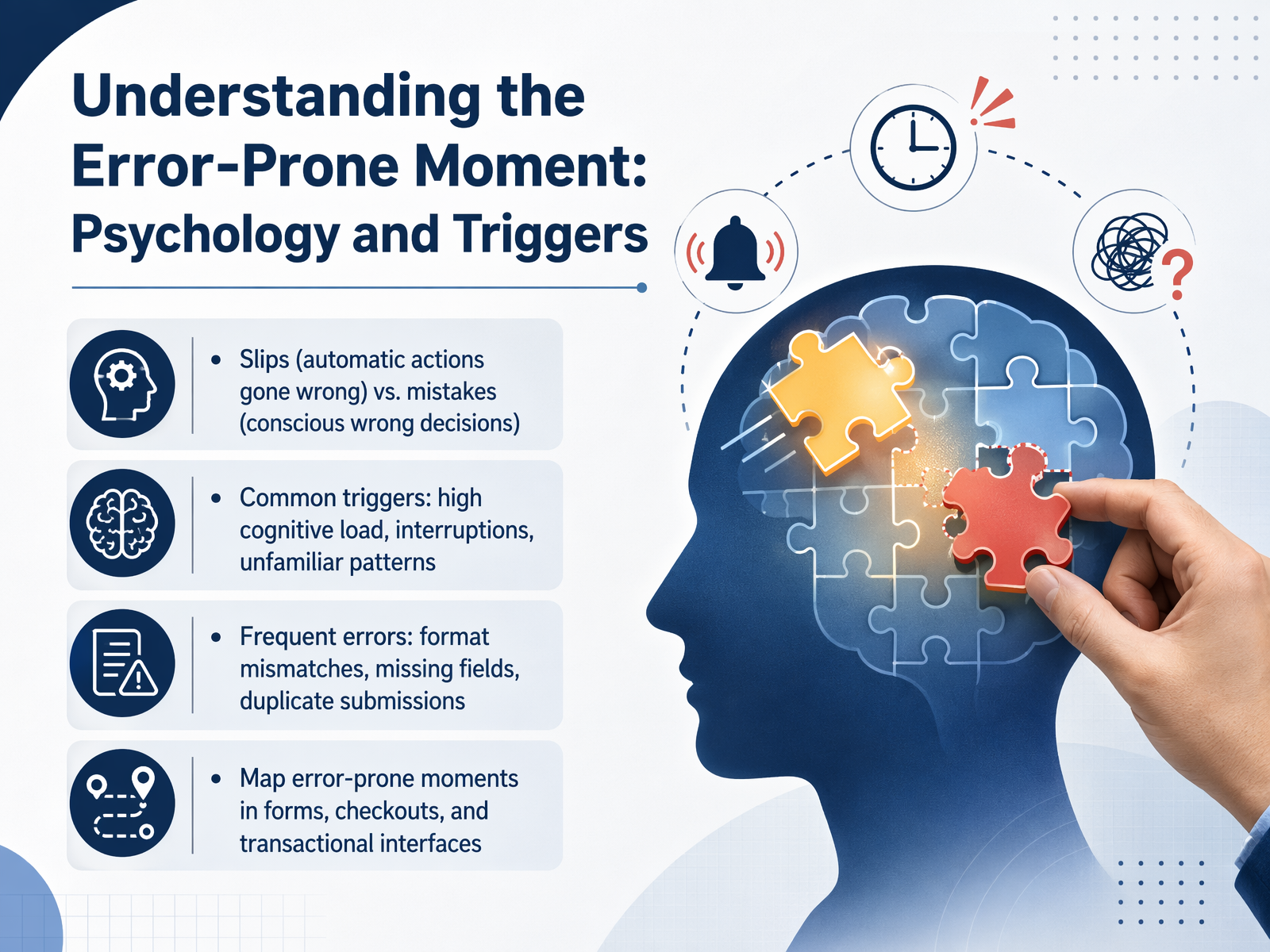
 - 03Understanding the Error-Prone Moment: Psychology and TriggersNow let’s look at the moment before an error happens. Understanding the psychology behind it helps us design better. Errors fall into two categories: slips and mistakes. Slips happen when you’re on autopilot—like typing your old address from memory. Mistakes are conscious wrong decisions, like choosing the wrong shipping option. Common triggers include high cognitive load, interruptions, and unfamiliar patterns. Frequent errors in forms and checkouts are format mismatches, missing fields, and duplicate submissions. Map these error-prone moments in your interfaces. Focus on where users are most distracted or under time pressure. That’s where prevention matters most. Next, we’ll explore the prevention pillar: designing errors out before they happen.
 nngroup.comrivereditor.comeui.elastic.co+21 min
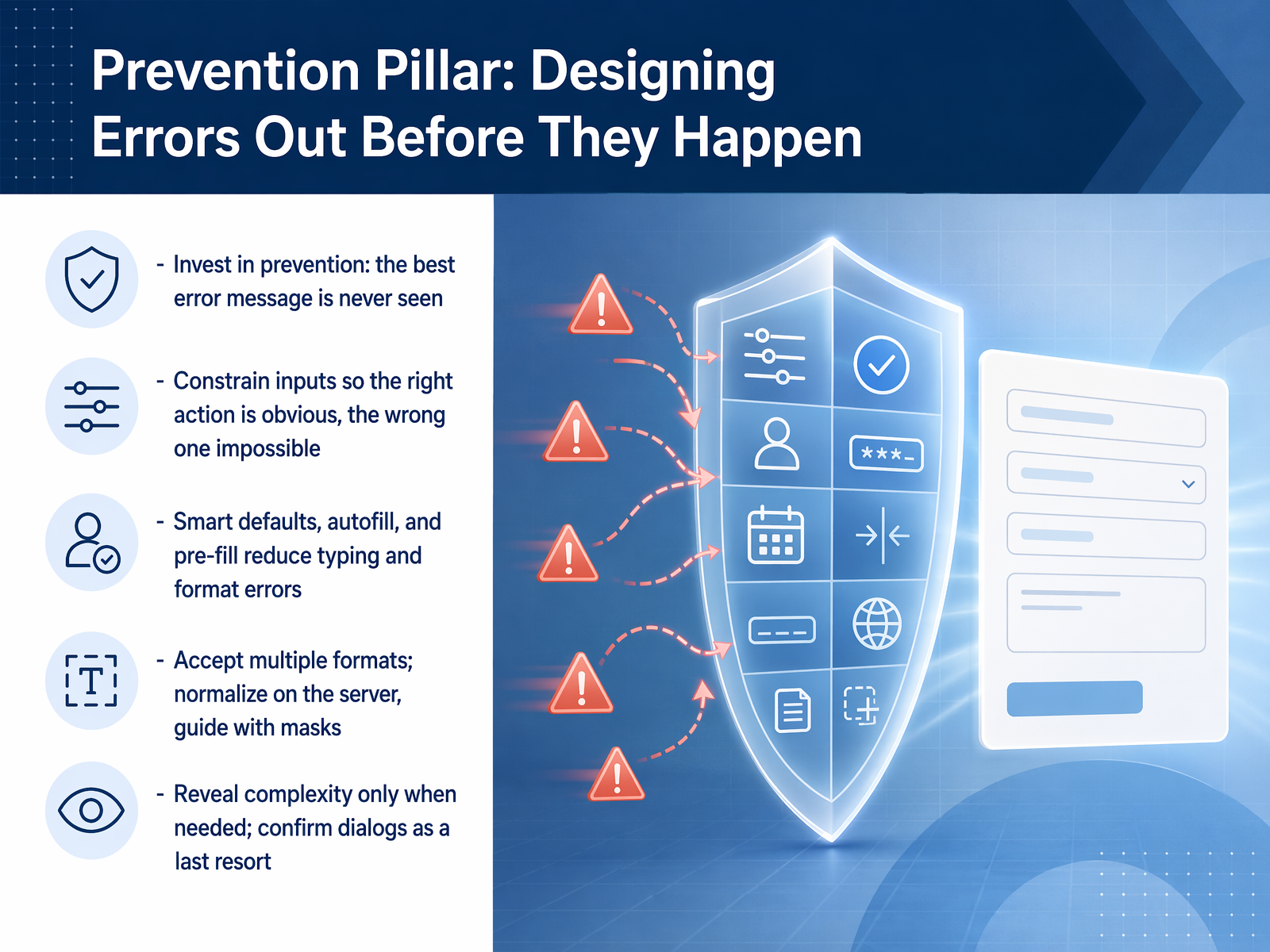
 - 04Prevention Pillar: Designing Errors Out Before They HappenNow let's look at the prevention pillar: designing errors out before they happen. The best error message is the one you never see. That means we stop mistakes at the field level, not the validation script level. First, constrain inputs so the right action is obvious and the wrong one is impossible. If a field accepts only numbers, set the keyboard to numeric. If the maximum length is ten characters, don't let the user type an eleventh. Second, lean on smart defaults, autofill, and pre-fill. Use the browser's autocomplete attribute to pull saved names, emails, and addresses. Pre-fill the user's country based on their location. Every field you fill for them is a field they can't get wrong. Third, accept multiple formats and normalize on the server. Let users type phone numbers with spaces, dashes, or parentheses. Clean it up behind the scenes. Use input masks to guide formatting as they type, but never fight real data. Fourth, reveal complexity only when it's needed. Save confirmation dialogs for truly destructive actions like deleting an account. If a choice can be undone, let the undo button be the safety net instead of a dialog. Prevent errors by making the correct path the easiest path. Up next, we'll zoom into input formatting and field design: prevention at the micro-level.
 w3.orgfrontendtools.techtylercoderre.medium.com+22 min
 - 05Input Formatting and Field Design: Prevention at the Micro-LevelNow let's zoom in to the micro-level: input formatting and field design. This is where small interface decisions either prevent mistakes or guarantee them. A fundamental rule: masks should guide, not control. That means paste must always work. People paste everything, and fighting their operating system breaks trust. For phone numbers, dates, credit cards, and IBANs, auto-format the values. Normalize the raw input while the user types, but apply the final pretty formatting on blur, not after every keystroke. Otherwise the field feels like it's arguing with you. On mobile, match the keyboard to the task. Use the correct input type so the email keypad shows the at symbol, and the number keypad appears for digits. For short, fixed-length fields, auto-advance the cursor to the next field when the user finishes. This removes friction. A critical cross-team practice: document the display format and the stored format separately. The way a value looks on screen is not always how it should be saved. This eliminates handoff friction between design and engineering. One simple fix with huge impact: seventy-two percent of sites format credit card expiry dates differently from the physical card. Match the card's format exactly. It costs almost nothing and prevents a common point of confusion. Next, we'll step back and look at prevention through architecture: forms, checkouts, and multi-step flows.
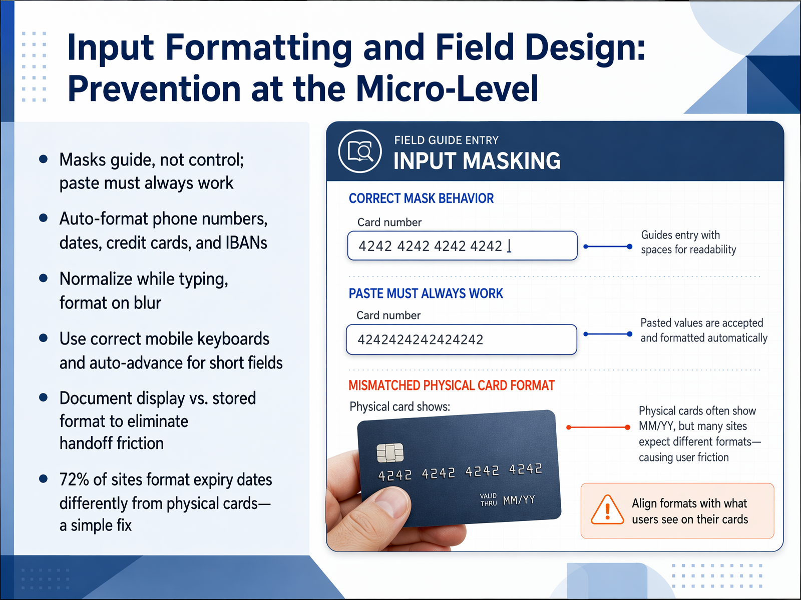 w3.orgfrontendtools.techtylercoderre.medium.com+22 min
 - 06Prevention Through Architecture: Forms, Checkouts, and Multi-Step FlowsNow let's look at how form architecture itself can prevent errors. Start by reducing field count. Research shows that every field above eight costs you nearly three percent in conversion. Aim for six to eight fields. Use a single-column layout with logical grouping. For complex forms, break them into multi-step flows. Offer guest checkout and express wallets like Apple Pay or Google Pay. These skip entire error categories because the user barely types. Use HTML autocomplete attributes on every field. This is one of the most powerful prevention tools you have. It lets the browser fill in saved data, eliminating typing mistakes. Show fields conditionally. Only ask for what is relevant at that moment. This reduces cognitive load and error opportunities. Display costs early and explain why you need sensitive data. When users understand the reason, they are less likely to make mistakes. The takeaway: design the form to prevent errors before they happen. Next, we will cover Validation and Feedback Patterns: Timing and Technique.
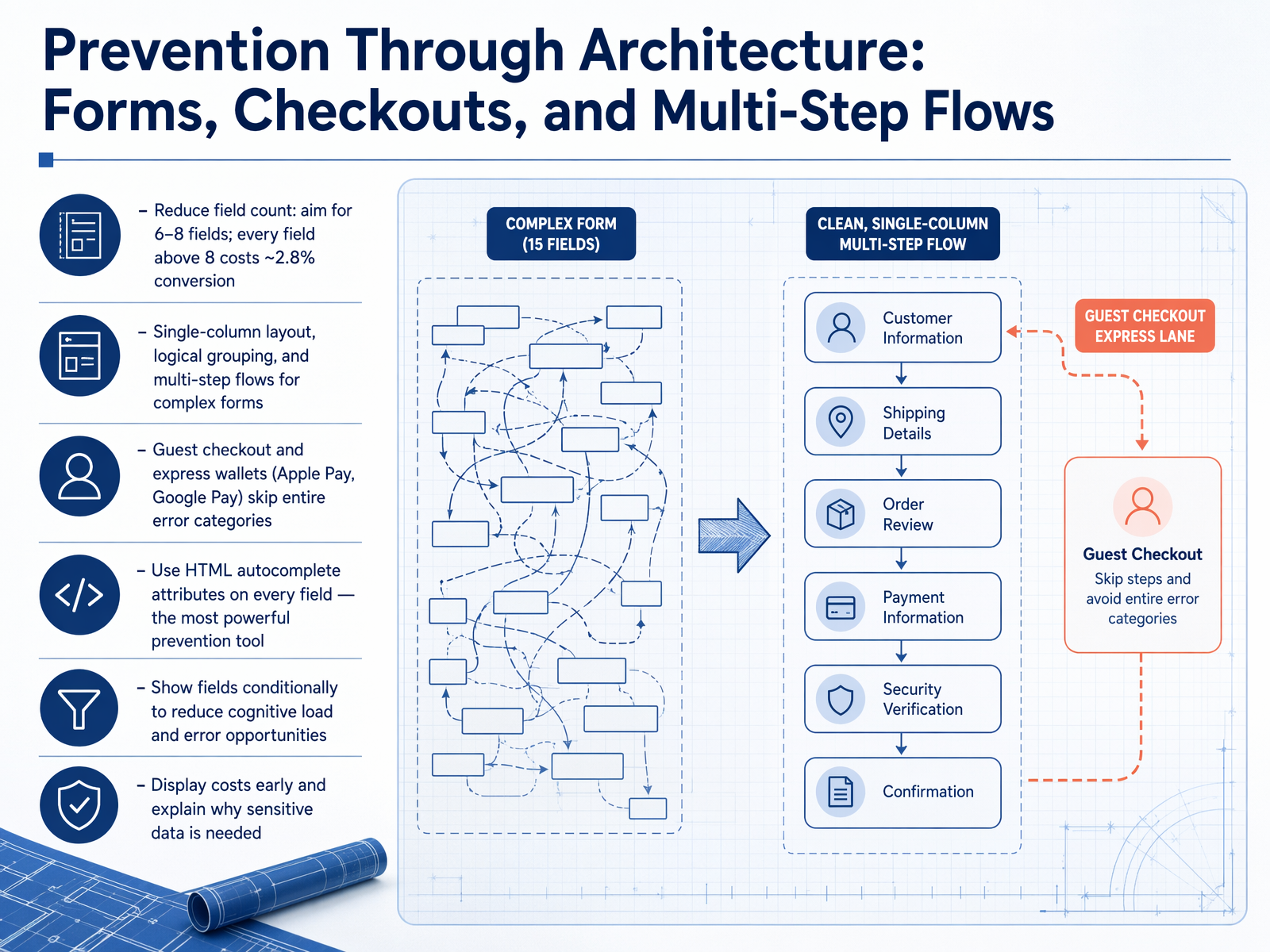 baymard.comstripe.comclutch.co+21 min
 - 07Validation and Feedback Patterns: Timing and TechniqueNow let's talk about the rhythm of validation. When you check a field, and what you show, is just as important as what you check. The first rule is timing. Validate on blur, which means waiting until the user finishes typing and moves to the next field. Never validate on every single keystroke. That creates a jarring, flashing experience that distracts and frustrates. When you wait for blur, inline validation can lift form completion rates by around twenty-two percent over waiting until the submit button is pressed. For the technique itself, use real-time helpers like password strength bars, character counters, and format confirmations. These are not errors. They are guides that build confidence. And remember, client-side validation is a helpful speed layer, but the server is the final authority on all data. Finally, and this is crucial, treat user input as sacred. If a server error occurs, never, ever wipe the form fields. Preserve everything they typed so they can simply fix the problem and move forward. Up next, we will move from prevention into the recovery pillar, helping users after an error occurs.
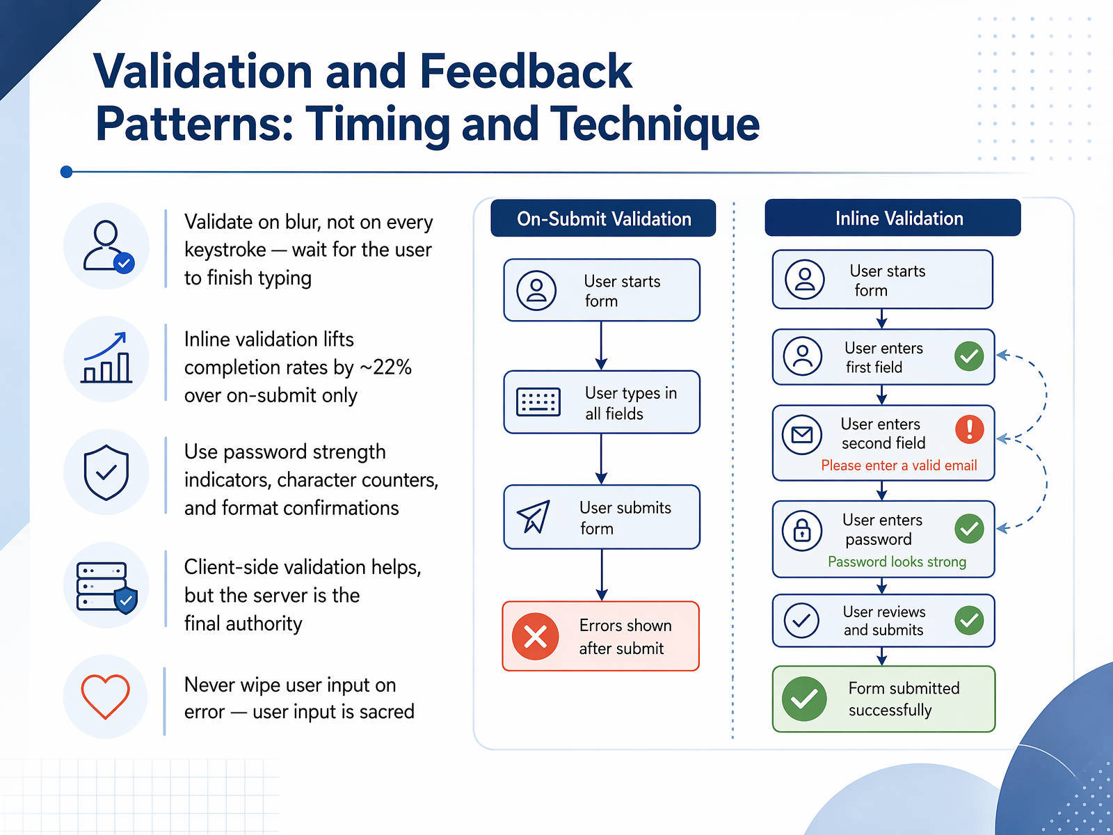 w3.orgfrontendtools.techtylercoderre.medium.com+22 min
 - 08Recovery Pillar: Helping Users After an Error OccursNow let's talk about what happens after an error occurs. The recovery pillar is about helping users get back on track quickly and confidently. We follow a four-step pattern: detect the error, explain it clearly, resolve it with a specific action, and reassure the user. Think of it as the Avoid, Explain, Resolve framework. First, say what to check. Then say what happened. Finally, say what to do next. When you diagnose the problem, avoid blaming the user. Be specific, be actionable, and be constructive. A reliable structure is the three-part error message: what went wrong, why it matters, and how to fix it. This turns a blocking moment into a guided step forward. And never underestimate the power of undo, redo, and version history. These tools let users reverse mistakes without consequence, which builds trust and encourages exploration. In the next slide, we'll look at writing error messages that users actually read and understand.
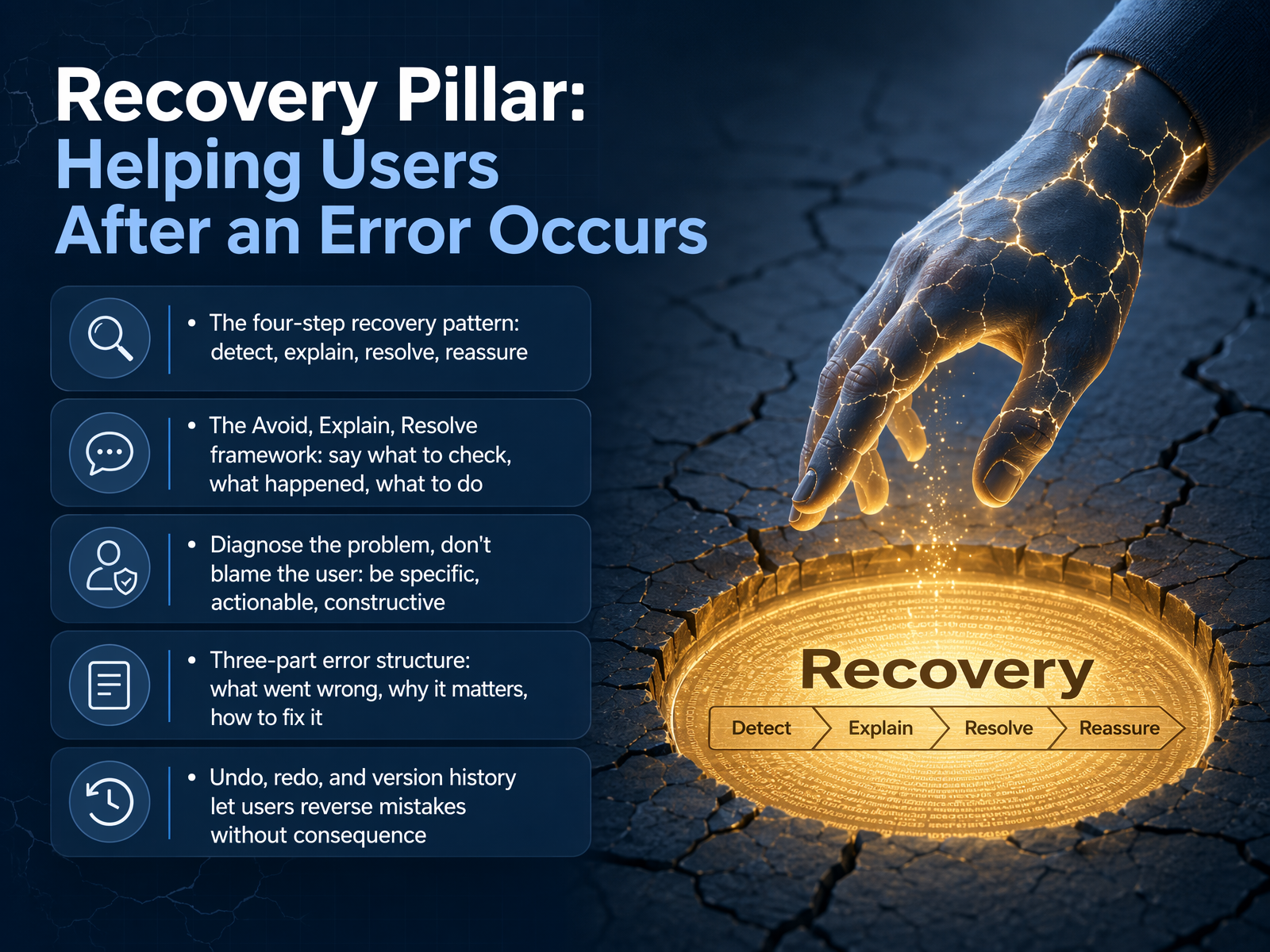 nngroup.comrivereditor.comeui.elastic.co+22 min
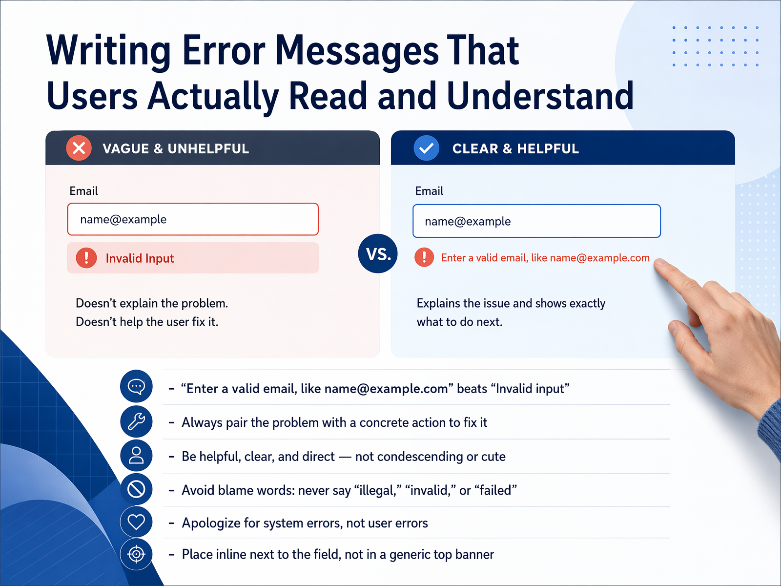
 - 09Writing Error Messages That Users Actually Read and UnderstandNow, let's focus on the error messages themselves. Because even when a mistake gets through, the words you show can either guide someone forward or push them away. The first rule is to be specific. A message like 'Enter a valid email, like name at example dot com' is far more helpful than simply saying 'Invalid input.' It names the problem and shows the correct format. Always pair the problem with a concrete action to fix it. Be helpful, clear, and direct. Avoid blame words. Never use terms like 'illegal,' 'invalid,' or 'failed.' These words make the user feel at fault, when the system should simply guide them. And remember, apologize only for system errors, not for user input. If the server is down, say you're sorry. If the email is mistyped, just explain how to fix it. Finally, place the message inline, right next to the field. A generic banner at the top of the page is easy to miss. The guidance should be exactly where the user is looking. Our next section will build on this by ensuring our error handling is accessible to everyone, in 'Accessibility and Error Handling: Designing for All Users.'
 nngroup.comrivereditor.comeui.elastic.co+22 min
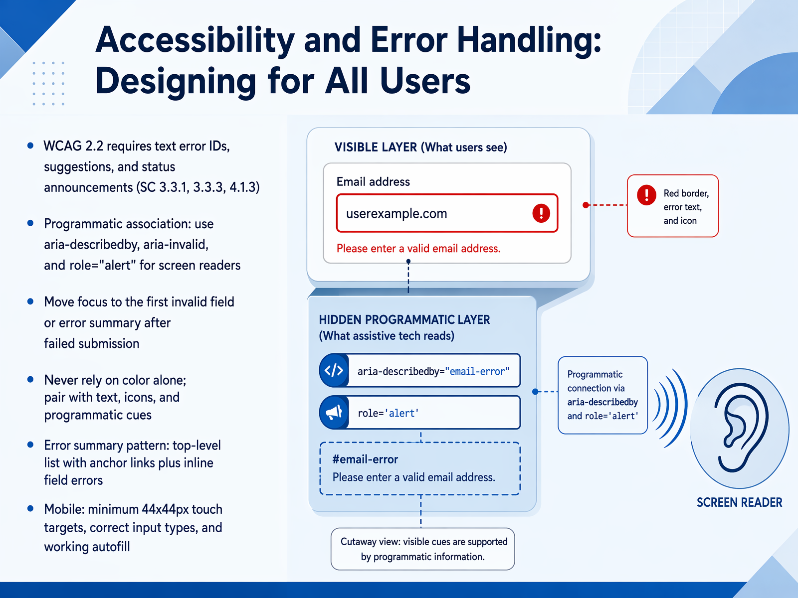
 - 10Accessibility and Error Handling: Designing for All UsersLet's build on what we've covered and talk about making error handling work for everyone, including users of assistive technology. The WCAG 2.2 guidelines require that errors are identified in text, suggestions are offered, and status changes are announced. This isn't just a compliance checkbox; it's about ensuring no one is left guessing. On the technical side, we use programmatic associations like aria-describedby to link error messages to their fields, and aria-invalid to signal the state. For critical alerts, role equals alert announces the problem immediately to screen readers. After a failed submission, move focus to the first invalid field or an error summary. This guides the user directly to the problem. And never rely on color alone to indicate an error. Always pair it with text, icons, and these programmatic cues. A robust pattern is the error summary at the top of the form, with anchor links pointing to each inline field error. For mobile users, there are two absolute musts: ensure touch targets are at least 44 by 44 CSS pixels, and use the correct input types, like email or tel, to trigger the right keyboard. Properly wired autofill is also a powerful ally for speed and accuracy. Now, let's move on to edge cases and graceful failures, when things go really wrong.
 w3.orgfrontendtools.techtylercoderre.medium.com+22 min
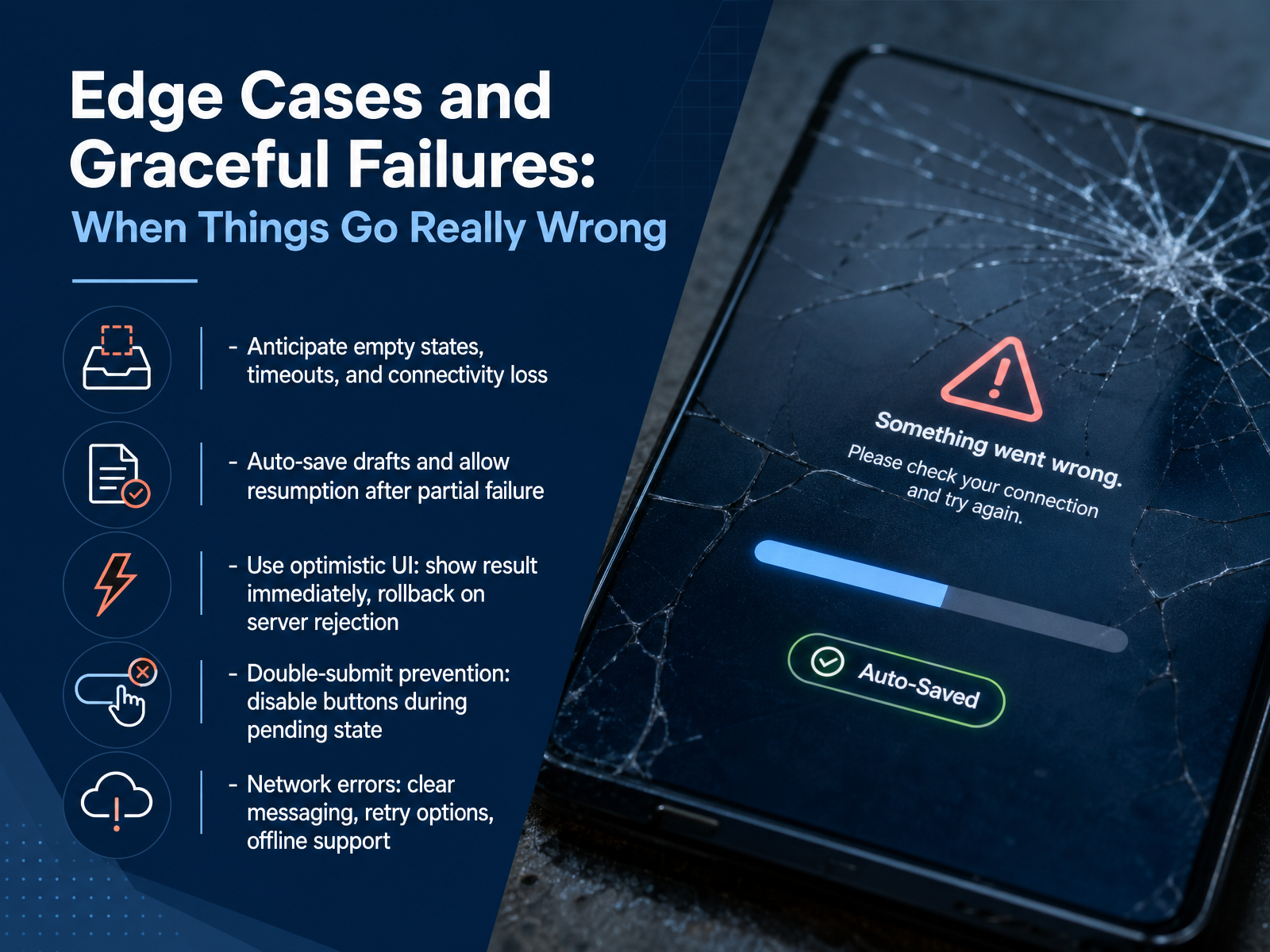
 - 11Edge Cases and Graceful Failures: When Things Go Really WrongNow let’s talk about edge cases and graceful failures — when things go really wrong. Start by anticipating empty states, timeouts, and connectivity loss. Auto-save drafts so users can resume after a partial failure. Use optimistic UI: show the result immediately, and roll back if the server rejects it. But remember, optimistic UI is a distributed systems problem. You need a reversible local patch, a stable identity for each operation, and a merge rule when the server responds. To prevent double-submit, disable buttons while the request is pending. For network errors, give clear messaging, retry options, and offline support. Make optimistic state temporary by design. Track pending state per item, not globally. And always converge on server truth. The goal is to make the app feel fast while keeping data safe. Next, we’ll look at Error States as Design System Components.
 baymard.comstripe.comclutch.co+21 min
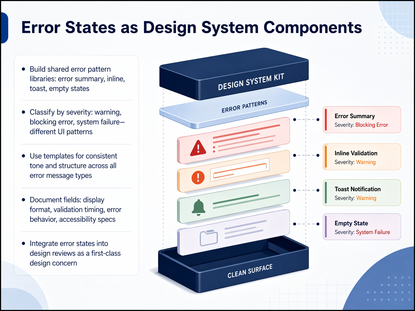
 - 12Error States as Design System ComponentsShifting focus slightly, let's look at how error states themselves become reusable components in your design system. Instead of designing each error message from scratch, you build a shared pattern library. This library includes components like error summaries for the top of a form, inline validation messages next to a specific field, toast notifications for transient failures, and empty states when content fails to load. The key is to classify these by severity. A warning is different from a blocking error, and a system failure requires a completely different UI pattern. You then use templates to ensure a consistent tone and structure across every message. These templates document critical fields like the display format, when validation should fire, the error behavior, and accessibility specifications. Most importantly, integrate these error states into design reviews as a first-class concern. Don't treat them as an afterthought. When you standardize error handling, you make the experience predictable and the recovery path clear. Next, we will put numbers to these improvements by examining how to measure error prevention and recovery with the metrics that matter.
 nngroup.comrivereditor.comeui.elastic.co+22 min
 - 13Measuring Error Prevention and Recovery: Metrics That MatterNow let's talk about the metrics that matter when measuring error prevention and recovery. The average error rate across software tasks is about point seven errors per task, and roughly two out of every three users will make at least one error. That's far more common than most teams assume. For forms specifically, the average abandonment rate is sixty-seven point nine percent, and twenty-seven percent of that abandonment is caused by validation friction alone. The fix? Inline validation lifts completion rates by about twenty-two percent compared to showing errors only after submission. The key metrics to track are error rate per field, recovery time, form abandonment rate, and dedupe hit rate. And if you want one combined score, the Single Usability Metric, or SUM, blends completion, time, satisfaction, and errors into a single number you can track over time. Next, we'll look at how to collaborate effectively with developers on error strategy.
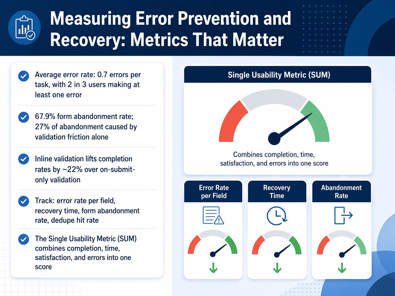 contentsquare.comretentioncheck.comgetperspective.ai+21 min
 - 14Collaboration: Working with Developers on Error StrategyNow let’s talk about collaboration with developers on error strategy. Start by defining the client-server validation contract. The client helps the user with hints and formatting, but the server is the final authority. Map field errors predictably so the UI and API agree on what went wrong. For every input, hand off six things: display format, stored format, allowed characters, validation timing, error behavior, and paste or autofill expectations. This removes ambiguity. Manage error messages through a shared content repository with version control and localization workflows. When using optimistic UI, apply it only for low-stakes actions like toggles. Avoid it for payments, irreversible side effects, or branching wizards. Finally, integrate error prevention into your sprints. Make error states part of the definition of done so they are never an afterthought. Next, we’ll look at testing and iterating on error handling.
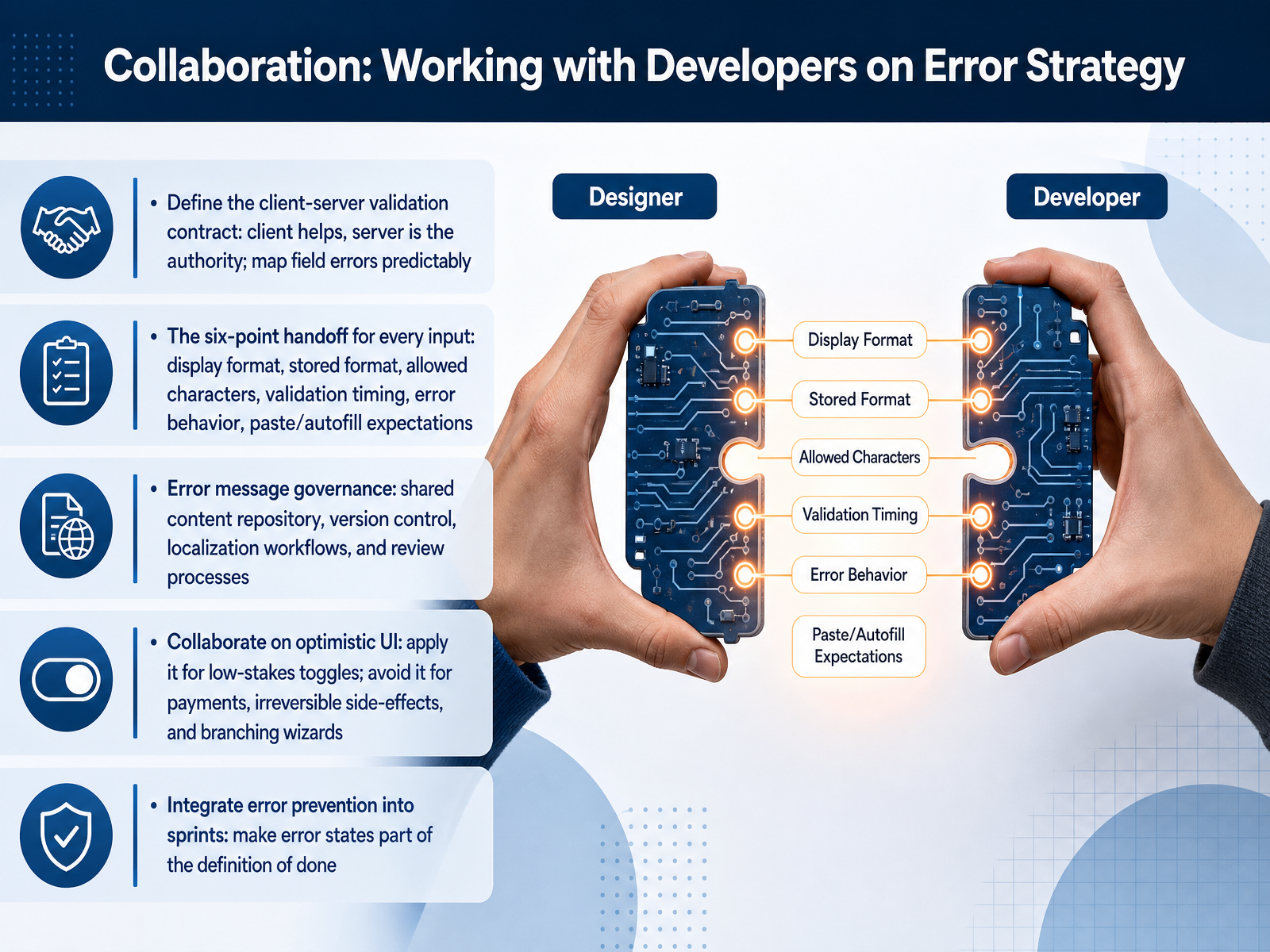 w3.orgfrontendtools.techtylercoderre.medium.com+21 min
 - 15Testing and Iterating on Error HandlingNow let's talk about testing and iterating on your error handling. This is where good design becomes measurable. Start with error-focused usability testing. Watch real users encounter errors, and observe three things: do they understand the message, how quickly can they recover, and what is their emotional response. Frustration here is a signal to redesign. Next, prototype the unhappy path. Include your error messages directly in clickable prototypes so you can test them before development. Accessibility testing is not optional. Run keyboard-only passes to verify focus moves to the first error. Test every screen with a screen reader to confirm error announcements. And check all states in high-contrast mode. You should also A and B test your error copy. Compare different headlines and body text to see which version helps users recover faster. Even small wording changes can cut time-to-recover in half. Finally, use session replay and analytics to spot where people slow down, abandon the flow, or trigger the same error repeatedly. These are your highest-priority fixes. Look for patterns, not one-off clicks. Up next, we'll shift from testing to building an error-prevention mindset on your team.
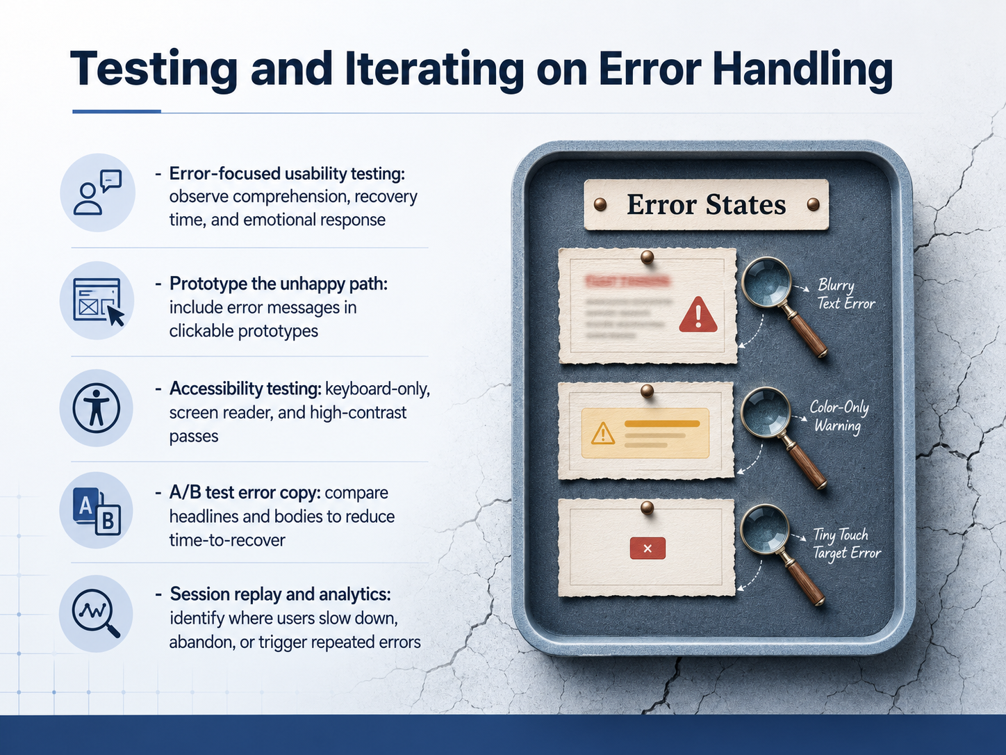 nngroup.comrivereditor.comeui.elastic.co+22 min
 - 16Building an Error-Prevention Mindset on Your TeamNow let's bring this together. Shifting a team's mindset starts with one simple question in every design review: 'What could go wrong here?' Make it as routine as checking alignment or color. Create a shared language for severity. Not all errors are equal. A simple warning is different from a system failure. Agree on terms like warning, validation error, workflow interruption, and system failure, so everyone knows the impact. Build a centralized error message library. This saves time and ensures consistency. Use templates for common situations, like network errors or invalid inputs, so you're never starting from scratch. Run error-focused design critiques. Before shipping, gather the team for a pre-mortem. Ask, 'If this fails, how will it fail?' This anticipates problems instead of just reacting to them. Finally, shift your culture. Treat errors as a primary interface, not an edge case. For a user who hits a problem, that error message is the product. Design it with the same care as the happy path. Thank you for joining this course. By building a prevention mindset, you turn moments of friction into opportunities to build trust. Go design those safety nets.
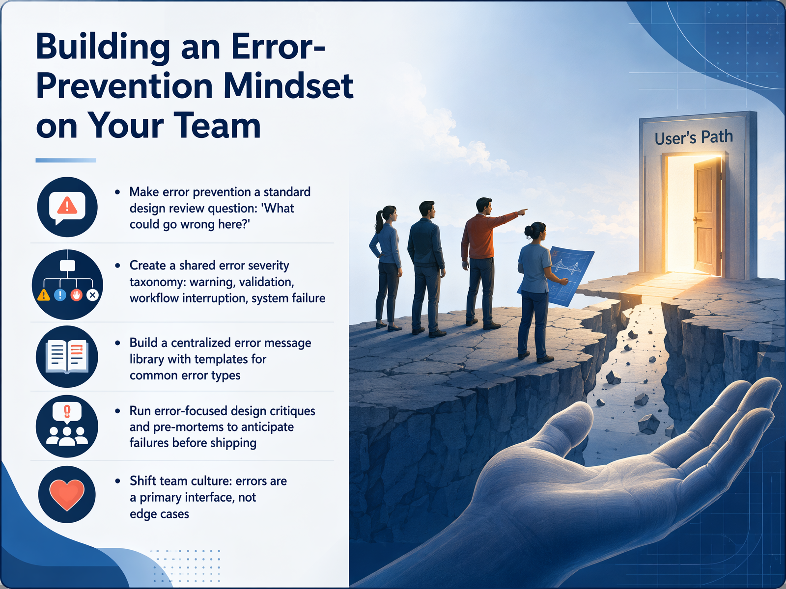 nngroup.comrivereditor.comeui.elastic.co+22 min
Take the deck with you
Download this course as a file — free, no sign-up needed.
- PDF handoutEvery slide page, ready to print or share.17 pages · 4.5 MBDownload
- Narrated PowerPointThe deck that presents itself — every slide carries the digital human's narration video.17 pages · 16.0 MBDownload
- PowerPoint slidesThe full deck as a .pptx — open it in PowerPoint, Keynote, or Google Slides.17 pages · 4.3 MBDownload
Free to use in your own training — please keep the PersonWise credit page at the end.
Have your own deck? Turn it into a course
Sources consulted
Web sources consulted while building this course.
- How Frustration Impacts Digital Experiences in 2026 — contentsquare.com
- Product is too difficult to use: Why It Drives Churn and How to Fix It - RetentionCheck — retentioncheck.com
- Form Abandonment in 2026: Why Multi-Step Forms Leak and What to Use Instead | Blog | Perspective AI — getperspective.ai
- UX-Oriented Design as a Tool for Improving Labor Productivity in Corporate SaaS Solutions — doi.org
- 30+ UX and Product Design Statistics That Explain Why Digital Products Fail — nuvra.tech
- Error-Message Guidelines — nngroup.com
- How to Write Error Messages That Help Users Solve Problems (2026) | River — rivereditor.com
- How to write good error messages | Elastic UI Framework — eui.elastic.co
- Error Message Design: Writing Copy That Helps Users ✦ Unicorn Club — unicornclub.dev
- Microcopy Best Practices 2025: Guide to UX Writing — pippit.ai
- Design Forms to Prevent Mistakes | Cognitive Accessibility Design Pattern | WAI | W3C — w3.org
- User Input Best Practices: Validation, Security & UX for Web Apps | FrontendTools — frontendtools.tech
- The Input Mask Field Guide. A designer-led reference for form… | by Tyler Coderre | Medium — tylercoderre.medium.com
- 8 Recommendations for Creating Effective Input Fields — baymard.com
- Typing Text in Forms: UX, Validation, Accessibility, and Best Practices — cleverence.com
- Checkout UX Best Practices 2025 — baymard.com
- Checkout screen best practices for high conversion | Stripe — stripe.com
- 15 Checkout Design Mistakes Killing Your Conversions | Clutch.co — clutch.co
- Checkout Form Optimization: Reduce Field Friction | Glued — insights.getglued.co
- Checkout Friction Audit: The 23 Points Costing You Sales | Pixeltree — pixeltree.store