UI Design Portfolio Creation
Begin
14 pages · ~28 min
UI Design Portfolio Creation
This training helps aspiring UI designers build a professional portfolio that showcases their skills and attracts employers or clients.
What you’ll learn
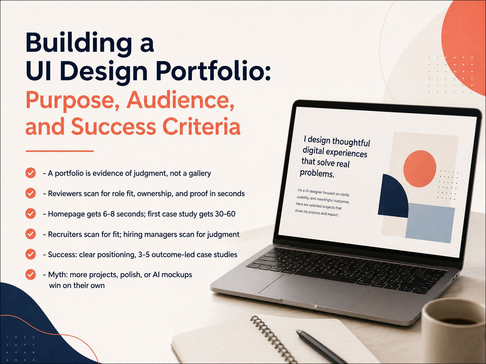
- 01Building a UI Design Portfolio: Purpose, Audience, and Success CriteriaWelcome. In this course, we're building your UI design portfolio, and we're starting with its purpose, its audience, and how to measure success. Here's the mindset shift: a portfolio is not a gallery. It is evidence of judgment. Reviewers are not admiring your screens. They are scanning for role fit, ownership, and proof, often in seconds. Your homepage gets about six to eight seconds. Your first case study gets thirty to sixty. Recruiters scan for fit. Hiring managers scan for judgment. So design both paths. Define success simply: clear positioning, and three to five outcome-led case studies. An outcome-led case study shows the problem, your decisions, and the result. One myth to drop: more projects, more polish, or AI mockups do not win on their own. Judgment does. Keep that frame as we move into what reviewers actually look for, and how fast they decide.2 min
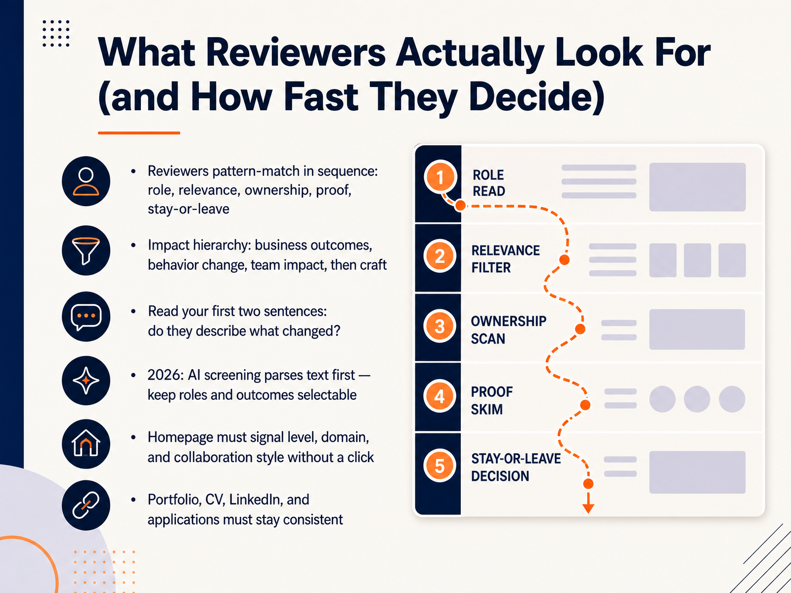
- 02What Reviewers Actually Look For (and How Fast They Decide)Let's talk about what actually happens when someone opens your portfolio. Reviewers don't read every word. They pattern-match in sequence. First, your role. Then, relevance to their problem. Then, ownership. Then, proof. Then they decide whether to stay or leave. So lead with impact, in this order: business outcomes first, then behavior change, then team impact, and finally craft. Read your first two sentences out loud. Do they describe what changed? For example, "Redesigned onboarding, cutting drop-off by thirty percent" beats "Passionate designer who loves creating delightful experiences." And in two thousand twenty-six, AI screening parses your text before a human sees it, so keep roles and outcomes as plain, selectable text, not embedded in images. Your homepage alone must signal three things without a click: your level, your domain, and how you collaborate. Finally, keep your portfolio, CV, LinkedIn, and applications consistent. Same titles, same dates, same outcomes. Next, let's look at positioning, choosing a target role and a clear point of view.
 2 min
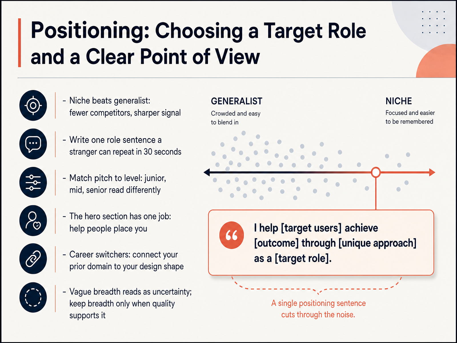
2 min - 03Positioning: Choosing a Target Role and a Clear Point of ViewLet's talk about positioning. This is where you choose a target role and a clear point of view. A focused niche beats being a generalist. You face fewer competitors and send a sharper signal. Write one role sentence that a stranger can repeat back in thirty seconds. For example, I design onboarding flows for fintech apps. Match your pitch to your level. Junior, mid, and senior portfolios read differently, so be honest about where you are. Your hero section has one job: help people place you fast. If you're a career switcher, connect your prior domain to your design shape. A former nurse becomes a designer of clinical dashboards. Vague breadth reads as uncertainty. Keep breadth only when your quality supports it. So pick a role, write that one sentence, and make your first screen do the placing work. Next, we'll look at selecting projects: range, depth, and relevance.
 2 min
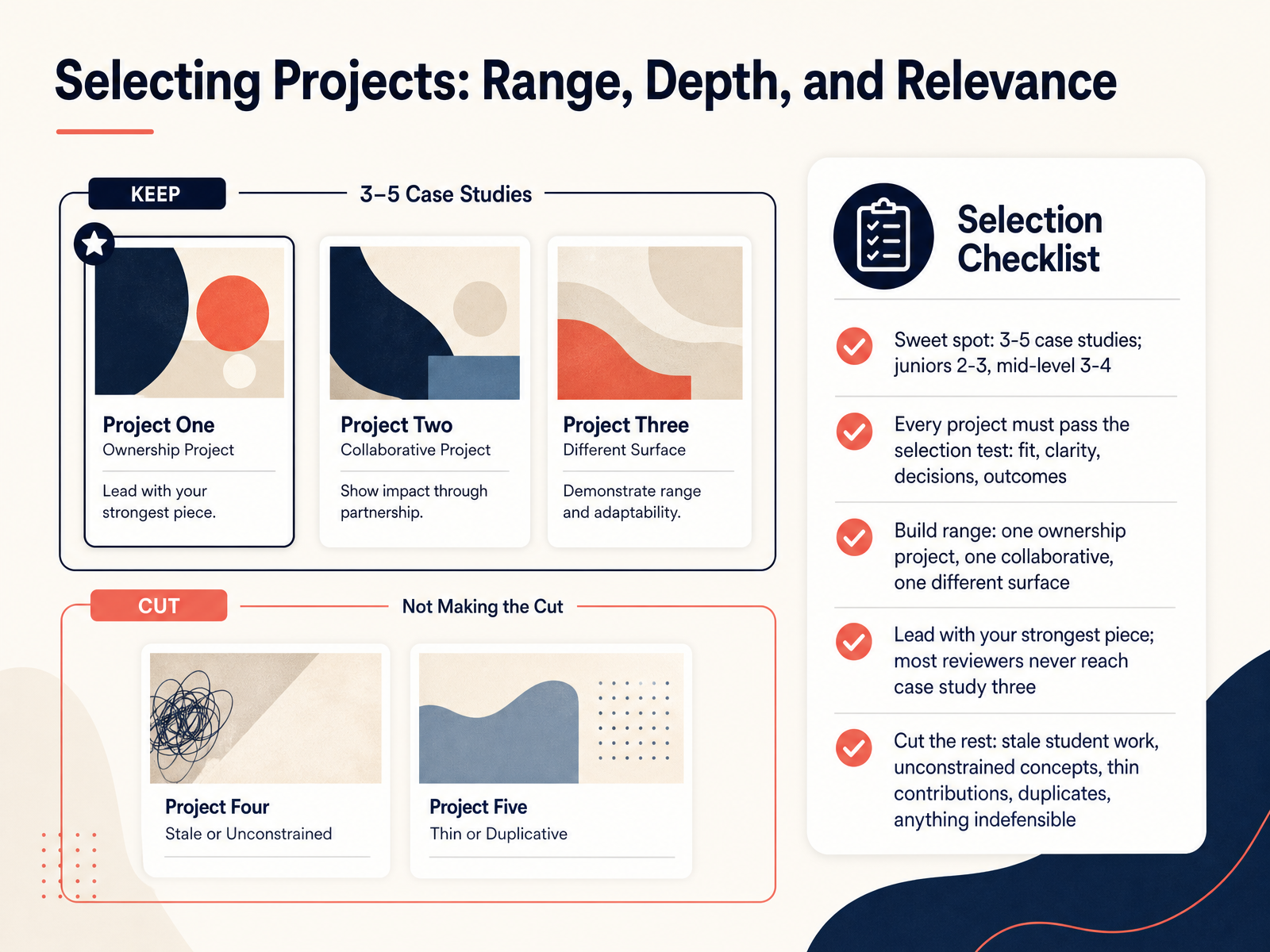
2 min - 04Selecting Projects: Range, Depth, and RelevanceNow let's talk about which projects actually earn a place in your portfolio. The sweet spot is three to five case studies. If you're a junior, aim for two or three. Mid-level designers, three or four. Every project should pass a simple selection test: fit, clarity, decisions, and outcomes. In other words, does it match the role, is the problem clear, did you show your thinking, and can you point to a result? Build range with intention. Include one ownership project where you led the work, one collaborative project, and one that shows a different surface, like mobile, web, or a design system. Then lead with your strongest piece, because most reviewers never reach case study three. Finally, cut the rest: stale student work, unconstrained concepts, thin contributions, duplicates, and anything you cannot defend in an interview. Next, let's look at sourcing projects when your professional work is thin. That slide is called Sourcing Projects When Your Professional Work Is Thin.
 2 min
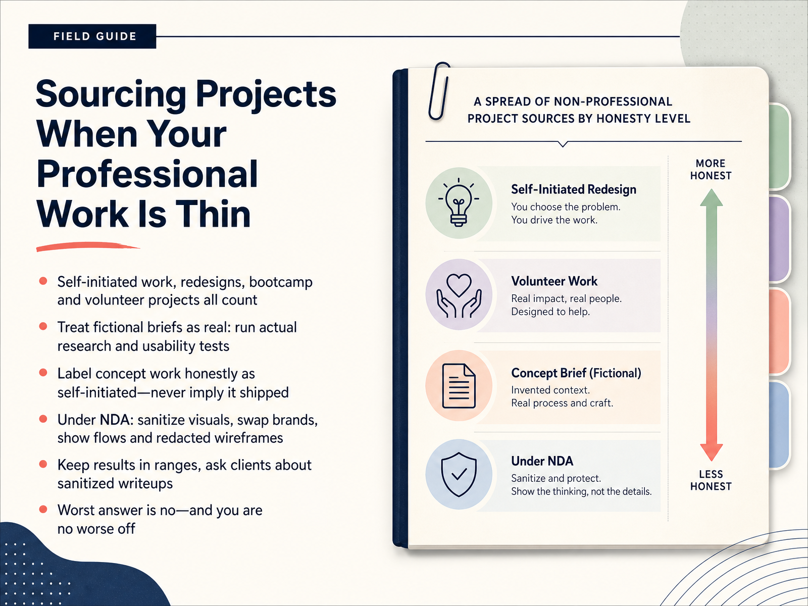
2 min - 05Sourcing Projects When Your Professional Work Is ThinLet's talk about where your projects come from when your paid work is still thin. First, don't panic. Self-initiated work, redesigns, bootcamp projects, and volunteer work all count. If you treat a fictional brief like a real one, it shows. Run actual research. Test it with real people. For example, redesign a local bakery's ordering page, interview three customers, and note what changed. Next, be honest. Label concept work as self-initiated, and never imply it shipped. Under a non-disclosure agreement, or N D A, sanitize everything: swap the brand, blur the logo, and show flows and wireframes with the sensitive details redacted. Results can stay in ranges, like "reduced checkout time by fifteen to twenty percent." Ask clients if you can write a sanitized case study. The worst answer is no, and you are no worse off. Now let's look at the case study structure reviewers can scan.
 1 min
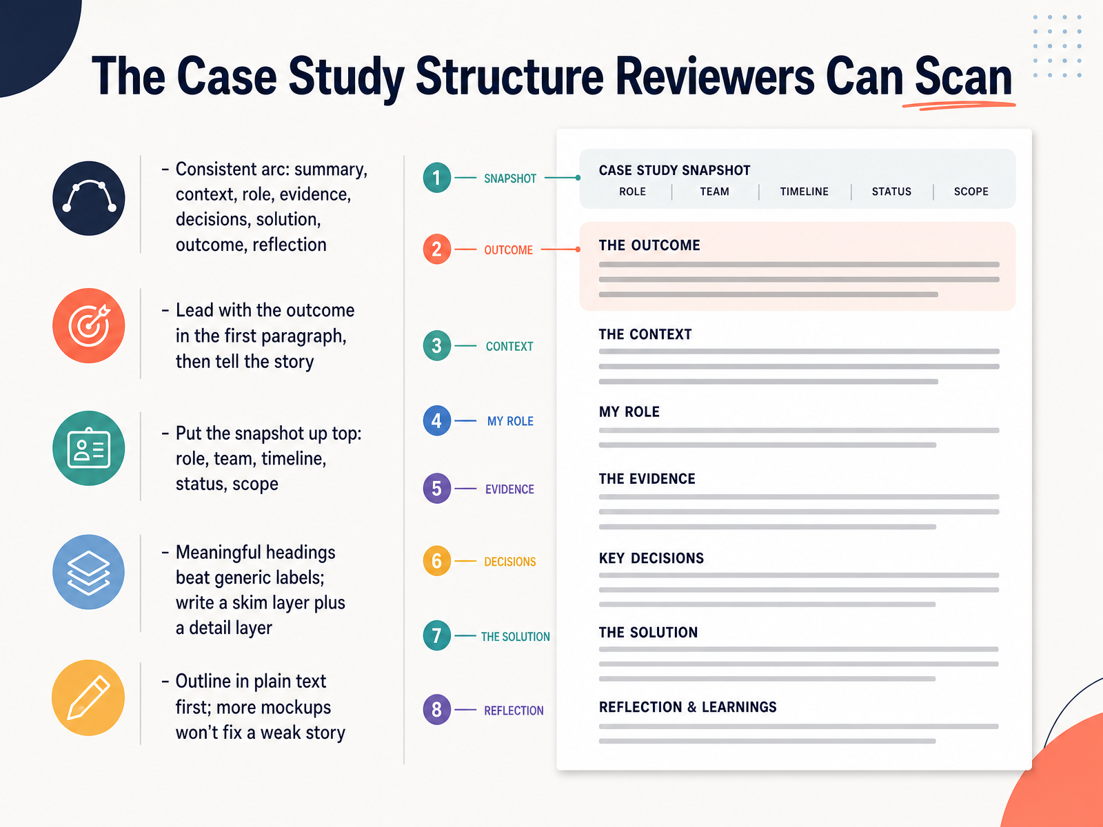
1 min - 06The Case Study Structure Reviewers Can ScanLet's look at a case study structure that reviewers can scan quickly. Your case study needs a consistent arc across every project: summary, context, your role, evidence, decisions, the solution, the outcome, and a short reflection. Lead with the outcome in the first paragraph. For example, start with "This redesign cut checkout drop-off by 20 percent," then explain how you got there. Put a snapshot at the top: your role, the team, the timeline, the status, and the scope. Use meaningful headings instead of generic labels like "Research" or "Design." Write in two layers: a skim layer of short headings and key metrics, and a detail layer of paragraphs and images. Outline in plain text before you open a design tool. More mockups will not fix a weak story. So keep your structure clear, outcome-first, and easy to scan.
 1 min
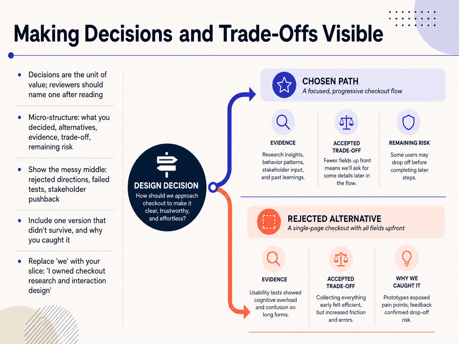
1 min - 07Making Decisions and Trade-Offs VisibleLet's look at something that separates a strong portfolio from a pretty one. Your decisions are the unit of value. After reading a case study, a reviewer should be able to name at least one decision you made. If they can't, they only saw pictures. So give each decision a small structure. State what you decided, the alternatives you considered, the evidence behind your choice, the trade-off you accepted, and any remaining risk. For example, you might say you moved the primary button above the fold because testing showed users missed it, even though it crowded the header. That is a decision a reviewer can repeat. Then show the messy middle. Include rejected directions, failed tests, and stakeholder pushback. Pick one version that didn't survive, and explain why you caught it. Finally, replace we with your slice. Say, I owned checkout research and interaction design. Next, let's cover documenting process, wireframes, and iteration without process theater.
 2 min
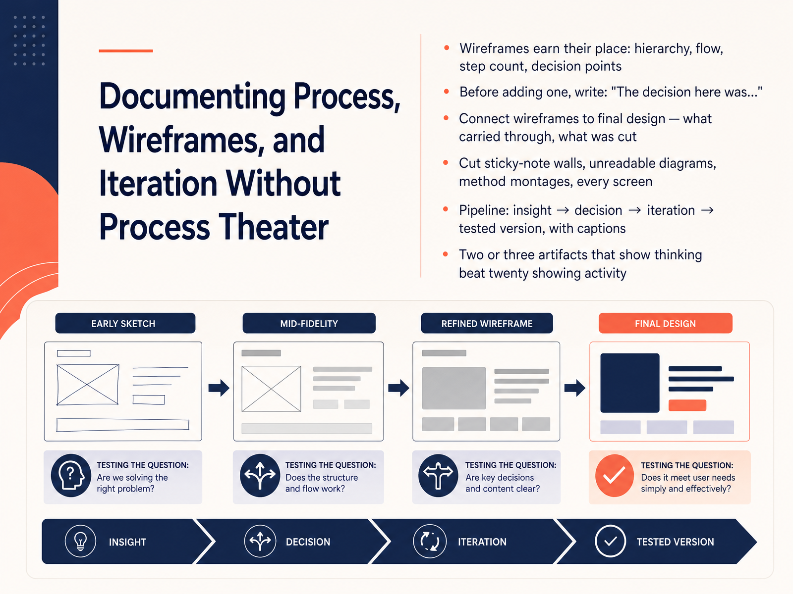
2 min - 08Documenting Process, Wireframes, and Iteration Without Process TheaterNow let's talk about documenting process without falling into process theater. A wireframe is just a simplified layout that shows structure and flow before visual design. It only earns its place if it shows hierarchy, flow, step count, or a real decision point. So before you add any wireframe, write one sentence: "The decision here was..." If you cannot finish that sentence, cut the image.
Next, connect each wireframe to the final design. Call out what carried through and what changed. Reviewers want to see your thinking, not a museum of every screen. Cut sticky note walls, unreadable diagrams, method montages, and twenty screens of small iterations.
Instead, show a simple pipeline: insight, decision, iteration, tested version. Caption each step so the reader never has to guess. Two or three artifacts that show real thinking will always beat twenty artifacts that only show activity. So ask yourself: does this image prove a decision? If not, it goes.
Coming up next, we will look at outcomes, metrics, and honest gaps.
 2 min
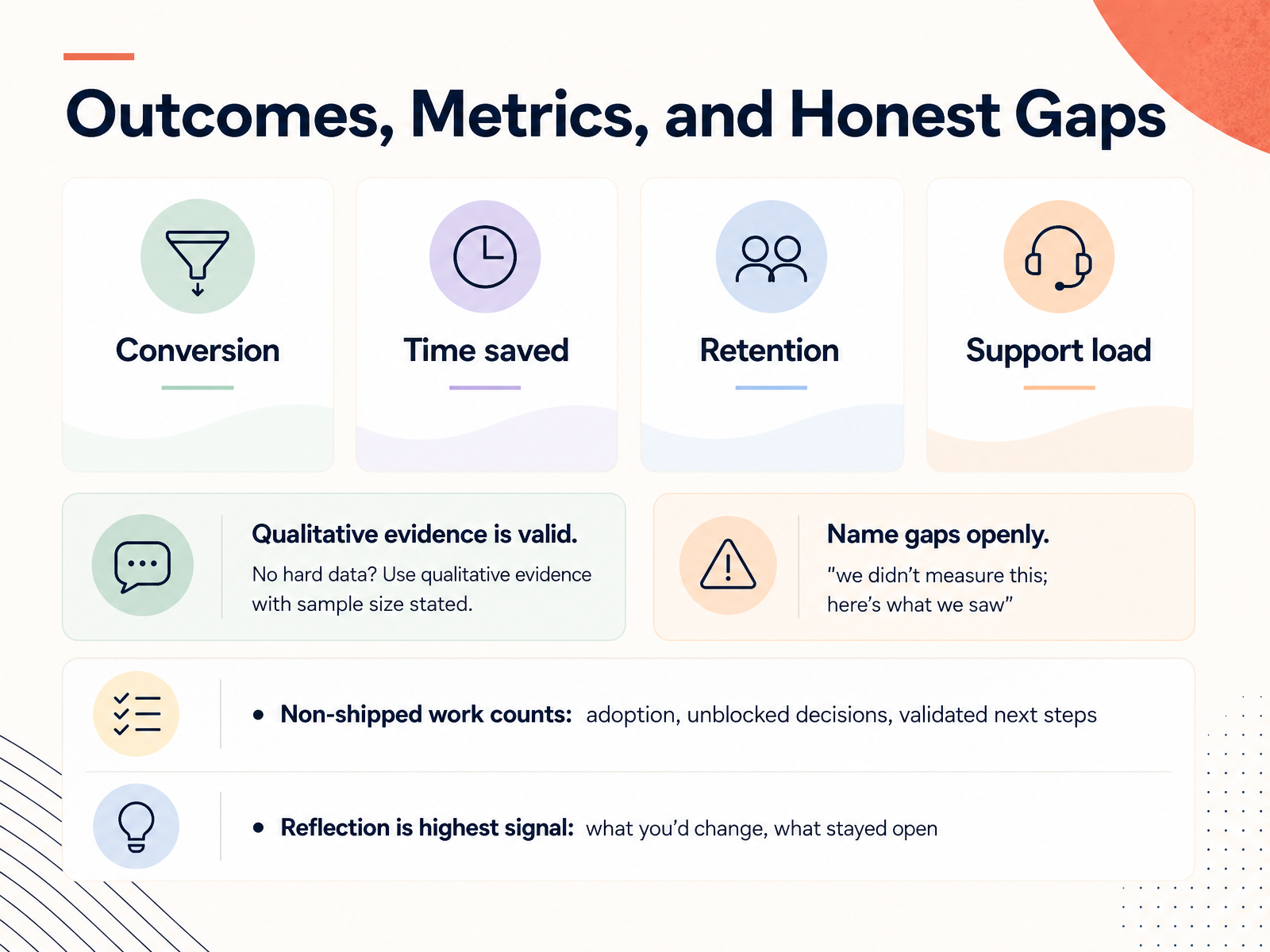
2 min - 09Outcomes, Metrics, and Honest GapsLet's talk about outcomes, metrics, and honest gaps. Outcomes are the results your design helped create, and metrics are simply the numbers you use to show them. If you have hard data, focus on four metric families: conversion, time saved, retention, and support load. Conversion means more people completed the task. Time saved means the team or user finished faster. Retention means people came back. Support load means fewer help requests. Here is the checkpoint: put one number in the top third of every case study, so a reviewer sees impact immediately. No hard data? That is fine. Use qualitative evidence, and always state the sample size. For example, five of six users found checkout in under a minute. Also, name gaps openly. Say, we didn't measure this; here's what we saw. Non-shipped work still counts if you show adoption, unblocked decisions, or validated next steps. Reflection is the highest signal: what you'd change, and what stayed open. Next, we look at visual presentation: layout, typography, and screenshot quality.
 2 min
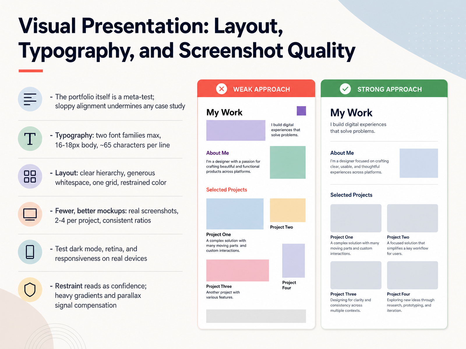
2 min - 10Visual Presentation: Layout, Typography, and Screenshot QualityNow let's talk about visual presentation, because your portfolio is a meta-test. That means the portfolio page itself is being judged. Sloppy alignment quietly undermines every case study, no matter how strong the project is. So keep typography simple. Use two font families at most, body text at sixteen to eighteen pixels, and around sixty-five characters per line so reading feels easy. For layout, build clear hierarchy, generous whitespace, one grid, and restrained color. Show fewer, better mockups. Use real screenshots, two to four per project, with consistent ratios. Then test dark mode, retina displays, and responsiveness on real devices, not just your laptop preview. Restraint reads as confidence. Heavy gradients and parallax often signal compensation. Next, we'll cover narrative, bio, and calls to action.
 1 min
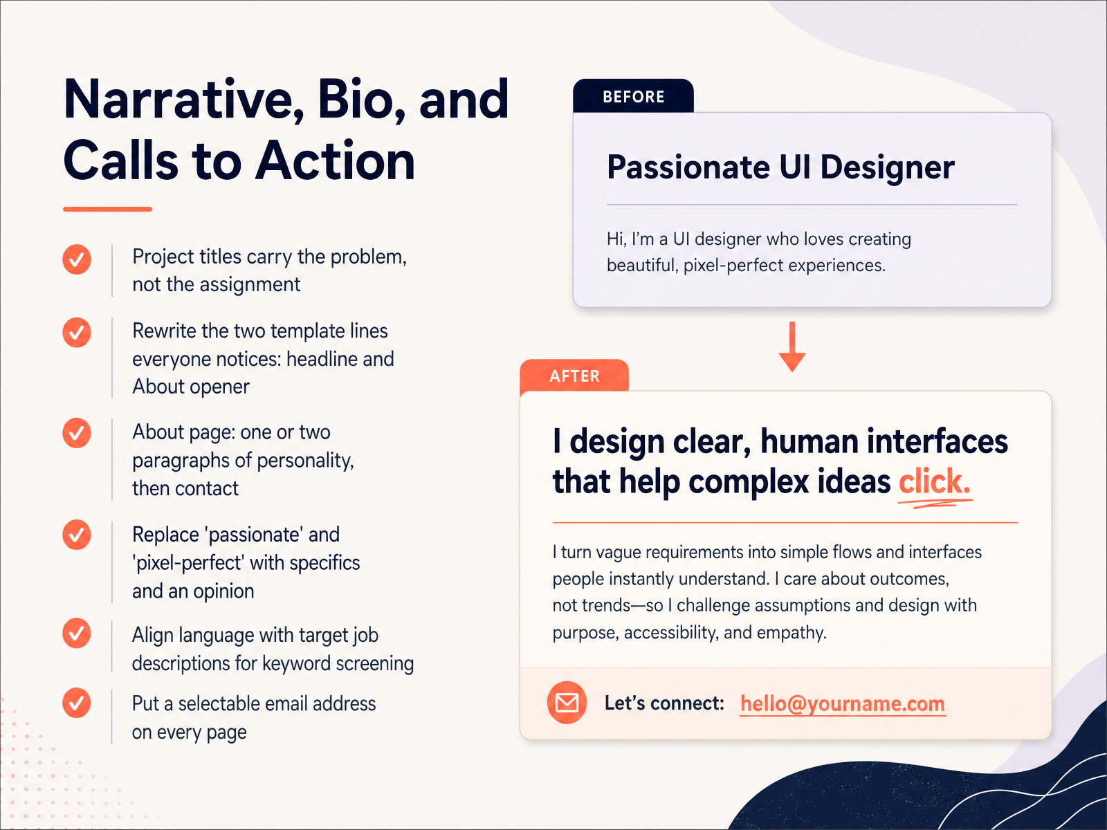
1 min - 11Narrative, Bio, and Calls to ActionNow let's talk about the words around your work: your narrative, your bio, and your calls to action. First, project titles should carry the problem, not the assignment. Instead of "UX Assignment Three," write "Reducing checkout drop-off for new users." Next, rewrite the two template lines everyone notices: your headline and your About opener. On your About page, keep it to one or two paragraphs with real personality, then give clear contact details. Replace vague words like "passionate" and "pixel-perfect" with specifics and an opinion. For example, say "I simplify complex forms" rather than "I am passionate about design." Also, align your language with target job descriptions so keyword screening works in your favor. Finally, put a selectable email address on every page. Start with these rewrites today, and your portfolio will sound like a person, not a template. Next, we will look at platform choice: personal sites, builders, and PDFs.
 2 min
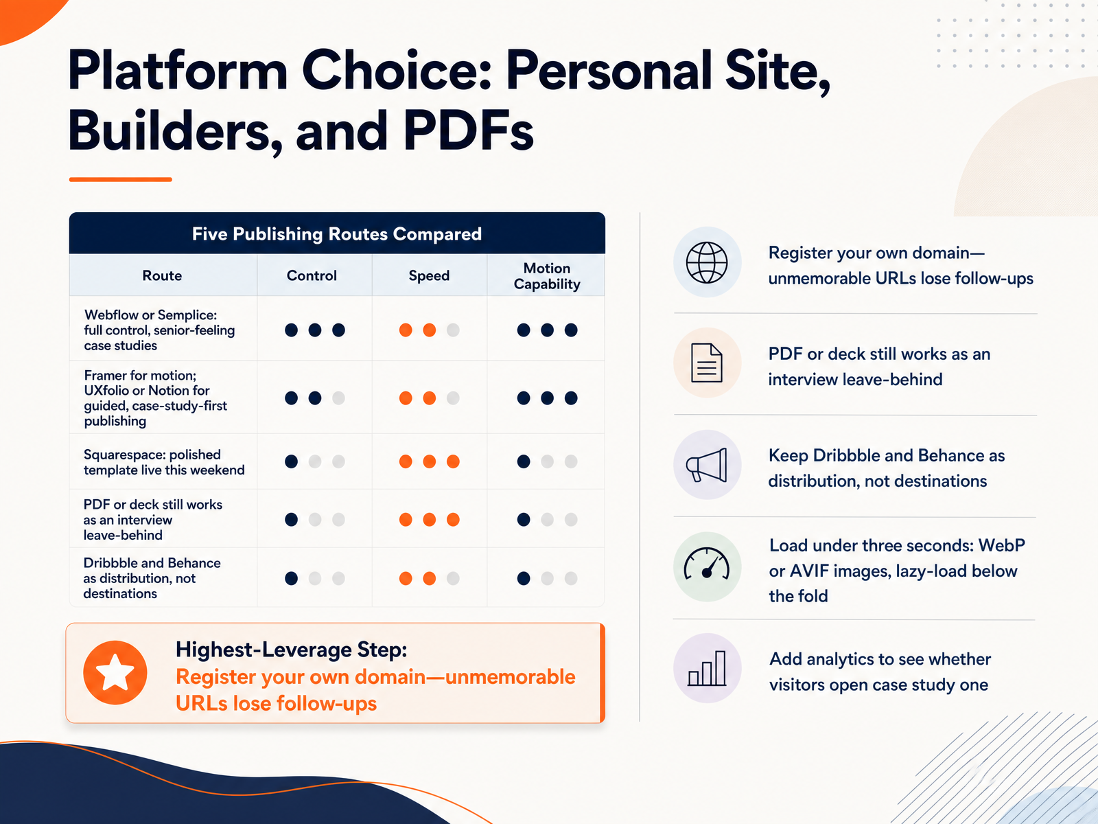
2 min - 12Platform Choice: Personal Site, Builders, and PDFsNext, let's talk about where your portfolio actually lives. Your platform choice matters, but it should not slow you down. Webflow or Semplice give you full control and senior-feeling case studies. Framer is great if motion is part of your story. UXfolio or Notion work well for guided, case-study-first publishing. And Squarespace can get a polished template live this weekend. Here is the first checkpoint. Register your own domain. A short, memorable address helps people follow up, while an unmemorable URL loses them. A PDF or deck still works as an interview leave-behind. Treat Dribbble and Behance as distribution, not destinations. They should point people back to your site. Also, keep load time under three seconds. Use WebP or AVIF images, and lazy-load anything below the fold. Finally, add analytics. That shows whether visitors actually open case study one. Your takeaway is simple. Pick the platform you can finish, make the domain clear, and track what people view. Now let's move on to Publishing, Feedback, and Iteration.
 2 min
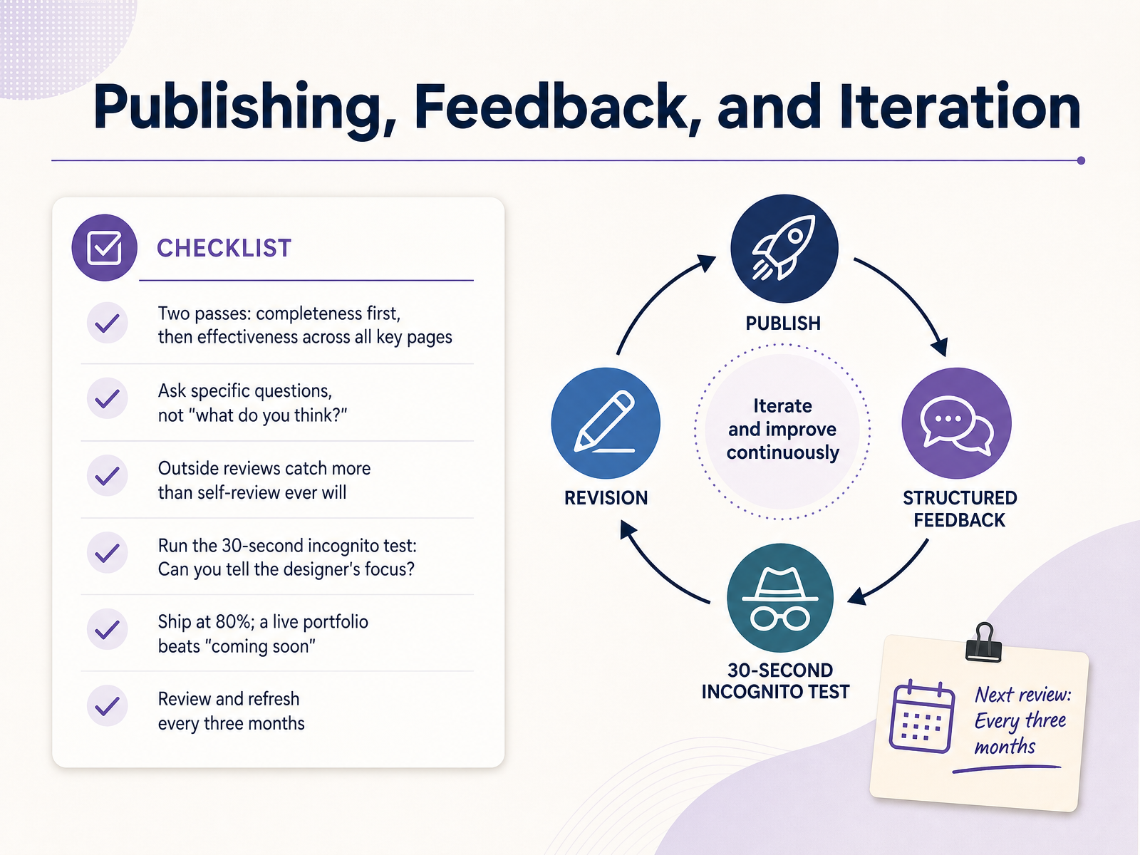
2 min - 13Publishing, Feedback, and IterationNow let's talk about publishing, feedback, and iteration. This is where your portfolio becomes real. First, plan two passes. Pass one is completeness: every case study has a problem, a process, and an outcome. Pass two is effectiveness: the pages are easy to scan and your decisions are clear. Second, ask specific questions. Instead of saying, what do you think, ask, can you tell what my role was in this project? Specific questions get useful answers. Third, get outside reviews. A mentor, a peer, or a hiring manager will catch issues you have gone blind to. Fourth, run the thirty-second incognito test. Show someone your homepage for thirty seconds. Can they tell what kind of designer you are and what you focus on? If not, your positioning needs work. Fifth, ship at eighty percent. A live portfolio beats a coming soon page every time. You can always improve it later. Sixth, review and refresh every three months. Your work grows, so your portfolio should too. Next, we will cover common pitfalls, how to stand out, and your four-week build plan.
 2 min
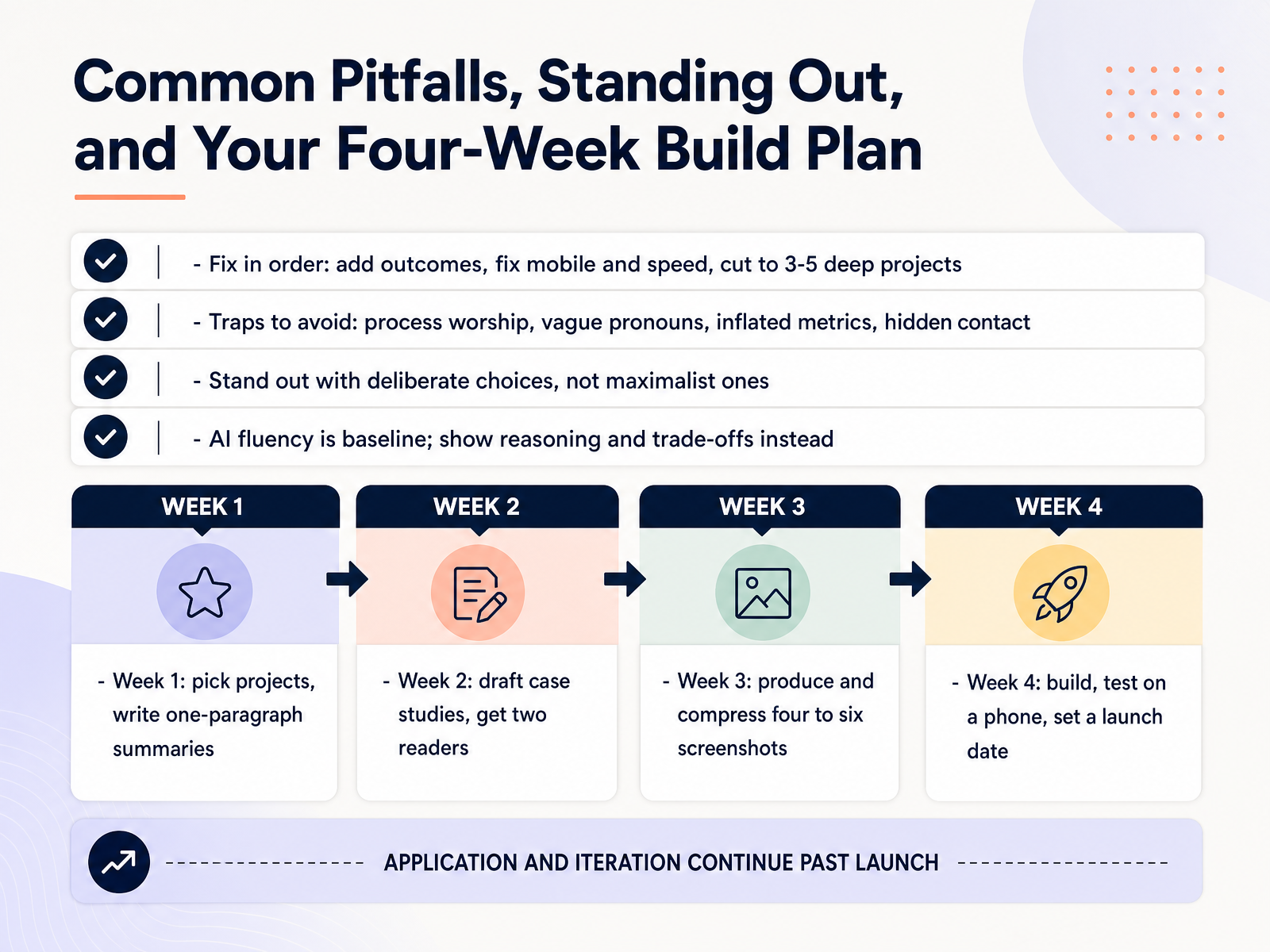
2 min - 14Common Pitfalls, Standing Out, and Your Four-Week Build PlanLet's finish with the fixes that matter most. If your portfolio needs repair, work in order. Add outcomes first. Then fix mobile layout and page speed. Then cut down to three to five deep projects. Depth beats volume. Next, avoid four common traps. Process worship, where you show every sketch. Vague pronouns, like saying we did this instead of what you did. Inflated metrics you cannot explain. And hidden contact information. To stand out, make deliberate choices, not maximalist ones. Also, AI fluency is now a baseline skill. So show your reasoning and trade-offs. Here is your four-week plan. Week one, pick your projects and write one-paragraph summaries. Week two, draft the case studies and get two readers. Week three, produce and compress four to six screenshots. Week four, build the site, test it on a phone, and set a launch date. You have everything you need. Start this week, keep it simple, and ship it. Thank you for learning with me.
 2 min
2 min
Take the deck with you
Download this course as a file — free, no sign-up needed.
- PDF handoutEvery slide page, ready to print or share.15 pages · 3.4 MBDownload
- Narrated PowerPointThe deck that presents itself — every slide carries the digital human's narration video.15 pages · 24.5 MBDownload
- PowerPoint slidesThe full deck as a .pptx — open it in PowerPoint, Keynote, or Google Slides.15 pages · 3.2 MBDownload
Free to use in your own training — please keep the PersonWise credit page at the end.
Have your own deck? Turn it into a course