Begin
13 pages · ~26 min
UI Design Framework Application
Learn to design consistent, scalable user interfaces using a component-based framework. Ideal for aspiring UI designers seeking practical skills in building reusable design systems.
A digital instructor presents all 13 pages. Hold “Ask” at any point and ask out loud — the answer comes from this course. No sign-up needed.
What you’ll learn
- 01UI Design Framework: Components and ApplicationWelcome, everyone. Today we're going to talk about UI design frameworks, what they really are, and how they work in practice. This isn't just a folder full of components. It's a governed rulebook that keeps product, design, and engineering on the same page. We'll clarify the difference between a UI kit, a design system, and a full framework. A UI kit is a box of parts, buttons and inputs. A design system adds the catalog and the assembly instructions. A framework goes further, adding principles, processes, and core rules so the whole product behaves consistently. This is for product designers, UI designers, and front-end teams who want to stop re-deciding the same details and start building with shared standards. By the end, you'll know how to apply this thinking to your own work. Next, let's look at why a systematic approach pays off.figr.designcomponents.buildsuperdesign.dev+21 min
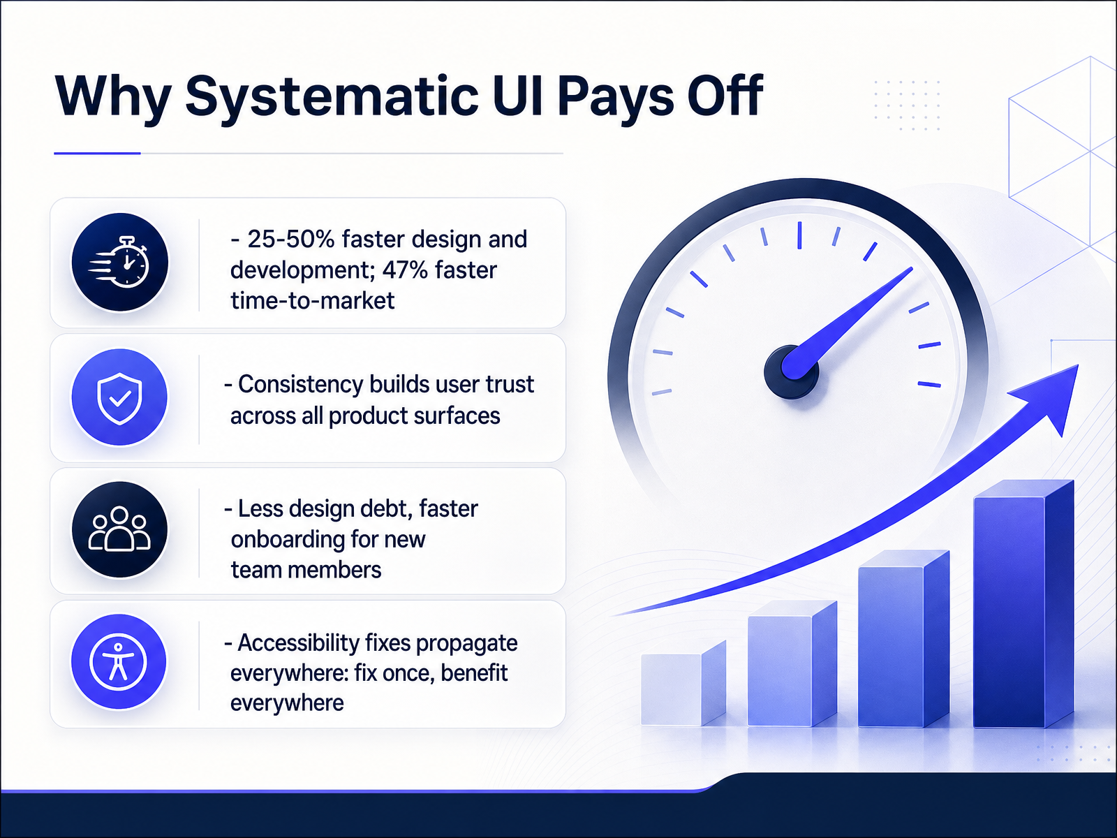
- 02Why Systematic UI Pays OffLet's talk about why a systematic approach to UI pays off. This isn't theoretical—these are measurable outcomes teams see in production. Mature design systems cut design and development time by 25 to 50 percent, and companies report shipping new features 47 percent faster. That means features get to users sooner, and your team spends less time rebuilding the same button for the third time. Consistency is the second win. When every screen follows the same patterns, users build trust—they know exactly what to expect, whether they're in onboarding or a deep admin panel. Third, you reduce design debt. New team members onboard in days instead of weeks because the patterns are documented and standard. And here's the multiplier: accessibility fixes propagate everywhere. You fix a contrast issue in the component once, and every application using it gets the fix automatically. That's the compounding return. Your team stops fixing the past and starts building the future. Now, let's break down what actually makes a component work—the anatomy of a UI component.
 easy.bijustin-dickinson.commindera.com+22 min
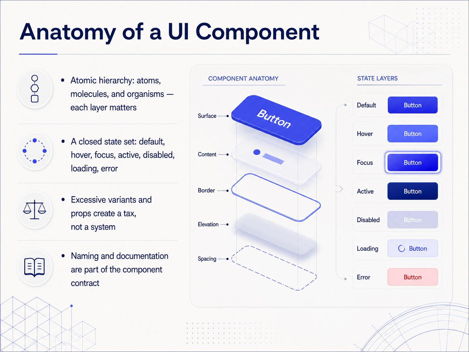
 - 03Anatomy of a UI ComponentLet’s break a component down to its skeleton. The atomic hierarchy gives us clean layers: atoms are the smallest elements, like a button or an input; molecules combine them into something functional, like a search bar; organisms assemble those into full sections, like a header. Each layer earns its place. Now, states. Every interactive component follows one closed set: default, hover, focus, active, disabled, loading, and error. That’s it. If you feel the need to add a new state, stop and rethink the control instead. Excessive variants and props don’t build a system—they create a tax on everyone who has to maintain it. And finally, naming and documentation are part of the component contract, not an afterthought. Write down what it is, when to use it, and how it behaves. That clarity is what your future self and your team will thank you for. Up next, we’ll get into the core components every team needs.
 dev.atomm.comatomiccomponents.commintlify.wiki+21 min
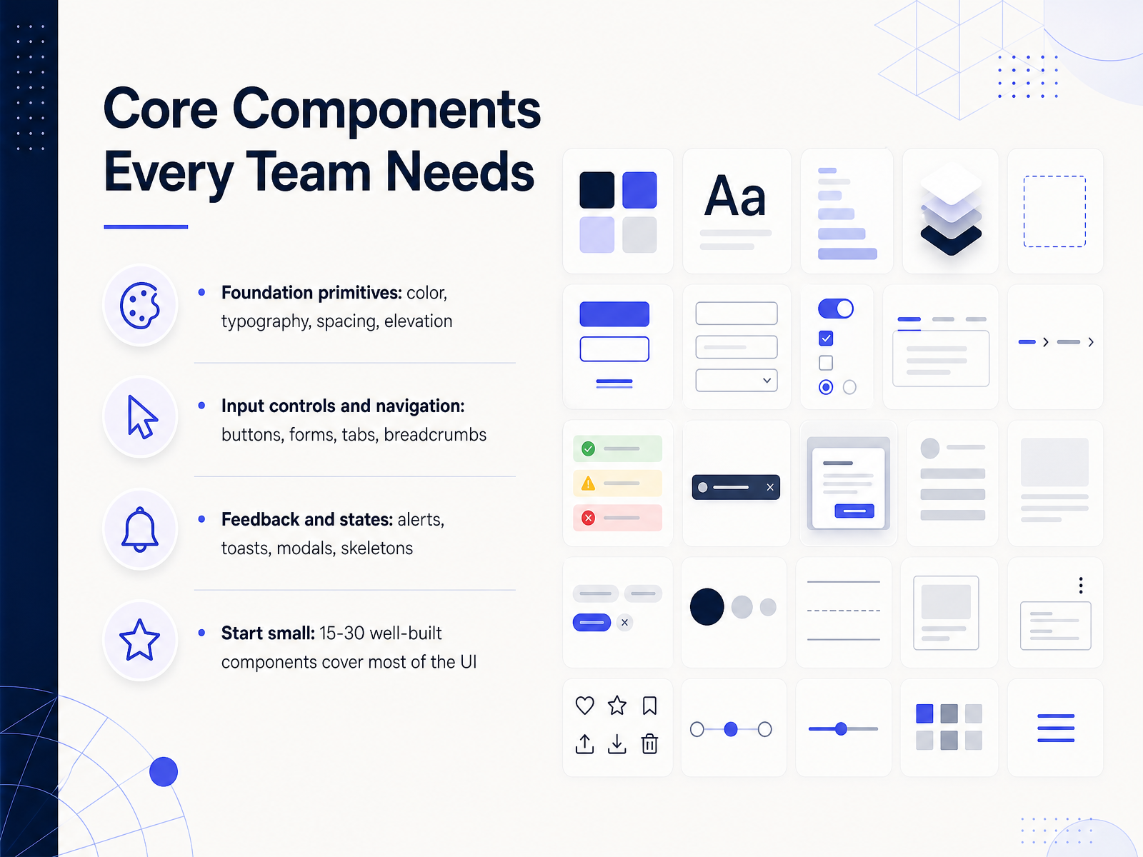
 - 04Core Components Every Team NeedsNow let's talk about the core components every team needs. Think of these as your starting lineup. First, you have foundation primitives: color, typography, spacing, and elevation. These are the building blocks that keep every screen visually consistent. Next are input controls and navigation: buttons, forms, tabs, breadcrumbs. These are what users interact with every day, so they need to feel intuitive and predictable. Then you have feedback and states: alerts, toasts, modals, and skeletons. These tell users what's happening, whether an action succeeded, or if content is still loading. A good rule of thumb is to start small. Just fifteen to thirty well-built components can cover most of your UI. Quality matters more than quantity. Focus on the ones you use most, and expand later. This keeps your system lean and manageable. Now let's look at design tokens, the shared source of truth that keeps all these components consistent.
 uxpin.commosqueras.comui.shadcn.com+21 min
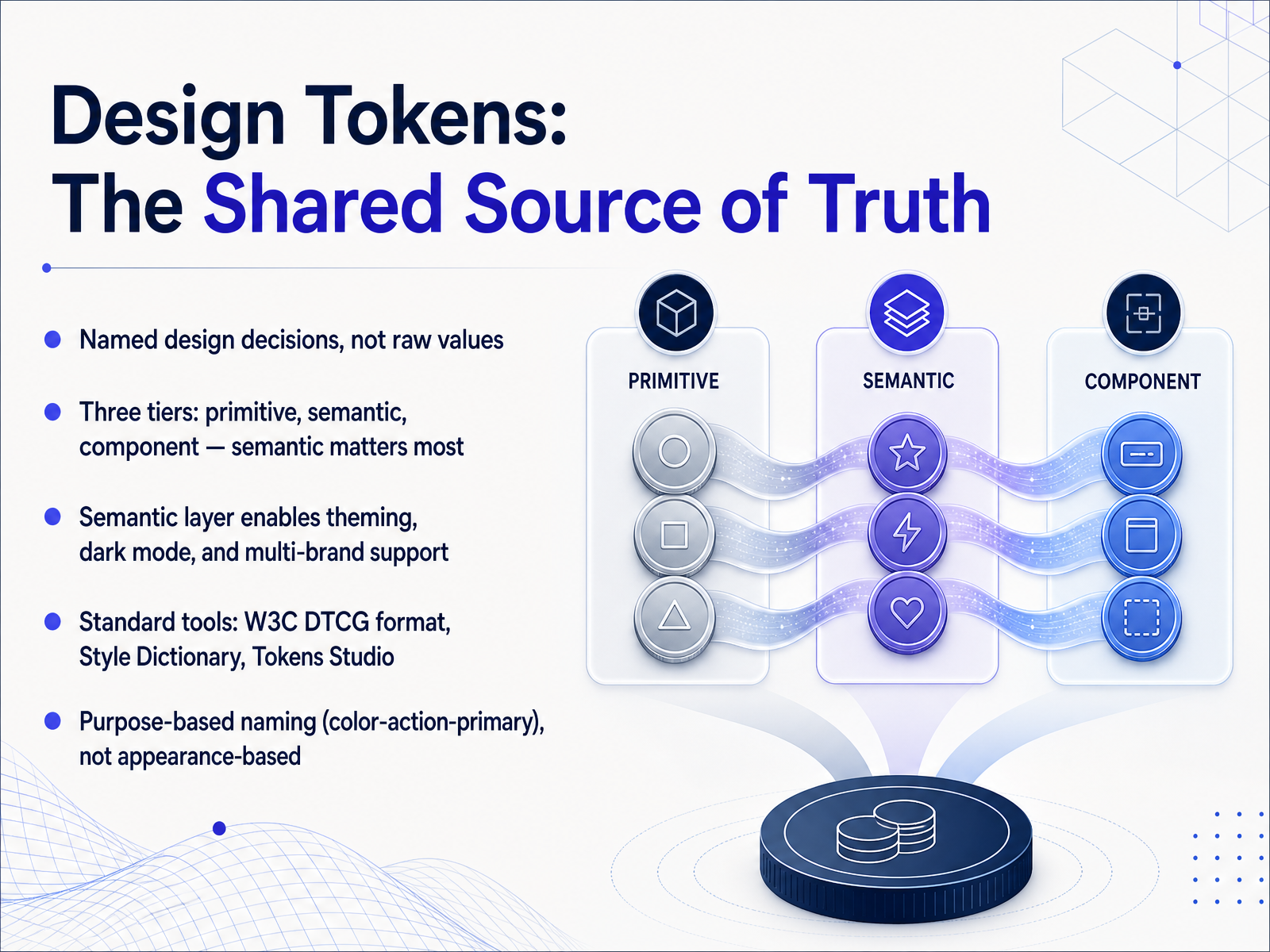
 - 05Design Tokens: The Shared Source of TruthNow let's talk about design tokens, because this is where a shared system really comes to life. Tokens are named decisions, not raw values. Think of them as the vocabulary your whole team uses to talk about design. There are three tiers: primitives, semantic, and component. Primitives hold the raw values, like a specific blue. Semantic tokens carry meaning, like the color for a primary action. Component tokens scope those decisions to specific UI parts. The semantic layer is the one that matters most. It's what makes theming, dark mode, and multi-brand support possible. When you get it right, switching themes is just swapping token values, not rewriting components. For tools, the W3C format, Style Dictionary, and Tokens Studio are the standard set. They keep Figma and code in sync, so you maintain one source of truth. And one critical habit: name tokens by purpose, not appearance. Call it color-action-primary, not blue-500. That way, when the brand changes, the name still makes sense. The value changes, the role doesn't. Next, we'll see how to apply this framework in real workflows.
 1 min
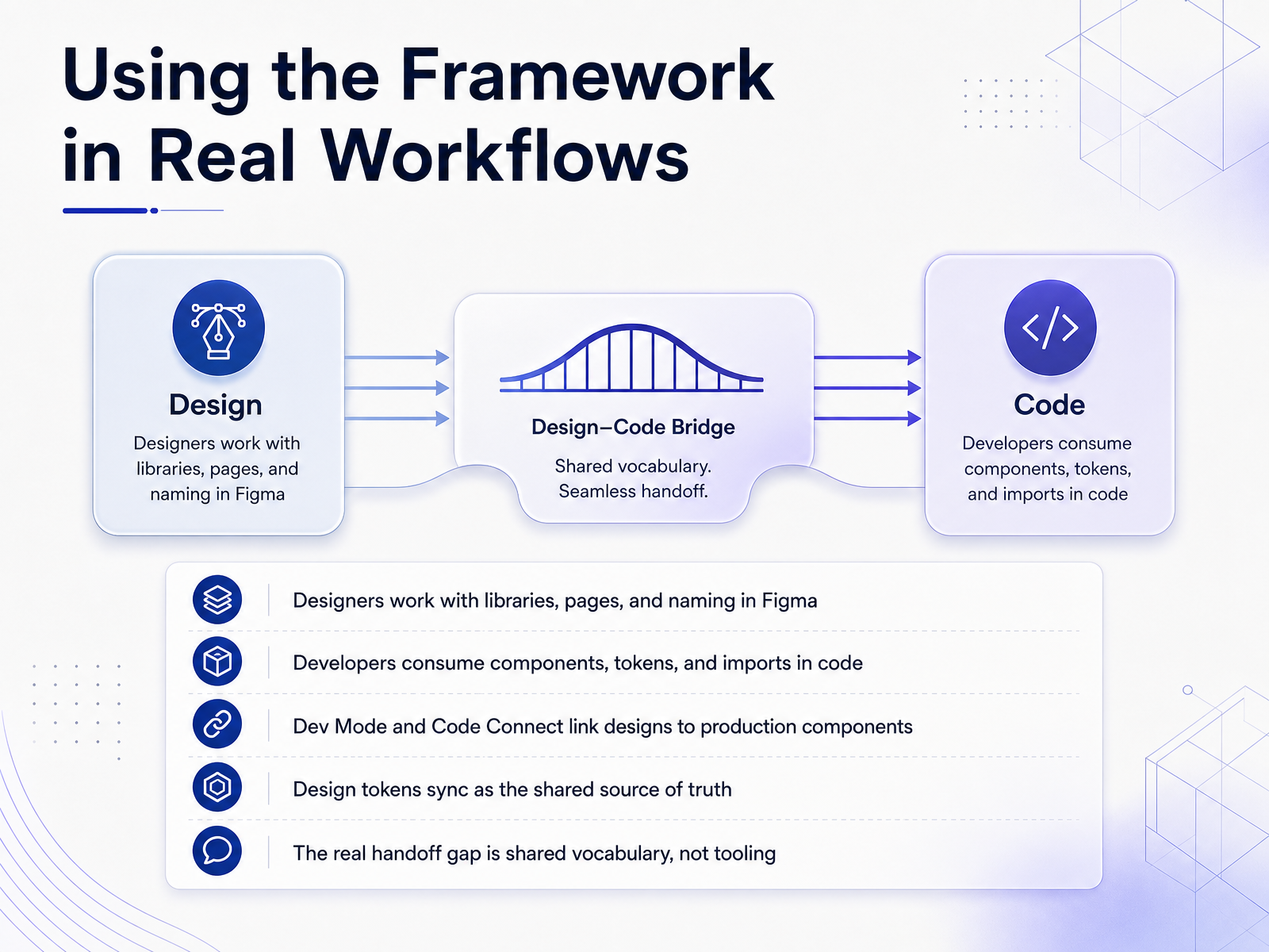
1 min - 06Using the Framework in Real WorkflowsNow let's talk about what this looks like in a real workflow. Designers work inside Figma with libraries, pages, and a clear naming system. Developers consume the same system through components, tokens, and imports in code. Dev Mode and Code Connect are what link the two sides together, so when a designer updates a component, the developer sees that change in the exact file they're already working from. Design tokens act as the shared source of truth. A color or spacing value defined once in Figma maps directly to a CSS variable or a theme object in code, with no manual transcription. But here's the part that matters most: the real handoff gap was never about tooling. It's about shared vocabulary. If the designer calls it a primary action button and the engineer calls it a CTA, you have a friction point that compounds across hundreds of decisions. So invest in the tools, but invest in the relationship first. Agree on naming together, document the intent behind the values, and bring developers into the conversation early. That's what turns a component library into a system both sides actually trust. Next, let's look at accessibility and responsiveness in components.
 1 min
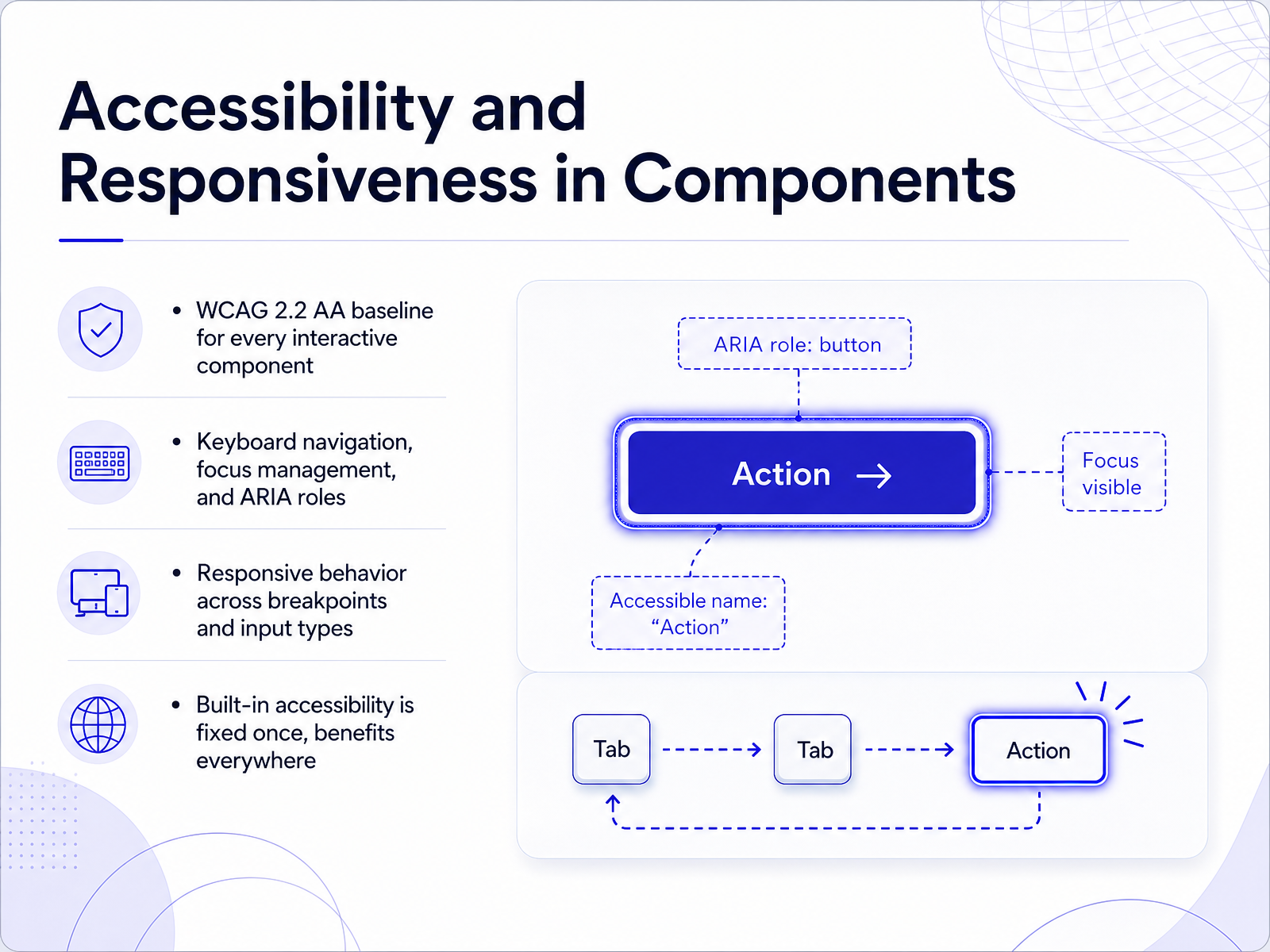
1 min - 07Accessibility and Responsiveness in ComponentsSo now let’s talk about accessibility and responsiveness, because these aren’t afterthoughts—they’re built into every component we ship. Start with the baseline: every interactive component must meet WCAG 2.2 Level AA. That means keyboard navigation, visible focus, and proper ARIA roles are non-negotiable. For example, a modal traps focus and returns it when closed. A tab set uses arrow keys and roving tabindex. These patterns are tested, not guessed. Next, think about responsive behavior. Components need to adapt across breakpoints and input types—mouse, touch, keyboard, voice. A nav that works with a mouse should also work with a tap or a Tab press. The good news: when you build accessibility in once, you benefit everywhere. The same focus management that helps keyboard users also helps voice control users. The same contrast that meets AA also survives a bright office. So treat accessibility as a spec, not a feature. Now let’s look at how to evaluate and choose a framework that supports these patterns.
 1 min
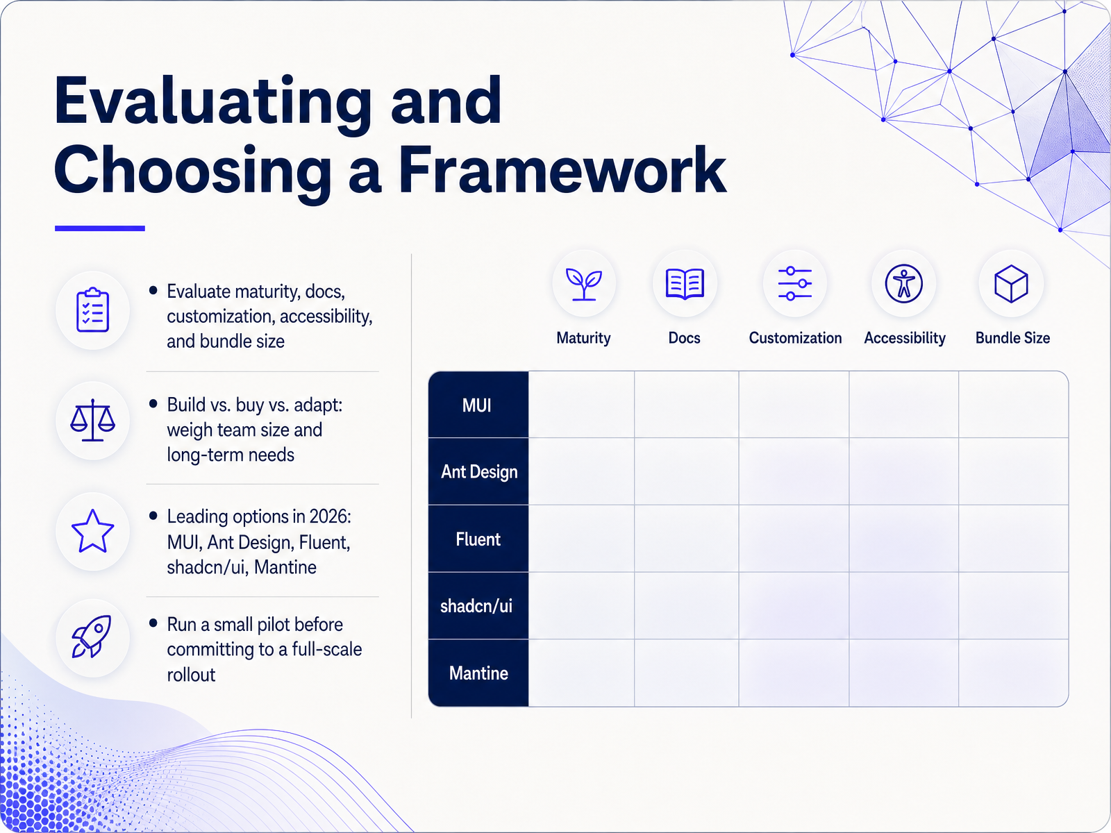
1 min - 08Evaluating and Choosing a FrameworkNow let’s talk about how to actually choose a framework. Start by evaluating maturity, documentation, customization options, accessibility, and bundle size. A mature framework with solid docs will save your team hours. Next, think build versus buy versus adapt. If your team is small and deadlines are tight, buying a full library like Material UI or Ant Design makes sense. If you need deep brand customization, consider adapting a headless solution like Radix or shadcn/ui, where you own the code. In 2026, the leading options are Material UI, Ant Design, Fluent, shadcn/ui, and Mantine. Material UI is the safe enterprise pick with the largest ecosystem, Ant Design excels at data-heavy admin panels, Fluent is great for Microsoft-centric products, shadcn/ui gives you full control with a tiny bundle, and Mantine offers modern architecture with excellent server component support. Finally, run a small pilot before you commit. Build a real feature with two candidates, measure bundle size, check customization effort, and see how your team feels. That hands-on test will tell you more than any comparison chart. Next, let’s look at common pitfalls and how to avoid them.
 2 min
2 min - 09Common Pitfalls and How to Avoid ThemLet’s talk about the traps that quietly undermine a design system, because they’re rarely the flashy failures. The first one is over-engineering. If a button has twelve variants, that’s not flexibility, that’s complexity. You haven’t built a system, you’ve built a catalog. Keep the API narrow. If a component needs more than five or six props, break it down. Next, no named owner. The system drifts when nobody is accountable for keeping it current. Assign one person, or a small team, with the explicit job of maintaining it. Then there’s design-code mismatch. When tokens in Figma don’t match the codebase, you get silent drift. The same name, the same value, one source of truth, or the system decays. Governance should feel lightweight, not like a bureaucratic gate. Make the intake process simple, fast, and lower friction than building locally. And finally, treat local workarounds as feedback, not discipline failures. Someone built their own button because yours didn’t fit. That’s a bug report, not a betrayal. Ask what gap they were solving. So remember, fewer components, a named owner, one source of truth, lightweight governance, and a feedback loop that feeds the roadmap. Now, let’s look at how adoption and governance keep this all running.
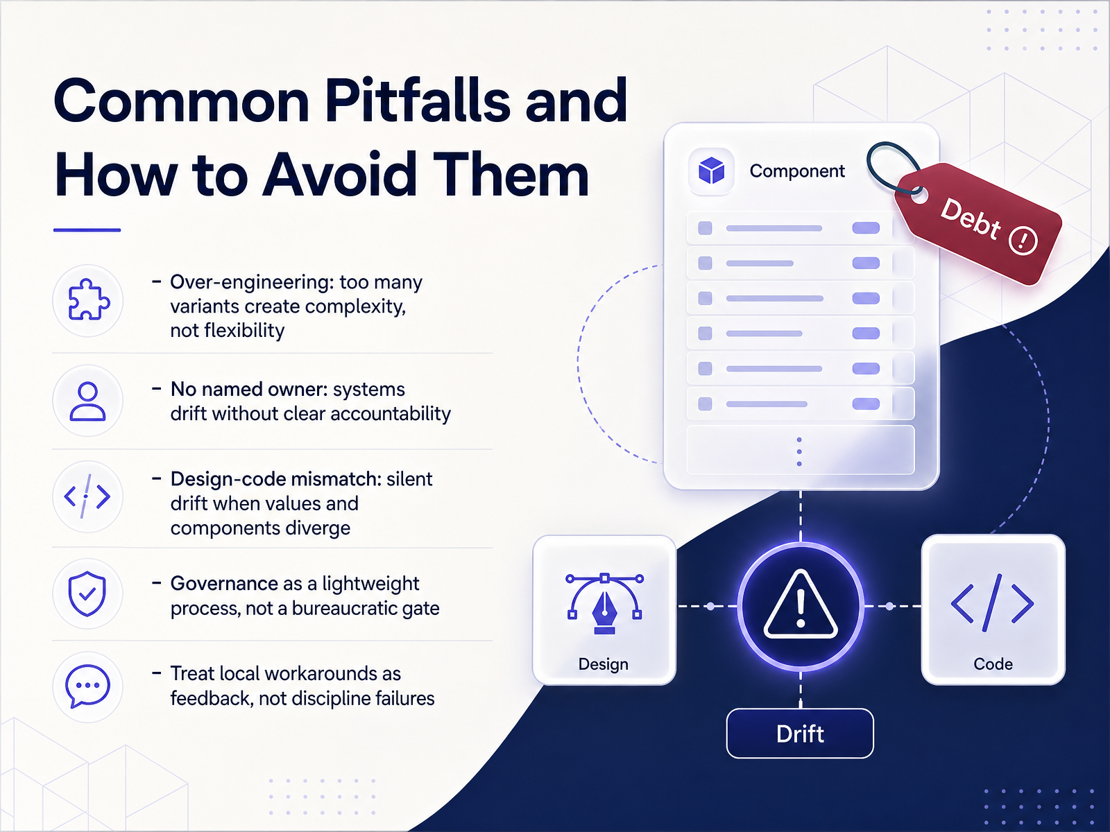 2 min
2 min - 10Adoption and GovernanceAdoption is the only metric that matters at the program level. A beautiful system with twelve percent adoption has failed. An imperfect one with ninety percent adoption is succeeding. So, let's talk about governance as the engine that drives that adoption. First, you need a clear contribution path. Propose, review, and approve. A simple three-step process that invites feedback without creating a bottleneck. Every change request goes through that pipeline. Next, treat versioning, deprecation, and communication as your foundations. Semver for tracking, a clear migration window for deprecated components, and a changelog that announces updates. Predictability builds trust. And most importantly, treat this system like a product, not a one-time deliverable. It has users, a roadmap, and it needs a dedicated owner who can make decisions. Adoption doesn't happen by accident. It happens when governance makes the system the path of least resistance. Now, let's look at how we measure what actually matters.
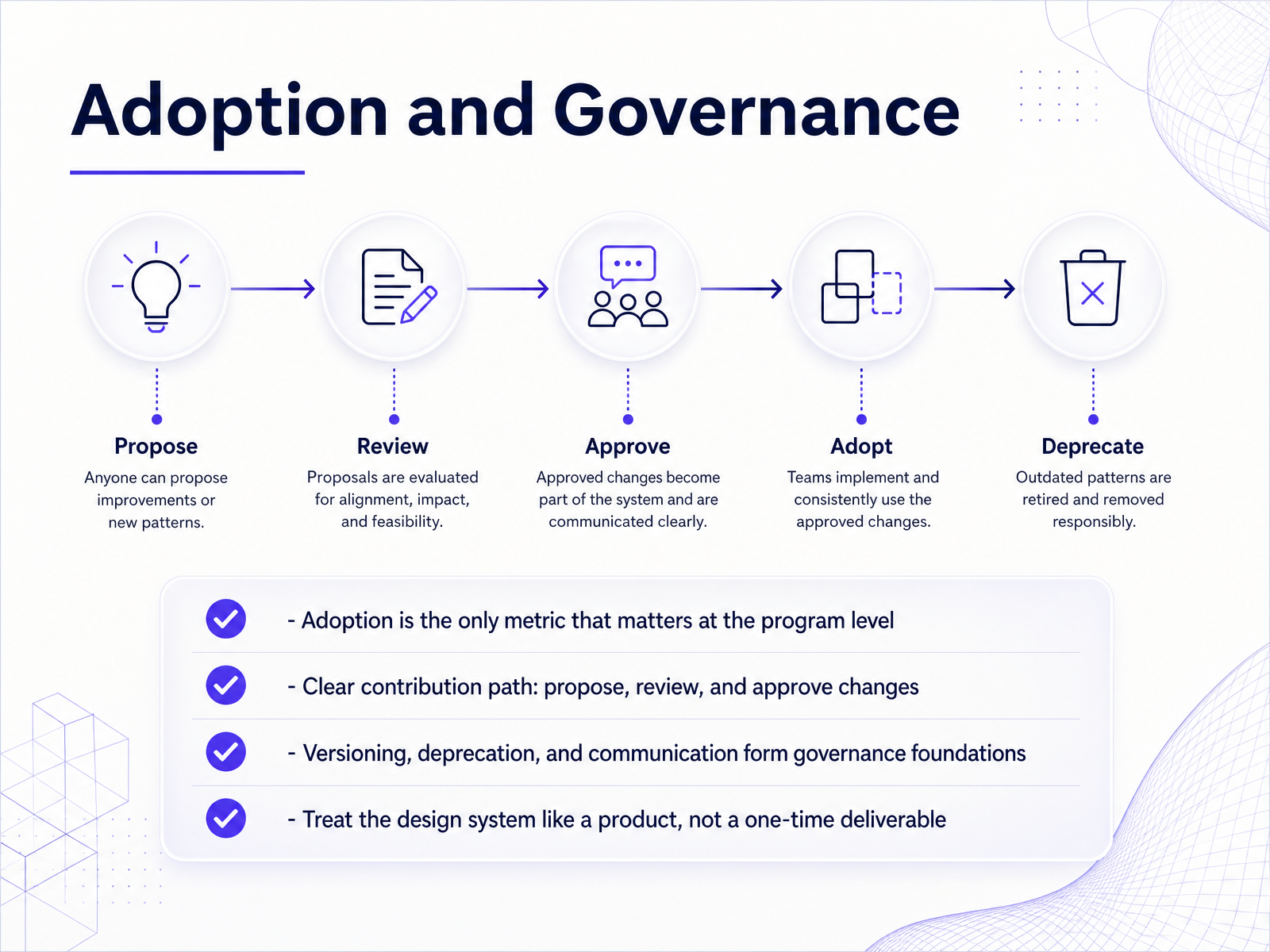 1 min
1 min - 11Measuring What MattersNow let’s talk about measuring what matters. This is where we close the loop. You can track usage, coverage, and detachment rates directly in Figma. Usage is how often a component shows up. Coverage is how much of your product is actually built with system components. Detachment tells you where people are breaking the connection. Treat it like a signal, not a failure. If a component keeps getting detached, it probably doesn’t fit the real use case. Fix the component, not the team. Also watch custom-component drift. That’s the count of bespoke parts that match what a system primitive should do. It’s a triage list for your next update. Now, remember the difference between leading and lagging indicators. Component usage is leading. It shows you are on track early. A reduction in design QA reviews is lagging. It appears weeks later. Both matter, but you act on the leading ones. Tie it all to business impact: time-to-market, onboarding speed, and defect counts. Then run regular audits, close the feedback loop, and adjust. That’s how you prove the system works, and it sets up what we’ll cover next: planning your first framework.
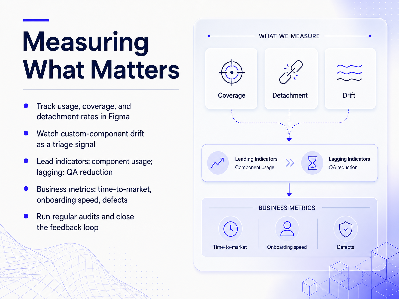 2 min
2 min - 12Planning Your First FrameworkNow let's talk about turning all of this into a practical plan. Don't boil the ocean. Start with an honest audit of your current UI. Find duplicate components and recurring pain points. That inventory is your evidence and your priority list. Next, scope a lean MVP. Tokens come first—they're the foundation everything depends on. Then pick five to ten high-frequency components, like buttons, inputs, and navigation. Resist the urge to build one hundred components up front. It's how you end up with one hundred inconsistent ones. Then run a pilot. Choose a small, representative project. Not the riskiest one, and not a trivial one. This is your proof of concept. It shows real value fast. Finally, build feedback loops into the process. Use a dedicated channel for questions, and log requests. Bi-weekly retros keep blockers visible. That continuous iteration is what turns a good system into an adopted one. Remember: audit, scope, pilot, improve. That's the sequence. Next, we'll lay out your action plan and next steps.
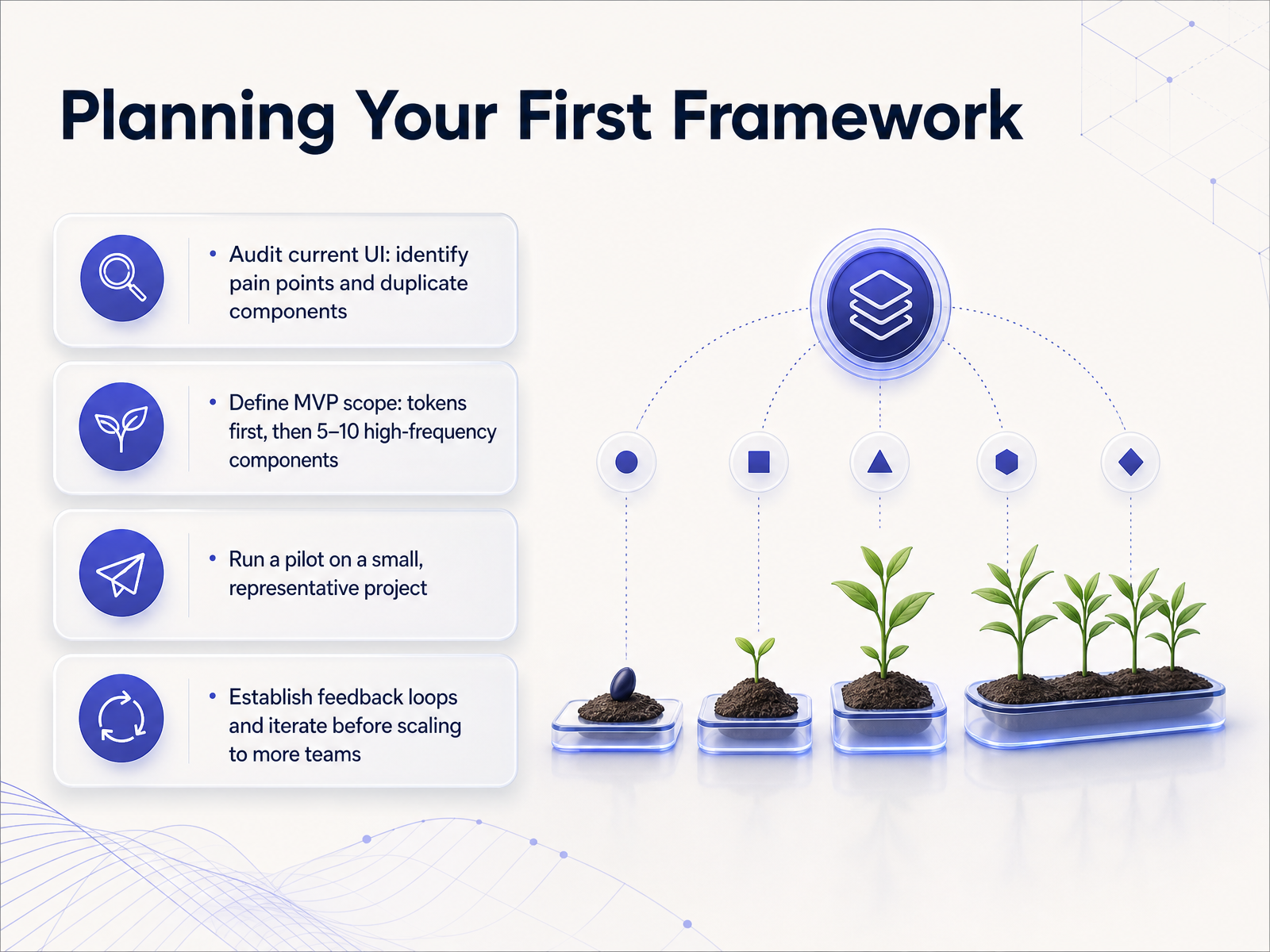 2 min
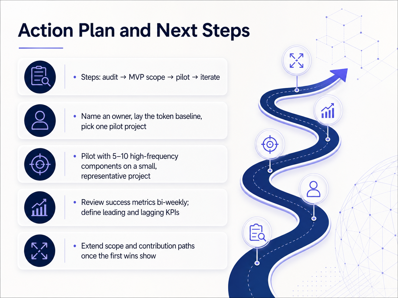
2 min - 13Action Plan and Next StepsSo here is the plan. Start by auditing what you already have. Look at your current components and identify the gaps. Then, scope a minimal viable product. Pick one pilot project, something small but representative, and name an owner. Lay the token baseline first. Then choose five to ten high-frequency components, buttons, inputs, navigation, and roll them into that pilot. Keep it focused. Review progress every two weeks. Track leading indicators like component usage in Figma and lagging ones like reduced design-to-dev handoff time. Define those KPIs upfront. Once you see the first wins, extend the scope and open contribution paths. The goal is not perfection today. It is steady, measurable progress. Start small, show value, then scale. Thanks for your time today. Go run that audit and make the first move.
 dev.atomm.comatomiccomponents.commintlify.wiki+21 min
Take the deck with you
Download this course as a file — free, no sign-up needed.
- PDF handoutEvery slide page, ready to print or share.14 pages · 2.9 MBDownload
- Narrated PowerPointThe deck that presents itself — every slide carries the digital human's narration video.14 pages · 12.4 MBDownload
- PowerPoint slidesThe full deck as a .pptx — open it in PowerPoint, Keynote, or Google Slides.14 pages · 2.8 MBDownload
Free to use in your own training — please keep the PersonWise credit page at the end.
Have your own deck? Turn it into a course
Sources consulted
Web sources consulted while building this course.
- A Guide to the User Interface Design Framework — figr.design
- Definitions — components.build
- What Is a Design System? Parts, Examples, and How to Build One (2026) | Superdesign — superdesign.dev
- skills/building-components/references/definitions.mdx at main · vercel/components.build — github.com
- What Is a UI Kit? Examples and UI Kit vs Design System (2026 edition) — Glow UI Blog — glowui.com
- Design Systems for Enterprise: Siemens Case Study | easy.bi — easy.bi
- Building a Robust Design System at TPT – Justin Dickinson — justin-dickinson.com
- Mindera - Minder helps FanDuel accelerate product design — mindera.com
- Uniphore’s DesignOps Journey to Streamlined Enterprise UX — neuronux.com
- Building an Enterprise Design System with 50+ Components | Sadam Hussain — sadamkhan.spiralsync.com
- Components · Atomm Docs — dev.atomm.com
- Atomic Design Guide - Methodology, Benefits & Examples | Atomic UI Components — atomiccomponents.com
- https://mintlify.wiki/svelte-atoms/core/guides/customization — mintlify.wiki
- How to Structure Your Figma Files Like a Design System ... — medium.com
- https://docs.digit.org/platform/guides/developer-guide/ui-developer-guide/digit-ui-components0.2.0/atom/checkbox-10 — docs.digit.org
- 10 Essential Design System Components Every Team ... — uxpin.com
- Ui Components Guide – Mosquera — mosqueras.com
- Building Blocks for the Web - shadcn/ui — ui.shadcn.com
- https://www.shadcn.io/components.mdx — shadcn.io
- Components — ui.vllnt.com