SaaS UX Design Clarity
Begin
14 pages · ~28 min
SaaS UX Design Clarity
Learn UX clarity principles for SaaS interfaces, including intuitive navigation, concise copy, and visual hierarchy to boost user comprehension and product usability.
What you’ll learn
- 01Clarity in SaaS UX DesignWelcome. If you design, write, or build SaaS products, you already know the stakes. Users decide within seconds whether your interface is worth their time. Clarity is what makes that decision easy. It is not minimalism or empty space. It is deliberate hierarchy. Every element earns its position. Users should instantly know where they are, what matters most, and what to do next. But clarity is often confused with usability. A usability problem is when users understand the promise but struggle to complete a task. A clarity problem is when they never form a confident mental model in the first place. They hesitate. They guess. That confusion drives real business outcomes. Faster onboarding, lower churn, and reduced support costs all trace back to how clearly your product speaks. Today, we will cover practical methods for diagnosing and fixing clarity issues. You will leave with a framework you can apply immediately. Let’s begin by exploring the business cost of confusion.theskinsfactory.comuiwithmuneeb.comtonyvle.com+21 min
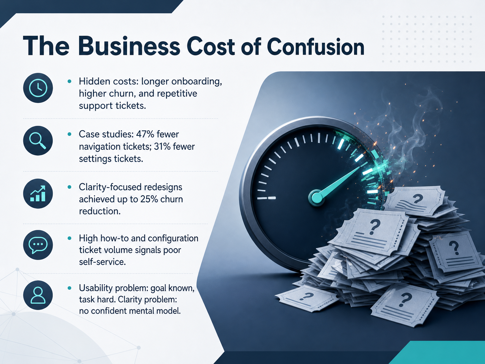
- 02The Business Cost of ConfusionLet’s talk about what confusion actually costs your business. When users can’t find their way, the impact shows up in three places: longer onboarding, higher churn, and a steady stream of repetitive support tickets. These aren’t abstract concerns. In a recent redesign, navigation-related tickets dropped by 47 percent. Another team cut settings-related tickets by 31 percent just by making configuration flows clearer. Clarity-focused redesigns have also achieved churn reductions up to 25 percent. So when you see high volumes of how-to and configuration tickets, that’s a signal your product isn’t supporting self-service. Users aren’t lazy; they’re stuck. The distinction matters: a usability problem means the user knows their goal but finds the task hard. A clarity problem means the user never forms a confident mental model in the first place. They hesitate, they guess, they leave. Not because the UI is hard to operate, but because the product isn’t making a clear argument. Keep that distinction in mind as we shift to what clarity actually looks like in practice.
 gainhq.comsetting.pageinnovationlabs.studio+21 min
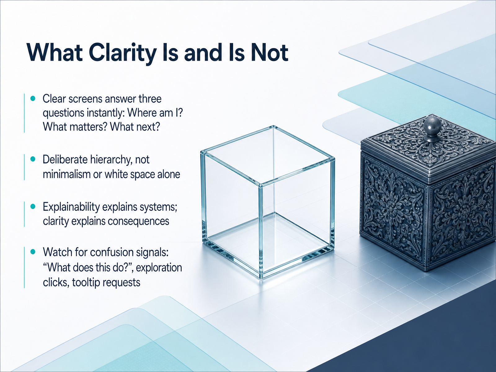
 - 03What Clarity Is and Is NotLet’s pin down what clarity actually is. A clear screen answers three questions instantly: Where am I? What matters most? And what do I do next? If users can’t answer those without pausing, that screen isn’t clear yet. Note that clarity is not minimalism, and it’s not white space for its own sake. White space isn’t a strategy. A sparse screen with accidental hierarchy still reads as noise. Clarity is a ranking problem, not a subtraction problem. It’s deliberately deciding what gets seen first, what can wait, and what stays hidden until asked for. And there’s another distinction worth making: explainability explains systems, but clarity explains consequences. Users don’t need to know how your engine calculates a recommendation. They need to know what that recommendation means for their next step. So watch for the signals that tell you clarity is missing: users asking “what does this do?” after seeing the screen, clicking around as if exploring instead of progressing, or constantly requesting tooltips for basic concepts. Those aren’t UX friction problems. Those are comprehension problems. Clear the meaning first, then refine the interface. Up next, we’ll look at visual hierarchy as the practical engine that drives all of this clarity into action.
 theskinsfactory.comuiwithmuneeb.comtonyvle.com+22 min
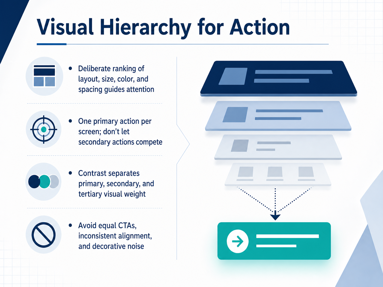
 - 04Visual Hierarchy for ActionLet’s talk about how visual hierarchy guides action. In a SaaS interface, every element competes for attention, but clarity means deciding what wins. Start with one primary action per screen. If two buttons carry equal weight, users hesitate, and hesitation erodes confidence. Use layout, size, and color deliberately. Contrast is your tool for separating primary weight from secondary, and tertiary. A bold solid button for the main step, a quiet text link for the alternative, and muted styling for anything that can wait. Avoid equal weight call-to-actions and inconsistent alignment. And watch for decorative noise. If an element doesn’t help users answer where they are or what to do next, it costs them focus. When hierarchy is deliberate, even a data-heavy screen feels manageable. Before you move on, ask yourself: does this screen have one obvious next step?
 theskinsfactory.comuiwithmuneeb.comtonyvle.com+21 min
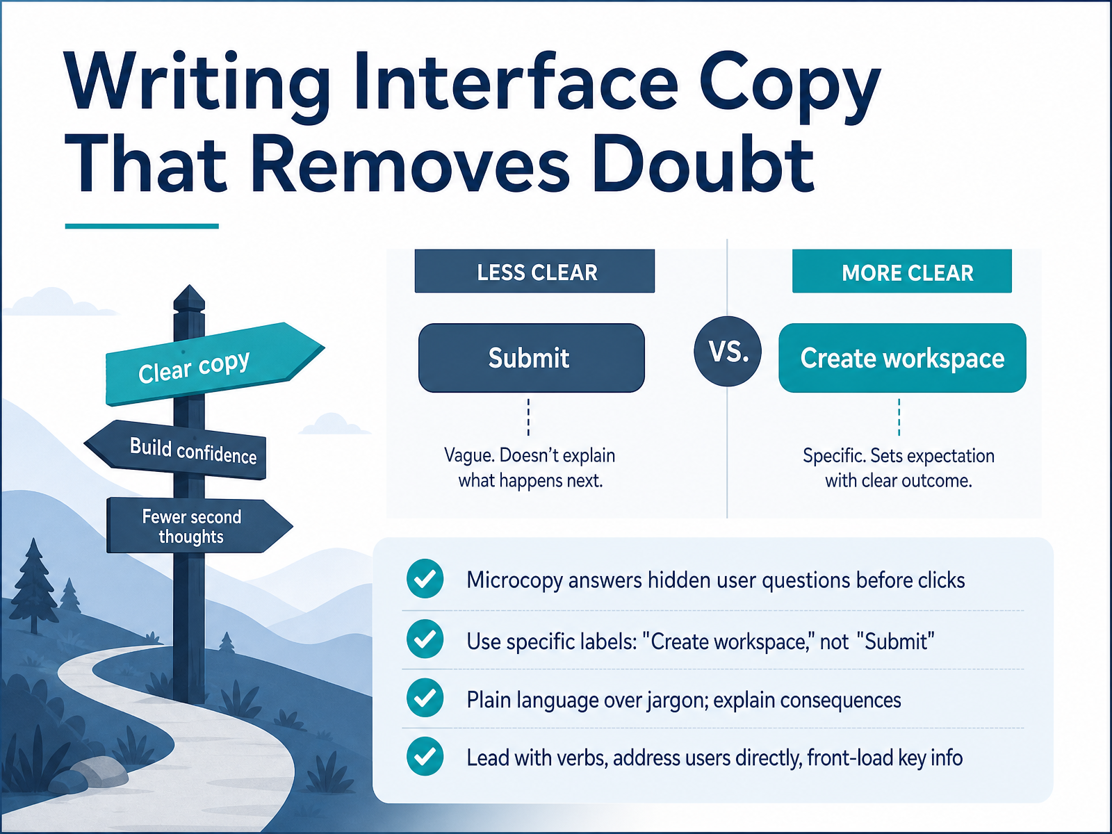
 - 05Writing Interface Copy That Removes DoubtNow let’s talk about the words themselves. Interface copy is where user doubt either gets resolved or gets amplified. Think of microcopy as answering the hidden question a user is asking right before they click. The most common hidden question is, what happens next? If your label doesn’t answer that, they hesitate. So be specific. A button that creates a workspace should say Create workspace, not Submit. Submit tells them they’re sending data somewhere. It doesn’t tell them what they’re getting back. Use plain language over jargon, and when an action has consequences, say so out loud. A label like Delete this project, this cannot be undone is far more honest than a vague warning. Lead with verbs. Address the user directly. Front-load the critical information so it’s the first thing they read, especially when they’re scanning under stress. Clear copy is a design decision, not a punctuation exercise. And that clarity sets us up perfectly for the next topic: microcopy that prevents mistakes, explains consequences, and helps users recover from errors.
 userpilot.comorbix.studioproductwithmustache.com+22 min
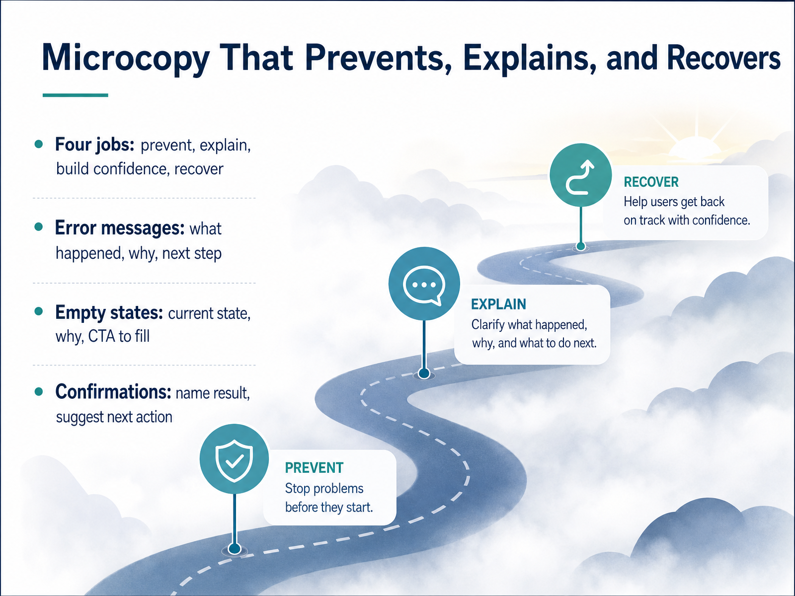
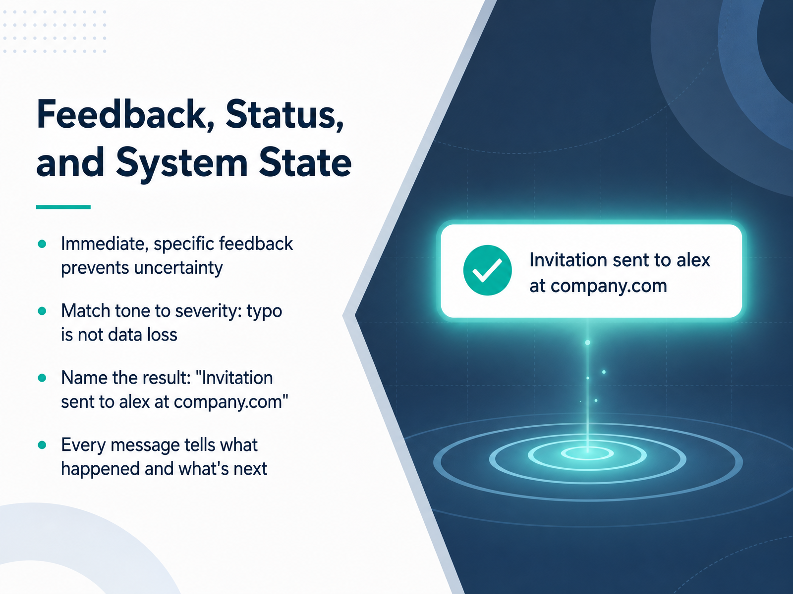
 - 06Microcopy That Prevents, Explains, and RecoversLet’s talk about microcopy that prevents, explains, and recovers. In your interface, every message should do at least one of four jobs: prevent a mistake, explain a consequence, build confidence, or help someone recover. Take error messages. A good one covers what happened, why, and the next step. Not a paragraph of caveats — just the fix. So instead of “Invalid input,” say “Your card was declined. Try another card or contact your bank.” That’s clear, and it keeps the user moving. Empty states follow the same logic. Tell the user what they’re looking at, why it’s empty, and what to do about it. “No projects yet. Create your first project to start planning work” beats “No data” every time. And confirmations? Name the result. “Invitation sent to [email protected]” is specific. “Success” is just noise. If it makes sense, suggest the next action. “Project created. Invite your team to start working together.” The pattern across all of these is the same: be specific, be actionable, and answer the question the user is quietly asking in that moment. Before we move on — think about what this means for how you structure your screens around user tasks. That’s where we’re headed next.
 userpilot.comorbix.studioproductwithmustache.com+22 min
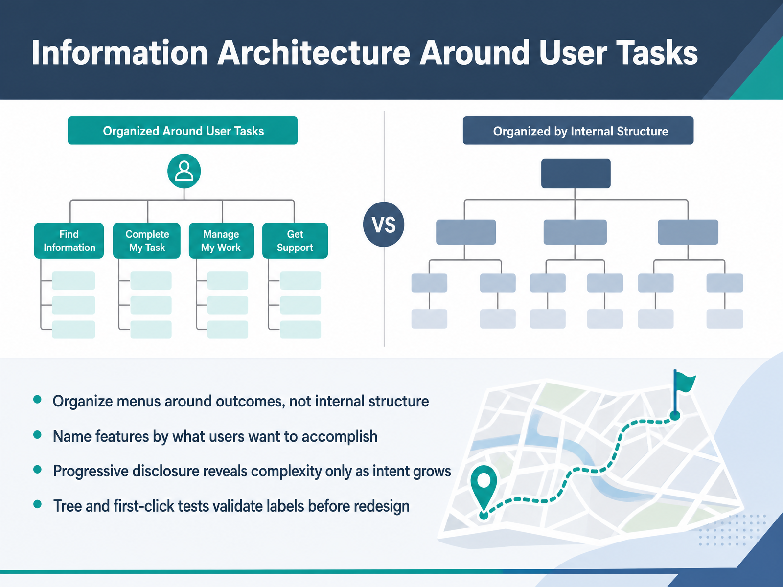
 - 07Information Architecture Around User TasksNow let's shift from visual hierarchy to structure. Information architecture is where clarity is won or lost before a single pixel is placed. The principle is simple: organize menus around outcomes, not internal structure. Your engineering org chart is not a navigation model. Users don't think in terms of modules or database tables. They think in terms of tasks they want to complete. So name features by what users want to accomplish. Instead of labeling something 'Asset Manager,' try 'Upload Media' or 'Share Files.' Renaming features based on outcomes rather than internal thinking closes the gap between the mental model of your team and the mental model of your user. And this is where progressive disclosure earns its keep. Reveal complexity only as intent grows. A new user creating their first report does not need access to advanced query builders or custom formatting. Show them what they need now, and layer deeper options as their behavior signals readiness. But do not guess at labels. Validate them. Tree tests and first-click tests are cheap, fast, and they will show you where users expect to find things before you commit to a full redesign. Test your labels against real user intent, not internal consensus. Remember, if labels sound clever or feature-driven, support tickets will spike with questions like 'where do I find?' Clarity here means the structure answers before the user has to ask. Next, let's look at clear workflows and task flows.
 theskinsfactory.comuiwithmuneeb.comtonyvle.com+22 min
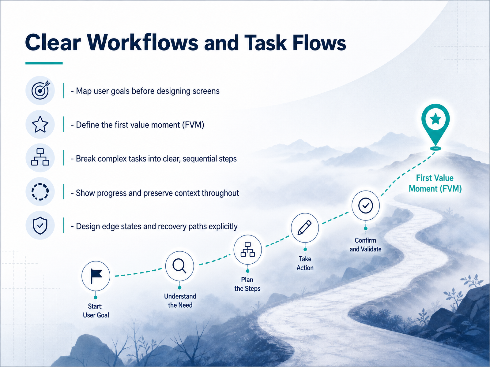
 - 08Clear Workflows and Task FlowsNow let's talk about clear workflows and task flows. Before you design a single screen, map the user's goal. What are they trying to accomplish, and what's the shortest path to get there? Then define the first value moment — that earliest point where a user sees proof the product works for them. For an analytics tool, it's not creating an account; it's seeing their first dashboard populated with real data. Once you know that moment, break complex tasks into clear, sequential steps. Show progress and preserve context throughout. If a setup has five steps, the user should always know where they are and what's next. Never leave them guessing whether their work is saved. And design edge states and recovery paths explicitly. What happens if a sync fails? What if they hit a permission error? A good error message says what happened, why, and how to fix it — like 'Your card was declined. Try another card or contact your bank.' That's the standard. Clear workflows aren't just about the happy path; they're about making every detour feel intentional. Next, let's look at feedback, status, and system state — how your product talks to users after they act.
 userpilot.comorbix.studioproductwithmustache.com+22 min
 - 09Feedback, Status, and System StateLet’s talk about feedback, status, and system state, because this is where users look for certainty. Every action your product takes should trigger an immediate response that removes doubt. If feedback is vague or delayed, users fill the gap with worry. So match your tone to the severity of the situation. A typo in an email field is not the same as an irreversible data deletion. Treating both with the same level of alarm or casualness erodes trust. The key is to name the result. Instead of a generic confirmation, say, invitation sent to alex@company dot com. That specificity confirms the recipient and the action. And every message you show should answer two questions: what happened, and what happens next. An error message that only says something went wrong leaves your user stranded. A message that says your card was declined, try another method, gives them a clear path forward. Remember, you're not just informing users, you're guiding their next move.
 userpilot.comorbix.studioproductwithmustache.com+21 min
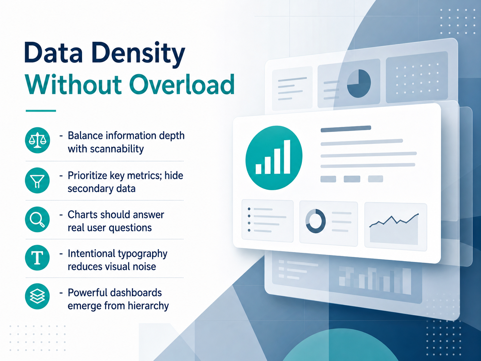
 - 10Data Density Without OverloadNow let's talk about one of the harder trade-offs in design: data density without overload. Your users need depth, but they also need to scan a screen in seconds. The key is prioritization, not subtraction. Start by deciding which metrics deserve the prime spot. Secondary data can be hidden behind a click, or surfaced when the context calls for it. For example, a sales dashboard should lead with revenue and active deals. It shouldn't compete with historical churn charts for attention. Similarly, a chart only earns its place if it answers a real question your user is asking. If it's just decorative, it's noise. Typography is your quietest tool here. Consistent sizing and spacing guide the eye and create rhythm without ever saying a word. A powerful dashboard is not the one with the most information. It's the one with the clearest hierarchy.
 theskinsfactory.comuiwithmuneeb.comtonyvle.com+21 min
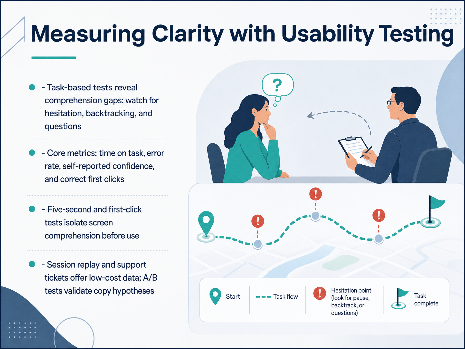
 - 11Measuring Clarity with Usability TestingSo how do you know if your interface is actually clear? You watch people use it. Task-based usability tests will reveal comprehension gaps that analytics never will. Watch for hesitation, backtracking, and the questions users ask out loud. Those moments of uncertainty are your real problems. Track the core metrics: time on task, error rate, self-reported confidence, and correct first clicks. These give you a baseline. But you can get faster signals too. Run five-second tests to see if users can identify what the screen is for before they engage with it. Use first-click tests to verify navigation logic before users invest time in a task. And don't overlook your existing data sources. Session replays are low-cost and show you exactly where hesitation happens. Support tickets tell you what questions your copy failed to answer. Then, when you have a hypothesis about the right language fix, validate it with an A/B test. The question isn't whether the copy sounds better. It's whether user behavior changed. Better clarity is measurable progress toward your users' first value moment. Now let's look at how to diagnose these clarity issues systematically with a focused audit.
 userpilot.comorbix.studioproductwithmustache.com+22 min
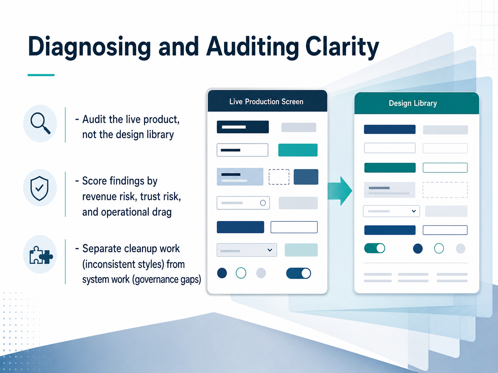
 - 12Diagnosing and Auditing ClarityNow let's talk about diagnosing clarity issues before they compound. The key is to audit the live product, not your design library. Your library shows what you intend to build, but the product reveals what users actually see, and that gap is where confusion lives. Walk through real user flows, capture every variant that renders on screen, and log the deviations. Then, score each finding by risk, not annoyance. Revenue risk, does it hurt conversion or onboarding? Trust risk, does it make the product feel unreliable or unpolished? And operational drag, does it slow down your team or create rework? This keeps your priorities aligned with business impact. Finally, separate the two types of work. Cleanup work is fixing inconsistent styles, like that button that appears in five different colors. System work addresses governance gaps, like missing documentation or unclear ownership. Cleanup patches the symptom; system work prevents recurrence. An audit that only lists inconsistencies produces a backlog. An audit that separates cleanup from system work produces a roadmap.
 netguru.comenspirit.coadamarant.com+22 min
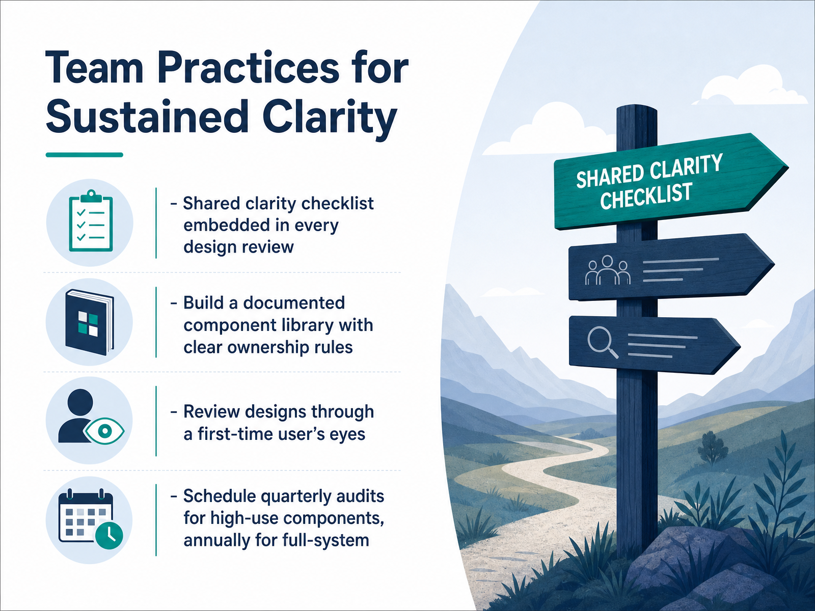
 - 13Team Practices for Sustained ClarityNow let’s talk about making clarity a habit. Sustained clarity doesn’t come from a single redesign; it comes from team practices. Start by embedding a shared clarity checklist into every design review. That checklist should include questions about labeling, error states, empty states, and whether key actions are obvious. The goal is to catch confusion before it reaches users. Next, build a documented component library with clear ownership rules. Every major component needs an owner, a description, and a last-updated trail. Without ownership, components drift and duplicate. Also, review designs through the eyes of a first-time user. Walk through a core flow as if you’ve never seen the product. Does the interface explain itself? Is the next step clear? Test with real user flows, not abstract mockups. Finally, schedule audits on a cadence: quarterly for high-use components like buttons, forms, nav, and annual for the full system. A light quarterly audit catches drift before it spreads. Fixed cadence beats crisis-driven fixes every time. And when you find issues, prioritize by impact—accessibility failures and variant sprawl in core workflows come first, not cosmetic differences. With these practices in place, clarity becomes part of your operating system. Next, I’ll take you from audit findings to a concrete clarity roadmap.
 netguru.comenspirit.coadamarant.com+21 min
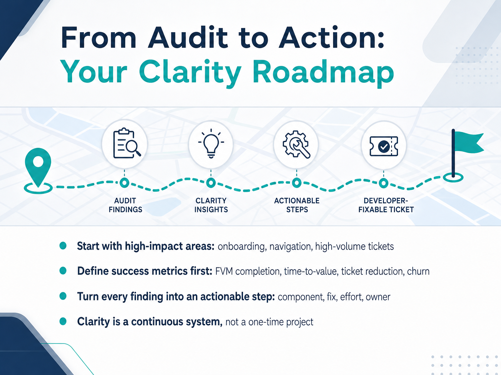
 - 14From Audit to Action: Your Clarity RoadmapWe've covered a lot of ground, so let's turn insight into action. Start with high-impact areas—onboarding, navigation, and the tickets that come in most often. For example, a settings redesign cut related tickets by thirty-one percent and shortened onboarding time by twenty-four percent. Define your success metrics before you change anything. First-value completion, time-to-value, ticket reduction, and churn are your strongest signals. Then turn every finding into an actionable step: the component, the fix, the effort, and the owner. That could be as simple as consolidating eleven button variants into one, estimated at a day of work. Clarity is not a one-time project. It's a continuous system. Review your audit quarterly, track your metrics after each release, and make clarity a habit across every team. Thank you for your attention today. You have the roadmap; now go make the path clear for your users.
 gainhq.comsetting.pageinnovationlabs.studio+21 min
Take the deck with you
Download this course as a file — free, no sign-up needed.
- PDF handoutEvery slide page, ready to print or share.15 pages · 3.1 MBDownload
- Narrated PowerPointThe deck that presents itself — every slide carries the digital human's narration video.15 pages · 16.4 MBDownload
- PowerPoint slidesThe full deck as a .pptx — open it in PowerPoint, Keynote, or Google Slides.15 pages · 3.0 MBDownload
Free to use in your own training — please keep the PersonWise credit page at the end.
Have your own deck? Turn it into a course
Sources consulted
Web sources consulted while building this course.
- SaaS UI/UX Design: Best Practices for Enterprise Apps in 2026 — The Skins Factory | UI/UX Design Agency — theskinsfactory.com
- SaaS UI/UX Design Guide 2026 | Best Practices, Process & Examples | UIwithMuneeb — uiwithmuneeb.com
- It Is Not A UX Problem. It Is A Clarity Problem — tonyvle.com
- 7 SaaS UX Design Best Practices for 2026 - Mouseflow — mouseflow.com
- It Is Not A UX Problem. It Is A Clarity Problem - Roger Wong — rogerwong.me
- UX Design Case Study: Strategic UI/UX That Cut Churn 28% - GainHQ — gainhq.com
- Reducing Support Tickets with Better Business Settings — setting.page
- Case Study: SaaS Dashboard | Portfolio — innovationlabs.studio
- SaaS Churn Reduction Through UX Funnel Refinement Case Study | Devlogix Tech — devlogixtech.com
- From 200 Support Tickets a Week to 50: A Paperchat Case Study – Paperchat — paperchat.co
- Microcopy UX in 2026: Why Clear Words Still Don't Stop User Hesitation — userpilot.com
- SaaS UX Writing: Principles, Examples, and Best Practices — orbix.studio
- Microcopy in UX Writing: 7 UI Elements with Examples — productwithmustache.com
- Microcopy: 30 Real Examples That Boost Conversion | CorsoUX | CorsoUX — courseux.com
- Onboarding micro-copy experiments to push users toward the first value moment in B2B SaaS | Atticus Li — atticusli.com
- How to Run a Design System Audit: A Step-by-Step Guide for UX Teams — netguru.com
- Design System Audit Checklist for Enterprise SaaS | Enspirit Journal — enspirit.co
- How to run a design system audit in 5 days: a checklist — adamarant.com
- Design System Checklist for SaaS Product Teams — eleken.co
- SaaS Design Debt Audit for Series B Teams in 2026 | Raze Growth — razegrowth.com