Sampling and Bias Essentials
Begin
13 pages · ~26 min
Sampling and Bias Essentials
A concise introduction to sampling and bias for beginners, covering key concepts and how to identify common sources of bias in data collection.
What you’ll learn
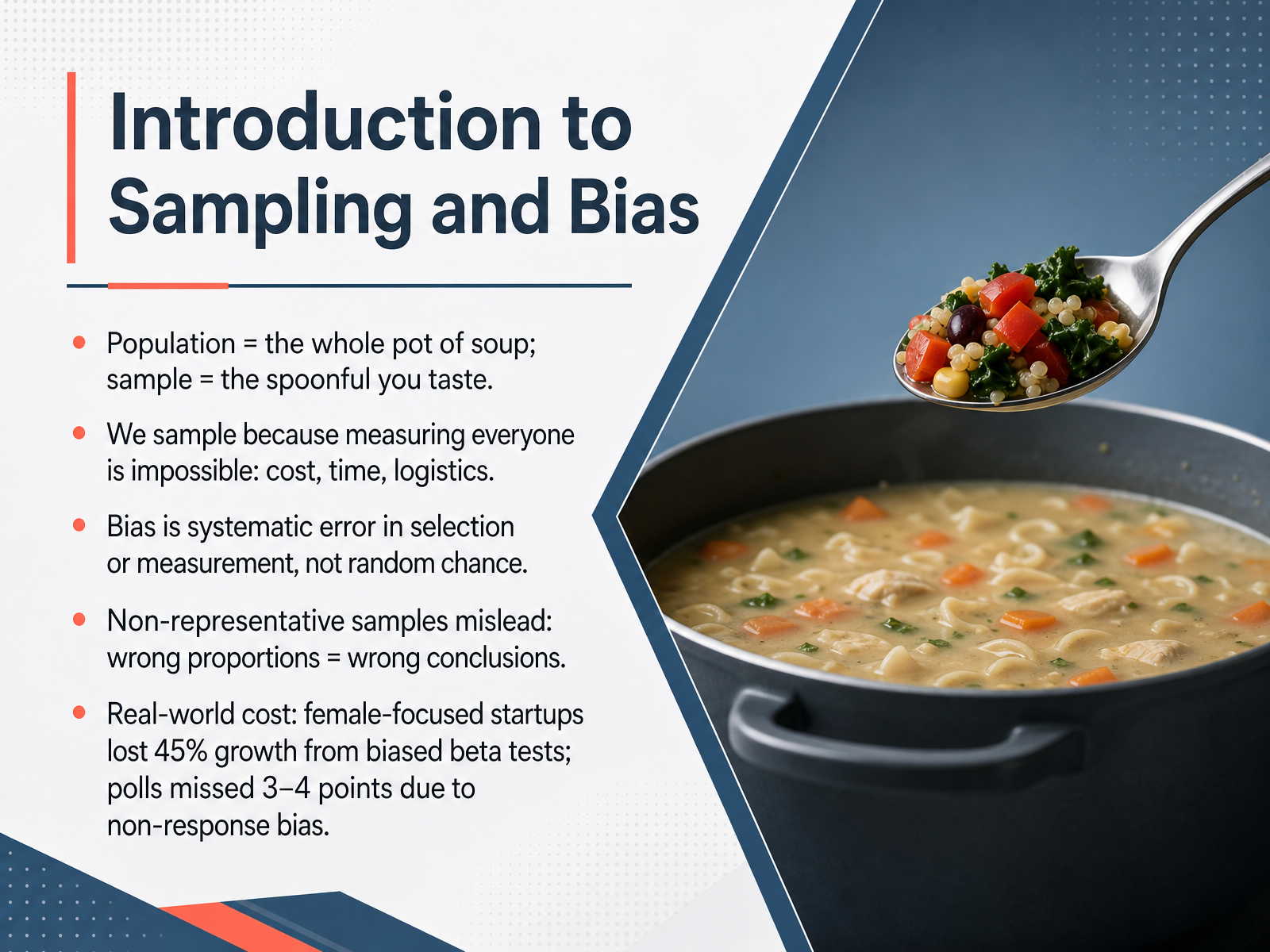
- 01Introduction to Sampling and BiasWelcome. In this session, we are going to explore sampling and bias, two ideas that sit at the heart of every data-driven decision. Our goal is to help you understand how a sample can faithfully represent a larger population, and how it can mislead us when bias creeps in. Think of a population as the whole pot of soup, and the sample as the single spoonful you taste. We sample because measuring everyone is usually impossible; it costs too much, takes too long, or is simply impractical. Bias is not random chance. It is a systematic error that pushes our results in a particular direction, over and over. When a sample is not representative, the proportions are off, and that leads us to wrong conclusions. The real-world cost is significant. For example, female-focused startups have lost as much as 45 percent growth because their beta tests were biased. In polling, non-response bias caused surveys to miss the mark by three to four points in recent elections. In a moment, we will start building a more precise picture of what makes a good sample, moving into our next topic: populations, frames, and the ideal sample.ssrs.comarxiv.orgipr.northwestern.edu+22 min
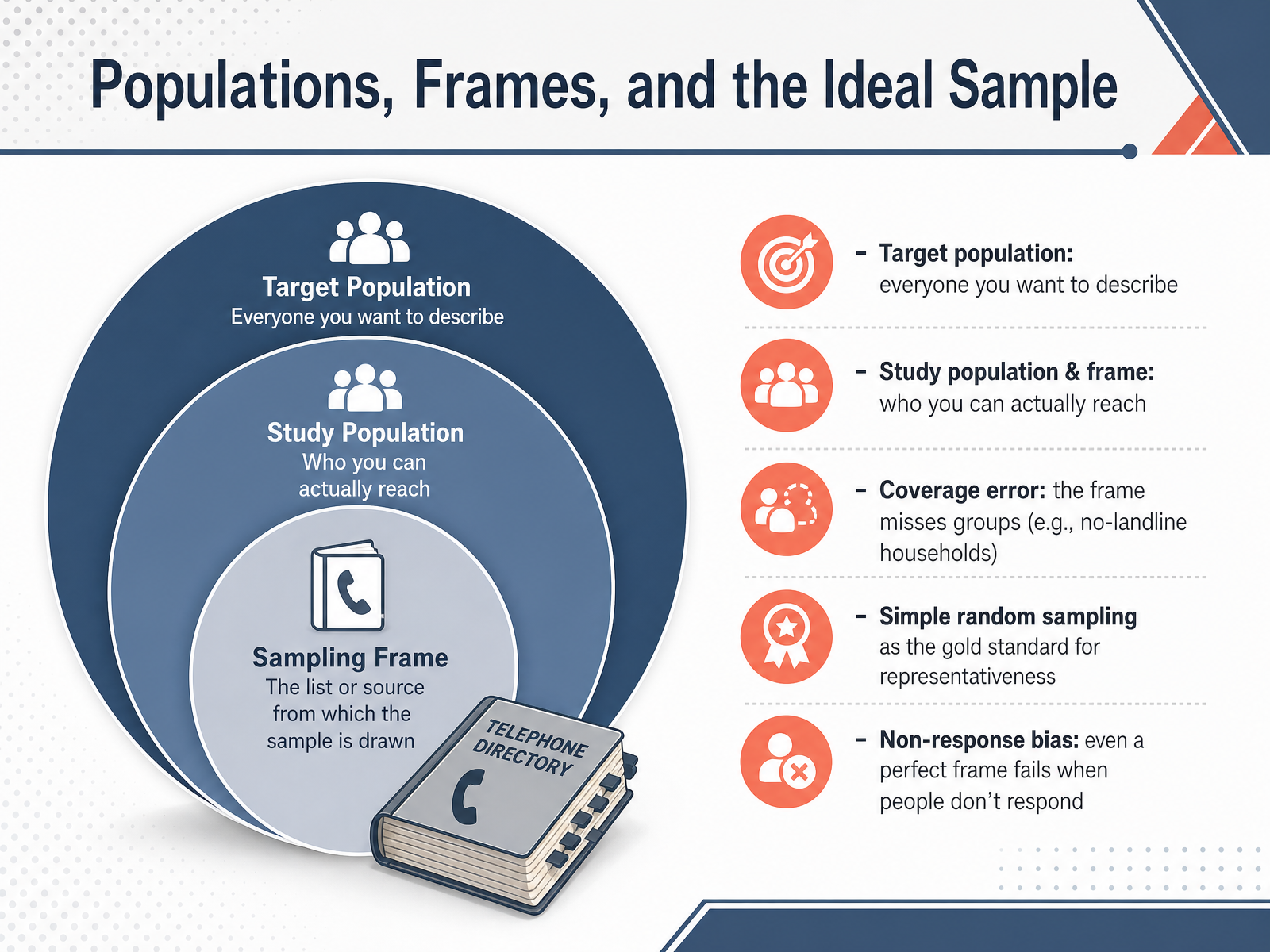
- 02Populations, Frames, and the Ideal SampleNow let's unpack how we move from the big picture down to the data we actually collect. The target population is everyone you want to describe—for example, all eligible voters in a country. But you can't practically reach everyone, so you define a study population and a sampling frame, which is the list of people you can actually contact. This gap can create coverage error if the frame systematically misses certain groups, like households that only have mobile phones and no landline. The gold standard for representativeness is simple random sampling, where every member of the population has an equal chance of being selected. But even with a perfect frame, we face non-response bias when selected individuals don't participate, potentially leaving certain voices unheard. Up next, we'll explore selection bias and how sample composition can go wrong.
 1 min
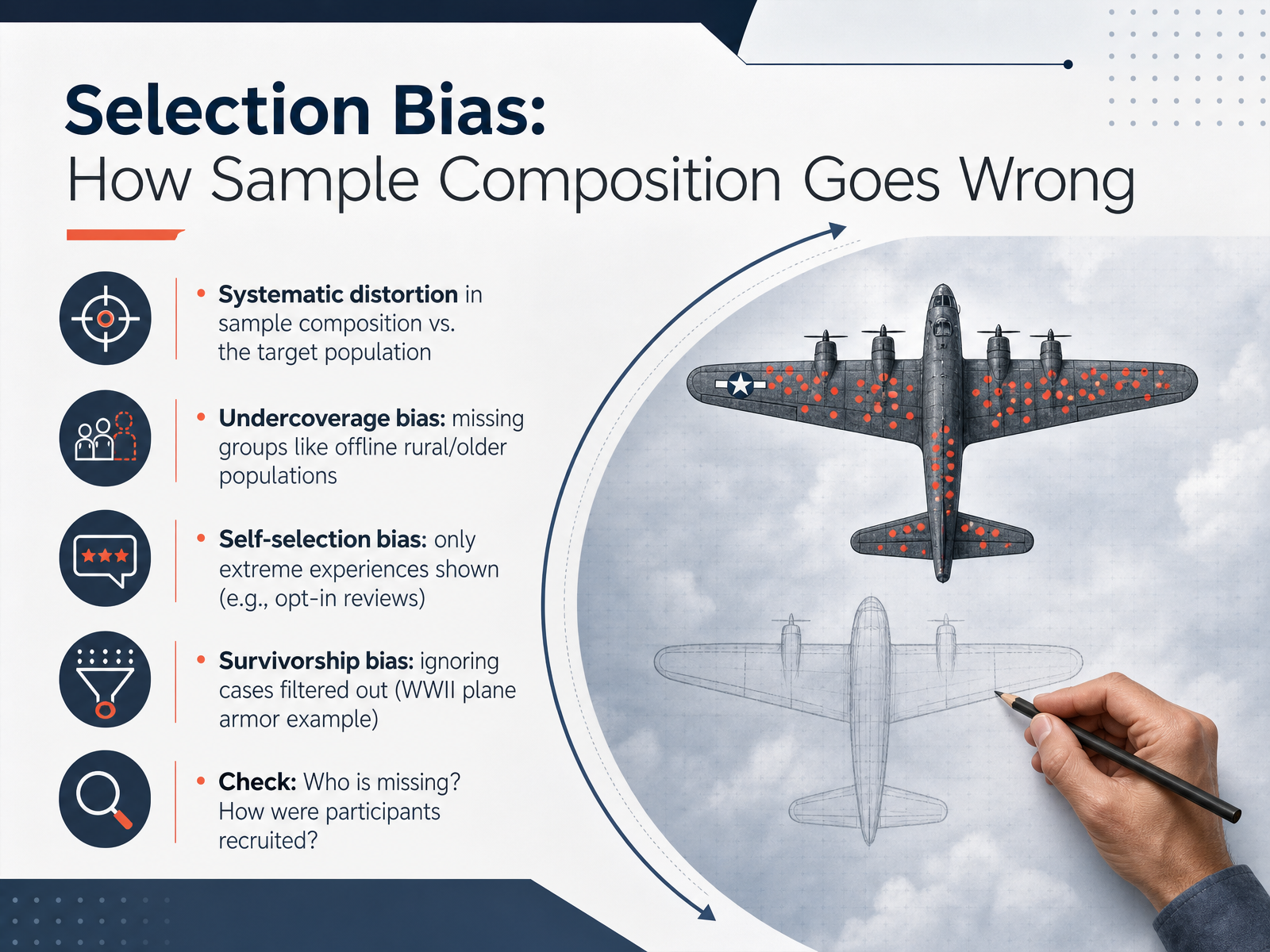
1 min - 03Selection Bias: How Sample Composition Goes WrongNow let’s get concrete about a problem that shows up across surveys, experiments, and even product reviews: selection bias. Selection bias happens when the way you recruit or include participants systematically distorts the composition of your sample compared to the target population you actually want to understand. Think of it as a funhouse mirror — the reflection is there, but it’s warped in a predictable direction. One common form is undercoverage bias, where entire groups are missing from the sampling frame. For example, a telephone poll that only calls landlines will underrepresent younger adults or rural populations who rely mostly on mobile phones. Another form is self-selection bias. This occurs when participation is voluntary and only people with strong opinions opt in — think of online restaurant reviews that are dominated by either raving fans or furious customers, while the quiet majority in the middle never writes a word. Then there is survivorship bias, which means we only see the cases that made it through some filter. The classic example comes from World War Two: analysts examined returning planes and recommended armoring the areas with the most bullet holes. But those planes survived; the planes that were hit in the engine didn’t come back, so they weren’t in the sample. Before you trust any dataset, ask two diagnostic questions: first, who is missing from this sample? And second, how exactly were participants recruited? The answers will tell you whether selection bias is quietly shaping what you see. Up next, we’ll look at another side of the same problem: response and non-response bias.
 aapor.orgdatafield.devdatafield.dev+22 min
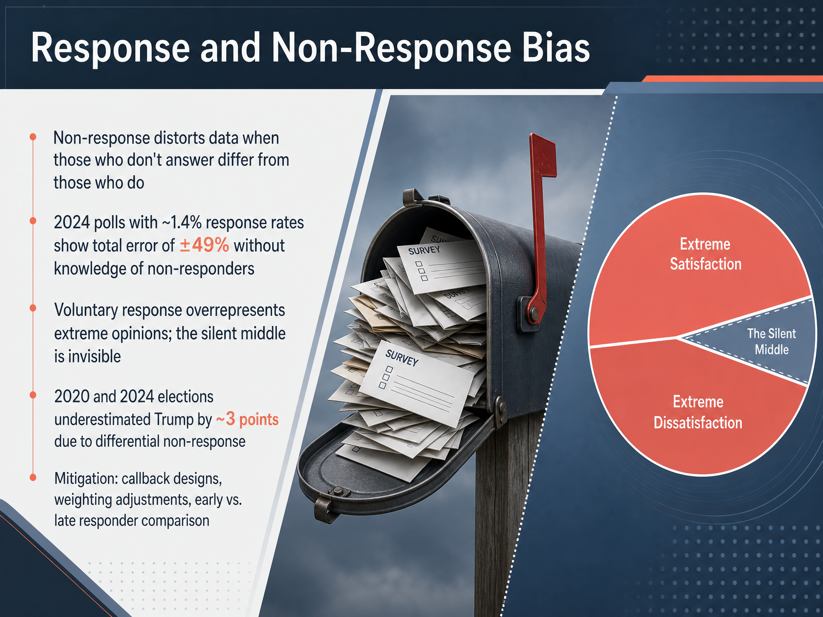
 - 04Response and Non-Response BiasNow let's turn to response bias and non-response bias. Non-response bias distorts data when the people who choose not to answer are systematically different from those who do. Think about a modern political poll. A poll might need to place nearly two hundred thousand calls just to get fifteen hundred responses, which is about a one point four percent response rate. If we have zero knowledge about the people who never picked up, the total margin of error can be as high as plus or minus forty-nine percent. That essentially means the poll tells us almost nothing, no matter how large the original sample was. Voluntary response surveys create a related problem. They overrepresent extreme opinions because the most motivated people opt in, while the silent middle stays invisible. Differential non-response also explains why polls in both twenty twenty and twenty twenty-four underestimated support for Donald Trump by roughly three points. Consistently, less trusting and less engaged voters were harder to reach, and those voters leaned Republican. To reduce these risks, researchers use callback designs, weighting adjustments, and compare early responders to late responders. Coming up next, we'll explore measurement bias and see how the questions themselves and the instruments we use can mislead respondents.
 ssrs.comarxiv.orgipr.northwestern.edu+22 min
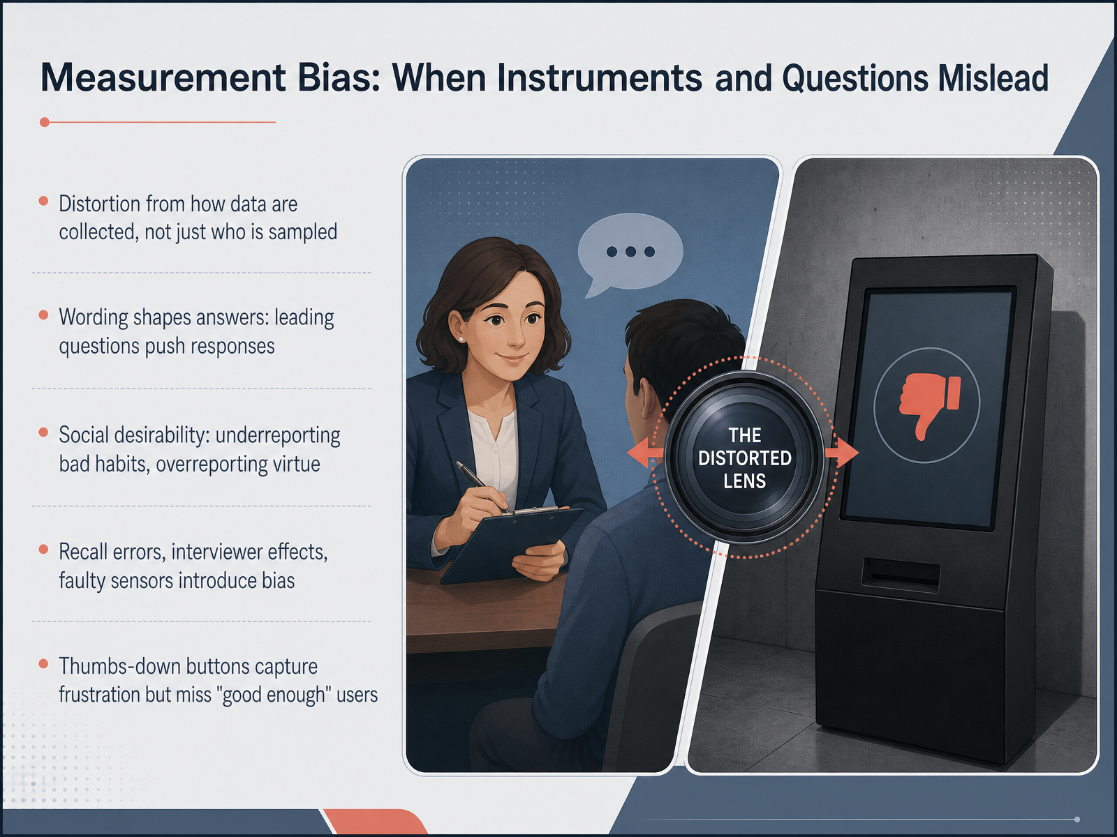
 - 05Measurement Bias: When Instruments and Questions MisleadNow let's turn to a different source of distortion: measurement bias. This happens not because of who we sample, but because of how we collect the data. The tools and questions themselves can mislead us. For example, the way a question is worded can push people toward a particular answer. A leading question like, "Don't you agree that the new policy is a great idea?" shapes the response before the person even answers. Another powerful effect is social desirability bias. People tend to underreport behaviors they think are bad, like smoking, and overreport things seen as virtuous, like how often they exercise. The instrument itself can also introduce error through faulty sensors, confusing survey designs, or even the interviewer's tone of voice. And think about those simple thumbs-down feedback buttons you see everywhere. They capture the voices of frustrated users very well, but they completely miss the people who had a good enough experience and just moved on without clicking anything. The measurement tool itself creates a distorted picture of user satisfaction. Understanding these mechanisms is the first step toward designing better instruments. We'll now explore what happens when these biases leak into the real world, with some important consequences of biased samples.
 economics.yale.educambridge.orgdoi.org+22 min
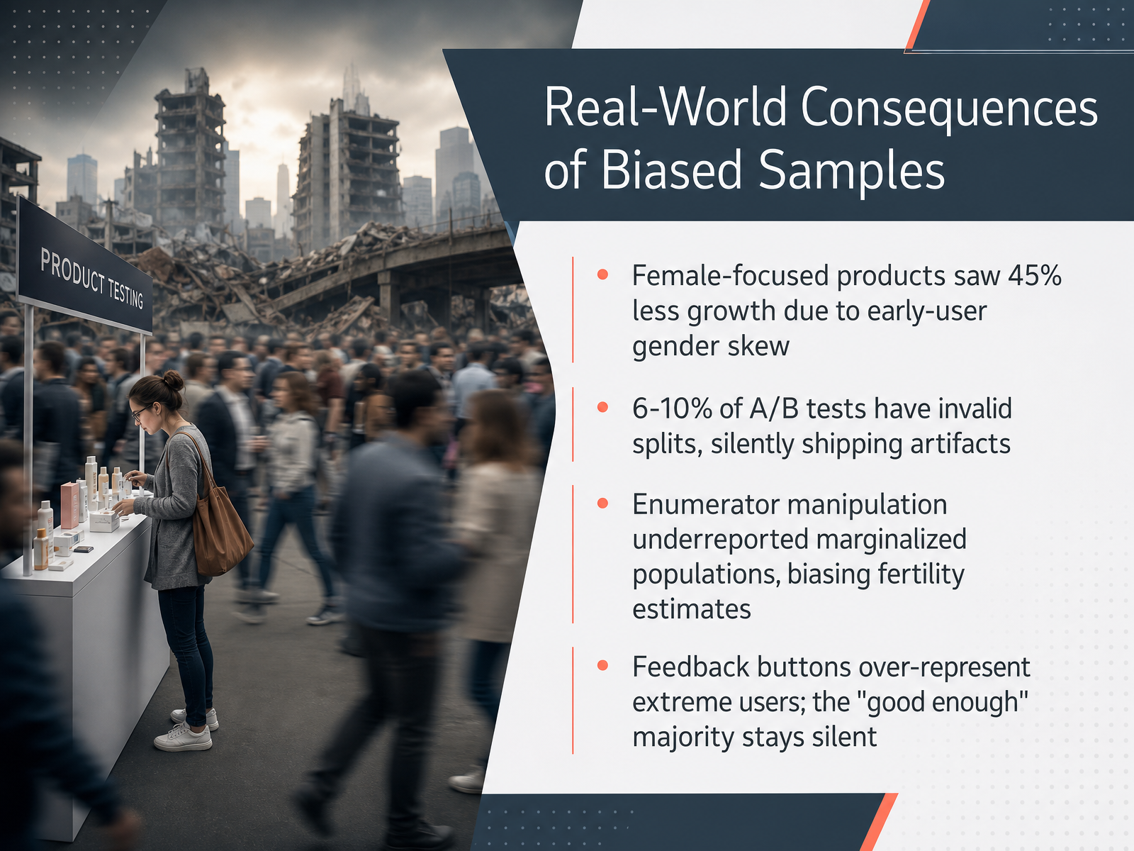
 - 06Real-World Consequences of Biased SamplesNow, let’s look at the real-world consequences when samples aren’t representative. Research shows products targeting women launched on a platform where nine out of ten early users were men experienced 45 percent less growth a year later, simply because the testers didn’t match the intended audience. In A-B testing, roughly six to ten percent of experiments have invalid splits, silently shipping changes based on biased data rather than real user preferences. Survey enumerators sometimes skip high-effort respondents, undercounting marginalized groups and distorting key statistics like fertility rates by five to ten percent. And feedback buttons over-represent extreme opinions, while the satisfied majority stays quiet, training AI on the voices of the frustrated few rather than actual user needs. Each of these cases shows how bias silently steers decisions away from the population we intend to measure. Up next, we’ll discuss practical methods for analyzing data from biased samples.
 nber.orgatticusli.comhbs.edu+21 min
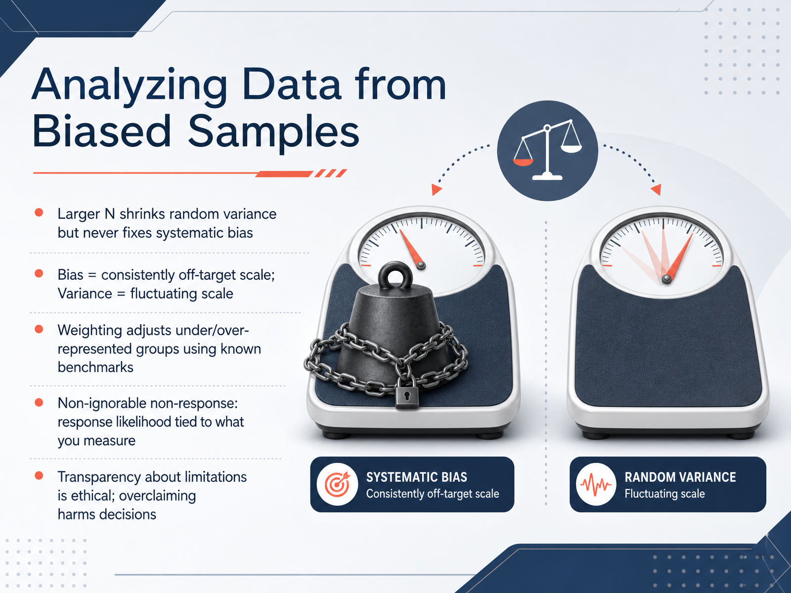
 - 07Analyzing Data from Biased SamplesNow let's talk about what actually happens when you try to analyze data from a biased sample. The first thing to remember is that a larger sample size only shrinks random variance. It never fixes systematic bias. Think of bias as a scale that is consistently off target, while variance is a scale that fluctuates around the true value. You can adjust for under- or over-represented groups through a technique called weighting, where you align your sample to known population benchmarks. But weighting only works if the reason people didn't respond is unrelated to what you are measuring. Polling in recent elections shows the opposite problem, what we call non-ignorable non-response. In twenty twenty and twenty twenty-four, Trump supporters were simply less likely to participate in surveys, even after controlling for demographics and party. Researchers found the data defect correlation persisted, making raw estimates consistently underestimate Trump's vote share while sometimes overestimating support for his opponent. No amount of traditional weighting could fully fix this. That is why transparency about your sample's limitations is not just ethical, it protects decisions from overclaimed certainty. Up next, we will apply these ideas to spotting bias in reports, polls, and dashboards.
 ssrs.comarxiv.orgipr.northwestern.edu+22 min
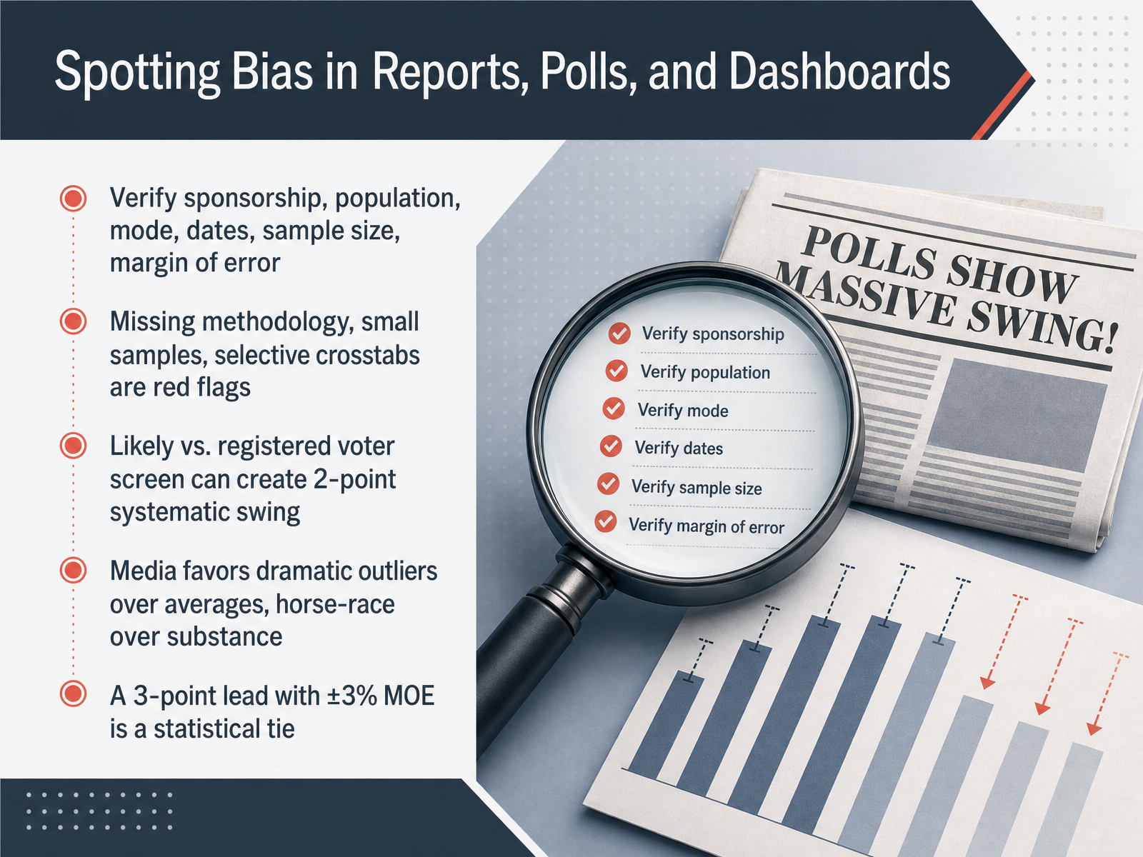
 - 08Spotting Bias in Reports, Polls, and DashboardsNow let’s turn to something you’ll face every day: spotting bias in reports, polls, and dashboards. When you see a poll headline, start by checking who sponsored it, how the sample was drawn, the mode used, the field dates, the sample size, and the margin of error. If the methodology is missing, the sample is tiny, or they only show cherry-picked crosstabs, those are red flags. One subtle but powerful shift comes from the voter screen. Registered voter samples tend to lean about two points more Democratic than likely voter models, so a poll that switches between them can look like real movement when it’s just a definition change. Media coverage adds another layer. Outlets often feature dramatic outliers over stable averages and favor horse-race leads over deeper substance. When you see a three-point lead in a poll with a three-point margin of error, remember that is a statistical tie, not a clear advantage. Bottom line, always ask who paid, how it was done, and whether the numbers really support the story. Next we’ll put this into practice in our case walkthrough: The 3 a.m. Eval Set.
 aapor.orgdatafield.devdatafield.dev+22 min
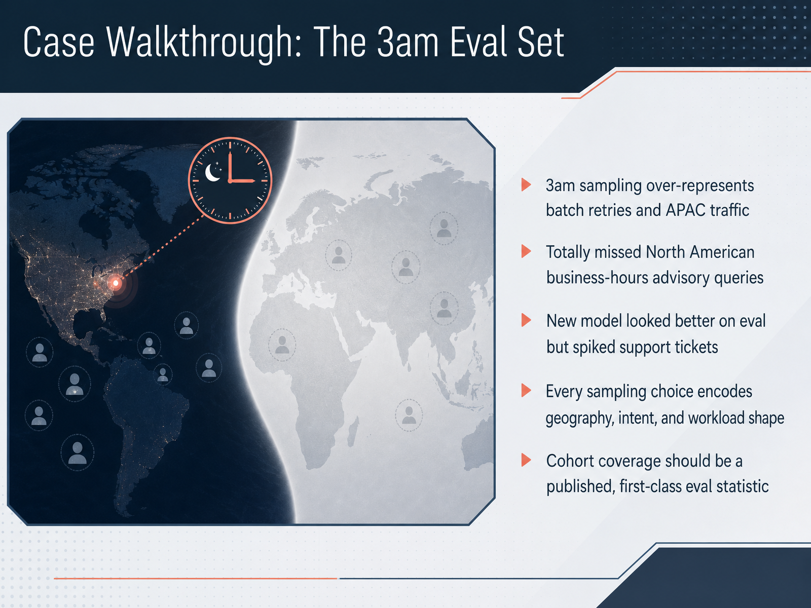
 - 09Case Walkthrough: The 3am Eval SetNow let's walk through a concrete case that shows how a seemingly small sampling decision can completely distort an evaluation. Imagine a team that builds an evaluation set at three in the morning. It turns out that three a.m. traffic over-represents batch retries and traffic coming from the Asia-Pacific region. Meanwhile, it totally misses North American business-hours advisory queries, the very queries where the model needs to be most accurate. When the team tested their new model on this evaluation set, the numbers looked better than before, so they shipped it. But instead of improvements, support tickets spiked. Their sampling had silently encoded geography, intent, and workload shape. The key takeaway is this: cohort coverage should be a published, first-class evaluation statistic. You need to know who is in the data and, just as importantly, who is missing. Up next, we will look at another real-world case in 'The Thumbs-Up Button That Poisoned the Eval Set.'
 2 min
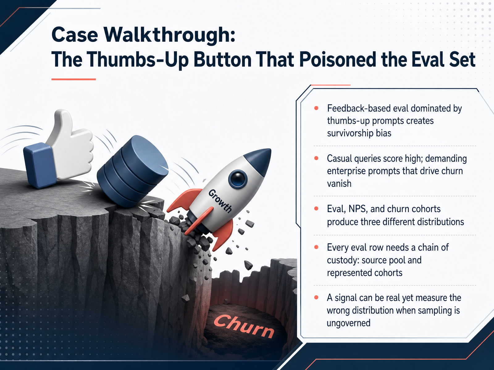
2 min - 10Case Walkthrough: The Thumbs-Up Button That Poisoned the Eval SetNow, let's walk through a concrete case that shows how sampling bias can silently distort your evaluation. Imagine your application collects feedback only from a thumbs-up button. Users click it after getting a quick, helpful answer, but when a demanding enterprise prompt fails, they simply leave without giving feedback. This creates survivorship bias: your evaluation set is dominated by casual, successful queries, while the high-stakes prompts that cause churn vanish from the data. As a result, evaluation scores, net promoter score, and churn cohorts tell three completely different stories. A signal can be real yet measure the wrong distribution when sampling is ungoverned. The practical fix is to give every evaluation row a chain of custody. This means recording which source pool the example came from and which cohorts it genuinely represents. When we loosen sampling controls, the decision to evaluate or not evaluate becomes a hidden variable that poisons the whole lens. Next, we will turn these insights into action and discuss reducing bias during study and survey design.
 2 min
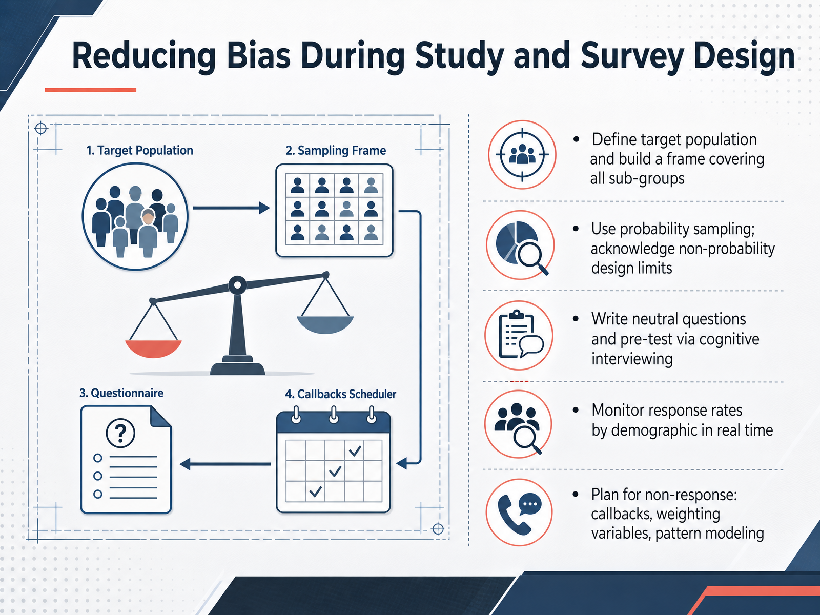
2 min - 11Reducing Bias During Study and Survey DesignLet’s turn to the practical side—specifically, how to reduce bias during study and survey design. The first step is to clearly define your target population and then build a sampling frame that covers all relevant subgroups. If a group is missing from that frame, selection bias is baked in from the start. Next, whenever feasible, use probability sampling, where every unit has a known chance of selection. When you must rely on a non-probability approach, be transparent about its limits and avoid generalizing as if it were a random sample. Questionnaire design matters too. Write neutral questions and test them with cognitive interviewing to catch wording that leads respondents toward a particular answer. As data comes in, monitor response rates by demographic group in real time—this helps you spot emerging imbalances before fieldwork ends. Finally, plan for non-response. Build in callbacks, consider weighting variables to adjust for underrepresented groups, and look into pattern modeling when data allows. Each of these strategies moves you closer to a study that genuinely reflects your population. Up next, we’ll look at governance and the role of continuous vigilance in keeping your data trustworthy.
 economics.yale.educambridge.orgdoi.org+22 min
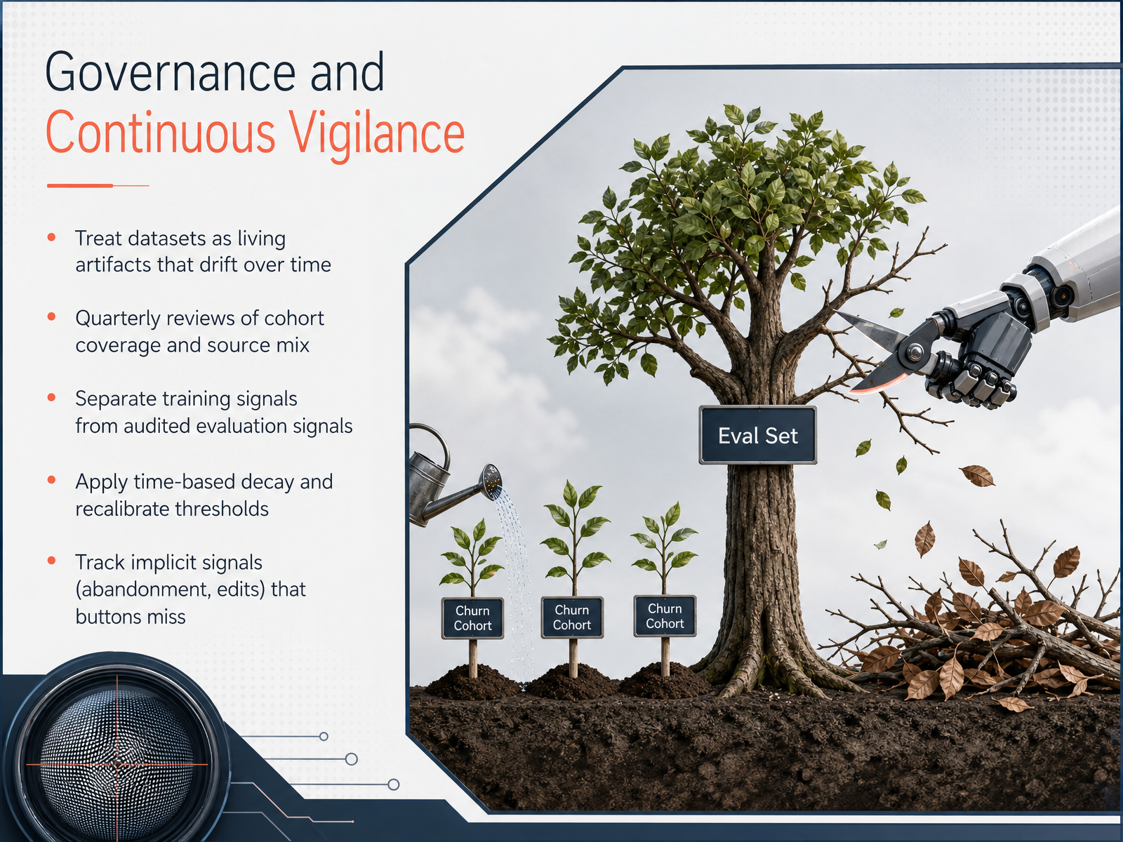
 - 12Governance and Continuous VigilanceLet's now talk about what it takes to maintain fair sampling over time. Think of your datasets not as one-time snapshots, but as living artifacts that drift as behaviors and populations change. To catch that drift, schedule quarterly reviews of cohort coverage and your source mix. Next, keep your training signals strictly separate from audited evaluation signals. When you mix them, you blind yourself to silent failures. Apply time-based decay to older examples so recent patterns carry appropriate weight, and recalibrate your decision thresholds on fresh, clean holdout data. Finally, track implicit signals that traditional buttons miss, such as user abandonment or manual edits. These quiet actions often reveal the real bias that click-through rates obscure.
 1 min
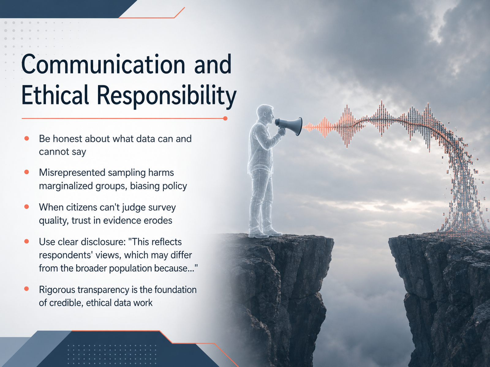
1 min - 13Communication and Ethical ResponsibilityWe have reached the final and perhaps most important slide of this course: our ethical responsibility as data communicators. Being honest about what data can and cannot say is not just good practice, it is a professional obligation. When sampling is misrepresented, the harm is not abstract. Recent research published in the American Journal of Public Health frames biased data collection as a form of institutional discrimination. It directly harms marginalized groups because policies built on skewed evidence fail the very people they claim to serve. When the public cannot judge survey quality, their trust in science and democratic processes erodes. So what do we do? We practice clear disclosure. For example, we openly state, 'These findings reflect the views of respondents, which may differ from the broader population because of sampling limitations.' As we saw in earlier slides, even large sample sizes cannot fix a biased sample. Rigorous transparency is the foundation of credible and ethical data work. Thank you for joining this introduction to sampling and bias. The next time you see a statistic, ask who is missing, and always disclose who is actually represented. That is how we build trust, one honest statement at a time.
 economics.yale.educambridge.orgdoi.org+22 min
Take the deck with you
Download this course as a file — free, no sign-up needed.
- PDF handoutEvery slide page, ready to print or share.14 pages · 3.6 MBDownload
- Narrated PowerPointThe deck that presents itself — every slide carries the digital human's narration video.14 pages · 16.0 MBDownload
- PowerPoint slidesThe full deck as a .pptx — open it in PowerPoint, Keynote, or Google Slides.14 pages · 3.5 MBDownload
Free to use in your own training — please keep the PersonWise credit page at the end.
Have your own deck? Turn it into a course
Sources consulted
Web sources consulted while building this course.
- What Can the SSRS Opinion Panel Tell Us About Nonresponse Bias in 2024 Election Polls? - SSRS — ssrs.com
- The Persistent Non-Response Bias in a Sample-Matched Poll for the 2024 U.S. Presidential Election — arxiv.org
- Accounting for Nonresponse in Election Polls: Total Margin of Error — ipr.northwestern.edu
- Bessette Pitney Text: Nonresponse Bias in 2024 — bessettepitney.net
- August 2024, Revised August 2024 — nber.org
- Journalist Cheat Sheet to Understanding Polls — aapor.org
- Chapter 10: Reading and Evaluating Polls | Political Analytics — datafield.dev
- Appendix F: Templates and Worksheets | Political Analytics | DataField.Dev — datafield.dev
- Political Polling Checklist 2026: What Analysts Must Know — veridatainsights.com
- How to Read Polls 2026: Sample Size, MOE, LV vs. RV, Aggregators Explained | USPollingData.com — uspollingdata.com
- Selection∗ — economics.yale.edu
- Predicting social assistance beneficiaries: On the social welfare damage of data biases | Data & Policy | Cambridge Core — cambridge.org
- Representativeness and Response Validity Across Nine Opt-In Online Samples — doi.org
- The Invisible Majority: Rethinking Sampling Bias in Social Media Experiments | The Economy — economy.ac
- Synthetic Sample in Social Research: significant limitations of AI generated responses — veriangroup.com
- Sampling Bias in Entrepreneurial Experiments — nber.org
- Sample Ratio Mismatch (SRM): The A/B Testing Quality Check Most Teams Skip | Atticus Li — atticusli.com
- https://www.hbs.edu/ris/Publication%20Files/21-059_96e01ed1-06e4-4219-b06d-a9798be1618a.pdf — hbs.edu
- Why Your Thumbs-Down Data Is Lying to You: Selection Bias in Production AI Feedback Loops — tianpan.co
- The Eval Set That Sampled Production Traffic at 3am EST — tianpan.co