Chart Selection Guide
Begin
14 pages · ~28 min
Chart Selection Guide
Learn to select the most effective chart type for any data question, improving clarity and impact in data presentations for analysts and professionals.
What you’ll learn
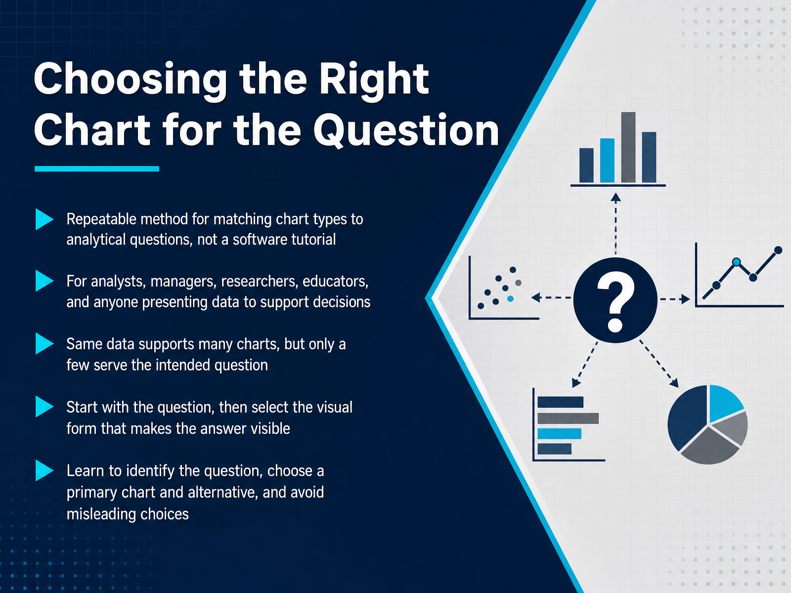
- 01Choosing the Right Chart for the QuestionWelcome. This course is about a repeatable method for matching chart types to analytical questions. It is not a software tutorial. Your role matters here. Whether you are an analyst, a manager, a researcher, or an educator, you present data to support decisions. The core principle is simple. The same dataset can support many different charts, but only a few of those charts directly answer the question you need to resolve. Start with the question. Do you need to show change over time, compare groups, or establish a relationship? Once you know that, select the visual form that makes the answer visible. Memorizing every chart type is not the goal. Instead, you will learn to identify the question, choose a primary chart plus a solid alternative, and avoid choices that mislead your audience. Next, we examine why chart choice becomes a communication problem.evalu-ate.orginfoguides.gmu.edudatafield.dev+21 min
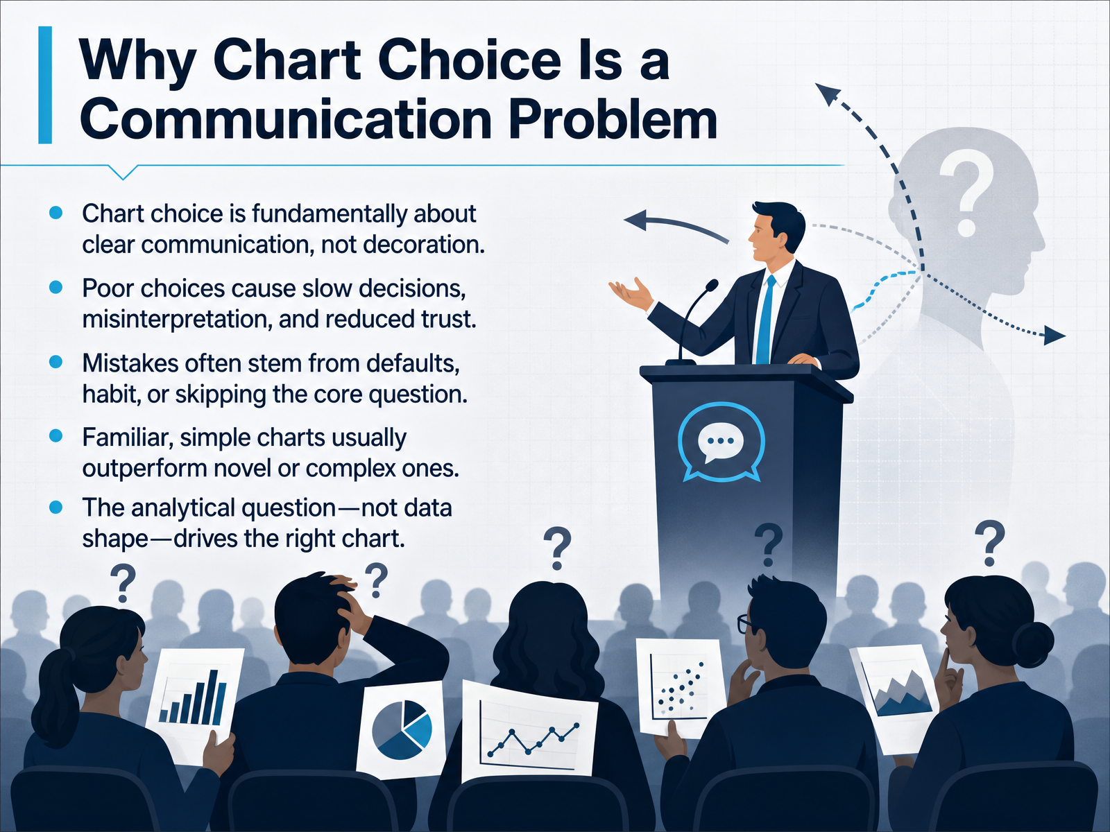
- 02Why Chart Choice Is a Communication ProblemLet's get straight to the core issue. Chart choice is not about aesthetics. It is a communication decision. The right chart answers a specific question quickly. The wrong one slows everything down. People misinterpret the data. And whether you intend it or not, trust erodes. Most of these mistakes happen for predictable reasons. We reach for the tool default. We reuse the chart we made last time. Or we skip the question entirely and start dragging fields onto a canvas. In practice, familiar charts almost always beat clever ones. A clean bar chart outperforms a complex novel visual because readers spend their energy on the insight, not on decoding the display. So the selection logic must be driven by the analytical question, not by the shape of your dataset. The data is never the starting point. The question is. Let's look at that principle next.
 service-manual.ons.gov.uklibguides.gwu.eduomni.co+21 min
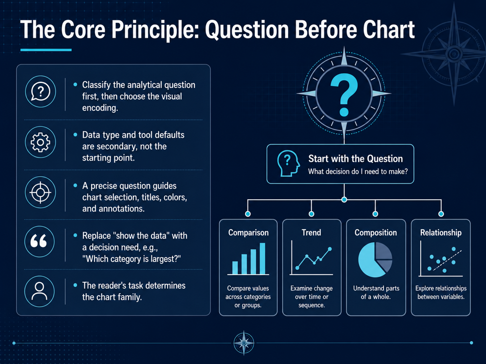
 - 03The Core Principle: Question Before ChartHere is the core idea we apply before building anything. Put the question first, not the tool. Start by classifying what the reader actually needs to decide, not by asking what the tool can display. For example, instead of opening a chart library and picking the prettiest option, we ask which category is largest, or how the trend moved across quarters. That question then drives the visual encoding. It tells us whether we need position on a common scale for exact comparisons, or slope and direction for change over time. It also sets the title, the colors, and the annotations. We stop using the vague prompt to show the data. We replace it with a specific decision need, like which region is underperforming. Data type matters, but it is secondary. A categorical field does not force us into a bar chart. A date does not automatically mean a line chart. The reader's task decides the chart family. If the task is to rank categories, we use ranked bars. If the task is to show parts of a whole, we use a stacked bar or a treemap. That is the filter that narrows a hundred chart options down to two or three workable choices. Next, we will look at the six analytical questions that drive chart choice.
 datawrapper.deservice-manual.ons.gov.ukdataschool.com+21 min
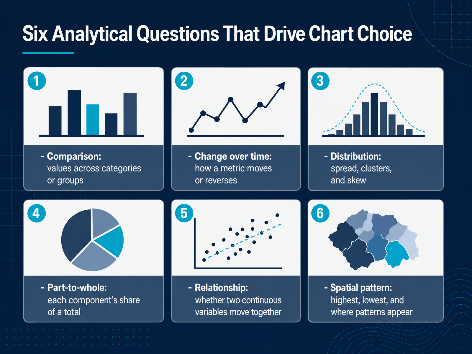
 - 04Six Analytical Questions That Drive Chart ChoiceBefore we get to which chart to pick, we need to name the question you are actually asking. Six question types drive most chart decisions. First, comparison: values across categories or groups, like revenue by product line. Second, change over time: how a metric moves, climbs, or reverses, like monthly active users. Third, distribution: the spread, clusters, and skew of a single variable, like order sizes. Fourth, part-to-whole: how each component contributes to a total, like regional share of sales. Fifth, relationship: whether two continuous variables move together, like marketing spend and pipeline. Sixth, spatial pattern: where the highs and lows appear, like regional churn. The key discipline is to phrase the question before touching a chart type. The same dataset can produce a bar chart, a histogram, or a scatter plot, depending on which of these six questions you lead with. Once the question is pinned down, the chart choice narrows quickly. That decision path is exactly what we will walk through next in From Question to Chart: A Decision Framework.
 evalu-ate.orginfoguides.gmu.edudatafield.dev+22 min
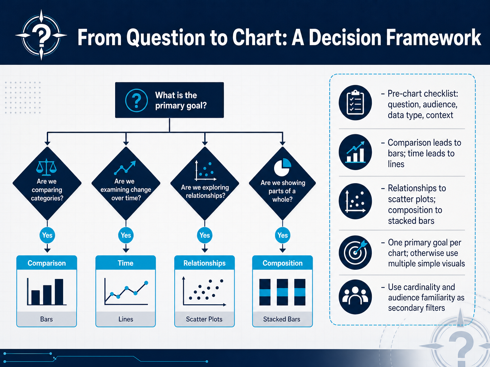
 - 05From Question to Chart: A Decision FrameworkSo let's turn the question into a decision framework. Before you build anything, run a quick pre-chart checklist. What question are you answering? Who is the audience? What data type do you have? And what context surrounds it? Once that is clear, the mapping is fast. Comparison questions lead to bars. Time-based questions lead to lines. Relationships point to scatter plots. Composition points to stacked bars. But here is the discipline. One primary goal per chart. If you catch yourself trying to show a trend and a ranking and a distribution in a single view, stop. Split it into multiple simple visuals. Then apply your secondary filters. Cardinality matters. Fifteen or more categories usually means you should group, filter, or use small multiples. Audience familiarity matters too. An executive review calls for a card or a single hero chart, not a dense scatter plot. So ask the question first, pick the most direct encoding, and keep it to one idea per chart. Next, we will walk through core chart types and exactly when each one earns its place.
 datawrapper.deservice-manual.ons.gov.ukdataschool.com+21 min
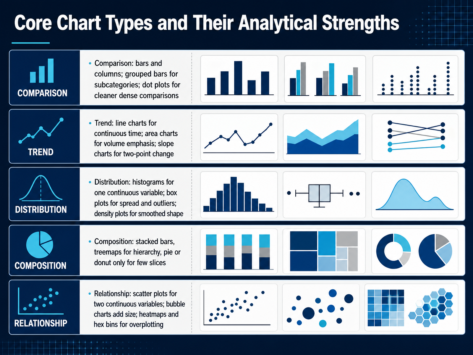
 - 06Core Chart Types and Their Analytical StrengthsThe chart you pick has to earn its place by matching the question you are asking. For comparison across categories, bars and columns do the heavy lifting. If you need to compare subcategories, use grouped bars. When the categories get dense, a dot plot gives you a cleaner read without the visual noise. For trend questions, reach for a line chart. It makes change over time readable through slope. Use an area chart when you need to emphasize volume. If you only care about two points in time, a slope chart works well. For distribution, a histogram shows the shape of one continuous variable. A box plot is better when you need to see spread and outliers. Use a density plot for a smoother view of that shape. For composition, stacked bars work when you need totals and parts. A treemap handles hierarchy. Pie or donut charts only make sense with very few slices. For relationship questions, use a scatter plot for two continuous variables. Add a bubble chart when you need a third measure mapped to size. When overplotting hides the pattern, switch to heatmaps or hex bins. The common thread stays simple: shape follows question. Next, we will look at matching charts to audience and context.
 michaelnocito.github.iodatafield.devtableau.com+22 min
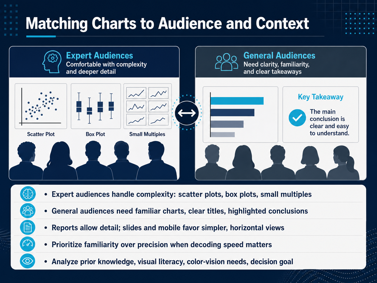
 - 07Matching Charts to Audience and ContextThe right chart depends heavily on who's in the room. An expert audience can handle complexity without you over-explaining. Scatter plots, box plots, and small multiples work well there because your colleagues already know how to read correlation, distribution, and variation across many panels. A general audience needs something different. Use familiar chart types, write clear titles that state the conclusion, and visually highlight the key point so no one has to hunt for it. The format matters just as much. Detailed reports support dense views and multiple comparisons. Slides and mobile screens demand simpler, horizontal charts that decode in seconds. When speed matters more than precision, choose the familiar bar or line over a technically superior but less common design. Before you finalize anything, think through four factors. What prior knowledge does your audience bring? How visually literate are they? Are color-vision needs a concern? And what decision are they trying to make? Match the chart to that context, not to what you would personally prefer. Up next, we'll cover how to avoid misleading and overloaded charts.
 journals.sagepub.comnorc.org1 min
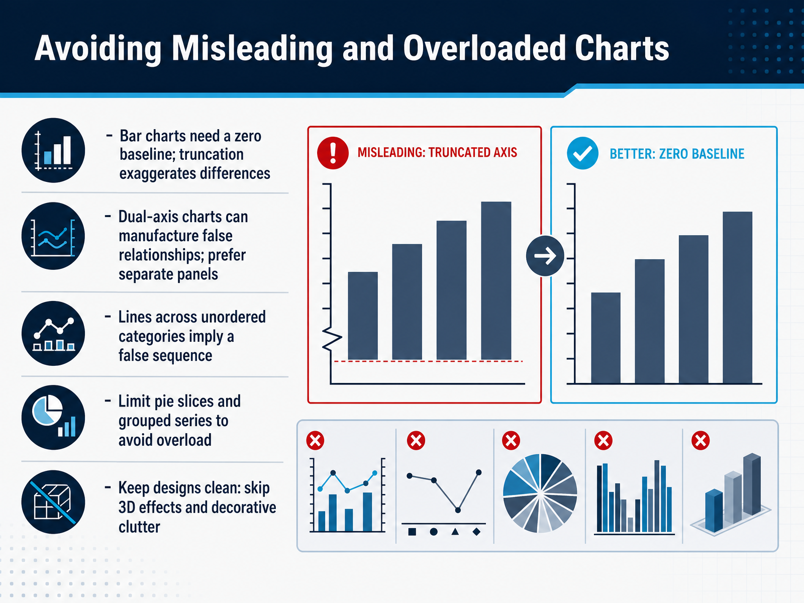
 - 08Avoiding Misleading and Overloaded ChartsNow let's talk about the design traps that can quietly undermine your analysis. First, bar charts need a zero baseline. Truncating the y-axis exaggerates differences and turns a small shift into a dramatic story. If someone hands you a bar chart that doesn't start at zero, question it. Dual-axis charts are another risk. Two different scales on one canvas can manufacture false relationships. When the units or magnitudes differ, prefer separate panels so each series speaks for itself. Also, avoid using lines across unordered categories. A line implies a sequence. If your categories aren't ordered, switch to bars. Finally, keep the chart itself clean. Limit pie slices and grouped series to prevent overload. Skip 3D effects and decorative clutter. Every element should answer the question, not distract from it. Next, we'll apply these rules to practical chart selection by common use case.
 1 min
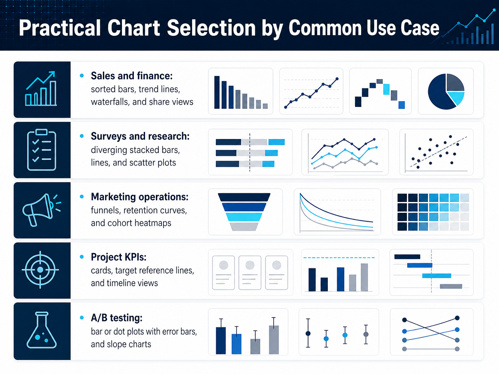
1 min - 09Practical Chart Selection by Common Use CaseNext, let's make this practical with common use cases. Your chart choice should start from the question you're answering, not the data you happen to have in front of you. For sales and finance work, sorted bars handle category comparisons cleanly. Trend lines show direction over time. Waterfalls explain the bridge from one revenue figure to the next. And share views answer part-to-whole questions when you have only a few slices. For surveys and research, pick diverging stacked bars when you need the balance between positive and negative sentiment at a glance. Lines work for tracking responses across waves. Scatter plots surface relationships between two variables. In marketing operations, funnels show sequential drop-off, retention curves reveal how audience attention decays, and cohort heatmaps expose how groups acquired in different periods behave over time. For project KPIs, cards give a single-value readout, target reference lines show performance against plan, and timeline views communicate sequence and dependencies. Finally, in A B testing, use bars or dot plots with error bars to show confidence intervals, and slope charts to compare the before and after for each variant. The throughline is the same in every case: name the analytic question first, then let the chart follow. Now let's test that instinct with a hands-on exercise where you'll choose the chart and defend the choice.
 2 min
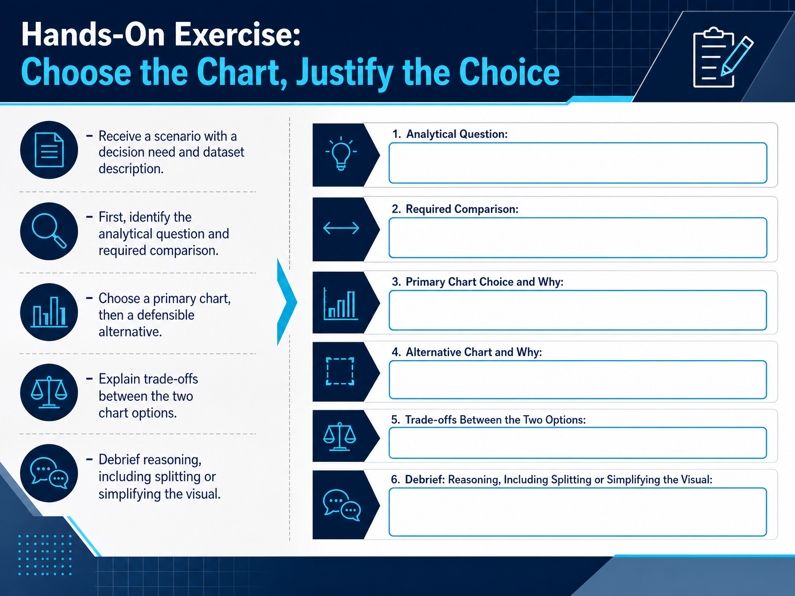
2 min - 10Hands-On Exercise: Choose the Chart, Justify the ChoiceTime to put this into practice. You'll receive a scenario with a decision need and a dataset description. Start by stating the analytical question and the required comparison. Do not touch a chart type until that question is clear. Then select a primary chart and a defensible alternative. Explain the trade-offs between the two. For example, a line chart shows trend continuity, while a column chart emphasizes discrete periods. Finally, debrief your reasoning, including whether the visual should be split or simplified. Two focused charts often beat one overloaded visual. Let's move to the chart selection checklist and job aids.
 datawrapper.deservice-manual.ons.gov.ukdataschool.com+21 min
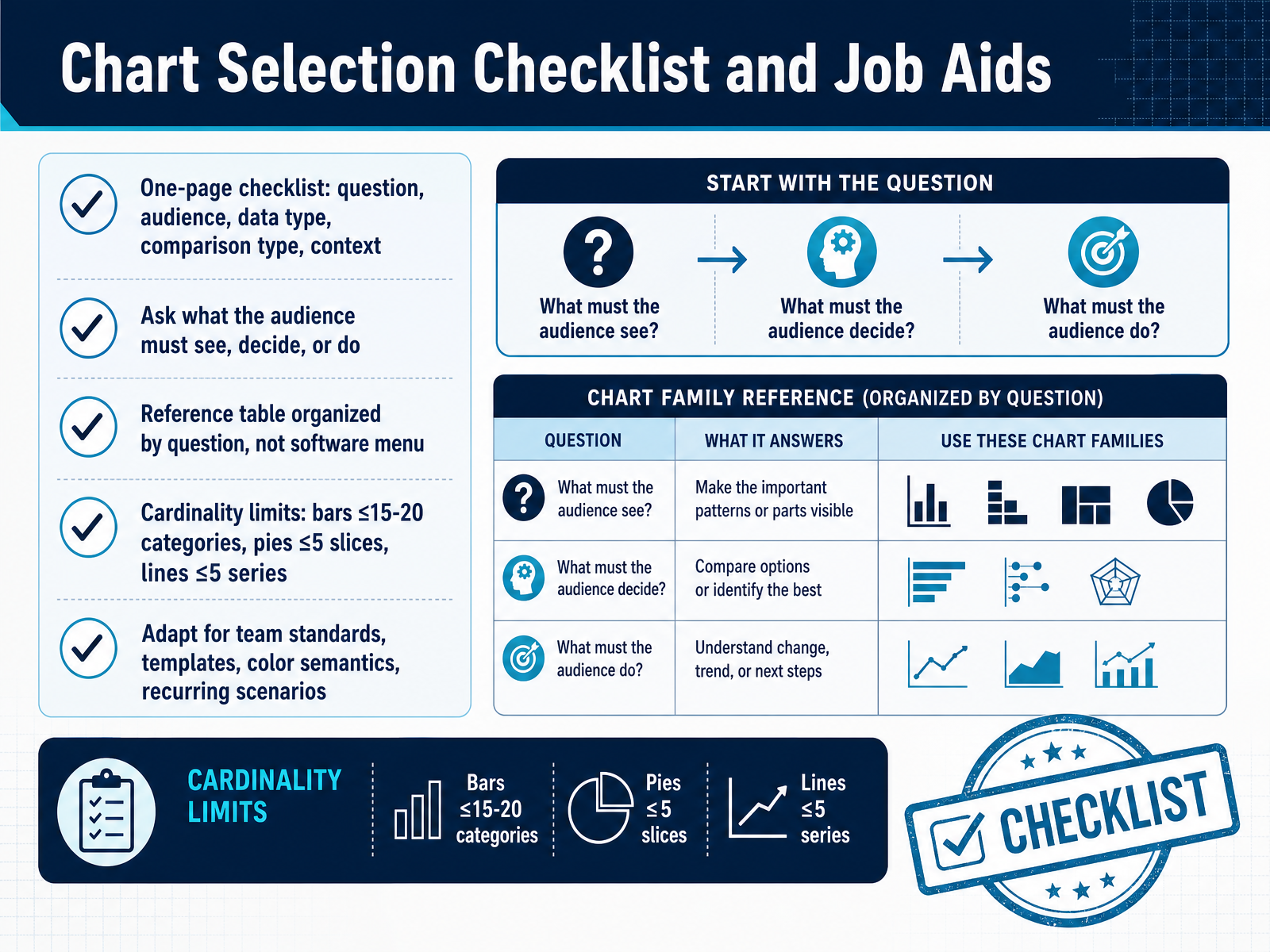
 - 11Chart Selection Checklist and Job AidsA good chart checklist keeps the decision focused where it belongs, on the question your audience needs answered. Start with five items. State the question in plain language. Name the audience and what they already know. Identify the data type, categorical, time series, or continuous. Name the comparison, ranking, composition, relationship, or trend. Then note the delivery context, a slide, a dashboard, or a printed report. The core question is simple. What must the audience see, decide, or do after looking at this chart? Write that sentence before you touch software. Keep a reference table organized by that question, not by the chart gallery in your tool. The table should move from what you are trying to show to the chart that answers it directly. It should also include cardinality limits. Bars work up to about fifteen or twenty categories. Pies stay readable at five slices or fewer. Lines hold up to roughly five series before they turn into spaghetti. These limits are not style preferences. They are readability thresholds. When a chart goes past its limit, the message gets buried in ink. Finally, adapt the checklist to your team reality. Add your house standards, templates, and color meanings. Fold in recurring scenario names like monthly operating review or pipeline snapshot. That makes the checklist a job aid people will actually use. Up next, we will pull the main points into your key takeaways and an action plan you can apply this week.
 evalu-ate.orgdatawrapper.deservice-manual.ons.gov.uk+21 min
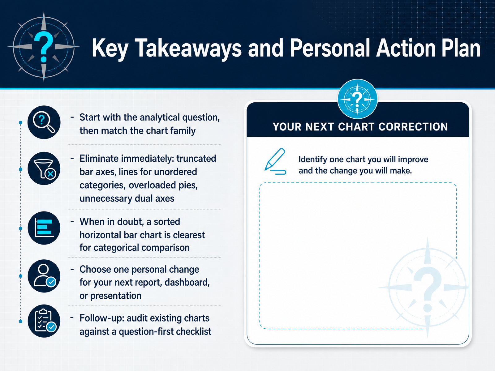
 - 12Key Takeaways and Personal Action PlanLet’s lock in the framework. Start with the analytical question, then match the chart family. If the goal is ranking categories, reach for a sorted bar. If it’s momentum over time, use a line. The question decides the form. Before you publish anything, eliminate the offenders. Truncated bar axes exaggerate small gaps. Lines connecting unordered categories imply sequence where none exists. Overloaded pie charts force viewers to judge angles badly. And unnecessary dual axes can manufacture a false correlation. Remove them on sight. When you’re stuck, remember the default. A sorted horizontal bar chart is almost always the clearest choice for comparing categories. Bar length is the visual cue we read most precisely. Now make it personal. Pick one change for your next report or dashboard. Maybe you retire a pie chart, start your bar axis at zero, or convert a line to bars. One concrete shift is enough. Then follow up by auditing an existing view against a question-first checklist. Ask what question each chart answers, and whether the form matches. Small, consistent corrections compound into trusted dashboards. Next up, we’ll apply these rules directly in scenario practice for sales, survey, and project decisions.
 service-manual.ons.gov.uklibguides.gwu.eduomni.co+22 min
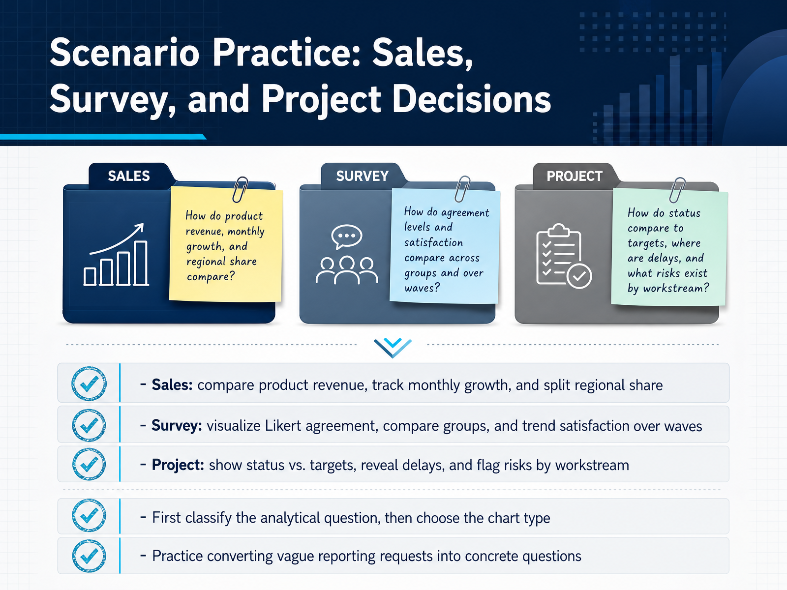
 - 13Scenario Practice: Sales, Survey, and Project DecisionsLet's move from theory into practice with three scenarios you see all the time. Start with sales. If you need to compare product revenue, use a sorted horizontal bar chart. If you're tracking monthly growth, switch to a line chart. And if you want regional share, keep it to a donut or a short bar chart, never a pie with six slices. Now survey data. For Likert agreement, use a diverging stacked bar so you can see the balance between positive and negative sentiment. To compare groups, a grouped bar chart works well. For satisfaction across waves, a line chart shows the trend clearly. And project decisions. Status versus targets is a bullet chart or a bar with a reference line. Delays over time are best shown as a Gantt chart. Risks by workstream are a simple color-coded table or heatmap. In every one of these cases, the pattern is the same. First classify the analytical question. Is it comparison, trend, composition, or status? Then choose the chart type. And practice converting vague reporting requests like show me sales into concrete questions like compare revenue by product this quarter. Do that consistently, and chart choice stops being a guessing game. Next, we'll review the most common pitfalls and how to avoid them.
 datawrapper.deservice-manual.ons.gov.ukdataschool.com+22 min
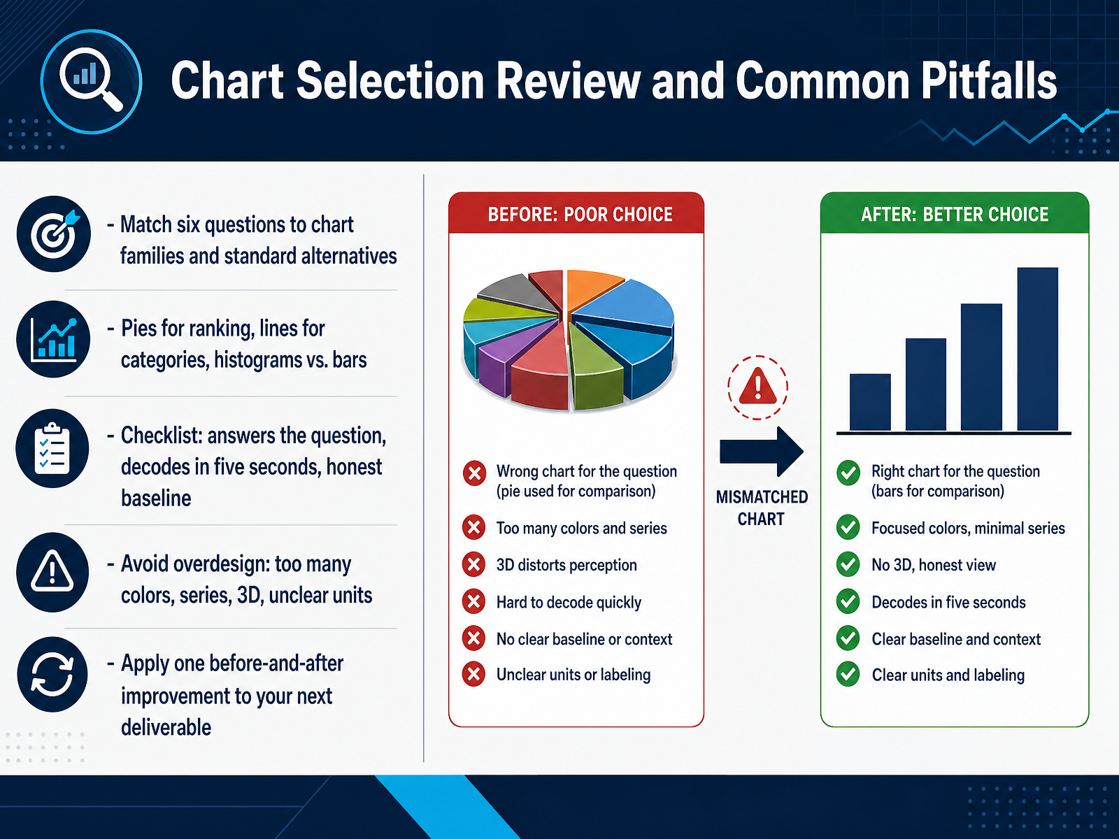
 - 14Chart Selection Review and Common PitfallsLet's lock this in with a quick review. Chart choice always starts with the question. If you need to show change over time, reach for a line chart. If you're ranking categories, use a sorted bar chart. And remember, a pie chart fails at ranking the moment it has more than a few slices. A histogram shows the shape of a distribution, while a bar chart compares individual categories. Don't mix those up. Before you finalize anything, run the checklist. Does the chart answer the question directly? Can a colleague decode it in under five seconds? And is the baseline honest, especially for bar charts? Then, strip out the noise. Too many colors, too many series, 3D effects, or missing units all bury the signal. For your next deliverable, pick one existing chart and apply one improvement from this course. Swap the pie for a bar. Fix a truncated axis. Or split a dual-axis chart into two. One clear fix is worth more than ten vague dashboard tweaks. Start there. Thanks for joining, and good luck with your next visualization.
 service-manual.ons.gov.uklibguides.gwu.eduomni.co+22 min
Take the deck with you
Download this course as a file — free, no sign-up needed.
- PDF handoutEvery slide page, ready to print or share.15 pages · 3.8 MBDownload
- Narrated PowerPointThe deck that presents itself — every slide carries the digital human's narration video.15 pages · 15.6 MBDownload
- PowerPoint slidesThe full deck as a .pptx — open it in PowerPoint, Keynote, or Google Slides.15 pages · 3.6 MBDownload
Free to use in your own training — please keep the PersonWise credit page at the end.
Have your own deck? Turn it into a course
Sources consulted
Web sources consulted while building this course.
- Evaluation Questions Chart Chooser - EvaluATE — evalu-ate.org
- Data Visualization: Chart Choosers - InfoGuides - George Mason University — infoguides.gmu.edu
- Chapter 5 — Quiz: Choosing the Right Chart | Data Viz with Python — datafield.dev
- Hannah Webber, Sarah J. Nelson, Ryan Weatherbee, Bill Zoellick, and Molly Schauffler — caryinstitute.org
- Exercises — Chapter 5: Choosing the Right Chart | Data Viz with Python | DataField.Dev — datafield.dev
- Overall considerations: Choosing a chart type – Data visualisation – Service manual – Office for National Statistics — service-manual.ons.gov.uk
- Common Mistakes - Data Visualization - Research Guides at George Washington University — libguides.gwu.edu
- Data Visualization Best Practices for Better Decision-Making - Omni Analytics — omni.co
- Common Mistakes in Data Presentation — perceptualedge.com
- Visual Best Practices - Tableau — help.tableau.com
- A friendly guide to choosing a chart type — datawrapper.de
- Best Visualizations for Metrics — dataschool.com
- skills/powerbi-report-design/references/chart-selection.md — github.com
- What Chart Should I Use? Chart Selection Guide 2025 — chartgen.ai
- How to Choose the Right Chart: One Question About Your Data — Analyst Prep Kit — michaelnocito.github.io
- Which Type of Chart or Graph is Right for You? — tableau.com
- Types of Charts and Graphs for Data Visualization — thoughtspot.com
- Essential Chart Types for Data Visualization — atlassian.com
- The Science of Visual Data Communication: What Works — journals.sagepub.com
- Measuring Real-World Understanding of — norc.org