First-Run Onboarding Design
Begin
15 pages · ~30 min
First-Run Onboarding Design
Learn to design effective first-run onboarding experiences that guide new users to initial product value.
What you’ll learn
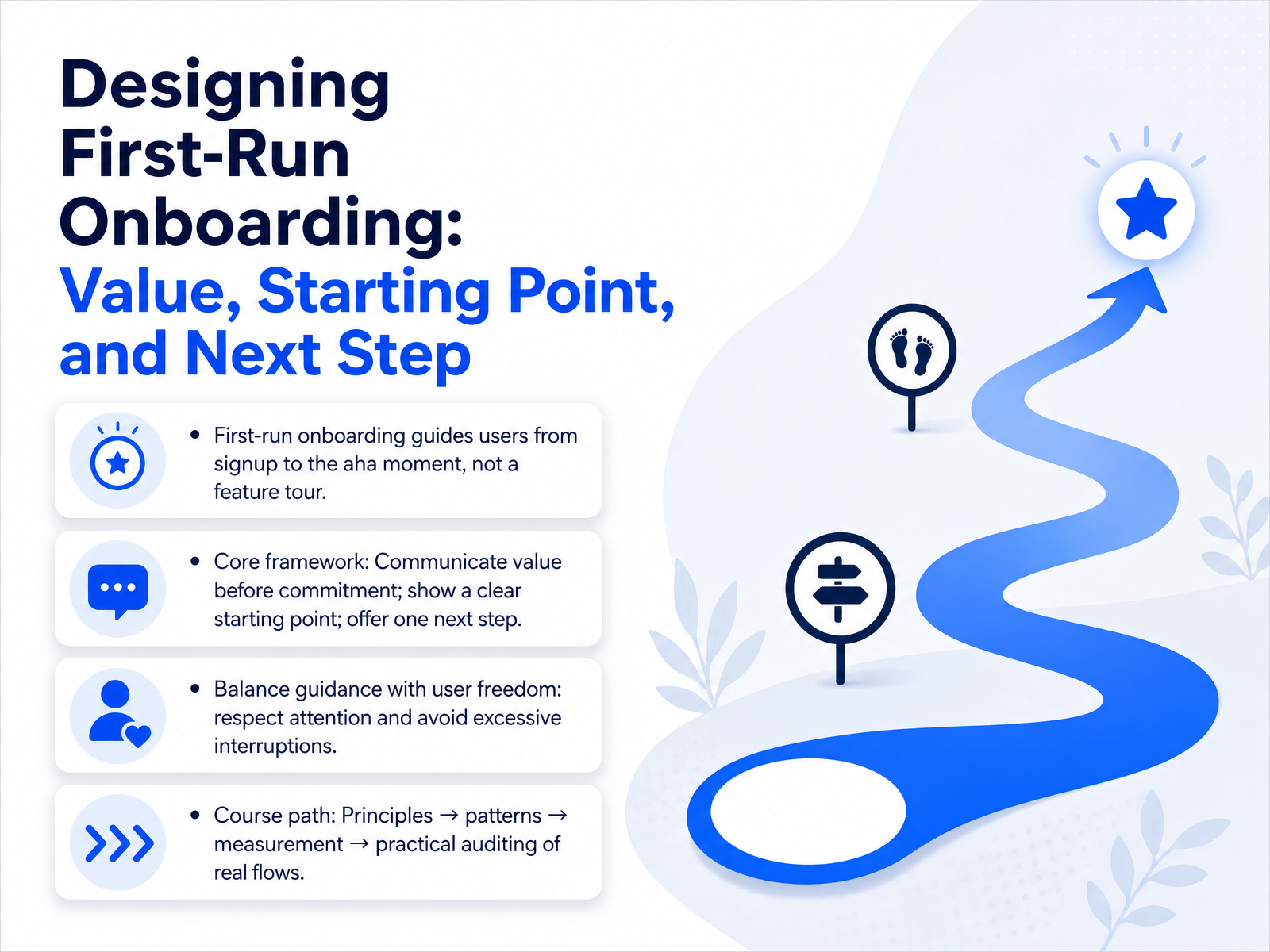
- 01Designing First-Run Onboarding: Value, Starting Point, and Next StepWelcome. Today, we're focusing on designing first-run onboarding that actually works. The goal isn't to tour every feature. It's to guide a new user from signup to their 'aha' moment as quickly and quietly as possible. We'll build this around a simple framework: communicate value before you ask for commitment. Show a clear starting point. And then offer just one next step. This means balancing helpful guidance with real user freedom. We respect the user's attention by avoiding excessive interruptions. Our path today will move from core principles, to proven patterns, then on to measurement, and finally, a practical audit of real-world flows. In the next slide, we'll step back and consider who our learner actually is — their roles, mental models, and what they already know.userpilot.comuserorbit.comcodivox.com+21 min
- 02The Learner's Starting Point: Roles, Mental Models, and Prior KnowledgeLet’s look at who we’re designing for and where they’re coming from. Our learners are UX designers, product managers, and developers. They already understand interaction design, UX writing, and user research. But applying that to a first-run experience is different. A common misconception is that onboarding means a product tour. Another is that more steps equal better learning. And a third is that one flow fits every user. These assumptions cause real problems. High drop-off. Intimidating blank states. Feature lists that create pressure instead of reducing friction. Your audience is capable. They just need the right structure the first time they open the product. That’s where we focus next. Coming up: The Three Pillars—Value, Starting Point, Next Step.
 1 min
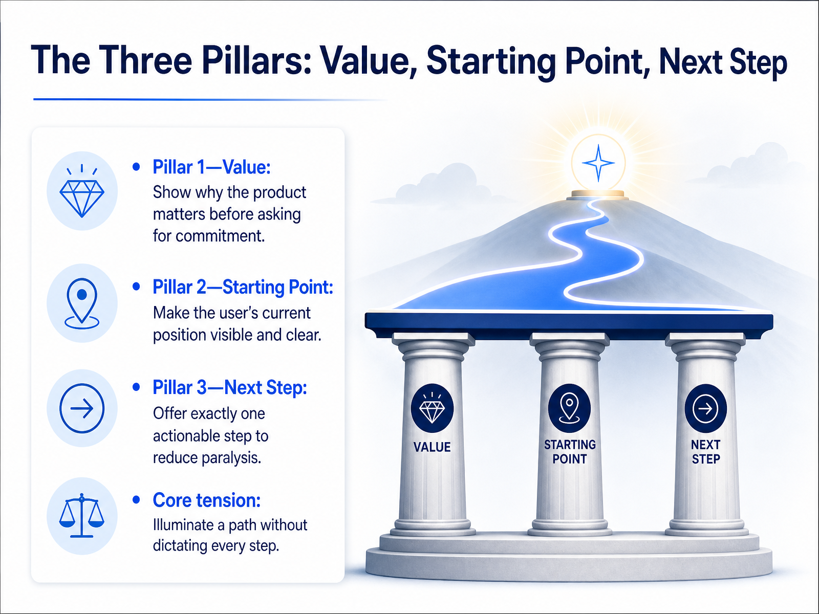
1 min - 03The Three Pillars: Value, Starting Point, Next StepNow let's break down the three pillars that hold up a great onboarding experience. Pillar one is Value. Before you ask someone to sign up or grant permissions, show them why this product matters in their world. Give them that quick win. Pillar two is the Starting Point. Make their current position visible. A blank canvas is intimidating. A dashboard that already reflects their situation tells them, I see you, and you're in the right place. Pillar three is the Next Step. Offer exactly one clear, actionable step. Too many choices lead to paralysis. This isn't about restricting freedom. The core tension is illuminating a path without dictating every step. You're a guide, not a puppeteer. Let's see how we apply that principle next with progressive disclosure, where we show less to teach more.
 1 min
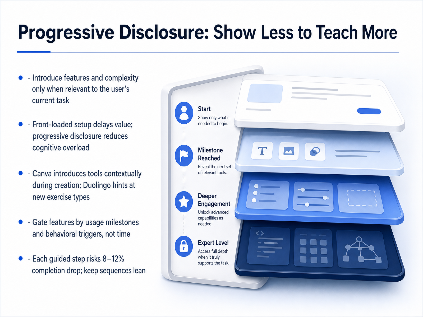
1 min - 04Progressive Disclosure: Show Less to Teach MoreNow, let's talk about how to actually introduce complexity. The answer is progressive disclosure. It means showing less upfront so users learn more over time. Think of it as teaching in layers. You only reveal a feature or a setting when it becomes relevant to the user's current task. Front-loaded setup—where you ask for everything before they start—delays value and creates friction. Progressive disclosure avoids that, reducing cognitive overload by letting users build confidence gradually. Canva does this well. It lets you start designing immediately, then introduces tools contextually as you work. Duolingo uses a similar approach, hinting at new exercise types only when you're ready for them. A critical rule: gate features by usage milestones and behavioral triggers, not just time. And remember, every extra guided step you add risks an 8 to 12 percent completion drop. Keep your sequences lean and focused.
 digia.techappcues.combabich.biz+21 min
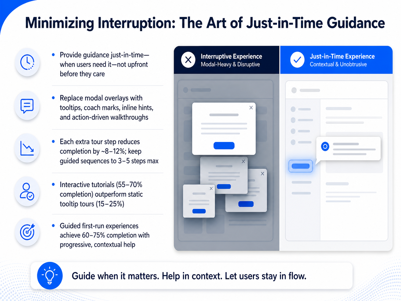
 - 05Minimizing Interruption: The Art of Just-in-Time GuidanceHere's a counterintuitive truth about great first-run design. The best guidance often feels invisible. It doesn't announce itself. It simply appears at the exact moment a user needs it and then gets out of the way. We call this just-in-time guidance. Instead of overwhelming someone with a tour the second they land, we wait. We watch for the moment of need. The data backs this up with striking clarity. Each extra step in a guided tour reduces completion by roughly eight to twelve percent. A tight three-step sequence can hold above seventy percent completion. Push that to ten steps and you drop into the twenty to thirty percent range. The format matters just as much as the length. Static tooltip tours often land between fifteen and twenty-five percent completion. Interactive tutorials, where the user performs the action themselves, can reach fifty-five to seventy percent. That's more than double. The pattern is clear. Replace modal overlays with coach marks, inline hints, and action-driven walkthroughs. Keep sequences short, ideally three to five steps maximum. And design for the user who wants to move at their own pace, not the one being marched through a script. When you get this right, guided first-run experiences with progressive, contextual help can achieve sixty to seventy-five percent completion. That's the difference between a user who explores and a user who simply closes the window. Next, we'll apply these principles by mapping the full first-run user journey.
 artisangrowthstrategies.comamworldgroup.comgetmonetizely.com+22 min
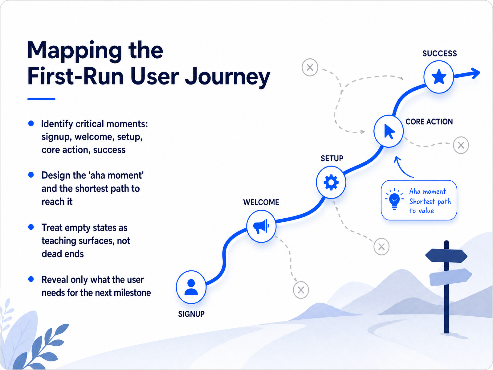
 - 06Mapping the First-Run User JourneyNow let's map the first-run user journey. Think of this as connecting the critical moments that a new user moves through. Signup, welcome, setup, the first core action, and finally, that moment of success. Your job is to design the shortest, clearest path to that success moment. We often call this the 'aha moment.' Identify it early, and then strip away everything that stands between the user and reaching it. Along that path, you will encounter empty states. These are not dead ends. Treat every blank screen as a teaching surface. Reveal only the specific information and the one action the user needs right now to reach the next milestone. Up next, we will dive deeper into empty states themselves, your most underrated onboarding surface.
 72technologies.compixxen.comnngroup.com+21 min
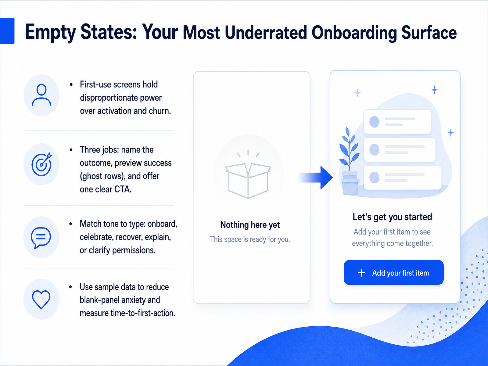
 - 07Empty States: Your Most Underrated Onboarding SurfaceNow, let's talk about the surface that does more onboarding work than any tooltip or tour: the empty state. These first-use screens hold disproportionate power over activation and churn. Most products waste them with a sad illustration and the words no data yet. But a well-designed empty state has three jobs. First, name the outcome. Tell the user what they will gain, not just what is missing. Second, preview success. A ghost row or a muted screenshot builds the mental model before you ask for effort. Third, offer exactly one clear call to action. Not three. One. Match the tone to the type. A first-use empty state should be instructive. A cleared state should celebrate. An error state should explain and offer recovery. A permissions state should show the path forward. One more tactic: offer sample data. It reduces blank-panel anxiety and lets users explore value immediately. Measure time-to-first-action from this screen. It is often the highest-ROI fix in your activation flow. Next, we will look at how to extend these principles into full sign-up flow design with smart defaults and previews in our next topic: Choice Architecture.
 72technologies.compixxen.comnngroup.com+22 min
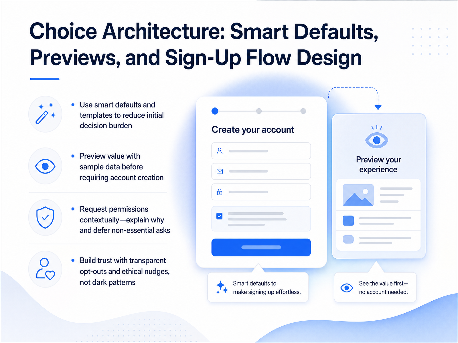
 - 08Choice Architecture: Smart Defaults, Previews, and Sign-Up Flow DesignLet's look at how choice architecture can guide users smoothly through onboarding. Start with smart defaults and templates. Pre-fill fields or give users a starting point. This reduces the mental load of making every decision from scratch. Next, show value early. Let people preview their data or see a sample dashboard before you ask for an account. When you do ask for permissions, do it in context. Wait until the feature is needed, and briefly explain why you need access. For example, say, 'We need your location to show nearby stores.' That builds understanding. Defer non-essential asks—you can always request them later. Most importantly, build trust through transparency. Make opt-outs clear and easy. Use ethical nudges, not dark patterns that trick people. A guided, honest flow respects the user and sets the right tone for the entire relationship. Up next, we'll explore how personalization and segmentation turn onboarding from one-size-fits-none into something that feels tailored.
 1 min
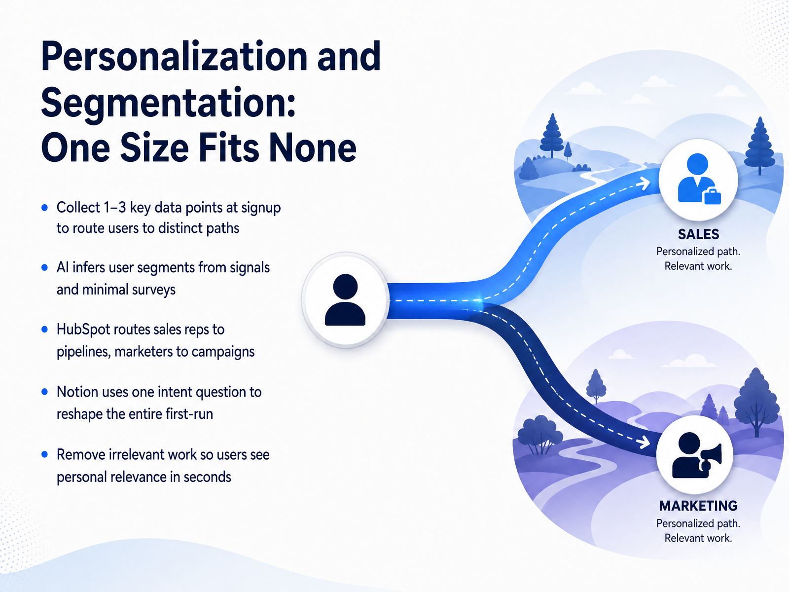
1 min - 09Personalization and Segmentation: One Size Fits NoneLet's move on to personalization. The reality is, one size fits none. Onboarding works best when users see their own world reflected in the product immediately. To do this, collect just one to three key data points at signup. This lets you route different users to distinct, relevant paths. Modern AI can often infer user segments from behavioral signals combined with very brief surveys. HubSpot does this well. It routes sales representatives straight into pipeline views, while marketers land in campaign tools. Notion takes an even lighter approach. It asks a single intent question upfront and reshapes the entire first-run experience based on that answer. The goal here is subtraction. Remove any work that is irrelevant to that user so they see personal relevance within seconds, not minutes. Next, we'll look at how to sustain that early engagement using checklists, progress indicators, and gamification to build momentum.
 1 min
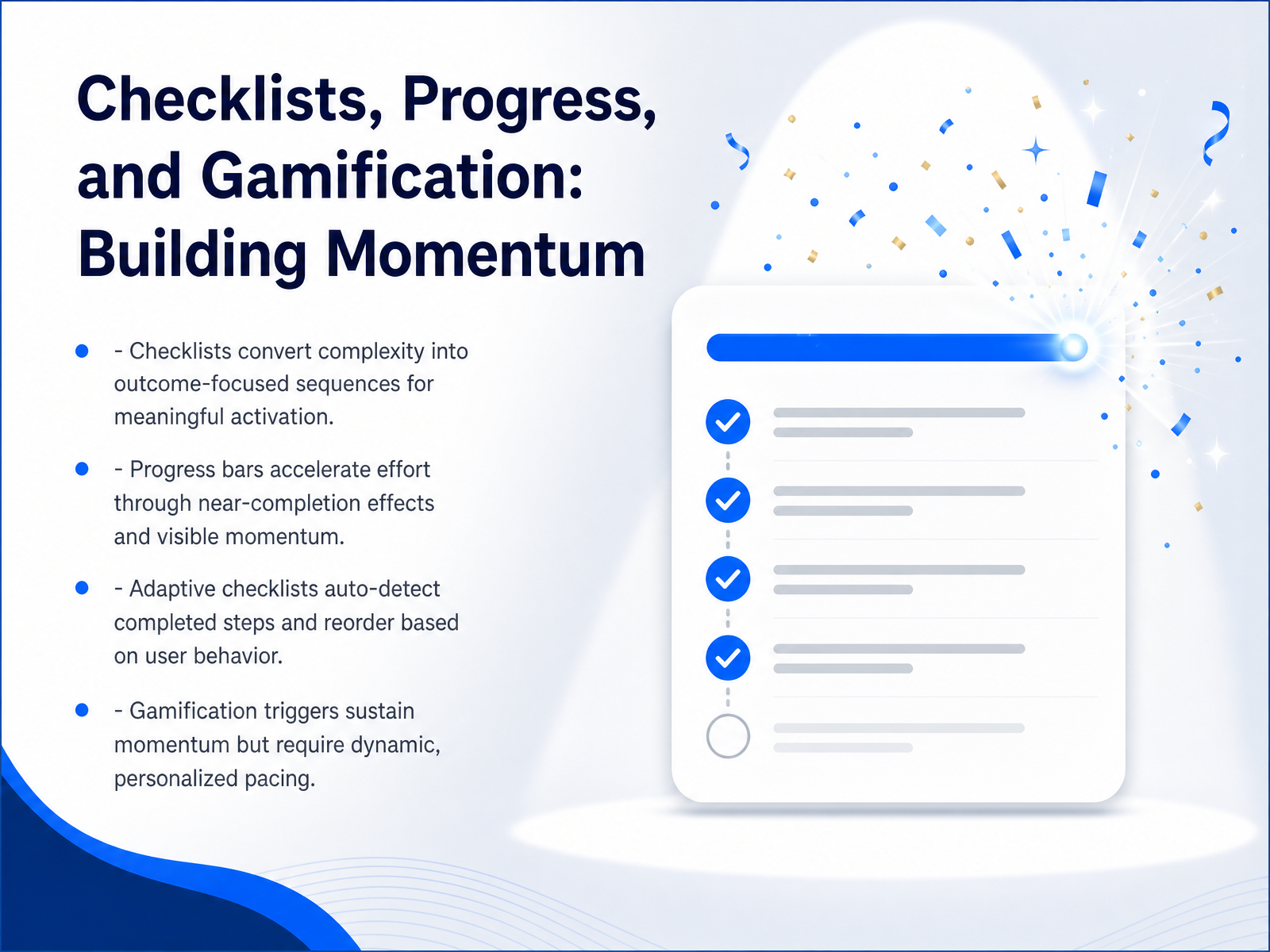
1 min - 10Checklists, Progress, and Gamification: Building MomentumLet's look at how to build real momentum. A long feature list is overwhelming. A checklist turns that complexity into a clear, outcome-focused sequence. Think of it not as a to-do list, but as a path to that first meaningful win. Next, consider the power of visible progress. A progress bar works because of a psychological principle called the goal-gradient effect. As users see they are near completion, their effort accelerates. Make that momentum visible. Now, take it a step further with adaptive checklists. Instead of a static list, the system should auto-detect completed steps and intelligently reorder tasks based on user behavior. This removes the guesswork. Finally, a note on gamification. Badges and points can sustain momentum, but only with personalized pacing. A generic, daily quest that ignores a user's actual stage will feel hollow and quickly backfire. Focus on dynamic triggers that match their real journey. Up next, we will cover measuring onboarding effectiveness and the metrics that matter.
 2 min
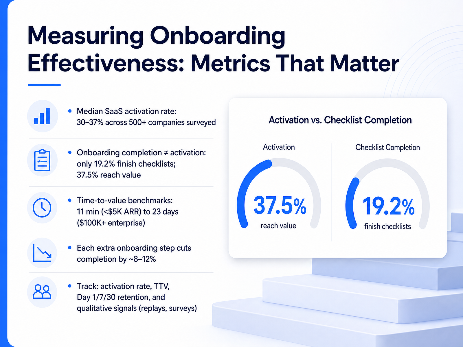
2 min - 11Measuring Onboarding Effectiveness: Metrics That MatterNow let’s talk about measuring what matters. The median S-a-a-S activation rate lands around 30 to 37 percent. That means most new signups never reach the value they came for. And here’s the twist. Onboarding checklist completion sits at only about 19 percent, yet activation rates are higher. Users often find value on their own terms, outside the path you designed. Time-to-value varies sharply by deal size. A sub-five-thousand-dollar account might hit value in eleven minutes. An enterprise account over one hundred thousand dollars can take twenty-three days. Design your first-run experience knowing your segment. Also know this: each extra step in your flow cuts completion by roughly eight to twelve percent. Keep paths short. Track the right signals. Measure activation rate, time-to-value, and Day one, seven, and thirty retention. Add qualitative signals too, like session replays and in-product surveys. Next, we’ll look at A/B Testing and Continuous Optimization.
 artisangrowthstrategies.comamworldgroup.comgetmonetizely.com+22 min
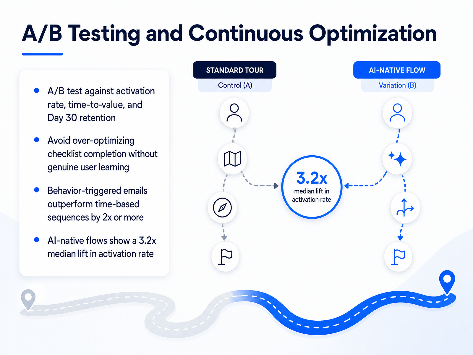
 - 12A/B Testing and Continuous OptimizationLet's talk about measuring and improving your onboarding over time. Your quickest path to better results is A/B testing against the metrics that matter. Test your flows against activation rate, time-to-value, and Day 30 retention. That last one keeps you honest. Avoid the trap of optimizing for checklist completion alone. A completed checklist doesn't mean a user learned anything. You want genuine capability, not just a series of clicked boxes. On the channel side, behavior-triggered emails consistently outperform time-based sequences by two times or more. Reach out when the user takes action, or when they stall, not just on day three. And for a directional benchmark, AI-native flows currently show a 3.2 times median lift in activation rate. That's not a small margin. Use these baselines to calibrate your own experiments, then double down on what moves the needle. Next, we'll examine common onboarding mistakes and how to fix them.
 2 min
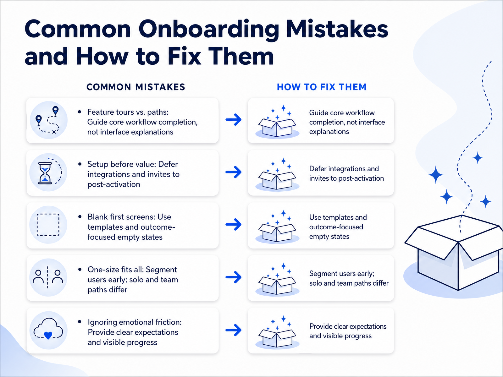
2 min - 13Common Onboarding Mistakes and How to Fix ThemNow let's look at common mistakes that can quietly derail onboarding, and how to fix them. First, avoid feature tours. Don't walk users through every button. Instead, guide them through one core workflow. Show the path, not the interface. Next, defer setup tasks like integrations and team invites. Let users experience value first, before asking for more work. Another trap is the blank first screen. Replace it with sample data or an outcome-focused empty state that clearly shows what the user will achieve. Also, avoid a one-size-fits-all flow. Segment users early. A solo user's path is different from a team lead's. Finally, don't ignore emotional friction. Show clear expectations and visible progress. A simple checklist or progress bar can reduce anxiety and build momentum. In our next slide, we'll put these ideas into practice with a hands-on workshop: auditing an existing onboarding flow.
 2 min
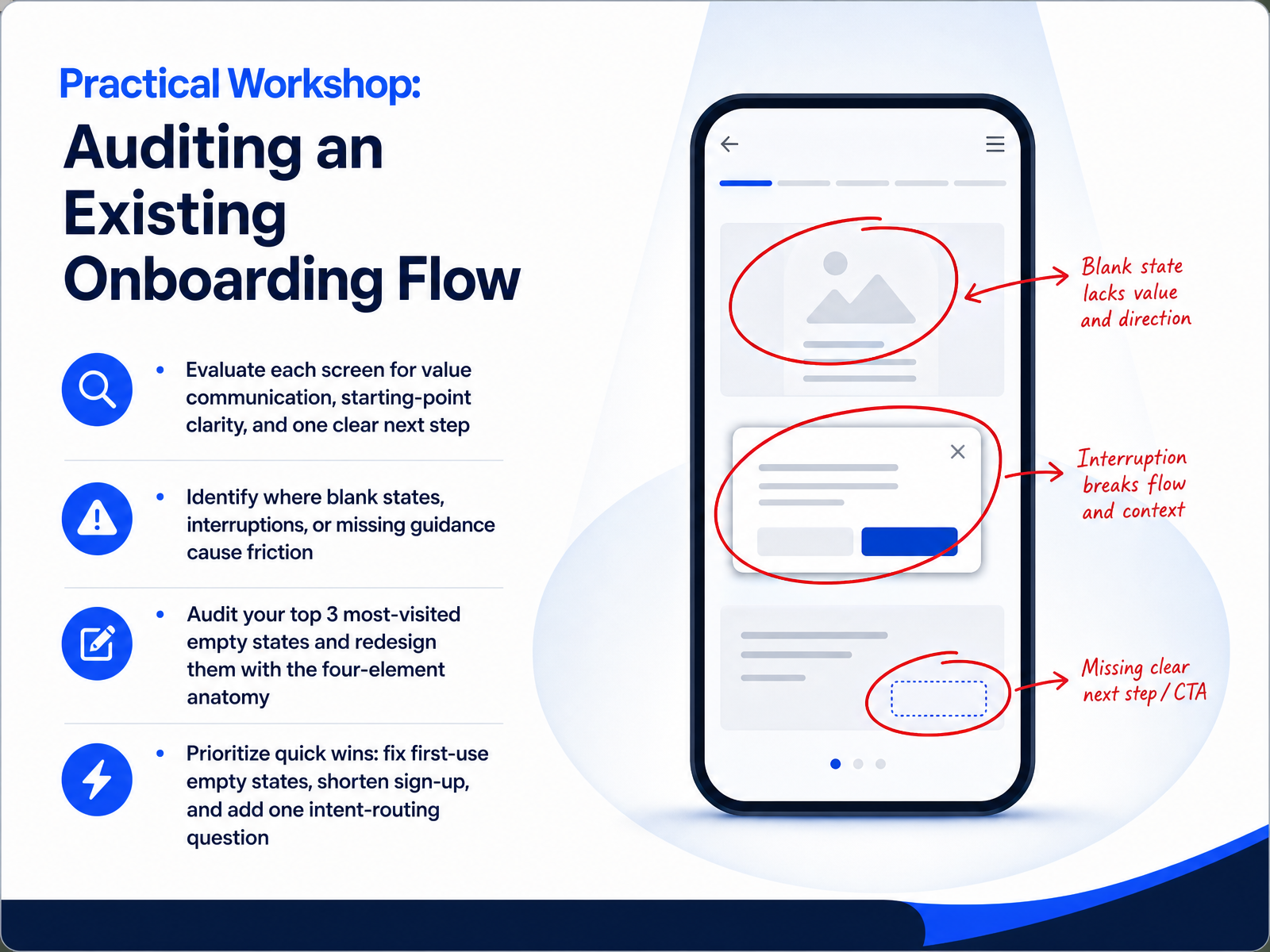
2 min - 14Practical Workshop: Auditing an Existing Onboarding FlowLet's put everything we've covered into practice with a hands-on audit. Open your own product as a brand new user and go screen by screen. For each one, ask three questions. Does this screen clearly communicate the value of what will live here? Does the user immediately understand the starting point? And is there exactly one obvious next step? Do not miss the places where blank states, sudden interruptions, or missing guidance create friction. Those are your highest-priority leaks. Now, pull your analytics and find your three most visited first-use empty states. Redesign them using the four-element anatomy: a headline that names the outcome, a preview of the populated state, one clear primary action, and a low-commitment escape hatch like sample data. Finally, prioritize speed over perfection. Fix those first-use empty states, shorten your sign-up flow wherever you can, and add a single question that routes users to their best first action. In the next slide, we'll move from the workshop to a concrete checklist that turns all of these principles into a repeatable design process.
 72technologies.compixxen.comnngroup.com+22 min
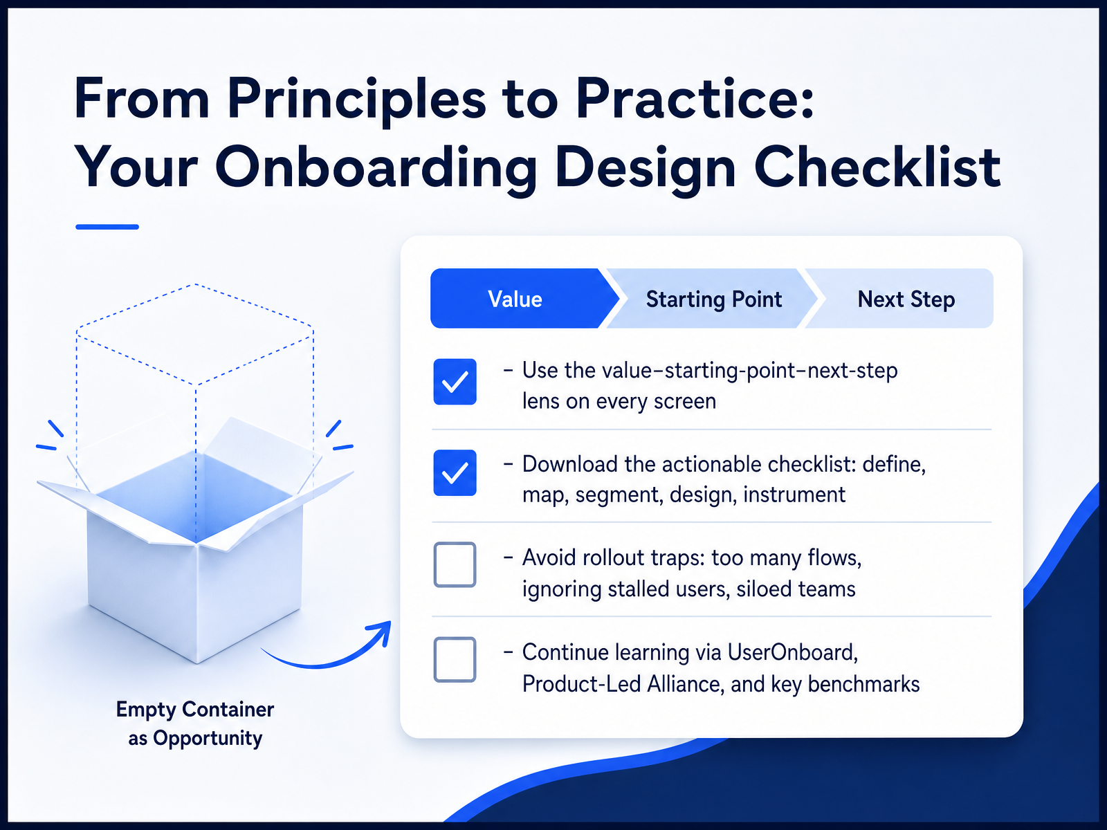
 - 15From Principles to Practice: Your Onboarding Design ChecklistLet's wrap up with a practical checklist. Use the value, starting-point, next-step lens on every screen. This ensures you always show a user why they're here, where they are, and what to do next. Grab the actionable checklist. It walks you through five phases: define, map, segment, design, and instrument. Stay clear of common rollout traps. Avoid too many flows, which hurts completion. Ignoring stalled users leads to silent churn. And siloed teams create fragmented experiences. For continued learning, explore resources from UserOnboard and the Product-Led Alliance. Most importantly, dig into key benchmarks. For context, median activation rates hover around thirty-seven percent, but top-quartile teams can surpass sixty percent. That gap is your opportunity. Thank you for joining this module. Use these principles to design onboarding that respects your users' time and drives real value.
 artisangrowthstrategies.comamworldgroup.comgetmonetizely.com+22 min
Take the deck with you
Download this course as a file — free, no sign-up needed.
- PDF handoutEvery slide page, ready to print or share.16 pages · 3.4 MBDownload
- Narrated PowerPointThe deck that presents itself — every slide carries the digital human's narration video.16 pages · 12.2 MBDownload
- PowerPoint slidesThe full deck as a .pptx — open it in PowerPoint, Keynote, or Google Slides.16 pages · 3.3 MBDownload
Free to use in your own training — please keep the PersonWise credit page at the end.
Have your own deck? Turn it into a course
Sources consulted
Web sources consulted while building this course.
- First-Time User Experience (FTUE): Best Practices & Examples — userpilot.com
- The Complete Guide to SaaS User Onboarding in 2026 | Userorbit — userorbit.com
- SaaS Onboarding Best Practices 2026: Reduce Churn from Day One | Codivox — codivox.com
- SaaS Onboarding in 2026: Best Practices & Examples — intempt.com
- Best User Onboarding Experiences in 2026: Examples and AI-Era ... — userpilot.com
- Onboarding Patterns for Mobile Apps: Progressive Disclosure vs Front- ... — digia.tech
- The essential guide to mobile user onboarding: UI/UX patterns and best ... — appcues.com
- Design Patterns: Progressive Disclosure for Mobile Apps — babich.biz
- Design Patterns: Progressive Disclosure for Mobile Apps — uxplanet.org
- App Onboarding Examples: 10 Flows That Activate Users | ziggle.art — ziggle.art
- SaaS Onboarding Completion Rate Benchmarks 2026 | Artisan Strategies — artisangrowthstrategies.com
- Customer Onboarding Statistics 2026 | TTV, Retention, Completion | AMW® — amworldgroup.com
- How to Measure Onboarding Completion Rates: A Strategic Guide ... — getmonetizely.com
- Benchmarking Your Onboarding: Industry Standards for 2026... — adoptkit.com
- What Are the SaaS Activation Benchmarks by Industry in 2026? | ProductQuant — productquant.dev
- Empty States as Onboarding: A Practical UX Playbook · 72Technologies — 72technologies.com
- SaaS Empty State Design: 9 Patterns That Drive Activation — pixxen.com
- Designing Empty States in Complex Applications — nngroup.com
- How to Design Empty States | UIGuides — uiguides.com
- Empty States - Onboarding UX Patterns — useronboard.com