Mobile Navigation Design
Begin
16 pages · ~32 min
Mobile Navigation Design
Learn to design mobile navigation patterns that enhance usability and user experience in mobile applications.
What you’ll learn
- 01Mobile Navigation Design: Core Principles for Modern Product DesignersWelcome to Mobile Navigation Design. This course is built for product designers who need to shape how people move through an app on a small screen. Over the next few sessions, we will move past opinion and focus on the principles that directly affect user behavior. By the end, you will have a concrete framework for making navigation decisions that improve conversion, retention, and trust. Let's start by defining the problem. Today, mobile devices account for sixty-three percent of all web traffic. Yet research from the Baymard Institute shows that two-thirds of mobile sites still deliver a mediocre or poor navigation experience. That gap is not just a design failure. It is a business liability. Poor navigation triggers a thirty-eight percent higher bounce rate and a twenty-four percent drop in conversions. Every extra tap, every hidden menu, and every unreachable target pushes a user back to the competition. On a small screen, the stakes are higher because the margin for error is smaller. What works on a desktop often fails on a phone, and that means we need radically different thinking. This training covers the full stack: thumb-zone ergonomics, navigation pattern selection, performance thresholds, and accessibility standards. We will ground every principle in real user behavior and show you exactly where the data leads. The goal is not to give you a single template. It is to give you the decision-making tools you need to audit and improve any mobile navigation architecture. Let's begin that work by looking at the human factors and cognitive constraints that shape every interaction.heurilens.comyourwebteam.iologoswebdesigns.com+22 min
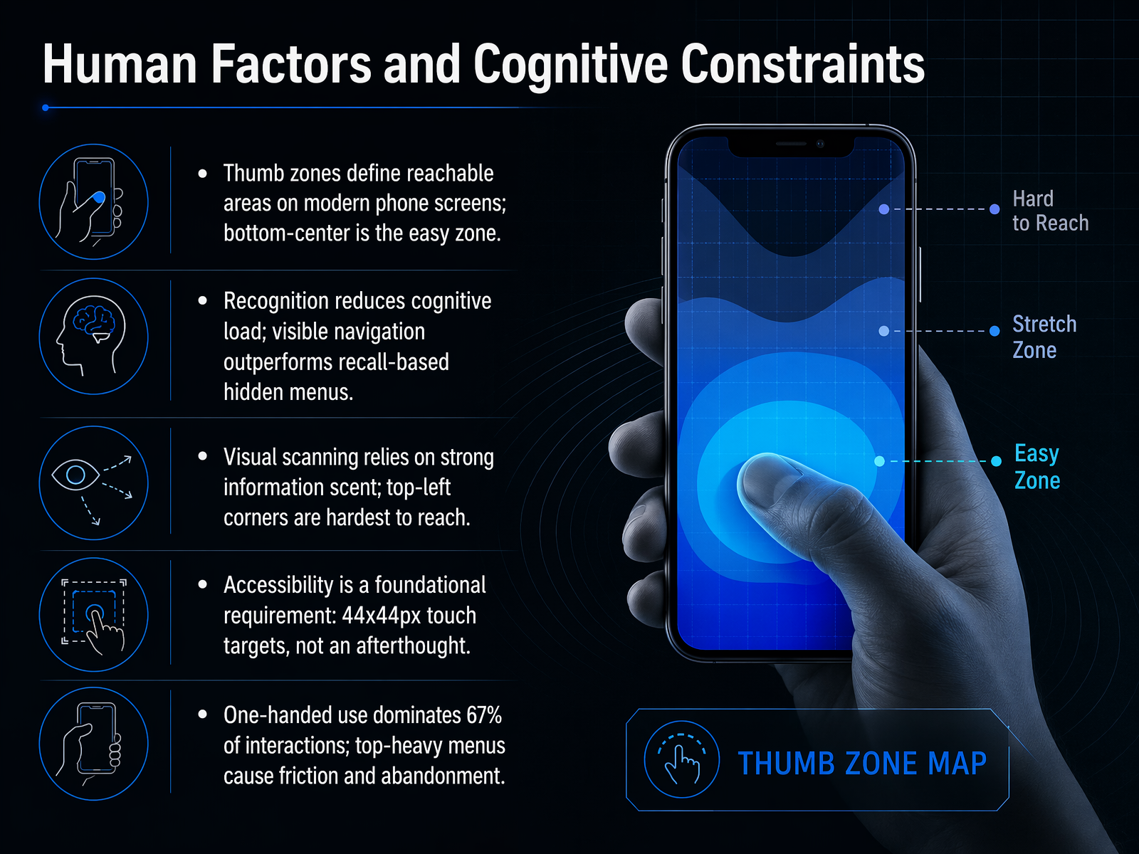
- 02Human Factors and Cognitive ConstraintsLet's ground this in the human body. When someone holds a phone, their thumb naturally falls to the bottom-center of the screen. That's the easy zone. Always place your most critical actions there. The top-left corner, by contrast, is a reach that forces a grip shift. Avoid it for primary controls. Think about the cognitive cost too. Visible navigation reduces mental load. Users recognize options they can see. Hidden menus demand recall, and research shows that cuts discoverability nearly in half. Don't make people hunt. And every touch target must be at least forty-four by forty-four pixels. That's not a suggestion; it's a foundational accessibility requirement, not an afterthought. Finally, two-thirds of interactions happen one-handed. A top-heavy menu isn't just inconvenient. It creates friction that leads to abandonment. Design for the thumb, and you design for the reality of use. Next, we'll apply these principles directly to navigation architecture patterns.
 dl.acm.orgprograms.sigchi.orgdoi.org+22 min
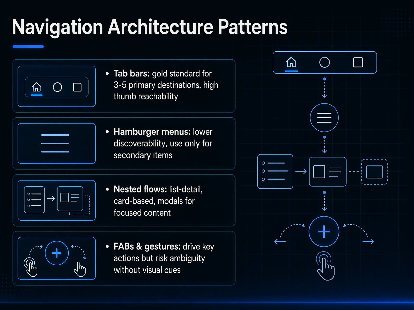
 - 03Navigation Architecture PatternsLet's move into the architecture patterns that actually make mobile navigation work. Start with the tab bar. For three to five primary destinations, it's the gold standard. Why? Because it sits right in the thumb zone, where 67 percent of interactions happen. Icons alone aren't enough—pair them with labels. Research shows icons without text cut discoverability in half. Next, the hamburger menu. Use it only for secondary items. Nielsen Norman Group found that hidden navigation reduces discoverability by almost 50 percent. If you bury a primary action in there, expect a steep drop in usage. For deeper content, think in nested flows. A list-detail structure, card-based layouts, or modals keep users focused without losing context. And finally, floating action buttons and gestures. They drive key actions, but they carry risk. A FAB can block content, and gestures without visual cues become guesswork. Every gesture must have a visible tap alternative. The takeaway is this: match the pattern to the frequency of use. High-frequency actions belong in the tab bar. Low-frequency, secondary items can live behind a menu or in a drawer. Up next, we'll apply that same logic to information architecture for mobile.
 heurilens.comyourwebteam.iologoswebdesigns.com+22 min
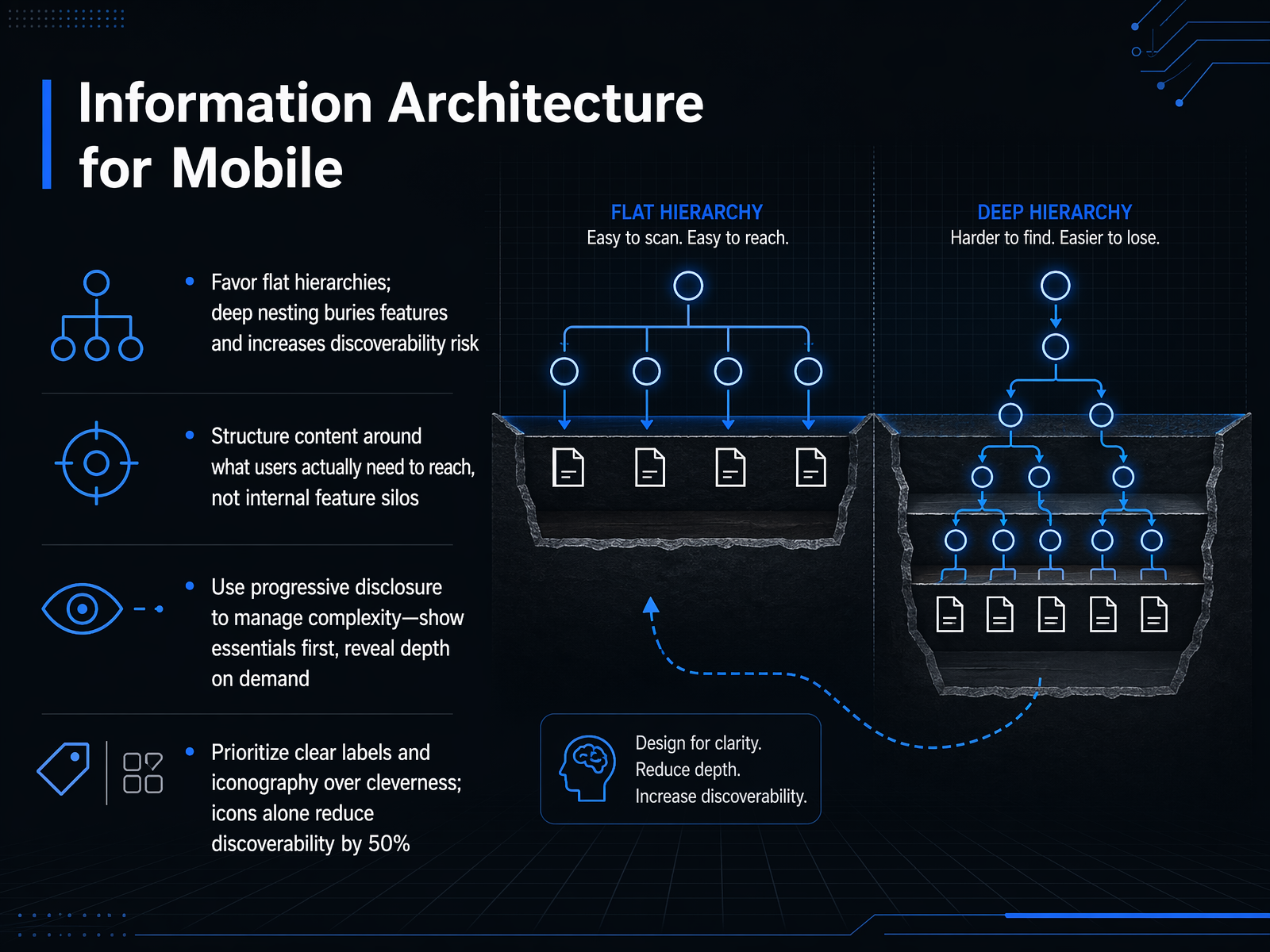
 - 04Information Architecture for MobileNow let's turn to the structural foundation of navigation: information architecture. On a small screen, the way you organize content directly determines whether users find what they need or abandon the task. Start with one hard rule: favor flat hierarchies. Deep nesting might feel organized to you, but it buries features and dramatically increases the risk that users will never discover them. Instead, structure your content around what users actually need to reach, not around your internal feature silos or departmental boundaries. When you do have to manage complexity, use progressive disclosure. Show the essentials first, and reveal depth only on demand. This keeps the initial view clean without stripping away capability. Finally, prioritize clear labels and iconography over cleverness. Research consistently shows that icons alone reduce discoverability by roughly fifty percent. Always pair an icon with a text label so users recognize the destination immediately, rather than having to guess. The bottom line is this: good architecture makes navigation feel obvious, not clever. Now, let's take these principles and apply them to practical strategies for navigation design.
 medium.comkontakt-94094.medium.commedium.com+22 min
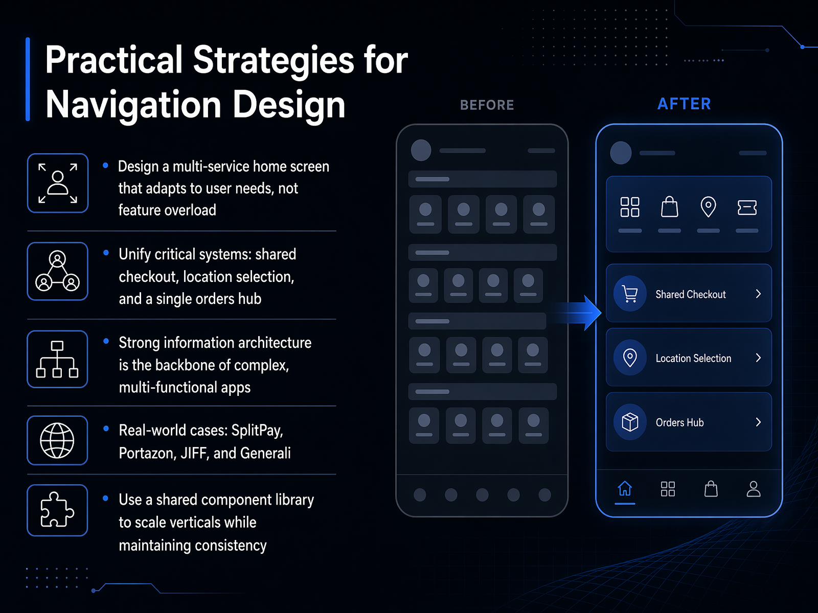
 - 05Practical Strategies for Navigation DesignLet's move into the practical strategies that make these complex systems work. The foundation is a multi-service home screen that adapts based on user state, not feature count. In JIFF, new users see a subscription prompt, while returning users jump straight to their active services. This prevents the overwhelm that kills adoption. Next, unify your critical systems. Share a single checkout, location selector, and orders hub across every vertical. In SplitPay, merging expense splitting with payments turned a cross-app relay race into a single tap. Strong information architecture is the backbone here. Without it, as Portazon discovered, features become invisible and users disengage. The real-world cases—SplitPay, Portazon, JIFF, and Generali—all prove that structure matters more than visual polish. Finally, use a shared component library to scale vertically while maintaining consistency. JIFF's reusable location and checkout patterns meant users only had to learn the system once. That consistency directly builds trust and reduces friction. Up next, we'll explore how visual design and affordances bring this architecture to life.
 medium.comkontakt-94094.medium.commedium.com+22 min
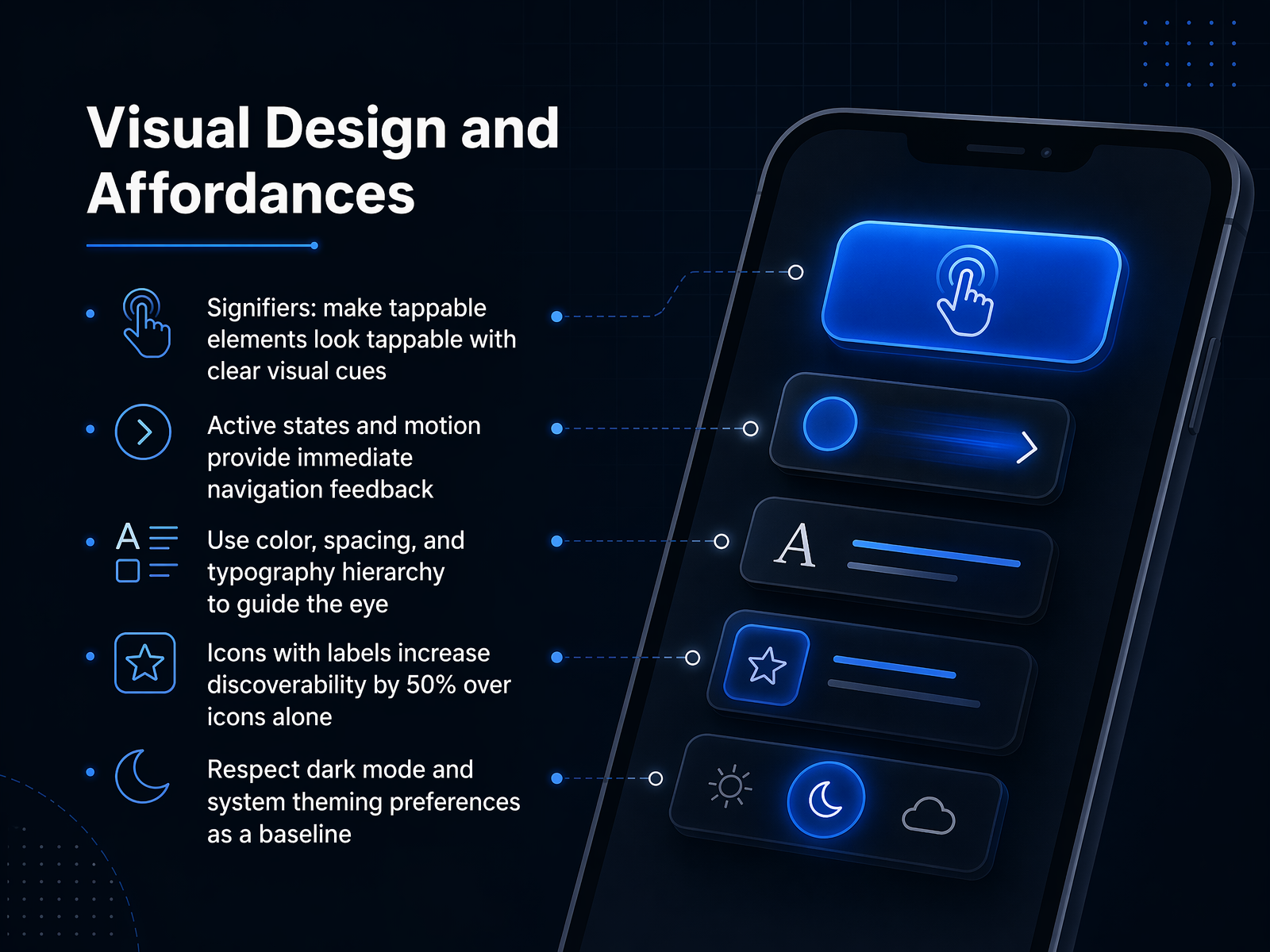
 - 06Visual Design and AffordancesLet's move into how visual design communicates interactivity, because on mobile, every pixel has to earn its place. Start with signifiers. A tappable element must look tappable, not ask users to guess. Shadows, subtle borders, or a distinct color treatment signal affordance before the finger ever lands. Without those cues, you're essentially hiding functionality in plain sight. Next, active states and motion. When a user taps an icon or a button, an instant visual response confirms the action. A brief scale or color shift isn't decoration; it's feedback that says 'I got you.' That feedback loop prevents the hesitation that makes people tap twice. Now, visual hierarchy. Use color, spacing, and typography weight to guide the eye. If everything shouts, nothing is heard. Your primary action should own the strongest visual weight, and secondary items should recede. This makes scanning faster and decisions more confident. One more critical finding: icons paired with text labels increase discoverability by fifty percent over icons alone. A magnifying glass is universal, but a heart or a star is not. Labels remove ambiguity and reduce cognitive load instantly. Finally, make dark mode and system theming your baseline. If your navigation ignores reduced motion or color contrast preferences, it signals to the user that you don't respect their context. Comply with system preferences, and the interface feels native and trustworthy from the first frame. That brings us to our next topic: Platform Conventions, Not Personal Styles.
 heurilens.comyourwebteam.iologoswebdesigns.com+22 min
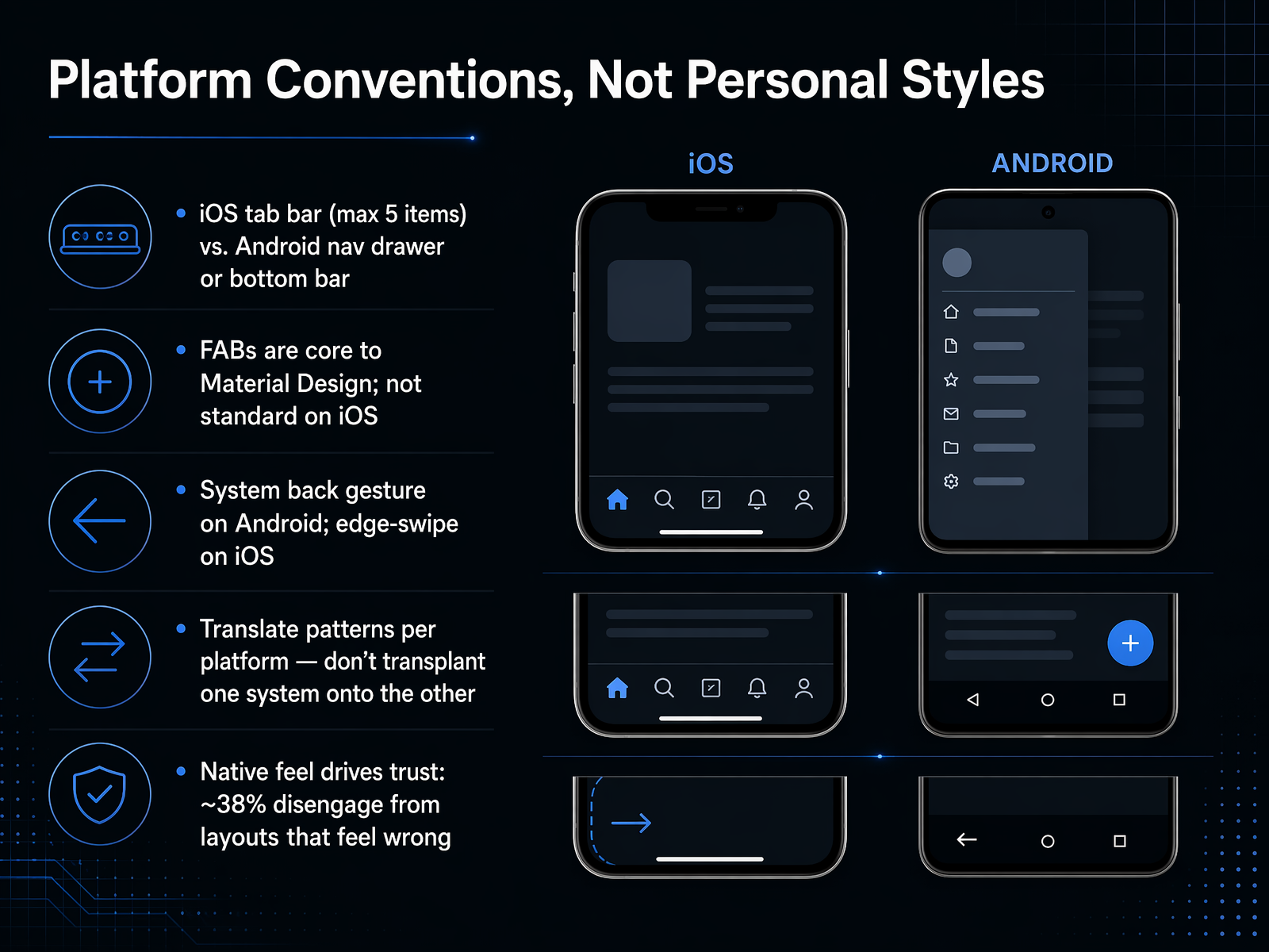
 - 07Platform Conventions, Not Personal StylesLet's focus on platform conventions. These are not personal style preferences; they are deeply ingrained user expectations. On iOS, use a bottom tab bar with a maximum of five items. On Android, you can use a bottom navigation bar or a navigation drawer for more complex apps. A floating action button, or FAB, is a core Material Design pattern on Android. It is not standard on iOS, so translate it into a primary action in the navigation bar or tab bar. The back action also differs. Android relies on the system back gesture, while iOS uses the edge-swipe from the left. The principle is simple: translate navigation patterns per platform. Do not transplant one system onto the other. A native feel drives trust. Research shows that roughly thirty-eight percent of users disengage from layouts that feel wrong. Next, we will apply this thinking to designing navigation for a cohesive ecosystem.
 aaronmallen.comvp0.comsanjaydey.com+21 min
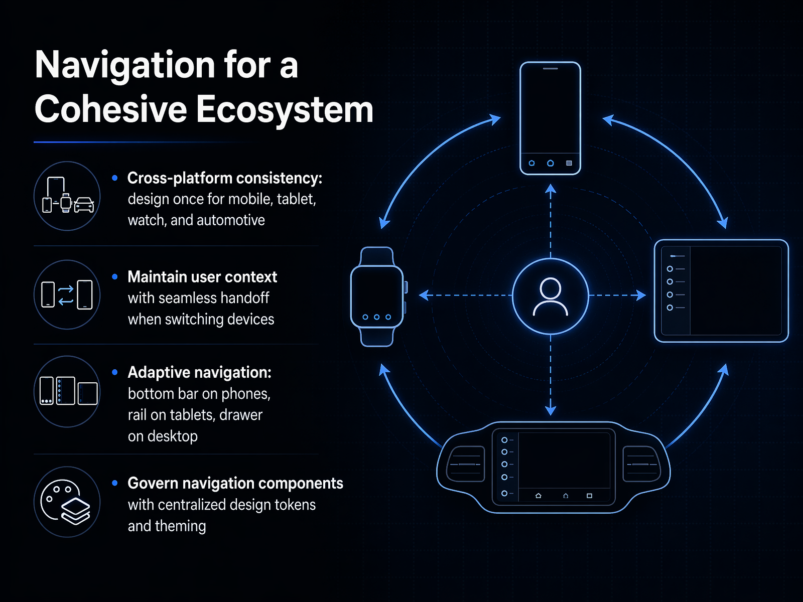
 - 08Navigation for a Cohesive EcosystemNow let's talk about designing navigation for a cohesive ecosystem. Think beyond a single screen. Your users aren't just on a phone. They move between their phone, a tablet, their watch, and even their car display. Your navigation framework must travel with them. Start with cross-platform consistency. Define the navigation structure once, and let the system adapt the presentation. A bottom navigation bar for phones, a rail for tablets, and a drawer or sidebar for desktop. The breakpoints matter: use a bottom bar when the screen is less than six hundred pixels wide, a rail between six hundred and eight hundred forty pixels, and a full drawer above twelve hundred forty. Next, maintain user context. A seamless handoff means the user's place, their scroll position, and their active task persist when they put down the phone and open the laptop. Finally, govern this entire system with centralized design tokens. Instead of hard-coding colors or spacing, use a single token set for all platforms. When you update the primary color or border radius in one place, every navigation component across every device inherits the change. This creates a single source of truth for your navigation system. Up next, we'll dig into prototyping and testing navigation.
 2 min
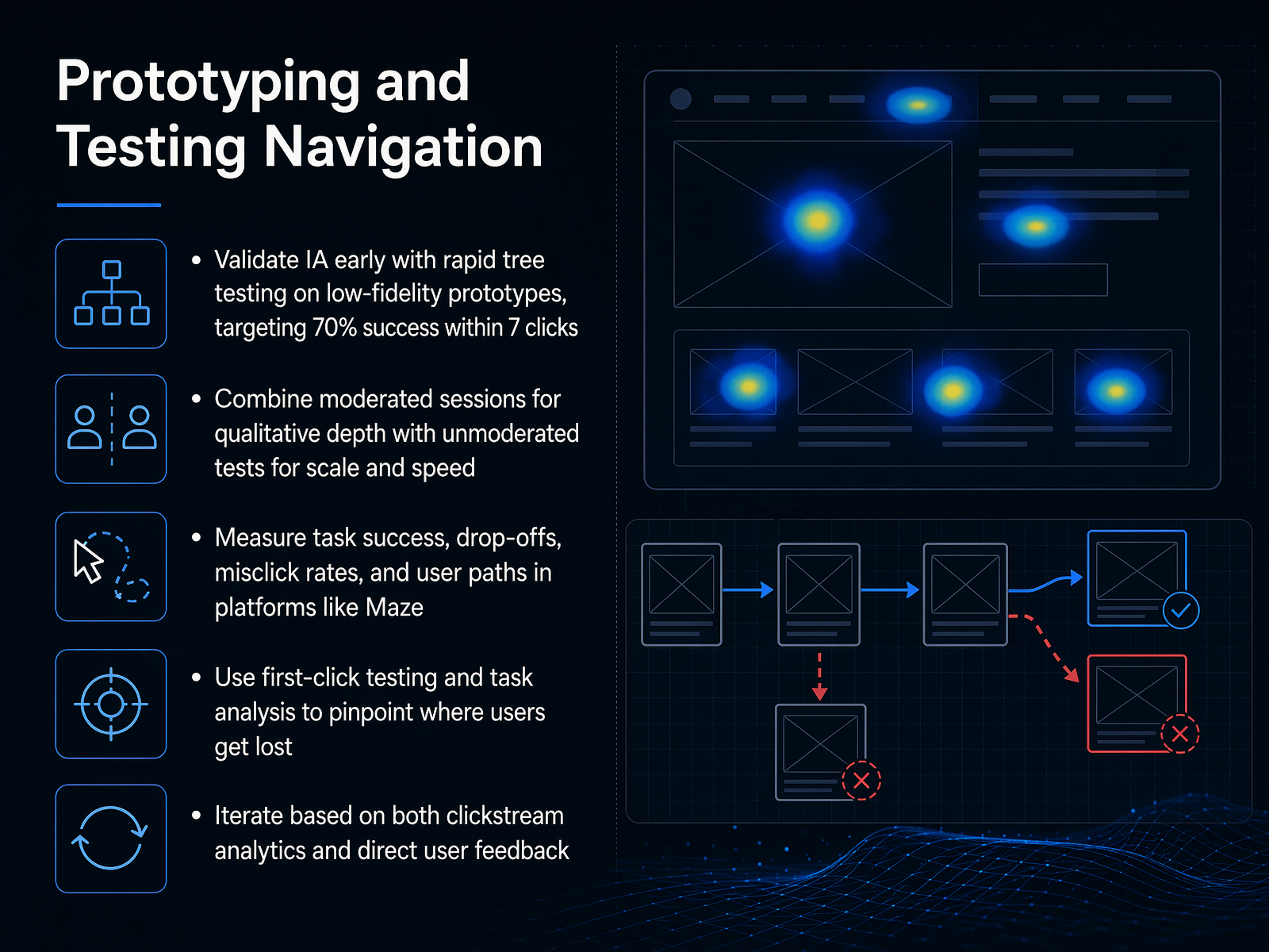
2 min - 09Prototyping and Testing NavigationLet's talk about prototyping and testing navigation. You validate your information architecture early with rapid tree testing on low-fidelity prototypes. Aim for seventy percent success within seven clicks. When that number drops, your labels or hierarchy are failing. Next, combine moderated sessions for qualitative depth with unmoderated tests for scale and speed. In moderated sessions, watch someone hesitate at a non-standard back button and ask why. In unmoderated tests, collect thousands of data points to confirm the pattern. Measure task success, drop-offs, misclick rates, and user paths in platforms like Maze. Use first-click testing and task analysis to pinpoint exactly where users get lost. If the first click is wrong, the task usually fails. Finally, iterate based on both clickstream analytics and direct user feedback. The numbers tell you what happened. The user's voice tells you why. Now, let's move on to common pitfalls and how to avoid them.
 1 min
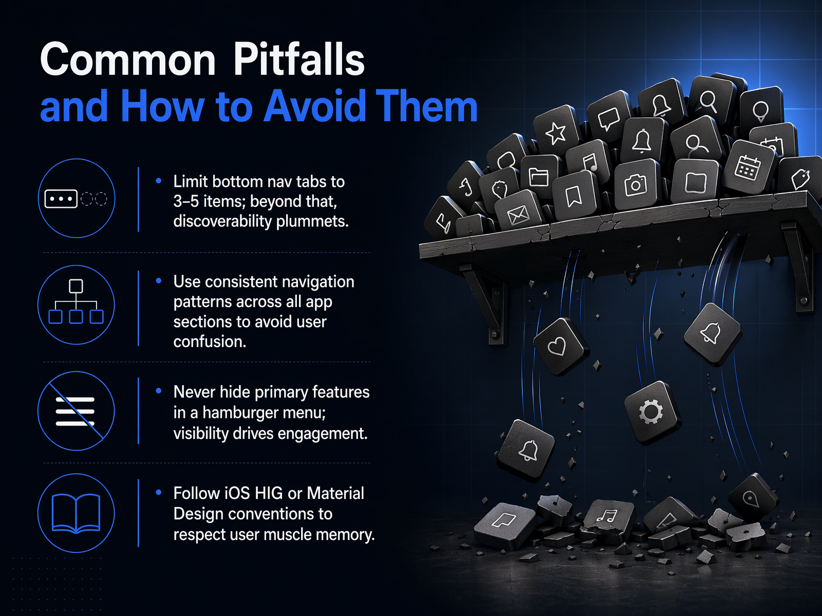
1 min - 10Common Pitfalls and How to Avoid ThemLet's move on to common pitfalls and, more importantly, how to steer clear of them. First, we have to talk about the bottom navigation bar. Limit it to three to five items. Research from the Baymard Institute and Nielsen Norman Group confirms that discoverability plummets when you exceed this. Users simply stop seeing the extra options. Second, maintain consistent navigation patterns across every section of your app. If the primary tab bar disappears or changes behavior on a specific screen, you force users to re-learn your interface, which creates confusion and erodes trust. Third, a critical mistake we still see: hiding primary features inside a hamburger menu. Visibility drives engagement. A Baymard study found that hidden navigation can cut discoverability nearly in half. If a feature is core to the daily experience, it needs to be visible and reachable with a single thumb tap. Finally, respect user muscle memory. Follow the conventions of Apple's Human Interface Guidelines or Google's Material Design. When you leverage standard patterns for navigation, gestures, and iconography, you reduce cognitive load. The app feels intuitive because it behaves exactly how users expect it to. Next, we'll build on these principles and explore advanced navigation, focusing on gestures and context.
 medium.comkontakt-94094.medium.commedium.com+22 min
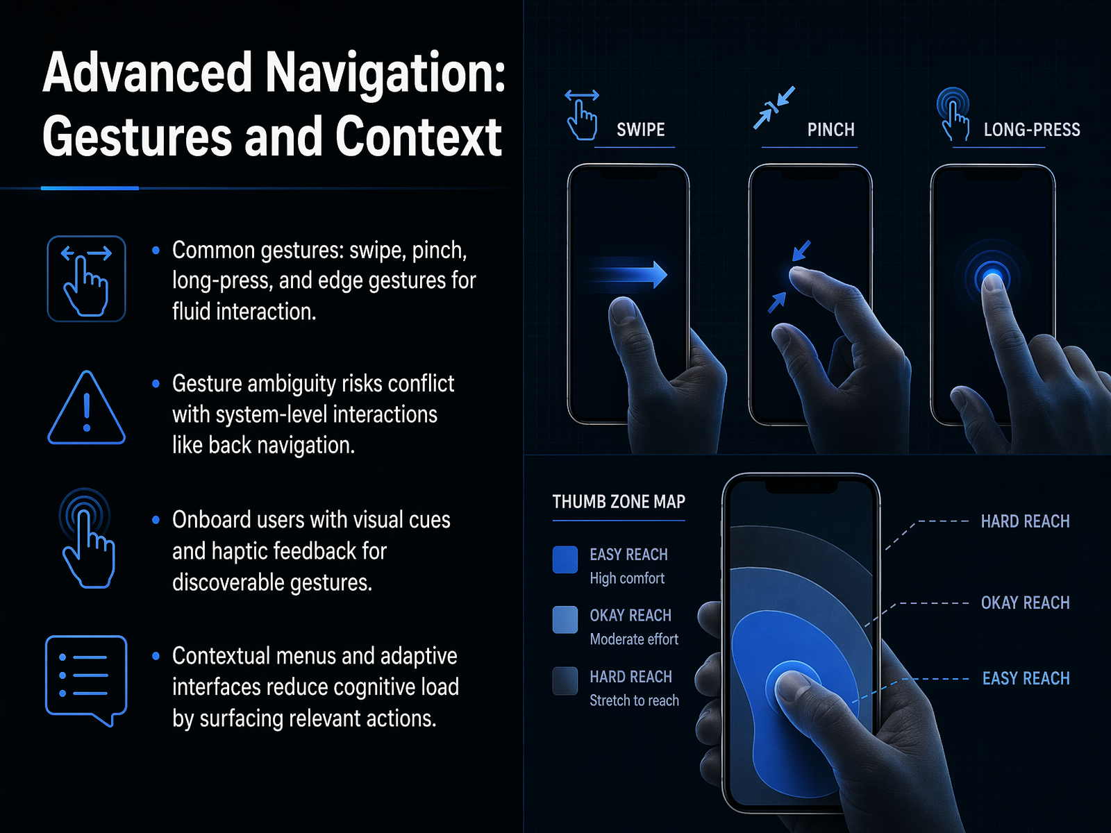
 - 11Advanced Navigation: Gestures and ContextLet's move beyond taps and buttons to the invisible layer of mobile design: gestures and context. When you get these right, the interface feels fast and fluid. Get them wrong, and users crash into system-level conflicts. Start with common gestures: swipe, pinch, long-press, and edge swipes. These feel natural, but they introduce ambiguity. An edge swipe meant for your in-app carousel can suddenly trigger the operating system's back navigation. That collision destroys user confidence instantly. The fix is onboarding. Use visual cues, like a subtle animation, and haptic feedback to make custom gestures discoverable. Your users shouldn't have to guess what's swipable. Next, think about context. Contextual menus and adaptive interfaces reduce cognitive load by surfacing only the actions relevant to the current task. For example, editing tools appear when text is selected, then vanish. This is not just about cleaning up the screen. It's about respecting the user's attention and keeping them in flow. Now, when you apply these principles, you're not just building for interaction. You're building trust and measurable engagement. That brings us directly to our next topic: the business case for great navigation.
 dl.acm.orgprograms.sigchi.orgdoi.org+22 min
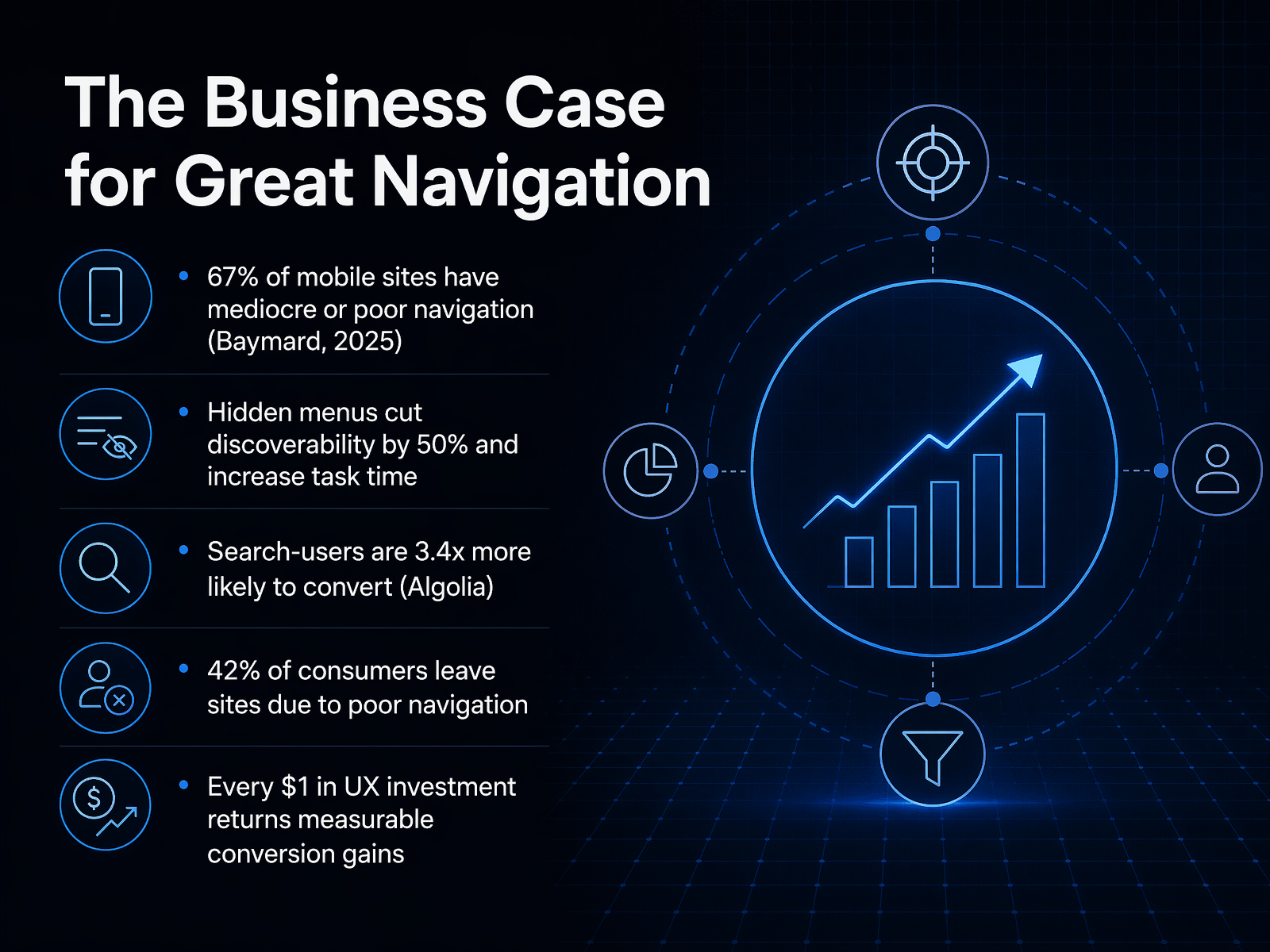
 - 12The Business Case for Great NavigationLet's translate these design patterns into a business conversation you can take to your stakeholders. The data is clear and it's blunt. Baymard's latest benchmark shows that sixty-seven percent of mobile sites provide mediocre or poor navigation. That means the majority of your competitors are leaving the door open for you to win simply by being easier to use. Hidden menus, while tidy, cut discoverability by nearly fifty percent and measurably increase task time. When users can't see their options, they stop looking. On the revenue side, the impact is direct. Algolia's research found that users of high-quality search are three point four times more likely to convert. Conversely, forty-two percent of consumers will simply leave a site because of poor navigation. This isn't just a design debt; it's a direct revenue leak. But here's the positive framing. Every dollar invested in UX returns measurable conversion gains. Improving navigation is one of the highest-leverage bets a product team can make. When we move to the next slide, we'll apply these principles to the hardware frontier: Designing for Foldable and Large-Screen Phones.
 heurilens.comyourwebteam.iologoswebdesigns.com+22 min
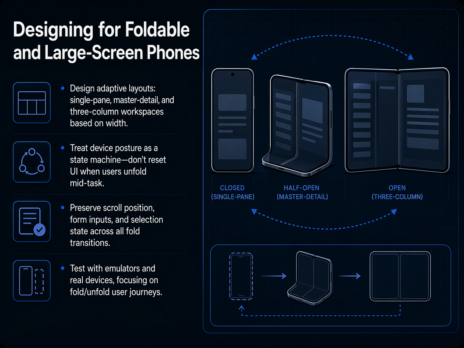
 - 13Designing for Foldable and Large-Screen PhonesNow, let's talk about designing for foldables and large-screen phones. This isn't just about making your UI bigger. The core discipline is building adaptive layouts. Based on the available width, you need to move your content fluidly between a single-pane stack, a master-detail split, and a three-column workspace when the screen is wide enough. Treat the device posture as a state machine. Never reset the UI when a user unfolds the device mid-task. You must preserve their scroll position, form inputs, and selection state across every single transition. This is the difference between a polished app and a broken one. Finally, test on emulators and real devices, focusing specifically on those fold and unfold user journeys. Automate your transitions, because the bugs live in the state changes, not the static screens. Up next, we'll dive into emerging patterns and future-proofing your architecture.
 1 min
1 min - 14Emerging Patterns and Future-ProofingNew hardware is arriving faster than our design systems can keep up, so the most practical defense is to build resilience into the architecture itself. Let's start with the most actionable data point. Hiding only low-frequency navigation while keeping the top three to five destinations visible at the bottom reduces task time by twenty-two percent. That's a direct cost of discoverability. So the first rule is clear: make the primary options visible, and tuck settings or account links out of sight. Now, we're also seeing a rise in invisible UI, where AI, voice, and gesture inputs let users navigate without touching icons. But the accessibility requirement is non-negotiable. Every gesture must have a tap alternative. Someone using a screen reader or a switch control cannot rely on a swipe, so the core path must work with a simple touch. In terms of system design, stop building layouts for a specific device model. Instead, build a modular design system that responds to capabilities. Does the screen support spanning? Is there a hinge? Are hover states available? These capability flags let your interface adapt whether the user is on a standard phone, a foldable, or a tri-fold device that doesn't even exist yet. Finally, treat your layout like a state machine. Define distinct modes such as compact, expanded, and spanning. When a user unfolds a device mid-task, the system should transition cleanly between states without losing scroll position, form data, or navigation context. That's the standard. Next, let's apply these principles to a practical audit of your existing navigation.
 heurilens.comyourwebteam.iologoswebdesigns.com+22 min
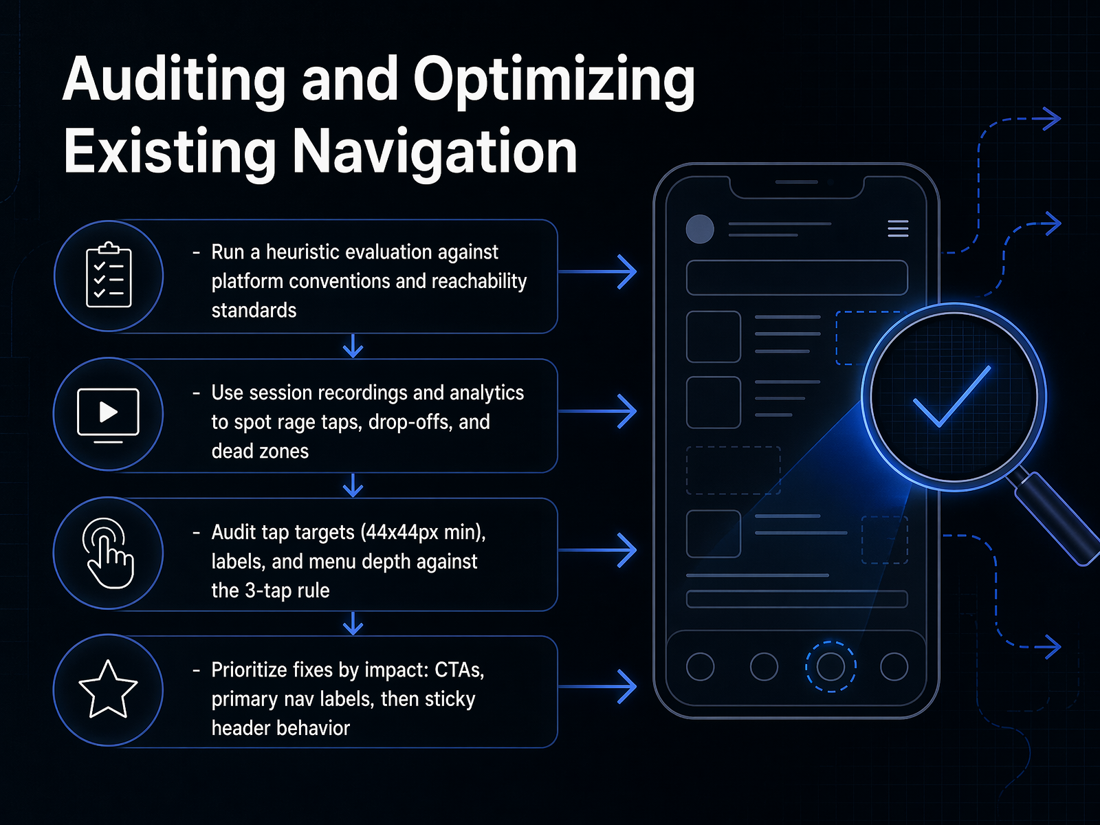
 - 15Auditing and Optimizing Existing NavigationNow, let's get tactical. Auditing your existing navigation is not about finding every flaw. It is about finding the flaws that cost you users. Start with a heuristic evaluation. Walk through your app and check it against platform conventions and reachability standards. Is the primary action in the thumb zone? Are your targets compliant with the forty-four by forty-four pixel minimum? Your own eyes will catch the obvious violations. But your users will show you the rest. Open your session recordings and analytics. Look for rage taps, those rapid, frustrated taps on a broken element. Look for drop-offs, where users suddenly exit. And look for dead zones, areas of the screen they tap but nothing happens. These are not design critiques; they are error reports. Then, put hard numbers to the patterns. Audit your tap targets against the forty-four pixel standard. Review your labels for clarity. And measure your menu depth against the three-tap rule. If a user cannot reach a core destination in three taps, the structure is too deep. Finally, prioritize ruthlessly. Do not start with the settings menu. Fix the highest-impact items first. Your call-to-action buttons, then primary navigation labels, then sticky header behavior. This is a triage, not a spring cleaning. It is about removing the sharpest friction first. Let us now move to the workshop, where we will redesign a navigation flow together.
 heurilens.comyourwebteam.iologoswebdesigns.com+22 min
 - 16Workshop: Redesigning a Navigation FlowNow it's your turn to apply what we've covered. You're going to work in small groups and take a real, problematic mobile navigation flow, and redesign it from the ground up. Your goal is to fix the structure so that the most frequent actions are immediately reachable—meaning a thumb can get there without stretching or shifting grip. At the same time, you need to make sure every section is discoverable, so a user never feels lost. As you critique each other's solutions, challenge the design on two fronts: can a user reach the primary action in one tap without adjusting their hand position, and can they predict where they'll land before they tap? After the exercise, we'll come back together to share key takeaways and open it up for questions. Thank you for the deep thinking today. Go build navigation that respects the thumb and the mind.
 1 min
1 min
Take the deck with you
Download this course as a file — free, no sign-up needed.
- PDF handoutEvery slide page, ready to print or share.17 pages · 3.7 MBDownload
- Narrated PowerPointThe deck that presents itself — every slide carries the digital human's narration video.17 pages · 16.1 MBDownload
- PowerPoint slidesThe full deck as a .pptx — open it in PowerPoint, Keynote, or Google Slides.17 pages · 3.5 MBDownload
Free to use in your own training — please keep the PersonWise credit page at the end.
Have your own deck? Turn it into a course
Sources consulted
Web sources consulted while building this course.
- Mobile UX Best Practices 2026: Data-Driven Guide — heurilens.com
- 29 Website Navigation Statistics for 2026: Menus and UX — yourwebteam.io
- Website Navigation Design That Converts in 2026 — logoswebdesigns.com
- Mobile App Navigation Design: 2026 UX Best Practices | by Eira Wexford | UI/UX Designing Trends | Medium — medium.com
- Mobile App Navigation Patterns: User Experience Guide 2026 - Calmops | Tech, Business & Indie Hacker Knowledge Base — calmops.com
- How Low Can Your Thumb Go? Investigating the Precision of Unidirectional Thumb Movements | Proceedings of the Extended Abstracts of the 2026 CHI Conference on Human Factors in Computing Systems — dl.acm.org
- Understanding How Mobile Interactions Shape Grasp and Contact Patterns Beyond the Touchscreen - CHI '26 — programs.sigchi.org
- How Low Can Your Thumb Go? Investigating the Precision of Unidirectional Thumb Movements — doi.org
- Understanding How Mobile Interactions Shape Grasp and Contact Patterns Beyond the Touchscreen — umtl.cs.uni-saarland.de
- Thumbs-Up: 3D Spatial Thumb-Reachable Space for One-Handed Thumb Interaction on Smartphones — dl.acm.org
- Medium — medium.com
- Portazon — Redesigning a Smart City Super App | by Christian Hauptmann | Medium — kontakt-94094.medium.com
- PandaPanda Case Study: UX/UI Product Design for a Fintech Investment Platform | by Wdesigna | Jun, 2026 | Medium — medium.com
- Generali Investments - Redesigning a Mobile Investment Platform — bordolenc.com
- JIFF Express Shopping Commerce Mobile App Design UI/UX Case Study (2025) | by michelle mielru | Medium — medium.com
- iOS vs Android Design Guidelines: Key Differences Every App Designer Should Know - Aaron Mallen — aaronmallen.com
- Material 3 to iOS HIG: Translating a UI (Not Transplanting) | VP0 Journal — vp0.com
- Android UX vs iOS UX Differences: 2026 Designer Guide — sanjaydey.com
- Mobile Navigation Patterns That Work in 2026 | Phone Simulator — phone-simulator.com
- Material Design vs iOS Human Interface: Complete Comparison — validatethat.io