Begin
14 pages · ~28 min
Presentation Slide Design Workflow
A practical workflow for designing effective presentation slides, teaching learners how to structure, create, and polish visual decks with clarity and impact.
A digital instructor presents all 14 pages. Hold “Ask” at any point and ask out loud — the answer comes from this course. No sign-up needed.
What you’ll learn
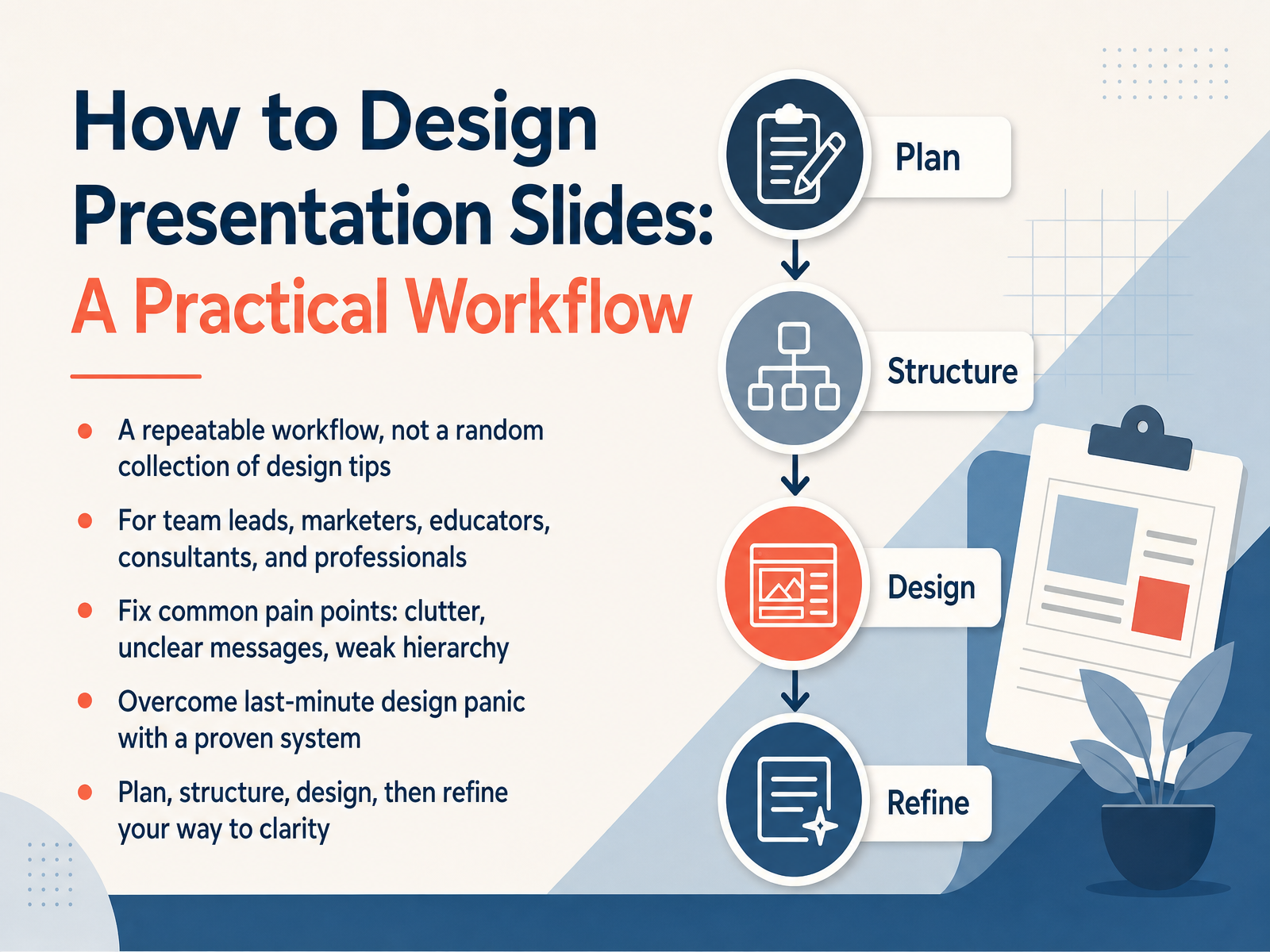
- 01How to Design Presentation Slides: A Practical WorkflowWelcome. Today, I want to share a practical workflow for designing presentation slides. This is not a random list of design tips. It is a repeatable system you can use whenever you need to build a deck, whether you are a team lead, a marketer, an educator, or a consultant. Many of us face the same pain points: slides that feel cluttered, messages that are unclear, or a weak visual hierarchy that buries the main point. And then there is the last-minute panic, when we are still rearranging slides late at night. This course helps you move past that. We will follow a clear sequence: plan, structure, design, and then refine. Each step removes guesswork and gives you a concrete way forward. By the end, you will have a process you can rely on, even when time is short. In the next part, we begin exactly where every good presentation should begin. Start with the audience, not the software.winningpresentations.comdeckary.comdigitalsolutionsedge.com+22 min
- 02Start with the Audience, Not the SoftwareLet's shift our focus to the first and most important step in building a deck: defining your audience. Before you even think about opening your slide software, you need a clear picture of who will be in the room. Ask yourself: what do they already know? What do they care about? And what might they be skeptical of? Your goal here is to define one audience-centered outcome. Instead of saying you want to update the team, get specific. Maybe you need the leadership team to approve a budget because the cost of waiting is higher than the cost of acting. Try writing a single sentence that captures what you want them to think, feel, or do by the end of your talk. This sentence becomes your filter. Every point you make and every slide you design should serve that one goal. Once you have that clear focus, you can start turning it into a powerful message. That's exactly what we'll do next, as we craft a single key message.
 mitcommlab.mit.eduimperial.ac.ukgalileo.fbw.ugent.be+21 min
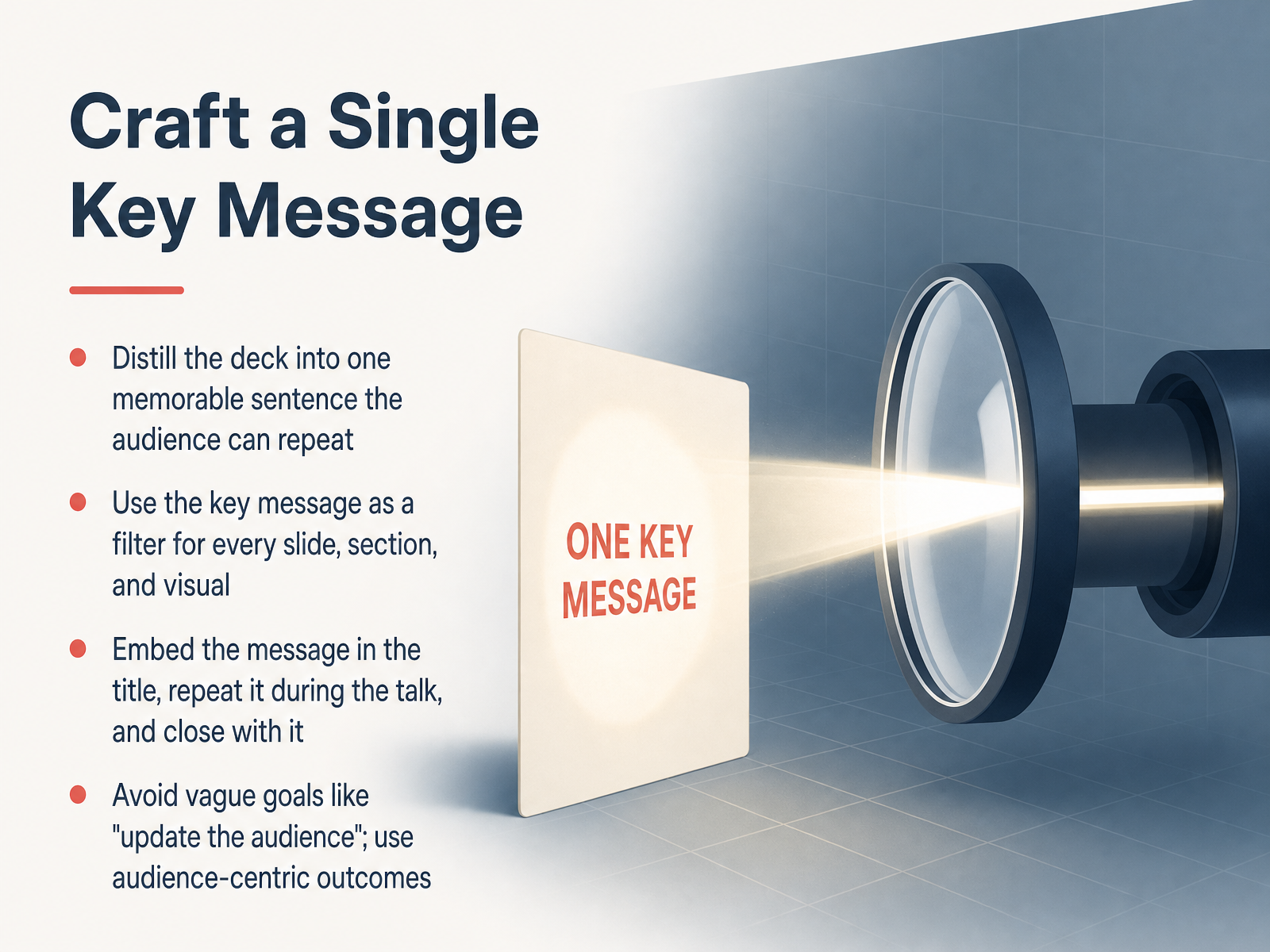
 - 03Craft a Single Key MessageSo this is where we turn a broad topic into a true focus. Your goal now is to craft a single key message, meaning one memorable sentence your audience could repeat back to you after the meeting. This isn't just a nice-to-have. Think of it as a filter. Every slide, every section, and every visual you create from this point forward either supports that sentence, or it gets cut. To make that filter work, embed your message directly in the slide title, say it again during the talk, and build your close around it. That repetition is what lodges the idea in people's minds. And be specific. Avoid vague goals like updating the audience. Instead, frame the outcome around them. For example, instead of saying you'll update the team on a project, your message might be that moving to a new platform will save the team ten hours per week. That gives them a reason to care. Once you have that single sentence locked in, you're ready to build a structure that proves it. Let's look at how to build a narrative spine, not just a list of topics.
 mitcommlab.mit.eduimperial.ac.ukgalileo.fbw.ugent.be+22 min
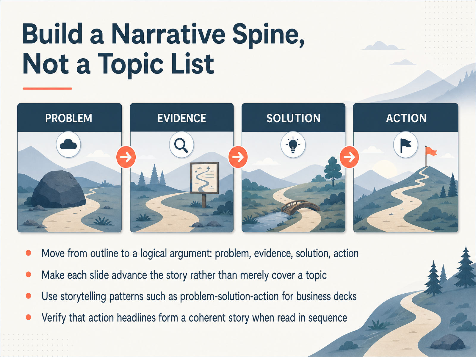
 - 04Build a Narrative Spine, Not a Topic ListNow let's turn our outline into a story your audience can follow. Most slide decks read like a table of contents, a list of topics that never quite connects. Instead, you want a narrative spine, a logical argument that moves people from where they are now to the decision you need from them. Start with the problem. What is the pain, the cost, or the missed opportunity? Then bring in the evidence. Show the data, the research, or the real world examples that make the problem undeniable. Next, present your solution. Explain what you propose and why it works. Finally, close with a clear call to action. What should the audience do next? Approve the budget, adopt the tool, or change the process. As you build, give each slide a headline that states a claim, not just a label. Then test the whole deck by reading only the headlines in sequence. If they tell a coherent story from problem to action, your spine is solid. If they read like a list of disconnected topics, go back and tighten the argument. Now let's make sure every single slide carries just one idea.
 winningpresentations.comdeckary.comdigitalsolutionsedge.com+21 min
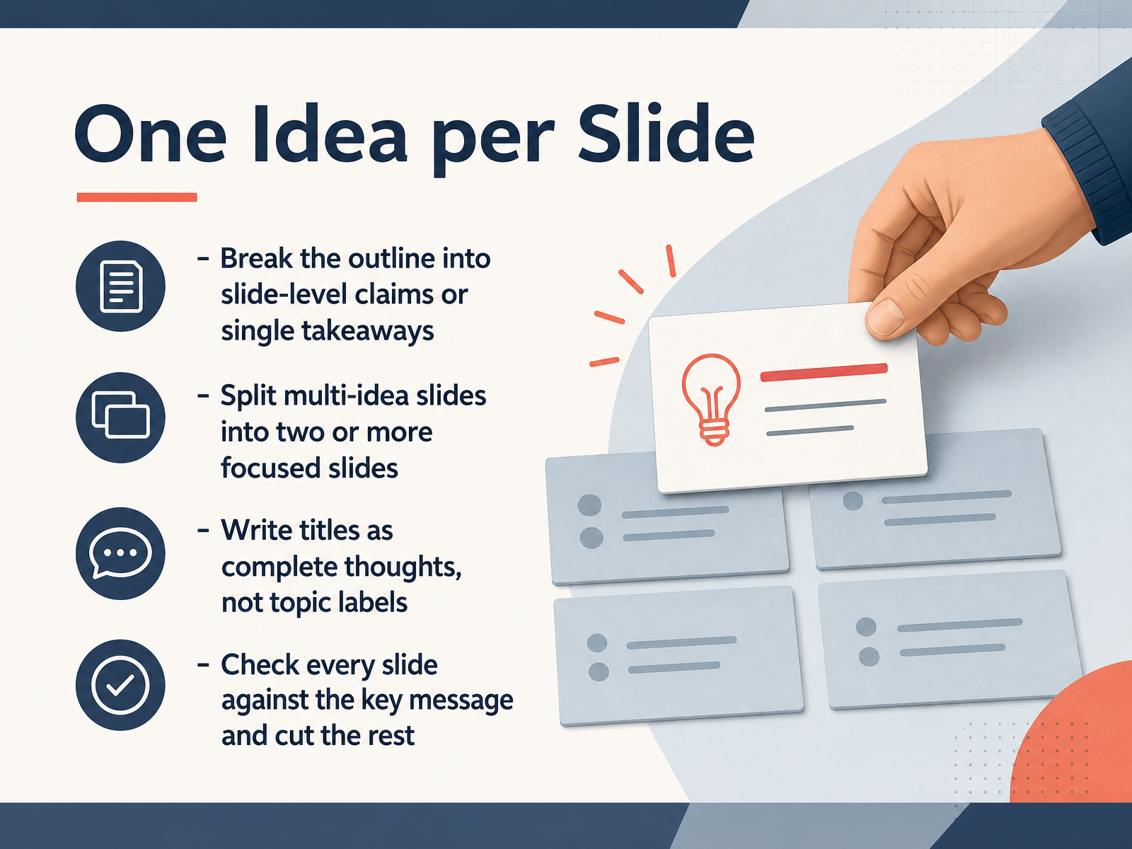
 - 05One Idea per SlideNow let's move from the big picture to the slide itself. The rule here is simple: one idea per slide. When you break down your outline, each slide should make a single claim or deliver one clear takeaway. If you find a slide trying to do two things at once, like explaining a problem and then pitching a solution, split it. Two focused slides always beat one crowded one.
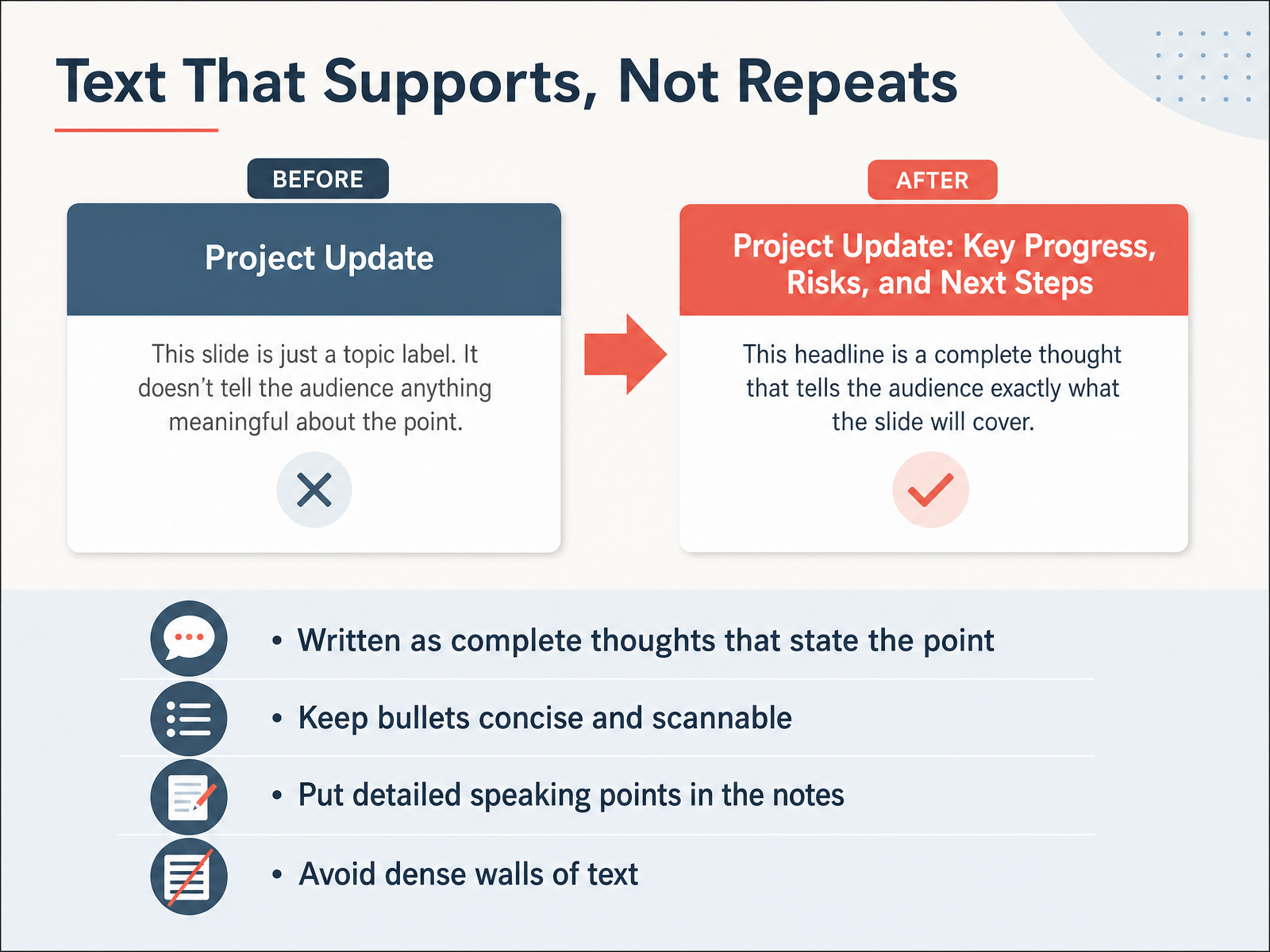
A practical trick is to write your titles as complete thoughts, not topic labels. Instead of the title 'Quarterly Results,' try 'Q3 Revenue Exceeded Forecast by Twelve Percent.' That title is your claim. It tells the audience exactly what to conclude before they even look at the details.
Finally, run a quick check. Look at every slide and ask: does this serve the key message? If not, cut it, no matter how interesting it seems. This keeps your deck tight and persuasive.
Once you have the right idea for each slide, the next step is deciding how to display it. Let's look at choosing layouts by content type.
 winningpresentations.comdeckary.comdigitalsolutionsedge.com+21 min
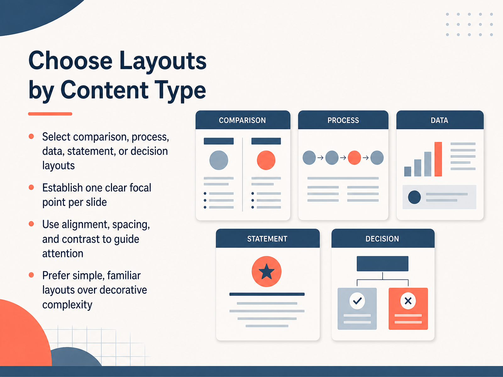
 - 06Choose Layouts by Content TypeNow let's talk about choosing the right layout for your content. The first decision is structural. Ask yourself what this slide actually needs to do. Is it comparing two options, walking through a process, presenting data, making a statement, or supporting a decision? Pick the layout that matches that job. Then give each slide one clear focal point. One idea, one visual anchor, one place the eye lands first. You guide attention through alignment, spacing, and contrast. Consistent alignment creates order. Generous spacing reduces noise. Strong contrast tells people what matters most. And prefer familiar layouts. A simple comparison table or a clean process flow beats decorative complexity every time. Your audience should recognize the pattern instantly and spend their energy on your content, not on decoding your design. Next, we'll look at how to write slide text that supports your point without repeating it.
 winningpresentations.comdeckary.comdigitalsolutionsedge.com+21 min
 - 07Text That Supports, Not RepeatsLet's talk about the text on your slides, because it should support you, not repeat you. Write your bullets as complete thoughts that actually make a point. Instead of "Budget," write "Budget approval unlocks Phase Two." That tells me something. Keep the bullets concise and scannable. Four words of meaning beat six lines of detail. If you need to explain a nuance, put it in the speaker notes. That is where the detail belongs, not on the screen in a dense wall of text. Your audience should be able to glance at the slide and instantly get the headline, then return their attention to you. If a slide reads like a paragraph, you have written a document, not a slide. Cut it down. Next, we'll look at choosing images, charts, and visuals that earn their place.
 winningpresentations.comdeckary.comdigitalsolutionsedge.com+21 min
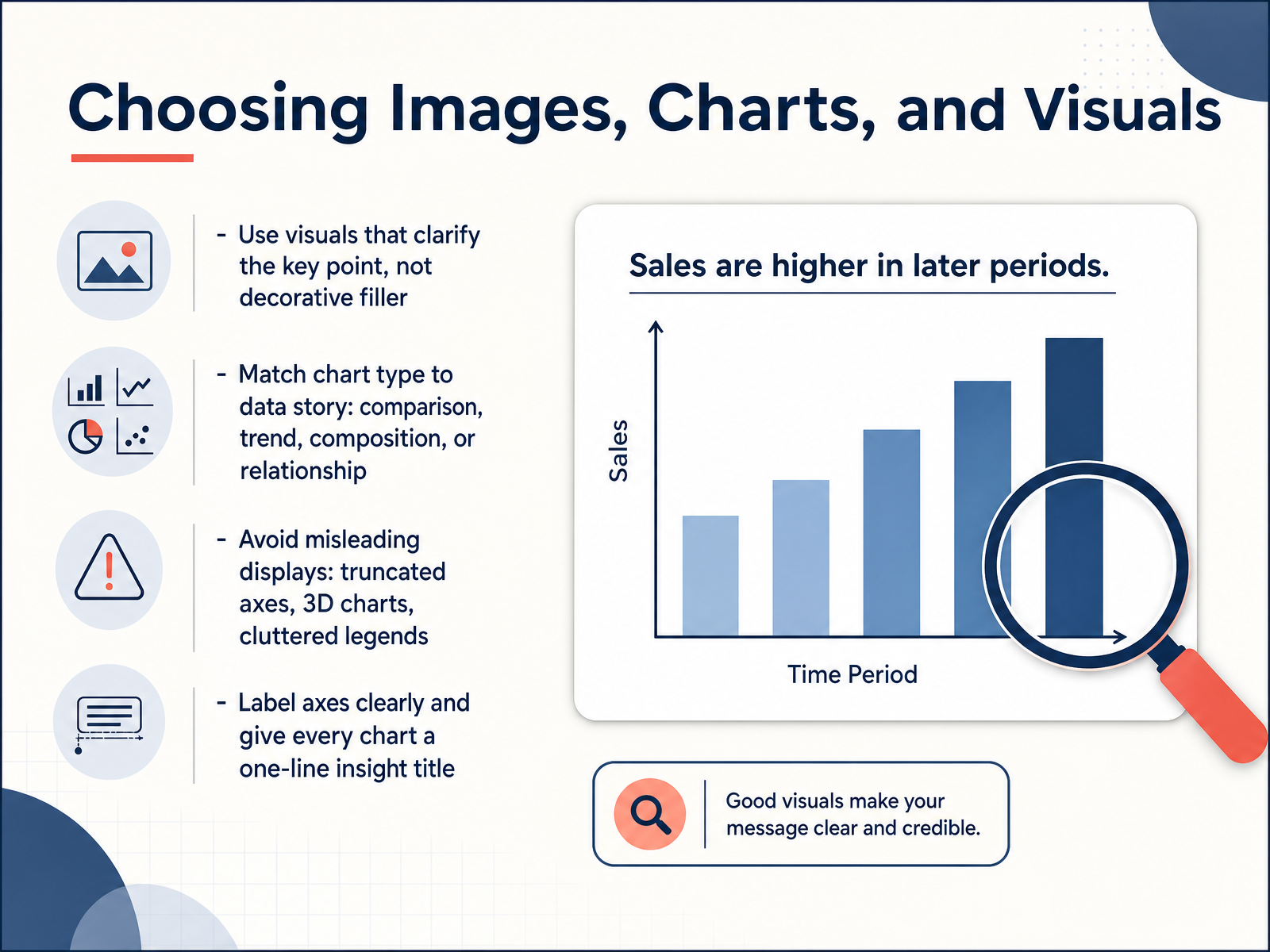
 - 08Choosing Images, Charts, and VisualsNow let’s talk about the visuals you choose, because every image and chart should earn its place. The rule is simple: if a visual doesn’t clarify your key point, cut it. Decorative filler slows people down and dilutes your message. When you do use a chart, match it to the story in your data. Use a bar chart for comparisons, a line chart for trends over time, a pie chart only for simple parts of a whole, and a scatter plot when you need to show a relationship between two variables. Avoid anything that distorts the truth. Truncated axes make small differences look huge. Three-dimensional charts make values hard to compare. Cluttered legends force your audience to work too hard. Instead, label your axes clearly so no one has to guess what they’re looking at. And give every chart a one-line insight title. Don’t title it ‘Quarterly Sales’. Title it ‘Q3 Sales Recovered After July Dip’. That tells your audience exactly what to see before you even explain it. Keep this discipline and your slides will feel sharper immediately. Next, we’ll move from individual visuals to the system that ties them together: applying a simple slide design system.
 service-manual.ons.gov.ukzoho.comdesign.bankofcanada.ca+22 min
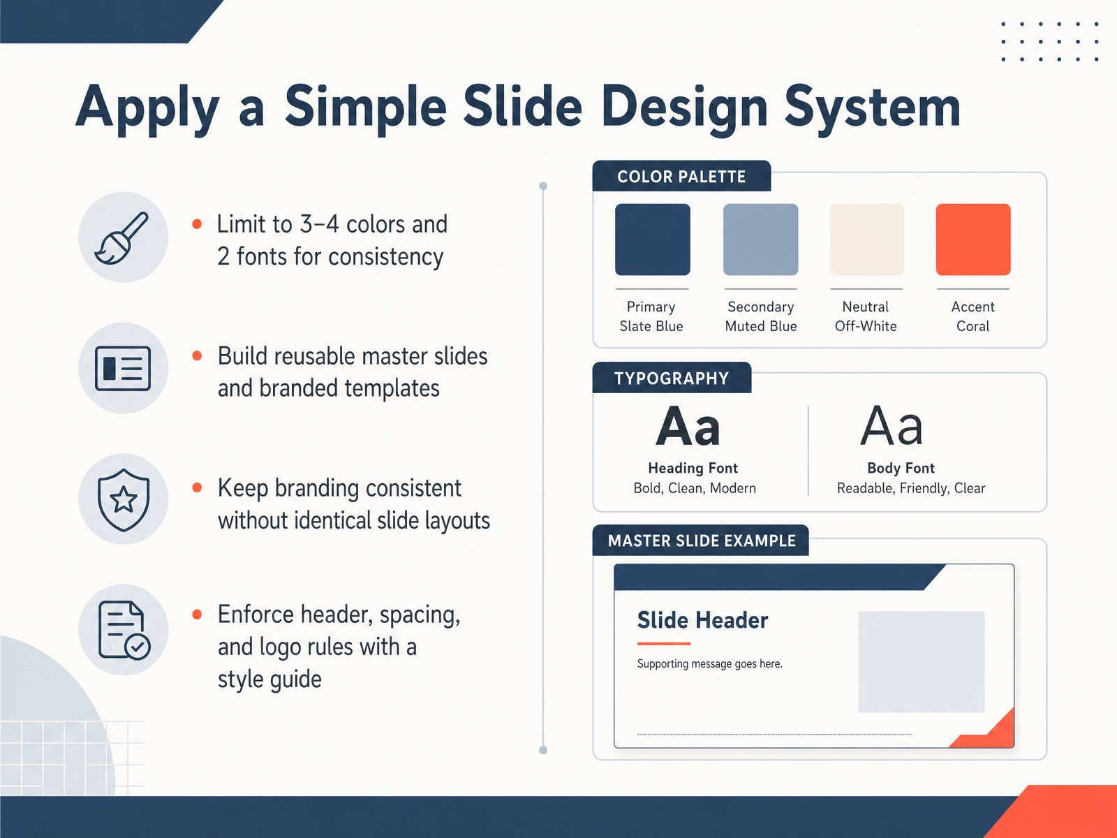
 - 09Apply a Simple Slide Design SystemNow let's talk about making all this feel consistent, because a reliable slide design system is what keeps your audience focused on your message instead of your formatting. Start with tight constraints. Limit yourself to three or four colors and two fonts across the entire deck. This alone removes most of the visual clutter that makes slides feel amateur. Then build reusable master slides or branded templates. These are your starting points, so you're not making alignment and spacing decisions from scratch every time. But consistency doesn't mean every slide looks identical. Keep the branding steady, but vary the layout. A section divider should look different from a data slide, while still feeling like part of the same family. Finally, document the rules. A simple style guide covering headers, spacing, and logo placement makes it easy for anyone on your team to produce decks that look like they came from the same source. Next, we'll move into refining for clarity and cutting visual noise.
 winningpresentations.comdeckary.comdigitalsolutionsedge.com+21 min
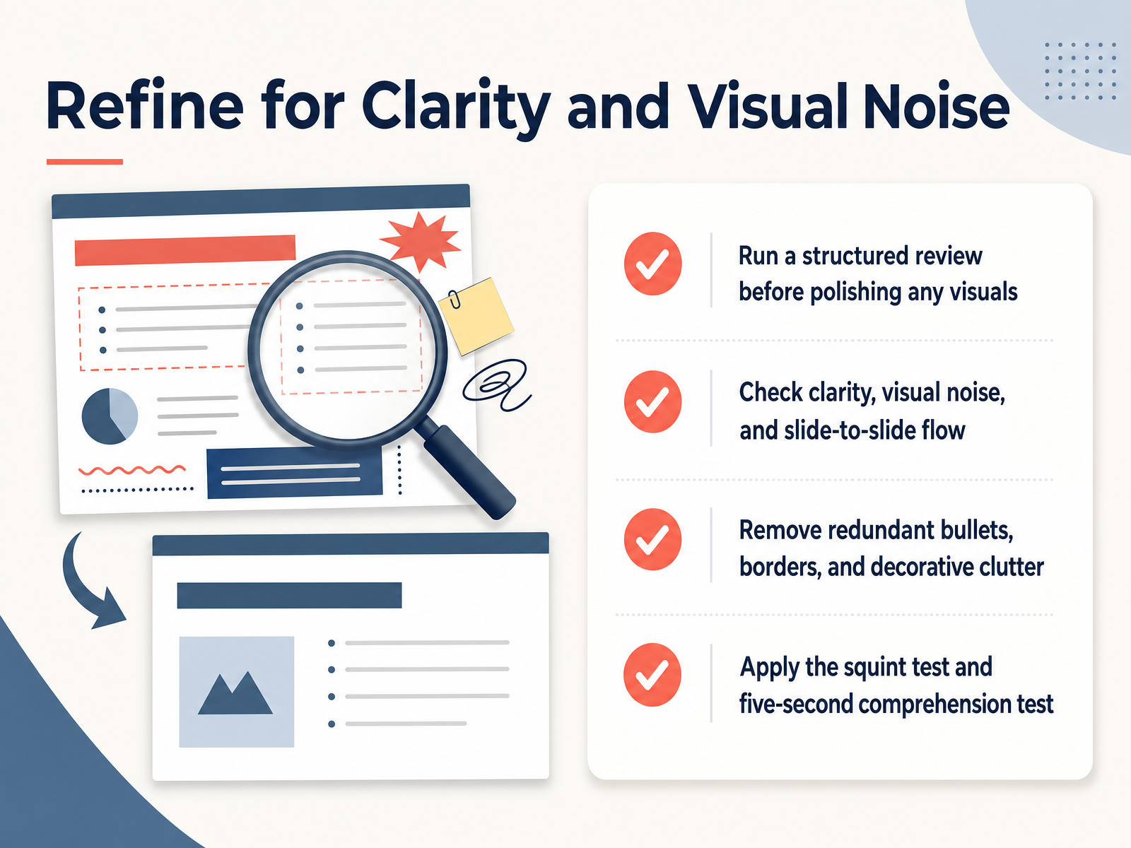
 - 10Refine for Clarity and Visual NoiseNow let's move into the refinement phase. Before you spend time polishing any visuals, run a structured review of your deck. Check each slide for clarity, visual noise, and how well it flows from one slide to the next. Look for redundant bullets, unnecessary borders, and decorative elements that don't earn their place. Then apply two quick tests. First, the squint test. Squint at the slide and ask yourself if the main point still comes through. If you can't tell what it's about, simplify it. Second, the five-second test. Show the slide to someone for five seconds, then ask what they remember. If they can't state the core message, you have more work to do. This is where you cut the clutter and protect the point you're making.
 winningpresentations.comdeckary.comdigitalsolutionsedge.com+21 min
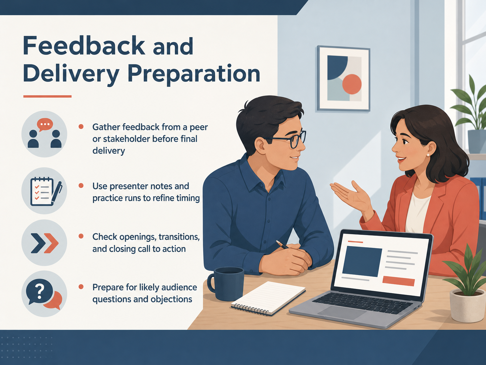
 - 11Feedback and Delivery PreparationNow we come to the step that separates a good deck from a great delivery. First, get outside eyes on your slides. Ask a peer or a stakeholder to spend ten minutes poking holes in your argument or your visuals. You are looking for the slide they misunderstand, not just the typo they catch. Second, use presenter notes and run through the deck out loud at least twice. Time yourself. If your transition feels rushed or a example falls flat, fix it now, not on stage. Third, check your key moments. Does the opening earn attention? Do the transitions carry the audience from one idea to the next? And does the closing call to action tell people exactly what to do? Finally, prepare for the room. Write down the three hardest questions or objections you might face, and decide how you will answer them in two or three sentences. This builds confidence and keeps you in control. Now let us put all of this into practice by redesigning a slide together.
 mitcommlab.mit.eduimperial.ac.ukgalileo.fbw.ugent.be+21 min
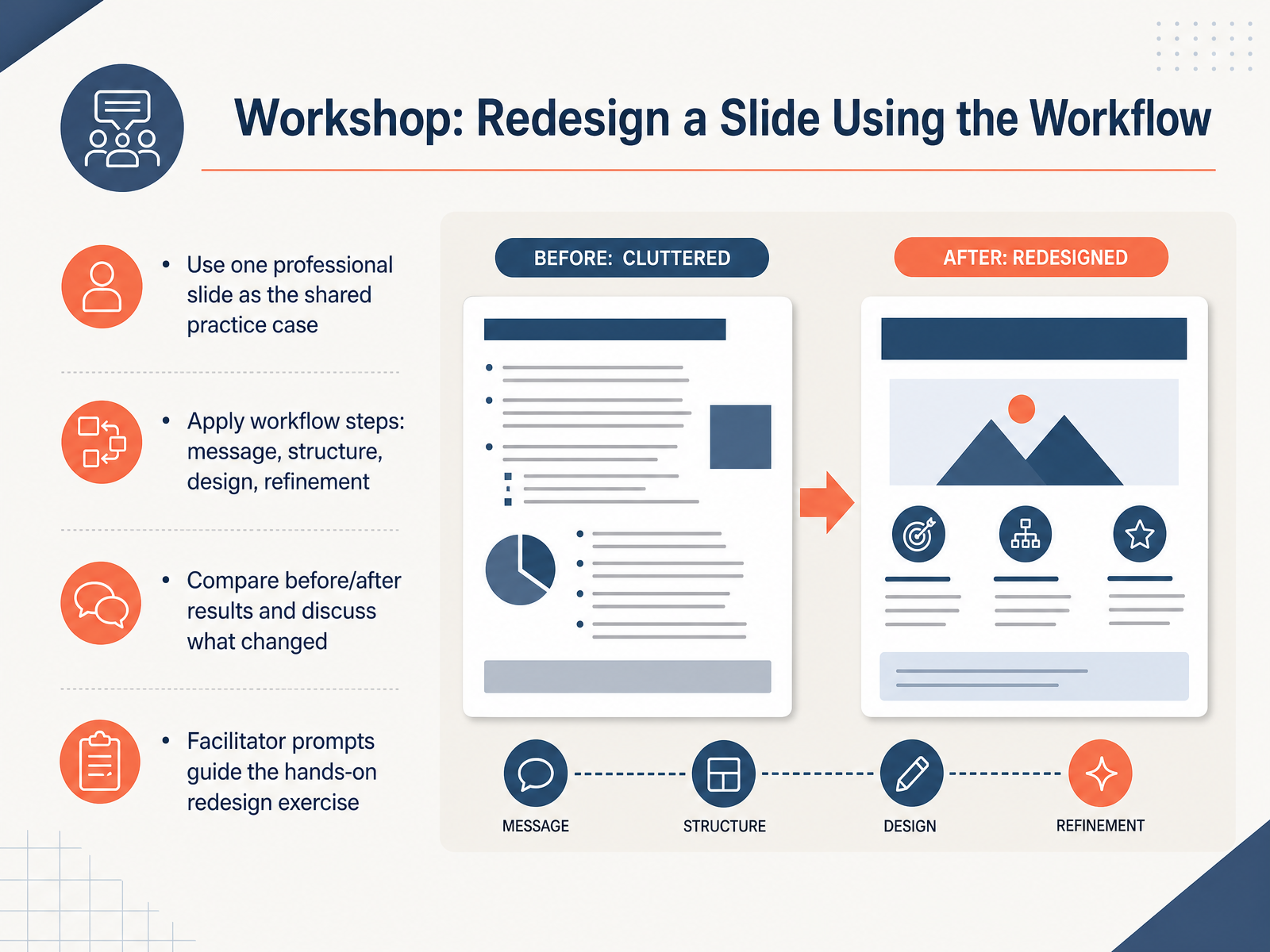
 - 12Workshop: Redesign a Slide Using the WorkflowNow it is time to put the workflow to work. We are going to take a single professional slide and redesign it together from the ground up. You will start by clarifying the message and fixing the structure. Then you will move into the actual design and finally refine the details. The key part of this exercise is the comparison. Once you see the before and after side by side, the reasoning behind each choice becomes obvious. You will be able to point to the exact moment a cluttered wall of text became a clear, scannable visual. Our facilitator will prompt you through the hands-on steps and keep the discussion focused on why each change matters, not just what looks nicer. When you see that before version, resist the urge to just tidy it up. Actually run the full workflow. You will find that the biggest improvements usually come from cutting content, not adding decoration. Next, we will wrap up with a quick reference checklist so you can keep this process running without the facilitator in the room.
 stephanieevergreen.comgarrreynolds.comqceptpresentations.com+21 min
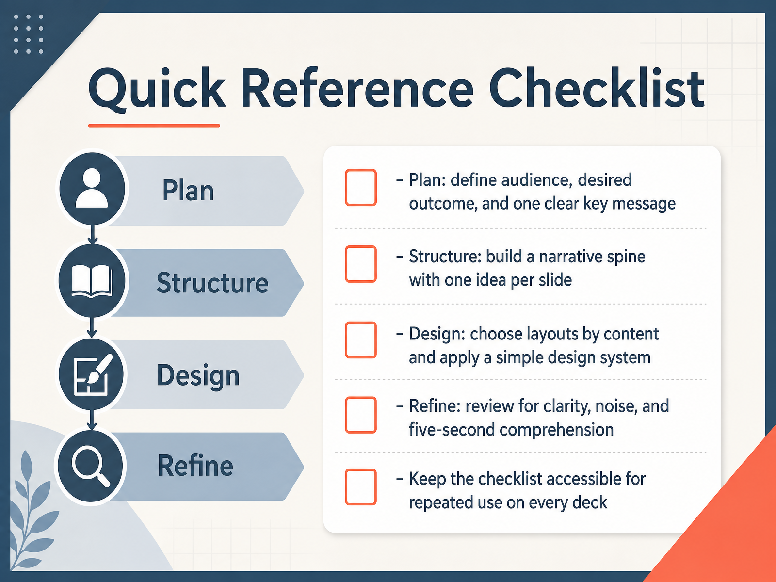
 - 13Quick Reference ChecklistThis checklist pulls the entire workflow into one place, so you can move fast without dropping any step. Start with Plan. Get clear on your audience, the outcome you need, and one key message. Then Structure. Build a simple narrative spine, with one idea per slide. After that comes Design. Choose the layout based on what the content needs to do, and apply the same design system throughout. Finally, Refine. Review each slide for clarity, cut visual noise, and test whether someone can understand it in five seconds. Keep this list where you can see it. Use it on every deck, from a quick team update to a high stakes proposal. It is not a heavy process. It is a guardrail that keeps your thinking clear and your slides clean. Coming up next, we will look at next steps and practice habits that make this workflow stick.
 winningpresentations.comdeckary.comdigitalsolutionsedge.com+22 min
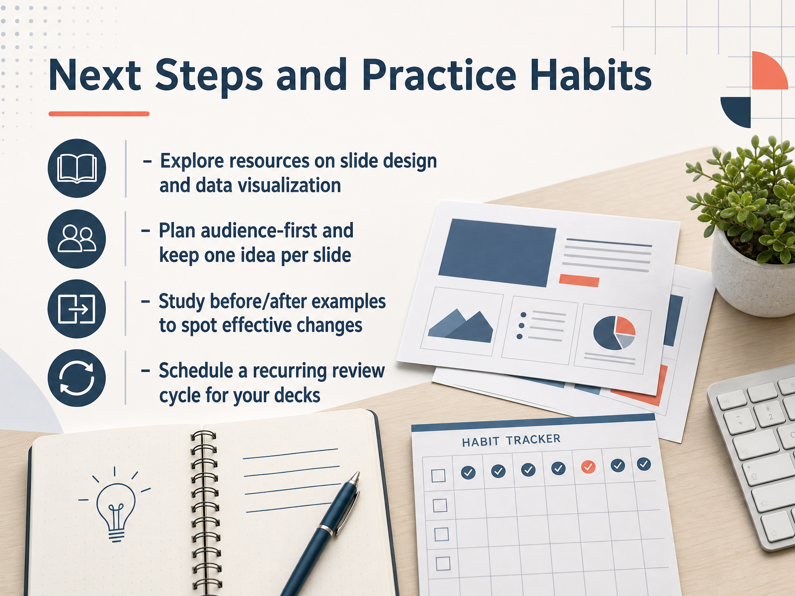
 - 14Next Steps and Practice HabitsLet's wrap up with how to make these skills stick. First, build your own resource base. Look for examples of strong slide design and clear data visualization. When you find a deck that works well, save it. Second, return to the two habits that matter most: plan around your audience, and keep one idea per slide. Before you build anything, ask what decision your audience needs to make. Third, study before and after examples. Pick a slide you have already delivered and rework it using the six word rule or the squint test. That small edit builds your judgment faster than reading another guide. Finally, put a recurring review on your calendar. Spend fifteen minutes each month revising one deck that did not land as well as you hoped. Over time, that review cycle compounds. You now have a complete workflow, from first decision to final polish. The goal is not perfect slides; it is clearer thinking and faster decisions. Thank you for staying with this. Now take one deck and apply just one step from this course this week.
 winningpresentations.comdeckary.comdigitalsolutionsedge.com+21 min
Take the deck with you
Download this course as a file — free, no sign-up needed.
- PDF handoutEvery slide page, ready to print or share.15 pages · 3.1 MBDownload
- Narrated PowerPointThe deck that presents itself — every slide carries the digital human's narration video.15 pages · 12.9 MBDownload
- PowerPoint slidesThe full deck as a .pptx — open it in PowerPoint, Keynote, or Google Slides.15 pages · 3.0 MBDownload
Free to use in your own training — please keep the PersonWise credit page at the end.
Have your own deck? Turn it into a course
Sources consulted
Web sources consulted while building this course.
- How to Make a Presentation With AI: 90-Minute Method [2026] — winningpresentations.com
- AI for PowerPoint Presentations: A Workflow Guide for When to Use (and Skip) AI | Deckary — deckary.com
- Create Presentation with AI: 12 Practical Steps to Faster, Smarter Slides in 2026 - Digital Solutions Edge By Thrinspire — digitalsolutionsedge.com
- How to Use AI Tools for Presentations: From Blank Slide to Delivered Deck in 2026 — solvetechtoday.com
- Step-by-Step AI Presentation Workflow for Working Professionals 2026 — planetspark.in
- Structuring a Slide Presentation : NSE Communication Lab — mitcommlab.mit.edu
- How do I give an engaging talk? — imperial.ac.uk
- What to say in a presentation? – Galileo — galileo.fbw.ugent.be
- Audience Needs Map™ | Duarte — duarte.com
- Consider Your Audience - Harvard Catalyst — catalyst.harvard.edu
- Overall considerations: Choosing a chart type – Data visualisation – Service manual – Office for National Statistics — service-manual.ons.gov.uk
- Choosing the right chart type for your presentation - Zoho Blog — zoho.com
- Choosing a chart type - Design System - Bank of Canada — design.bankofcanada.ca
- How to choose the right chart for your data – Prezi Support Center — support.prezi.com
- stephen turbek: Better charts from simple questions — turbek.com
- What I Do: Before and After Business Slides - Evergreen Data — stephanieevergreen.com
- PowerPoint slide makeovers. Design tips. See before/after samples of ... — garrreynolds.com
- Investor pitch deck makeover: From basic slides to investor-ready — qceptpresentations.com
- Slide Makeovers: Before and After - Scissortail Creative Services, LLC — scissortailcs.com
- Ceridian – Before and After ~ Killer Presentations — killerpresentations.com