Begin
14 pages · ~28 min
Design Systems Core Skills
This training builds core design system skills for designers and developers, covering components, tokens, and scalable UI practices.
A digital instructor presents all 14 pages. Hold “Ask” at any point and ask out loud — the answer comes from this course. No sign-up needed.
What you’ll learn
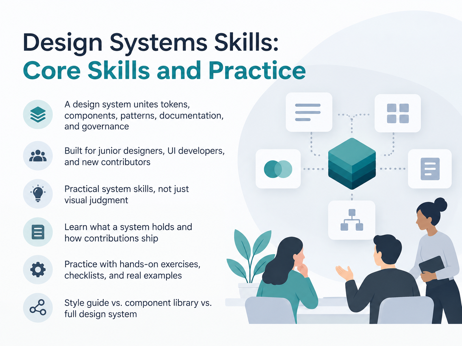
- 01Design Systems Skills: Core Skills and PracticeWelcome. This course is called Design Systems Skills: Core Skills and Practice. Over the next fourteen slides, we'll get practical about how design systems actually work and how your contributions ship. A design system unites tokens, components, patterns, documentation, and governance. Tokens are named values, like a color or spacing decision, that both design and code can reference. This course is built for junior product designers, UI developers, and anyone new to contributing. We'll focus on practical system skills, not just visual judgment. You'll learn what a system holds and how contributions move from an idea to a released, documented part of the library. And you'll practice with hands-on exercises, checklists, and real examples, including the difference between a style guide, a component library, and a full design system. Let's start by asking why shared systems matter for product teams.smashingmagazine.comdocs.tokens.studiodesignsystems.one+21 min
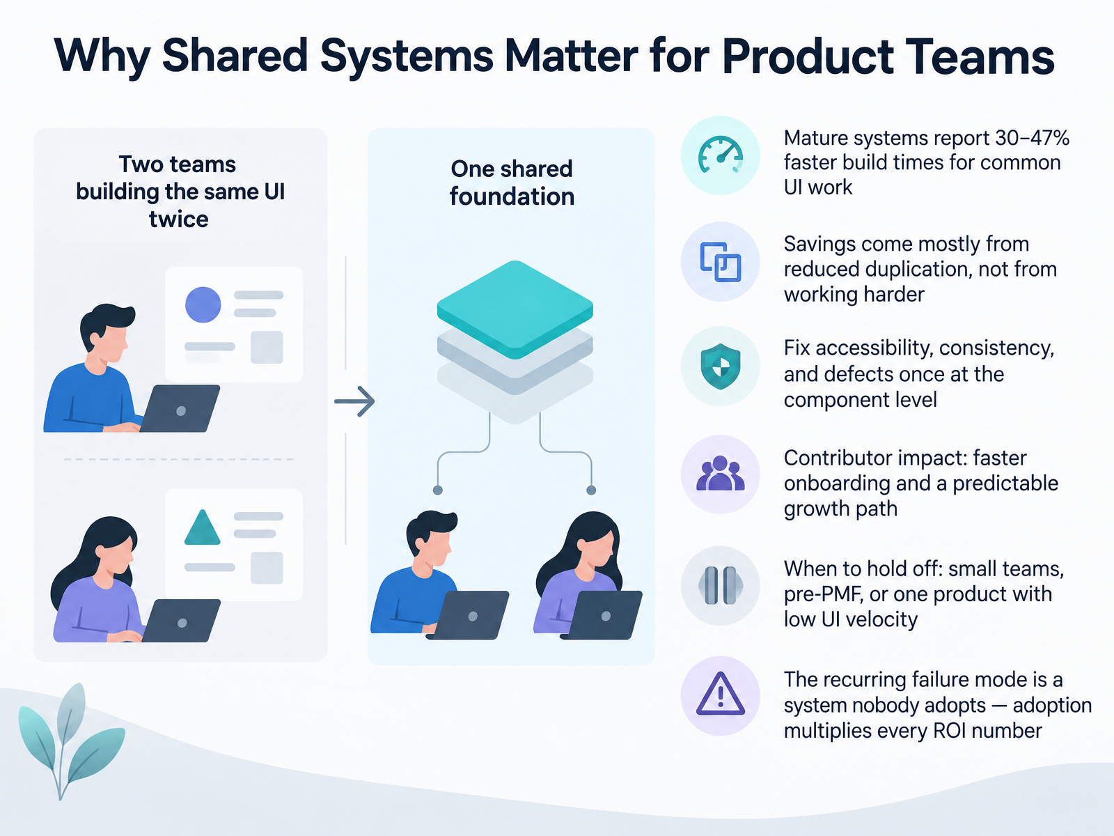
- 02Why Shared Systems Matter for Product TeamsLet's talk about why shared systems matter. Mature design systems report roughly thirty to forty-seven percent faster build times for common UI work. That gain comes from reduced duplication, not from anyone working harder. You fix accessibility, consistency, and defects once at the component level, and those fixes carry across every product surface. For contributors, the payoff is faster onboarding and a predictable growth path. But be honest about when to hold off: small teams, pre-product-market-fit, or one product with low UI velocity. And remember the recurring failure mode, a system nobody adopts. Adoption multiplies every return number you calculate. Next, we look at foundations one: design tokens as the shared language.
 designx.coeltherion.comredbaton.digital+21 min
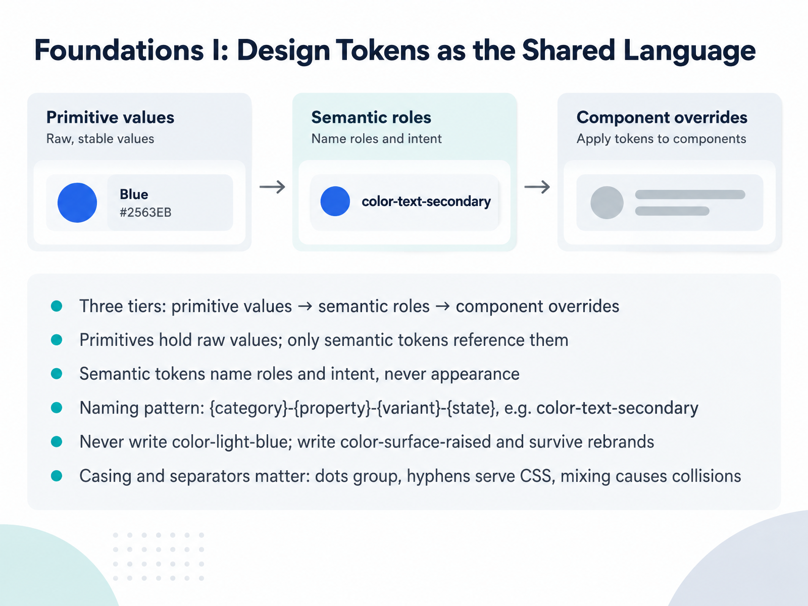
 - 03Foundations I: Design Tokens as the Shared LanguageNow let's look at the first foundation: design tokens as the shared language. Tokens come in three tiers. Primitives hold raw values. Semantic tokens reference primitives and name roles, never appearance. Component tokens are scoped overrides for a single component. Rule of thumb: components should never reference a primitive directly. Name semantic tokens by role, context, and state using the pattern category, property, variant, state. So color-text-secondary, not color-light-blue. Write color-surface-raised, and your system survives a rebrand. One more thing to watch: casing and separators are not cosmetic. Dots group tokens into folders in design tools; hyphens carry through to CSS custom properties. Mix them carelessly and you get naming collisions, which break the unique identifier every consumer relies on. So next time you add a token, ask which tier it belongs to, then name the role, not the pixel. That sets up our next topic, Foundations Two: Components, Variants, and API Design.
 smashingmagazine.comdocs.tokens.studiodesignsystems.one+22 min
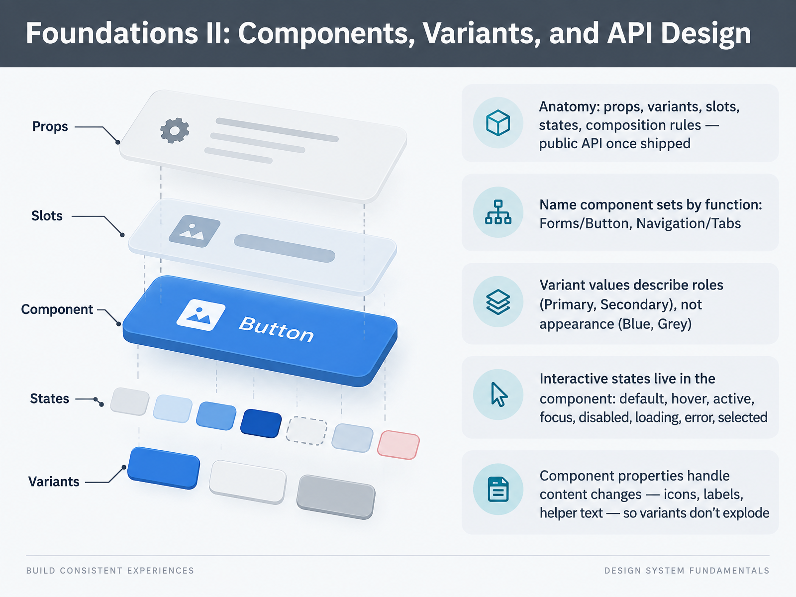
 - 04Foundations II: Components, Variants, and API DesignLet's move on to foundations, part two: components, variants, and API design. Here's the mindset shift. The moment a component ships to consumers, its props, variants, slots, and states become a public API. Changing them later breaks someone. So design names to last. Name component sets by function, like Forms/Button or Navigation/Tabs. Variant values should describe roles, such as Primary or Secondary, never appearance, like Blue or Grey. Then put interactive states inside the component itself: default, hover, active, focus, disabled, loading, error, and selected. Keep focus especially visible, because that's where handoffs most often fall apart. Finally, use component properties for content changes, like icons, labels, and helper text, so your variant list doesn't explode. Start with one component you own. Audit whether its names, states, and props would survive a rebrand. Next, Foundations III: Patterns and Where to Draw the Line.
 smashingmagazine.comdocs.tokens.studiodesignsystems.one+22 min
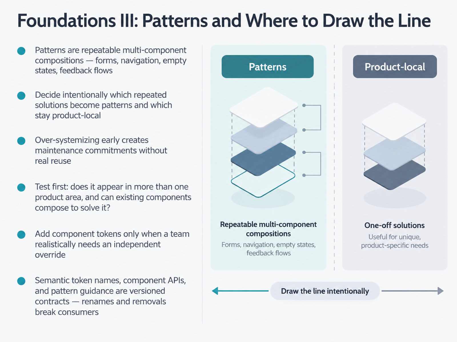
 - 05Foundations III: Patterns and Where to Draw the LineNow let's talk about patterns and where to draw the line. Patterns are repeatable multi-component compositions. Think forms, navigation, empty states, feedback flows. The core decision is which repeated solutions to promote into the system, and which stay product-local. Over-systemizing early locks you into maintenance commitments before you have real reuse. So test first. Does this appear in more than one product area? And can existing components already compose to solve it? Only add component tokens when a team realistically needs an independent override. Start sparse, then promote values as real requests come in. Here's the part that trips people up. Semantic token names, component APIs, and pattern guidance are versioned contracts. Renaming or removing them breaks consumers, so treat changes like major releases, with deprecation and a migration path. Next, we look at where contributors fit and how change gets owned.
 smashingmagazine.comdocs.tokens.studiodesignsystems.one+21 min
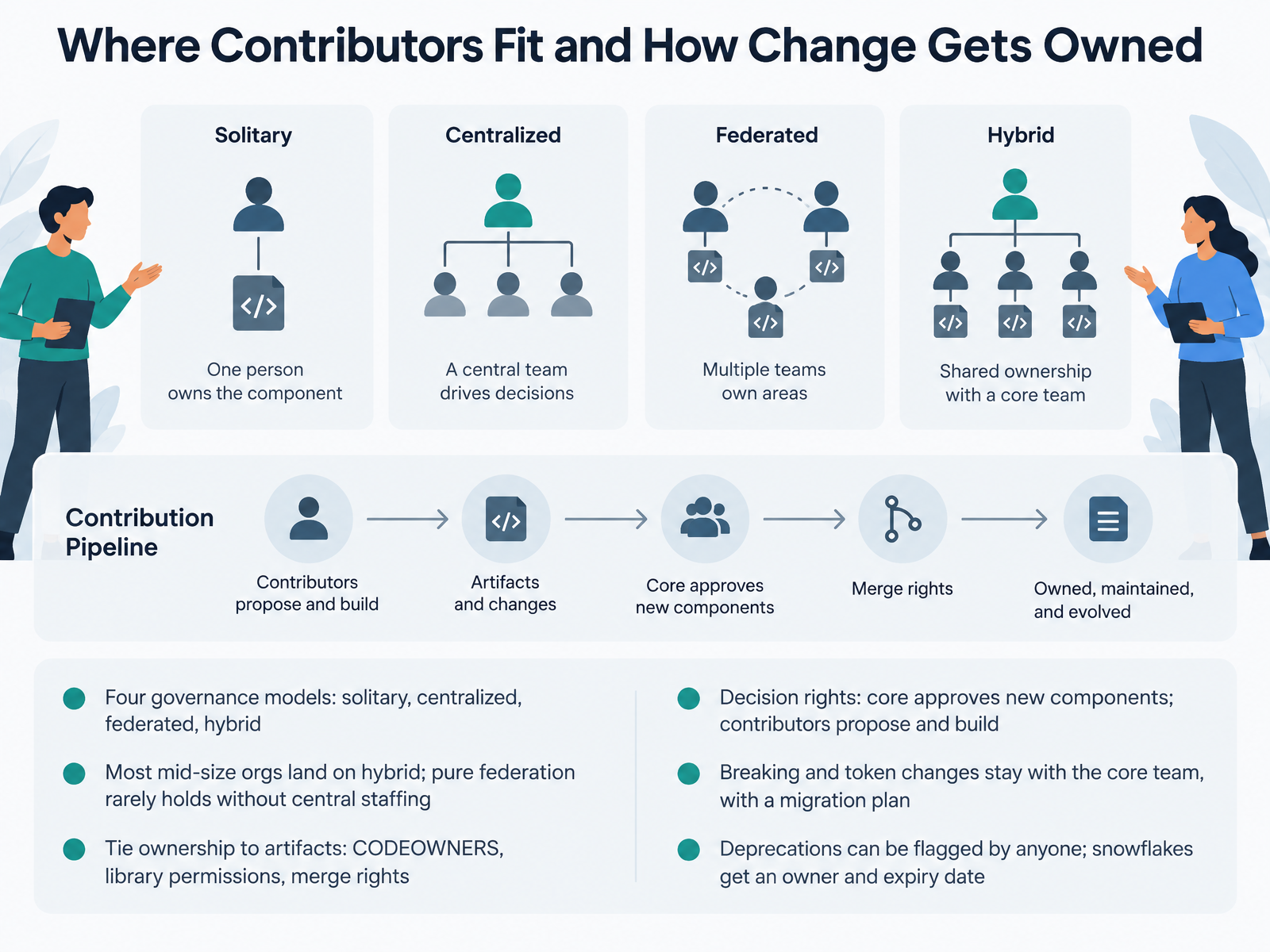
 - 06Where Contributors Fit and How Change Gets OwnedNow let's look at where contributors actually fit, and how change gets owned. There are four common governance models: solitary, where one person owns everything; centralized, where a dedicated core team holds the system; federated, where many product teams contribute; and hybrid, where a core team owns tokens and release while product teams propose and build. Most mid-size organizations land on hybrid. Pure federation rarely holds unless the center still gets real staffing and authority. The key move is tying ownership to real artifacts, not job titles. That means CODEOWNERS entries, library permissions, and merge rights. On decision rights, keep the split simple: the core team approves new components, and contributors propose and build them. Breaking changes and token changes stay with the core team, always with a stated migration plan. Anyone can flag a deprecation. And when a one-off snowflake ships, give it a named owner and an expiry date, or it becomes permanent drift. Next, we'll walk through the contribution workflow from proposal to release.
 github.comgithub.comdesignsystems.one+21 min
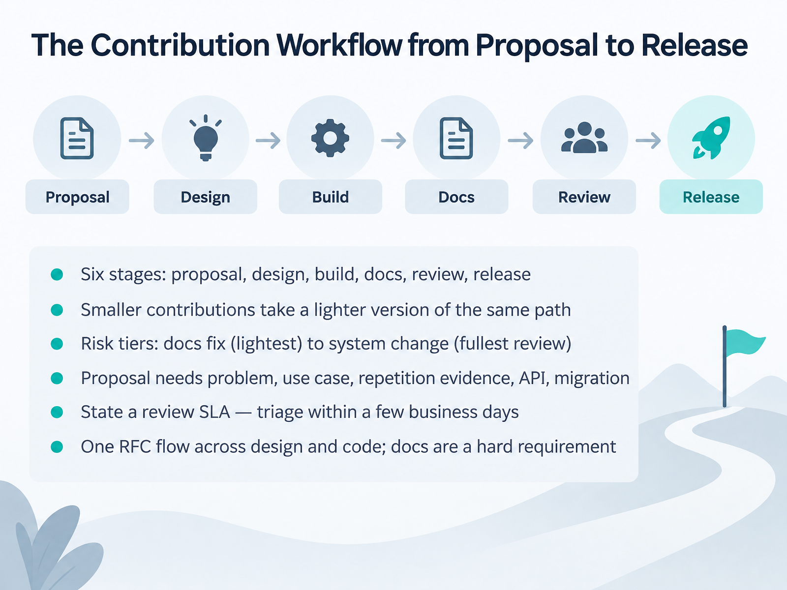
 - 07The Contribution Workflow from Proposal to ReleaseFrom proposal to release, every contribution walks the same core path, but the depth changes with risk. You have six stages: proposal, design, build, docs, review, and release. A docs fix moves through the lightest version. A system-level change gets the fullest review, because its blast radius is widest. So the workflow scales, it doesn't disappear. Every proposal needs five things: the problem, the use case, evidence the need repeats across teams, the proposed API surface, and the migration impact. That's your RFC, a request for comments, one written doc that design and code both gate against. Reviewers comment on the doc, not the pull request. Documentation is a hard requirement, not a follow-up. Components without docs aren't finished. And state your review SLA up front: triage within a few business days. Without a stated turnaround, proposals stall in a queue nobody owns. Next, we'll look at documenting and communicating system decisions.
 github.comgithub.comdesignsystems.one+21 min
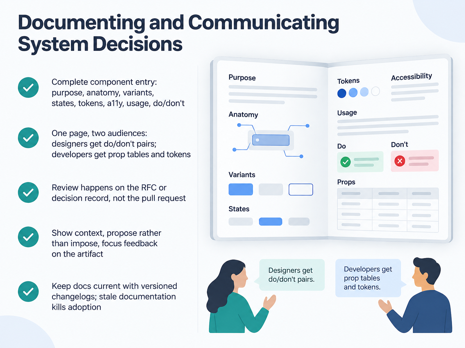
 - 08Documenting and Communicating System DecisionsLet's talk about documenting and communicating system decisions, because a component isn't really done until someone else can use it without asking you. Start with a complete component entry: purpose, anatomy, variants, states, tokens, accessibility, usage, and do and don't examples. Write one page that serves two audiences. Designers read the do and don't pairs, while developers go straight to the prop tables and token references. Here's the part teams often get wrong. Review happens on the RFC or decision record, not the pull request. The pull request confirms the decision. The RFC is where the discussion belongs. When you propose, show the context and offer the change rather than imposing it. Then focus feedback on the artifact, not the person. Finally, keep docs current with a versioned changelog. Stale documentation kills adoption faster than missing features. Next, we look at accessibility essentials for contributors.
 design.va.govdesign-system.hpe.designatlassian.design+21 min
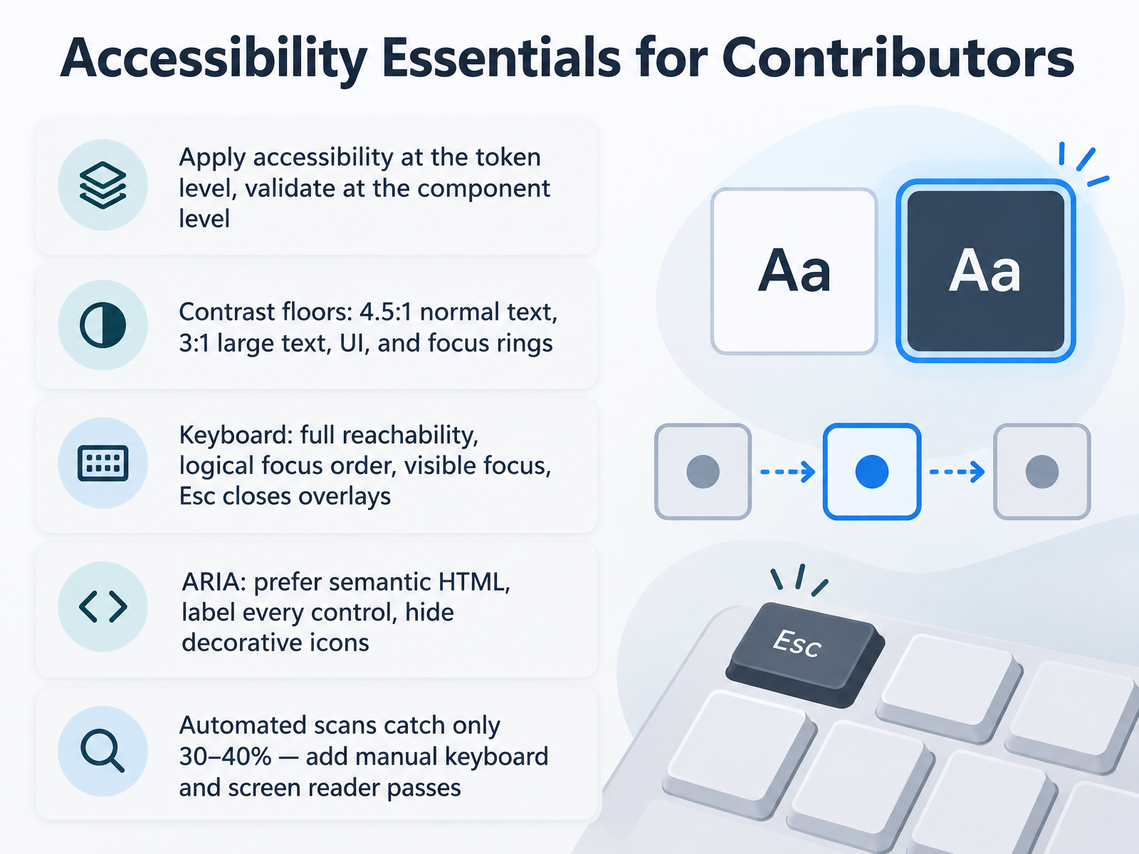
 - 09Accessibility Essentials for ContributorsLet's look at accessibility essentials, because in a design system, accessibility is a foundation, not a feature you bolt on later. The pattern to remember is simple: apply accessibility at the token level, then validate it at the component level. So check your contrast floors early. Normal text needs four point five to one. Large text, UI elements, and focus rings need three to one. Tokens carry those values, so fixing contrast once fixes it everywhere. Next, keyboard: every interactive element must be fully reachable, in a logical focus order, with a visible focus ring, and overlays should close on Escape. For assistive tech, prefer semantic HTML over ARIA, label every control, and hide decorative icons. One honest caveat: automated scans catch only thirty to forty percent of issues. So add manual keyboard passes and screen reader checks on your core components. Up next, we'll put this into practice.
 design.va.govdesign-system.hpe.designatlassian.design+22 min
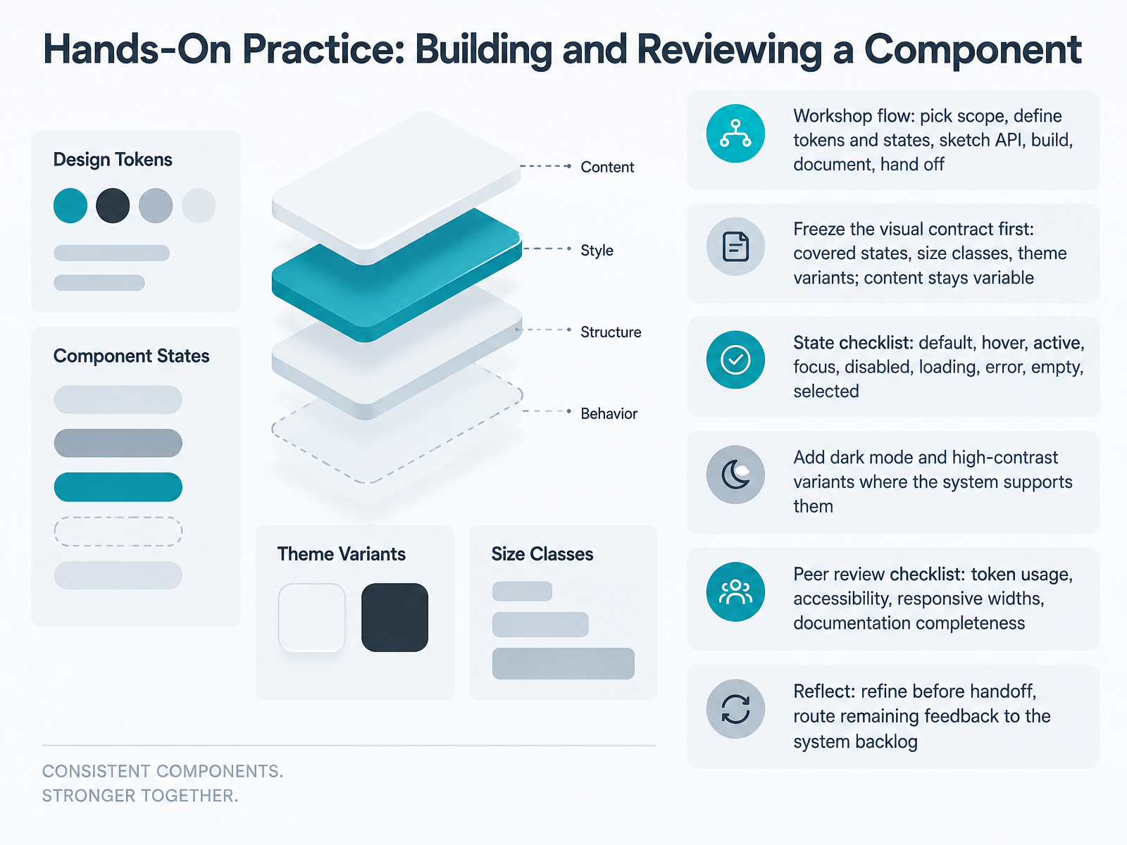
 - 10Hands-On Practice: Building and Reviewing a ComponentLet's put this into practice. In this workshop, you'll build and review one component end to end. The flow is: pick scope, define tokens and states, sketch the API, build, document, then hand off. Start by freezing the visual contract. That means deciding the covered states, size classes, and theme variants up front, while content stays variable. Run through the state checklist: default, hover, active, focus, disabled, loading, error, empty, and selected. Then add dark mode and high-contrast variants where your system supports them. When you review a peer's work, check token usage, accessibility, responsive widths, and documentation completeness. Before handoff, reflect, refine what you can, and route remaining feedback to the system backlog. That keeps fixes from getting lost. Next, we'll look at Testing Contributions: Visual Regression, API, and A11y Checks.
 design.va.govdesign-system.hpe.designatlassian.design+21 min
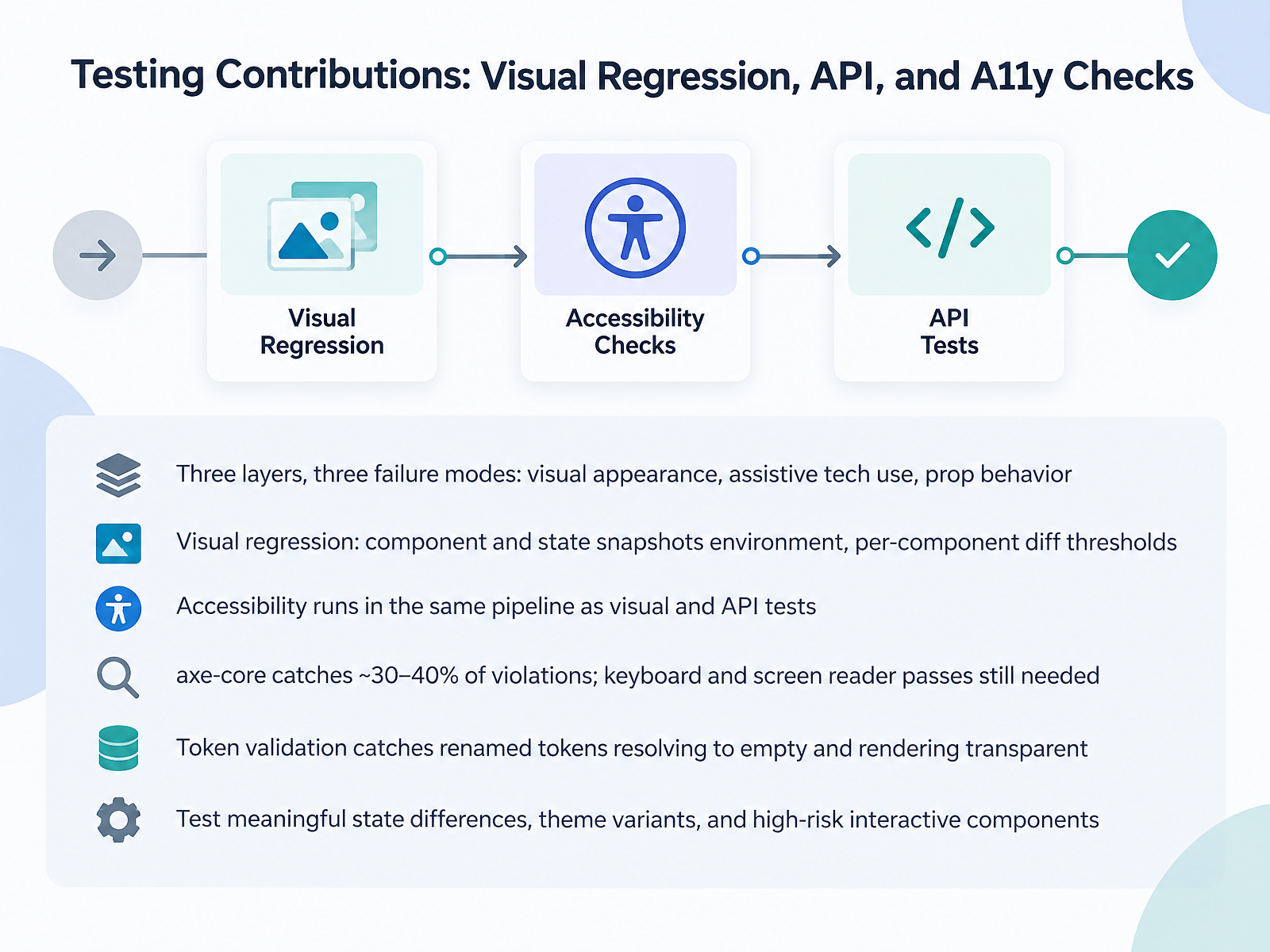
 - 11Testing Contributions: Visual Regression, API, and A11y ChecksNow let's talk about testing your contribution. Think in three layers, because they fail in three different ways. Visual appearance, assistive tech use, and prop behavior. Visual regression captures component and state snapshots in a consistent environment, and you set diff thresholds per component. A plain button might need zero pixel tolerance, while a blurred or animated surface needs a looser one. Accessibility should run in the same pipeline as your visual and API tests, not as a separate phase. One caution: axe-core catches roughly thirty to forty percent of violations, so keyboard and screen reader passes are still on you for dialogs, menus, and custom selects. Also validate tokens. A renamed token can resolve to an empty value and render transparent, which snapshots may miss. Finally, keep coverage meaningful. Test state differences, theme variants, and high-risk interactive components, not every prop combination. Next, governance, review gates, and release discipline.
 design.va.govdesign-system.hpe.designatlassian.design+22 min
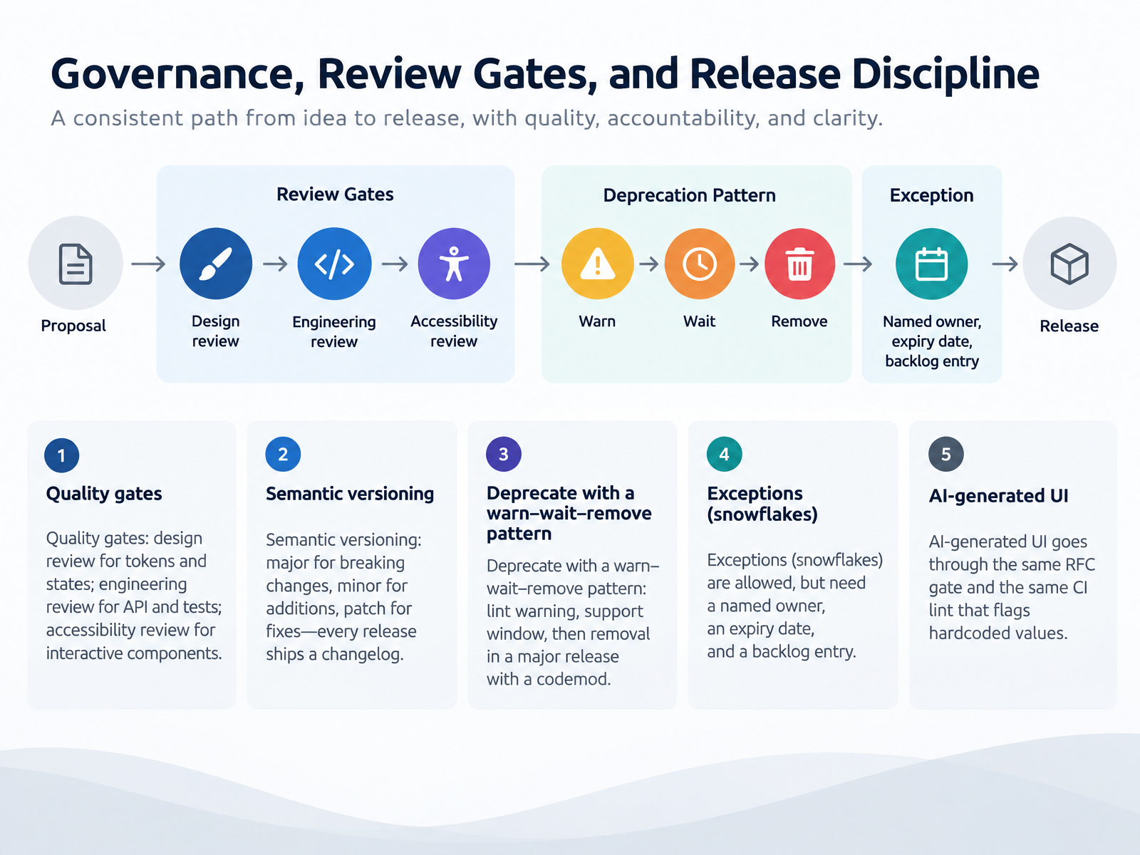
 - 12Governance, Review Gates, and Release DisciplineLet's talk about governance: the review gates and release discipline that keep contributions trustworthy. Quality gates come in three flavors. Design review covers tokens and states. Engineering review covers the API and tests. And accessibility review covers interactive components, like dialogs and menus. Next, semantic versioning. Major for breaking changes, minor for additions, patch for fixes. Every release ships a changelog naming what changed and who is affected. When you deprecate something, use warn, wait, remove. Add a lint warning first, keep a support window, then remove it in a major release with a codemod. Sometimes a product genuinely cannot wait for the full review cycle. That is a snowflake, and it is allowed, but it needs a named owner, an expiry date, and a backlog entry so someone revisits it. And AI-generated UI goes through the same RFC gate and the same CI lint that flags hardcoded values. Same rules, whether a person or a model wrote it. The takeaway is simple: agreed gates, honest versioning, and visible exceptions keep the system healthy as it scales. Next, we look at adoption signals and measuring contribution impact.
 github.comgithub.comdesignsystems.one+22 min
 - 13Adoption Signals and Measuring Contribution ImpactNow let's talk about adoption signals, and how to measure whether your contribution actually moved the needle.
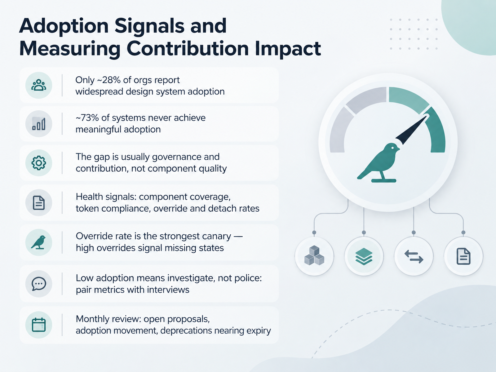
The baseline is sobering. Only about twenty-eight percent of organizations report widespread adoption of their design system. And roughly seventy-three percent never reach meaningful adoption at all. Notice the cause, though. The gap is usually governance and contribution, not component quality.
So track health signals: component coverage, token compliance, override and detach rates. If you only watch one, watch override rate. It is the strongest canary. High overrides tell you a component is missing real states, not that teams are misbehaving.
That is why low adoption means investigate, not police. Pair the metrics with interviews, and ask teams what broke. Then run a monthly review: open proposals, adoption movement, and deprecations nearing expiry.
Next, we put this into practice with your action plan, from first contribution to system partner.
 designx.coeltherion.comredbaton.digital+22 min
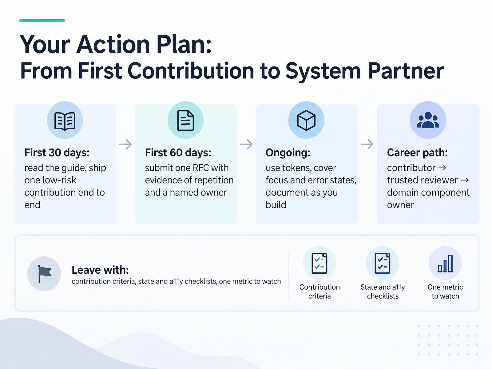
 - 14Your Action Plan: From First Contribution to System PartnerLet's bring it together with an action plan you can actually run. First thirty days: read the contribution guide, then ship one low-risk contribution end to end. Pick something small, like adding a missing state to an existing component, so you feel the whole path from proposal to release. By day sixty, submit one RFC. Keep it short: the problem, evidence that at least two teams hit it, and a named owner who will maintain it after launch. That named owner matters. Contributions without an owner become backlog, not components. Ongoing, do three things: use tokens instead of hardcoded values, always cover focus and error states, and document as you build rather than after. And notice the career path here. You start as a contributor, then become a trusted reviewer, and eventually you own a domain component end to end. So leave with three things in hand: your contribution criteria, your state and accessibility checklists, and one metric you'll watch, like override rate or time from proposal to merge. Pick one contribution this week. Thank you for working through this course, and good luck. You're ready to build inside the system, not around it.
 github.comgithub.comdesignsystems.one+22 min
Take the deck with you
Download this course as a file — free, no sign-up needed.
- PDF handoutEvery slide page, ready to print or share.15 pages · 2.9 MBDownload
- Narrated PowerPointThe deck that presents itself — every slide carries the digital human's narration video.15 pages · 13.6 MBDownload
- PowerPoint slidesThe full deck as a .pptx — open it in PowerPoint, Keynote, or Google Slides.15 pages · 2.9 MBDownload
Free to use in your own training — please keep the PersonWise credit page at the end.
Have your own deck? Turn it into a course
Sources consulted
Web sources consulted while building this course.
- Best Practices For Naming Design Tokens, Components ... — smashingmagazine.com
- Token Name Technical Specs | Tokens Studio for Figma — docs.tokens.studio
- Naming conventions — the API of the system | DesignSystems.one — designsystems.one
- skills/figma-generate-library/references/naming-conventions.md at HEAD · figma/mcp-server-guide — github.com
- Token Naming Conventions & Tier Architecture · UI/UX Atlas — uiuxatlas.com
- Design System ROI for B2B SaaS: What to Measure | DesignX — designx.co
- Design system adoption: cost, rollout, ROI | Eltherion — eltherion.com
- Measuring Design System ROI in Enterprises - Red Baton — redbaton.digital
- Design system ROI: measure it as a P&L line item — adamarant.com
- Design System ROI: Measuring the Business Impact of Scalable Design - UX Stalwarts — uxstalwarts.com
- skills/contribution-workflow/SKILL.md — github.com
- skills/design-system/references/governance-playbook.md — github.com
- Governance: who owns what — Playbook 07 | DesignSystems.one | DesignSystems.one — designsystems.one
- Design System Contribution Model: Scaling Teams in 2026 — figr.design
- Governance & Contribution Models · UI/UX Atlas — uiuxatlas.com
- Accessibility testing for design system components — design.va.gov
- Accessibility — HPE Design System — design-system.hpe.design
- Atlassian DESIGN.md — atlassian.design
- Accessibility — components.build
- skills/building-components/references/accessibility.mdx at main · vercel/components.build — github.com