Designing Clear Data Tables
Begin
18 pages · ~36 min
Designing Clear Data Tables
This training teaches designers how to create clear, accessible data tables by applying best practices in layout, typography, and visual hierarchy.
What you’ll learn
- 01Designing Clear Data TablesWelcome to Designing Clear Data Tables. In this course, we are going to focus on one of the most critical UI patterns for product designers and content creators: the data table. Whether you are building enterprise SaaS dashboards, admin tools, or any data-rich product, the table is often where the real work gets done. But here is the core tension we have to navigate. We need high data density, yet we cannot sacrifice scannability and readability. We will cover everything from the anatomy of a table and content design, to interaction patterns, typography, responsive strategies, accessibility, and how it all fits into a design system. Here is the goal we are aiming for. The best tables disappear. The user stops noticing the interface and starts reasoning about the data. That is what we want to achieve. Let us begin by grounding our design decisions in the user's actual tasks. Next, we will explore The User Tasks a Table Must Support.setproduct.comsizzy.cojamesrossjr.com+21 min
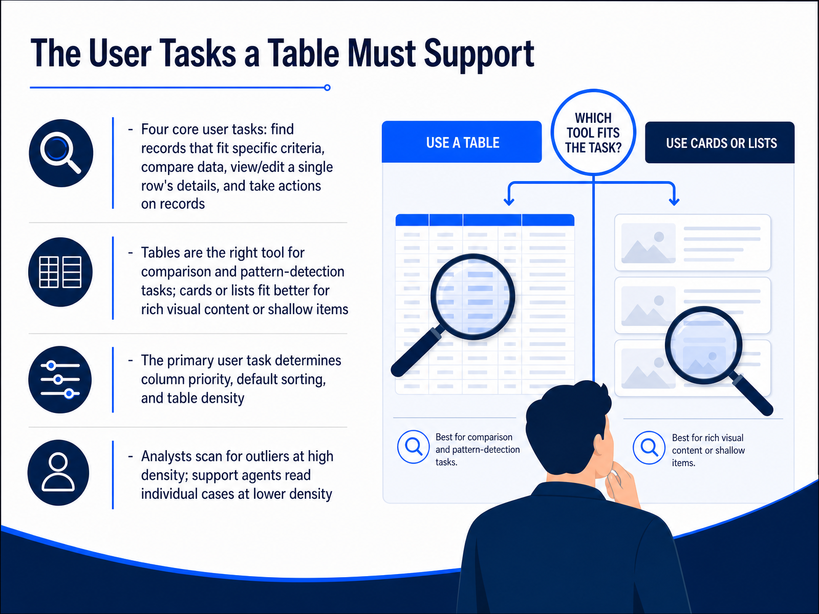
- 02The User Tasks a Table Must SupportLet's move into the core user tasks a table must support. Every good table design starts with understanding what people actually need to do. In our research, we see four tasks that show up again and again. First, find records that fit specific criteria, like locating all overdue invoices. Second, compare data across rows, spotting the high and low values in a column. Third, view, edit, or add a single row's details. And fourth, take actions on records, like approving or deleting a batch. Now, tables are the right tool for comparison and pattern-detection tasks. If you're presenting rich visual content or shallow items, cards or lists usually fit better. The primary user task directly shapes your design decisions. It determines which columns get priority, what the default sort should be, and how dense the table needs to be. For example, an analyst scanning for outliers needs high density to see many rows at once, with row heights around thirty-two to thirty-six pixels. A support agent reading individual cases needs lower density, with more whitespace and heights closer to forty-four to fifty-six pixels. Matching the density to the task prevents cognitive fatigue and keeps the user effective. Let's look at the anatomy that makes these tasks possible in the next slide, Anatomy of a Data Table.
 nngroup.comnngroup.comsetproduct.com+22 min
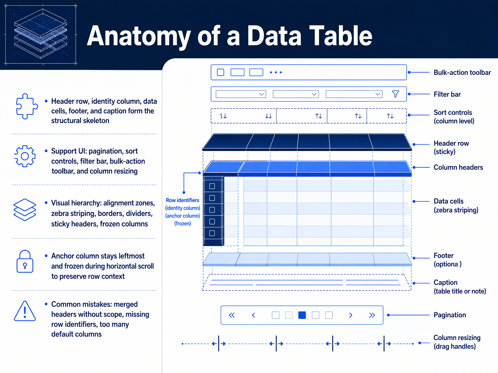
 - 03Anatomy of a Data TableLet's lay out the bones of a data table. The structural skeleton is built from the header row, an identity column, data cells, a footer, and a caption. Around that we add the support UI, things like pagination, sort controls, a filter bar, bulk-action toolbars, and column resizing. Then there's the visual hierarchy. This includes alignment zones, zebra striping, borders, dividers, sticky headers, and frozen columns. A critical piece is the anchor column. It stays leftmost and frozen during horizontal scroll, so users never lose row context. Watch out for a few common mistakes. Merged headers without proper scope attributes break accessibility. Missing row identifiers leave users disoriented. And showing too many default columns creates cognitive overload before the user even starts. Next, we'll look at content design for headers, cells, and microcopy.
 setproduct.comsizzy.cojamesrossjr.com+21 min
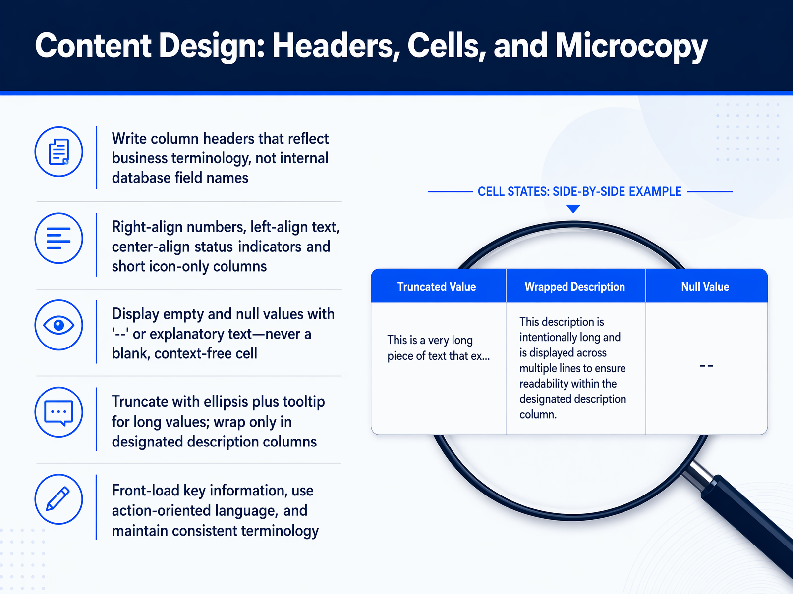
 - 04Content Design: Headers, Cells, and MicrocopyNow let's talk about the words inside the table. Headers, cells, and microcopy are where clarity either happens or breaks down. Write column headers that use business terminology your audience actually recognizes, not internal database field names that only your team understands. For alignment, right-align numbers so users can scan magnitudes quickly. Left-align text for natural reading flow. Center-align status indicators and short icon-only columns so they sit neatly under the header. When a cell has no value, never leave it blank. A context-free empty cell makes users wonder if data is missing or broken. Use a double dash or a short explanatory phrase instead. For long values, truncate with an ellipsis and show the full text in a tooltip on hover or focus. Wrap text only in designated description columns, because multi-line rows everywhere destroy the vertical rhythm that makes scanning fast. Front-load the most important information in every cell. Use action-oriented language and keep terminology consistent. If you call it a project on one screen, don't call it a job on another. Next, we'll look at alignment, typography, and numeric readability.
 justinmind.commidrocket.comsummationworks.com+22 min
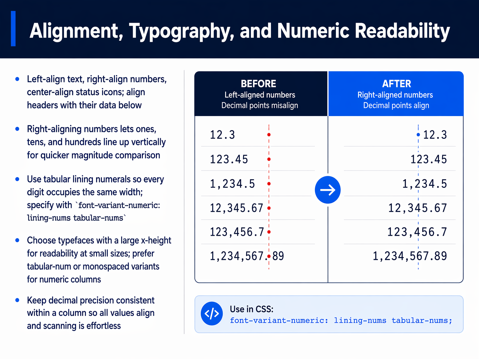
 - 05Alignment, Typography, and Numeric ReadabilityNow let's get into the core mechanics of alignment, typography, and numeric readability. These decisions directly affect how quickly your users can scan and compare data. First, a simple rule: left-align text, right-align numbers, and center-align status icons. And always align your column headers with the data below them. When you right-align numbers, the ones, tens, and hundreds stack vertically. This makes magnitude comparison almost instantaneous. Your reader doesn't have to hunt for the start of each number. To support this, you need to specify tabular lining numerals. These ensure every digit occupies the same width. In CSS, you can set this with font-variant-numeric: lining-nums tabular-nums. For typeface selection, prioritize fonts with a large x-height. This keeps your data readable even at small sizes. Look for tabular or monospaced variants for your numeric columns. Finally, enforce consistent decimal precision within a column. If one value shows two decimal places, they all should. This eliminates visual noise and makes scanning effortless. Next, we'll explore how to balance visual density, color, and spacing to further reduce cognitive load.
 doi.orgalistapart.comdoi.org+21 min
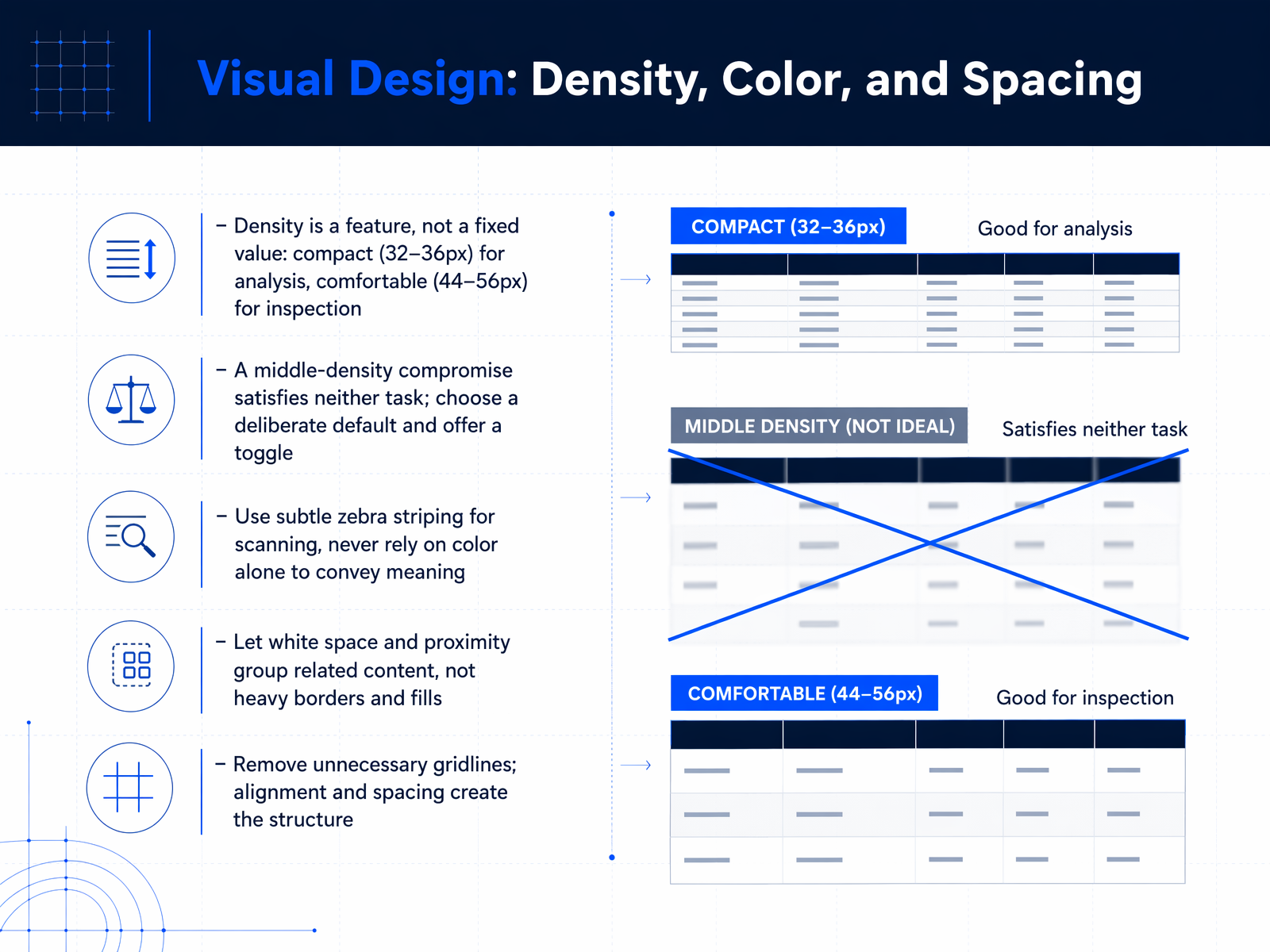
 - 06Visual Design: Density, Color, and SpacingNow let's talk about the visual design levers that make a table feel easy to scan: density, color, and spacing. Think of density as a feature, not a single fixed value. For fast scanning and comparison tasks, a compact density with row heights around 32 to 36 pixels works well. For slower inspection and decision tasks, a more comfortable density around 44 to 56 pixels lets the content breathe. The most common mistake is choosing a middle value that satisfies neither task. Instead, pick a deliberate default and offer a toggle so users can switch modes. When it comes to color, subtle zebra striping can help the eye track across long rows, but never rely on color alone to convey meaning. Always pair it with text or icons. For structure, let white space and proximity do the heavy lifting. Use generous padding and alignment to group related content, and avoid heavy borders and fills that add visual noise. In fact, you can remove most gridlines entirely. The alignment and spacing will create the structure for you. Next, we'll move from visual structure to how users actually navigate and narrow the data, covering interaction design for sorting, filtering, and searching.
 nngroup.comnngroup.comsetproduct.com+22 min
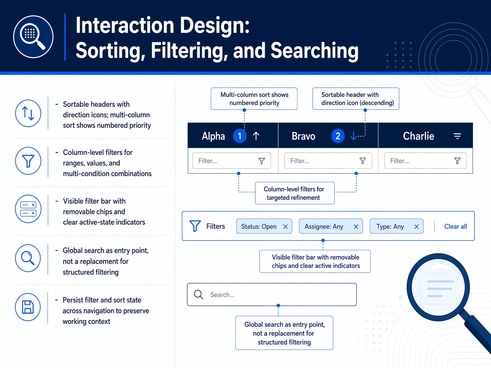
 - 07Interaction Design: Sorting, Filtering, and SearchingSorting, filtering, and searching turn a static table into an interactive workspace. Let's start with sorting. Sortable headers with directional arrows give users immediate control. For power users, multi-column sort is indispensable. When you support it, show numbered priority indicators next to each sort arrow so the sequence is obvious. For filtering, place column-level controls right at the top of each column. Users need to filter by ranges, specific values, and multi-condition combinations. A visible filter bar is equally important. It should display removable chips and clear active-state indicators so users always know what subset they are viewing. Global search is a great entry point, but it cannot replace structured filtering. Use it for quick lookups, not as the only way to narrow data. Finally, a critical but often overlooked detail: persist filter and sort state across navigation. When a user clicks into a record and returns, they should find their working context exactly as they left it. Next, we'll explore row actions, bulk actions, and editing patterns.
 nngroup.comnngroup.comsetproduct.com+22 min
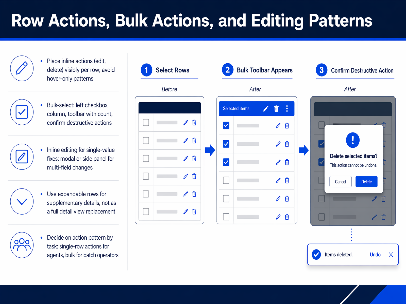
 - 08Row Actions, Bulk Actions, and Editing PatternsNow let's focus on how users actually interact with the data—through row actions, bulk actions, and editing. The key principle is visibility. Inline actions like edit or delete should be visible on each row by default, never hidden behind a hover. For bulk operations, place a checkbox column on the left. When rows are selected, a toolbar should appear showing the count and providing clear actions, with a confirmation step for anything destructive. For editing, match the pattern to the task. A single-value fix, like correcting a name, works best with inline editing directly in the cell. When a change involves multiple fields, use a modal or a side panel instead. Expandable rows are useful, but only for supplementary details—they should not replace a full detail view. Finally, decide your action pattern based on the user's role. Support agents often need single-row actions, while batch operators rely on bulk-select. Next, we'll tackle how to keep performance smooth when those tables grow large, covering pagination, virtualization, and performance.
 nngroup.comnngroup.comsetproduct.com+22 min
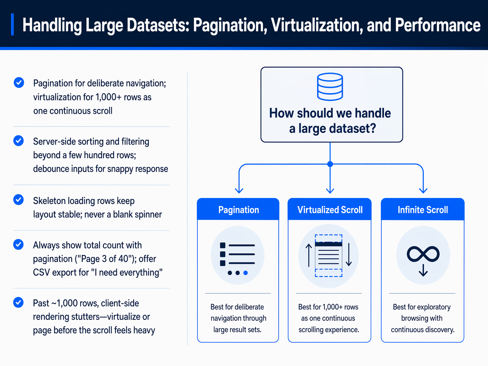
 - 09Handling Large Datasets: Pagination, Virtualization, and PerformanceNext, let's tackle how to handle large datasets without breaking the user experience. Performance is not just a technical concern; it's a core part of the design. For tables with a few hundred rows, pagination is usually the right call. It gives users a clear sense of place, like showing 'Page 3 of 40', and allows for deliberate navigation. But once your dataset climbs past roughly one thousand rows, client-side rendering starts to stutter and the scroll feels heavy. That's when you should switch to virtualization, which renders only the visible rows to keep the scroll smooth and continuous. For sorting and filtering, move those operations to the server side as soon as you have more than a few hundred rows. Also, debounce any text inputs to prevent janky, slow responses. While the data loads, use skeleton loading rows to keep the layout stable. You should avoid a blank spinner, which can make the wait feel longer. And always offer a CSV export. No matter how good your virtual scroll is, some users just need the entire dataset. Now, let's shift our focus to responsive table strategies for mobile.
 nngroup.comnngroup.comsetproduct.com+21 min
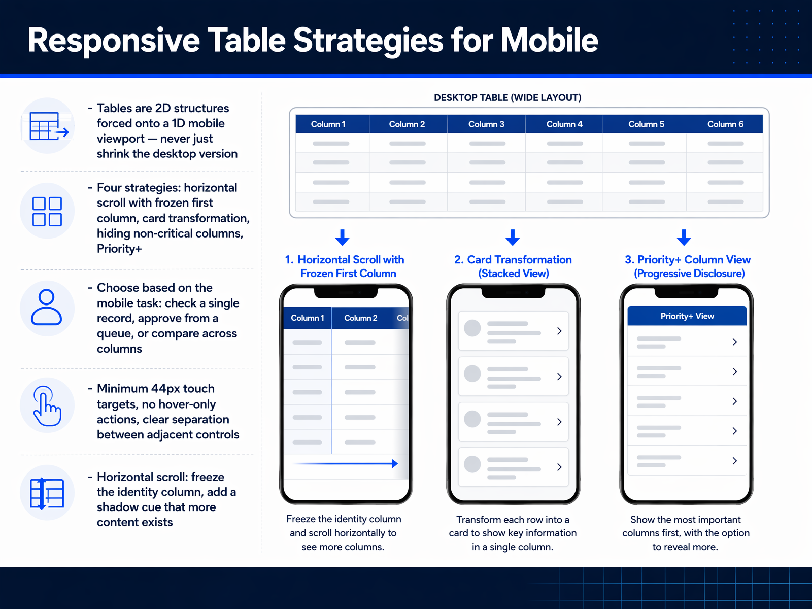
 - 10Responsive Table Strategies for MobileNow let's tackle responsive strategies for mobile. Think of a data table as a two-dimensional structure being forced onto a one-dimensional mobile viewport. Never simply shrink the desktop version. That path leads to tiny text and pinch-to-zoom frustration. Instead, choose from four deliberate strategies. First, horizontal scroll with a frozen first column. This preserves the full table structure. Add a shadow cue on the frozen column's right edge so users know there is more content to swipe to. Second, card transformation, where each row becomes a stacked card. This works beautifully for reviewing individual records, but it breaks down for comparing values across rows. Third, hiding non-critical columns. Show only the essential columns and tuck the rest behind a detail view. Fourth, the Priority Plus pattern, which shows the top columns and reveals the rest on demand. Your choice should be driven by the user's mobile task. Is someone checking a single record's status, approving items from a queue, or comparing values across columns? Each task maps to a different strategy. Also, enforce minimum touch targets of forty-four pixels, avoid hover-only actions, and maintain clear separation between adjacent controls. Let's move on to how we keep key context visible as users scroll, with sticky headers, frozen columns, and context preservation.
 setproduct.comsizzy.cojamesrossjr.com+22 min
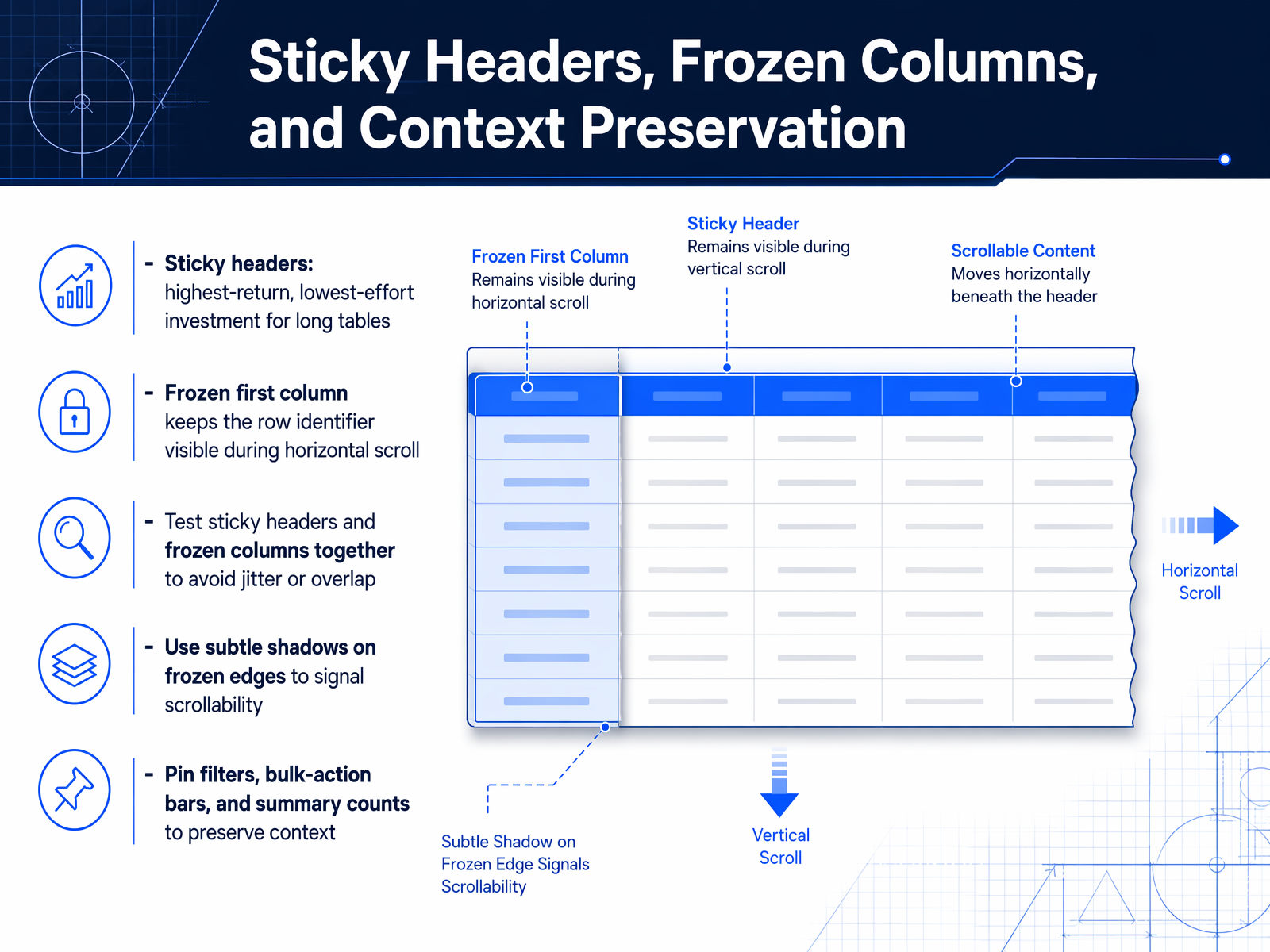
 - 11Sticky Headers, Frozen Columns, and Context PreservationScrolling through a long or wide table shouldn't mean losing your place. That's where sticky headers and frozen columns come in. A sticky header is the highest-return, lowest-effort investment you can make for long tables. It keeps column titles visible as users scroll vertically, so they never have to scroll back up just to remember which column is which. For wide tables, freezing the first column keeps the row identifier anchored during horizontal scroll, preserving context. These two patterns should always be tested together to avoid jitter or overlap. Adding a subtle shadow to the frozen edge visually signals that the content is scrollable. Beyond headers and identifiers, you should also pin filters, bulk-action bars, and summary counts. These elements preserve the user's working context and prevent disruptive back-and-forth scrolling. When applied thoughtfully, these techniques turn a disorienting scroll into a smooth, confident navigation experience. Next, we'll look at Empty States, Loading States, and Error Handling.
 nngroup.comnngroup.comsetproduct.com+22 min
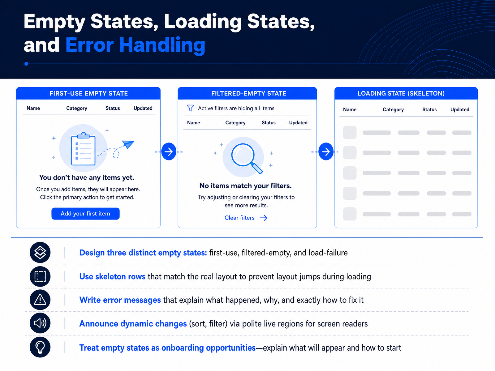
 - 12Empty States, Loading States, and Error HandlingNow let's move beyond the happy path and design for the moments when the table has no data, is still loading, or has hit an error. These states are not edge cases. They are part of the core experience, and they directly shape user trust. First, differentiate three empty states. A first-use empty state explains what will appear here and how to create the first row. A filtered-empty state says that the current filters returned no results and suggests adjusting them. A load-failure state acknowledges the error and offers a clear retry action. During loading, replace a generic spinner with skeleton rows that match the actual table layout. This prevents layout jumps and makes the wait feel shorter. For errors, write messages that explain what happened, why, and exactly how to fix it. Never blame the user. When the table changes through sorting or filtering, announce the update via polite live regions so screen reader users get the same real-time feedback. Finally, treat empty states as onboarding opportunities. Instead of a blank screen, tell the user what will appear and give them one clear action to get started. Next, we will cover accessibility: semantic structure and screen reader navigation.
 justinmind.commidrocket.comsummationworks.com+21 min
 - 13Accessibility: Semantic Structure and Screen Reader NavigationNow let's talk about making the structure of your tables accessible to screen readers. The first and most important rule is to use real semantic HTML. That means a genuine table element, with thead, tbody, and th elements. Include scope attributes on your headers, set to col or row, so the assistive technology knows exactly which cells each header describes. Every table also needs an accessible name. Use a caption element whenever you can, because it's visible to everyone. If the design doesn't show a caption, provide an aria-label instead. For irregular or multi-level headers that don't fit a simple grid, use id and headers attributes to explicitly associate data cells with their header cells. One more thing: reserve ARIA grid roles like role equals grid for custom, interactive, virtualized grids. For standard structured data, a native table is always the better foundation. Finally, when your table data changes dynamically, like after a sort, announce the change with an aria-live region. For example, "sorted by date, descending." This keeps screen reader users informed without moving their focus. Next, we'll build on this by covering keyboard navigation, focus management, and color considerations.
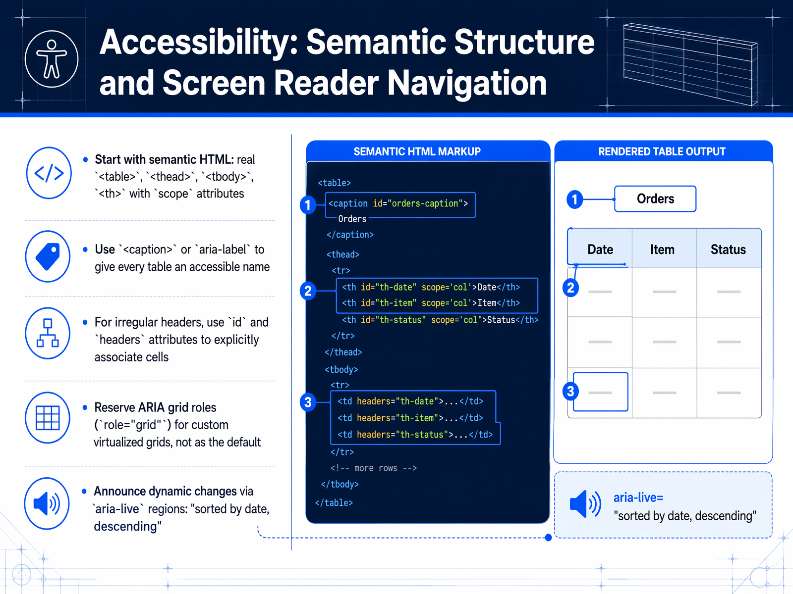 ictbaseline.access-board.govw3.orgw3.org2 min
 - 14Accessibility: Keyboard Navigation, Focus, and ColorNow let's talk about accessibility for keyboard navigation, focus, and color. When you add interactive elements like sorting, filtering, or row selection, every single one must be reachable and operable using only the keyboard. That includes inline editing controls and expandable row triggers. After any dynamic change, such as inserting or removing a row, the focus order needs to stay logical. For complex data grids, use a roving tabindex pattern so users can arrow through cells without cluttering the normal tab sequence. Focus indicators themselves must meet the three-to-one minimum contrast ratio against adjacent colors, as required by WCAG success criteria two point four point seven and two point four point eleven. Color is a powerful tool, but never rely on it alone to communicate status. Always pair color with a text label, an icon, or a shape so that meaning is clear to everyone. For expandable rows, use a real button element inside the cell, and set aria-expanded to communicate the state and aria-controls to link to the revealed content. This gives assistive technology users the full picture. Coming up next, we'll examine comparative table design patterns.
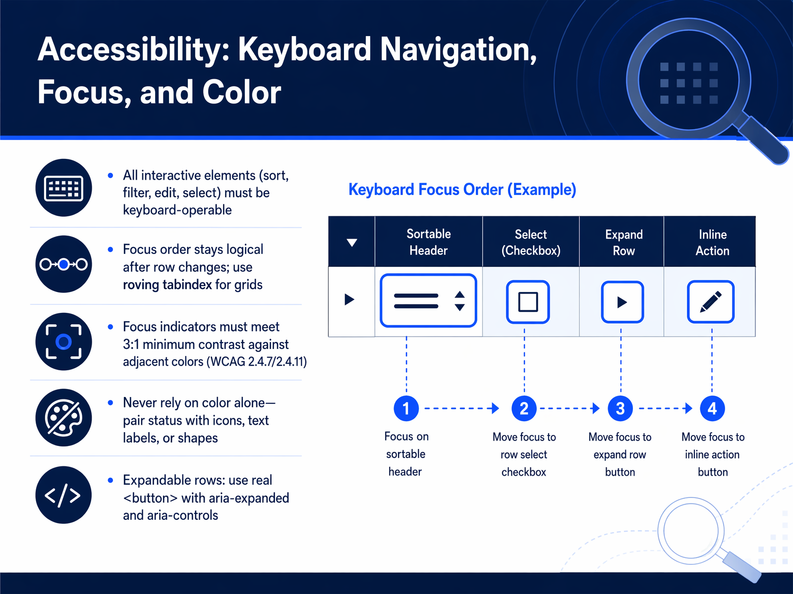 ictbaseline.access-board.govw3.orgw3.org2 min
 - 15Comparative Table Design PatternsNow let's look at how these principles come together in five common data table patterns. First, the product comparison table. Here, options sit in columns and attributes in rows. Limit the table to five items or fewer. More than that, and you're asking users to hold too much in memory. Use a static table for small sets, and dynamic selection for larger catalogs. Second, pricing tables. Stick to three plan tiers, highlight the recommended plan with a subtle badge and border, and place a clear call to action at both the top and bottom of the table. Third, feature matrices. Show only the differentiating features. Replace ambiguous checkmarks with explicit labels like 'Included' or 'Limited to ten projects,' so the user never has to hunt for a footnote. Fourth, dashboard data tables. Prioritize real-time status indicators, alert states, and clear drill-down pathways. These tables are for monitoring, not just reading. Finally, a universal rule for long tables: use sticky column headers. When a user scrolls, the context stays locked in place, reducing cognitive load and preventing costly mistakes. Up next, we'll explore how to integrate these patterns into your broader design systems.
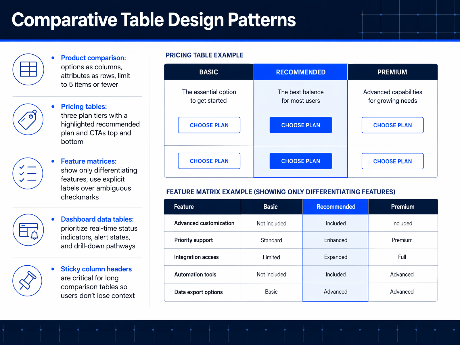 2 min
2 min - 16Integration into Design SystemsNow that we have defined clear table patterns, let’s talk about integrating them into your design system. Start by defining reusable table variants. A default read-only view, a selection variant with checkboxes, an expansion variant for progressive disclosure, a sortable header variant, and a batch-action variant. Next, tokenize the visual properties. Create presets for spacing, typography, color, and row height. Name them compact, default, and comfortable, and map them to core design tokens. Document usage guidelines, including column-width strategies, text alignment rules, and how to handle empty, loading, and error states. Then expose consistent application programming interface properties for sort, filter, pagination, selection, and expansion. Finally, test across breakpoints, data volumes, and screen readers. Use automated tools like Axe Core alongside manual walkthroughs to catch issues early. This systematic approach turns a one-off table into a scalable, accessible system component. Next, we’ll explore common pitfalls and how to avoid them.
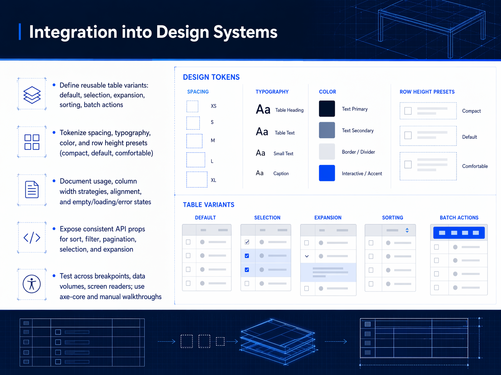 2 min
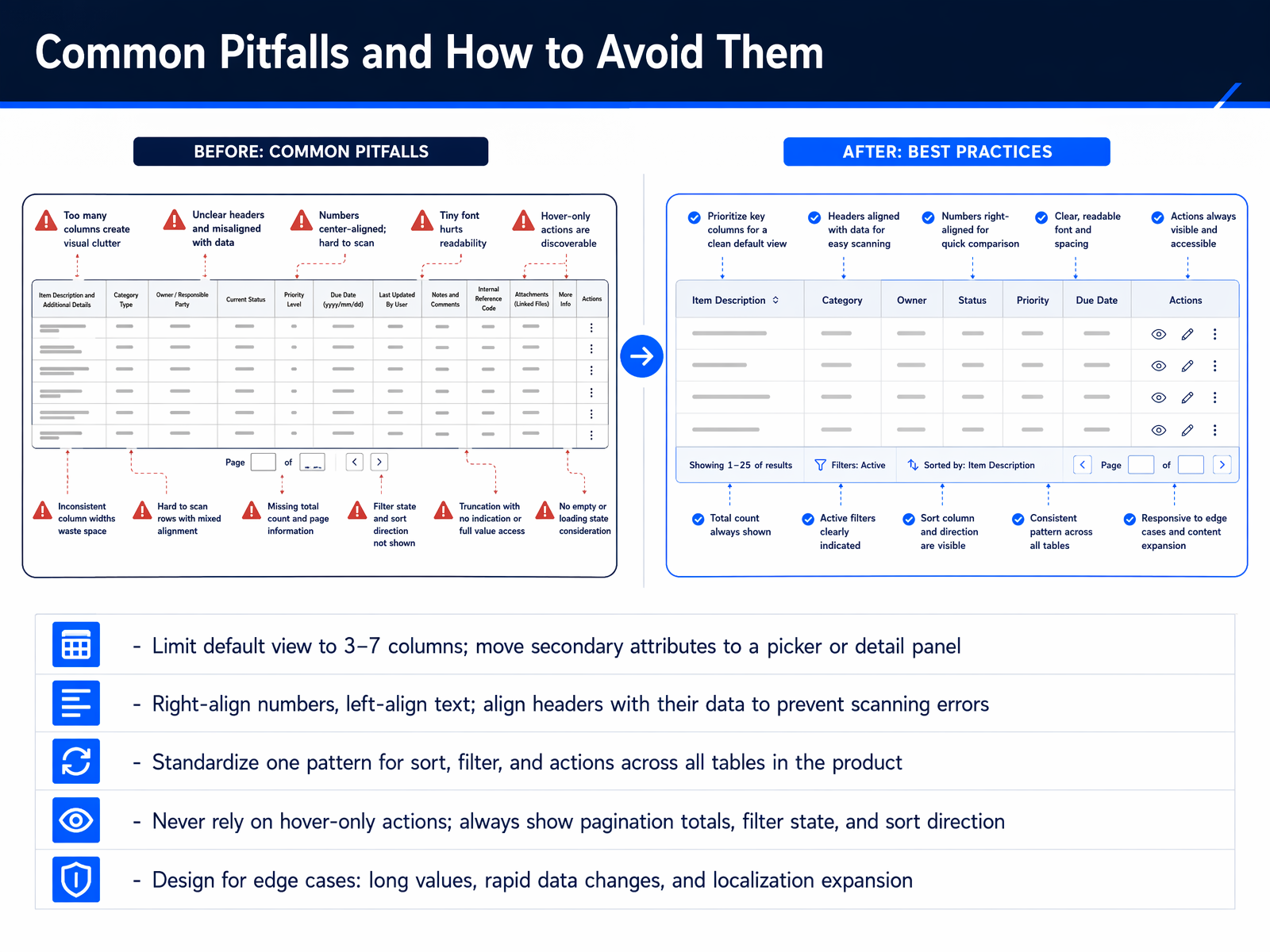
2 min - 17Common Pitfalls and How to Avoid ThemNow let's talk about the most common pitfalls in data table design, and more importantly, how to avoid them. First, resist the urge to show every column at once. Limit your default view to three to seven columns. Any additional attributes can live in a detail panel or a column picker. This keeps the initial view scannable. Next, alignment matters. Always right-align numbers and left-align text. Headers must align with their data, or you’ll cause scanning errors. Third, standardize your interaction patterns. Pick one design for sorting, filtering, and row actions, and use it consistently across every table in your product. Inconsistency is a quiet source of cognitive load. Fourth, never rely on hover-only actions. Critical information like pagination totals, active filter state, and sort direction must always be visible. Hiding them breaks trust. Finally, design for edge cases from the start. Account for long values, rapid data changes, and text expansion for localization. If you address these five areas, your tables will be far more robust and user-friendly. Up next, let's put these principles into practice with a practical exercise and discuss your next steps.
 nngroup.comnngroup.comsetproduct.com+22 min
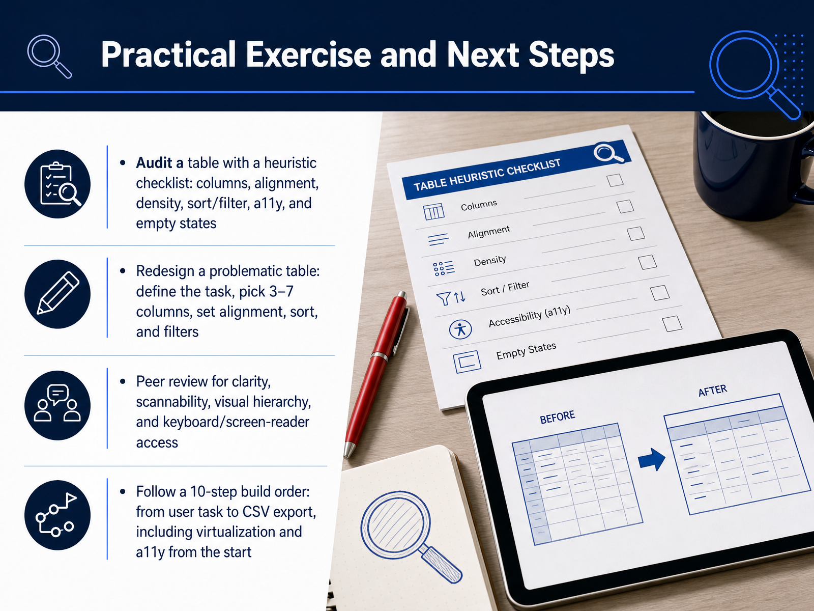
 - 18Practical Exercise and Next StepsLet's put these principles into practice with four concrete next steps. First, audit an existing table using a heuristic checklist. Go through columns, alignment, density, sort and filter controls, accessibility, and empty states. This quick audit will surface the highest-impact fixes. Second, choose one problematic table and redesign it. Define the primary user task, then pick three to seven columns that serve that task. Set the alignment, the default sort, and any filters the user needs most. Third, set up a peer review focused on clarity, scannability, visual hierarchy, and keyboard and screen-reader access. Having another designer walk through your table often catches issues you missed. Finally, follow a ten-step build order for new tables. Start with the user task, and end with CSV export. Build in virtualization and accessibility from the very beginning, not as an afterthought. These steps take you from theory to real, usable tables. Thank you for joining this course. I hope you feel equipped to design data tables that are clear, fast, and genuinely helpful. Go make your users' data easier to work with.
 nngroup.comnngroup.comsetproduct.com+22 min
Take the deck with you
Download this course as a file — free, no sign-up needed.
- PDF handoutEvery slide page, ready to print or share.19 pages · 4.6 MBDownload
- Narrated PowerPointThe deck that presents itself — every slide carries the digital human's narration video.19 pages · 17.5 MBDownload
- PowerPoint slidesThe full deck as a .pptx — open it in PowerPoint, Keynote, or Google Slides.19 pages · 4.2 MBDownload
Free to use in your own training — please keep the PersonWise credit page at the end.
Have your own deck? Turn it into a course
Sources consulted
Web sources consulted while building this course.
- Data table UI design reference guide for 2026 — setproduct.com
- How to Make Responsive Tables | Sizzy Blog — sizzy.co
- Responsive Data Tables That Actually Work on Mobile | James Ross Jr. — jamesrossjr.com
- Big Data Table Design: A UX Guide That Actually Works — ninjatables.com
- SaaS Data Table UI Patterns: Designing Tables Users Can Actually Work In | SaaSUI Blog — saasui.design
- Data Tables: Four Major User Tasks — nngroup.com
- Designing Tables for Desktop Apps with Lots of Data (Video) - NN/G — nngroup.com
- How to Design Data Tables That Stay Readable as Data Scales | 137Foundry — 137foundry.com
- Microcopy: examples and best practices for great UX - Justinmind — justinmind.com
- UX Writing Best Practices and Examples — Midrocket — midrocket.com
- UX Writing: Microcopy That Guides Users | SummationWorks — summationworks.com
- Getting Started | VTEX UX Writing Guidelines — uxwriting.vtex.com
- Tabular Typography — doi.org
- Web Typography: Designing Tables to be Read, Not Looked At — alistapart.com
- Web Table Formatting Affects Readability on Mobile Devices — doi.org
- Which fonts to use for your charts and tables | Datawrapper Blog — datawrapper.de
- Web Typography — book.webtypography.net
- 12. Tables (Web) — ictbaseline.access-board.gov
- How to Meet WCAG (Quickref Reference) — w3.org
- Tables Tutorial | Web Accessibility Initiative (WAI) — w3.org