Time Series: Trends, Seasonality, and Change
Begin
15 pages · ~30 min
Time Series: Trends, Seasonality, and Change
Learn to analyze time series data by identifying trends, seasonal patterns, and detecting changes for effective forecasting and decision-making.
What you’ll learn
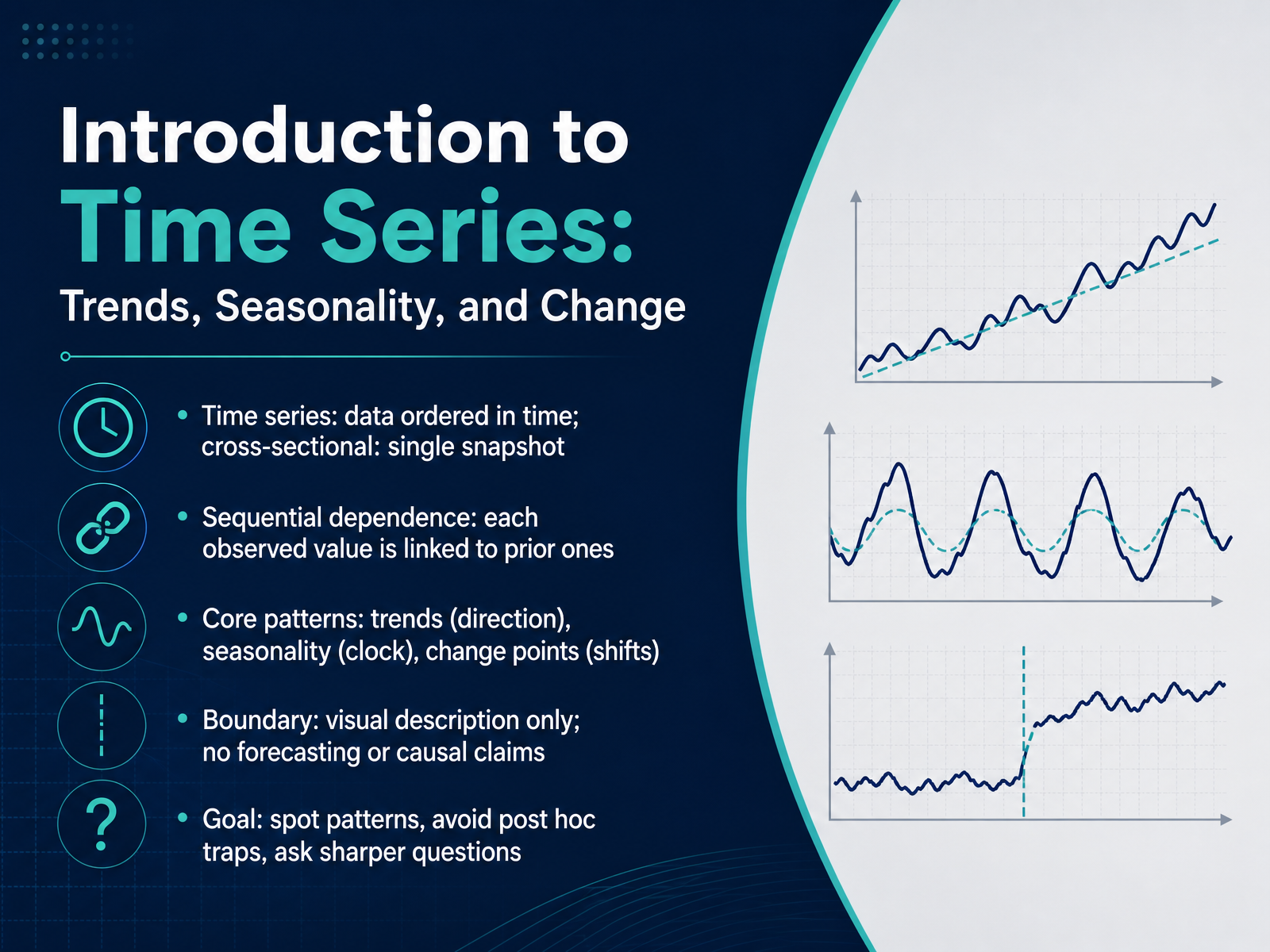
- 01Introduction to Time Series: Trends, Seasonality, and ChangeWelcome. In this course we explore how to read patterns in data that is ordered through time. We won't make forecasts or predictions. Instead we'll focus on careful observation and sharper questions. Let's start with the basics. A time series is simply data arranged in time order. That is different from cross-sectional data, which is a single snapshot. In a time series each value is connected to the ones before it. We call that sequential dependence. When we look at a time series we watch for three core patterns. A trend is a long-term direction, like a gradual rise in average temperature. Seasonality is a repeating clock-like rhythm, like higher sales every December. A change point is a sudden shift in the behavior of the series, such as a sharp drop in website visits after a redesign. Our goal here is visual description only. We'll learn to spot these patterns, avoid traps like seeing causes where none exist, and get better at asking what the data is really showing us. In the next slide we'll dig into what makes time series special by exploring sequential dependence in more depth.2 min
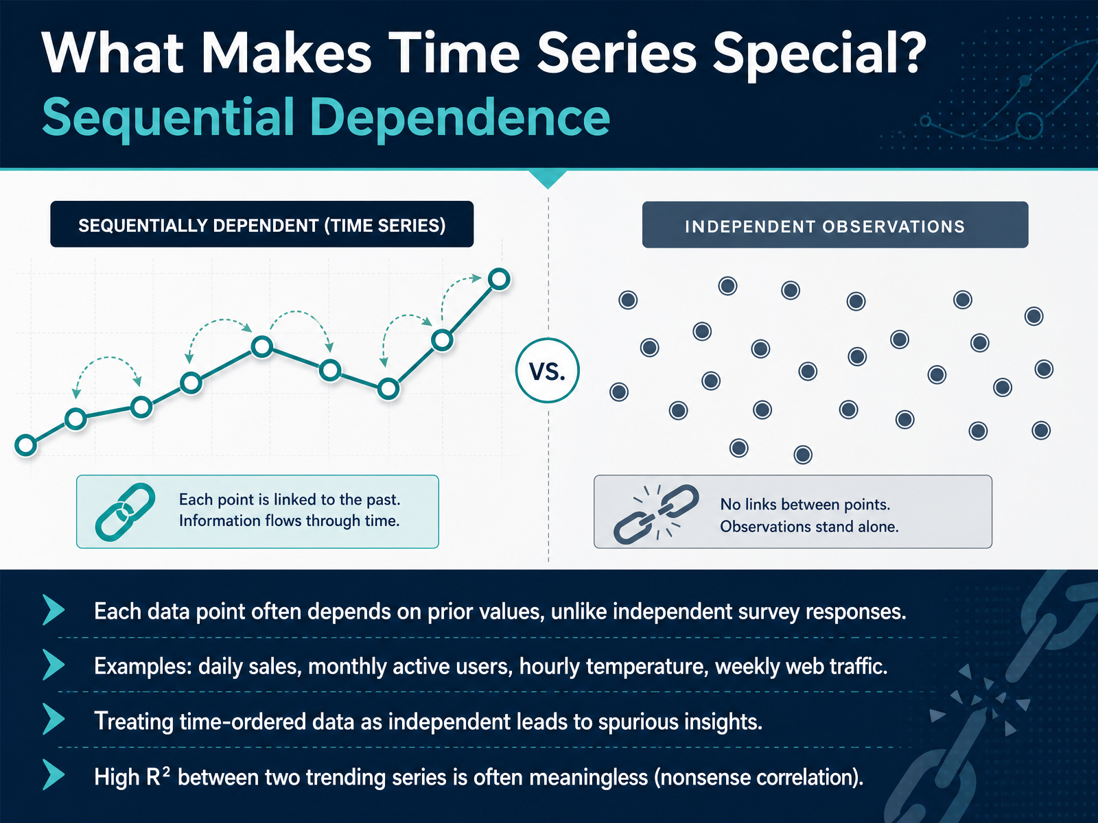
- 02What Makes Time Series Special? Sequential DependenceNow let's dig into what sets time series apart: sequential dependence. In a typical survey, each response stands alone. But in time series, today’s value usually depends heavily on yesterday’s value. Think of daily sales, monthly active users, hourly temperature readings, or weekly web traffic. Each data point carries a memory of the ones before it. Treating time-ordered data as if it were independent is risky—it often produces spurious insights. For example, if you spot a high R-squared between two trending series, like your revenue and total Netflix subscribers, that strong relationship is often meaningless. Both are simply climbing over time, creating a nonsense correlation that has nothing to do with cause and effect. This trap is called spurious regression. The takeaway: before you trust any correlation, remember that time itself can be a hidden confounder. That leads directly to our next topic: deconstructing the additive framework.
 mathworks.comlink.springer.compinchofdata.com+22 min
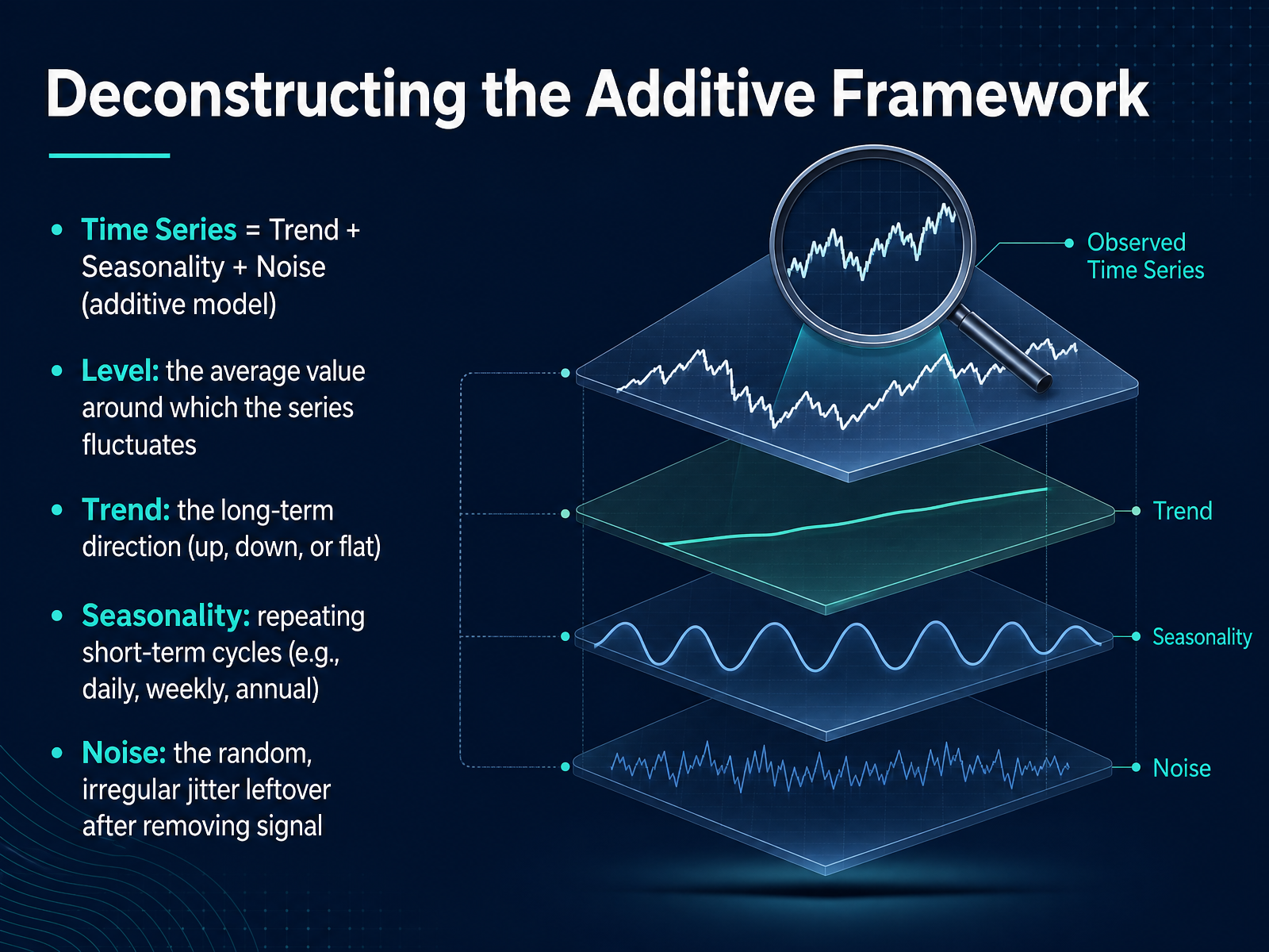
 - 03Deconstructing the Additive FrameworkNow that we have a feel for the structure, let's formalize it with the additive framework. Think of a time series as a signal built from three distinct layers. We can express this simply as: the data equals the Trend, plus the Seasonality, plus the Noise. We start by establishing the Level. This is the average value around which everything fluctuates. It is the baseline. Next, the Trend. This is the long-term direction. Is the series climbing, falling, or staying flat over the years? Notice how the trend ignores the short-term ups and downs. Then there is Seasonality. These are the repeating short-term cycles, like a spike in sales every December, or a dip in server traffic every weekend. The key is that these patterns repeat at a fixed, known frequency. Finally, there is Noise. Once we remove the trend and seasonality, what remains is the irregular jitter, the random bumps you cannot forecast. In a well-decomposed series, this noise should look like unpredictable static. This additive separation is most appropriate when the size of the seasonal swings stays roughly constant, regardless of whether the trend is high or low. We will learn when to adjust this approach later. But for now, this framework lets us isolate the signal from the chaos. Let's move on to examine that long-term signal more closely, and learn the art of recognizing the trend.
 otexts.comotexts.commachinelearningmastery.com+22 min
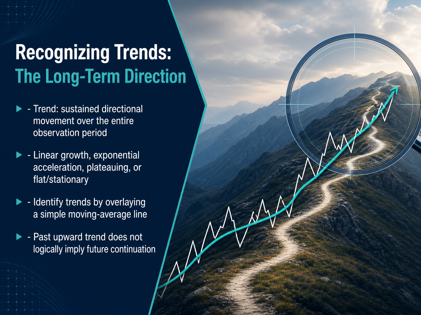
 - 04Recognizing Trends: The Long-Term DirectionMoving from patterns that repeat, let's consider the long-term direction hidden in a time series. This slide introduces the concept of a trend. A trend is a sustained directional movement that persists over the entire observation period, not just a few data points. This long-term behavior can take several forms. You might see linear growth, where values increase by a roughly constant amount over time. Alternatively, you could observe exponential acceleration, where the rate of growth itself is increasing. Other series show a plateauing effect, leveling off after a period of change, or remain flat and stationary. To identify these trends, try overlaying a simple moving-average line on your data. Notice how this smooth line can cut through the short-term noise and reveal the underlying direction. However, a crucial point for any analyst is this: a past upward trend does not logically imply a future continuation. Observing a historical pattern describes what has happened, but it is not a reliable predictor of what will happen next. We can now use this lens of a long-term direction to look at a different rhythmic pattern, which brings us to understanding seasonality, the clock inside your data.
 2 min
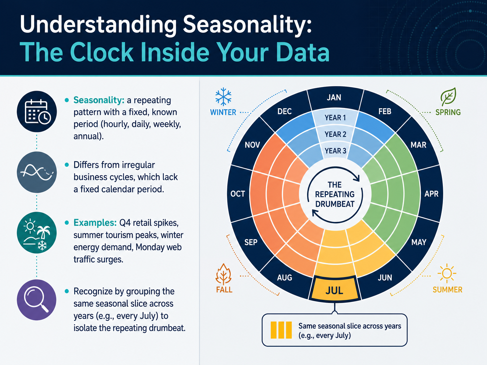
2 min - 05Understanding Seasonality: The Clock Inside Your DataNow let's focus on seasonality, which you can think of as the clock inside your data. Seasonality is a repeating pattern with a fixed, known period. For example, an hourly pattern, a daily rhythm, a weekly cycle, or an annual trend. Notice how this differs from irregular business cycles, which lack a fixed calendar period. We can see seasonality in familiar contexts, such as retail spikes in the fourth quarter, summer tourism peaks, winter energy demand, or Monday web traffic surges. To recognize these patterns, try grouping the same seasonal slice across years. For instance, isolate every July across multiple years to hear that repeating drumbeat. This approach helps you observe the rhythm without jumping to predictions. Up next, we will explore detecting change points and structural breaks.
 robjhyndman.commedium.comchicagofed.org+21 min
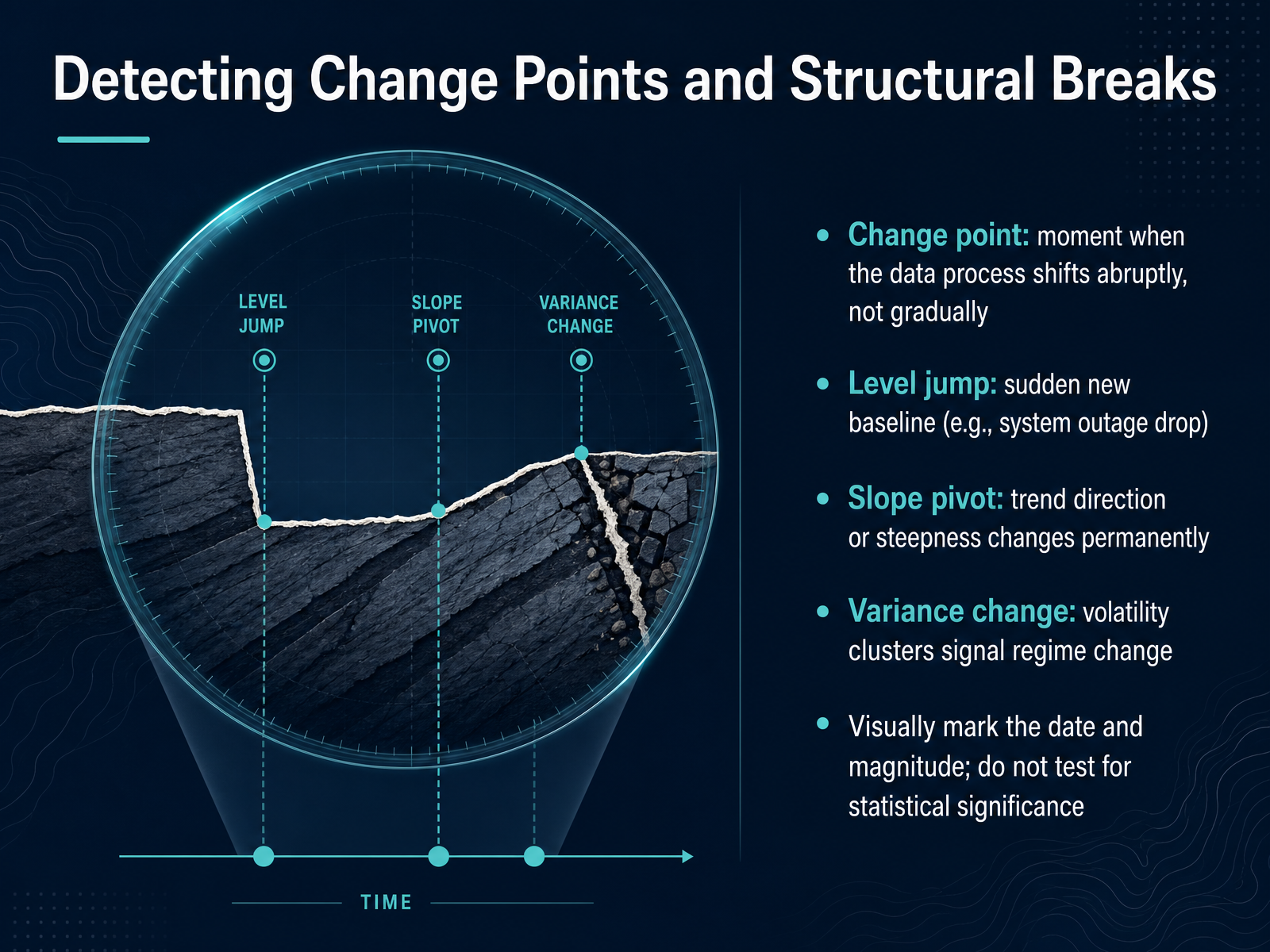
 - 06Detecting Change Points and Structural BreaksNow, let's focus on abrupt shifts in a series, known as change points or structural breaks. These are moments when the data-generating process itself changes suddenly, not gradually. There are three key forms to recognize. The first is a level jump, where the baseline shifts instantly. Think of website traffic after a system outage: it drops to a new low and may recover, but the break is clear. The second is a slope pivot, where a trend changes direction or steepness permanently. A product launch might accelerate growth, while a market saturation might flatten it. The third is a variance change, where volatility suddenly clusters, signaling a regime change—like price swings after a supply shock. When you detect these breaks, your primary job is to visually mark the date and note the magnitude. You are observing a shift in the process, not forecasting its future path. Avoid testing for statistical significance right away; first, simply see and describe what the history shows. This observational habit prepares us for our next topic: separating signal from noise.
 robjhyndman.commedium.comchicagofed.org+22 min
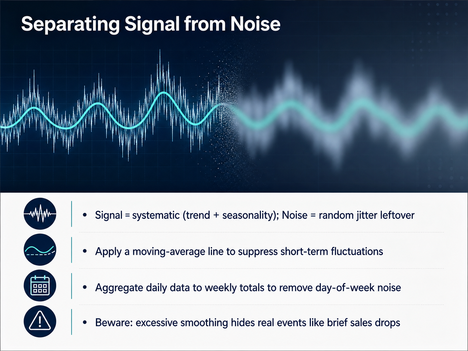
 - 07Separating Signal from NoiseNow let’s separate signal from noise. Think of signal as the systematic part of your data: trend plus seasonality. Noise is the random jitter leftover after you account for those patterns. A practical way to reduce noise is to apply a moving-average line. This smooths short-term ups and downs so the larger direction becomes clearer. Another useful trick is to aggregate daily data into weekly totals. That simple step strips out day-of-week noise, which often dominates raw daily views. But be careful: smoothing too aggressively can hide real events, like a brief sales drop. So tune your window to balance clarity with detail. Next, we’ll explore spurious traps, specifically why correlation is not causation.
 arxiv.orggithub.comkexinrong.github.io+21 min
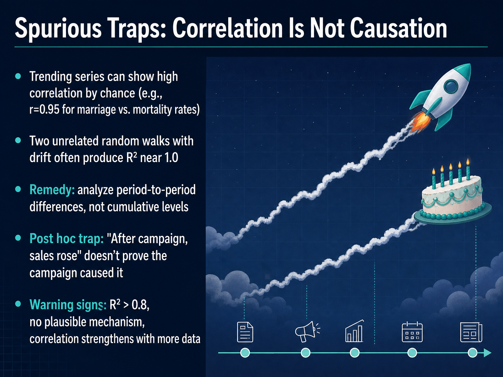
 - 08Spurious Traps: Correlation Is Not CausationMoving on, let's talk about spurious traps, where correlation really does not equal causation. You might see two trending series with a shockingly high correlation, like a point nine five between marriage rates and mortality rates. It feels significant, but it's often just a shared upward or downward drift over time. In fact, two completely unrelated random walks can produce an R squared near one point zero. So how do we avoid this trap? Instead of analyzing cumulative levels, examine period-to-period differences. Notice how the strong relationship often disappears. We also need to watch for the post hoc trap. Just because sales rose after a campaign does not prove the campaign caused it. Key warning signs include an R squared above zero point eight, no plausible mechanism linking the variables, and a correlation that strengthens as you add more data. Always remember, with trending data, levels can lie, but differences tend to tell the truth. Next, we'll explore another hidden danger: cherry-picking and the danger of the time window.
 mathworks.comlink.springer.compinchofdata.com+21 min
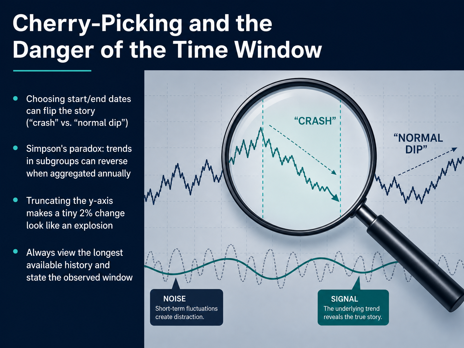
 - 09Cherry-Picking and the Danger of the Time WindowLet's shift from the broad patterns of trend and seasonality to an even more subtle challenge: cherry-picking the time window and the way it can flip the story. Choosing different start and end dates changes what we see. A sudden drop near the end might look like a crash in a short window, but when we zoom out, that same drop often looks like a normal dip in a long upward trend. This is exactly what can happen with Simpson's paradox in time series. A trend that looks positive inside each age group can reverse and look negative when we aggregate all the data by year. The subgroups are telling one story, and the collapsed yearly numbers are telling another. Another frequent pitfall is truncating the vertical axis. A tiny two percent change can be stretched to look like a dramatic explosion. So what do we do? Always view the longest available history. And whenever you show a chart or share an insight, state the observed window clearly. Be explicit about the start date and the end date, so the story stays honest. Now let's apply these ideas in practice. In the next slide, we begin our walkthrough with the classic airline passengers dataset.
 mathworks.comlink.springer.compinchofdata.com+22 min
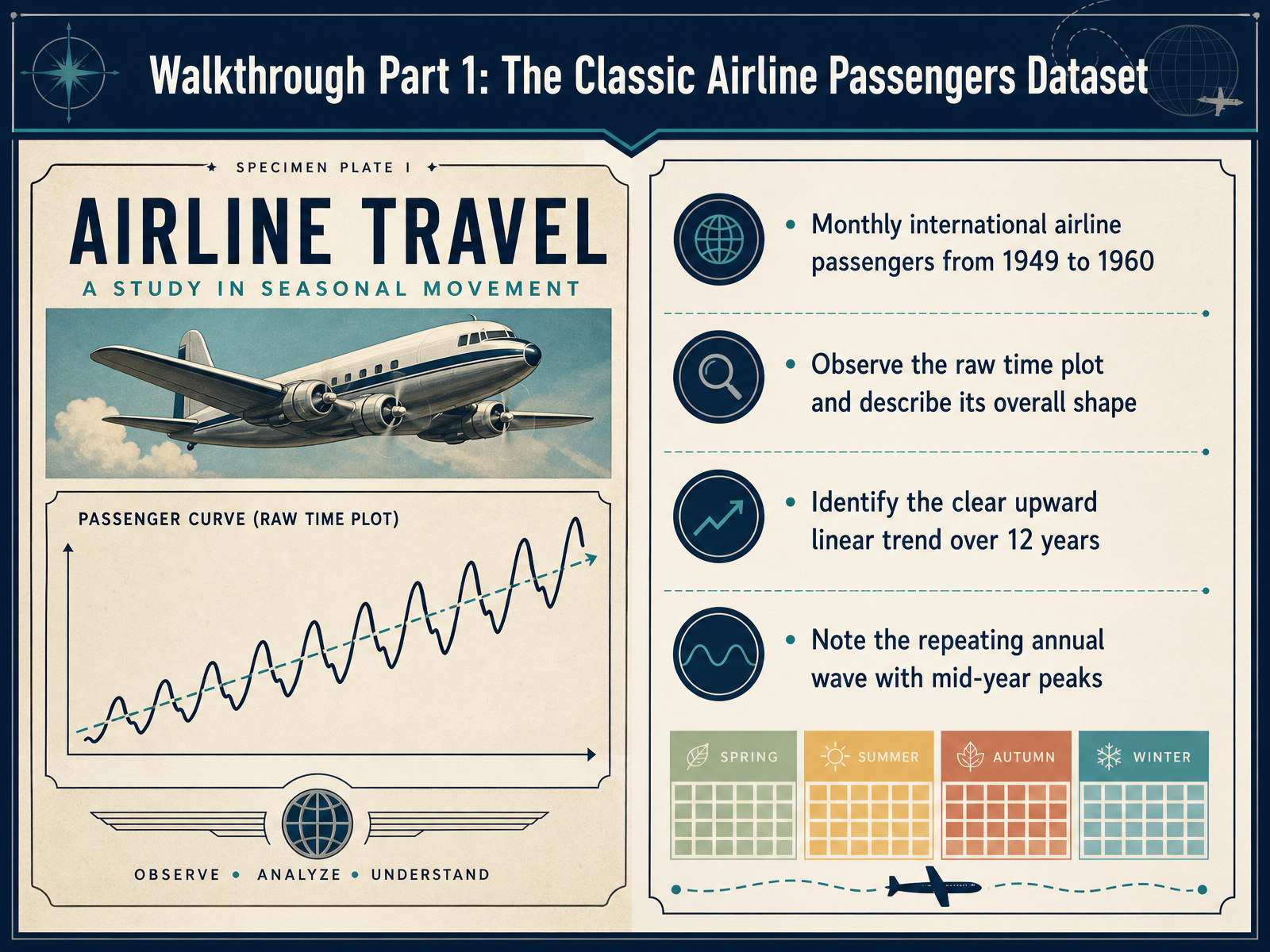
 - 10Walkthrough Part 1: The Classic Airline Passengers DatasetNow let’s apply what we’ve discussed to a real dataset. We’re looking at monthly international airline passengers from 1949 to 1960. Start by observing the raw time plot. Notice the overall shape. The data climbs steadily across all twelve years—that’s a clear upward linear trend. At the same time, see how the line repeats a predictable wave each year, peaking around mid-year before dipping. That repeating annual wave is seasonality. We aren’t making a forecast here, just describing these visible structures. Next, we’ll go deeper into seasonality and also explore change points in this same airline data.
 1 min
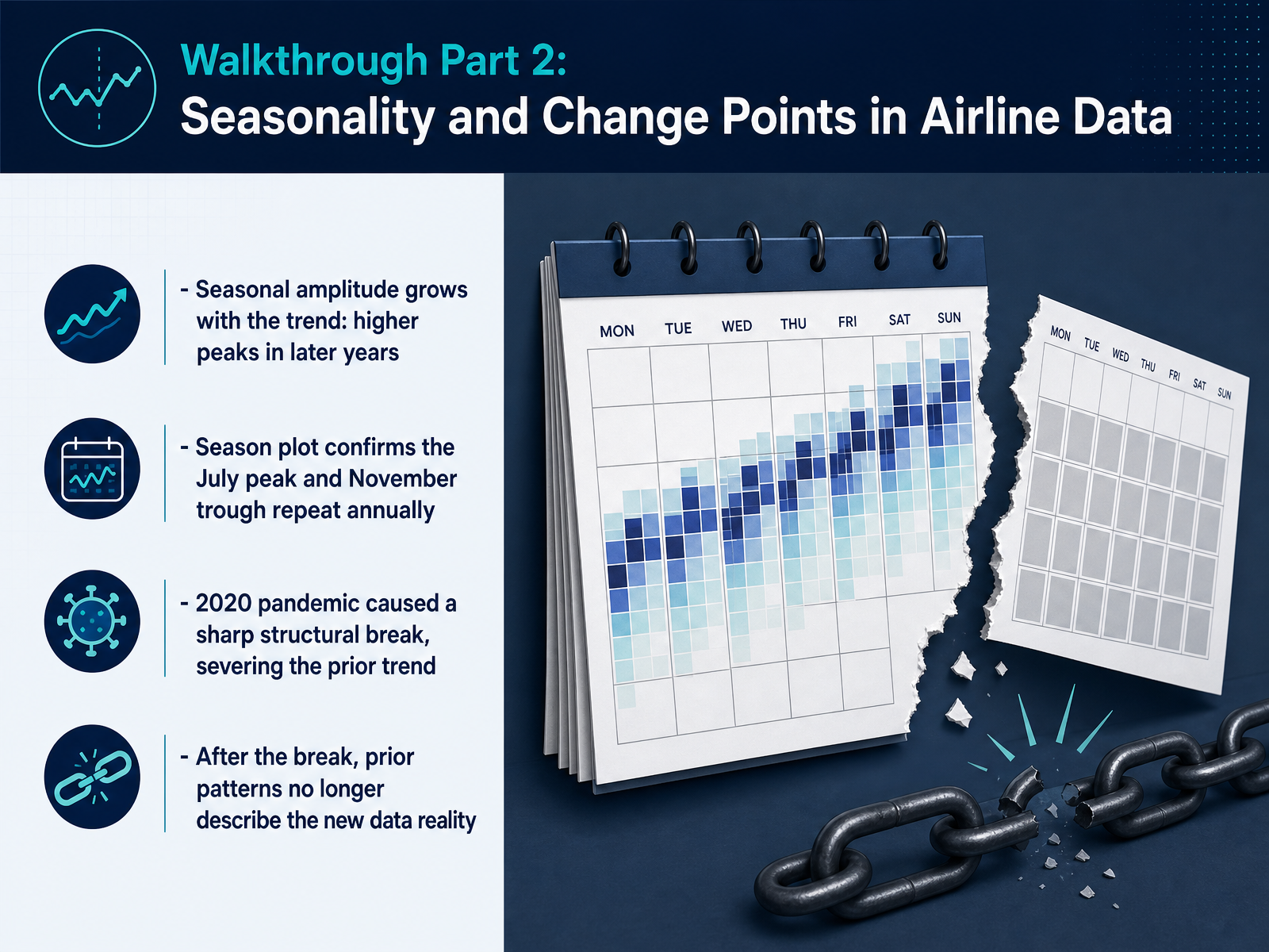
1 min - 11Walkthrough Part 2: Seasonality and Change Points in Airline DataNow, let's turn to seasonality and change points using airline passenger data. Notice how the seasonal amplitude actually grows with the trend. The summer peaks in later years tower far above the peaks in earlier years. This pattern suggests that the seasonal swing itself is getting larger as the overall passenger volume rises. A season plot confirms the repeating rhythm: a July peak and a November trough return reliably every year. But then, observe what happens in 2020. The pandemic created a sharp structural break, severing the prior trend entirely. After this change point, the old seasonal patterns and trend lines no longer describe the new data reality. This is a crucial insight. When a structural break occurs, past data loses its ability to inform the current state. It reminds us to describe what the data shows, but not to presume future patterns will repeat, especially after a disruptive event. Let's apply this careful lens in our next practice case, where we examine retail, operations, and digital metrics.
 robjhyndman.commedium.comchicagofed.org+22 min
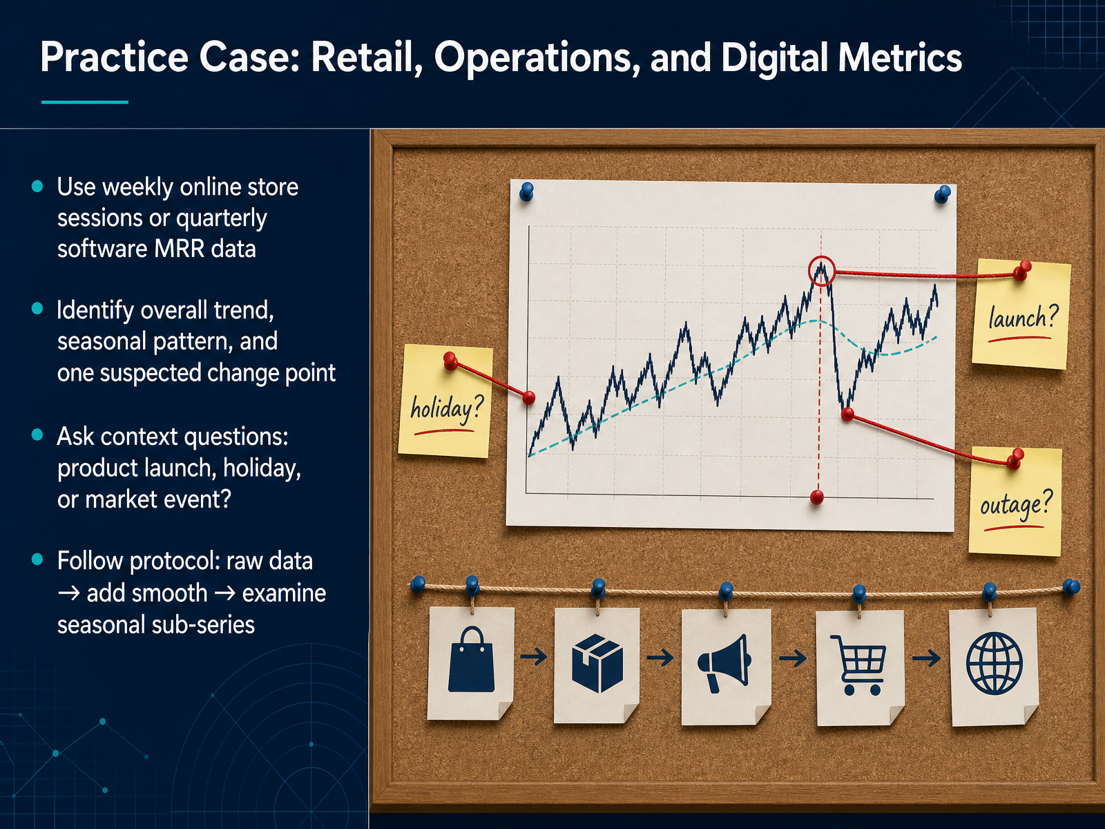
 - 12Practice Case: Retail, Operations, and Digital MetricsNow let's apply this framework to a practice case covering retail, operations, and digital metrics. Here's your dataset: you can use weekly online store sessions, or quarterly software MRR data. Your task is to identify the overall trend, one seasonal pattern, and one suspected change point. Start by visualizing the raw data. Then add a smoothed line to clarify the trend. Next, examine seasonal sub-series to isolate recurring patterns. Notice how the data rises and falls within a regular cycle? That is seasonality. When you spot a sharp shift that disrupts that cycle, pause and ask context questions. Was there a product launch, a major holiday, or a market event at that time? This protocol moves you from observation to informed inquiry. Raw data, then smooth, then seasonal sub-series. Follow it step by step. Now we shift our focus from 'What happened?' to 'What should we ask?', which is where your analytical questions take center stage.
 2 min
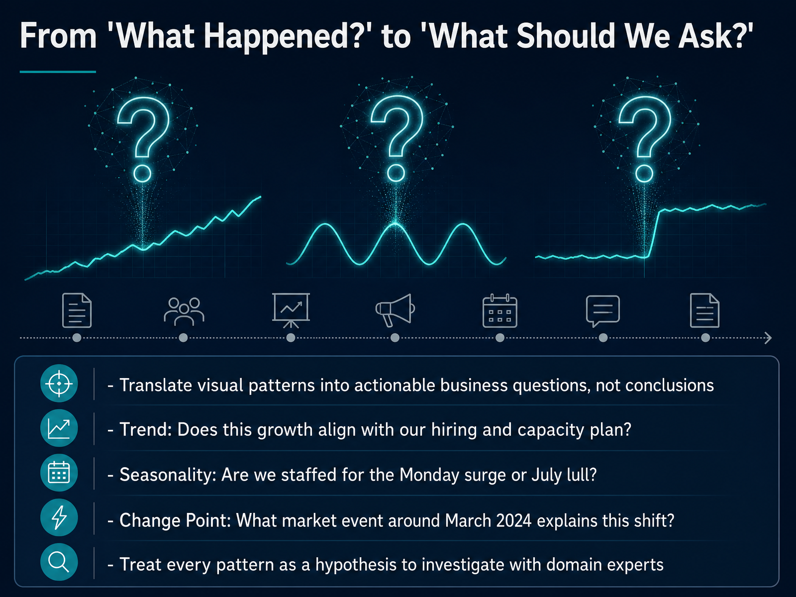
2 min - 13From 'What Happened?' to 'What Should We Ask?'Now we shift from observing patterns to asking better questions. The goal here is not to make a conclusion about the future, but to translate what we see into hypotheses that your business team can investigate. Let's take each pattern in turn. If you notice a steady upward trend, a productive question is, does this growth align with our hiring and capacity plan? Pause on that. When you see seasonality, ask, are we staffed for the Monday surge or the July lull? Notice how the question turns a visual cycle into an operational check. Change points require a different lens. Ask, what market event around March twenty twenty-four explains this shift? Treat every pattern as a starting point for a conversation with domain experts, not as a final answer. Coming up next, we will build a no-statistics visual inspection checklist to make this questioning habit fast and consistent.
 2 min
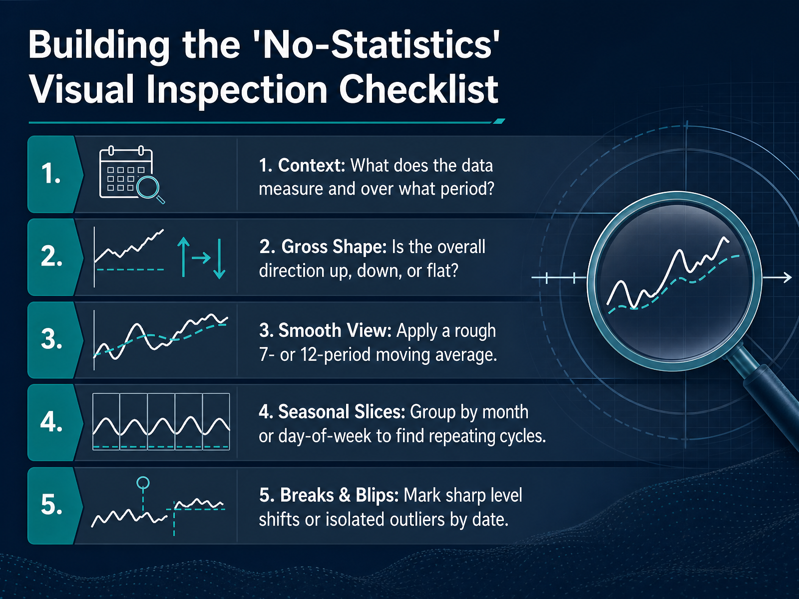
2 min - 14Building the 'No-Statistics' Visual Inspection ChecklistLet's consolidate the visual patterns we've been discussing into a practical, no-statistics inspection checklist. You can use this sequence every time you look at a time series plot. Step one: Context. Ask yourself, what does this data measure and over what time period? This simple question prevents you from misreading the scale. Step two: Gross Shape. Look at the overall direction. Does the series trend generally up, down, or stay flat? Step three: Smooth View. Mentally apply a rough moving average, perhaps a seven-period or twelve-period window, to strip away noise and reveal the underlying signal. Step four: Seasonal Slices. Compare periods like months or days of the week side-by-side. Look for repeating cycles that rise and fall consistently. Finally, step five: Breaks and Blips. Scan for sharp level shifts or isolated outliers and mentally mark their dates. These five steps help you observe structure without jumping to conclusions. Next, we will bring everything together in our summary and core rules of thumb.
 2 min
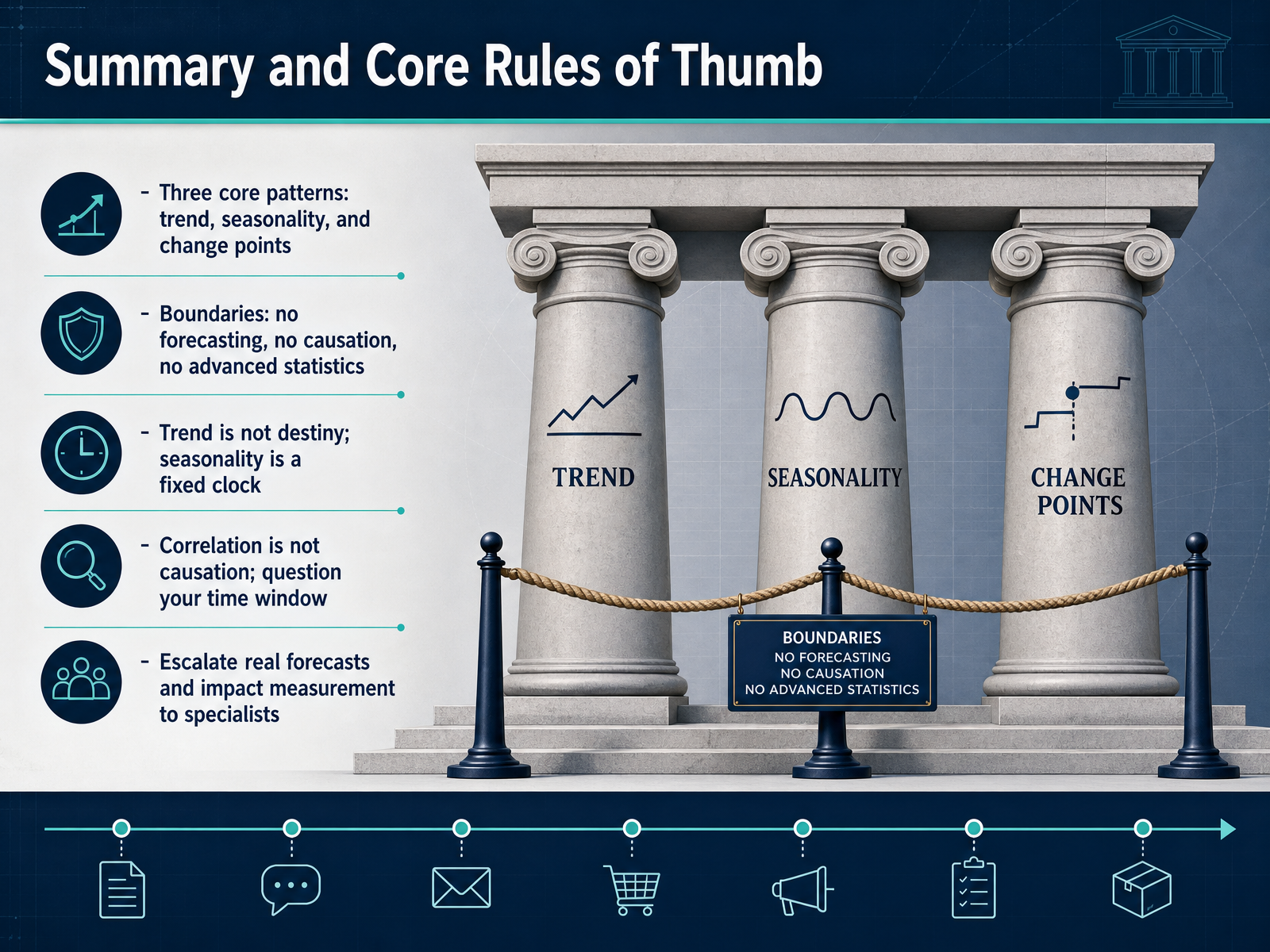
2 min - 15Summary and Core Rules of ThumbLet's bring everything together with a few core rules of thumb before you head back to your own data. First, remember the three patterns you should always scan for: a long-term trend, a repeating seasonal heartbeat, and abrupt change points that break the pattern. Second, respect the boundaries of this course. We are not forecasting, we are not proving causation, and we are not building advanced statistical models. Think of trend as a historical shape, not a promise. Think of seasonality as a fixed clock, not a flexible one. A strong visual correlation is also not enough to claim causation, so always question your time window. If your analysis suggests a real forecast is needed, or you need to measure impact precisely, that is the moment to escalate to a specialist. Thank you for joining this session. Keep these patterns in mind, stay curious, and trust your eyes before your conclusions.
 2 min
2 min
Take the deck with you
Download this course as a file — free, no sign-up needed.
- PDF handoutEvery slide page, ready to print or share.16 pages · 4.3 MBDownload
- Narrated PowerPointThe deck that presents itself — every slide carries the digital human's narration video.16 pages · 15.5 MBDownload
- PowerPoint slidesThe full deck as a .pptx — open it in PowerPoint, Keynote, or Google Slides.16 pages · 4.2 MBDownload
Free to use in your own training — please keep the PersonWise credit page at the end.
Have your own deck? Turn it into a course
Sources consulted
Web sources consulted while building this course.
- Time Series Regression IV: Spurious Regression - MATLAB & Simulink Example — mathworks.com
- Understanding of Causes of Spurious Associations: Problems and ... — link.springer.com
- Pitfalls of time-series correlation — pinchofdata.com
- Why do we Sometimes get Nonsense-Correlations between Time-Series?--A Study in Sampling and the Nature of Time-Series — nomanarshed.wordpress.com
- Linear Regression in Time Series: Sources of Spurious Regression | Towards Data Science — towardsdatascience.com
- 3.2 Time series components | Forecasting: Principles and Practice (3rd ed) — otexts.com
- 3.4 Classical decomposition | Forecasting: Principles and Practice (3rd ed) — otexts.com
- How to Decompose Time Series Data into Trend and Seasonality — machinelearningmastery.com
- Time Series Decomposition: Trends, Seasonality, and Noise — datacamp.com
- Additive Models – BYU-Idaho Time Series — byuistats.github.io
- Seasonal mortality rates – Rob J Hyndman — robjhyndman.com
- Medium — medium.com
- Seasonal and Business Cycles of U.S. Employment - Federal Reserve Bank of Chicago — chicagofed.org
- Analysis of Airline Passengers - Peltier Tech — peltiertech.com
- Diurnal and Seasonal Mood Vary with Work, Sleep, and Daylength Across Diverse Cultures — science.org
- ASAP: Prioritizing Attention via Time Series Smoothing — arxiv.org
- stanford-futuredata/ASAP — github.com
- ASAP: Prioritizing Attention via Time Series Smoothing — kexinrong.github.io
- docs/asap.md — github.com
- M4: A Visualization-Oriented Time Series Data Aggregation — vldb.org