Designing Settings and Preferences
Begin
14 pages · ~28 min
Designing Settings and Preferences
Learn to design intuitive settings and preferences interfaces that empower users to personalize their experience efficiently.
What you’ll learn
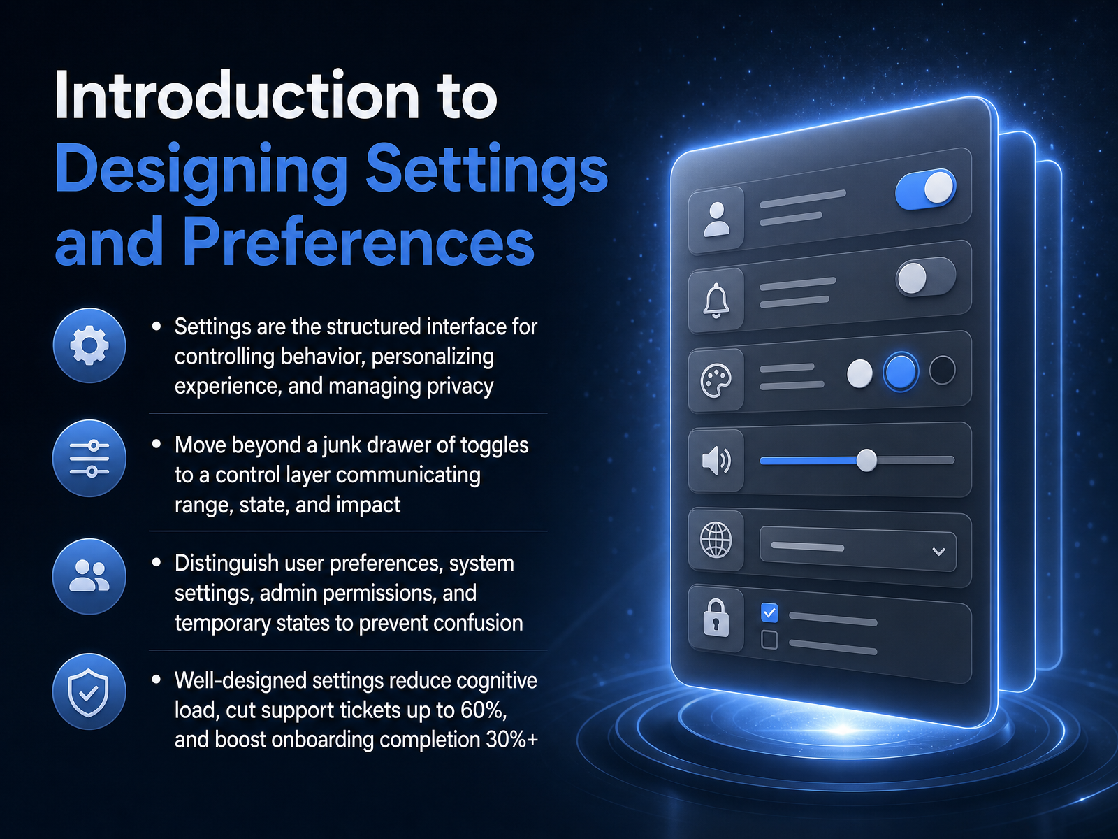
- 01Introduction to Designing Settings and PreferencesWelcome to Designing Settings and Preferences. In this session, we will explore how to transform an ordinary settings screen into a clear, trustworthy control layer that reduces confusion and supports your users. Settings are not just a collection of switches. They are a structured interface for controlling behavior, personalizing experience, and managing privacy. When designed well, they move beyond a junk drawer of toggles. They communicate what a setting does, what state it is in, and who is affected by a change. Throughout the course, we will also distinguish between user preferences, system settings, admin permissions, and temporary states. This prevents miscommunication and costly mistakes. Research shows that thoughtful settings design can reduce support tickets by up to sixty percent and increase onboarding completion by over thirty percent. So the design choices you make here have measurable business impact. With this foundation, let's move on to Mental Models and the Psychology of Control.setting.pagesaasui.designboundev.ai+22 min
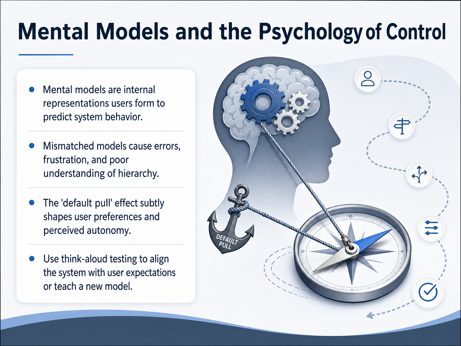
- 02Mental Models and the Psychology of ControlLet's talk about the psychology behind settings, specifically how users form mental models. A mental model is simply the story a user tells themselves about how your system works. It is how they predict what a button will do before they press it. When that internal story matches the actual logic of the interface, the experience feels seamless. But when the model mismatches, we see frustration, errors, and confusion about the hierarchy of a screen. Users struggle to understand cause and effect. That gap is often why they cannot find the right option. Another powerful force is the default pull effect. The preset choices you define quietly influence user preferences and shape their sense of autonomy. To bridge these gaps, think-aloud usability testing is essential. You listen to users narrate their expectations and then adjust the design to match their logic or explicitly teach them a new model. Next, we will apply these psychological concepts to the Information Architecture for Scalable Settings.
 aisel.aisnet.orgarxiv.orgnngroup.com+21 min
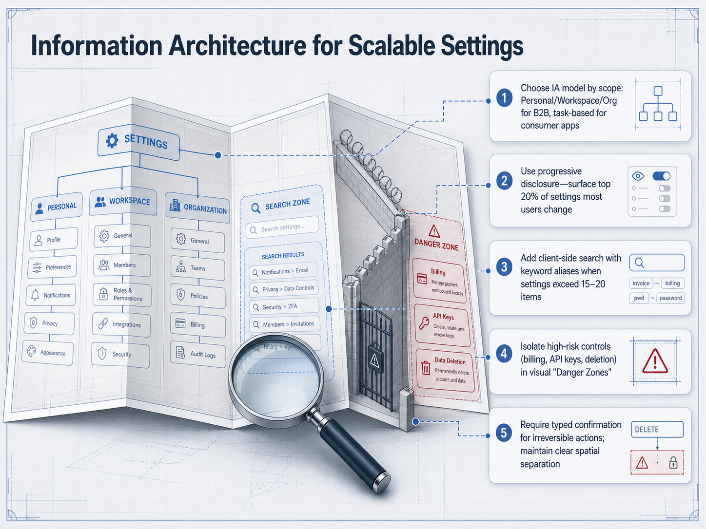
 - 03Information Architecture for Scalable SettingsLet’s talk about the information architecture that keeps settings scalable. Choosing the right model from the start prevents the chaos of a long, mixed list. For B2B products, organize by scope—such as Personal, Workspace, and Organization—so users immediately understand who a change affects. For consumer apps, a task-based structure works better, grouping controls by goals like notifications or privacy. Next, use progressive disclosure. Surface only the top twenty percent of settings that most people change, and tuck advanced options behind a clear, discoverable control. When your list exceeds about fifteen to twenty items, add client-side search. Include keyword aliases—for example, mapping a search for "two F A" to "two-factor authentication"—so users find what they need in seconds. Now, isolate high-risk controls. Move billing, API keys, and deletion into clearly separated visual zones, often called danger zones, to distinguish them from everyday preferences. Finally, require typed confirmation for irreversible actions. Asking someone to type "DELETE" or the account name creates deliberate friction that prevents costly mistakes. All of this builds the structural backbone we need. Next, we’ll explore how to communicate range, status, and impact through the controls themselves.
 setting.pagesaasui.designlayoutscene.com+22 min
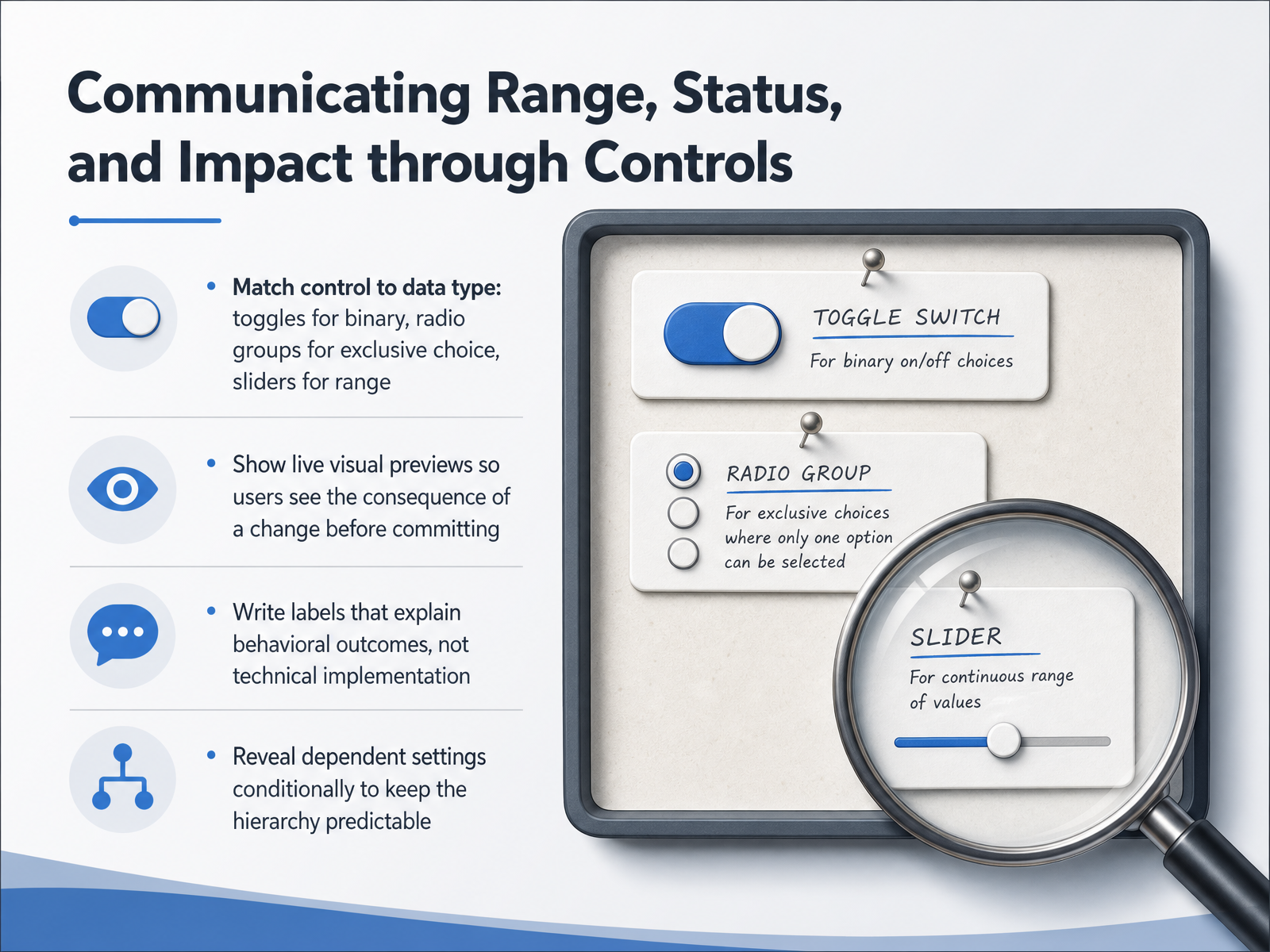
 - 04Communicating Range, Status, and Impact through ControlsLet's move into the practical layer: how controls actually communicate range, status, and impact to the user. The goal here is not just to pick the right UI component, but to make every setting's effect obvious before and after a change. First, match the control to the data type. Use a toggle for a binary on-or-off state. Use a radio group for a single choice from a small set of exclusive options. And use a slider when the user needs to select a value within a defined range. Second, show live visual previews. When a user drags a border-radius slider, show a sample element changing shape in real time. This turns an abstract number into a concrete, immediate consequence, so they can see the result before they commit. Third, write labels that explain behavioral outcomes, not technical implementation. Instead of 'enabled prefetching,' say 'load pages before you click to speed up browsing, but use more data.' The label should answer the question: what actually happens when I change this? Fourth, reveal dependent settings conditionally. If an option is meaningless until a parent toggle is turned on, keep it hidden until that moment. This keeps the interface predictable and reduces cognitive load. Let's carry these ideas forward as we look at how defaults, presets, and AI-driven recommendations shape the starting experience.
 shadcn.ioshadcn.ioshadcn.io+22 min
 - 05Defaults, Presets, and AI-Driven RecommendationsNow let's turn to defaults, presets, and AI-driven recommendations. When we get these right, most users never even need to open the settings panel. The first rule is to design defaults that work for about eighty percent of your users. If the out-of-the-box behavior is sensible, you minimize the immediate need to visit settings at all. Next, provide overridable presets for common workflows. Think of a writing app that offers a few document templates so users don't have to configure margins and fonts from scratch every time. For AI-inferred preferences, like a system that suggests muting promotional emails based on your past dismissals, the label must be crystal clear. Always support a one-click undo so the user stays in control. Finally, always offer a non-destructive reset path back to the original defaults. This simple safety net encourages safe exploration, because users can experiment without fear of breaking something permanently. Up next, we'll apply this thinking to Designing for Trust: Danger Zones and Saving Strategies.
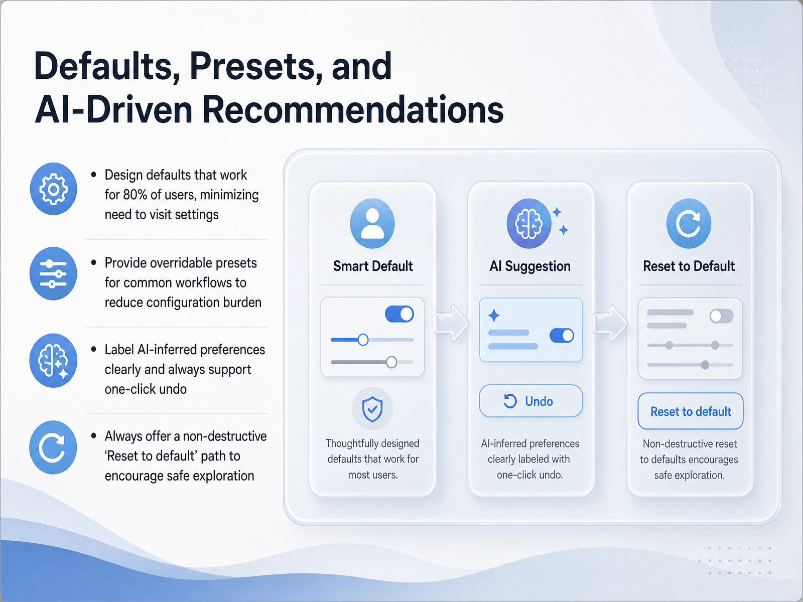 parallelhq.comboundev.aibrillcreations.com+22 min
 - 06Designing for Trust: Danger Zones and Saving StrategiesNow let's talk about designing for trust, specifically around danger zones and saving strategies. Saving behavior is not one size fits all. For low-stakes toggles like switching a theme or muting notifications, auto-save is ideal. The change happens instantly. But for high-stakes, multi-field forms like updating billing details or security credentials, an explicit save button is safer. It gives users a moment to review before committing. Always show the system state clearly. For auto-saves, a brief saved indicator confirms the action. For explicit saves, use a persistent unsaved-changes bar so users never lose their work when navigating away. Now, let's address destructive actions. Place irreversible controls, like deleting an account or removing a workspace, into a visually separate Danger Zone. This spatial isolation signals that these actions are different from routine preferences. But visual separation is not enough. You must add proportional friction. For the most catastrophic errors, require a typed confirmation, asking the user to re-enter the project name before deletion. This intentional pause prevents devastating mistakes while still allowing intentional users to proceed safely. Next, we will focus on handling complex and advanced options gracefully.
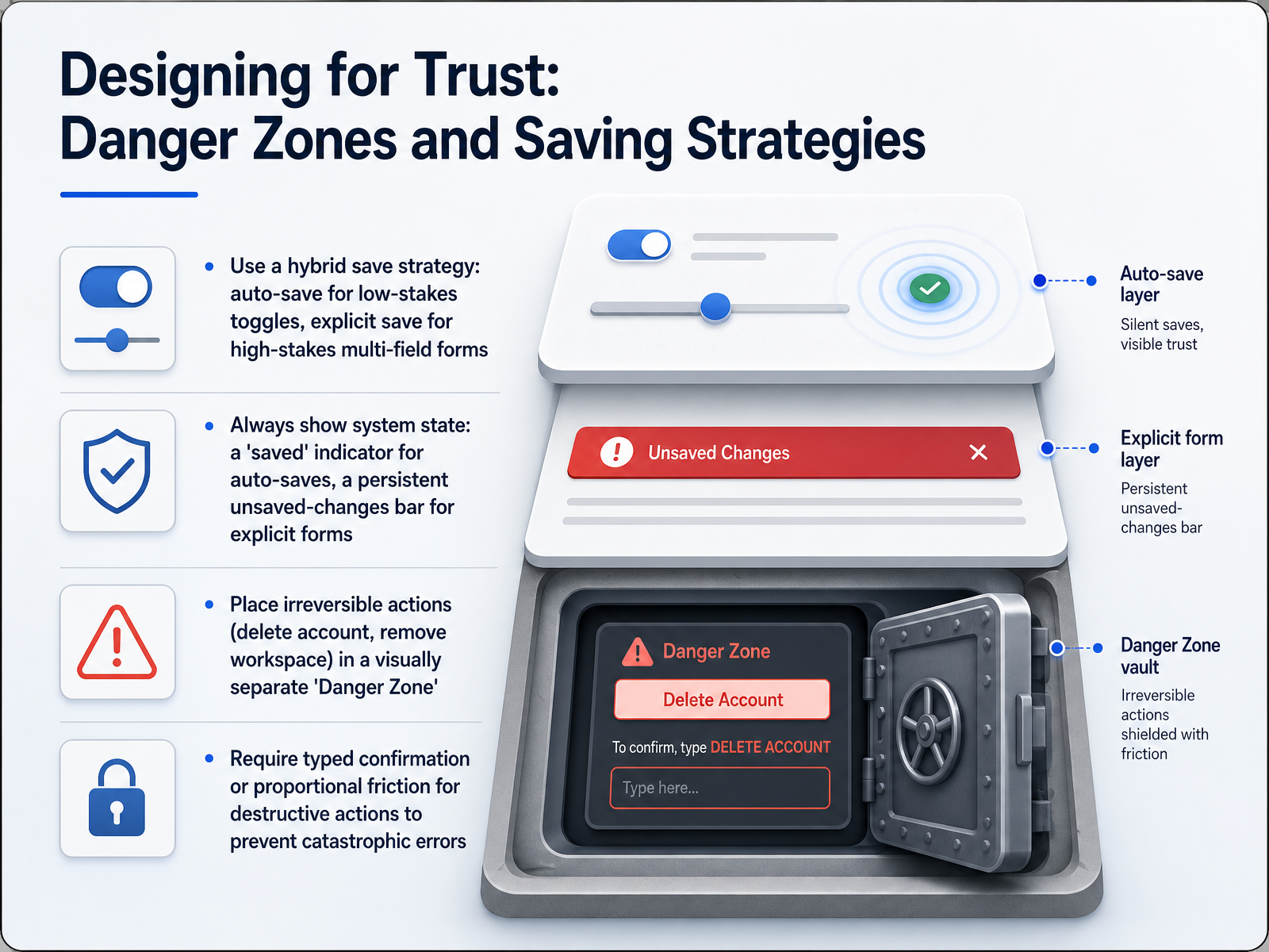 setting.pagesaasui.designboundev.ai+22 min
 - 07Handling Complex and Advanced Options GracefullyNow let's talk about handling complex and advanced options without overwhelming the majority of your users. The first principle is aggressive curation. Analytics consistently show that over half of all settings are never touched by anyone. Move these near-zero-use options behind an Advanced disclosure control. This keeps the default view clean for the ninety-five percent of users who don't need them, while preserving access for power users. Second, label those advanced sections honestly. Use terms like Developer Settings or Advanced Configuration, never just clicking More without context. Users should know exactly what they are opting into before they click. Third, keep your layout stable. Unlike adaptive menus that reshuffle based on frequency, progressive disclosure should maintain a fixed structure. When a power user memorizes that Developer Settings is always the third item, that spatial memory saves them time on every visit. Finally, enforce a scalable technical pattern: introduce every new setting through a single declarative registry entry. This prevents the settings page from becoming a fragmented collection of one-off controls, making it easier to maintain consistency as your product grows. Next, we'll build on these structural choices by exploring accessibility and inclusive settings by design.
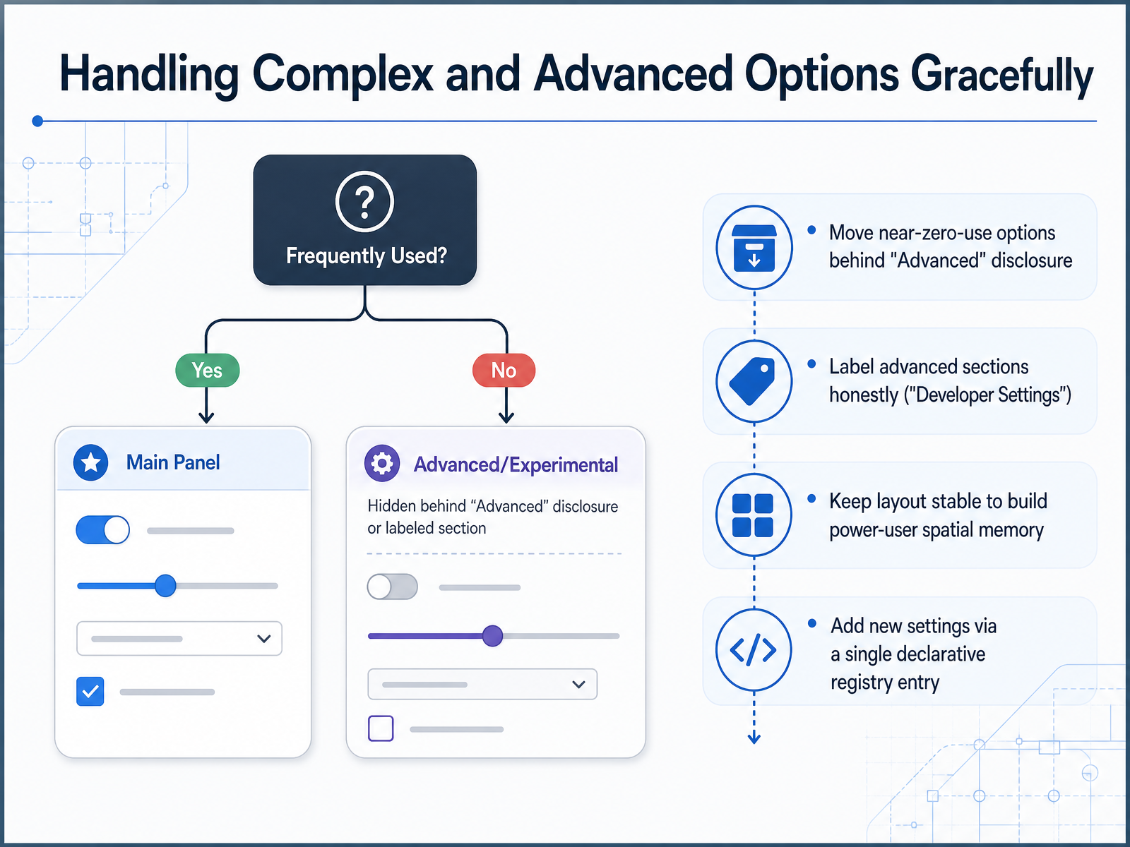 137foundry.comsetting.pagesaasui.design+22 min
 - 08Accessibility and Inclusive Settings by DesignNow let's talk about baking accessibility directly into the settings you design. Instead of treating inclusion as a separate checklist, think of it as core design logic. First, your controls must meet the latest WCAG 2.2 level AA standards. This means every toggle and dropdown must be fully operable with a keyboard alone, and the keyboard focus indicator needs a minimum contrast ratio of three to one against the background. Each label must be programmatically associated with its input so that screen readers can accurately describe what each control does. Next, respect the user's system-level preferences by default. If a user has set their operating system to reduced motion or high contrast, your settings panel should automatically adopt those choices without forcing them to hunt for a separate toggle. For touch interfaces, every interactive target must be at least twenty-four by twenty-four pixels to support users with limited motor control. You should also physically separate destructive actions, like an account deletion button, from routine preferences on mobile screens to prevent accidental taps. Finally, you cannot assume a dynamic interface is accessible just by looking at it. When you build live previews that update as a user changes a setting, you must run those interactions through real usability tests with screen reader users. Only then can you verify that the assistive technology announces the change of state correctly. By building with these constraints from the start, your preference panel becomes a space where every user can adjust their experience with confidence and independence. That principle of confidence leads us directly to our next topic: achieving cross-platform consistency and conflict-free sync.
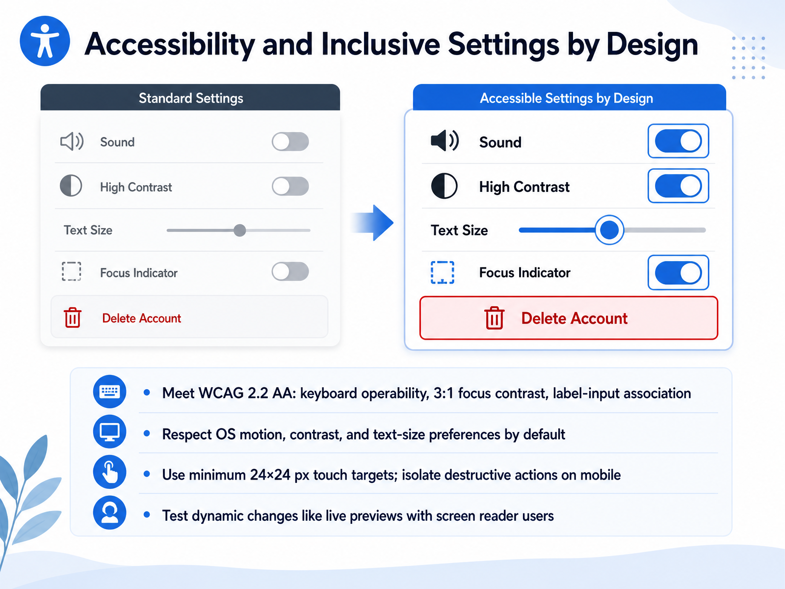 setting.pagesaasui.designboundev.ai+22 min
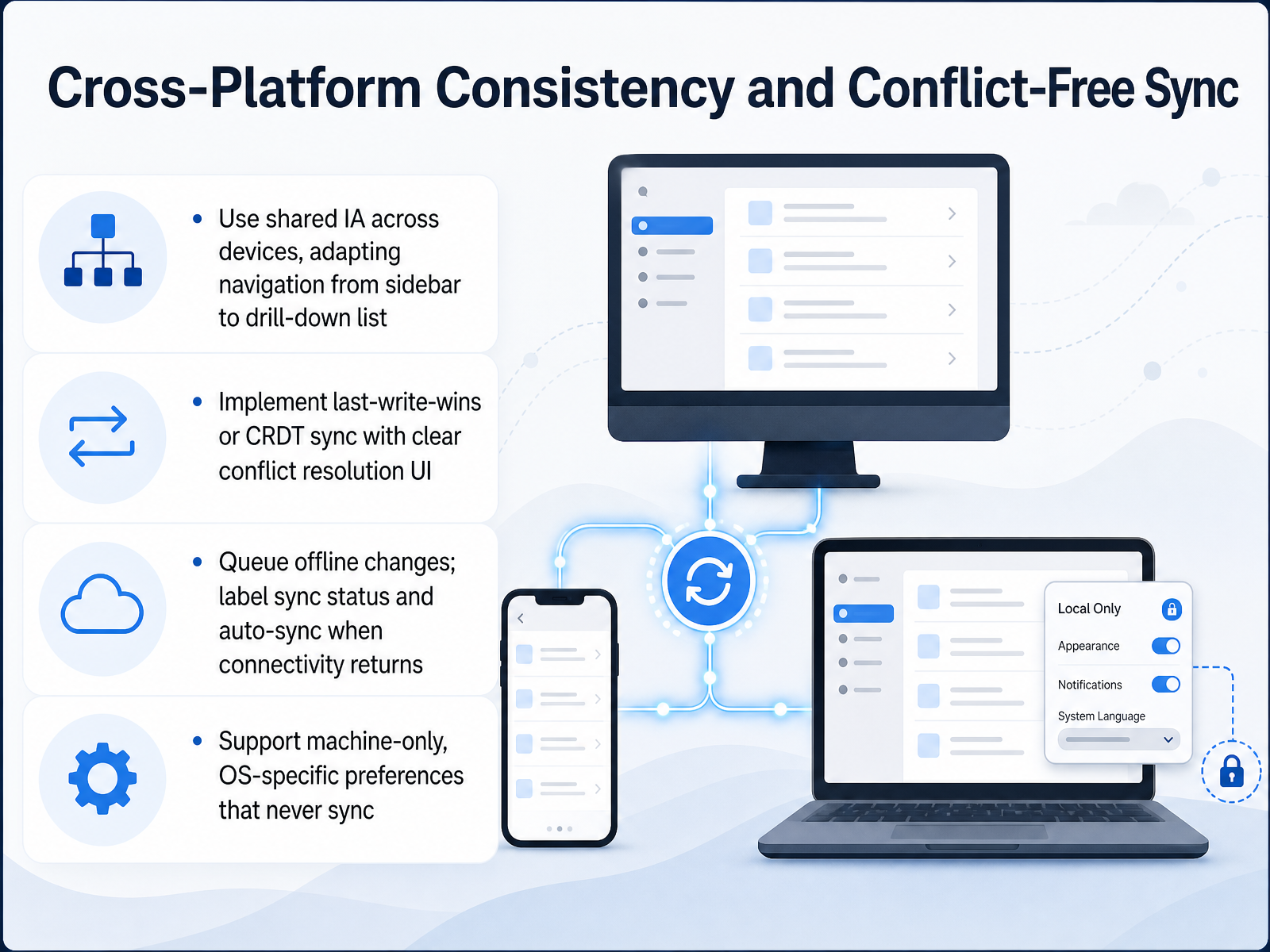
 - 09Cross-Platform Consistency and Conflict-Free SyncNow we turn to cross-platform consistency and conflict-free sync. It's a domain where small oversights can lead to major data loss. Think about how users move between devices. The same settings must follow them, but the way those settings are presented might change. An information architecture that works as a sidebar on a desktop might need to become a drill-down list on a phone. The key is a shared data model that adapts its display without losing meaning. Next, consider sync logic. A last-write-wins strategy is simple, but it can silently overwrite new data with stale cached data from another device. For complex structures, C R D Ts offer more robust merging. If a conflict cannot be resolved automatically, the user needs a clear resolution screen that asks which version to keep, rather than making a hidden choice. Offline work is another essential piece. When a connection drops, changes must be queued locally with a visible sync status. A simple label like 'Saved locally, syncing when connected' builds trust. As soon as the network returns, sync should resume automatically. Finally, not every preference should sync. Machine-specific or O S-specific settings, like a display zoom level or a file path unique to one operating system, must never be shared across devices. Marking these as local-only prevents configuration errors and frustration. In the next slide, we will explore patterns for high-impact preference centers.
 2 min
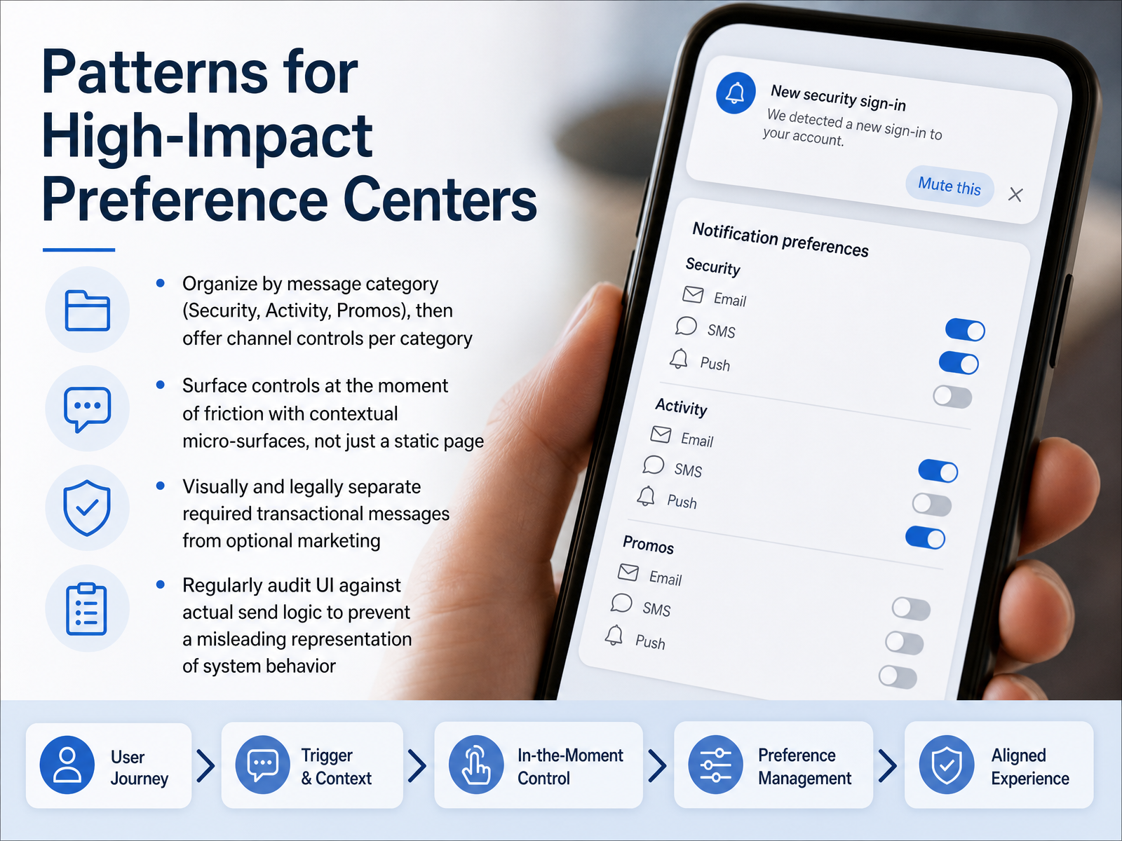
2 min - 10Patterns for High-Impact Preference CentersNow let's move from general principles to four specific patterns for building high-impact preference centers. These patterns separate the functional centers from the ones that just add noise. First, organize controls by message category—like security, account activity, and promotions—then offer channel options within each category. Users think in terms of why they are being contacted, not which technical pipeline sends the email. Second, surface controls at the moment of friction. Instead of sending users to a static page, show a contextual micro-surface when an unwanted notification arrives. This turns a moment of frustration into a moment of control. Third, visually and legally separate required transactional messages from optional marketing. If a security alert looks the same as a weekly newsletter, users lose confidence in the entire model. Use distinct sections and locked states. Fourth, regularly audit your preference UI against the actual send logic. The most common failure is a settings page that promises more control than the backend actually delivers. When the interface becomes misleading, trust erodes quickly. These four patterns form a foundation, but building trust also requires measuring the experience. Up next, we will explore how to measure UX, from usability testing to business return on investment.
 setting.pagesaasui.designboundev.ai+22 min
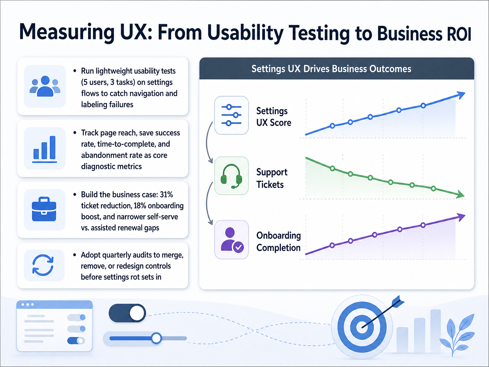
 - 11Measuring UX: From Usability Testing to Business ROILet's look at how to measure the impact of settings design with real numbers. Start small with usability testing: five users, three tasks. Watch for navigation failures and confusing labels. It does not take much to surface the biggest problems. Then expand your view to the metrics that matter most. Track page reach, save success rate, time to complete, and abandonment rate on your settings flows. These four signals tell you exactly where users get stuck. Now connect those numbers to business outcomes. Teams that invest in smarter settings flows consistently see a thirty-one percent reduction in support tickets and an eighteen percent boost in onboarding. More importantly, they narrow the renewal gap between accounts that needed help with setup and those that did not. This is where configuration work becomes a measurable retention lever. Finally, protect those gains with a routine. Run quarterly audits to merge, remove, or redesign controls before settings rot sets in. A settings page that worked well last quarter can quietly degrade as features launch around it. Now that we have covered measuring impact, let's examine how governance and ethical design keep our settings trustworthy in a world of AI-infused products.
 137foundry.comthreshline.comsetting.page+22 min
 - 12Governance and Ethical Design for AI-Infused SettingsNow let's move from designing the controls themselves to governing the AI that might run behind them. This slide addresses governance and ethical design for AI-infused settings. Think of these four points as your safety rails. First, label AI-personalized settings clearly. The EU AI Act now requires it. If a recommendation or layout shift is machine-driven, users must know. Second, for every AI-driven adaptation, provide an undo and an override. A simple 'revert' button maintains user agency and builds trust when the system gets it wrong. Third, audit your personalization models for bias across demographic groups. Regularly check whether different user segments receive systematically different default experiences. Finally, treat your settings schema as a versioned data model with migrations. When you rename or split a preference, a deliberate migration preserves a user’s prior choice instead of silently resetting it to a default. Together, these practices turn governance from a checklist item into a product discipline that protects both your users and your business. Next, we'll put this into practice with a heuristic review, auditing an existing settings screen.
 parallelhq.comboundev.aibrillcreations.com+22 min
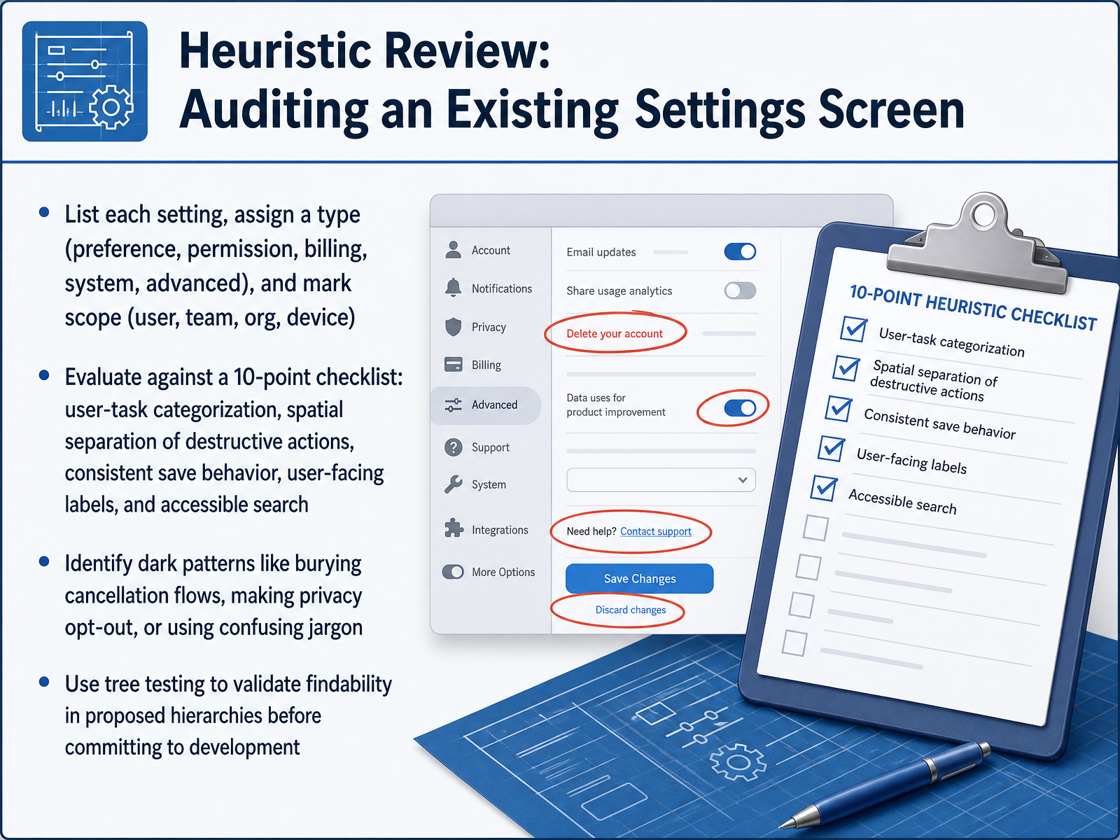
 - 13Heuristic Review: Auditing an Existing Settings ScreenNow let's talk about how to audit an existing settings screen using a heuristic review. Start by listing every single setting, assigning each one a type, such as preference, permission, billing, system, or advanced, and then marking its scope: does it affect just the user, the whole team, the organization, or a specific device? Once you have that map, evaluate the screen against a ten-point checklist. Look for user-task categorization, spatial separation of destructive actions, consistent save behavior, clear user-facing labels, and accessible search. As you review, actively identify dark patterns. Watch for buried cancellation flows, privacy controls that make sharing opt-out instead of opt-in, or confusing jargon that hides what a setting actually does. Finally, before committing any new hierarchy to development, validate its findability using tree testing. This method asks users to locate items in a proposed structure, revealing exactly where the navigation breaks down. That wraps up the heuristic review. Coming up next, we'll move into a hands-on practical workshop where you'll build a designer's action plan.
 setting.pagesaasui.designboundev.ai+22 min
 - 14Practical Workshop: A Designer's Action PlanAnd here is your practical action plan to lock in what we have covered. First, conduct a hands-on audit: choose a real settings screen and identify the top three friction points that would frustrate a user. Ask yourself whether the labels are confusing, whether the scope is unclear, or whether a dangerous action is sitting too close to a harmless preference. Next, develop a scope document that includes your information architecture model, your chosen defaults, and a clear measurement framework so you can track whether your changes actually reduce support tickets. After that, run a peer review of your redesigned flows. Have a colleague test your layout and check for label clarity and whether the right control stands out for each decision. Remember the core principle: every thoughtful placement and clear label builds a transparent, trustworthy relationship between your user and your product. When settings feel predictable, the entire experience feels more respectful. Thank you for investing this time in designing better settings. Go put these principles into action and watch the trust in your product grow.
 setting.pagesaasui.designboundev.ai+22 min
Take the deck with you
Download this course as a file — free, no sign-up needed.
- PDF handoutEvery slide page, ready to print or share.15 pages · 3.7 MBDownload
- Narrated PowerPointThe deck that presents itself — every slide carries the digital human's narration video.15 pages · 16.8 MBDownload
- PowerPoint slidesThe full deck as a .pptx — open it in PowerPoint, Keynote, or Google Slides.15 pages · 3.6 MBDownload
Free to use in your own training — please keep the PersonWise credit page at the end.
Have your own deck? Turn it into a course
Sources consulted
Web sources consulted while building this course.
- Settings Page Best Practices: Living Checklist — setting.page
- SaaS Settings Page UX Patterns: Designing Account, Billing & Preferences Screens | SaaSUI Blog — saasui.design
- Settings Screen UX: Complete Design Guide | Boundev — boundev.ai
- How to Build a Settings Page That Does Not Suck — Threshline — threshline.com
- Designing Settings Screens That Scale as Features Grow | 137Foundry — 137foundry.com
- An Inquiry into Mental Models of Web Interface Design — aisel.aisnet.org
- Investigating the effect of Mental Models in User Interaction with an Adaptive Dialog Agent — arxiv.org
- Mental Models and User Experience Design — nngroup.com
- Effects of Asymmetry between Design Models and User Models on Subjective Comprehension of User Interface — mdpi.com
- Settings Information Architecture Guide — setting.page
- Mastering Settings Page Information Architecture Patterns for Superior UX - Layout Scene — layoutscene.com
- Settings Architecture UX Case Study: Designing a System Control Layer — zofiaszuca.com
- With Live Preview — shadcn.io
- Range Slider — shadcn.io
- Slider Range Form — shadcn.io
- How to arrange a Slider control with DropDown option — ux.stackexchange.com
- Setting the stage: Designing settings screen UI — blog.logrocket.com
- Personalization in UX Using AI: 2026 Guide to Adaptive UI — parallelhq.com
- AI in UX Engineering: 3 Case Studies | Boundev AI | Boundev — boundev.ai
- AI UX Trends That Will Dominate Websites in 2026 — brillcreations.com