Begin
14 pages · ~28 min
Graphic Design Styles Overview
Explore key graphic design styles, their visual characteristics, and practical applications for aspiring designers.
A digital instructor presents all 14 pages. Hold “Ask” at any point and ask out loud — the answer comes from this course. No sign-up needed.
What you’ll learn
- 01Types of Graphic Design StylesWelcome. This course is about making style decisions with confidence. We'll start by defining what a graphic design style actually is, and why it matters strategically. A style is a repeatable visual system. It's how color, typography, composition, and image treatment work together to create a consistent aesthetic. But style goes deeper than surface. It drives brand recognition and shapes how an audience feels before they read a single word. The right system reinforces values, supports usability, and sets a brand apart from competitors. As we move through the training, we'll cover core foundations, major style families, practical decision frameworks, and emerging trends. Keep one principle in mind throughout. Styles aren't fixed templates to copy. They're sets of principles to interpret, adapt, and evolve for specific products and audiences. Let's begin by examining style as a strategic tool.shopify.combighuman.comdesignpickle.com+21 min
- 02Understanding Style as a Strategic ToolLet's move from broad definitions to how style actually functions in practice. The key shift is this: style is not decoration layered on after the fact. It is a visual system. That system shapes brand personality, drives emotional response, and directly impacts user experience. Every aesthetic choice, from the grid structure to the typeface to the color palette, signals values and positioning to your audience. Think of Swiss design. Its asymmetric grids and neutral sans serifs communicate order and precision before a single word is read. Historic styles are best treated as flexible principles to interpret and evolve, not rigid templates to copy. In a crowded market, selecting a style strategically becomes a recognition tool. It is how a brand becomes instantly identifiable. So, the practical focus is not just knowing styles, but knowing when and why to deploy them. Let's look at the core elements that define any style.
 bighuman.commagier.combusiness.adobe.com+21 min
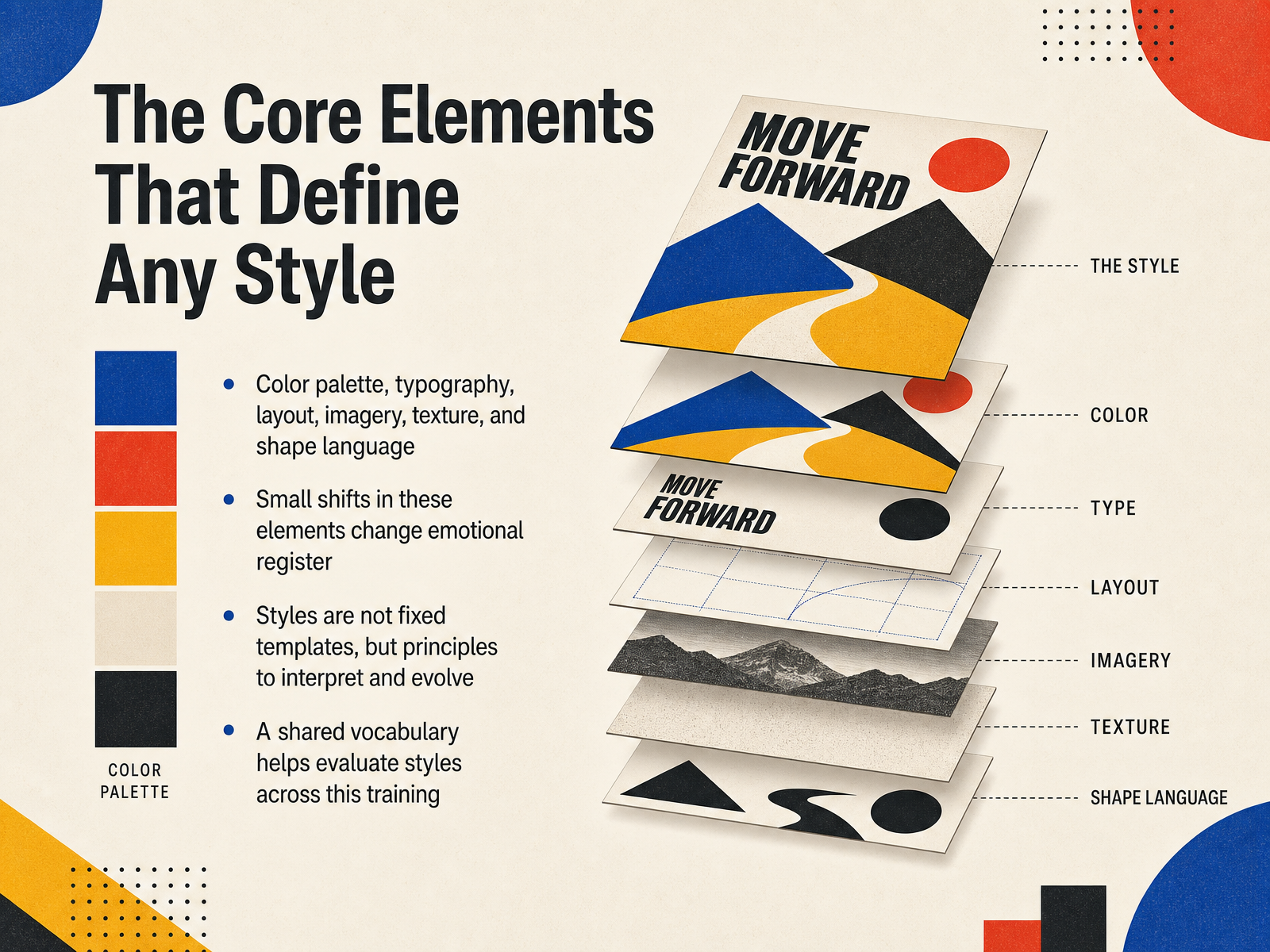
 - 03The Core Elements That Define Any StyleSo, when we look across all these movements, what actually defines them? It comes down to a set of core elements. We are talking about color palette, typography, layout, imagery, texture, and shape language. Think of these as the levers you pull in your work. A small shift in any one of them can completely change the emotional register. Swap a serif for a geometric sans on the same grid, and the voice changes entirely. The important thing to remember is that these styles are not fixed templates. They are principles. Principles meant to be interpreted and evolved for the problem in front of you. That is why we are building a shared vocabulary here. It gives us a precise way to evaluate and discuss the choices we see in the work. With that foundation set, let's look at where these principles originated and how they still shape what we do today.
 bighuman.commagier.combusiness.adobe.com+21 min
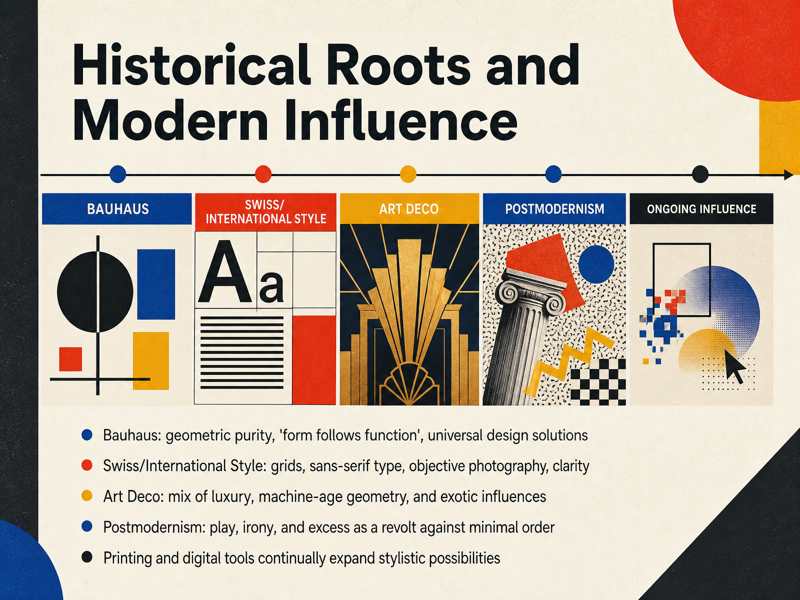
 - 04Historical Roots and Modern InfluenceA working grasp of style starts with the movements that still shape our layouts. The Bauhaus set the foundation: geometric purity, form following function, and the ambition to find universal solutions. The Swiss International Style then gave that logic a practical system, building on the grid, sans-serif typefaces, and objective photography to privilege clarity above all. Art Deco moved in a different register, combining luxury, machine-age geometry, and exotic influences into a polished, commercial visual language. Postmodernism arrived as a deliberate revolt, using play, irony, and excess to break the strict order of minimal modernism. Each of these shifts was enabled by the tools of its time, from print to digital, and those tools continue to expand what a style can be. Next, we will look at how that expansion plays out in minimalism, flat design, and the new sense of digital depth.
 britannica.comen.wikipedia.orgyalebooks.yale.edu+21 min
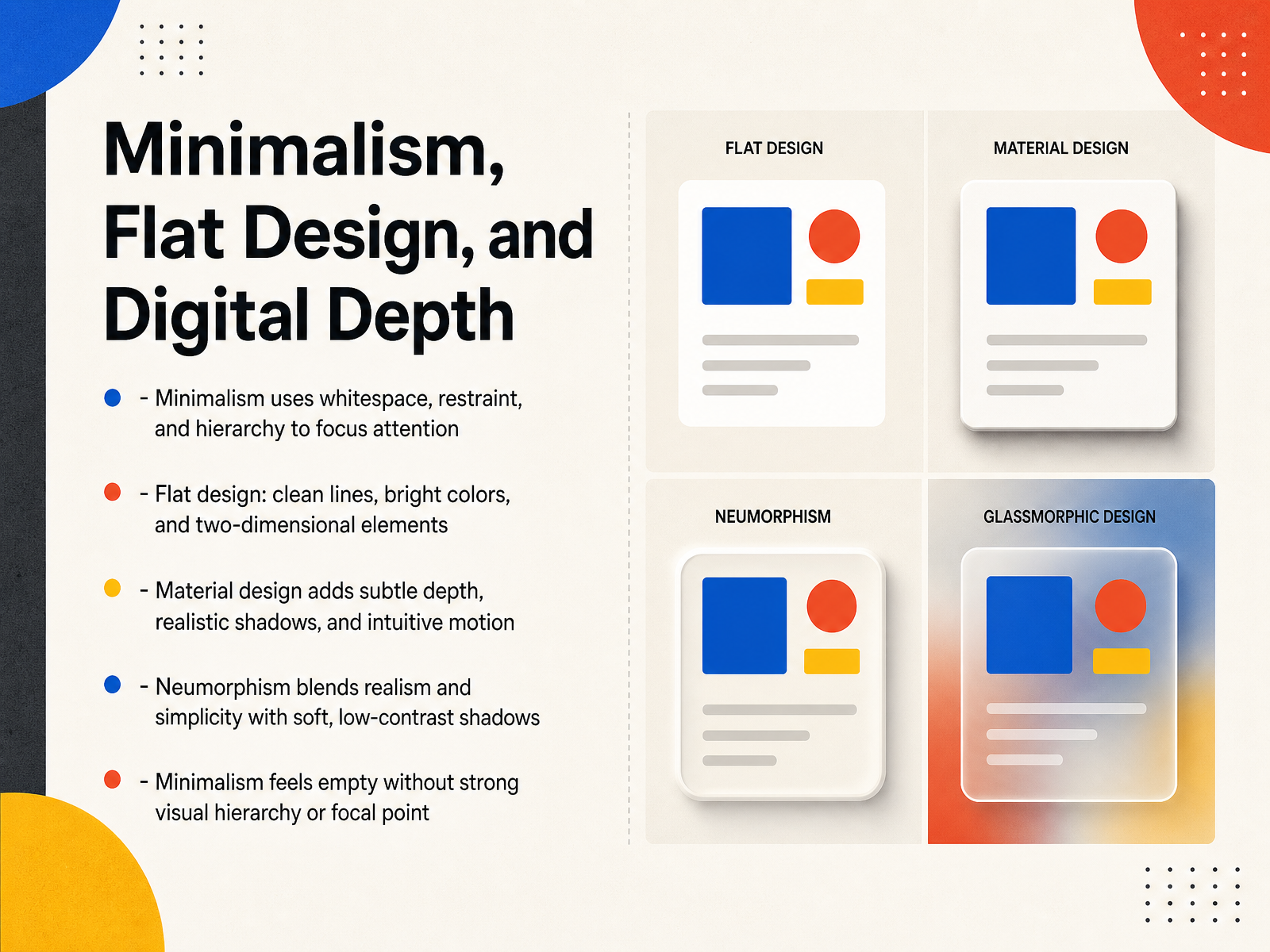
 - 05Minimalism, Flat Design, and Digital DepthNext, let's look at how flat design evolves once you start adding depth. Minimalism relies on whitespace and a strong hierarchy to direct the eye. But if the focal point is weak, the layout simply feels empty. Flat design strips away all texture, using clean lines and two-dimensional elements. It is fast and clear, but the lack of depth sometimes makes it hard to tell what is clickable. Material design solves this by introducing the Z axis. Surfaces hover like paper, casting subtle shadows that establish hierarchy without cluttering the composition. Neumorphism goes further, blending realism with restraint. Elements seem extruded from the background through soft, low-contrast highlights. Visually, it feels premium, yet that low contrast creates real accessibility risks. Buttons can disappear if they share the same surface color. So when you use neumorphism, keep color as a secondary signifier. Each of these approaches trades physical realism for interface logic. Now let's shift to styles that intentionally look backward with Retro, Vintage, and Nostalgia-Driven Design.
 wow-how.comblog.ferpection.comnuventureconnect.com+21 min
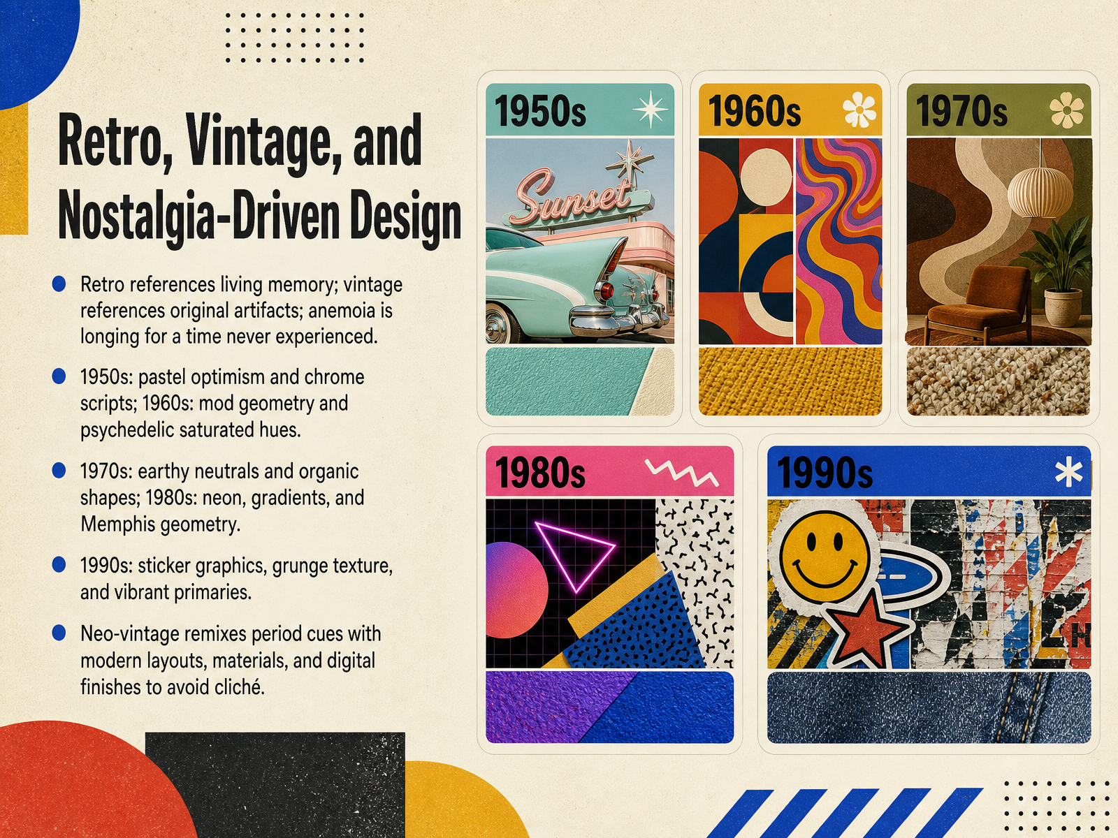
 - 06Retro, Vintage, and Nostalgia-Driven DesignNow, let's unpack retro, vintage, and nostalgia-driven design. First, a quick language distinction. Retro references periods within living memory, while vintage points to original artifacts from an earlier time. Anemoia is different again: it's a longing for an era you never actually experienced, which is a powerful driver for Gen Z audiences. Each decade brings a specific visual fingerprint. The 1950s give us pastel optimism and chrome scripts. The 1960s shift into mod geometry and psychedelic saturated hues. The 1970s favor earthy neutrals and organic forms, while the 1980s explode with neon, gradients, and Memphis geometry. The 1990s respond with sticker graphics, grunge texture, and vibrant primaries. The key for contemporary work is neo-vintage: remixing these period cues with modern layouts, materials, and digital finishes to avoid cliché. That tension between familiar and fresh keeps the work feeling intentional. Next, we'll look at typography-led and editorial design.
 thedieline.com1 min
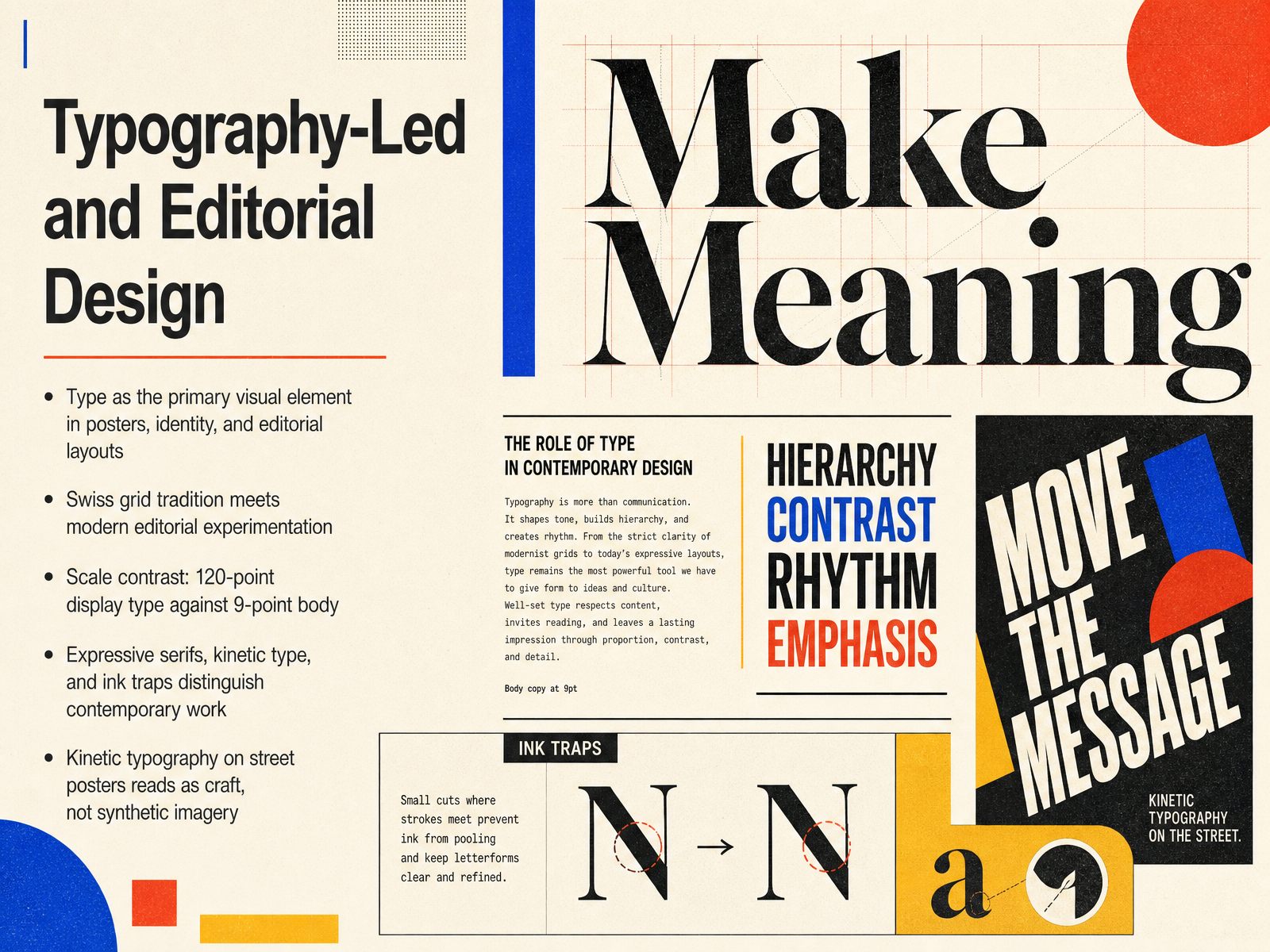
 - 07Typography-Led and Editorial DesignTypography-led design puts letterforms in charge. The type isn't supporting the image; it is the image. We see this in street posters and editorial spreads where a single word can fill an entire surface. The Swiss grid is still the foundation, but contemporary work treats that grid as an argument rather than a shortcut. Think about the extreme tension of scale dissonance: a 120-point display face sitting against 9-point body copy. That contrast creates instant hierarchy and forces the viewer to slow down. Contemporary work is also defined by expressive serifs, kinetic motion, and technical details like ink traps. On a physical poster, kinetic typography reads as craft. In an environment flooded with synthetic imagery, confident type is the strongest signal of human intention. Next, let's look at how these principles translate into illustrative and handcrafted styles.
 1 min
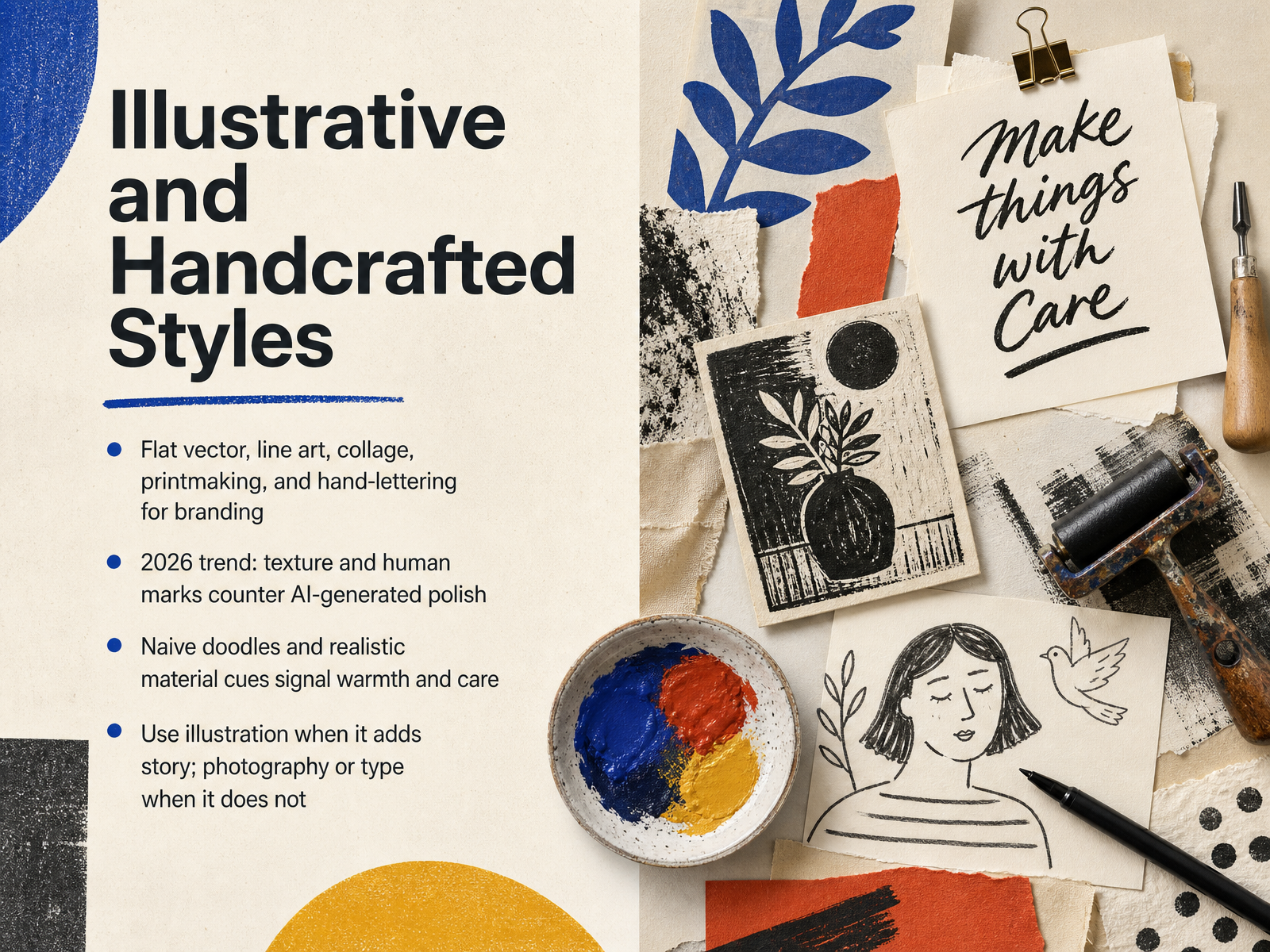
1 min - 08Illustrative and Handcrafted StylesNow let's look at illustrative and handcrafted styles. This is where flat vector, line art, collage, printmaking, and hand-lettering all converge for branding work. The 2026 shift is significant. Texture and visible human marks are being used deliberately to counter the polish of AI-generated output. Naive doodles and realistic material cues—like paper grain or ink bleed—signal warmth, care, and an actual craft process. That's the emotional payload. But the decision rule stays disciplined. Use illustration only when it adds narrative. If it doesn't carry story, rely on photography or typography instead. A hand-drawn mark should earn its place in the composition, not decorate it. Up next, we'll move into digital, 3D, and futuristic aesthetics.
 1 min
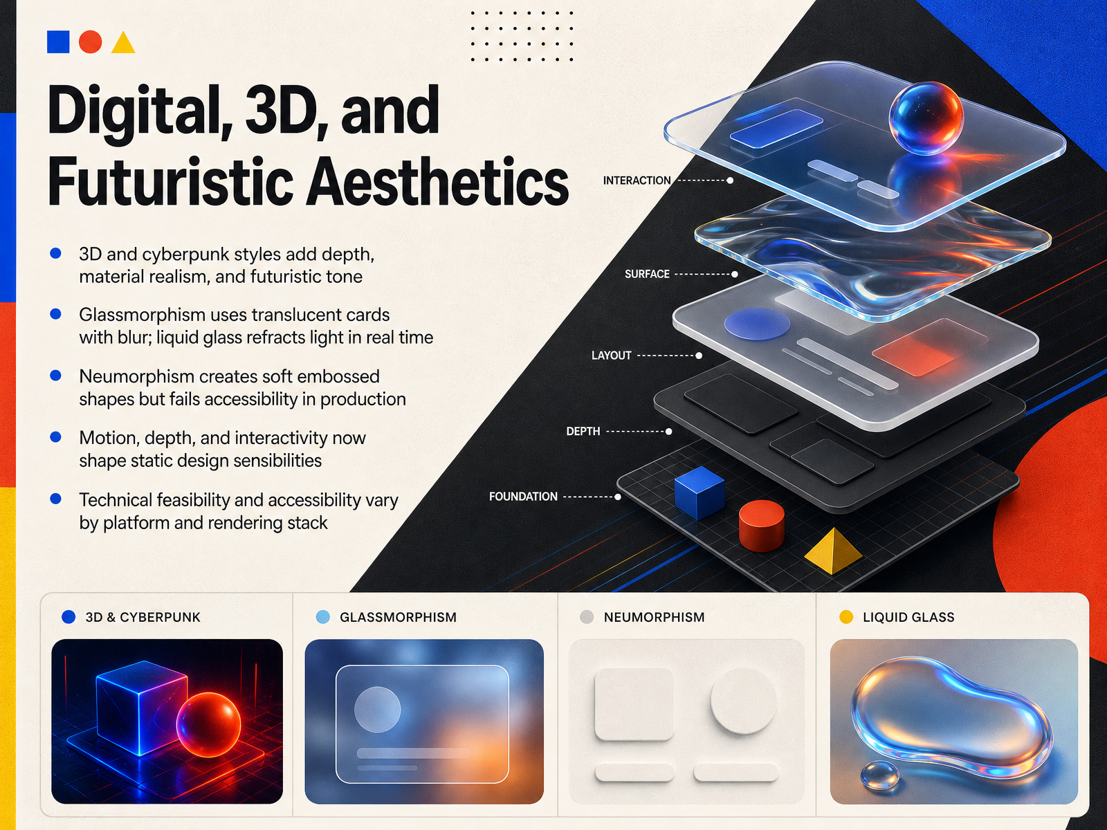
1 min - 09Digital, 3D, and Futuristic AestheticsNow let's look at the digital and spatial side of contemporary style. Some of the most compelling work today comes from 3D and cyberpunk directions, where depth, material realism, and a futuristic tone carry the visual message. Glassmorphism evolved from a simple backdrop blur into a more deliberate system of translucency and refraction. In practice, it works best for accents and chrome, not dense reading surfaces, because contrast depends heavily on what sits behind the panel. Liquid glass takes that further, bending light in real time, which is compelling on Apple platforms, though the effect is tied to the native rendering stack. Neumorphism gives us those soft embossed forms we saw in portfolio work, but those same low contrast shadows make it a well known accessibility failure in production. What is more interesting is how motion, depth, and interactivity now influence even static composition. A flat layout may still be the most efficient foundation, but designers increasingly use material and light as information, not just decoration. The key caveat is feasibility. The same visual system can behave differently across devices, browsers, and rendering pipelines. That brings us naturally to what is actually moving the industry forward, so next we will look at current trends and 2026 forecasts.
 wow-how.comblog.ferpection.comnuventureconnect.com+21 min
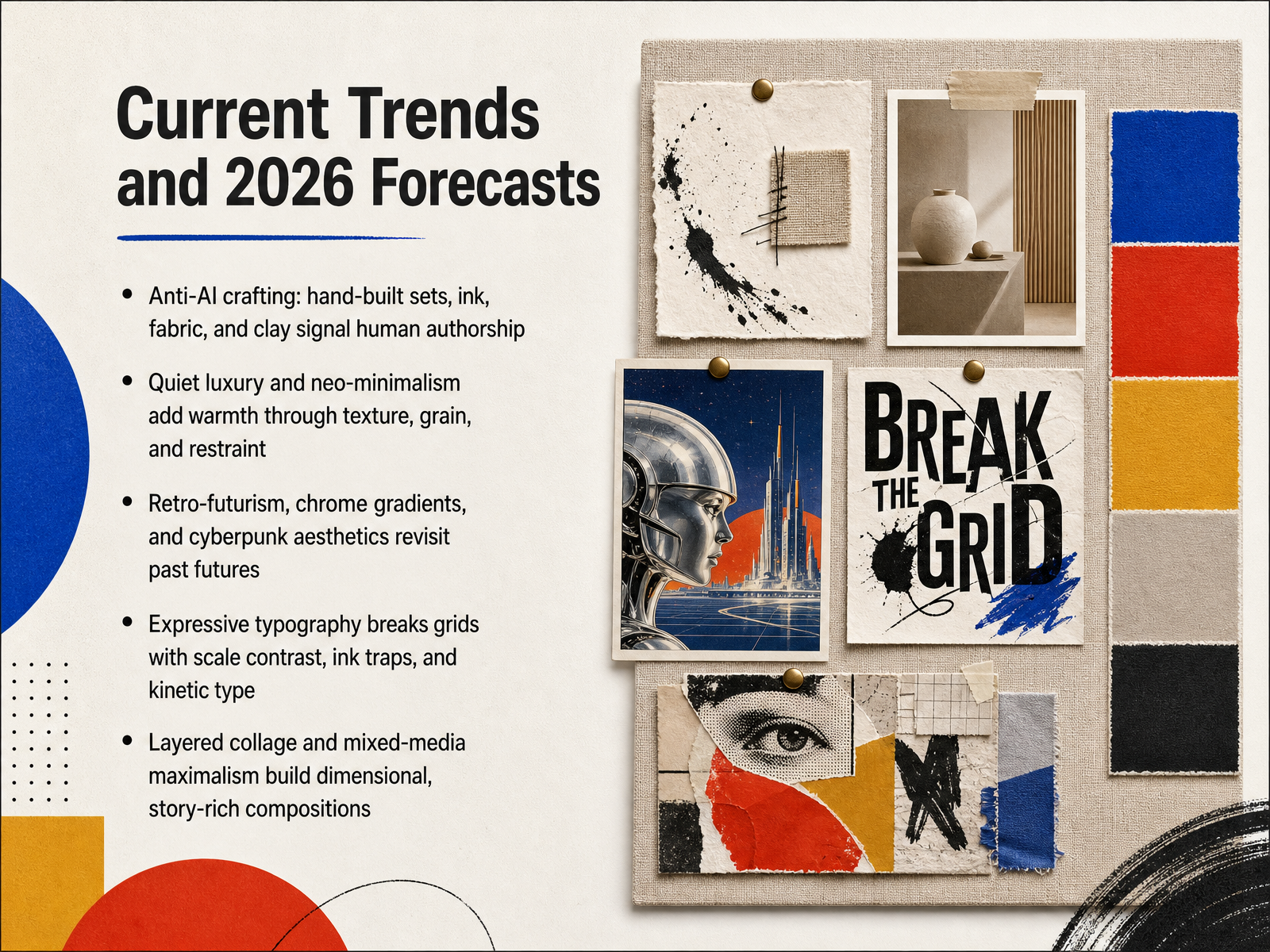
 - 10Current Trends and 2026 ForecastsNow let's look at where the discipline is heading into twenty twenty-six. The first major signal is anti-AI crafting. We're seeing hand-built sets, physical ink, fabric, and clay used deliberately to communicate human authorship. This is a strategic response to synthetic sameness, not nostalgia. Parallel to this is a quieter move: quiet luxury and neo-minimalism, where restraint gets warmth from grain, texture, and material restraint. On the other end, retro-futurism, chrome gradients, and cyberpunk aesthetics are revisiting past visions of the future. Chrome finishes and neon palettes are creating depth and motion without added complexity. Typography is also pushing harder. Expressive type is breaking the grid through scale contrast, visible ink traps at display sizes, and kinetic motion. Finally, layered collage and mixed-media maximalism are building dense, story-rich compositions. The common thread across all of these is clear: differentiation is becoming the premium. Next, we'll apply these currents to a practical framework for matching styles to project goals.
 business.adobe.combighuman.commagier.com+22 min
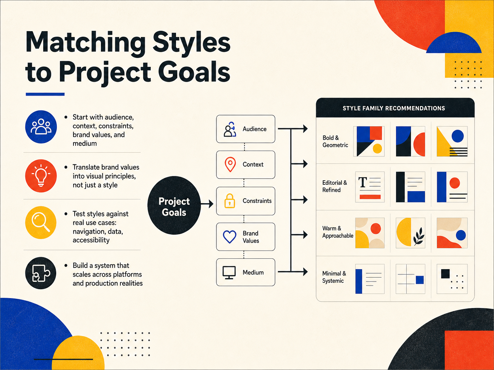
 - 11Matching Styles to Project GoalsMatching a style to project goals starts long before you choose a typeface. Begin with audience, context, constraints, brand values, and medium. A fintech dashboard, a consumer app, and an editorial brand all place very different demands on design. Next, translate brand values into visual principles, not just a named style. Clarity, warmth, or confidence become the criteria you design against. Then stress-test those principles against real use cases. Check navigation, dense data, responsive layouts, and accessibility requirements. A direction can look strong in a deck but fail inside a working interface. Finally, build a system, not a static aesthetic. Codify spacing, color, and component behavior so the language scales across platforms and holds up under production realities. Next, we will look at mood boards, style guides, and references as the practical tools for turning these decisions into a deliverable system.
 shopify.combighuman.comdesignpickle.com+22 min
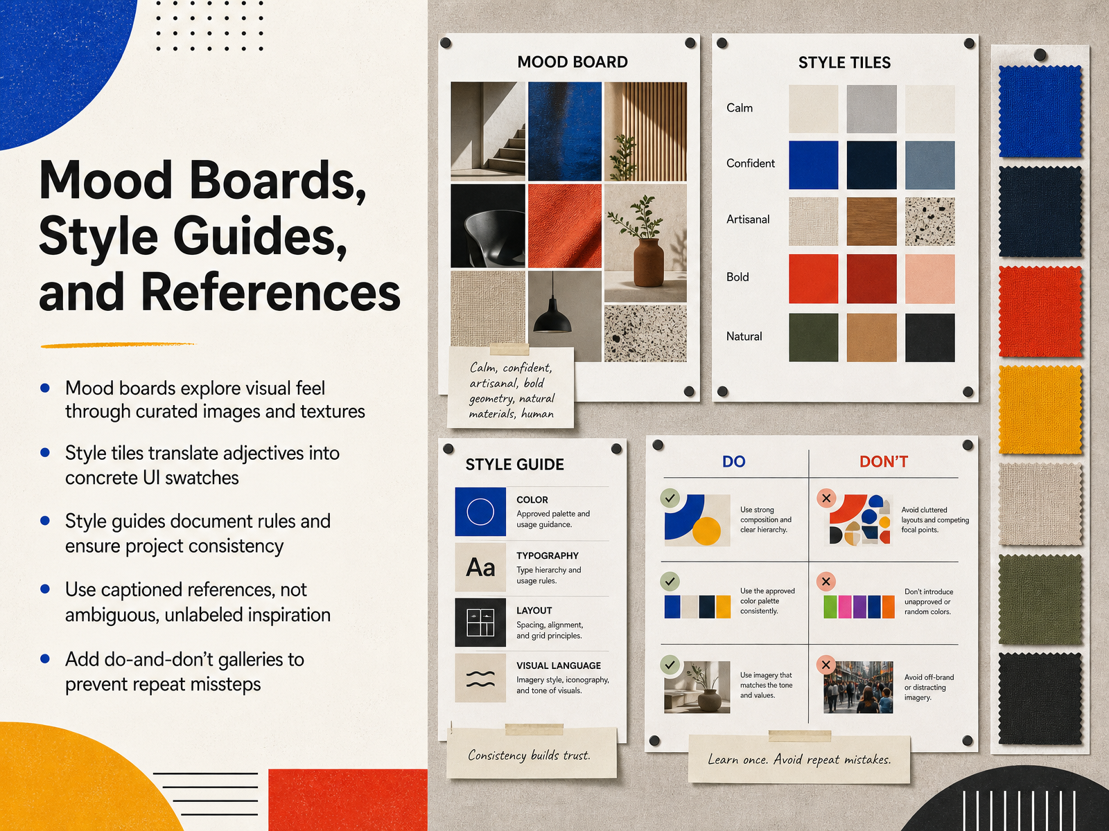
 - 12Mood Boards, Style Guides, and ReferencesNow we move into the reference toolkit that carries a design direction from exploration into execution. Mood boards, style guides, and style tiles each do a different job. A mood board chases feel through curated images and textures. It is deliberately loose, almost atmospheric. A style tile translates adjectives into concrete UI swatches. When a client says friendly or clean, the style tile shows exactly what that looks like in type, color, and interface elements. A style guide then documents the rules so the work stays consistent across every asset and every designer. One point that separates professional practice from amateur inspiration is captioning. Every reference image needs a note that says what specifically carries into the work. Is it the negative space, the lighting, or the composition. Without captions, your team has to guess, and the guess is wrong half the time. Pair that with a do and don't gallery. Showing past treatments that were rejected, with the reason, stops the same misstep from being rebuilt. Up next, we will look at client communication and professional practice.
 2 min
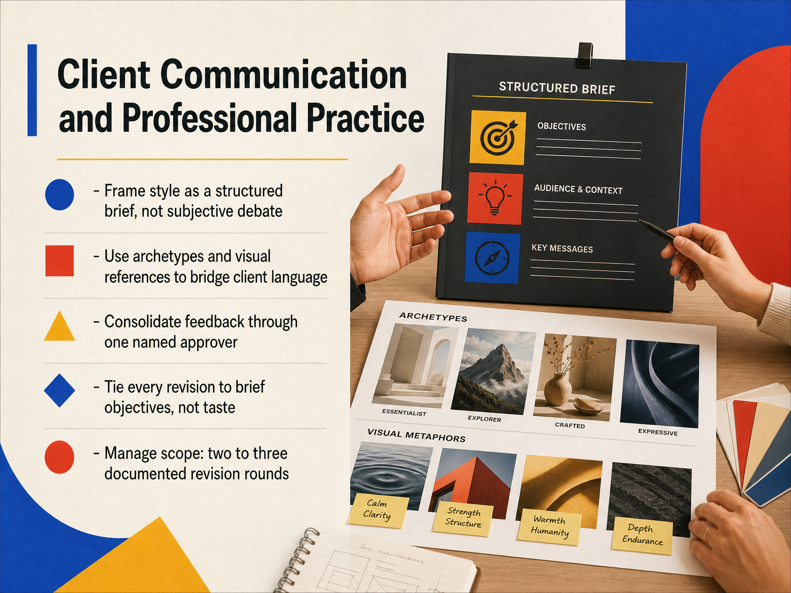
2 min - 13Client Communication and Professional PracticeNow let’s turn to how we present and protect that style work with clients. Style is not a subjective debate. Frame it as a structured brief, with the same rigor you would apply to a grid or a type system. When clients reach for words like clean or premium, bridge that language with archetypes and visual references. A mood board or style tile turns an adjective into a concrete, shared reference point. Then consolidate feedback. Route all comments through one named approver, so the designer is not chasing three contradictory opinions. Every requested revision should tie back to a brief objective, not personal taste. Instead of I don’t love the blue, we want the headline to stop competing with the logo for attention. That points directly to a fix. Finally, manage scope by documenting two to three revision rounds up front. That protects the timeline and keeps the conversation focused on the work. Next, we’ll move into building a durable visual judgment.
 1 min
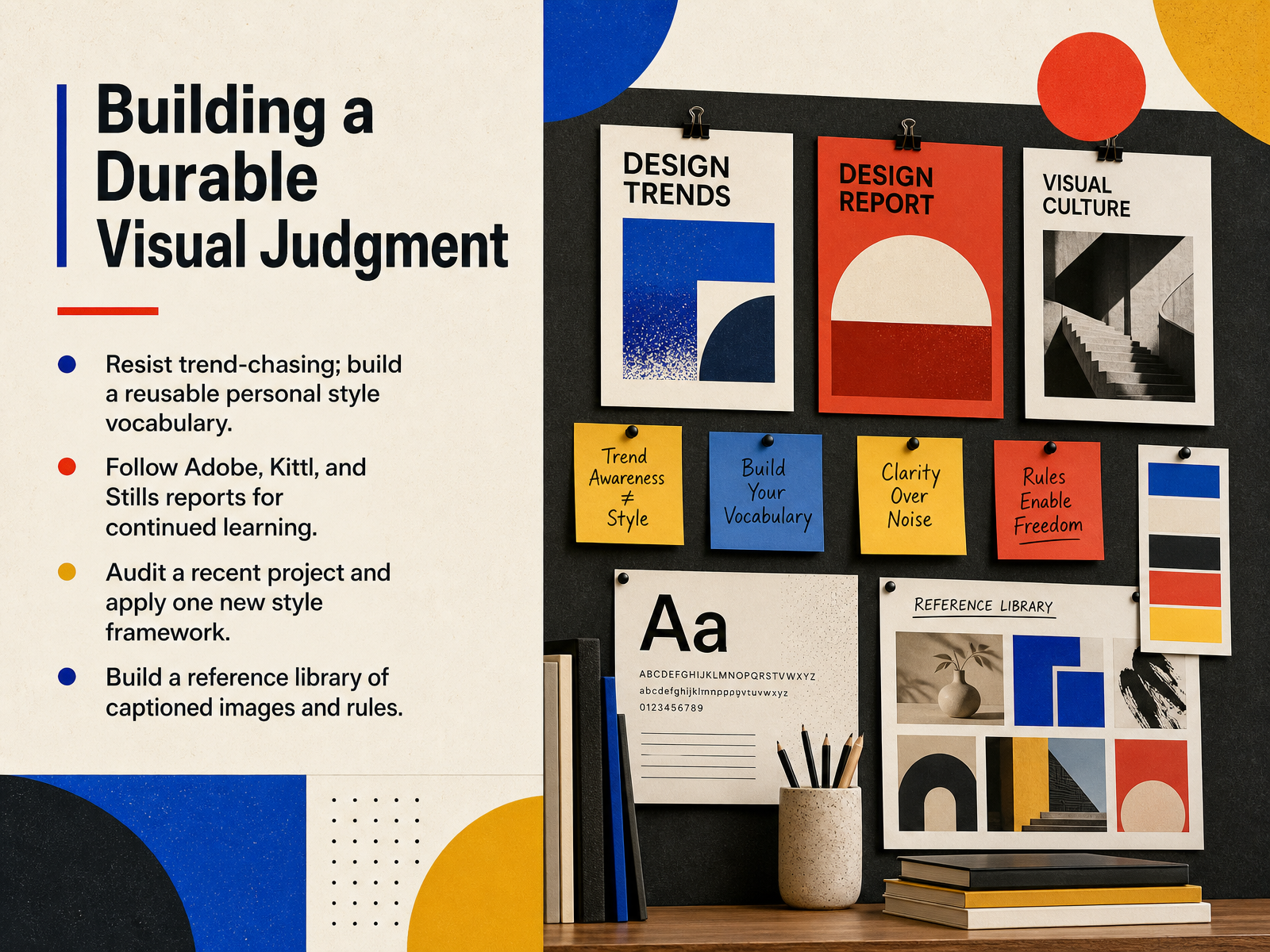
1 min - 14Building a Durable Visual JudgmentLong-term visual judgment is built on habit, not on chasing what is trending this month. Start by auditing one recent project. Identify a single choice you made from habit, then rework that decision using a new style framework we discussed. That discipline turns passive awareness into a reusable skill. Next, treat your inspiration like a working asset. Build a reference library, but do not just save images. Caption each one with the specific rule it demonstrates, whether that is a grid, a type pairing, or a textural treatment. Finally, follow the annual reports from Adobe, Kittl, and Stills. They provide a useful shared vocabulary for client conversations. You are not looking for a template to copy. You are sharpening your ability to explain why a specific style solves a specific problem. That judgment is the real deliverable. Thank you for your time, and keep building that visual fluency.
 business.adobe.combighuman.commagier.com+21 min
Take the deck with you
Download this course as a file — free, no sign-up needed.
- PDF handoutEvery slide page, ready to print or share.15 pages · 5.2 MBDownload
- Narrated PowerPointThe deck that presents itself — every slide carries the digital human's narration video.15 pages · 15.6 MBDownload
- PowerPoint slidesThe full deck as a .pptx — open it in PowerPoint, Keynote, or Google Slides.15 pages · 5.2 MBDownload
Free to use in your own training — please keep the PersonWise credit page at the end.
Have your own deck? Turn it into a course
Sources consulted
Web sources consulted while building this course.
- A Guide to Graphic Design Styles + 8 Examples (2025) - Shopify — shopify.com
- 12 Graphic Design Styles: A Complete Guide for 2026 | Big Human — bighuman.com
- Which graphic design art styles are right for your business identity? | Blog — designpickle.com
- Graphic Design Styles: Complete Guide to Visual Aesthetics — rivetdigital.co.uk
- Choose the Right Graphic Design Style | The Chambers Group — chambersgroup.com
- Graphic Design Styles: The Ultimate Guide for 2026 - Magier — magier.com
- Innovation and authenticity — Adobe’s 2026 Creative Trends forecast — business.adobe.com
- 10+ Graphic Design Styles Every Designer Should Know - Get Studio — getstud.io
- Graphic design trends 2026: 8 styles shaping visual culture — elements.envato.com
- Graphic design - 20th Century, Typography, Visual Communication | Britannica — britannica.com
- History of graphic design — en.wikipedia.org
- Graphic Design — yalebooks.yale.edu
- The International style 1950-1970 — nb.admin.ch
- International Typographic Style — en.wikipedia.org
- 4 Main Types of Morphism in UI Design | Wow-How Studio Blog — wow-how.com
- Flat design, Skeuomorphism, Material design or Neuomorphism ? — blog.ferpection.com
- UI Design Trends Explained: Skeuomorphic, Flat, Material ... — nuventureconnect.com
- Tridimensionality: skeuomorphism, flat design, and neumorphism — uxdesign.cc
- UI flat design and skeuomorphism mediation with neumorphism (material design) | Darmawan | Jurnal Desain — journal.lppmunindra.ac.id
- DIELINE's 2026 Trend Report - DIELINE — thedieline.com