Begin
14 pages · ~28 min
Data Visualization Roles and Handoffs
This training defines data visualization roles, responsibilities, and handoffs, helping teams clarify ownership and collaborate effectively across the visualization process.
A digital instructor presents all 14 pages. Hold “Ask” at any point and ask out loud — the answer comes from this course. No sign-up needed.
What you’ll learn
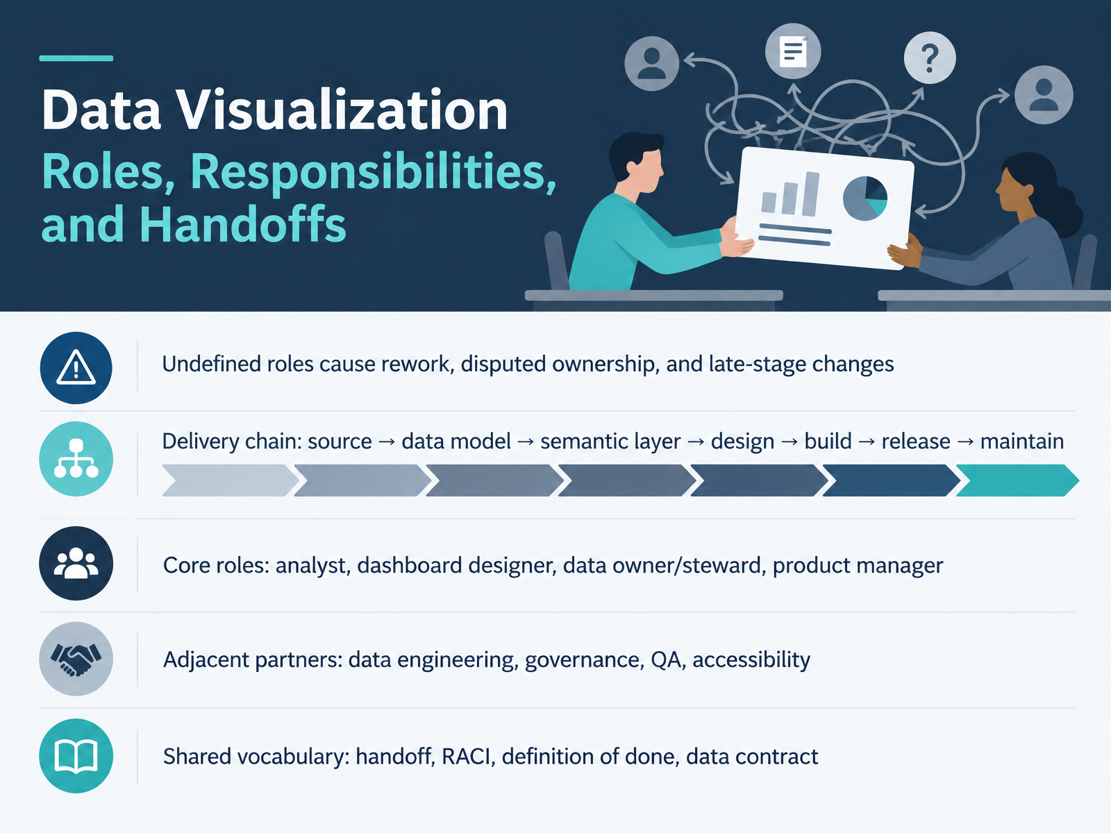
- 01Data Visualization Roles, Responsibilities, and HandoffsWelcome. This course is about data visualization roles, responsibilities, and handoffs. Our goal is simple. We want fewer late-stage changes and clearer ownership across the delivery chain. Undefined roles cause rework, disputed ownership, and last-minute surprises. So picture the full path: source, data model, semantic layer, design, build, release, maintain. At each step, someone owns the outcome. Let's name the core roles. The analyst frames questions and validates insight. The dashboard designer shapes the experience and the visuals. The data owner or steward protects meaning, quality, and access. The product manager sequences the work and confirms priorities. Around them sit adjacent partners: data engineering, governance, quality assurance, and accessibility. You will also hear a shared vocabulary: handoff, RACI, definition of done, and data contract. Keep those four terms close. Confirm the metric owner before design starts. Note where your handoff ends and the next role begins. That single habit prevents most disputes. Next, we will look at Course Objectives and Audience Alignment.gartner.comlanguage.foundationforrester.com+22 min
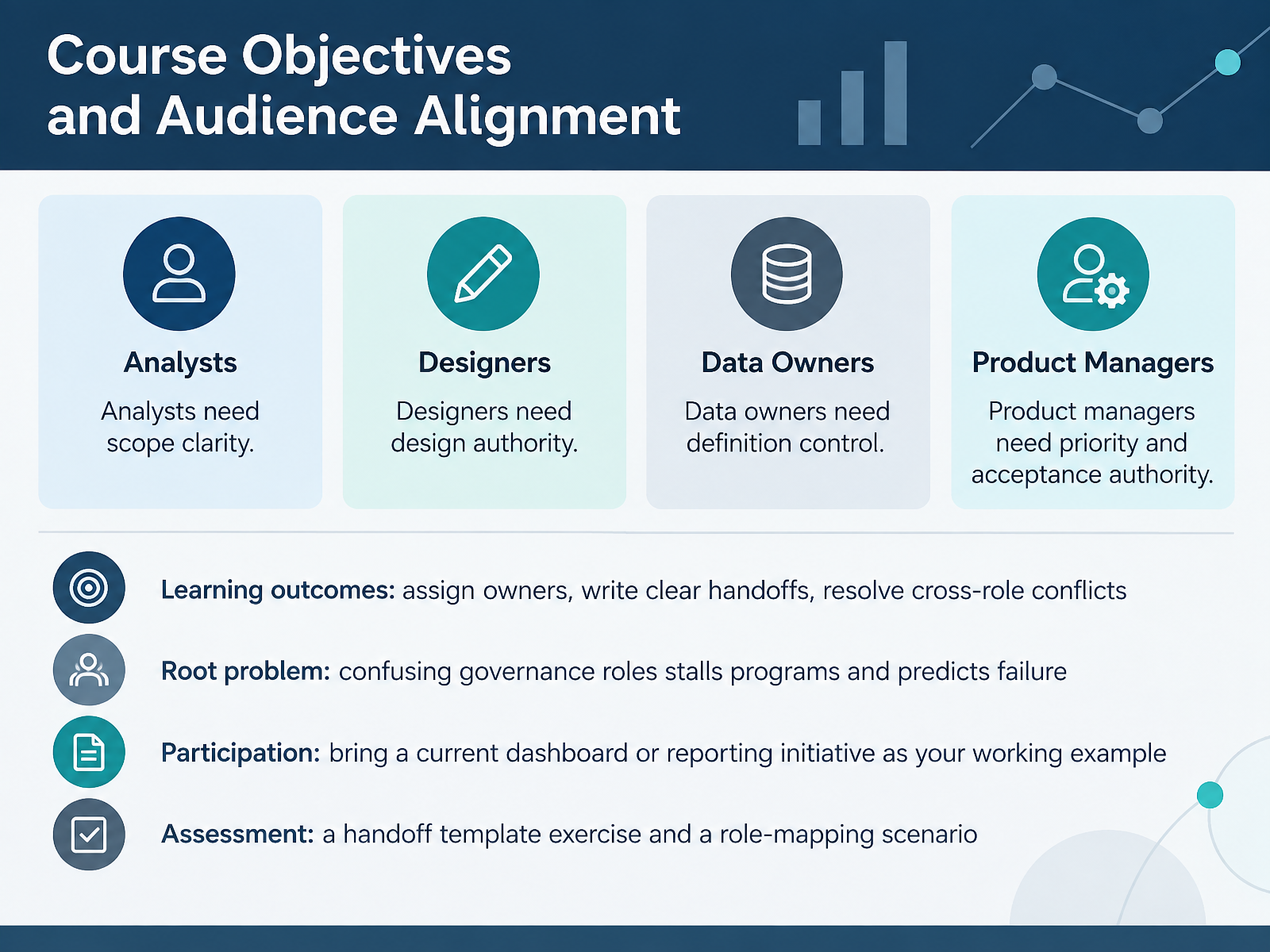
- 02Course Objectives and Audience AlignmentLet's look at what you'll take away from this course. By the end, you should be able to assign owners, write clear handoffs, and resolve cross-role conflicts. Each role needs something specific. Analysts need scope clarity before they start work. Dashboard designers need design authority over the layout and presentation. Data owners need definition control over what the metrics actually mean. Product managers need priority and acceptance authority, deciding what ships and when it's accepted. Notice that data owners keep definition authority throughout, even when priorities shift. The root problem is simple. Confusing governance roles stalls your programs and predicts failure. So please bring a current dashboard or reporting initiative as your working example. You'll apply every exercise to your own project. For assessment, you'll complete a handoff template exercise and a role-mapping scenario. Now let's walk through the Visualization Delivery Lifecycle.
 thedatagovernor.comatlan.comnmsconsulting.com+21 min
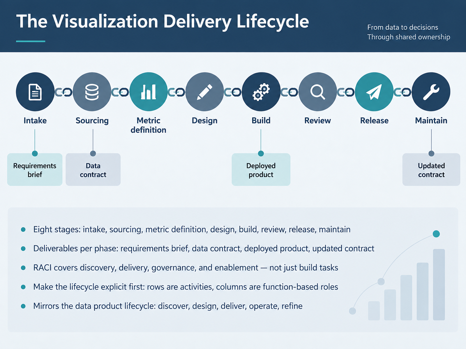
 - 03The Visualization Delivery LifecycleLet's walk through the visualization delivery lifecycle together. Picture eight stages: intake, sourcing, metric definition, design, build, review, release, and maintain. Confirm the metric owner before design starts. Each phase produces a deliverable you can point to: a requirements brief, a data contract, the deployed product, and an updated contract after release. Note where your handoff ends and someone else's begins. Your RACI covers discovery, delivery, governance, and enablement, not just build tasks. Make the lifecycle explicit first: rows are activities, columns are function-based roles. This mirrors the data product lifecycle: discover, design, deliver, operate, refine. Here's a quick example. During design review, the analyst confirms the metric definition. The dashboard designer builds to that contract. The data owner certifies the source. The product manager signs off release. Now let's look at the role map across the lifecycle.
 gartner.comlanguage.foundationforrester.com+22 min
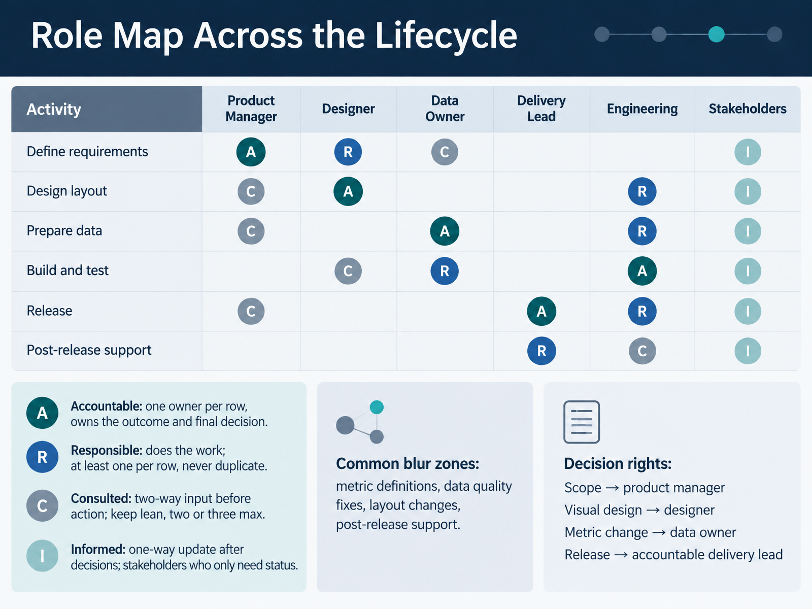
 - 04Role Map Across the LifecycleLet's map roles across the lifecycle. Treat every decision row the same way. Name one accountable owner per row. That person owns the outcome and makes the final call. Add at least one responsible person who does the work, and never duplicate that role. Keep consulted input lean, two or three people at most, since two-way input happens before action. Then inform everyone else one-way, after the decision is made. Now watch the blur zones. Metric definitions, data quality fixes, layout changes, and post-release support cause the most confusion. So confirm decision rights early. Scope belongs to the product manager. Visual design belongs to the designer. Metric changes belong to the data owner. Release belongs to the accountable delivery lead. Note where your handoff ends, and say so out loud. Next, we look at the people doing the daily work: Analyst and Dashboard Designer Responsibilities.
 gartner.comlanguage.foundationforrester.com+21 min
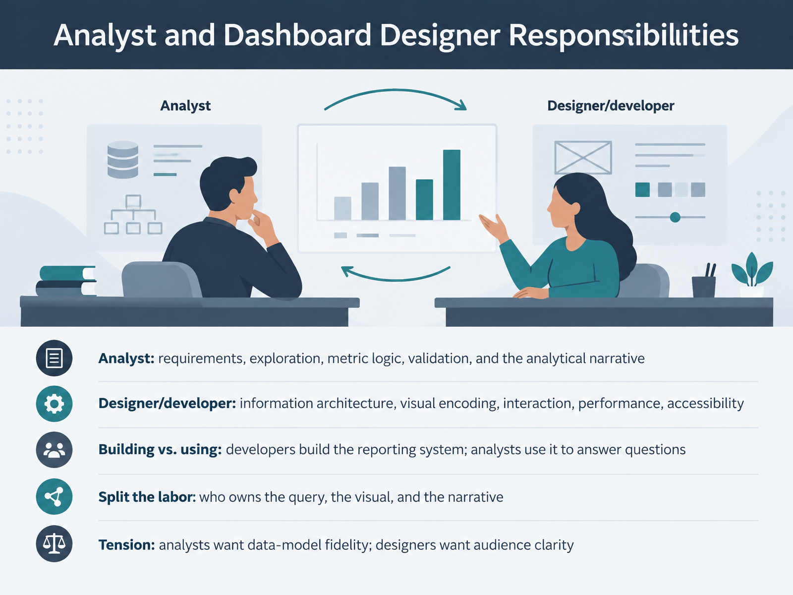
 - 05Analyst and Dashboard Designer ResponsibilitiesLet's look at who does what between analysts and dashboard designers. The analyst owns requirements, exploration, metric logic, validation, and the analytical narrative. The designer owns information architecture, visual encoding, interaction, performance, and accessibility. So confirm your seat before design starts. Here is the useful split. Developers build the reporting system. Analysts use it to answer questions. At intake, agree on who owns the query, the visual, and the narrative. One common tension is worth naming. Analysts want fidelity to the data model. Designers want clarity for the audience. Neither wins by default. Talk it through early, and note where your handoff ends. Next, we move to accessibility and visual standards as shared responsibilities.
 gartner.comforrester.comumbrex.com+21 min
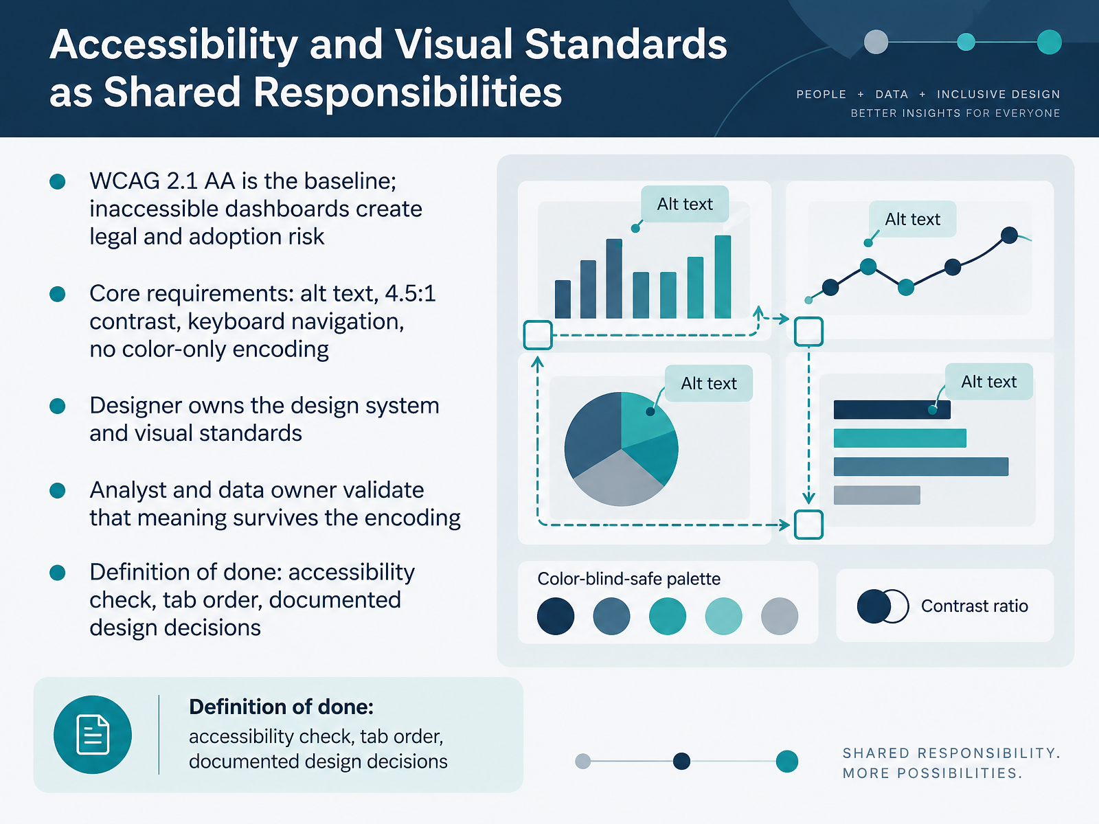
 - 06Accessibility and Visual Standards as Shared ResponsibilitiesLet's talk about accessibility and visual standards as shared responsibilities. WCAG 2.1 double A is your baseline. Inaccessible dashboards create legal and adoption risk, so treat compliance as non-negotiable. The core requirements are alt text, a contrast ratio of four point five to one, keyboard navigation, and never encoding meaning in color alone. The designer owns the design system and the visual standards. The analyst and data owner validate that meaning survives the encoding. Test the chart with a colorblind-safe palette. Confirm the labels still tell the story. Your definition of done includes three checks: an accessibility check, a verified tab order, and documented design decisions. Agree on these standards early. They are much cheaper to build in than to retrofit. This sets up who owns what next, as we look at data owner and product manager responsibilities.
 tdwi.orgpwskills.comcodersarts.com+21 min
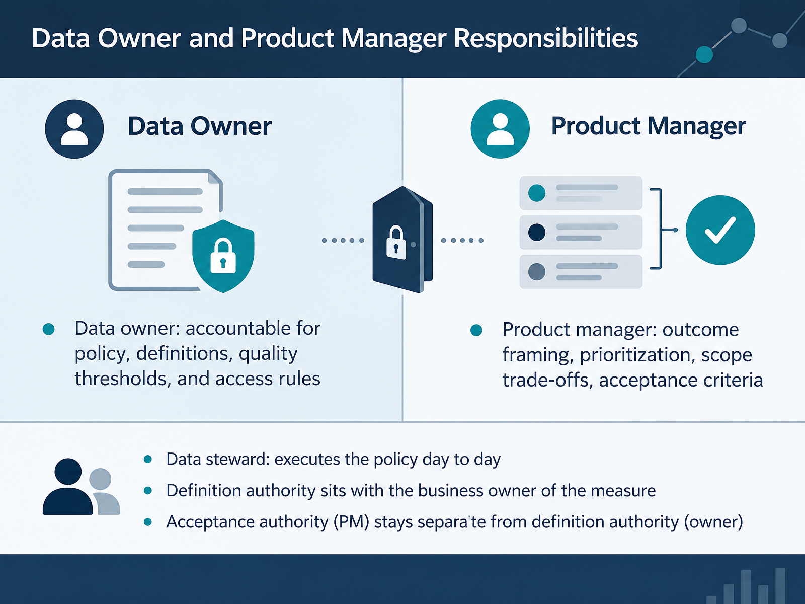
 - 07Data Owner and Product Manager ResponsibilitiesLet's draw the line between two roles that are often confused. The data owner is accountable for policy, definitions, quality thresholds, and access rules.
The data steward executes that policy day to day. So when you build your RACI, put accountability with the owner and responsibility with the steward.
The product manager handles outcome framing, prioritization, scope trade-offs, and acceptance criteria.
Here's the key principle. Definition authority sits with the business owner of the measure. Acceptance authority stays with the product manager, and those two must remain separate. If one person holds both, you lose an independent check on whether the work is actually ready.
So before design starts, confirm who owns the definition. And confirm who signs off on acceptance. Two different names, two different accountabilities. That separation protects the integrity of every dashboard you ship.
Next, we'll walk through handoff artifacts and definition of done.
 thedatagovernor.comatlan.comnmsconsulting.com+22 min
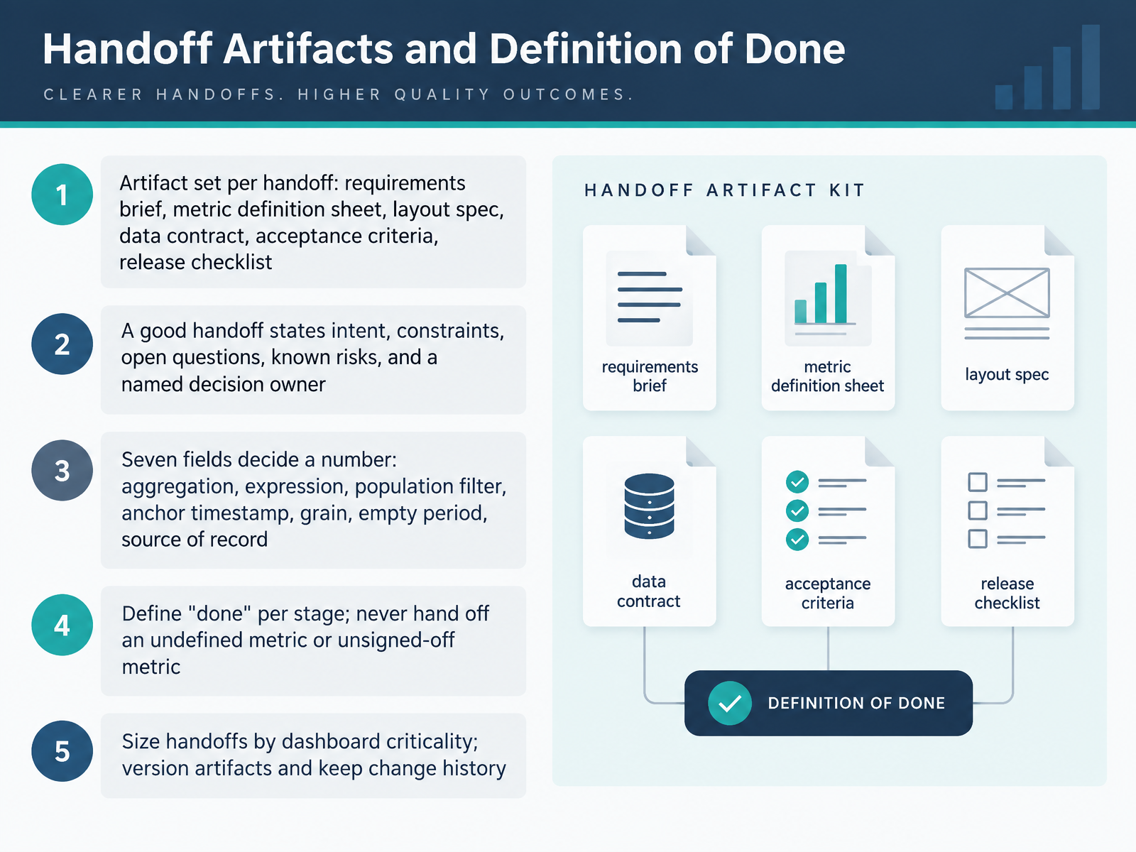
 - 08Handoff Artifacts and Definition of DoneNow let's talk about handoff artifacts and what done really means. Each handoff should carry a standard artifact set. That includes the requirements brief, the metric definition sheet, the layout spec, the data contract, acceptance criteria, and the release checklist. A good handoff states intent, constraints, open questions, known risks, and one named decision owner. Remember, seven fields decide a number: aggregation, expression, population filter, anchor timestamp, grain, empty period, and source of record. Define done per stage. Never hand off an undefined metric or one that has not been signed off. Size your handoffs by dashboard criticality, and version every artifact so change history stays visible. This is where we go next, into the coordination workflow and communication cadence.
 analyticsengineering.comkcm-solutions.comgithub.com+21 min
 - 09Coordination Workflow and Communication CadenceNext, let's look at your coordination workflow and communication cadence. Start with intake and triage. Route every request through one front door, using a structured form and a simple request taxonomy. Then apply your triage rule. Priority tiers P1 through P4, paired with effort sizing from small to extra large, set predictable response times. So everyone knows what to expect and when. Now the cadence. Kickoff, design review, data validation checkpoint, release review, and retro. Make each recurring meeting produce or approve a named artifact. For example, design review approves the spec, and release review signs off the dashboard. Keep async handoffs visible in tickets, comments, annotations, and a decision log. Finally, watch for failing signals. Silent assumptions, repeated clarification, and unapproved scope creep. When you see them, pause and reset the workflow. Escalation, conflict resolution, and change control come next.
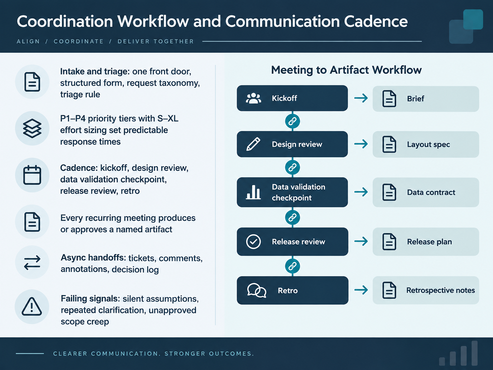 gartner.comlanguage.foundationforrester.com+22 min
 - 10Escalation, Conflict Resolution, and Change ControlLet's talk about escalation, conflict resolution, and change control. Conflicts usually fall into four types. Metric definition, scope, design authority, and data quality ownership. When one appears, follow a clear resolution path. The data owner rules on definitions. The product manager prioritizes scope. The council or sponsor settles the rest. Never resolve these in side threads. Now the change workflow. Intake, impact assessment, approval, implement, communicate, then review. During impact assessment, list affected dashboards, downstream consumers, docs, and training. That list tells you who to notify and what to test. For deprecation, keep the handoffs simple. The owner decides, the PM communicates, and the platform team cleans up. Confirm the decision owner before work starts. Note where your handoff ends. That one habit prevents most escalations. Next, we move into dashboard sprawl and lifecycle governance.
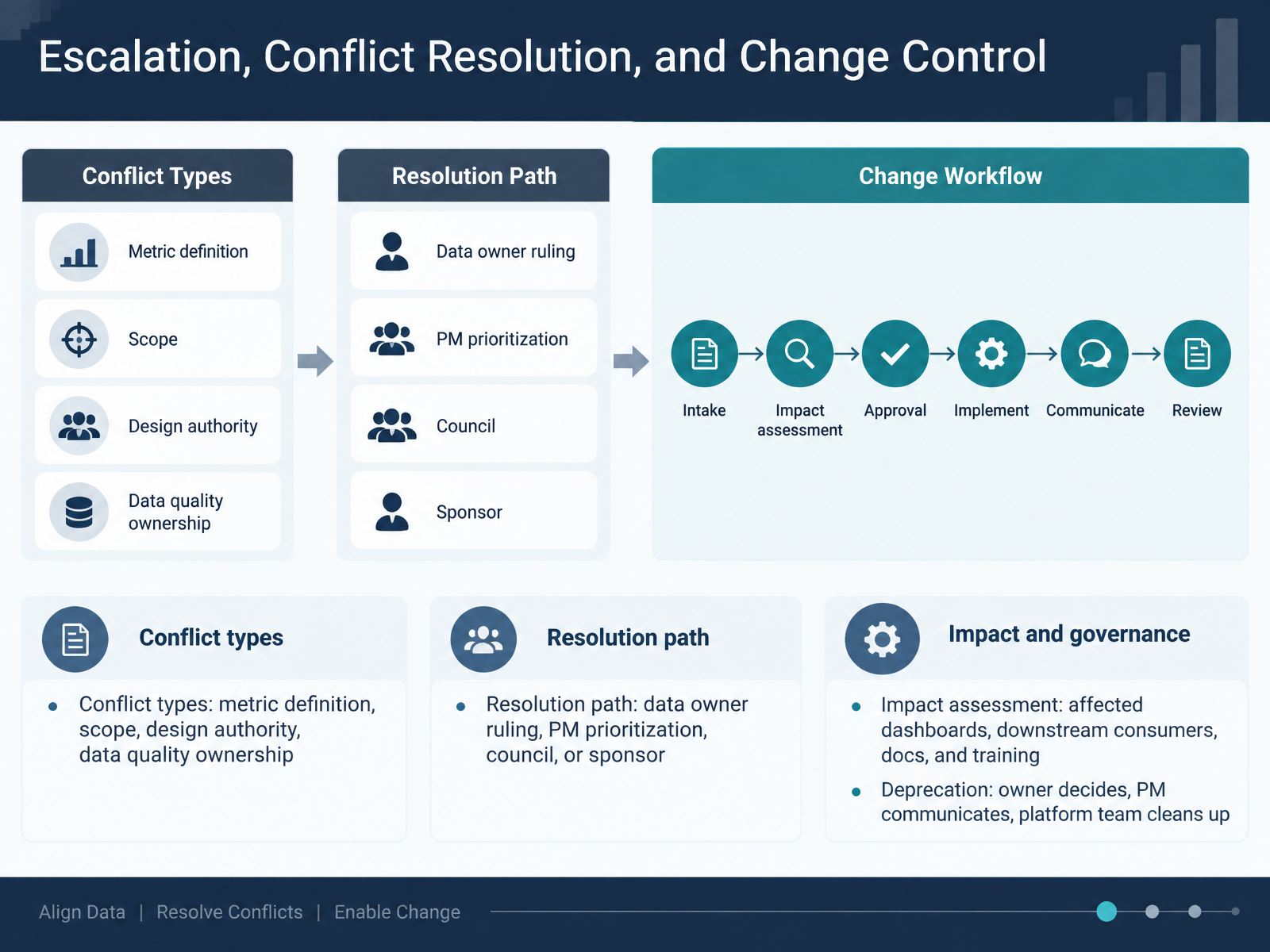 gartner.comlanguage.foundationforrester.com+22 min
 - 11Dashboard Sprawl and Lifecycle GovernanceLet's talk about dashboard sprawl and lifecycle governance. Sprawl erodes trust. Conflicting KPIs and duplicate dashboards hide what is official. So agree on a simple lifecycle: create, review, certify, deprecate, and archive. Before a dashboard is shared widely, run a lightweight review. Then certify it as the source of truth. Track a few governance KPIs. Watch the dormant dashboard rate, certification lag, definition conflict rate, and issue resolution time. When you deprecate, do it carefully. Every deprecation needs a replacement, an announced date, and a prominent banner. Surprise deprecations erode trust, so announce changes early and offer safe alternatives. A banner that names the replacement and the owner gives people a path forward. Next, we will look at operating model options and right-sizing.
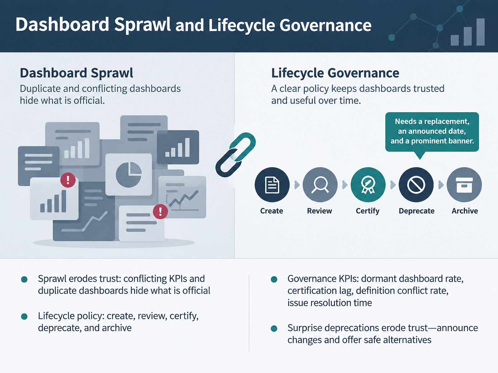 1 min
1 min - 12Operating Model Options and Right-SizingNow let's look at operating model options, and how to right-size yours. Centralized means one team owns the platform, the pipelines, and governance. That gives you consistency, but it can become a ticket queue. Federated means domains own delivery, which moves fast, but risks metric and tool drift. The practical default is hub-and-spoke. The central hub owns the platform, the guardrails, and the shared truth. The spokes own their domain data products, definitions, and delivery. So confirm who owns each side before you staff anything. Then right-size. One dashboard needs a lightweight setup. Enterprise reporting needs a formal responsibility matrix. Add a dashboard designer, an analytics engineer, or a steward only when scale demands it. Next, we'll look at diagnosing and fixing broken handoffs.
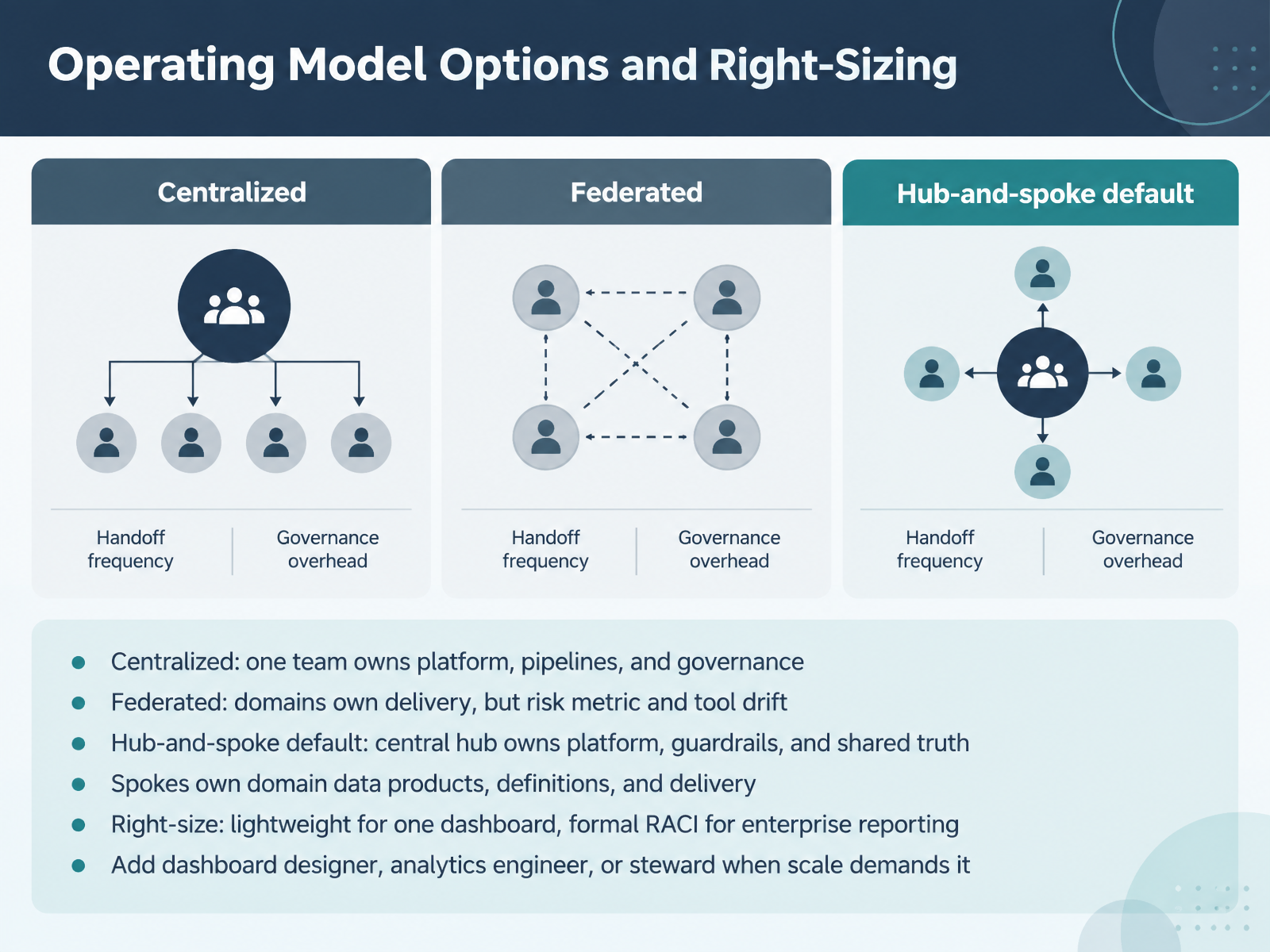 contextawareanalytics.comthedatagovernor.comatlan.com+21 min
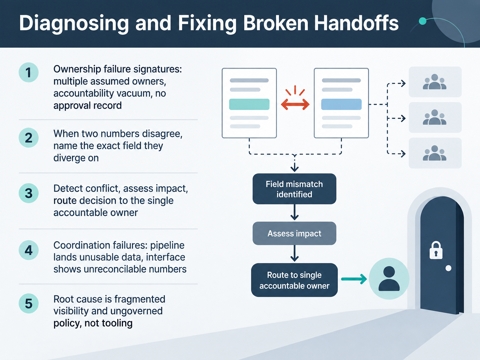
 - 13Diagnosing and Fixing Broken HandoffsLet's talk about diagnosing and fixing broken handoffs. Start with the ownership failure signatures. You might see multiple assumed owners, an accountability vacuum, or no approval record at all. Each of these signals that a handoff has quietly broken down.
When two numbers disagree, name the exact field they diverge on. That single detail turns a vague argument into a solvable problem. Then detect the conflict, assess the impact, and route the decision to the single accountable owner.
Coordination failures look different. A pipeline lands unusable data, or an interface shows irreconcilable numbers. But the root cause is usually fragmented visibility and ungoverned policy, not tooling.
So confirm the metric owner before design starts, and note where your handoff ends.
Next, we'll move into applied practice building a role and handoff plan.
 gartner.comlanguage.foundationforrester.com+22 min
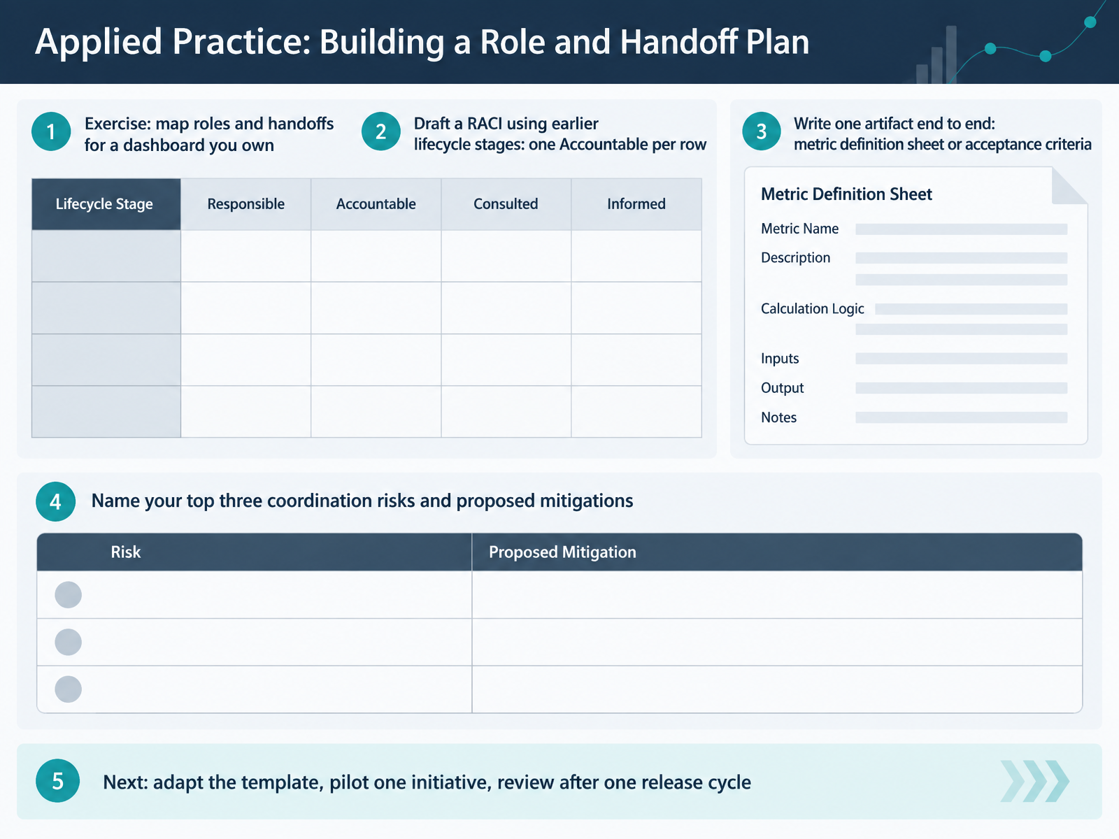
 - 14Applied Practice: Building a Role and Handoff PlanTo close, let's turn the framework into a plan you can actually use. Pick one dashboard you own and map its roles and handoffs. Draft a RACI using the lifecycle stages we covered, with exactly one Accountable owner per row. Then write one artifact end to end, either a metric definition sheet or a set of acceptance criteria. Name your top three coordination risks and a mitigation for each. For example, unclear data ownership might become a named owner in the intake form. Your next step is simple. Adapt the template, pilot one initiative, and review after one release cycle.
Thank you for working through this course with me. Start with one dashboard and one artifact this week. Small, consistent handoffs are what make visualization delivery dependable. You are ready to put this into practice.
 analyticsengineering.comkcm-solutions.comgithub.com+21 min
Take the deck with you
Download this course as a file — free, no sign-up needed.
- PDF handoutEvery slide page, ready to print or share.15 pages · 3.0 MBDownload
- Narrated PowerPointThe deck that presents itself — every slide carries the digital human's narration video.15 pages · 12.7 MBDownload
- PowerPoint slidesThe full deck as a .pptx — open it in PowerPoint, Keynote, or Google Slides.15 pages · 2.9 MBDownload
Free to use in your own training — please keep the PersonWise credit page at the end.
Have your own deck? Turn it into a course
Sources consulted
Web sources consulted while building this course.
- Toolkit: Create a RACI Matrix for Data and Analytics Product Management — gartner.com
- From RACI to Reality: Build a RACI Matrix Template for Data Science Delivery – Language.Foundation — language.foundation
- The Data Governance RACI Matrix | Forrester — forrester.com
- RACI Framework for Data Governance Change Management in BI & — fanruan.com
- 04_operate/raci_template.md at main · srini86/data-products-lifecycle-fsi-example — github.com
- https://thedatagovernor.com/data-product-management-governance/ — thedatagovernor.com
- Data Governance Roles & Responsibilities 2025: What Every Data Leader Must Know — atlan.com
- Data Governance Operating Model: Products, Quality KPIs, and Cadence — nmsconsulting.com
- Roles, Responsibilities, and RACI That Actually Work — umbrex.com
- Data Stewardship Roles: Ownership and Accountability in Data Governance | Context Aware Analytics | Context Aware Analytics — contextawareanalytics.com
- Why Your Power BI Project Has No Owner | Alluvium — alluviumbi.com
- What a BI Developer Does, and How the Role Differs From a Data Analyst | TDWI — tdwi.org
- The Difference Between Dashboard Builders and Business Analysts — pwskills.com
- Dashboard Developer: What They Do, When to Hire One, and What a Custom Dashboard Actually Costs (2026 Guide) — codersarts.com
- Dashboard Developer Job Description [Updated for 2026] — interviewguy.com
- Senior BI Analytics Designer — wearedevelopers.com
- Metric Definition Worksheet: Copyable Analytics Template — analyticsengineering.com
- One KPI, Three Answers: A Practical Introduction to Metric Contracts - KCM Solutions — kcm-solutions.com
- AndrejGlavnik/dashboard-governance-playbook — github.com
- Free Metric Definitions Document Template (2026) — meetriver.com