Multi-Step Experience Design
Begin
17 pages · ~34 min
Multi-Step Experience Design
Learn to design intuitive multi-step experiences for users, targeting UX designers and product managers seeking to improve complex workflows and user satisfaction.
What you’ll learn
- 01Designing Multi-Step ExperiencesWelcome. In this session, we are going to tackle a pattern that affects everything from enterprise setup wizards to checkout flows: designing multi-step experiences. If you build long, linear tasks, you know the challenge. Users need to understand where they are, see progress, and move forward or back without losing their work. Our goal is to equip you to build flows that feel clear, safe, and effortless. First, let us define the landscape. A multi-step flow can be a setup wizard, a checkout, or a complex configuration inside an enterprise tool. The core user needs are consistent: orientation, perception of progress, safe navigation, and confidence to complete. When these needs are not met, the business impact is real. Poorly designed flows cause abandonment, errors, and extra support tickets, which all translate to lost revenue. Throughout this course, we will learn how to avoid those outcomes. Let us begin by examining the most common places these flows break down. Coming up next: Why Multi-Step Flows Fail.foundey.comuxpin.comeleken.co+22 min
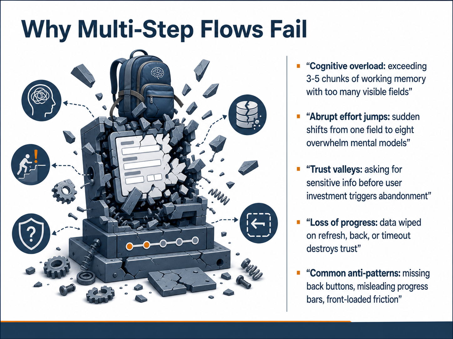
- 02Why Multi-Step Flows FailNow, let's look at why multi-step flows often fail, even when the design seems clean. The first culprit is cognitive overload. When a single step shows more than three to five visible fields, it exceeds what our working memory can handle comfortably. Users scan the page, feel overwhelmed, and often abandon before they even start. Next, abrupt effort jumps break mental models. A user might move from a one-field email screen to a step with eight open fields, and that sudden shift feels like hitting a wall. It is not the total number of fields that hurts, it is the unexpected increase in effort. Then there are trust valleys. This happens when we ask for sensitive information, like payment details or a phone number, too early. Without clear context, the request feels suspicious, and the user drops off. Another major failure is loss of progress. If a user hits the back button, refreshes the page, or times out and all their data disappears, trust is destroyed. They rarely return. Finally, common anti-patterns make this worse. For example, a missing back button traps users who want to review, or a misleading progress bar that jumps from twenty percent to ninety percent in one click creates false expectations. Front-loaded friction, where all the hardest fields appear on the first page, also pushes users away. In short, these failures happen when the flow ignores how the brain manages effort, trust, and momentum. Next, we will explore user mental models in linear tasks and how to design for how people actually think.
 wearetenet.comnngroup.comacceleroi.com+22 min
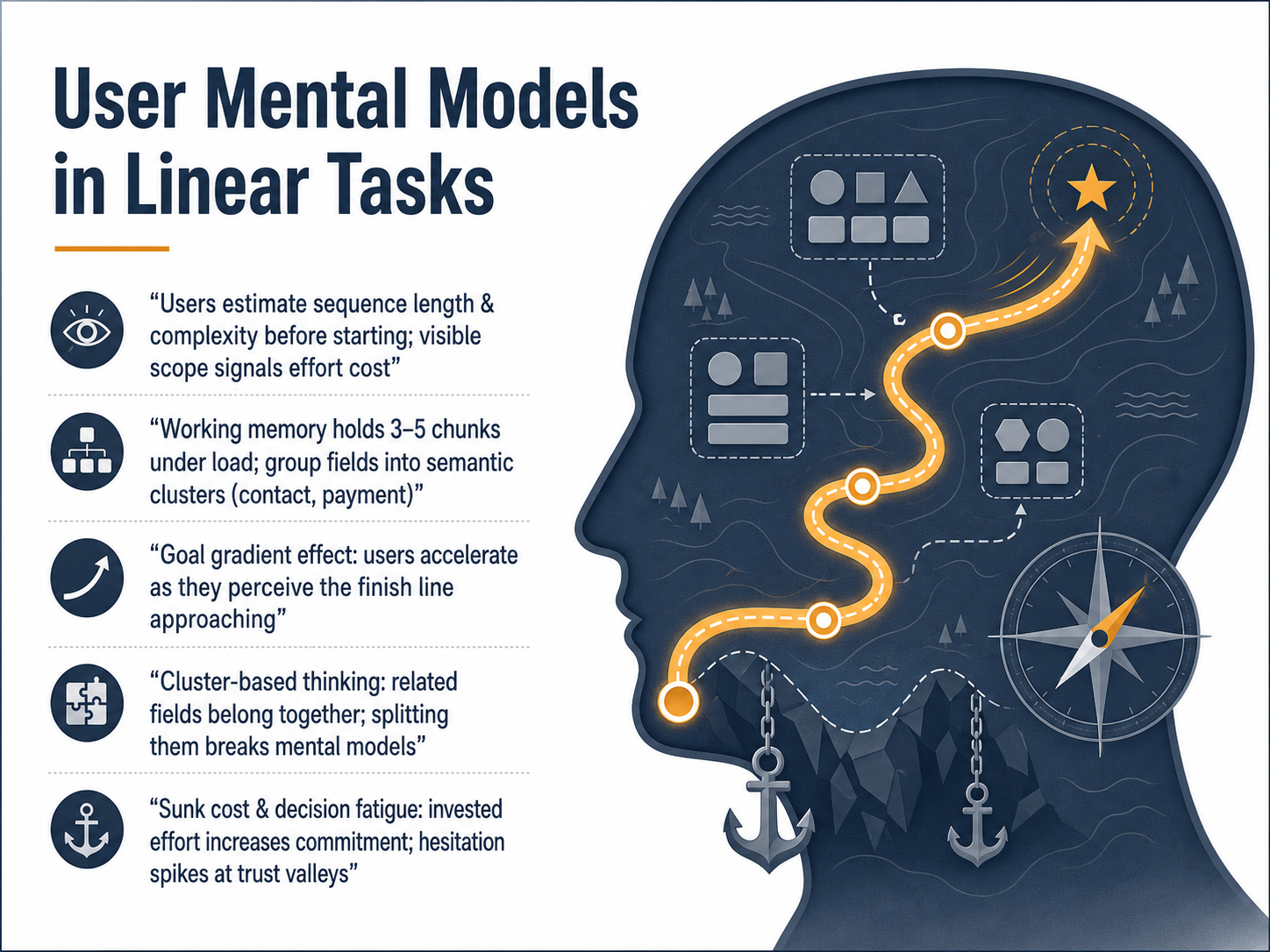
 - 03User Mental Models in Linear TasksNow let's look at how users actually think when they move through a linear task. Before anyone starts filling in fields, they quickly estimate the length and complexity of the sequence. Visible scope signals the effort cost—if it looks like a long haul, many will leave before typing a single character. Once they start, working memory holds only about three to five chunks under load. That's why we group fields into semantic clusters like contact, shipping, or payment. Related fields belong together; splitting them across steps breaks the user's mental model and adds unnecessary work. We also see the goal gradient effect: users accelerate as they perceive the finish line approaching. A clear progress indicator turns that psychology into momentum. Notice as well that sunk cost and decision fatigue play a real role. Effort already invested increases commitment, but hesitation spikes at trust valleys—moments where the stakes feel higher, such as asking for payment or a phone number. Design those points carefully. Confirm the user's choice, explain the why, and keep the path forward visible and safe. Next, we'll decide when to use multi-step flows.
 wearetenet.comnngroup.comacceleroi.com+22 min
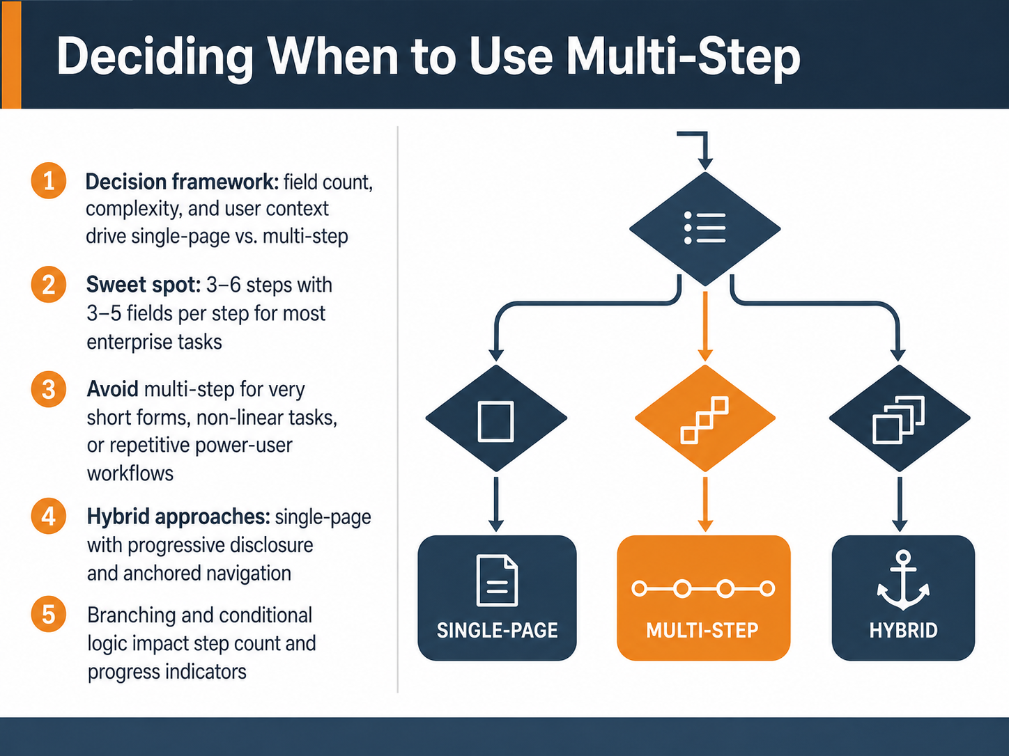
 - 04Deciding When to Use Multi-StepNow, let's focus on a practical decision framework. Knowing when to use a multi-step flow starts with three factors: field count, question complexity, and your user's context. For most enterprise tasks, the sweet spot is three to six steps, with three to five fields per step. Avoid multi-step for very short forms, like a simple login, or for non-linear tasks where users need to jump freely. It also adds friction for repetitive power-user workflows. Sometimes, a hybrid approach works best. Use a single page with progressive disclosure and anchored navigation, so users see everything but only edit one section at a time. Finally, remember that branching and conditional logic change the game. If your flow adapts to user answers, your step count and progress indicators must update dynamically. Next, we will apply these ideas directly to Step Sequencing and Field Grouping.
 promptlyforms.comweweb.ioorbitforms.ai+21 min
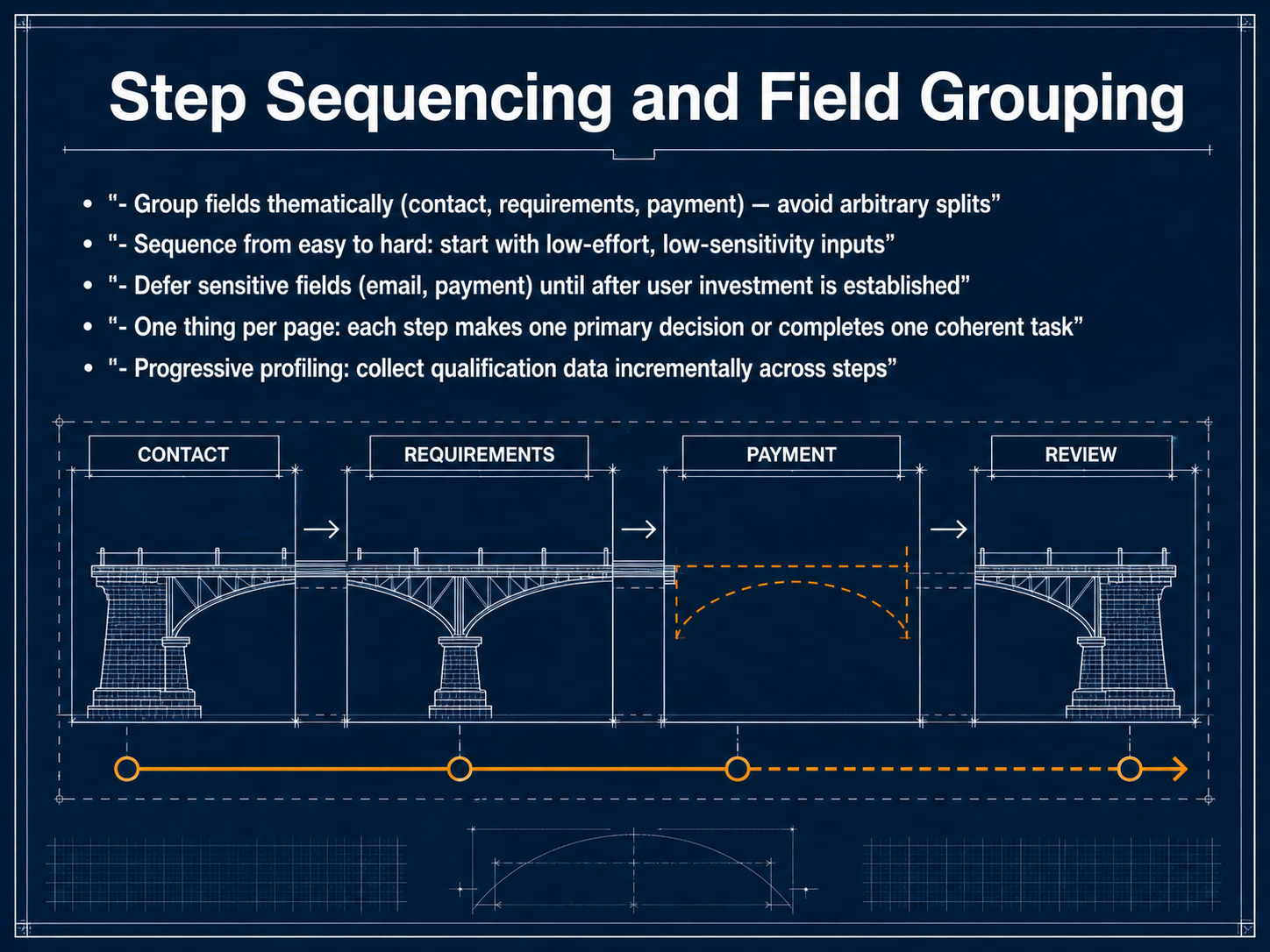
 - 05Step Sequencing and Field GroupingLet's look at how to sequence your steps and group your fields. This is where the structure of your form really starts to affect completion. First, group related fields thematically. Keep contact details together, project requirements together, and payment details together. Avoid mixing unrelated fields in a single step. It breaks the user's focus and makes the form feel arbitrary. Next, sequence your steps from easy to hard. Start with low-effort, low-sensitivity inputs. This builds momentum. Defer sensitive fields like email or payment details until after the user is invested. They've already put in effort, so they're more likely to continue. A good rule is one primary task per page. Each step should ask the user to make one clear decision or complete one coherent set of inputs. Finally, apply progressive profiling. Collect qualification data incrementally across the steps. Ask a segmentation question early, then follow up with relevant details later. This keeps the form shorter and feels more like a conversation. Let's apply these principles as we move into the next topic: Progress Communication Patterns.
 promptlyforms.comweweb.ioorbitforms.ai+22 min
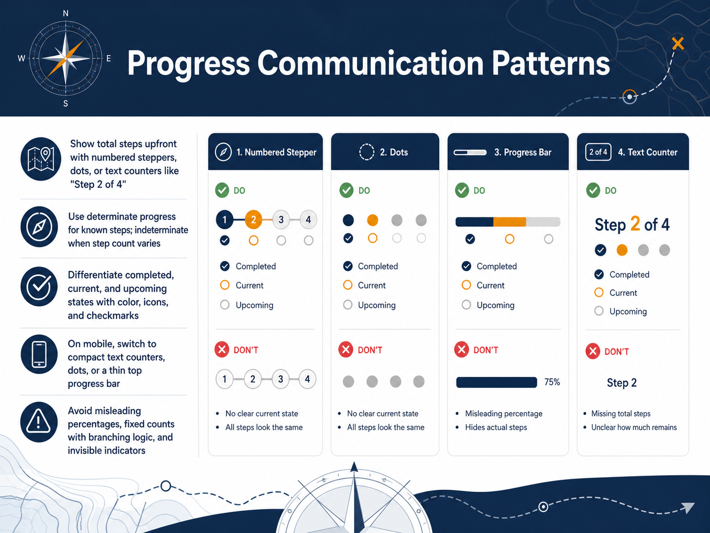
 - 06Progress Communication PatternsNow let's look at the core patterns that communicate progress to your users. First, always show the total steps upfront. Use numbered steppers, dots, or a simple text counter like Step 2 of 4. This sets clear expectations and reduces uncertainty. When the number of steps is known and fixed, use a determinate progress indicator. It fills as the user advances. If the step count varies based on user choices, switch to an indeterminate pattern so you don't mislead them. Your design must clearly differentiate three states: completed, current, and upcoming. Use distinct colors, checkmark icons for finished steps, and a highlighted treatment for the active step. Upcoming steps should stay visually muted. On mobile, horizontal rails with labels often break. Switch to compact text counters, dot indicators, or a thin top progress bar that leaves room for the main content. Finally, avoid three common mistakes. Don't show misleading percentages if steps aren't equal in length. Don't use a fixed step count when branching logic changes the journey. And never hide the indicator entirely. Users need that visible reassurance. Next, we'll move into Designing Safe Navigation, where we'll cover how to let users move forward and back without losing their work.
 foundey.comuxpin.comeleken.co+22 min
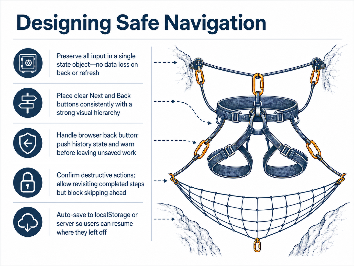
 - 07Designing Safe NavigationNow let’s focus on designing safe navigation. Safe navigation means your users never lose their place or their data. Start by preserving all input in a single state object. This way, clicking Back or refreshing the browser does not erase what they’ve already entered. Next, place clear Next and Back buttons consistently on every step. Use a strong visual hierarchy so users always know how to move forward or review previous work. Handle the browser back button carefully. Push a history state on each step advance, and warn users before they leave if they have unsaved work. This prevents accidental data loss. Also, confirm any destructive action before it executes. Allow users to revisit completed steps so they can review or correct information, but block them from skipping ahead to steps they haven’t reached yet. Finally, auto-save progress to localStorage or a server. When a user returns, they can resume exactly where they left off. These practices build trust and keep long forms from feeling risky. In the next slide, we’ll look at validation strategies across steps.
 137foundry.comstaticforms.devviprasol.com+22 min
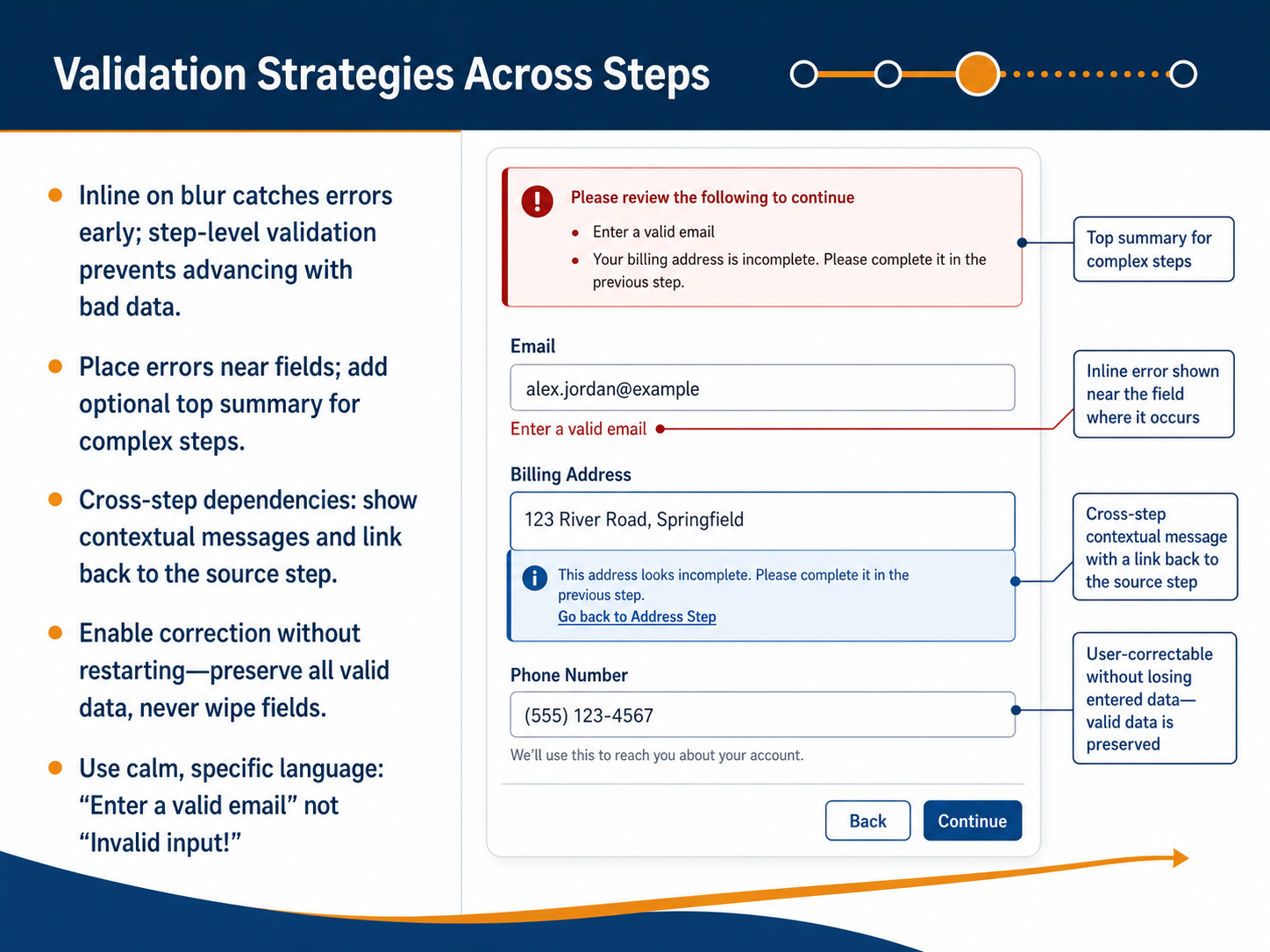
 - 08Validation Strategies Across StepsNow, let's focus on validation strategies across steps. In a multi-step form, validation does not happen all at once at the end. Instead, you need to validate early and often. First, catch errors the moment a user leaves a field, which is called inline on blur. This gives them immediate feedback. Next, perform step-level validation before they can move forward. This prevents them from advancing with bad data. Place the error message directly near the problem field. For complex steps, you can also add an optional summary at the top. When you have cross-step dependencies, where an answer in step one affects step three, show a contextual message. For example, tell them, 'Based on the account type you selected in step one, you need to enter a business tax ID.' Provide a link back to the source step so they can correct it easily. A critical rule is to enable correction without restarting. Preserve all valid data and never wipe fields clean. Finally, use calm, specific language. Say 'Enter a valid email' instead of 'Invalid input.' This keeps the tone supportive and professional. Next, we will look at the review and summary before completion.
 designlab.comtimgraf.com2 min
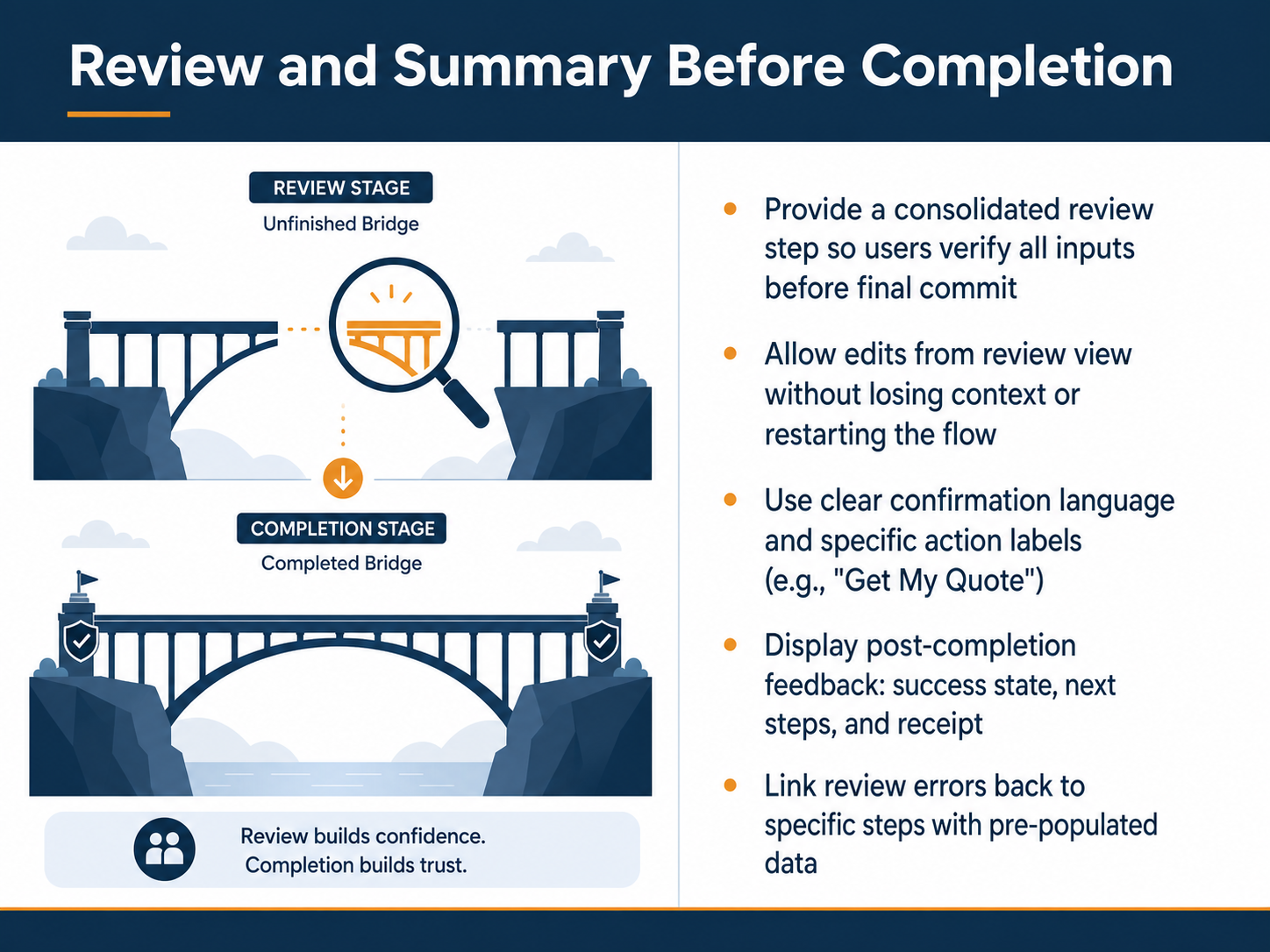
 - 09Review and Summary Before CompletionA review step might feel like extra work, but it is one of the most powerful trust-building moments in any multi-step flow. Think of it as a final checkpoint where users confirm every input before they commit. Without it, small errors slip through, and confidence drops. With it, you give people a clear, scannable summary of everything they have entered. Even better, let them edit directly from the review view. They should be able to tap a field or click an edit link, jump back to the exact step with their data pre-populated, make the fix, and return without starting over. Notice how that preserves momentum and context instead of punishing the user for a mistake. Use specific, action-driven labels on the final button. Instead of a generic Submit, say Get My Quote, Place Order, or Create My Account. That language confirms what happens next and removes ambiguity. After they submit, show a clear success state, spell out the next steps, and offer a receipt or confirmation number. If a review catches an error, link it back to the original step with the data already filled in. That small detail turns a potential dead end into a quick correction. When you design the review this way, it stops being a formality and becomes the moment users feel truly in control.
 promptlyforms.comweweb.ioorbitforms.ai+22 min
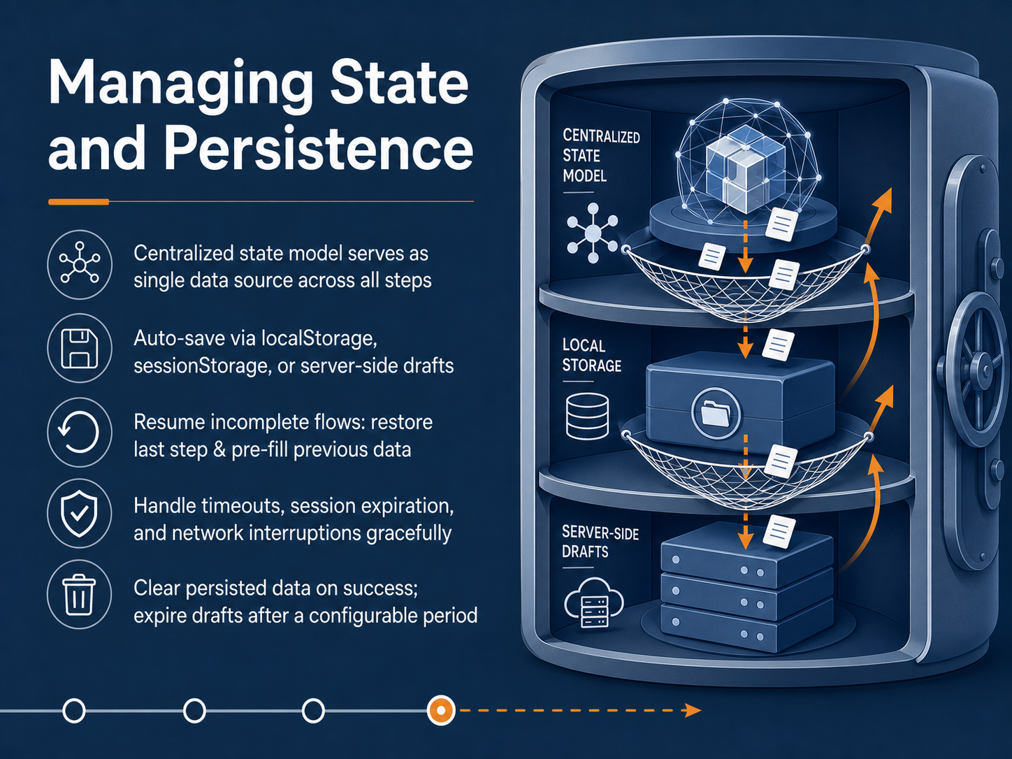
 - 10Managing State and PersistenceNext, let's look at managing state and persistence. This is the behind-the-scenes work that keeps your users' progress safe. A centralized state model acts as a single source of truth for all the data across your steps. To protect that data, implement auto-save using localStorage, sessionStorage, or server-side drafts. Auto-save gives users permission to pause and return later, which is a powerful signal that builds trust. You also need to handle interruptions gracefully, such as a time-out, a session expiration, or a network drop. When a user returns, restore them to their last active step and pre-fill any data they already entered. Finally, remember to clear the persisted data on a successful submission, and set your drafts to expire after a configurable period, like twenty-four to seventy-two hours. Now, let's apply these principles to Accessibility in Multi-Step Flows.
 137foundry.com1 min
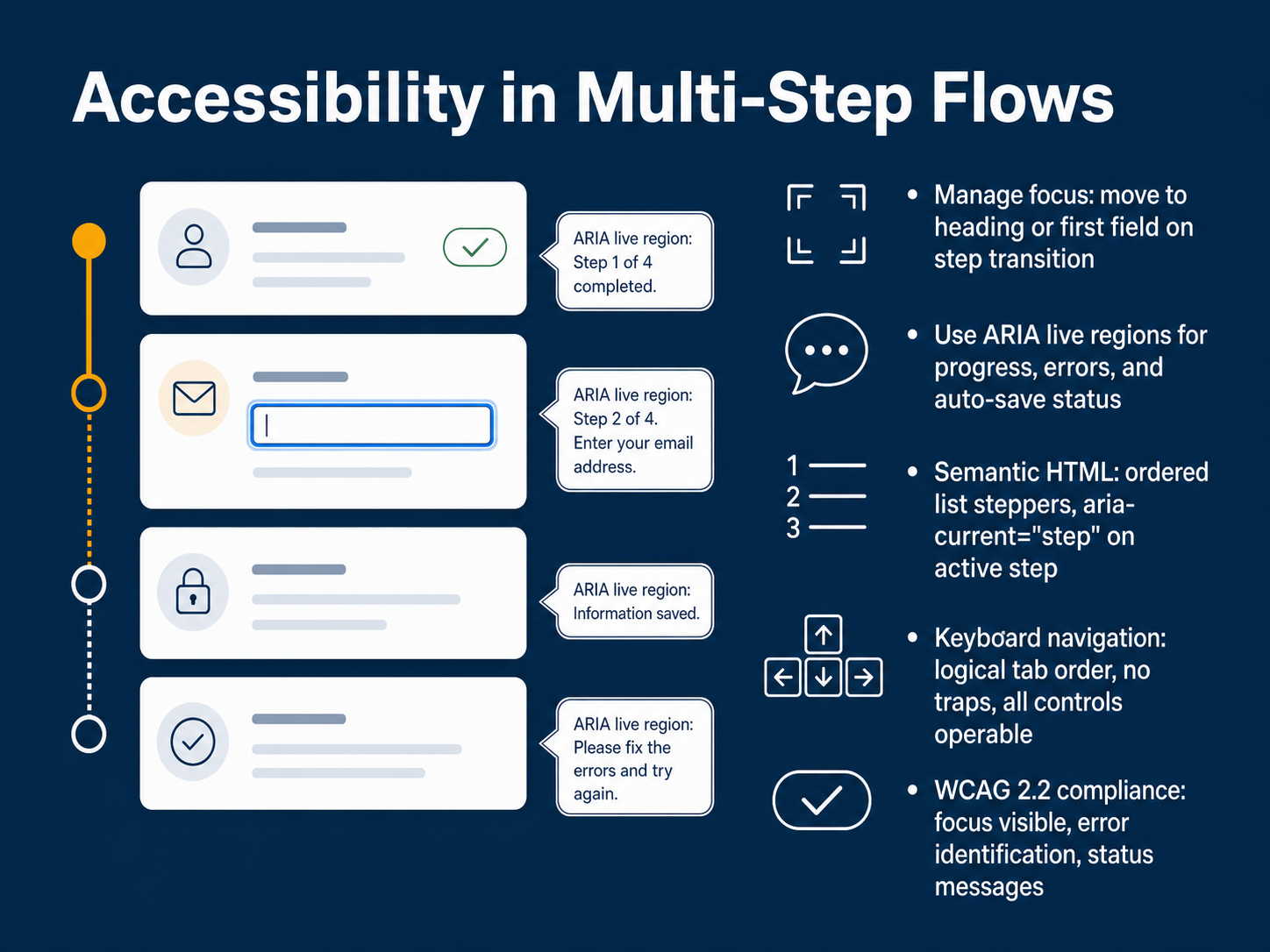
 - 11Accessibility in Multi-Step FlowsNow, let's turn to accessibility in multi-step flows. When we shift focus between steps, we need to move it deliberately. For example, send focus to the new step's heading or its first form field so assistive technology users know exactly where they are. Use ARIA live regions to announce key changes, like progress updates, validation errors, or auto-save confirmations, without forcing the user to hunt for that information. Build your stepper with semantic HTML. An ordered list with aria-current set to 'step' on the active item gives screen readers a clear mental model of the sequence. Keyboard navigation must be seamless. Maintain a logical tab order, avoid focus traps, and make sure every control is operable without a mouse. These practices align with W C A G two point two requirements, including visible focus, clear error identification, and programmatic status messages. Next, we'll explore mobile-first design for multi-step experiences.
 1 min
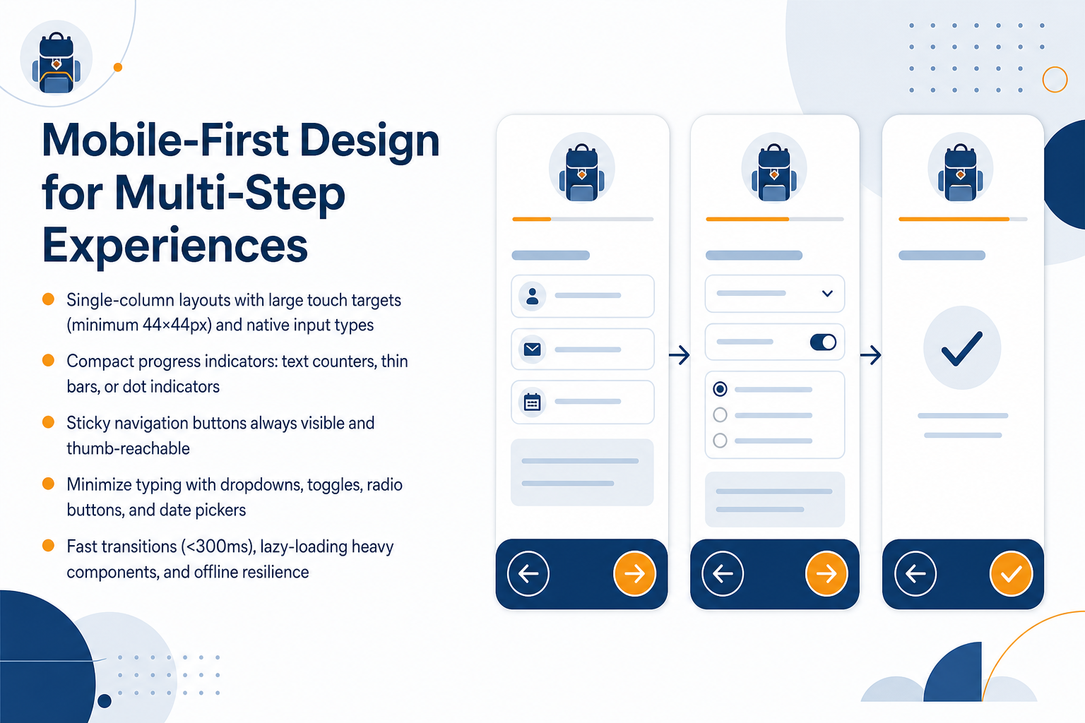
1 min - 12Mobile-First Design for Multi-Step ExperiencesNow let’s focus on mobile-first design for multi-step experiences. On small screens, space is tight, so adopt single-column layouts with large touch targets. Each tap area should be at least forty-four by forty-four pixels. Use native input types like date pickers, toggles, and dropdowns to minimize typing. For progress, choose compact indicators. A text counter that reads “Step 2 of 5” works well, or try a thin bar or simple dot row. Keep navigation buttons sticky and always visible, placed where a thumb can reach them easily. Performance matters too. Aim for fast transitions under three hundred milliseconds. Lazy-load heavy components and build in offline resilience so users can recover if the connection drops. Every delay adds friction, so keep the experience quick and predictable. Up next, we’ll cover testing and evaluating multi-step experiences.
 foundey.comuxpin.comeleken.co+21 min
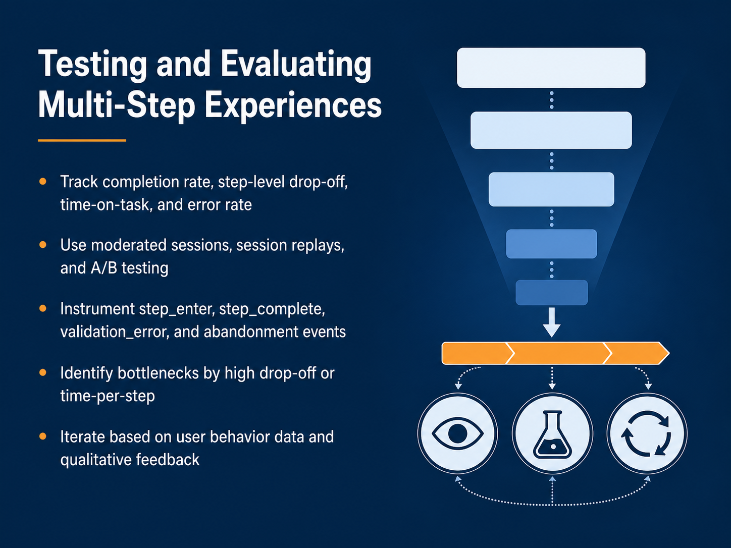
 - 13Testing and Evaluating Multi-Step ExperiencesNow, let's move into the practical side: testing and evaluating your multi-step experience. Design is only half the work. You need to measure what happens when real users interact with your flow. Start by tracking four core metrics: your overall completion rate, step-level drop-off, time-on-task, and error rate. Notice how each of these tells a different story. Completion rate shows whether users finish. Drop-off pinpoints exactly where they leave. Time-on-task reveals friction, and the error rate catches confusing validation rules. To gather this data, use a mix of methods. Run moderated usability sessions to hear users think aloud. Watch session replays to see real behavior silently. And deploy A/B tests to compare design changes directly. On the technical side, instrument specific events in your analytics. You need to fire events for step enter, step complete, validation error, and abandonment. These events build a funnel that shows you exactly where momentum breaks. Once data is flowing, look for bottlenecks. A step with unusually high drop-off or a long time-per-step is your biggest opportunity. Finally, iterate. Combine the quantitative behavior data with qualitative feedback from user comments. Prioritize changes that fix the most frequent and severe friction points. Next, we will examine common design patterns and anti-patterns to guide your revisions.
 2 min
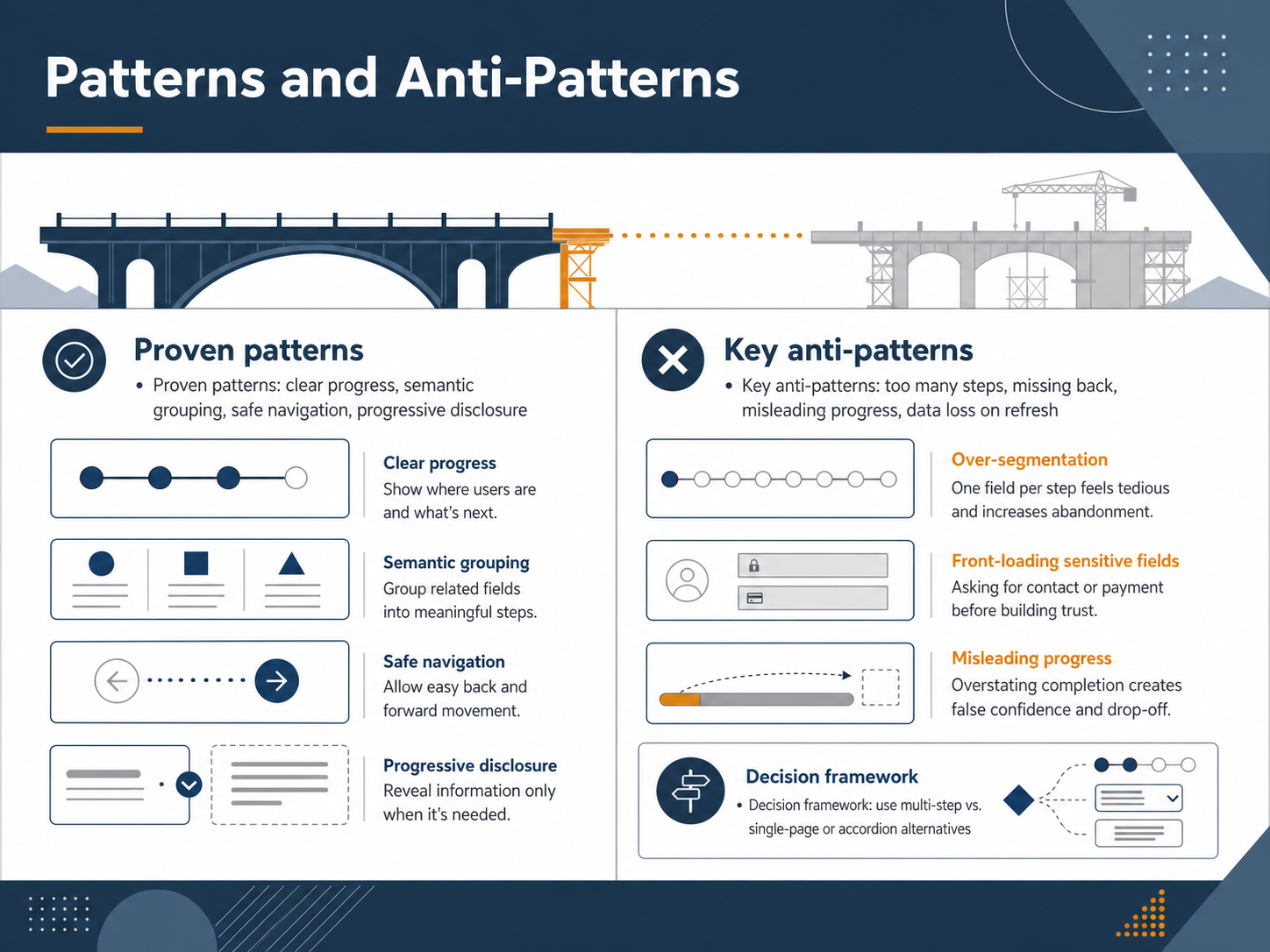
2 min - 14Patterns and Anti-PatternsLet's step back and look at the patterns that make or break a multi-step experience. On the proven side, four patterns stand out. First, clear progress. Users need to see where they are and what's left. Second, semantic grouping. Each step should feel like a single, focused task. Third, safe navigation. Notice how a reliable back button and a clear save option give users the confidence to move forward. And fourth, progressive disclosure. Reveal complexity only when it's needed. Now the anti-patterns. Avoid too many steps. More than six or seven steps often increases abandonment. Never hide the back button. A misleading progress indicator erodes trust. And losing data on refresh is a critical failure. Test your autosave. Two specific traps to watch for. Over-segmentation, where one field per step feels tedious and increases drop-off. And front-loading sensitive fields. Asking for payment or personal contact details before you've built trust triggers hesitation. Finally, remember the decision framework. Ask yourself: does this task truly need a multi-step flow, or would a single-page layout or accordion alternative work better? The right pattern depends on the complexity and the user's need for orientation. Coming up next, we'll look at implementation patterns and technical architecture.
 foundey.comuxpin.comeleken.co+22 min
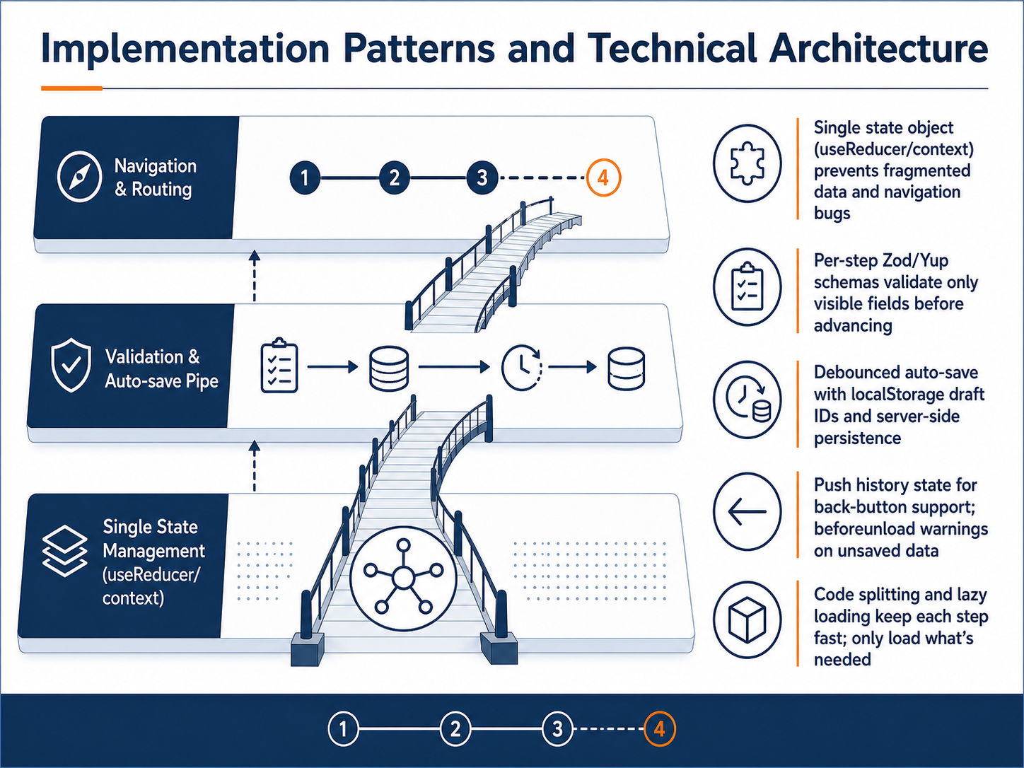
 - 15Implementation Patterns and Technical ArchitectureNow let's look at the technical architecture that makes safe navigation possible. Centralize all form data in a single state object, using useReducer or React context. A single source of truth prevents the fragmented data and navigation bugs that break multi-step experiences. Validate each step independently with libraries like Zod or Yup, checking only the visible fields before the user advances. This keeps feedback focused and immediate. For data preservation, implement debounced auto-save. Store progress in localStorage with a draft ID, and sync it to the server for higher-value forms. Support the browser back button by pushing history state on each step, and trigger a beforeunload warning if there is unsaved data. Finally, use code splitting and lazy loading. Load only the components needed for the current step, keeping the initial render fast and the experience responsive. These patterns work together to create a form that feels fast, safe, and trustworthy. Next, we will explore 'Designing for Trust and Completion Confidence'.
 137foundry.comstaticforms.devviprasol.com+22 min
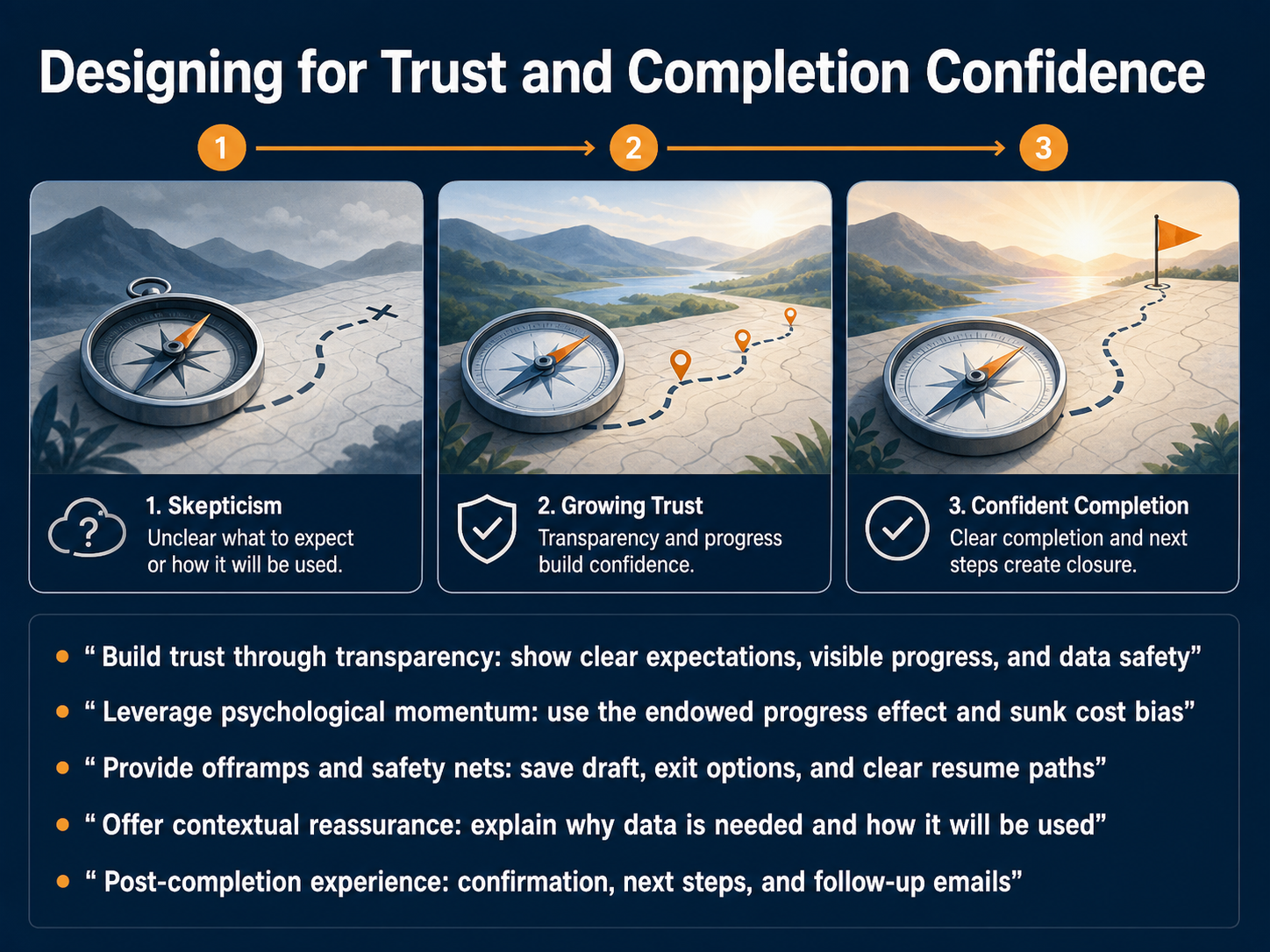
 - 16Designing for Trust and Completion ConfidenceMoving forward, let’s focus on designing for trust and completion confidence. When users enter a multi-step flow, they are constantly deciding whether to continue. Your job is to make that decision feel safe and rewarding. First, build trust through transparency. Show clear expectations, visible progress, and reassure users that their data is protected. When people see a step indicator that says Step two of four, instead of a vague percentage, their brain interprets it as an achievement rather than a math problem. Next, leverage psychological momentum. Notice how the endowed progress effect works. If you give users a small head start, like pre-filling known information, they feel invested and are far more likely to finish. Provide offramps and safety nets. Always offer a save draft button, clear exit options, and a visible resume path. This tells the user the system is working with them, not against them. Offer contextual reassurance. Never ask for a phone number or payment details without explaining exactly why you need it and how it will be used. Finally, design the post-completion experience. A confirmation screen, clear next steps, and a follow-up email turn a finished task into a lasting sense of confidence. You’ve now seen how trust and transparency keep users moving. In our next slide, we will put these principles into practice during a workshop on diagnosing and redesigning a multi-step flow.
 wearetenet.comnngroup.comacceleroi.com+22 min
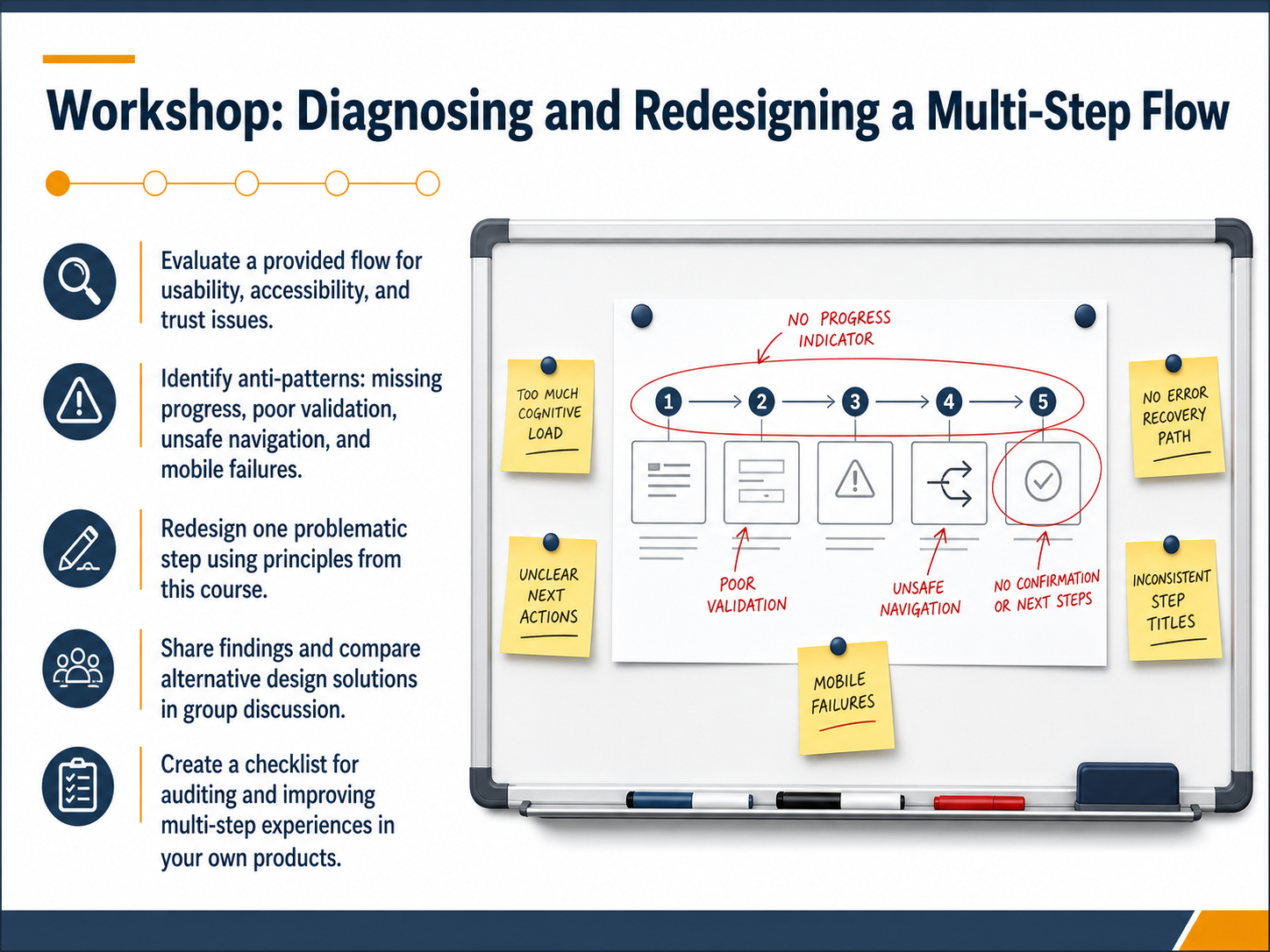
 - 17Workshop: Diagnosing and Redesigning a Multi-Step FlowWelcome to our final workshop. In this session, you will put the entire course into practice. First, evaluate a provided flow for usability, accessibility, and trust issues. Look for anti-patterns such as missing progress indicators, poor validation, unsafe navigation, and mobile failures. Next, select one problematic step and redesign it using the principles you have learned. Then, share your findings and compare alternative solutions in a group discussion. Finally, create a practical checklist for auditing and improving multi-step experiences in your own products. Thank you for your focus throughout this course. Now, go apply these skills and build flows that guide users with clarity and confidence.
 1 min
1 min
Take the deck with you
Download this course as a file — free, no sign-up needed.
- PDF handoutEvery slide page, ready to print or share.18 pages · 4.4 MBDownload
- Narrated PowerPointThe deck that presents itself — every slide carries the digital human's narration video.18 pages · 18.6 MBDownload
- PowerPoint slidesThe full deck as a .pptx — open it in PowerPoint, Keynote, or Google Slides.18 pages · 4.3 MBDownload
Free to use in your own training — please keep the PersonWise credit page at the end.
Have your own deck? Turn it into a course
Sources consulted
Web sources consulted while building this course.
- Stepper UI: 12 Patterns From SaaS Products That Get It Right | Foundey — foundey.com
- Progress Tracker Design: UX Best Practices, Examples & Tips (2026) — uxpin.com
- 32 Stepper UI Examples and What Makes Them Work — eleken.co
- Stepper UI: Designing Clear Multi-Step Journeys — edana.ch
- Beyond the Progress Bar: The Art of Stepper UI Design — lollypop.design
- How We Approach UX for Multi-Step Workflows Like Checkout — wearetenet.com
- 4 Principles to Reduce Cognitive Load in Forms — nngroup.com
- Chunking in UX Design | acceleroi — acceleroi.com
- Forms as Friction Surfaces: Quantifying Field-Level Drop-Off | Product Philosophy — productphilosophy.com
- Miller's Rule: Chunking Long Forms · The Frontend Casebook — anmshpndy.com
- Multi-Step Form Best Practices That Lift Conversion (2026) | Promptly Forms Blog — promptlyforms.com
- Multi-Step Form Design in 2026: Best Practices, Examples ... — weweb.io
- OrbitForms — orbitforms.ai
- Multi Step Forms: A Guide to Design, UX, and Implementation | Static Forms — staticforms.dev
- Designing Multi-Step Flows and Wizards: A Comprehensive UX Framework for Complex Form Wizards, Setup Flows, and Multi-Page Decision Processes - Timothy Graf | UX/UI Design Theory & 2026 Strategies — timgraf.com
- How to Build a Multi-Step Form Flow That Saves Progress | 137Foundry — 137foundry.com
- React Multi-Step Form Stepper: Per-Step Validation | Viprasol — viprasol.com
- Autosave form UX Pattern | UX Patterns Guide — uxpatternsguide.com
- System Design #12: Design a Multi-Step Form Wizard | DevPrep — devprep.co
- How to Design Multi-Step Forms that Enhance the User ... — designlab.com