UX Design Process
Begin
14 pages · ~28 min
UX Design Process
A training for aspiring UX designers covering the full design process, from research to prototyping and user testing.
What you’ll learn
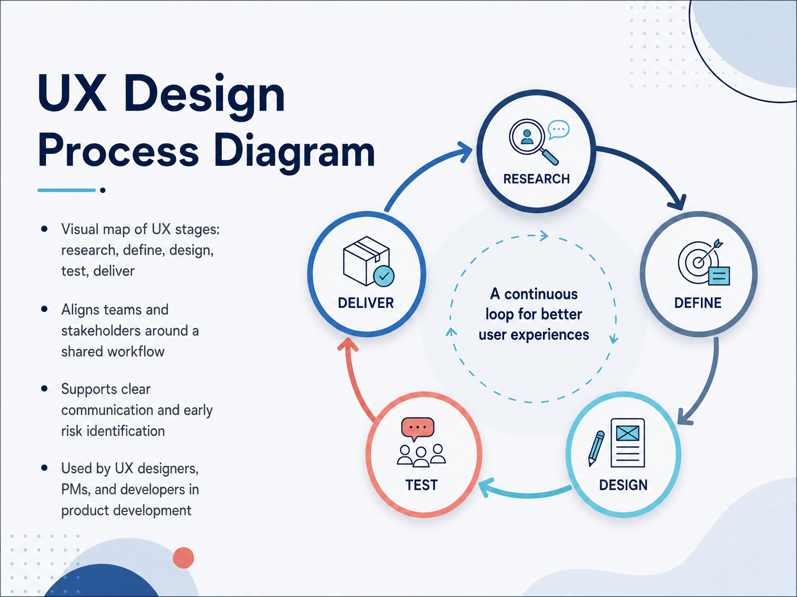
- 01UX Design Process DiagramWelcome. Let's talk about the UX design process. In this session, we'll break it down into a clear, practical map. You'll see the stages we use to move from a raw idea to a finished product: research, define, design, test, and deliver. This is not a rigid checklist. It's a shared workflow that keeps everyone aligned. Designers, product managers, and developers all benefit from seeing the same picture. When we agree on the steps upfront, communication stays clear and we spot risks early. Think of it as our common language for building better products. We'll explore each stage in detail, starting with the core concepts you need to know.ixdf.orgdesignlab.comuxpin.com+21 min
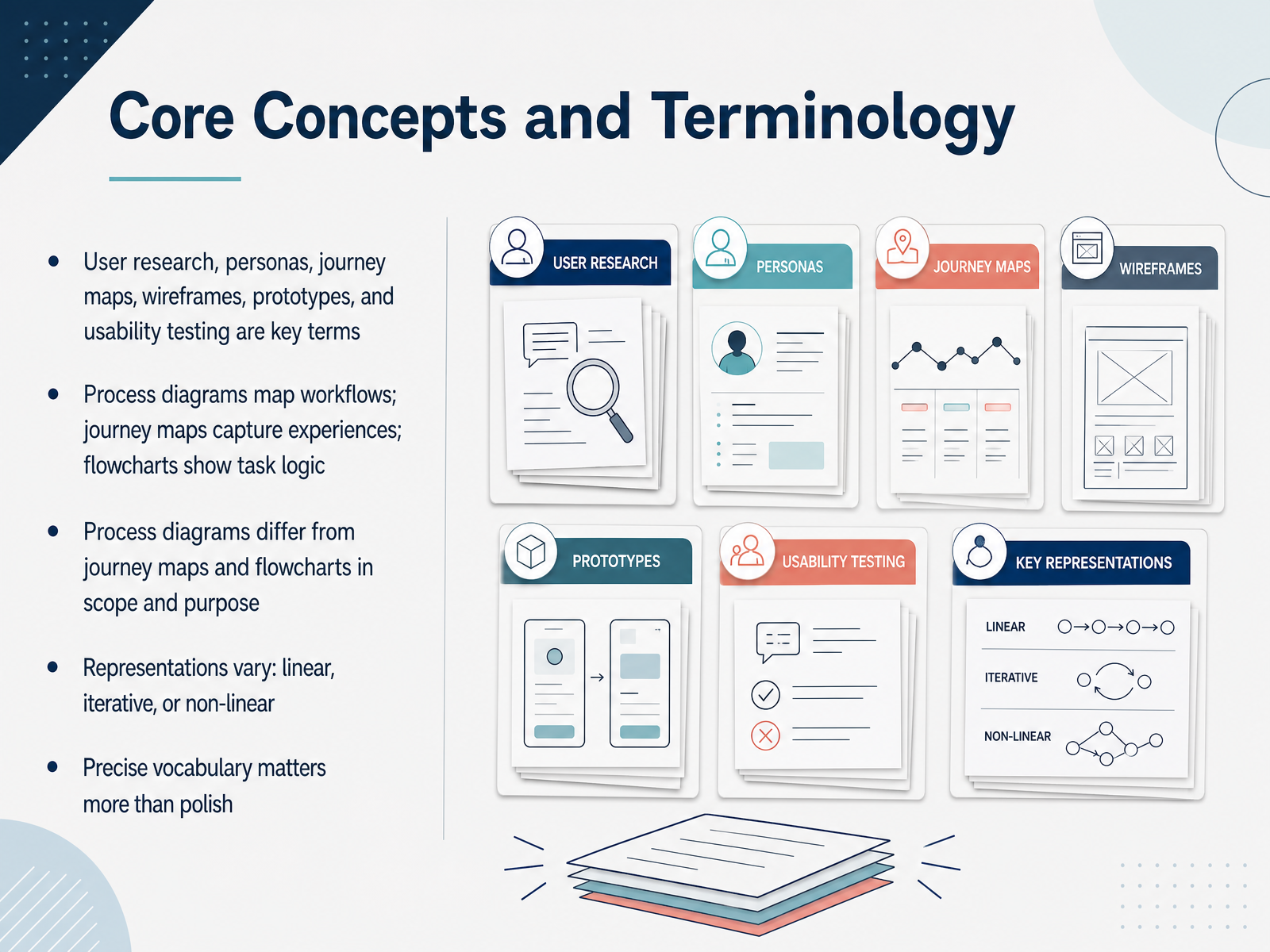
- 02Core Concepts and TerminologyBefore we go further, let's agree on the language we'll use. Terms like user research, personas, journey maps, wireframes, prototypes, and usability tests show up constantly in this field. We'll define each one as we encounter it. What matters right now is understanding the diagrams that hold them together. A process diagram maps the workflow of a product or feature. A journey map captures the user's experience over time, including their emotions and thoughts. A flowchart shows the logic of a specific task, like what happens when a user clicks a button. The key difference is scope. Journey maps zoom out to the big picture across channels. Flowcharts zoom in on detailed, step-by-step interactions inside a single product. These representations vary too. Some are linear, some are iterative, and some are non-linear. Choose the one that fits the question you're answering. In UX, precise vocabulary matters more than polish. Use the right term, and your team shares a clear mental model. Use the wrong one, and you create confusion. Now let's talk about why process diagrams matter.
 nngroup.comnngroup.commiro.com+22 min
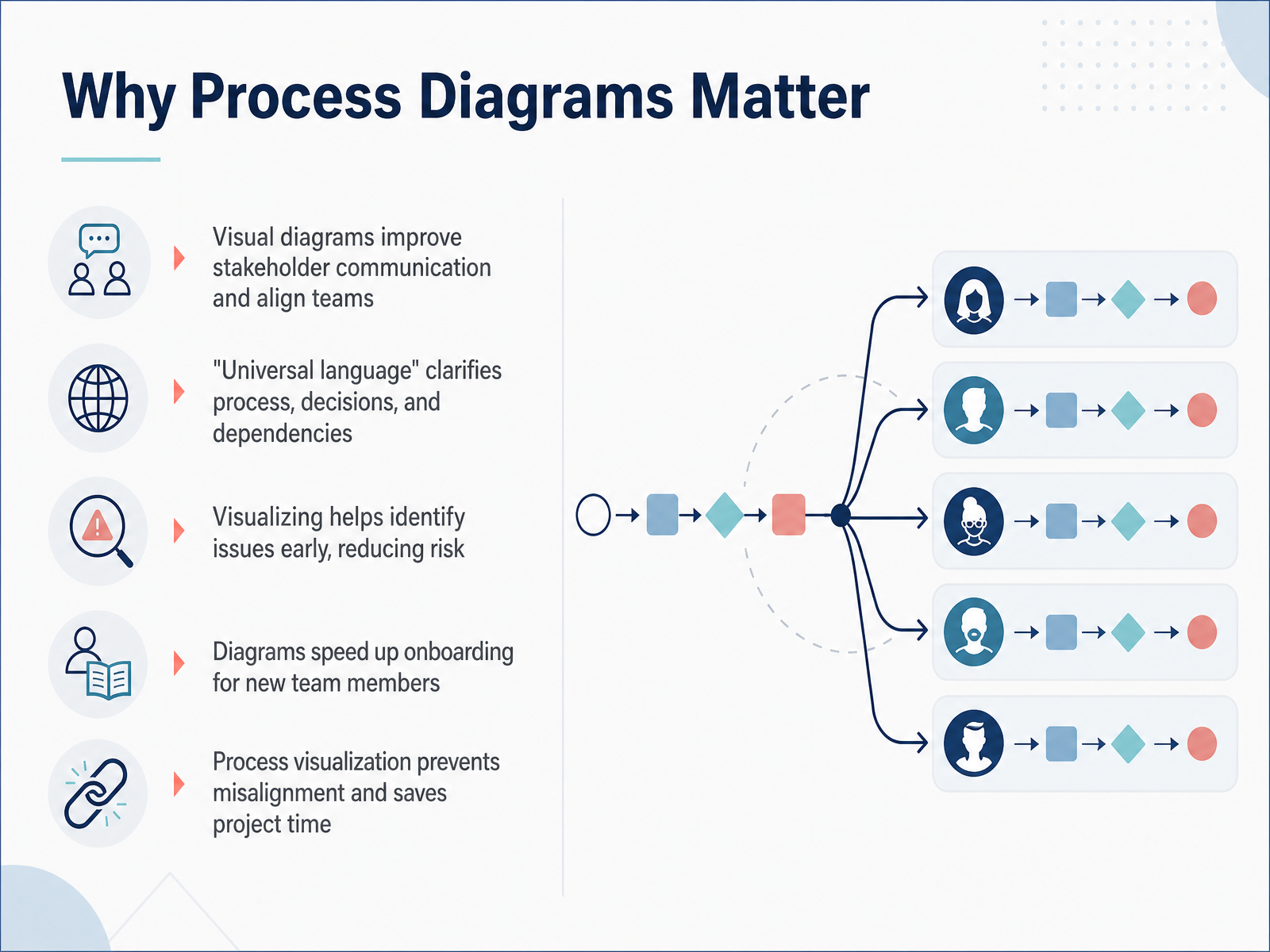
 - 03Why Process Diagrams MatterSo why do we bother drawing all this out? Because diagrams are a universal language. They give everyone on the team - designers, developers, executives - a shared picture of the journey, the decisions, and the dependencies. When something is laid out visually, issues get spotted early, before they become expensive surprises. It also gets new team members up to speed quickly. Instead of reading long documents, they look at the map and understand the flow. Simple. Visual. That alignment is what saves a project time and prevents misalignment from day one. Let’s look at some common models and frameworks you can use.
 satchel.worksmockflow.comuxplanet.org+21 min
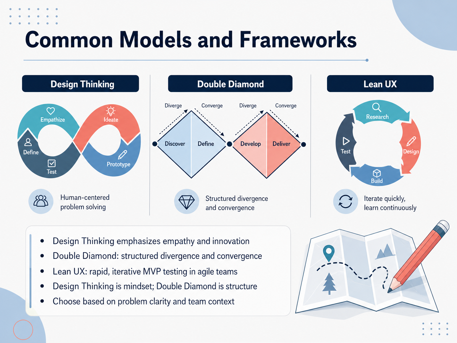
 - 04Common Models and FrameworksSo, which process do you actually use? That's where common frameworks come in. There are three you'll see most often. First, Design Thinking. It's the mindset, built on empathy and innovation. It pushes you to understand the user deeply before solving anything. Then there's the Double Diamond. This is the structure. It gives you a visual map, with four phases—Discover, Define, Develop, Deliver. The value here is the rhythm: diverge to explore broadly, then converge to focus. Finally, Lean UX. This is for speed. In agile teams, you build a minimal viable product, or MVP, test it fast, and iterate based on real feedback. So, which one do you pick? Think of it this way: Design Thinking is your mindset, and the Double Diamond is your structure. Lean UX is your speed. Your choice depends on problem clarity and team context. If the problem is vague, start with Design Thinking. If you need clear milestones, use the Double Diamond. If you need rapid validation, go with Lean UX. Now, let's look at how these stages come together in a typical workflow.
 medium.comjasonhopkins.ukdoi.org+21 min
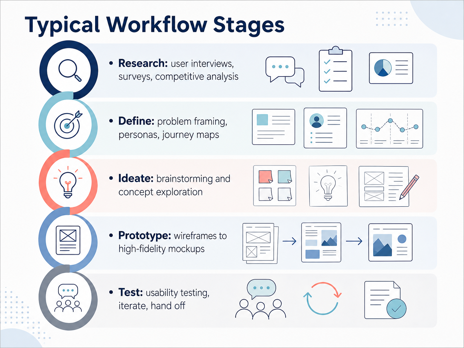
 - 05Typical Workflow StagesLet’s walk through the typical workflow stages. You’ll see these appear in most process diagrams, though teams often rename or reorder them. Start with Research. This is where you conduct user interviews, send out surveys, and run a competitive analysis. Your goal is simple: learn who your users are and what they actually need. Next is Define. Here, you frame the real problem and turn your findings into tools like personas and journey maps. A persona is a fictional profile that represents a user type. It keeps the team focused on real needs, not assumptions. Then comes Ideate. This is the brainstorming phase. The team explores concepts freely, generating as many ideas as possible before narrowing down. Quantity matters more than quality at this point. After that, you move to Prototype. You start with low-fidelity wireframes, which are basic layout sketches, and then build up to high-fidelity mockups that look and feel like the final product. Finally, you Test. You run usability tests, observing real users as they try the prototype. You note where they struggle, iterate on the design, and then prepare for handoff to developers. One key takeaway: this process is iterative. You will loop back and forth between stages. That is normal and healthy. Next, let’s look at how to read a UX process diagram.
 ixdf.orgdesignlab.comuxpin.com+22 min
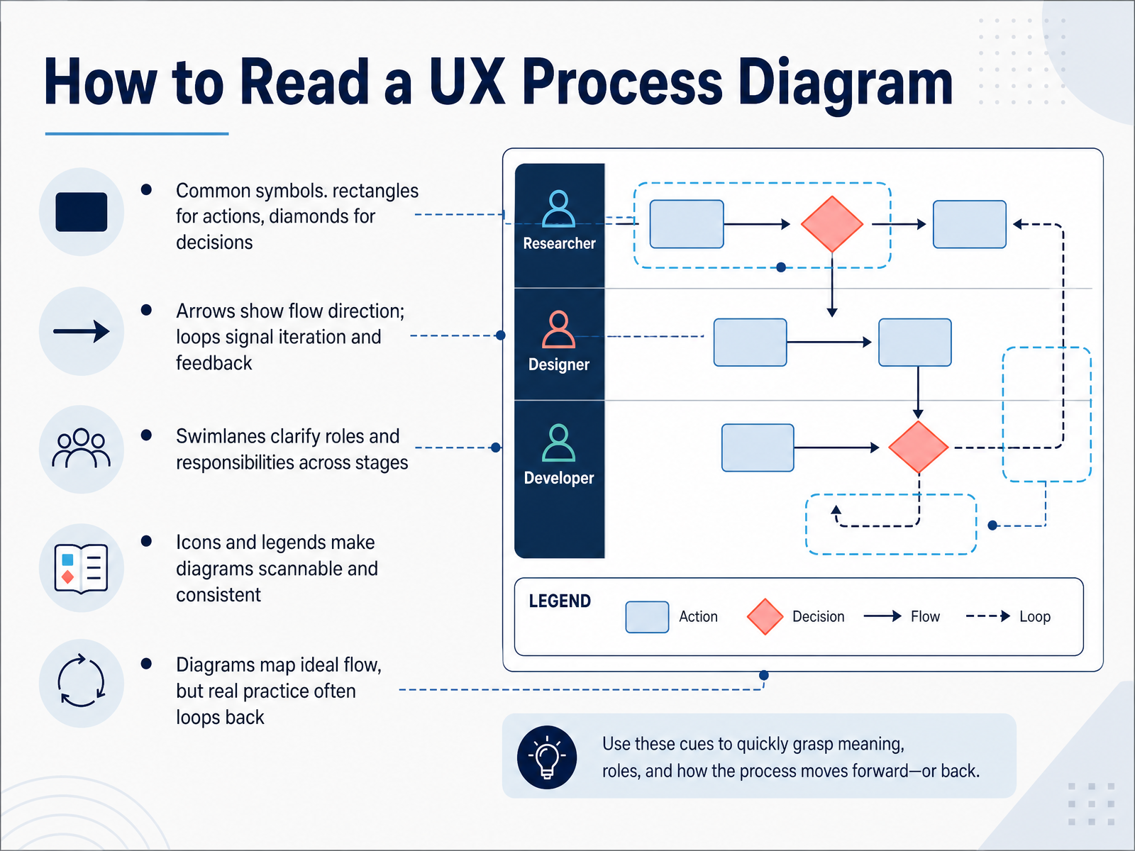
 - 06How to Read a UX Process DiagramNow let's look at how to actually read one of these diagrams. It is simpler than it looks. Rectangles are actions. Those are things the user does, like entering an email or tapping a button. Diamonds are decision points. They ask a yes or no question and branch the path. Arrows show the direction of the flow. When an arrow loops back, that is the system telling you this step repeats until the user gets it right. Swimlanes are the horizontal bands that show who owns each step, useful when multiple teams are involved. Icons and a legend keep everything consistent so the whole team reads the same language. One thing to remember: these diagrams show the ideal path, but real users loop back. They make mistakes, they hesitate, they change their minds. So treat the diagram as a map, not a railway track. Keep it visible during design reviews and usability tests. That is how it earns its place. Next, let's walk through how to build one of these diagrams yourself.
 nngroup.comnngroup.commiro.com+22 min
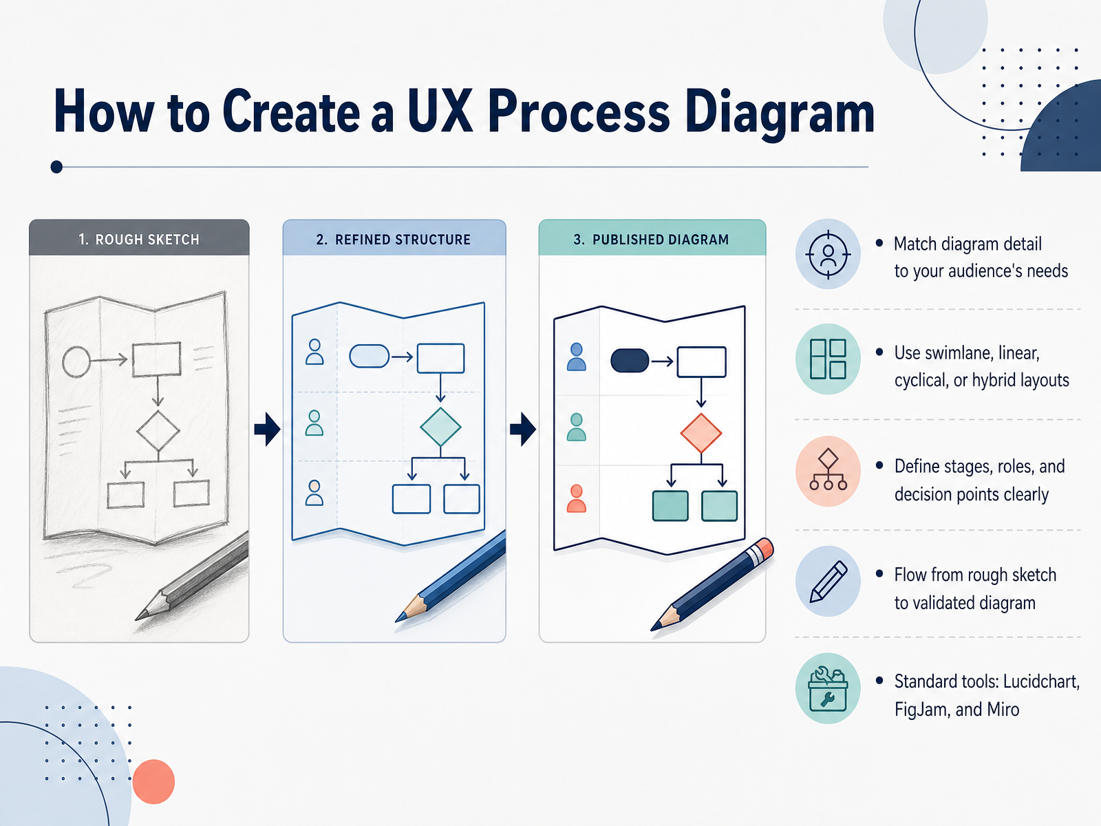
 - 07How to Create a UX Process DiagramNow let's talk about how to actually build the diagram. Don't overthink it. Start by matching the level of detail to your audience. Executives want a high-level view. Engineers need the edge cases and error states. Then choose a layout that fits how you work. Swimlanes are great for showing roles and handoffs. A linear flow works for a simple happy path. And a cycle is perfect for iterative loops like research, design, test, repeat. However you arrange it, be explicit about the stages, the roles, and the decision points. Don't make people guess who does what or where a branch goes. A good approach is to start rough. Sketch it on paper or a whiteboard first to align with your team. Then move to a tool like Lucidchart, FigJam, or Miro to make it shareable. Above all, remember the diagram is a hypothesis, not a contract. Validate it with your team, refine it, and keep it current. Next, let's look at the best practices for clarity and consistency.
 uxpin.com1 min
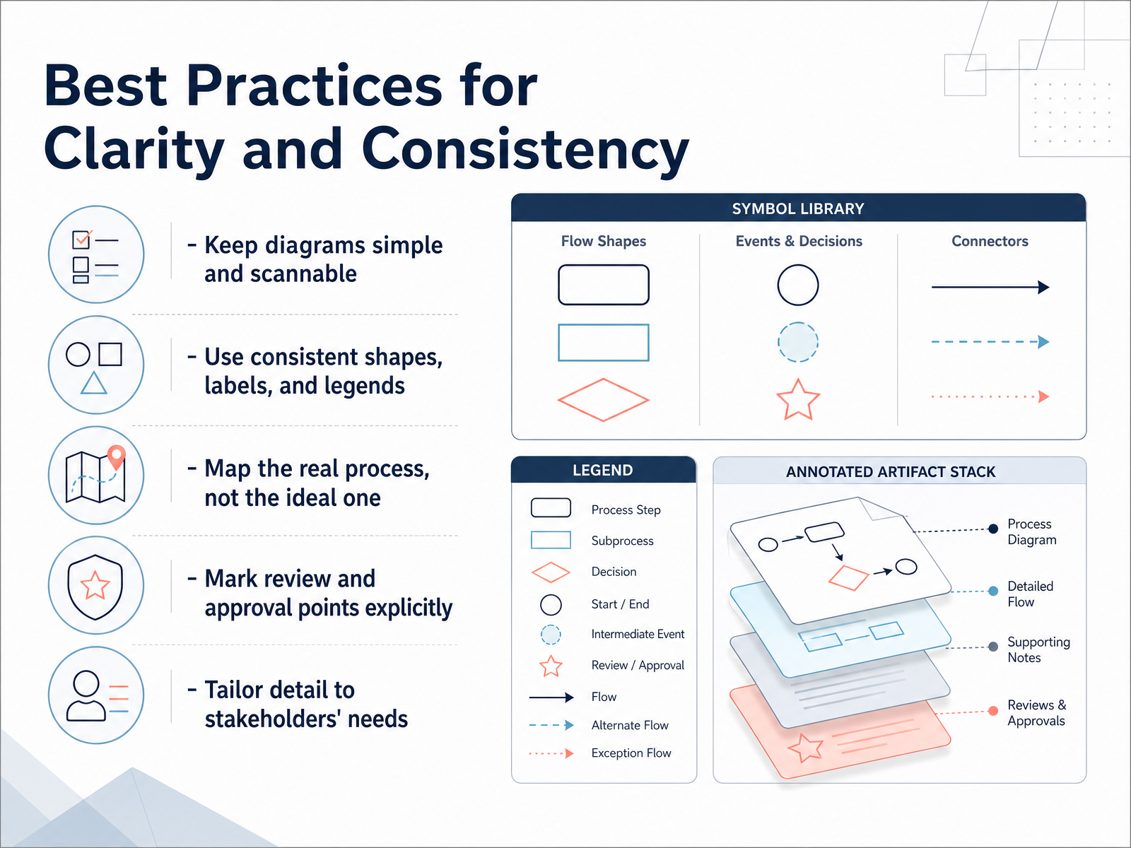
 - 08Best Practices for Clarity and ConsistencyWhen you map your UX process, clarity beats complexity. Keep the diagram simple and scannable. If a stakeholder needs a five-minute explanation to understand it, it's too dense. Use consistent shapes, labels, and legends. A rectangle should always mean the same thing across the entire diagram. Define your symbols once, add a legend, and stick to it. Now, here's a key point: map the real process, not the ideal one. Base your diagram on what actually happened in your last two projects, not on your best-case scenario. You can mark where you skipped steps or where you hope to improve. Also, make review and approval points explicit. Teams often map the design activities perfectly but leave out the approvals that take most of the calendar time. Mark each one clearly with its owner and expected sign-off. Finally, tailor the level of detail to your stakeholders. A product manager might need the high-level flow. Developers might need every error state and edge case. Keep one core diagram simple, and link out to the deeper details. The best process diagram is the one people actually use. If a new team member can follow it without being lost, you've done your job. Next, let's look at the common mistakes that undermine these diagrams and how to avoid them.
 uxpin.com1 min
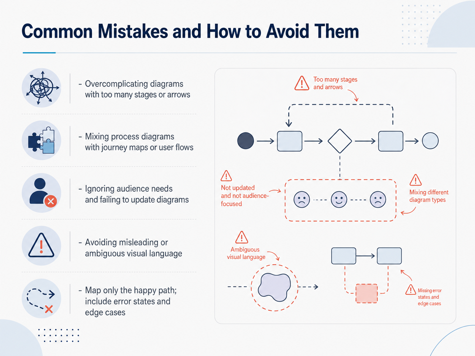
 - 09Common Mistakes and How to Avoid ThemNow let’s talk about common mistakes and how to avoid them. The first one? Overcomplicating your diagram. Too many stages or arrows can make it unreadable. If your diagram has more than two or three levels of branching, split it into separate, focused diagrams. The goal is clarity, not complexity. Another mistake is mixing process diagrams with journey maps or user flows. These are different tools. A process diagram shows your workflow. A journey map shows the user’s experience over time. Keep them distinct. Next, ignoring your audience. Ask yourself, who will read this diagram? Update it as the project evolves. A static diagram becomes misleading fast. Also, avoid ambiguous visual language. If a diamond means a decision in one place, don’t let it mean a screen somewhere else. Consistency matters more than the exact shapes you use. And finally, don’t map only the happy path. The happy path is the easy part. Real users hit errors. Include error states and edge cases, like a failed payment or a session timeout. If you don’t, developers will guess, and those guesses will be inconsistent. Keep your diagrams simple, accurate, and honest. Next, let’s look at practical strategies your team can bring into the process.
 uxpin.com2 min
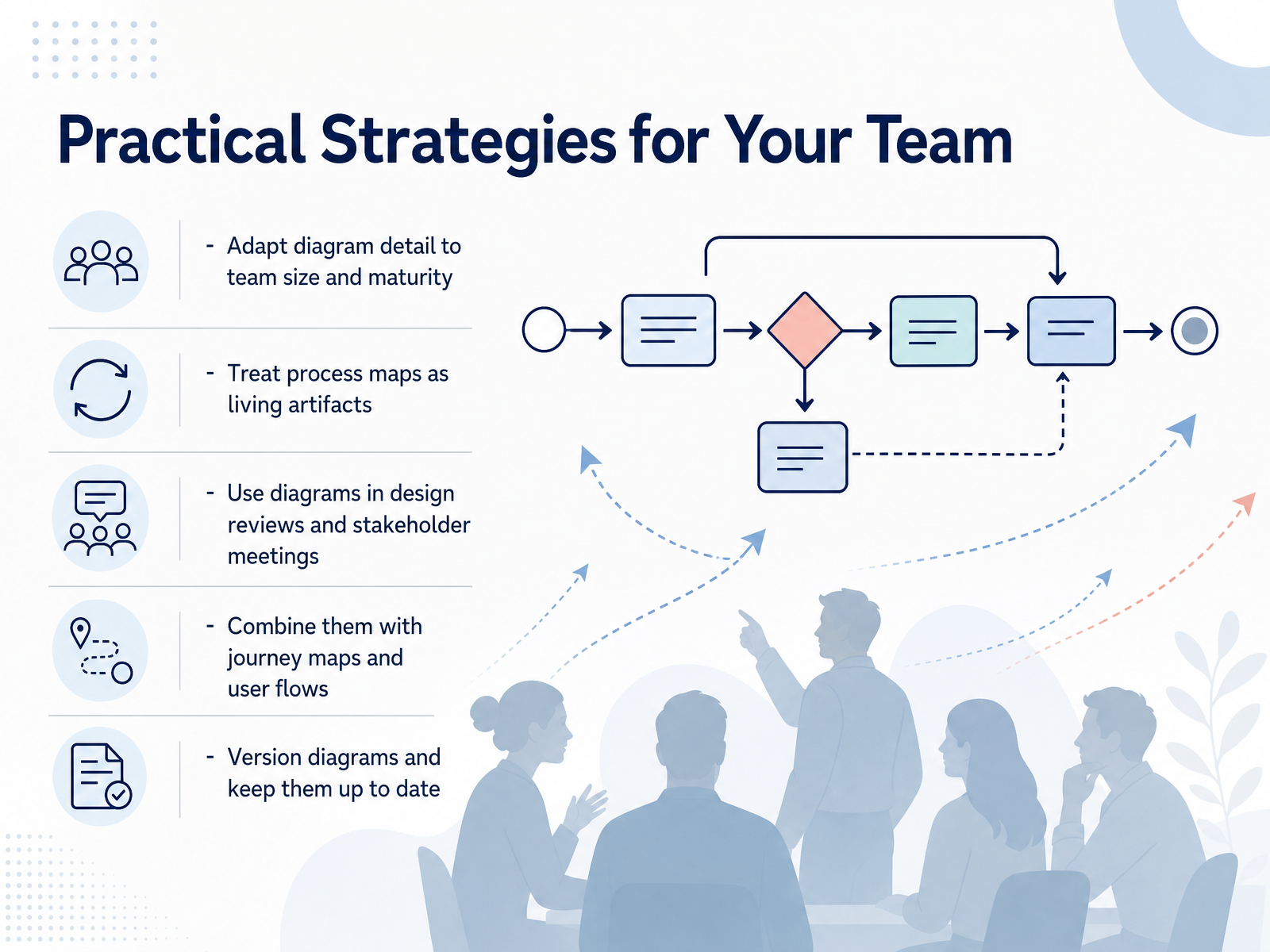
 - 10Practical Strategies for Your TeamSo how do we make these diagrams work in the real world, with real teams? First, adapt the level of detail to your team's size and maturity. A small startup needs a lighter process than a large enterprise. Match the effort to the risk. Second, treat your process map as a living artifact. It is not static. Update it as your team learns and grows. Third, use the diagram in your design reviews and stakeholder meetings. It gives everyone a shared vocabulary and a clear picture of where we are and what comes next. Fourth, combine the process diagram with journey maps and user flows. Together, they connect the big picture to the specific user path. Fifth, and this is important, version your diagrams and keep them up to date. Misalignment often starts with outdated documentation. A simple version number prevents a lot of confusion. Keep the diagram honest, and your team will actually use it. Next, let's look at a real-world example in a case study.
 uxpin.com1 min
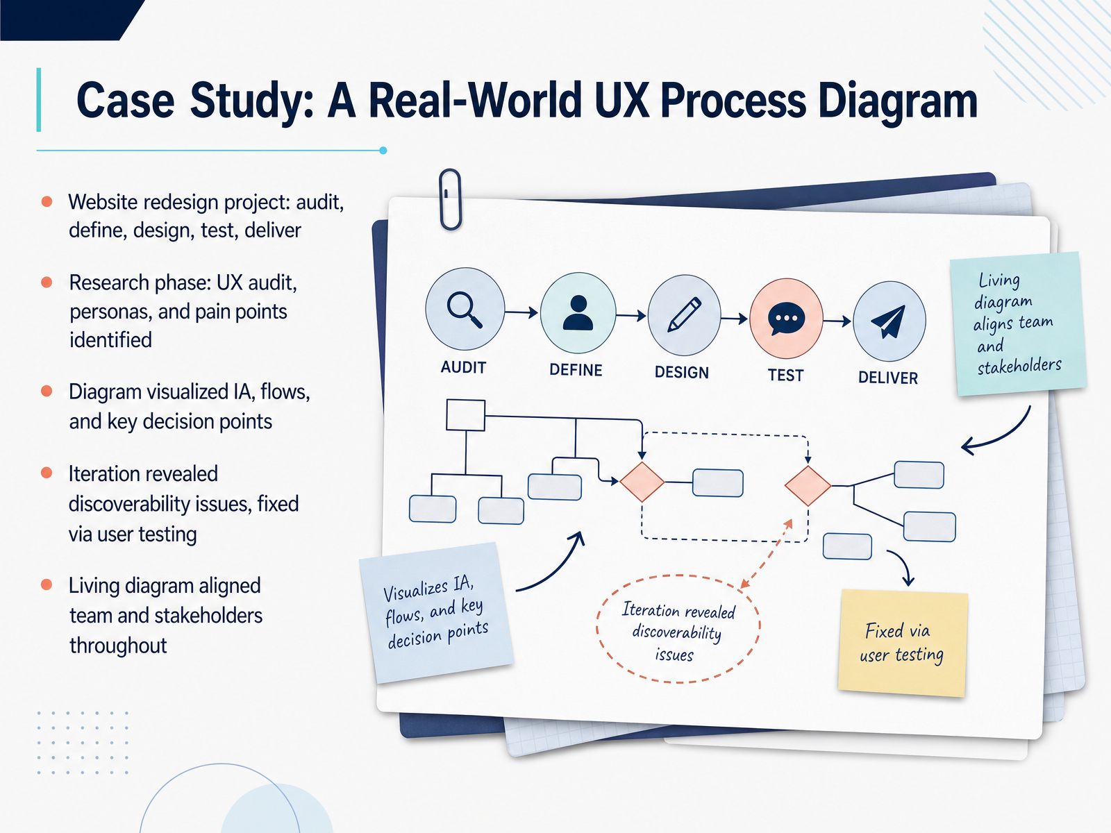
 - 11Case Study: A Real-World UX Process DiagramLet's make the process tangible with a real example: a website redesign project. We started with an audit to find pain points, then defined user personas and mapped out a new structure. The diagram we created visualized the information architecture, key flows, and critical decision points for the whole team to see. That visual became our shared roadmap. When we ran user testing, it exposed discoverability issues we missed on paper—people couldn't find key features. So we iterated and fixed them. The diagram wasn't static; it lived and evolved with the project, keeping stakeholders aligned from start to finish. The takeaway is that a process diagram is not just a deliverable. It's a communication tool that keeps everyone grounded in the user's journey. Now, let's look at how these diagrams fit into your broader UX documentation.
 1 min
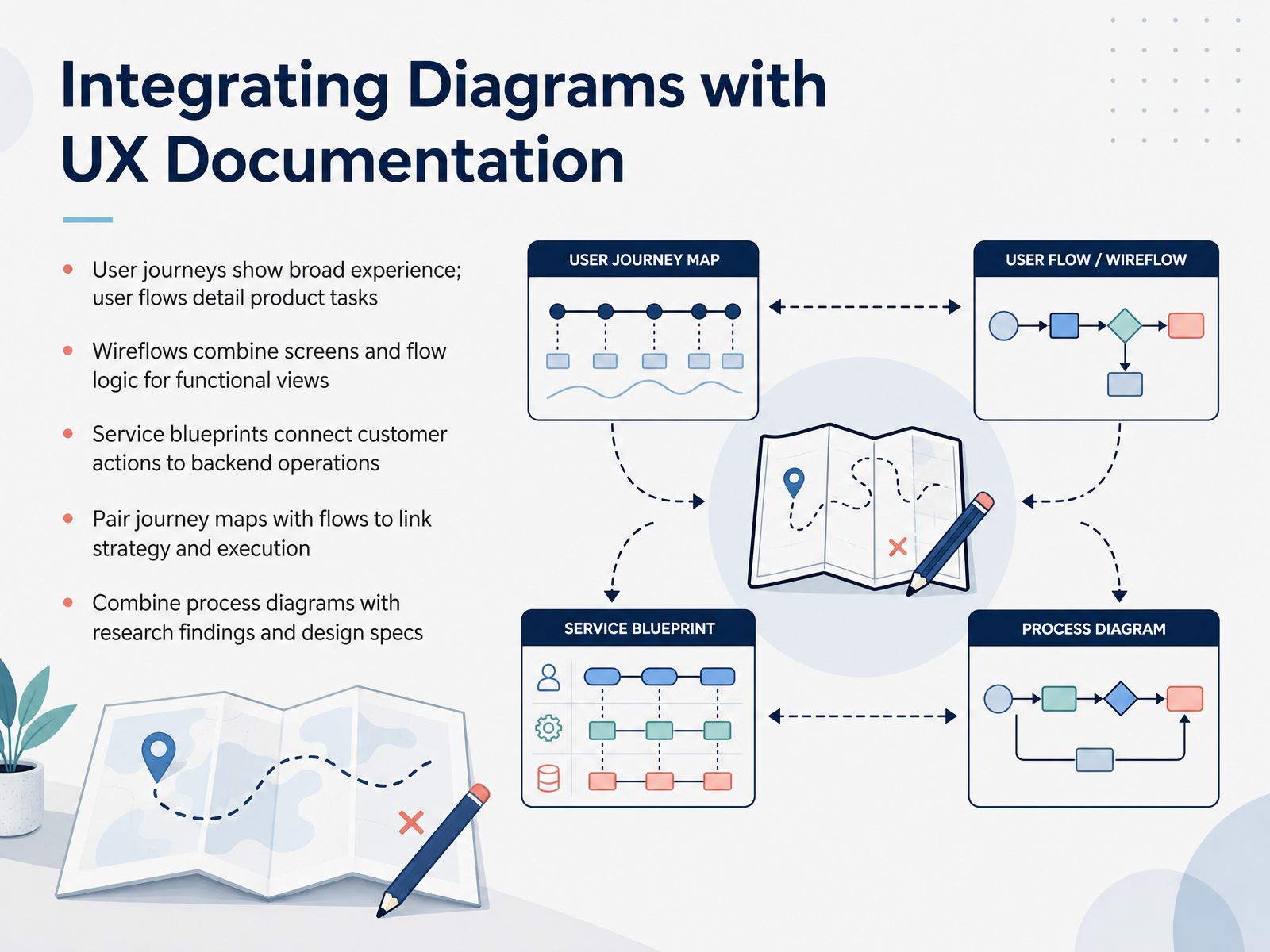
1 min - 12Integrating Diagrams with UX DocumentationLet’s talk about how these diagrams fit into your wider UX documentation. User journeys give you the broad experience across channels and time. User flows, on the other hand, zoom in on the specific steps within a product. Pair them together, and you connect strategy with execution. A wireflow is your practical middle ground. It combines screen layouts with flow logic, so you can see both the interface and the path through it. For service design, use a service blueprint. It links customer actions to the backend operations that support them. That gives you a fuller picture of how your product delivers value. Finally, keep your diagrams attached to your research findings and design specs. This turns a static map into a living reference your team can act on. The takeaway is simple: don't choose between a journey and a flow. Use them together to move from insight to implementation. Now, let's move on to building your first diagram.
 nngroup.comnngroup.commiro.com+21 min
 - 13Building Your First DiagramNow let's put this into practice. To build your first diagram, start with a clear goal and identify who the user is. One goal, one entry point, one persona. Scope tightly. Next, map the happy path first. That is the simplest route from start to finish. Once that skeleton is down, add the decisions and edge cases. Think about what happens when a payment fails or a session times out. Sketch it roughly at first. Refine it with team feedback, then polish it. And keep it simple. Use ovals for the start and end, rectangles for steps, and diamonds for decision points. A clean, simple diagram that the team understands beats a complex one that nobody reads. We'll capture the key takeaways next.
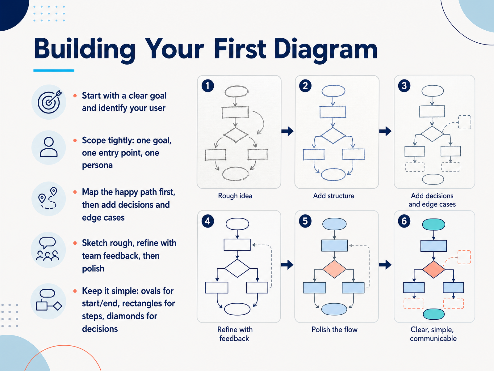 uxpin.com1 min
 - 14Key Takeaways and Next StepsAnd that brings us to the end of our journey through the UX design process diagram. Let's pull the key takeaways together. A good diagram aligns the team, and it reduces design risk. That is its core value. Remember, the stages we reuse are research, define, design, and test. Those four form the backbone of almost any project you will work on. Here is the practical advice for your own work. Start simple. Do not try to draw the perfect process. Map the real process first, the one you actually follow, and then iterate on it using feedback from stakeholders and users. Above all, avoid overcomplicating the diagram. Keep it clear, keep it readable, and keep it current as the product evolves. A stale diagram is worse than none at all. So here is your next step. Take a current project and sketch a process diagram for it. Map out the stages, the decisions, and the loops. Then share it with your team and see what you learn. Thank you for taking this course. Now go out, map your process, and design something great.
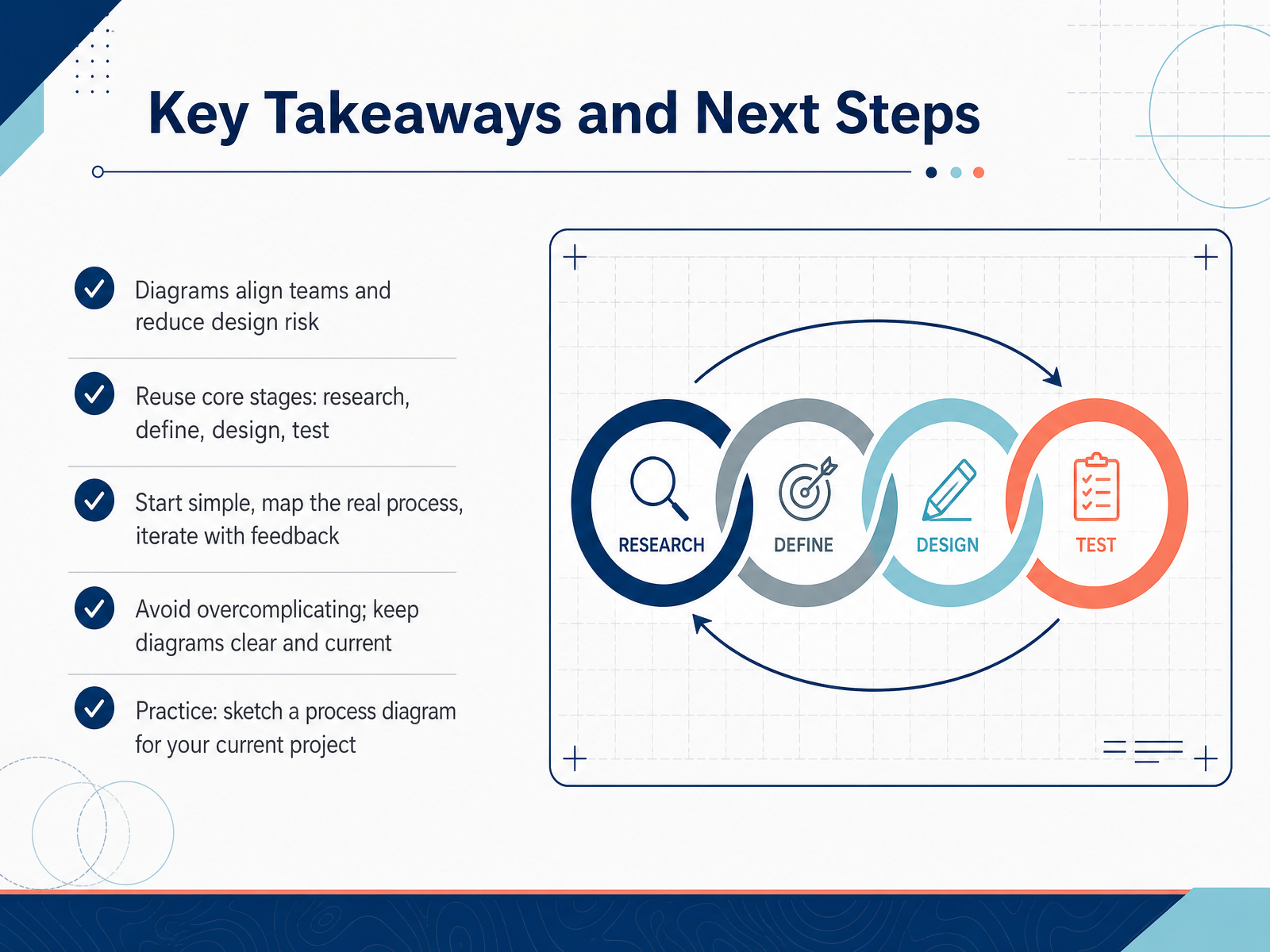 ixdf.orgdesignlab.comuxpin.com+22 min
Take the deck with you
Download this course as a file — free, no sign-up needed.
- PDF handoutEvery slide page, ready to print or share.15 pages · 3.0 MBDownload
- Narrated PowerPointThe deck that presents itself — every slide carries the digital human's narration video.15 pages · 13.4 MBDownload
- PowerPoint slidesThe full deck as a .pptx — open it in PowerPoint, Keynote, or Google Slides.15 pages · 2.9 MBDownload
Free to use in your own training — please keep the PersonWise credit page at the end.
Have your own deck? Turn it into a course
Sources consulted
Web sources consulted while building this course.
- What is the UX Design Process? 5 Steps to Success - IxDF — ixdf.org
- The UX Design Process: The Ultimate 8-Step Guide | Designlab — designlab.com
- UX Design Process – Actionable 8-Step Guide — uxpin.com
- The UX Design Process: Steps, Methods and How It Works in Practice | UX Academy London — myuxacademy.com
- 6 Key Stages of UX Design Process: A Beginner’s Guide — mockplus.com
- User Journeys vs. User Flows — nngroup.com
- UX Mapping Methods Compared: A Cheat Sheet - NN/G — nngroup.com
- User Journey vs User Flow: The Key Differences | Miro — miro.com
- The Difference Between User Flow, Task Flow, and Journey Map - Sense Central — sensecentral.com
- https://infinum.com/blog/ux-flowcharts/ — infinum.com
- The 7 benefits of building a UX Flow Chart before writing a line of code (free template included) — satchel.works
- User Flow and Its Role In User Experience (UX) Design — mockflow.com
- Bursting pipes. The strategic use of maps and diagrams… | by Christian Contemori | UX Planet — uxplanet.org
- Eliminating waste in UX workflows with lean process mapping · tsoon — tsoon.com
- The Benefits of Flowcharts for User Experience Design — ux4dotcom.blogspot.com
- Design Thinking vs. Lean UX vs. Double Diamond Design - Medium — medium.com
- Choosing the Right Design Process: A Guide for UX, Product and Service Designers. - Jason Hopkins Blog — jasonhopkins.uk
- User‐Centered Innovation Methods: Design Thinking, Double Diamond, Lean UX and Time to Concept — doi.org
- Design Thinking Process, Double Diamond Process, User-centered Design Process, and lean/Agile UX — medium.com
- 02. Design Process: Design Thinking & Double Diamond — courses.cs.taltech.ee