Begin
14 pages · ~28 min
Troubleshooting Common UX Design Problems
This training helps UX designers identify and resolve common design problems through practical troubleshooting techniques.
A digital instructor presents all 14 pages. Hold “Ask” at any point and ask out loud — the answer comes from this course. No sign-up needed.
What you’ll learn
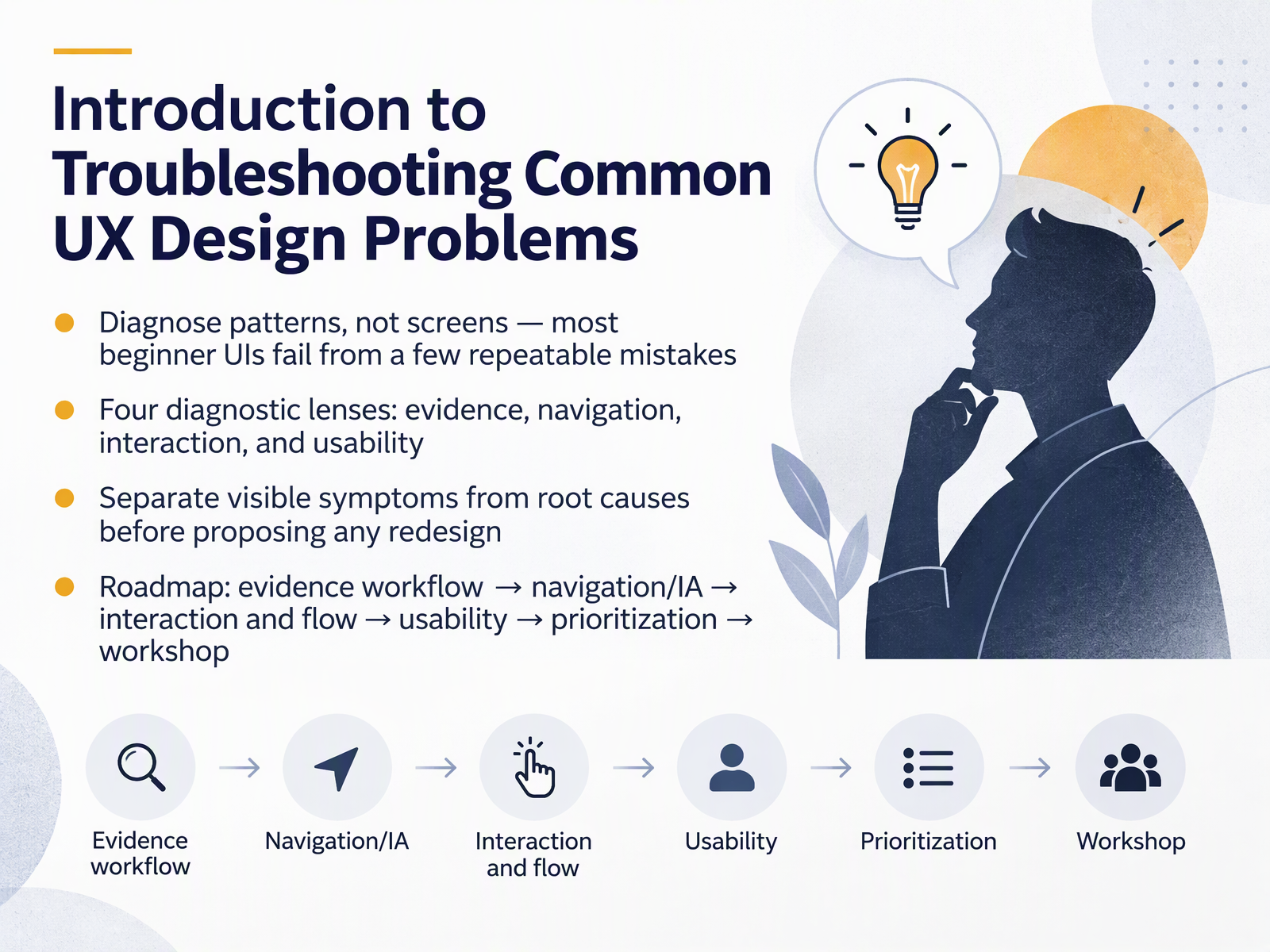
- 01Introduction to Troubleshooting Common UX Design ProblemsWelcome. This course is about troubleshooting common UX design problems. The goal is simple. When something in an interface feels off, you should be able to name the problem, find the likely cause, and choose a next check. Not guess, and not blame yourself. If you are a junior designer or part of a product team working with limited research time and lots of handoffs, this is built for you. Here is the core idea. Most beginner interfaces fail from a few repeatable mistakes, not unique ones. So we diagnose patterns, not individual screens. We will use four diagnostic lenses. Evidence, meaning what you actually know about users. Navigation, meaning information architecture and findability. Interaction, meaning flows, states, and feedback. And usability, meaning whether real tasks succeed. Across every lens, we separate visible symptoms from root causes before proposing any redesign. Your roadmap runs in a clear order. Evidence workflow, then navigation and information architecture, then interaction and flow, then usability, then prioritization, and finally a short workshop. Treat each problem as an evidence gap, not a personal failure. Next, we look at the troubleshooting mindset, and how to tell symptoms apart from root causes.mockflow.comcompanionlink.comuxpacific.com+22 min
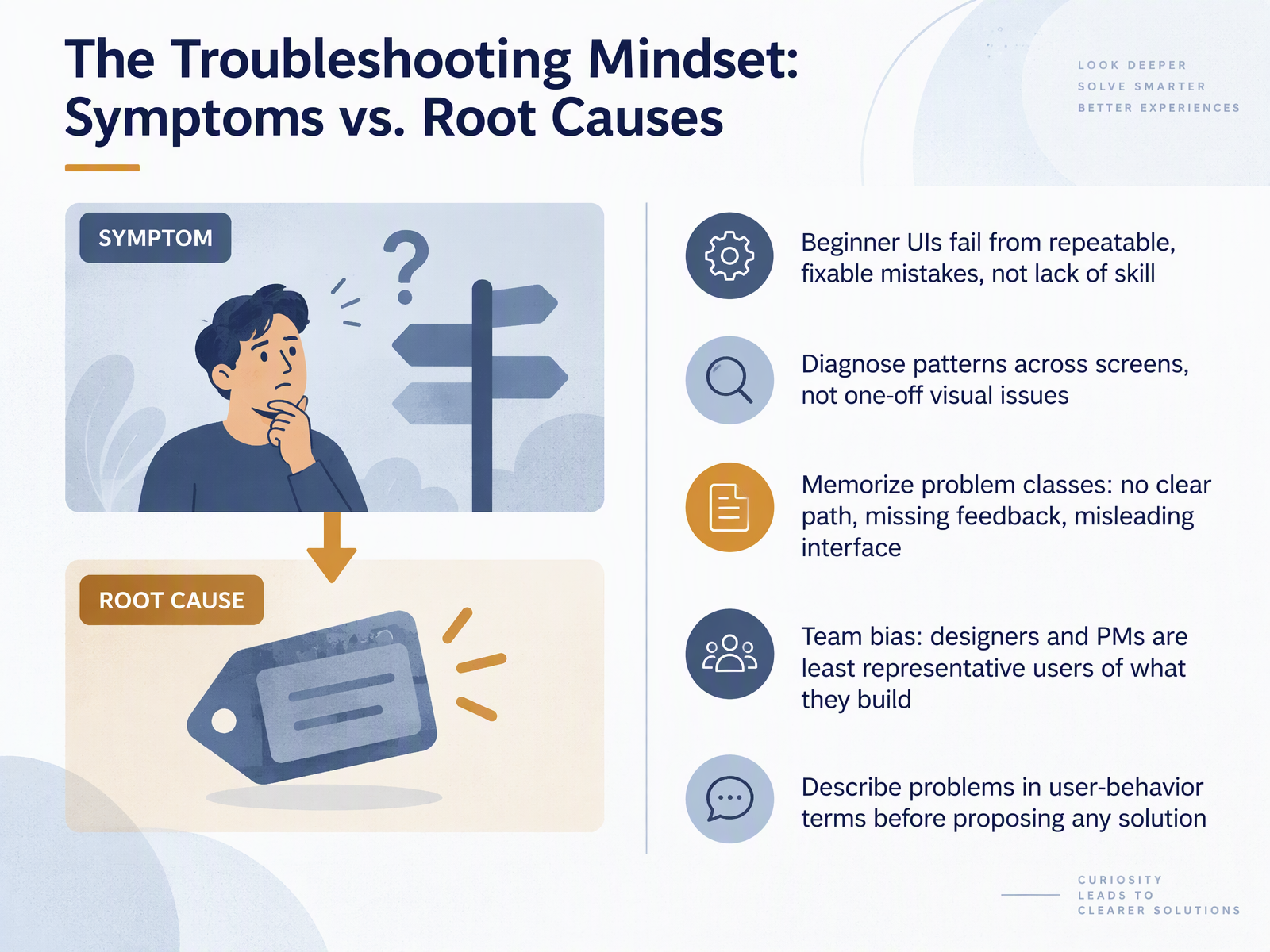
- 02The Troubleshooting Mindset: Symptoms vs. Root CausesLet's look at how to actually think about a problem. Beginner interfaces rarely fail because of a lack of skill. They fail from a small set of repeatable, fixable mistakes. So diagnose patterns across screens, not one-off visual quirks. And keep three problem classes in mind: no clear path to what users need, missing feedback after an action, and an interface that misleads. One more thing worth saying plainly. Designers and product managers are the least representative users of what they build, because you already carry too much context. So describe problems in user-behavior terms before you propose any solution. Instead of saying the button looks off, say users cannot find the button. That names the symptom, and points toward a root cause you can check. Building an Evidence-Based Diagnosis Workflow.
 mockflow.comcompanionlink.comuxpacific.com+22 min
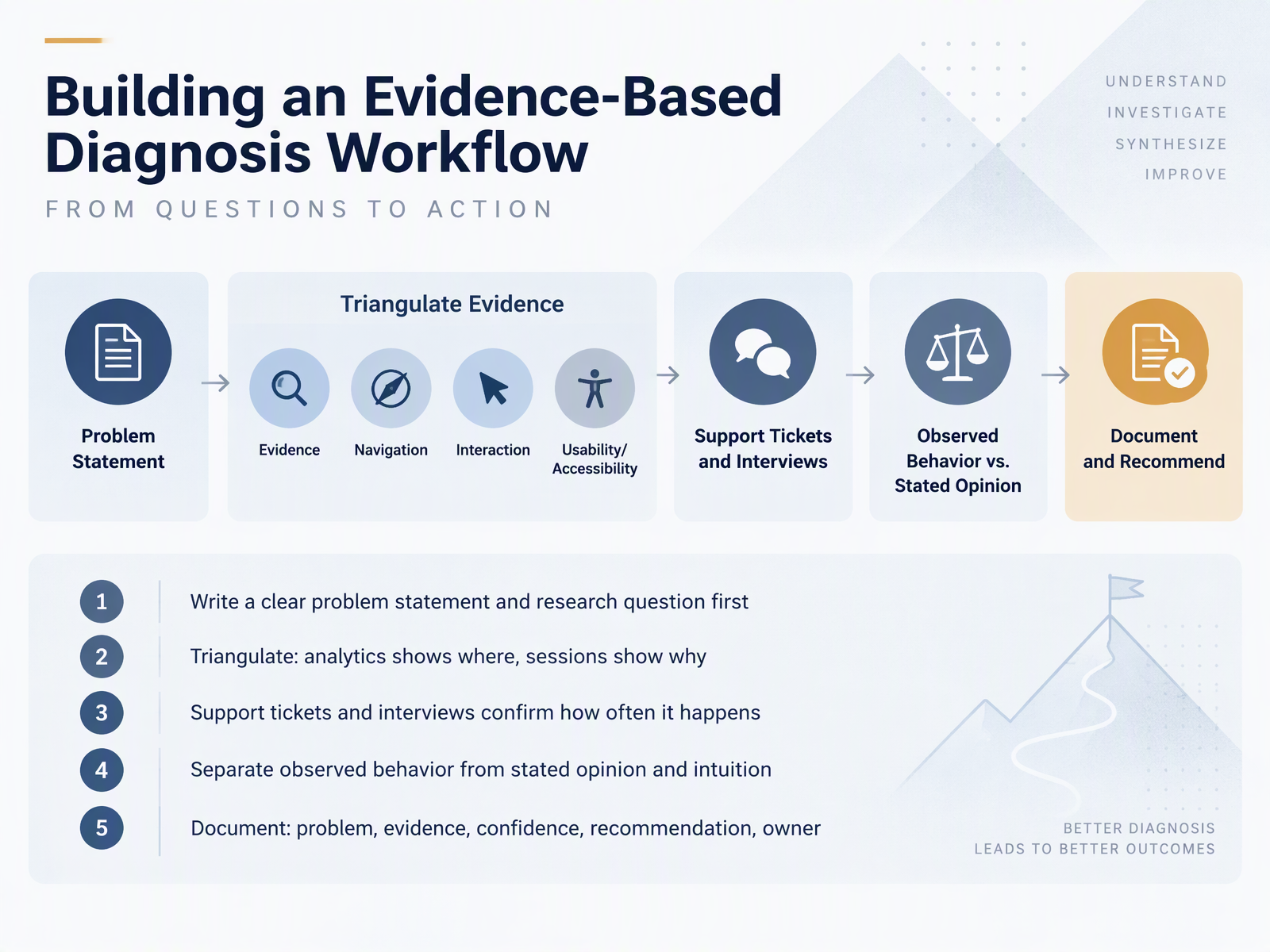
- 03Building an Evidence-Based Diagnosis WorkflowLet's look at how to turn a tangled problem into a clear, evidence-based diagnosis. Start by writing a simple problem statement and one research question. That keeps the investigation focused. Next, triangulate. Analytics shows you where something happens, and session recordings or usability tests show you why. Then check support tickets and interviews to confirm how often it happens. As you gather all this, separate what you observed from what people said, and from your own intuition. Observed behavior is your strongest evidence. Finally, document five things: the problem, the evidence, your confidence level, a recommendation, and an owner. That record is what keeps a diagnosis honest and shared across the team. Coming up next, Triangulating Signals Without Fooling Yourself.
 nngroup.comdoi.orgdoi.org+21 min
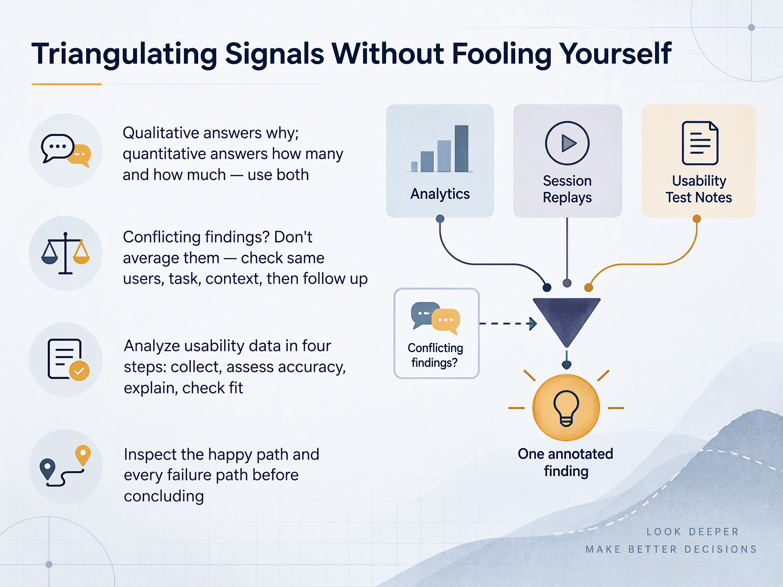
- 04Triangulating Signals Without Fooling YourselfNext, let's look at how to combine evidence without fooling yourself. Qualitative data tells you why something happens. Quantitative data tells you how many, and how much. Use both. Now, what if your findings conflict? Don't average them into one tidy number. Instead, check whether the methods studied the same users, the same task, and the same context. If they did, follow up with a small study to test the most plausible explanation. When you analyze usability data, work in four steps. Collect the relevant moments. Assess each one for accuracy. Explain them. Then check whether your explanation fits all the data. And before you conclude, inspect the happy path and every failure path. Agreement builds confidence. Contradiction shows you where to look next. That leads us to spotting problems in navigation and information architecture.
 nngroup.comdoi.orgdoi.org+21 min
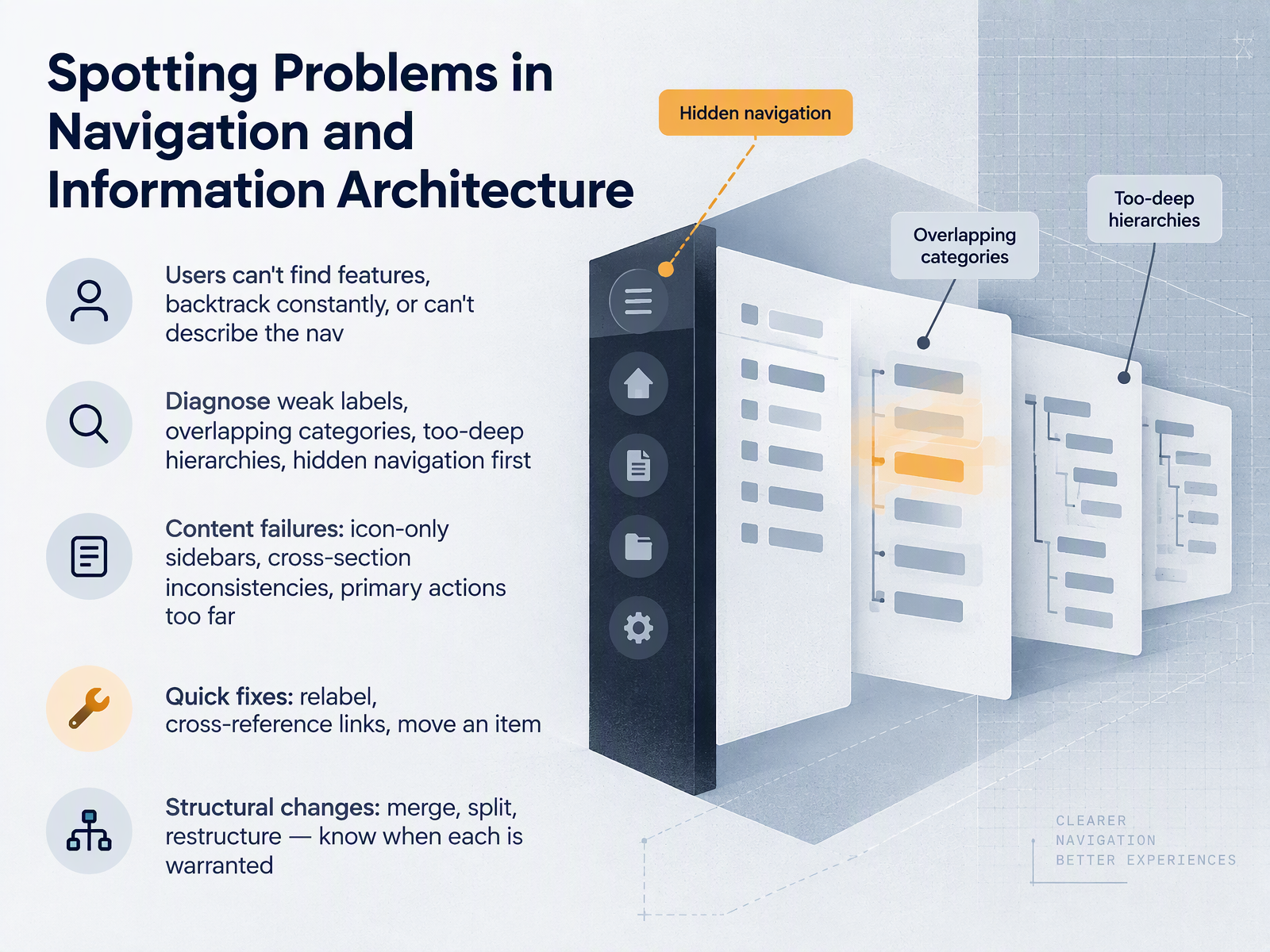
- 05Spotting Problems in Navigation and Information ArchitectureNow let's look at navigation and information architecture. The symptoms are usually visible. Users can't find features, they backtrack constantly, or they can't describe your navigation when you ask them. Treat these as evidence gaps, not failures. When you see these symptoms, check four things first. Weak labels, overlapping categories, hierarchies that are too deep, and hidden navigation. Users talk in plain words, and if your labels don't match those words, they will click the wrong thing. The first click is a strong signal here. It often predicts whether someone succeeds. If first clicks scatter across many categories, your categories probably overlap. Once you suspect the structure, look at content symptoms too. Icon only sidebars, inconsistencies between sections, and primary actions placed too far away. For quick fixes, try relabeling, adding cross reference links, or moving one item to where users already look. Those are low cost moves you can test quickly. Structural changes are different. Merging, splitting, or restructuring is warranted when labels and placement keep failing, or when categories overlap so much that no single rename can fix them. So the takeaway is this. Go from the cheapest fix to the most expensive, and let observed first clicks guide you. Next, we'll validate that structure with tree tests and first click tests.
 nngroup.comnngroup.comnngroup.com+22 min
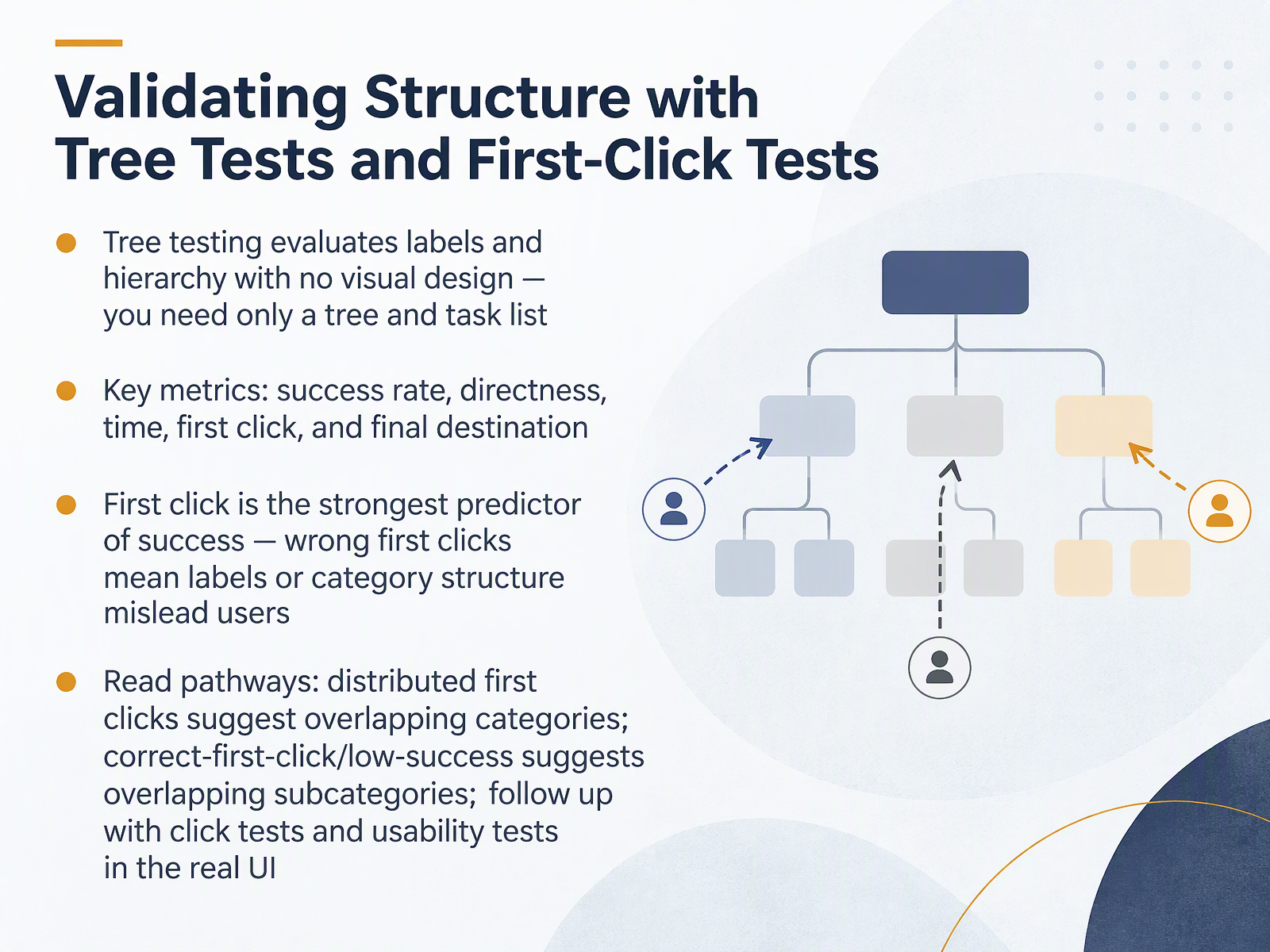
- 06Validating Structure with Tree Tests and First-Click TestsNow let's look at validating your structure with tree tests and first-click tests. A tree test checks your labels and hierarchy with no visual design at all. You only need two things: the tree, and a task list. From the results, watch five metrics: success rate, directness, time, first click, and final destination. Here is the key finding. First click is the strongest predictor of success. A wrong first click usually means your labels or category structure are misleading people. So read the pathways. If first clicks are spread across many categories, your top-level categories probably overlap. If the first click is correct but success stays low, look at lower-level categories that overlap too much. To confirm the cause, follow up with click tests and usability tests in the real interface. Diagnosing Interaction and Flow Breakdowns comes next.
 nngroup.comnngroup.comnngroup.com+21 min
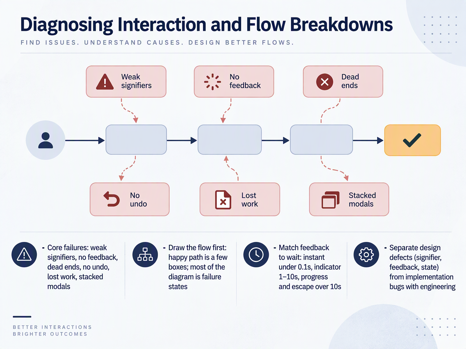
- 07Diagnosing Interaction and Flow BreakdownsNext, let's look at diagnosing interaction and flow breakdowns. Start with the symptoms. Core failures look like this. Weak signifiers, where clickable things do not look clickable. No feedback, so people click again. Dead ends with no clear exit. No undo. Lost work. And stacked modals. Here is a useful first move. Draw the flow before you judge the screens. The happy path is usually just a few boxes. Most of the diagram is failure states. That ratio is normal. It shows you where people actually get stuck. Then, match feedback to the wait. Under one tenth of a second, just act. One to ten seconds, show an indicator. Over ten seconds, show progress and a way to leave. Finally, separate design defects from implementation bugs. Weak signifiers, missing feedback, and broken state are design issues. Talk them through with engineering, and agree on which is which before you write fixes. Coming up next, locating friction on user flows.
 nngroup.comassets.interaction-design.orgnngroup.com+21 min
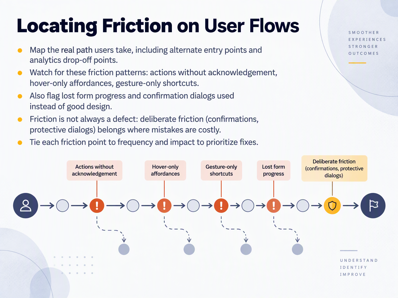
- 08Locating Friction on User FlowsNow let's look at locating friction on user flows. Begin by mapping the real path users take, not just the intended one. Include alternate entry points and the drop-off points your analytics reveal. Then watch for a few common friction patterns. Actions without acknowledgement, where the user clicks and hears nothing back. Hover-only affordances, which are invisible on touch and unreachable by keyboard. And gesture-only shortcuts with no visible alternative. Also flag lost form progress, and confirmation dialogs used as a substitute for good design. One caution: friction is not always a defect. Deliberate friction, like confirmations and protective dialogs, belongs where mistakes are costly. For each friction point, note how often it happens and how much impact it causes, then prioritize fixes accordingly. Next, we move on to usability issues, heuristic evaluation and testing.
 nngroup.comassets.interaction-design.orgnngroup.com+21 min
- 09Usability Issues: Heuristic Evaluation and TestingNext, let's look at usability issues through heuristic evaluation and testing. Start with Nielsen's ten heuristics as a fast expert checklist. Think of them as a diagnostic scan, not a verdict. Heuristic evaluation tends to surface systemic problems like inconsistent navigation or missing error messages. Usability testing shows real task failures, where someone actually gets stuck. Then rate severity as frequency times impact times persistence, on a zero to four scale. Averages from at least three evaluators are far more reliable than one person's judgment. So run the heuristic pass first to clean up obvious issues, then confirm with about five usability test participants. That sequence saves time and tells you which problems genuinely block real users. Next, we'll look at accessibility as a troubleshooting lens.
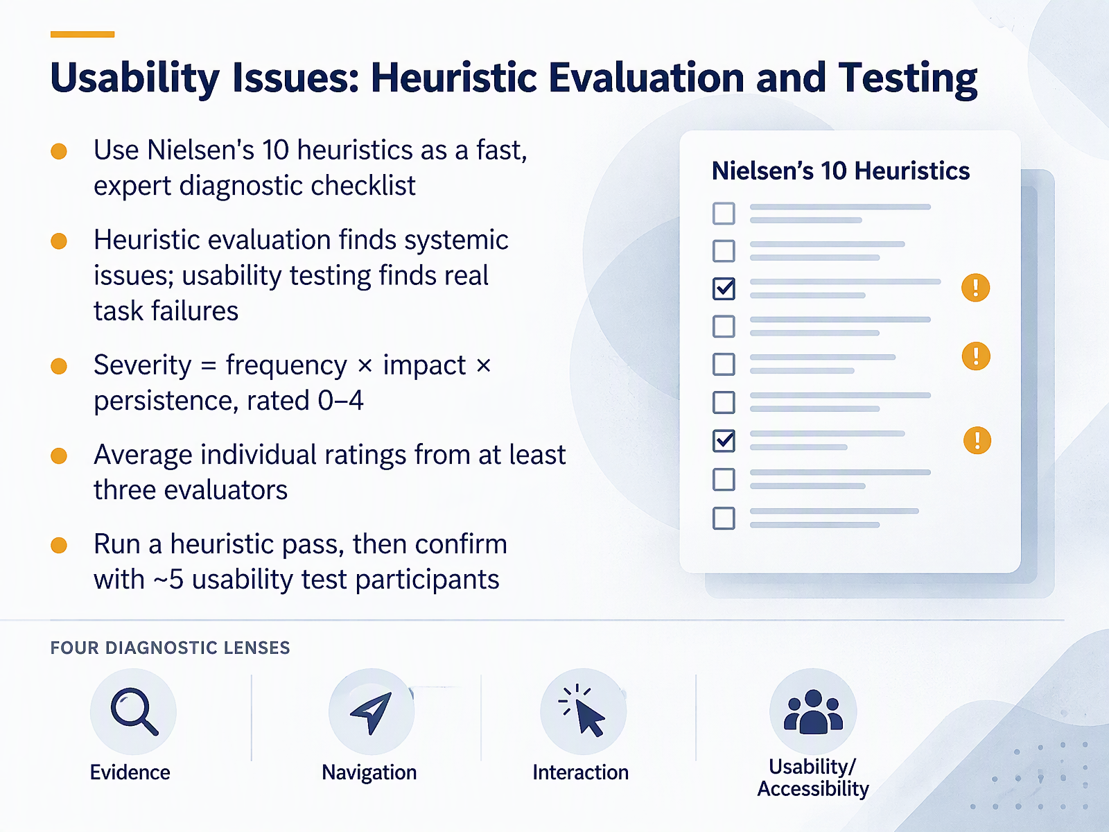 nngroup.comassets.interaction-design.orgnngroup.com+21 min
- 10Accessibility as a Troubleshooting LensLet's look at accessibility as a troubleshooting lens. Accessibility failures often show up first as usability complaints, not as formal audit findings. Hover-only actions, placeholder text used as labels, focus that disappears, and targets that are too small are common examples. A quick manual pass helps here. Check contrast in every state, including hover and focus. Tab through the page and watch the order. Confirm that every form field has a real, visible label. Automated tools are useful, but they catch roughly half of WCAG issues, so pair them with manual checks. When you log a finding, include the WCAG criterion, the user impact, and who owns the fix. Treat each finding as an evidence gap, not a verdict. That keeps the conversation constructive. Next, we'll look at prioritizing and communicating fixes.
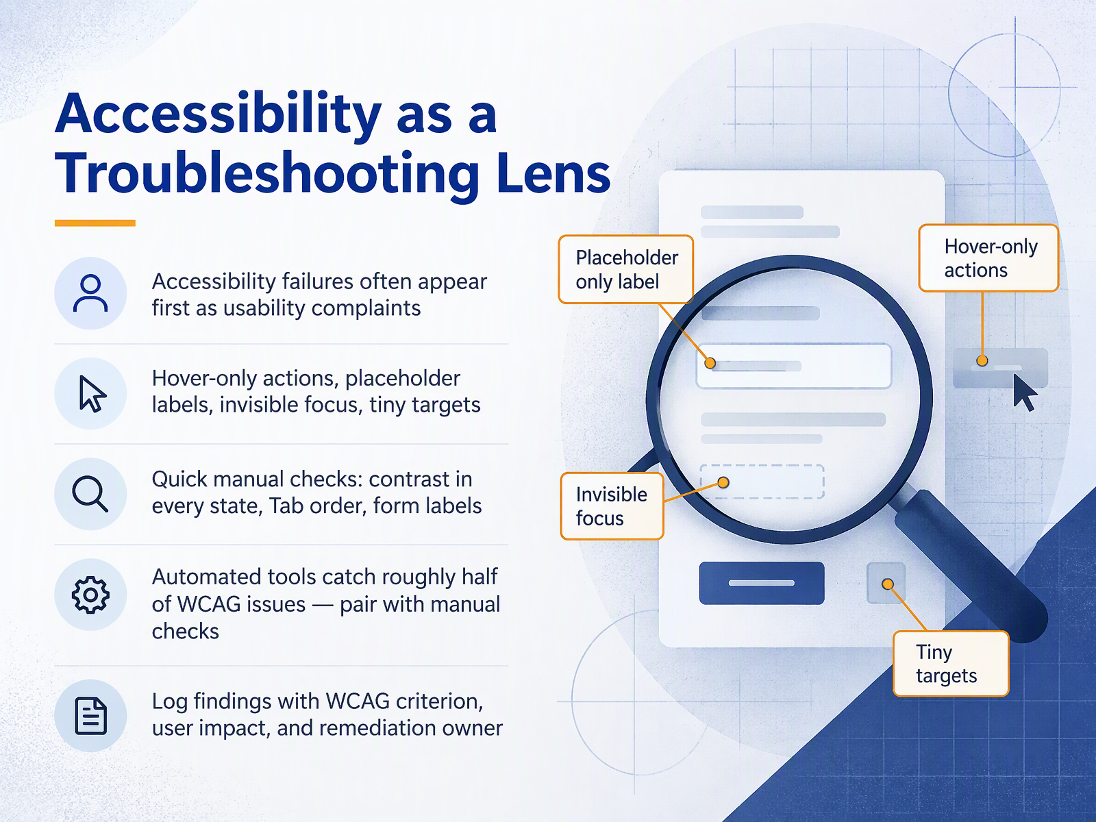 1 min
- 11Prioritizing and Communicating FixesNow, how do you turn all of that evidence into a decision the team can act on? Start by scoring each issue on shared impact dimensions. Revenue, reach, severity, and strategic alignment. For severity, use a simple three point scale. Blocking, degrading, or annoying when encountered. Next, plot the issues on an impact effort matrix. The four quadrants are quick wins, strategic bets, fill ins, and defer or cut. Then vote silently by domain expertise before anyone discusses. This keeps the loudest voice from setting the agenda. After voting, talk through the placement and negotiate. When you write a recommendation, include four things. The problem, the evidence, the rationale, and the expected outcome. Finally, keep a public not fixing list, and revisit deferred issues quarterly. That way, a deferral stays a decision, not a disappearance. Next, we will walk through a full case study from start to finish.
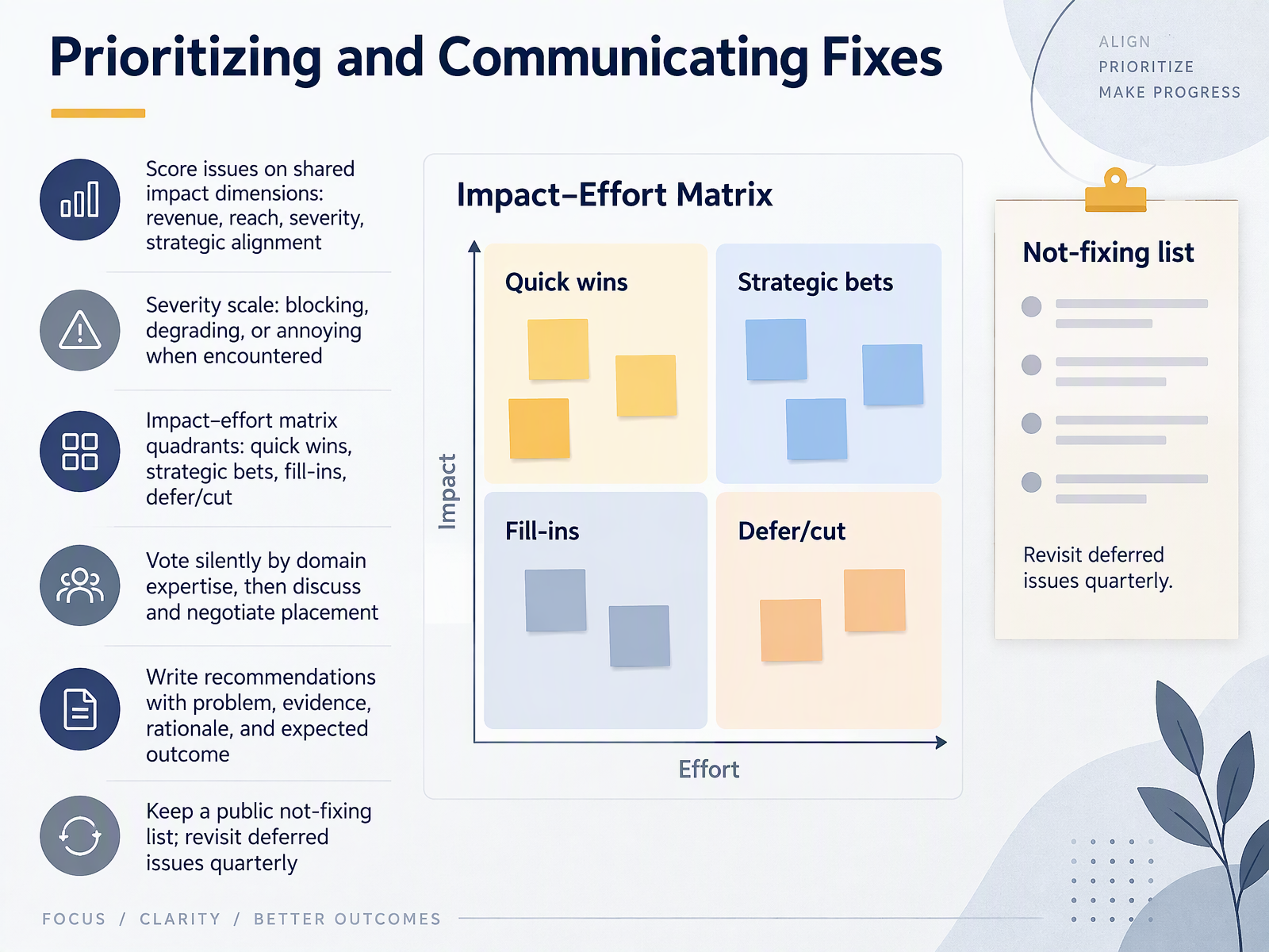 1 min
- 12Case Study: End-to-End Troubleshooting WalkthroughLet's put all of this together with an end-to-end walkthrough. In this case, a feature was moved during a redesign, and visits dropped by ninety-two percent. Page analytics flagged it. The team suspected the new tab placement, but they needed evidence. Session replays showed users consistently missing the new tab location. So they added a tooltip. Visits rose by seventy-five percent, which confirmed placement was the cause. In a second case, a card sort surfaced confusing terms, and a tree test validated a simpler structure. The lessons are simple. Validate before redesigning. Let evidence overrule intuition. And measure every fix. Next, we will practice these moves in a hands-on workshop called Practice Workshop: Diagnose a Broken Experience.
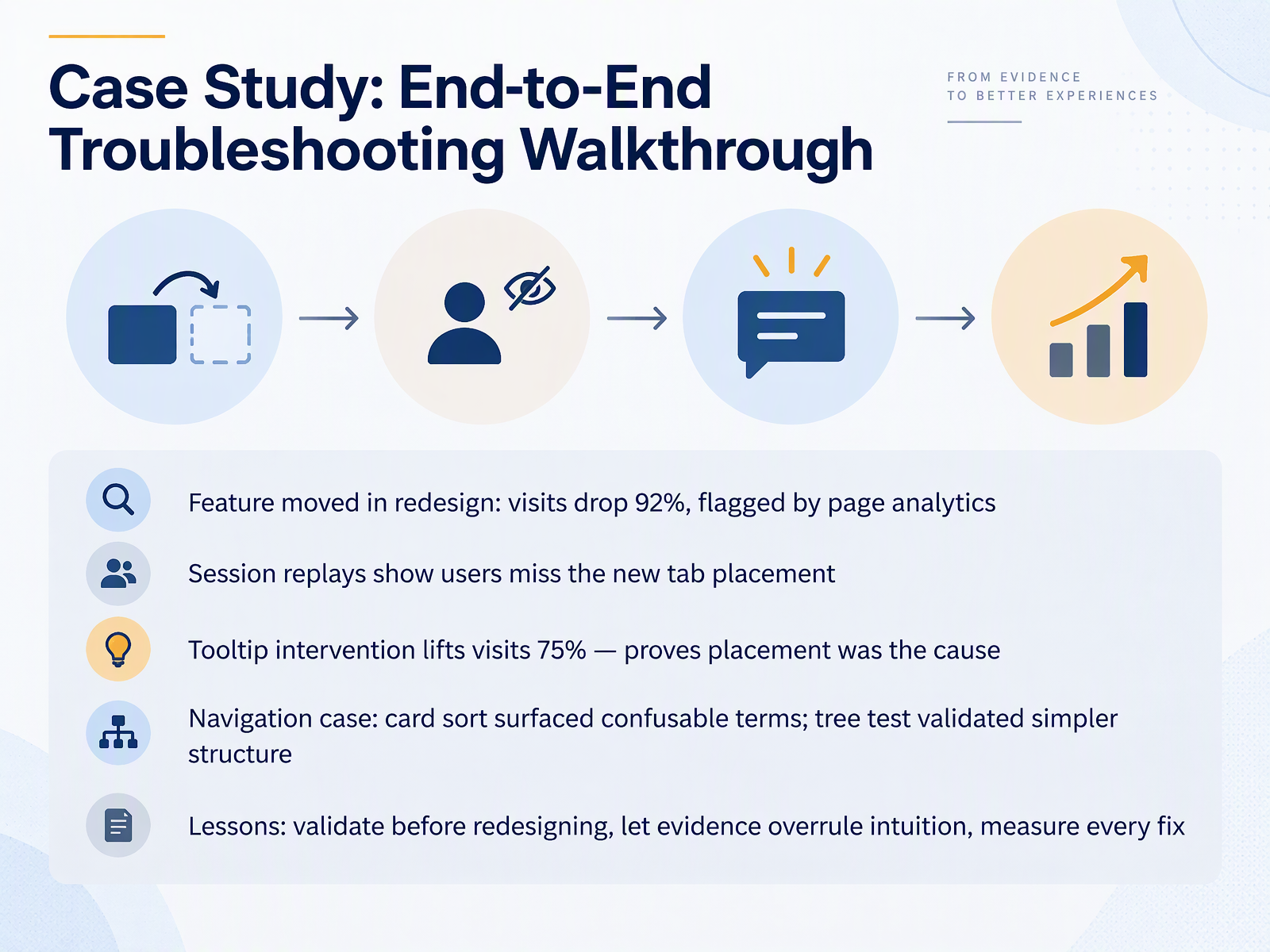 nngroup.com1 min
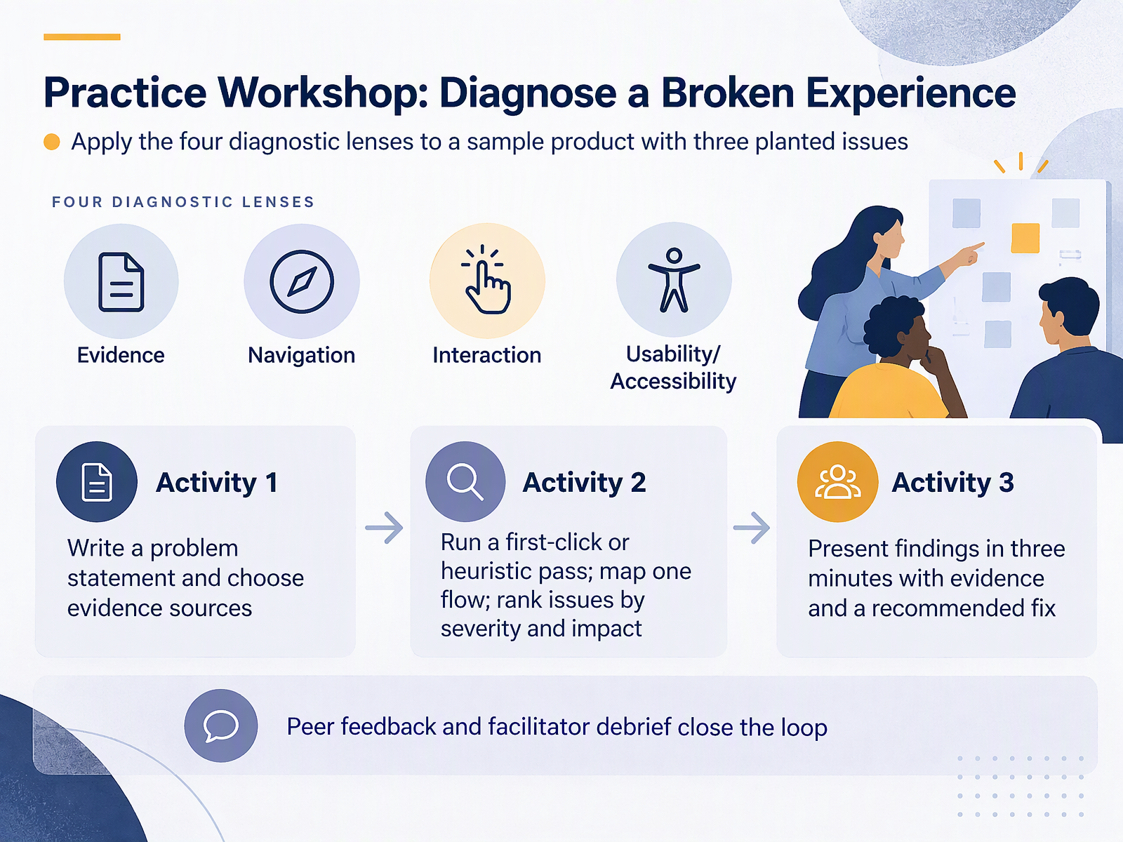
- 13Practice Workshop: Diagnose a Broken ExperienceNow let's put those diagnostic lenses into practice. You'll work with a sample product that has three planted issues, and you'll find them the way you would at work, through evidence rather than guesswork.
In Activity One, write a clear problem statement and choose the evidence sources that would confirm it. For example, a tree test or a first-click check for a findability question, and a heuristic pass for feedback and system status. In Activity Two, run that first-click or heuristic pass, map one flow, and rank what you find by severity and impact using frequency, impact, and persistence.
In Activity Three, present your findings in three minutes. State the evidence, name the likely cause, and recommend one fix. Peer feedback and the facilitator debrief then close the loop.
Remember that the goal is a shared troubleshooting move, not a verdict. Next, we'll pull this together in Takeaways and a Reusable Troubleshooting Checklist.
 nngroup.comnngroup.comnngroup.com+22 min
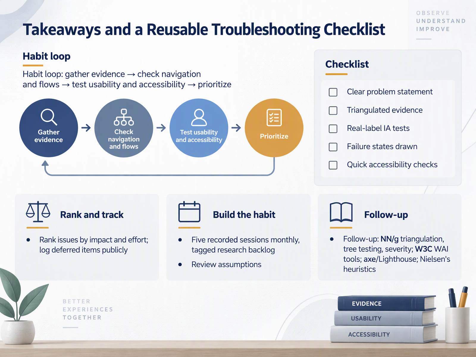
- 14Takeaways and a Reusable Troubleshooting ChecklistLet's pull this together into a habit you can reuse. First, the loop. Gather evidence, check navigation and flows, test usability and accessibility, then prioritize. Second, the checklist: a clear problem statement, evidence from more than one source, information architecture tests with real labels, failure states drawn out, and quick accessibility checks. Third, rank issues by impact and effort, and log deferred items publicly so nothing quietly disappears. Fourth, build the habit: five recorded sessions a month, a tagged research backlog, and a regular review of assumptions. For follow-up, look to Nielsen Norman Group for triangulation, tree testing, and severity ratings. Use the W three C W A I tools, axe and Lighthouse for accessibility, and Nielsen's heuristics for expert review. You now have a repeatable way to turn symptoms into evidence, and evidence into priorities. Thank you for working through this with me. Keep asking what the evidence says, and keep going. Every problem you catch early is one your users never have to feel.
 mockflow.comcompanionlink.comuxpacific.com+22 min
Take the deck with you
Download this course as a file — free, no sign-up needed.
- PDF handoutEvery slide page, ready to print or share.15 pages · 3.3 MBDownload
- Narrated PowerPointThe deck that presents itself — every slide carries the digital human's narration video.15 pages · 12.4 MBDownload
- PowerPoint slidesThe full deck as a .pptx — open it in PowerPoint, Keynote, or Google Slides.15 pages · 3.3 MBDownload
Free to use in your own training — please keep the PersonWise credit page at the end.
Have your own deck? Turn it into a course
Sources consulted
Web sources consulted while building this course.
- 18 Common UI Design Mistakes and How to Fix Them (2026) — mockflow.com
- 7 UI/UX Design Problems Killing Your Product: Phenomenon Studio’s Problem-Solving Guide — companionlink.com
- 10 Common UX Mistakes and How to Avoid Them | UX Pacific Blog — uxpacific.com
- The Complete Guide to UX Audits (2026) — UX Companion — uxcompanion.co.uk
- 7 UI/UX Mistakes That Scream Beginner | BuildOS — build-os.com
- Triangulation: Get Better Research Results by Using Multiple UX Methods - NN/G — nngroup.com
- Triangulation in UX Studies — doi.org
- Triangulation of Multiple Human Factors Methods in User Experience Design and Evaluation — doi.org
- Triangulating Methods | UX & Usability Toolkit — softwareevaluation.de
- User Experience Methods in Research and Practice — doi.org
- Tree Testing: Fast, Iterative Evaluation of Menu Labels and Categories - NN/G — nngroup.com
- Low Findability and Discoverability: Four Testing Methods to Identify the Causes - NN/G — nngroup.com
- Tree Testing Part 2: Interpreting the Results - NN/G — nngroup.com
- Picking the Right Methods to Improve Navigation – MeasuringU — measuringu.com
- Cross-methodological comparison of tree testing variants ... — sciencedirect.com
- 10 Usability Heuristics for User Interface Design - NN/G — nngroup.com
- Cognition in UX/UI Design — assets.interaction-design.org
- Top 10 Application-Design Mistakes — nngroup.com
- Design Heuristics and Guidelines | Textbook of Usability — textbookofusability.com
- Design Methods - How to design interfaces — faculty.washington.edu