UX Design Portfolio Websites
Begin
14 pages · ~28 min
UX Design Portfolio Websites
Learn to create a professional UX design portfolio website that showcases your projects and attracts employers.
What you’ll learn
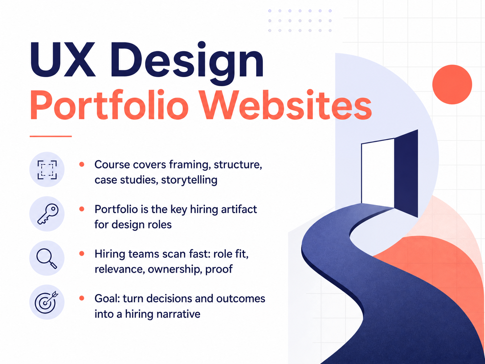
- 01UX Design Portfolio WebsitesWelcome. If you're here, you've likely felt the weight of that single question: how do I prove I'm a designer when my work isn't on a real product? Let's change how you view that. Your portfolio does not have to be a high-stakes gatekeeper. Treat it as an iterative design project you're building for a very specific user, the hiring manager. In this course, we'll cover framing your experience, structuring your projects, writing case studies, and mastering storytelling. Here's the reality we're designing for: hiring teams scan portfolios in seconds, not minutes. They are pattern-matching for four things: role fit, relevance, ownership, and proof. Your goal? Translate your decisions and outcomes into a hiring narrative. So, let's start by understanding the pressure those reviewers are under and how they actually make their snap decisions.superhive.coblog.opendoorscareers.comannanerz.substack.com+22 min
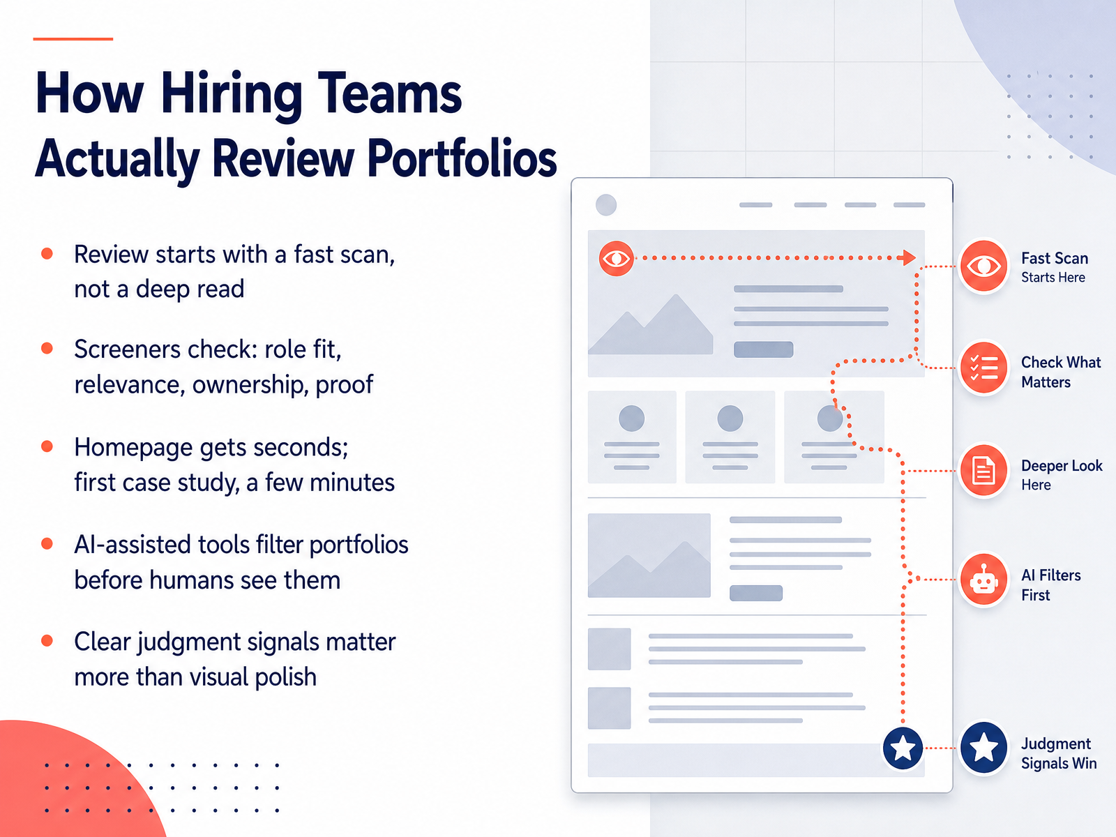
- 02How Hiring Teams Actually Review PortfoliosLet's pull back the curtain on how portfolios are really reviewed. It's probably not the deep, thoughtful read you imagine. In practice, a reviewer starts with a fast scan, not a deep read. They are juggling dozens of candidates, often between meetings, and they're looking for clear signals. When they first land on your site, screeners check for four things quickly: role fit, relevance, ownership, and proof. They want to know what role you're targeting, if your work matches their open position, what you specifically owned, and that there's evidence to back it up. Your homepage gets only a few seconds of attention. If it passes that test, they might open your first case study, giving it a few more minutes. And here's a reality of the current market: AI-assisted tools often filter portfolios before a human even sees them, parsing for keywords and structure. But here's the empowering part, clear judgment signals matter far more than visual polish. You don't need a flashy site. You need to make your thinking and impact easy to spot. Next, we'll talk about how to define your audience and portfolio goals to make those signals crystal clear.
 superhive.coblog.opendoorscareers.comannanerz.substack.com+22 min
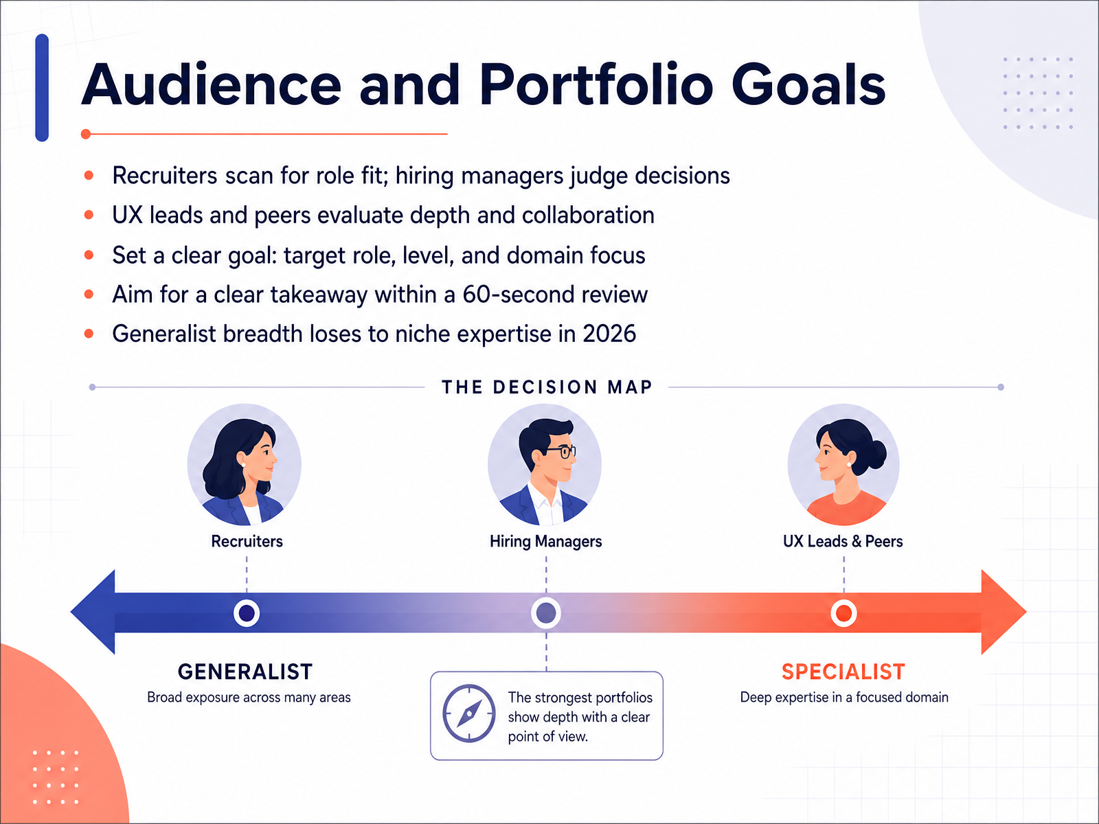
 - 03Audience and Portfolio GoalsLet's get grounded in who you're actually designing this portfolio for, because that shapes everything you'll create. It's tempting to think a broad audience will be impressed, but in practice, you're really designing for a few specific people. Recruiters scan your portfolio for role fit. They're asking, does this person roughly match the job description? Hiring managers, on the other hand, are judging your decisions. They want to see your judgment, your rationale, and how you think. And UX leads and peers? They're evaluating your depth of craft and how you collaborate. So your portfolio has to serve all three at a glance. This means you need to be crystal clear on your goal. Don't be a generalist. Aim for a specific role, a certain level, and a focused domain. Maybe that's product design for fintech or UX research for healthcare. This focus lets reviewers understand your value in seconds. Remember, you might only get sixty seconds of review time before they decide to dig deeper or move on. Make that time count. In 2026, being a generalist is a liability. It's far better to be the top choice for one specific niche than a candidate for everything. That clarity is your superpower. Now that you know who you're designing for, let's look at what actually makes it past that first scan. That's up next.
 muz.liudit.esdesigncase.app+22 min
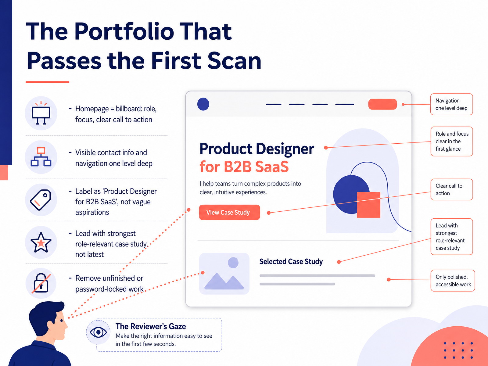
 - 04The Portfolio That Passes the First ScanSo let’s talk about what happens in the first few seconds of that initial scan. Think of your homepage as a billboard, not a biography. It needs to tell a stranger exactly what you do, who you do it for, and how to reach you, all without scrolling. That means a clear role label like Product Designer for B2B SaaS, not a vague tagline about creating meaningful experiences. Your contact info should be visible immediately. Email, LinkedIn, no treasure hunts. Now here’s a counterintuitive move. Lead your portfolio with the case study that best matches the job you want, not necessarily the one you finished most recently. Relevance beats chronology. And finally, make some tough cuts. If a project is unfinished, or hidden behind a password, remove it. A locked case study is just a blank space to a recruiter who won’t email you for the key. The goal is to make that first scan effortless. When you do, you set the stage for the deeper look. Next, we’ll map out the core structure and navigation that keeps reviewers moving through your work.
 muz.liudit.esdesigncase.app+21 min
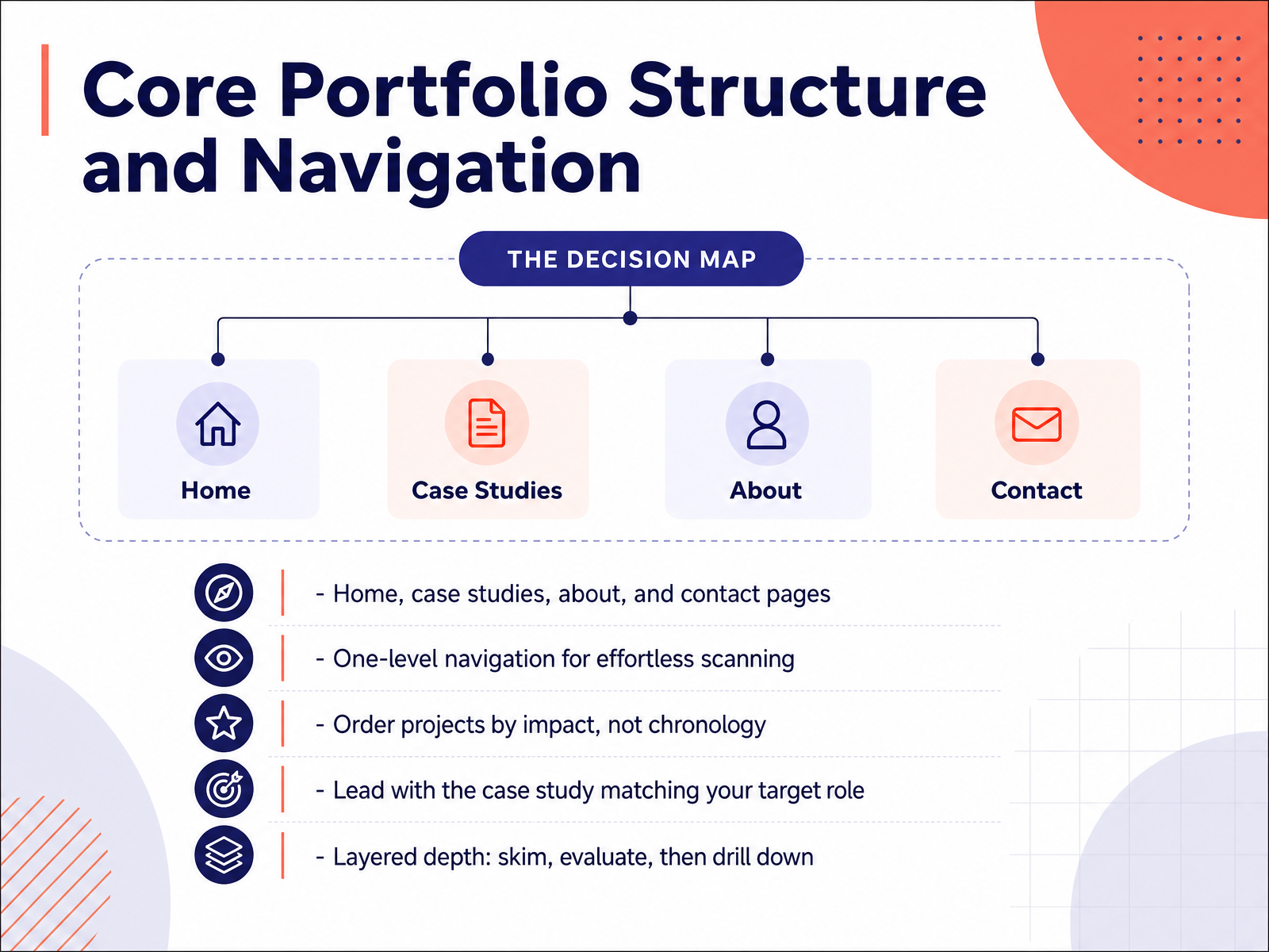
 - 05Core Portfolio Structure and NavigationNow let's talk about the structure of your portfolio site itself. Think of it like a well-designed product. You want four core pages: a home page that showcases your best work, your case studies, an about page that shares who you are and how you work, and a contact page that makes it effortless to reach you. No treasure hunts. Keep the navigation to a single, simple level. No nested menus. A reviewer should reach any case study in one click. When you arrange your projects, don't default to chronological order. Lead with impact. Put the case study that best matches the job you're applying for front and center. And here's the key insight: structure your portfolio for layered reading. A recruiter should be able to skim the headline and key result in seconds. A hiring manager can then evaluate your process in a few minutes. And if they're truly interested, they can drill down into the details of your decisions and research. Design for those three different levels of attention. Give people exactly the depth they need, when they need it. Up next, we'll get practical about how to choose the right projects to feature.
 muz.liudit.esdesigncase.app+22 min
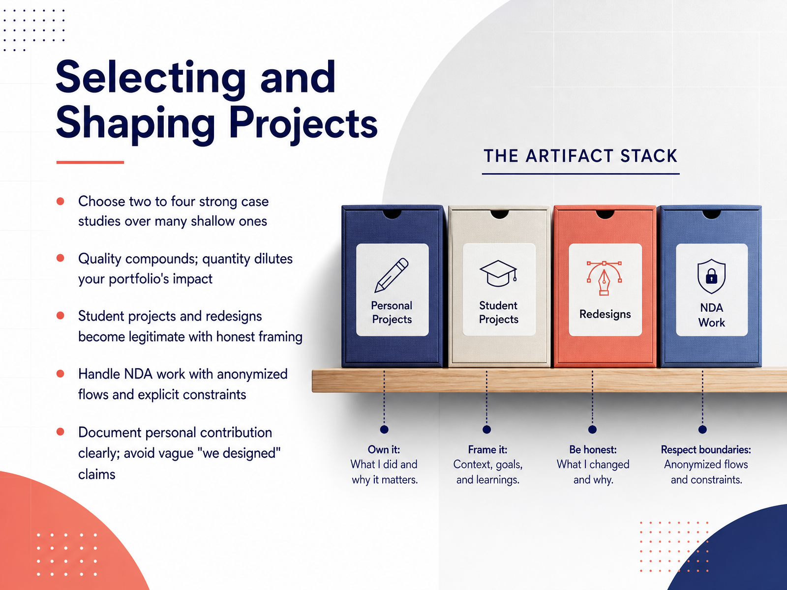
 - 06Selecting and Shaping ProjectsOnce you have your project ideas lined up, the hardest part is choosing what actually makes the cut. Here's the rule of thumb: two to four strong, deep case studies will always beat a stack of shallow ones. Think of quality like compounding interest, it builds on itself. Quantity just waters things down. Now, if you're early in your career, please know this, student projects and redesigns are completely legitimate. The key is honest framing. Say clearly that it was a course project or that you chose to redesign a public app. That transparency builds trust. What about work you can't show? NDA projects can still be included. Anonymize the flows, blur sensitive details, and explain the constraints you worked under. That actually signals real-world experience. And always, always document your personal contribution. Avoid team credit like the vague 'we designed.' If you say 'we,' the reviewer can't tell what you did. So, write down what you specifically owned. That clarity is what makes a portfolio credible. Up next, we dig into case studies that show your design judgment.
 blog.uxfol.iomentorcruise.comindianschoolofskills.org+22 min
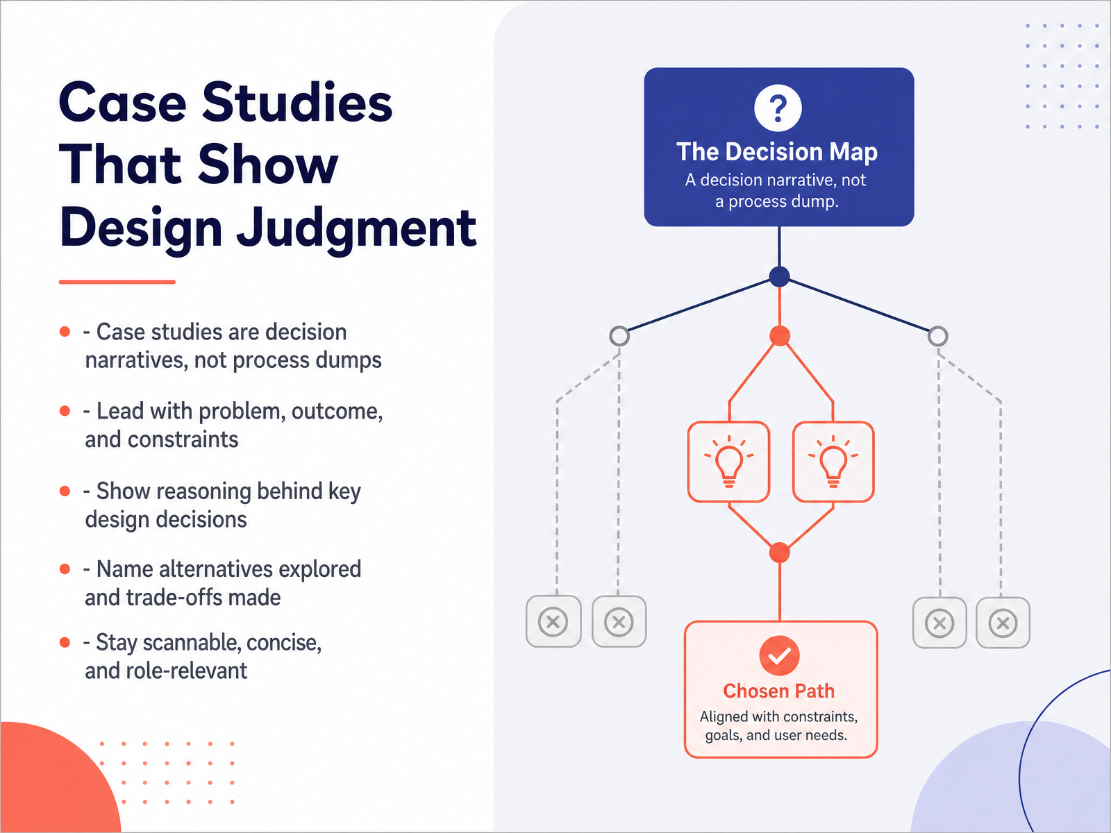
 - 07Case Studies That Show Design JudgmentLet’s talk about how to structure the story itself. Your case study is not a process dump. It is a decision narrative. That means you lead with the problem, the outcome, and the constraints that made the project hard. Then, you walk through the reasoning behind your key decisions. Here is the part most people skip: name the alternatives you explored, and be honest about the trade-offs you made. A sentence like “I chose the three-step flow over the single page because early tests showed users got lost in the longer form” tells a reviewer more about your judgment than a hundred screenshots. And remember, keep it scannable. Stay concise, use clear headings, and make sure every detail is relevant to the role you are applying for. Weave in specific numbers when you have them, like task completion rates from a small usability test. Those concrete details prove your decisions were grounded in evidence. You are not just decorating a screen; you are making defensible choices under real limits. That is what they want to see. Now, let’s look at how to format your case studies so they are easy to skim in a hurry.
 blog.uxfol.iomentorcruise.comindianschoolofskills.org+22 min
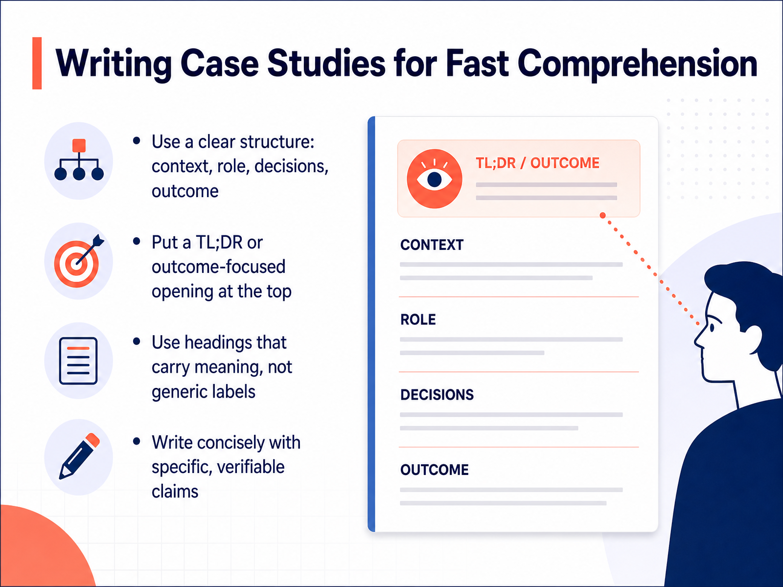
 - 08Writing Case Studies for Fast ComprehensionAll right, let's talk about writing case studies that respect your reader's time, because hiring managers are skimming, not studying. Fast comprehension is about structure. First, use a clear arc: context, your role, the decisions you made, and the outcome. Keep it predictable so reviewers know where to find what matters. Second, put a short TL;DR, or outcome-focused summary, at the very top. Lead with the result. What changed because of your work, in concrete terms. Third, use headings that carry meaning. Don't label a section "Research." Label it "Three interviews revealed users trusted reviews over price." That heading tells a mini-story. Finally, write concisely with claims you can prove. Specific beats vague every time. "Task completion rose from forty to seventy percent across five sessions" is powerful. "Users liked it" is forgettable. Remember, your goal is to make the reasoning easy to find. If a stranger can skim your study in a minute and repeat your key decision back to you, you have succeeded. Speaking of proving your worth, let's look at how to communicate your impact without inflating it.
 blog.uxfol.iomentorcruise.comindianschoolofskills.org+22 min
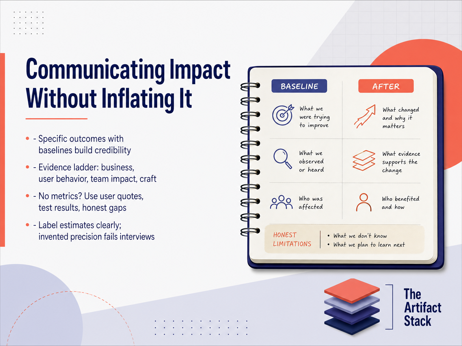
 - 09Communicating Impact Without Inflating ItWhen you talk about results, specificity is your best friend. Saying your redesign reduced drop-off matters, but saying it reduced drop-off from 40 percent to 25 percent over six weeks—that builds real credibility. If numbers feel scarce, you can still show impact. Think of it as an evidence ladder. Start with business outcomes, then user behavior changes, then team impact, and finally the craft itself. No access to analytics? No problem. User quotes from testing, specific observations from usability sessions, and honest accounts of what didn't work are all legitimate evidence. And if you are estimating an improvement, label it clearly as an estimate. Invented precision falls apart the moment an interviewer asks a follow-up question. But a thoughtful, honest gap? That shows maturity. Remember, clarity and honesty always beat vague confidence.
 blog.uxfol.iomentorcruise.comindianschoolofskills.org+21 min
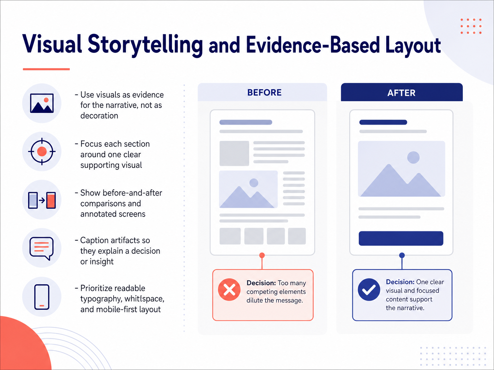
 - 10Visual Storytelling and Evidence-Based LayoutNow let's talk about making your case studies visually convincing. The golden rule here is simple: every image should work as evidence, not decoration. Ask yourself what each visual proves. If it doesn't support your narrative, it probably doesn't belong. Give each section one clear, supporting visual. A single strong screenshot or mockup can carry a point far better than a clutter of images. Try to include before-and-after comparisons whenever you can. They make your impact tangible. Annotated screens are also powerful, so use arrows or captions to point the reviewer's eye to what matters and explain why. Every caption should clarify a decision you made or an insight you uncovered, not just describe what's on screen. And as you build the page, prioritize readable typography and generous white space. Remember, a clean, scannable layout shows you respect the reader's time. Let's move on to talk about which tools and platforms will help you bring this all together.
 shadcn-ui-blocks.comstartdesigns.comuiuxshowcase.com+22 min
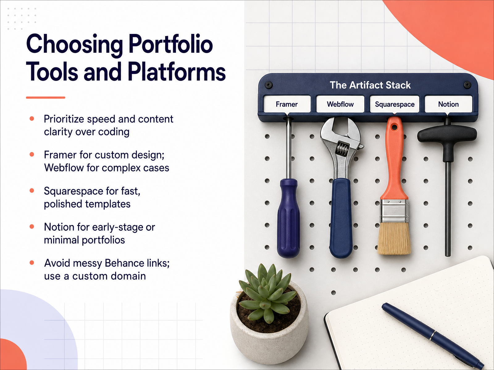
 - 11Choosing Portfolio Tools and PlatformsLet’s talk about platforms, because this is where a lot of designers get stuck. Remember, your portfolio is judged by the quality of your case studies, not by how complex the site is to build. So, prioritize speed and content clarity over coding. If you want strong design control and you already think in Figma, Framer is a natural fit. For more complex layouts or content-heavy sites that need managing, Webflow is your powerful option, though it has a steeper learning curve. Need something clean and polished this weekend? Squarespace templates have you covered. And if you’re just starting out, Notion makes a perfectly fine home for an early-stage portfolio. Here’s the practical takeaway: avoid sending people to a messy Behance link. Buy a custom domain that points to your name. It costs a few dollars a year and instantly signals professionalism. A simple, clear site is always better than a fancy one that hides your work.
 muz.liudit.esdesigncase.app+21 min
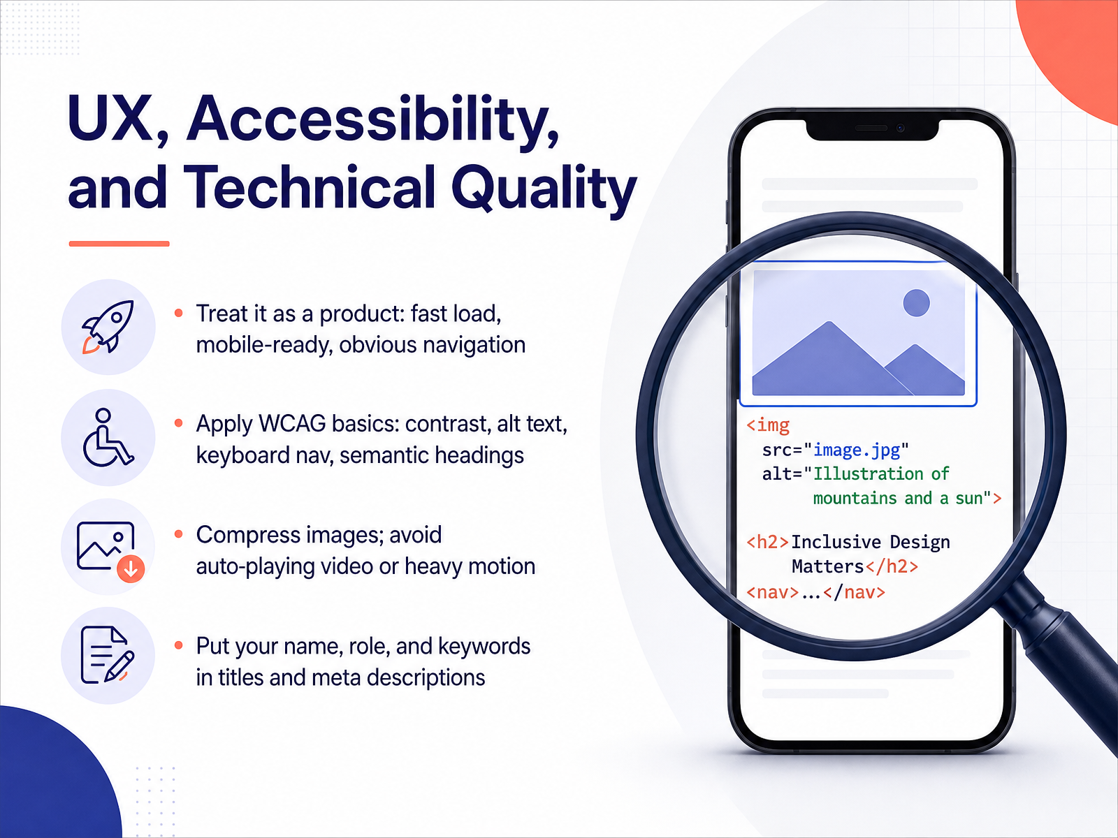
 - 12UX, Accessibility, and Technical QualityNow, let's talk about treating your portfolio like the product it is. Because here's the truth: your portfolio's UX is part of the evaluation. Reviewers will notice if your own site is hard to navigate. So, make it fast. Compress those images, and lose the auto-playing video. Ensure it loads smoothly on mobile, because many recruiters will first open it on their phone. Apply basic accessibility standards, like WCAG. That means sufficient color contrast, descriptive alt text for your screenshots, and a logical heading structure that supports keyboard navigation. And don't forget the metadata. Put your name, your role, and relevant keywords in your page titles and meta descriptions. This helps you get found in search—and it helps the AI screening tools that many recruiters now use. When your site is fast, accessible, and easy to scan, you're proving your skills before they even read a word. Next, let's talk about getting feedback, testing, and iterating on your portfolio.
 muz.liudit.esdesigncase.app+22 min
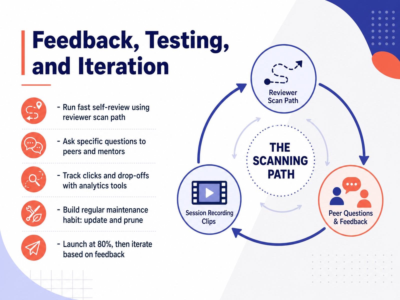
 - 13Feedback, Testing, and IterationLet's talk about treating your portfolio like the product it is. The first step is a fast self-review, using the same scan path a hiring manager would. Open your site, spend thirty seconds on the homepage, and write down what you understand about the designer. Then ask peers and mentors specific questions like: can you tell what I specialize in, and is my role clear in this case study? Vague requests get vague answers, so be direct. You can also connect basic analytics tools to see which projects get the most clicks and where people drop off. That data tells you what to strengthen. Then, build a regular maintenance habit. Set a reminder to update your case studies and prune anything that no longer reflects your best work or current role target. Remember, a portfolio is never truly finished. So, launch at eighty percent, gather feedback, and iterate from there. A live site that improves over time will always beat a perfect one that never sees the light of day. This mindset carries us into launch, distribution, and next steps.
 muz.liudit.esdesigncase.app+22 min
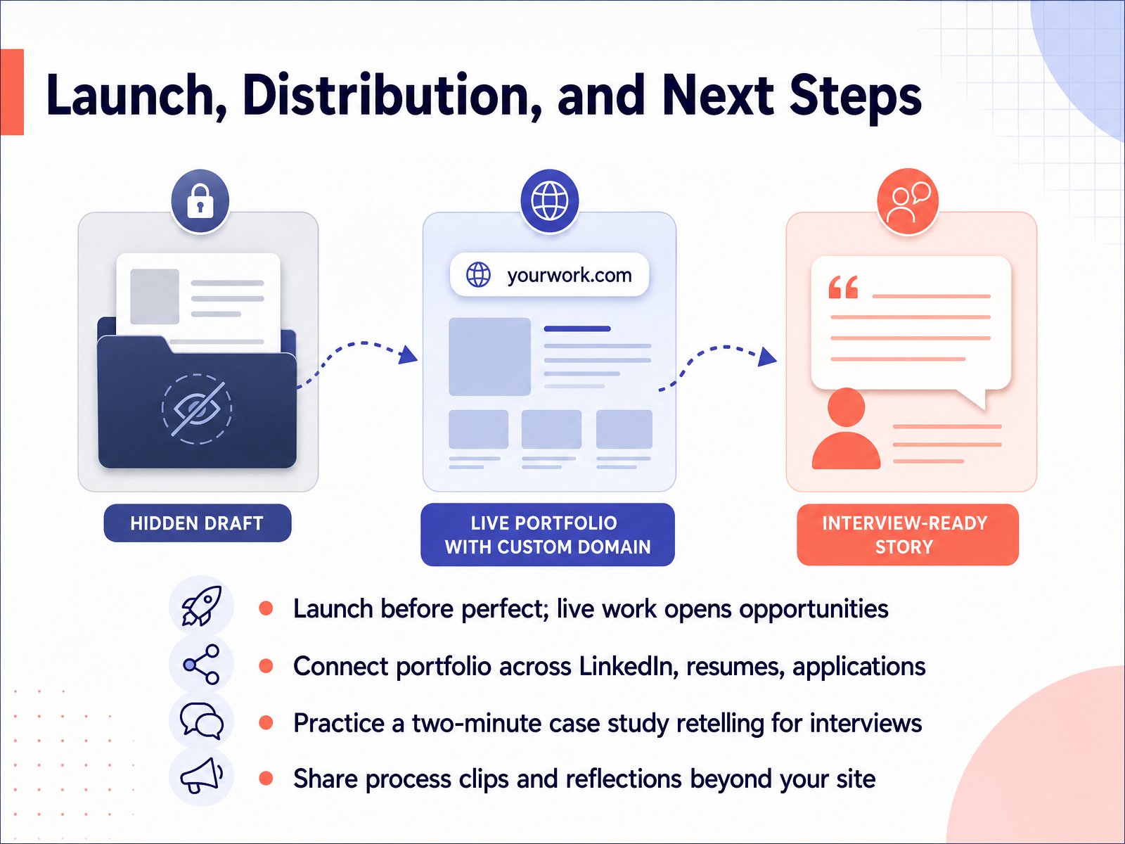
 - 14Launch, Distribution, and Next StepsYou’ve built it. And now, it’s time to share it with the world. I want you to launch before perfect. A portfolio sitting in Figma is just a draft. A live portfolio, on the other hand, is an opportunity. So get it out there. Make sure your portfolio link is on your LinkedIn profile, your resume, and every single application you send. Then, practice telling your story. We call this the two-minute case study retelling. If you can walk through your process and key decisions clearly out loud, you’ll walk into interviews with far more confidence. And don't stop at your website. Share video clips of your prototypes or brief reflections on your process on social platforms. This gets you noticed and builds genuine momentum. Remember, your portfolio is a living product, not a one-time deliverable. It will evolve alongside you. So launch it, learn from feedback, and keep iterating.
 muz.liblog.opendoorscareers.comudit.es+22 min
Take the deck with you
Download this course as a file — free, no sign-up needed.
- PDF handoutEvery slide page, ready to print or share.15 pages · 3.1 MBDownload
- Narrated PowerPointThe deck that presents itself — every slide carries the digital human's narration video.15 pages · 13.2 MBDownload
- PowerPoint slidesThe full deck as a .pptx — open it in PowerPoint, Keynote, or Google Slides.15 pages · 3.0 MBDownload
Free to use in your own training — please keep the PersonWise credit page at the end.
Have your own deck? Turn it into a course
Sources consulted
Web sources consulted while building this course.
- UX Design portfolio review: What hiring managers look for — superhive.co
- How Hiring Managers Actually Scan Your Portfolio in 2026 👀 — blog.opendoorscareers.com
- How I actually screen for design roles - by Anna Nerz — annanerz.substack.com
- The 7-Second Portfolio Test: What Happens When a Hiring Manager Opens Your Portfolio | Xperience Wave — xperiencewave.com
- UX Portfolios: What Hiring Managers Look For (Video) — nngroup.com
- How to Build a UX Portfolio That Actually Gets You Hired (2026) | Muzli Blog — muz.li
- Portfolio UX 2026: structure, cases and checklist | UDIT — udit.es
- How to Show Information Architecture in a UX Portfolio — designcase.app
- How to build a UX portfolio website that works as hard as your best project — superhive.co
- The UX Portfolio Guide (2026) — UX Companion — uxcompanion.co.uk
- The Ultimate UX Case Study Template & Structure (2026 Guide) — blog.uxfol.io
- How to write a UX case study that passes the hiring manager's cold read - MentorCruise — mentorcruise.com
- How to Write UX Case Studies: The Ultimate Guide (2026) | ISS — indianschoolofskills.org
- How to Write a Strong Case Study for Your Portfolio in 2026 🧠 — blog.opendoorscareers.com
- Writing a UX Design case study that shows thinking, not just pixels — superhive.co
- Portfolio Case Study: Large Visual Focus Case Study | Shadcn UI Blocks — shadcn-ui-blocks.com
- Framer UX Portfolio Design for Yitian Li | Start Designs — startdesigns.com
- Ysabella Nicole - UI UX Showcase — uiuxshowcase.com
- Courtside — A Storytelling Portfolio — contra.com
- UX Portfolio Case Study template (plus examples from ... — uxplanet.org