Business Intelligence Fundamentals
Begin
14 pages · ~28 min
Business Intelligence Fundamentals
This training introduces the fundamentals of Business Intelligence, equipping beginners with core concepts and skills to analyze data and support informed decision-making.
What you’ll learn
- 01Introduction to Business Intelligence FundamentalsWelcome to Business Intelligence Fundamentals. I'm glad you're here. Whether you're an analyst, an operations lead, or a manager, this course is designed to give you a practical grounding in BI. Let's start with a simple idea. Business intelligence is the process of turning raw data into clear, useful insights. Instead of guessing, you use evidence to make informed decisions. Think of it this way. You already have data scattered across spreadsheets, reports, and systems. BI brings that data together, cleans it up, and presents it in a way that makes sense. It goes beyond static reports and manual number-crunching. With BI, you get interactive dashboards and visualizations that help you see what's happening right now, and what happened before. The goal here is not just to learn definitions. The goal is to help you work smarter, spot problems sooner, and find opportunities faster. We'll build this understanding step by step. Next, we'll look at why evidence-based decisions matter now more than ever.techtarget.cominvestopedia.comcloud.google.com+22 min
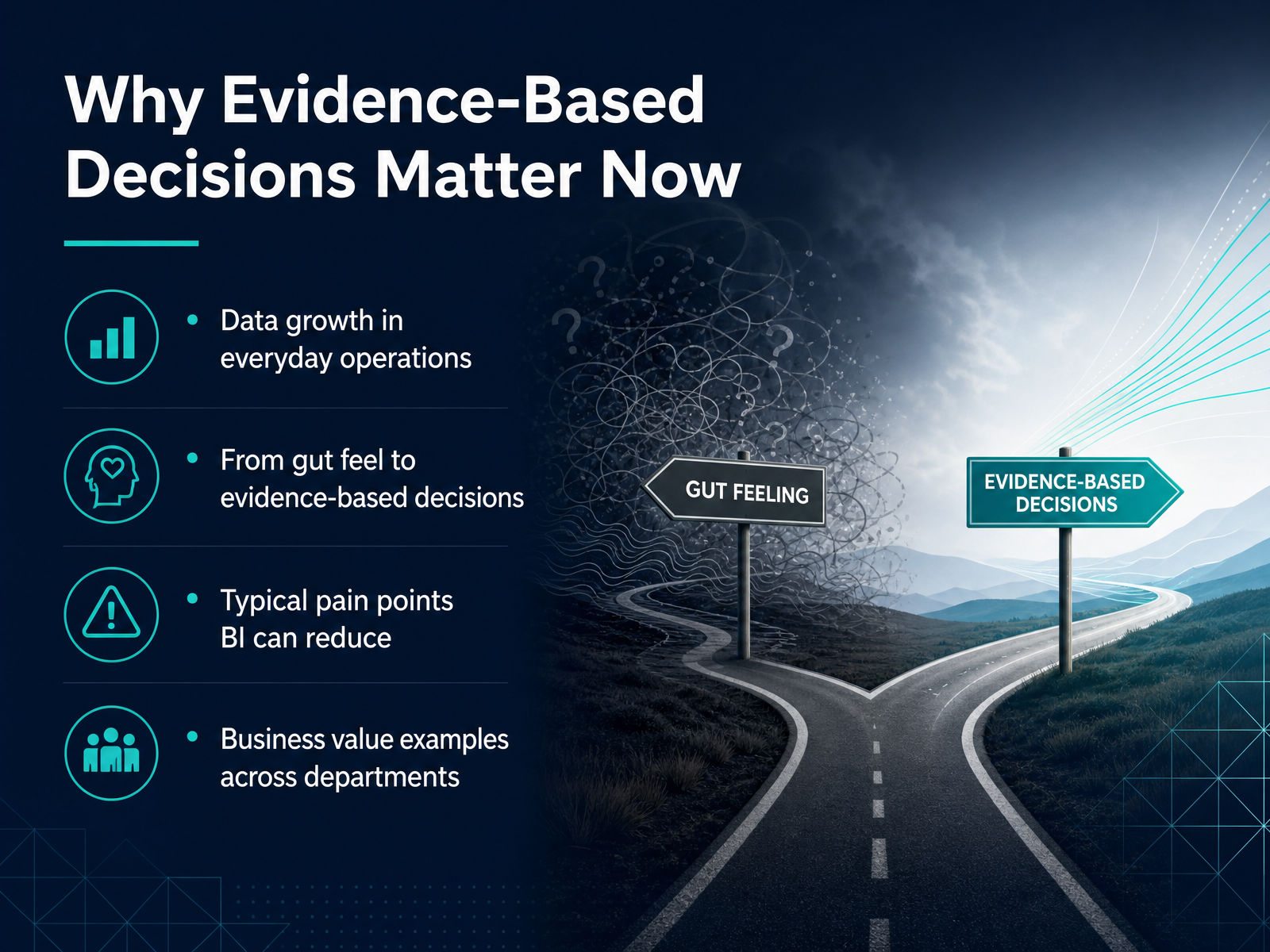
- 02Why Evidence-Based Decisions Matter NowSo why does this matter right now? The simple answer is that data has moved out of the IT department and into everyday operations. We are generating more information from sales, marketing, supply chains, and customer interactions than ever before. Relying only on gut feel or past experience is no longer practical when things change this fast. Evidence-based decisions help us reduce risk and react sooner. Now, you have probably felt the pain points that business intelligence can solve. Maybe you have spent hours pulling together a report from five different spreadsheets. Or maybe different teams are looking at different numbers and arguing about which one is correct. These are exactly the kinds of problems BI is designed to fix. And the value shows up everywhere. A marketing team can see which campaigns actually drive revenue. An operations team can spot delays before they become customer complaints. Finance can track spending against targets in real time instead of waiting for the monthly close. This is about turning scattered information into a clear, shared picture that helps everyone do their job better. Up next, we are going to define the basic building blocks you will use to create that picture, including key terms like data, metrics, dimensions, and K P I s.
 techtarget.comtechtarget.combarc.com+21 min
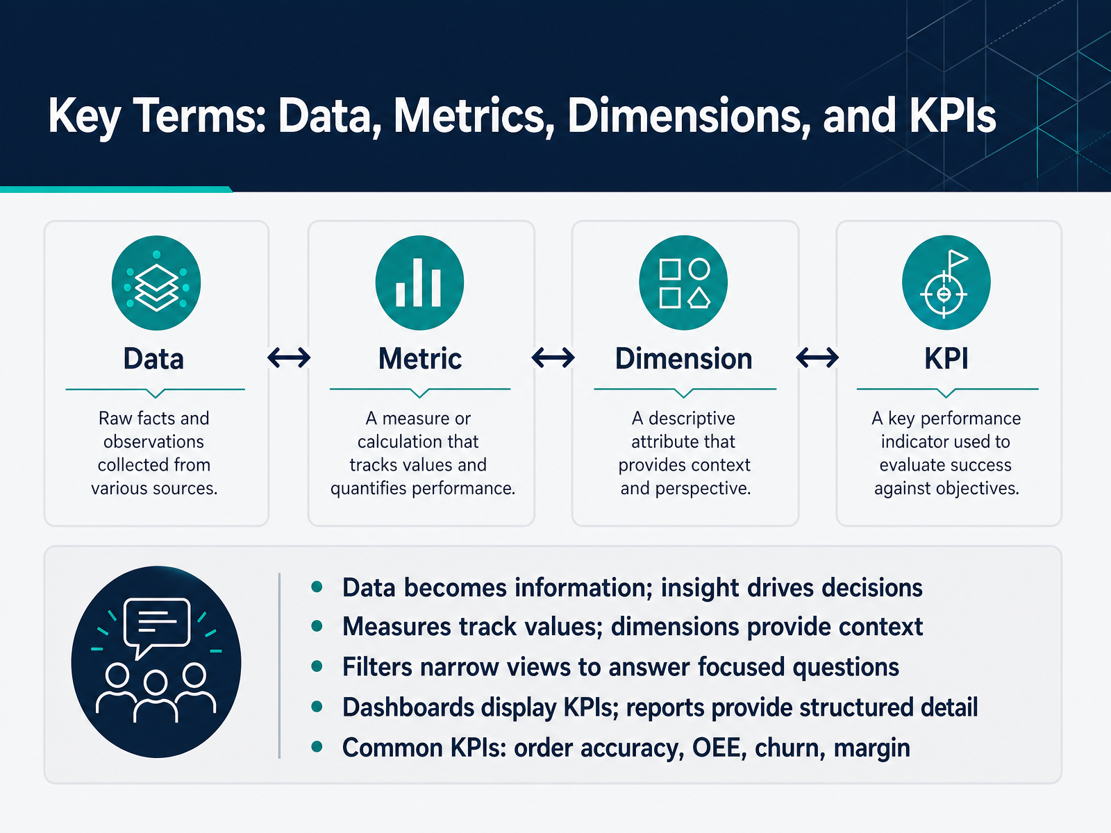
 - 03Key Terms: Data, Metrics, Dimensions, and KPIsLet's get comfortable with a few terms you will see everywhere in business intelligence. Think of data as the raw material, like sales transactions or machine logs. When that data gets organized and summarized, it becomes information. And insight is what happens when that information clearly points to a decision you should make. Now, measures are the numbers you track. Things like total sales or units produced. Dimensions are the categories that give those numbers context, like region, product line, or month. Filters let you narrow your view. So instead of all sales, you could filter down to one region in one quarter to answer a focused question. Dashboards are visual displays that bring your key metrics together at a glance. Reports are more structured and detailed, for when you need to dig into the exact numbers. You will also hear the term K P I. That stands for key performance indicator. These are the specific measures that tell you if you are hitting your targets. Common examples include order accuracy, overall equipment effectiveness, churn, and profit margin. Remember, the goal is not just to collect numbers. It is to turn them into decisions. Next, we will walk through how data flows from its source all the way to your dashboard.
 techtarget.cominvestopedia.comcloud.google.com+21 min
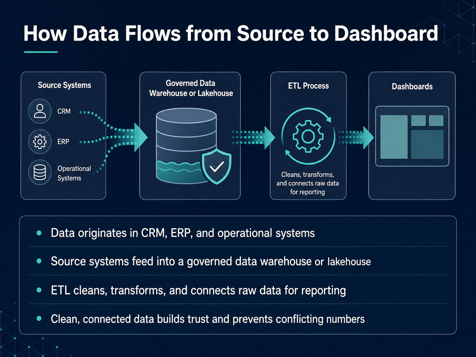
 - 04How Data Flows from Source to DashboardNow let's trace the actual path your data takes before it appears on a dashboard. It starts in the systems you already use every day, like your CRM, your ERP, or other operational tools. Those systems are great at capturing transactions, but they aren't built for analysis. So the raw data moves into a governed data warehouse or a lakehouse. Think of that as a single, controlled storage space designed for reporting. Along the way, a process called ETL steps in. That stands for extract, transform, and load. ETL pulls the data out, cleans it up, standardizes names and formats, and connects related records from different systems. This step is what prevents conflicting numbers. When two teams see the same metric, they can trust it because the data went through the same preparation. Once that clean, connected data is in place, it is ready to be visualized and explored. Up next, we'll look at the landscape of BI tools that sit on top of this foundation and turn that data into dashboards and reports.
 techtarget.comtechtarget.combarc.com+21 min
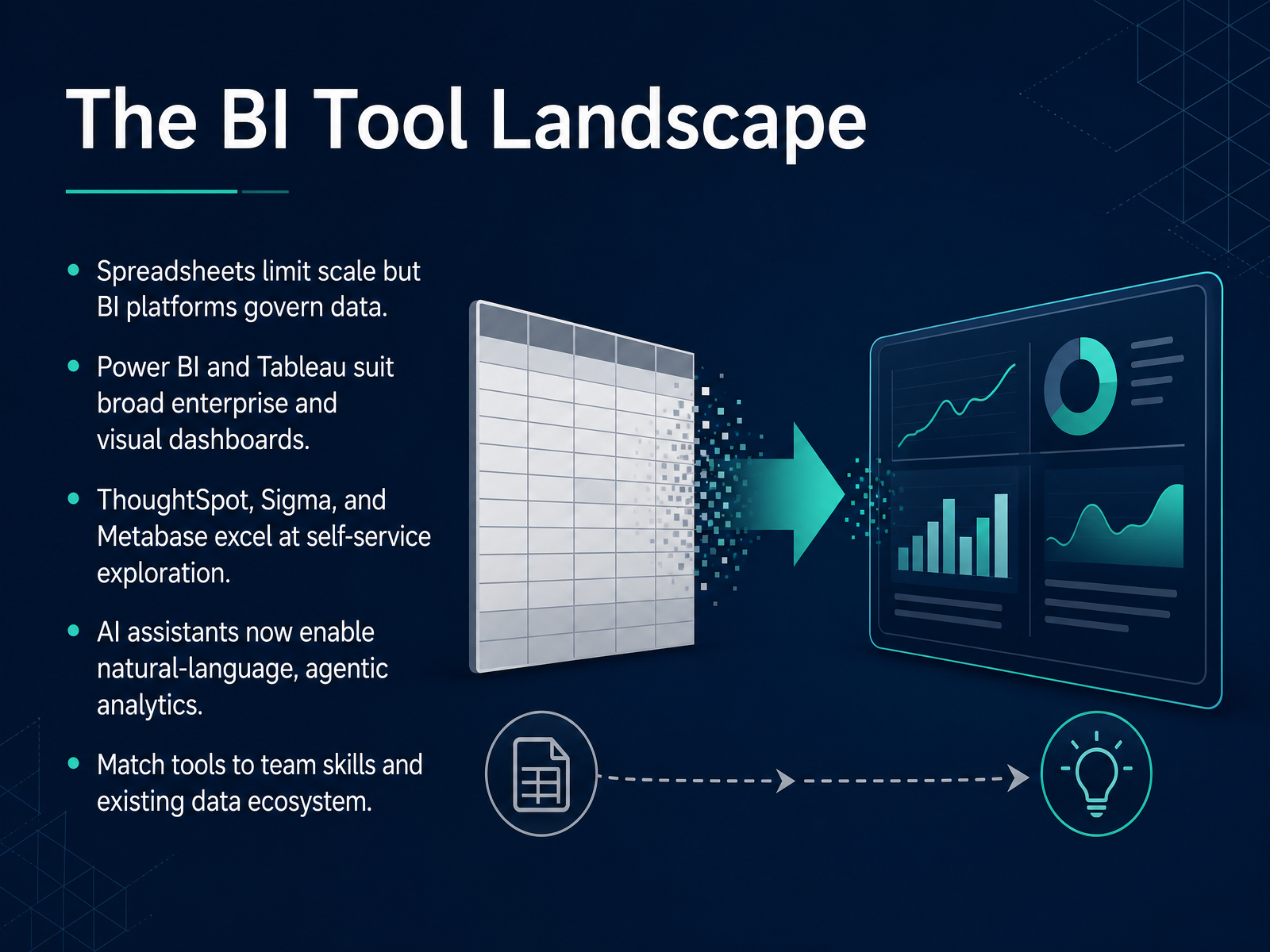
 - 05The BI Tool LandscapeNow let's look at the BI tool landscape. Spreadsheets are great for quick analysis, but they hit a wall when you need governed data and consistent metrics at scale. So think of spreadsheets as the sketchpad, and BI platforms as the governed system of record for your numbers. For broad enterprise reporting and visual dashboards, Power BI and Tableau are the heavy hitters. Power BI fits naturally if your company lives in the Microsoft ecosystem. Tableau is often preferred for highly polished, analyst-grade visualizations. On the self-service exploration side, ThoughtSpot, Sigma, and Metabase are built for speed and accessibility. ThoughtSpot is search-first, so users can simply type a question and get an answer. Sigma gives spreadsheet-fluent teams a familiar interface. Metabase is a strong, low-cost starting point for smaller teams. One major shift is the rise of AI assistants. Today, platforms embed natural language and agentic analytics, so users can ask questions in plain English and even get recommended actions, not just charts. The key is to match the tool to your team's skills and the data ecosystem you already have. Next, we'll explore how to design dashboards that actually drive action.
 techvendorindex.comcube.devpromethium.ai+22 min
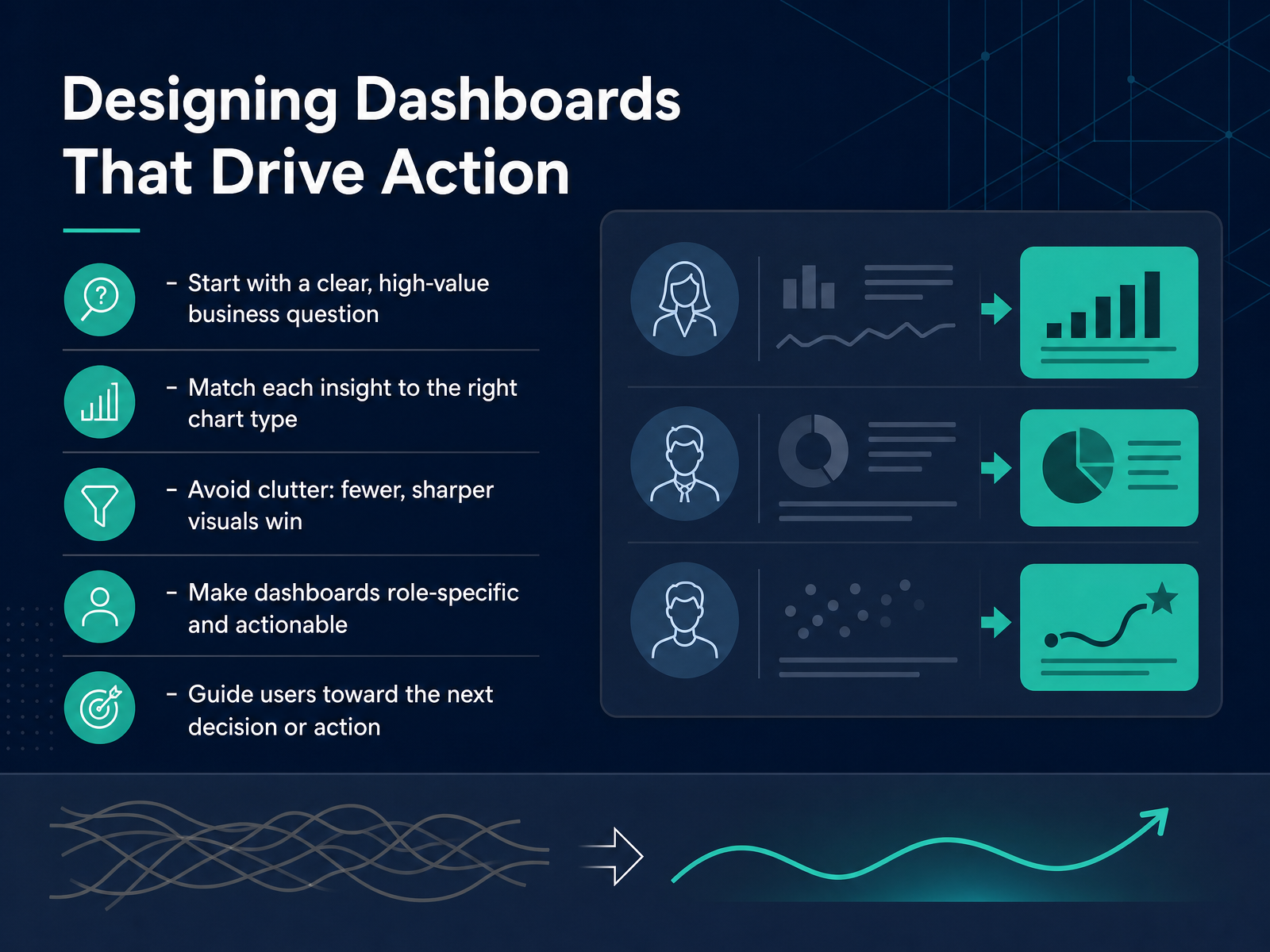
 - 06Designing Dashboards That Drive ActionNow let's talk about designing dashboards that actually drive action. A dashboard should start with a clear, high-value business question. If you don't know what decision it supports, the dashboard probably isn't ready to build yet. Match each insight to the right chart type. Trends work well as line charts. Comparisons are easier to see as bars. Avoid clutter. Fewer, sharper visuals always win over a wall of widgets. Make dashboards role-specific and actionable. A sales manager and an operations lead should not be looking at the same layout, because they are answering different questions. And always guide users toward the next decision or action. If a number is off target, the dashboard should point to where they can dig in next. Keep that focus in mind, and your dashboards will move from reporting to real decision support. Next, we'll build on this by looking at reading BI outputs with confidence.
 1 min
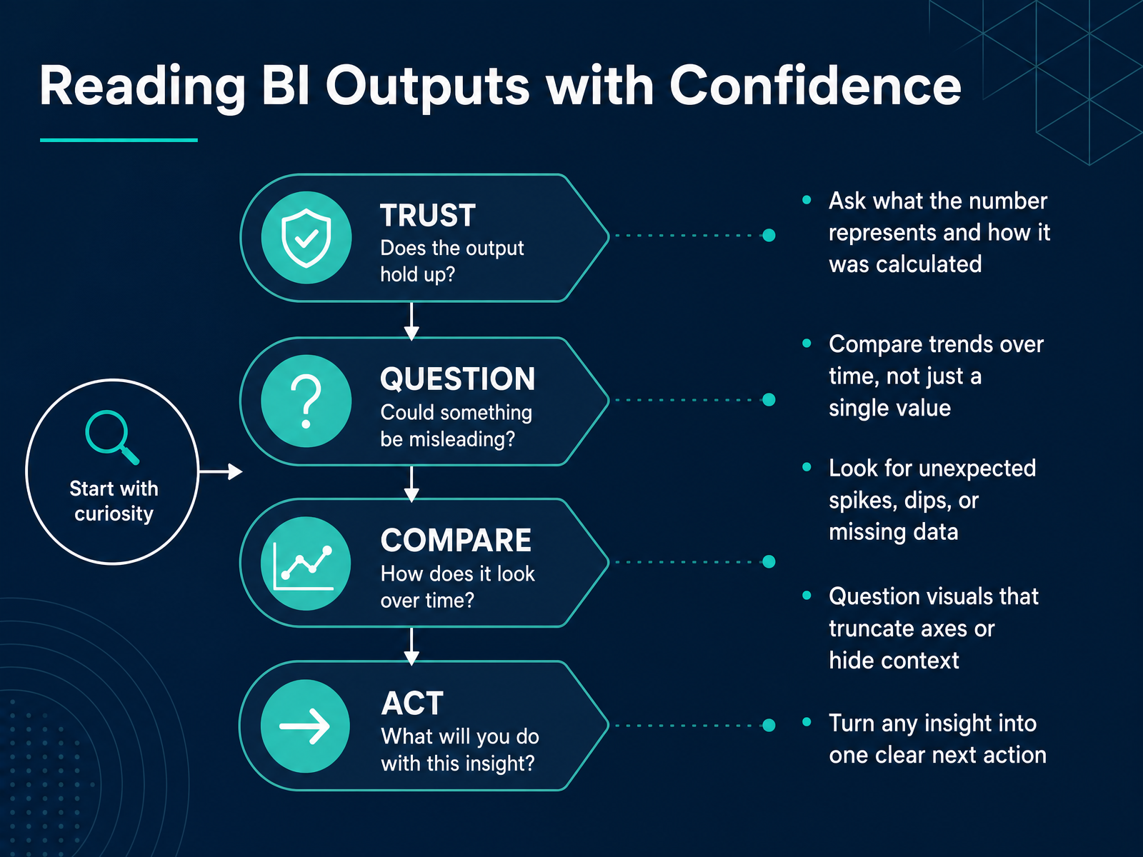
1 min - 07Reading BI Outputs with ConfidenceNow let's talk about reading BI outputs with confidence. When you see a number on a dashboard, don't just accept it at face value. First, ask what that number actually represents and how it was calculated. Is it a count of orders, a sum of revenue, or an average of response times? That definition changes what the number means. Second, compare trends over time, not just a single value. A revenue figure by itself tells you very little. But seeing that figure rise or fall across several months tells a story. Third, look for unexpected spikes, dips, or missing data. A sudden drop could be a real problem, or it could be a reporting gap. You need to know the difference. Fourth, question visuals that truncate axes or hide context. A chart can look dramatic simply because the scale starts at ninety instead of zero. Finally, turn any insight into one clear next action. If you see a decline in a key metric, decide what you will do about it. Who should investigate, and by when? Reading BI outputs confidently means moving from looking at a number to acting on it. Next, we'll cover common pitfalls in early BI adoption.
 2 min
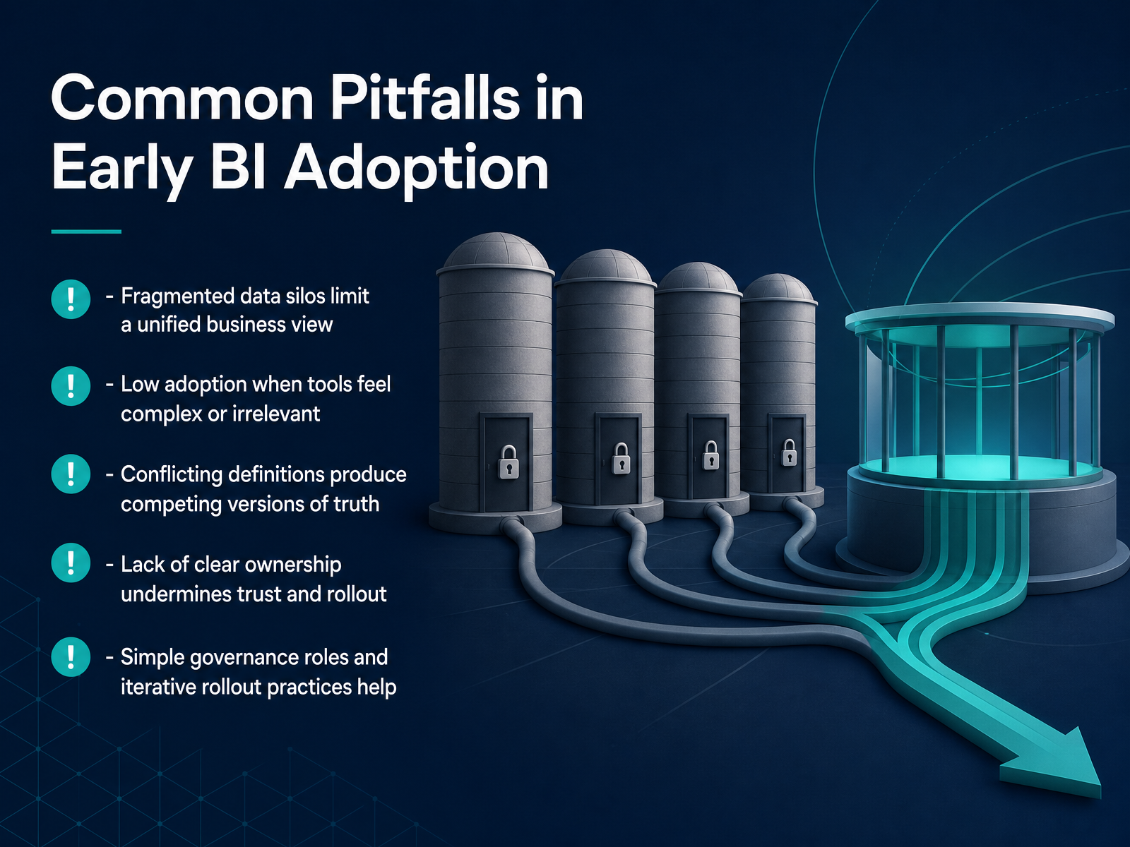
2 min - 08Common Pitfalls in Early BI AdoptionNow let's talk about some of the common roadblocks teams hit when they first adopt BI, because knowing them upfront can save you a lot of rework. The first big one is fragmented data silos. When sales data lives in one system and operations data in another, you can't see the full picture of the business. The result is competing versions of truth, where two managers bring different revenue numbers to the same meeting and spend the whole time arguing about whose spreadsheet is right. That friction kills trust. The second common pitfall is low adoption. If a dashboard feels complicated or doesn't answer a real question, people just go back to what they know. That's why simple ownership matters. Every report needs a clear person who stands behind the numbers. And finally, don't try to fix everything at once. Start with a small set of governed metrics and expand from there. In the next slide, we'll build on that idea with governance and trust in today's BI.
 techtarget.comcio.comemerald.com+21 min
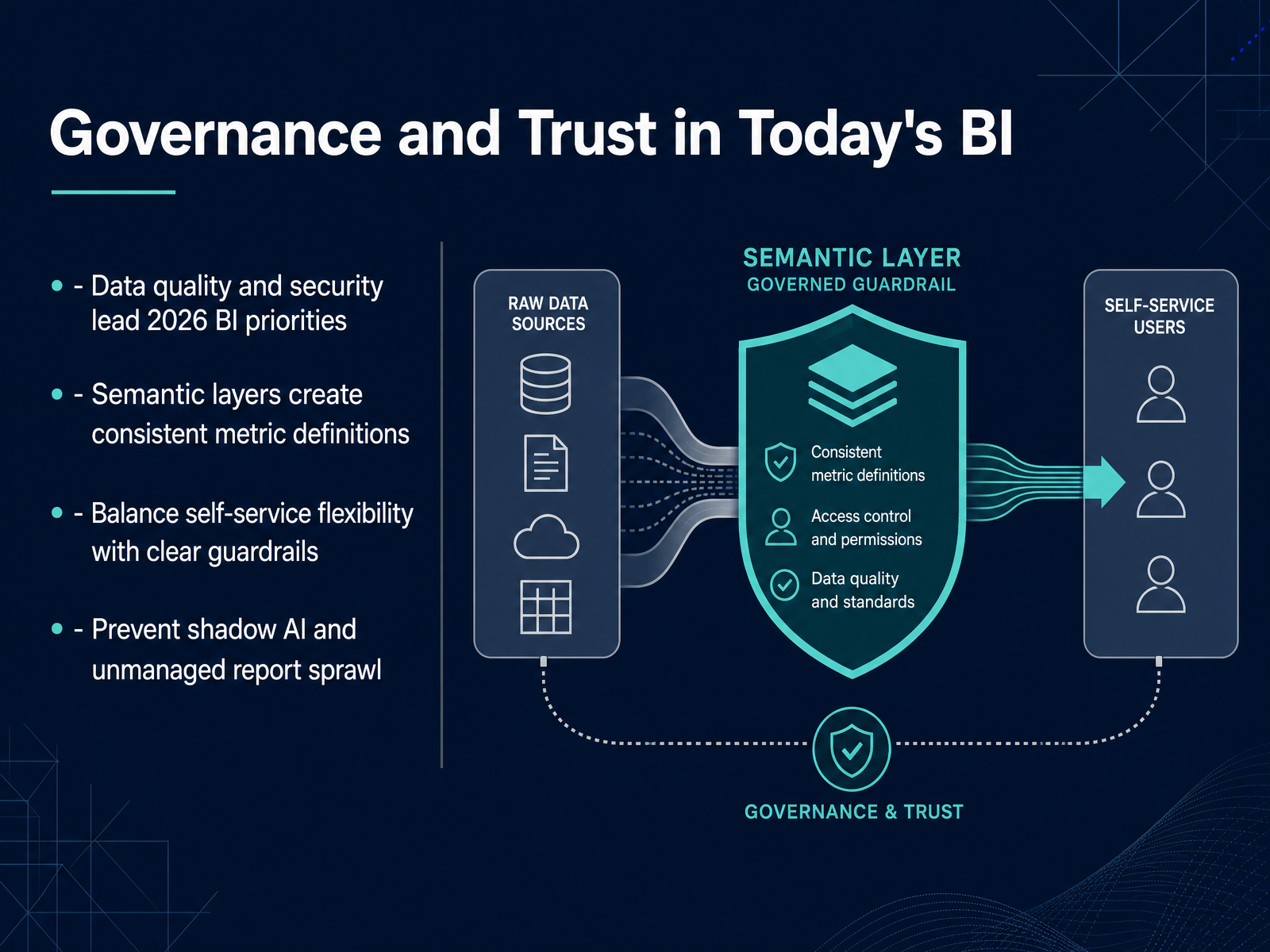
 - 09Governance and Trust in Today's BINow let's talk about something that quietly decides whether your BI program succeeds or stalls. It's about governance and trust. This year, data quality and security have become the top priorities for most organizations. That's not surprising. If the numbers aren't reliable or safe, every decision built on them is at risk. One way to make numbers more reliable is through a semantic layer. Think of it as a shared dictionary for your metrics. It makes sure that when the sales team and the finance team say revenue, they mean exactly the same thing. But we also need to balance this structure with flexibility. Self-service is powerful, but it needs clear guardrails. Without them, you end up with shadow AI tools and unmanaged reports spreading in every direction, which creates confusion instead of clarity. So remember, good governance isn't about saying no. It's about giving people the freedom to explore while keeping everyone on the same page. Next, we'll look at making numbers comparable across teams.
 techtarget.comtechtarget.combarc.com+21 min
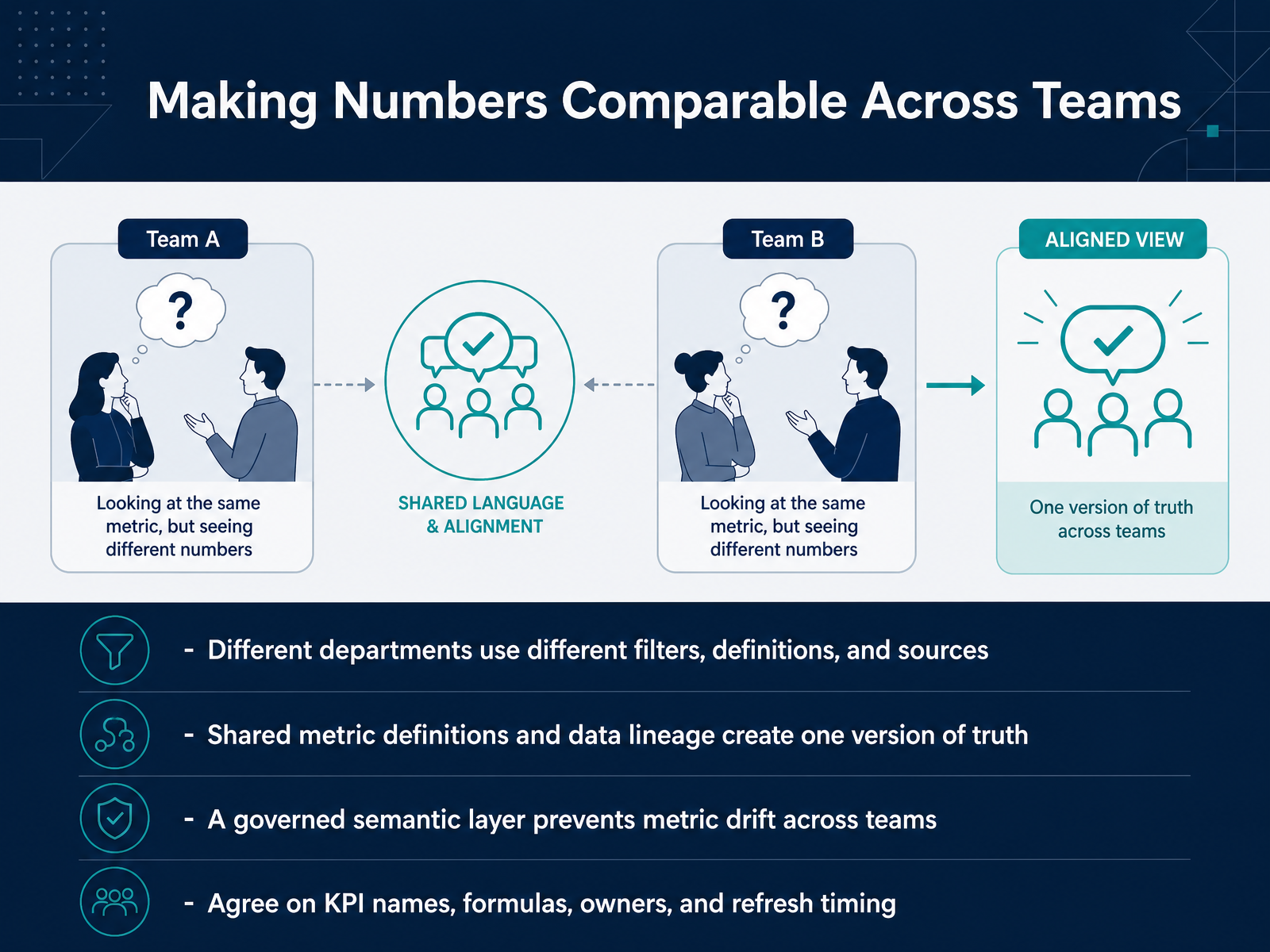
 - 10Making Numbers Comparable Across TeamsNow let's talk about something that causes a lot of quiet frustration: teams comparing numbers that don't actually mean the same thing. Sales calculates revenue one way. Finance uses a different filter. Operations pulls from another source altogether. Everyone is looking at a dashboard, but no one is looking at the same truth.
The fix isn't technical magic. It's agreement on shared definitions and clear data lineage. Think of data lineage as a map showing exactly where each number comes from and how it was calculated. When that map exists, a metric means one thing, no matter which team opens the report.
A governed semantic layer makes this practical. It's a shared business vocabulary that sits between raw data and your reports, so metric definitions don't drift over time. In practice, you agree on KPI names, the exact formula, who owns the metric, and when it refreshes. That sounds simple, but it prevents most of the arguments in Monday meetings.
Once your numbers are comparable, the next step is letting people explore them safely on their own. Let's move into self-service exploration.
 techtarget.comcio.comemerald.com+22 min
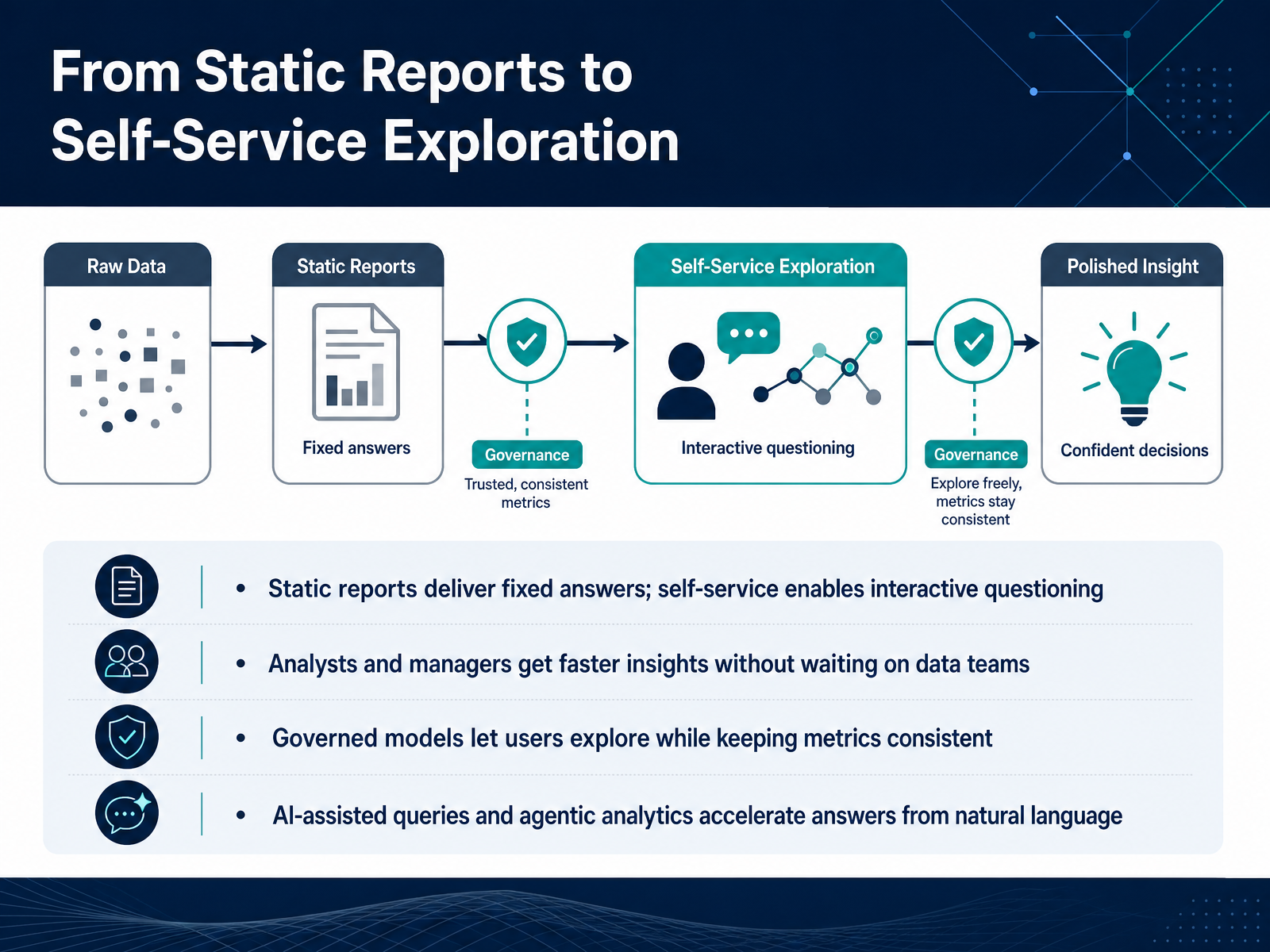
 - 11From Static Reports to Self-Service ExplorationLet's shift from predefined reports to something more flexible. Static reports answer a fixed question. Self-service exploration lets you ask your own questions as they come up. That means analysts and managers can get answers in minutes, instead of waiting for a data team to build another report. The key is governance. When metrics are defined in a shared model, people can explore freely and still get consistent numbers. And with AI-assisted queries, you can ask a question in plain English and get a useful answer back almost immediately. That combination of governed models and natural language is what makes self-service both fast and trustworthy. Next, we'll look at what it takes to run a successful first BI pilot.
 techvendorindex.comcube.devpromethium.ai+22 min
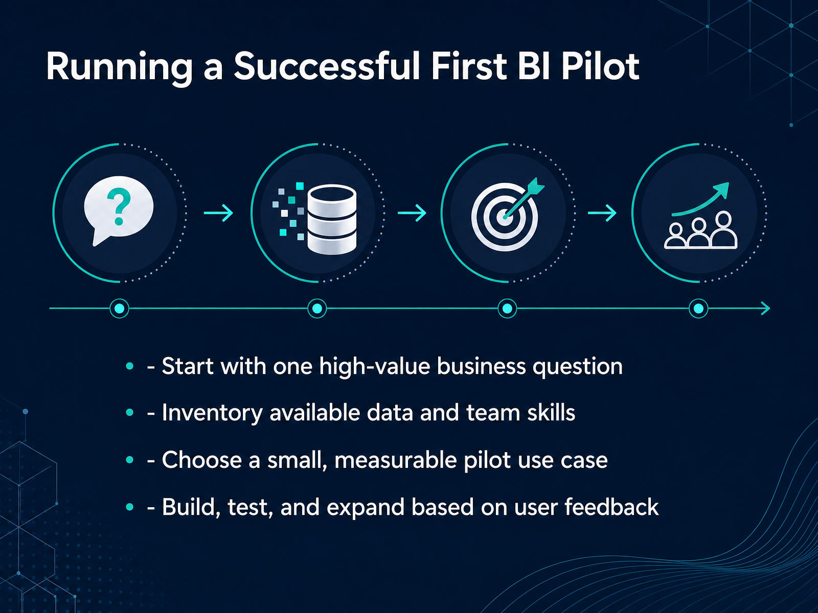
 - 12Running a Successful First BI PilotNow let's talk about running your first BI pilot well, because the goal here is not a big rollout. It is a small win that builds trust. Start with one high-value business question. Maybe your question is, why did customer churn rise last quarter, or which product region is most profitable. That clarity keeps the team focused. Next, inventory what you already have. Look at available data and team skills before you buy anything new. Imperfect data is okay for a pilot. You are testing a way of working, not building the final system. Then choose a small, measurable use case, something a few people can use in a few weeks. Build it, test it with real users, and listen carefully. Their feedback tells you what to fix, what to simplify, and what to expand next. That loop is what turns a pilot into adoption, not just another abandoned dashboard.
 techtarget.comcio.comemerald.com+21 min
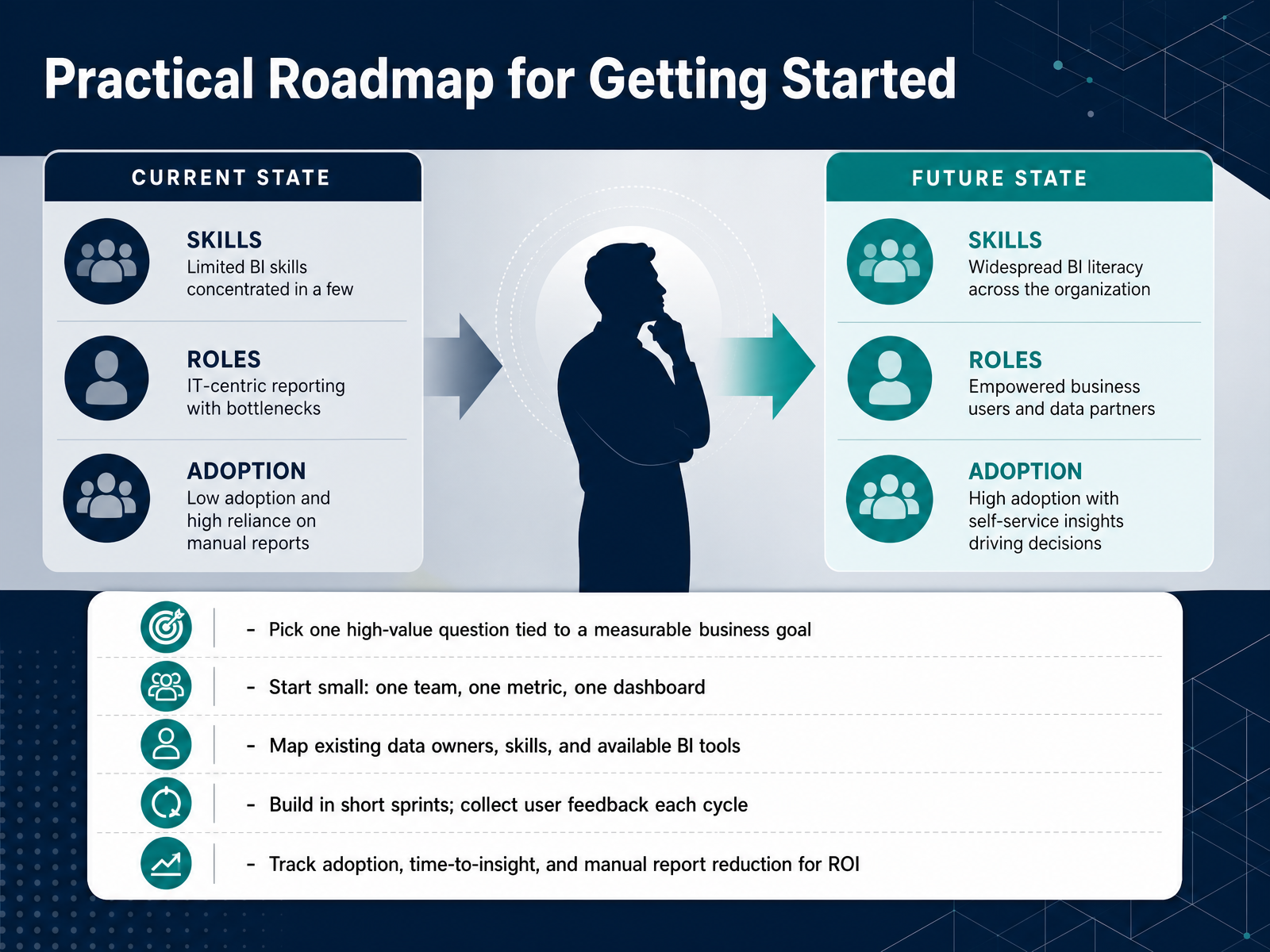
 - 13Practical Roadmap for Getting StartedLet's turn this into a practical plan you can start tomorrow. First, pick one high-value question. Not the biggest question. Just the one that, answered well, moves a measurable business goal forward. Start small: one team, one metric, one dashboard. That keeps scope controlled and lets you learn before you scale. Next, map what you already have: data owners, skills, and the BI tools already in play. You likely have more building blocks than you think. Then build in short sprints. Two weeks is enough to deliver something usable. Show it to real users, listen to their feedback, and improve each cycle. Finally, measure the right things: adoption, time-to-insight, and manual report reduction. Those tell you whether the effort is actually paying off. In the next section, we'll talk about how to apply BI this week.
 techtarget.comtechtarget.combarc.com+21 min
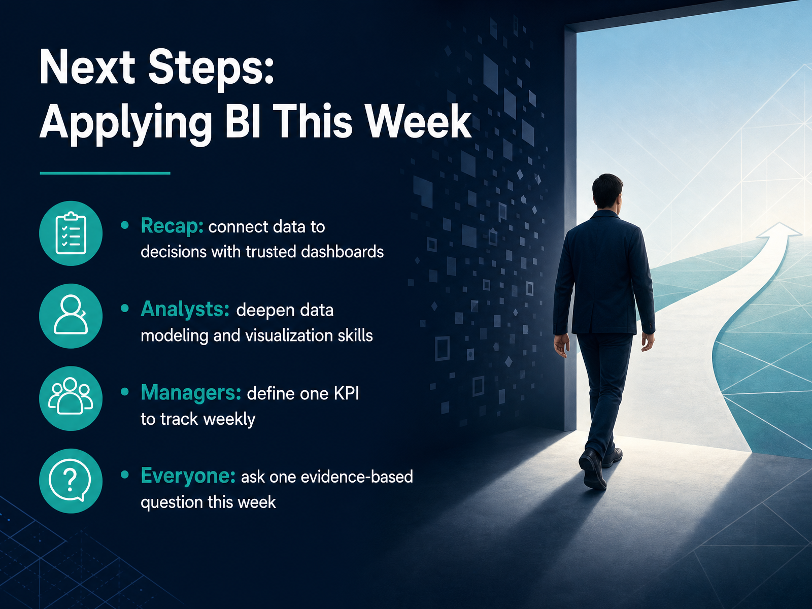
 - 14Next Steps: Applying BI This WeekLet's bring this full circle. The point of Business Intelligence is not the tool or the chart. It is connecting data to decisions through dashboards you can trust. If you're an analyst, take time this week to strengthen your data modeling or visualization skills. Pick one small project where clearer structure would save people time. If you're a manager, define one KPI you will review weekly. Choose something specific, like orders shipped on time or support tickets resolved within a day. And everyone can do this next step: ask one evidence-based question this week. For example, what does the data show about why last month's numbers changed? That single habit often reveals more than a full dashboard review. Thank you for working through these fundamentals with me. Start small, use data deliberately, and let the evidence guide your next decision.
 1 min
1 min
Take the deck with you
Download this course as a file — free, no sign-up needed.
- PDF handoutEvery slide page, ready to print or share.15 pages · 3.2 MBDownload
- Narrated PowerPointThe deck that presents itself — every slide carries the digital human's narration video.15 pages · 13.3 MBDownload
- PowerPoint slidesThe full deck as a .pptx — open it in PowerPoint, Keynote, or Google Slides.15 pages · 3.1 MBDownload
Free to use in your own training — please keep the PersonWise credit page at the end.
Have your own deck? Turn it into a course
Sources consulted
Web sources consulted while building this course.
- What is Business Intelligence (BI)? A Detailed Guide | TechTarget — techtarget.com
- Business Intelligence (BI): Tools, Types, Benefits, and Applications — investopedia.com
- What is Business Intelligence (BI)? Benefits and use cases — cloud.google.com
- What Is Business Intelligence | Microsoft Power BI — microsoft.com
- What Is Business Intelligence and Why Does It Matter? | Coursera — coursera.org
- The Future of Business Intelligence: 10 Top Trends in 2026 | TechTarget — techtarget.com
- AI in Business Intelligence: How to Manage It Effectively | TechTarget — techtarget.com
- Data, BI & Analytics Trend Monitor 2026 | BARC Research — barc.com
- The state of BI and analytics in 2026 | Observable — observablehq.com
- Trend Monitor 2026 - Top 20 Trends in Detail — barc.com
- Best BI for Self-Service 2026 — Top 8 Platforms Ranked — techvendorindex.com
- Best Self-Service Analytics Tools in 2026, Compared — cube.dev
- Top 10 Self-Service Analytics Tools in 2026: Complete Guide — promethium.ai
- Self-service analytics tools compared for 2026 — kleene.ai
- Self-Service Analytics Tools: Best Platforms and Features for 2026 - Data Pilot — data-pilot.com
- Business Intelligence Challenges Intensify as AI Use Grows — techtarget.com
- 6 BI challenges IT teams must address | CIO — cio.com
- Successful business intelligence implementation: a systematic literature review — emerald.com
- Why BI Implementations Fail: A Guide to Avoiding the Pitfalls | Business Intelligence Curated — bicurated.com
- Why Does It Fail? A Systematic Review of End-Users’ Challenges in Business Intelligence — ideas.repec.org