Begin
17 pages · ~34 min
Information Architecture Fundamentals
This training covers the core principles of information architecture, teaching learners how to structure and organize content for intuitive user experiences.
A digital instructor presents all 17 pages. Hold “Ask” at any point and ask out loud — the answer comes from this course. No sign-up needed.
What you’ll learn
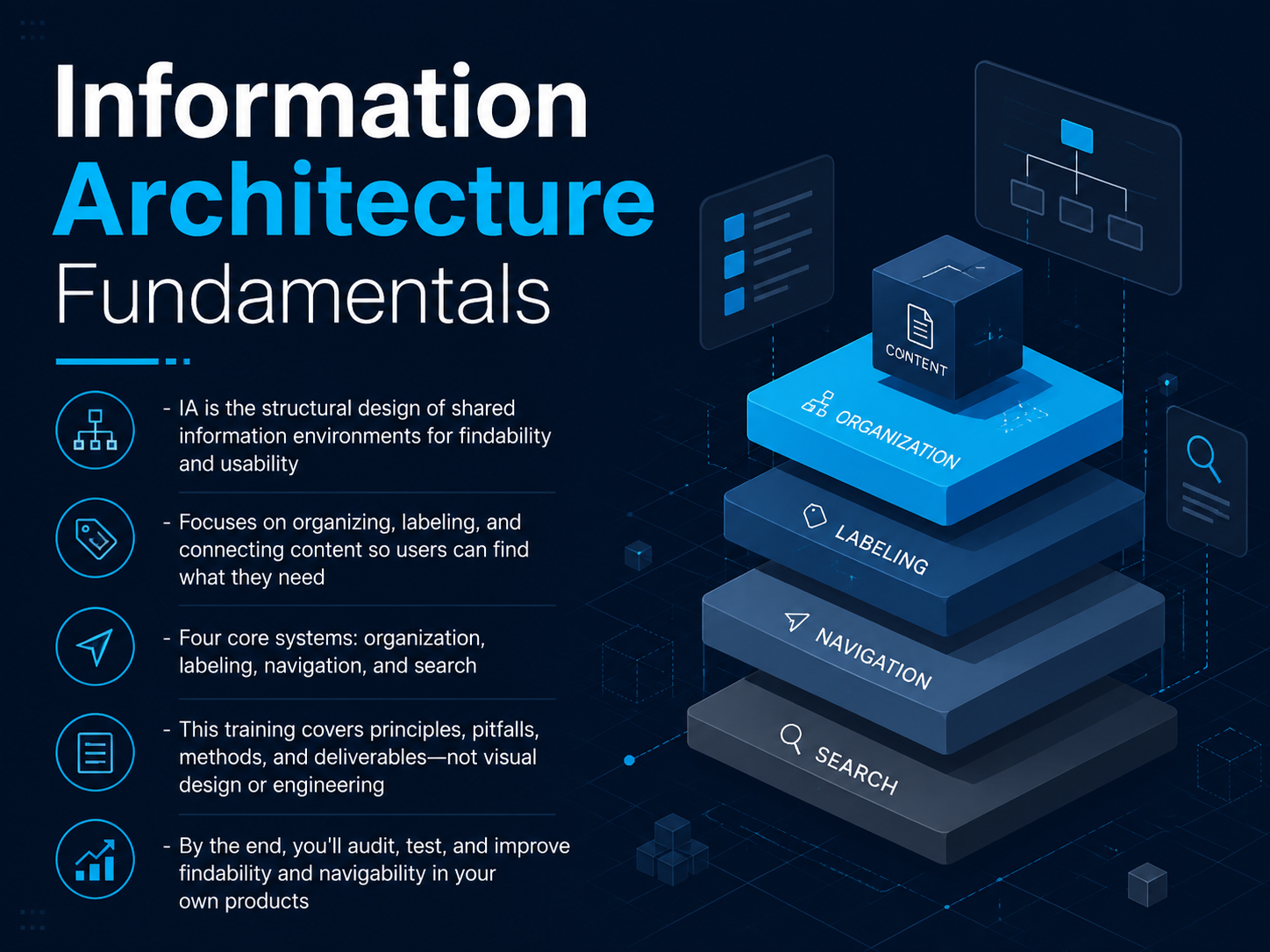
- 01Information Architecture FundamentalsWelcome to Information Architecture Fundamentals. I'm glad you're here. If you're a product designer or content designer, you already know the frustration of watching users get lost in a product you built. This course is about fixing that. Information architecture, or IA, is the structural design of shared information environments. In plain language, it's how we organize, label, and connect content so that people can find what they need and understand where they are. We're not going to talk about visual design or engineering. Instead, we'll focus on four core systems: organization, labeling, navigation, and search. By the end of this training, you'll be able to audit your own products, test how findable your content is, and make real improvements to navigability. Let's start by looking at what happens when IA goes wrong. Next up: Why IA Fails, Common Pitfalls in Products and Content.en.wikipedia.orguxguides.comixdf.org+21 min
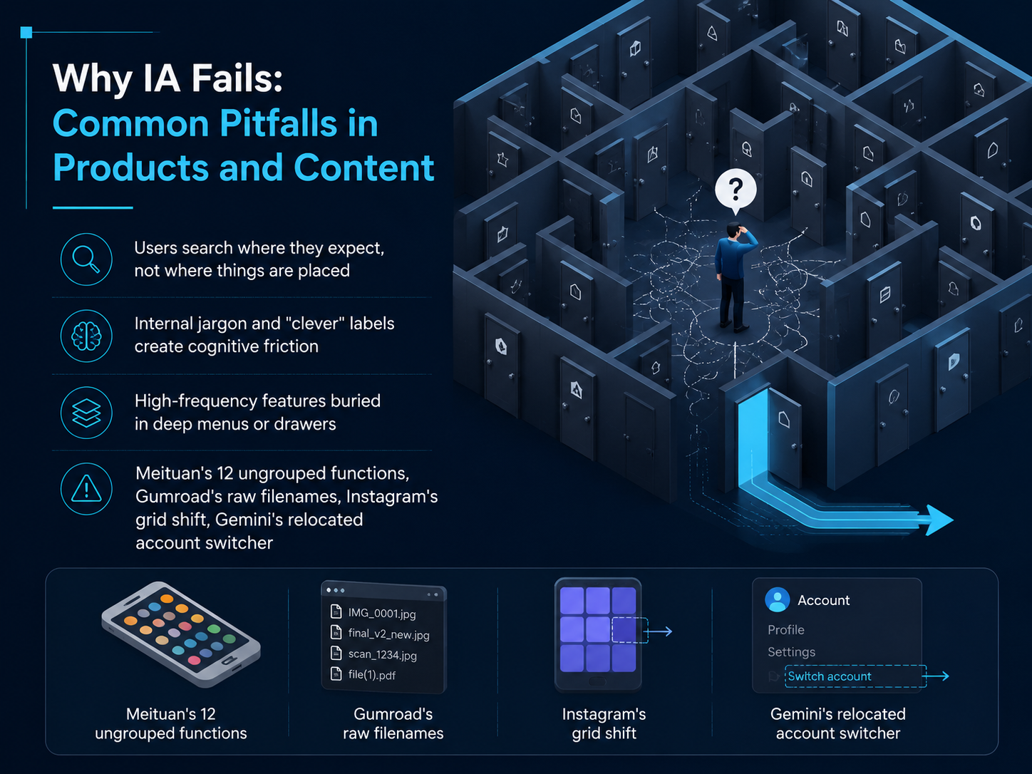
- 02Why IA Fails: Common Pitfalls in Products and ContentLet's examine why information architecture so often fails. The first pitfall is a disconnect between user expectations and placement. People search where they expect to find something, not where the system actually puts it. When a feature lives in a location that makes sense to the team but not to the user, it becomes invisible. A second common problem is internal jargon and overly clever labels. Names like Raccoon Canteen or Rice Grains might feel creative, but they create cognitive friction. Users are forced to decode meaning instead of recognizing it, which violates the simple principle: don't make people think. The third pitfall is burying high-frequency features deep in menus or drawers. Think of Meituan's twelve ungrouped functions in a single drawer, or the Gumroad app returning raw filenames instead of recognizable product cards. When critical actions are hidden, users abandon the task. Even established products make these mistakes. Instagram's shift to a rectangular grid broke carefully curated profiles, and Gemini's relocation of the account switcher disrupted muscle memory built over years. Each of these examples shows that when structure fails, the experience fails. Next, we'll look at the business cost of bad IA.
 oreateai.commedium.comunstar.app+22 min
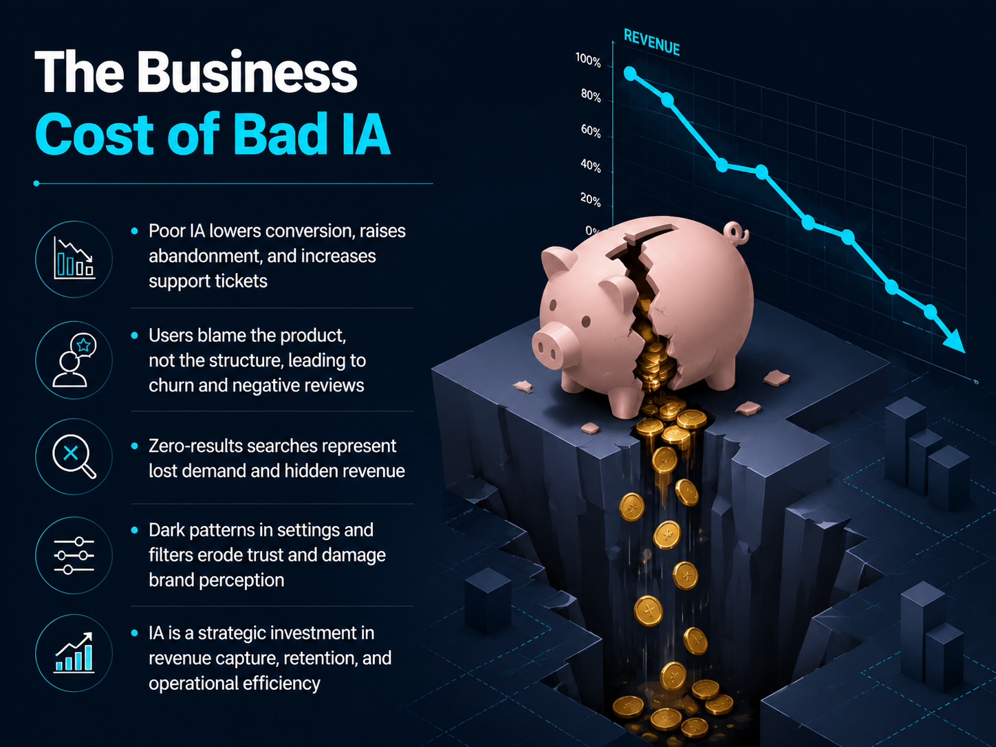
 - 03The Business Cost of Bad IALet's get specific about what bad information architecture actually costs your business. When users can't find what they need, conversion drops and abandonment rises. Worse, support tickets pile up because confused customers reach out for help instead of completing their tasks. But here's the real danger: users rarely blame the structure. They blame the product. This leads to churn, negative reviews, and a damage to brand perception that is hard to undo. A particularly revealing signal is the zero-results search. Every time a user searches and gets nothing, you're seeing lost demand and hidden revenue. It tells you the customer wants something you likely have, but your IA failed to connect them. Add to this the slow erosion of trust caused by dark patterns in your settings and filters, like hiding the cancel button or making data sharing the default. Users notice, and they remember. Investing in IA is not a theoretical exercise. It is a strategic decision that directly impacts revenue capture, customer retention, and operational efficiency. A well-structured product pays for itself by reducing support costs and capturing the revenue that a confusing layout would otherwise leave on the table. Now, let's apply this thinking to the structure itself. We'll move next to organization systems and how to structure content for findability.
 oreateai.commedium.comunstar.app+22 min
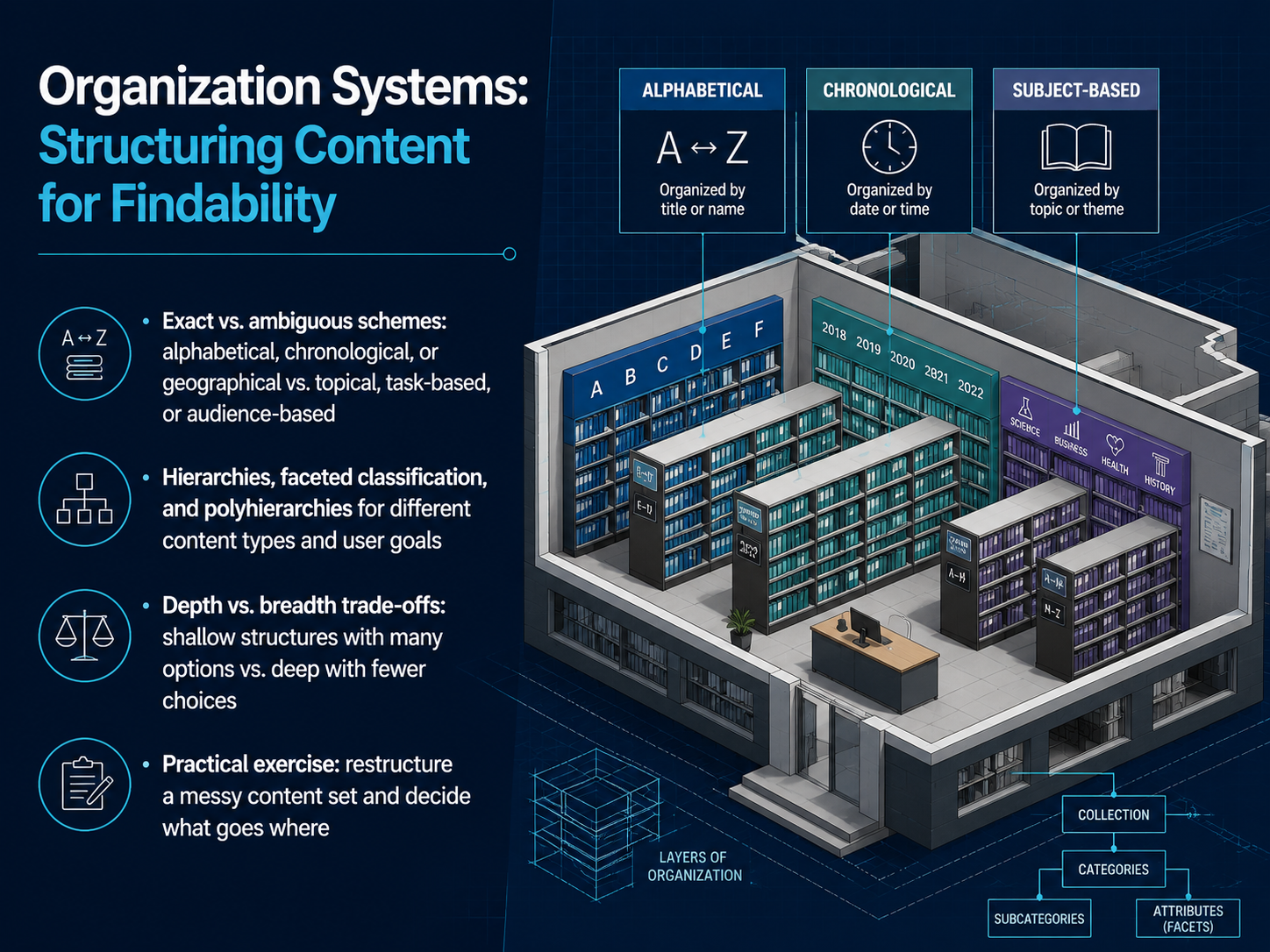
 - 04Organization Systems: Structuring Content for FindabilityLet's explore the engine that makes findability work: organization systems. These are the rules you use to group and arrange content so users can predict where things live. You have two broad directions. Exact schemes let users look up a known item, like finding a contact by last name alphabetically, or an event by date. Ambiguous schemes are for discovery, like browsing by topic, by task, or by audience role. Both are valid; the key is matching the scheme to the user's goal. Now, how deep should you go? That's the depth versus breadth trade-off. A shallow structure means fewer clicks but more options per screen, which can overwhelm. A deep structure means fewer choices at each step, but users click through more layers and can get lost. There's no perfect number, but test your structure early. You'll also use hierarchies for simple parent-child relationships, or faceted classification when one item belongs in multiple dimensions, like a product that can be filtered by color, size, and price. The real skill is knowing when to apply each. So, your practical exercise is this: take a messy content set, identify the right scheme, and decide where each piece goes. This moves you from theory to the real structure work that shapes navigation. Next, we'll look at how the words you choose on those labels can make or break the experience, in Labeling Systems: The Words That Guide Users.
 en.wikipedia.orguxguides.comixdf.org+22 min
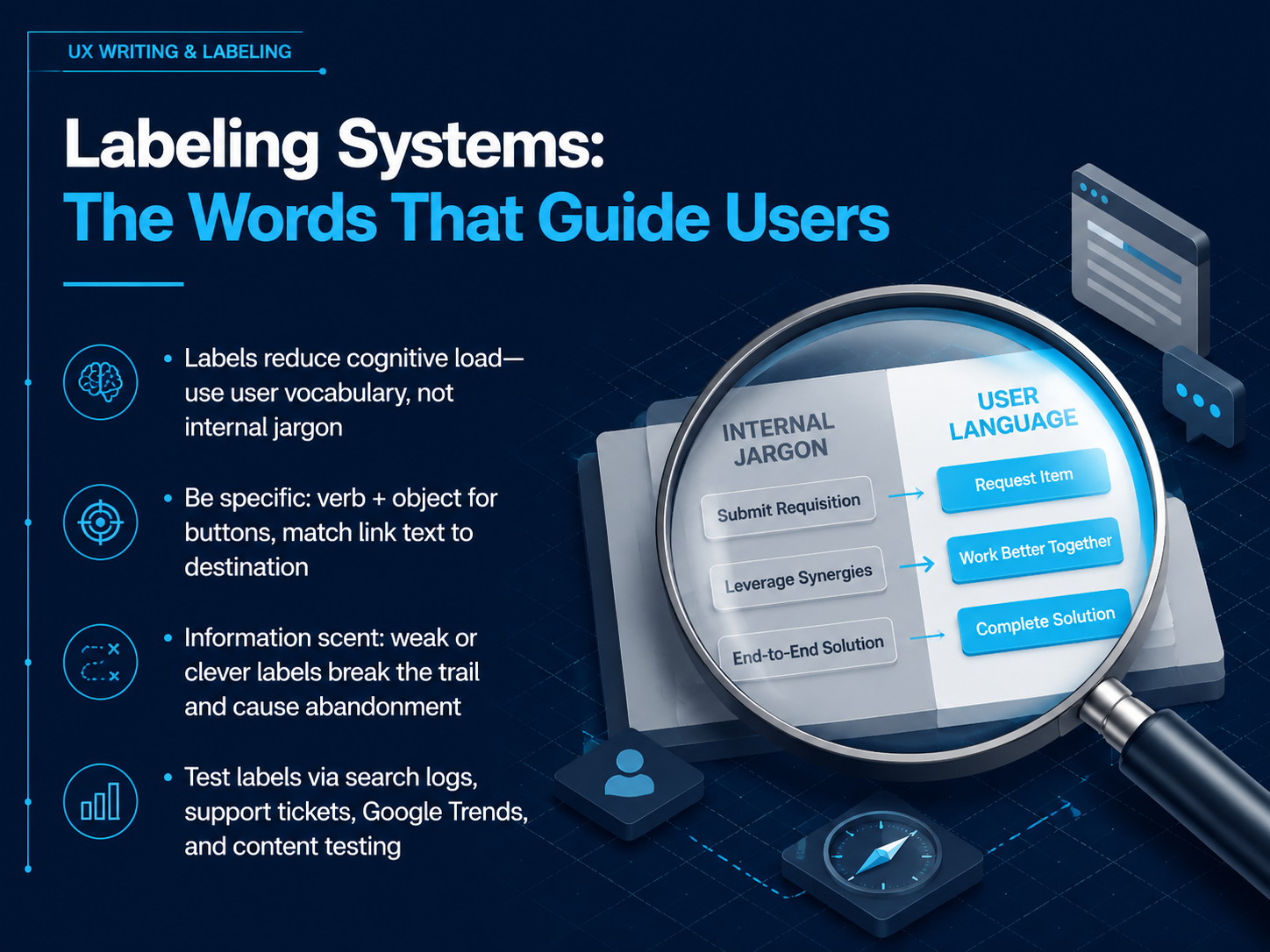
 - 05Labeling Systems: The Words That Guide UsersLet's focus on the words that guide your users: labeling systems. These are the signposts of your interface—button text, navigation names, and field labels. The right words reduce cognitive load. The wrong words create confusion. The first rule is simple. Use your users' vocabulary, not internal company jargon. Your team might call it a 'member onboarding optimization,' but your users are searching for 'how to get started.' Match their language. Next, be specific. Buttons should use a verb plus object format, like 'Send invoice' instead of 'Submit.' This tells the user exactly what will happen. Link text must match the destination. If a link says 'Pricing,' the page it leads to must show pricing, not a signup form. This is called information scent. Weak or clever labels break the trail and cause users to abandon their task. A label like 'Our World' forces users to decode a metaphor. 'About Us' is instantly clear. To find the right words, test your labels. Look at internal search logs for the terms users type. Review support tickets for recurring points of confusion. Use Google Trends to see what language people actually search for. And run content testing to validate your choices. Clear labels mean confident users. Next, we'll explore navigation systems: helping users find their way.
 lettercrafted.comalphonsolabs.comblog.logrocket.com+22 min
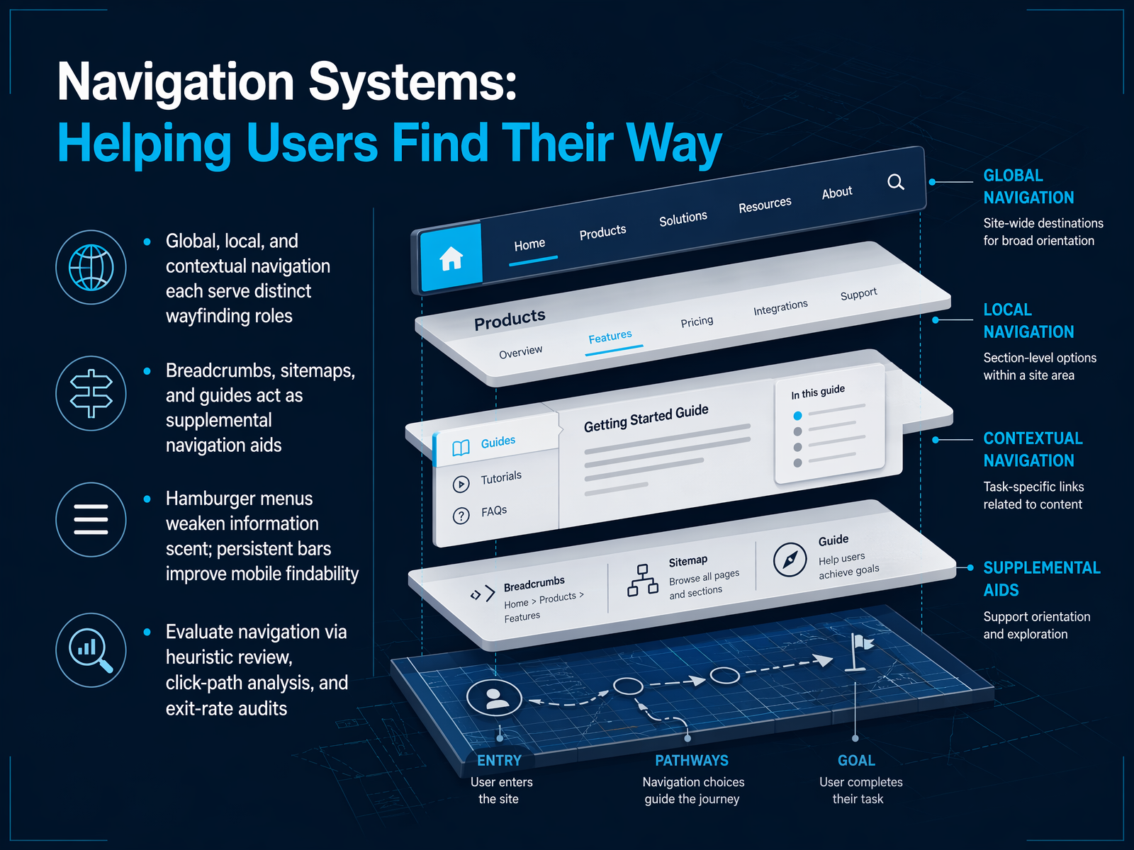
 - 06Navigation Systems: Helping Users Find Their WayNow let's talk about navigation systems, the main tool you use to help people find their way through your content. Think of navigation as having three distinct roles. Global navigation is always visible, like the main menu at the top of a site. Local navigation helps users move within a specific section. And contextual navigation provides inline links to related content exactly when it's needed. Beyond these core systems, you also have supplemental aids. Breadcrumbs show users where they are in the hierarchy. Sitemaps and guides give them a broader view of the whole structure. A word of caution on mobile: hamburger menus are common, but they hide choices and weaken what we call information scent. Persistent navigation bars often improve findability because users can see and scan their options directly. So how do you know if your navigation is working? You can evaluate it with a heuristic review, analyze click-paths to see where users actually go, and audit exit rates to spot pages where people give up and leave. A quick audit of these signals can reveal a lot about structural problems before users complain. Next, we'll explore search systems and how to design for the moment when browsing isn't enough.
 en.wikipedia.orguxguides.comixdf.org+22 min
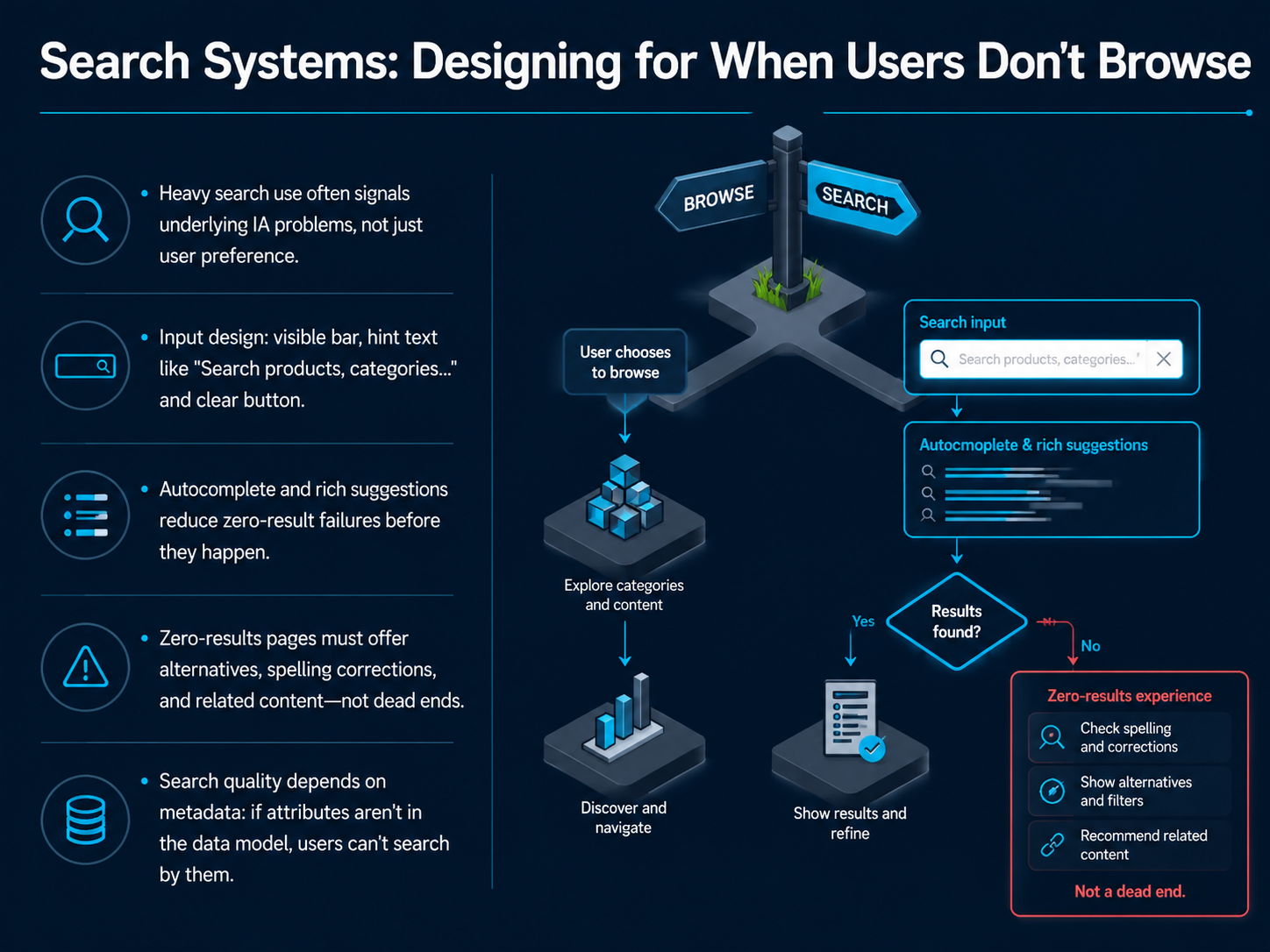
 - 07Search Systems: Designing for When Users Don't BrowseNow, let's talk about what happens when users don't browse, but search instead. Heavy use of the search bar often signals a deeper information architecture problem, not just a user preference. So, how do we design a search system that truly supports them? First, the input itself. Make the search bar visible, and use hint text that guides users, like 'Search products, categories, or brands.' Always include a clear button to let them easily undo a search. Second, use autocomplete and rich suggestions, like product thumbnails or prices, to prevent zero-result failures before they even happen. If a search does return zero results, that page must never be a dead end. Offer alternatives, spelling corrections, and links to related content to keep the user moving forward. Finally, remember that search quality depends entirely on your metadata. If key attributes like 'waterproof' or 'sleeve length' aren't in your data model, your users simply cannot search by them. Let's take these principles and apply them to the search results page, making every single result count.
 timgraf.combutterflai.proaijourn.com+22 min
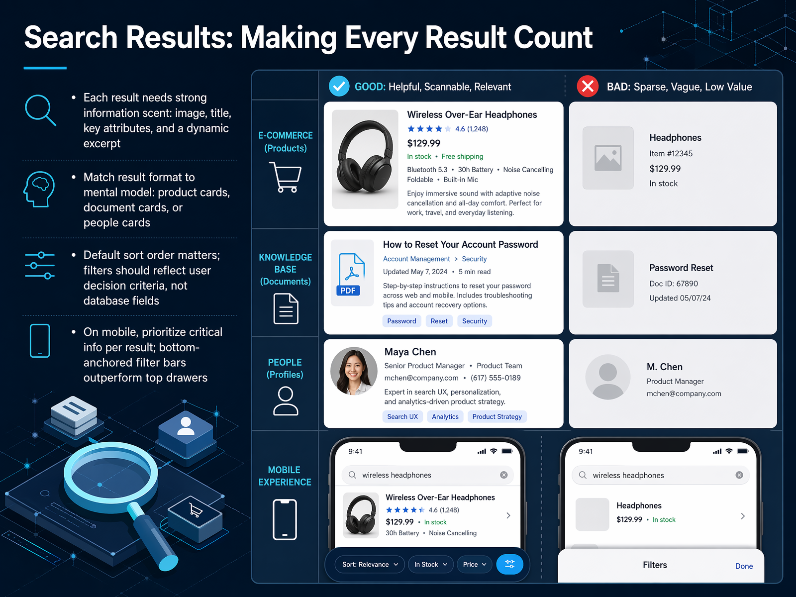
 - 08Search Results: Making Every Result CountNext, let's focus on the search results page itself. After a user types a query, every result on the page needs to help them decide: is this what I'm looking for? This is called information scent. For a product, strong scent means an image, a title, a price, and a dynamic excerpt that highlights the matching terms from the query. If the excerpt is generic, the user might skip a perfectly relevant result. Match the result format to the user's mental model. Use product cards for a catalog, document cards for a knowledge base, and people cards for a directory. The default sort order matters a lot. Most users won't change it, so default to relevance or bestseller recency, not just newest first. Filters should reflect decision criteria like size or material, not database fields like SKU code. On mobile, screen space is tight, so prioritize the most critical information per result. A bottom-anchored filter bar usually outperforms a top drawer because it's easier to reach with one thumb. In short, make every result count by providing the right cues in the right format. Up next, we'll build on this with content modeling and metadata.
 timgraf.combutterflai.proaijourn.com+22 min
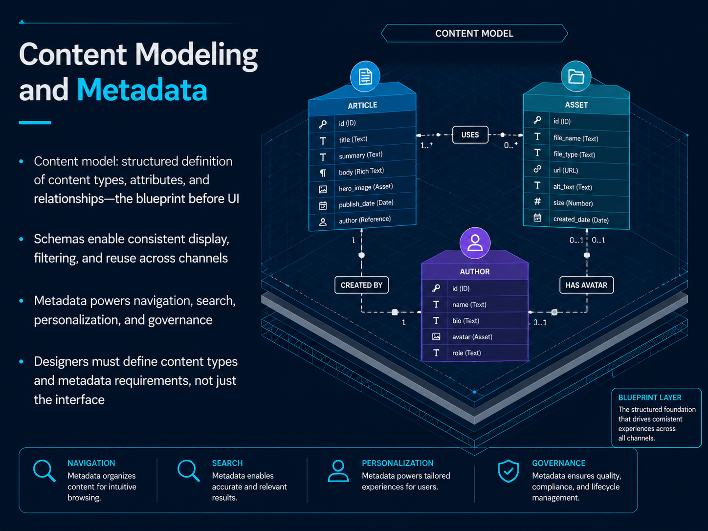
 - 09Content Modeling and MetadataNow, let's translate structure into a system with content modeling and metadata. A content model is the blueprint that defines your content types, their attributes, and how they relate to each other—all before you design the interface. Think of it as the structured definition that makes consistent display, filtering, and reuse possible across different channels. Schemas take that model and enforce the rules, so a product card looks and behaves the same whether it appears in search, on a category page, or in a recommendation module. This is where metadata becomes essential. Metadata—like tags, categories, dates, and authors—is what powers navigation, search, personalization, and governance. But here is the key takeaway for you as a designer: your role is not just sketching the interface. You must define the content types and metadata requirements upfront, because those decisions directly create or eliminate the filter and sort options your users will rely on. If the metadata is missing, the findability is missing. Next, we'll explore the methods that validate these structures: research methods for IA, starting with card sorting.
 en.wikipedia.orguxguides.comixdf.org+22 min
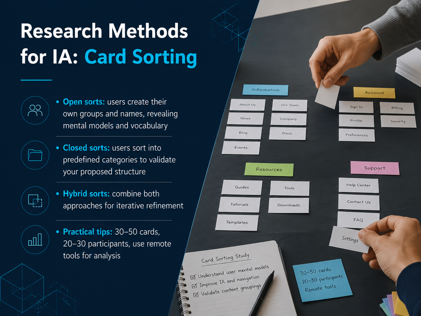
 - 10Research Methods for IA: Card SortingNow let's explore the most practical research method you have for building better navigation: card sorting. Think of card sorting as a way to see your content through your users' eyes. There are three main approaches you can use. First, open sorts. Here, participants create their own groups and name them however they like. This reveals their natural mental models and the exact vocabulary they use. Second, closed sorts. You provide predefined categories, and participants sort items into them. This validates whether your proposed structure actually makes sense to users. Third, hybrid sorts combine both. You start with some fixed categories but let participants add their own, which is great for iterative refinement. For a successful study, aim for thirty to fifty cards, recruit twenty to thirty participants, and use a remote tool like Optimal Workshop, UXtweak, or ValidateThat. These tools handle the heavy lifting of analysis, giving you similarity matrices and dendrograms without manual spreadsheets. Up next, we'll look at another essential method for validating your structure: tree testing and beyond.
 2 min
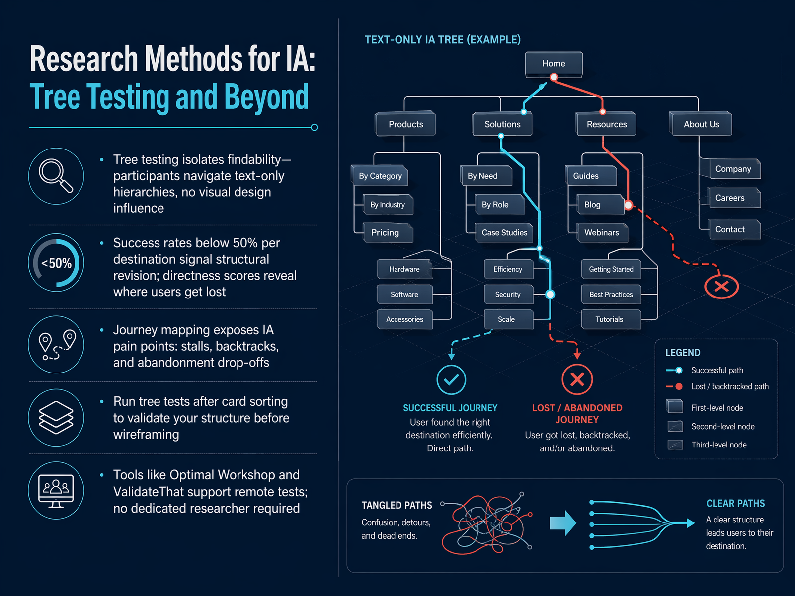
2 min - 11Research Methods for IA: Tree Testing and BeyondNow, let's look at how we actually test an information architecture before it goes live. The primary tool for this is tree testing. Think of it as a stripped-down version of your site: participants navigate a text-only hierarchy with no visual design influence. This isolates findability, because if they can't find an item in a bare list, no amount of color or layout will fix it. When you see success rates below fifty percent for a destination, or low directness scores that show users wandering off-path, that's a clear signal that the structure needs revision. Journey mapping adds another layer, exposing the pain points where people stall, backtrack, or abandon the task entirely. The workflow is straightforward: run an open card sort first to understand how users group content, then validate your proposed structure with a tree test before you commit to wireframes. Tools like Optimal Workshop and ValidateThat support these tests remotely, and you don't need a dedicated researcher to run them. They handle the data collection and analysis so you can focus on the structural decisions. Next, we'll move into practice with 'IA in Practice: Deliverables That Drive Decisions'.
 uxguides.com2 min
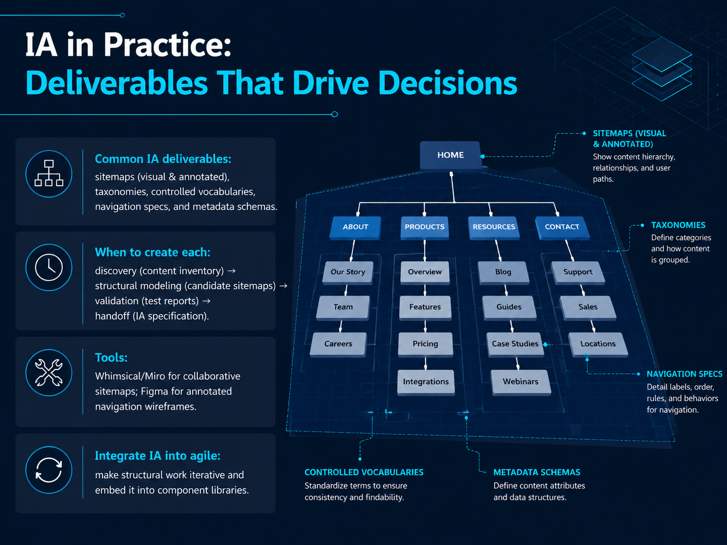
 - 12IA in Practice: Deliverables That Drive DecisionsNow let's turn the theory into concrete deliverables. In practice, you'll produce a set of artifacts that drive structural decisions. Common ones include visual and annotated sitemaps, taxonomies, controlled vocabularies, navigation specifications, and metadata schemas. The key is knowing when to create each. During discovery, you build a content inventory. In structural modeling, you draft candidate sitemaps. Validation produces test reports. And handoff requires a formal IA specification. For tools, Whimsical and Miro are great for collaborative sitemapping. Figma works well for annotating navigation wireframes. Finally, you can integrate IA into agile by making structural work iterative and embedding it into your component libraries. Up next, we'll explore how to keep those structures healthy over time with IA governance.
 uxguides.com1 min
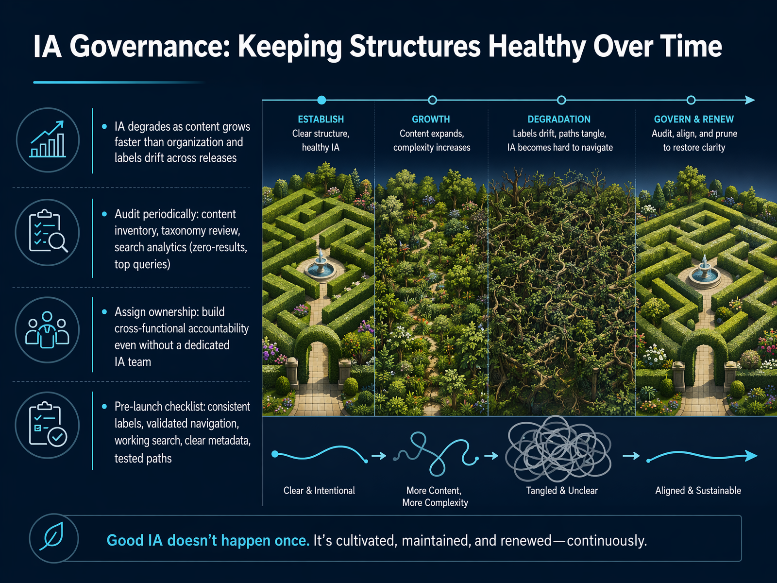
 - 13IA Governance: Keeping Structures Healthy Over TimeSo far, we have focused on building a solid structure. But even the best architecture degrades over time. Content grows faster than our ability to organize it, and labels start to drift as teams push updates. Without governance, your hard work unravels. The fix is a health check routine. First, audit periodically. Run a content inventory to see what you actually have. Review your taxonomy to spot broken categories. And never ignore your search analytics. Zero-result queries and top search terms are direct signals of where your structure is failing your users. Next, assign clear ownership. You do not need a dedicated information architecture team, but you do need cross-functional accountability. Someone must own the taxonomy, and someone must own the search experience. Finally, build governance into your release cycle. Create a pre-launch checklist that covers consistent labels, validated navigation, working search, clear metadata, and tested user paths. Think of governance not as a bureaucratic gate, but as the maintenance that keeps your product findable. Now, let’s step back and look at the full design process from end to end in the next section.
 timgraf.combutterflai.proaijourn.com+22 min
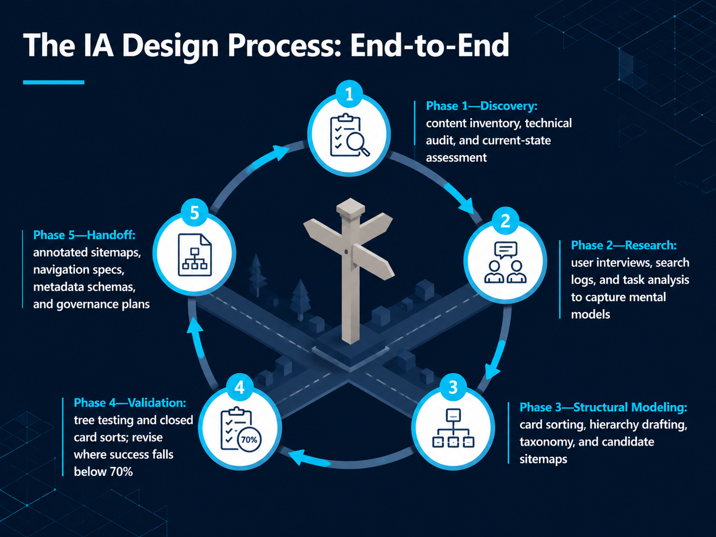
 - 14The IA Design Process: End-to-EndNow let's walk through the end-to-end IA design process, step by step. Think of this as your practical roadmap for any project. Phase one is Discovery. Here, you conduct a content inventory and a technical audit to understand the current state of your system. Phase two is Research. You use user interviews, search log analysis, and task analysis to capture your audience's mental models—the way they think about and expect to find information. Phase three is Structural Modeling. This is where you synthesize your research into candidate structures using methods like card sorting to draft your hierarchy, taxonomy, and initial sitemaps. Phase four is Validation. You test your structure with tree testing and closed card sorts. If the success rate for finding an item falls below seventy percent, you revise until it's clear. Finally, phase five is Handoff, where you deliver annotated sitemaps, navigation specs, metadata schemas, and a governance plan to guide development and maintenance. Next, let's look at six core principles that will keep your IA successful.
 uxguides.com2 min
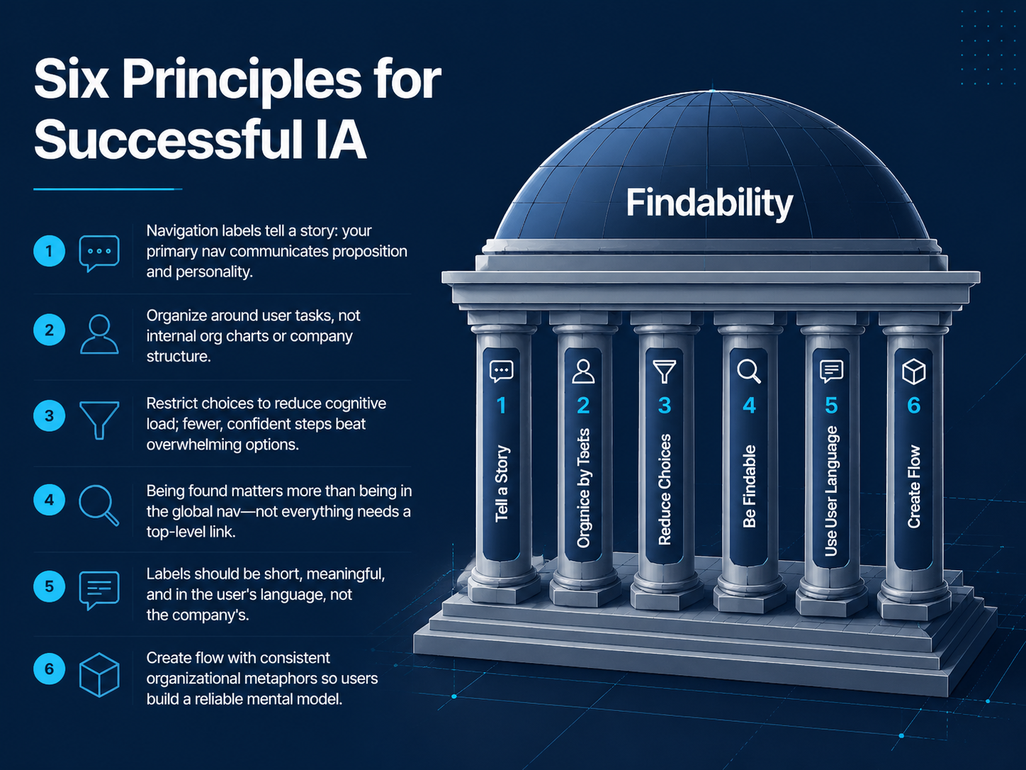
 - 15Six Principles for Successful IALet's move into the six principles that make information architecture truly work. First, your navigation labels tell a story. The words in your primary nav communicate your proposition and your personality. Think of it as the first handshake with your user. Second, organize around user tasks, not your internal org chart. Your audience thinks in terms of goals, like 'planning a trip,' not your department names. Third, restrict choices to reduce cognitive load. A few confident steps beat a sea of overwhelming options every time. Fourth, remember that being found matters more than being in the global nav. Not everything needs a top-level link. Fifth, keep labels short, meaningful, and in the user's language, not your company's jargon. And sixth, create flow with consistent organizational metaphors. This helps users build a reliable mental model as they move through your product. Up next, we'll apply these IA fundamentals directly to your current project.
 uxguides.comlettercrafted.comalphonsolabs.com+22 min
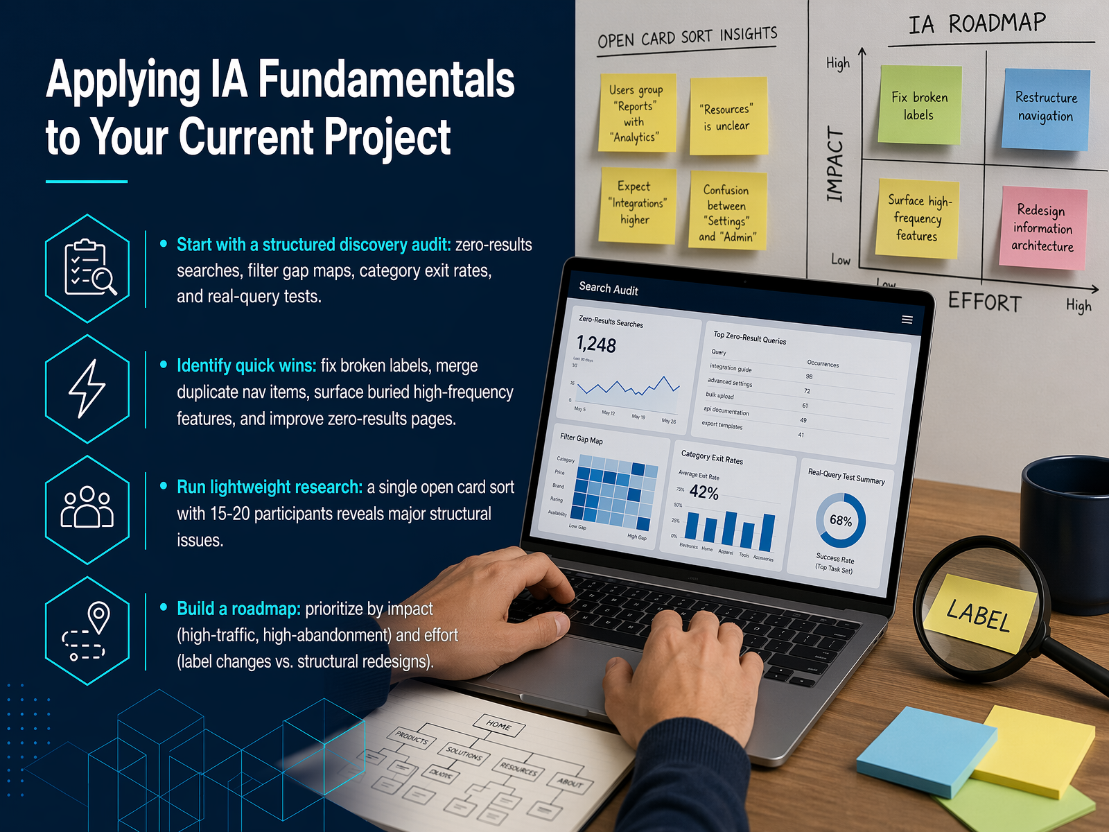
 - 16Applying IA Fundamentals to Your Current ProjectLet's shift from theory to your immediate project. Start with a structured discovery audit. Look at your zero-results searches, any gaps between the filters users want and what you offer, and where people exit a category page. Real-query testing is essential here. Type what your customers type, not your internal product names. Next, identify quick wins that build momentum. Fix broken labels, merge duplicate navigation items, and surface high-frequency features that are buried too deep. Improve those zero-results pages with alternatives instead of dead ends. Then, run lightweight research to validate your direction. A single open card sort with fifteen to twenty participants often reveals major structural issues, and you can run it remotely with tools like UserBit or ValidateThat. Finally, build a practical roadmap. Prioritize by impact and effort. Start with high-traffic, high-abandonment areas, and tackle label changes before structural redesigns. This turns your audit into a sequenced action plan. Up next, let's wrap up with your next steps and resources.
 timgraf.combutterflai.proaijourn.com+22 min
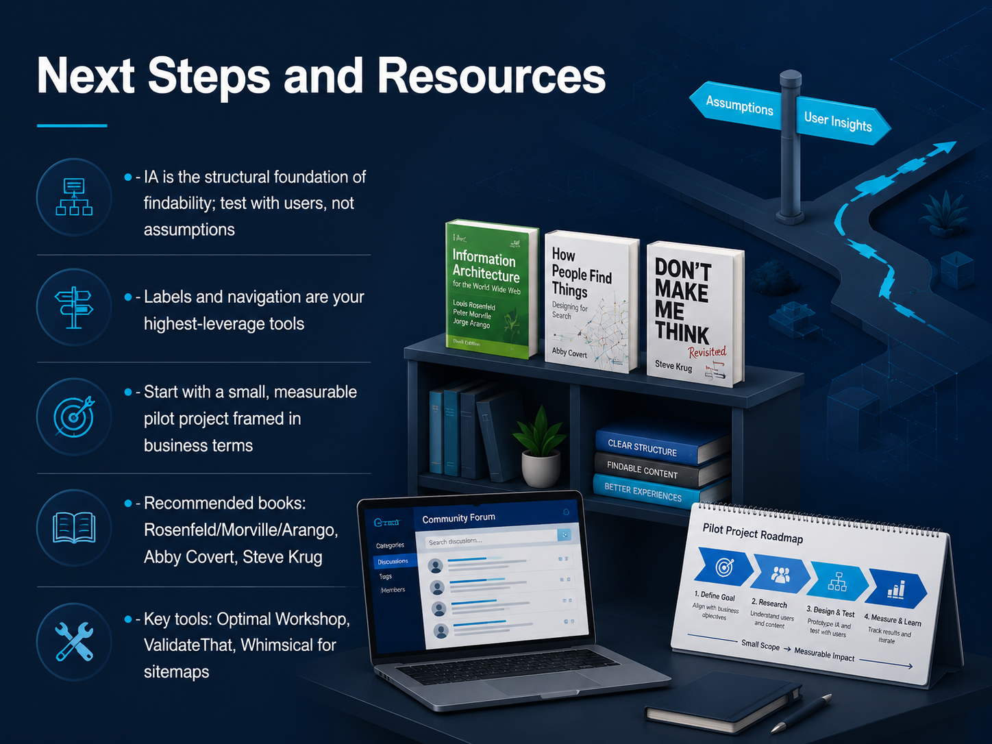
 - 17Next Steps and ResourcesWe've covered a lot of ground, so let's wrap up with your path forward. Remember, information architecture is the structural foundation of findability. Always test your structures with real users, not assumptions. The labels you choose and the navigation you design are your highest-leverage tools for improving the user experience. Your next step is to start small. Pick a specific, measurable pilot project, like fixing a single section of your product, and frame it in business terms, such as reducing support tickets or improving task completion. For resources, the core books are by Rosenfeld, Morville, and Arango, Abby Covert, and Steve Krug. For tools, explore Optimal Workshop for testing, and Whimsical for creating sitemaps. Thank you for joining this course. You now have the fundamentals to make information easier to find and navigate. Go put them into practice.
 uxguides.com2 min
Take the deck with you
Download this course as a file — free, no sign-up needed.
- PDF handoutEvery slide page, ready to print or share.18 pages · 4.7 MBDownload
- Narrated PowerPointThe deck that presents itself — every slide carries the digital human's narration video.18 pages · 19.2 MBDownload
- PowerPoint slidesThe full deck as a .pptx — open it in PowerPoint, Keynote, or Google Slides.18 pages · 4.6 MBDownload
Free to use in your own training — please keep the PersonWise credit page at the end.
Have your own deck? Turn it into a course
Sources consulted
Web sources consulted while building this course.
- Information architecture — en.wikipedia.org
- What Is Information Architecture? A Guide for UI Designers | UIGuides — uxguides.com
- Information Architecture (IA) — ixdf.org
- What Is Information Architecture? | Figma — figma.com
- What is Information Architecture? | World Information Architecture Association — information-architecture.world
- In-Depth Reflection on the Design of Meituan Waimai's 'More' Menu: The Information Architecture Dilemma and Optimization Path of Functional Drawers - Oreate AI Blog — oreateai.com
- Nielsen Heuristic Analysis: Gumroad Mobile App UX Case Study | by Kardelen Graf | May, 2026 | Medium — medium.com
- Dark Patterns Exposed: What 1-Star Reviews Reveal (2026) | Unstar — unstar.app
- Gemini's New App Design: A Step Back for Android UI? (2026) — thewhimsigoth.com
- Gemini’s new app design makes me worried for the future of Android UI — androidauthority.com
- UX Writing Guide for Better Labels, CTAs, and Navigation — lettercrafted.com
- 12 UX Writing Checklist Essentials for Microcopy (2026) — alphonsolabs.com
- Label UX: Definition, best practices, examples - LogRocket Blog — blog.logrocket.com
- The Definitive Guide to UX Writing 2026: How AI Is Changing Microcopy Forever — ericwongcontentstrategist.com
- Information Scent Theory in UX Design: A Practical Framework for Designing Navigation, Links, and Content Labels That Guide Users to Their Goals - Credit Union Website Solutions — creditunionwebsolutions.com
- Designing Search Interfaces That Actually Work: A Comprehensive UX Framework for Search Bars, Filters, and Results Pages - Timothy Graf | UX/UI Design Theory & 2026 Strategies — timgraf.com
- Site Search for Ecommerce: The Ultimate Guide for 2026 — butterflai.pro
- The 7-Step Framework for Designing Search Experiences Users Actually Trust | The AI Journal — aijourn.com
- Design Decisions for a New Search Results Page | Harlan D. Harris — harlan.harris.name
- CRO for Ecommerce: Complete Guide to Search Solutions for Conversion Growth (2026) — constructor.com