Begin
13 pages · ~26 min
UI Design Principles: Research to Practice
A concise overview of key UI design principles from academic research, helping designers and developers apply evidence-based ideas to real interface projects.
A digital instructor presents all 13 pages. Hold “Ask” at any point and ask out loud — the answer comes from this course. No sign-up needed.
What you’ll learn
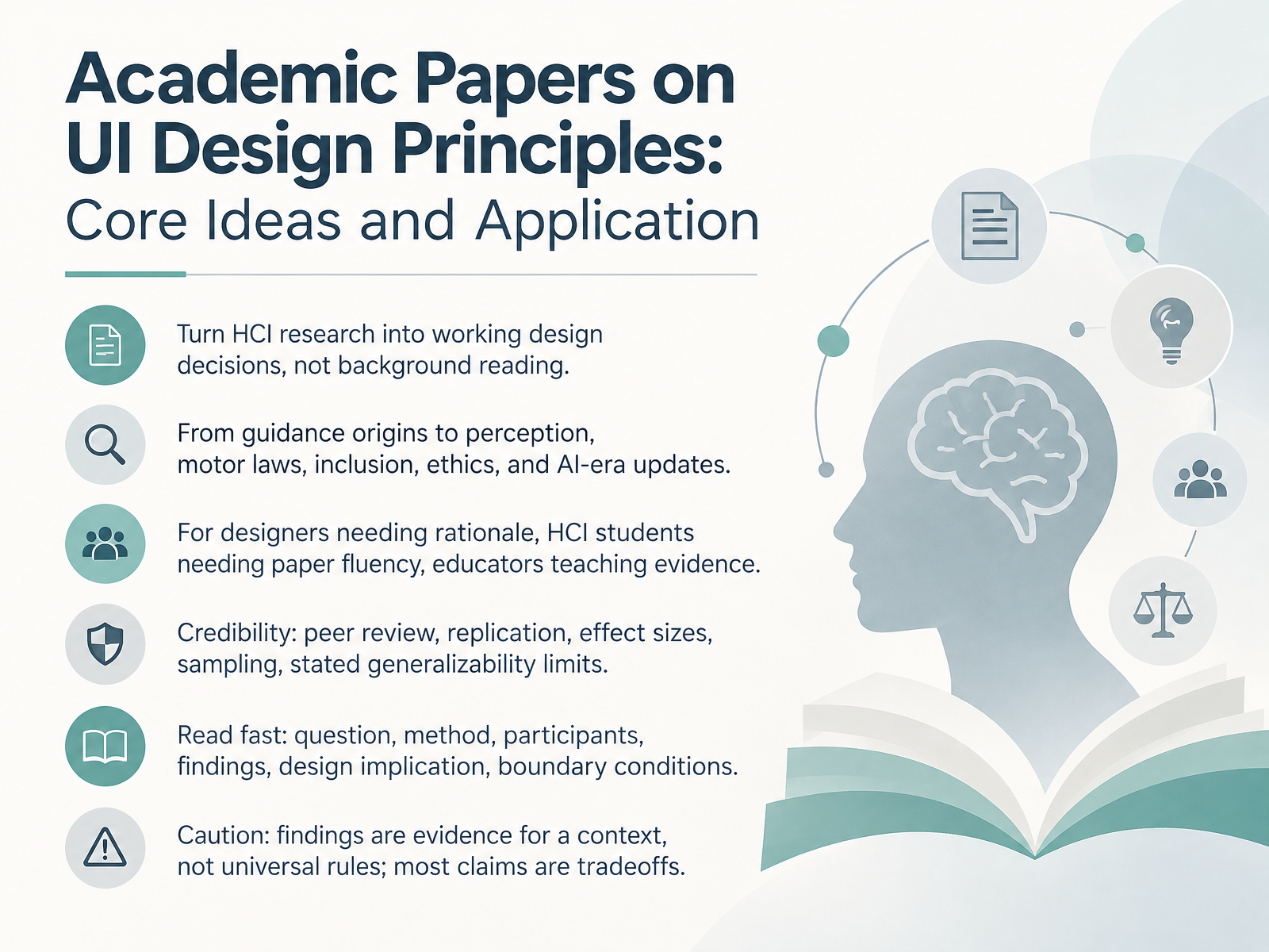
- 01Academic Papers on UI Design Principles: Core Ideas and ApplicationWelcome. Over the next several slides, we are going to turn HCI research into working design decisions, not background reading. Our goal is simple. By the end, you should be able to open a paper, find its design implication, and defend that implication in a critique or design review. We will move from guidance origins to perception and motor laws, then inclusion, ethics, and AI-era updates. This is for three overlapping groups. Designers who need rationale. HCI students who need paper fluency. Educators who teach evidence. So we will also read critically. Ask about peer review, replication, effect sizes, sampling, and stated generalizability limits. A fast reading routine helps. Question, method, participants, findings, design implication, boundary conditions. Remember, findings are evidence for a context, not universal rules. Most claims are tradeoffs. Let us start with where this guidance came from. Background. How HCI Research Became Design Guidance.journals.sagepub.comdl.acm.orgdoi.org+21 min
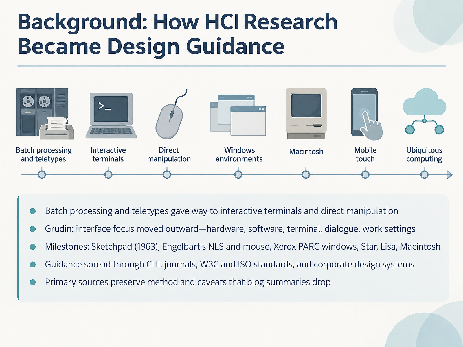
- 02Background: How HCI Research Became Design GuidanceLet's start with where this guidance actually came from. Early computing meant batch processing and teletypes, where you handed off cards and waited. Interactive terminals changed that. Direct manipulation followed, and the interface finally became a design problem.
Grudin described this as an outward movement. Focus shifted from hardware, to software, to the terminal, then to dialogue, and finally to work settings. So when you critique an interface, ask which layer the problem really lives in.
Milestones anchor the story. Sketchpad in nineteen sixty-three. Engelbart's NLS and the mouse. Xerox PARC windows, then Star, Lisa, and Macintosh. Each one moved visible objects and direct pointing closer to everyday use.
Guidance then spread through CHI, journals, W three C and ISO standards, and corporate design systems. One practical caveat. Primary sources preserve method and limitations that blog summaries drop. Read the original before you cite a rule in a review.
Next, we move from history to core concepts: mental models, affordances, signifiers, and feedback.
 doi.orgmicrosoft.comdlnext.acm.org+22 min
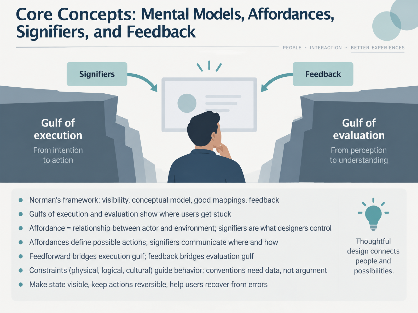
- 03Core Concepts: Mental Models, Affordances, Signifiers, and FeedbackLet's break down the core concepts: mental models, affordances, signifiers, and feedback. Norman's framework rests on four pillars: visibility, a good conceptual model, natural mappings, and clear feedback. Underneath that framework are two gaps. The gulf of execution is the distance between what you intend and what the interface lets you do. The gulf of evaluation is the distance between the system's state and your ability to read it. Here's the distinction worth carrying into your next review. An affordance is a relationship between an actor and an environment. It defines what actions are possible. A signifier is what you, as a designer, actually control: the visible cue that tells someone where and how to act. So affordances define possibilities, and signifiers communicate them. Feedforward bridges the execution gulf by previewing an action's result before it happens, while feedback bridges the evaluation gulf by confirming what just happened. Constraints, whether physical, logical, or cultural, quietly steer behavior. And conventions deserve data, not argument. Watch people in their own environment before you assume a pattern is shared. The practical moves are simple: make state visible, keep actions reversible, and design so people can recover from errors. Next, we look at usability heuristics and their research roots.
 dl.acm.orgalice.id.tue.nlfiles.addictbooks.com+22 min
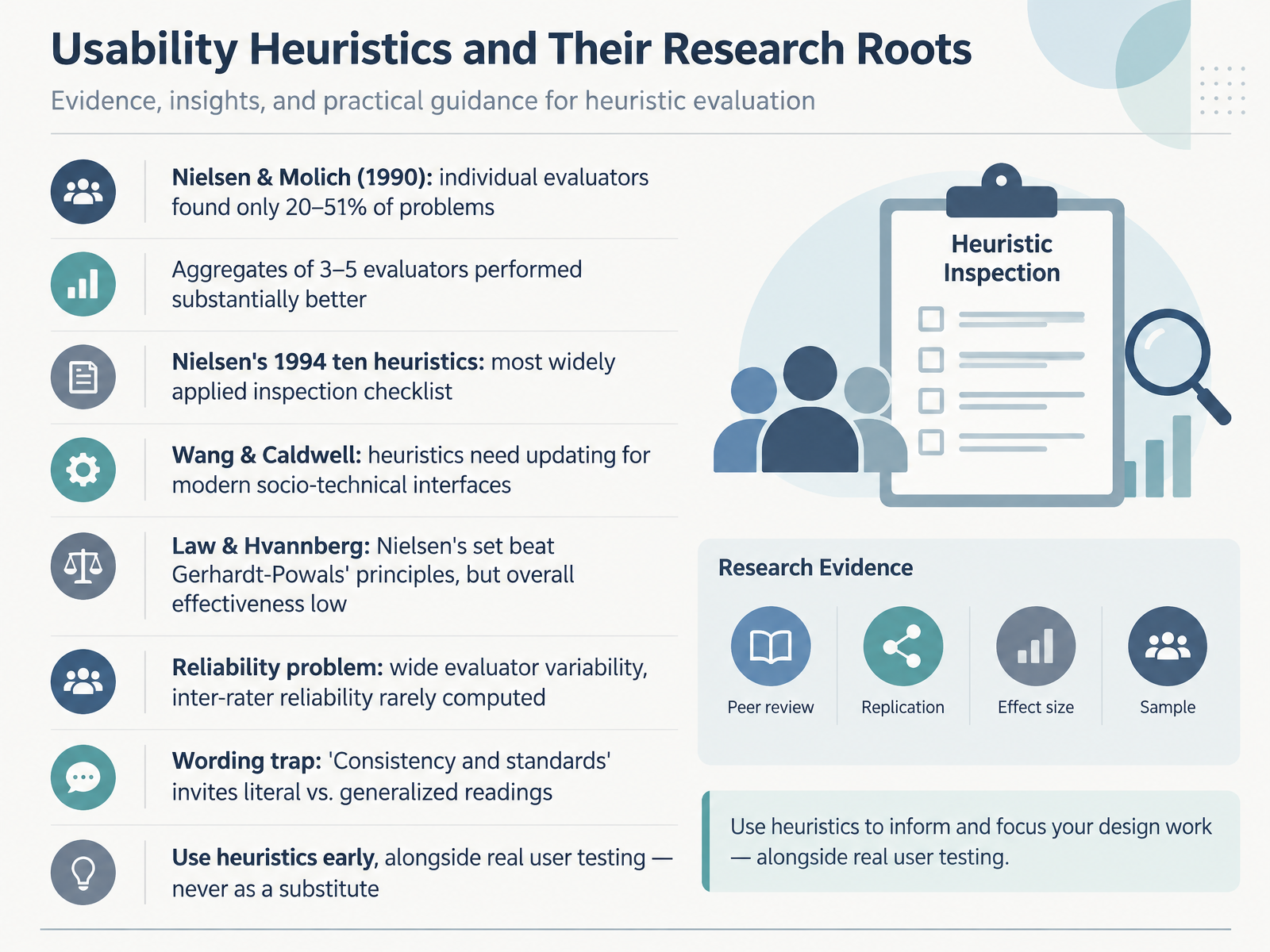
- 04Usability Heuristics and Their Research RootsLet's turn to usability heuristics and where they came from. Nielsen and Molich showed in 1990 that a single evaluator typically finds only twenty to fifty one percent of usability problems. But aggregate three to five evaluators, and coverage improves substantially.
Nielsen's 1994 set of ten heuristics became the most widely applied inspection checklist. Yet the research is mixed. Wang and Caldwell argue it needs updating for modern socio-technical interfaces. Law and Hvannberg found Nielsen's set outperformed Gerhardt-Powals' principles, but overall effectiveness stayed low.
There is also a reliability problem. Evaluator variability is wide, and inter-rater reliability is rarely computed. And watch the wording trap. Consistency and standards invites either a literal or a generalized reading, which changes what you flag.
So use heuristics early, alongside real user testing, never as a substitute.
Next, we look at visual perception and layout, through Gestalt and grouping evidence.
 journals.sagepub.comdl.acm.orgdoi.org+22 min
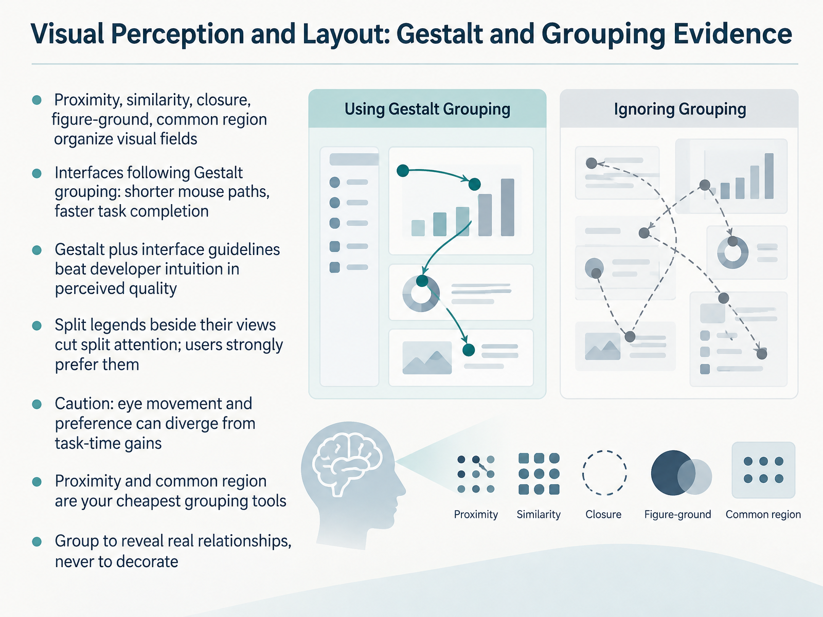
- 05Visual Perception and Layout: Gestalt and Grouping EvidenceNow let's look at visual perception and layout through the Gestalt principles: proximity, similarity, closure, figure-ground, and common region. These describe how people organize a visual field before they consciously inspect it. In one controlled study, interfaces that followed Gestalt grouping produced shorter mouse movement paths and faster task completion times. Another study found that combining Gestalt principles with interface guidelines beat developer intuition on perceived quality. One practical case: when legends were split and placed beside their views instead of gathered in a corner, users strongly preferred the split layout and eye movements showed less split attention. But here is an important caution. Eye movement and preference can diverge from task-time gains, so measure both. For your critiques, proximity and common region are your cheapest grouping tools. Group to reveal real relationships, never just to decorate. Next, we move to visual search, attention, and preattentive processing.
 doi.orgdoi.orgdoi.org+21 min
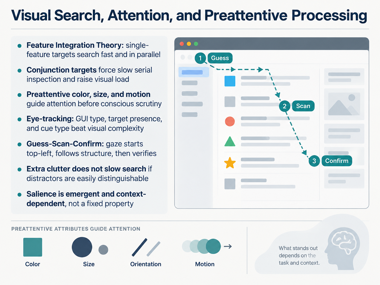
- 06Visual Search, Attention, and Preattentive ProcessingLet's move into visual search, attention, and preattentive processing, because this is where research most directly changes how you build and critique an interface. Start with Feature Integration Theory. When a target differs from distractors by a single feature, say one blue icon among gray ones, search is fast and largely parallel. But a conjunction target, defined by two features like shape and color together, forces slow, serial inspection and raises visual load. That distinction is your first evaluation criterion. Preattentive color, size, and motion guide attention before conscious scrutiny, so use one strong channel when you want something found quickly. Eye-tracking adds nuance. In a large study of real GUIs, target presence, cue type, and interface type affected search time more than visual complexity did. The same work describes a Guess, Scan, Confirm pattern: gaze often starts top-left, follows the layout's structure, then verifies the target. Interestingly, extra clutter does not always slow search if distractors are easily distinguishable. And remember, salience is emergent and context-dependent, not a fixed property of red or bold. Test it in your own layouts. Next, we move to motor and cognitive laws in practice, Fitts and Hick-Hyman.
 1 min
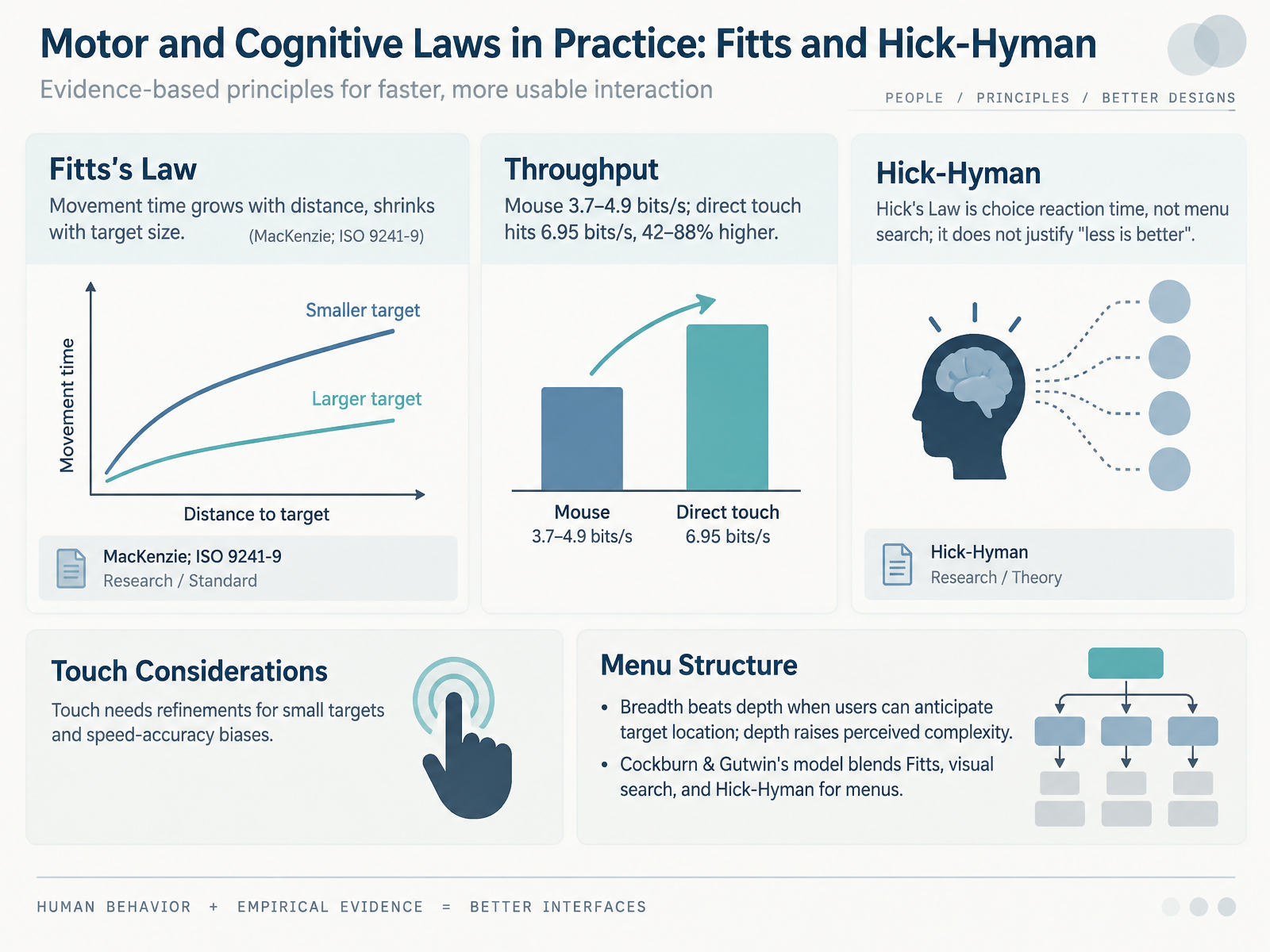
- 07Motor and Cognitive Laws in Practice: Fitts and Hick-HymanLet's bring these laws into practice with motor and cognitive models. Fitts's Law says movement time grows with distance and shrinks with target size. Throughput captures that in bits per second. In a standard mouse study, throughput runs about three point seven to four point nine bits per second. Direct touch reaches six point nine five, roughly forty-two to eighty-eight percent higher. So for touch, refine small targets and account for speed-accuracy bias. Now Hick's Law. It measures choice reaction time, not menu search, so it does not justify the slogan that less is always better. When users can anticipate where a target lives, breadth beats depth; depth raises perceived complexity. Cockburn and Gutwin's model blends Fitts, visual search, and Hick-Hyman to predict menu performance before you build. Use it to critique structure, not just looks. Next, we turn to accessibility and inclusive design research.
 2 min
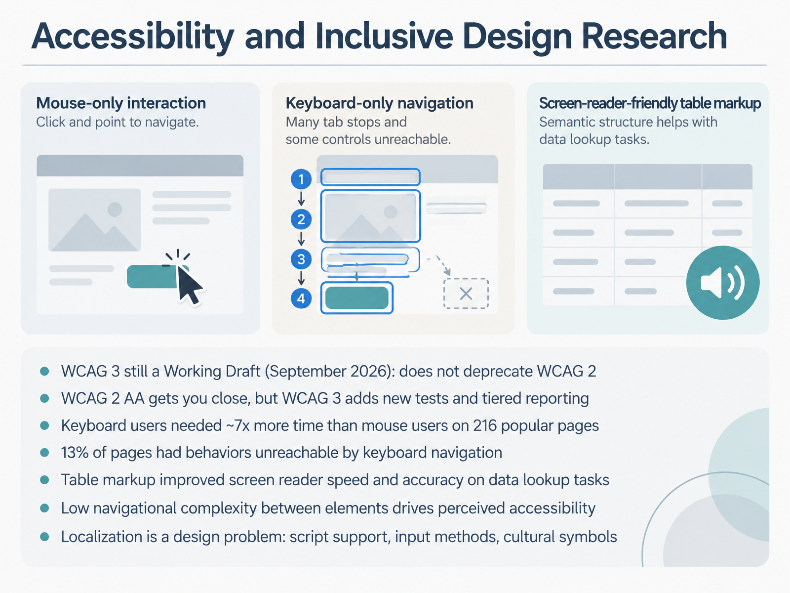
- 08Accessibility and Inclusive Design ResearchNow, let's turn to accessibility and inclusive design research. First, a status check. WCAG 3 is still a Working Draft, published in September 2026. It does not deprecate WCAG 2. In fact, WCAG 2 will remain required by many countries for years, so keep building against two point two double A. That gets you close, but WCAG 3 adds new tests and tiered reporting, so expect additional work for full conformance.
The empirical picture is sobering. In a study of two hundred sixteen popular pages, keyboard users needed roughly seven times more time than mouse users to complete the same task. And in thirteen percent of pages, key behaviors like submitting forms or opening menus were unreachable by keyboard navigation at all. So in critique, tab through flows yourself before signing off.
On the positive side, table markup improved screen reader speed and accuracy on data lookup tasks. And low navigational complexity between elements drives perceived accessibility. Fewer steps between controls means a better experience.
Finally, localization is a design problem, not just translation. Script support, input methods, and cultural symbols all shape whether an interface is genuinely inclusive. Next, we look at Evaluation Methods: From Lab Studies to Field Evidence.
 2 min
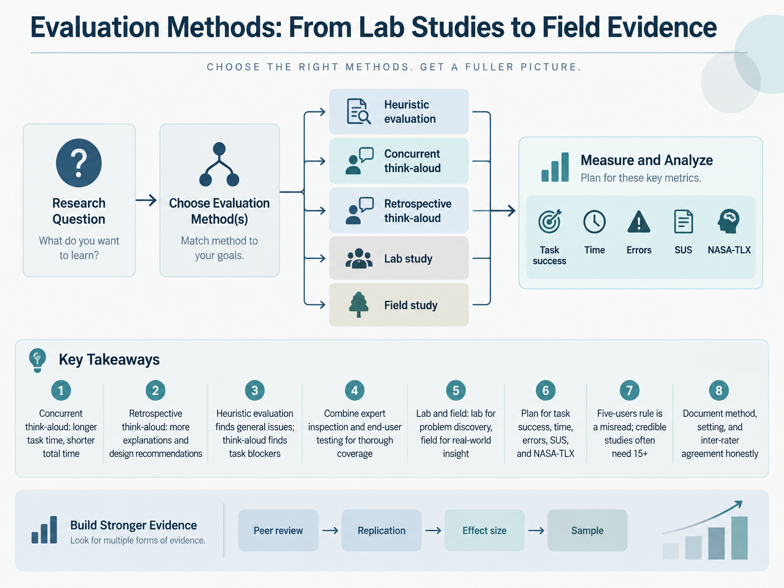
- 09Evaluation Methods: From Lab Studies to Field EvidenceLet's move from principles to evaluation methods. When you choose a method, you're choosing what evidence you'll have in a critique or design review. Concurrent think aloud yields longer task time but shorter total time. Retrospective think aloud produces more explanations and design recommendations, though it needs more total time. Heuristic evaluation finds general interface issues, while think aloud surfaces task blockers. So combine expert inspection with end user testing for thorough coverage. Lab studies are for problem discovery; field studies give real world insight. Plan measures in advance: task success, time, errors, the System Usability Scale, and NASA Task Load Index. And treat the five users rule as a misread. Credible studies often need fifteen or more. Finally, document method, setting, and inter rater agreement honestly. That honesty is what makes your findings defensible. From Paper Findings to Design Decisions.
 journals.sagepub.comdl.acm.orgdoi.org+21 min
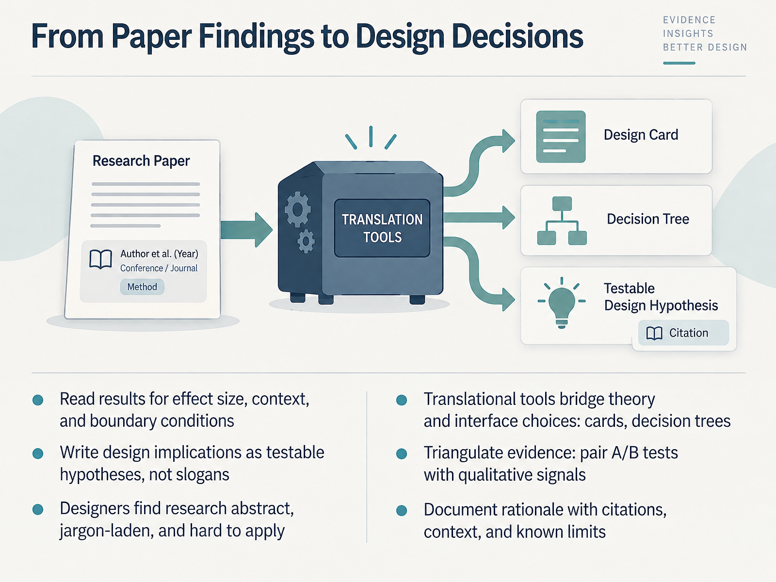
- 10From Paper Findings to Design DecisionsNow let's talk about moving from paper findings to design decisions. This is where research either earns its place in your process or quietly gets ignored. Start by reading results for effect size, context, and boundary conditions. If a study reports a moderate improvement in task completion, ask: moderate compared to what, and for whom? Then write your design implications as testable hypotheses, not slogans. Instead of "reduce cognitive load," say "if we progressively disclose advanced settings, first-time users will complete setup faster and with fewer errors." That claim can be measured. It is no secret that designers often find research abstract, jargon-laden, and hard to apply. Translational tools bridge that gap, things like design cards and decision trees that convert principles into interface choices. And triangulate your evidence. Pair A/B tests with qualitative signals, because a lift in clicks will not tell you why users hesitated. Finally, document your rationale with citations, context, and known limits, so the next designer understands not just what you chose, but why. Next, we turn to ethics, bias, and dark patterns.
 2 min
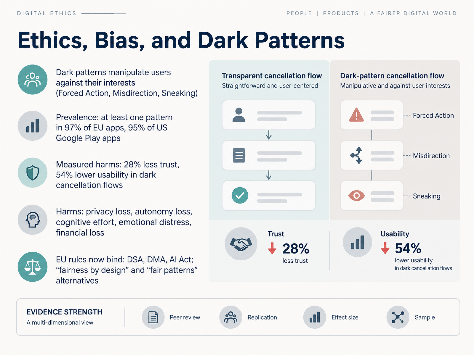
- 11Ethics, Bias, and Dark PatternsNow let's turn to ethics, bias, and dark patterns. Dark patterns are interface designs that manipulate users against their own interests. Researchers commonly group them into categories like Forced Action, Misdirection, and Sneaking, where the interface pushes you toward a choice you did not really make. And this is not rare. At least one dark pattern appears in ninety-seven percent of popular apps and websites studied for EU consumers, and in ninety-five percent of US Google Play apps. The measured harms are concrete. One study of subscription cancellation flows found a twenty-eight percent drop in user trust and a fifty-four percent decrease in usability when dark patterns were present, compared with transparent alternatives. Broader harms include privacy loss, reduced autonomy, extra cognitive effort, emotional distress, and financial loss. As designers, this is where evaluation criteria matter. In a critique or design review, ask whether a flow makes the desired action easy and the alternative genuinely accessible, especially in cancellation, consent, and unsubscribe paths. Regulation now reinforces that expectation. Europe's Digital Services Act, Digital Markets Act, and AI Act bind these practices, and frameworks like fairness by design and fair patterns show how to present information clearly, at the right moment, to support informed choice. Next, we move to AI-era interfaces, where new research is shaping new principles.
 2 min
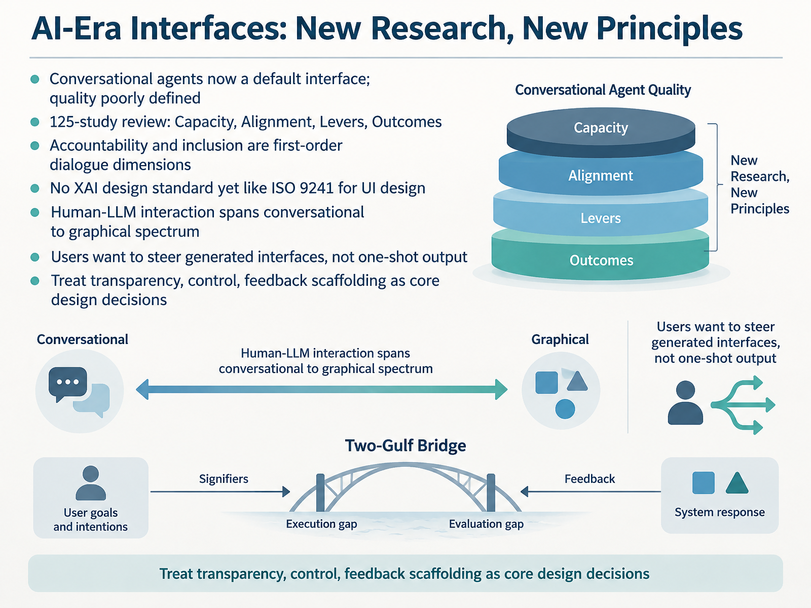
- 12AI-Era Interfaces: New Research, New PrinciplesNow, let's turn to how AI is changing our core principles. Conversational agents have become a default interface, yet we still struggle to define what quality means. A recent integrative review of one hundred and twenty-five empirical studies offers a four-layer framework: Capacity, Alignment, Levers, and Outcomes. Crucially, it positions accountability and inclusion as first-order dimensions of dialogue quality, not nice-to-haves. Think of a student support chatbot: if it gives accurate answers but cannot explain its reasoning or adapt to accessibility needs, users judge it as low quality regardless of its technical capacity. This matters because we still lack a design standard for explainable AI comparable to ISO 9241 for user interfaces. Instead, interaction with large language models now spans a spectrum from purely conversational to richly graphical. And users want to steer generated interfaces, not accept one-shot output. In a travel planning tool, for example, letting someone click a filter to refine suggestions gives them tangible agency. So treat transparency, control, and feedback scaffolding as core design decisions, not afterthoughts. That is your evaluation criterion: can users see the reasoning, steer the outcome, and give useful feedback? Next, we'll look at how to stay current with sources, preprints, and a readiness checklist.
 2 min
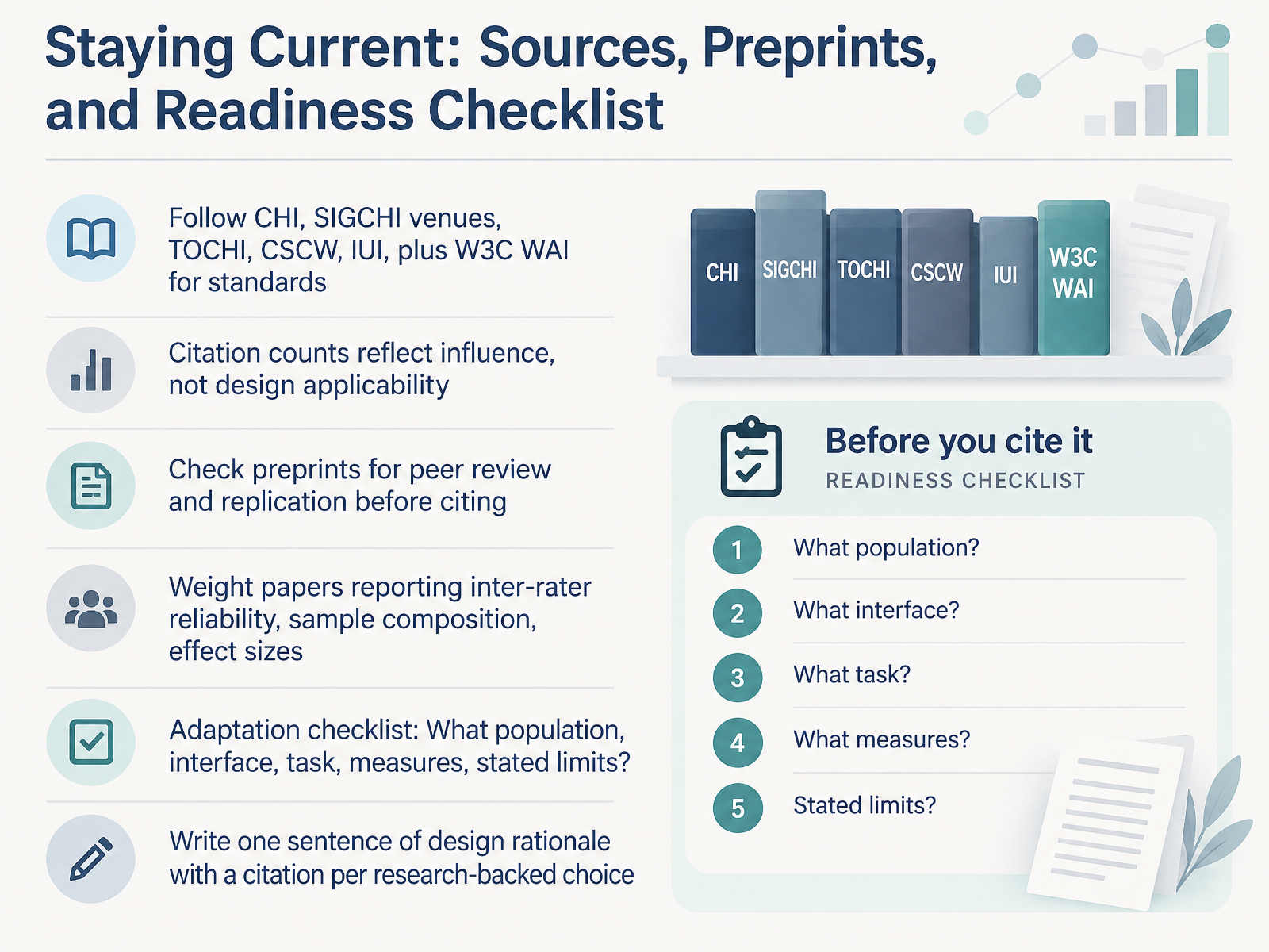
- 13Staying Current: Sources, Preprints, and Readiness ChecklistLet's close with how to stay current without getting buried. For venues, track CHI and the broader SIGCHI conferences, plus journals like TOCHI and CSCW, IUI, and for standards, the W3C Web Accessibility Initiative. Now a caution you'll need in design reviews: citation counts reflect influence, not design applicability. A paper can be famous and still not fit your context. Before citing a preprint, check whether it's peer reviewed and whether anyone has replicated it. And weight studies that report inter-rater reliability, sample composition, and effect sizes, because those tell you how much to trust the finding. When adapting any result, run the checklist: what population, what interface, what task, what measures, and what limits did the authors state? Then, for every research-backed choice you make, write one sentence of rationale with a citation. That single habit turns opinion into evidence, and it's what makes design critiques defensible. So stay curious, cite carefully, and keep translating research into better interfaces. Thanks for working through this with me, and good luck applying it in your next project.
 journals.sagepub.comdl.acm.orgdoi.org+22 min
Take the deck with you
Download this course as a file — free, no sign-up needed.
- PDF handoutEvery slide page, ready to print or share.14 pages · 3.2 MBDownload
- Narrated PowerPointThe deck that presents itself — every slide carries the digital human's narration video.14 pages · 26.7 MBDownload
- PowerPoint slidesThe full deck as a .pptx — open it in PowerPoint, Keynote, or Google Slides.14 pages · 3.1 MBDownload
Free to use in your own training — please keep the PersonWise credit page at the end.
Have your own deck? Turn it into a course
Sources consulted
Web sources consulted while building this course.
- Examination of the Use of Nielsen’s 10 Usability Heuristics & Outlooks for the Future — journals.sagepub.com
- Heuristic evaluation of user interfaces | Proceedings of the SIGCHI Conference on Human Factors in Computing Systems — dl.acm.org
- Analysis of strategies for improving and estimating the effectiveness of heuristic evaluation — doi.org
- Revisiting Heuristic Evaluation Methods to Improve the Reliability of Findings — doi.org
- Finding usability problems through heuristic evaluation | Proceedings of the SIGCHI Conference on Human Factors in Computing Systems — dl.acm.org
- A brief history of human-computer interaction technology — doi.org
- A Moving Target—The Evolution of — microsoft.com
- A Historiography of Human–Computer Interaction | IEEE Annals of the History of Computing — dlnext.acm.org
- Interaction Research and Design across Times in HCI — dl.acm.org
- The computer reaches out: the historical continuity of interface design — doi.org
- ACM: Digital Library: interactions — dl.acm.org
- Signifiers, Not Affordances — alice.id.tue.nl
- The Design of Everyday Things: Revised and Expanded Edition - PDFDrive.com — files.addictbooks.com
- Norman p38-42 — lri.fr
- The Design of Everyday Things — en.wikipedia.org
- The Effects of Gestalt Principles on the Perceived Usability of User Interface in a Web Context — doi.org
- On the perception of graph layouts — doi.org
- Research on the Weight Design of Gestalt Principles in the Interface of Smartphone Puzzle Games — doi.org
- The Impact of Combining Gestalt Theories with Interface Design Guidelines in Designing User Interfaces — aisel.aisnet.org
- A User Evaluation on Mouse Movements in Visual Interfaces — doi.org