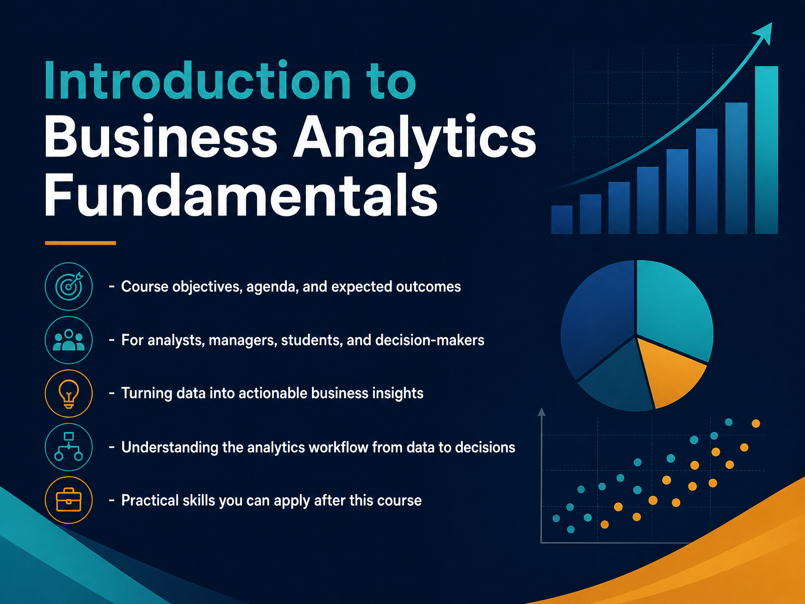
Business Analytics Fundamentals
Begin
14 pages · ~28 min
Business Analytics Fundamentals
This training introduces business analytics fundamentals, covering key concepts and techniques for data-driven decision-making. It is designed for professionals seeking to leverage data to solve business problems and improve performance.
What you’ll learn
- 01Introduction to Business Analytics FundamentalsWelcome to Business Analytics Fundamentals. I am glad you are here. This course is designed for people who want to turn raw data into decisions that actually move the business forward. Whether you are an analyst, a manager, or a student, we are going to focus on the practical side of analytics. We will start by understanding the workflow that takes us from messy data all the way to a clear action plan. You will learn how to spot trends, ask the right questions, and translate numbers into insights you can share with your team. The goal is not just theory. It is giving you skills you can apply to your own reports and planning immediately. By the end, you should feel confident using data to support your next big recommendation. Let us get started by laying the groundwork with what business analytics really means.techtarget.comaws.amazon.comtableau.com+21 min
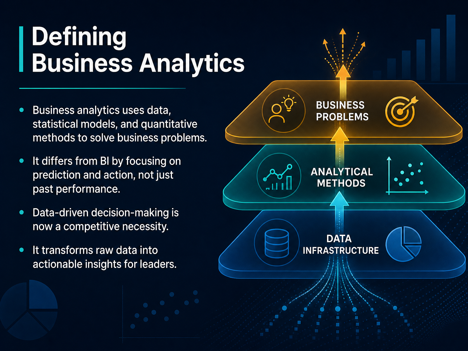
- 02Defining Business AnalyticsLet's ground ourselves in what business analytics really means. In plain terms, it's using data, statistical models, and structured methods to solve actual business problems. It's not just about looking at last quarter's revenue. The real power comes from predicting what will happen next, and then turning that prediction into a specific action. A common point of confusion is with business intelligence. Business intelligence shows you the scoreboard. It tells you what happened. Business analytics tells you why it happened, what's likely to happen next, and what you should do about it. In today's market, making decisions from your gut or solely from past reports is a risk. Every team, from sales to operations, now needs to leverage data to stay competitive. The goal here is simple. We take the raw data sitting in your spreadsheets or databases and refine it into guidance that you can use in tomorrow's planning meeting. Next, let's talk about why this matters so much for your specific role and daily choices.
 techtarget.comaws.amazon.comtableau.com+21 min
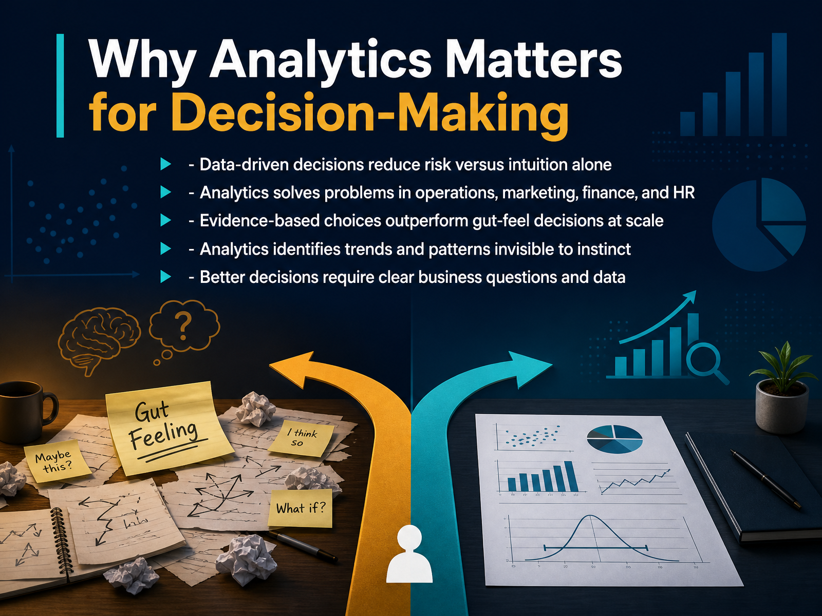
 - 03Why Analytics Matters for Decision-MakingLet's look at why analytics has become such a central part of decision-making. When you rely on intuition alone, you're really betting on experience and gut feel. Analytics adds evidence to that equation, which directly reduces risk. Imagine a regional sales manager deciding where to focus next quarter's training budget. Instinct might point to the largest territory, but data could reveal that a mid-sized territory has the highest churn risk and the strongest upside if supported now. That's a more precise, confident decision. The same logic applies across operations, marketing, finance, and HR. Analytics helps you spot trends that are too slow, too scattered, or too subtle for instinct to catch. But here's the key point. Better decisions don't start with more data. They start with a clearer business question, like which customer segment is most likely to renew, or where are we losing margin. Once the question is sharp, the right data becomes obvious. So analytics doesn't replace judgment. It gives your judgment better inputs. Next, we'll move into the types of analytics and how they take you from insight to action.
 2 min
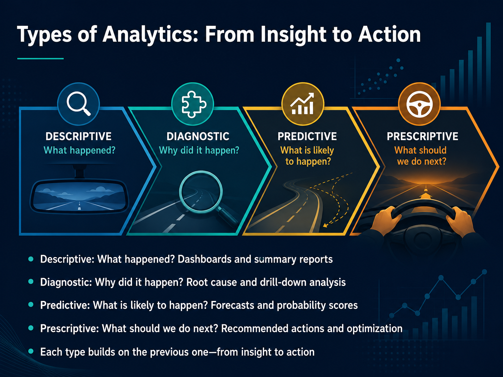
2 min - 04Types of Analytics: From Insight to ActionLet's move from the overall landscape to the four types of analytics, because these four questions form a natural progression from insight to action. The first is descriptive: what happened? This is your dashboards and summary reports. You know sales were up twelve percent last quarter. The natural next question is diagnostic: why did it happen? You drill down, segment the data, and find that a specific region drove the growth. Then you ask predictive: what is likely to happen next? Here, you use historical patterns to forecast next quarter's demand or score the likelihood a lead will close. Finally, prescriptive analytics asks, what should we do about it? This is where the analysis recommends specific actions, like increasing production at one plant or rerouting shipments to avoid a delay. Each layer builds on the previous one. You can't reliably recommend actions until you understand the forecast, and you can't forecast well until you know the root causes of what already happened. Up next, we will walk through the analytics process itself, covering framing, data, analysis, and action.
 domo.comtechtarget.comcoursera.org+22 min
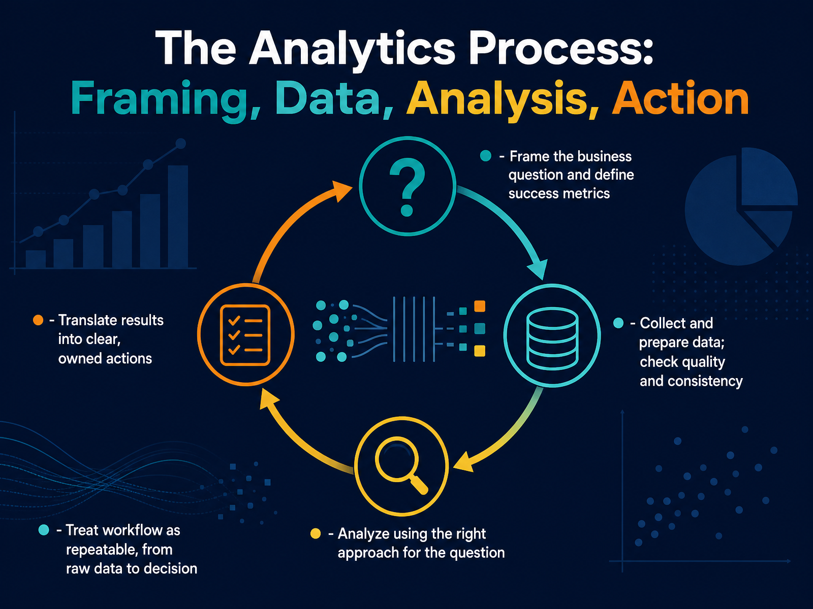
 - 05The Analytics Process: Framing, Data, Analysis, ActionLet's walk through a repeatable analytics process, from raw data to a real decision. Think of this as your roadmap whenever you need to move from a vague feeling about the business to something concrete and actionable. It starts with framing. Before you touch any data, get clear on the business question you're actually answering. For example, are we trying to reduce customer churn, or just understand why last quarter dipped? That question defines what success looks like. Then, collect and prepare your data, and treat quality as a gate, not a step. Check for duplicates, missing values, and inconsistent customer names. Every insight downstream inherits the quality of what you put in. Next, choose the right analysis for that specific question, whether it's a simple trend comparison or a deeper segmentation. After the analysis, the most important step is translating results into clear, owned actions. A recommendation without a specific owner and a timeline is just an observation. Finally, treat this whole workflow as repeatable, so the next question takes you less time and produces more trust. Now, to run this process well, we need to agree on the basic vocabulary of analytics. Let's cover that next with key concepts like metrics, KPIs, and data types.
 informs.orgdomo.comastrato.io+21 min
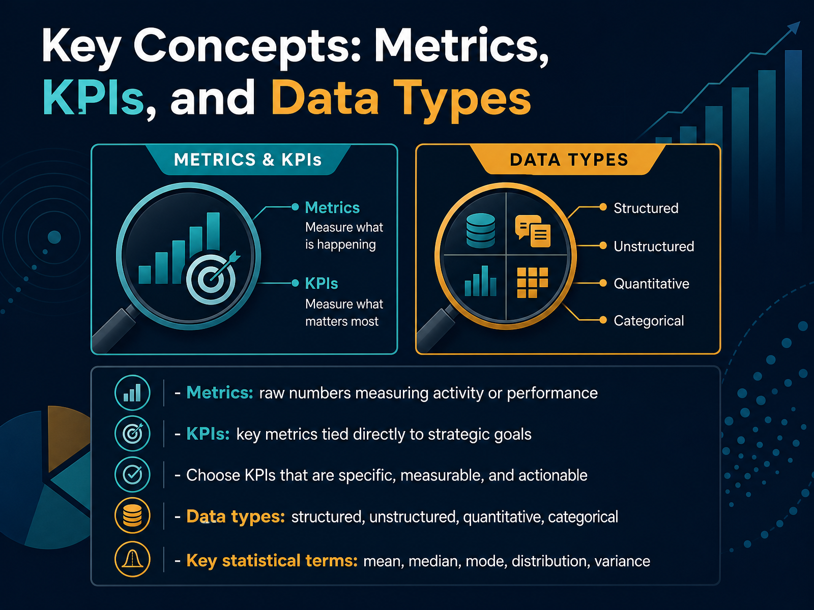
 - 06Key Concepts: Metrics, KPIs, and Data TypesNow let's get clear on the language of measurement, because this is where many business decisions either get sharper or stay vague. A metric is simply a raw number that tracks activity or performance, like total sales calls made, units produced, or website visits. A KPI, or key performance indicator, is different. It is a metric that connects directly to a strategic goal, such as net revenue growth, customer retention rate, or operating margin. When you choose a KPI, make sure it is specific, measurable, and actionable, so the number tells you what to do next rather than just what happened. You will also work with different data types. Structured data fits neatly in rows and columns, like a spreadsheet. Unstructured data includes text, images, or call recordings. Quantitative data is numeric, like order size. Categorical data is descriptive, like region or product type. Finally, keep a few statistical terms close by. The mean is the average, the median is the middle value, and the mode is the most common value. Distribution shows how your data spreads out, and variance tells you how much individual numbers differ from the average. In practical terms, if average order value looks healthy but variance is high, a few large deals may be hiding weaker performance across most customers. Next, we will move into the core tools and techniques that make these concepts useful in daily reporting.
 2 min
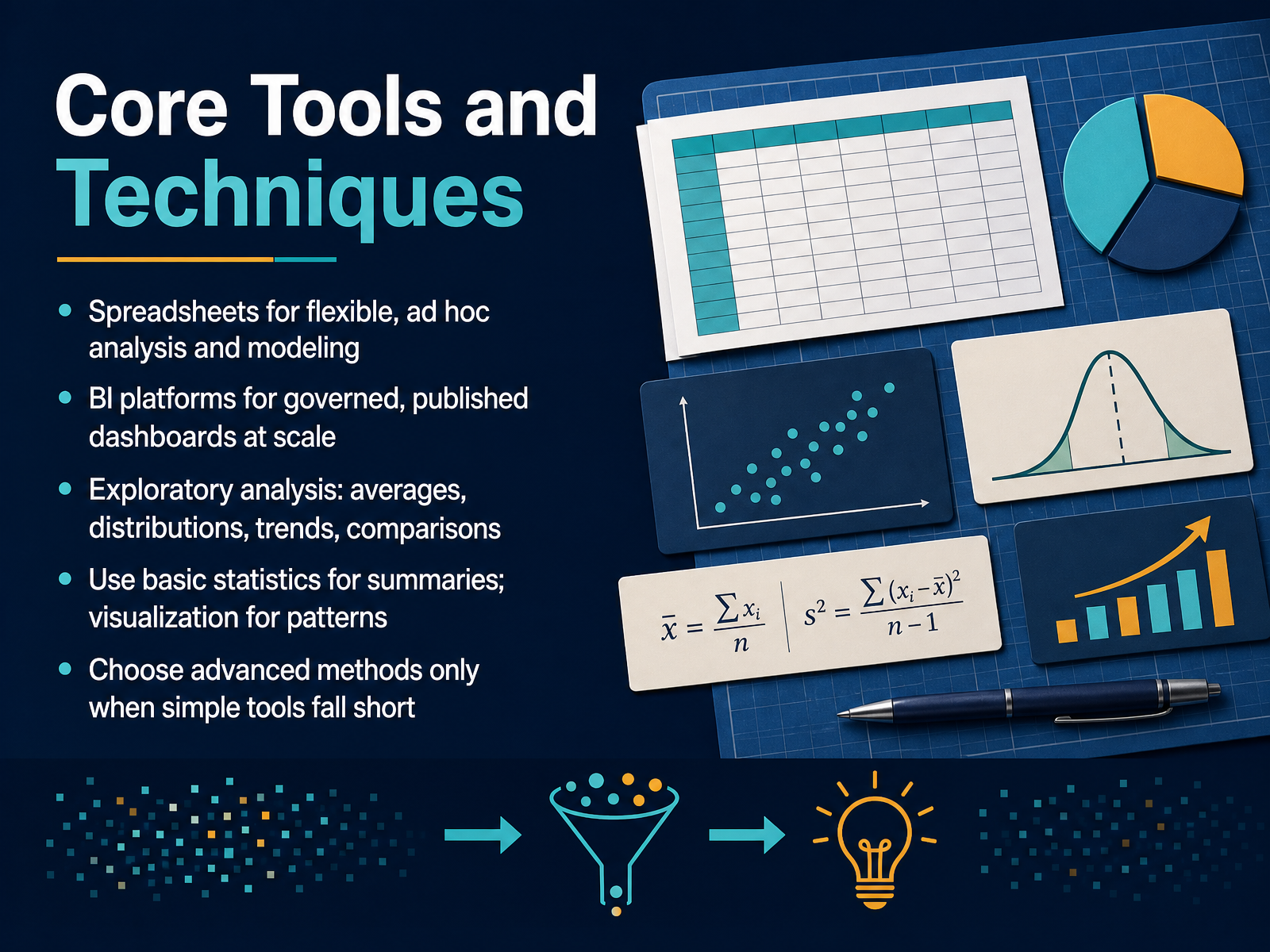
2 min - 07Core Tools and TechniquesNow let's get practical and look at the core tools and techniques you will actually use. Think of spreadsheets as your flexible workbench for quick, ad hoc analysis and modeling. When a question is new, or you are still exploring, a spreadsheet is usually the fastest place to start. BI platforms, on the other hand, are built for scale. They give you governed, published dashboards that everyone in the company can trust and refresh on a schedule. As for the analysis itself, start simple. Use averages, distributions, trends, and comparisons to understand what is happening. Basic statistics help you summarize the data, and visualizations help you spot the patterns. A simple line chart often reveals more than a complex model. The key rule is this: choose advanced methods only when simple tools fall short. If a pivot table answers the question, stop there. Save the heavier techniques for when they actually add value. That mindset will keep your work fast, clear, and credible.
 quadratichq.commicrosoft.comusepulseai.com+21 min
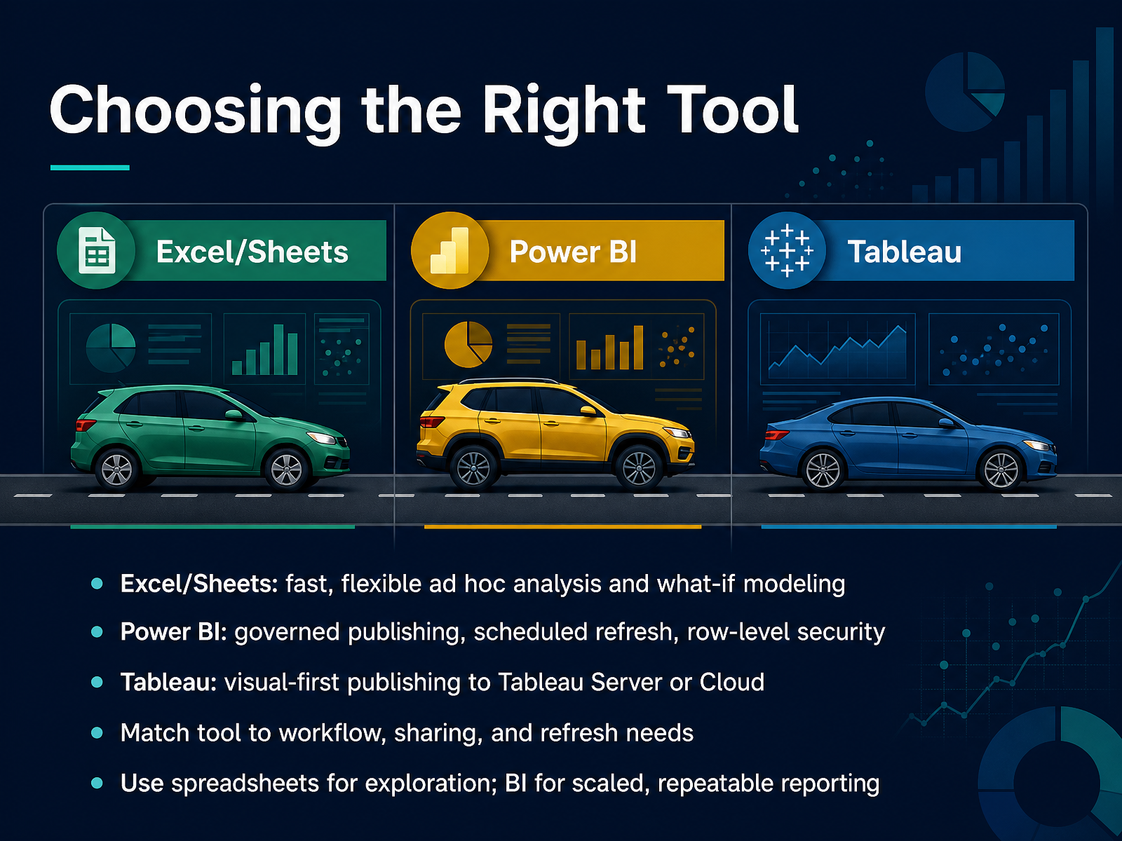
 - 08Choosing the Right ToolNow, let's get practical about picking the right tool for the job, because the best tool is really the one that matches your workflow. If you need to move quickly with ad hoc analysis or what-if modeling, a spreadsheet like Excel or Google Sheets is usually your best friend. It is perfect for exploration, testing ideas, and creating those one-off insights for yourself or a small group. But when you need to publish a report that the whole team relies on, that is when you graduate to a business intelligence tool. For example, think of Power BI for governed publishing, scheduled data refreshes, and row-level security, ideal for a standardized sales dashboard that updates every morning. Tableau is another strong choice here, especially if your priority is visual-first publishing to a server or cloud. The core idea is simple. Use spreadsheets for exploring the numbers, and use a BI tool for scaled, repeatable reporting that needs to be shared and trusted. Next, we will take this idea and apply it directly by building practical analytics in Excel.
 quadratichq.commicrosoft.comusepulseai.com+21 min
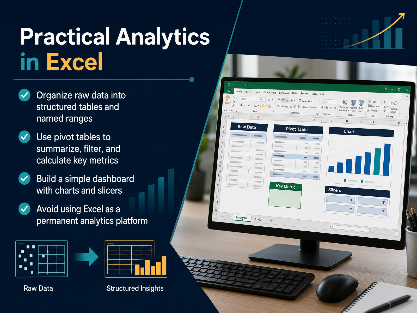
 - 09Practical Analytics in ExcelSo now let's look at where analytics often starts: right inside Excel. Excel is an excellent place for fast analysis, one-off questions, and what-if modeling, but the way you set things up matters. First, organize raw data into structured tables and named ranges. That simple step makes formulas easier to read and prevents errors as the workbook grows. Next, use pivot tables to summarize, filter, and calculate key metrics. A pivot table takes a messy export and turns it into revenue by region, orders by month, or margin by product line in just a few clicks. Then, build a simple dashboard with charts and slicers. Slicers are especially powerful because managers can explore the data themselves without touching the underlying calculations. That creates a quick, usable view for the person asking the question. But here is the honest part. Avoid using Excel as a permanent analytics platform. It is ideal for analysis and modeling, but when reporting needs to be shared, refreshed on a schedule, or controlled with permissions, it is time to move to a dedicated tool. That leads us into the next topic: practical analytics in Power BI and Tableau.
 1 min
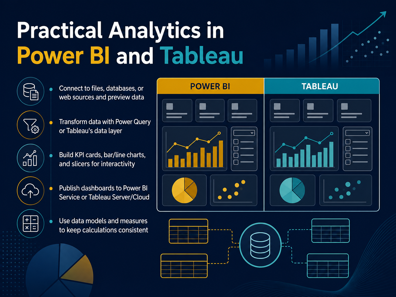
1 min - 10Practical Analytics in Power BI and TableauNow let’s talk about how these concepts come to life in the tools you will likely use most. In Power BI and Tableau, the workflow begins the same way. You connect to a source, whether that is a simple Excel file, a company database, or a web feed, and you preview the data before doing anything else. From there, you can clean and shape that data. In Power BI you use Power Query, and in Tableau you use its built in data layer. This is where you fix messy columns, rename fields, or change data types. Once your data is ready, you can build the visuals that matter for decisions. KPI cards give you a single headline number, bar and line charts show trends, and slicers let your audience filter by region or date. When your dashboard is ready, you publish it so your team can view it online, either through the Power BI Service or Tableau Server. One final point. Using a data model and measures keeps your calculations consistent. Instead of someone recalculating profit on their own, the formula lives in the model and everyone sees the same number. Next, let’s look at how to visualize and communicate your findings.
 2 min
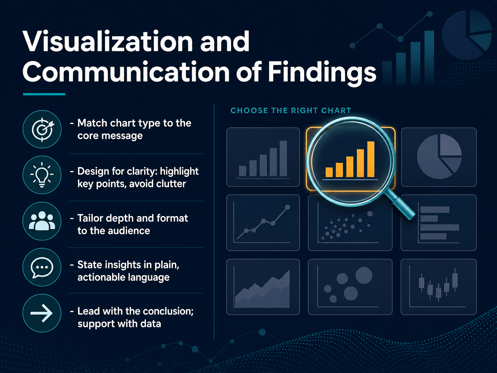
2 min - 11Visualization and Communication of FindingsNow let's talk about how you actually present your findings, because even the best analysis falls flat if no one understands it. Start by matching your chart to your core message. If you're showing a trend over time, use a line chart. If you're comparing categories, a bar chart usually works best. Then design for clarity. Highlight the one or two points that matter, and cut everything else. A cluttered dashboard hides the insight you worked so hard to find. Also, tailor your depth to your audience. An executive team may need the conclusion and the business impact, while an operations group may want the supporting detail. Either way, state the insight in plain, actionable language. Instead of saying there is a negative correlation, say that when shipping delays go up, repeat orders go down. And lead with the conclusion. Tell your audience what you found and what you recommend first, then back it up with the data. That way, they know exactly what to listen for. Up next, we'll look at common challenges and how to avoid them.
 informs.orgdomo.comastrato.io+21 min
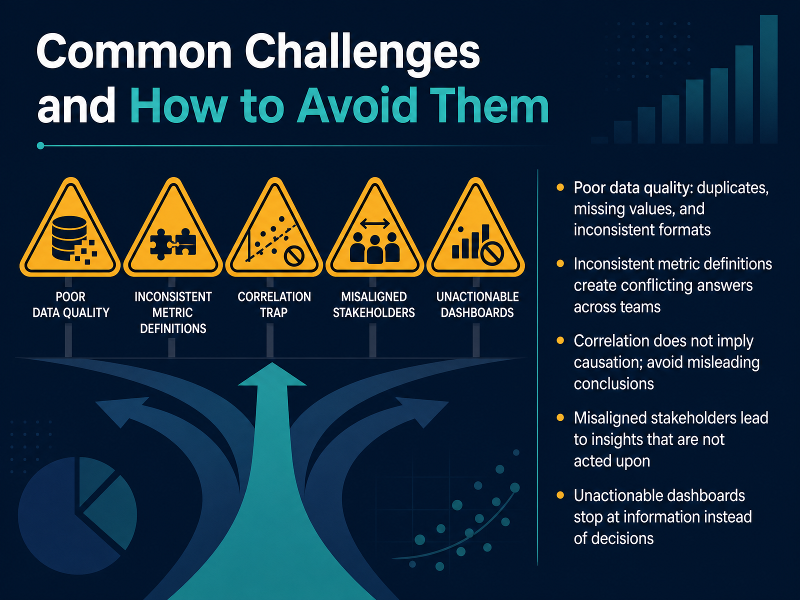
 - 12Common Challenges and How to Avoid ThemNow let's talk about the challenges you'll likely face, and how to sidestep them. First, poor data quality. Duplicates, missing values, and inconsistent formats are the root of most bad decisions. Think of it as building on unstable ground. So, treat data cleaning as a gate, not an afterthought. Next, inconsistent metric definitions. If sales and finance define revenue differently, you get conflicting answers. Define each metric once, in one place, so everyone speaks the same language. A big one is correlation versus causation. Just because two trends move together doesn't mean one caused the other. Always pressure-test your conclusions before acting. Misaligned stakeholders are another trap. Involve them early, so your insights actually get used. Finally, avoid dashboards that only inform. Every report should end with a decision, an owner, and a timeline, because analysis without action is just history. Let's turn that insight into action.
 informs.orgdomo.comastrato.io+21 min
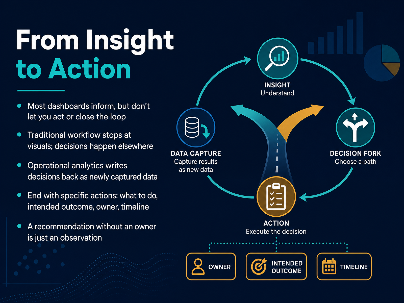
 - 13From Insight to ActionNow let's talk about the final, and most important, step of the workflow: moving from insight to action. Most dashboards are very good at informing you, but they stop there. You look at the numbers, you understand the situation, and then you leave the dashboard to go make a decision somewhere else. That gap is where insight often dies. The key shift is to close the loop. Instead of just presenting a chart, operational analytics lets you capture the decision you made right there, and write that action back into your data system as a new record. That way, the result of your analysis becomes the input for the next round. To do this well, every recommendation needs to end with four specific things. First, the action: what exactly should be done. Second, the intended outcome: what result do you expect. Third, the owner: who is responsible. And fourth, the timeline: when will it be done. Remember, a recommendation without an owner is not a plan. It is simply an observation. Next, we will look at how to apply analytics directly in your role.
 informs.orgdomo.comastrato.io+21 min
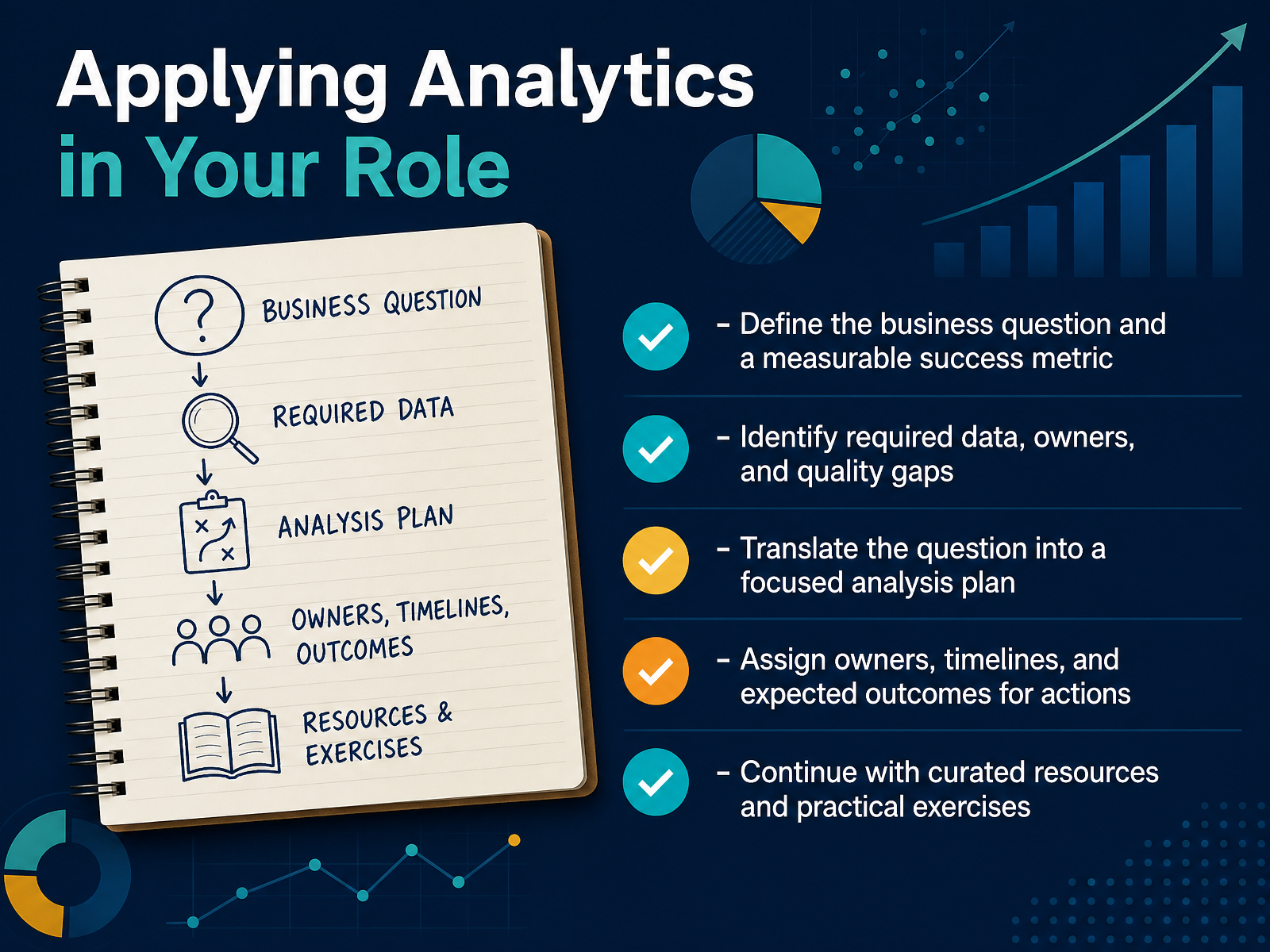
 - 14Applying Analytics in Your RoleLet's bring all of this together and talk about how you can apply analytics in your own role. Think of this as your practical, four step action plan. First, start with the question. Before you open a single report, get specific. Instead of saying, we need to understand sales, ask, why did repeat customer orders in the North East region drop during the last quarter. And what number would show we've fixed it. Second, figure out what data you actually need, who owns it, and whether it's reliable. A model is only as good as the data behind it, so spot the gaps early. Third, translate that business question into a focused analysis plan. This is where you work with analysts or business intelligence tools to decide what to compare and what to measure. Finally, assign owners and timelines. The best analysis means nothing if it doesn't lead to a clear action. So define who does what, by when, and what outcome you expect. That is the whole game in one slide: question, data, analysis, and action. Thank you for joining me. Continue with the curated resources and practical exercises, and start applying this in your next planning meeting. You've got this.
 2 min
2 min
Take the deck with you
Download this course as a file — free, no sign-up needed.
- PDF handoutEvery slide page, ready to print or share.15 pages · 3.6 MBDownload
- Narrated PowerPointThe deck that presents itself — every slide carries the digital human's narration video.15 pages · 16.5 MBDownload
- PowerPoint slidesThe full deck as a .pptx — open it in PowerPoint, Keynote, or Google Slides.15 pages · 3.6 MBDownload
Free to use in your own training — please keep the PersonWise credit page at the end.
Have your own deck? Turn it into a course
Sources consulted
Web sources consulted while building this course.
- What Is Business Analytics? | Definition from TechTarget — techtarget.com
- What is Business Analytics? - Business Analytics Explained - AWS — aws.amazon.com
- What is Business Analytics? — tableau.com
- What is Business Analytics? | Jaspersoft — jaspersoft.com
- What is business analytics? | Fortune Education — fortune.com
- The 4 Types of Data Analytics Explained + Examples — domo.com
- Descriptive vs. Prescriptive vs. Predictive Analytics Explained — techtarget.com
- Descriptive, Predictive, and Prescriptive Analytics: Understanding the Differences | Coursera — coursera.org
- What Is Prescriptive Analytics? 6 Examples — online.hbs.edu
- 4 Types of Data Analytics: Descriptive, Diagnostic, Predictive, Prescriptive — metricasoftware.com
- INFORMS Analytics Framework — informs.org
- Data Analysis Workflow: Key Steps and Best Practices - Domo — domo.com
- Astrato | What Is a Data Analytics Workflow? (And Why It Shouldn’t End at a Dashboard) — astrato.io
- Structuring an Analytics Project - INFORMS — informs.org
- Business Intelligence and Analysis: The 2026 Playbook — thoughtspot.com
- Spreadsheet vs. BI: Buyer’s Guide for Modern Analysis | Quadratic — quadratichq.com
- Power BI - Data Visualization | Microsoft Power Platform — microsoft.com
- Excel vs Google Sheets for Business Analytics: Which Should You Use in 2026? – Pulse — usepulseai.com
- Metabase — metabase.com
- Business Intelligence and Analytics Software | Tableau — tableau.com