Begin
14 pages · ~28 min
Managing Design Color Systems
Learn to build and maintain design color systems using practical tooling, helping designers and developers ensure consistent, accessible color across products.
A digital instructor presents all 14 pages. Hold “Ask” at any point and ask out loud — the answer comes from this course. No sign-up needed.
What you’ll learn
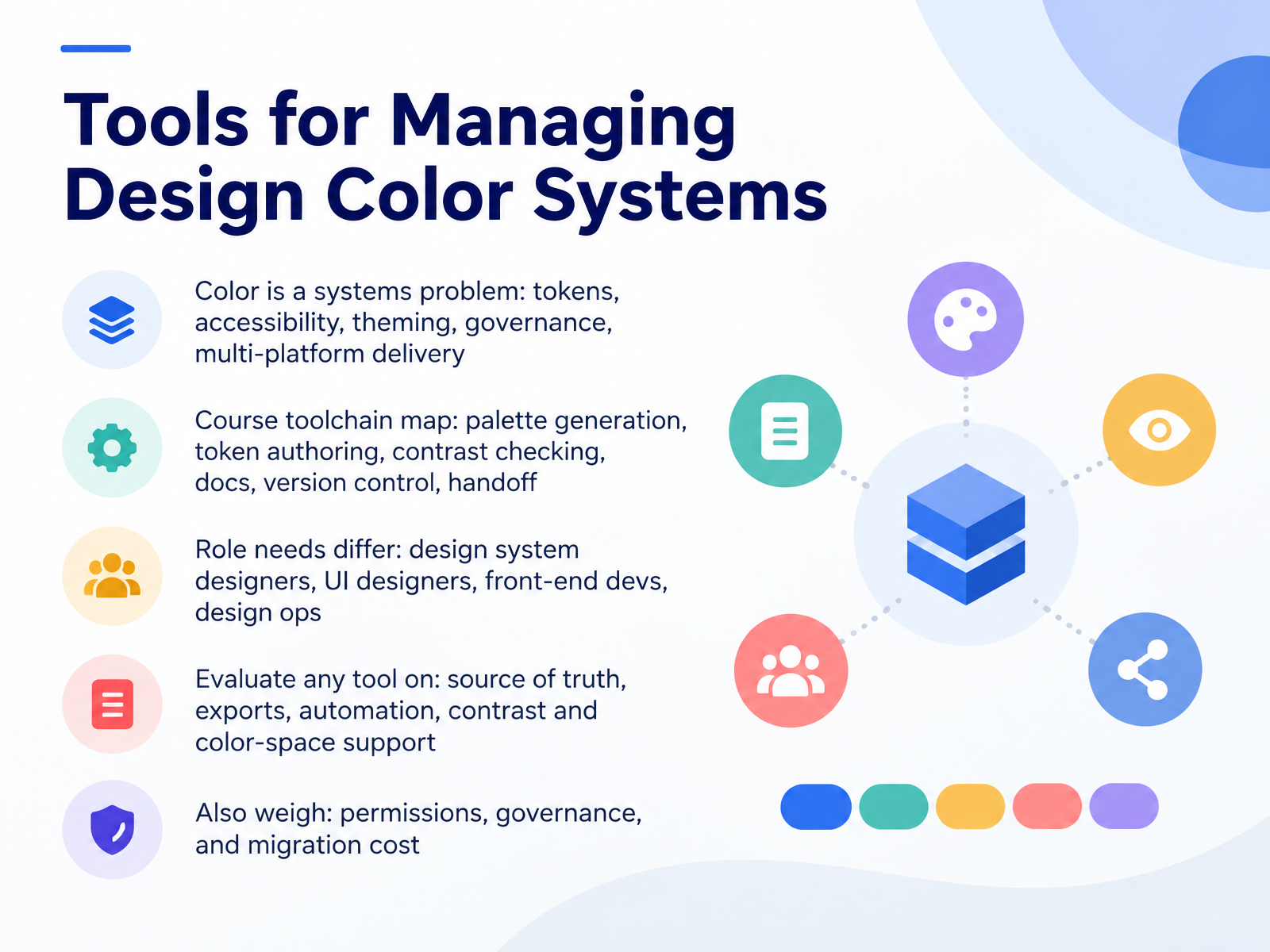
- 01Tools for Managing Design Color SystemsWelcome. Over the next fourteen slides, we are going to treat color as a systems problem. That means tokens, accessibility, theming, governance, and multi-platform delivery, not just picking nice hues. My goal is simple. By the end, you will know how to evaluate and combine tools for managing a color system, whatever its size.
Here is the map we will follow. Palette generation, token authoring, contrast checking, documentation, version control, and handoff. Each one is a distinct job, and no single tool does all of them well.
Role needs differ too. A design system designer owns structure and naming. A UI designer needs fast, on-brand choices. A front-end developer needs clean exports. Design ops needs permissions and predictable change.
So when you evaluate any tool, ask four questions. Where is the source of truth? What does it export? Can it automate the build? Does it support contrast checks and modern color spaces?
Then weigh the constraints. Permissions, governance, and migration cost decide whether a tool survives real use. Drift and legacy palettes are the shared pain here.
One next step. List the color tools your team uses today, and write down where the source of truth actually lives.
Let us start with the fundamentals. Color Token Fundamentals: Primitives, Semantics, and Components.docs.tokens.studiolenkastudio.comux-maldo.hashnode.dev+22 min
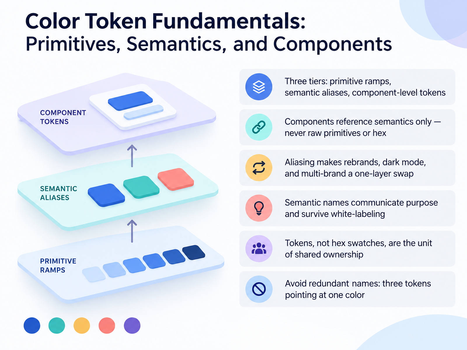
- 02Color Token Fundamentals: Primitives, Semantics, and ComponentsNow let's talk about color token fundamentals. There are three tiers you need to know. Primitives are your raw ramps, like blue five hundred. Semantics are aliases with purpose, like background primary. Components sit on top, like button background default. Here is the rule that matters: components reference semantics only, never raw primitives, never hex. If button background points straight at blue five hundred, you lose the theming layer, and a rebrand means hunting down every component token. Aliasing buys you something concrete. Dark mode and multi-brand become a one-layer swap in semantics. Semantic names communicate purpose and survive white-labeling, so brand maps to whatever the new color is. And tokens, not hex swatches, are the unit of shared ownership. One more pattern to avoid: redundant names. In one documented cleanup, content base, content elevated, and content dim all resolved to the same near-black. Three tokens, one color, maximum confusion. Audit for duplicates, collapse them, and keep names role-based. Your next step: export your semantic layer and grep for any component that references a primitive directly. Next, we move into perceptual color spaces: OKLCH, LCH, and Display P3.
 docs.tokens.studiolenkastudio.comux-maldo.hashnode.dev+22 min
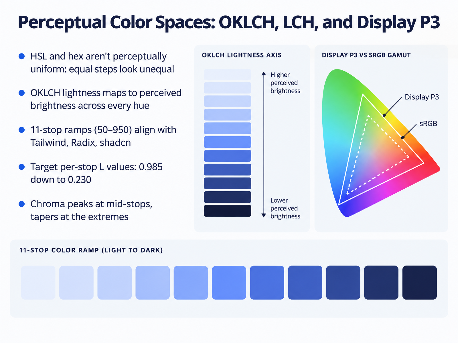
 - 03Perceptual Color Spaces: OKLCH, LCH, and Display P3Let's talk about the color space itself, because this is where drift starts. H S L and hex aren't perceptually uniform. Two colors with the same lightness value can look wildly different in brightness. So equal numeric steps read as unequal steps, and you end up hand-tuning shades by eye. In OKLCH, lightness maps to perceived brightness across every hue. Two colors at L equals 0.6 look equally bright, whether they're blue or yellow. That makes ramps reproducible. The convention you should match is eleven stops, 50 through 950, the same shape Tailwind, Radix, and shadcn use. Target lightness values step from about 0.985 at stop 50 down to 0.230 at 950. Chroma follows its own curve. It peaks around the mid-stops, 400 and 500, then tapers at both ends so 50 doesn't blow out and 950 doesn't go muddy. One constraint, OKLCH can describe colors outside sRGB. Clamp chroma first to bring each stop back into renderable range, and keep lightness and hue fixed. Next, we'll look at the tooling itself. Tool Landscape: Palette Generators, Systems, and Accessibility Checkers.
 accessibility.buildujl-framework.orgwirechunk.com+22 min
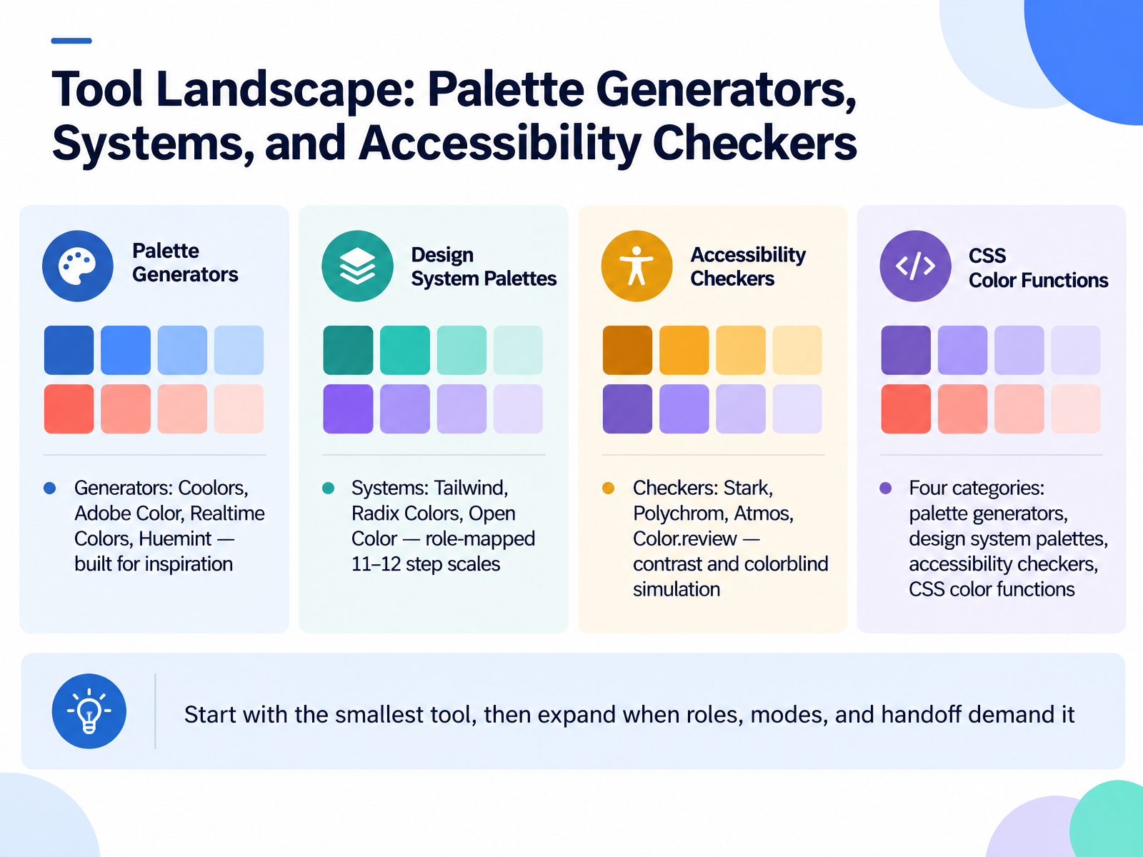
 - 04Tool Landscape: Palette Generators, Systems, and Accessibility CheckersLet's map the tool landscape. There are four categories here, and knowing which one you're in saves a lot of wasted effort. First, palette generators: Coolors, Adobe Color, Realtime Colors, Huemint. These are built for inspiration, and they're genuinely good at it. A space bar press, a few swatches, you have directions. What they don't give you is role mapping or a scale that survives dark mode. Second, design system palettes: Tailwind, Radix Colors, Open Color. Radix ships twelve steps per hue, each step tied to a role, so step three is a UI element background, step twelve is high contrast text. That role mapping is the point. Third, accessibility checkers: Stark, Polychrom, Atmos, Color.review. Use these to verify contrast ratios and run colorblind simulation against real surfaces, not against white. Fourth, CSS color functions like oklch and color-mix. That's where the math lives in code, and it's worth learning even if you don't author tokens by hand. The practical rule: start with the smallest tool that finishes your job, then expand only when roles, modes, and handoff demand it. So open your current palette in a contrast checker and record one passing and one failing pair. Next, Token Pipelines: Tokens Studio, Figma Variables, and Style Dictionary.
 stackfyi.comguideflow.comgitnux.org+22 min
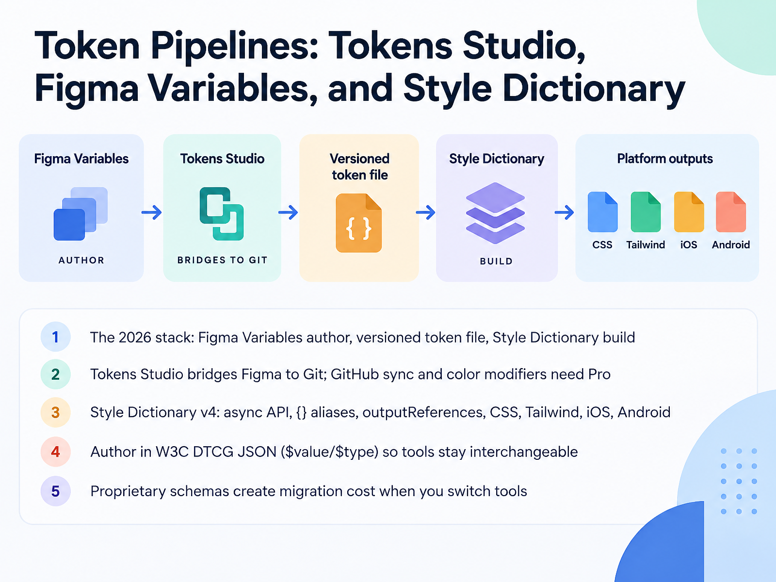
 - 05Token Pipelines: Tokens Studio, Figma Variables, and Style DictionaryLet's look at the token pipeline itself, and the three tools most teams are running in 2026. The stack is simple. You author in Figma Variables, you keep a versioned token file, and Style Dictionary builds the output. One source, many targets.
Tokens Studio is the bridge. It lets designers edit tokens inside Figma and sync straight to Git. Two constraints worth knowing. GitHub sync and color modifiers both require the Pro licence, roughly sixteen dollars a month.
Style Dictionary version four is the build step. It has an async API, resolves aliases written in curly braces, and with outputReferences true it keeps those aliases as CSS variable references instead of flattening them to hex. From one source you can emit CSS, a Tailwind theme, iOS, and Android.
One rule keeps this portable. Author in W3C DTCG JSON, with dollar value and dollar type. Proprietary schemas create migration cost the moment you switch tools. So before your next build, check that your token file uses dollar value and dollar type.
Next, we'll look at Building and Automating the Pipeline in CI.
 docs.tokens.studiolenkastudio.comux-maldo.hashnode.dev+22 min
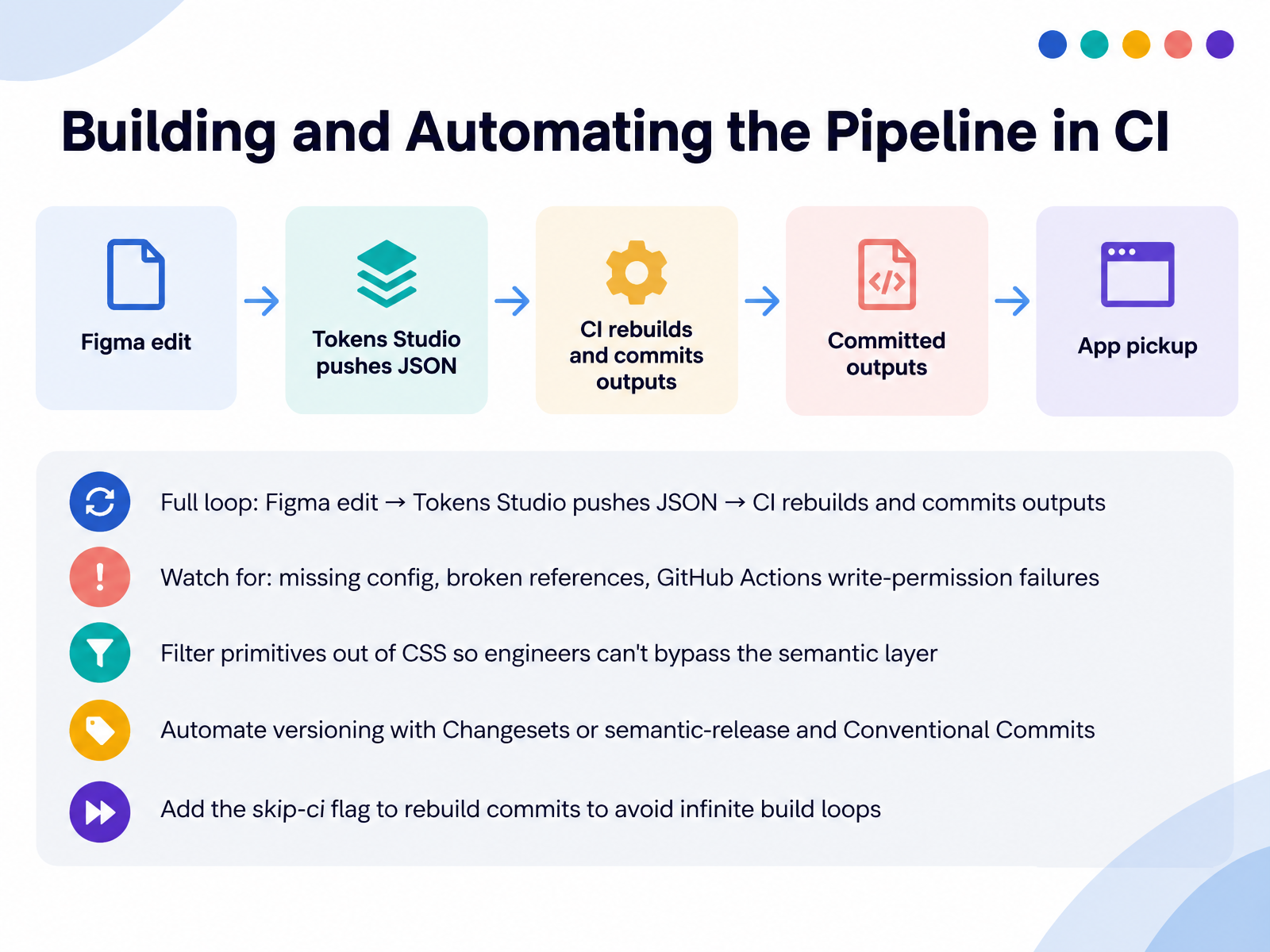
 - 06Building and Automating the Pipeline in CINow let's wire the whole loop together in CI. The full cycle runs like this: someone edits in Figma, Tokens Studio pushes the updated JSON, and CI rebuilds and commits the outputs. When Setup runs a token pipeline, three failures show up again and again. Missing config, like Style Dictionary version four not auto-detecting your config file. Broken references from messy Figma variables. And GitHub Actions write-permission failures, where the build passes but the bot can't push. That last one is usually a one-checkbox fix under Workflow permissions. Next, filter primitives out of your CSS output. Add a filter so only semantic and component tokens land in variables dot CSS. This keeps engineers from bypassing the semantic layer, and it can cut CSS size by roughly half. Then automate versioning. Use Changesets or semantic-release with Conventional Commits. A renamed token is a major bump, not a fix. Finally, add the skip-ci flag to rebuild commits. Without it, the auto-commit retriggers the workflow, and you get an infinite loop. Your next step: check your workflow file for that write permission and the skip-ci flag. That keeps the pipeline stable. Coming up next, Accessibility and Contrast Tooling.
 docs.tokens.studiolenkastudio.comux-maldo.hashnode.dev+22 min
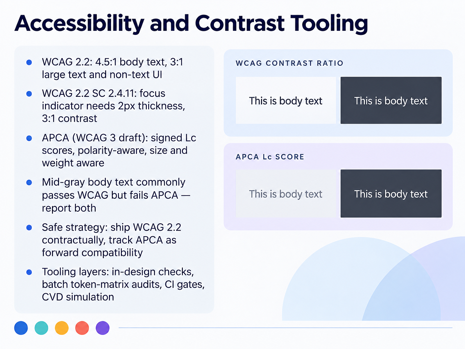
 - 07Accessibility and Contrast ToolingNow let's look at accessibility and contrast tooling. The baseline is WCAG 2.2. Body text needs 4.5 to 1, large text and non-text UI need 3 to 1. Focus indicators are stricter now: at least 2 pixels thick, with 3 to 1 contrast against the adjacent color. Then there's APCA, the candidate algorithm in the WCAG 3 draft. It returns signed Lc scores, and it's polarity-aware, so dark on light and light on dark are not symmetric. It also factors in size and weight. Here's the pain point: mid-gray body text commonly passes WCAG but fails APCA. A good example is hex 767676 on white. That's 4.54 to 1, passing AA, but APCA Lc 53, which fails the body floor of 75. So report both numbers. The safe strategy: ship WCAG 2.2 contractually, and track APCA as forward compatibility. On tooling, work in layers: in-design checks, batch token-matrix audits, CI gates, and CVD simulation. Next step: run a batch audit across your text-on-surface tokens and flag any pair where the two models disagree.
 github.comzeontools.comaccessibility.build+22 min
 - 08Theming, Dark Mode, and Multi-Brand ScalingLet's talk about theming, dark mode, and scaling across multiple brands.
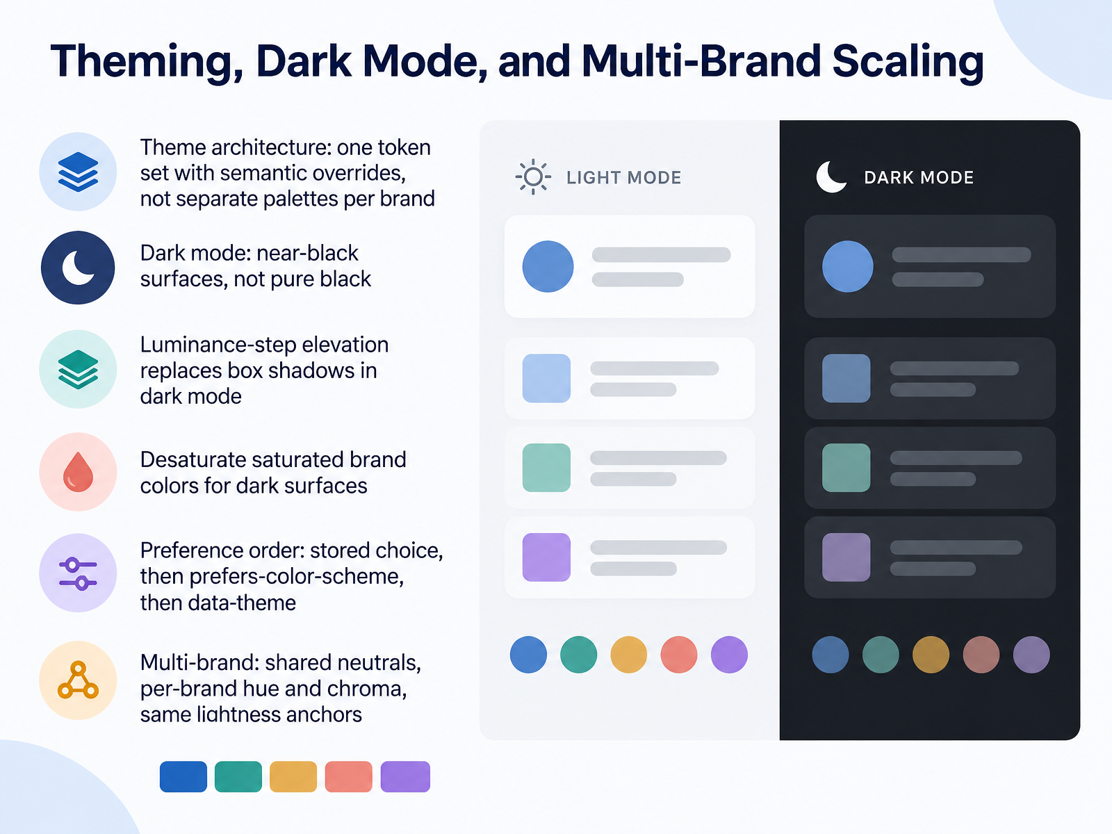
The architecture matters most. Keep one token set with semantic overrides. Do not ship a separate palette per brand, because those drift fast. Dark mode is its own theme, not an inverted light palette. Use near-black surfaces around eight to ten percent lightness, not pure black. Pure black causes halation around text and kills your sense of depth.
For elevation, replace box shadows with luminance steps. Surfaces closer to the user get slightly lighter, about two to three percent in OKLCH. Shadows are nearly invisible on dark backgrounds anyway. Also desaturate your brand colors for dark surfaces. The same chroma reads heavier against a dark background, so step back one or two stops toward the light end.
For theme selection, use this preference order: stored choice first, then prefers-color-scheme, then the data-theme attribute as the mechanism.
For multi-brand, share your neutrals and let each brand supply its own hue and chroma, while inheriting the same lightness anchors. That way every brand passes the same contrast gates.
Next, we'll cover documentation, versioning, and governance.
 accessibility.buildujl-framework.orgwirechunk.com+22 min
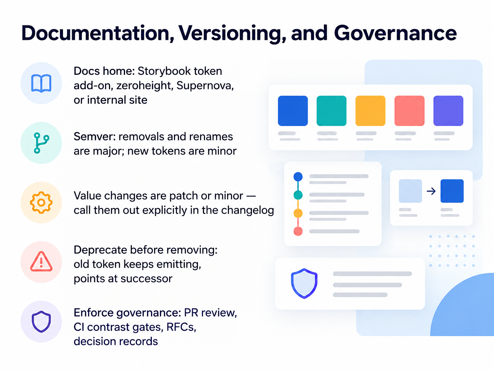
 - 09Documentation, Versioning, and GovernanceNow let's cover documentation, versioning, and governance. Four decisions you need to settle here.
First, where docs live. Pick one home: a Storybook token add-on, zeroheight, Supernova, or an internal site. One home only. If docs live in two places, they drift.
Second, semantic versioning. Removals and renames are major. New tokens are minor. Value changes are patch or minor, but call them out explicitly in the changelog, because a hue shift can restyle every downstream app without breaking a single variable name.
Third, deprecate before you remove. Keep the old token emitting, pointed at its successor, then delete it in a later major release with a migration note.
Fourth, enforce governance. Pull request review, a CI contrast gate on your text-on-surface pairs, RFCs for structural changes, and decision records for the rest.
Start with one action: write your versioning policy down, then add a contrast check to CI this week.
Next, developer handoff and code integration.
 docs.tokens.studiolenkastudio.comux-maldo.hashnode.dev+22 min
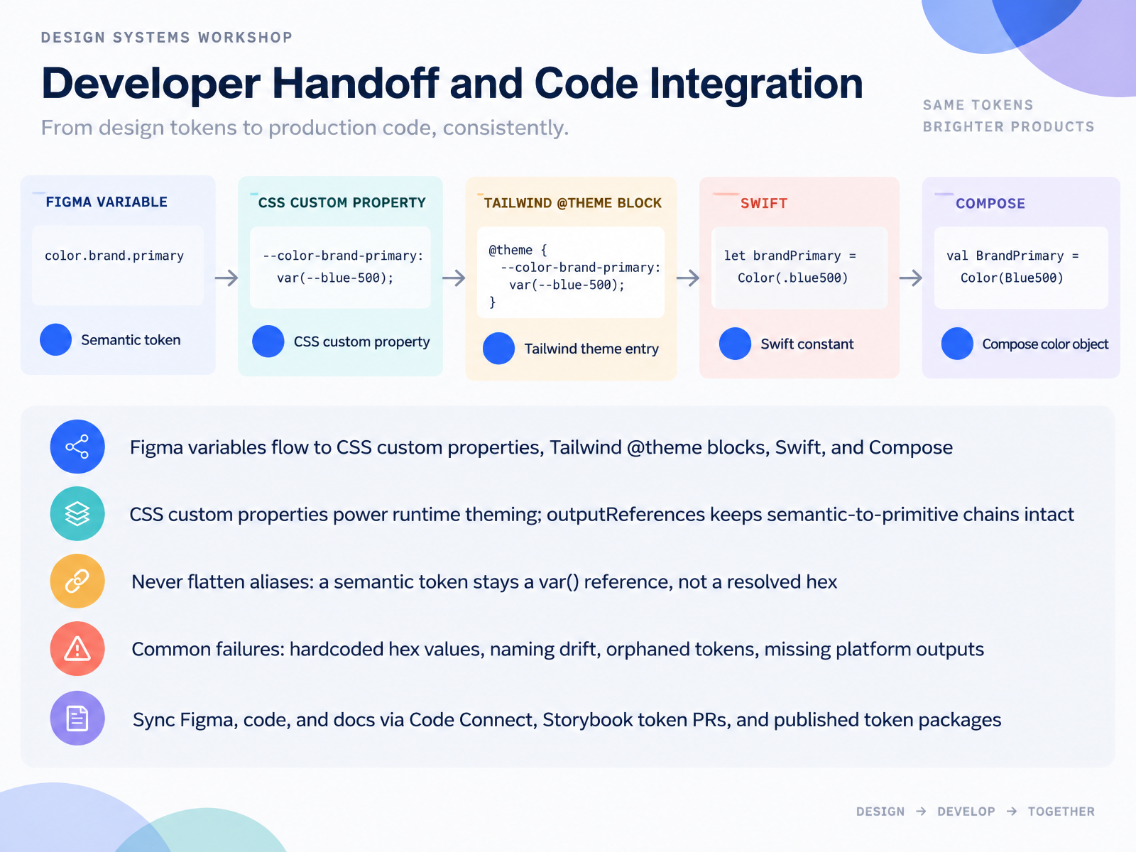
 - 10Developer Handoff and Code IntegrationLet's move to developer handoff and code integration. This is where tokens stop being a design artifact and become runtime code. Figma variables flow into CSS custom properties, Tailwind at-theme blocks, Swift, and Compose. On the web, CSS custom properties give you runtime theming, so a theme switch is a variable change, not a rebuild. Keep output references on. A semantic token should stay a var() reference, never a resolved hex. If you flatten color slash text slash link down to a hex value, you throw away the relationship that makes dark mode and theming possible. The common failures are predictable: hardcoded hex values, naming drift, orphaned tokens, and missing platform outputs. Sync Figma, code, and docs with Code Connect, Storybook token pull requests, and published token packages. Your next step: pick one semantic color token and confirm it lands in code as a reference, not a hex value. From here, let's look at the adoption path, migrating an existing color system.
 1 min
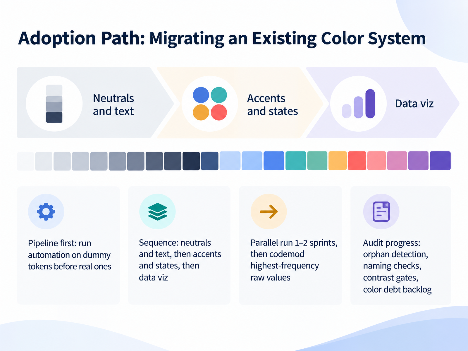
1 min - 11Adoption Path: Migrating an Existing Color SystemLet's move on to adoption. Migrating an existing color system is where good intentions meet real code, so here's a sequence you can actually run. Pipeline first: point your automation at dummy tokens before real ones. That way, contrast gates and naming checks fail on purpose, not in production. Then sequence the work. Neutrals and text come first, because they deliver immediate readability wins in both light and dark mode. Accents and interactive states come next, since they carry chroma policies and need contrast automation. Data viz goes last, where you can loosen chroma constraints while keeping your lightness anchors. Run old and new tokens in parallel for one or two sprints, then codemod the highest-frequency raw values into semantic equivalents. Expect drift and legacy palettes to surface. That's normal. Track progress with orphan detection, naming checks, contrast gates, and a color debt backlog for the oddities you defer. Your next step: turn on the pipeline against dummy tokens this week.
 accessibility.buildujl-framework.orgwirechunk.com+21 min
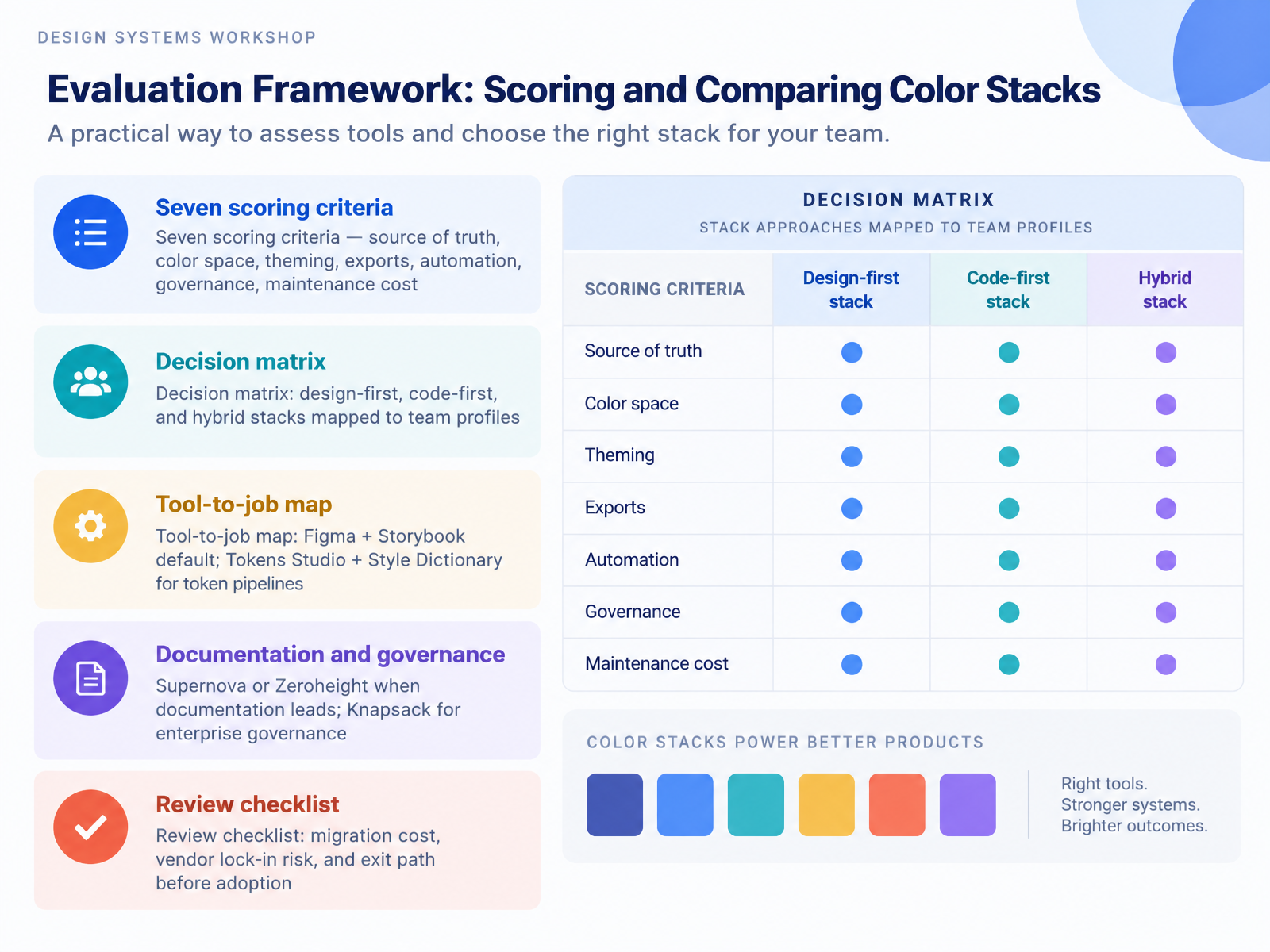
 - 12Evaluation Framework: Scoring and Comparing Color StacksLet's walk through how to score and compare color stacks. You have seven criteria: source of truth, color space, theming, exports, automation, governance, and maintenance cost. Score each stack against all seven. Then build a decision matrix. Design-first stacks suit teams where designers own the palette. Code-first stacks fit engineering-led teams. Hybrid stacks split the difference when both sides ship tokens.
Next, map tools to jobs. Figma plus Storybook is the default for most product teams. Tokens Studio plus Style Dictionary handles token pipelines. Supernova or Zeroheight when documentation leads. Knapsack when enterprise governance is the requirement.
Before you adopt anything, review three things: migration cost, vendor lock-in risk, and your exit path. Write them down. That checklist protects you from a painful rebuild later.
In the next section, you'll build a semantic color set end to end.
 stackfyi.comguideflow.comgitnux.org+21 min
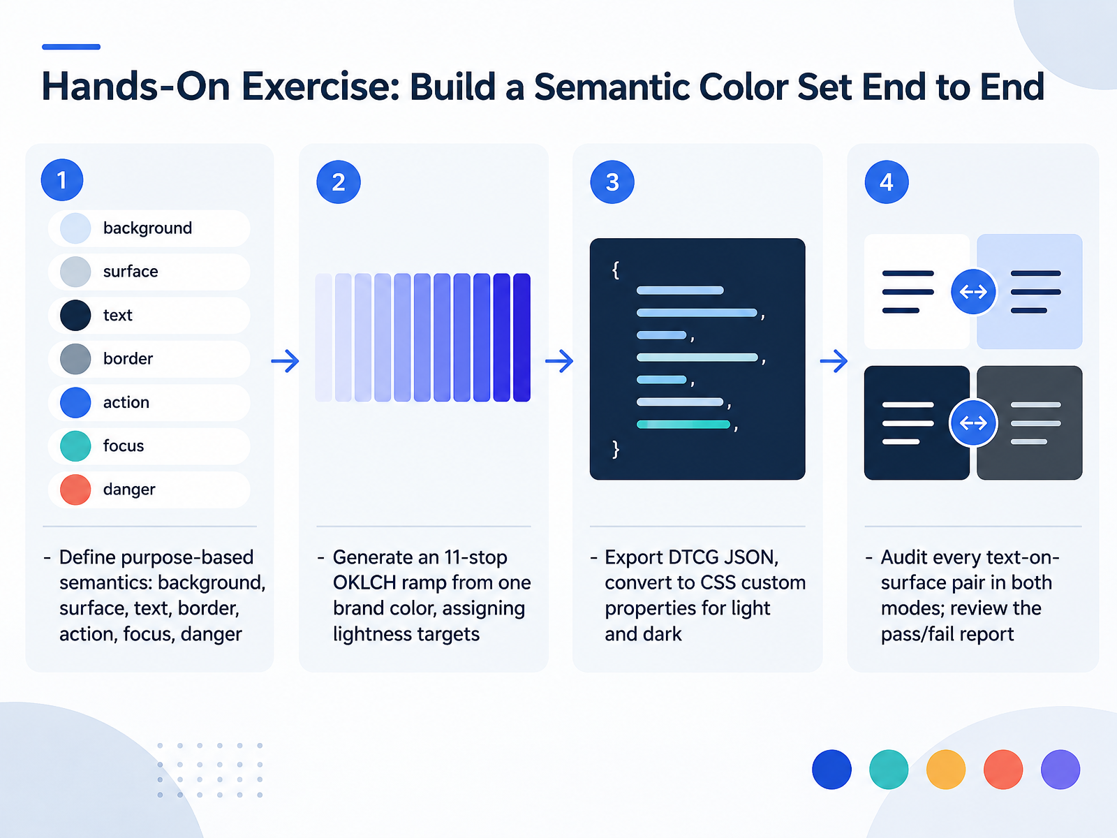
 - 13Hands-On Exercise: Build a Semantic Color Set End to EndNow let's build a semantic color set end to end. Start by naming purpose, not appearance: background, surface, text, border, action, focus, danger. Then take one brand color and generate an eleven stop OKLCH ramp, assigning lightness targets to each stop. Keep hue locked, and taper chroma at the extremes so stop fifty doesn't glow and stop nine fifty doesn't turn muddy. Export that ramp as D T C G JSON, then convert it to CSS custom properties for light and dark. In dark mode, remap the semantics rather than inverting the light palette. Finally, audit every text on surface pair in both modes. Run WCAG two point two as your normative baseline, and read APCA alongside it, because a mid gray can pass one and fail the other. For this exercise, check each pair, then review the pass and fail report as a single artifact. Your next step: pick one brand color and complete the full loop once this week. Next, we'll cover wrap up, next steps, resources, and common failure modes.
 github.comzeontools.comaccessibility.build+22 min
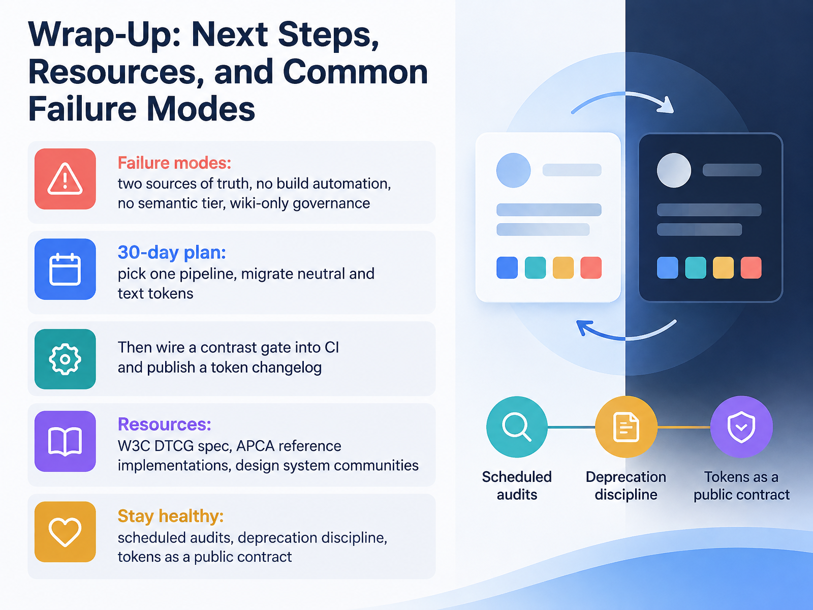
 - 14Wrap-Up: Next Steps, Resources, and Common Failure ModesLet's close with what actually goes wrong, and what to do next. Four failure modes come up again and again. Two sources of truth, where Figma variables and your CSS tokens drift apart. No build automation, so every export is a manual step that eventually gets skipped. No semantic tier, meaning components reference primitives and theming breaks. And wiki only governance, where the rules live in a document nobody reads at review time. Pick one pipeline this month, and migrate your neutral and text tokens first, since those touch everything. Then wire a contrast gate into continuous integration, and publish a token changelog so consumers see renames, removals, and value shifts. For reference, start with the W3C Design Tokens Community Group spec, APCA reference implementations, and design system communities. Stay healthy with scheduled audits, real deprecation discipline, and the mindset that your published tokens are a public contract. Thanks for working through this with me. Go pick that one pipeline, and ship the first migration this week.
 2 min
2 min
Take the deck with you
Download this course as a file — free, no sign-up needed.
- PDF handoutEvery slide page, ready to print or share.15 pages · 2.9 MBDownload
- Narrated PowerPointThe deck that presents itself — every slide carries the digital human's narration video.15 pages · 27.9 MBDownload
- PowerPoint slidesThe full deck as a .pptx — open it in PowerPoint, Keynote, or Google Slides.15 pages · 2.8 MBDownload
Free to use in your own training — please keep the PersonWise credit page at the end.
Have your own deck? Turn it into a course
Sources consulted
Web sources consulted while building this course.
- Style Dictionary + SD Transforms | Tokens Studio for Figma — docs.tokens.studio
- Design Tokens Figma to Code: Automate the Whole Pipeline — lenkastudio.com
- Session 1: Pipeline + Color Token Architecture — ux-maldo.hashnode.dev
- tokens-studio/sd-transforms — github.com
- Design Tokens: A Practical Guide for 2026 | Masterly — themasterly.com
- OKLCH + APCA Color Systems for Accessible Design Systems — accessibility.build
- ADR-009: OKLCH Color Space for Design Tokens | UJL Framework — ujl-framework.org
- Modern CSS Color: OKLCH, LCH, Wide-Gamut, and New Color Functions Explained — wirechunk.com
- Designing Luminance‑First Color Systems with OKLCH: Tokens, Ramps, and Real‑World Pitfalls | BoldVanta — boldvanta.com
- Color experiments with OKLCH – Chris Henrick — clhenrick.io
- Best Design System Tools in 2026 | StackFYI — stackfyi.com
- 15 best design system tools for 2026 - Guideflow Blog — guideflow.com
- 10 Tools Compared: Best Design System Software (2026) — gitnux.org
- Design system tooling in 2026 — what to use, what to skip | DesignSystems.one | DesignSystems.one — designsystems.one
- Coolors alternatives for design systems: choose the output you actually need | Identity Forge — identityforge.io
- hedronit/hedron-contrast-checker — github.com
- WCAG 2.2 & APCA Color Contrast Checker Studio | ZeonTools — zeontools.com
- Accessible Palette Studio | OKLCH + APCA — accessibility.build
- Color Contrast Checker | José Manuel Requena Plens — jmrp.io
- Ratia: Color Contrast Checker (WCAG 2.2 + APCA) — appcrib.com