Designing Date and Time Inputs
Begin
12 pages · ~24 min
Designing Date and Time Inputs
A training on designing effective date and time input fields, teaching UX designers how to create clear, user-friendly forms.
What you’ll learn
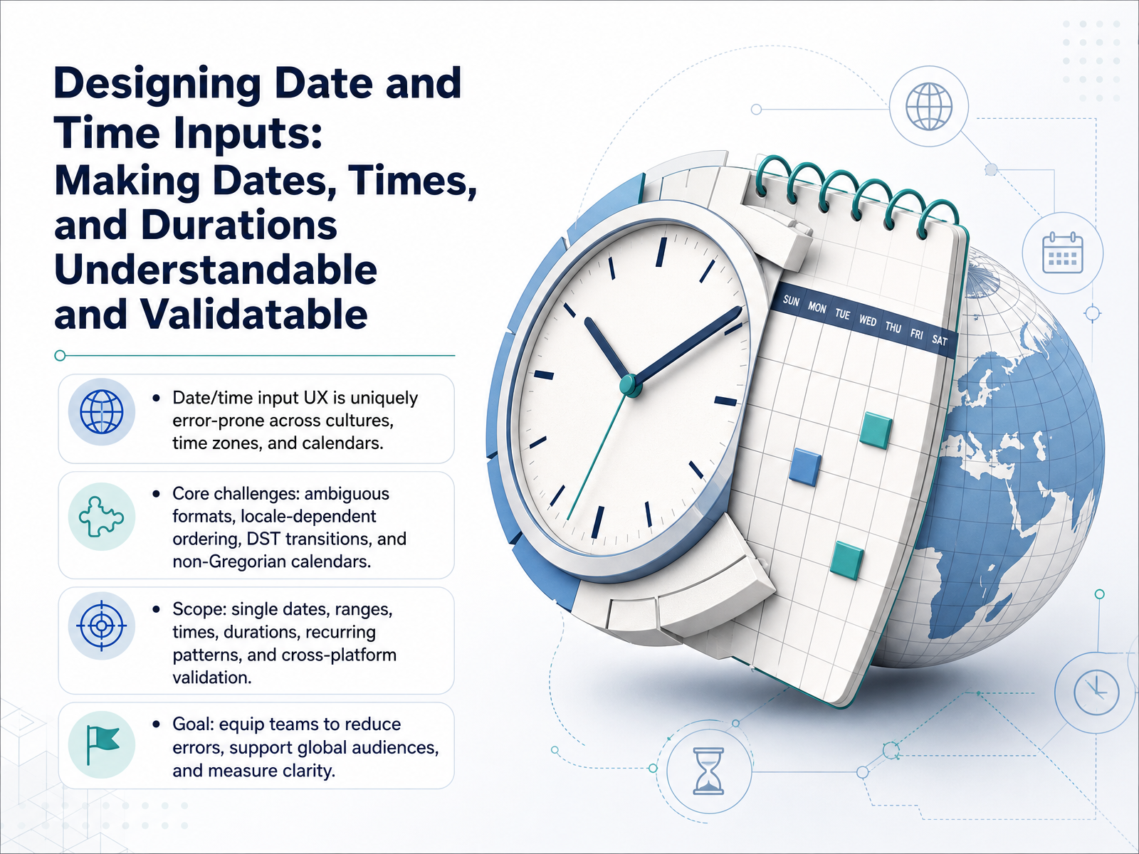
- 01Designing Date and Time Inputs: Making Dates, Times, and Durations Understandable and ValidatableWelcome to Designing Date and Time Inputs. In this course, we move beyond basic pickers to build interfaces that make dates, times, and durations both understandable and reliably validatable. As designers, we know this small set of fields causes outsized frustration. Ambiguous formats like 03/04/2026 mean different things in different cultures. Daylight saving transitions and non-Gregorian calendars like Hijri or Buddhist systems silently break data. Our scope covers single dates, ranges, specific times, recurring patterns, and cross-platform validation. The goal is practical: equip your team to reduce errors, support global audiences, and bring measurable clarity to every temporal input you ship. Let's begin by grounding our work in real user mental models and task context.setproduct.comjoegullo.combubble.ro+21 min
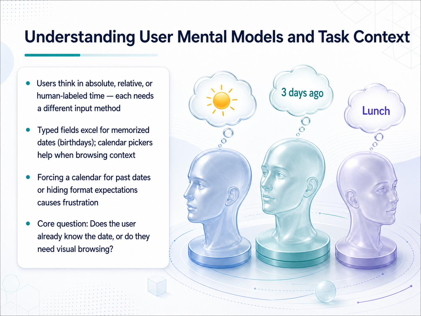
- 02Understanding User Mental Models and Task ContextNow let's look at user mental models. People think about time in three distinct ways: absolute dates like a birthday, relative dates like next Tuesday, or human-labeled time like Thanksgiving weekend. Each one needs a different input method. Typed fields work best for memorized dates. A user knows their birth date without any visual help, so a text field is fast and efficient. Forcing them to use a calendar picker for a past date like a birthday just creates frustration. In fact, studies from the Nielsen Norman Group specifically warn that calendar pickers become a clicking marathon when the target date is more than a few months away. Calendar pickers, on the other hand, are ideal when the user needs to browse. Booking a trip, scheduling a payment, or picking the third Thursday of a month all benefit from seeing the surrounding days. So the core design question for every date input is this: does your user already know the exact date, or do they need visual context to find it? Answer that, and you'll know which control to reach for. Next, we'll dive into input modality choice, covering text fields, pickers, and hybrid patterns.
 journals.sagepub.comonlinelibrary.wiley.comjournals.sagepub.com+22 min
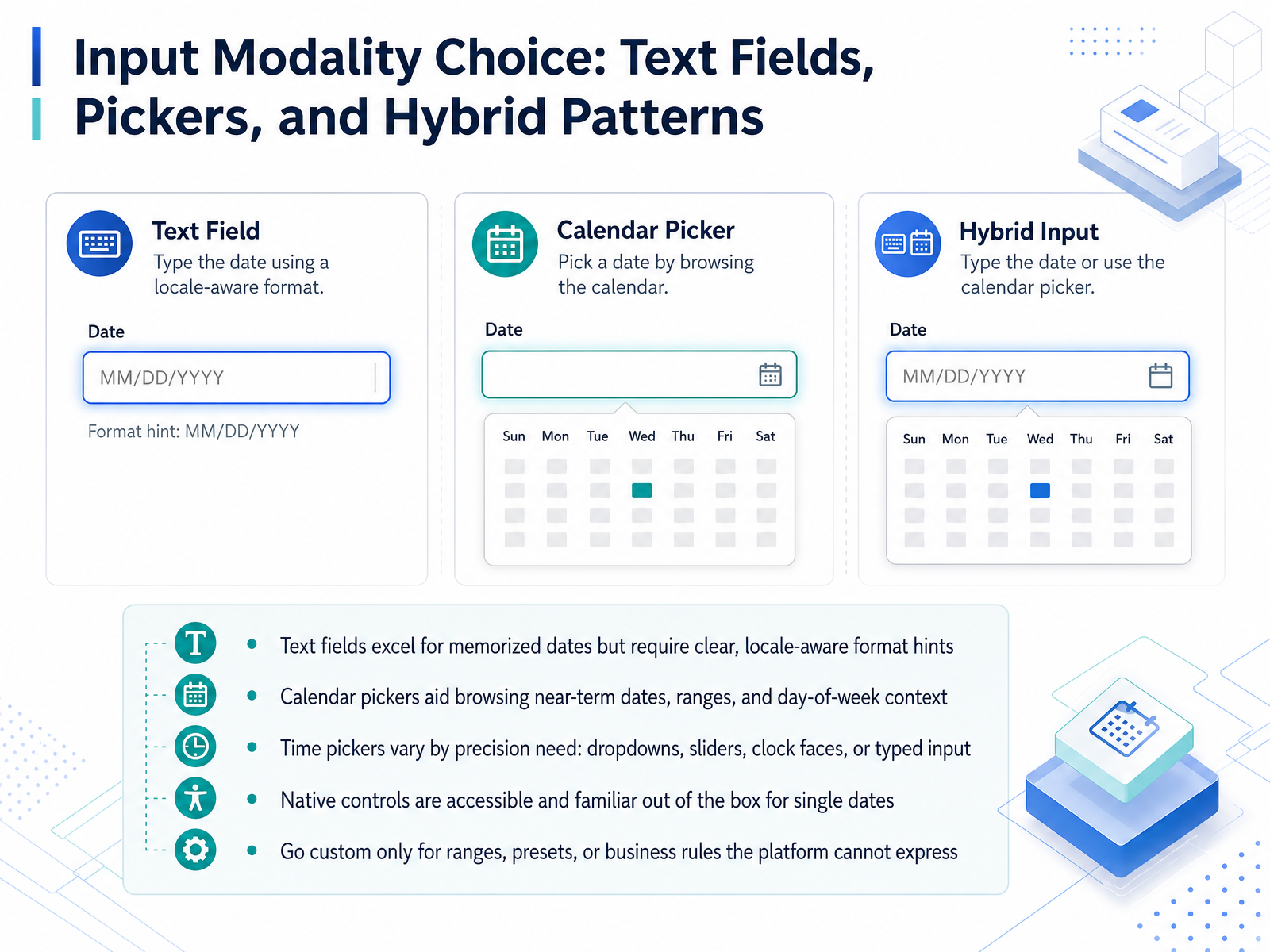
 - 03Input Modality Choice: Text Fields, Pickers, and Hybrid PatternsLet's turn to the core decision when designing a date and time input: choosing the right modality. You have three primary patterns to work with. First, the humble text field. It's unbeatable for speed when a date is memorized, such as a birthdate or an expiration date. The performance data confirms this. But its success depends entirely on providing a clear, locale-aware format hint placed outside the field, not just inside a disappearing placeholder. Second, the calendar picker. This tool shines when users need to browse for near-term dates, select ranges, or understand the day of the week in context, like picking a travel departure. However, a calendar becomes a navigation nightmare for dates far in the past or future, where a year dropdown or direct text entry is vastly more efficient. For time entry, precision dictates the pattern. Simple dropdowns work for coarse increments, but sliders or clock-face dials can be more intuitive for specific times. Always supplement the graphical picker with a typed input as an escape hatch. Now, when should you build a custom solution? For simple, single dates, native HTML controls are your most accessible baseline. They are familiar to the operating system and meet baseline accessibility out of the box. Reserve custom development for what the platform cannot express natively: complex date ranges, business logic that disables specific dates, or interface presets. And if you do go custom, validate it against the WAI-ARIA grid pattern to ensure you are not creating a keyboard trap. Next, we'll address a critical source of user error: disambiguating formats and handling locale.
 journals.sagepub.comonlinelibrary.wiley.comjournals.sagepub.com+22 min
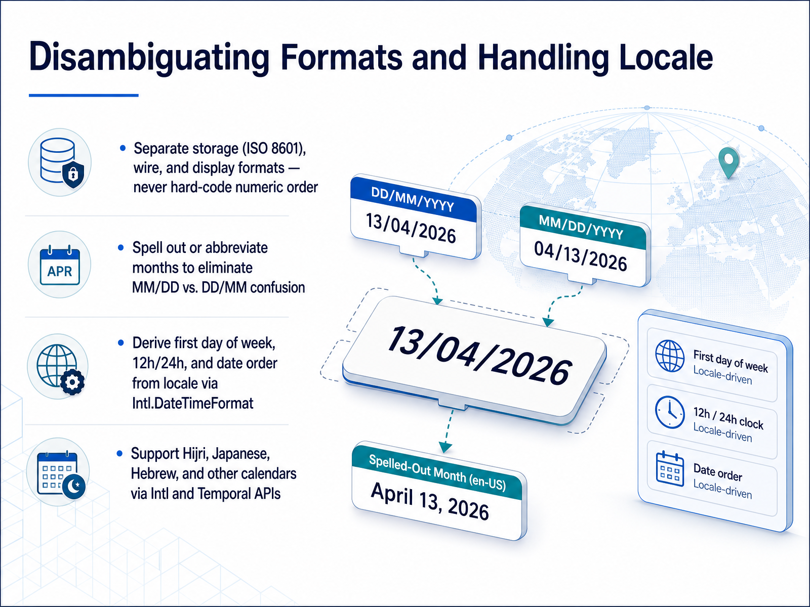
 - 04Disambiguating Formats and Handling LocaleNow let's talk about disambiguating formats and handling locale, because a date like three-four-twenty-twenty-six can mean March fourth or April third depending on where your user is. The core rule is to separate your layers: store everything in ISO 8601, transmit it as a stable wire format, and only localize the display. Never hard-code a numeric order like month-day-year. Instead, spell out the month or use an abbreviation to remove the MM/DD versus DD/MM confusion entirely. For display, rely on Intl.DateTimeFormat to derive the correct date order, the first day of the week, and whether your user expects a twelve-hour or twenty-four-hour clock. And where your market requires it, support non-Gregorian calendars. You can surface Hijri, Japanese, Hebrew, and others through the same Intl and emerging Temporal APIs, rendering them while keeping your canonical data in Gregorian UTC. In short, let the user's locale drive presentation; keep your storage and logic strictly normalized. Up next, we'll look at timezone-aware input design and scheduling pitfalls.
 setproduct.comjoegullo.combubble.ro+22 min
 - 05Timezone-Aware Input Design and Scheduling PitfallsLet's now tackle what may be the single biggest source of silent bugs in scheduling interfaces: timezone-aware design. This isn't just about putting a dropdown in settings. It's about how you store, convert, and display moments in time to prevent meetings from appearing on the wrong day. The core technical rule is to store your instants in UTC with IANA timezone identifiers, like America/New_York. You only convert to local time at the display layer, right before the user sees it. When you present a timezone selector, build a city-based search with auto-detection. Do not use raw offset menus, such as UTC minus five, because offsets change with daylight saving time. A city-based name captures the actual location rules. Next, you must actively prevent DST hazards. Block impossible times—like 2:30 AM during the spring-forward gap—and provide a UI to disambiguate fall-back overlaps when the same hour occurs twice. Finally, for all-day events and birthdays, store them as plain dates without time components. Attaching midnight UTC to a birthday is the classic mistake that turns a May 22nd celebration into May 21st for users west of the Prime Meridian. Plain dates avoid off-by-one errors entirely. Up next, we'll apply these ideas to duration, range, and recurrence input patterns.
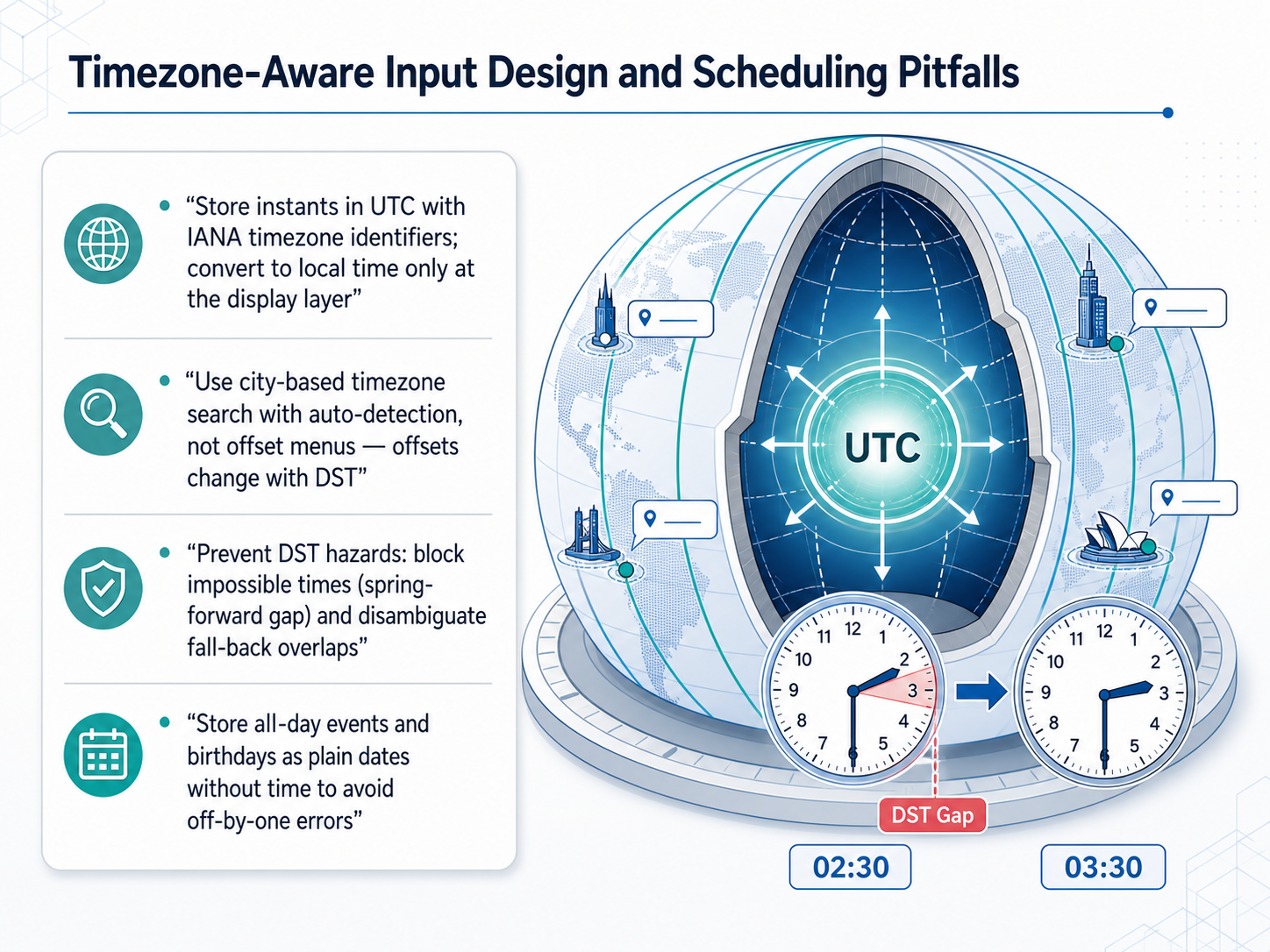 nngroup.comsmart-interface-design-patterns.comzoer.ai+22 min
 - 06Duration, Range, and Recurrence Input PatternsNow let's move from atomic dates to durations, ranges, and recurrence. Users don't just pick a single point in time; they book stretches of time and repeating schedules. For duration, support mixed-unit inputs. Let someone type one hour thirty minutes as a single value, separated from the arithmetic of absolute timestamps. For date ranges, the common friction is selecting an end that falls before the start. Validate with cross-constraint checks and show two months side by side so users can see both endpoints without flipping back and forth. For recurrence, the backbone is the iCalendar RRULE specification. But no one should have to write a raw RRULE string. Build a visual editor with toggles for weekdays, monthly patterns, and end conditions, and pair it with a natural-language summary generator that reads back: recurring weekly on Monday and Wednesday until December thirty-first. This builds trust that the machine and the human agree. Finally, guard against the calendrical traps that quietly corrupt recurring data. End-of-month rules must handle months with thirty-one, thirty, or twenty-eight days. Leap years shift anniversaries. Holiday offsets and exclusion dates let users carve specific days out of a series without breaking the pattern. Treat these as first-class validation logic, not edge cases to document in a help box. Next up, we'll explore validation tiers and timing strategies to catch errors before they become data problems.
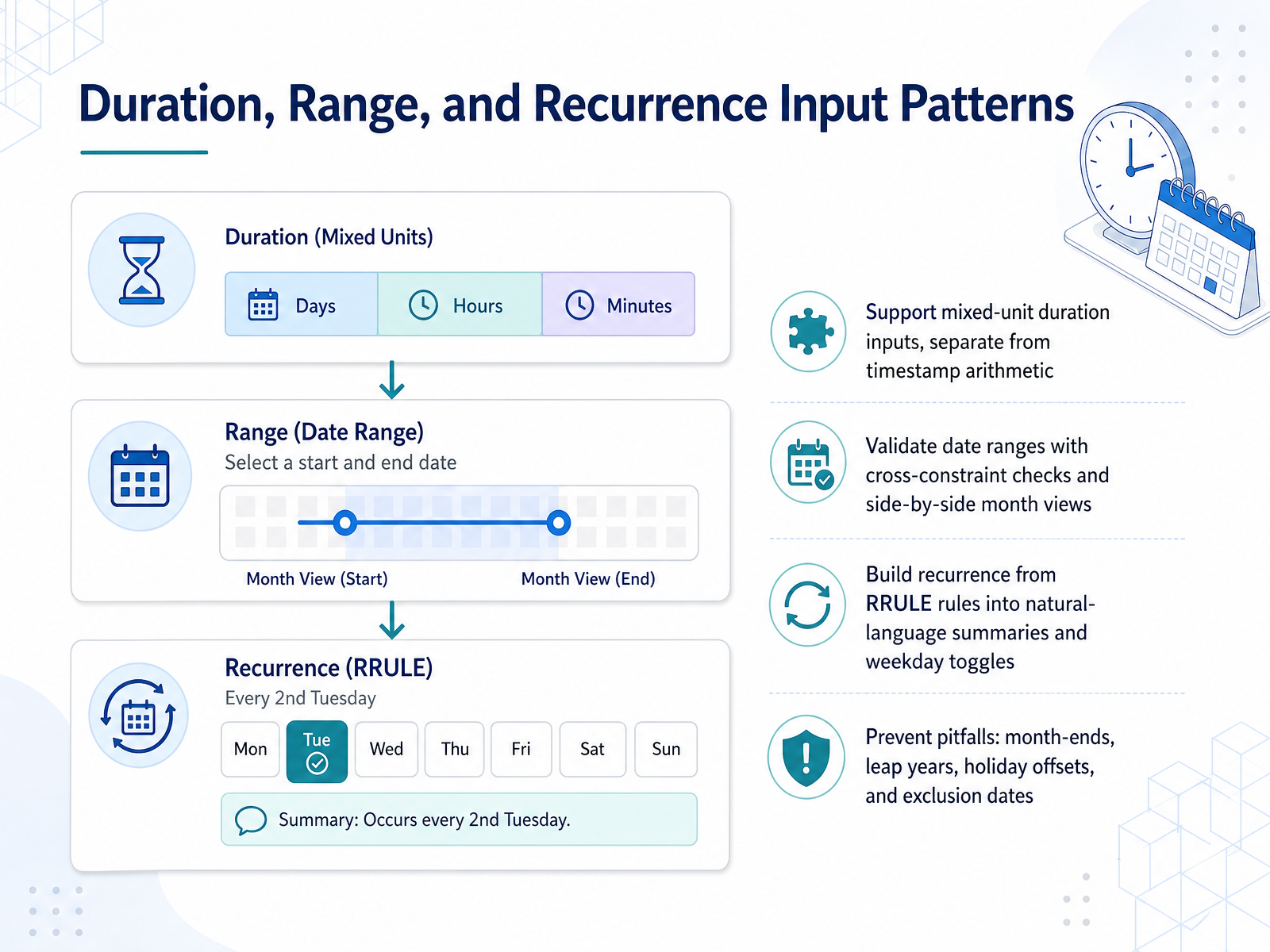 github.comgithub.comgithub.com+22 min
 - 07Validation Tiers and Timing StrategiesNow let's focus on validation tiers and timing strategies. When a user enters a date, you should validate in layers. First, check the syntax: is this a real date format? Then, check calendar existence: is February 30th actually a day? Next, apply logical rules, like ensuring an end date is after a start date. Finally, enforce business constraints, such as blocking weekends or holidays. This tiered approach catches errors at the right level of detail.
Timing is just as critical. Trigger format and completeness checks on blur, when the user leaves the field. This follows the 'Reward Early, Punish Late' pattern. Once a field has an error and the user returns to fix it, switch to live validation. Clear the error message the instant the correction is made, so the user gets immediate positive feedback.
For accessibility, connect your error messages to the input using aria-describedby. Toggle aria-invalid to true only when an error is present, and use a polite live region to announce changes without interrupting the user's flow.
Next, we'll apply these concepts to constraint communication and graceful error recovery.
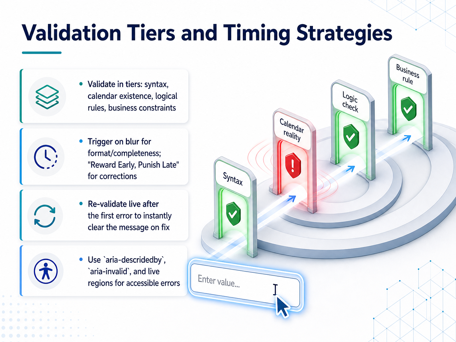 construkt.eusetproduct.comgithub.com+22 min
 - 08Constraint Communication and Graceful Error RecoveryNow, let's turn to constraint communication and graceful error recovery. The number one rule is to show limits before they become errors. Communicate minimum and maximum dates, disabled days, blackout periods, and format hints right up front. If a date is greyed out, you must explain why. A dimmed day with no tooltip reads as a broken control, not a business rule. Always provide a reason, like 'past the cutoff' or 'fully booked.' When the user still enters an invalid date, never silently auto-correct. Instead, suggest the nearest valid date and let the user decide. For validation timing, run format checks when the user leaves the field, on blur. Then, on form submit, focus the first error field and display a summary list of all issues with anchor links, so users can fix everything efficiently without hunting. Following Nielsen's heuristic, true error prevention is about designing constraints that make errors difficult to commit in the first place. Looking ahead, our next topic covers accessibility, focusing on keyboard navigation, screen reader support, and WCAG compliance.
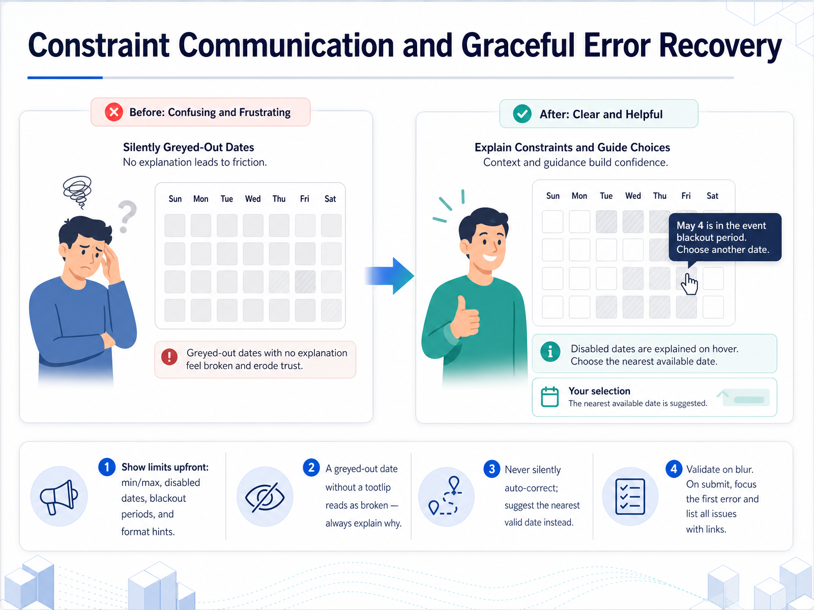 construkt.eusetproduct.comjoegullo.com+22 min
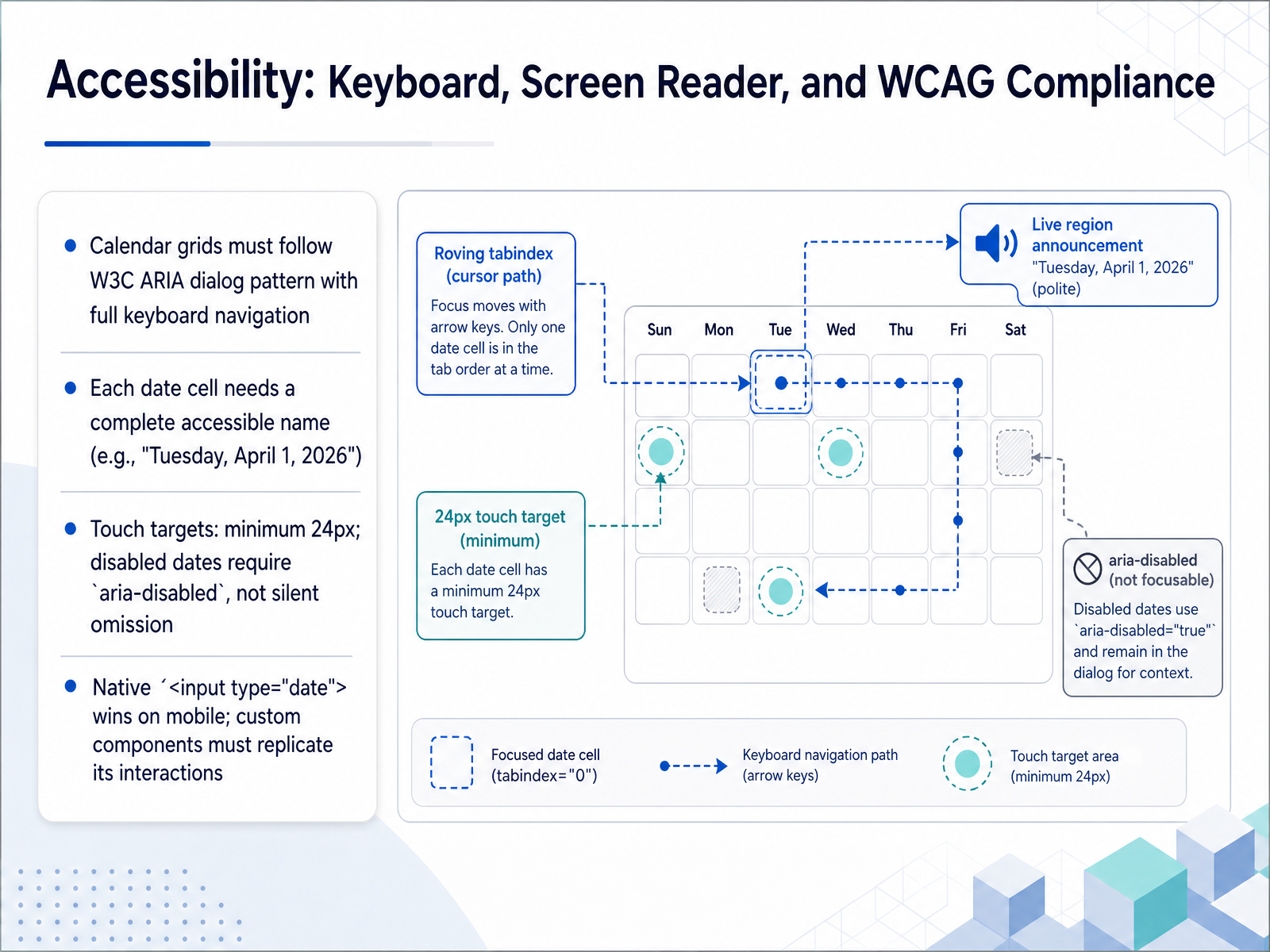
 - 09Accessibility: Keyboard, Screen Reader, and WCAG ComplianceNow let's talk about accessibility: keyboard, screen reader, and WCAG compliance. Calendar grids must follow the W3C ARIA dialog pattern with full keyboard navigation. That means arrow keys move between dates, Page Up and Page Down change months, and Escape closes the popover. Each date cell needs a complete accessible name, like 'Tuesday, April 1, 2026', not just the number one. Touch targets should be at least 24 pixels; any smaller and your users will tap the wrong day. When you disable dates, use aria-disabled so screen readers can still announce them as unavailable. If you silently remove them from the grid, you are hiding information from non-sighted users. For simple single-date selection on mobile, the native HTML date input wins almost every time. It inherits platform accessibility, supports the user's preferred locale, and requires zero extra code. If your project demands custom calendar widgets, your implementation must replicate all of these native interactions. In the next slide, we will explore cross-platform consistency and mobile considerations.
 setproduct.comjoegullo.combubble.ro+22 min
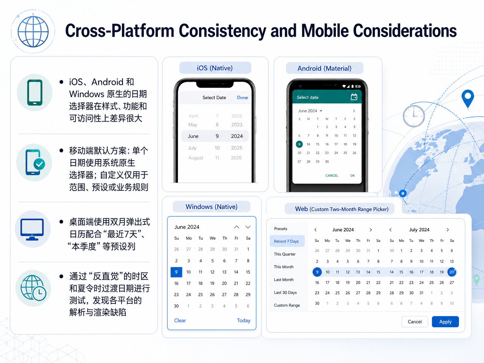
 - 10Cross-Platform Consistency and Mobile ConsiderationsNow let's look at how platform differences affect your date and time inputs. When you design a single component, it will face three very different realities. iOS, Android, and Windows each ship their own native picker, with distinct visual styles, interaction patterns, and accessibility behaviors. You cannot assume the same experience works everywhere without testing. For mobile, the safest default is to use the system's native control for a single date. It is already accessible, touch-optimized, and familiar to the user. Reserve custom mobile pickers strictly for cases where you need date ranges, quick presets, or complex business logic that the platform cannot express. On desktop, the dynamic shifts. A two-month pop-up calendar works well, especially when paired with a preset sidebar offering options like "last seven days" or "this quarter." This lets users choose relative dates with one click instead of navigating the grid. Finally, and this is critical, test your component with counter-intuitive time zone boundaries and daylight saving transitions. You will often uncover parsing and rendering defects that only appear when the clock jumps forward or falls back. These edge cases are where cross-platform date bugs hide. Next, we will examine how to measure clarity and reduce support cost.
 setproduct.comjoegullo.combubble.ro+22 min
 - 11Measuring Clarity and Reducing Support CostLet's talk about how we actually know if our date-input redesign is working. Measuring clarity means moving beyond visual polish to tracking real user behavior. Start with concrete metrics: task completion rate, time on task, error rate, support tickets, and field abandonment. These numbers directly reflect whether people struggle or succeed. Next, test for real-world confusion. Run usability studies focusing on cross-cultural format ambiguity, the far-past date problem for birthdays or anniversaries, and the headaches of multi-timezone scheduling. These scenarios are where silent failures happen. Then, experiment methodically. A B test your format hints, placeholder strategies, picker defaults, and especially your validation timing. A blur-based validation often outperforms validation on every keystroke. Finally, let data prove your redesign. One case study showed that adding text fallbacks alongside a calendar picker, combined with smart presets like last month or last quarter, cut custom-date usage from eighty-five percent to forty-three percent. That drop represents a massive reduction in support cost and user error. Up next, we'll look at how to govern these design decisions and hand them off to developers effectively, in Design System Governance and Developer Handoff.
 medium.comsetproduct.comjoegullo.com+22 min
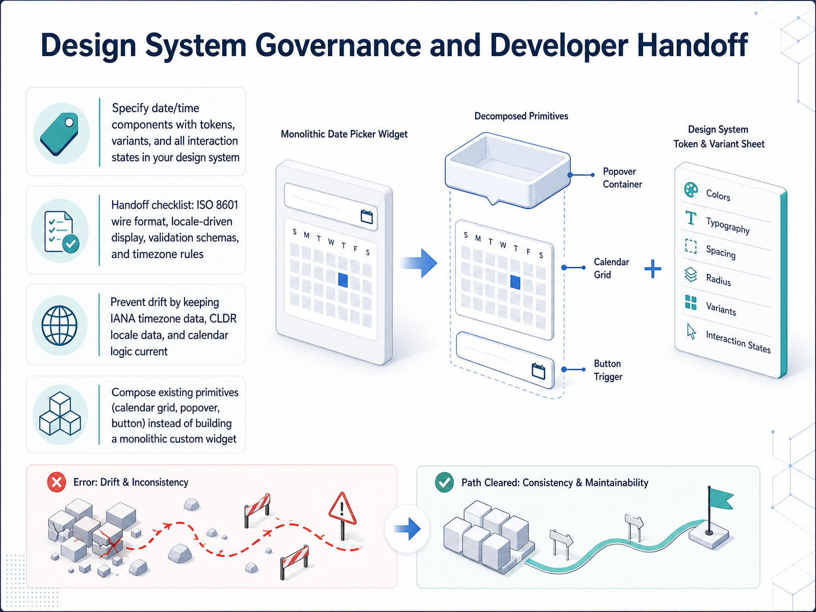
 - 12Design System Governance and Developer HandoffFor our final slide, let's talk about governance and handoff. As you move your date and time components into production, your design system needs to specify every variant, token, and interaction state. Don't just hand off a static mockup; provide the developer with the component's full lifecycle. Your handoff checklist must include the ISO 8601 wire format for all date-time values, locale-driven display rules using CLDR data, complete validation schemas, and explicit timezone rules. To prevent drift, you must treat timezone and locale data as living dependencies. Keep your IANA timezone database, your CLDR locale data, and your calendar logic patched and current, just like any other library. Finally, build for composition. Compose existing primitives like the calendar grid, the popover, and the trigger button, instead of engineering a monolithic custom widget. This keeps the system maintainable, accessible, and consistent. Thank you for joining me to explore the details of date and time input design. Apply these rules in your next project, and you'll solve some of the most persistent frustrations in form design. Thank you.
 setproduct.comjoegullo.combubble.ro+22 min
Take the deck with you
Download this course as a file — free, no sign-up needed.
- PDF handoutEvery slide page, ready to print or share.13 pages · 3.2 MBDownload
- Narrated PowerPointThe deck that presents itself — every slide carries the digital human's narration video.13 pages · 14.0 MBDownload
- PowerPoint slidesThe full deck as a .pptx — open it in PowerPoint, Keynote, or Google Slides.13 pages · 3.1 MBDownload
Free to use in your own training — please keep the PersonWise credit page at the end.
Have your own deck? Turn it into a course
Sources consulted
Web sources consulted while building this course.
- Date picker UI design, from anatomy to accessibility | Setproduct Blog — setproduct.com
- Date Pickers are the Worst Component on the Internet | Joe Gullo — joegullo.com
- i18n in 2026: The Tricks Nobody Told You About – Bubble — bubble.ro
- Date-Input Form Fields: UX Design Guidelines — nngroup.com
- Date and Time Localization: Formats, Time Zones, and the Bu… — better-i18n.com
- Comparison of Date Entry Methods: An Update for the Internet Age — journals.sagepub.com
- Working towards Usable Forms on the World Wide Web: Optimizing Date Entry Input Fields — onlinelibrary.wiley.com
- Empirical Evaluation of Entry and Selection Methods: For Specifying Dates — journals.sagepub.com
- A Comparison of Date Selection Elements on Mobile Touch Devices in eCommerce Sites | Documents - Universidad de Oviedo — portalinvestigacion.uniovi.es
- It's Time We Addressed Time-Zone Selectors — nngroup.com
- Designing A Time Zone Selection UX — smart-interface-design-patterns.com
- Site Language & Timezone Setup: Best Practices for 2025 — zoer.ai
- Designing date-time picker for SaaS — medium.com
- Time Picker UX: Best Practices, Patterns & Trends for 2026 — eleken.co
- erwan-joly/react-rrule-form — github.com
- Add RRuleEditor composite widget (recurrence editor for calendar / scheduling) — github.com
- glue-berlin/rbc-recurrence — github.com
- React Calendar Recurring Events Block — shadcn.io
- The intricacies of designing a recurrence calendar — medium.com
- Why premature live validation sucks (and how to solve it) - construkt.eu — construkt.eu