Accessible Color Systems Design
Begin
14 pages · ~28 min
Accessible Color Systems Design
Learn to create inclusive color systems that meet accessibility standards, ensuring your designs are usable by people with visual impairments.
What you’ll learn
- 01Designing Accessible Color SystemsWelcome to Designing Accessible Color Systems. My goal for this course is to give you practical, concrete ways to make color work clearly for everyone who uses your interfaces. We’re going to focus on three core tools: contrast, non-color cues, and defining a sharp, intentional role for color. Consider this: over 300 million people worldwide live with some form of color vision deficiency. When we design for their needs, we end up building better, more legible products for all users. By the end of our time together, you’ll know how to build a color system that is usable, compliant, and genuinely beautiful. Let’s get started. Up next, we’ll look at how humans perceive color in the first place.1 min
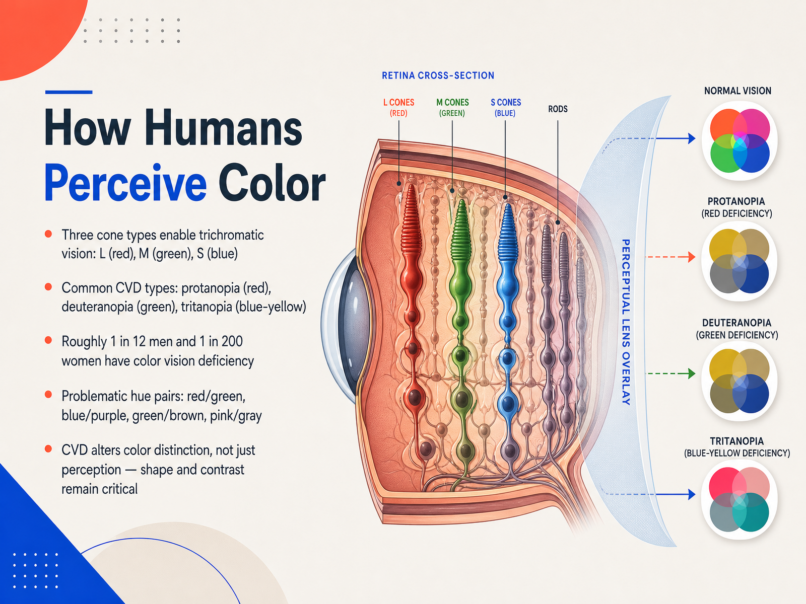
- 02How Humans Perceive ColorNow let's look at how humans actually perceive color. Our eyes use three types of cone cells to see the full spectrum: L cones for red, M cones for green, and S cones for blue. This is called trichromatic vision. But not everyone processes these signals the same way. Color vision deficiency, or CVD, alters color distinction, not just perception. The most common types are protanopia, which affects red; deuteranopia, which affects green; and tritanopia, a rarer type affecting blue-yellow perception. Globally, about one in twelve men and one in two hundred women have some form of color vision deficiency. That means in any sizable audience, you are designing for people who may not distinguish certain color pairs. The combinations that cause the most trouble are red and green, blue and purple, green and brown, and pink and gray. And here is the key takeaway: while specific hues may become indistinguishable, shape and contrast remain visible and critical. This is why we will rely heavily on contrast ratios and non-color cues throughout this course. Next, we will explore digital color spaces and perceptual uniformity, which give us the tools to manage these challenges with precision.
 w3.orgw3.orgw3.org+22 min
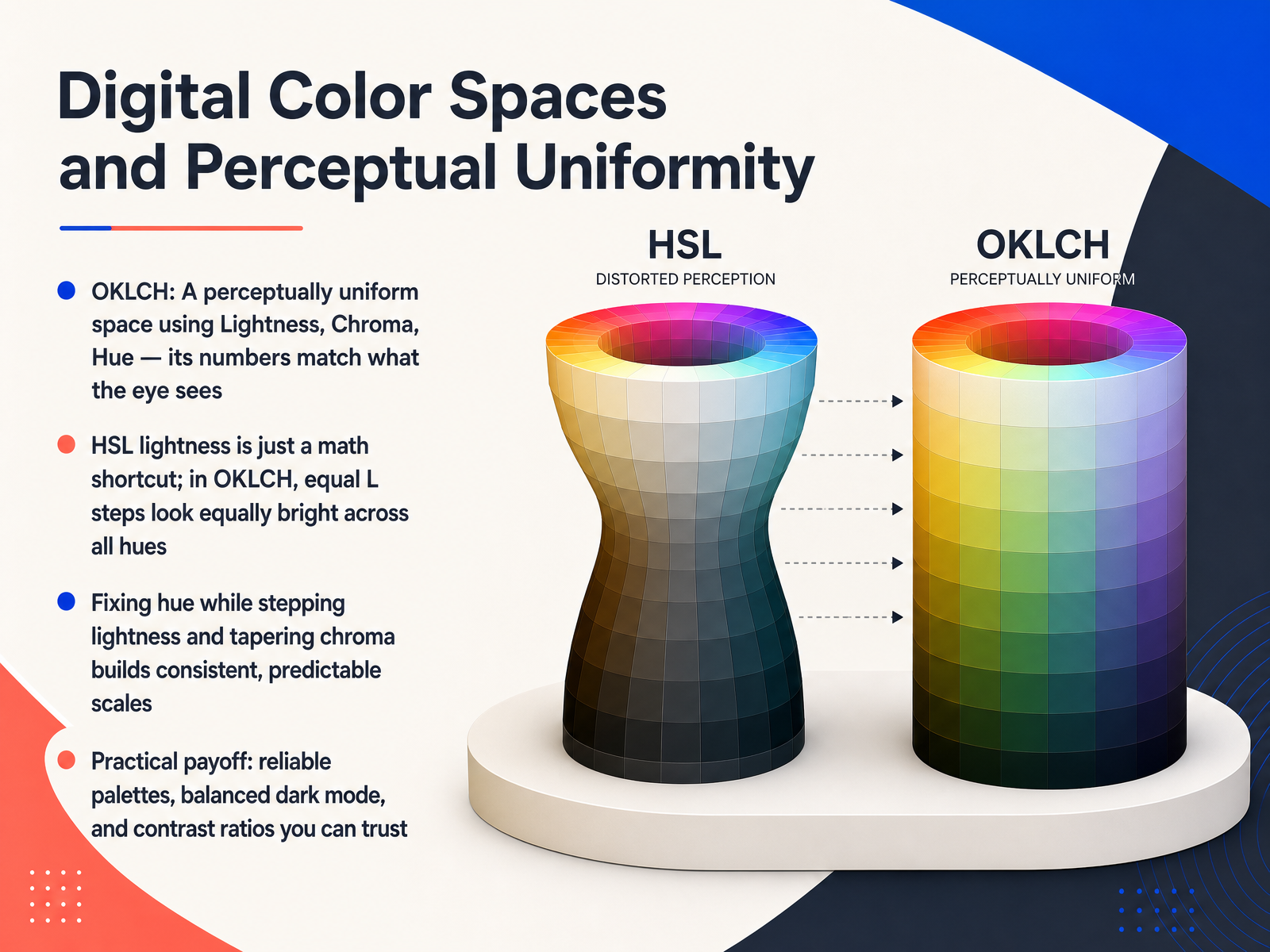
 - 03Digital Color Spaces and Perceptual UniformityNext, let's talk about a tool that makes building consistent color systems much easier: perceptually uniform color spaces, specifically OKLCH. The problem with older models like HSL is that the lightness number is just a math shortcut. A yellow and a blue at the same HSL lightness value look totally different in brightness to your eye. OKLCH fixes this. It stands for Lightness, Chroma, and Hue, and it's designed so that equal lightness steps look equally bright across all hues. This means when you create a palette by fixing the hue and stepping lightness down by a fixed amount, what you see is a perfectly even, predictable scale. To make the scale truly seamless, you also taper the chroma at the very light and dark ends, which prevents those colors from clipping unexpectedly. The practical payoff is huge. You can generate reliable palettes faster, build balanced dark mode themes without guesswork, and trust that the contrast ratios you calculate from lightness values are actually real. This perceptual uniformity turns color from a subjective tweak into a dependable system. In the next slide, we'll build on this foundation by focusing on contrast itself, the heart of legibility.
 zepixo.comdev.tomedium.com+22 min
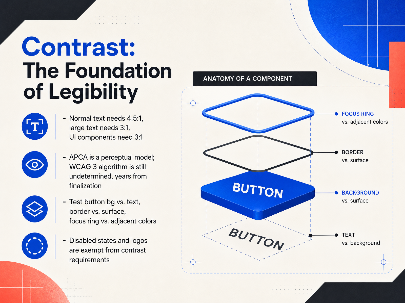
 - 04Contrast: The Foundation of LegibilityNow let's talk about the numbers that hold everything together—contrast. Think of contrast as the foundation of legibility. Without it, your interface simply isn't readable for many people. The ratios are actually simpler than they seem. For normal body text, you need four point five to one against the background. For large text—that's around eighteen point six six pixels bold or twenty-four pixels regular—the minimum relaxes to three to one. And here's a rule teams often miss: interactive components like buttons, form borders, and focus rings also need three to one against their adjacent colors. This is the non-text contrast requirement under Success Criterion one point four point eleven. So when you're testing, check the button fill against its text, the input border against the surface, and the focus ring against whatever sits behind it. A faded grey border on a white background is a classic failure. Now, you might hear about APCA as a newer perceptual model. Just know that WCAG 3 is still a working draft, and the contrast algorithm is yet to be determined. Finalization is years away. For legal compliance today, WCAG 2 point 2 is your standard. Also remember the exemptions: disabled states and logos have no contrast requirement. So don't waste energy fixing elements that are meant to be inactive. Next, we'll take these contrast rules and build them into a usable color palette.
 w3.orgw3.orgw3.org+22 min
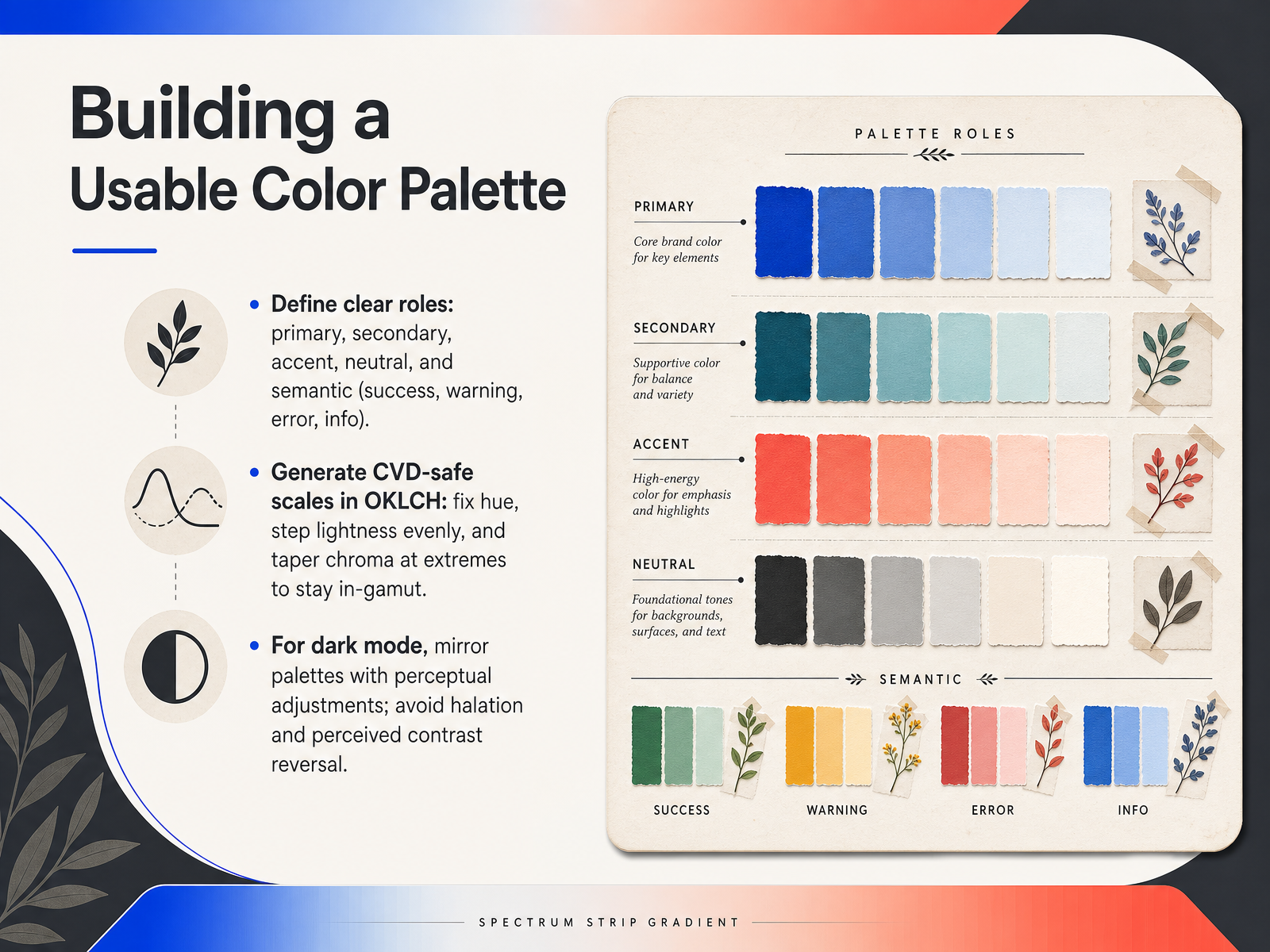
 - 05Building a Usable Color PaletteTo build a usable color palette, start by defining clear roles for every color. Think of primary, secondary, accent, and neutral families, plus semantic colors for success, warning, error, and info states. Each role needs a distinct job, so users instantly understand the interface. Now, when you generate the actual color scales, use the O K L C H color space. Here is the recipe. Fix the hue to keep your brand consistent, then step lightness evenly from light to dark. To avoid colors that fall outside the displayable range, taper the chroma down at the extreme light and dark ends. This keeps every shade clean and in gamut. For dark mode, do not just invert the lightness values. Instead, mirror your palettes with perceptual adjustments. Dark backgrounds make colors feel more saturated, so reduce chroma slightly and compress the lightness range. This avoids halation, that glowing halo effect, and prevents perceived contrast from feeling harsh or reversed. Your light and dark themes will feel balanced and intentional. Let's see how we can strengthen these color choices even further by going beyond color with non-color cues.
 zepixo.comdev.tomedium.com+22 min
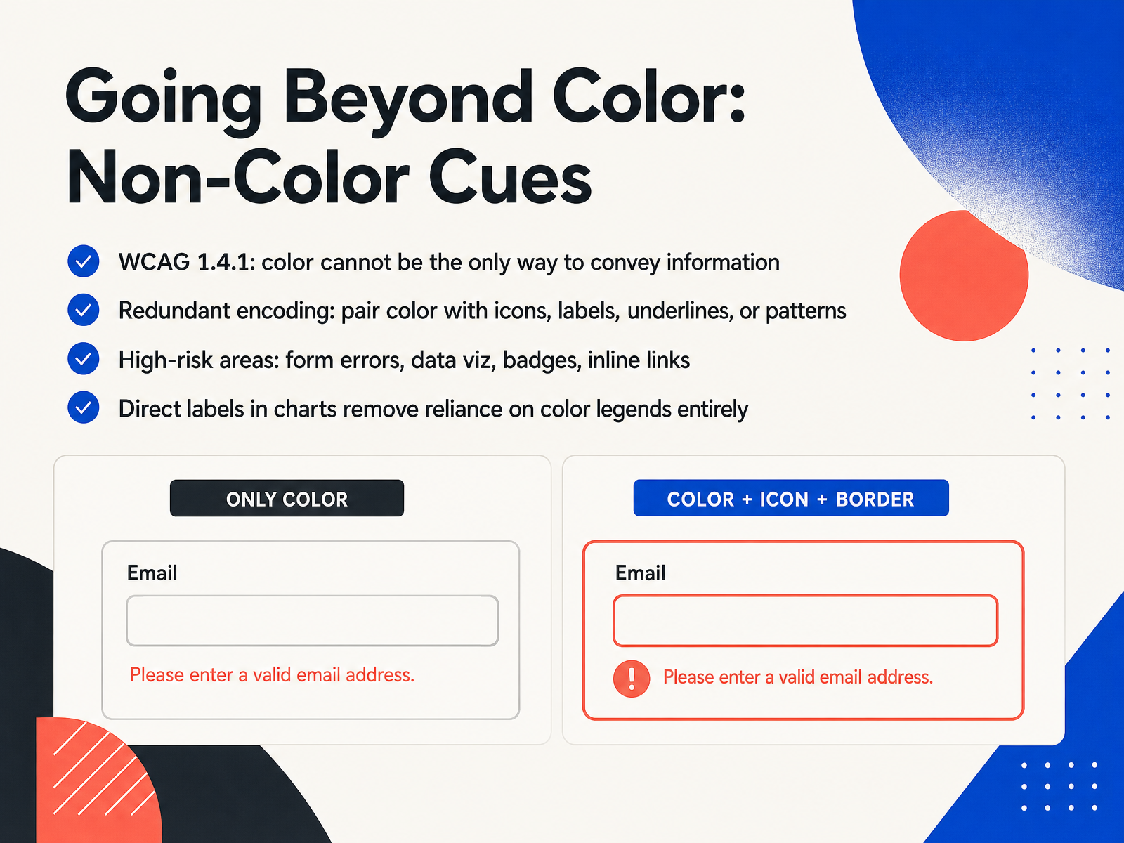
 - 06Going Beyond Color: Non-Color CuesNow let's move beyond color itself. According to WCAG criterion 1.4.1, color cannot be the only way you convey information. Think about a form where a red border marks an error. If someone can't perceive that red, the message is lost. That's where redundant encoding comes in. Pair color with something else — add an icon, a text label, an underline, or a fill pattern. The most common high-risk areas are form errors, data badges, and inline links. But this really hits home in data visualization. A color legend forces a constant eye trip between the chart and a key, and that trip fails entirely when hue isn't a reliable signal. The fix is direct labeling: put the series name right on the data, at the end of a line or above a bar. This removes dependence on color legends completely, making the chart readable in grayscale, for a color-blind viewer, and for a screen reader all at once. Let's see how these non-color cues play out in accessible data visualization.
 interactive-data-visualization.cominteractive-data-visualization.comhighcharts.com+21 min
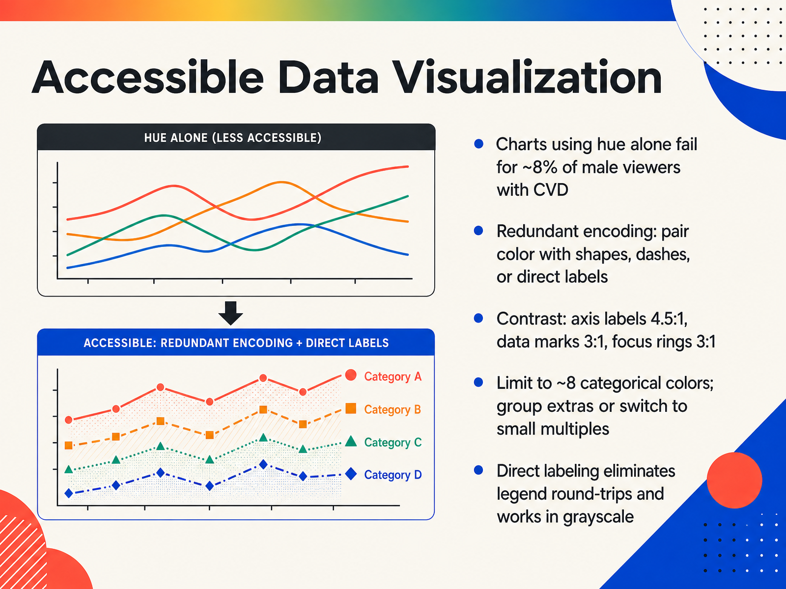
 - 07Accessible Data VisualizationData visualization brings the same color challenges we have been discussing directly into charts and graphs. When hue is the only way to tell data series apart, roughly one in twelve male viewers and one in two hundred female viewers will struggle to read the chart correctly. The fix is redundant encoding. That means pairing color with a second channel like shape, dash pattern, or texture. A circle, square, and triangle stay distinct even when the hues blend together. This also makes the chart readable in grayscale and more usable for everyone. Contrast thresholds apply here, too. Axis labels and legend text need at least a 4.5 to 1 ratio against their background. Data marks such as bars, lines, and points need at least 3 to 1 against adjacent colors, including other marks they touch. Focus rings also need that same 3 to 1 requirement. A practical ceiling for distinct categorical colors is around eight, even with a colorblind-safe palette like Okabe Ito. Beyond that, color stops being a reliable differentiator. Group minor series into an other category or switch to small multiples. And here is the most powerful technique: whenever you can, place the label directly on the data. End-of-line labels or values above bars remove the legend round-trip entirely and work perfectly in grayscale. Next, we will apply this thinking to interactive states and feedback.
 interactive-data-visualization.cominteractive-data-visualization.comhighcharts.com+22 min
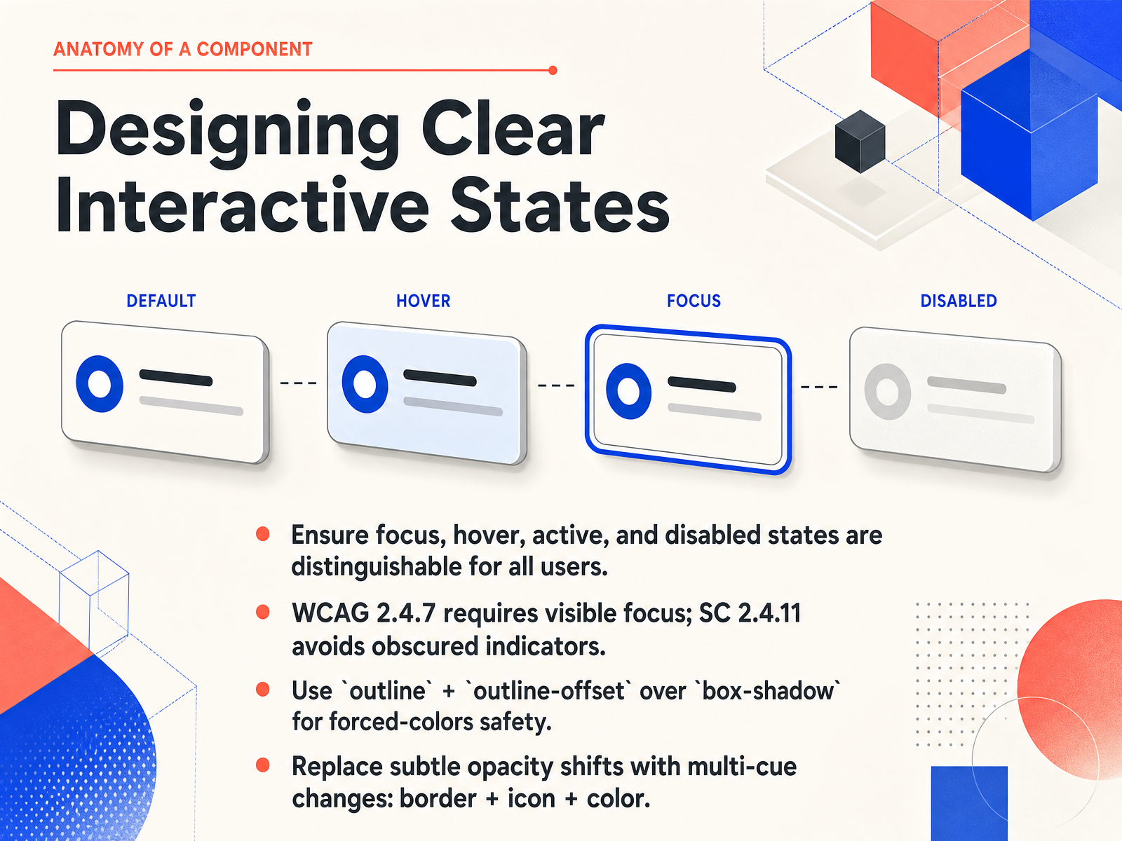
 - 08Designing Clear Interactive StatesOur next step is designing clear interactive states. This means making sure every element—focus, hover, active, and disabled—looks distinct to every user. Without that clarity, someone navigating by keyboard is essentially moving through the interface blind. The standard WCAG Two point Four point Seven requires a visible focus indicator, and the newer Success Criterion Two point Four point Eleven goes further by demanding that the indicator must never be completely hidden behind sticky headers or other overlapping content. For the implementation itself, use the outline property with outline-offset instead of box-shadow. Outlines survive forced-colors mode where shadows get stripped, and they resist clipping from overflow hidden containers. Finally, avoid relying on subtle opacity shifts to signal a state change. Instead, use multi-cue changes: combine a border adjustment, an icon transformation, and a color shift together. These layered signals reinforce each other and remain understandable regardless of someone's visual context. Up next, we will build on these fundamentals by designing for environmental and user modes.
 blog.pope.tech72technologies.comanimationpatterns.art+21 min
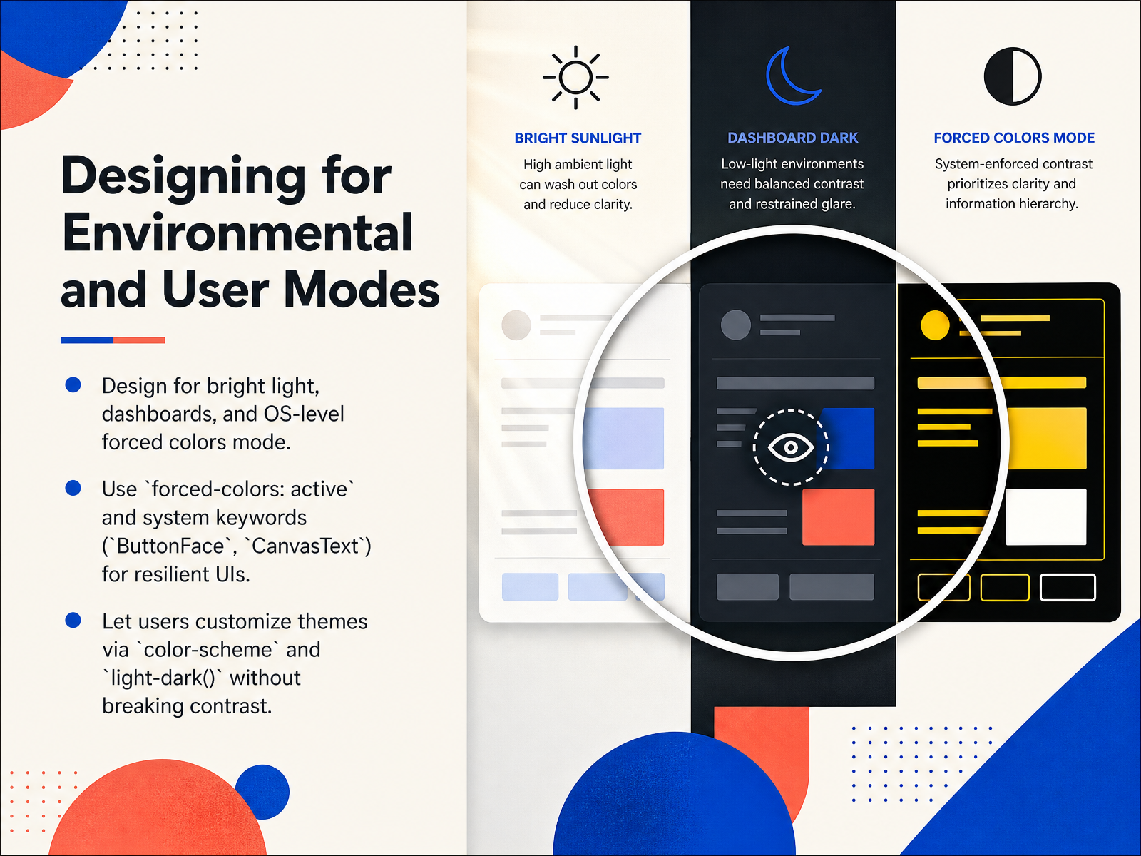
 - 09Designing for Environmental and User ModesSo far we've focused on designing a color system that you control. Now let's talk about the environments you don't control: bright sunlight, dashboard displays, and operating-system-level forced colors modes. When a user enables a high-contrast theme on Windows or a similar setting, the browser aggressively strips your backgrounds, shadows, and custom colors to enforce readability. Your job isn't to fight that override; it's to make sure your interface holds its shape and meaning when it happens. Use the media query `forced-colors: active` to detect that state, and inside it, swap your design tokens for system color keywords like `ButtonFace`, `CanvasText`, or `Highlight`. These keywords automatically map to the user's chosen palette, so you never need to guess which hex code they're using. If a button relied on a background color alone, add a solid border using `ButtonText` so its boundaries stay visible. For icons, switch fills to `currentColor` or `CanvasText` so they don't disappear. Also, let users customize themes through `color-scheme` and the `light-dark()` function without breaking contrast. In the next slide, we'll translate all of this thinking into reusable design tokens that communicate your color decisions clearly across the team.
 zepixo.comdev.tomedium.com+22 min
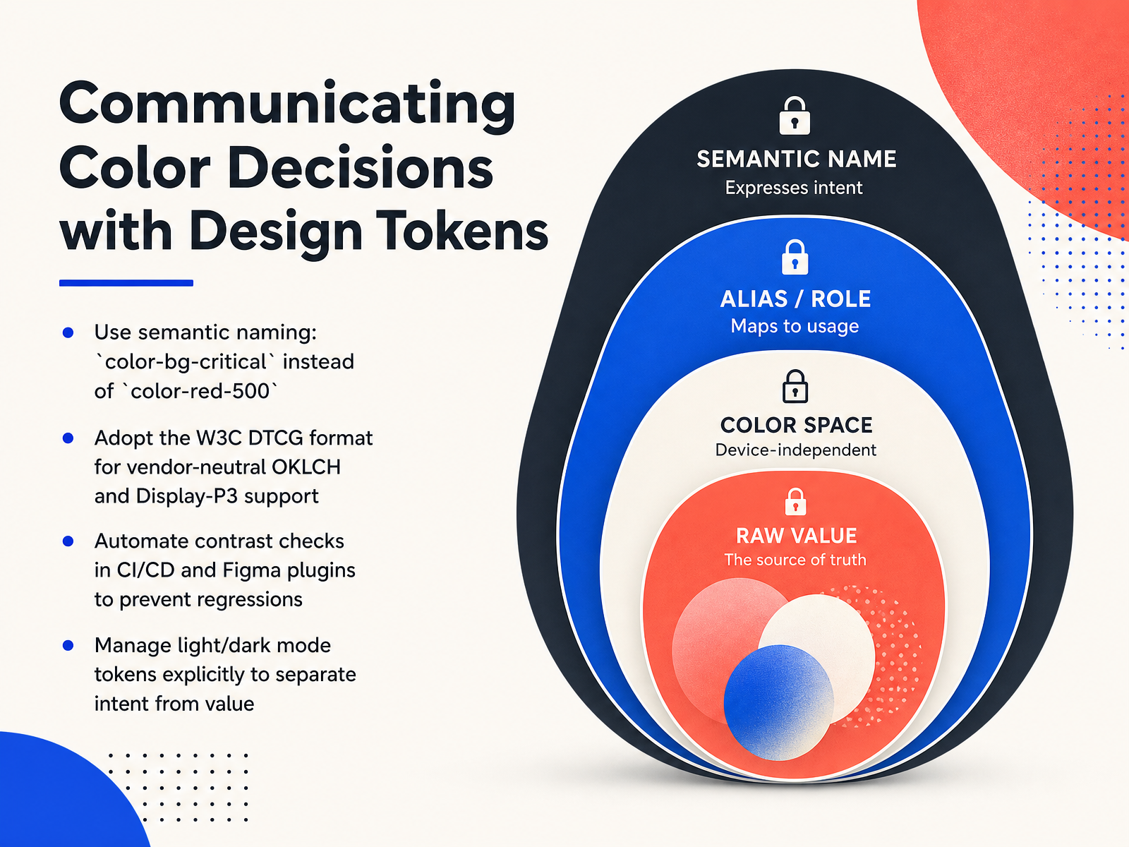
 - 10Communicating Color Decisions with Design TokensNow let's talk about communicating your color decisions, so they survive the journey from design to code. The foundation is semantic naming. Instead of a token called color-red-500, name it by its role: color-bg-critical. This tells developers what the color does, not just what it looks like. Next, adopt the W C three D T C G format. It supports modern color spaces like O K L C H and Display P three in a vendor-neutral way, so your tokens work across any tool or platform. Once tokens are in place, automate contrast checks. You can use Figma plugins that scan entire frames, or wire validation into your continuous integration pipeline. This catches regressions before they reach production. Finally, manage light and dark mode tokens explicitly. Keep the user intent, like background or text, separate from the actual hex value for each theme. This lets you swap values without rewriting your design logic. Next, we'll explore design linting and automated enforcement.
 1 min
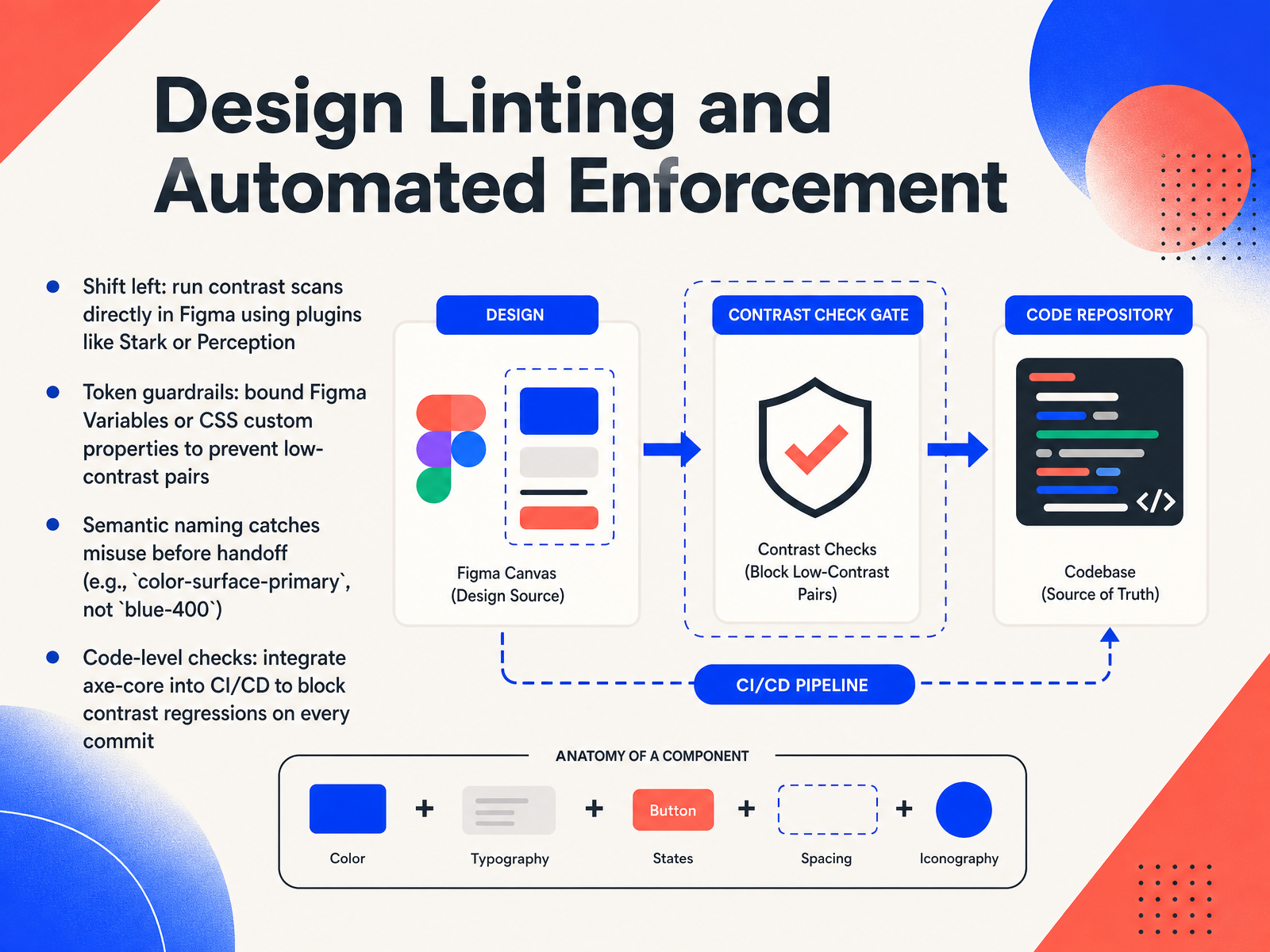
1 min - 11Design Linting and Automated EnforcementNow let's look at how we can automate accessibility so it sticks, long before launch. Think of this as design linting, similar to how code linting catches errors early. The idea is to shift left: catch contrast failures while you're still in Figma, not after development. Plugins like Stark, Perception, or the Advanced Contrast Checker let you scan frames directly. They don't just compare two flat swatches; they sample real backgrounds behind your text, including gradients, images, and transparent overlays, and give you instant pass or fail results against both WCAG and APCA standards. Next, set up token guardrails. When you bind Figma Variables or CSS custom properties to specific roles, you can actually prevent low-contrast pairs from being applied in the first place. Tools like the Accessibility Heatmap can even bind a layer's fill to the correct design system variable with one click. This is where semantic naming becomes a powerful safety net. Naming a token `color-surface-primary` tells everyone exactly where it belongs. A name like `blue-400` doesn't do that. It invites misuse. Semantic names catch errors before handoff because a developer can't accidentally put a surface color where text is expected. And finally, don't let those gains disappear in code. Integrate automated checks like axe-core into your continuous integration pipeline. Run them on every commit to block contrast regressions from reaching production. Let's take this mindset into practice as we explore testing and auditing with tools and real users.
 2 min
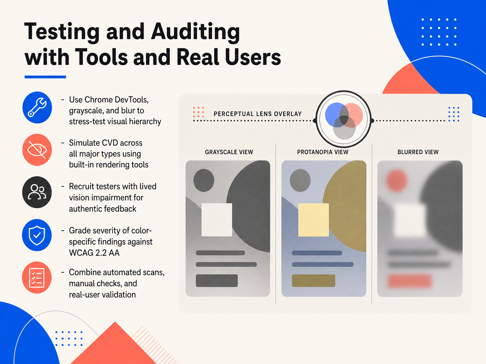
2 min - 12Testing and Auditing with Tools and Real UsersNow that we've covered design principles, let's talk about verifying your work through testing and auditing. This stage combines automated scans, manual checks, and most critically, feedback from real users with lived vision impairment. Start by stress-testing your visual hierarchy using browser tools. In Chrome DevTools, you can apply grayscale to see if any information gets lost when color is removed. You can also add a blur filter, which reveals whether your layout and spacing carry enough weight on their own. Next, use the same DevTools rendering panel to simulate major types of color vision deficiency like protanopia and deuteranopia. This lets you catch moments where two colors blend together and lose their meaning. But tools can only take you so far. You should recruit testers with real vision impairments to provide authentic feedback. Their experience will surface usability issues that no simulator can predict. As you collect findings, grade the severity of color-specific issues directly against the WCAG 2.2 AA criteria. This keeps your priorities grounded in a shared standard. Finally, remember that no single method is enough. The strongest approach always combines automated scans for contrast and code-level problems, manual checks for context and meaning, and validation from real users to confirm that your designs actually work for everyone.
 2 min
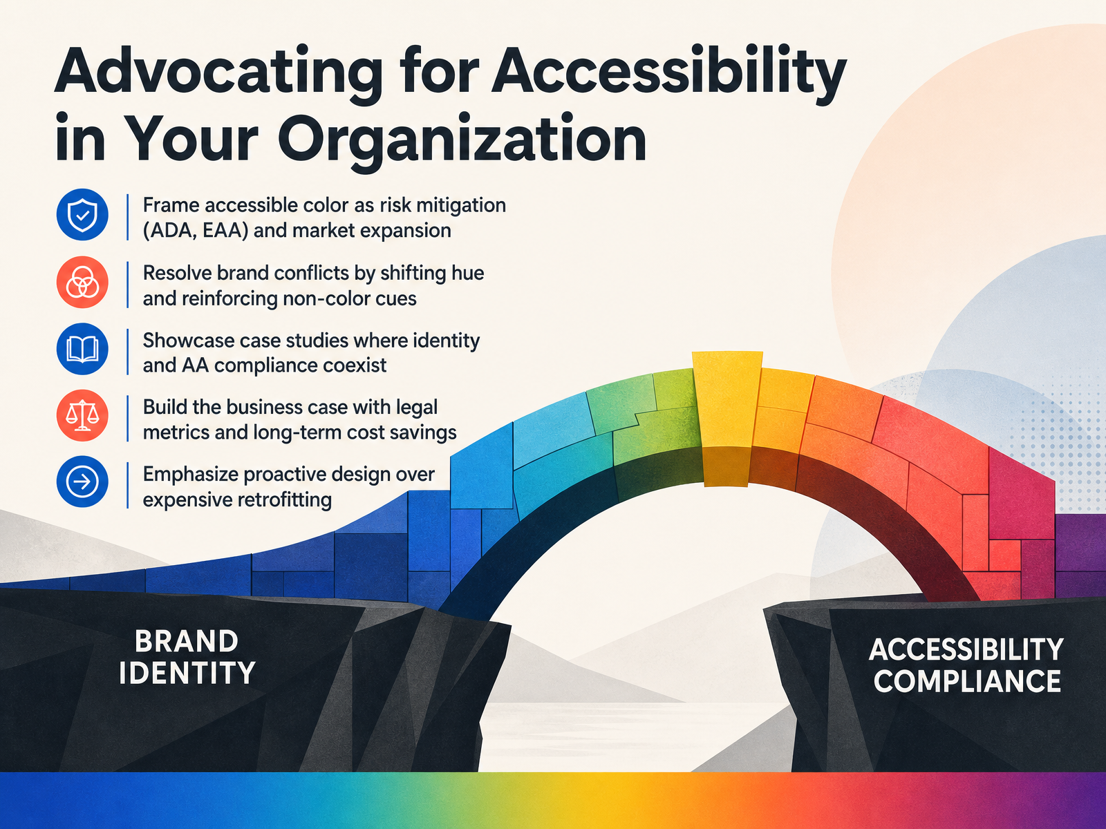
2 min - 13Advocating for Accessibility in Your OrganizationNow, let's talk about bringing these principles into your organization. Advocating for accessible color isn't just a design conversation; it's a strategic one. Frame it first as risk mitigation. Regulations like the ADA and the European Accessibility Act are tightening, and compliance protects the company from legal exposure. But don't stop there. Shift the narrative to market expansion. Accessible design opens your product to millions more users, and that's a clear growth opportunity. When brand guardians push back, don't fight the palette. Instead, shift the hue slightly—keeping the brand feel—and reinforce the design with non-color cues like icons or text labels. It resolves the conflict without sacrificing identity. Share case studies. Show real-world projects where strong brand identity and AA compliance coexist beautifully. This makes the goal tangible. Build a solid business case with legal metrics and the long-term cost savings of proactive design. It’s far cheaper to design for accessibility now than to retrofit later. Next, let’s wrap up with the course summary and your action plan.
 2 min
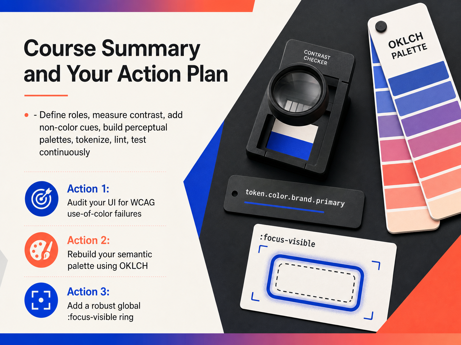
2 min - 14Course Summary and Your Action PlanLet's quickly pull everything together into a clear, actionable plan so you can start auditing and rebuilding your color system today. Throughout this course, we moved through a repeatable workflow: define clear color roles, measure contrast precisely, reinforce meaning with non-color cues, build perceptual palettes in a modern color space like OKLCH, tokenize those decisions, lint them automatically, and test continuously. Now, your first step is straightforward. Take an existing interface and audit it for WCAG use-of-color failures. Look for any place where color alone is the only way to understand information. Your second step is to rebuild your semantic palette using OKLCH. This ensures a perceptually even lightness scale from the start, making contrast calculation more predictable and inclusive. And your third step is to add a robust, global focus-visible ring across your entire application. This single non-color cue immediately improves keyboard navigation and makes your interface work for everyone. Thank you for joining this course. You now have a concrete framework to turn color from a decorative afterthought into a clear, functional, and inclusive tool. Go build with confidence.
 2 min
2 min
Take the deck with you
Download this course as a file — free, no sign-up needed.
- PDF handoutEvery slide page, ready to print or share.15 pages · 3.7 MBDownload
- Narrated PowerPointThe deck that presents itself — every slide carries the digital human's narration video.15 pages · 15.4 MBDownload
- PowerPoint slidesThe full deck as a .pptx — open it in PowerPoint, Keynote, or Google Slides.15 pages · 3.7 MBDownload
Free to use in your own training — please keep the PersonWise credit page at the end.
Have your own deck? Turn it into a course
Sources consulted
Web sources consulted while building this course.
- Understanding Success Criterion 1.4.11: Non-text Contrast | WAI — w3.org
- Web Content Accessibility Guidelines (WCAG) 2.2 — w3.org
- W3C — w3.org
- How to Meet WCAG (Quickref Reference) — w3.org
- Web Content Accessibility Guidelines (WCAG) 2.2 — w3c.github.io
- What Is OKLCH? A Plain Guide for Designers · Zepixo — zepixo.com
- What Is OKLCH? The Modern CSS Color Space, Explained - DEV Community — dev.to
- OKLCH from a UI Designer’s Perspective: Moving Beyond Intuition in Color Design | by Wakana Asai | May, 2026 | Medium — medium.com
- OKLCH Color Space: The Modern Alternative to HSL and RGB - codetools.run — codetools.run
- OKLCH: The Colour System That Does Not Lie — Vivian Voss — vivianvoss.net
- Color and Contrast Encoding for Charts | IDV Guide — interactive-data-visualization.com
- Accessible Interactive Data Visualization | IDV Guide — interactive-data-visualization.com
- 10 Guidelines for DataViz Accessibility — highcharts.com
- Data visualization accessibility: Focus on color - Minnesota.gov — mn.gov
- A new way to make graphs more accessible to blind and low-vision readers | MIT News | Massachusetts Institute of Technology — news.mit.edu
- A guide to accessible focus indicators - Pope Tech Resources — blog.pope.tech
- Designing Focus Rings That Pass WCAG 2.2 and Design Review · 72Technologies — 72technologies.com
- CSS Custom Focus Indicators with focus-visible — Animation Patterns — animationpatterns.art
- Visible Focus Rings: A Practical Guide for 2026 · 72Technologies — 72technologies.com
- Understanding Success Criterion 2.4.13: Focus Appearance | WAI — w3.org