Icon & Symbol Design
Begin
15 pages · ~30 min
Icon & Symbol Design
Teaches how to effectively use icons and visual symbols in design to enhance communication and user experience.
What you’ll learn
- 01Designing with Icons and Visual Symbols: Communicating Actions, Status, and FeedbackWelcome. I'm glad you're here. This course is about designing with icons and visual symbols. We'll focus on what you need most: communicating actions, status, and feedback with speed and clarity. You already know that a well-chosen icon can bridge languages and zip past a wall of text. But unclear symbols do the opposite. They create confusion, cause errors, and shut out users. We're going to fix that. We'll build from the core principles and systems, then move through practical workflows that take you from cognition to production-ready assets. You'll learn to show, not over-explain. Ready to sharpen your visual language? Let's start with why icons matter in your role as a product designer.1 min
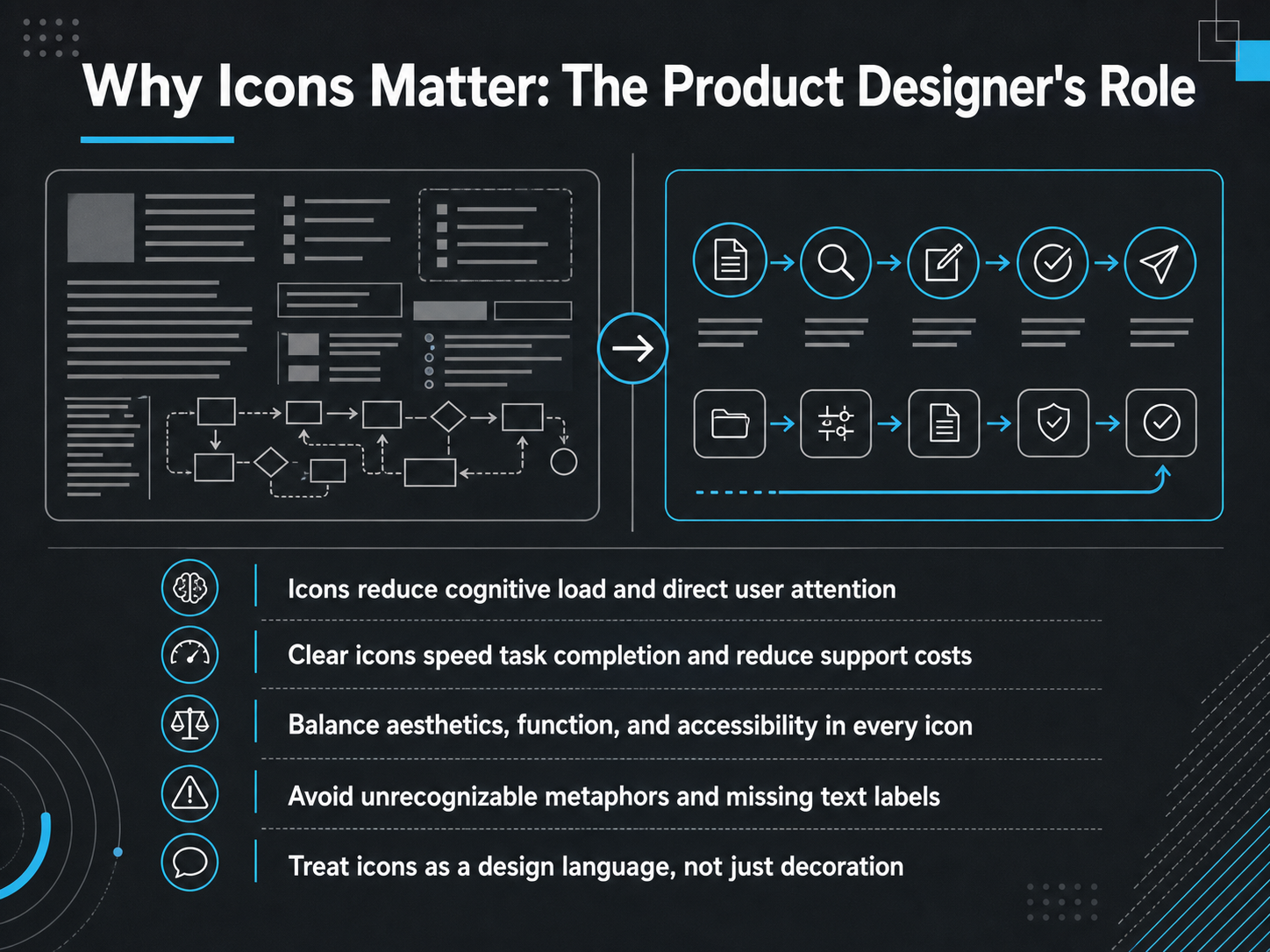
- 02Why Icons Matter: The Product Designer's RoleIcons aren't decoration. They're a fundamental part of your design language. Let's talk about why they matter so much for us, as product designers. Our number one job is to reduce cognitive load. A well-chosen icon directs attention faster than a text label ever could. It pre-processes the message for the user, speeding up task completion. That speed directly lowers support costs. But we have to balance three things: aesthetics, function, and accessibility. An icon that fails a screen-reader test or doesn't meet contrast ratios isn't finished. We avoid unrecognizable metaphors that confuse users and we never rely on an icon alone to convey critical meaning without a text label. Treat every icon in your set as a deliberate word in your product's visual language, not just a decoration you add at the end. Now, let's get practical and look at how we use icons for action, status, and feedback.
 icojoy.comiconly.aiezeicons.com+22 min
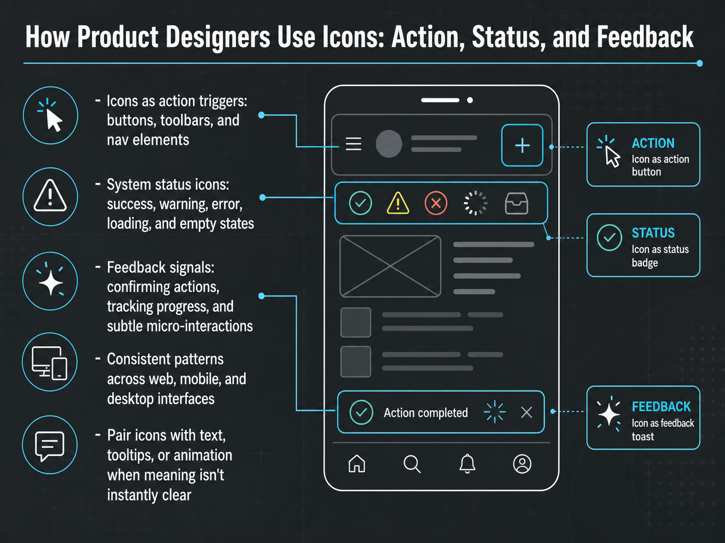
 - 03How Product Designers Use Icons: Action, Status, and FeedbackLet's look at the three core jobs icons perform in your product: action, status, and feedback. First, icons as action triggers. Think buttons, toolbars, and navigation. A trash icon signals delete. A magnifying glass says search. These need to be instantly recognizable, so users can act without hesitation. Next, system status icons. These are your success checkmarks, warning triangles, error alerts, loading spinners, and empty state illustrations. They set expectations and reduce anxiety. A red error icon tells users something went wrong; a loading spinner tells them to wait. Then, feedback signals. A subtle checkmark appearing after a form submission confirms the action. A progress bar shows how far a task has come. Even a micro-animation, like a heart icon briefly filling in, provides satisfying, real-time feedback. Remember, these patterns must stay consistent across web, mobile, and desktop. And when an icon's meaning isn't crystal clear, always pair it with a text label, a tooltip, or a supporting animation. Clarity always wins. Now, what makes some symbols instantly click while others confuse? Let's move into cognition and visual perception to find out.
 2 min
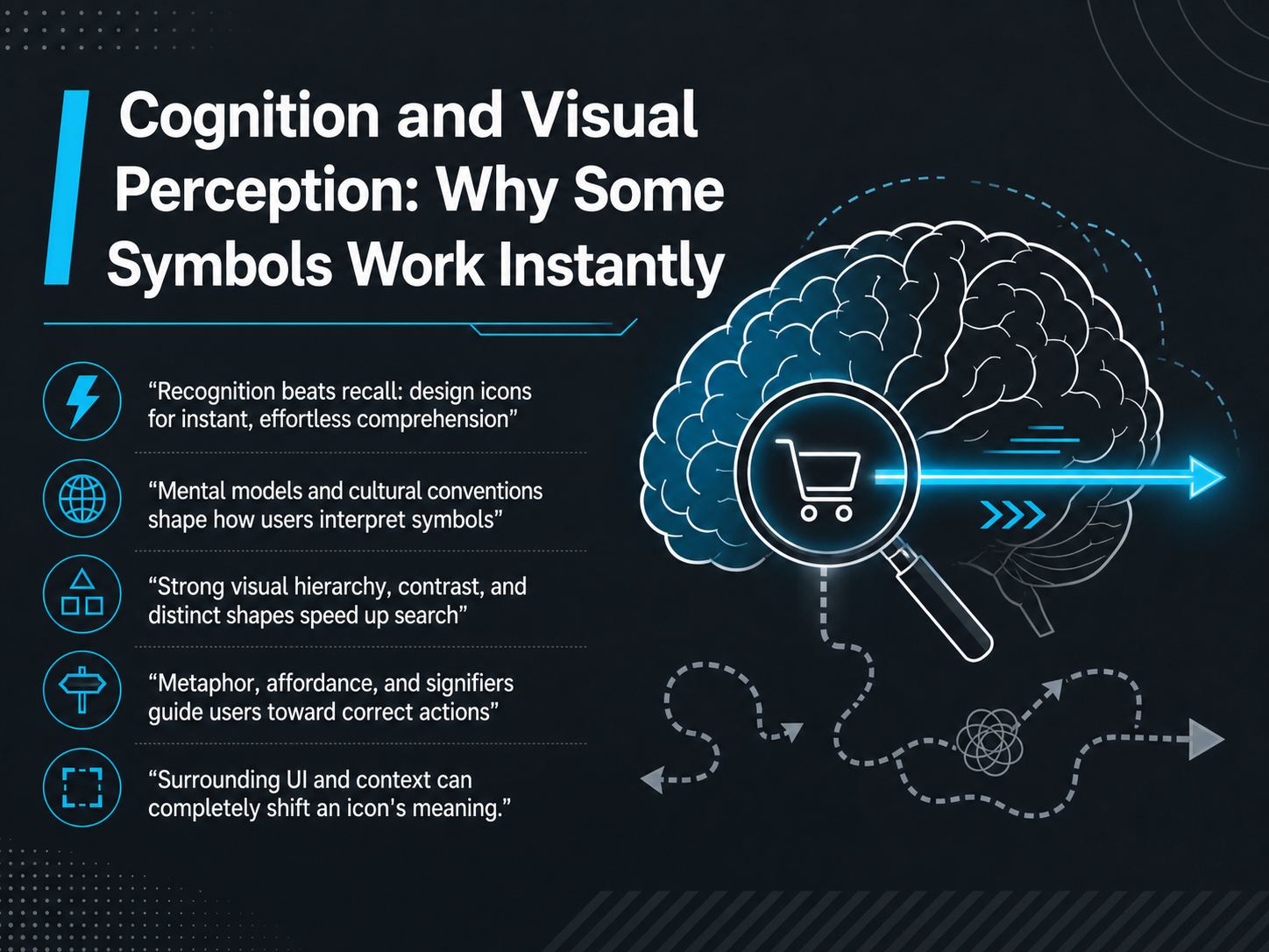
2 min - 04Cognition and Visual Perception: Why Some Symbols Work InstantlyLet's dig into why some symbols just click, and others leave users guessing. It really comes down to one core principle: recognition beats recall. You want users to understand an icon instantly, without having to think about what it means. This is where mental models and cultural conventions come in. A magnifying glass means search, and a floppy disk means save, but only because users have learned those patterns. For a global audience, those conventions can shift dramatically. Research on vehicle interfaces shows that even small cultural differences can slow down icon recognition. So, a one-size-fits-all approach is a risk. To speed up visual search, rely on strong visual hierarchy, high contrast, and distinct shapes. A solid, concrete icon with a clear silhouette is almost always faster to find than a complex outline. Also, think about metaphor and affordance. Does the icon look like what it does? A trash can for delete is a metaphor that gives a clear affordance, or clue, about the action. But remember, context is everything. A simple bell icon can mean notifications, a silent alarm, or a hotel front desk, depending entirely on the surrounding UI. So, always test your icons in their final layout. Next, we'll look at the science behind recognition, covering how style, familiarity, and something called semantic distance directly impact user speed.
 research.googleui.adsabs.harvard.edudoi.org+22 min
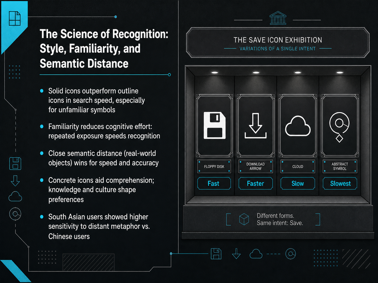
 - 05The Science of Recognition: Style, Familiarity, and Semantic DistanceLet's break down what really makes an icon fast to recognize. First, style matters. Solid icons consistently outperform outline icons in search speed, especially when the symbol is new to the user. The filled shapes are simply quicker for the brain to process. Second, familiarity is your best friend. The more users see an icon, the less cognitive effort they need. That's why sticking with established conventions often wins over clever reinvention. Now, think about semantic distance—that's the gap between the icon's visual and its real-world meaning. Closer distances, like a camera for a photo app, are faster and more accurate. Concrete icons that depict real objects almost always beat abstract metaphors. But here's the nuance: culture changes the rules. Research shows that users from South Asian backgrounds are far more sensitive to distant metaphors than Chinese users. A remote metaphor that's mildly slow for a Chinese user might be a major roadblock for a South Asian user. So, always test your icons with your target audience. A one-icon-fits-all approach simply doesn't work globally. Next, we'll move from individual icons to building a coherent system. Let's talk about Icon Systems and Style Guides.
 research.googleui.adsabs.harvard.edudoi.org+22 min
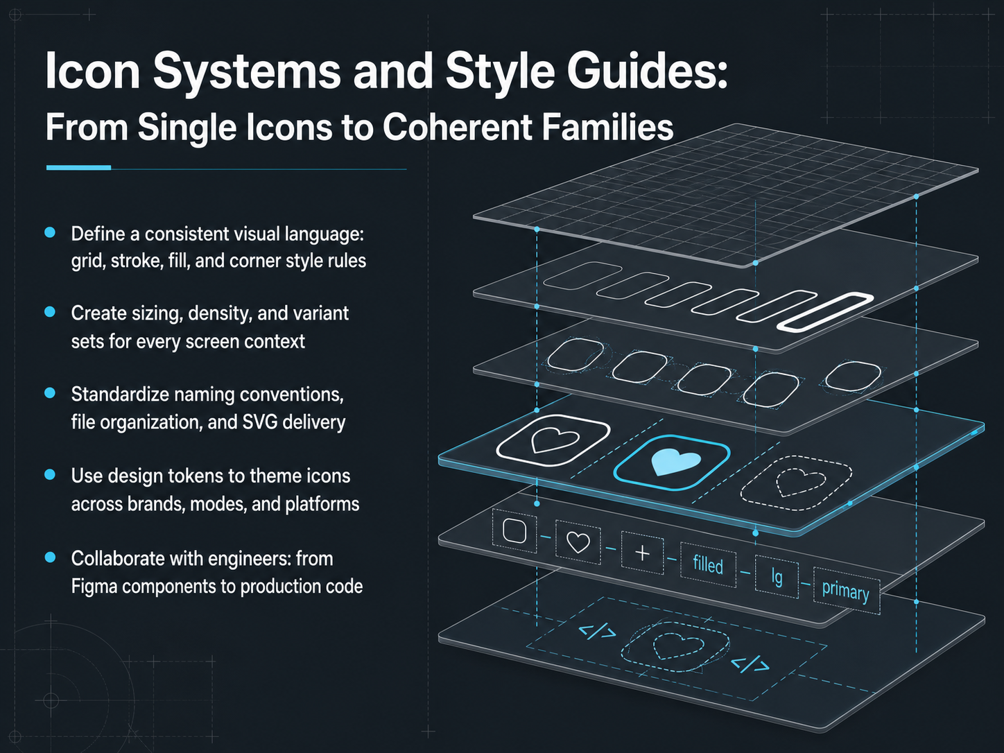
 - 06Icon Systems and Style Guides: From Single Icons to Coherent FamiliesNow, let's move from designing individual icons to building a complete system. A strong icon set isn't just a folder of SVGs; it's a coherent family. Start by defining a consistent visual language. Lock down your grid, stroke weight, fill rules, and corner styles. This is the DNA that makes every icon feel like it belongs together. Next, create sizing and density variants for every screen context. An icon on a dense dashboard shouldn't just be a scaled-down version of a mobile icon; it needs its own optical adjustments. Then, standardize your naming conventions and file organization. A clear, searchable name like 'alert-circle-filled' saves everyone time. Finally, use design tokens to theme your icons. Link an icon's color to a semantic token, like 'icon-primary', and the entire set will adapt instantly when you switch from light to dark mode. This is how you stop drawing icons and start designing a system. Up next, we'll close the loop with design tokens and developer handoff, making those icons truly scale.
 figma.comfigma.comnpmjs.com+22 min
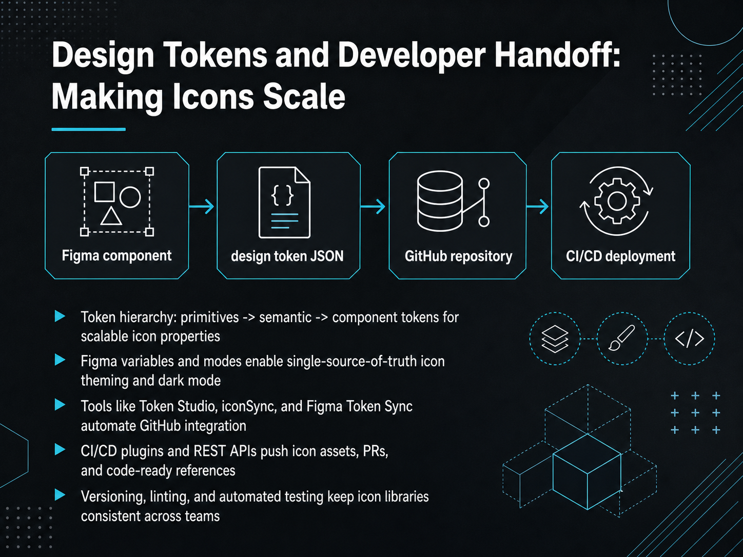
 - 07Design Tokens and Developer Handoff: Making Icons ScaleNow let's talk about making your icons truly scalable across products, themes, and platforms. The key is a solid token hierarchy. Start with primitive tokens, your raw values like hex codes or pixel sizes. Then layer on semantic tokens, which give those values a meaningful role, like icon-primary or icon-secondary. Finally, component tokens tie those roles directly to a specific icon, like a navigation bar icon. This setup lets you change one primitive, and all related icons update instantly. In Figma, you set this up with variables and modes. Modes let you switch a single source of truth from light to dark theme in one click, and every icon re-themes itself. The handoff to development is where this really pays off. Tools like iconSync and Figma Token Sync automate the bridge to GitHub. They can push icon assets, manage versioning, and even open pull requests with code-ready references. Your developers then see the exact token names in Dev Mode, linked directly to the code. The result is a single pipeline where a design update can trigger automated linting, testing, and a PR. This keeps your icon library consistent and removes the manual export dance. Coming up next, we'll shift to validation: testing your icons for clarity to make sure they actually communicate what you intend.
 figma.comfigma.comnpmjs.com+22 min
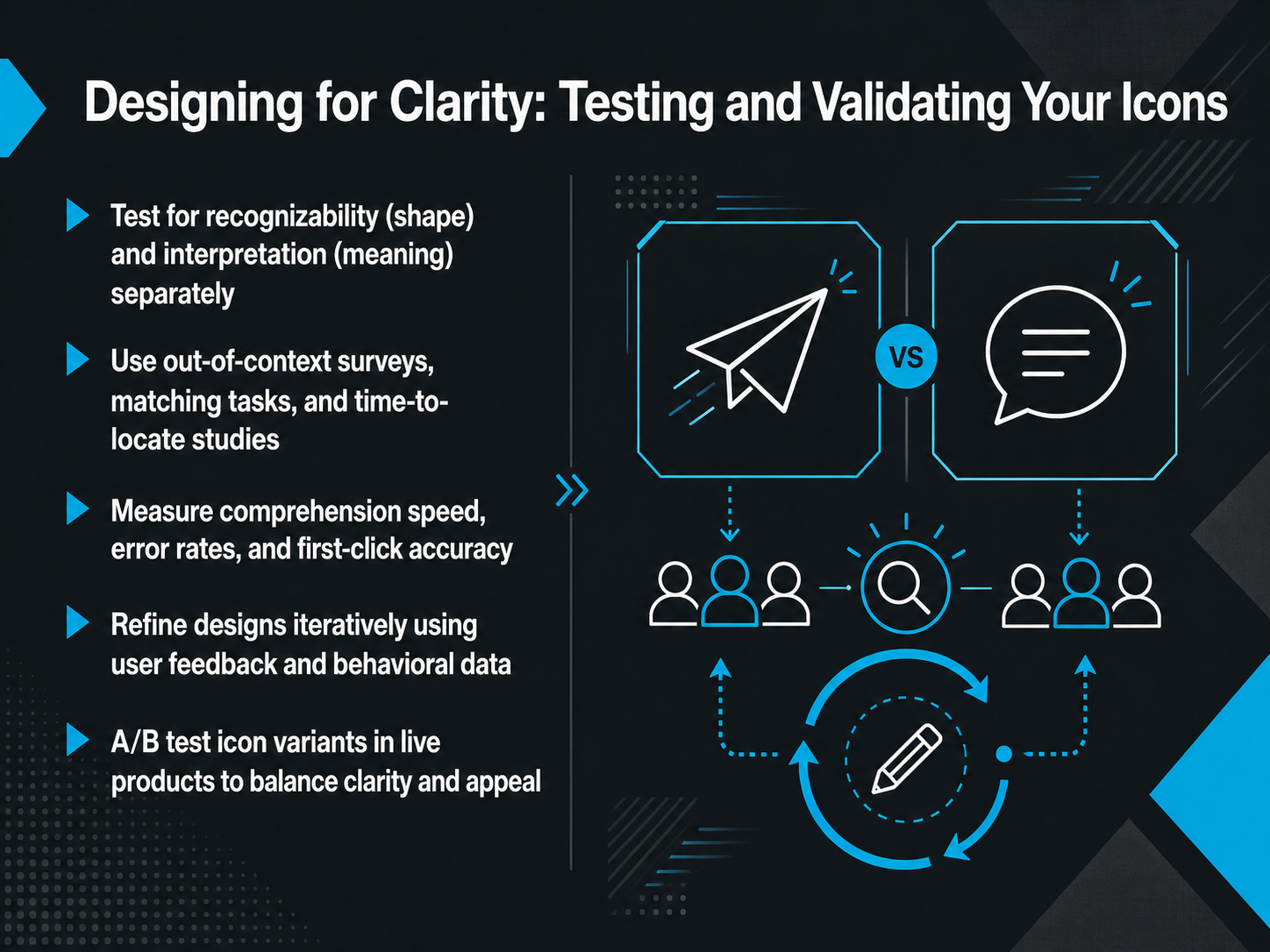
 - 08Designing for Clarity: Testing and Validating Your IconsLet's shift from crafting icons to proving they work. You cannot trust your gut here. You need evidence. Testing for clarity means separating two things: recognizability and interpretation. First, does the shape look like a star? That is recognizability. Second, does that star mean 'favorite' in your interface? That is interpretation. They are not the same, so test them independently. Start with out-of-context surveys. Show the icon in isolation, without a label, and ask people what it is. Then, run matching tasks or time-to-locate studies in the interface. Measure more than just opinion. Track comprehension speed, error rates, and first-click accuracy. That data tells you if your icon guides action or causes friction. Refine iteratively. Use the behavioral data to tweak and retest. Finally, when you are close to launch, A B test icon variants in the live product. This balances raw clarity with visual appeal. Remember, a recognizable shape is not enough. Users must instantly predict the right action. Next, let's apply these testing principles to inclusive and accessible icon design, covering WCAG and beyond.
 nngroup.comdoi.orgdoi.org+22 min
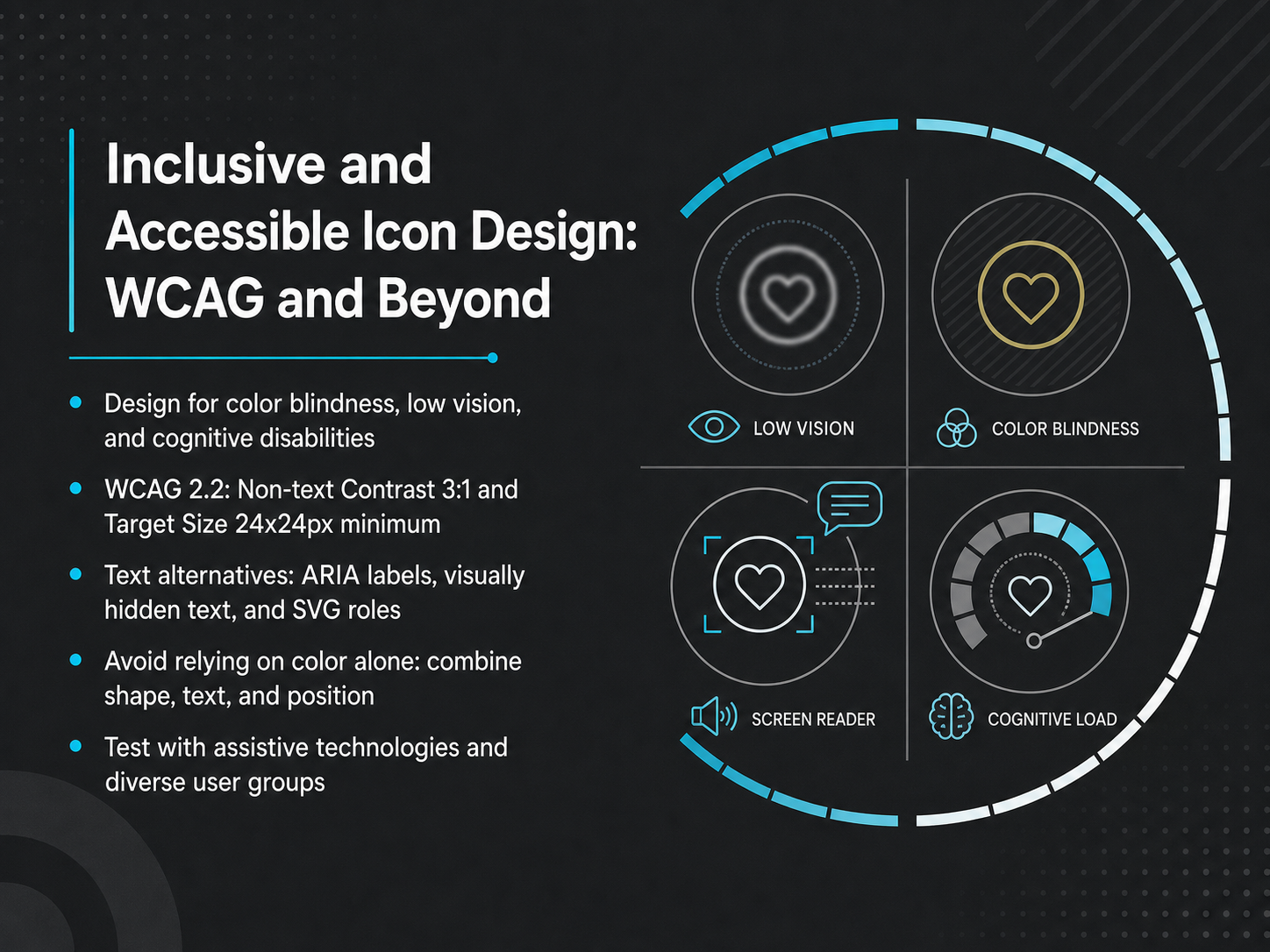
 - 09Inclusive and Accessible Icon Design: WCAG and BeyondNow let's move from visual design to inclusive design. Accessibility isn't a final checklist—it's a core design constraint that makes your icons better for everyone, including sighted users in bright light or on low-quality screens. Start by designing for color blindness, low vision, and cognitive disabilities. That means never relying on color alone. Combine shape, text, and position. A red X and a green checkmark might look identical to someone with deuteranopia, so add a circle and a triangle, or pair the icon with a visible label. WCAG 2.2 gives us concrete numbers. Your icons need a 3:1 contrast ratio against the background, and interactive targets must be at least 24 by 24 pixels. Aim for 44 by 44 on mobile. For text alternatives, put ARIA labels on the button, not the SVG. Describe the action, not the icon shape. Use aria-hidden for decorative icons, and visually hidden text for complex descriptions. Finally, test with real assistive technologies. Run a screen reader, tab through your interface, and listen. If your icon button passes a visual review but fails a screen-reader test, it isn't done. Up next, we'll turn these principles into practical implementation patterns for your team.
 icojoy.comiconly.aiezeicons.com+22 min
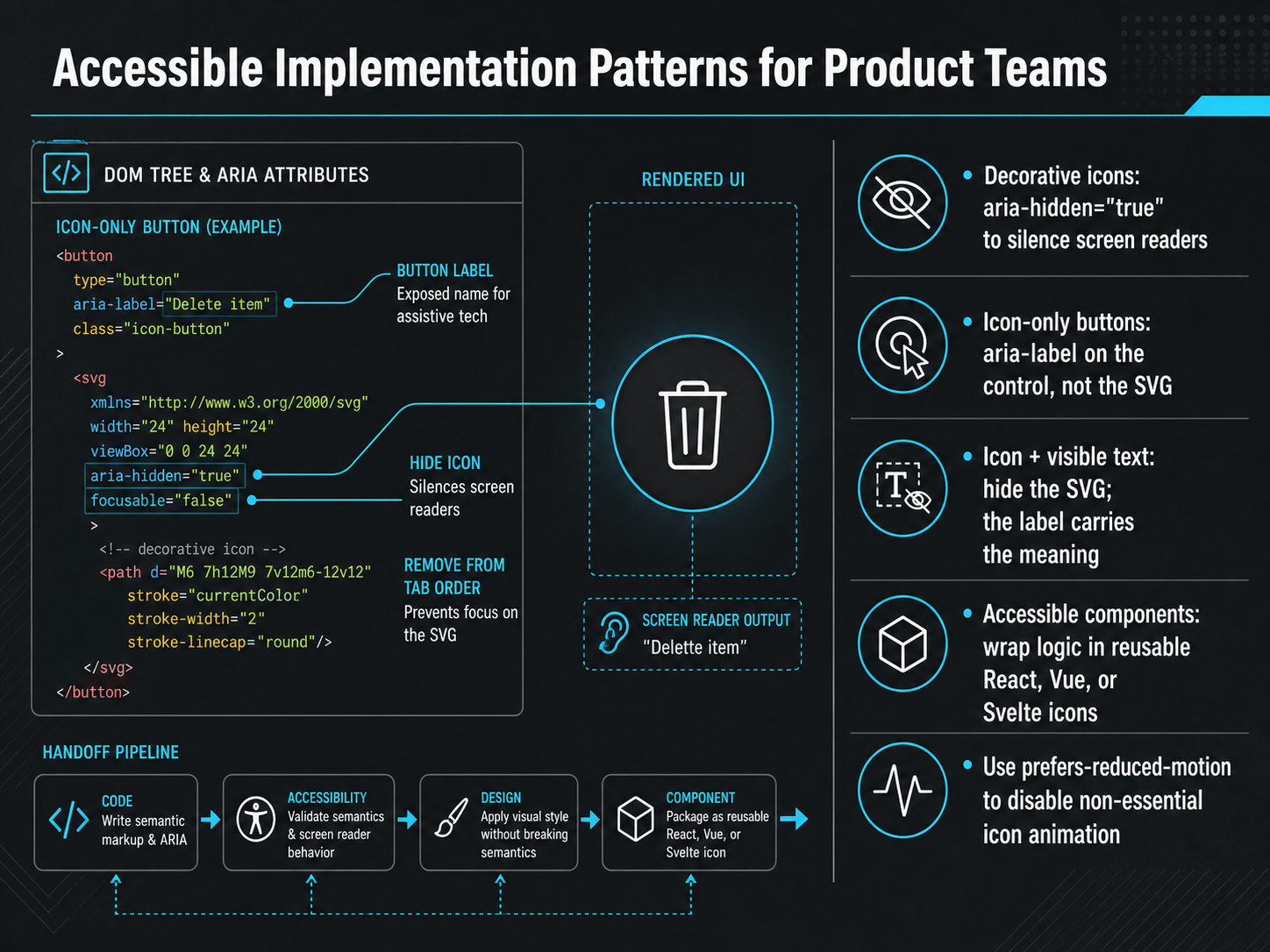
 - 10Accessible Implementation Patterns for Product TeamsNow let's turn patterns into practice. Accessible implementation doesn't need to be complicated—it needs to be correct. Let's walk through the four patterns your team will use every day. First, decorative icons. These sit next to visible text and add visual polish. Mark them with aria-hidden equals true. That silences screen readers completely, so users hear the label once, not twice. Second, icon-only buttons. When there's no visible text, the accessible name must go on the control itself—use aria-label on the button, not the SVG. Keep the label action-focused: "Close dialog," not "X icon." Third, icon plus visible text. This is the easiest pattern. Hide the SVG entirely with aria-hidden. The visible label carries all the meaning. Fourth, wrap this logic once. Build a reusable icon component in React, Vue, or Svelte that accepts a label prop. When the label is present, the icon is informative. When it's absent, the icon is decorative. One component, zero decision fatigue. Finally, respect motion preferences. Use the prefers-reduced-motion media query to disable non-essential icon animations. Spinning loaders, bouncing indicators—these can trigger vestibular issues. A simple media query protects your users. Next, we'll look at visual symbols beyond icons: badges, avatars, and data glyphs.
 icojoy.comiconly.aiezeicons.com+22 min
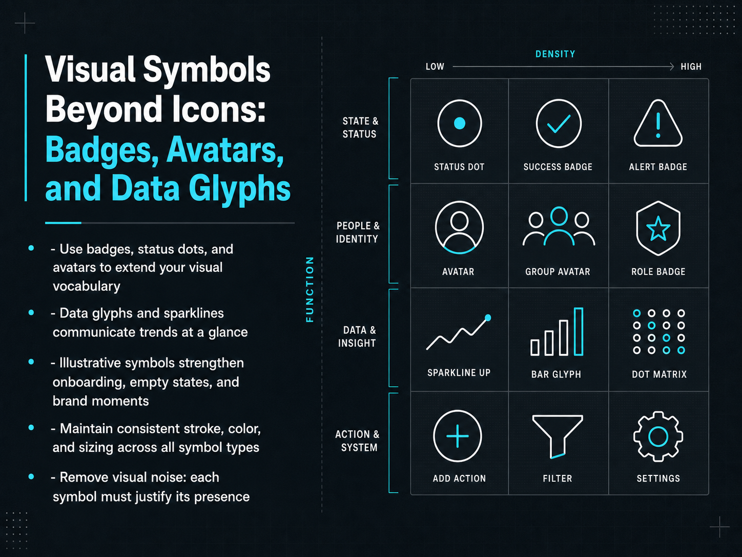
 - 11Visual Symbols Beyond Icons: Badges, Avatars, and Data GlyphsNow let's expand your tool kit beyond the icon itself. Badges, status dots, and avatars extend your visual vocabulary with minimal real estate. A green dot instantly signals availability. A numbered badge communicates unread items without a single word. Data glyphs and sparklines go even further, letting users scan trends and performance at a glance. Think of illustrative symbols next. They turn empty states and onboarding moments into brand-building opportunities, guiding users with personality instead of a blank screen. But here's the rule that keeps everything coherent: maintain consistent stroke, color, and sizing across every symbol type. A badge shouldn't feel like it belongs to a different product. And the hardest part? Remove visual noise. Every symbol must justify its presence. If it doesn't speed up a decision or clarify a state, delete it. Up next, we'll put these principles into motion with an icon design workflow, from concept to production-ready asset.
 1 min
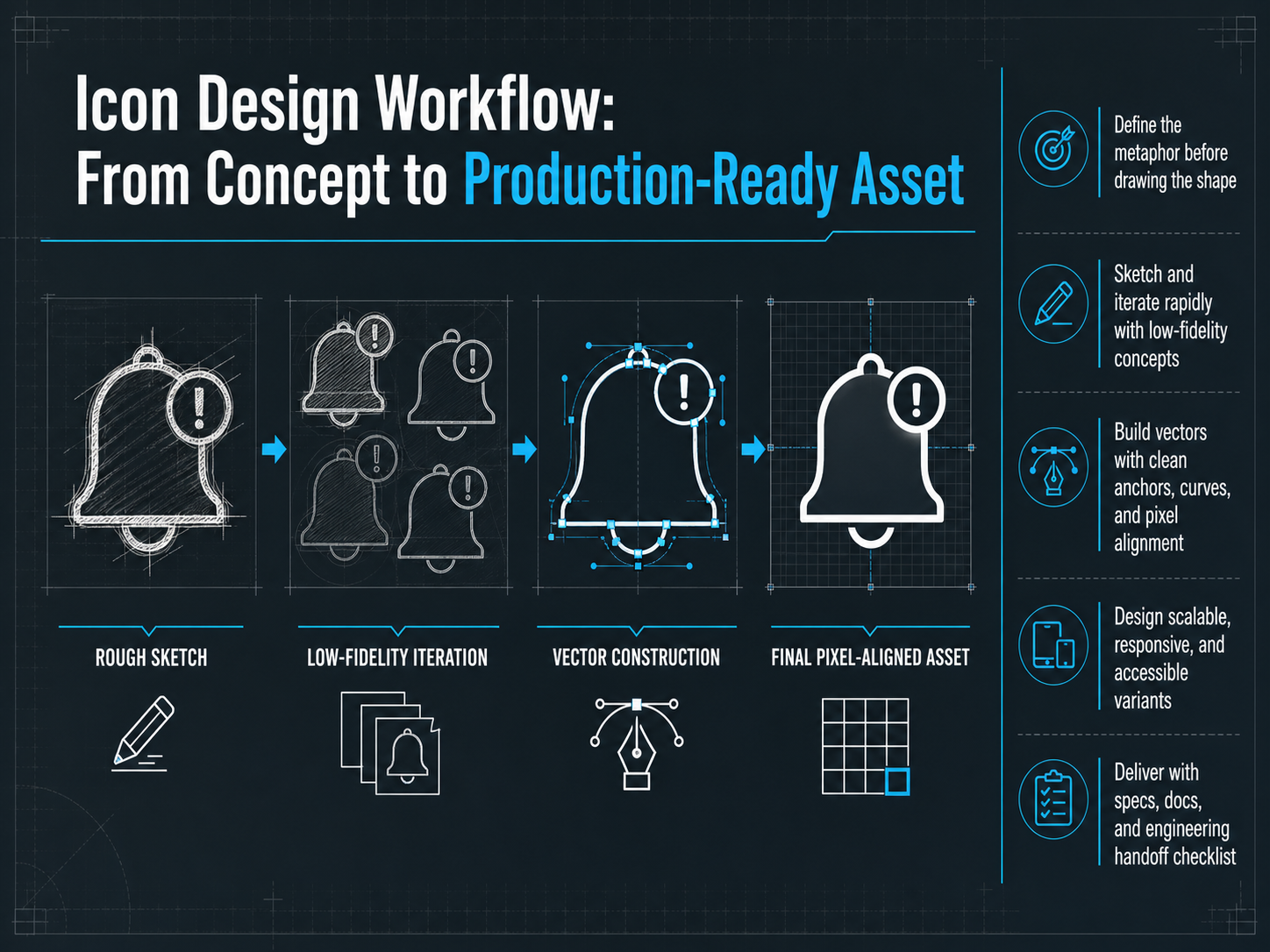
1 min - 12Icon Design Workflow: From Concept to Production-Ready AssetAlright, let's walk through a workflow that turns a rough idea into a production-ready asset. It starts before you even touch a shape. First, define the metaphor. Is it a home for 'home' or a gear for 'settings'? Nail the meaning, then build the form. Next, sketch rapidly. Use low-fidelity concepts to test ideas fast. This is about speed and discovery, not perfection. Once the concept works, move to vector building. Focus on clean anchors, smooth curves, and sharp pixel alignment. This ensures your icon stays crisp on every screen. Then, design for scale. Create responsive variants and accessible states, like high-contrast modes. Finally, deliver the full package. Provide specs, documentation, and a clean engineering handoff checklist. This makes implementation seamless. Coming up, we’ll look at emerging trends, including AI, motion, and spatial interfaces.
 1 min
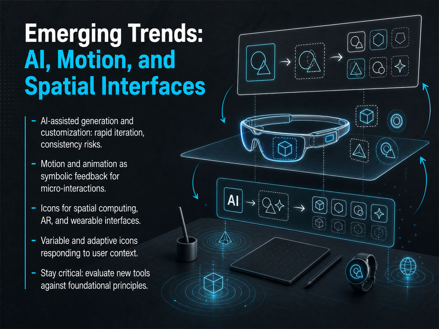
1 min - 13Emerging Trends: AI, Motion, and Spatial InterfacesLet's look ahead at AI, motion, and spatial interfaces. First, AI-assisted generation. Tools can now create full icon sets from a text prompt in seconds. That speed is incredible for prototyping, but watch out for consistency risks. A batch of AI icons might look like they belong to slightly different families. Your job is to apply a critical eye, lock in a style, and refine the outputs so they feel like one system. Next, motion. Micro-interactions are a form of symbolic feedback. A subtle rotation on a loading icon, a gentle scale on a success checkmark, these animations tell the user what just happened without a single word. They're especially powerful in gesture-driven interfaces. Now, spatial computing. Icons for AR glasses or headsets need to be legible from multiple angles, against unpredictable backgrounds. Use filled shapes, high contrast, and safe padding. Think of them as floating signs, not just flat pixels. And we're starting to see adaptive icons that change based on context, like switching from outline to filled based on ambient light. Stay curious, but stay grounded. Every new tool should pass the same test: does it make the user's next action clearer and faster? Coming up, we go deeper into designing for XR with volumetric icons and spatial UI.
 2 min
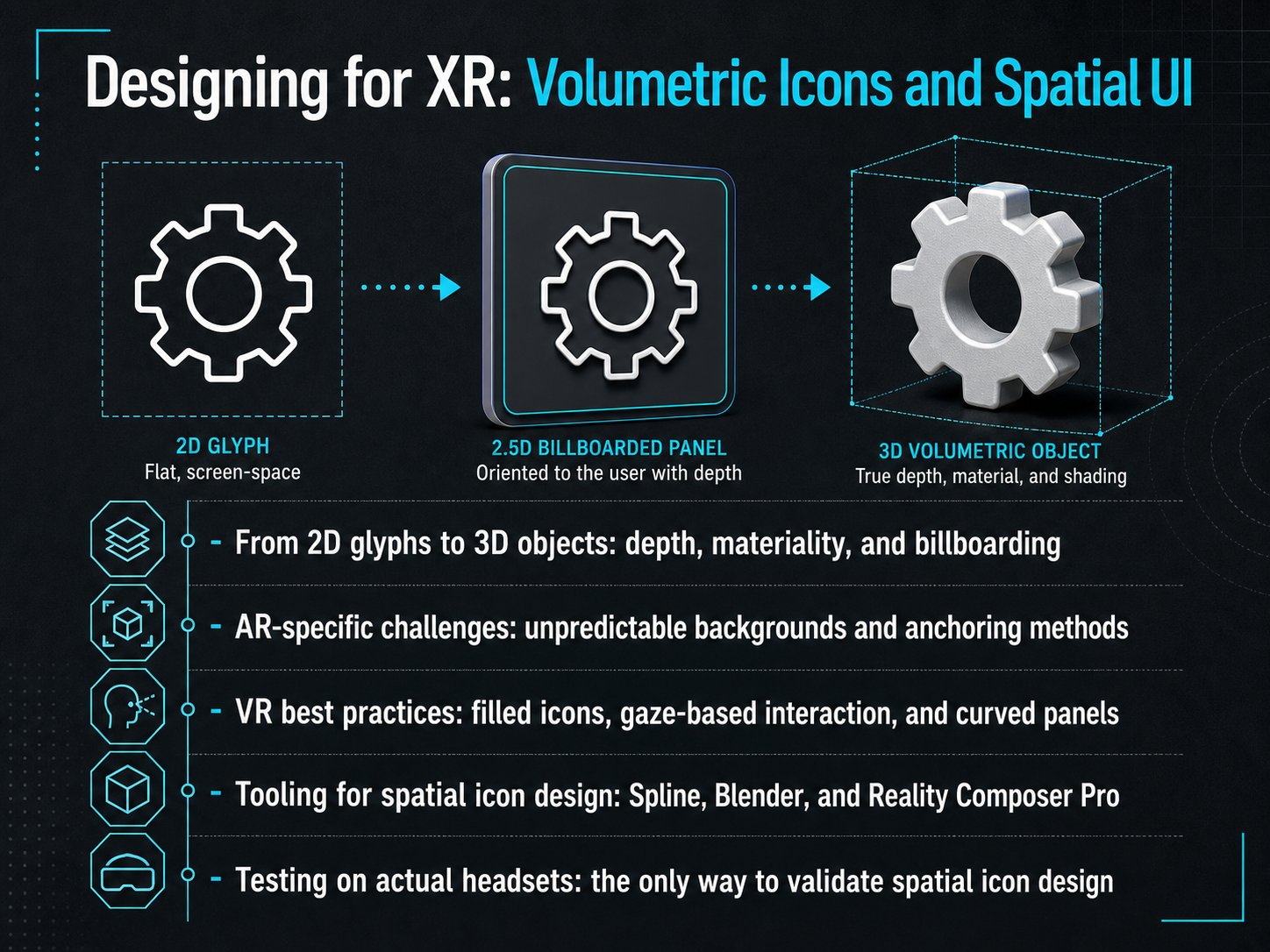
2 min - 14Designing for XR: Volumetric Icons and Spatial UINow let's talk about designing icons for extended reality, where your glyphs become volumetric objects. In spatial UI, a two-dimensional icon gains depth and materiality. It might float in space or attach to a curved panel. You need to decide if it faces the user at all times—that's billboarding—or if it stays anchored to a real-world surface. Augmented reality throws a major curveball: your icon must stay legible against unpredictable backgrounds. Solutions include a subtle background plate, an outline glow, or adaptive contrast. For virtual reality, the rules are different. Filled icons are your go-to for readability. Interactions rely on gaze and dwell, so button targets need to be larger than touch equivalents, somewhere around eight to twelve millimeters. To build these, start in two dimensions, then extrude to three dimensions in Spline or Blender. For Apple Vision Pro, turn to Reality Composer Pro. And here's the non-negotiable rule: you must test on actual headsets. The monitor preview lies. Only in-headset testing lets you validate scale, contrast, and readability. Next up, we'll walk through practical application and your next steps.
 2 min
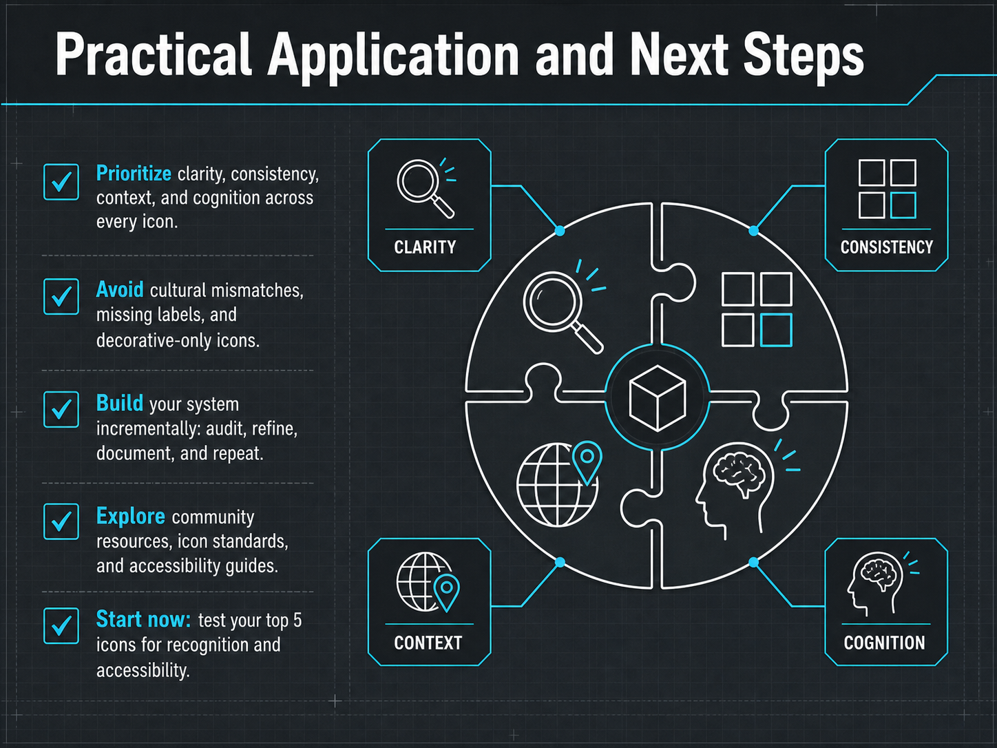
2 min - 15Practical Application and Next StepsLet's wrap up with a clear action plan. As you move forward, prioritize four things: clarity, consistency, context, and cognition. Every icon must earn its place. Watch out for common pitfalls. Avoid cultural mismatches that confuse users, missing labels that hide meaning, and purely decorative icons that add visual noise. Show, don't over-explain. Build your icon system step by step. Start with an audit of what you have. Refine for meaning and simplicity. Document your decisions, then repeat the cycle. Don't go it alone. Explore community resources, established icon standards, and accessibility guides. They'll save you time and prevent mistakes. But most importantly, start right now. Pick your top five icons and test them for instant recognition and accessibility. That small step will give you real data to build on. Thank you for joining me. Now go make your interfaces faster, clearer, and more inclusive for everyone.
 2 min
2 min
Take the deck with you
Download this course as a file — free, no sign-up needed.
- PDF handoutEvery slide page, ready to print or share.16 pages · 4.1 MBDownload
- Narrated PowerPointThe deck that presents itself — every slide carries the digital human's narration video.16 pages · 14.7 MBDownload
- PowerPoint slidesThe full deck as a .pptx — open it in PowerPoint, Keynote, or Google Slides.16 pages · 4.1 MBDownload
Free to use in your own training — please keep the PersonWise credit page at the end.
Have your own deck? Turn it into a course
Sources consulted
Web sources consulted while building this course.
- Accessible Icon Design: ARIA Labels, Contrast & Screen-Reader Support | Icojoy — icojoy.com
- Icon Accessibility: Making Your Icons Work for Everyone in 2026 | Iconly Blog — iconly.ai
- Making Icons Accessible: A Developer's Guide to ARIA and Semantic SVG - EzeIcons Blog | EzeIcons — ezeicons.com
- Icon Accessibility Guidelines: Designing Icons for an Inclusive Web — 10web.io
- Accessible SVG Icons — IconVectors — iconvectors.io
- Iconography for international users: Developing a systematic approach to ensuring comprehension of UI icons at scale — research.google
- The Effects of Icon Characteristics and Metaphors on the Recognition of Icons by Students With Different Knowledge Structures - ADS — ui.adsabs.harvard.edu
- Effects of icon semantic distance and cultural background on visual search efficiency in vehicle control interfaces — doi.org
- CultIcon-Bench: A Pilot Benchmark for Cultural Interpretation of Visual Icons | The International FLAIRS Conference Proceedings — journals.flvc.org
- Effects of icon semantic distance and cultural background on visual ... — nature.com
- Design Tokens: How to Sync Design and Code in Figma — figma.com
- iconSync | Figma — figma.com
- figma-icons-tokens v1.5.2 — npmjs.com
- Figma Design System Widget — figmadesignsystem.app
- srouse/figma-design-system — github.com
- Icon Usability: When and How to Evaluate Digital Icons — nngroup.com
- The Effects of Icon Characteristics and Metaphors on the Recognition of Icons by Students With Different Knowledge Structures — doi.org
- Semantic distance of icons: Impact on user cognitive performance and a new model for semantic distance classification — doi.org
- A study on the impact of icon structural features in human–computer interface on visual search efficiency — doi.org
- The effects of layout types, visual features and text labels on icon visual search performance — doi.org