Begin
14 pages · ~28 min
UX Design Checklist Creation
Learn how to create a practical UX design checklist to evaluate and improve digital products. Ideal for designers and product teams seeking consistent, user-centered quality.
A digital instructor presents all 14 pages. Hold “Ask” at any point and ask out loud — the answer comes from this course. No sign-up needed.
What you’ll learn
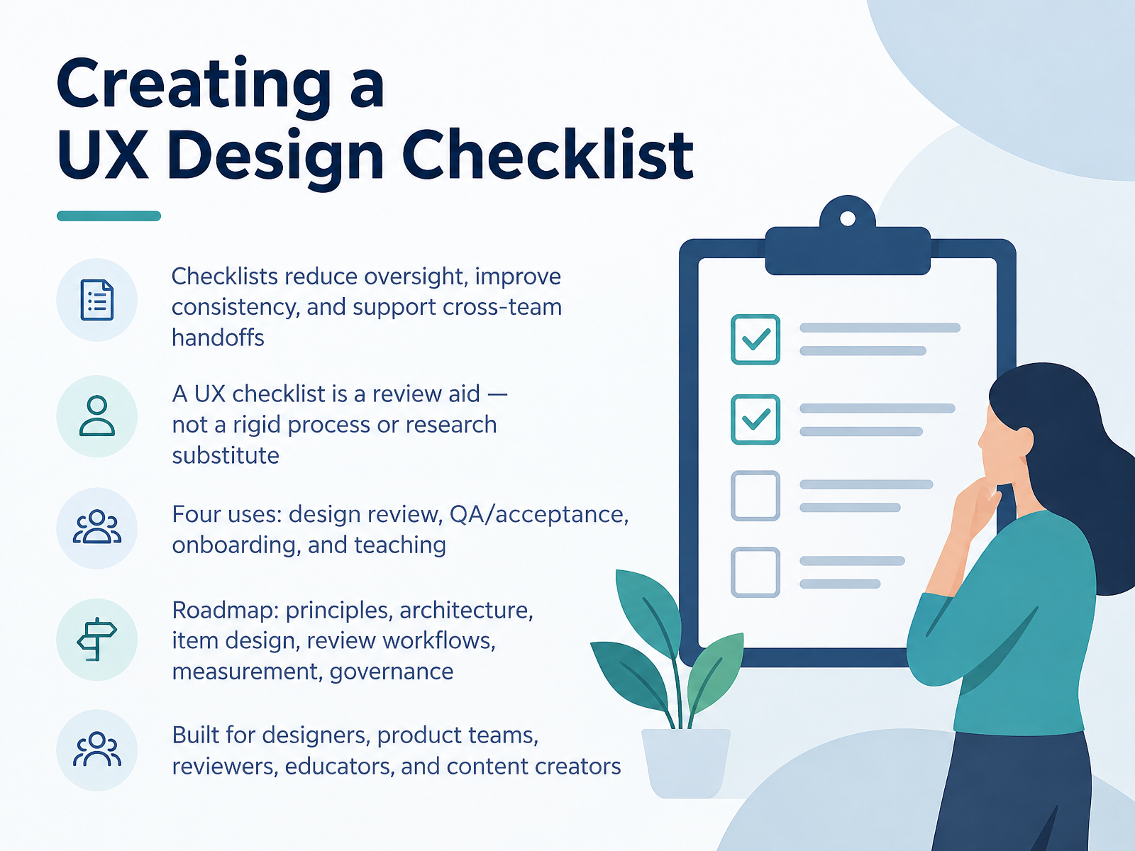
- 01Creating a UX Design ChecklistWelcome. In this course, we're building a UX design checklist you can actually use, whether you're a designer, on a product team, reviewing other people's work, teaching, or creating content.
Here's the goal. A good checklist reduces oversight and improves consistency. It also makes cross-team handoffs much smoother.
But let's set expectations. A UX checklist is a review aid. It's not a rigid process, and it's not a substitute for research. Treat it as a set of questions to ask, not a box to tick.
We'll look at four practical uses: design review, QA and acceptance, onboarding, and teaching.
Then we'll walk a roadmap together: principles, architecture, item design, review workflows, measurement, and governance.
Keep your current project in mind as we go. That way, each section gives you something concrete to apply.
First, let's get clear on what checklists solve, and what they don't.baymard.comdesignrush.comfigr.design+22 min
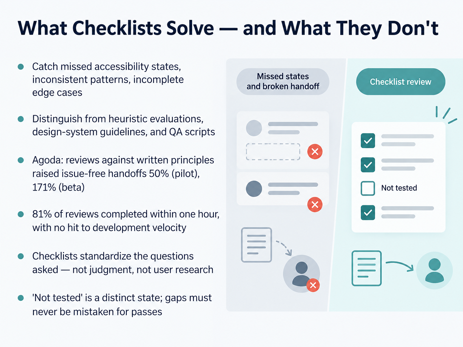
- 02What Checklists Solve — and What They Don'tLet's get clear on what a checklist actually buys you, and where it stops. In practice, a good checklist catches the things that quietly slip: missing accessibility states, patterns that drift between screens, edge cases nobody wrote down. It is not a heuristic evaluation, not a design-system guideline, and not a QA script. Those do different jobs. The evidence here is worth pausing on. Agoda reviewed designs against written experience principles, and handoffs with no open issues rose by fifty percent in the pilot, then one hundred seventy-one percent in the beta. Eighty-one percent of reviews finished within one hour, and ninety percent of designers reported no hit to development velocity. Here is the limit: a checklist standardizes the questions you ask. It does not replace judgment, and it does not replace user research. And treat not tested as its own distinct state. A gap in your review must never be mistaken for a pass. Next, we look at how to sequence this in Principles Before Items.
 uaskos.orgmedium.combugsmash.io+22 min
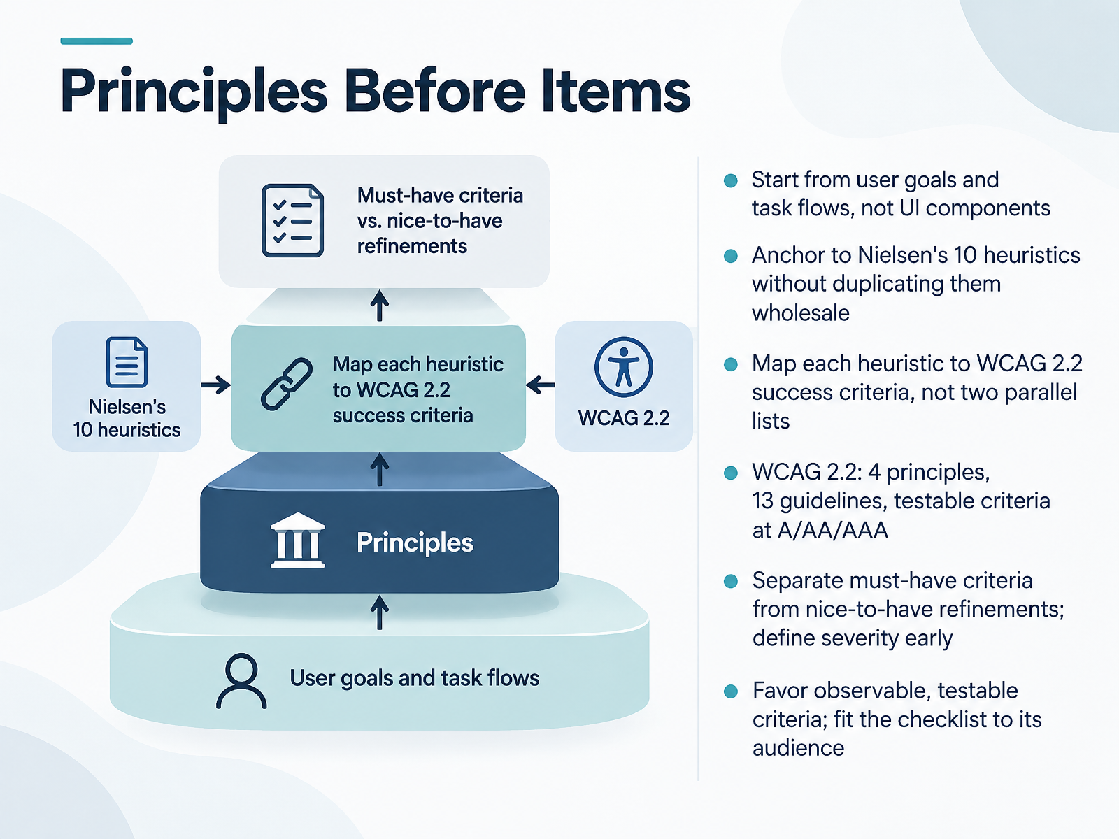
- 03Principles Before ItemsLet's talk about why principles come before items. Begin with user goals and task flows, not interface components. Ask what someone is trying to accomplish, then trace the steps they take. Next, anchor your checklist to Nielsen's ten heuristics, but don't copy them wholesale. Map each heuristic to the relevant WCAG 2.2 success criteria, so you build one linked structure instead of two parallel lists. Keep the WCAG shape in mind: four principles, thirteen guidelines, and testable criteria at levels A, double A, and triple A. Early on, separate the must-have criteria from nice-to-have refinements, and define severity before you start reviewing. Favor criteria you can observe and test, and fit the checklist to its audience. A designer needs different prompts than a reviewer or a teacher. Here's the takeaway: principles give your checklist its spine, and testable criteria give it its teeth. Next, we'll look at the anatomy of a well-formed checklist item.
 w3.orgnngroup.comw3.org+21 min
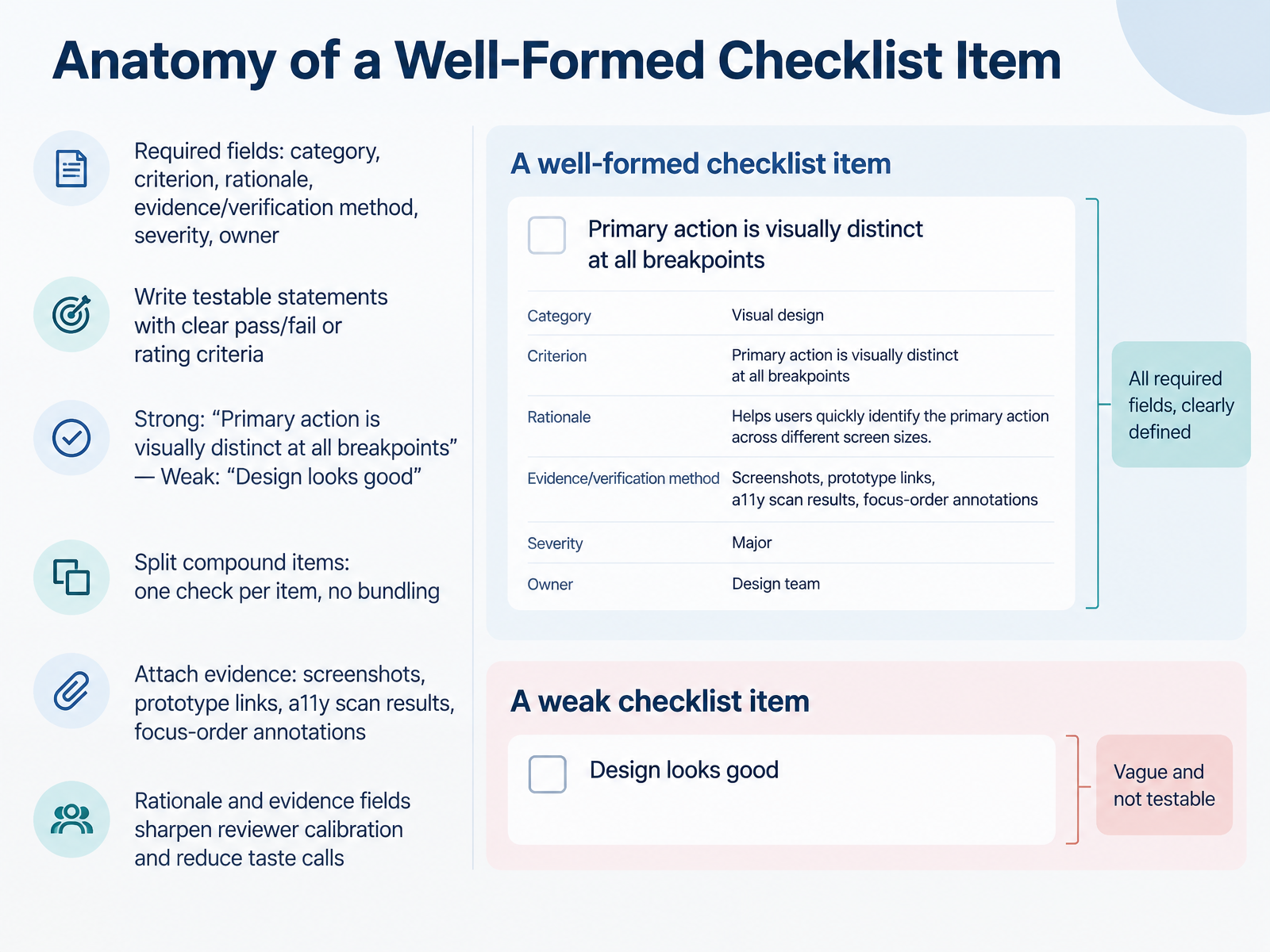
- 04Anatomy of a Well-Formed Checklist ItemLet's break down what makes a checklist item well-formed. Every item needs six fields: category, criterion, rationale, evidence or verification method, severity, and owner. Write the criterion as a testable statement with clear pass, fail, or rating criteria. For example, "Primary action is visually distinct at all breakpoints" works. "Design looks good" does not. Keep one check per item. If you're bundling two conditions, split them. Then attach evidence: screenshots, prototype links, accessibility scan results, or focus-order annotations. That evidence, plus the rationale, is what sharpens reviewer calibration and cuts down on taste calls. Next, we'll look at the coverage map and what belongs in a UX checklist.
 primer.stylew3.orgw3.org+21 min
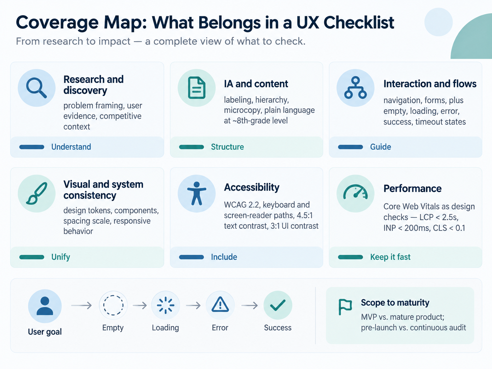
- 05Coverage Map: What Belongs in a UX ChecklistHere is the coverage map for your checklist. Start with research and discovery. Frame the problem, ground it in user evidence, and note the competitive context. Next, information architecture and content. Check labeling, hierarchy, and microcopy. Aim for plain language at roughly an eighth grade reading level. Then interaction and flows. Cover navigation and forms, and design every state: empty, loading, error, success, and timeout. For visual consistency, check design tokens, components, and your spacing scale, and confirm responsive behavior. For accessibility, work against WCAG 2.2. Verify keyboard and screen reader paths. Text contrast is four point five to one, and interface elements are three to one. Performance counts as a design check. Aim for Largest Contentful Paint under two point five seconds, Interaction to Next Paint under two hundred milliseconds, and Cumulative Layout Shift under zero point one. Finally, scope to maturity. A minimum viable product needs fewer checks than a mature product, and pre-launch reviews differ from continuous audits. So size the checklist to where the product actually is. Next, we look at accessibility items worth stealing from published checklists.
 primer.stylew3.orgw3.org+22 min
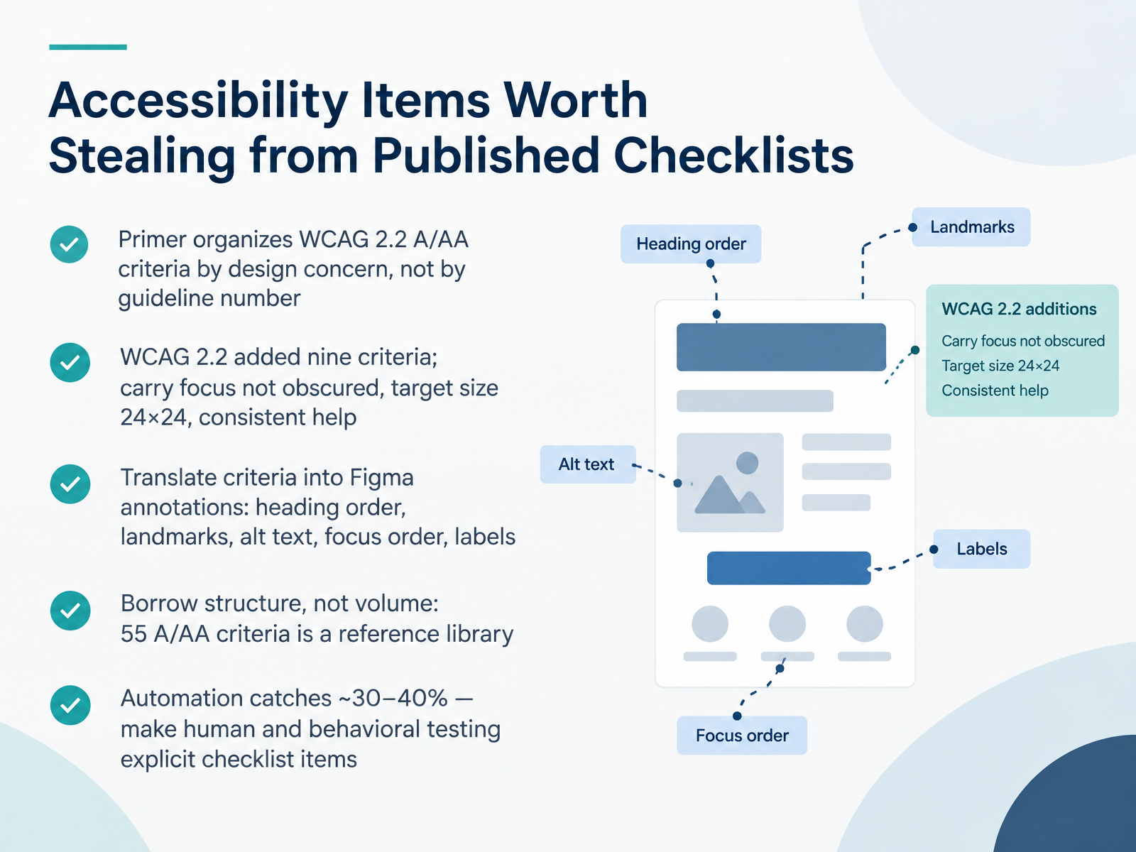
- 06Accessibility Items Worth Stealing from Published ChecklistsNext, let's look at accessibility items worth stealing from published checklists. Start with structure. Primer organizes WCAG 2.2 A and AA criteria by design concern, not by guideline number. That means color, hierarchy, content, forms, and keyboard, which matches how you actually work. Use that grouping in your own checklist.
Then update your items. WCAG 2.2 added nine criteria. For designers, carry focus not obscured, target size of twenty-four by twenty-four CSS pixels, and consistent help. Write each one as a checkable line.
Now translate criteria into Figma annotations. Annotate heading order, landmarks, alt text, focus order, and labels. That turns a guideline into a design decision.
One caution. Borrow structure, not volume. The fifty-five A and AA criteria are a reference library, not a daily list.
And automation catches roughly thirty to forty percent. So make human and behavioral testing explicit checklist items.
Next up, Formats, Tools, and Templates.
 primer.stylew3.orgw3.org+22 min
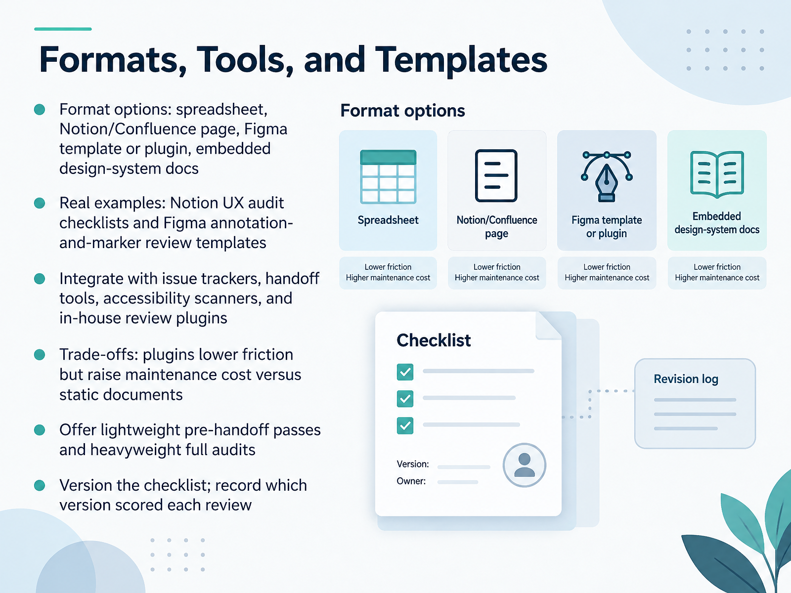
- 07Formats, Tools, and TemplatesNow let's talk about where your checklist actually lives. You have real format options. A spreadsheet is quick and familiar. A Notion or Confluence page keeps notes and comments in one place. A Figma template or plugin puts the checklist right on the design. And embedded design-system docs keep standards close to the work. You can borrow from real examples, like a Notion UX audit checklist, or a Figma template built around annotations and markers for review. Next, wire your checklist into the tools you already use: issue trackers, handoff tools, accessibility scanners, and any in-house review plugin. Be honest about trade-offs. Plugins lower friction, but they raise maintenance cost compared with static documents. So offer two levels: a lightweight pre-handoff pass, and a heavyweight full audit. And version the checklist. Record which version scored each review, so results stay comparable over time. Next, we'll look at running a review with the checklist.
 notion.comfigma.comuaskos.org+21 min
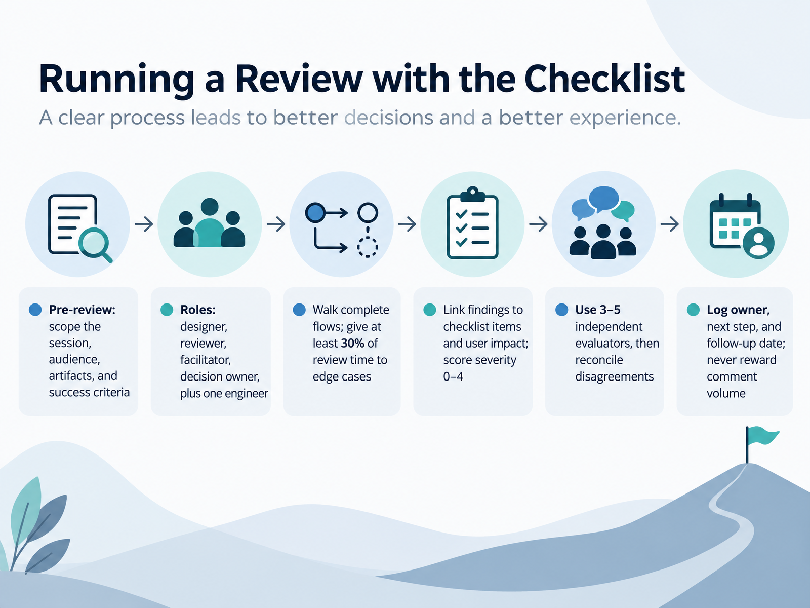
- 08Running a Review with the ChecklistNow let's talk about how you actually run a review with the checklist. Before you meet, scope the session: what's in, who's attending, which artifacts you'll look at, and what success looks like. Then assign clear roles: a designer, a reviewer, a facilitator, a decision owner, and at least one engineer. During the session, walk complete flows rather than isolated screens, and give at least thirty percent of your time to edge cases. Empty states, errors, and loading moments are where designs break. Link every finding to a checklist item and to user impact, then score severity from zero to four. For stronger coverage, use three to five independent evaluators, and reconcile disagreements before you close. Log an owner, a next step, and a follow-up date for each finding. And never reward comment volume. Reward better, safer decisions. Next, we'll look at adapting checklists for designers and product teams.
 uaskos.orgmedium.combugsmash.io+21 min
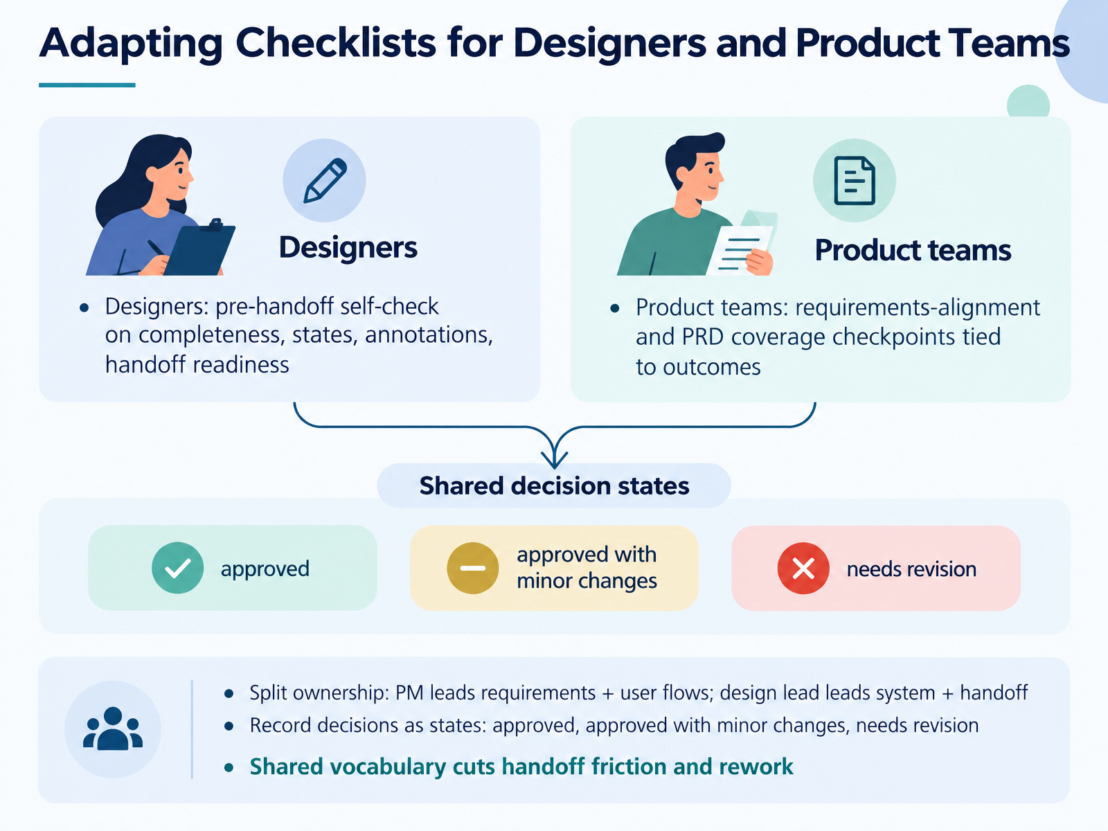
- 09Adapting Checklists for Designers and Product TeamsSo the same checklist should behave differently depending on who's holding it. Designers use it as a pre-handoff self-check: are all states covered, empty, error, loading, success, is the annotation clear, and is the file actually ready for engineering. Product teams use a different slice of the same document, tying requirement alignment back to outcomes. Does each user story map to a designed flow, and can you measure success from what was built? Split ownership along those lines. The PM leads requirements and user flows. The design lead owns the system and handoff readiness. Then record each decision as a state: approved, approved with minor changes, or needs revision. That shared vocabulary sounds small, but it cuts handoff friction and rework, because nobody has to interpret what done means. Next, let's look at adapting checklists for reviewers, educators, and content creators.
 notion.comfigma.comuaskos.org+22 min
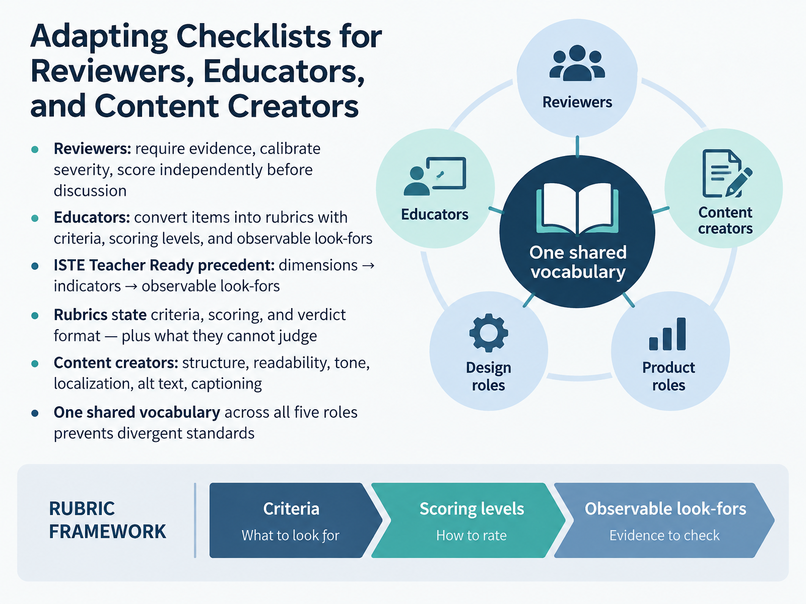
- 10Adapting Checklists for Reviewers, Educators, and Content CreatorsSo far, we have used one checklist. Now let's adapt it to each role. For reviewers, require evidence for every finding, calibrate severity together, and have each person score independently before you discuss. That prevents groupthink. For educators, turn checklist items into rubrics. Each rubric states criteria, scoring levels, and observable look-fors. The ISTE Teacher Ready framework shows the pattern. Dimensions break into indicators, and indicators break into observable look-fors. A good rubric also states plainly what it cannot judge. For content creators, the same checklist becomes a content review. Check structure, readability, tone, localization, alt text, and captioning. The point is one shared vocabulary across all five roles, so standards don't drift apart. Next, we look at measuring effectiveness and iterating.
 primer.stylew3.orgw3.org+22 min
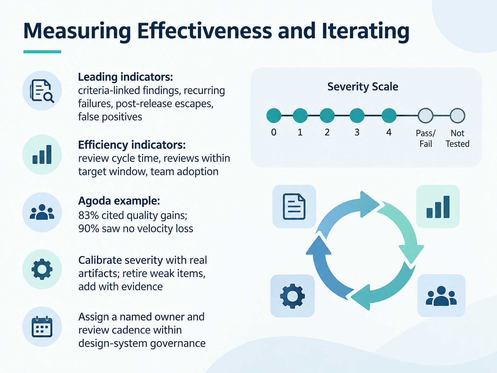
- 11Measuring Effectiveness and IteratingLet's look at how you measure whether the checklist is actually working. Start with leading indicators tied to your criteria. Track the share of findings linked to an explicit criterion, recurring failures across products, issues found only after release, and false positives. These tell you early whether the criteria are sharp. Then add efficiency indicators. Measure review cycle time, the share of reviews completed within your target window, and team adoption. Agoda's experience is a useful reference. Eighty-three percent of their designers cited quality gains, and ninety percent reported no loss of velocity. Now calibrate. Test severity against real artifacts. Retire weak items, and add new ones only when you have evidence. Finally, give the checklist a named owner and a review cadence inside your design-system governance. Otherwise it quietly goes stale. Next, we'll cover common pitfalls and practical guardrails.
 uaskos.orgmedium.combugsmash.io+22 min
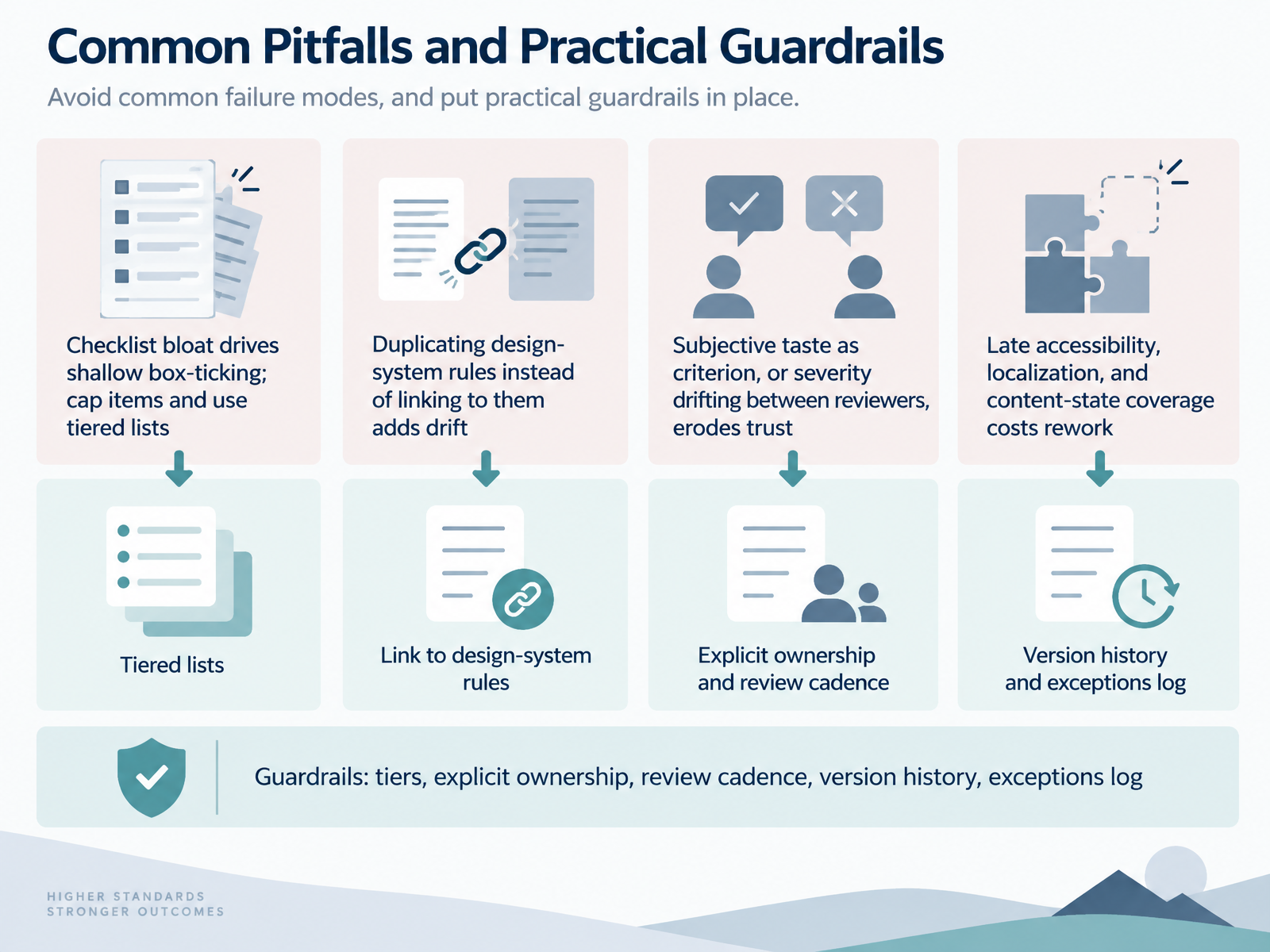
- 12Common Pitfalls and Practical GuardrailsLet's talk about where checklists go wrong, and how to keep them useful. The first pitfall is checklist bloat. If your list runs long, reviewers just tick boxes without looking closely. So cap the number of items, and split them into tiers: must-check, should-check, and nice-to-check. Second, don't copy design-system rules into your checklist. Link to them instead, or the two will drift apart. Third, avoid subjective taste as a criterion, and make sure severity means the same thing to every reviewer, or trust erodes fast. Fourth, bring accessibility, localization, and content states in early. Handling them late costs rework. Fifth, don't over-standardize across very different product contexts. That kills team autonomy. So build guardrails: tiers, explicit ownership, a review cadence, version history, and an exceptions log. Next, you'll put this into practice in the workshop: Draft Your First Checklist.
 primer.stylew3.orgw3.org+22 min
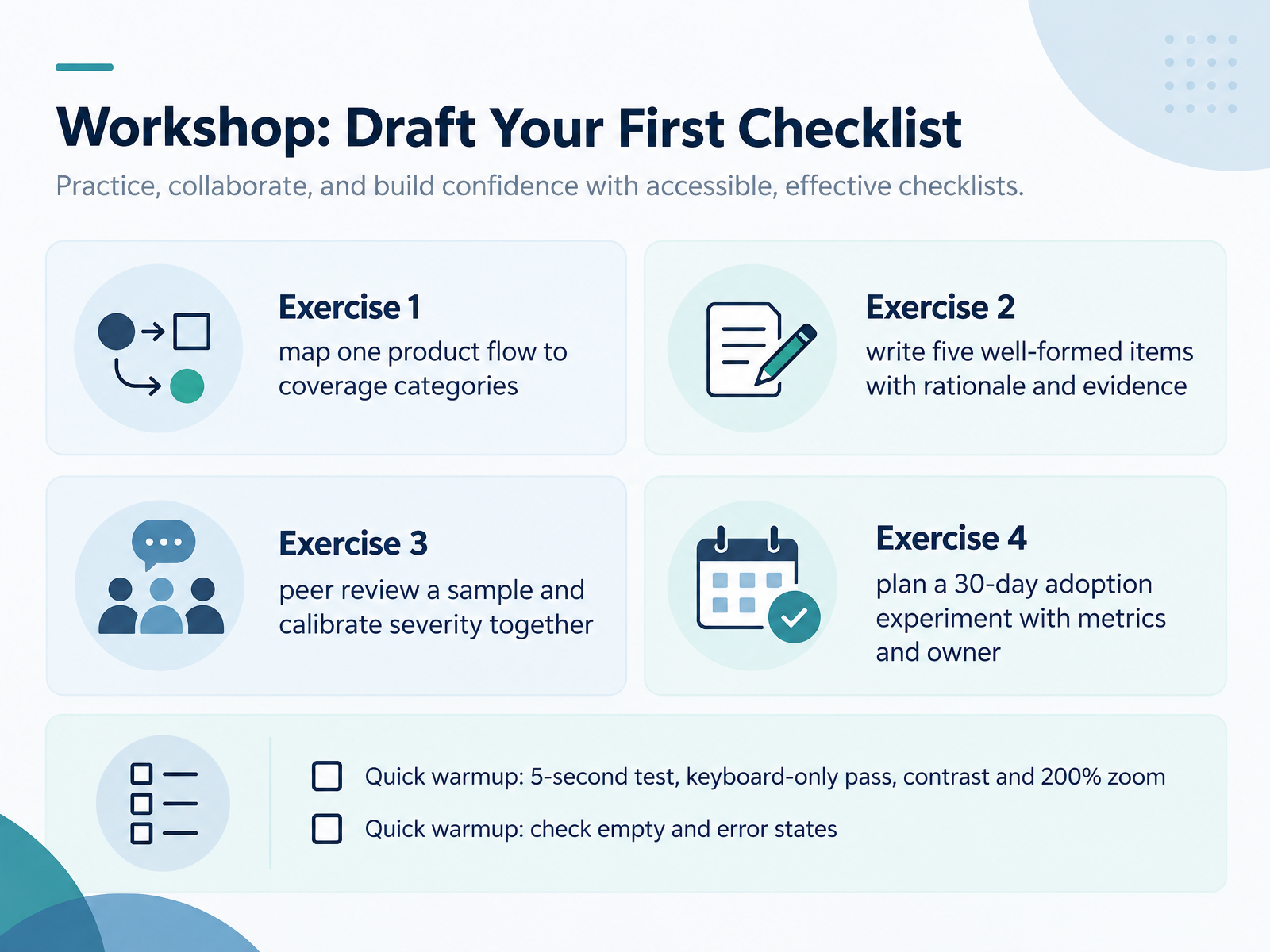
- 13Workshop: Draft Your First ChecklistNow let's put all of this into practice. Here's your workshop, built around four short exercises. Start by mapping one real product flow to your coverage categories, so you can see which areas your checklist already covers and where the gaps sit. Next, write five well-formed items, and include the rationale and the evidence for each one. Then swap with a peer, review a sample together, and calibrate severity until your ratings match. Finally, plan a thirty-day adoption experiment, with clear metrics and a named owner. Before you split into groups, run the quick warmups. Try the five-second test, a keyboard-only pass, a contrast check at two hundred percent zoom, and finally check the empty and error states. These take minutes and will sharpen your eye. Keep each item tied to a concrete decision, and you'll leave with a checklist you can actually use. Next, we'll cover Takeaways, Starter Template, and Next Steps.
 baymard.comdesignrush.comfigr.design+21 min
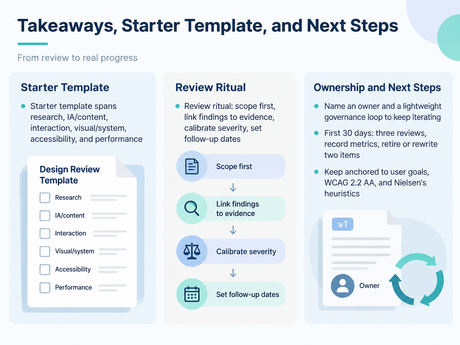
- 14Takeaways, Starter Template, and Next StepsLet's bring this together. Your starter template spans research, information architecture and content, interaction, visual and system work, accessibility, and performance. Keep the review ritual simple. Scope first, link each finding to evidence, calibrate severity, and set a follow-up date. Then name an owner and a lightweight governance loop so the checklist keeps improving instead of gathering dust. Here's a concrete first thirty days. Run three reviews, record a few metrics, and retire or rewrite two checklist items. That small loop builds momentum without slowing delivery. And keep the whole thing anchored to user goals, WCAG 2.2 double A, and Nielsen's heuristics. That's a wrap. Thank you for working through this with me. Start small, run one review this week, and let the evidence guide your next step. You've got everything you need to make review a reliable habit.
 uaskos.orgmedium.combugsmash.io+22 min
Take the deck with you
Download this course as a file — free, no sign-up needed.
- PDF handoutEvery slide page, ready to print or share.15 pages · 3.0 MBDownload
- Narrated PowerPointThe deck that presents itself — every slide carries the digital human's narration video.15 pages · 13.2 MBDownload
- PowerPoint slidesThe full deck as a .pptx — open it in PowerPoint, Keynote, or Google Slides.15 pages · 3.0 MBDownload
Free to use in your own training — please keep the PersonWise credit page at the end.
Have your own deck? Turn it into a course
Sources consulted
Web sources consulted while building this course.
- UX Audit Checklist & Template Framework for Designers – Baymard — baymard.com
- UX Checklist for Interface Designers (2026) — designrush.com
- The Complete UX Audit Checklist — figr.design
- The ultimate UX best practices checklist (2026 edition) — productrocket.ro
- UX Audit Checklist (2026): Heuristics, WCAG 2.2 & CWV — elgrith.com
- Design review and critique — HIF — uaskos.org
- How Agoda Incorporated Design Reviews to Ship Quality Designs | by Agoda Engineering | Agoda Engineering & Design | Medium — medium.com
- 7-Point Design Review Checklist Template [2025] — bugsmash.io
- Gerren Lamson - Advanced Usability Checklist — gerrenlamson.com
- How to Run a Design Audit That Actually Changes Something | Unicorn Club — unicornclub.dev
- Web Content Accessibility Guidelines (WCAG) 2.2 — w3.org
- 10 Usability Heuristics for User Interface Design — nngroup.com
- What's New in WCAG 2.2 | Web Accessibility Initiative (WAI) | W3C — w3.org
- Aligning Jakob Nielsen's 10 Usability Heuristics with the WCAG 2.2 — rightbadcode.com
- WCAG 2.2 Success Criteria Checklist — Every Level A and AA Criterion — accessible.so
- Designer Checklist | Primer — primer.style
- Understanding Techniques for WCAG 2.2 Success Criteria | WAI | W3C — w3.org
- checklists/engineering-checklist.md at main · github/annotation-toolkit — github.com
- UX Audit Checklist - Minimal Template by Echoes of Panda🐼 | Notion Marketplace — notion.com
- UX UI Audit & Design Review Template - Annotations, Markers, Checklist for UX Evaluation | Figma — figma.com