Search and Filtering Design
Begin
12 pages · ~24 min
Search and Filtering Design
A training for developers on designing efficient search and filtering systems, covering query optimization, index strategies, and user-friendly filtering interfaces.
What you’ll learn
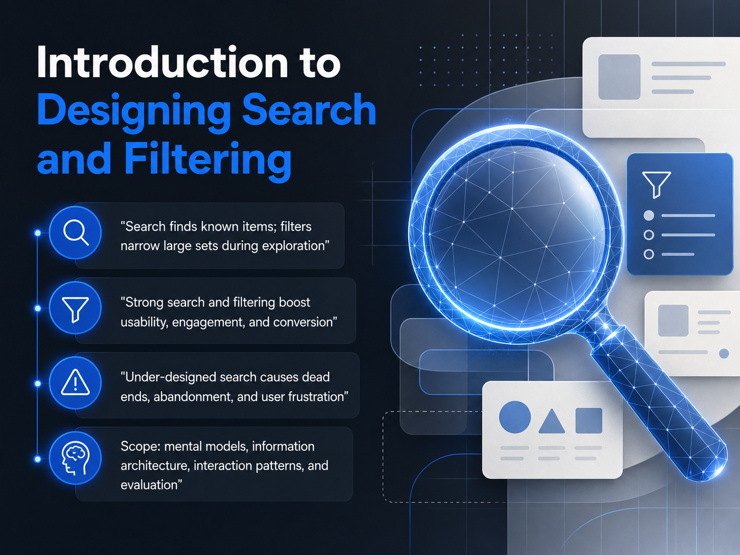
- 01Introduction to Designing Search and FilteringWelcome to Designing Search and Filtering. I'm glad you're here. The goal of this course is to help you build experiences that let your users find exactly what they need, whether they're looking for a known item or exploring a large set of options. Think of search as the tool for when someone knows what they want, like a specific article or product name. Filtering, on the other hand, helps users narrow down a big collection when they're still deciding. When these tools are designed well, engagement and conversion go up. When they're not, users hit dead ends, get frustrated, and often leave. Throughout this course, we'll cover the mental models users bring, how to structure information, the interaction patterns that work best, and how to evaluate your designs. We'll focus on reducing user effort at every step. Up next, we'll dive into understanding user mental models and intent.nngroup.comuxuiprinciples.comnngroup.com+21 min
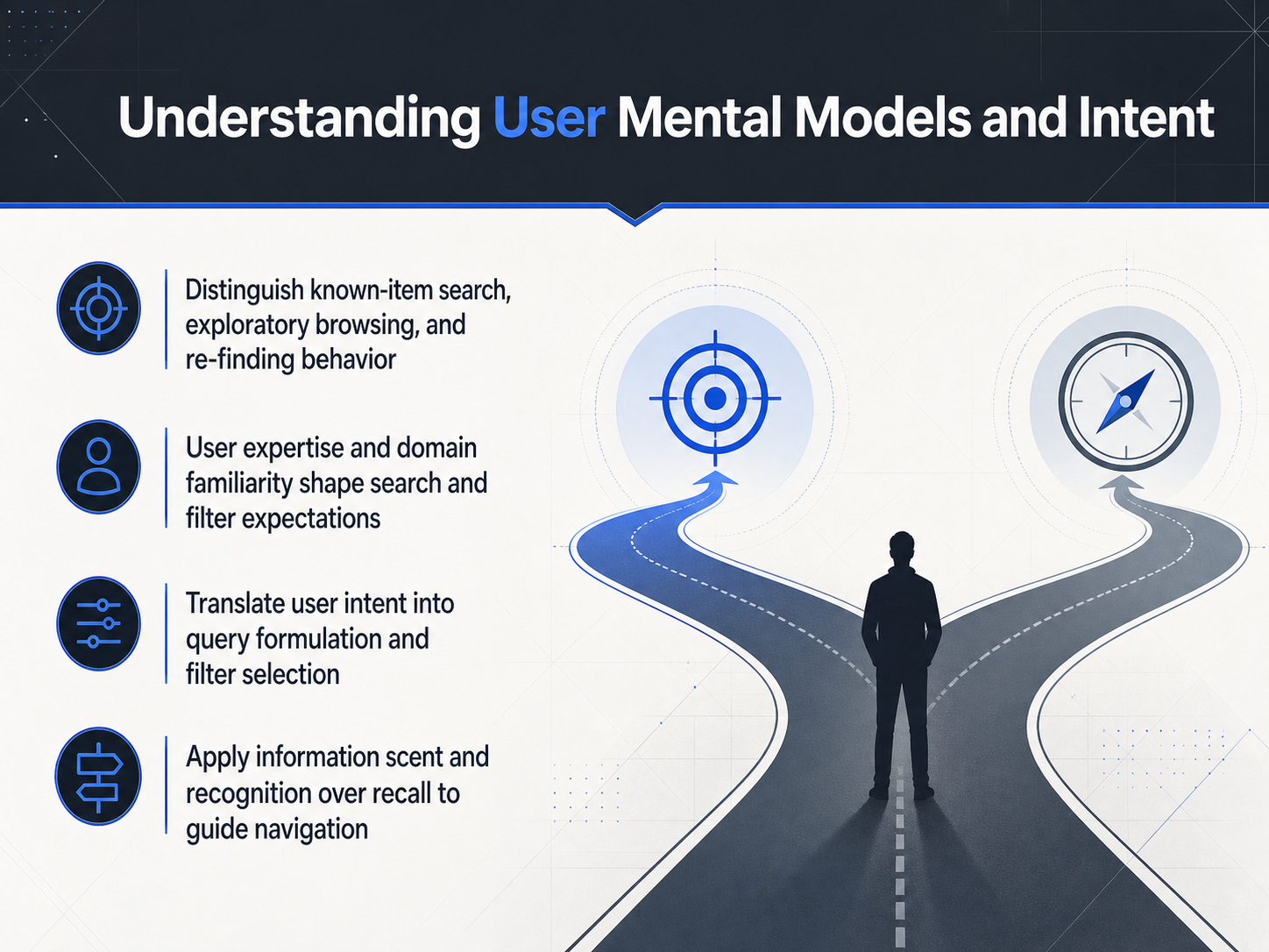
- 02Understanding User Mental Models and IntentNow let's understand the user's mental model before they even type. When someone uses search, they are usually in one of three mindsets. First, a known-item search, where they want one specific thing, like finding an invoice by its number. Second, exploratory browsing, where they are comparing options, like shopping for a new tent without a fixed brand in mind. Third, re-finding behavior, trying to get back to something they saw yesterday. Their expertise matters too. A beginner might search for 'fix login,' while a power user from IT might query 'SSO error code 452.' We must translate that raw intent into effective queries and filters. Our goal is to reduce the need for recall, which is hard, and maximize recognition, which is easy. This is where information scent comes in. Strong scent means link labels and filter options clearly predict what is on the other side. Instead of a link that says 'Learn More,' use a label that gives the user a preview of the destination, like 'View Q3 Financial Report.' This lets them navigate confidently, following the scent of the information they need, rather than guessing. Up next, we will talk about how to build those clear paths with Content Modeling and Faceted Classification.
 nngroup.comuxuiprinciples.comnngroup.com+22 min
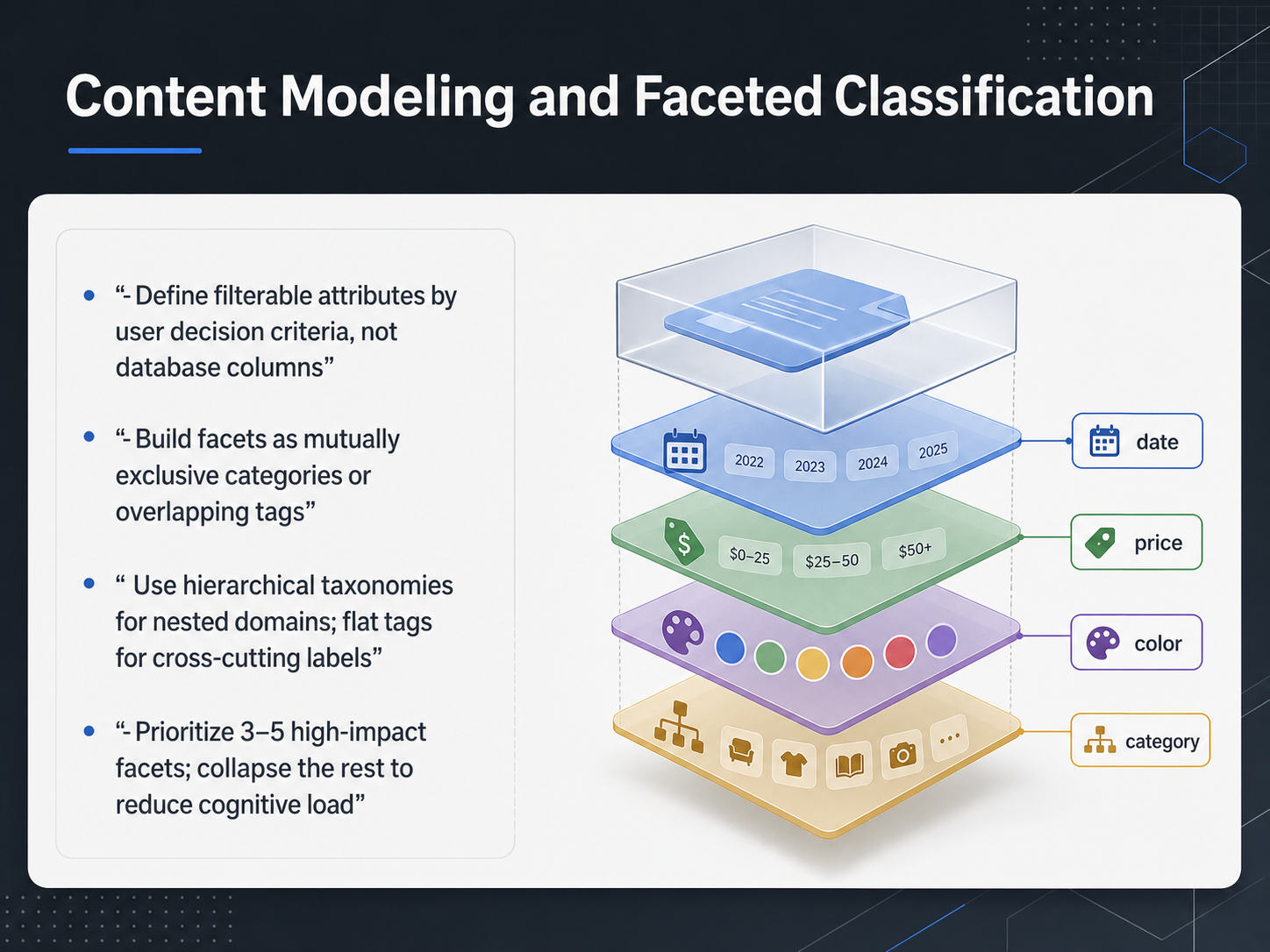
 - 03Content Modeling and Faceted ClassificationNow let's move from the overall search experience to the foundation that makes filtering actually work: content modeling and faceted classification. Think of this as the blueprint behind every filter your users will touch. The first rule is to define filterable attributes based on user decision criteria, not your database columns. Just because a field exists in the backend doesn't mean a customer cares about it. Filter by things like 'material' or 'capacity', not 'SKU prefix' or internal status codes. Next, build your facets as either mutually exclusive categories or overlapping tags. Categories like 'room type' or 'size' help users narrow down, while tags like 'vegan' or 'waterproof' let them cross-cut for exactly what they need. For nested domains, use hierarchical taxonomies. A parent category like 'electronics' breaks down into 'audio' and 'cameras', which is intuitive. For cross-cutting labels like 'color' or 'collection', flat tags are cleaner and faster. Finally, prioritize just three to five high-impact facets upfront. These are the few filters that eliminate the most irrelevant results immediately. Collapse the rest behind a 'more filters' button to reduce cognitive load and keep the panel scannable. This structured approach is what prevents a filter panel from becoming a confusing form. Next, let's look at how these filters behave in the interface when we explore search interaction design patterns.
 baymard.comnngroup.comblog.logrocket.com+22 min
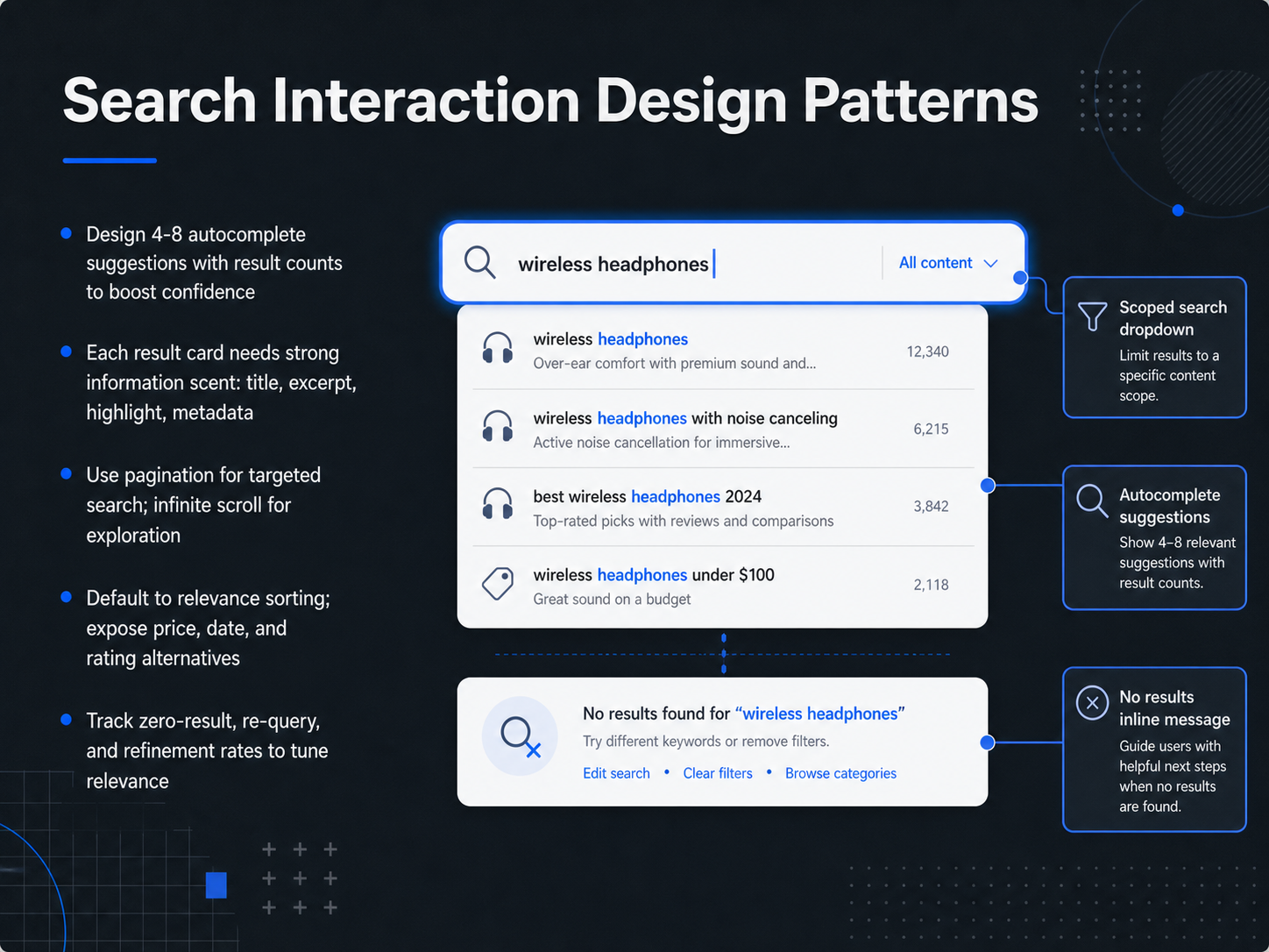
 - 04Search Interaction Design PatternsNow, let's turn our attention to the search interaction design patterns that help users find what they need faster. First, autocomplete. When users start typing, aim to show four to eight suggestions. Research shows this range boosts confidence and completion rates. More than eight can overwhelm, and fewer can feel like the system isn't trying. Including result counts next to each suggestion, like a number in parentheses, helps users know if they are on a productive path before they even hit enter. Next, focus on the result cards themselves. Each card needs strong information scent. This means a clear title, a dynamic excerpt that highlights the matched query terms, and relevant metadata like a date or price. This allows users to make a confident click decision in under two seconds. For browsing through results, the choice between pagination and infinite scroll depends on the user's goal. Use pagination for targeted search, like finding a specific document, because it gives users a sense of place. Use infinite scroll for exploration, like browsing products, where discovery is the main task. Sorting is just as important. The default should always be relevance, but you also need to expose alternatives like price, date, or rating. This gives users control over how they make sense of large result sets. Finally, you must measure success. Track your zero-result rate, re-query rate, and refinement rate. A high re-query rate often signals that the initial results lacked strong information scent. These metrics are your direct line to understanding where your design is failing the user. Next, we'll move on to filtering and sorting interaction design.
 timgraf.comkroolo.comblog.logrocket.com+22 min
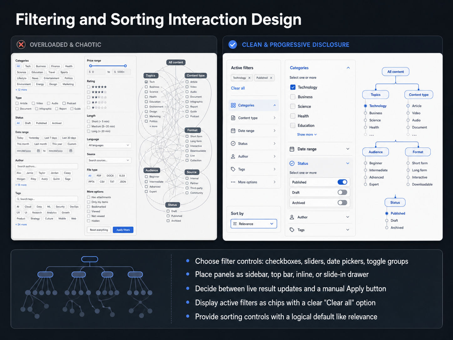
 - 05Filtering and Sorting Interaction DesignNow let's look at the controls and placement choices that make filtering feel effortless. Your goal is to help users find a known item or narrow a large set quickly, so every design decision should reduce the steps they need to take. First, choose filter controls that match the data. Use checkboxes for multi-select lists like brands or colors, sliders for ranges like price, and date pickers for time based filters. Toggle groups work well for binary choices like on sale or in stock. Next, decide where to place the panel. A sidebar keeps filters always visible on desktop, while a slide in drawer works better on mobile. A top bar is compact but best for only a few simple filters. You also need to decide between live results that update instantly and a manual Apply button. Live updates are great for fast, small datasets. An Apply button is better for heavy queries or when you want users to refine several choices before the page reloads. Once filters are active, show them as chips near the results, with a clear Clear all option. Finally, provide sorting controls with a logical default like relevance, so users see the most useful items first. Getting these interaction details right turns a frustrating hunt into a quick, satisfying find. Up next, we'll bring it all together by combining search and filtering into a coherent experience.
 dev.tosmart-interface-design-patterns.compencilandpaper.io+22 min
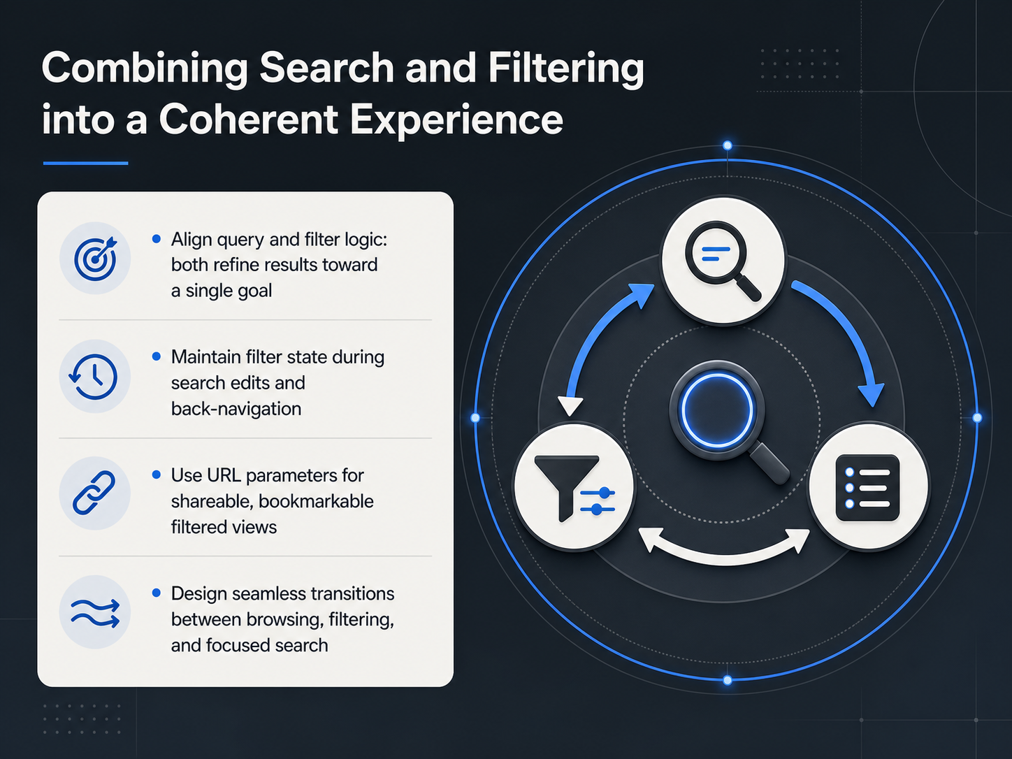
 - 06Combining Search and Filtering into a Coherent ExperienceNow let's talk about combining search and filtering into one coherent experience. Your users don't think of these as two separate tools. They just want to narrow down results, and they'll use whatever control feels fastest. So our job is to align query and filter logic so both work toward a single goal: refining the result set. That means when someone types a search term, the available filters should reflect what's relevant to those results. And when they apply a filter, the search should still work within that narrowed set. Next, you must maintain filter state. If a user edits their query, don't wipe their filters. If they click a result and then hit the back button, return them to the exact same filtered view. Using URL parameters is the best way to achieve this. It makes filtered views shareable, bookmarkable, and safe through page refreshes. Finally, design seamless transitions between browsing, filtering, and focused search. A user should move from exploring a category, to applying a few filters, to typing a specific query, without ever feeling like they've started over. When you get this integration right, the interface feels like a single, intelligent tool rather than a collection of disconnected features. Up next, we'll apply these principles to designing for mobile and responsive search experiences.
 timgraf.combtng.studiouxpin.com1 min
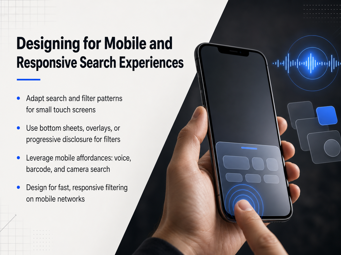
 - 07Designing for Mobile and Responsive Search ExperiencesNow, let's translate these patterns to small screens. Designing for mobile isn't about shrinking a desktop sidebar; it's about rethinking how a user interacts with a thumb and a spotty connection. For filters, full-screen overlays or bottom sheets give users enough room to work without losing context. Progressive disclosure keeps them from being overwhelmed—show the most popular filters first, and let them expand sections only when needed. Mobile also unlocks unique affordances. Don't just offer text input. Integrate voice search, barcode scanning, or camera-based visual search to reduce typing effort. Finally, always design for fast, responsive filtering on mobile networks. Use batch apply models or debounced inputs so the UI doesn't freeze on every single tap. Give immediate loading feedback, like a skeleton screen, to maintain the sense of speed. The goal is to make every interaction feel solid and immediate, even on a slower connection. Next, we'll look at measuring and evaluating search and filtering effectiveness, so you can prove these improvements are working.
 btng.studio2 min
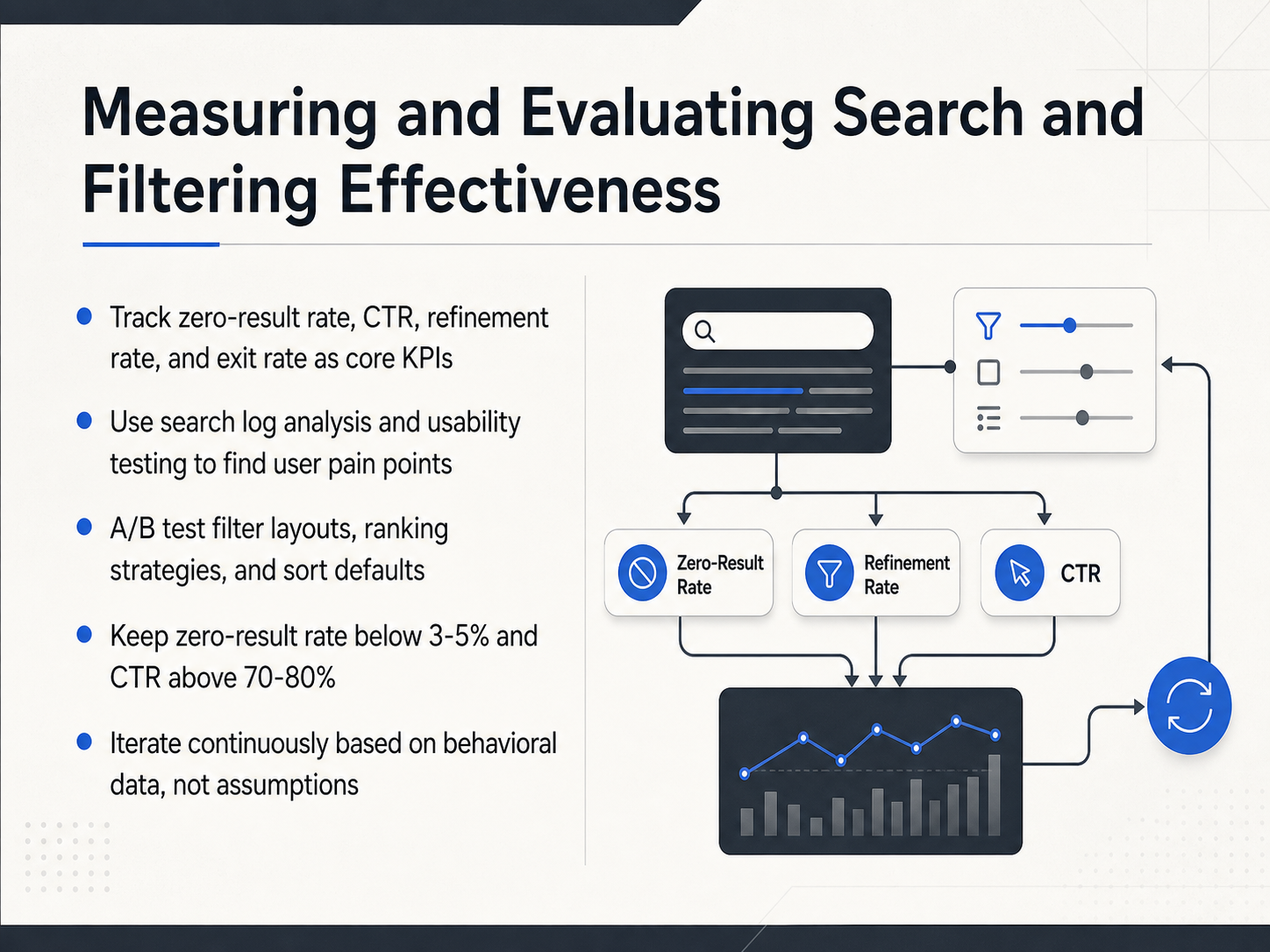
 - 08Measuring and Evaluating Search and Filtering EffectivenessNow let's turn to something that often gets overlooked: actually measuring whether your search and filtering experience is working. Without good data, you're just guessing. So, what should you track? Start with a handful of core KPIs. Watch your zero-result rate, your click-through rate, or CTR, your refinement rate, and your exit rate. These four numbers tell you quickly if users are finding what they need, or if they're hitting dead ends and leaving. You can dig deeper with search log analysis and usability testing. Logs from real searches will show you exactly where users struggle, and usability tests reveal why they struggle. Once you have a baseline, experiment. A and B test your filter layouts, your ranking strategies, and even your sort defaults. Changing the default sort from 'newest' to 'relevance' can sometimes dramatically improve click-through. As you evaluate, aim for clear benchmarks. Try to keep your zero-result rate below three to five percent, and your click-through rate above seventy to eighty percent. If you're outside those ranges, you have a clear signal to investigate. Most importantly, iterate continuously based on what the behavioral data shows, not on assumptions. Let user behavior, not internal opinion, drive your design decisions. Now that we know how to measure success, let's look at the mistakes that can undo all that work. Next, we'll cover common pitfalls and anti-patterns to avoid.
 timgraf.combtng.studiouxpin.com2 min
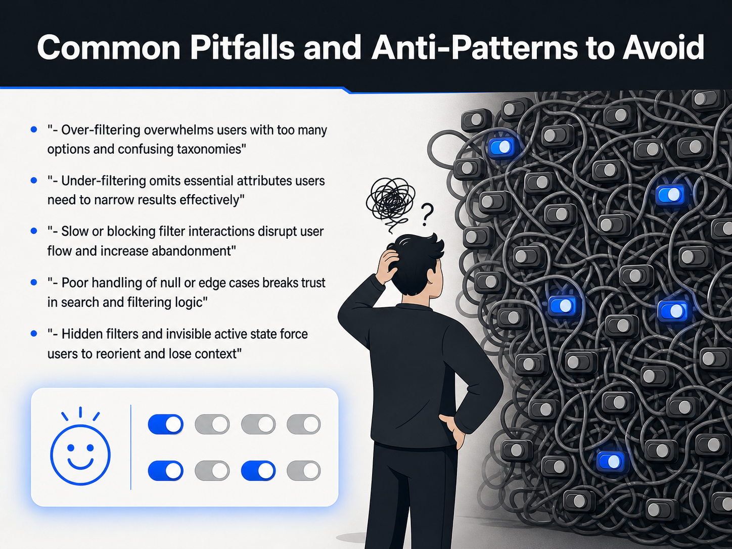
 - 09Common Pitfalls and Anti-Patterns to AvoidLet's walk through some of the most common problems that can break the search and filtering experience. These are the anti-patterns that quietly push users away. First, over-filtering. When you present users with dozens of options and confusing category names, they feel overwhelmed, not empowered. Second, the opposite problem: under-filtering. If you don't include attributes that are essential for their decision, like size for clothing or location for a job search, your users can't narrow results effectively and they'll leave. Next, slow interactions. If clicking a filter causes a full-page freeze or a long loading spinner, the user's flow is broken. They lose momentum and often abandon the task. Poor handling of edge cases is another major trust-killer. Think about what happens when a filter combination returns zero results. If the user just sees a blank page that says 'No results found,' they feel like the system is broken. You need to guide them back with helpful suggestions. Finally, hidden filters and invisible active states. If a user applies a filter and then can't easily see what's active, they lose context. They have to reorient themselves, which is pure mental effort. Always show active filter chips or a clear summary so they always know exactly where they are. Now, turning these principles into working code requires a clean handoff to development. Let's look at how to bridge that gap in the next section: From Concept to Implementation: Design-to-Dev Handoff.
 uxpin.comtimgraf.combtng.studio2 min
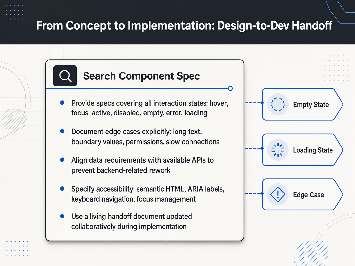
 - 10From Concept to Implementation: Design-to-Dev HandoffNow, let's move from our design thinking into the actual handoff, where we turn your concepts into code—specifically for search and filtering features. This is where many great designs fall apart, so the goal is to provide a spec so complete that a developer hardly needs to ask questions. First, you must document every interaction state. That means not just the default look, but hover, focus, active, disabled, and the critical functional states like empty results, error messages, and loading spinners. Next, think through the edge cases explicitly. What happens when a user pastes a very long string into the search box? How does the filter behave on a slow connection or with a huge dataset? Document these answers. You also need to align your data requirements with the available APIs before development starts. Confirm the backend actually returns the fields you’re displaying, like a ‘last active’ timestamp, to prevent costly rework. Accessibility is not optional; specify the semantic HTML, ARIA labels, and keyboard navigation right in your handoff. Finally, treat this document as a living artifact. Update it collaboratively with developers during implementation to keep it accurate. Next, we’ll explore practical strategies you can apply as a product creator.
 2 min
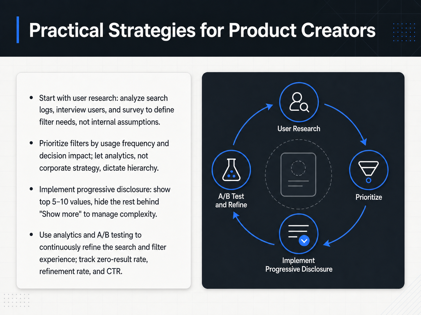
2 min - 11Practical Strategies for Product CreatorsLet’s turn these patterns into a practical, repeatable workflow. The first step is to start with user research, not internal assumptions. Analyze search logs, interview real users, and run surveys to understand which attributes actually drive their decisions. The language your customers use often differs from your internal taxonomy, so let their vocabulary shape your filter labels. Next, prioritize your filters by actual usage frequency and decision impact. Let analytics, not corporate strategy, dictate which filters appear first. For example, if eighty percent of interactions are on size and price, those should be the most prominent. Then, implement progressive disclosure to manage complexity. Show the top five to ten values for each filter and hide the rest behind a “Show more” link. This keeps the interface scannable without removing power-user options. Finally, commit to continuous refinement. Track metrics like zero-result rate, refinement rate, and click-through rate. Use A B testing to validate changes, and let the data guide every iteration. Good search and filter experiences are never finished, they just keep getting closer to what your users need. Up next, we’ll wrap up with key takeaways and actionable next steps.
 dev.tosmart-interface-design-patterns.compencilandpaper.io+22 min
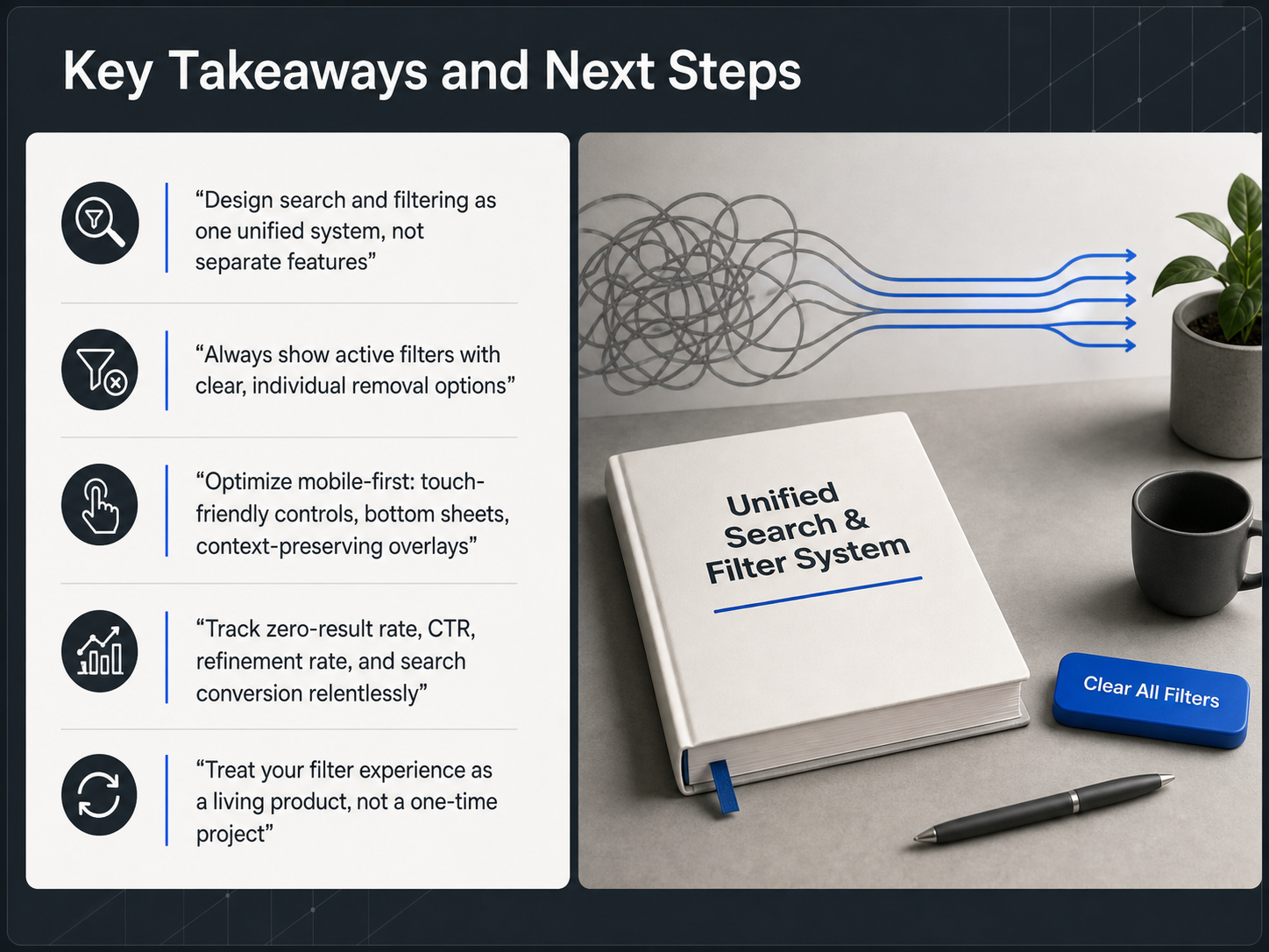
 - 12Key Takeaways and Next StepsWe have covered a lot of ground, so let us bring it all together with the key takeaways. First, make a fundamental shift in your thinking: design search and filtering as one unified system, not as separate features. Your users see them as the same thing, a way to narrow down options, so your interface should feel that way too. Second, always show active filters clearly, with easy, individual ways to remove them. This simple act of transparency gives users control and prevents frustration. Next, commit to optimizing for mobile first. Use touch-friendly controls, bottom sheets, and overlays that preserve the user's context, because more than half your traffic likely comes from a phone. Fourth, measure relentlessly. Track your zero-result rate, click-through rate, refinement rate, and search conversion. If you do not track it, you cannot improve it. Finally, treat your filter experience as a living product, not a one-time project. Continuously test, learn from the data, and refine. The best search experiences are built through iteration, not perfection on day one. Thank you for joining this course. Now, go out there and make finding things a joy for your users.
 baymard.comtimgraf.combtng.studio+12 min
Take the deck with you
Download this course as a file — free, no sign-up needed.
- PDF handoutEvery slide page, ready to print or share.13 pages · 2.9 MBDownload
- Narrated PowerPointThe deck that presents itself — every slide carries the digital human's narration video.13 pages · 14.4 MBDownload
- PowerPoint slidesThe full deck as a .pptx — open it in PowerPoint, Keynote, or Google Slides.13 pages · 2.8 MBDownload
Free to use in your own training — please keep the PersonWise credit page at the end.
Have your own deck? Turn it into a course
Sources consulted
Web sources consulted while building this course.
- Information Scent: How Users Decide Where to Go Next — nngroup.com
- Search Query Formation Law in UX Design | UX/UI Principles — uxuiprinciples.com
- Memory Recognition and Recall in User Interfaces — nngroup.com
- Information Scent: Navigation UX Guide | UX/UI Principles — uxuiprinciples.com
- Using Information Scent to Understand Mobile and Desktop Web Search Behavior — dl.acm.org
- Product List UX Best Practices 2025 — baymard.com
- Defining Helpful Filter Categories and Values for Better UX — nngroup.com
- Faceted filtering for better ecommerce experiences - LogRocket Blog — blog.logrocket.com
- Designing Filters and Faceted Search for Large Catalogs | Strynal — strynal.com
- Ecommerce Filter UX Design Patterns That Convert (2026) — btng.studio
- Designing Search Interfaces That Actually Work: A Comprehensive UX Framework for Search Bars, Filters, and Results Pages - Timothy Graf | UX/UI Design Theory & 2026 Strategies — timgraf.com
- Search UX Design: Build Results Pages Employees Actually Use — kroolo.com
- Search bar UI: Best practices, modern trends, and examples - LogRocket Blog — blog.logrocket.com
- Essential Search UX Best Practices that Improve User Success — coveo.com
- Search Results Pattern | UX Patterns for Developers — uxpatterns.dev
- Filter UX Design: Best Practices for SaaS Product Success - DEV Community — dev.to
- Filtering UX – Smart Interface Design Patterns — smart-interface-design-patterns.com
- Filter UX Design Patterns & Best Practices - Pencil & Paper — pencilandpaper.io
- Getting filters right: UX/UI design patterns and best practices - LogRocket Blog — blog.logrocket.com
- Filter UI and UX Design: Best Practices, Patterns, and Examples (2026) — uxpin.com