Categorical Data Analysis
Begin
15 pages · ~30 min
Categorical Data Analysis
This training teaches learners to analyze categorical data using counts, proportions, and comparative methods for data-driven decision-making.
What you’ll learn
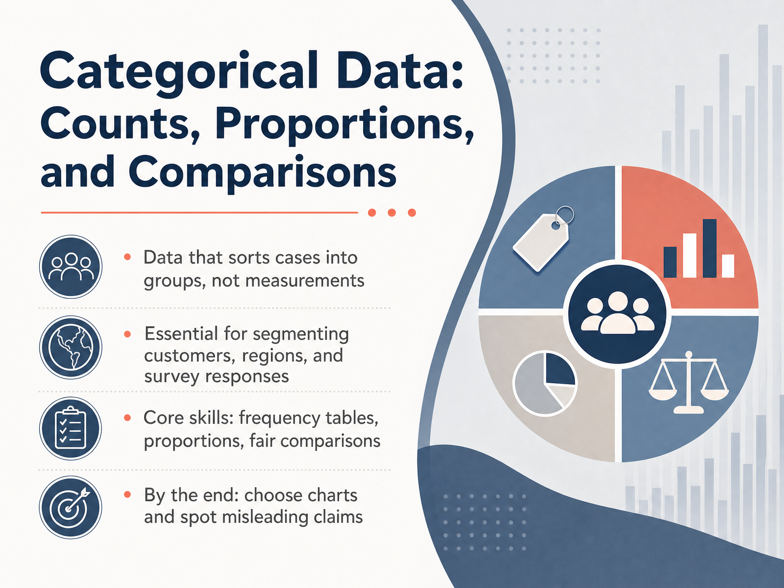
- 01Categorical Data: Counts, Proportions, and ComparisonsWelcome. In this course, we focus on categorical data—data that sorts cases into groups, not measurements. This kind of data is essential when you segment customers by region, classify survey responses, or compare product categories. You will build three core skills: creating frequency tables to organize counts, calculating proportions to show relative shares, and making fair comparisons between groups. By the end, you'll know how to choose the right chart for your message and how to spot claims that may mislead. In the next slide, we start with a closer look at what categorical data really means.1 min
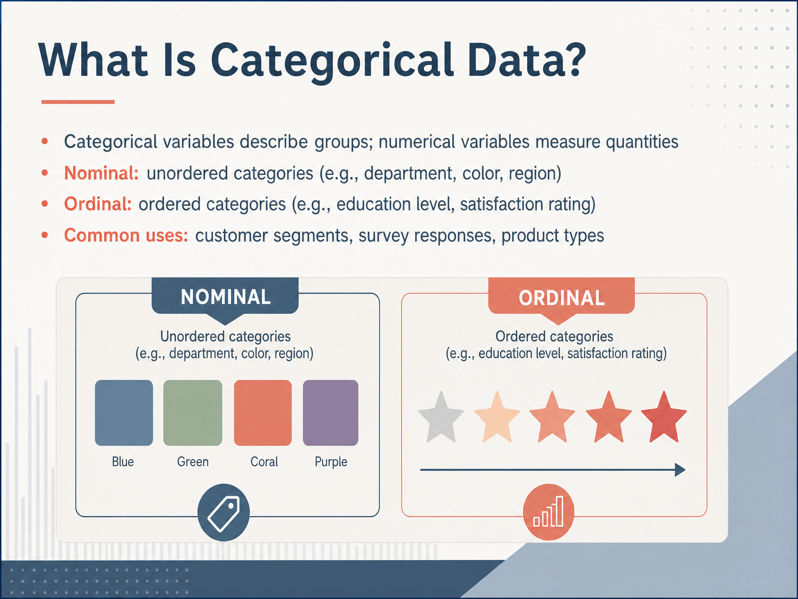
- 02What Is Categorical Data?Now that we have a shared starting point, let us define exactly what categorical data is. Categorical variables describe groups or qualities, while numerical variables measure quantities like dollars or minutes. Within categorical data, we distinguish two important types. Nominal categories have no natural order—think of department names, colors, or sales regions. Ordinal categories do have a meaningful order—for example, education level, or a satisfaction rating from very dissatisfied to very satisfied. You will see categorical data constantly in your work: customer segments, survey responses, product types, and channel preferences. Recognizing these types now will help you later when you decide whether to use a count, a proportion, or a specific chart. Next, we will build frequency tables from raw data.
 1 min
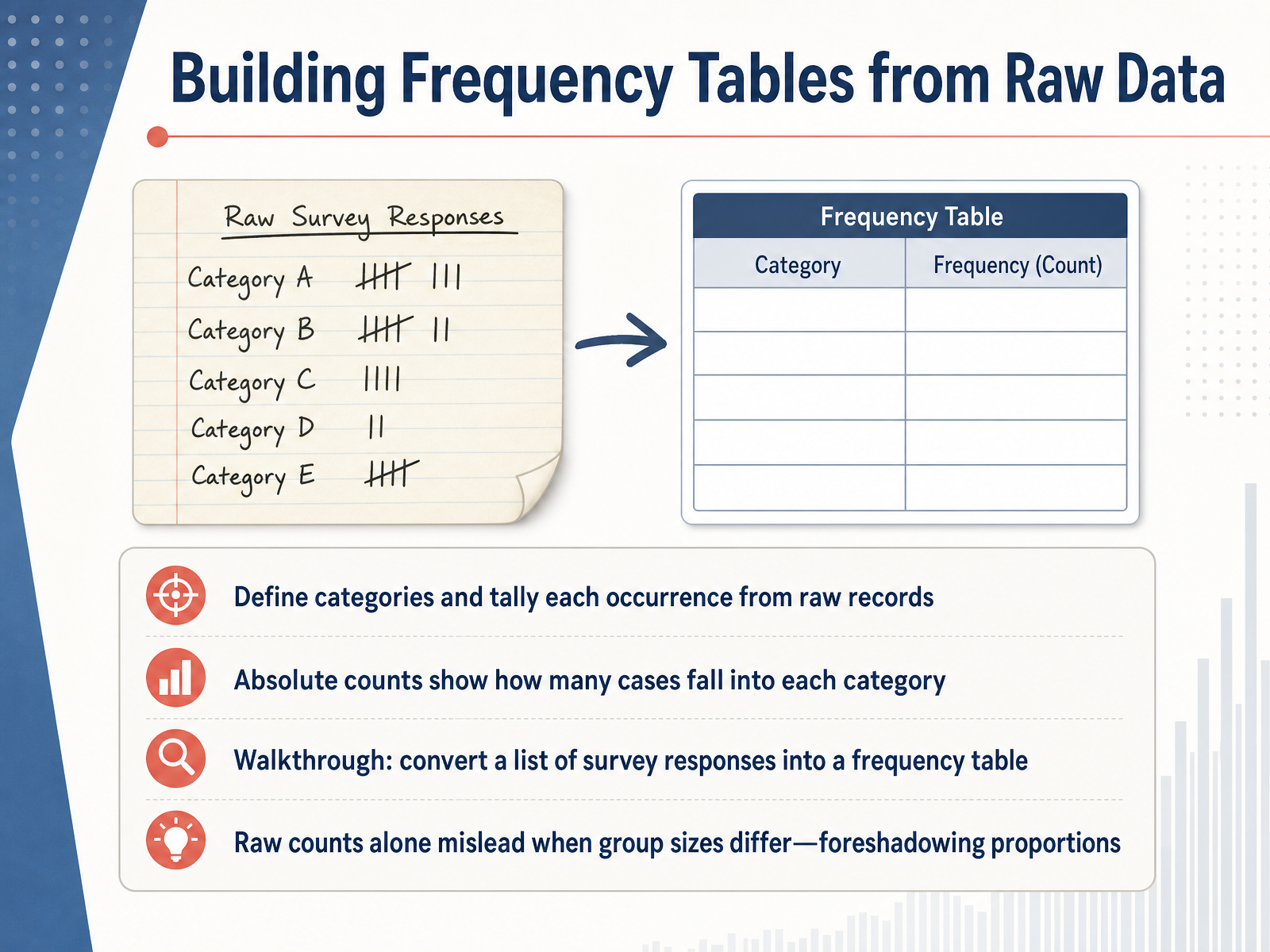
1 min - 03Building Frequency Tables from Raw DataNow let's look at how we build those frequency tables from raw data. First, we look at each response in our record, and we identify its category. Then we simply tally each occurrence. The absolute count is the total number of cases that fall into a specific category, nothing more complicated than that. Let's walk through an example. Imagine a list of survey responses where people chose their preferred communication method: email, phone, or text. We go down the list, mark a tally for each email, each phone, and each text choice. When we're done, we translate those tallies into numbers—say, forty-five for email, thirty for phone, and twenty-five for text—and put them into a table. But here's a crucial point to keep in mind. Raw counts can be misleading when we compare groups of different sizes. If a small department gives us twenty-five email responses, and a large department gives us forty-five, it doesn't mean the large department prefers email more. The smaller group might actually represent a much higher proportion. This is exactly why we'll need to move beyond just counts. Coming up next, we'll make that shift, moving from counts to proportions and percentages.
 2 min
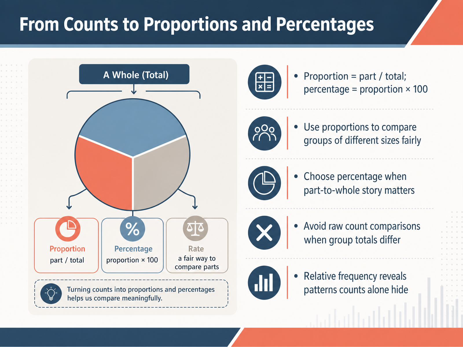
2 min - 04From Counts to Proportions and PercentagesNow, let's move from raw counts to proportions and percentages. A proportion is simply the part divided by the total. A percentage is that proportion multiplied by one hundred. You should choose proportions when your goal is to compare groups of different sizes fairly, because raw counts can be misleading. Opt for a percentage when the part-to-whole story is what matters most. Remember, avoid comparing raw counts directly whenever your group totals differ. Relative frequency, expressed as a proportion or percentage, reveals patterns that counts alone can easily hide. For example, if one team has one hundred users and ten complete a task, while another team has only ten users but five complete it, the raw counts make the first team look better, but the relative frequency tells a different story. This concept is especially important as we move to the next slide, Making Comparisons Fair with Proportions.
 atlassian.comstatology.orgobservablehq.com+21 min
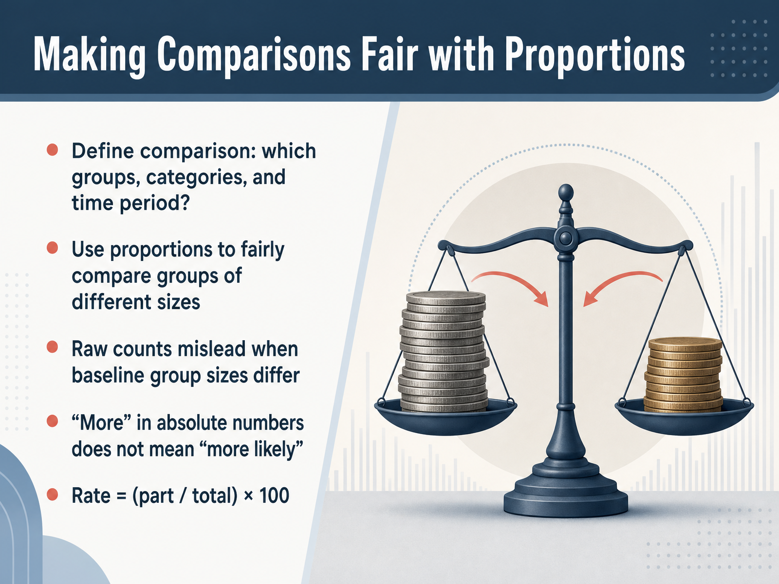
 - 05Making Comparisons Fair with ProportionsNow let's talk about making comparisons fair by using proportions. When you compare groups, the first step is to define exactly which groups, which categories, and which time period you are looking at. Without that clarity, comparisons can quickly become misleading. The key idea here is that raw counts can fool you when baseline group sizes are different. For example, if Group A has one thousand people and Group B has two hundred, seeing more complaints from Group A in absolute numbers does not mean complaints are more likely there. In fact, the rate could be much lower. To compare fairly, use a proportion, often expressed as a percentage. The formula is straightforward: take the part, divide by the total, and multiply by one hundred. This simple step converts counts into rates, letting you say clearly which group has a higher likelihood, not just a higher tally. Always choose proportion over count when comparing groups of different sizes. Next, we will build on this by organizing two or more variables together in contingency tables.
 1 min
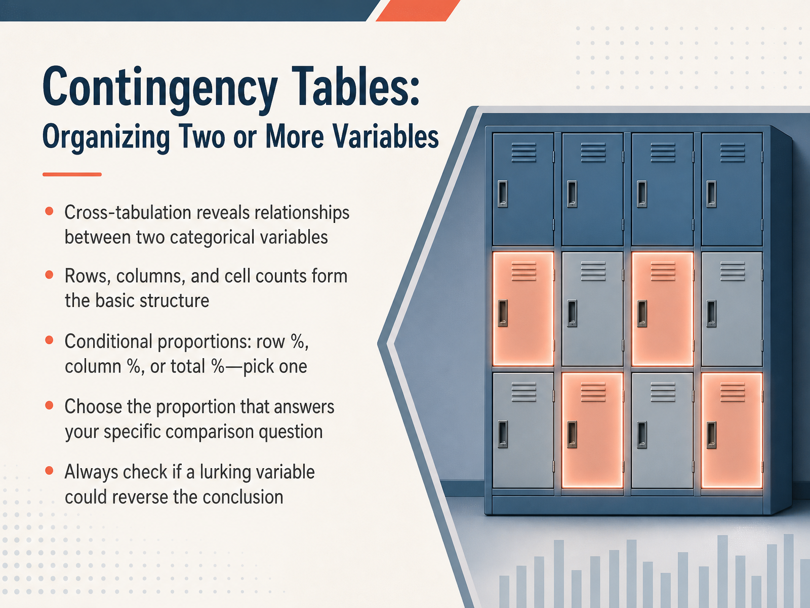
1 min - 06Contingency Tables: Organizing Two or More VariablesNow we need a tool to organize two variables at once. That tool is the contingency table, also called a cross-tabulation. It reveals relationships between two categorical variables by placing one variable in the rows, the other in the columns. Each inner cell holds a count. From those counts we calculate conditional proportions to make meaningful comparisons. You can choose row percentages, column percentages, or percentages of the total. The key decision is picking the proportion that answers your specific comparison question. For example, to compare male and female acceptance rates within each department, use department-specific column percentages, not the overall total. There is one more crucial step. Always check whether a lurking variable could reverse your conclusion. This is the famous Simpson’s paradox. Consider the UC Berkeley graduate admissions case. Overall, men had a forty-four percent acceptance rate, and women had thirty-five percent. But when we stratified by department, women’s acceptance rates were actually similar to, or slightly higher than, men’s in nearly every department. The reversal happened because women applied disproportionately to more competitive departments with lower overall acceptance rates. The aggregated data hid that structural difference. So before you finalize a comparison, ask whether an unmeasured third variable might be lying in wait. Next, we will move into choosing the right chart for categorical comparisons.
 britannica.comstatisticsbyjim.compwacker.com+22 min
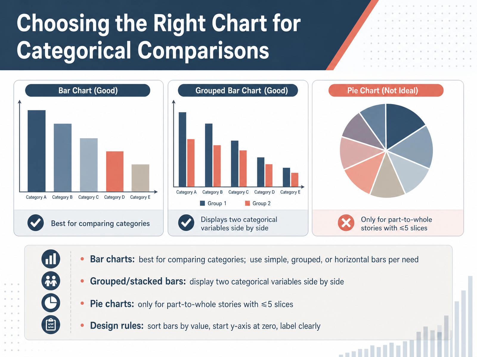
 - 07Choosing the Right Chart for Categorical ComparisonsNow let's focus on choosing the right chart for categorical comparisons. Your main tool for comparing categories is the bar chart. You can use simple bars for one variable, grouped bars to show two categorical variables side by side, or horizontal bars when you have long category labels. Bar charts make it easy to see which value is larger and to detect small differences. Pie charts serve a different purpose. They answer a very specific question: what share of the whole does each part represent? Reserve pie charts for part-to-whole stories, and only when you have five or fewer slices. If you have more categories, or the slices are very close in size, a bar chart is the safer choice. As a practical decision, choose proportion over count when comparing groups of different sizes, but still use a bar chart to display those proportions accurately. When you design your chart, apply three simple rules to protect clarity. Sort bars by value so patterns emerge instantly. Always start the y-axis at zero so the visual lengths are honest. And label everything clearly so your audience can read the numbers without guessing. Next, we will move into designing charts to communicate clearly.
 atlassian.comstatology.orgobservablehq.com+22 min
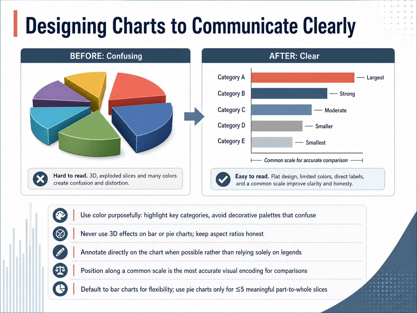
 - 08Designing Charts to Communicate ClearlyLet's turn now to designing charts that communicate your message clearly. Think of every design choice as a practical decision. Use color purposefully: highlight the key category you want your audience to notice, and avoid decorative palettes that create confusion. Never apply three dimensional effects to bar or pie charts; they distort proportions and break honest comparisons. Keep your aspect ratios honest. Whenever possible, annotate directly on the chart instead of forcing the reader to look back and forth at a legend. Remember, the most accurate visual encoding for comparisons is position along a common scale. For flexibility, default to bar charts. If you must use a pie chart, do so only when the slices add up to a meaningful whole and you have five or fewer slices. Even then, bar charts handle precise ranking more accurately. In the next slide, we'll move from designing visualizations to interpreting what they tell us: Interpreting Differences: Signal or Noise?
 atlassian.comstatology.orgobservablehq.com+21 min
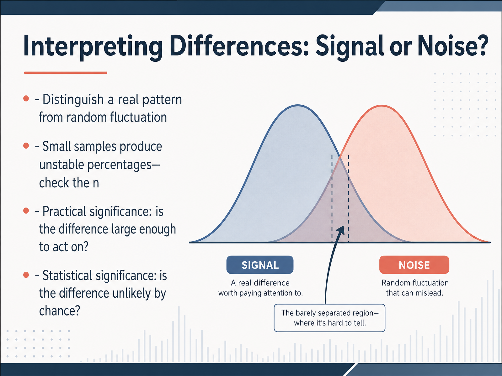
 - 09Interpreting Differences: Signal or Noise?Now we face an important question. When you see a difference between groups, how do you know whether it's a real pattern or just random noise? First, always check the sample size. Small samples can produce unstable percentages. A difference that looks dramatic might disappear with just one or two more observations. So let the number of cases, the n, guide your confidence. Next, consider practical significance. Ask yourself: is the difference large enough to act on? A tiny gap might be real but still not justify changing a decision. And if you need a formal rule, statistical significance tells you whether a difference is unlikely to occur by chance alone. In short, look at the sample size, the size of the effect, and the role of chance before you interpret any comparison. Up next, we'll explore a surprising trap: Simpson's paradox, where combining groups reverses the story the data seems to tell.
 1 min
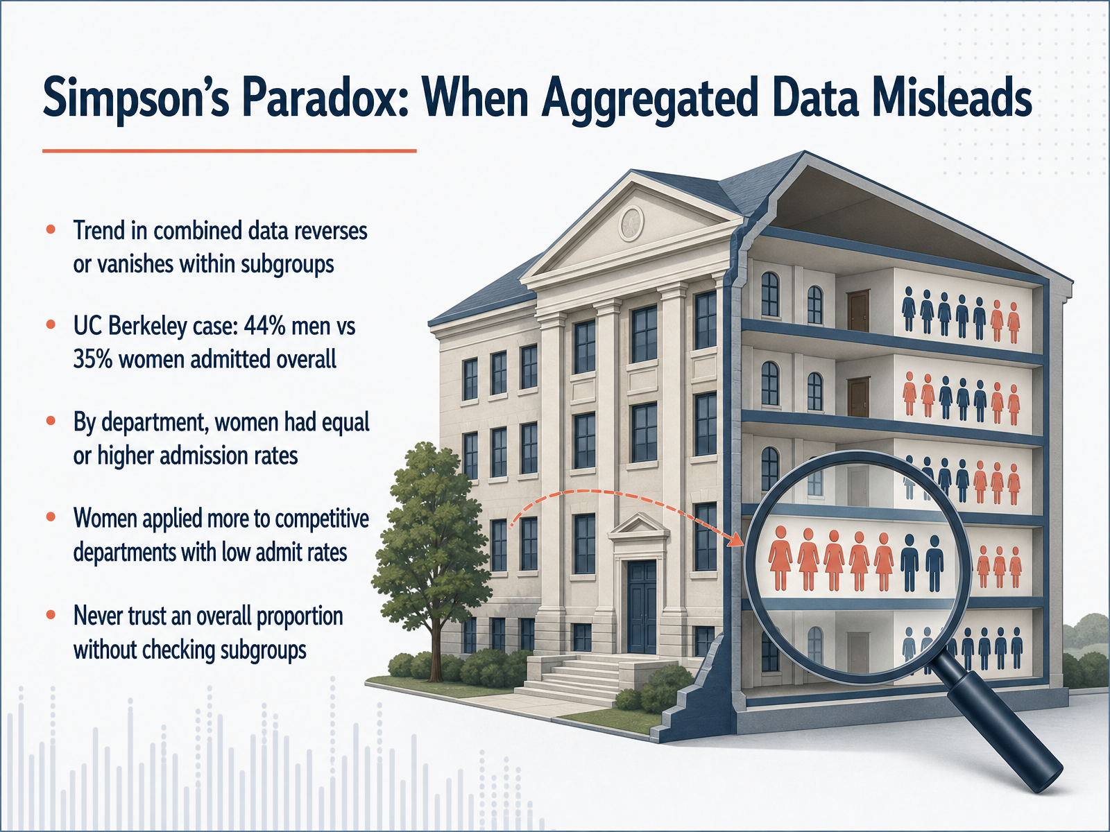
1 min - 10Simpson’s Paradox: When Aggregated Data MisleadsNow let's explore a phenomenon that challenges our intuition about proportions: Simpson's Paradox. This occurs when a trend in combined data reverses or disappears once we look inside subgroups. Consider the famous case of UC Berkeley graduate admissions. The aggregated data showed forty-four percent of men admitted, but only thirty-five percent of women. That looks like a clear bias against women. However, when researchers examined the data department by department, the story flipped entirely. Within each department, women actually had admission rates equal to or higher than men. So how did the overall proportion mislead? The answer lies in application patterns. Women applied disproportionately to highly competitive departments with very low overall admit rates. Men applied in larger numbers to less competitive departments with higher admit rates. The aggregated proportion mixed two different effects: admission difficulty and applicant distribution. The lesson is simple but vital. Never trust an overall proportion without checking the subgroups. Always ask whether a hidden variable, like department competitiveness, is pulling the strings behind the numbers. When we move to the next slide, we will apply this lesson to other real-world cases and see how causal thinking helps us decide which proportions to trust.
 britannica.comstatisticsbyjim.compwacker.com+22 min
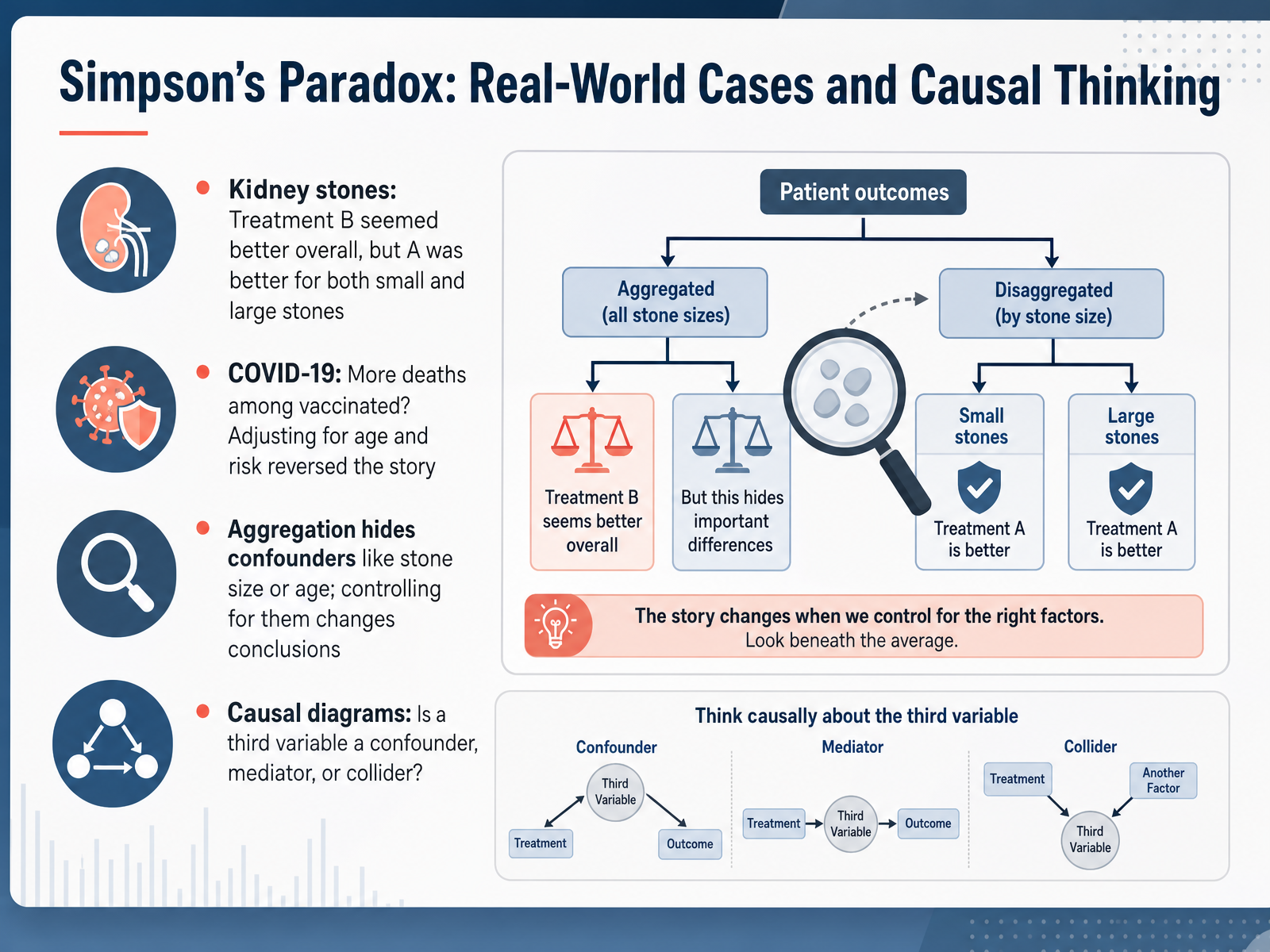
 - 11Simpson’s Paradox: Real-World Cases and Causal ThinkingNow let's look at two real-world cases that bring Simpson's paradox to life. First, the classic kidney stone study. Overall, treatment B appeared to have a higher success rate than treatment A. But when researchers stratified by stone size, the story reversed. Treatment A was actually better for both small stones and large stones. The aggregation hid the fact that doctors gave treatment A more often to harder cases with large stones, dragging its overall rate down. Next, consider COVID-19 data. In some reports, vaccinated people seemed to account for more deaths. Adjusting for age and baseline risk reversed the conclusion entirely, showing strong vaccine effectiveness. In both cases, aggregation concealed important confounders. To avoid being misled, we must think causally. When you see a third variable, ask a simple question: Is it a confounder, a mediator, or a collider? The answer changes whether you disaggregate, and how you read the results. Causal diagrams help you make that call before you trust a proportion or a comparison. Let's carry this forward. Next, we will focus on avoiding common errors in categorical comparisons.
 britannica.comstatisticsbyjim.compwacker.com+22 min
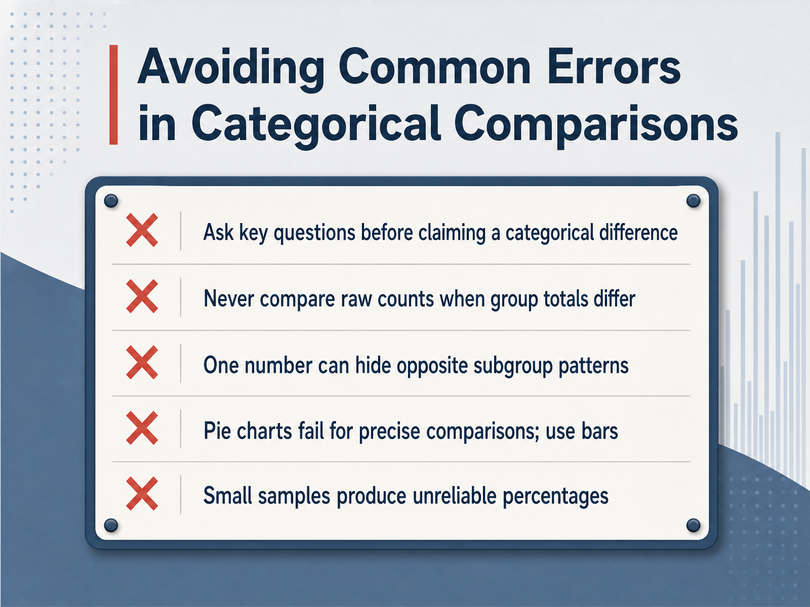
 - 12Avoiding Common Errors in Categorical ComparisonsNow let's look at some common errors to avoid when you're comparing categorical data. First, before you claim a difference between groups, step back and ask the key question: is this difference real, or could it just be noise? Never compare raw counts when the groups have different totals. For example, if Department A has five hundred employees and Department B has only fifty, comparing counts directly is misleading. Always convert to proportions or percentages first. Second, one overall number can easily hide opposite patterns in subgroups. This is Simpson's paradox. So always break down your data into relevant categories before drawing a conclusion. Third, avoid pie charts if you need precise comparisons. The human eye struggles to judge the size of angles accurately. A simple bar chart is almost always a better choice. Finally, be careful with small sample sizes. A percentage from just ten or twenty observations is highly unstable and can change dramatically with one or two new data points. When the base size is tiny, present the counts alongside the percentage and treat the result with caution. Next, we'll bring everything together by building your comparison workflow.
 1 min
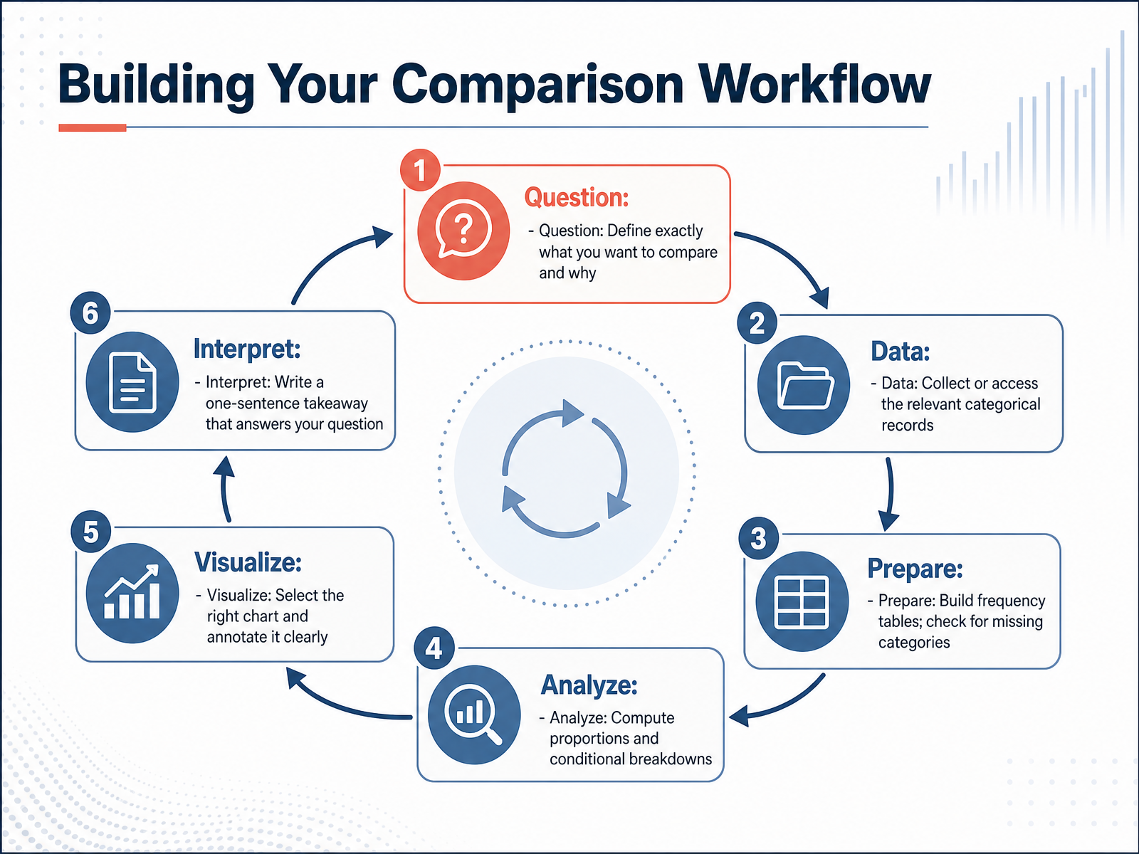
1 min - 13Building Your Comparison WorkflowLet's now pull everything together into a clear comparison workflow. The process always starts with a precise question. Define exactly what you want to compare and why—for example, 'Does product preference differ by age group?' Next, collect or access the relevant categorical records. Build frequency tables and check for any missing categories that could distort your results. Once your data is clean, compute the proportions and conditional breakdowns, choosing a proportion over a raw count whenever group sizes differ. Then select the right chart, such as a grouped bar chart, and annotate it clearly. Finally, interpret the result with one sentence that directly answers your original question. Up next, we will apply this workflow with a peer review checklist and quality assurance step.
 1 min
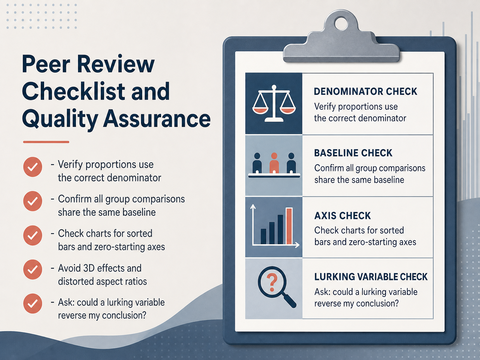
1 min - 14Peer Review Checklist and Quality AssuranceNow we turn to quality assurance with a peer review checklist. First, verify that all your proportions use the correct denominator. For example, if you are comparing satisfaction by product category, the denominator must be the total respondents for that specific category, not the overall survey total. Second, confirm that every group comparison shares the same baseline. When you compare proportions across departments, make sure each proportion is calculated from its own department's total. Next, check your charts carefully. Bars should be sorted logically, often by frequency, and the value axis must always start at zero to avoid exaggerating differences. Avoid three-dimensional effects and distorted aspect ratios, these visual tricks can mislead your audience. Finally, ask yourself a critical question: could a lurking variable reverse my conclusion? A hidden grouping factor might explain the pattern you see. Apply these checks to every chart and table you produce.
 1 min
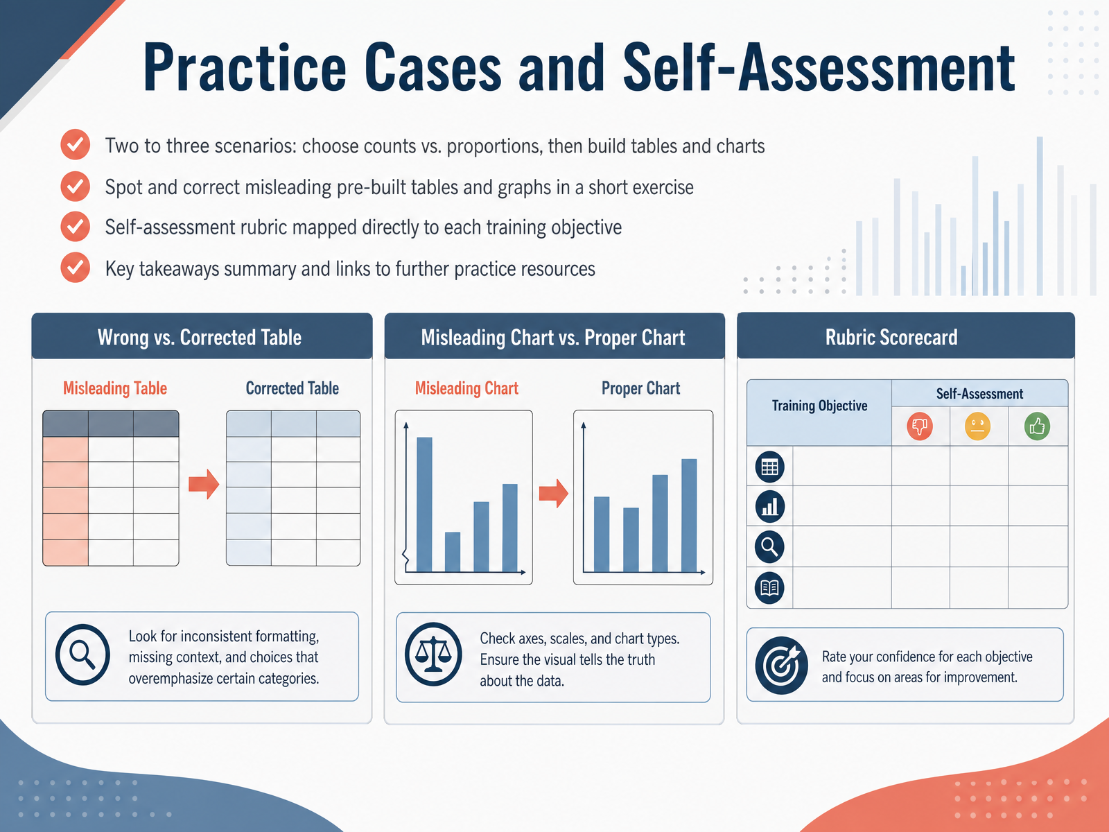
1 min - 15Practice Cases and Self-AssessmentNow let's put everything into practice. In this final section, you will work through two to three real-world scenarios. For each one, decide whether counts or proportions tell the clearer story. Then build the frequency table and choose the right bar chart. Next, you will find an exercise with pre-built tables and graphs that are intentionally misleading. Your task is to spot what is wrong and correct it. After that, use the self-assessment rubric on your screen. It is mapped directly to each training objective, so you can check your own understanding step by step. Let's quickly recap the key takeaways. Use counts when group sizes are equal and you need the raw numbers. Choose proportions when comparing groups of different sizes. Always build clear frequency tables first, then select a chart that supports honest comparisons. And when you read someone else's graph, pause and check the scale and the baseline. Thank you for working through this module. You now have a practical framework for summarizing and comparing categorical data. Keep practicing with the linked resources, and trust your ability to make data clear and accurate.
 2 min
2 min
Take the deck with you
Download this course as a file — free, no sign-up needed.
- PDF handoutEvery slide page, ready to print or share.16 pages · 3.7 MBDownload
- Narrated PowerPointThe deck that presents itself — every slide carries the digital human's narration video.16 pages · 15.3 MBDownload
- PowerPoint slidesThe full deck as a .pptx — open it in PowerPoint, Keynote, or Google Slides.16 pages · 3.6 MBDownload
Free to use in your own training — please keep the PersonWise credit page at the end.
Have your own deck? Turn it into a course
Sources consulted
Web sources consulted while building this course.
- How to choose between a bar chart and pie chart — atlassian.com
- Choosing the Right Graph for Your Data: A Decision Tree Approach — statology.org
- Everything you think you know about pie charts is wrong | Observable — observablehq.com
- Pie Chart vs Bar Chart: When to Use Each Type — Data Visualization Guide — makepiechart.com
- Data Visualization: Chart Types — guides.lib.uoguelph.ca
- Simpson’s paradox | Definition, Example, and Explanation | Britannica — britannica.com
- Simpsons Paradox Explained - Statistics By Jim — statisticsbyjim.com
- An explorable explanation of Simpson's paradox — pwacker.com
- Simpson’s Paradox (Stanford Encyclopedia of Philosophy) — plato.stanford.edu
- Simpson's Paradox—explained with causal diagrams - To Summarise — tosummarise.com