Data Visualization Fundamentals
Begin
14 pages · ~28 min
Data Visualization Fundamentals
Learn to design clear, impactful data visualizations by applying core principles of chart selection, visual encoding, and storytelling with data.
What you’ll learn
- 01Data Visualization FundamentalsWelcome to Data Visualization Fundamentals. This training is designed for analysts, business professionals, students, and anyone who creates reports. The goal is simple. We want to help you turn raw data into clear, readable visuals that support real decisions. You do not need any design background to follow along. If you have ever stared at a spreadsheet and wondered how to present it, you are in the right place. Over the next few slides, we will cover the core reasons visualization matters in business and analysis. We will look at what this training includes and what you will be able to do by the end. We will also explore how a well-chosen chart can move a conversation from confusion to action. A good visual respects the reader’s time. It makes the key point obvious and supports a confident next step. That is our focus throughout. So keep an open mind, and do not worry about making everything perfect at first. Clarity comes from deliberate choices, and we will build those skills together. Let’s get started by looking at why we visualize data in the first place.2 min
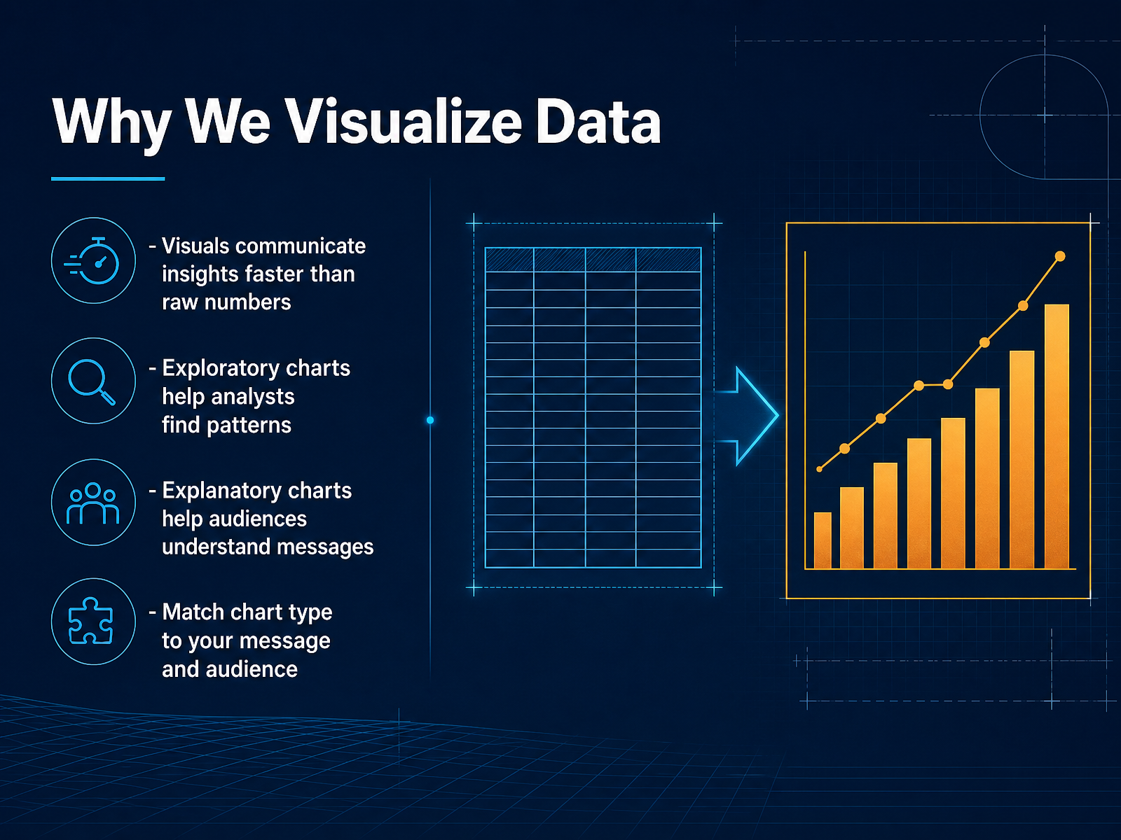
- 02Why We Visualize DataLet's get into why we visualize data in the first place. A well-designed chart communicates insight much faster than a table of raw numbers. Your eye can spot a trend or an outlier in a second, where a spreadsheet might take minutes to scan. When you are exploring data, charts help you find patterns yourself. You can notice relationships, clusters, or gaps that were never obvious before. When you are explaining findings to others, charts do the heavy lifting. They turn your analysis into a clear, memorable message. The key is to match the chart type to your specific message and your audience. A scatter plot might be perfect for one audience and confusing for another. So always ask what you want the reader to see, and what they need to understand. Up next, we will look at how our eyes and brains actually read charts.
 1 min
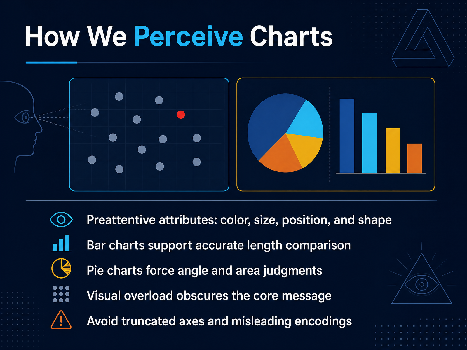
1 min - 03How We Perceive ChartsLet's take a quick look at how we actually perceive charts, because that determines whether your message lands clearly or gets lost. Our eyes pick up certain things almost instantly. Color, size, position, and shape. Those are preattentive attributes. They help viewers notice differences before they even start reading. Bar charts fit this well, because we compare lengths accurately without much effort. Pie charts, on the other hand, force us to judge angles and areas, which is much harder for most people. When too many visual elements compete, overload happens, and the core message disappears. So avoid truncated axes that distort scale. Also avoid misleading encodings that suggest a difference that isn't really there. Make deliberate choices that help your reader see the real story fast. Up next, we'll use these ideas to choose the right chart type for your data.
 1 min
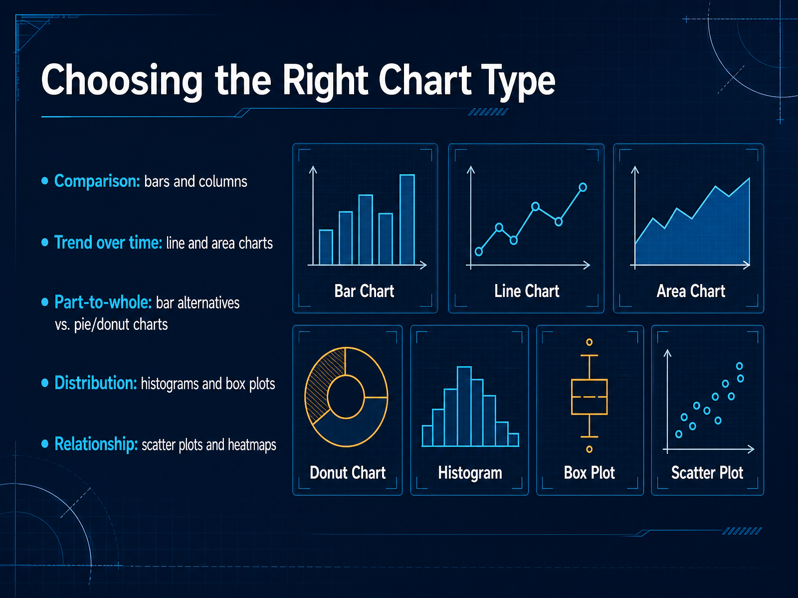
1 min - 04Choosing the Right Chart TypeNow, let's make that visual choice count. The chart you pick is really about the question you're answering. If you're comparing categories, like sales by region, bar charts are your workhorse. Columns work too. For trends over time, think line charts or area charts. They show movement and momentum clearly. When you need to show parts of a whole, be careful. Pie charts are common, but bar alternatives are often easier to read because our eyes compare length better than angle. If you want to see how your data is spread out, use a histogram for one variable, or a box plot to spot the middle and the outliers. And to explore relationships between two measures, scatter plots and heatmaps are your best friends. Remember, the goal is always a visual that is fast to read and easy to act on. Next, we'll put this into practice with a decision framework for chart selection.
 1 min
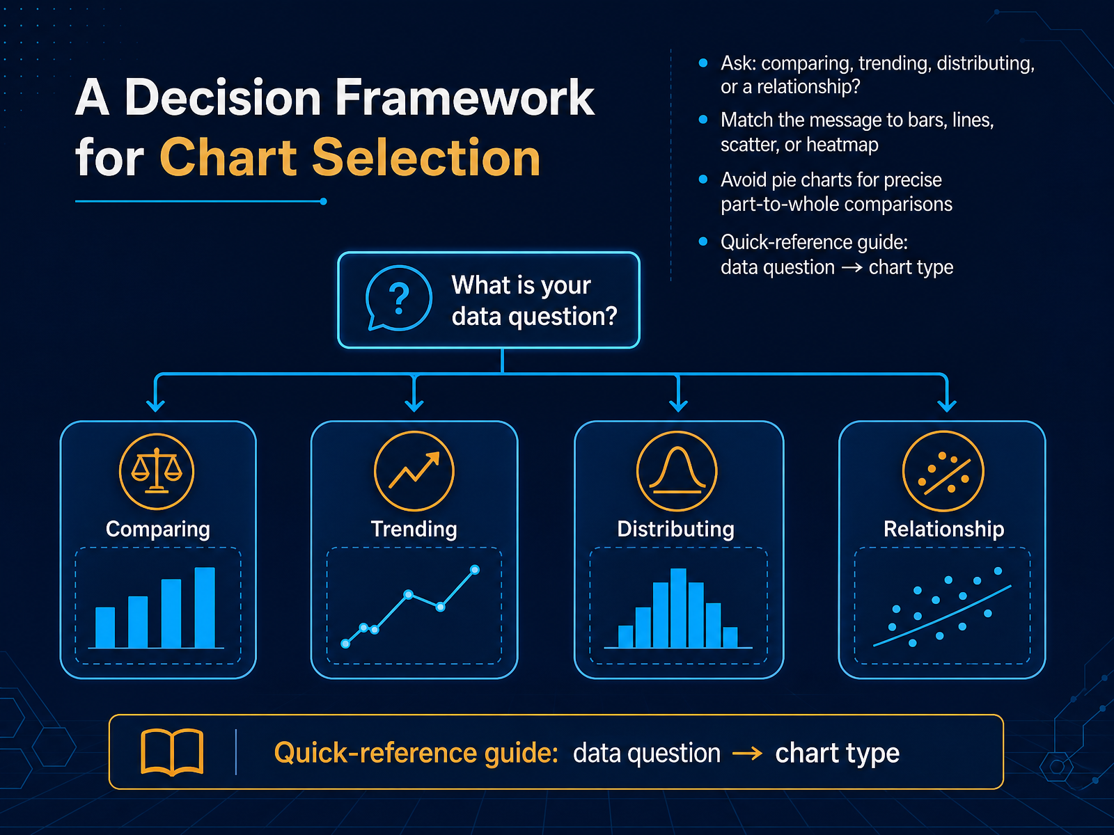
1 min - 05A Decision Framework for Chart SelectionNow let’s make chart selection feel less like guesswork. Start with four simple questions. Are you comparing categories, tracking a trend over time, showing how parts make up a whole, or exploring a relationship between two numbers? Let the answer guide your chart. Comparisons usually work best with bar charts. Trends over time call for line charts. Relationships often become clearer with scatter plots or heatmaps, especially when you have a lot of data points. And avoid pie charts when people need to make precise part to whole comparisons, because our eyes are not great at judging small angle differences. A straightforward bar chart is almost always easier to read for that task. Keep this quick reference in mind: first identify the data question, then match it to a chart that makes the answer obvious. Up next, we’ll look at using color effectively so those choices stay clear and accessible.
 1 min
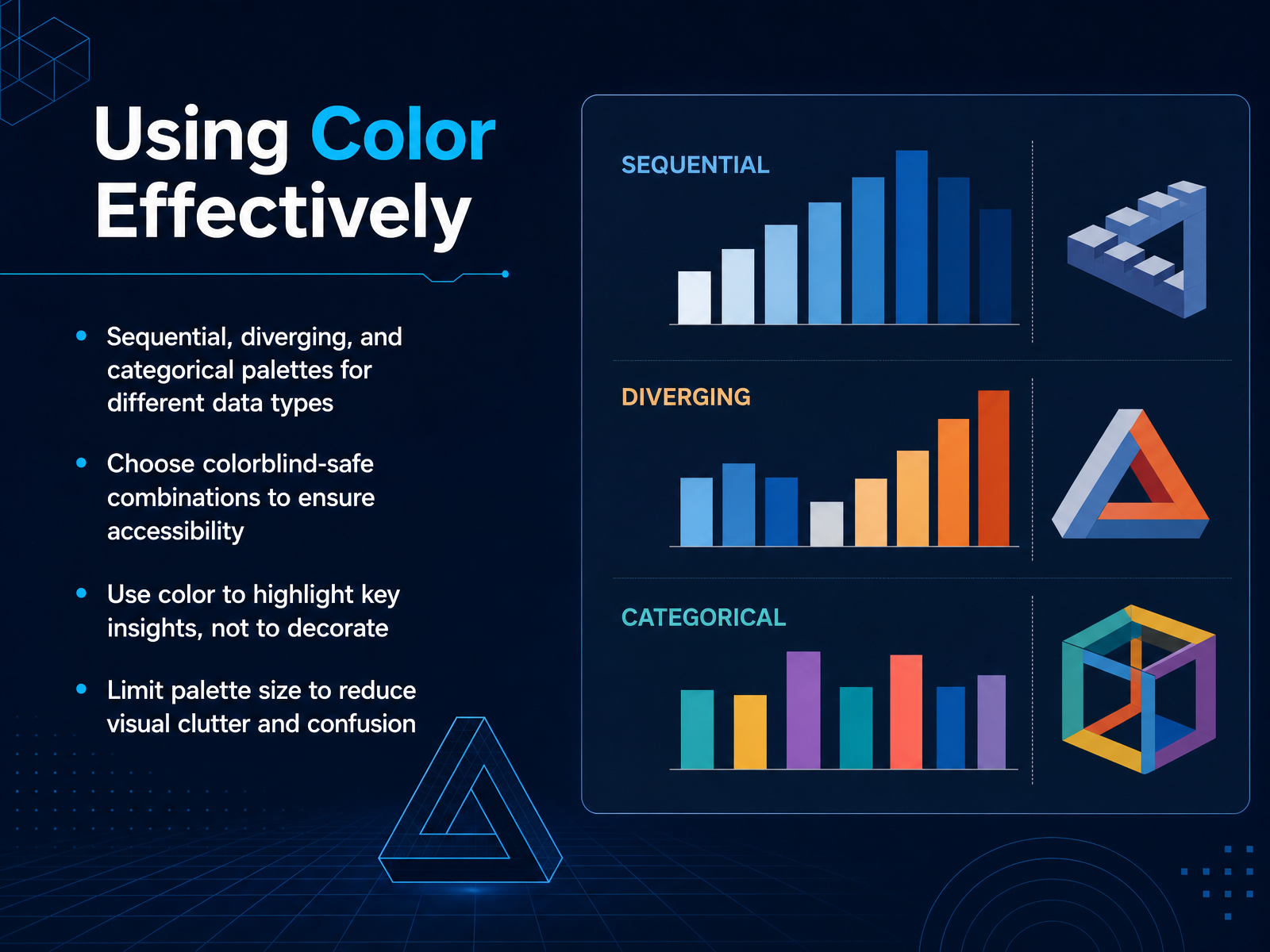
1 min - 06Using Color EffectivelyNow let us talk about color. Color can make a chart easier to read, or much harder to read. The first rule is to match the palette to the data type. Use sequential palettes when values go from low to high, diverging palettes when values sit on two sides of a midpoint, and categorical palettes when you are comparing distinct groups. Second, choose colorblind-safe combinations. Simple blues and oranges usually work better than reds and greens. Third, use color to highlight a key insight, not to decorate. If everything is bright, nothing stands out. Finally, keep your palette small. Too many colors create visual clutter and slow down interpretation. Think of color as a guide for the reader, not as decoration. Next, we will look at simplifying chart elements.
 1 min
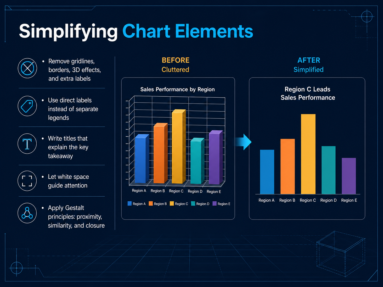
1 min - 07Simplifying Chart ElementsNow let's make those charts easier to read by simplifying the elements around them. Start by removing anything that doesn't carry useful information. That usually means gridlines, borders, three-dimensional effects, and redundant labels. They add visual noise, not insight. Instead of a separate legend, place labels directly next to the data points so the reader doesn't have to search back and forth. And write your title as the key takeaway, not just a description. For example, say sales rose twenty percent in quarter three, rather than simply sales by quarter. Then let white space do the work. Extra space around the chart guides attention to the most important part. You can also apply a few Gestalt principles. Keep related items close together. Make similar items look similar through color or shape. And let the mind complete familiar shapes so you need fewer lines and boxes. These small removals and groupings make the visual feel calm and focused. The reader sees the point quickly and trusts the chart more. Next, we'll move from cleaner charts to telling a story with data.
 2 min
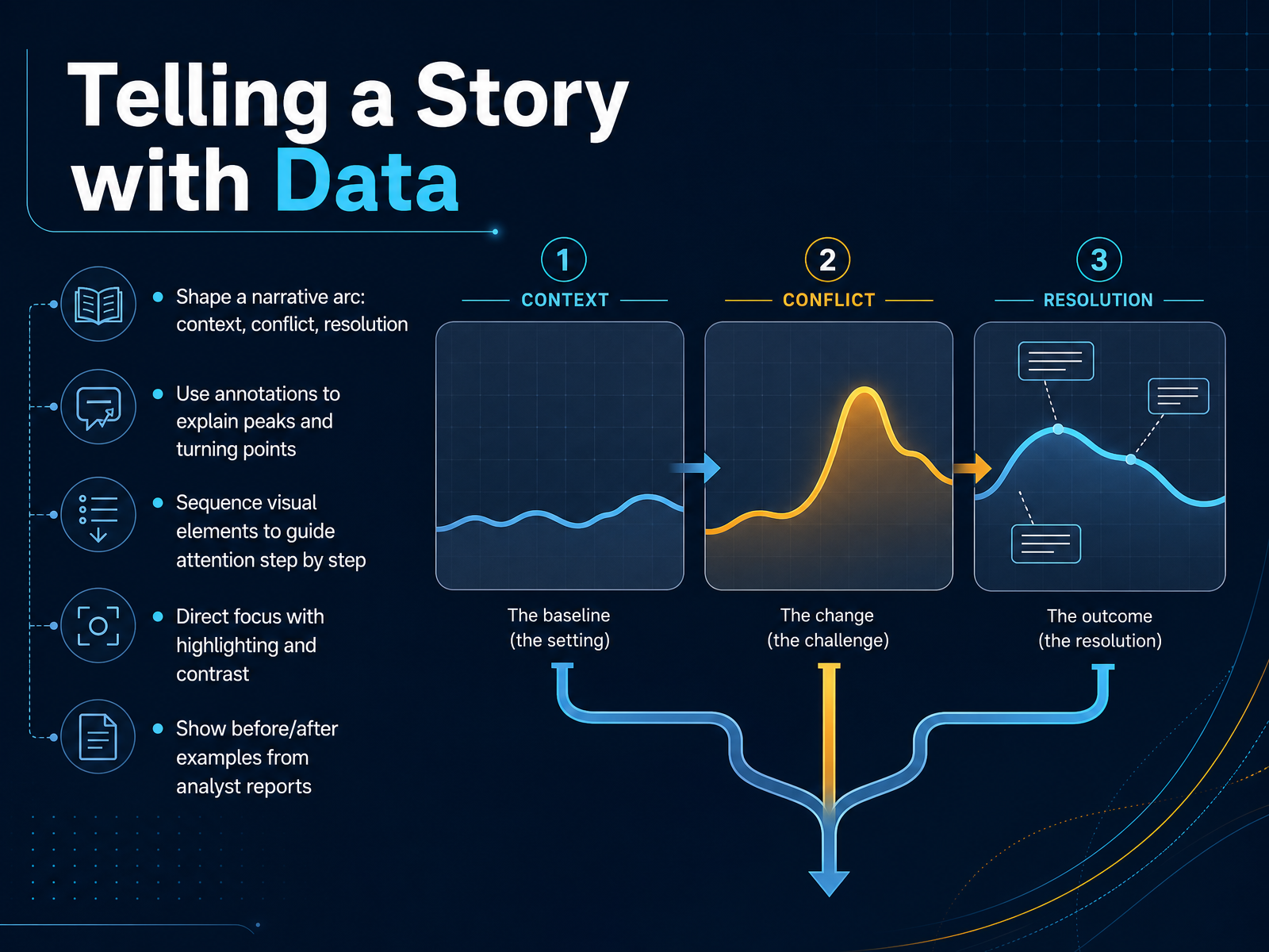
2 min - 08Telling a Story with DataLet’s move from individual charts to the bigger picture: telling a story with data. Think of your visual as a simple narrative arc. Start with context, the current situation or baseline. Then introduce the conflict, the change, gap, or unexpected shift. End with the resolution, the outcome or recommended action. This structure gives your reader a reason to keep looking. Next, use annotations to explain peaks and turning points. A short label like “supply delay” or “campaign launch” can turn a confusing spike into a clear cause. Sequence your visual elements step by step. If you are building a dashboard or slide, guide attention in the order you want the story understood. You can do this with placement, numbering, or progressive reveals. Direct focus with highlighting and contrast. Make the key bar darker, gray out the less important lines, or add a subtle background to the critical region. The reader should never have to guess what matters. To make this practical, compare before and after examples from analyst reports. The before version often shows all the data, but no clear path. The after version shows fewer distractions, clearer labels, and one dominant insight. That is the shift we are aiming for. So the takeaway is this: a good data visual respects the reader’s time by showing not just what happened, but why it matters and what to do next. Up next, we’ll look at common visualization pitfalls, and how to avoid them.
 2 min
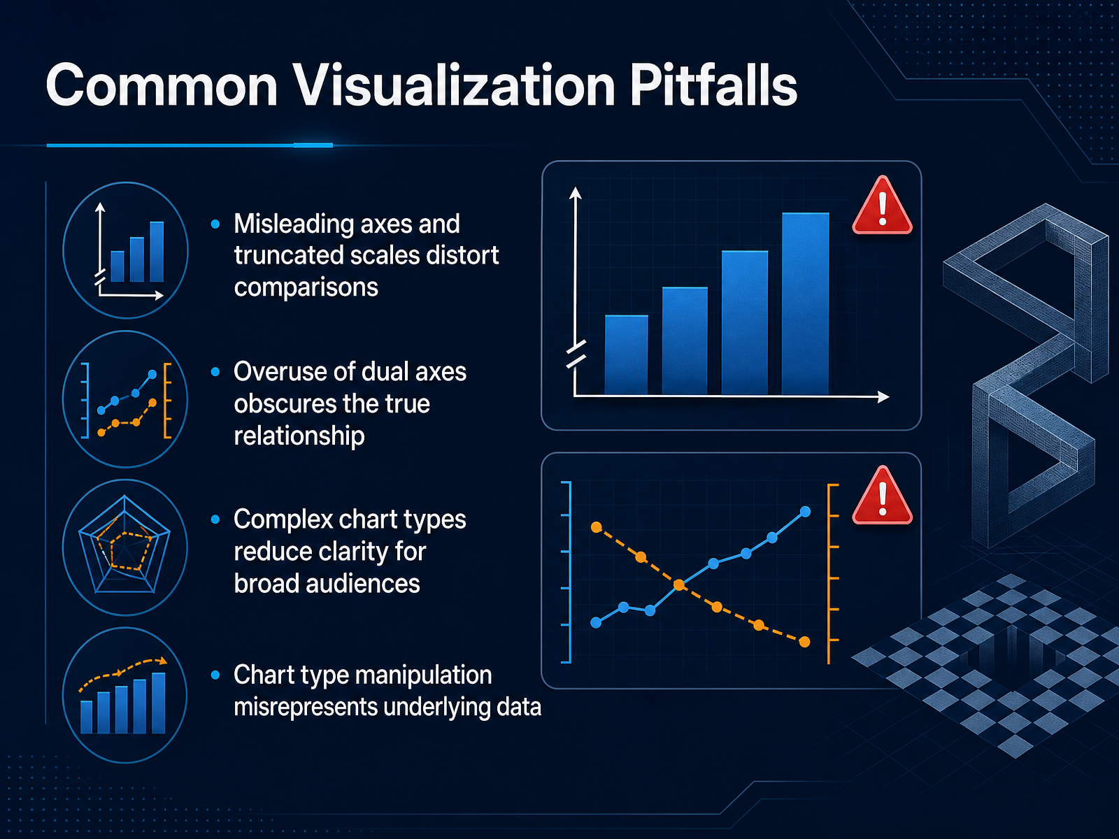
2 min - 09Common Visualization PitfallsNow let's talk about the mistakes that quietly undermine a chart's credibility. First, watch your axes. Truncating the y-axis, or starting it far above zero, can make a small difference look enormous. Always ask whether the scale honestly reflects the size of the change. Second, be careful with dual axes. Overlaying two different measures can suggest a relationship that isn't really there, so reserve this approach for cases where the comparison is genuinely meaningful. Third, resist complexity for its own sake. Fancy chart types may impress a few people, but they usually slow down a broad audience. A simple bar or line is often the fastest path to understanding. And fourth, never choose a chart type just to force a story. If changes in visual form make the data appear more dramatic, you're misrepresenting the underlying numbers. A quick check is to ask whether a colleague would read the same message from the raw data alone. When in doubt, simplify and respect your reader's time. Up next, we'll connect these choices to ethics and accuracy in visualization.
 2 min
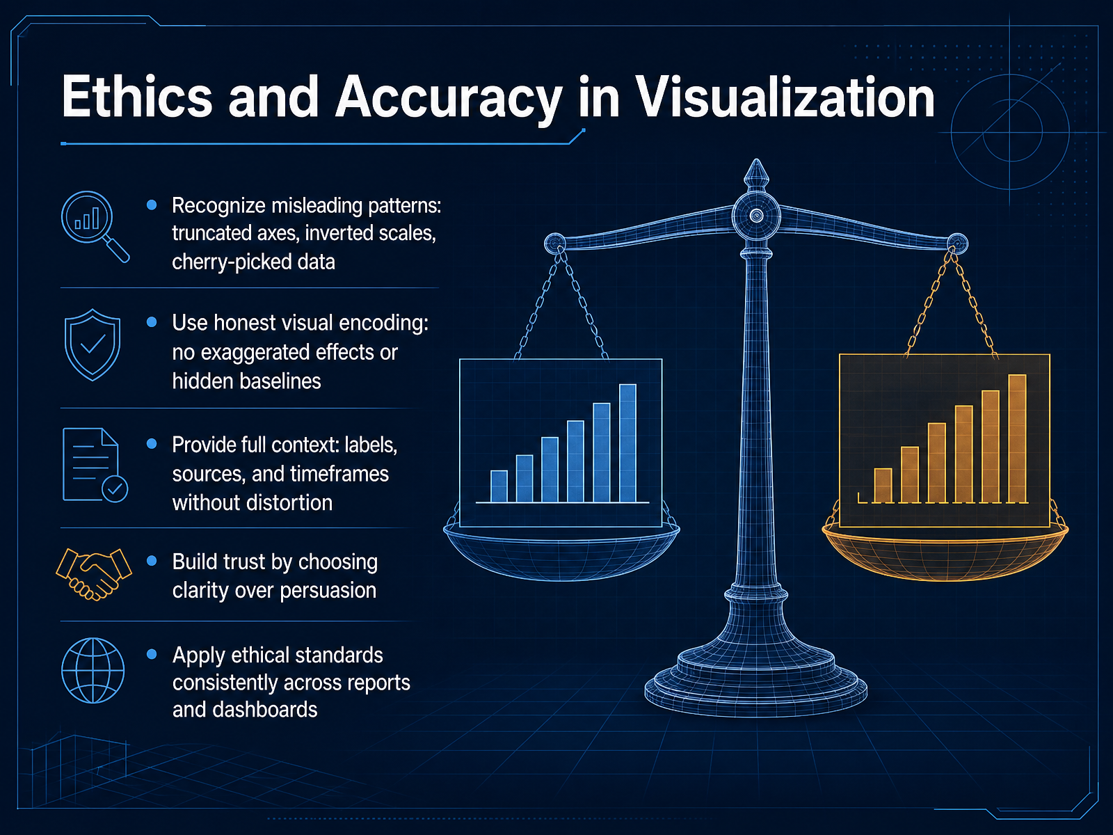
2 min - 10Ethics and Accuracy in VisualizationNow let's talk about ethics and accuracy in visualization. This is where good chart making becomes responsible chart making. First, learn to recognize misleading patterns. Truncated axes, inverted scales, and cherry-picked data can all make a weak story look strong. If a bar chart starts at fifty instead of zero, small differences suddenly look dramatic. Always check the baseline. Second, use honest visual encoding. Avoid exaggerated effects or hidden baselines. A three dimensional pie slice may look impressive, but it distorts proportions. Keep the visual representation true to the numbers. Third, provide full context. Labels, sources, and timeframes should be complete and placed so the reader can see them without effort. If you are showing only one quarter, say so. If the data source is internal, name it. Context prevents misunderstanding. Fourth, build trust by choosing clarity over persuasion. A clean, accurate chart builds more confidence over time than a flashy visual that overstates the result. And finally, apply these ethical standards consistently. The same rules should guide every report and dashboard you produce. When you protect the reader's ability to see the truth, you protect your own credibility. Next, we will look at tools for creating dashboards and reports, so you can put these principles into practice.
 2 min
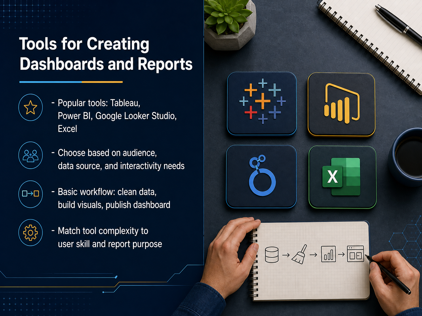
2 min - 11Tools for Creating Dashboards and ReportsNow let’s talk about the tools you can use to actually build these visuals. The most common options are Tableau, Power BI, Google Looker Studio, and Excel. Each one works, but the right choice depends on a few things: who will view the report, where your data lives, and how much interaction people need. Think of it this way. If your team already works in Microsoft tools, Power BI often fits naturally. If you need quick, free dashboards from Google Sheets, Looker Studio is a strong option. For deeper analytics and polished interactive reporting, Tableau is a great choice. And for simple business charts or a fast internal summary, Excel can still do the job well. The basic workflow is the same across tools. First, make sure your data is clean and organized. Then build the visuals one at a time. Finally, publish the dashboard so the right people can access it. Match the complexity of the tool to the skill of the user and the purpose of the report. A simple chart in Excel might beat an advanced dashboard in Tableau if the audience just needs one clear answer. Next, let’s walk through a simple workflow for planning a chart.
 2 min
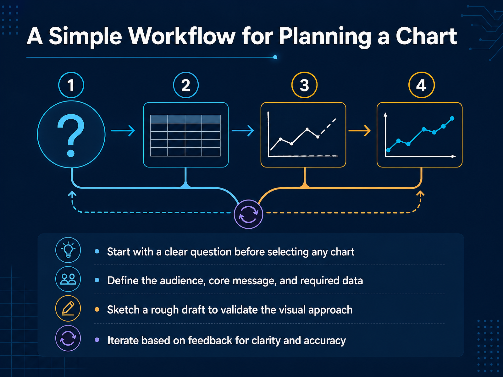
2 min - 12A Simple Workflow for Planning a ChartNow let’s put all of this into a simple planning workflow. Before you choose any chart, start with a clear question. What decision should this visual support? Then define your audience, your core message, and the data you actually need. That keeps you from adding information just because it is available. Next, sketch a rough draft before you build anything polished. A quick hand drawn version or a simple tool can reveal whether the visual approach makes sense. It is fine if the first sketch is imperfect. The point is to test the idea early. After that, share the draft and iterate based on feedback. Ask whether the message is clear, whether anything distracts, and whether the data reads accurately. Each small revision should make the chart easier to understand. In short, plan the question first, sketch early, and improve through feedback. Next, we will look at how to critique and improve the visuals you already have.
 1 min
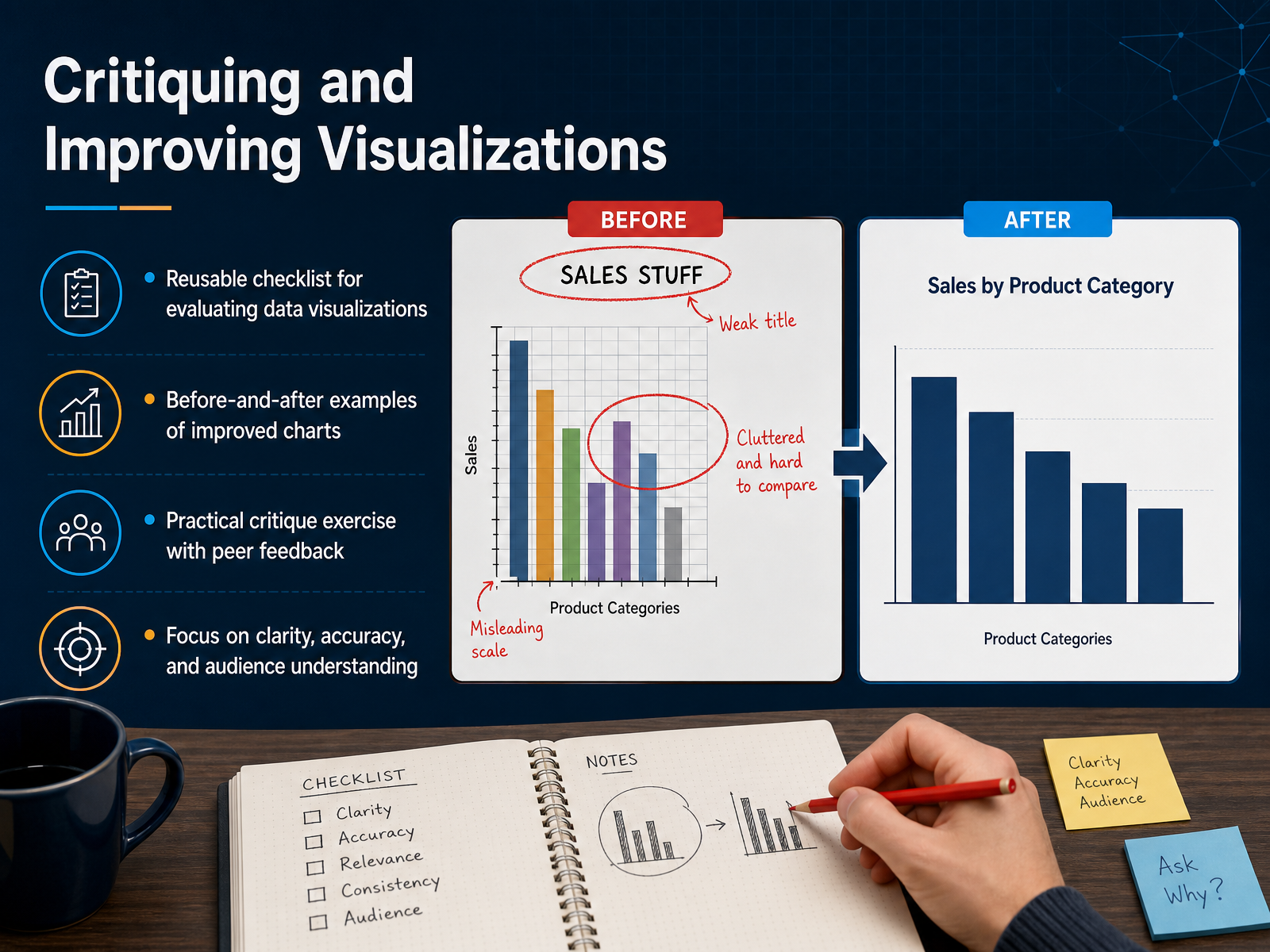
1 min - 13Critiquing and Improving VisualizationsNow let’s put everything into practice with a simple critique routine. Start with a reusable checklist before you share any visual. Ask three questions. Is the chart type appropriate? Is the information accurate and clearly labeled? And will the intended audience understand the message in under a minute? If any answer is no, that’s your signal to revise. Let’s look at a quick before and after. A common mistake is using a pie chart for twelve categories with overlapping colors and tiny labels. The improved version might use a horizontal bar chart, sorted by value, with direct labels and one highlighted insight. Same data, much faster to read. For your practice exercise, pick a chart you’ve made or seen recently. Review it with the checklist, then ask a colleague for one piece of feedback on clarity only. You don’t need a perfect redesign. You need the next deliberate improvement. In our final slide, we’ll map your next steps and how to keep building this skill.
 1 min
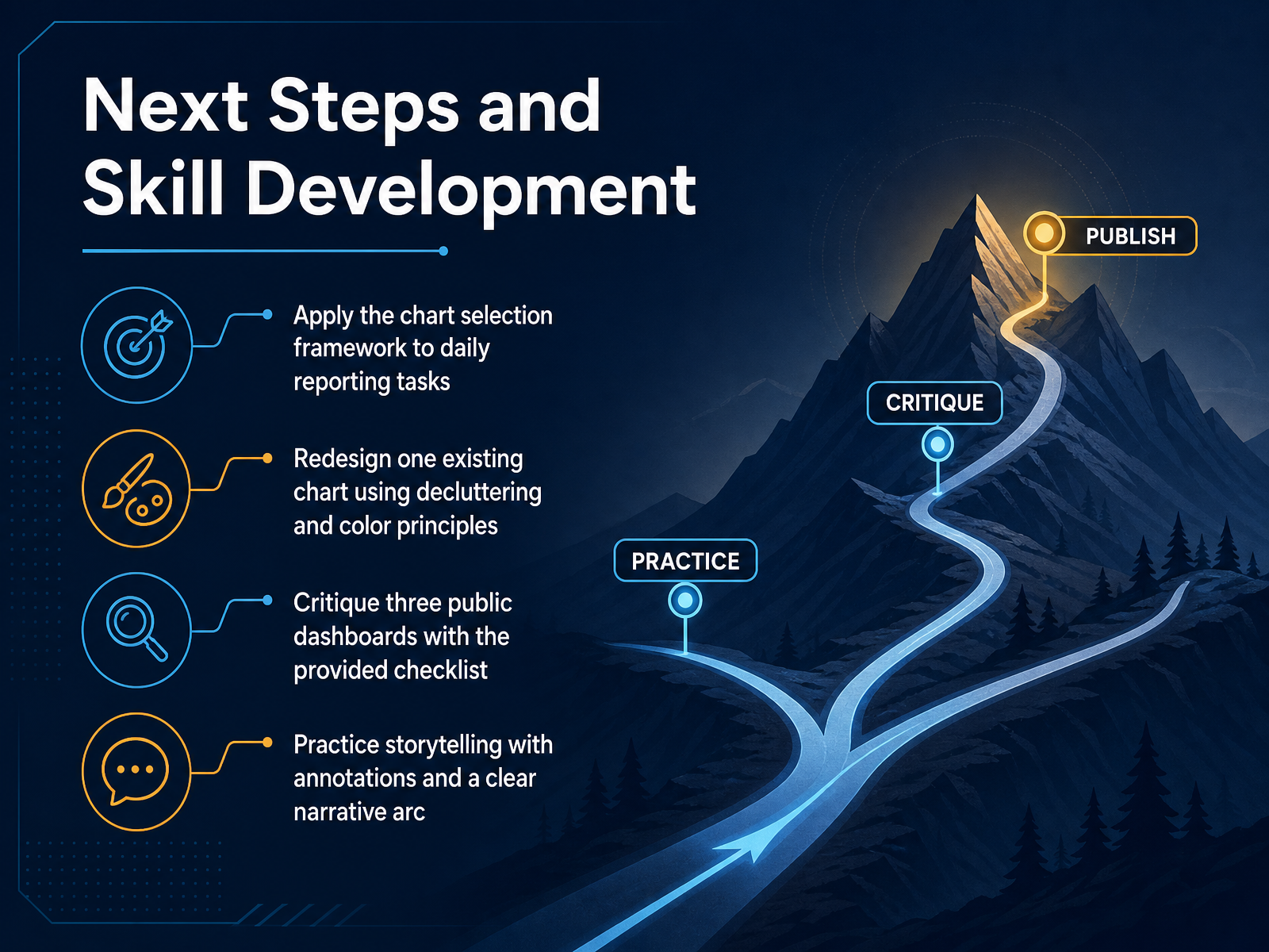
1 min - 14Next Steps and Skill DevelopmentLet’s turn these ideas into a simple practice plan. First, use the chart selection framework in your everyday reporting. When you need to show a trend, reach for a line chart. When you need to compare categories, try a bar chart. Second, take one existing chart and redesign it using the decluttering and color principles we covered. Remove anything that doesn’t help the reader, and make the most important point stand out. Third, review three public dashboards with the provided checklist. Ask what works, what confuses you, and what you would change. Finally, practice storytelling with annotations and a clear narrative arc. Before you share a visual, decide what you want the reader to notice first, then use a title, a callout, or a highlighted reference line to guide them there. These habits build real skill over time. Start small, compare your next version with the previous one, and keep asking one simple question: does this make the message easier to understand? Thank you for joining this training. Your attention to clear, thoughtful visuals will make every report you create more useful and more trusted.
 2 min
2 min
Take the deck with you
Download this course as a file — free, no sign-up needed.
- PDF handoutEvery slide page, ready to print or share.15 pages · 3.4 MBDownload
- Narrated PowerPointThe deck that presents itself — every slide carries the digital human's narration video.15 pages · 14.0 MBDownload
- PowerPoint slidesThe full deck as a .pptx — open it in PowerPoint, Keynote, or Google Slides.15 pages · 3.2 MBDownload
Free to use in your own training — please keep the PersonWise credit page at the end.
Have your own deck? Turn it into a course