Begin
14 pages · ~28 min
Avoiding Design System Mistakes
A practical training for designers and developers on identifying and avoiding common design systems mistakes to build more consistent, scalable products.
A digital instructor presents all 14 pages. Hold “Ask” at any point and ask out loud — the answer comes from this course. No sign-up needed.
What you’ll learn
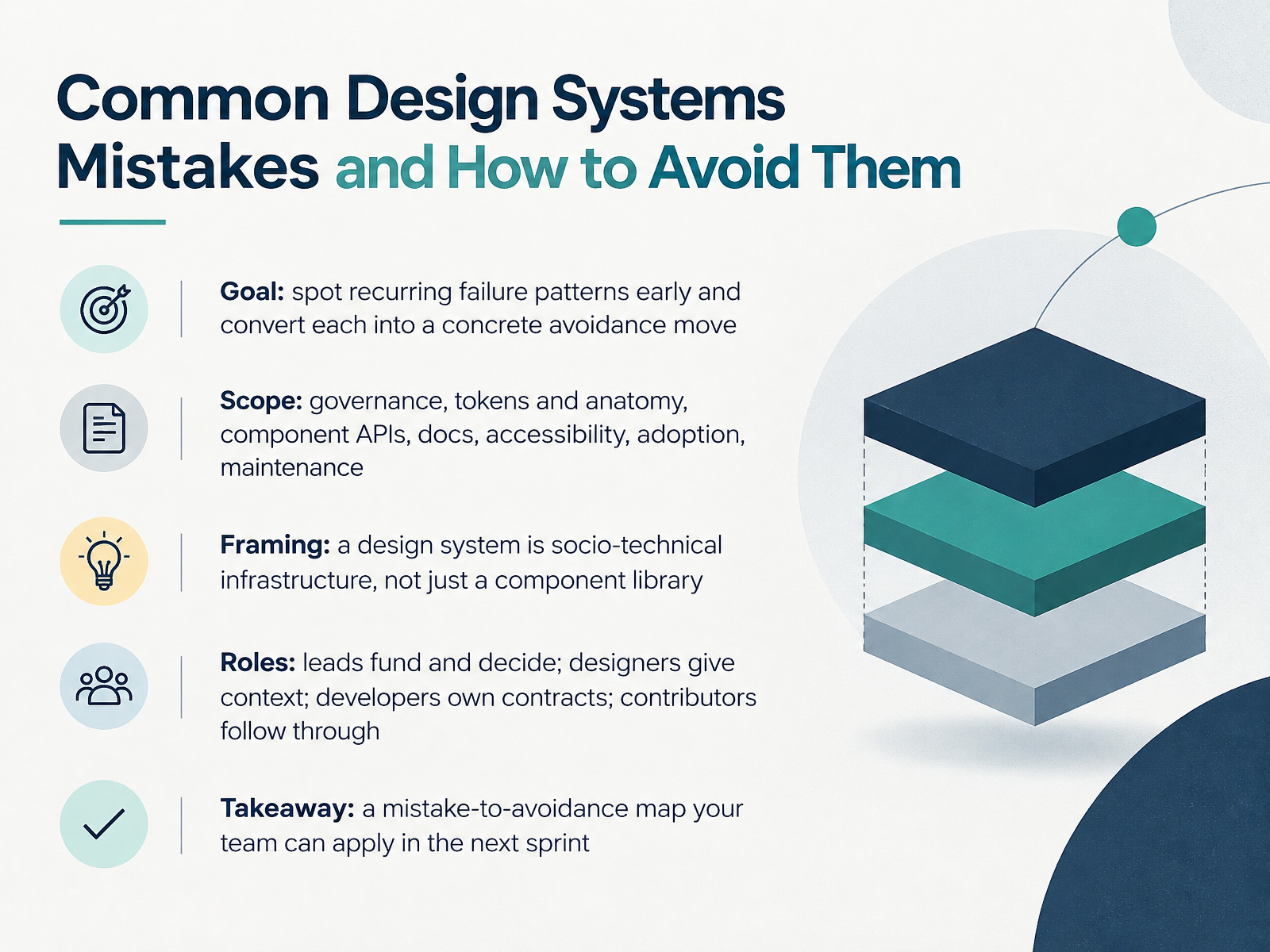
- 01Common Design Systems Mistakes and How to Avoid ThemWelcome, everyone. Today we're talking about common design systems mistakes and how to avoid them. Our goal is practical: spot recurring failure patterns early, and turn each one into a concrete avoidance move. We'll cover governance, tokens and component anatomy, component APIs, documentation, accessibility, adoption, and maintenance. One framing idea holds this together. A design system is socio-technical infrastructure, not just a component library. It's the people and processes as much as the code. So we'll name roles explicitly. Leads fund and decide. Product designers give context. Front-end developers own the contracts. Contributors follow through. By the end, you'll have a mistake-to-avoidance map your team can apply in the next sprint. Let's start with why design systems fail, looking at root causes and early warning signs.othr.zeroheight.comreport.zeroheight.comwebdesignerdepot.com+21 min
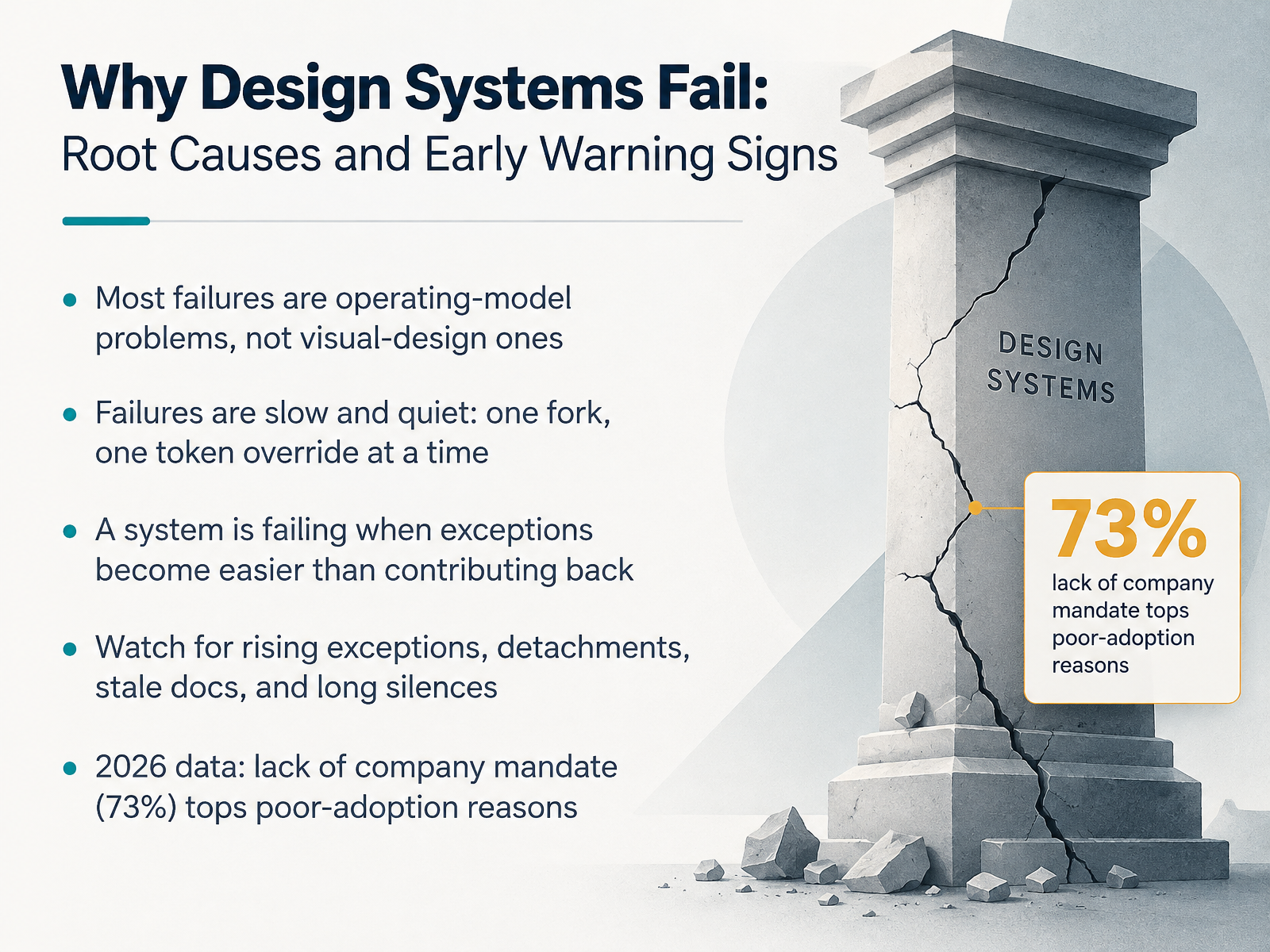
- 02Why Design Systems Fail: Root Causes and Early Warning SignsLet's look at why design systems actually fail. And here's the headline: most failures are operating-model problems, not visual-design ones. The components were probably fine. What broke was ownership, governance, and the path back into the system.
Failures are also slow and quiet. One team forks a component because it can't handle an edge case. Another overrides a token to hit a deadline. Nobody announces anything.
A system is failing when exceptions become easier than contributing back. So watch for rising exceptions, detached components, stale docs, and long silences on requests. A quick no keeps a team inside the system. A long silence sends them out for good.
And the data backs the mandate point: in 2026, lack of a company mandate was the top reason for poor adoption, at seventy-three percent. If usage is optional, expect drift.
Next, a diagnostic lens: what health looks like across six dimensions.
 doi.orguxdesign.cckennytran.design+22 min
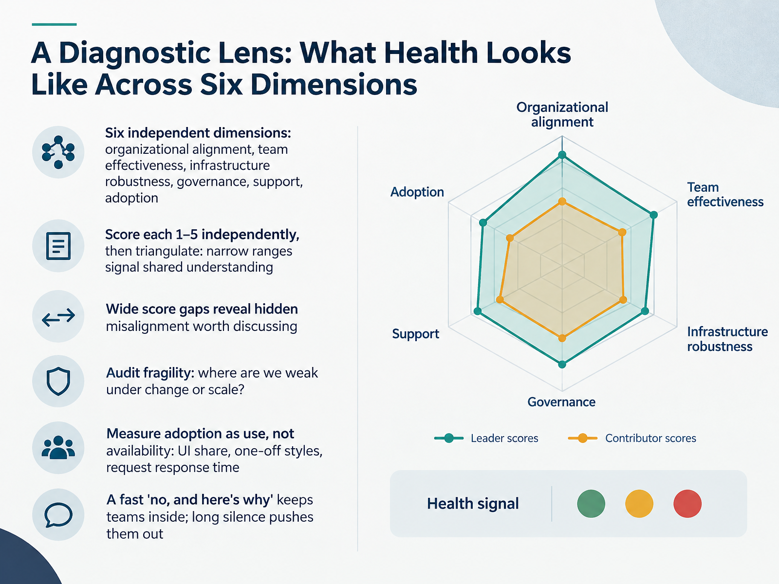
- 03A Diagnostic Lens: What Health Looks Like Across Six DimensionsSo how do we diagnose health? Use six independent dimensions: organizational alignment, team effectiveness, infrastructure robustness, governance, support, and adoption. Have four to eight evaluators, across the design-system team and product teams, score each dimension from one to five on their own before discussing. Then triangulate. Narrow score ranges signal shared understanding, so note them and move on. Wide gaps are the valuable part. If a product designer rates support a two and a design-system lead rates it a four, that is intended investment versus perceived impact, and it is worth a real conversation. Next, audit fragility. Ask where we are weak under change or scale. A three means functional but fragile, and that is normal, not failure. Finally, measure adoption as use, not availability. Track UI share, count one-off styles, and watch request response time. A fast no, with a reason, keeps teams inside the system. Long silence pushes them out to build their own. Mistake 1: No Clear Ownership or Governance Model.
 designsystem.digital.govfigr.designgithub.com+22 min
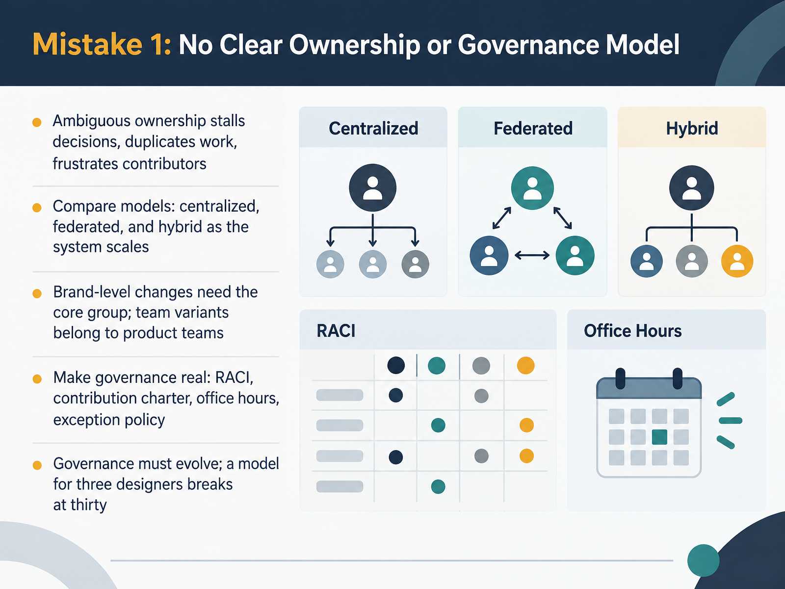
- 04Mistake 1: No Clear Ownership or Governance ModelMoving on, let's talk about the first common mistake: no clear ownership or governance model. When ownership is ambiguous, decisions stall. Work gets duplicated. And contributors get frustrated because nobody can tell them who approves what. There are three common models to compare. Centralized, where one core team owns everything. Federated, where product teams contribute and maintain their own pieces. And hybrid, which blends the two as the system scales. A practical rule: brand-level changes, like core tokens and foundational components, need the core group. Team-specific variants belong to the product teams. Now, make governance real. That means a RACI, which is a responsibility chart showing who is responsible, accountable, consulted, and informed. It means a contribution charter, office hours, and an exception policy for when teams need to deviate. And remember, governance must evolve. A model that works for three designers breaks at thirty. So review it as you grow. Next, we look at mistake two: treating the system as a component library only.
 2 min
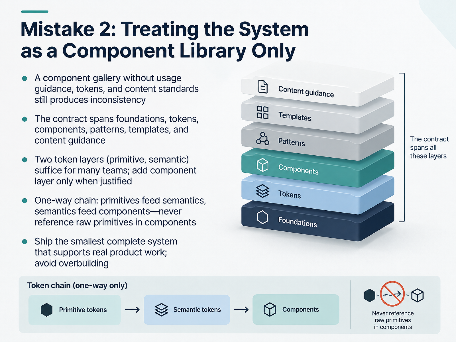
- 05Mistake 2: Treating the System as a Component Library OnlyLet's look at mistake two: treating the system as a component library only. A component gallery without usage guidance, tokens, and content standards still produces inconsistency. The system is a contract. It spans foundations, tokens, components, patterns, templates, and content guidance. So who owns what? The design-system lead sets the contract and the token layers. The product designer applies it and flags gaps. The front-end developer keeps components on semantic tokens, never raw values. The contributor documents usage and content standards. On tokens: two layers, primitive and semantic, suffice for many teams. Primitives hold raw values. Semantics name intent, like action primary background. Components read those semantics. Add a component layer only when justified, for example when a semantic token outgrows what it can specify across a button, a badge, and a focus ring. Keep one-way dependencies: primitives feed semantics, semantics feed components. Never reference raw primitives in components. And ship the smallest complete system that supports real product work. Avoid overbuilding. The takeaway: a gallery alone won't fix consistency. Tokens, guidance, and clear ownership will. Next, mistake three: designing components in isolation from product context.
 figma.comcss-architecture.compathtoproject.com+22 min
- 06Mistake 3: Designing Components in Isolation From Product ContextNext, let's talk about designing components in isolation from product context. A component does not become a design system asset just because it looks good on its own. The real test is how it holds up in actual product screens.
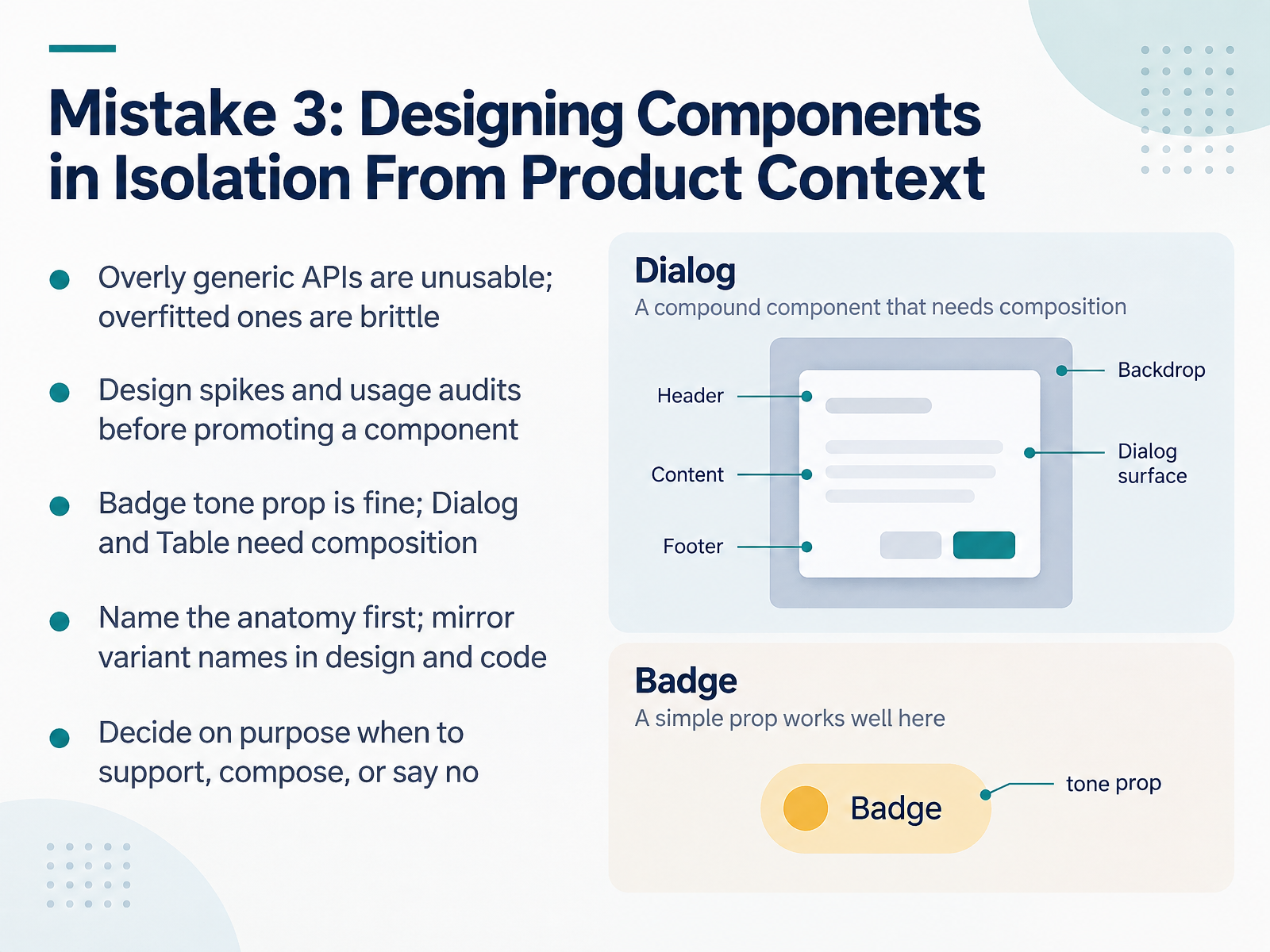
The first symptom is the API. An API is the set of props and behaviors other developers use to work with your component. Overly generic APIs are unusable, because callers cannot express what they actually need. Overfitted APIs are brittle, because every new product case forces a change to the shared component.
So before promoting a component, run design spikes and usage audits. A design spike is a short, time-boxed prototype in real screen context. A usage audit means reviewing where the component actually appears and what people are trying to do with it. A Badge with a tone prop is fine. A Dialog or a Table needs composition, where callers assemble named parts instead of pushing variation through more and more props.
Name the anatomy first. Write down the parts, like trigger, content, and item, before any code. Then mirror variant names in design and in code, so a product designer and a front-end developer are talking about the same thing. Finally, decide on purpose when to support a request, when to compose, and when to say no. That decision belongs to the design-system lead, but it depends on evidence that contributors and product designers bring from real usage.
Mistake 4: Documentation That Doesn't Support Real Decisions.
 2 min
- 07Mistake 4: Documentation That Doesn't Support Real DecisionsLet's look at mistake four: documentation that doesn't support real decisions. Docs fail when they describe what a component is, but skip when and why to use it. A product designer arrives with a real product question. The doc should answer it, not just show a picture.
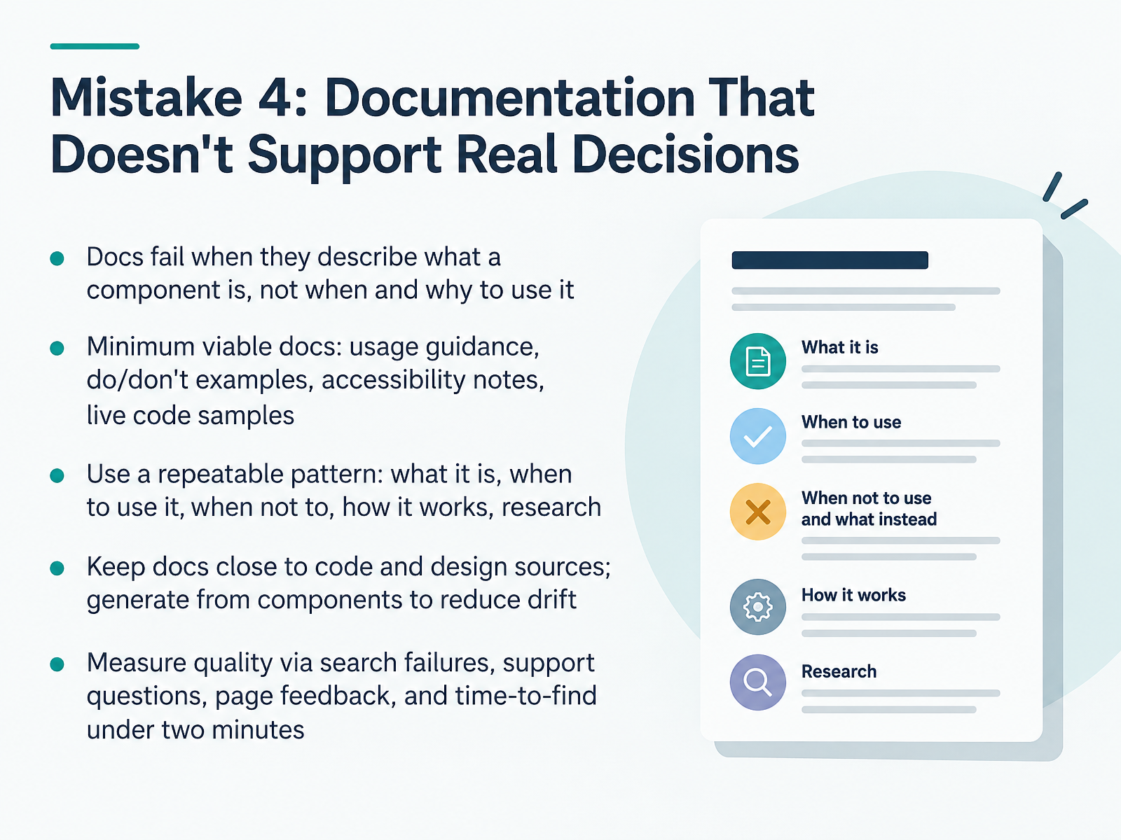
Start with a minimum viable set of docs: usage guidance, do and don't examples, accessibility notes, and a live code sample. Then use a repeatable pattern across every component: what it is, when to use it, when not to use it, how it works, and what research supports it. That structure builds trust, because people know where to look.
Keep docs close to code and design sources. Generate them from the components themselves so they don't drift. Drift misleads people, and that's worse than no docs. For front-end developers, a live rendered example that updates with the code saves a support thread. For contributors, the pattern makes writing and reviewing straightforward.
Finally, measure quality. Track search failures, support questions, page feedback, and time-to-find. If people can't find the answer in under two minutes, they'll rebuild the component. Next, we'll look at mistake five: weak accessibility and inclusion practices.
 2 min
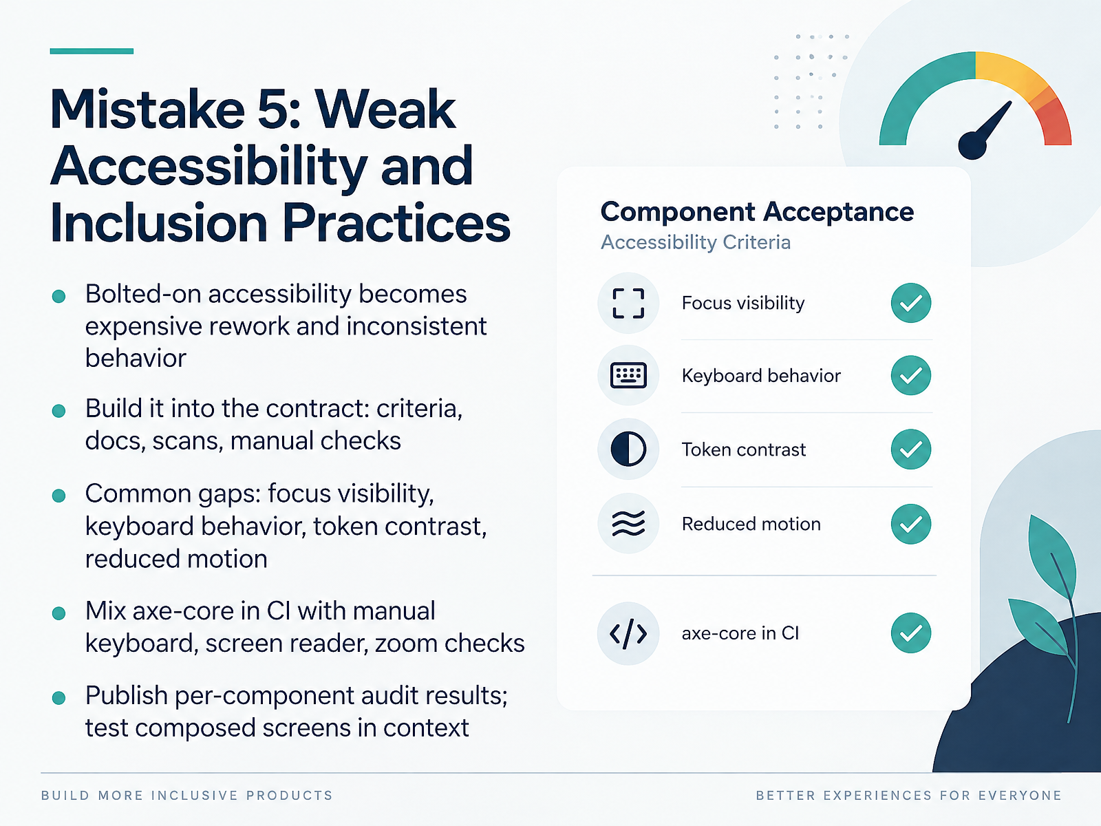
- 08Mistake 5: Weak Accessibility and Inclusion PracticesLet's turn to mistake five: weak accessibility and inclusion practices. Treating accessibility as something bolted on at the end is expensive. You get rework, and behavior that's inconsistent from one component to the next. The fix is to build it into the contract. Design-system leads, define criteria and publish documentation. Front-end developers, wire automated scans into continuous integration. Contributors, run manual checks before you call a component done. Four gaps show up again and again: focus visibility, keyboard behavior, token contrast, and reduced motion. Mix axe-core in CI with manual keyboard, screen reader, and zoom checks. Publish audit results per component, and test composed screens in context, because some issues only appear when components meet. Next, mistake six: launching without an adoption and migration plan.
 1 min
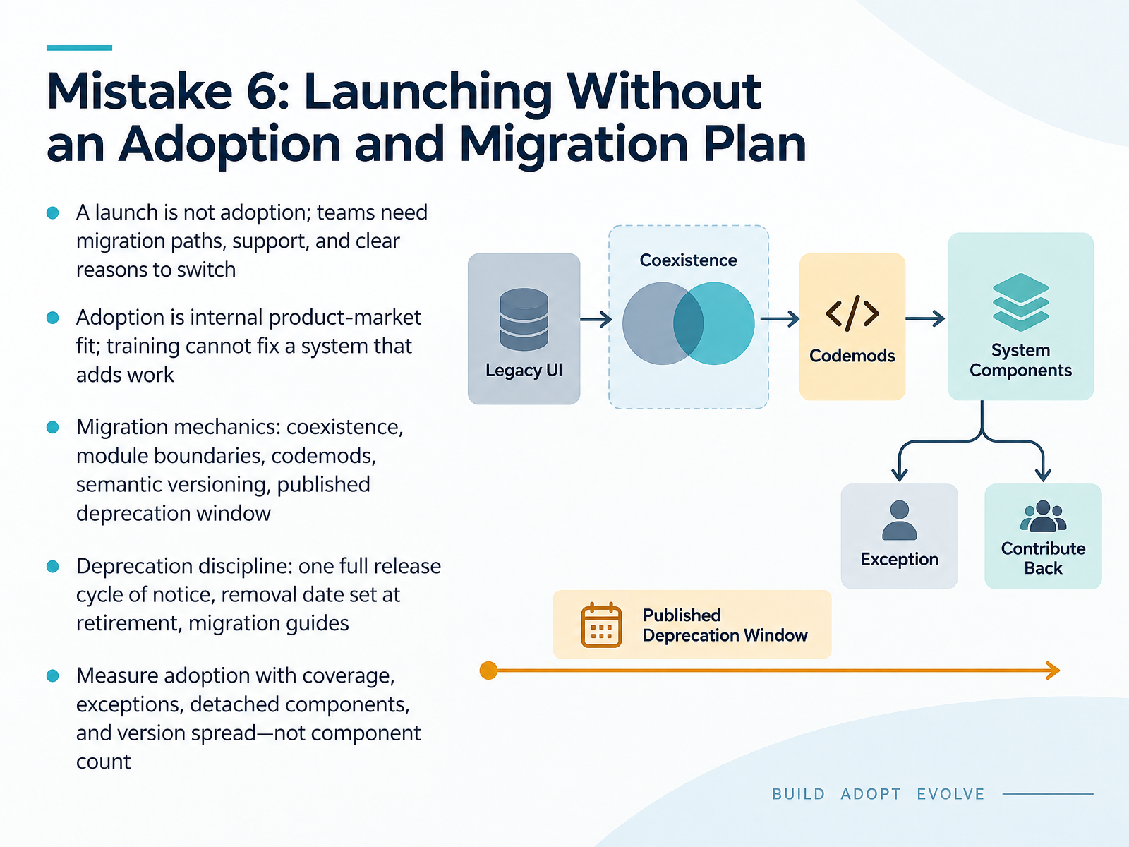
- 09Mistake 6: Launching Without an Adoption and Migration PlanAnd that brings us to mistake number six: launching without an adoption and migration plan. A launch is not adoption. Teams need a migration path, real support, and a clear reason to switch. Think of adoption as internal product-market fit. Training will not fix a system that adds work. On migration mechanics, lead the way with coexistence, so old and new components run side by side. Use module boundaries to move whole pages at once, and codemods, which are scripted code rewrites, to handle repetitive changes. Keep semantic versioning so every change is predictable, and publish a deprecation window. On deprecation discipline, give at least one full release cycle of notice, set the removal date when you announce retirement, and ship a migration guide. Then measure adoption with coverage, exceptions, detached components, and version spread, not component count. Your takeaway: plan the exit from day one. Next, Mistake 7: Ignoring Maintenance, Versioning, and Contribution Health.
 1 min
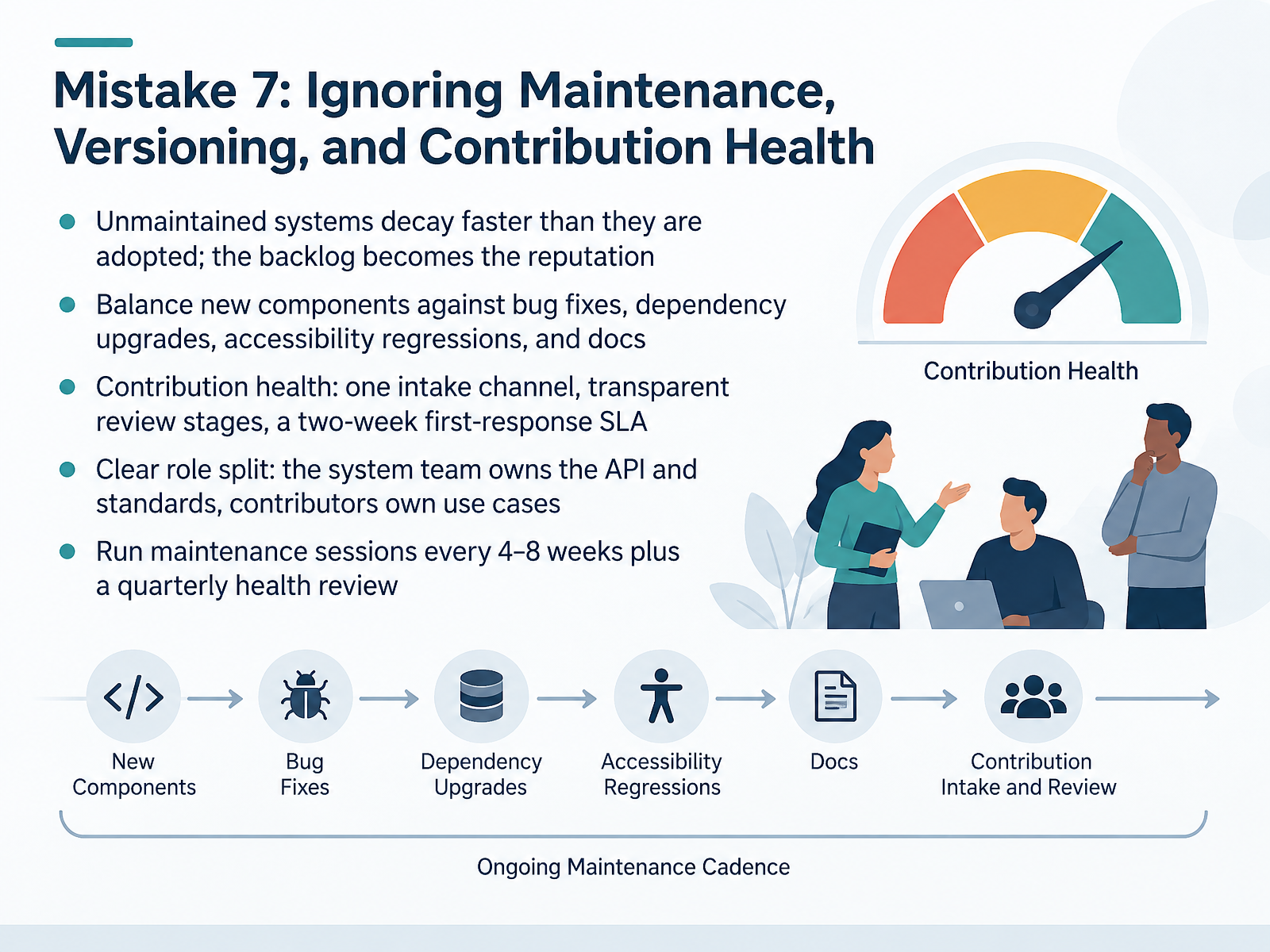
- 10Mistake 7: Ignoring Maintenance, Versioning, and Contribution HealthLet's talk about the mistake that quietly erodes trust: ignoring maintenance, versioning, and contribution health. An unmaintained system decays faster than it gets adopted, and your backlog becomes your reputation. So balance new components against bug fixes, dependency upgrades, accessibility regressions, and docs. For contribution health, keep one intake channel, make review stages transparent, and commit to a two-week first-response service-level agreement. That agreement is simply your promised reply time. Clarify roles: the system team owns the API and standards, while contributors own their use cases. Run maintenance sessions every four to eight weeks, plus a quarterly health review. Next, Mistake 8: Handing Down a System Instead of Building It With Teams.
 1 min
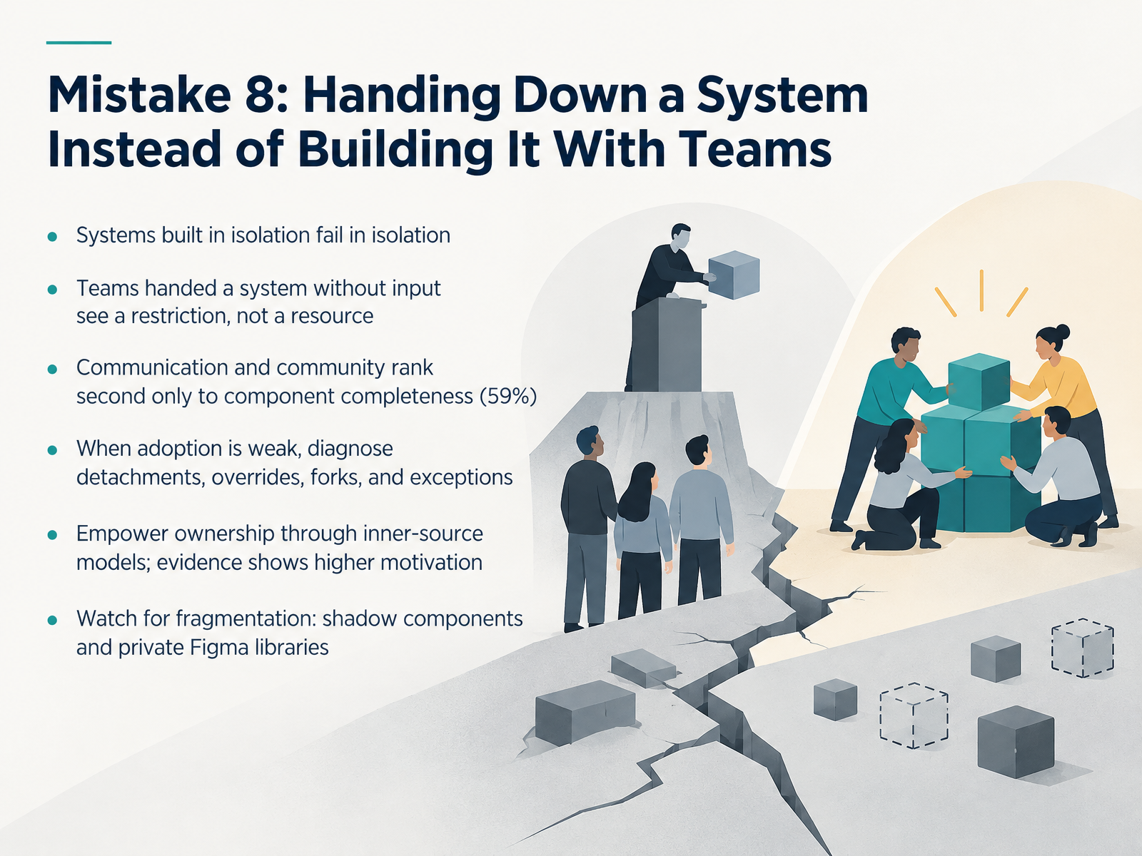
- 11Mistake 8: Handing Down a System Instead of Building It With TeamsLet's look at mistake eight. Handing down a system instead of building it with teams. Systems built in isolation fail in isolation. When a product designer or front-end developer receives a system they had no input in, they see a restriction, not a resource. That is a normal reaction, not resistance. So communication and community matter second only to component completeness, at fifty-nine percent. When adoption is weak, your job as a design-system lead is to diagnose. Look for detachments, overrides, forks, and exceptions, and ask why each one happened. Then empower ownership through an inner-source model, where contributors from product teams can propose and shape changes. Evidence shows that raises motivation. Finally, watch for fragmentation. Shadow components and private Figma libraries are early warnings that teams have given up on the shared system. Next, we'll look at what good looks like, with before-and-after signals for each mistake.
 2 min
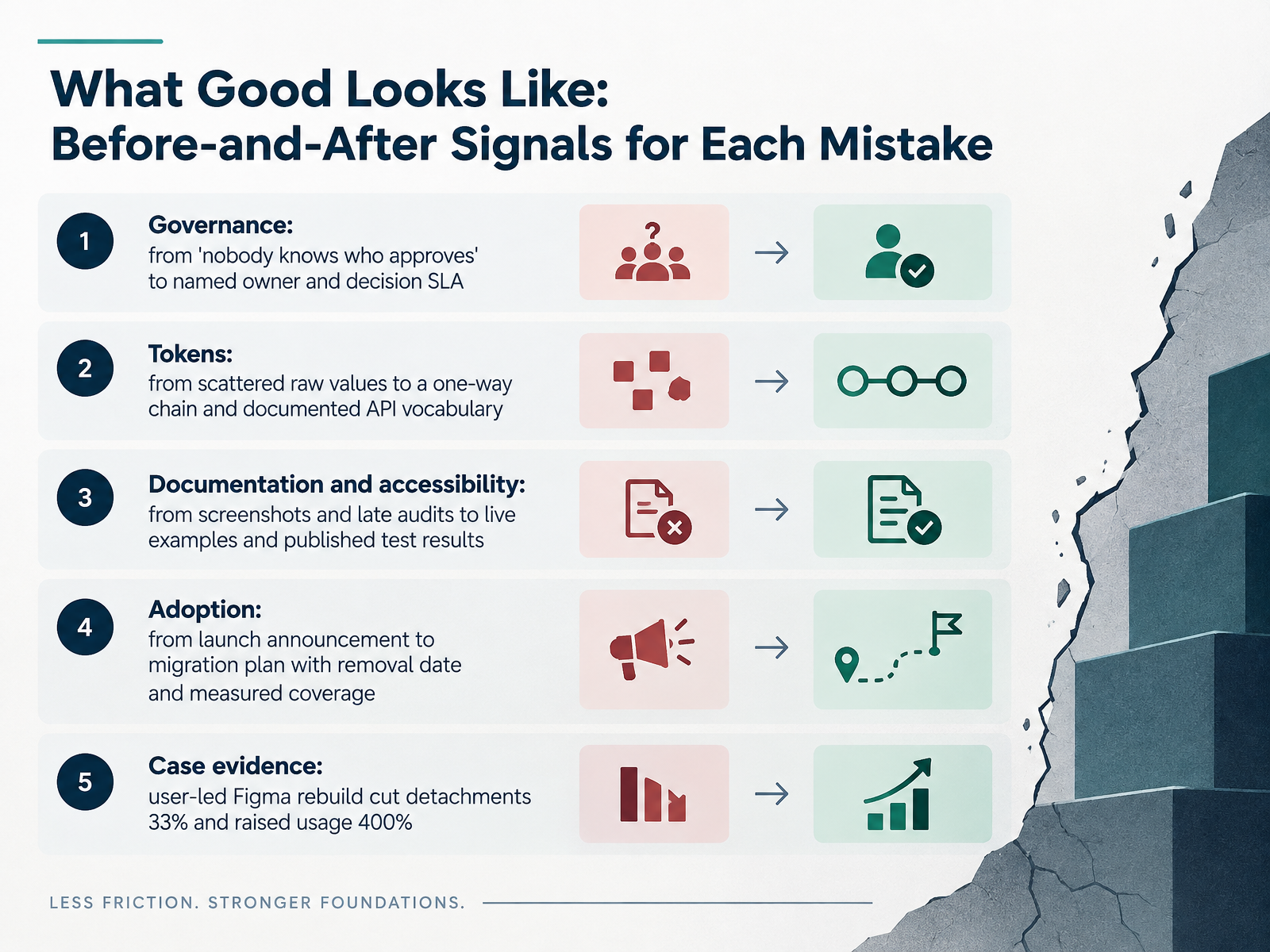
- 12What Good Looks Like: Before-and-After Signals for Each MistakeLet's make this concrete by comparing the before and after signals for each mistake. On governance, the before is nobody knows who approves. The after is a named owner and a decision service-level agreement, meaning a published response time. On tokens, the before is scattered raw values. The after is a one-way chain, where changes flow from source to product, plus a documented API vocabulary. On documentation and accessibility, the before is screenshots and late audits. The after is live examples and published test results. On adoption, the before is a launch announcement. The after is a migration plan with a removal date and measured coverage. And here is the case evidence. When users led a Figma rebuild, design detachments dropped by thirty-three percent and usage rose four hundred percent. So the takeaway for every design-system lead, product designer, front-end developer, and contributor is simple. Measure the after signals, not just the launch. Next, we move into role-based plays: leads, product designers, front-end developers, contributors.
 2 min
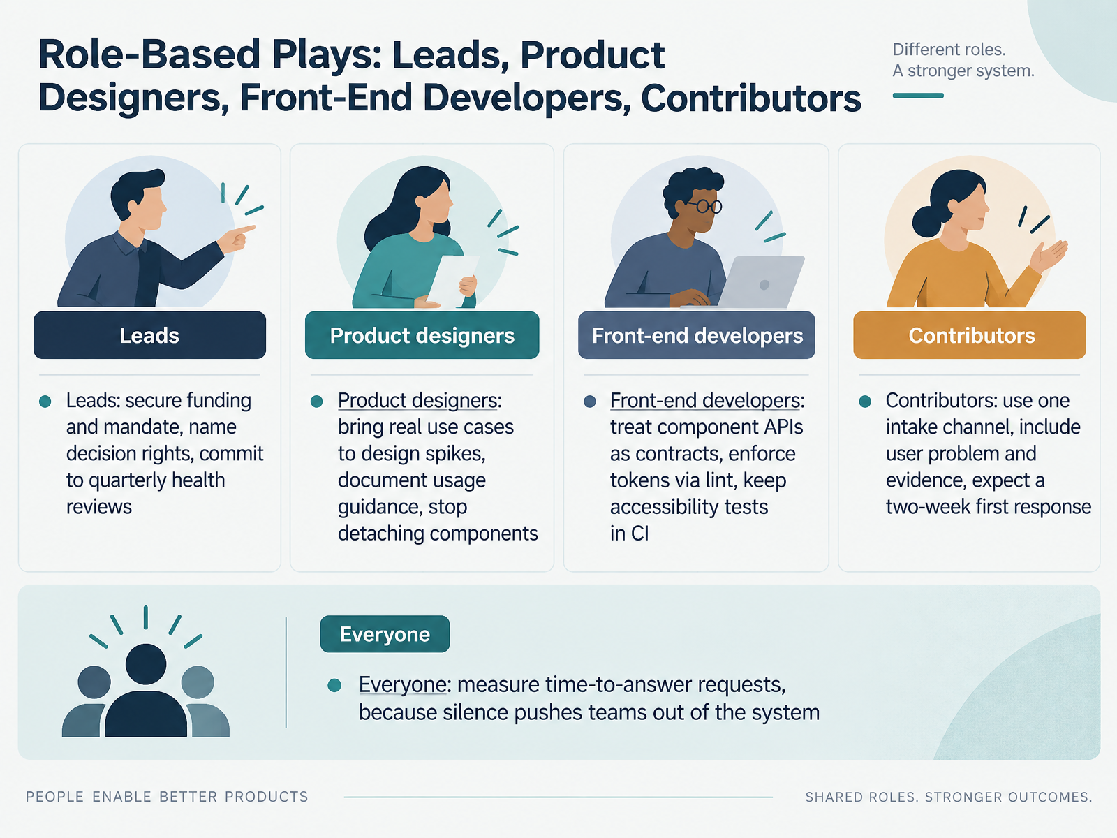
- 13Role-Based Plays: Leads, Product Designers, Front-End Developers, ContributorsSo let's make this practical with role-based plays. Each role has a short list of actions that move the system forward.
Design-system leads: secure funding and a clear mandate. Name who holds decision rights, so debates end with an owner. Commit to a quarterly health review, and publish what you measure.
Product designers: bring real use cases to design spikes, not abstractions. Document usage guidance next to each component. And stop detaching components, because detached copies drift and create rework.
Front-end developers: treat component APIs as contracts. Enforce design tokens through lint rules, so drift is caught in review. Keep accessibility tests in continuous integration, so regressions fail fast.
Contributors: use one intake channel. Include the user problem and evidence of need. Expect a first response within two weeks, even if it is just a status update.
And everyone: measure time-to-answer requests. Because silence pushes teams out of the system.
Next, we will look at the prevention checklist and thirty, sixty, and ninety-day next steps.
 2 min
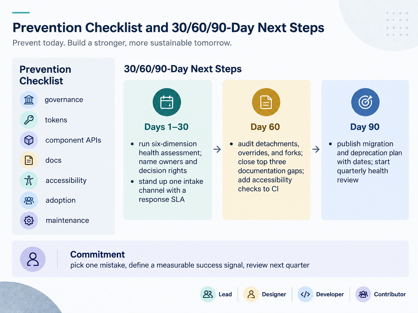
- 14Prevention Checklist and 30/60/90-Day Next StepsLet's close with a checklist and a ninety-day plan you can actually run. The prevention checklist covers governance, tokens, component APIs, documentation, accessibility, adoption, and maintenance. Treat it as a recurring review, not a one-time audit. In days one through thirty, run a six-dimension health assessment and name owners and decision rights. Also stand up one intake channel with a response service-level agreement, which simply means a stated time for replying to requests. By day sixty, audit detachments, overrides, and forks, close the top three documentation gaps, and add accessibility checks to continuous integration. By day ninety, publish a migration and deprecation plan with dates, and start a quarterly health review. Finally, make one commitment. Pick a single mistake, define a measurable success signal, and review it next quarter. That is how prevention becomes habit. Thank you for your attention today, and good luck making your system steadier.
 designsystem.digital.govfigr.designgithub.com+22 min
Take the deck with you
Download this course as a file — free, no sign-up needed.
- PDF handoutEvery slide page, ready to print or share.15 pages · 3.5 MBDownload
- Narrated PowerPointThe deck that presents itself — every slide carries the digital human's narration video.15 pages · 14.7 MBDownload
- PowerPoint slidesThe full deck as a .pptx — open it in PowerPoint, Keynote, or Google Slides.15 pages · 3.4 MBDownload
Free to use in your own training — please keep the PersonWise credit page at the end.
Have your own deck? Turn it into a course
Sources consulted
Web sources consulted while building this course.
- Brought to you by — othr.zeroheight.com
- Design Systems Report 2026 - brought to you by zeroheight — report.zeroheight.com
- Zeroheight Releases Its Design Systems Report 2025 — webdesignerdepot.com
- Why Design Systems Are Now a Strategic Imperative for ... — adrenalin.co
- Design Systems Report 2026 - brought to you by zeroheight — report.zeroheight.com
- Improving Design System Adoption with Inner Source — doi.org
- How design systems fail. And how to prevent it from happening | by Kevin Muldoon | UX Collective — uxdesign.cc
- Scaling a Design System through a Figma Library Rebuild — kennytran.design
- Why Most Design Systems Fail As Deliverables — Oz Gultekin — ozgur.design
- Why Design Systems Fail: 8 Failure Modes And Fixes — designwhine.com
- USWDS maturity model | U.S. Web Design System (USWDS) — designsystem.digital.gov
- Design System Audit Checklist Generator | Free Figr Tool — figr.design
- skills/system-health/SKILL.md — github.com
- Design-System Maturity: A 6-Dimension Framework - NN/G — nngroup.com
- USWDS maturity assessment worksheet — designsystem.digital.gov
- Design Token Architecture: Structuring for Scale | Figma — figma.com
- Multi-Brand & White-Label Token Architecture | CSS Architecture — css-architecture.com
- Design Token Governance for Multi-Brand Platforms — pathtoproject.com
- Patterns: Multi-Brand Architecture : VDS — variable-design-standard.vercel.app
- The Many Faces of Themeable Design Systems | Brad Frost — bradfrost.com