Content Collections with Cards
Begin
14 pages · ~28 min
Content Collections with Cards
Learn to organize and present content effectively using cards, building structured collections for enhanced user experiences.
What you’ll learn
- 01Designing Content Collections with CardsWelcome. Today we're exploring how to design content collections with cards. This is about taking a set of related, repeatable items and grouping them so users can browse, discover, and compare. A card is the dominant user interface pattern for that job. Think of a card as a self-contained, scannable container. It bundles a title, a bit of body text, maybe an image, and a clear action into one perceivable object. You'll find cards everywhere: streaming libraries, e-commerce grids, dashboards, and search results. In this journey, we'll start with your discovery goals, then move through layout, interaction, and governance. Along the way, you'll learn card anatomy, how to build layouts for comparison, how to make cards accessible, and how to scale your design system without losing control. Next we'll dig into the why: discovery, comparison, and when not to use cards.uianatomy.devdesign.learn.microsoft.comjustfigma.com+21 min
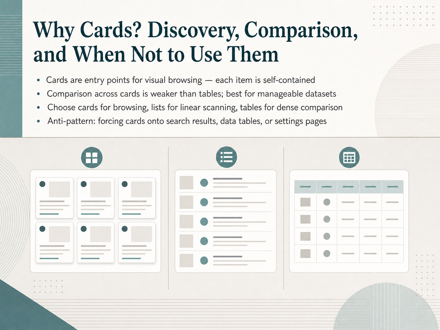
- 02Why Cards? Discovery, Comparison, and When Not to Use ThemLet's get right to the heart of why we reach for a card in the first place. A card is fundamentally an entry point for visual browsing. Each card is a self-contained, scannable unit—it groups a title, a bit of supporting text, maybe an image, and one clear action. Think of it as a promising doorway that invites someone to step inside. But here's the trade-off you need to weigh carefully. Cards are weakest for direct side-by-side comparison. If your user needs to scan across many rows and columns of dense data to spot patterns, a table is almost always clearer. So, how do you choose? Reach for cards when the primary task is browsing a manageable set of mixed-content items, like a product catalog or a series of project briefs. Use a list when users need fast, linear scanning of uniform items, like an inbox. And go to a table for dense, data-heavy comparison. One crucial anti-pattern to avoid: forcing cards onto search results, data tables, or settings pages. Cards hide ranking, waste space, and slow down scanning. That's a sure way to break a user's flow. Now, understanding when to use cards is just the first step. Next, we'll dig into the psychology behind how users actually scan and compare them.
 shaheermalik.comstan.visiongithub.com+22 min
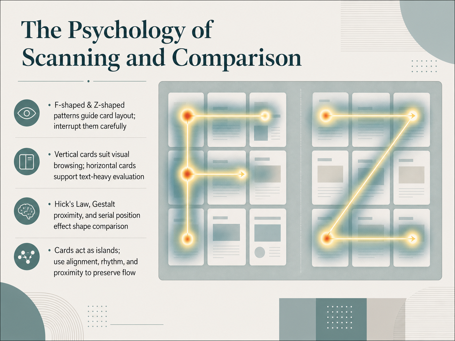
 - 03The Psychology of Scanning and ComparisonNow, let's get into the psychology behind why we scan and compare. When users land on a collection, their eyes don't wander randomly. They typically follow predictable paths, like the F-shaped pattern or the Z-shaped pattern. Knowing these patterns lets you place your most important content where it will be seen first. But feel free to interrupt those patterns carefully with a strong visual anchor to pull attention to something crucial. Another key decision is card orientation. Think about what your user is doing. If they are browsing visually, vertical cards support that top-to-bottom, image-led discovery effortlessly. But if they need to evaluate text-heavy information, horizontal cards are your friend. They align text side-by-side, making it easier to read and compare details. As you create these layouts, remember a few core principles. Hick's Law tells us that more choices increase decision time, so keep it focused. Use Gestalt proximity to group related items, and be aware of the serial position effect, where users remember the first and last items best. Finally, treat each card as an island, but don't leave it stranded. Use consistent alignment, visual rhythm, and close proximity to bridge the gaps and preserve a smooth, continuous flow for the eye. Next, we'll break down the exact anatomy of a card and how to model content inside it.
 doi.orgwebdesignerdepot.comjournals.sagepub.com+22 min
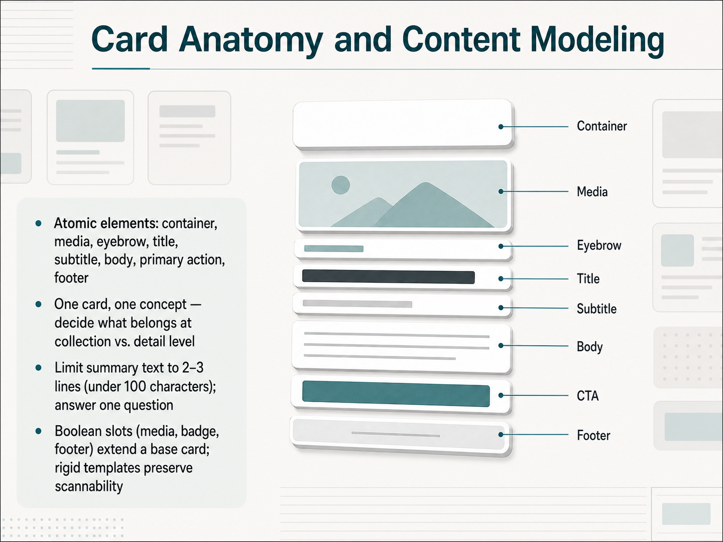
 - 04Card Anatomy and Content ModelingNow that we have a feel for what a collection is, let's open up the card itself and look at its anatomy. A card is built from atomic slots: the container, media, an eyebrow label, title, subtitle, body, the primary action, and a footer. Think of these as the skeleton that every card in your system shares. The core rule is one card, one concept. So when you're deciding what goes where, ask yourself: does this piece of information define the item at a glance, or does it belong on the detail page? For the summary text in the body, keep it tight. Limit yourself to two or three lines, under a hundred characters total, and make sure it answers exactly one question for the user. To keep your collection scannable, we use Boolean slots for elements like media, badges, or footers. These extend a single base card instead of creating a dozen variants. Rigid templates preserve that scannability, so every card in a grid feels like it belongs to the same family. Alright, let's step back and look at how these cards work together in collection architecture and layout patterns.
 uianatomy.devdesign.learn.microsoft.comjustfigma.com+22 min
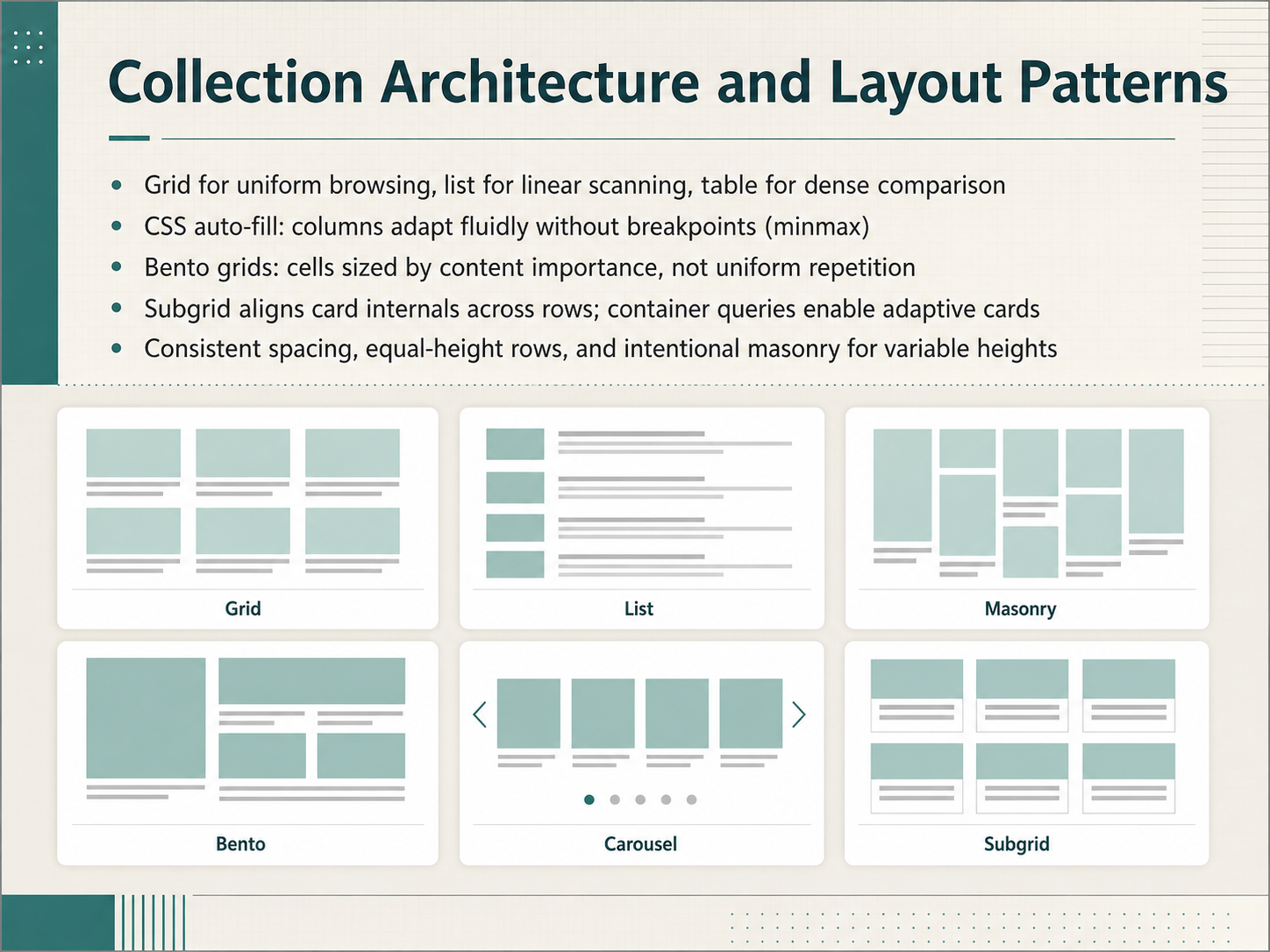
 - 05Collection Architecture and Layout PatternsSo you've decided to group content into collections. Now you need to choose the architecture—the actual layout pattern—that shapes how people browse and compare. Think of the layout as a promise to the user. A grid promises uniform browsing. A list promises linear scanning. A table promises dense, side-by-side comparison. The right choice depends entirely on the task. Don't default to cards just because they look modern. If your user needs to compare a dozen price points, give them a table. If they're scanning a feed, give them a list. If visual discovery is the goal, a grid is your best tool. For responsive grids, the 'auto-fill' and 'minmax' pattern in CSS lets columns adapt fluidly without any breakpoints. You define a minimum card width—say, 300 pixels—and the browser handles the rest. Now, when you need to signal hierarchy, consider a bento grid. Unlike a uniform card wall, bento cells are sized by their content importance. The anchor cell is larger, supporting cells are smaller, and the whole composition reads as a single, intentional unit. Just keep it to about eight cards to avoid overwhelming the user. For polished alignment, subgrid lets you align card internals—like titles and footers—across entire rows, and container queries let individual cards adapt to their own container's size instead of the viewport. Finally, lock down your spacing. Consistent gutters, equal-height rows, and intentional masonry for variable heights are what separate a professional collection from a rough prototype. Next, let's look at the visual attributes that enable comparison.
 spell.shartofstyleframe.comuxpatterns.dev+22 min
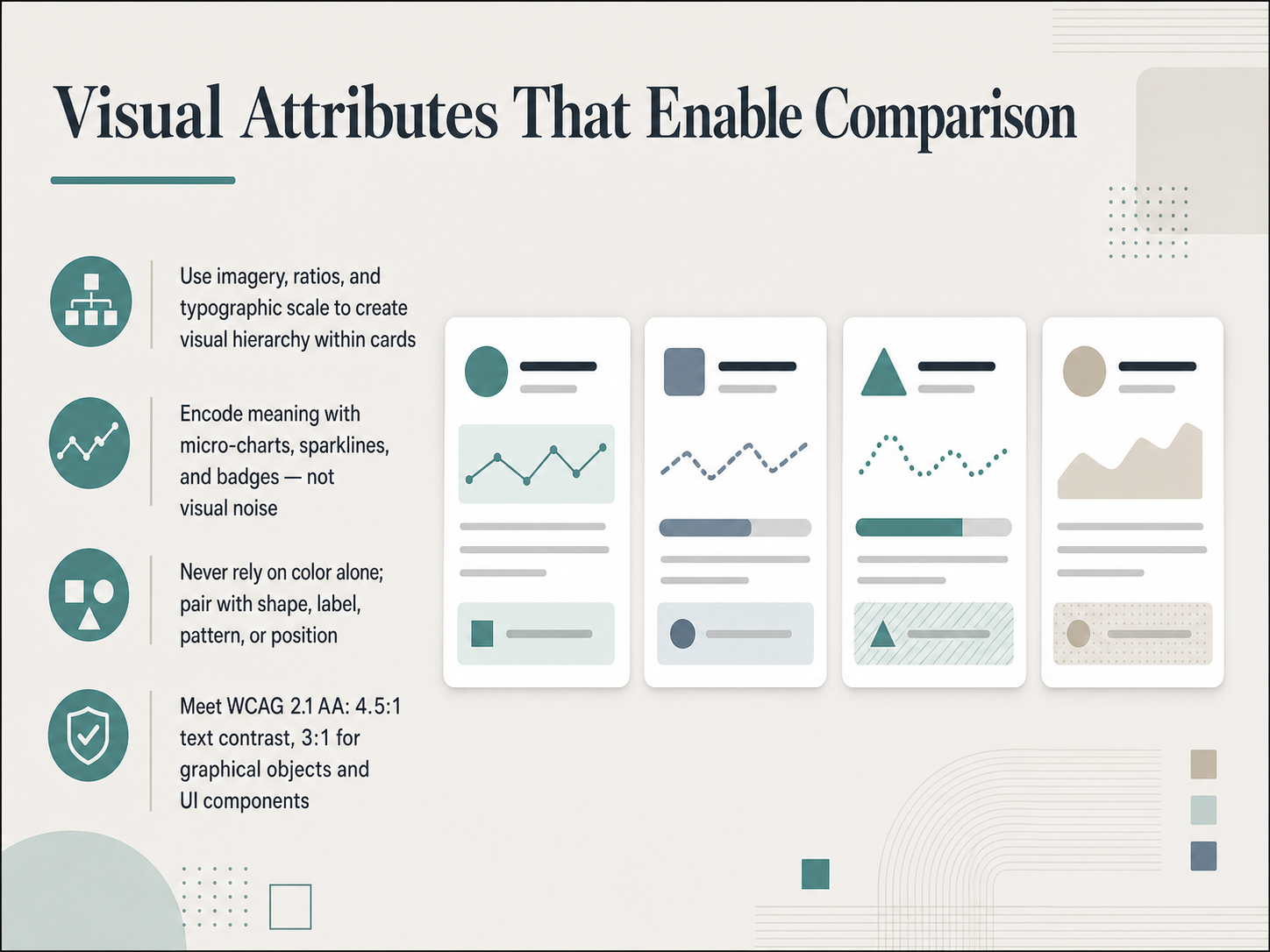
 - 06Visual Attributes That Enable ComparisonNow that we have a collection, let's talk about the visual attributes that make comparison possible. When you scan a set of cards, your eye needs to land on the right data instantly. That doesn't happen by accident. You create it with a deliberate visual hierarchy. Start with imagery, ratios, and typographic scale. A larger heading, a consistent image crop, a key number set in a bigger weight. All of these signal importance before anyone reads a word. Next, encode meaning with micro-charts, sparklines, and badges. A tiny sparkline inside a card shows a trend faster than a table does. A badge can surface status without adding clutter. But remember, these are tools for encoding, not visual noise. Every mark you add should carry information. And here is a rule that will save your team from the most common accessibility failure. Never rely on color alone. Pair that red error state with a distinct shape, a text label, or a pattern. A screen reader won't see the color change, and a color-blind user might miss it completely. Finally, meet the contrast minimums. WCAG 2.1 AA requires 4.5 to 1 for text and 3 to 1 for graphical objects and UI components. That includes the edges of your sparklines and the borders of your badges. If you treat these four attributes as a checklist, your cards won't just look good. They'll be readable and comparable by everyone. Up next, we'll look at how those cards behave when someone interacts with them. Let's move into interaction design, states, affordances, and filtering.
 dap.berkeley.edu2 min
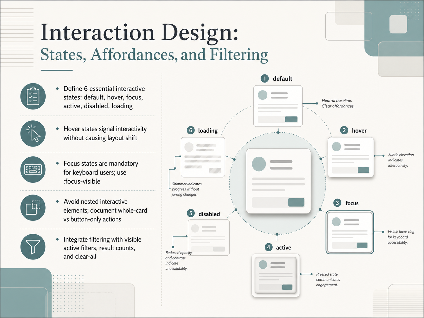
 - 07Interaction Design: States, Affordances, and FilteringNow let's get into the interaction design details that make a card collection feel responsive and trustworthy. We're going to define six essential interactive states: default, hover, focus, active, disabled, and loading. Think of these as the contract between your user and the interface. First, hover states. Their job is to signal interactivity, but they must never cause layout shift. A subtle lift or a shadow change is all you need. Next, focus states. These are mandatory for keyboard users. Always use the focus-visible selector for a clear, high-contrast ring. A critical rule here: avoid nested interactive elements. Decide whether the whole card is the click target or if only a specific button is, and document that choice clearly. Finally, we need to integrate filtering. When a user applies a filter, make the active filters visible with chips or tags, show the result count, and always provide a clear-all option. These details prevent dead ends and build trust. Up next, we'll build on this foundation to tackle performance, perceived speed, and loading states.
 spell.shlayoutscene.comstan.vision+12 min
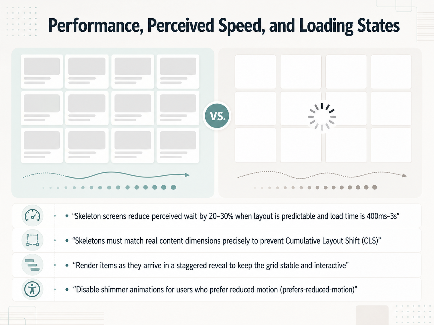
 - 08Performance, Perceived Speed, and Loading StatesNow let’s get into performance, perceived speed, and loading states. When you’re designing a collection of cards, you don’t want a blank screen while data loads. Skeleton screens can reduce perceived wait by twenty to thirty percent, but only when the layout is predictable and the load time falls between roughly 400 milliseconds and three seconds. The key is precision. Your skeleton must match the real content dimensions exactly, otherwise you’ll trigger Cumulative Layout Shift when the actual cards appear. Think of each slot as a fixed container. Render items as they arrive in a staggered reveal, so the first few cards become interactive while the rest load in waves. This keeps the grid stable and usable earlier. And one thing we shouldn’t overlook: disable shimmer animations for users who prefer reduced motion. A static skeleton still communicates structure without causing discomfort. Keep these four rules together, and your loading states will feel faster and more intentional.
 1 min
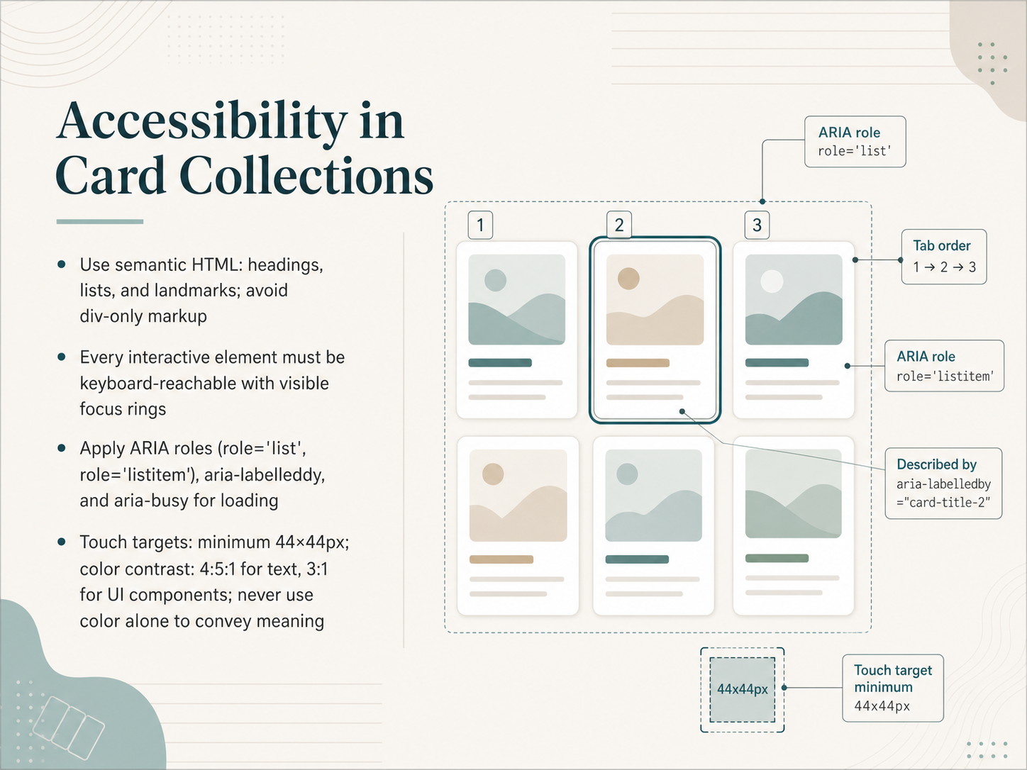
1 min - 09Accessibility in Card CollectionsNow let's talk about building accessibility directly into your card collections. This isn't a final checklist—it's the foundation you lay from the first component. Start with semantic HTML. Use headings, lists, and landmarks. Avoid div-only markup, because assistive technology needs real structure to understand the page. Next, every interactive element must be keyboard-reachable. That means a visible focus ring on every link, button, and filter control. If a keyboard user can't see where they are, they can't use your collection. We also apply ARIA roles where needed—think role="list" for the container, role="listitem" for each card, and aria-labelledby to tie a card's title to its content. When content loads dynamically, aria-busy tells screen readers to wait. Finally, the physical targets. Touch targets need a minimum of forty-four by forty-four pixels. For color contrast, text needs a ratio of four point five to one against its background, and UI components need three to one. And never use color alone to convey meaning—always pair it with a label, icon, or pattern. These rules turn a visual layout into something everyone can reach and understand. Up next, we'll look at how design system governance and token architecture keep all of this consistent across your product.
 dap.berkeley.eduspell.shlayoutscene.com+22 min
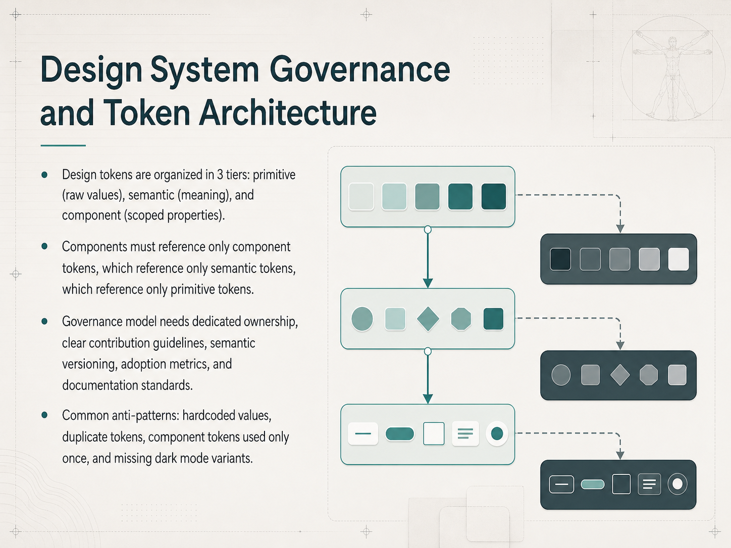
 - 10Design System Governance and Token ArchitectureNow let's talk about the rules that keep your token system healthy: design system governance and token architecture. Think of your tokens in three tiers. Primitive tokens are the raw values, like a hex code or a pixel size. Semantic tokens give those raw values meaning, like "color-action-primary." Component tokens are the scoped properties specific to a single component, like a button's background color. The critical rule is a strict reference chain. Components can only reference component tokens. Component tokens can only reference semantic tokens. And semantic tokens can only reference primitive tokens. This chain is your governance backbone. What happens if someone breaks it? Common anti-patterns include hardcoded values, duplicate tokens, component tokens used only once, and missing dark mode variants. Each of these quietly erodes consistency. A real governance model needs dedicated ownership, clear contribution guidelines, semantic versioning, adoption metrics, and documentation standards. It's the difference between a living system and a static library. Next, let's scale this thinking to card variants, density, and cross-platform consistency.
 2 min
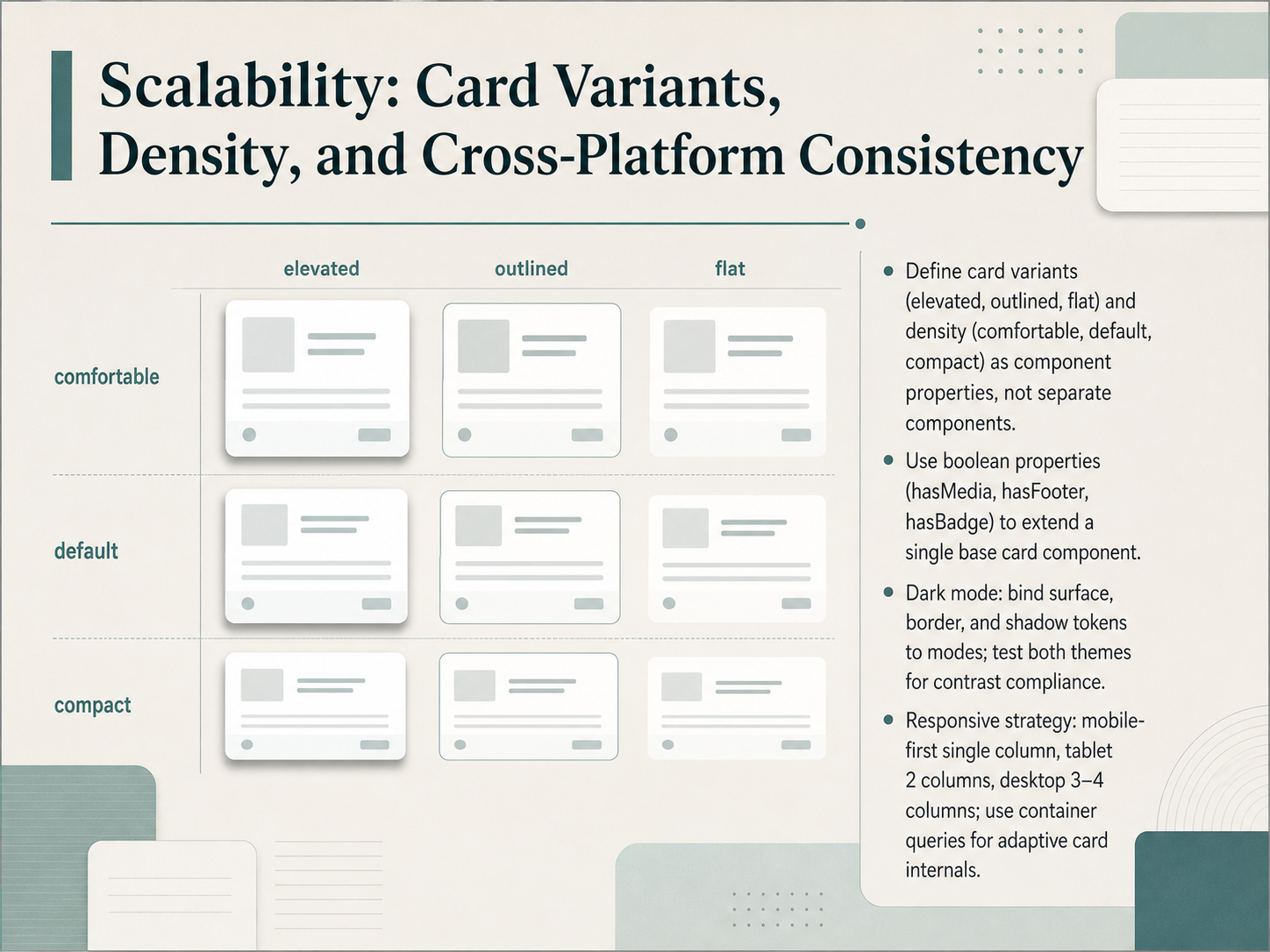
2 min - 11Scalability: Card Variants, Density, and Cross-Platform ConsistencyNow let's talk about scalability, or how a single card component stretches across variants, densities, screens, and even dark mode without becoming a maintenance nightmare. Think of card variants like elevated, outlined, and flat not as separate components, but as properties on one base card. The same goes for density: comfortable, default, and compact are just spacing presets, not three different cards. We extend this further with boolean properties, simple true or false toggles. For example, hasMedia, hasFooter, or hasBadge let you turn slots on and off from a single source of truth. For dark mode, bind your surface, border, and shadow tokens directly to the mode. You flip the theme, the card updates automatically. Just remember to test both themes against your contrast requirements. On the responsive side, start mobile-first with a single column. As the viewport grows, shift to two columns on tablet, and three or four on desktop. For the card internals, use container queries so the card adapts to its own space, not just the screen width. This keeps your collection consistent and your component panel lean. Next, we will move into testing and evaluating card collections to make sure they hold up under real content and real users.
 uianatomy.devdesign.learn.microsoft.comjustfigma.com+22 min
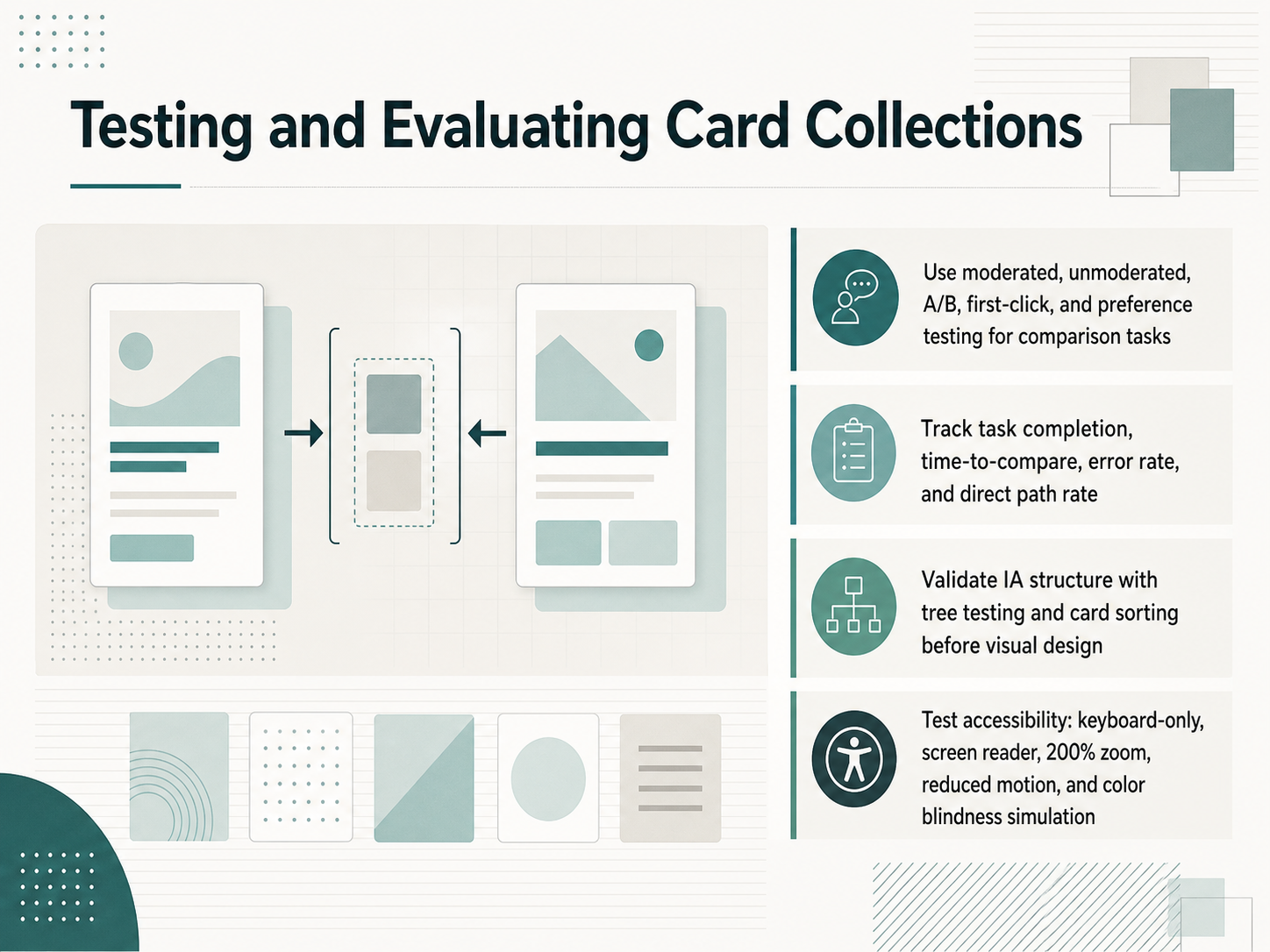
 - 12Testing and Evaluating Card CollectionsNow that you have a collection designed, how do you know it actually works? Let's talk about testing and evaluating card collections. You need methods built for comparison tasks. Think moderated or unmoderated usability testing, A/B testing, and first-click testing. Preference testing with justification is also valuable, because it reveals the 'why' behind user choices. When you run these tests, focus on key metrics: task completion, time-to-compare, error rate, and direct path rate. But hold on, before you invest in visual design, you must validate your information architecture. Use tree testing and card sorting first. These methods confirm your underlying structure makes sense. And finally, never skip accessibility testing. Verify your cards work with keyboard-only navigation, screen readers, two hundred percent zoom, reduced motion, and color blindness simulation. All of this builds confidence that your collection is clear, findable, and inclusive. Up next, we'll walk through a practical card design checklist, and the common mistakes you'll want to avoid.
 2 min
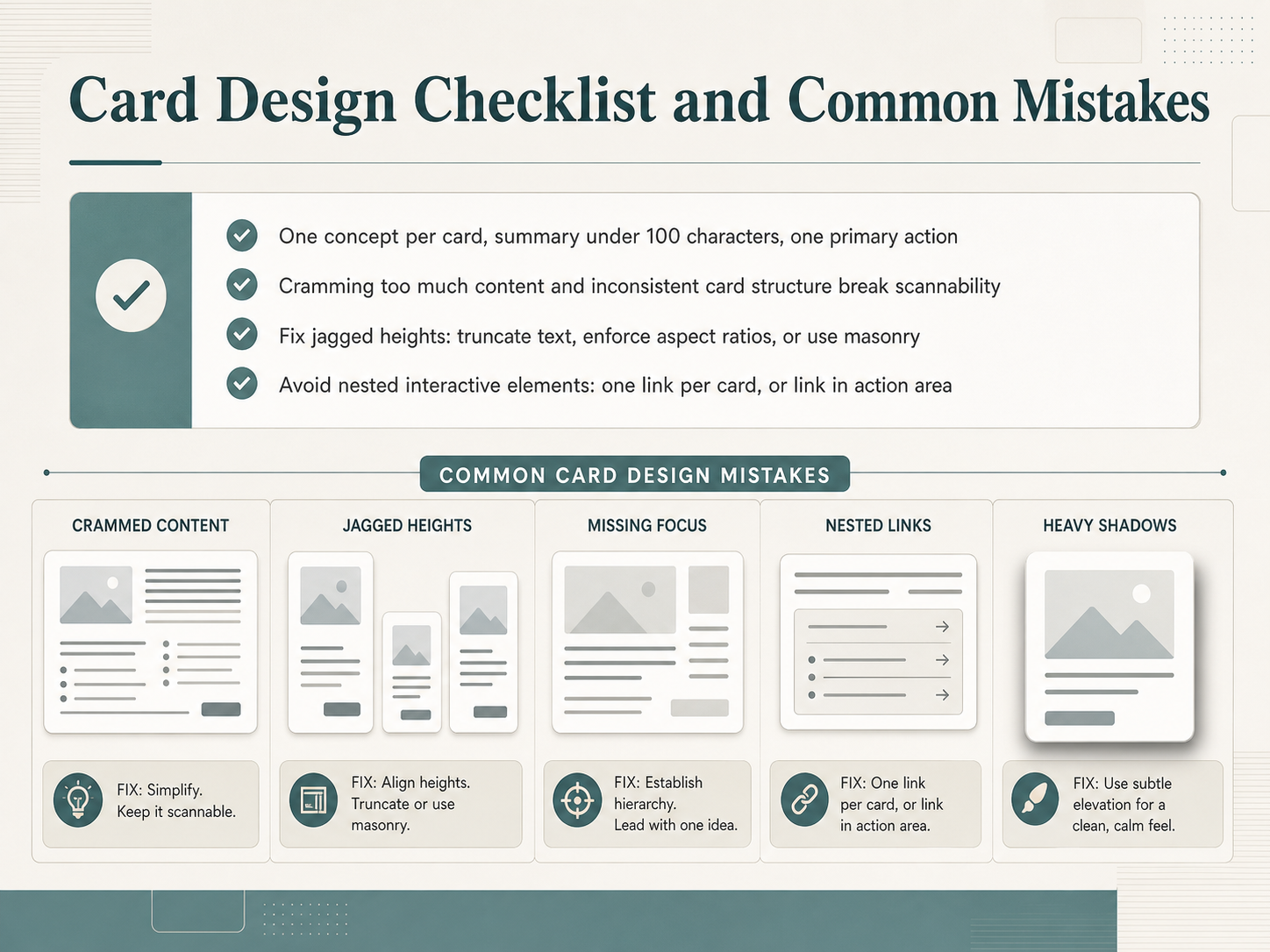
2 min - 13Card Design Checklist and Common MistakesLet's turn our attention to the checklist that keeps your card collections clean and professional. The golden rule is one concept per card. That means a single idea, a summary under one hundred characters, and one primary action. If you're cramming in a second narrative, you're building a detail page, not a card. The most common mistake we see is inconsistent structure. Jagged heights across a row break scannability. To fix this, truncate text at a set character count, enforce consistent image aspect ratios, or use a masonry layout where variable heights are intentional. Another critical error is nesting interactive elements. Avoid placing multiple links inside one card. Either make the entire card the single click target, or keep the link strictly in the action area. This protects keyboard navigation and keeps the interaction predictable. Review these four points before you hand off any card design, and you'll avoid the majority of usability issues. Next, we'll bring everything together in our final workflow: Putting It All Together.
 shaheermalik.comstan.visiongithub.com+22 min
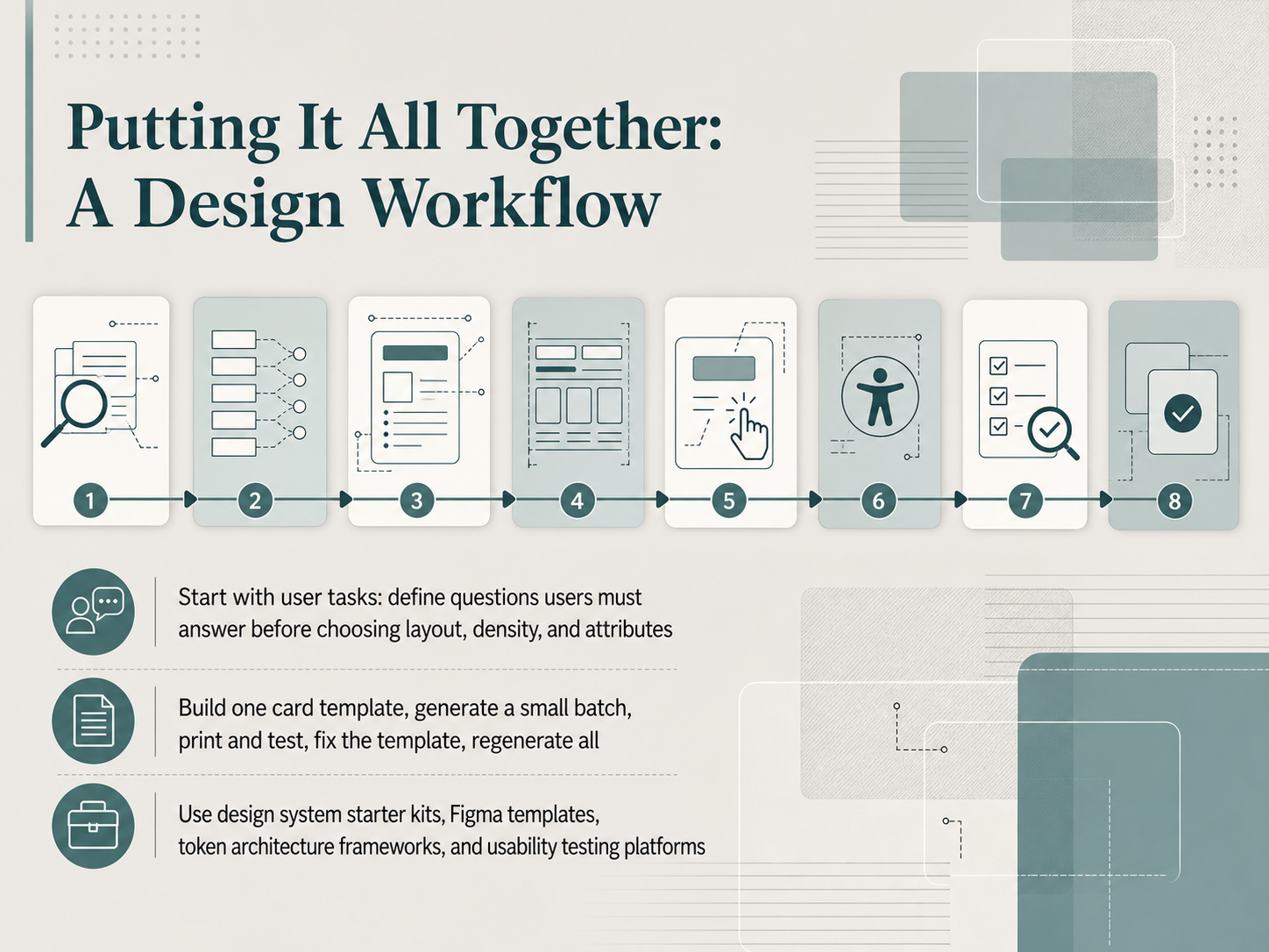
 - 14Putting It All Together: A Design WorkflowAlright, let's pull the whole workflow together so you can move from raw idea to polished set of cards with confidence. The process follows a logical chain: start with a content audit, map your attributes, define your card anatomy, then lock in layout, interaction, accessibility, testing, and governance. But the real secret is that you don't begin with the template. You begin with user tasks. Ask yourself, what questions must a user answer when they scan this collection? Define those questions first, and only then choose your layout, density, and attributes. That keeps the design user-centered instead of decoration-first. Here's the practical loop: build one card template, generate a small batch of maybe ten or twenty, print them, and test them physically. Find the problems, fix the template, and then regenerate the whole batch. The fix propagates instantly. And you don't have to start from zero. Use the design system starter kits, Figma templates, token architecture frameworks, and usability testing platforms we talked about earlier. They remove the busywork and let you focus on the design decisions that matter. So that's the workflow. Content audit to attribute mapping, card anatomy to layout, interaction to accessibility, testing to governance, all anchored by user tasks and a tight template-driven iteration loop. Thank you for working through this with me. Now go build something great, and remember: start small, test fast, and let the template do the heavy lifting.
 2 min
2 min
Take the deck with you
Download this course as a file — free, no sign-up needed.
- PDF handoutEvery slide page, ready to print or share.15 pages · 3.1 MBDownload
- Narrated PowerPointThe deck that presents itself — every slide carries the digital human's narration video.15 pages · 16.3 MBDownload
- PowerPoint slidesThe full deck as a .pptx — open it in PowerPoint, Keynote, or Google Slides.15 pages · 2.9 MBDownload
Free to use in your own training — please keep the PersonWise credit page at the end.
Have your own deck? Turn it into a course
Sources consulted
Web sources consulted while building this course.
- Card — UI Anatomy — uianatomy.dev
- Card | Atlas Design | Microsoft — design.learn.microsoft.com
- Design Cards in Figma (2026 Guide) — justfigma.com
- Cards – Material Design 3 — m3.material.io
- Cards · Koder Design — kds.koder.dev
- Card Design Best Practices (2026) — Shaheer Malik — shaheermalik.com
- UI Card Design: Examples, Best Practices & Common Patterns — stan.vision
- apps/web/content/pattern-guide/table-vs-list-vs-cards.mdx at main · thedaviddias/ux-patterns-for-developers — github.com
- Mastering Card UI Design Patterns for 2026: Your Definitive Guide to Engaging User Experiences - Layout Scene — layoutscene.com
- UI Card Design Patterns and Best Practices | Spell UI — spell.sh
- Eye-Tracking-Based Evaluation of Visual Search Efficiency in Simulated VR Menu Interfaces: Effects of Card Layout Structure and Target Spatial Quadrant — doi.org
- Vertical vs. Horizontal Cards: The UX Tradeoffs That Shape Modern Interfaces — webdesignerdepot.com
- First Look: Examining the Horizontal Grid Layout using Eye-tracking — journals.sagepub.com
- Vertical vs. Horizontal Cards: Which Are Better? | by UX Movement | Medium — uxmovement.medium.com
- I Stopped Putting Everything Inside Cards — My UX Metrics Improved ... — javascript.plainenglish.io
- CSS Layout Patterns in 2026: Grid, Flexbox, or Bento? — artofstyleframe.com
- Table vs List View vs Card Grid: Which Data Display Pattern Should You Use? | UX Patterns for Developers — uxpatterns.dev
- Card Grid Pattern | UX Patterns for Developers — uxpatterns.dev
- Bento Grid Design: A 2026 Guide to Layouts and Spacing | Brainy Papers — brainy.ink
- Accessible card UI component patterns | Digital Accessibility — dap.berkeley.edu